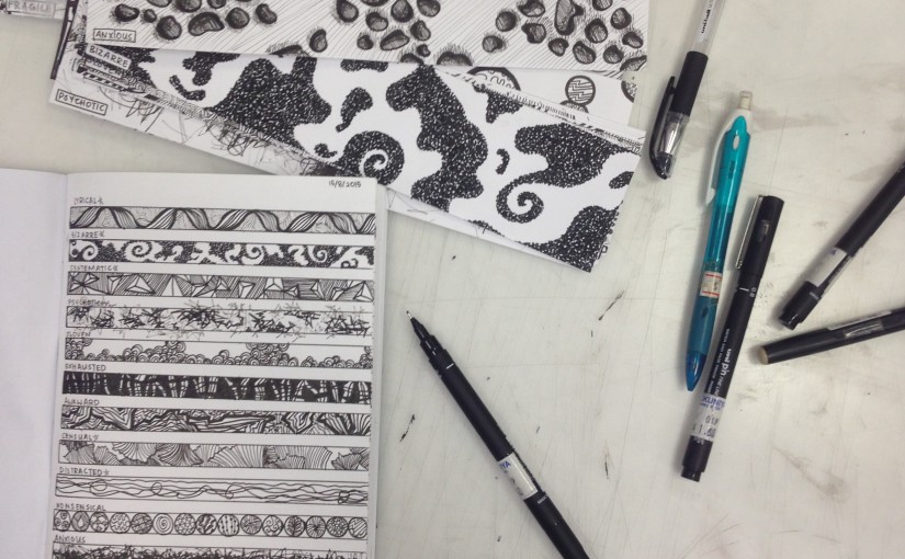
Principles of Design

The Principles of Design:

  • Balance

Distribution of objects, texture, space and colours to make up a stable design. Three types of balance:

– Symmetrical balance – elements on one side of the design are similar to the opposite side

– Asymmetrical design – sides are different but still remain visually balanced

– Radial balance – elements are arranged around a centre, focal point

HERBERT_BAGLIONE_BALANCE Principles-01

  • Emphasis

A part of the design that jumps out at the viewer. Usually made visible through contrasting with other areas of the design, using, for example, size/shape/colour etc.

8538488 emphasis

  • Pattern / Repetition

Constant repeating of an object or symbol in a design to create a recurring form or sequence. Gives unity to the art work.

e76af62c77457fdb1007510d0c31771a pattern 1 using rhythm repetition

  • Proportion

When all parts of a design correlate and work well together, it is good proportion. Parts can refer to sizes, amounts or numbers in the design.

images tumblr_ly7rw3XKYa1r1lgpio1_1280

  • Movement

The path the viewer’s eyes follows through in the design, and usually stops to rest and observe a focal area. Movement can be shown using lines, edges, shapes, or colours, etc.

Design monochrome spiral movement illusion background. Abstract strip lines warped backdrop. Vector-art illustration

images

2D Assignment 1 – Lines (Completed Work)

The completed 18 emotions:

  1. Bizarre – Tiny dots that formed inconsistent and strange shapes, that does not allow the viewer’s eyes to focus on anything at once.
  2. Anxious – Played on the fear, Trypophobia (whether it is proven or not), as many people, including myself, feel uncomfortable looking at multiple holes in a region.
  3. Spontaneous – Used medium, glitter, to represent explosiveness and fun, which symbolises spontaneity. Nail polish used over glitter to prevent it from falling out. Grey outline to further allow glitter to stand out.
  4. Lyrical – Music gets predictable, as the lyrics and chords are repeated in songs. I used a repeated, cursive pattern to represent repeated rhythms.
  5. Awkward – Different but similar shapes to show that people who feel awkward would feel uneasy as they are different from others. Consistent but plain background to allow shapes to stand out more.
  6. Sensual – Emotion is related to feelings of carnal desire or pleasure. The beach is often related to sensuality, so I wanted to create a softer, and more inviting version of seashells.
  7. Distracted – Lines that start of straight, but at various times, differ from the path they are supposed to take.
  8. Indecisive – Used a kaleidoscope of triangles, circles and squares, all fluctuating irregularly towards different directions.
  9. Fragile – Drew bullet holes on the paper, and wrapped plastic over. The plastic was meant to protect the paper, but it shows that fragile things in life will typically be broken eventually.
  10. Embarrassed – Used many types of eyes to show that the spotlight is on the viewer. Whether it is in their minds only or actually taking place, embarrassed people usually feel that many people are scrutinising them.
  11. Psychotic – Portraying a serial killer. Their insanity does not ever leave them, but is more volatile at some timings. Hence, used dark, confusing lines in the middle to show consistent insanity, but overbearing, raw emotions at various points.
  12. Aggressive – Cut the paper and painted over to resemble cuts on skin with dried blood. Used stapler bullets to punch right through the paper as well to show anger.
  13. Ambiguous – Used fingerprints and paint to show ambiguity and mysteriousness. The design is confusing and difficult to follow.
  14. Nonsensical – Drew many different patterns in circles that represent marbles in different sizes, that children usually play with.
  15. Turbulent – Background is tumultuous waves, as the sea can be dangerous and unstable. Added scotch tape over the waves to add a reflective, watery effect.
  16. Exhausted – White parts are like human bones, as people feel exhausted every once in a while. Gave the bones a cracked appearance.
  17. Systematic – Triangles are pointed, and made using straight lines, giving them a structured look. Background and foreground are uniform, an unchanging element.
  18. Sloven – Different pen inks and patterns to show haphazard drawings – lazy and untidy. The peaks are unsteady, displaying carelessness.

Ones that were spoken about in presentation:

Sensual, Aggressive and Turbulent ( photos as follows)

IMG_8033  IMG_8032

IMG_8039

Photos of completed work:

IMG_7853  IMG_7852

IMG_7851  IMG_7850

IMG_7849  IMG_7848

IMG_8037

2D Assignment 1 – Lines (Research)

Research done:

After searching for the word definitions of each emotion, I also searched for photos of ideas of what an emotive art work would look like.

I googled vague descriptions to get a general idea first for inspiration, and then after that, searched for more specific examples of the drawings or mediums I wanted to include.

Photos of research material:

il_fullxfull.328969789  how-to-draw-carnation04

Seashell and flower petals for ‘Sensual’

11954244791861345463rejon_Noise.svg.hi

Messy lines for ‘Distracted’

b306de52d87b8abba3f91077cf60ce1e

Chaotic waves for ‘Turbulent’

 bones_of_arms_and_legs_by_arvalis

Human bones for ‘Exhausted’

f2d76ee3aa98587778384bc2a99bd2aa

Multiple eyes for ‘Embarrassed’

   images

Bullet holes for ‘Fragile’

df58899ab8e9f805569436c2be00de64

Scratches on skin for ‘Aggressive’

2D Assignment 1 – Lines (Journal Process)

Process:

Wanting to incorporate what my perspective was of each emotion onto the strips of paper, I began by googling the meaning of all 18 words.

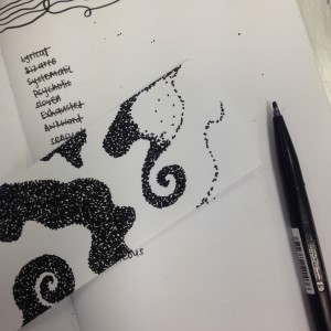
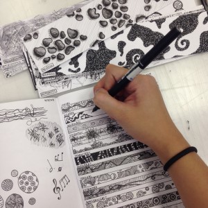
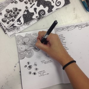
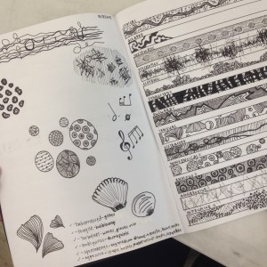
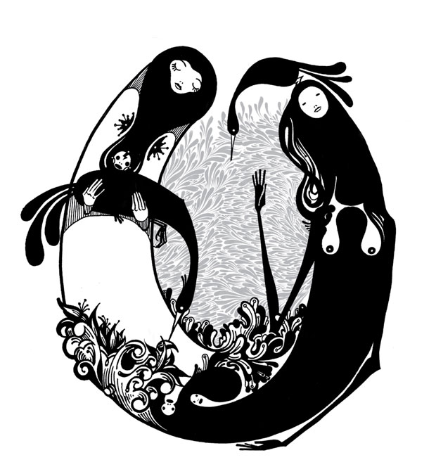
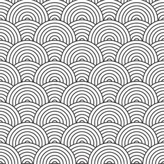
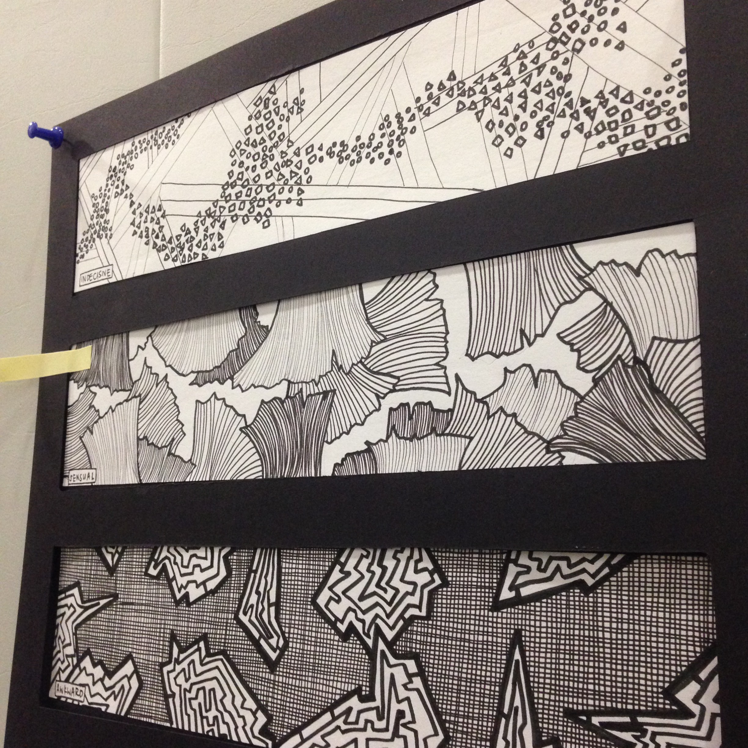
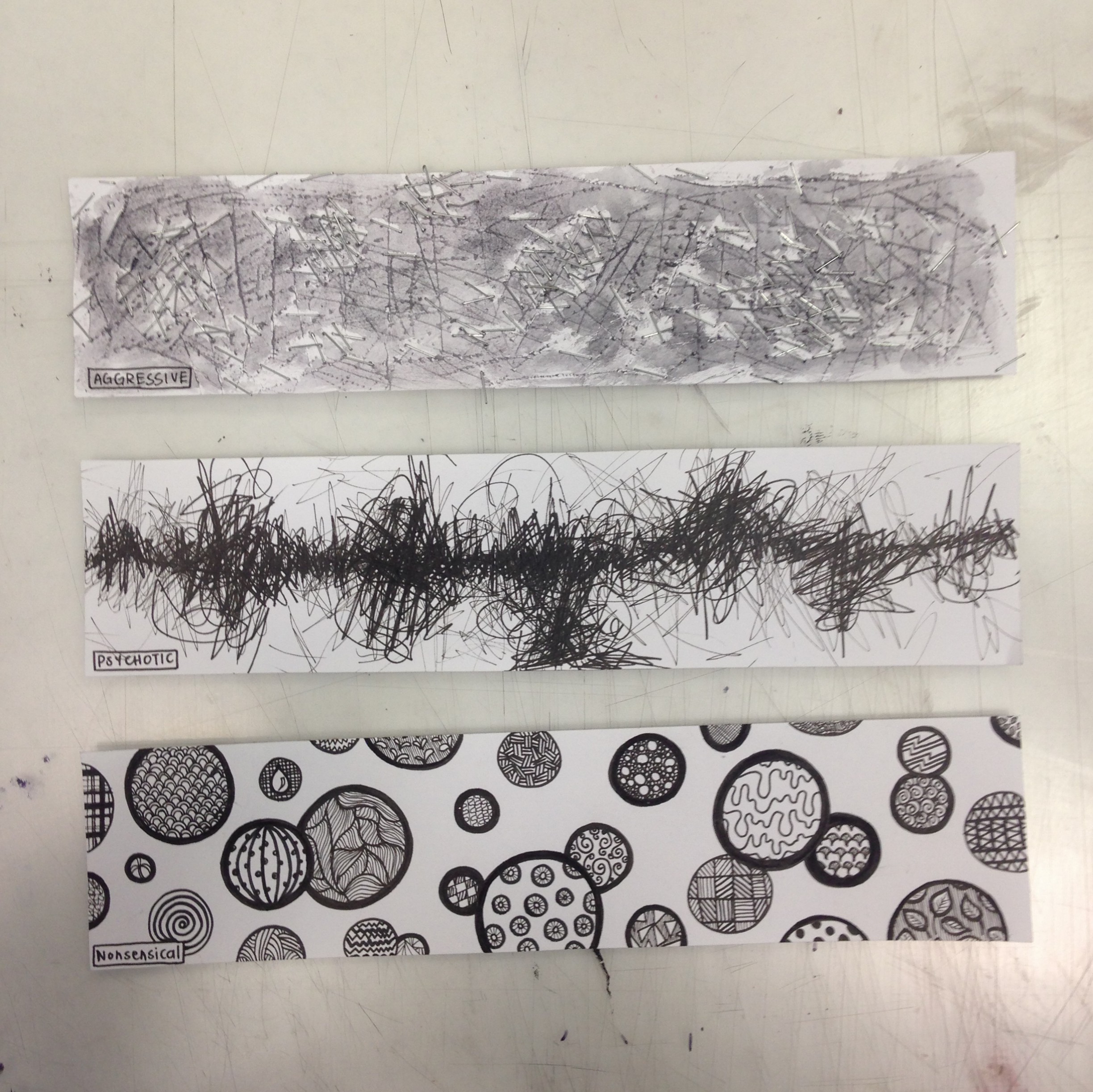
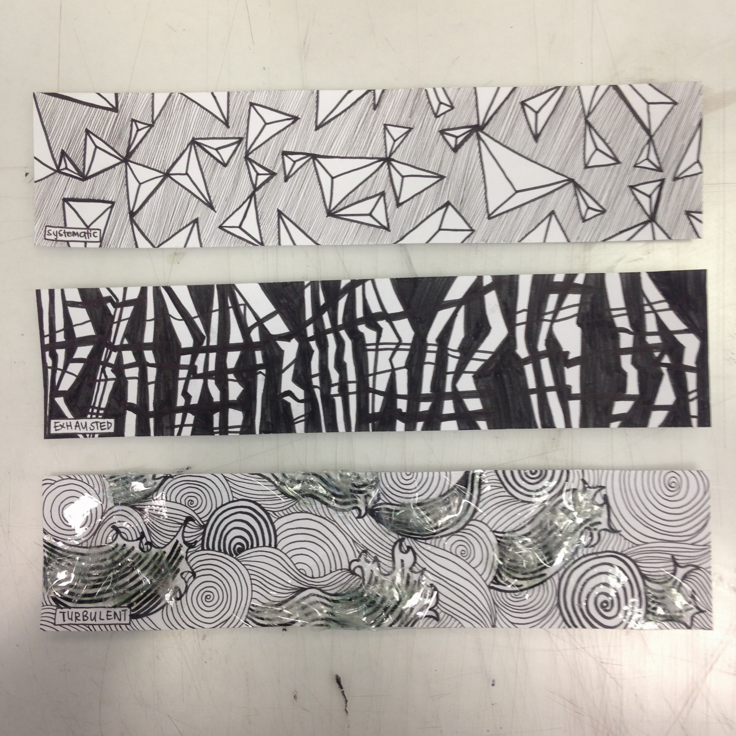
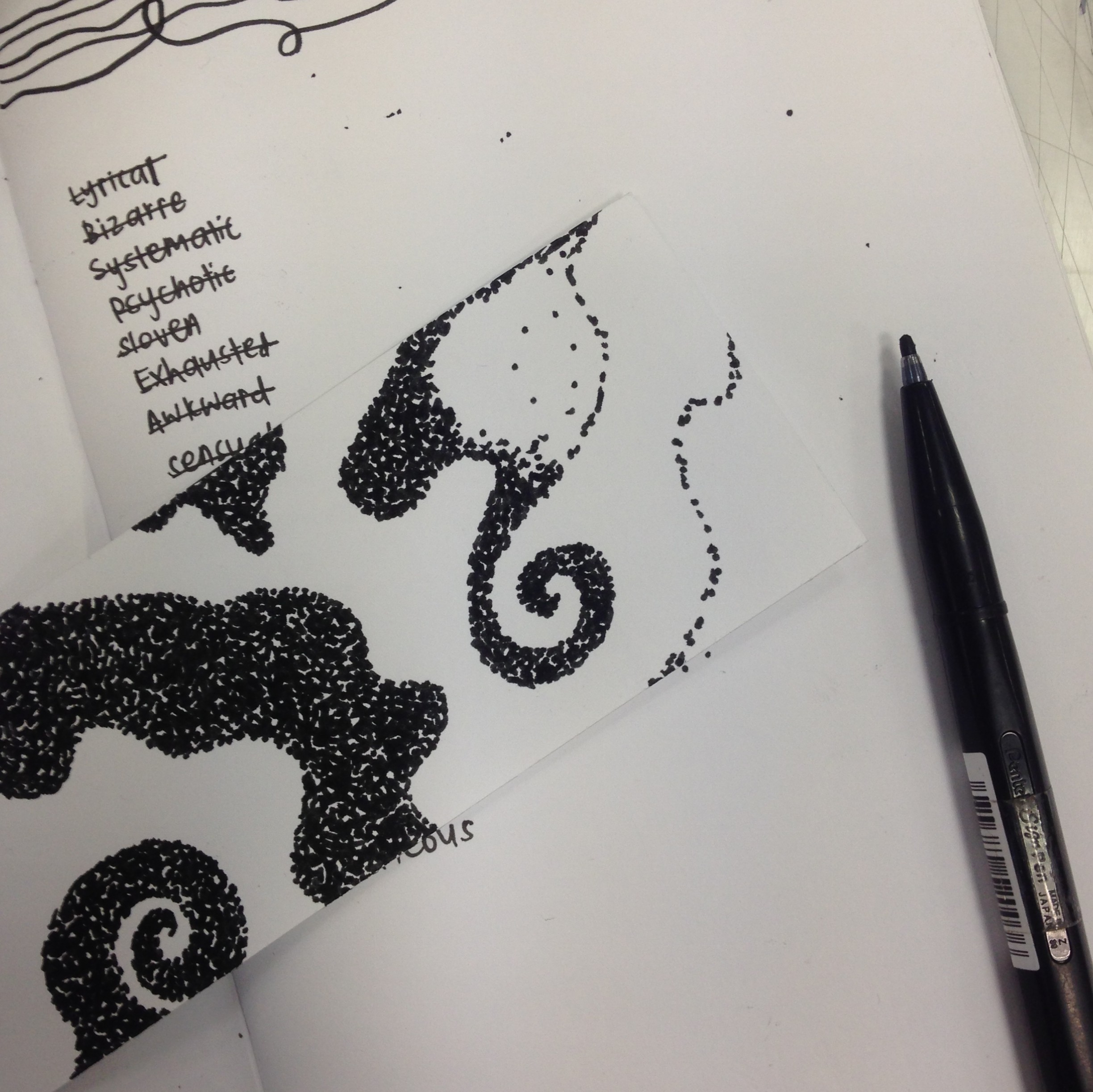
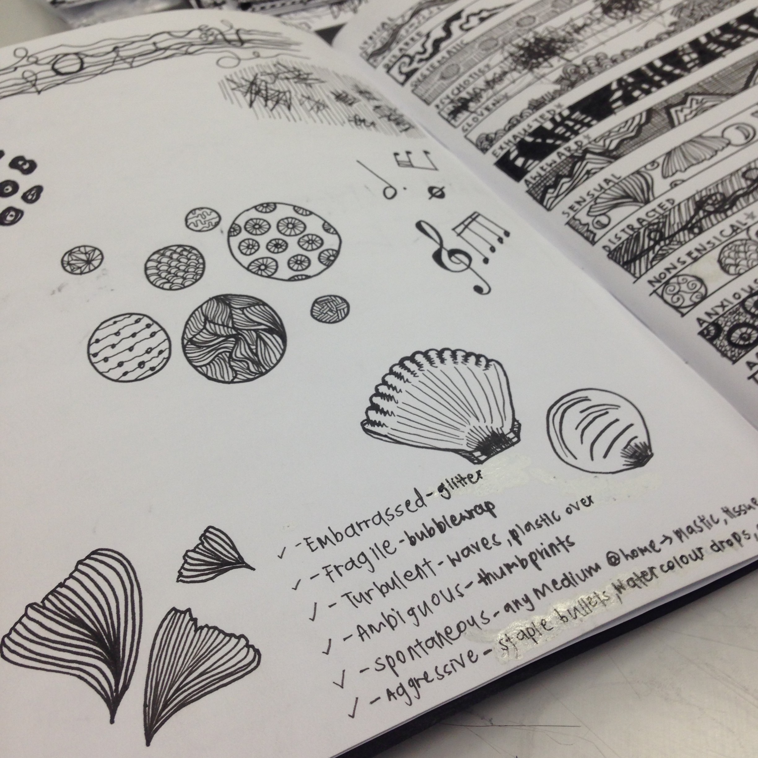
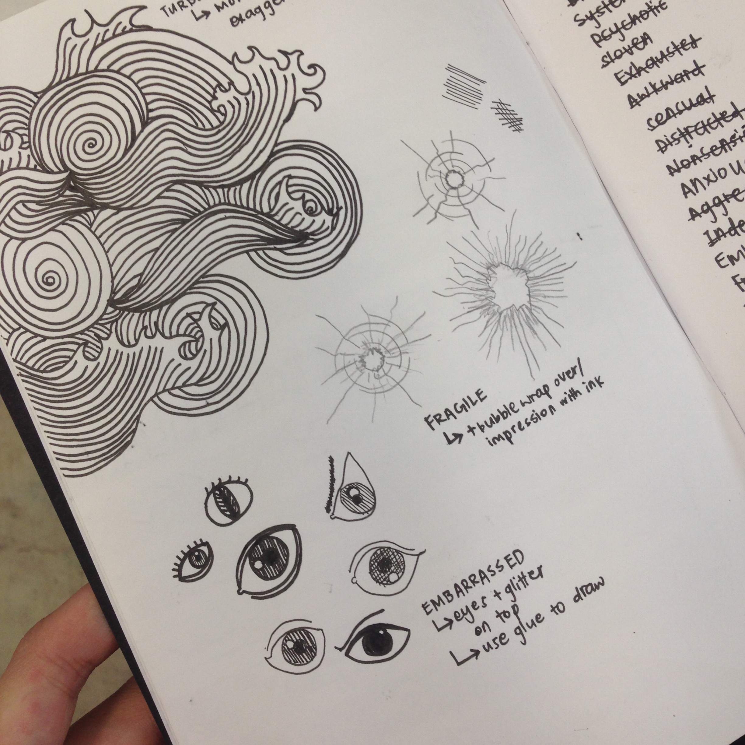
After understanding the emotions a little more, I started experimenting with all sorts of lines – thick, thin, curly, straight, squiggly, jagged, etc. I practiced drawing these lines first, and then started making patterns or shapes out of them, in order to convey the emotion onto paper.

I always thought that patterns were just for design purposes, but after delving into this project, I realised that various patterns can incur different emotions. Thick lines can mean security or safety, large circles combined with small circles can portray vast comparison between two elements, and triangles can appear rather technical.

Then I also discovered that shading was another way of making emotions more defined. Darker strips could present more negative emotions as compared to lighter coloured ones.

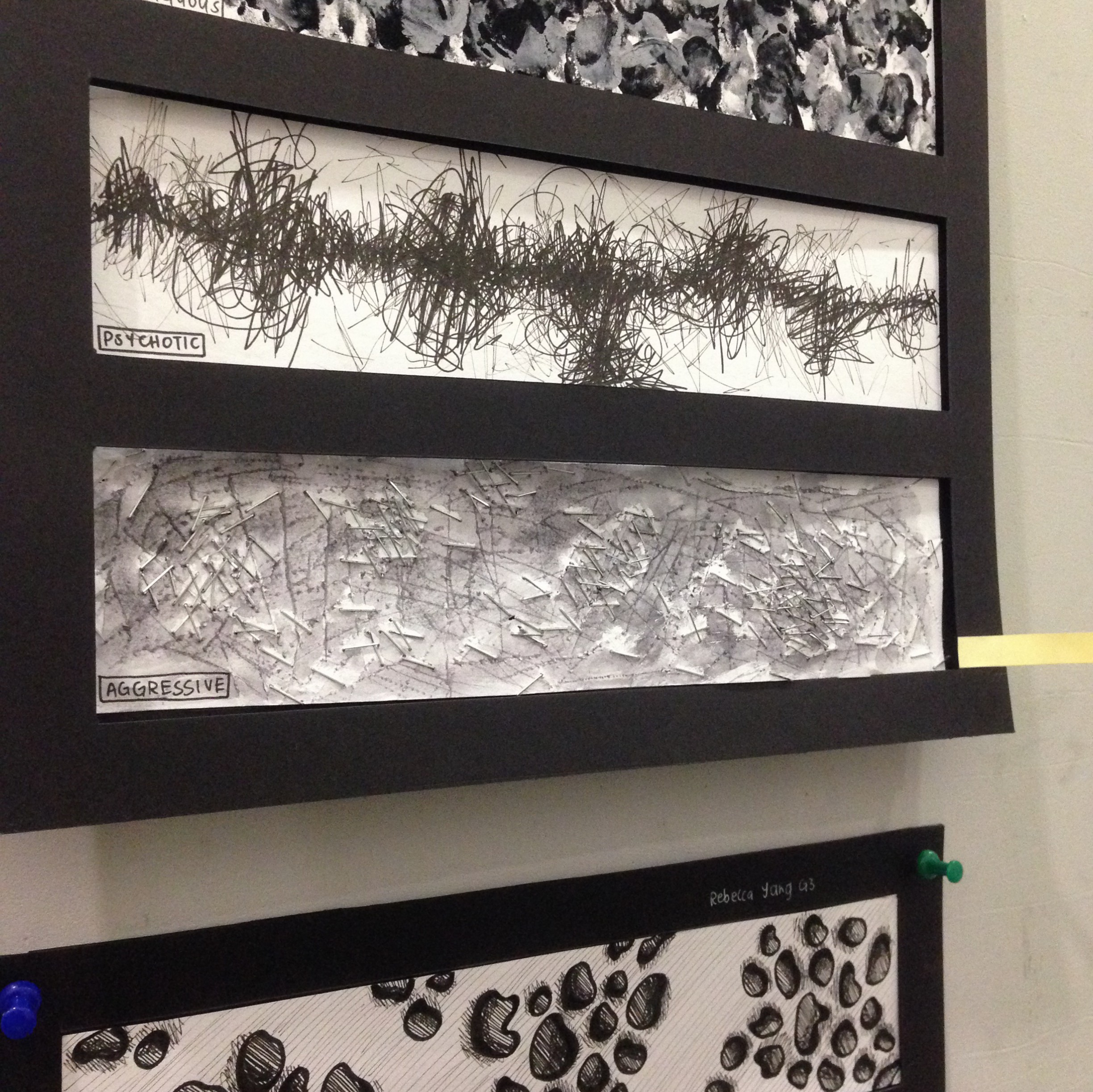
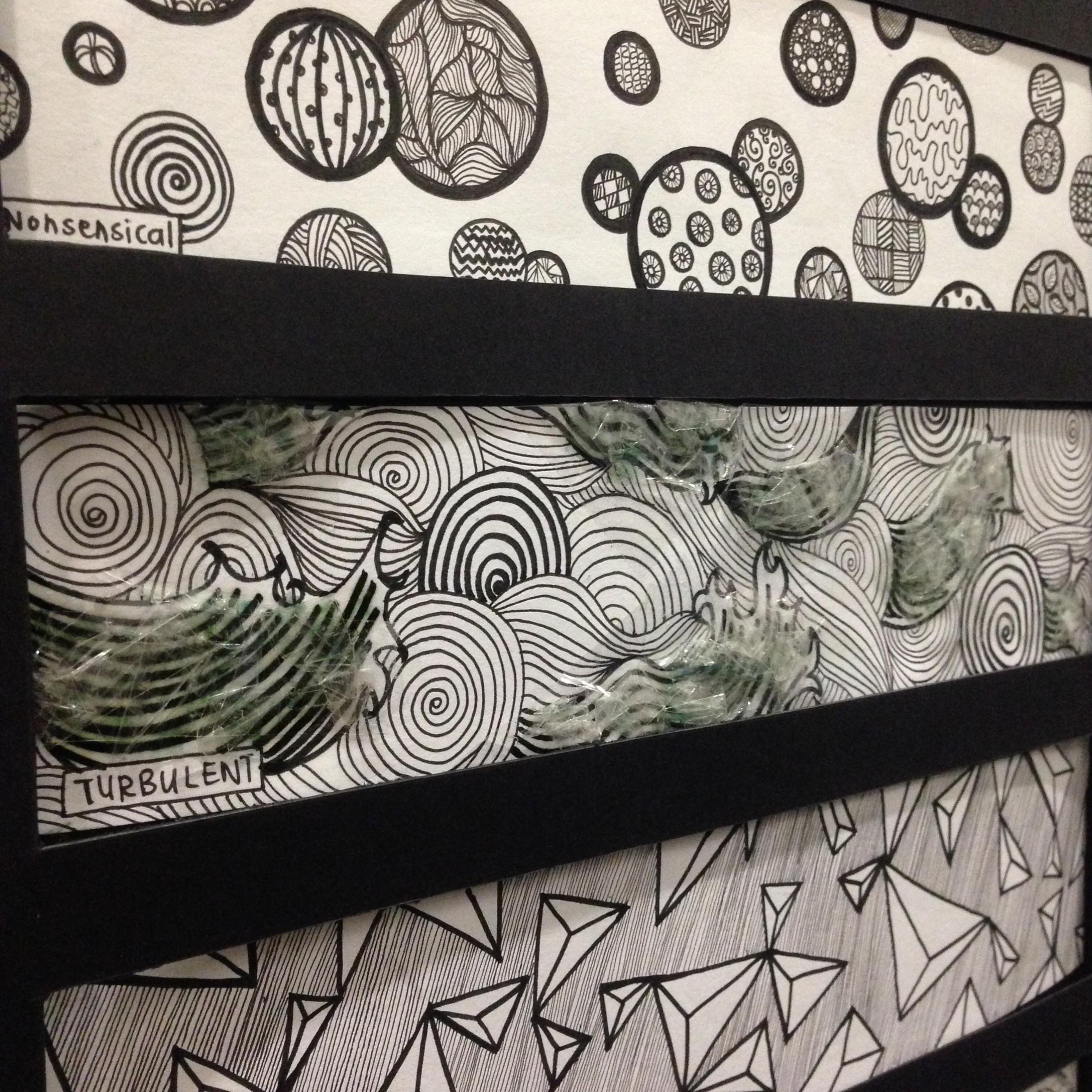
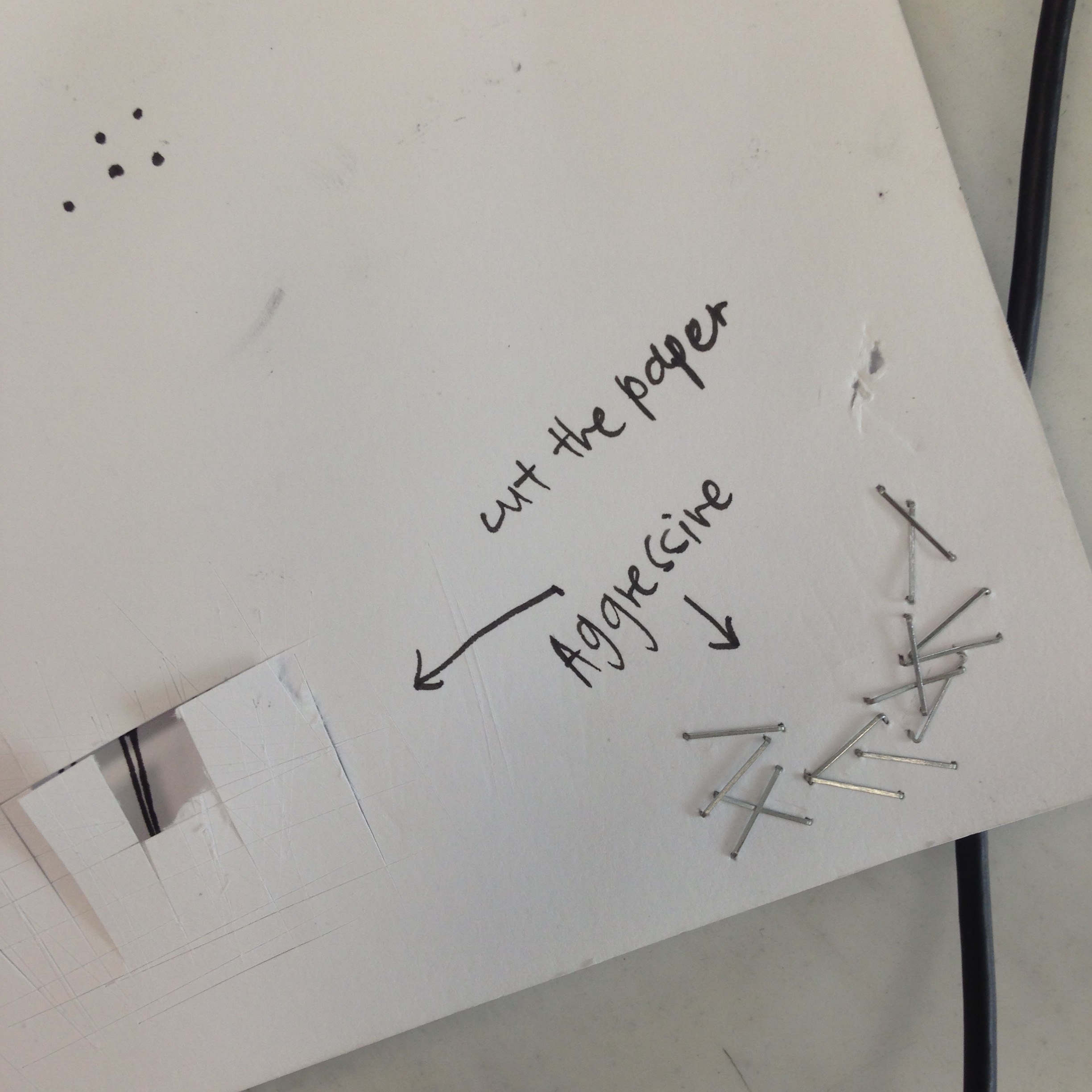
As I am more accustomed to using pens for drawing, I used that as my main medium. However, I also wanted to make use of other mediums, as that would add creative value to my pieces. After using different mediums (e.g. glitter, nail polish, plastic, scotch tape, stapler bullets, and paint), I found that it gave much more room to experiment and let our inventiveness and imagination grow.

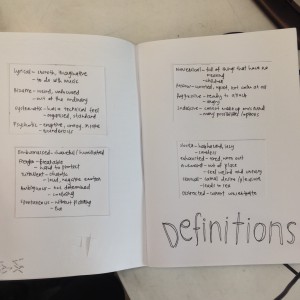
Definitions of the 18 emotions:

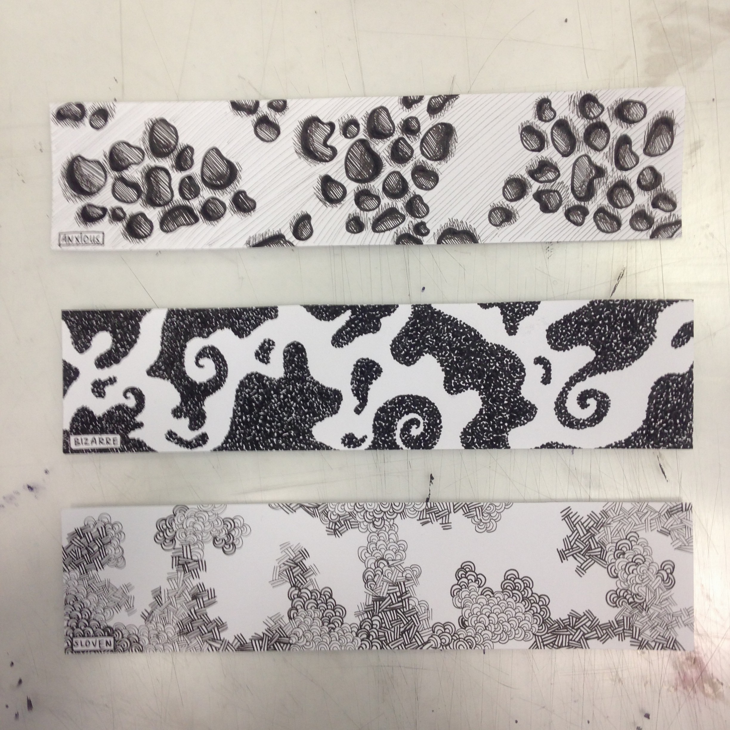
  1. Bizarre – Weird, strange, unfocused. Out of the ordinary
  2. Anxious – Worried and upset. Can be triggered off at the slightest gesture. Not calm at all.
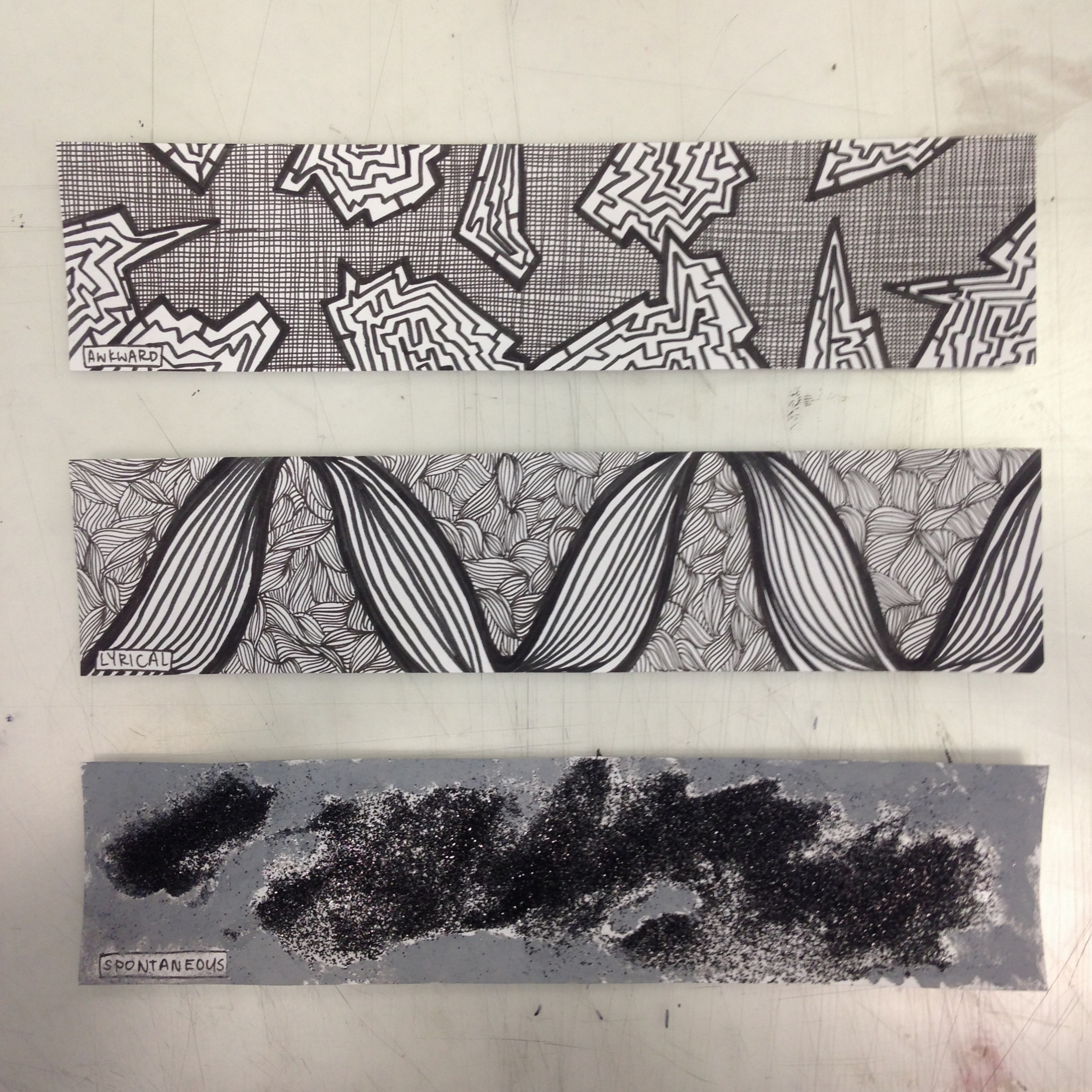
  3. Spontaneous – Fun. Without any planning. Stands out and very bold.
  4. Lyrical – Smooth and imaginative, has to do with music.
  5. Awkward – Out of place, feeling of not fitting in with the others around. Unpleasant and self inflicted.
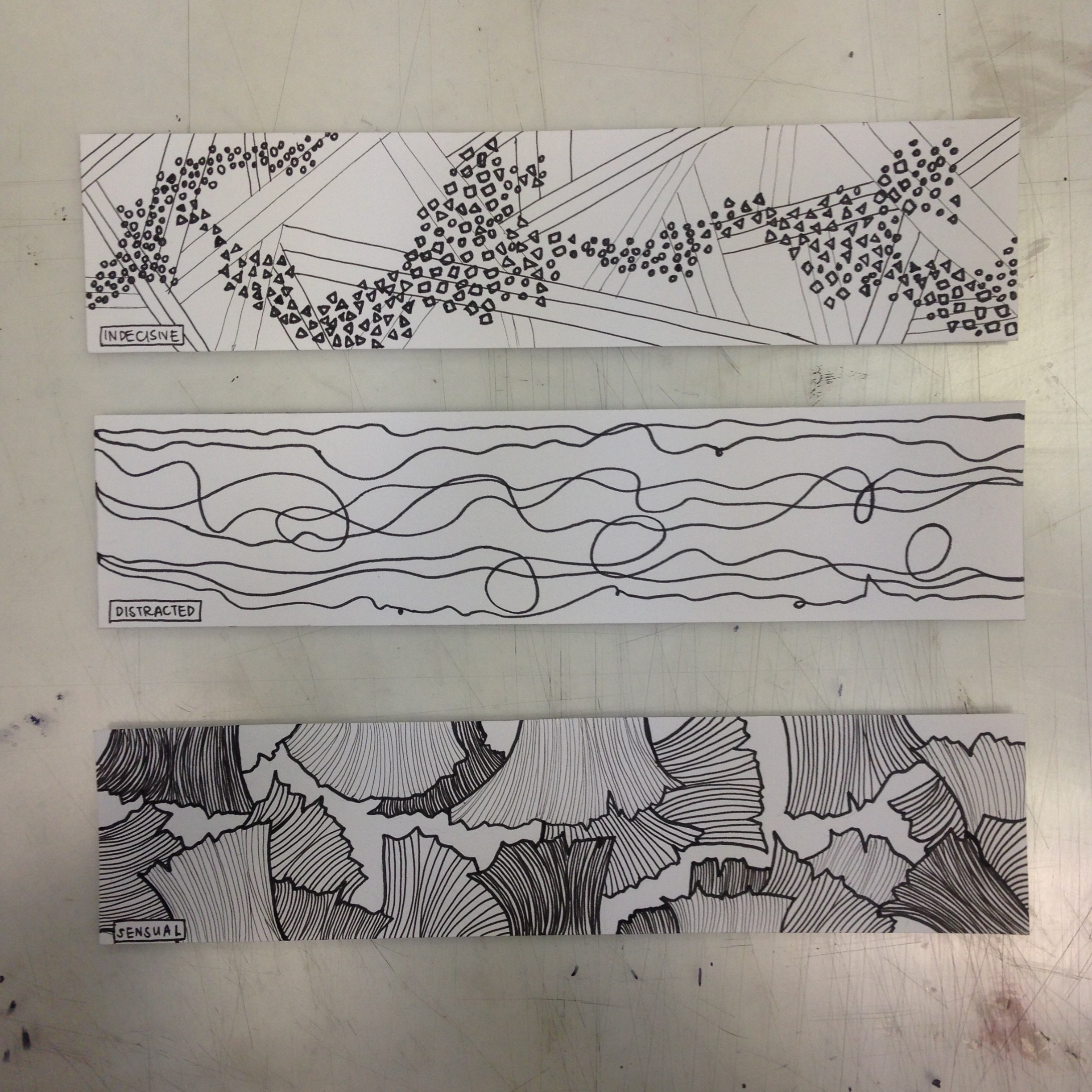
  6. Sensual – Relates to carnal desire and pleasure. Thin line between lust and love. Relates to places or things that leads to sex.
  7. Distracted – Unable to concentrate. Breaks free of what was initially supposed to be done.
  8. Indecisive – Consists of many ideas/opportunities/options. Cannot make up your mind due to this reason.
  9. Fragile – Breakable and difficult to protect or keep safe.
  10. Embarrassed – Shameful, feeling of being humiliated and wanting to hide.
  11. Psychotic – Eruptive, crazy, insane. Murderous, serial killer like.
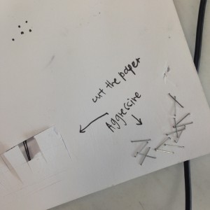
  12. Aggressive – Ready to attack and pounce. Very angry and bitter, wants to release unhappiness through violence.
  13. Ambiguous – Not set in stone, difficult to deduce. Confusing.
  14. Nonsensical – Full of things that have no meaning. Related back to young children.
  15. Turbulent – Chaotic. Classified as a loud, more negative emotion.
  16. Exhausted – Tired, worn out. Have no strength to carry on.
  17. Systematic – Has a technical feel towards it. Very organised and standardised.
  18. Sloven – Haphazard. Lazy and careless. Without giving things much thought as to how and why it’s done.
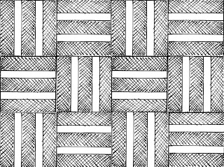
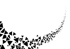
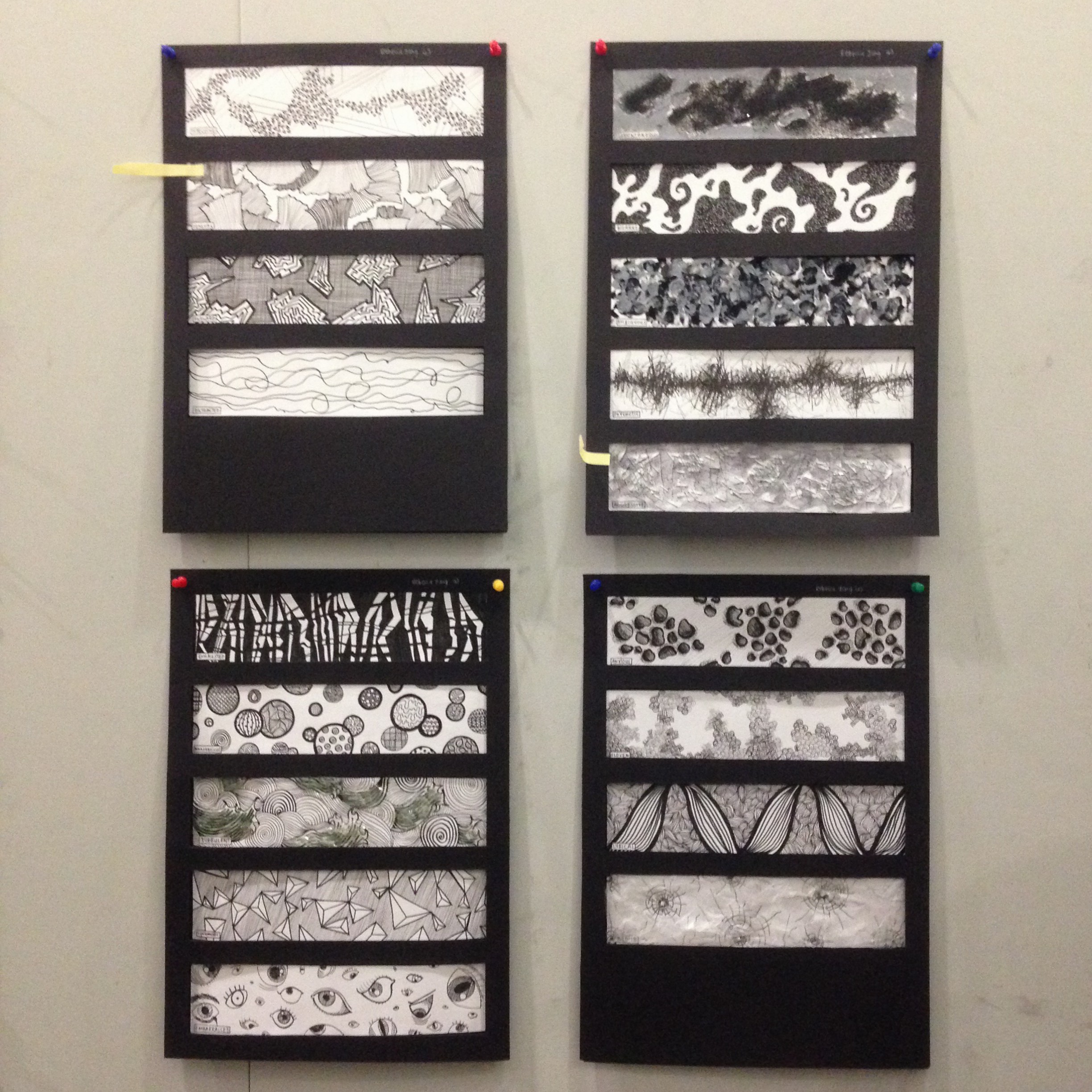
Process photos:

IMG_7828IMG_7858IMG_7859IMG_7860IMG_8046IMG_8041IMG_7864IMG_8042IMG_8043IMG_8045