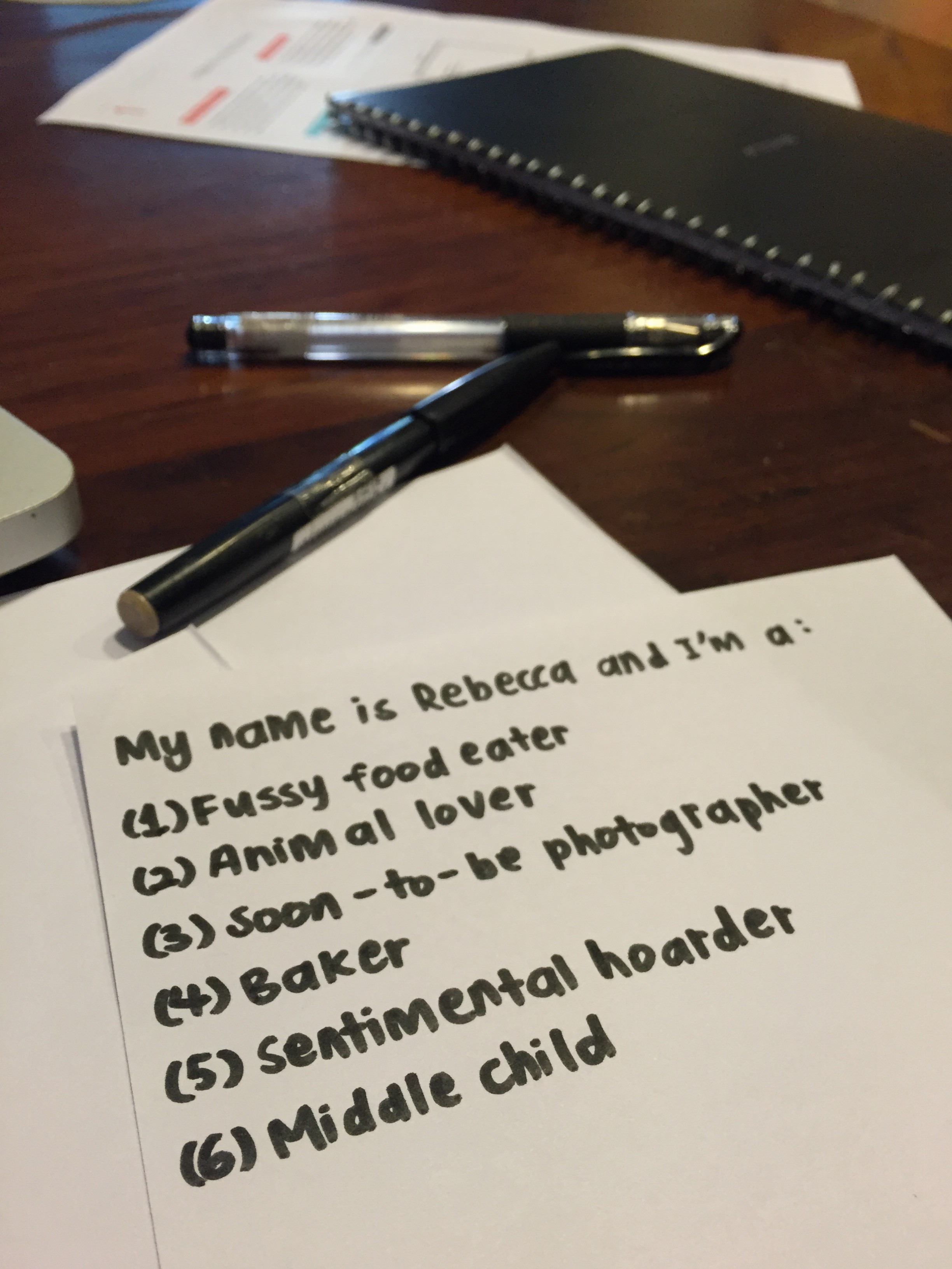
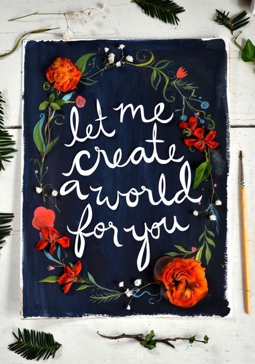
THE 6 ATTRIBUTES:
After contemplating which aspects of myself I wanted to attempt to portray with assignment 1, I decided that I wanted it to encompass my feelings, interests, habits, and future aspirations, as I feel that these general factors contribute greatly to the components of an individual.
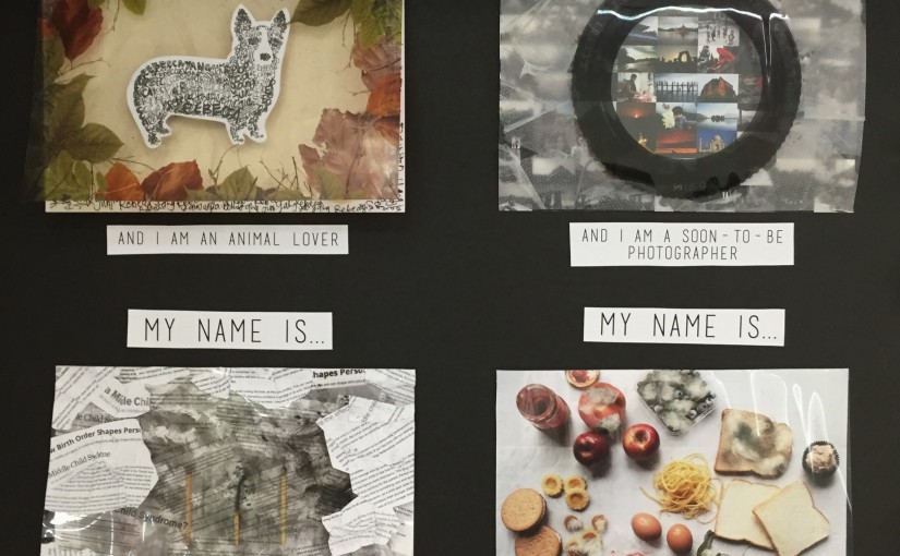
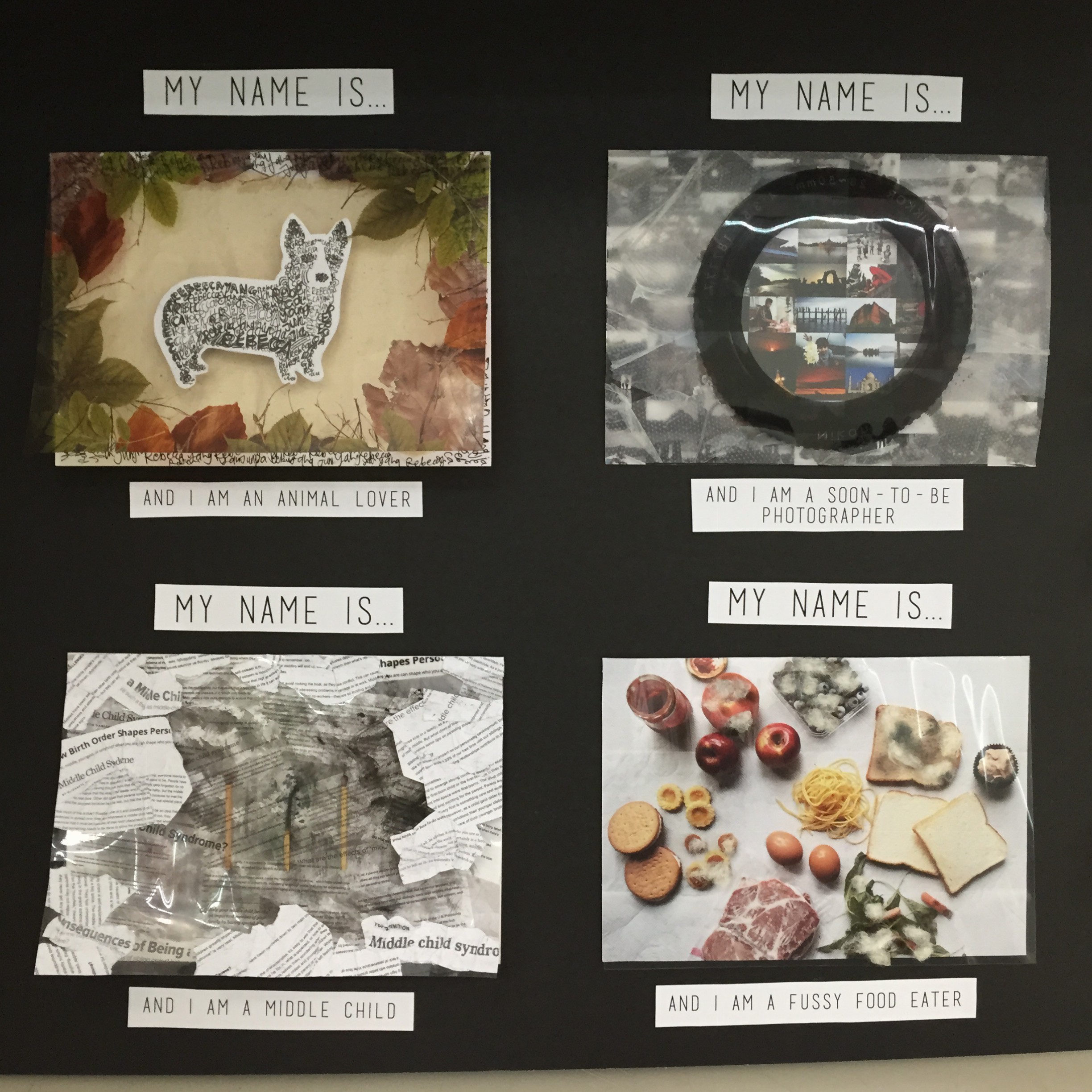
- Fussy food eater
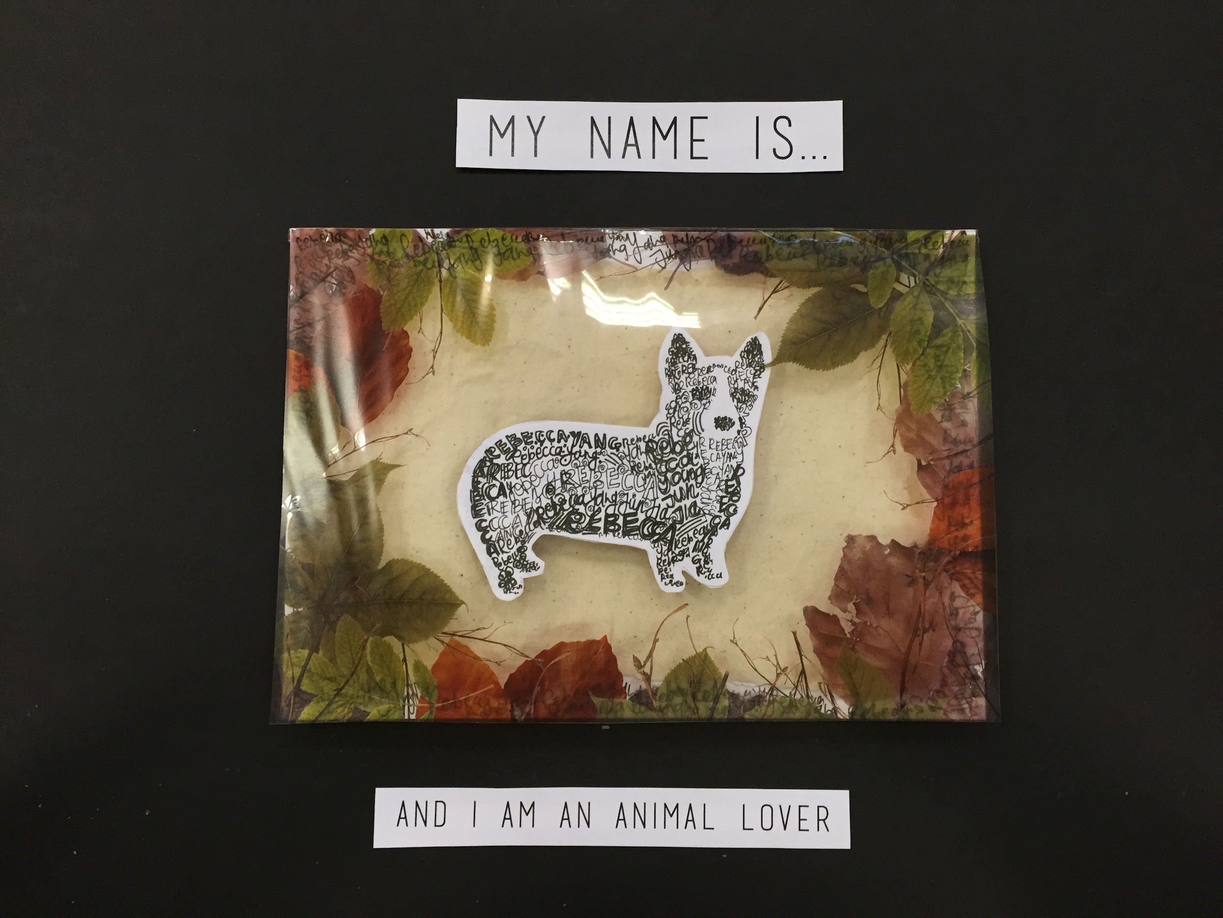
- Animal lover
- Soon-to-be photographer
- Baker
- Sentimental hoarder
- Middle child


I began by going on Pinterest to search for ideas and different types of materials used, as I knew it would be fun and informative to test out various mediums.
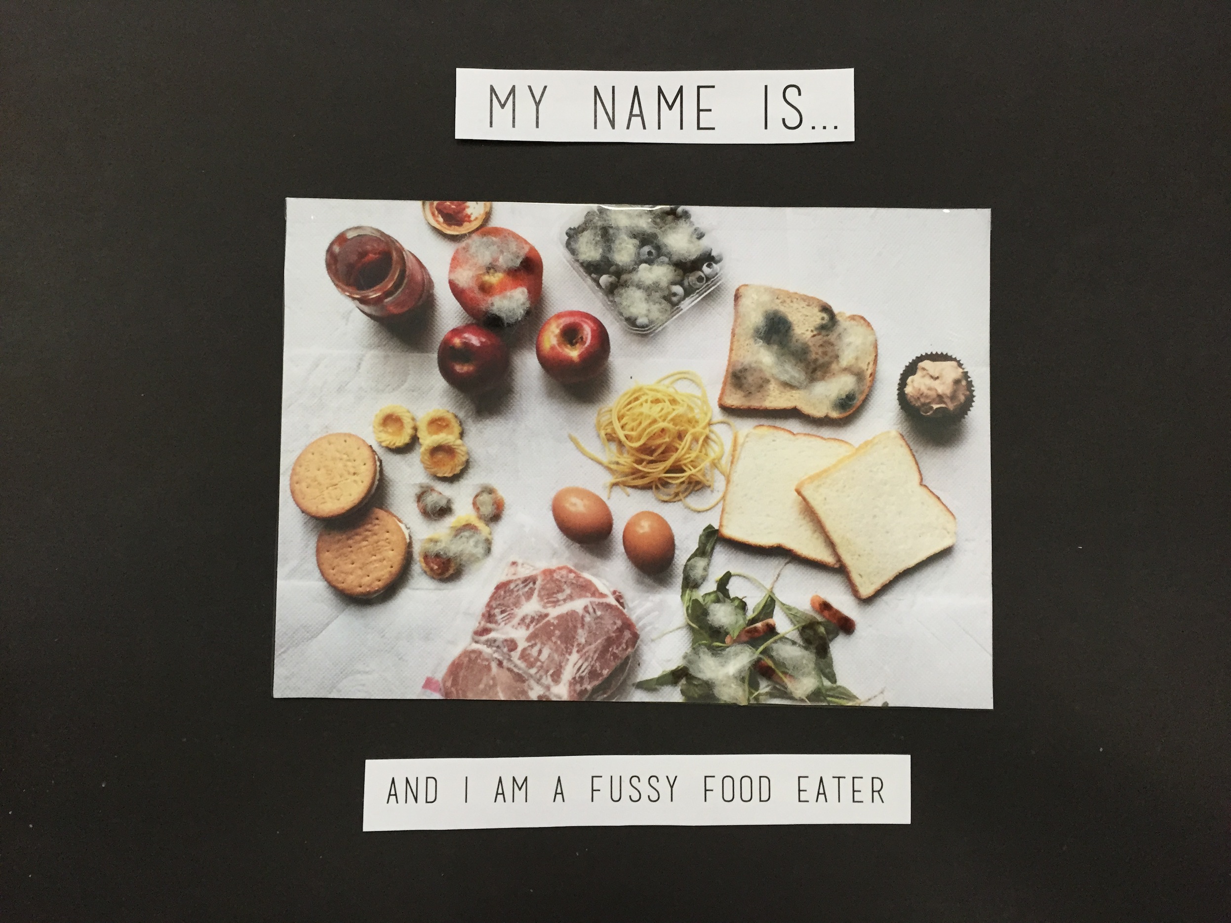
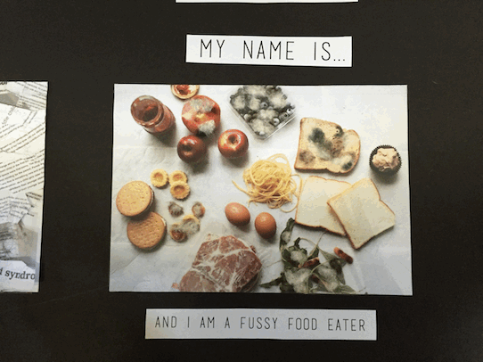
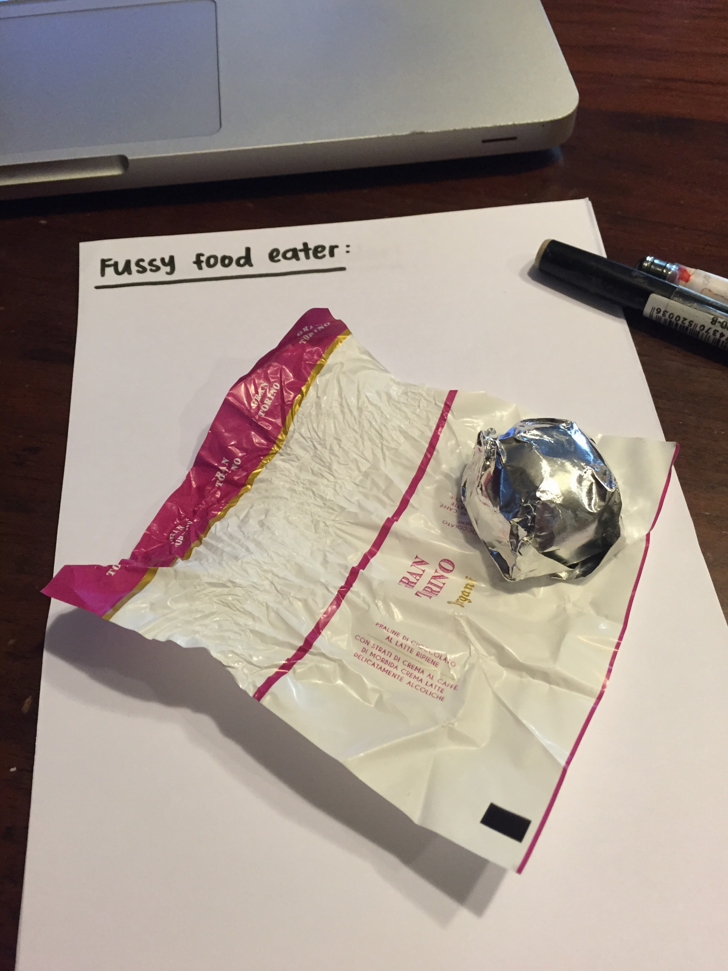
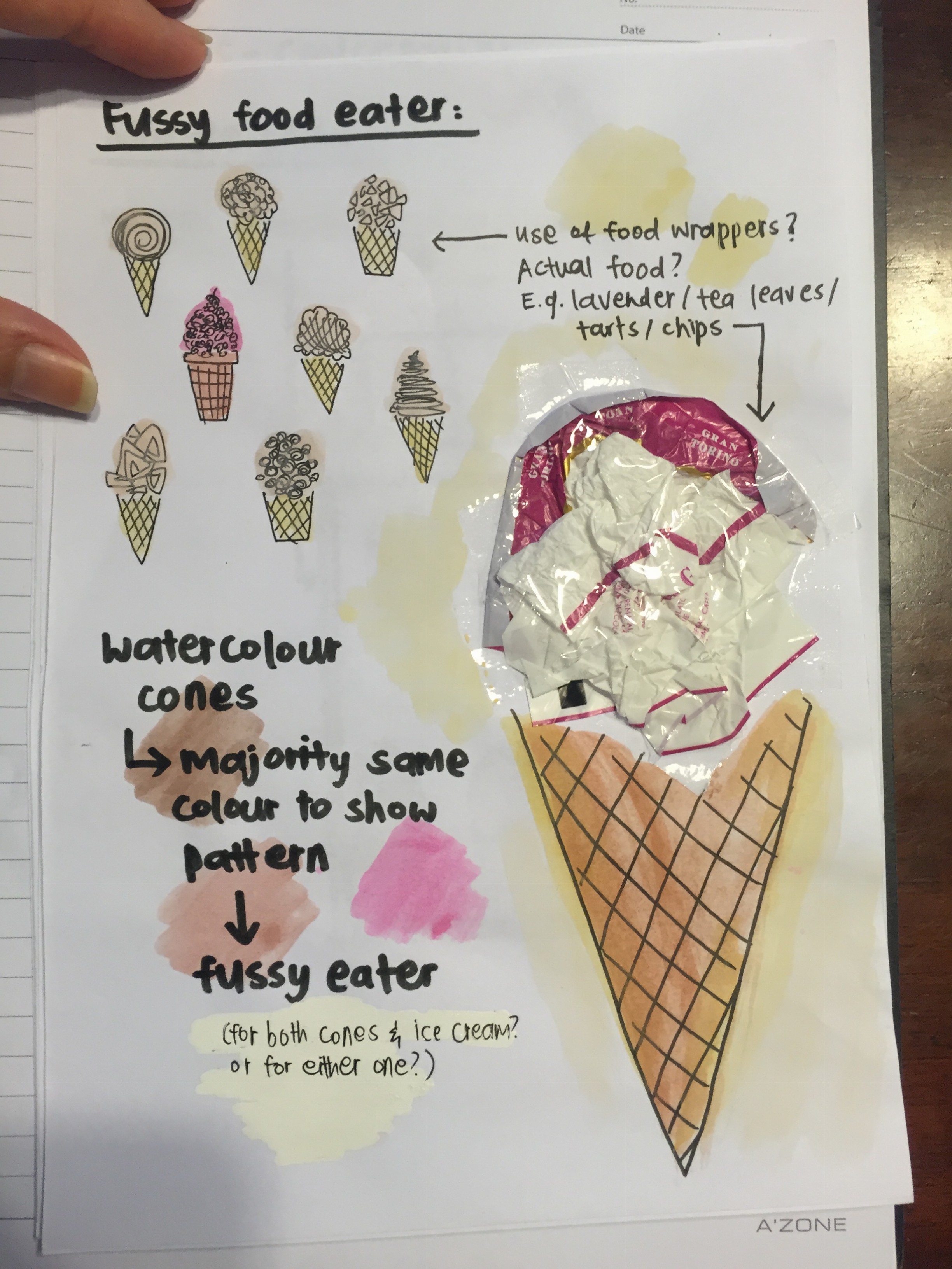
FUSSY FOOD EATER:
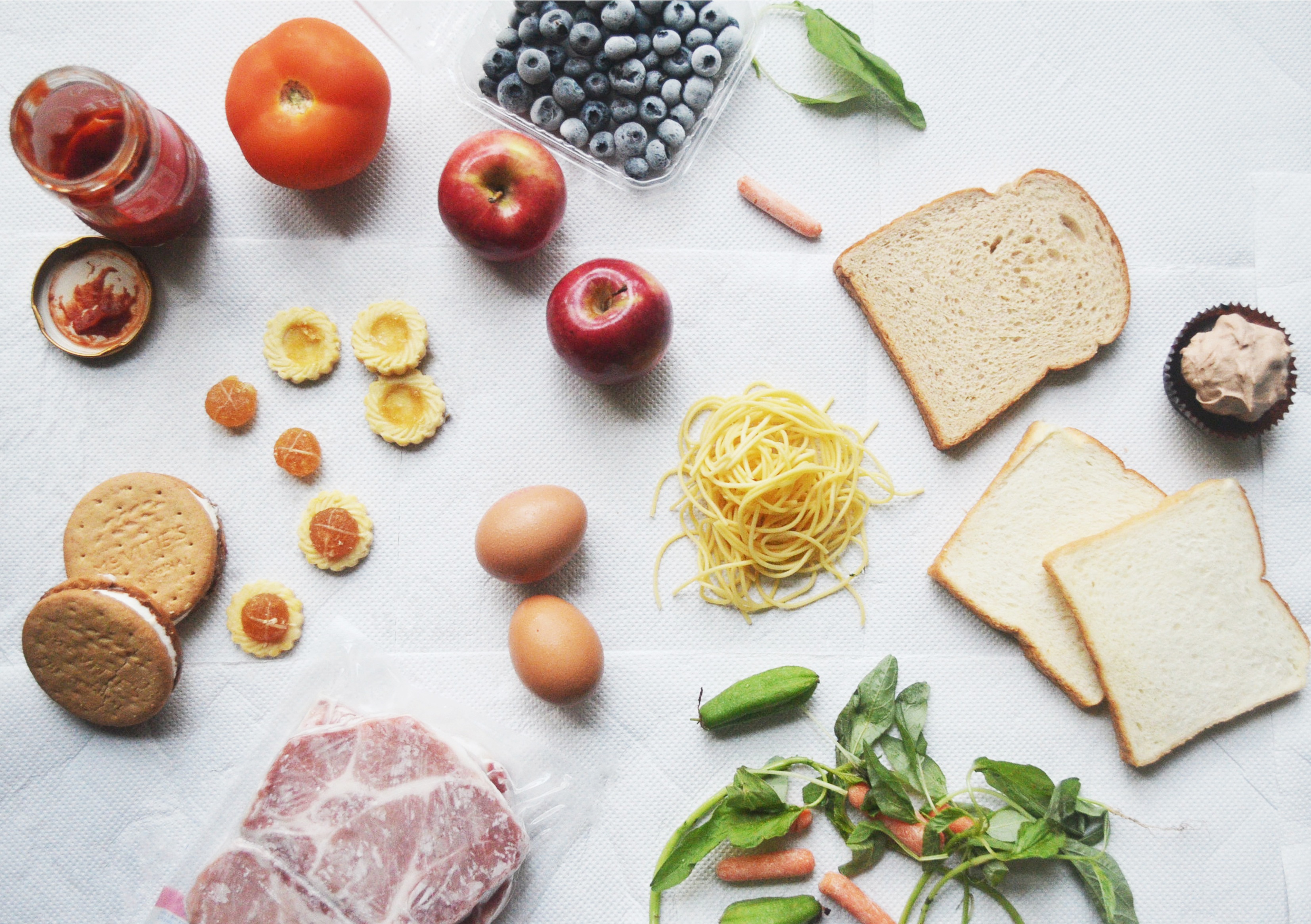
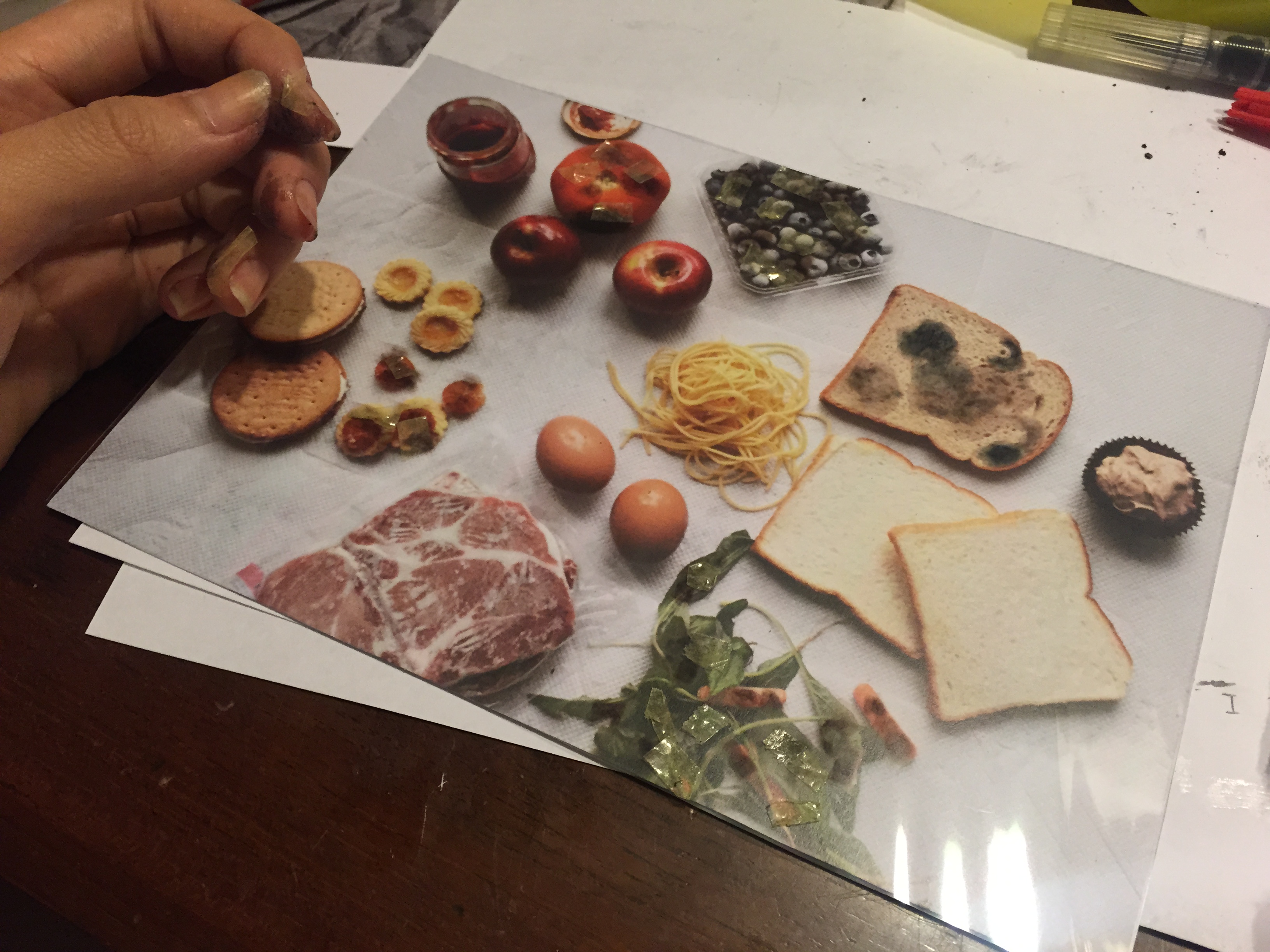
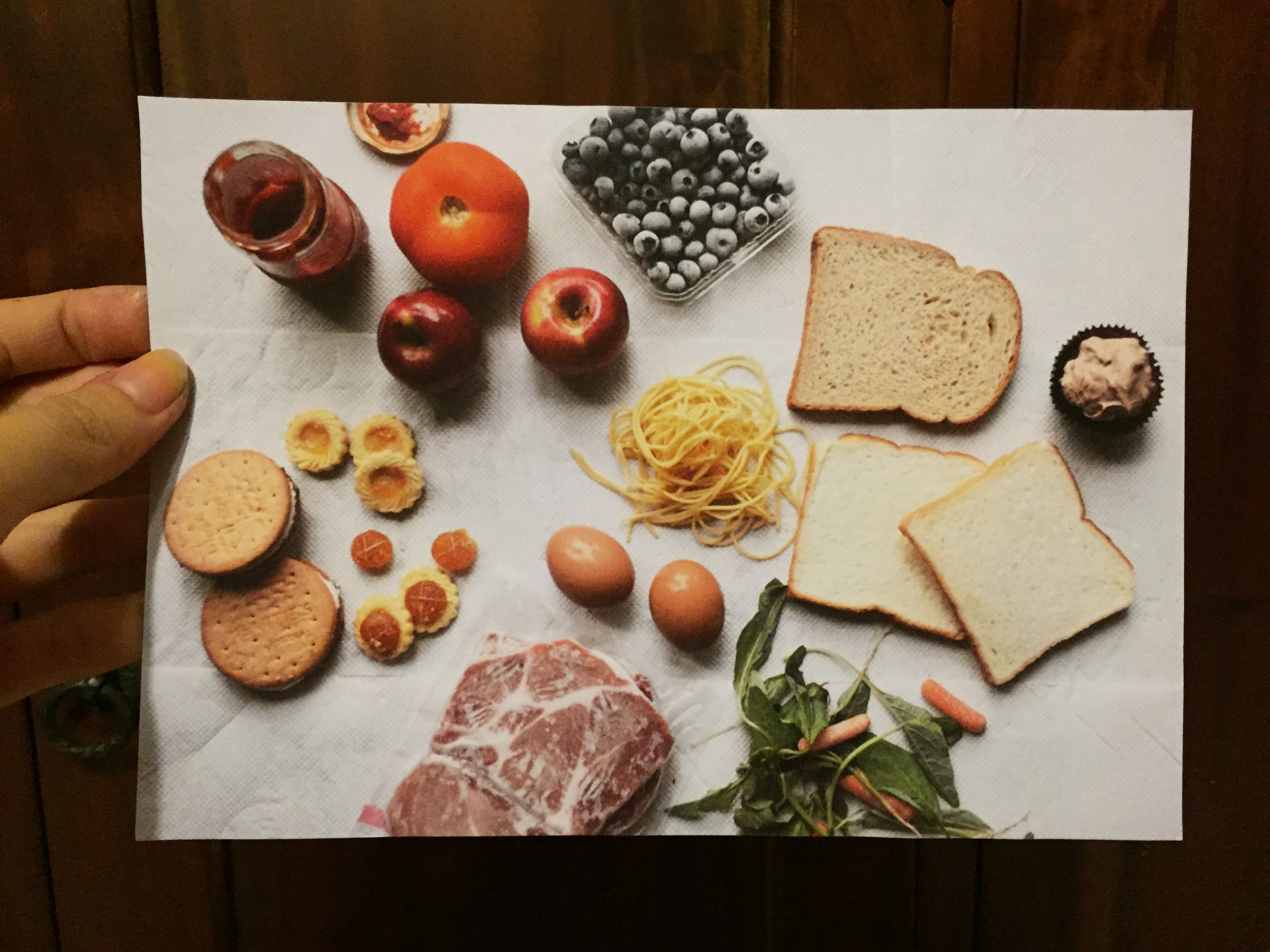
I usually am quite fussy, unless the situation disallows me to be, and I pick out food that I want to eat, and waste the rest, which isn’t a very desirable habit of mine.
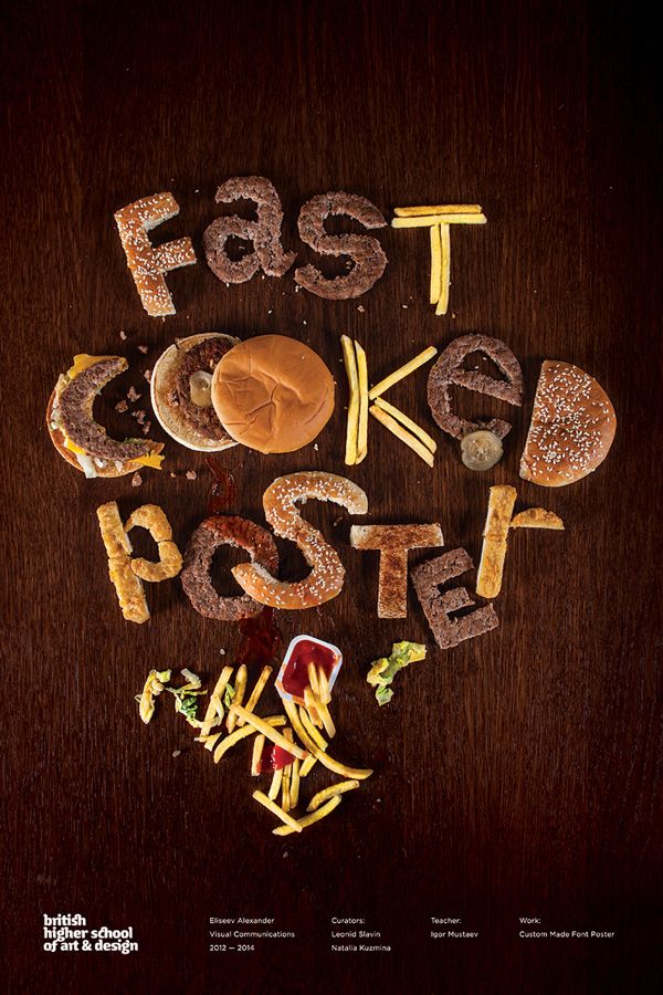
I wanted to use both 3D and 2D materials to challenge my creativity, and therefore thought of using water colour paint to create ice cream cones with actual food or its wrappers to substitute ice cream.
My initial idea:


Water colour food inspiration

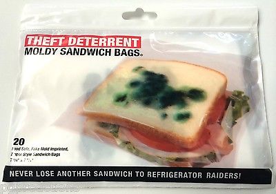
After giving it further thought, I may position the food in a manner that looks as though I bit into the ‘ice cream’ and wasted it, showing the downside of being fussy. Another idea I had after consultation was to use rotten/moldy food to represent the ice cream, which increases the feeling of repulsion and wastage, depicting my feelings towards the subject.
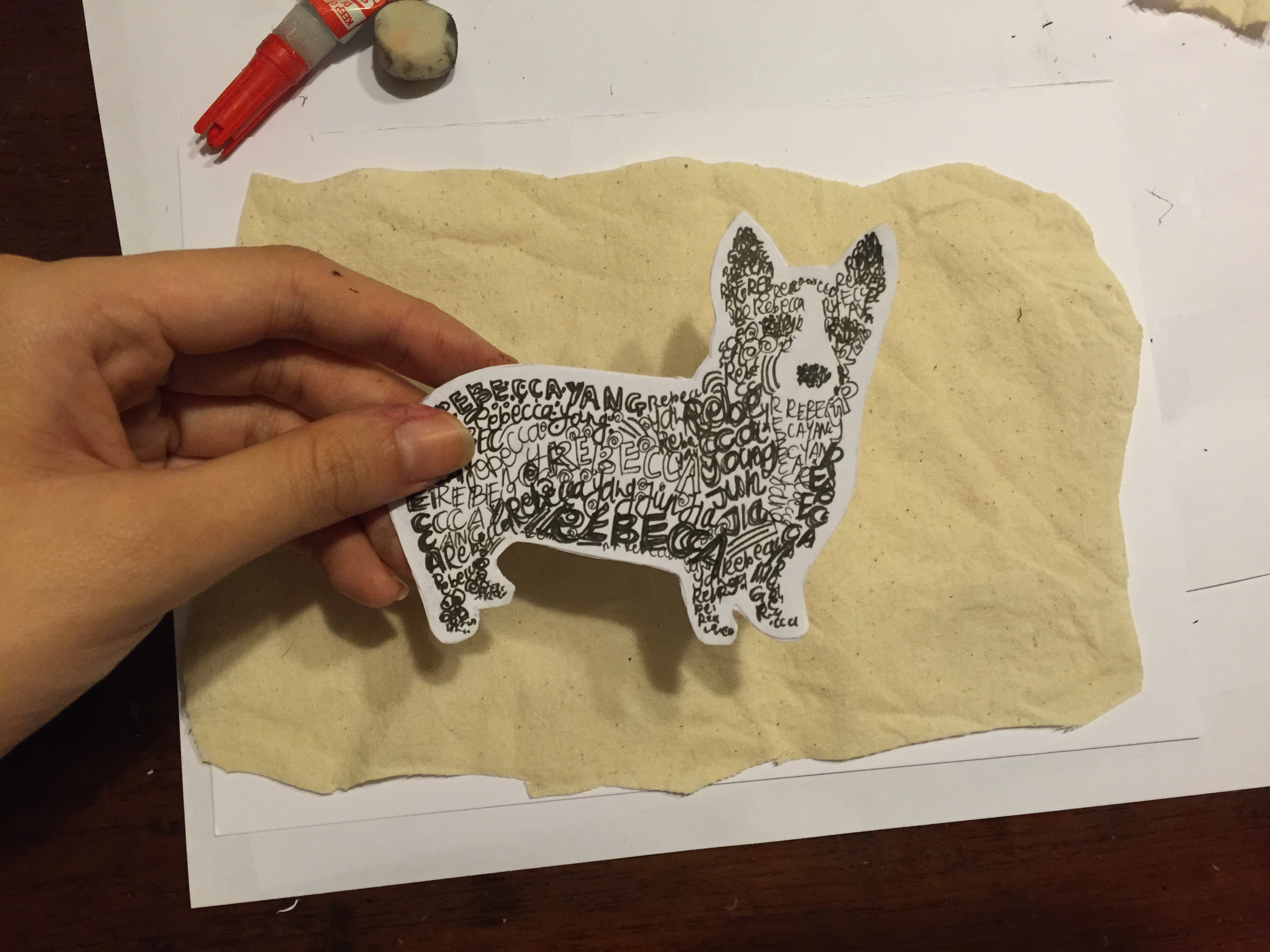
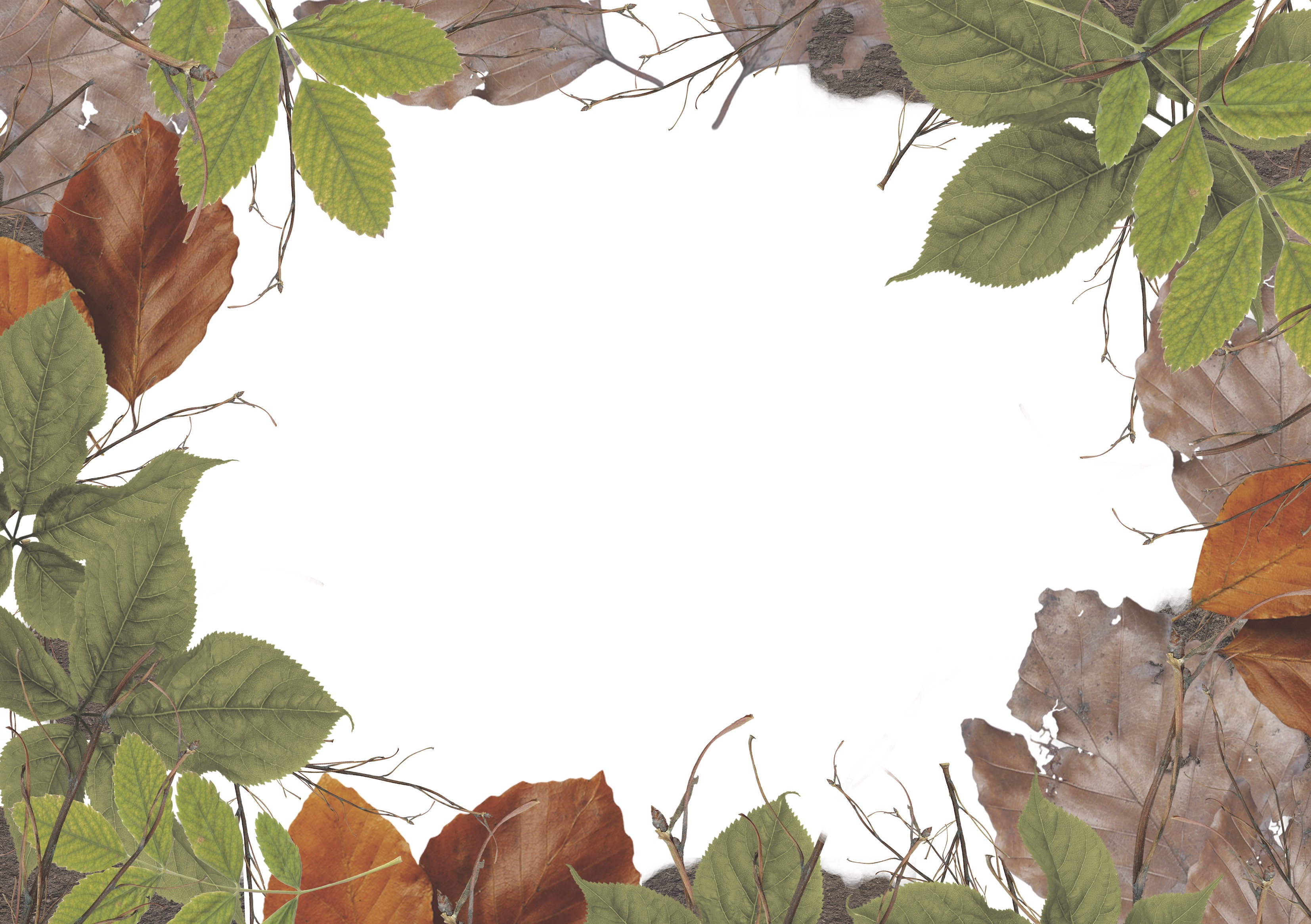
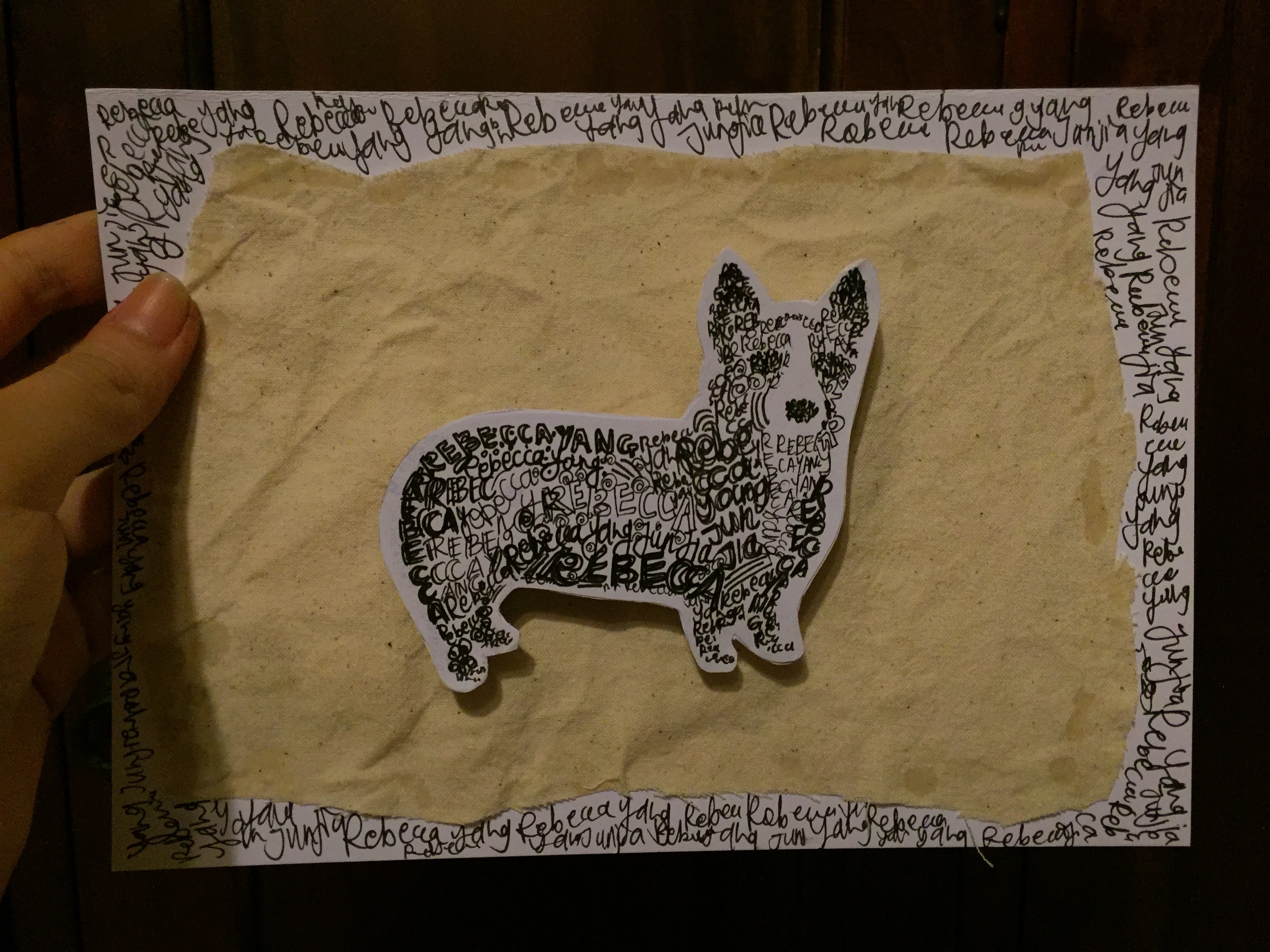
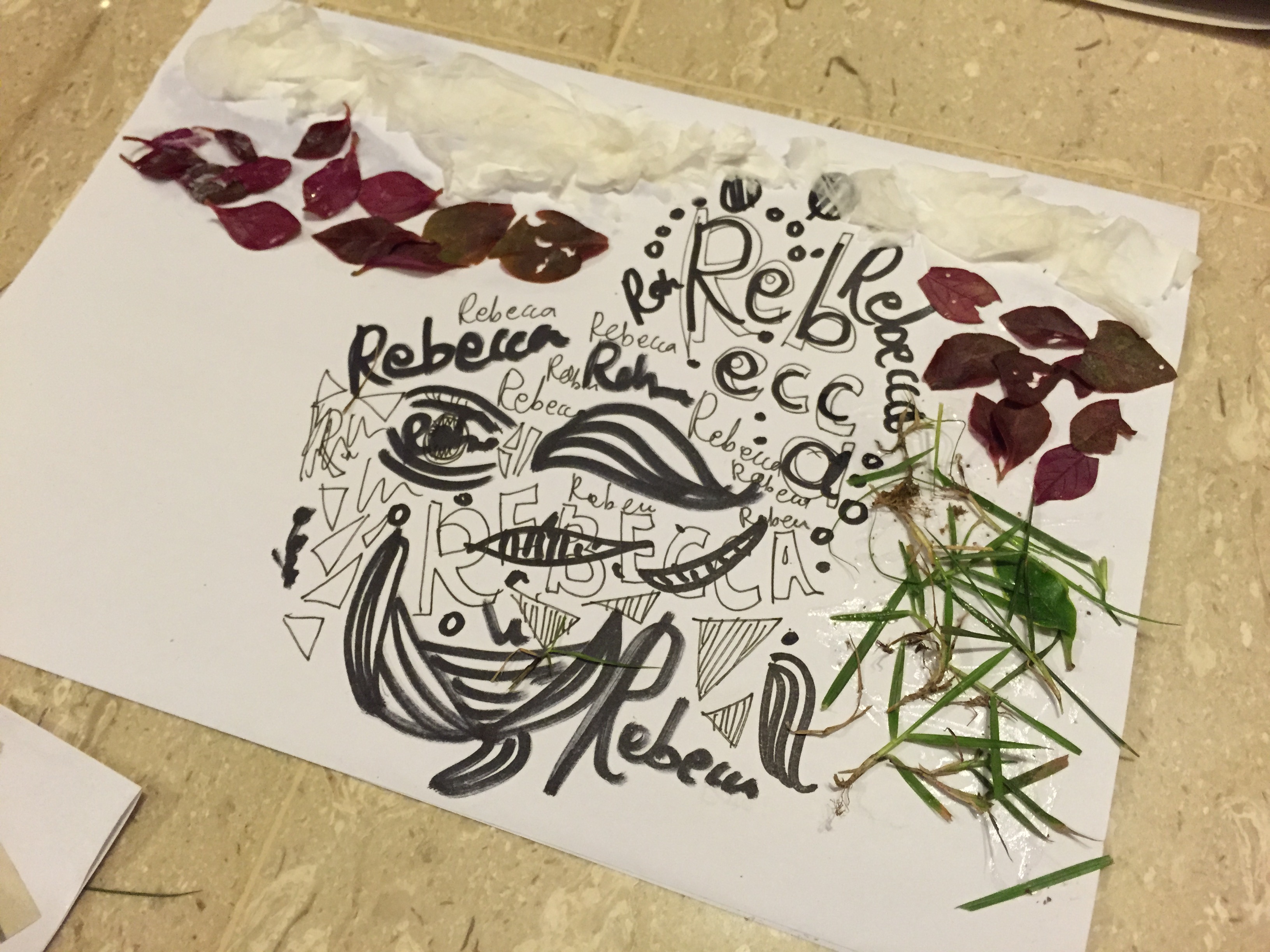
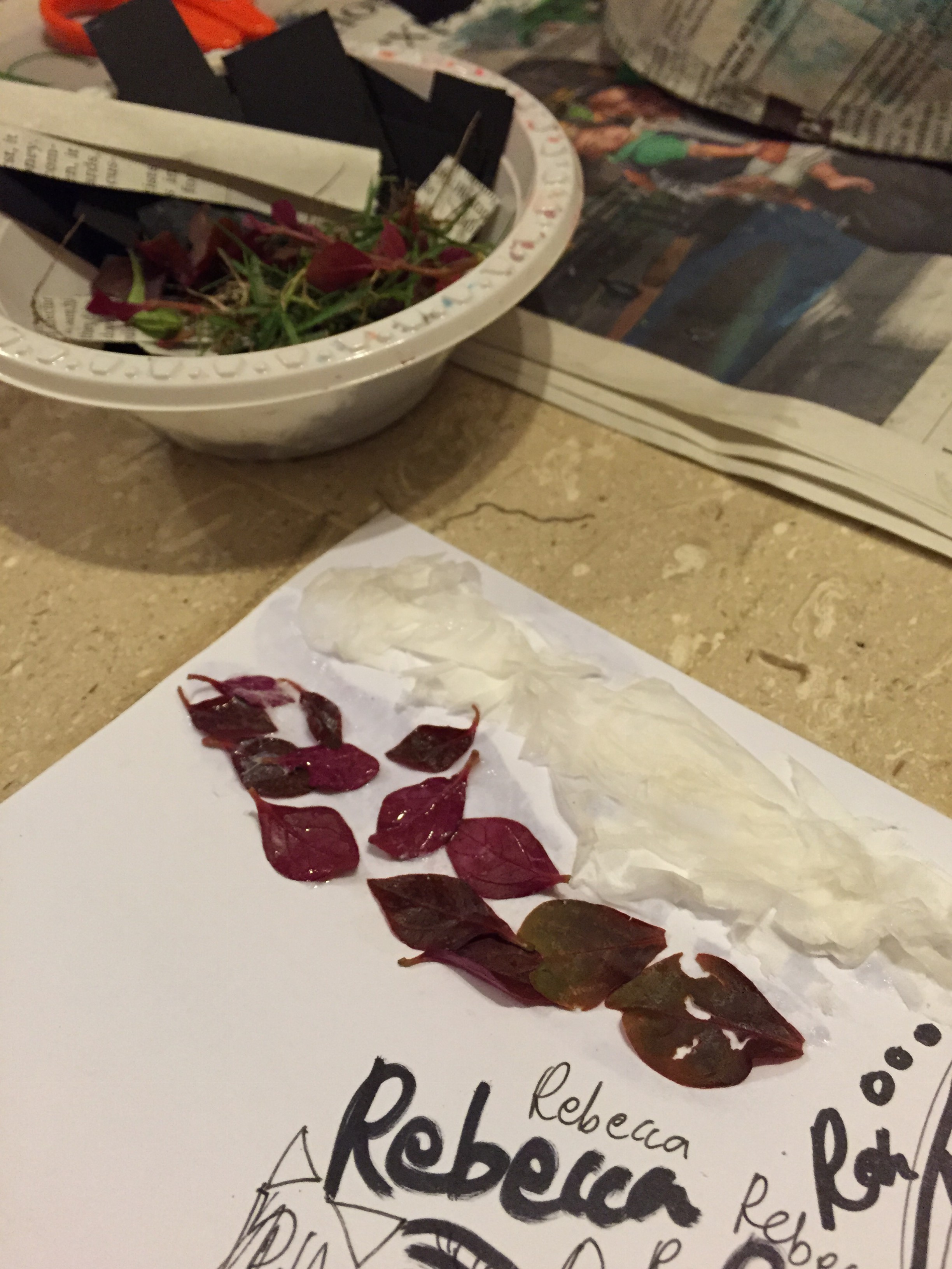
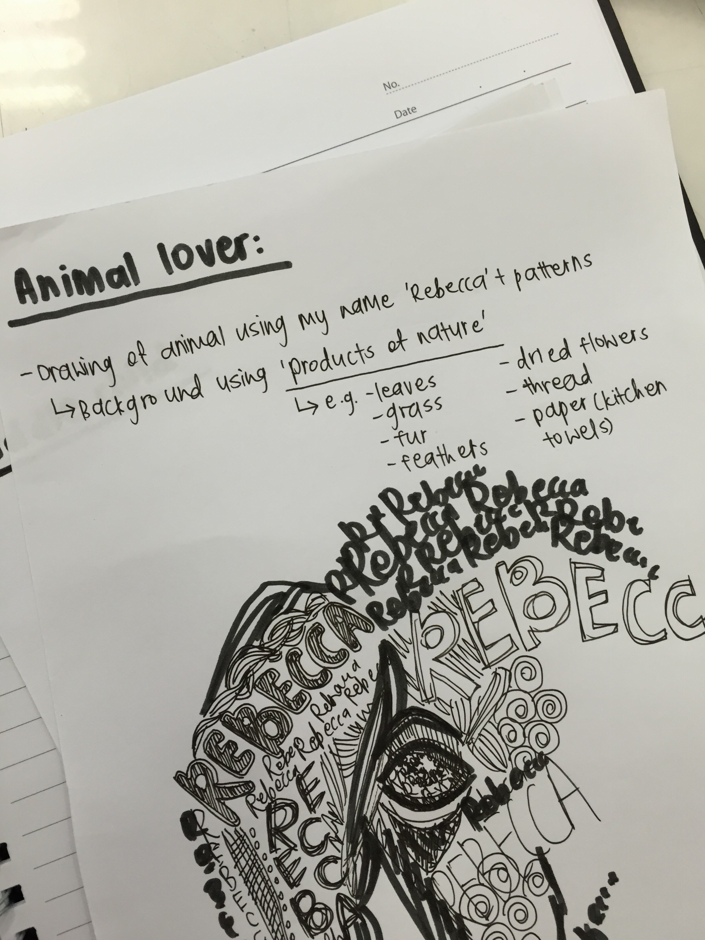
ANIMAL LOVER:
I have three dogs at home, and personally, it’s something I hold dear, as I value them very much, and I believe nothing can replace the feeling of having a pet and earning its trust and loyalty. In fact when I’m older, I would like to have dogs in place of kids 😀 Having said this, I do like other animals as well, and it isn’t just confined to dogs alone.
Although, on the other hand, I also feel that an animal’s instinct is to be in the wild, and sometimes I do think it isn’t fair to keep them away from their natural habitats, and keep them domesticated.
My idea is to create a portrait of one of my dogs using patterns (different forms of black and white patterns) and my name. I also want to use bits of nature, like leaves, twigs, cotton, etc, to symbolise that its a large part of animals to long for being in the wild.


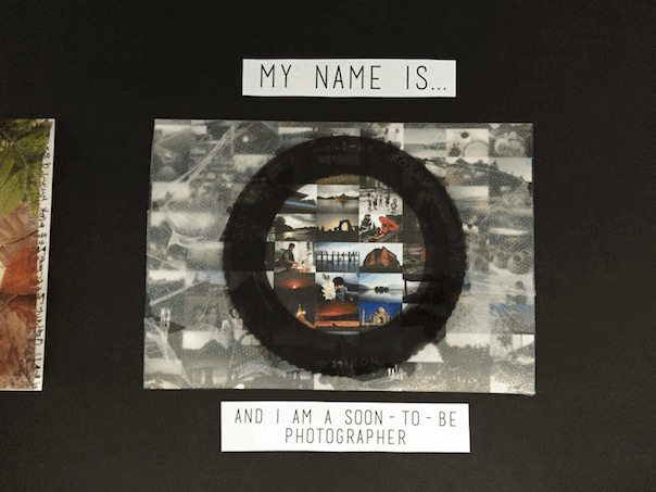
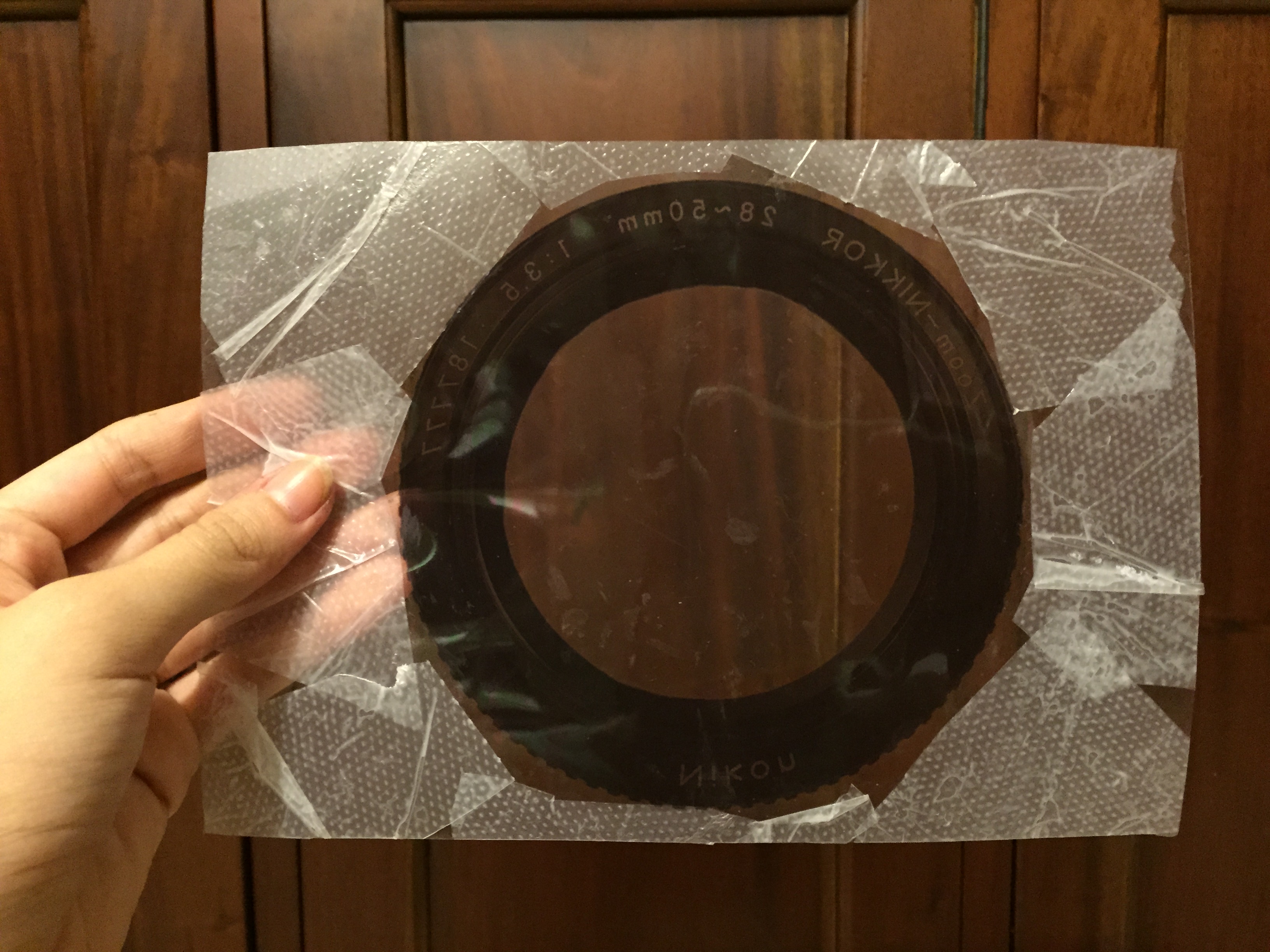
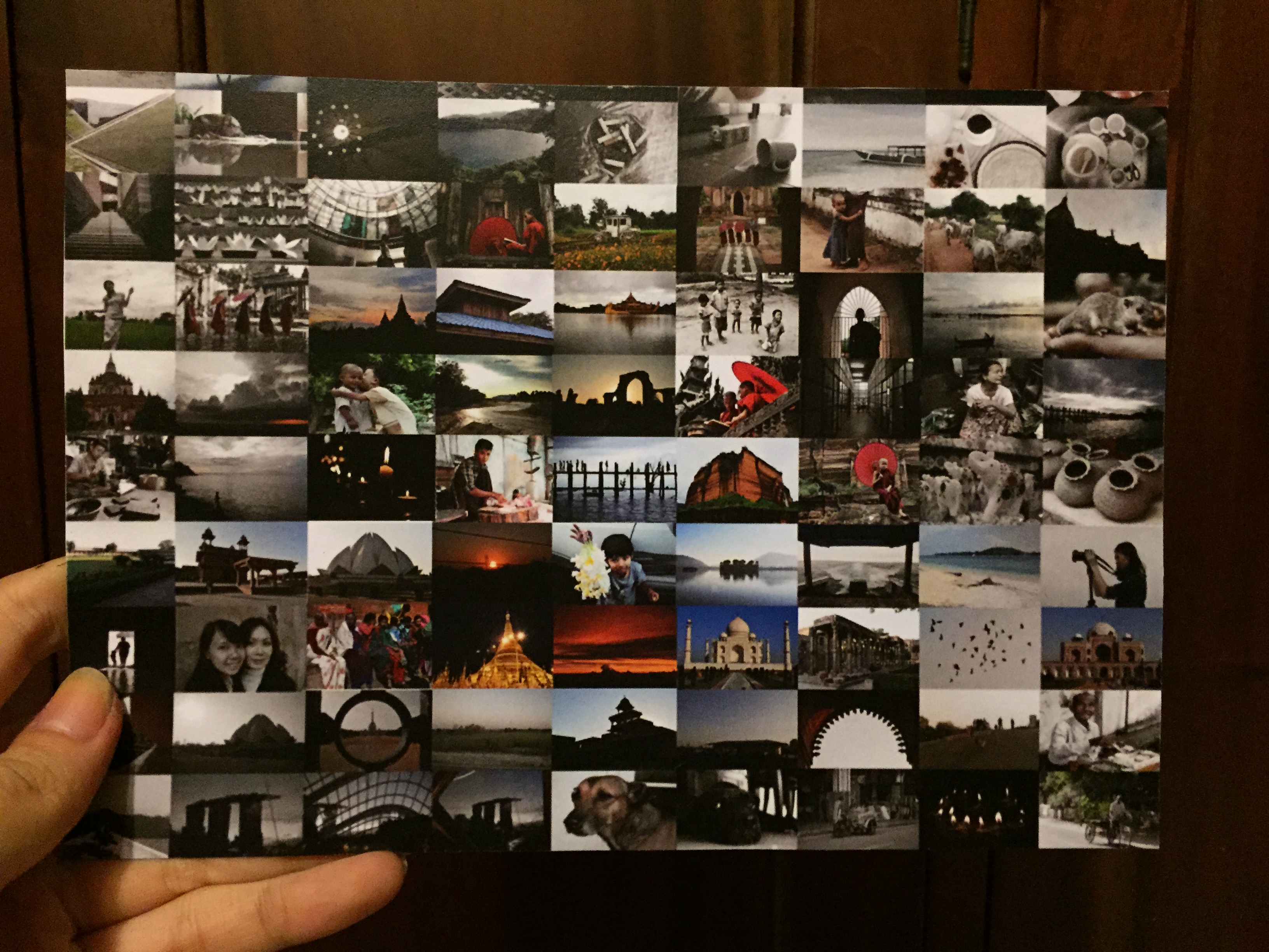
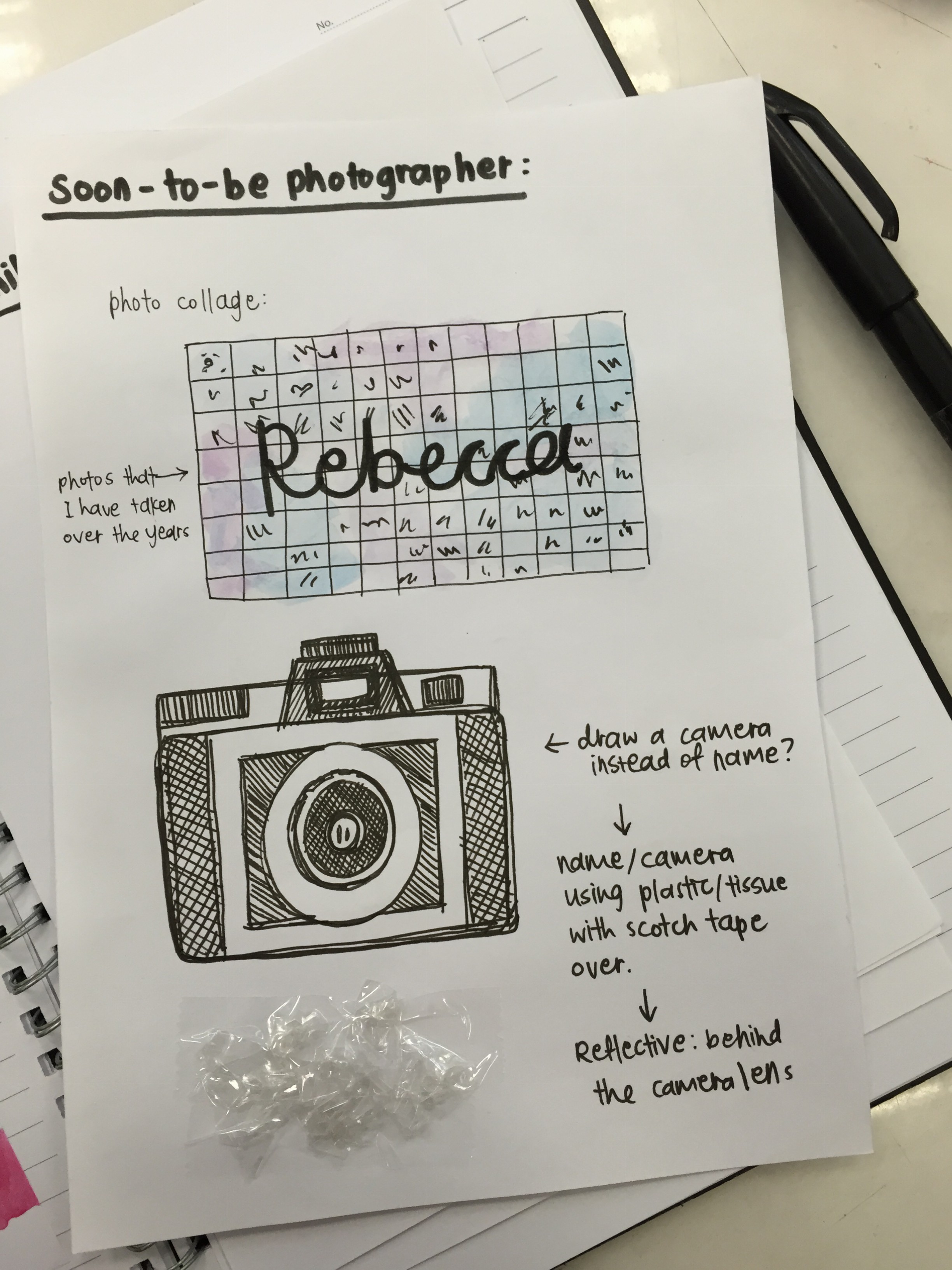
SOON-TO-BE PHOTOGRAPHER:
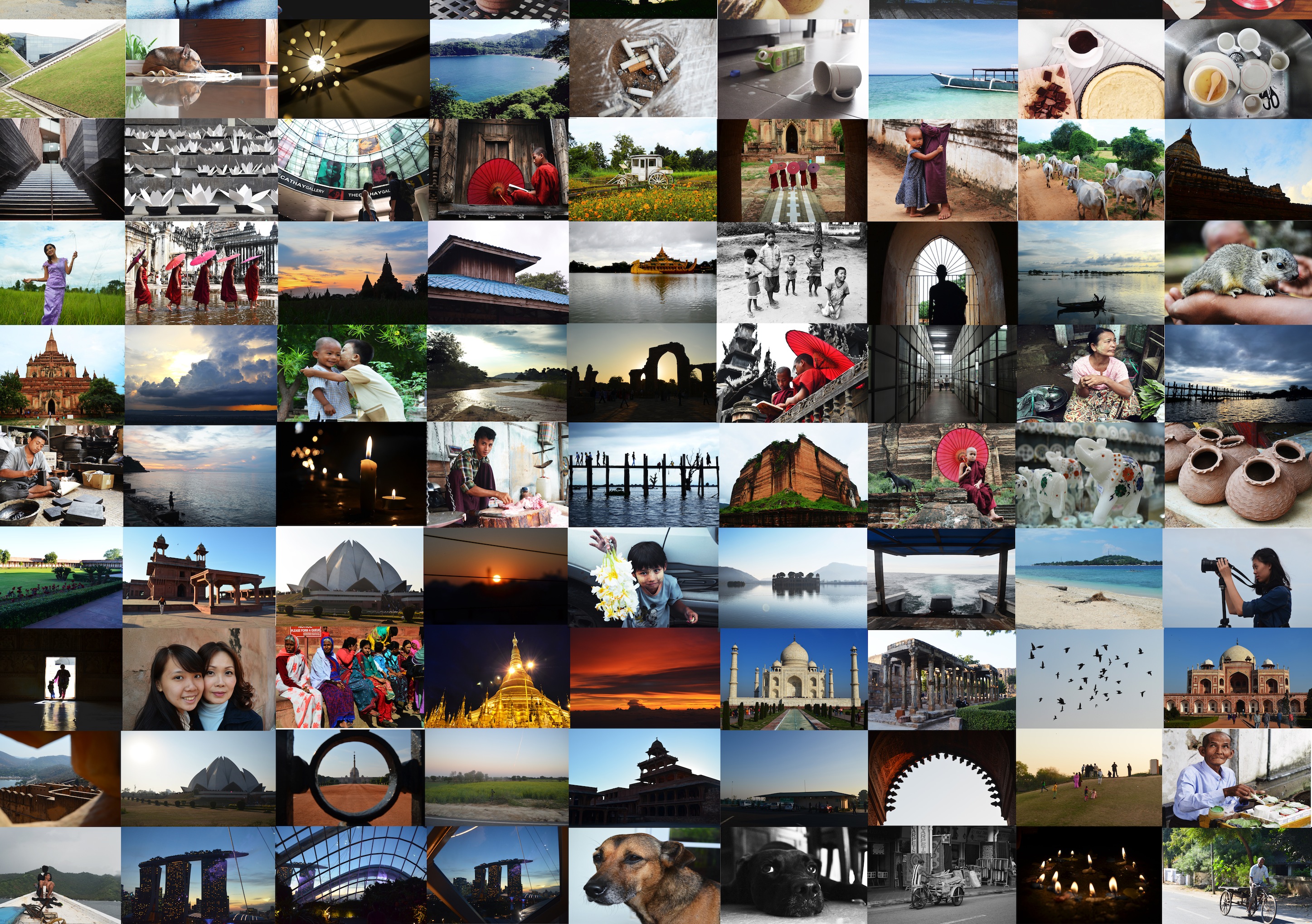
My major for Year 2 onwards is Photography and Digital Imaging, and so, I believe my skills in this area will definitely be honed and sharpened. I wanted to bring across the idea that my opinion on photography is that it is a very important aspect of life, as it captures memories – ones that the human mind cannot remember clearly even if we try, as memories become blurry in time.
Therefore, I wanted to make a collage of photos that I have taken over the year in a cool blue-ish hue, and blur out it out to create a background. In contrast, I wanted to create my name using some sort of reflective material (like scotch tape or acrylic), to spell out my name, and the areas that is part of my name will be slightly brighter in nature and colour, and of high definition. This is to represent that parts behind the lens will always remain vivid and clear.

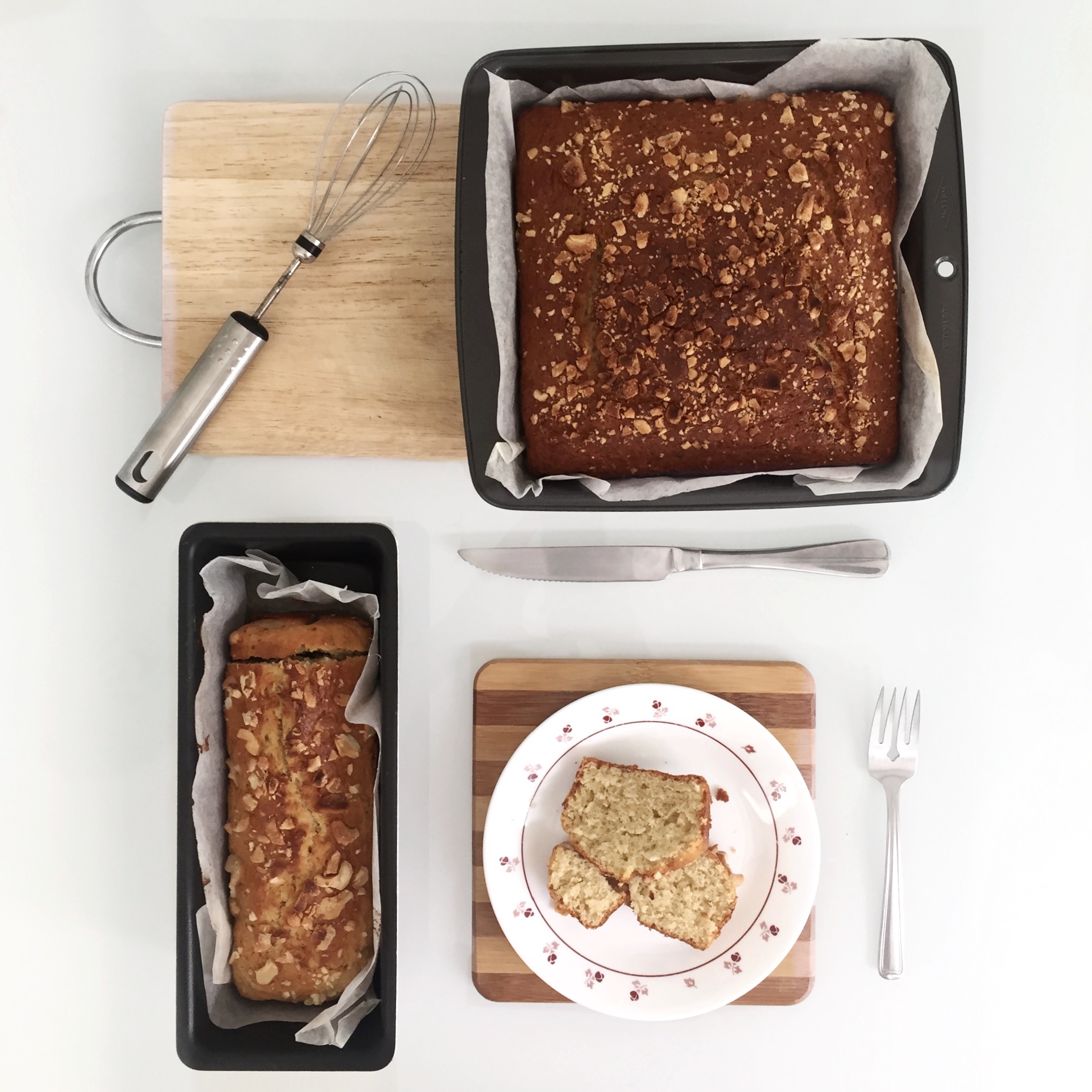
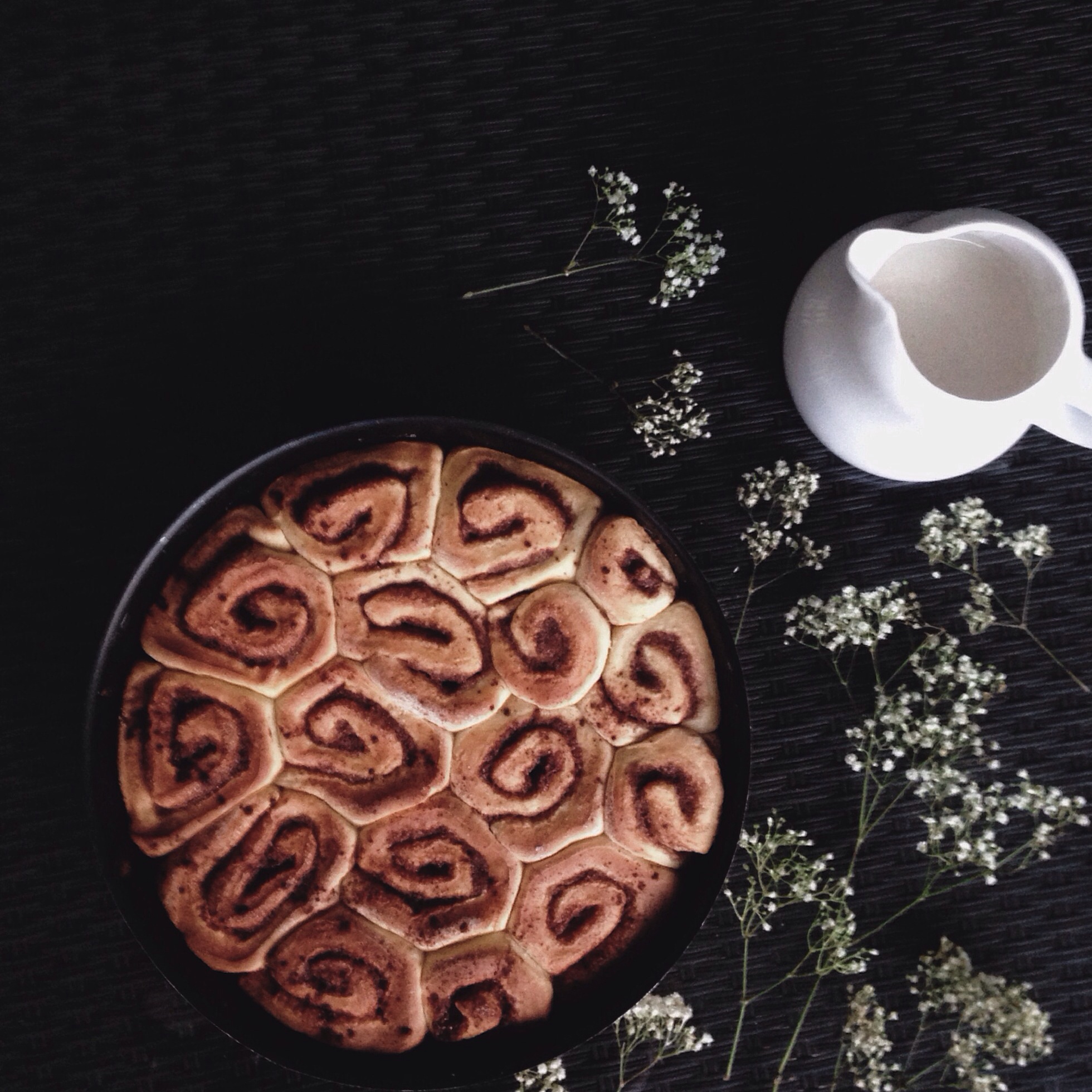
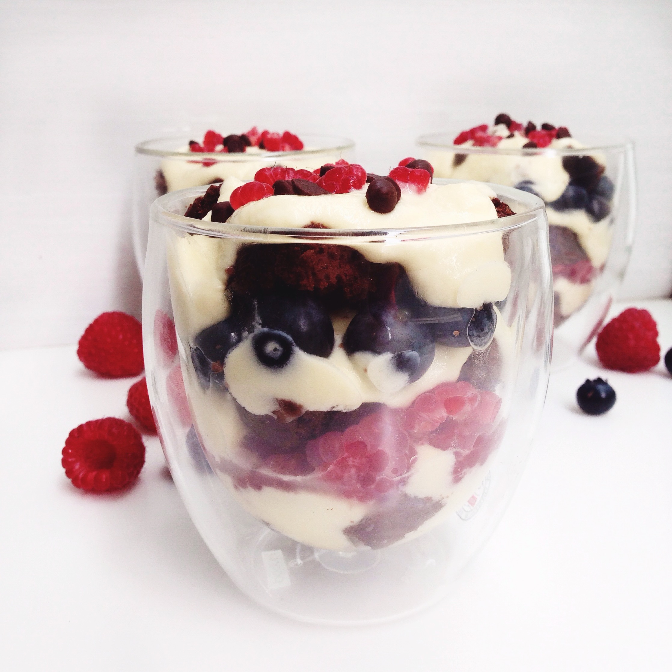
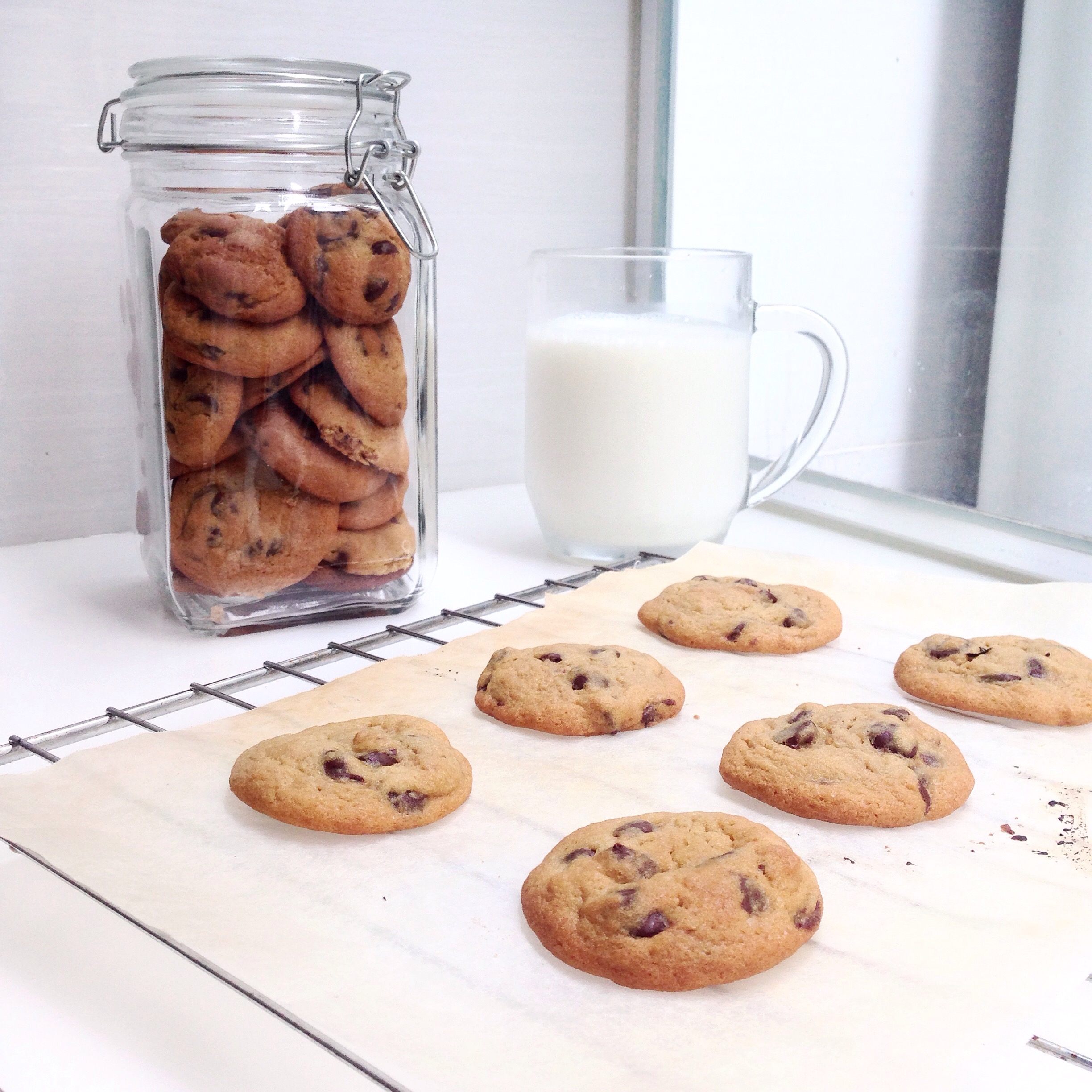
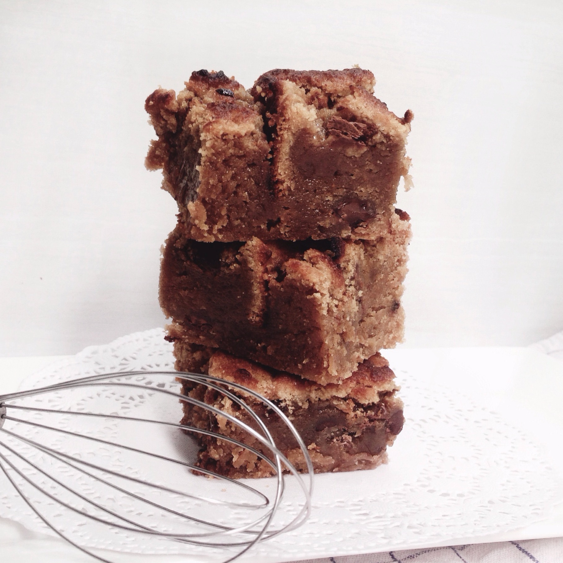
BAKER:
I like to bake as a past time, as I find it therapeutic and calming. I usually bake during my free time, or even if I am busy, I try to make it a point to wake up early and whip up something in the mornings.
Here are some of the things I have done so far:


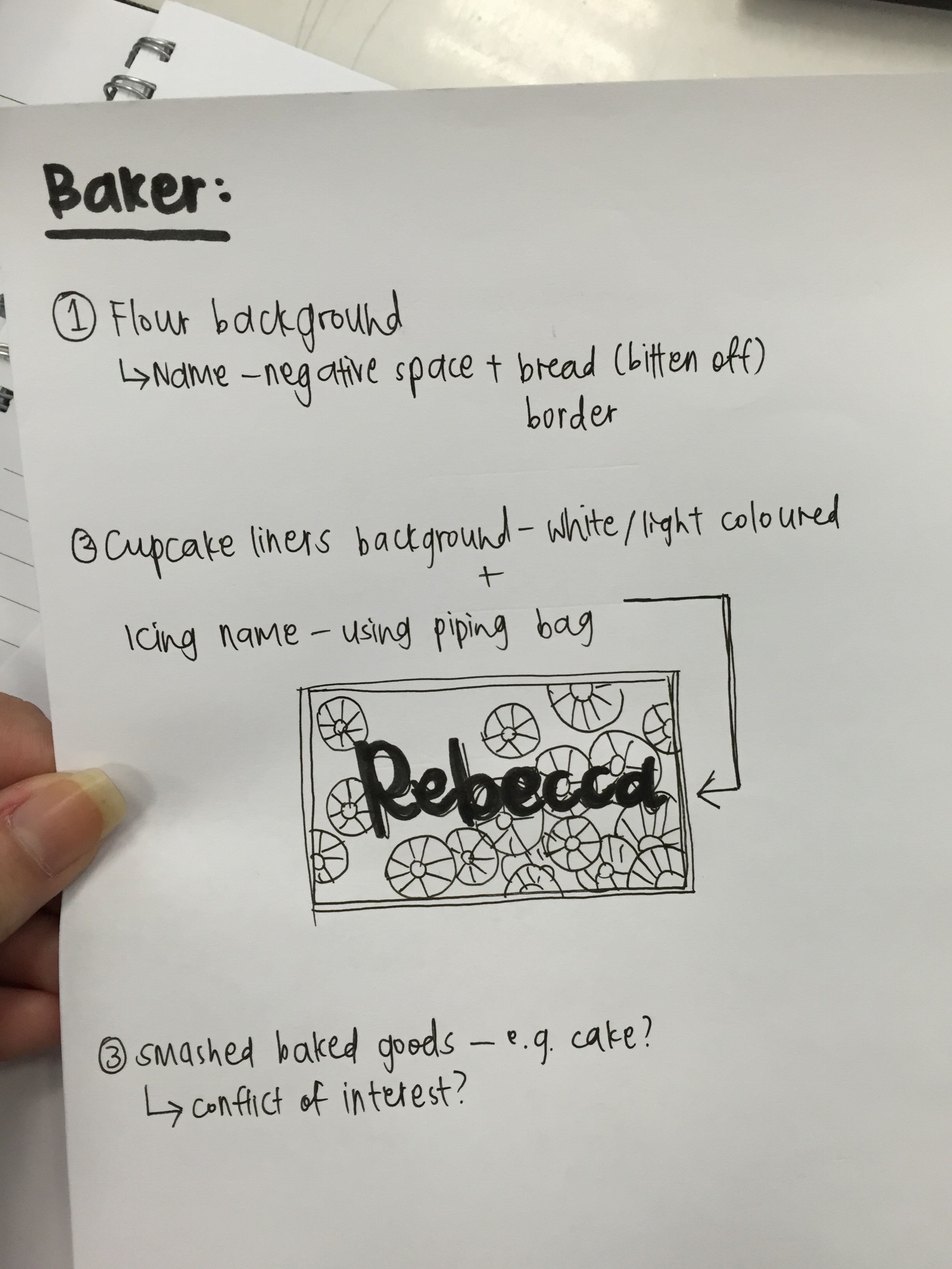
I thought of using items like cupcake liners to give texture to the background, and using icing in a piping bag to create my name, and take a photograph of that (playing with lighting and locations), to create typography for this attribute.
However, after consultation, I also thought that the concept for this one was not strong enough, and did not portray my feelings towards baking. I then thought of things that I felt were calming and sort of cathartic, to show my thoughts on the subject. Other materials I have considered using are things like coffee, flowers, cocoa powder, etc.

SENTIMENTAL HOARDER:
I usually keep things – mementos, items, cards, notes – that I receive from people, as I find meaning and value in them, and it helps me remember good times from the past. As a result, my room is packed with boxes of things, but they’re all neatly in different boxes, labelled with names like ‘cards’, ‘from friends, ‘letters’, etc, and I know where to find the stuff. In other words, I am an organised mess.
Or, as I would call it, a ‘sentimental hoarder’. I find there’s nothing wrong with keeping things, as hoarders would, but due to the lack of space, I have to filter and throw out some things. Ultimately, I only keep the stuff that are very precious to me.
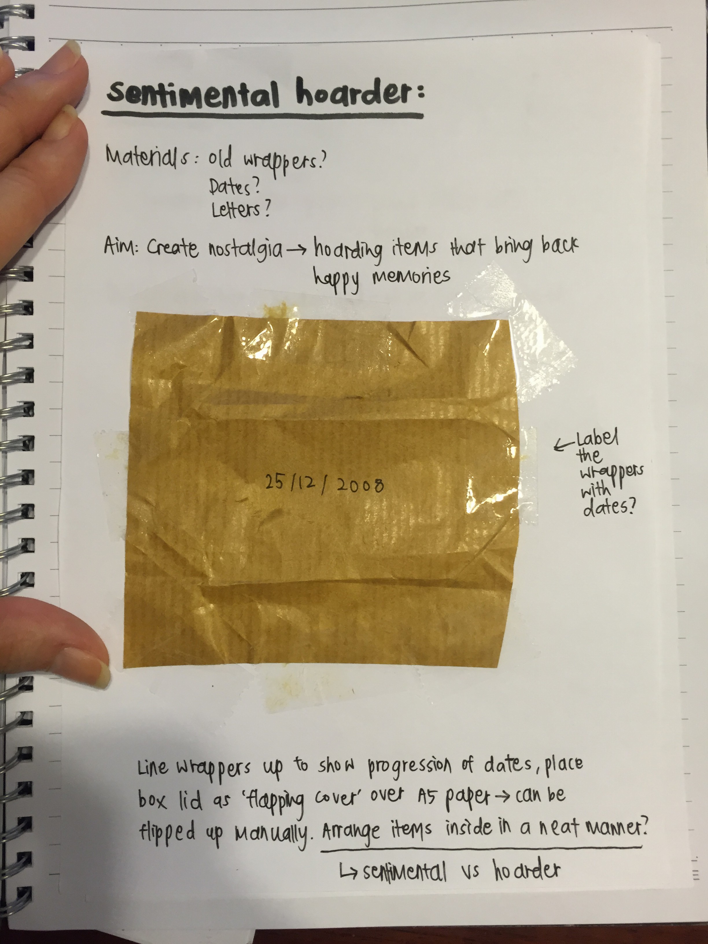
I thought of using old wrappers (either part with the ones I have hoarded over the years or replicate them), to show a timeline of items I have kept. The wrappers I have are creased, but not entirely crumpled because I have taken care of them. I was also thinking of arranging them into my name, with the nicer things being arranged neatly, while the others (trailing off from the end of my name), will be messy, and in darker lighting, to symbolise that I’ve disposed of those items.

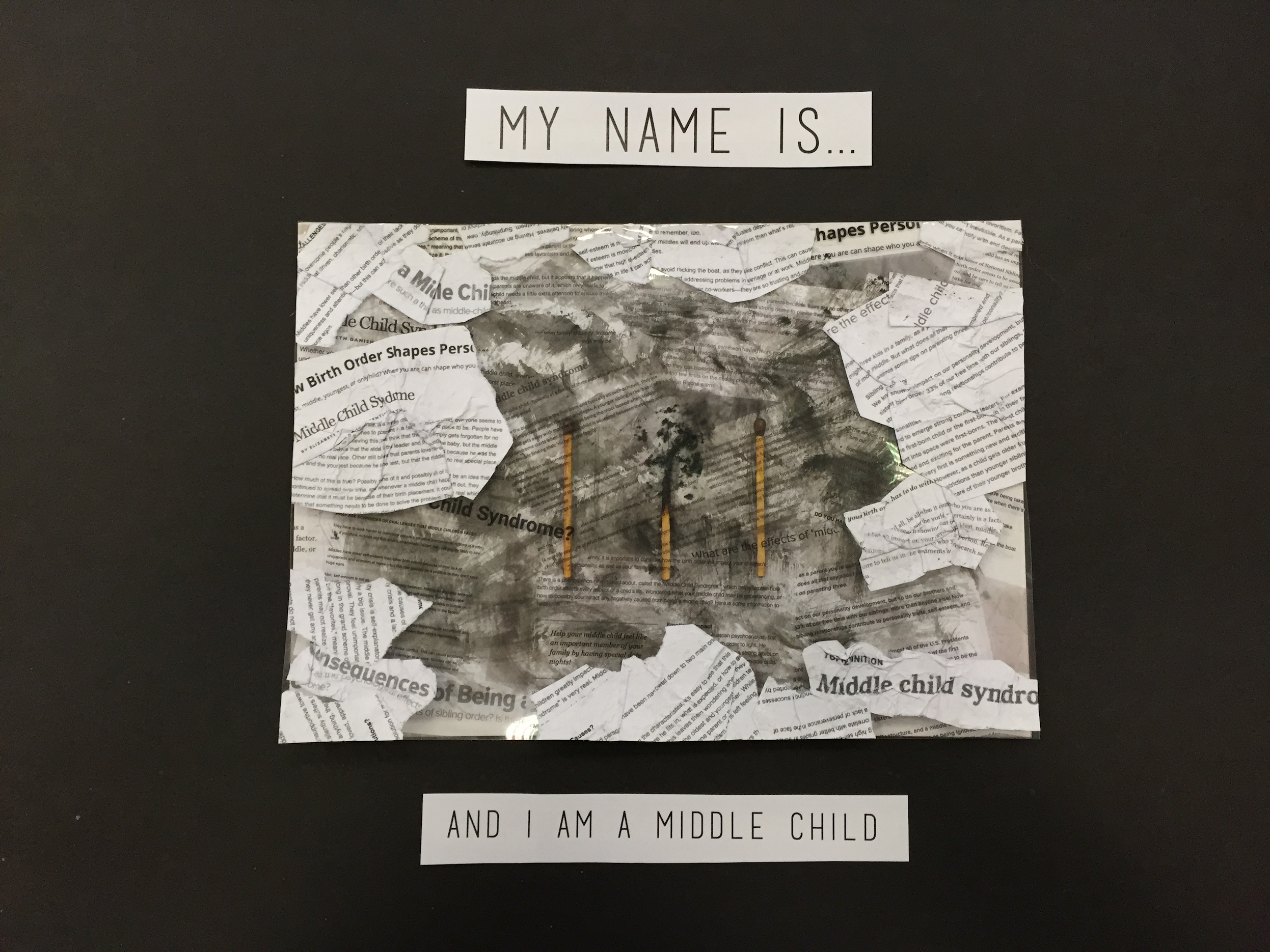
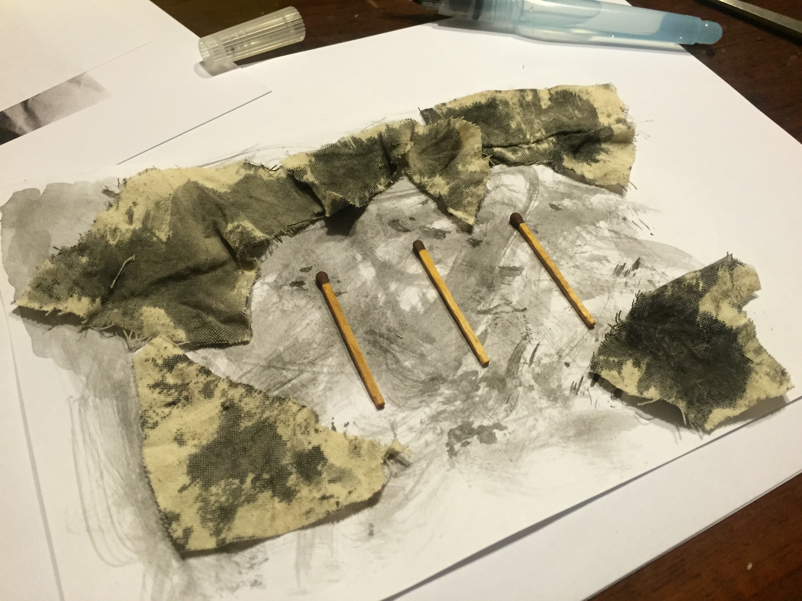
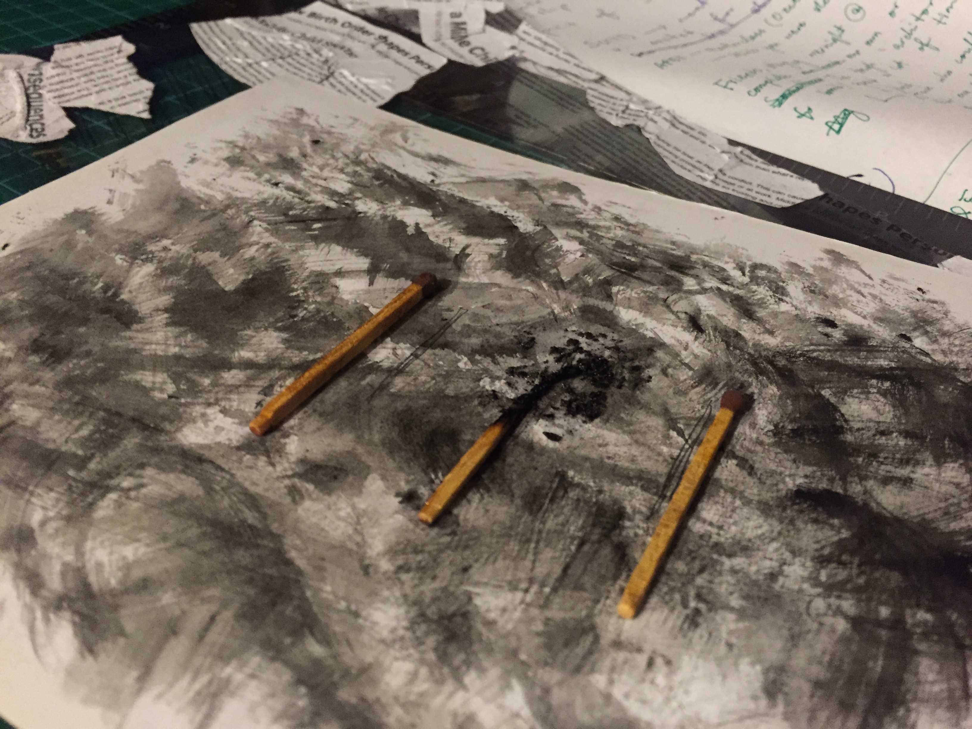
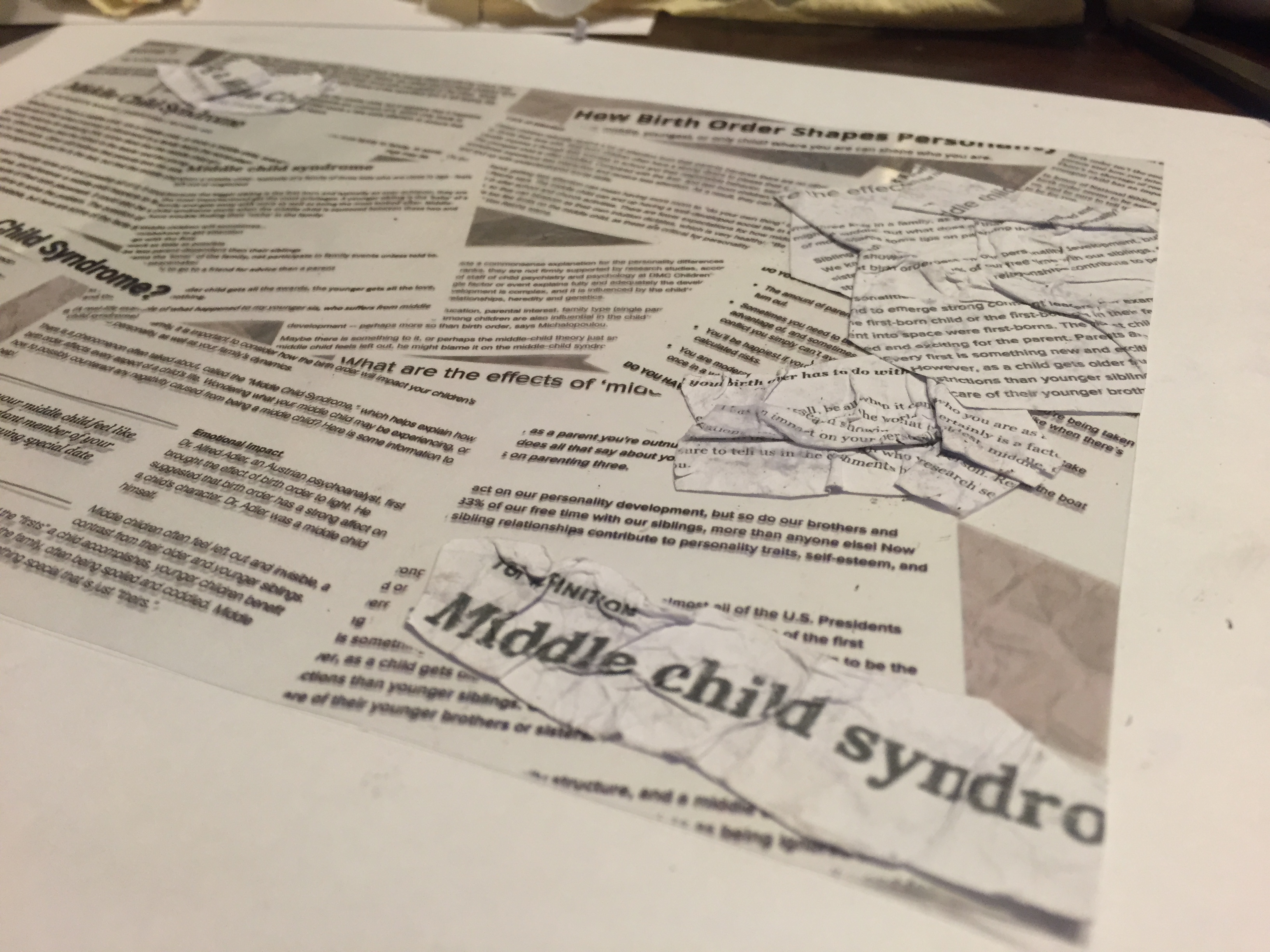
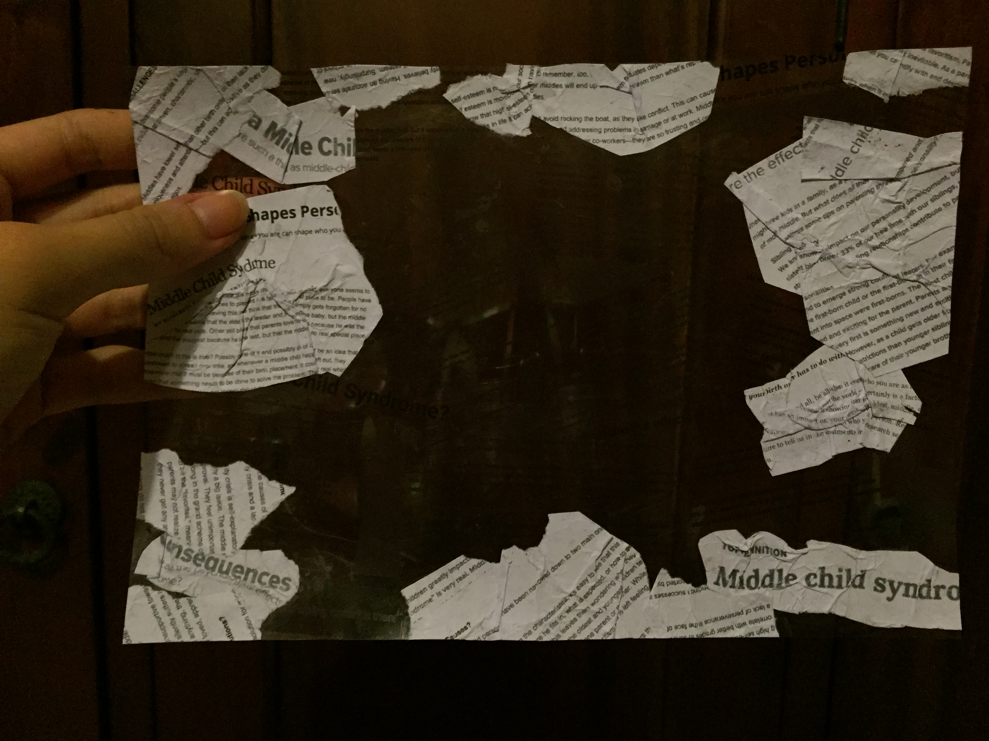
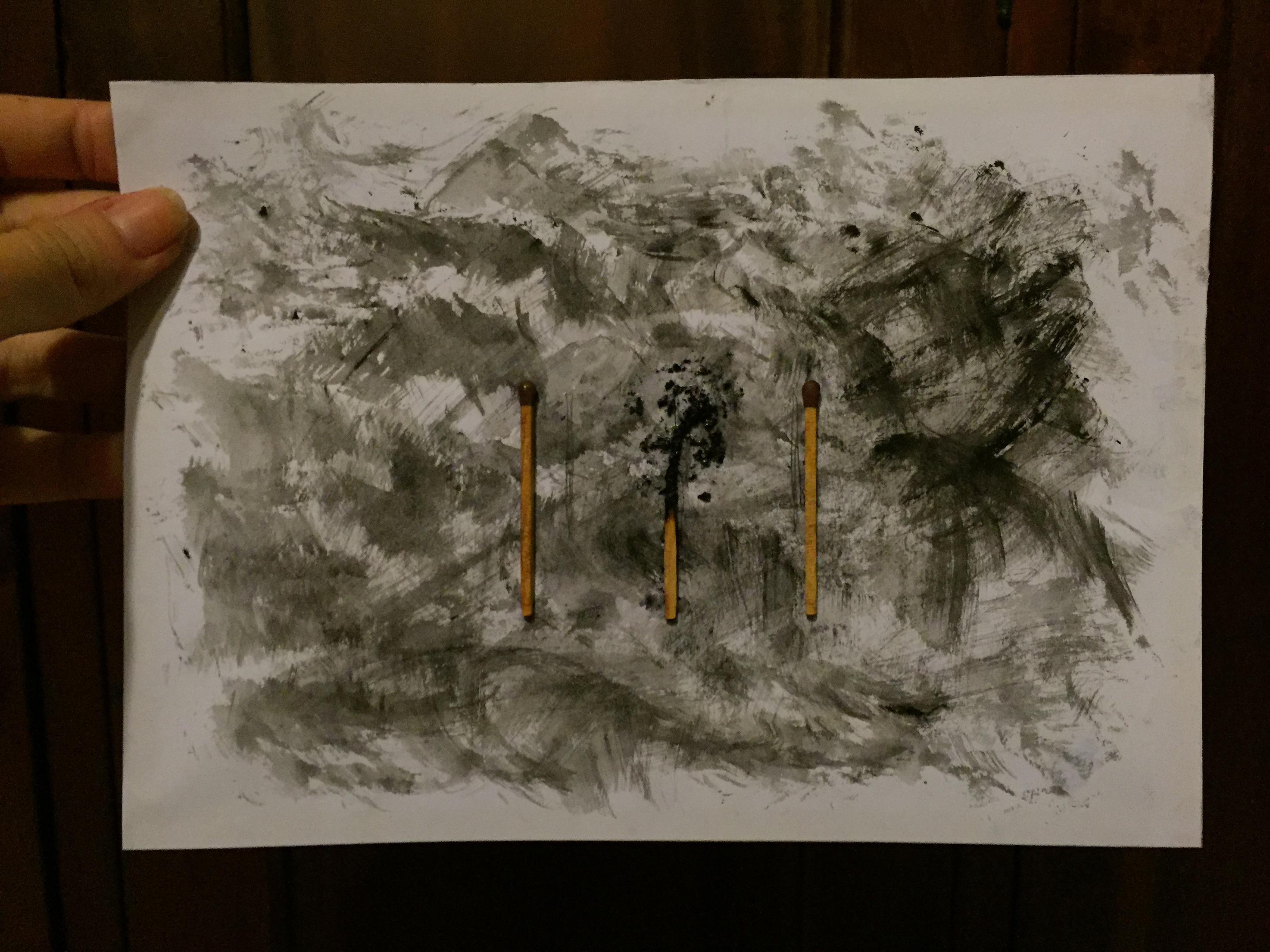
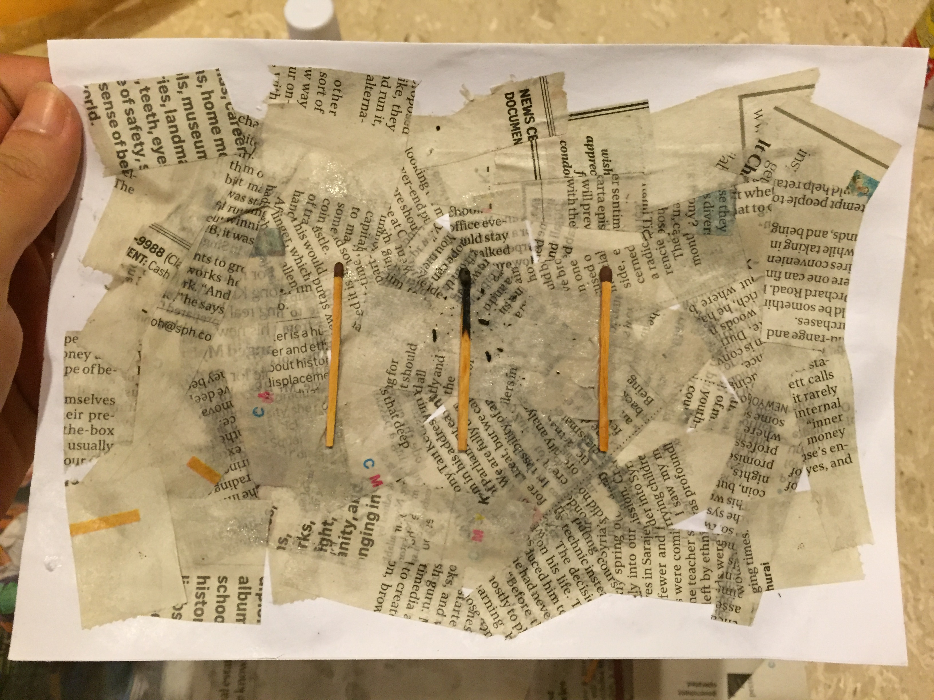
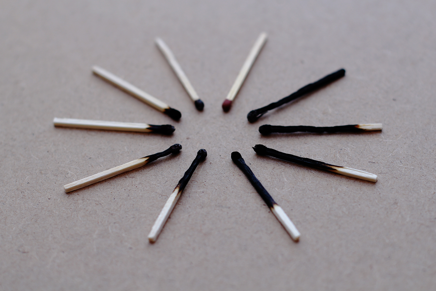
MIDDLE CHILD:
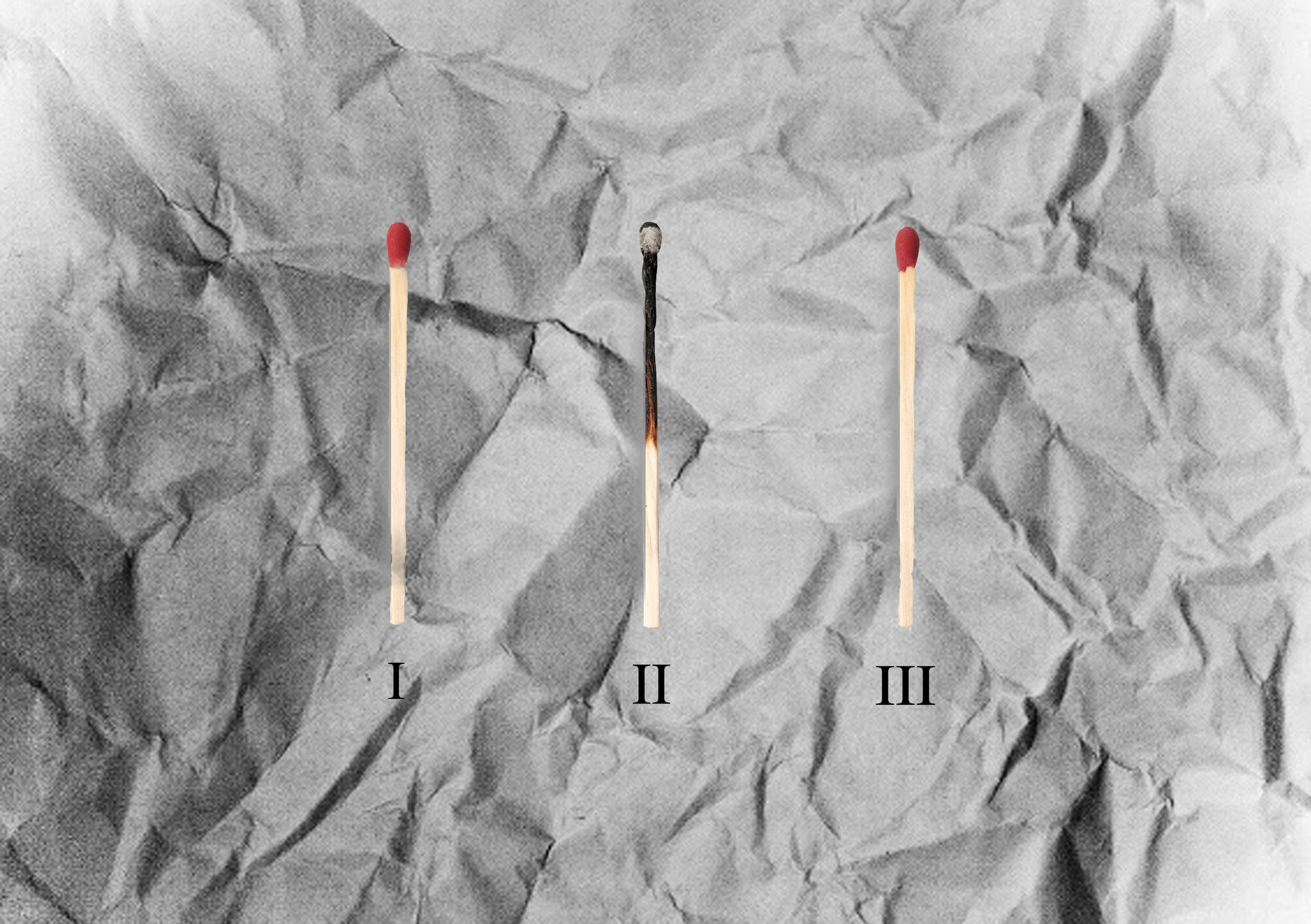
Middle Child Syndrome is an actual tangible issue, perhaps not for all, but being a middle child myself, I can say that I experienced it when I was younger. Growing up, it’s true that middle children sometimes feel out of place, as the elder sibling is viewed as the mature, responsible one who has the respect of the parents, while the younger sibling is frequently doted on, and essentially, very well looked after.
This leaves middle children feeling lonely, always having to vie for attention and eventually, becoming competitive with his/her siblings, and feeling burnt out if the issue is not addressed. Of course, most of the time, if parents treat the kids impartially, it isn’t their fault – it’s just the way things are.
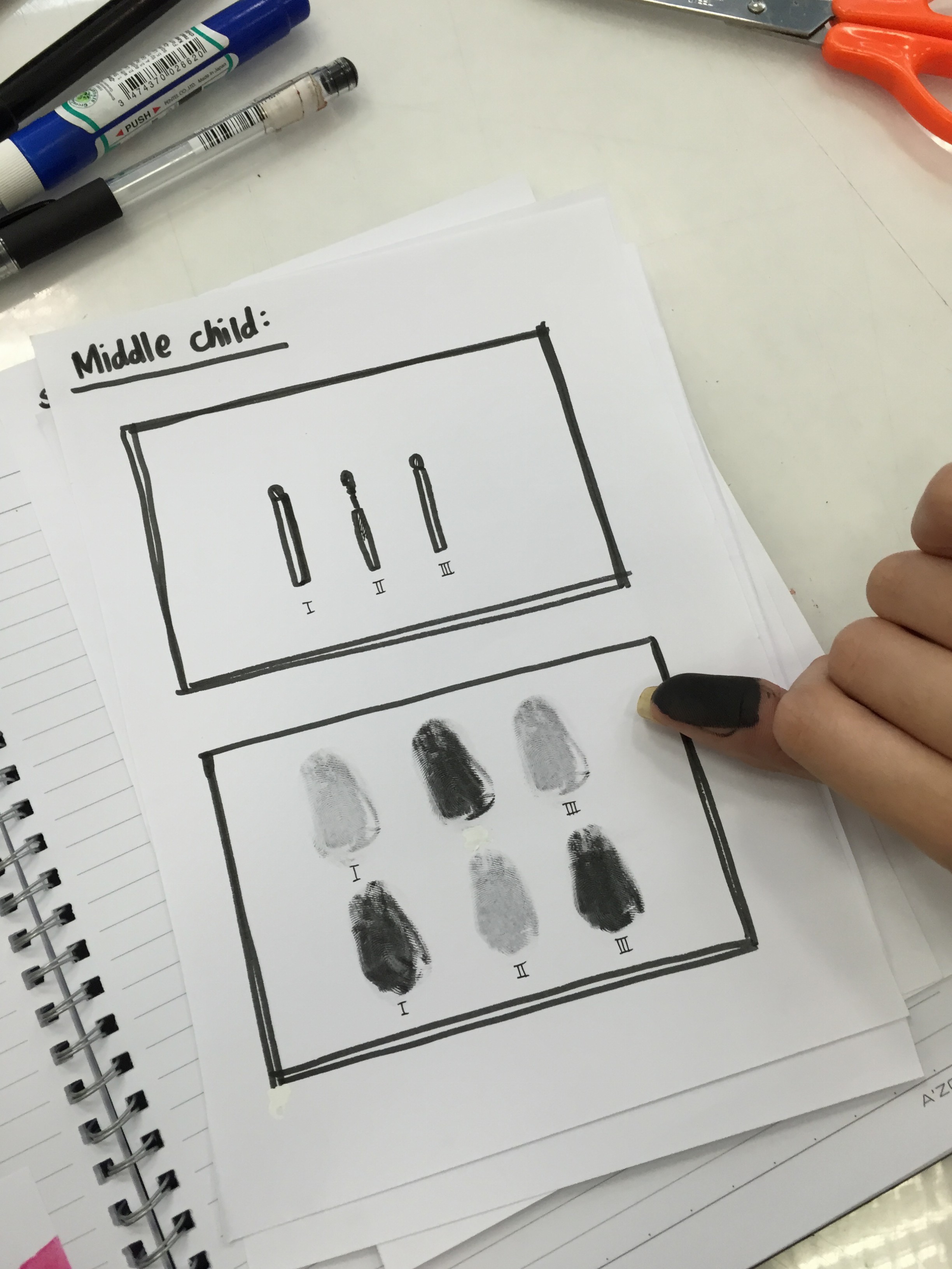
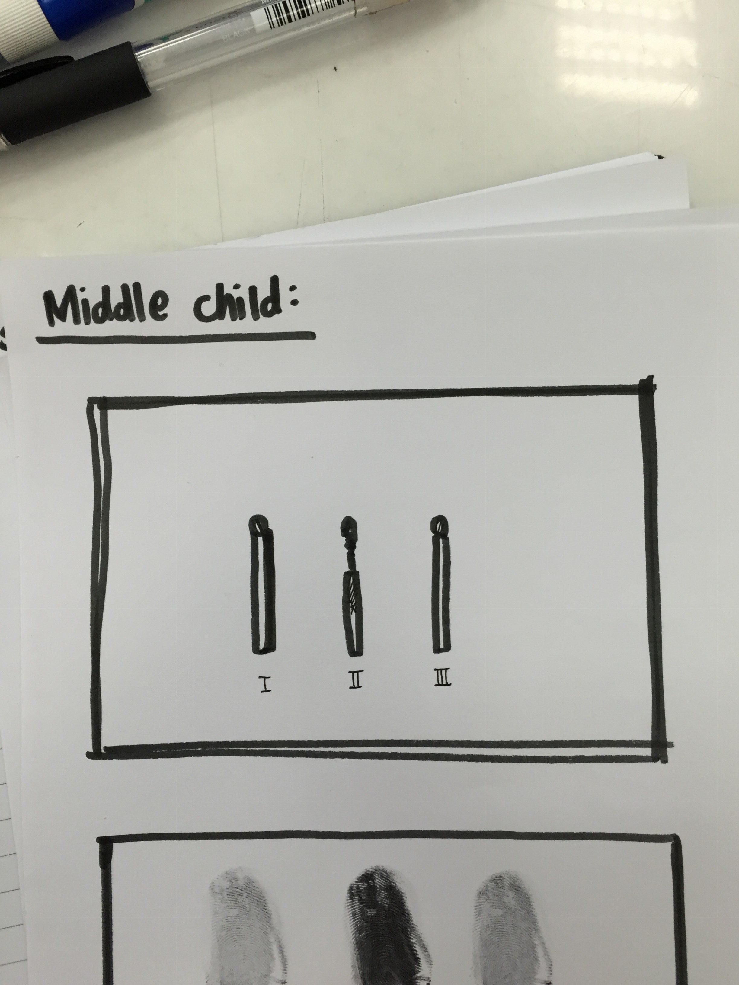
So my idea is to show the tired, angry sort of feeling middle children feel. I thought of using matchsticks or fingerprints, always making the one in the middle different from the other two. I will most likely go with matchsticks, as I feel this medium accurately represents what I feel on the subject.


