2D II – Project 3 FINAL

And here’s my last post for 2D II!! Most of this post will be images, as I’ll be showing my final work for my Zine. 

Thank you all for a lovely semester, it was fun being with this class, and I most definitely learnt so much from everyone! Every critique session is useful and a privilege to attend, because you guys are all such talented individuals and I’m always awed and intrigued by all your work (‘: I have a long way to go, and every experience is something to learn from. Thank you, Joy, for being an awesome tutor, and always giving indispensable advice and comments, for pushing us to do better, encouraging us to explore new things, and for always being so patient (and for always giving us food heheh). Bidding for your class during the STAR Wars was the right choice!! Annnnddddd we’re done with foundation year! (:

So without further ado, please see below for my final pages! Especially because of the hardcopy you guys had to see during critique. I apologise for the horrible quality then hhahah.

Microsoft Word - Journal Photos 1.docx

Overall look of all 8 pages

COVER PAGE

Cover Page

PAGE 6

Page 2

PAGE 4

Page 3

PAGE 5

Page 4

PAGE 7

Page 5

PAGE 2

Page 6

PAGE 3

Page 7

BACK PAGE

Back Cover

2D ll – Project 3 Development

Hello everyone! This will be my process post for this project. In this post, I will be talking about the overall theme, illustration process, photoshopping, using InDesign, binding, type of paper used and difficulties faced (:


overall theme:

My concept for this assignment is based on my ‘darker side’. I wanted to use this Zine as a demonstration of my negative aspects, namely my fears and things I dislike. I chose to go for this theme because I felt that my previous works, whether in semester one or two, have mostly highlighted positive things when it came to representing myself. Therefore, I wanted to challenge myself and try something different.

Another reason was that my projects from semester two have been especially based on photography, setting up, and photo editing. Although it’s what I enjoy doing, I acknowledged that I could try different styles, even more so after reading comments or hearing what my classmates had to say, which was to try something new.

Additionally, because I knew this project should ideally be combined, an extension or a rearrangement of our previous works, I decided to make it relative to my work from semester one’s Ego project. My Ego project was done by illustrating in pencils, outlining in pens and then colouring in with watercolour pencils. You can see it below!

IMG_2535

IMG_2537 IMG_2538

In order to keep the whimsical and child-like nature of the Ego project, I decided to go for a sort of book that would be for adults, however, look like it’s for children. I kind of liked the idea of an illustrated book based on my inspirations like Tim Burton, Happy Tree Friends, and Fran Krause (who did the Deep Dark Fears series, one of my faves). So the style would be dark, eerie, and maybe even slightly sadistic, but look sort of cute at the same time.

I also went along to continue drawing paus, because I’m represented by a pau. So this assignment is full of paus as well. However, in some illustrations, I adapted to pau to have a body.

After consultations, I also decided to go with content that were ‘not so normal’ – things that others would envision to be good things, but to me, they have a negative connotation. For example, things like children, coffee, balloons, high heeled shoes, etc. Joy mentioned that it would be more interesting and less expected, and I’m glad I heeded her advice! I tried as best I could to think of and illustrate less expected ideas, and to follow this direction throughout the Zine.


IllUStration process:

I planned out the content I wanted to generate in my Zine, and then took to trying out the calligraphy (? not sure if it can be called that hahaha) and doodling. I wanted my details to be all in the drawings, instead of being scattered around the pages and focused on the layout.

My planned 8 pages were:

  1. Front cover
    • Pau standing in the dark, looking afraid.
    • Has title ‘Are You Afraid Of The Dark?’ – Inspired because I personally dislike the feeling of being in the dark. I also wanted to keep the front cover more general, so that people would pick it up if it resonated with them.
    • Has author’s name.
    • Initially, my front cover also had a white background, but then I changed it to a black background, so that it would look more like a cover, and stand out more from the pages inside the Zine.
  2. Second page
    • Balloons – I’ve had a phobia of balloons since I was a child, after one exploded in my face. Ever since then, I’ve seen people loving balloons and thinking they’re so pretty, but they still freak me out.
    • Illustration of balloons, with one bursting in the pau’s direction.
    • Shows the pau’s skin being peeled and flaking off from the blast.
    • Has words ‘What if a balloon exploded near your face and ripped your skin out?’ to encompass what I was afraid of.
  3. Third page
    • Children – When I was younger, I used to love children, and enjoyed being around them and playing with them. However, as I grew older, I realised I didn’t like children as much, especially when I had to spend more than two hours with them. Or if they started crying, or asking questions. Needless to say, I dislike children.
    • Illustration of three tiny pau children at the older pau’s feet (me), because of the height. I’m shooting myself because I’m surrounded by them.
    • Black lines amasses together in the background and shooting out in this particular direction in order to guide the viewer’s eyes to converge onto what’s taking place in the middle.
    • Words are ‘ Children are horrible little creatures’.
  4. Fourth page
    • Pores – Up till now, sometimes if I stare long and hard at my skin, I wonder what would happen if my pores suddenly shrunk into my skin painfully, leaving indents, like little holes. My skin would then sizzle as the pores retreat deeper into my flesh.
    • Illustration of the pau’s arm with its pores sinking in. Shows the stages of pores leaving holes – some have fully sunk in, while others are halfway through sinking in, on the verge of sinking, or are still regular pores.
    • Words are ‘Pores. One day your pores will expand and sink painfully into your skin. Forever.’
  5. Fifth page
    • Dentist – I’ve had braces in the past, and it was quite a painful process, as I had a severe underbite, which had to be rectified by pushing my lower jaw backwards (as a result, it made my face even rounder LOL so it all links). Since then, I’ve had a phobia of dentists, quite irrationally too, as dentists only want to help their patients.
    • Illustration of a pau with straps on its face, pulling back its eyes, and pulling apart its lips to stretch the skin and show the disgustingly crooked and sharp, jagged teeth. Because of the stress created by the straps, the mouth area has begun to crack and pull apart.
    • Words are ‘The dentist puts straps on my face to look at my horribly decayed teeth’
  6. Sixth page
    • Stitches – When I was nine, i climbed up a water slide by running upwards. I slipped, fell and landed on my jaw. Because water slides are build by attaching separate pieces together, the entire slide is not actually 100% smooth. My jaw slid against the uneven plastic pieces, and then my flesh got ripped out. There was a hole deep enough to see my jaw bone from the outside, and yes, ever since then, I’ve hated stitches. I went to the hospital immediately and got an anaesthetic jab right in the middle of the hole, and got 16 stitches. I’ve also been afraid of having stitches on my mouth so I cannot speak.
    • Illustration of a pau with stitches all over the mouth, with the needle and thread still attached. Stitches also scattered around the pau’s ribbon and has cracks that are sewn shut.
    • Spools of thread lie beside the pau.
    • Words are ‘Sometimes, I worry that if I have to get stitches again, I’ll be stitched up in all the wrong places’.
  7. Seventh page
    • Ageing – To me, there is a very big difference between ageing and death. I don’t want to age and become dependent on other people, not being able to do mundane things like eat food, brush my teeth, stand up or walk. I think ageing comes hand in hand with horrible things like dementia and osteoperosis, and thinking ahead, ageing is something I’d rather not face, as compared to death. Some may want to grow up, and achieve things, and even look forward to ageing, but I don’t.
    • Illustration of six small boxes of paus, each depicting a life phase – from young and unmarred, to old and rotting.
    • Words are ‘Ageing’ and ‘To die would be an awfully big adventure. – J.M. Barrie’. I love the second quote, taken from Peter Pan, the children’s book, and thought it was very apt to put inside my Zine.
  8. Back cover
    • Plain and simple, with the text ‘Don’t look under the bed’
    • In lieu with cover page. I wanted them to be inclusive of the theme of a child’s room, hence, the dark and the reference of not looking under the bed.

After illustration, I scanned the drawings into softcopy version at 300dpi, so I could edit them on Photoshop and InDesign.

IMG_0264 IMG_0262

EPSON029 EPSON028 EPSON027 EPSON026
EPSON022 EPSON018 EPSON019 EPSON020 wfb j

EPSON021 EPSON025 EPSON024


Photoshop and indesign:

After scanning the illustrations into images, I began arranging them on Photoshop, such as putting the text and main image together, and finalising my compositions. 

I also edited certain parts, like erasing some details, or vice versa. The biggest thing I edited on Photoshop would be the back and front covers. I switched the colours around so that the illustrated parts would be in white, while the background would be in black.

Then, I moved on to InDesign. I finalised some things on the software, and mainly used it to look at my pages as a whole, to see if they fit well together. I felt InDesign was good to look at the entire spread and layout, because it shows you all the pages put together so I could envision what it would look like after being printed out.

I also exported it from InDesign.

Screen Shot 2016-04-13 at 9.00.18 PM Screen Shot 2016-04-13 at 9.00.53 PM


Binding, type of paper selected & printing:

I knew I wanted something slightly shiny but matte. This is because I wanted it to look as close to a children’s book as possible. However, what I learnt at the printing shop was that the thicker the paper, the harder it would be to bind, given the number of pages the Zine consisted of. The staff informed me that thinner paper would be better, and recommended a few. 

I thought this was interesting as I always thought thicker paper would be better, since there were only 8 pages. So eventually, I settled for thinner paper. I’m not sure of the exact gsm as it wasn’t stated, and I forgot to ask the staff, so next time, I will definitely remember to!

Binding wise, I asked for perfect binding. I selected perfect binding as I was thinking of if the Zine could be mass produced in the future. This was also the reason why I chose to scan in my illustrations instead of directly drawing on the Zine. If it were ever mass produced, I would like the Zine to have a hard cover, while the pages inside would be kept thin.


Difficulties faced:

I think the most difficult thing about this project was actually printing! Because my printing initially was really bad, I had to go get it done again. But although it was really tedious and rather upsetting at the moment, I’m glad it happened.

I learnt a lot from it, and now I know the importance of sourcing for a good printing shop, as well as choosing the right paper, etc.

Other parts would be the time spent on illustrating, as well as learning how to use InDesign.

2D ll – Project 3 Research

Hi everyone! Just a quick update!

I’ve thought of creating a book titled ‘My Dark Side’ (or something like that, maybe I’ll change the name hahaha). I want it to incorporate things that are negative of myself, or people in general, such as my fears and dislikes.


Also, for this assignment, I have referenced certain artists or programmes and art forms that I was intrigued with as a child.

Tim Burton:

I’ve always enjoyed Tim Burton’s work, whether in its pure art form, or in films. I feel his characters have a certain captivating aspect and consistency. His works are extremely identifiable, and anyone who is familiar with his art would be able to point them out. I particularly like that he can add personality and bring his characters to life while keeping them illustrated in regular mediums and pen.

8a3f53eddb82213dd004f5b5843dd033 lionking tim-burton-sketch xmas

Happy Tree Friends:

Ok, firstly, I won’t put the explicit examples here that I looked at, because they are slightlyvery graphic and gory. But I’ve watched clips of this cartoon when I was growing up, and I like how everything looks so happy, with such vivid colours and children-friendly animal characters, but 30 seconds into the video, things take a violent turn. I found this particularly appealing, because it’s something that amalgamates a cute element with a sinister one, and it basically plays on the shock factor which I didn’t see coming the first time I watched it.

Happy-Tree-Friends hqdefault

2D II – Project 2 FINAL

Hey everyone! So this post will be broken into two parts, one to show my final steps of food stamping, and secondly, the pictorial examples of my end products! (:


FOOD STAMPING:

I used food that was related to each of the compositions for various reasons, as I wanted the item I chose to have a deeper meaning and symbolise something rather than be used for it’s print just for aesthetic reasons. 

Image above shows the first food stamped collection. Printed two sets of the compositions so there would be room for trial and error, which proved to be a good decision because I felt the first set that I stamped on was too dark in terms of colour, and was kind of distracting. I also noted that I should not stamp too near to the centre of the image, because then the background became unnoticeable, and that wasn’t what I wanted, as the background plays a large part in the irony of my work.

IMG_6747

Food in the point of view of instagram is popularity

I chose wafers because I wanted to keep the sort of geometric shape of the Instagram layout, so I did not want anything circular or rounded. I also felt that the print made was rather different and pretty, something that was very easily identifiable, which captured the essence of my subject, because that’s what popularity represented on Instagram – wanting to stand out from others and gain following.

IMG_6748

Food from the point of view of a model is calories

I used lime halves for this composition, because I wanted something that was currently keeping up with the trend of detoxing one’s body. It’s a pretty big area right now, with many models and influencers promoting this ritual, so I wanted a medium that showed that as well.

IMG_6751

Food from the point of view of obesity is diabetes

Marshmallows! I used it for this mainly because it’s a snack that is well known to be very unhealthy, and too much consumption of this type of food will lead to unhealthy consequences, much like the chocolate coated chips and rock sugar I used to make the background.

IMG_6754

Food from the point of view of farmers is income

For this composition, I wanted something else that farmers are known to harvest. The tea industry has always, and will probably continue to be one of the better known farmers produce. This is a high in demand product with a large consumer market, therefore, I decided to use teabags. The print made had a line down the middle and smaller lines outlining it. I managed to get this shape by using the base of the tea bag, instead of the side.

IMG_6755

Food in the point of view of the homeless is survival

I chose to use dried bread that I left out without covering or wrapping up, to get a more rough texture. I wanted to use bread to attain a messy kind of effect, and also because of the idea that the homeless would not have access to fresh goods.

IMG_6760

Food in the point of view of starvation is luxury

I chose to use dog food as a medium for food stamping because in my opinion, I feel if people are pushed towards starvation with no way out and they are on the brink of death, at the moment no one would hesitate to eat whatever they find, even if it’s not seen as clean, or even food made for humans, because the only thing they would be thinking of is to fill their stomachs. So, I chose dog food to encompass the desperation they would feel.


FINAL COMPOSITIONS:

IMG_6769 IMG_6770 IMG_6771 IMG_6772 IMG_6773 IMG_6774 IMG_6775

Thanks for reading, guys! 😀

2D ll – Project 2 Development (#3)

SETTING UP FOR PHOTOS

And here’s another update that will be shown mainly through photos! (: I apologise in advance for the length of this post, due to all the images, because I have a few variations and examples for each hahah. So here are some process shots that I took to document the initial stage of setting up the place and props for taking photos to use for each piece. Below shows things like the cutting the cucumbers into thin slices, taking the fat out of meat, staining coins using red and brown paint, and arranging the crackers to make backgrounds.

IMG_6716 IMG_6723 IMG_6732 IMG_6734 IMG_6735 IMG_6736IMG_6720


EXAMPLES OF ORIGINAL PHOTOS

I decided to go with placing something that is not edible by itself on the plate, because it shows irony, as people would expect a meal to be served on each dish. I thought it would make things more interesting if the background were food items, while the plates/bowls signify something else that targets the social issues.

I had a lot of fun playing around with the lighting and positioning of the props. Firstly, I had to ensure that I took the photos between 1pm to 6pm, because I wanted bright sunlight. The morning would be too blue-ish, while the night time would be too dark, or yellowish, especially since I did not have access to a studio, and my lights at home all use yellow bulbs. Therefore, I set up outside of my house, and laid the food items on the ground, on top of kitchen towels or a tray to keep the area as clean as possible. I took a couple test shots using average shutter speed, and found that it was sufficient, since the subject was not a moving one. I also increased the exposure, as I personally prefer brighter ones as compared to dark photos. I feel that unless the subject is a light form, bright photos bring out details better. 

IMG_9060

Food in the point of view of a model is calories

IMG_9094

Food from the point of view of obesity is diabetes

IMG_9135

Food from the point of view of Instagram is popularity

IMG_9147

Food from the point of view of Instagram is popularity

IMG_9161

Food from the point of view of starvation is a luxury


After digital manipulation (without warped background)

These are the shots after being edited on photoshop. I changed things like the colour and contrast, saturation, colour balance, etc. I also added in certain features into a couple of the compositions, if I did not manage to create props for them (like cockroaches, because I ain’t touching the real ones hahahah).

Farmer 2 Farmers 1 Homeless Instagram Starvation 1 Starvation 2 Model 1 Model 2 Obesity 2Obesity 1


AFTER DIGITAL MANIPULATION (WITH WARPED BACKGROUND and sizing)

I wanted each composition to be evenly sized, meaning the plates to be all uniform in terms of placing in the centre, as well as sizing. I used grid lines on photoshop to measure each piece and keep the dishes constant. I also added a warped-ish texture by using the smudge tool on photoshop, because I feel it creates a more dynamic tone, and I want it to reflect the inconsistencies and disillusion of society and its social issues. I will do food stamping on the edges of each composition, to create a border and add texture to the art work, using food that is related to the theme of each (e.g. obesity = biscuits, or homeless = crackers)

Farmers 1 Farmers 2

Food in the point of view of farmers is income

I used rice for the photo background, because it is a staple produce that farmers always harvest, and it’s a big part of our Asian culture. I chose to use blood stained coins because I want it to represent that farmers work hard using their blood, sweat and tears, but reap very little (hence the coins).

Homeless

Food from the point of view of the homeless is survival

I used instant noodles because I feel it’s something that is very fragile and breakable, as well as convenient to be eaten. Also, due to the nature of it, the noodles can be eaten before boiling (although it isn’t advised, but it can be if people are desperate = survival). I chose a can and wrappers in the middle because the homeless typically live on these products, especially when it comes from food donations/food drives.

Instagram

Food from the point of view of Instagram is popularity

The crackers behind represent the application because of it’s square shape, and the layout of how posts on Instagram are shown (in grid form). I felt the warp especially added to it because of how what we see on social media is usually twisted from reality. The eyeballs are to symbolise popularity, in a way that people are always watching.

Model 1 Model 2

Food from the point of view of a model is calories

I chose cucumbers, because it is a type of food that models always eat, like carrots and asparagus. In fact, many of them develop eating disorders from it, health problems, or faint from not having enough food intake. The butter and chicken skin and fats on the sterile, clean looking dish is to show calories.

Obesity 1 Obesity 2

Food from the point of view of obesity is diabetes

I used chocolate coated potato chips, as well as rock sugar to show unhealthy snacks or food that contributes to obesity. The plate contains pills and syringes to signify diabetes, like how diabetic patients have to consistently take insulin shots.

Starvation 1 Starvation 2

Food from the point of view of starvation is a luxury

I made gruel for the background using cereals, oats, grains and chopped up bread – a type of food that is typically known in the past especially, for feeding the poor and hungry, as it is very filling and loaded with carbohydrates. For the bowl, I chose a crystal one, to show the contrast between luxury and starvation, and placed products like perfume and jewellery that is associated with privilege into the dish. I also used blue cheese and grapes to juxtapose this, as I think it is ironic that the starving will eat mouldy food out of survival instincts, but the rich may consume it in this context as it is an expensive product.

2D ll – Project 2 Development (#2)

Exploration:

budapest warsaw prague

I thought these were pretty cool images of food and how it uses separate products to create something that obviously represents something – in this situation, a location.

15035cd1a31701ab8124864c1401a2d9 DanielCarlsten_Cone-002 l_10500_martin-roller-food-art

I thought these were pretty cool, I like that it focuses on a single item in the middle, and the backgrounds are solid coloured, or gradient (but in colours that are not too bright).

rose-prints-with-celery-heartswatercolor-795162_640

Marie Holdaway/ I am Marie is giving away Free Watercolour Textures.This is Collection One.

14886902-Abstract-black-watercolor-background-Stock-Photo-brush-paint-inkbrushy_textures_cm_2-o

The first photo (with pink markings) are actually made of ink marks using celery stalks, and I was considering combining that with various food like pomegranates, oranges and bread to create a textured background. Another thought was to use black watercolour to create various backgrounds for each piece, to show collaboration.


IMG_6367 IMG_6369 IMG_6368 IMG_6370 IMG_6371 IMG_6372

These are a couple of things I tried out at home, using dry food as mediums and watercolour.

2D ll – Project 2 Development (#1)

Hello everyone! Just updating on my progress for the second project, and I’ve decided that I want to focus on the 6 points that focus on social issues, because it’s a subject I feel quite strongly about, and I feel it will string my ideas together better if they’re related in this way. I also hope that my work will be able to bring across poignant or thought provoking messages in terms of its tone, in an underlying manner that isn’t too direct.


The 6 points are:
  1. Food from the point of view of starvation is a luxury.
  2. Food from the point of view of a model is calories.
  3. Food from the point of view of farmers is income.
  4. Food from the point of view of the homeless is survival.
  5. Food from the point of view of obesity is diabetes.
  6. Food from the point of view of Instagram is popularity.

Before beginning my thought process on how and what I will use to go about this project, my first step is to pen down how I feel about each point. I’m hoping this will help me consolidate and categorise, so I know what exactly it is about each subject that I want to bring across to the audience, and how to stimulate the related thoughts and emotions.


Food from the point of view of starvation is a luxury

6a0120a7cb9b0e970b016764ff5fa9970b

I’ve travelled to places like India and Cambodia because I find it is a beautiful thing to immerse in another’s culture, and these trips are real eye openers. Starvation is a sad thing that affects 795 million people in the world – and that’s almost 13% of the world’s population. It’s also attributed to almost half of the deaths of children in the world.

I think what strikes me most about starvation is the cruelty of the situation, yet it is something that links to the political and economical success (or lack of) of a country. Therefore, I feel food is a luxury to those suffering from starvation, because it isn’t something that can be easily solved, and although there are humanitarian movements that aim to alleviate this matter, there isn’t a solution that will easily change things.


Food from the point of view of a model is calories

Say-no-to-anorexia

And yet, there is an irony in this situation. There are so many models (regular people as well, not just women) who are fixated on being a size 0 so they can walk the runway for high end brands, or simply, just to look good. I personally feel that this is because of society’s standards of beauty, and how the media portrays them, seeing how it’s been modified for centuries. Anorexia and bulimia are very tangible issues right now, and it’s so unhealthy for the body.

I believe it is each individual’s choice on how they want to live their life, so it’s really up to them to define their eating habits, but people should not be easily influenced. Instead, they should think for themselves, and live the kind of lifestyle they want. In this case, I always feel healthiness is the most important aspect to take into consideration.


Food from the point of view of farmers is income

thailands-rice-farmers

Farmers are the ones who begin the cycle of harvesting and growing crops to give us food in it’s raw form, and I feel that it’s a commendable act. However, in less developed countries, the time and effort to monetary ratio is not something that is in favour of the farmers.

The point I hope to bring across: what’s most severe for farmers is that they may spend hours labouring in fields or factories, and they do not earn very much profit or income, as most of it goes to the middlemen, or distributors, who earn a lot more from us, who in turn, purchase the produce from supermarkets and stores.


Food from the point of view of the homeless is survival

homelessfood_wide-933c67b9420c54f467eac1229d7a7c027e2b565c-s900-c85
Many social issues affect the homeless, which turns the lack of available housing for people into a social issue itself. Problems would include substance abuse, deinstitutionalisation, urbanisation, lack of family support and economic downturn. The homeless then find themselves trapped in this predicament that is incredible difficult to break out of, and this in turn, affects their children as well. The saying goes, ‘The rich get richer, and the poor get poorer.’

However, I think a large part of how the homeless survive is through food drives or food donations that people participate in. In Singapore, we may not have many homeless people, but we do have organisations like The Food Bank or Food From The Heart that contributes to delivering food to the less privileged. In this sense, when they do not own materialistic things like fancy clothes or houses, food is more or less a major part of what the homeless need for survival.


Food from the point of view of obesity is diabetes

obesity4

Society is very focused on image – how a person looks and behaves. It’s sad, but in a way, it is also very true that generally larger sized people are subject to more prejudgment from people. It affects body image and is stressful as well. They may become introverted and lose confidence. Another issue is that health issues like diabetes is a very real threat to people of all ages (Singapore has the second highest proportion of diabetics amongst developed nations).

My personal stance on this is that too much food is capable of causing body image issues, but on a more serious note, it can endanger lives through diseases like diabetes, and the latter is something that people should be more conscious about, because sometimes diabetes is dormant and only acts up in later years.


Food from the point of view of Instagram is popularity

android-instagram-cbs_620x350

Social media is a platform for people to connect, expand businesses, create awareness, and share moments or opinions. However, it can be also used in an unhealthy way. I’ve decided to focus on Instagram because I think it’s one of the platforms that is currently in the spotlight, and many people are still on it.

I feel it can be unhealthy when users take to it to gain validation to a point of obsession. For example, if they are on it simply to attain popularity because it temporarily satisfies them. It is not a permanent solution, and is a social issue because so many people are using Instagram, and that leaves a lot of room for users to be susceptible to this, especially those growing up in the digital age.


2D II – Project 2 Research

Hey guys!

So I decided I want to use food as a subject for this project, because while doing Project 1, I found it was pretty fun incorporating food into assignments, as it has always been an interest of mine – whether involving cooking, baking or food photography.

Therefore, I would like this project to be a platform for me to express and develop both my conceptual and visual skills in this area, because what better way is there to combine my ‘out-of-school’ passion and art? 😀


Reference artists:

Beth Galton:

img_310974 I_06-82_120328-Cut-Foods-36738 popcorn_soda-beth-galton VT98Tfi

Christopher Boffoli:

canoe+au+lait+150ppi cbm2 christopher-boffoli-1 christopher-boffoli-big-appetites_banana-cyclists_collabcubed cookie+climbers+COPYRIGHTED+IMAGE+Please+don't+repost+without+permission foodies-orange_2018426i

Alison Anselot:

113-800x800 1082114152 pantone-site2 pantone-site22 pantone-site34-1024x1024


18 Points of View:
  1. Food from the point of view of starvation is a luxury.
  2. Food from the point of view of children is play.
  3. Food from the point of view of model is calories.
  4. Food from the point of view of farmers is income.
  5. Food from the point of view of the homeless is survival.
  6. Food from the point of view of a chef is creativity.
  7. Food from the point of view of a food critique is a delicacy.
  8. Food from the point of view of obesity is diabetes.
  9. Food from the point of view of an athlete is energy.
  10. Food from the point of view of a cook is a recipe.
  11. Food from the point of view of Instagram is popularity.
  12. Food from the point of view of parents is love.
  13. Food from the point of view of tourists is cultural exchange.
  14. Food from the point of view of friends is gathering.
  15. Food from the point of view of a photographer is art.
  16. Food from the point of view of a food fight is mess.
  17. Food from the point of view of teeth is decay.
  18. Food from the point of view of tissue paper is dirt.

2D II – Project 1 FINAL

It’s a wrap for Project 1! I’m happy to say I had a lot of fun finishing my first ever typography assignment, and there were a lot of things I learnt from it – like working on my conceptual and photoshop skills, sourcing for materials, what types of glue to use for various mediums.

I’m definitely looking forward to the next project after hearing the feedback, because I feel there is a lot of room for further improvement of my concepts and I also want to continue honing my photoshop (something that I found very useful during this assignment), photography, tactile and sensory skills.

Soooo without further ado, here are my final designs for the project!

IMG_2612IMG_2605

GIF ANIMAL LOVER

IMG_2607 GIF PHOTOGRAPHYIMG_2608GIF MIDDLE CHILDIMG_2606GIF FUSSY FOOD Continue reading 2D II – Project 1 FINAL

2D II – Project 1 Development (#3)

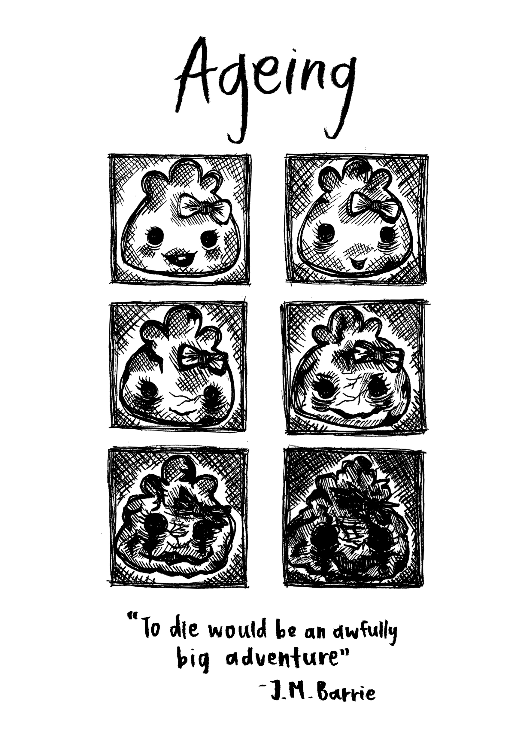
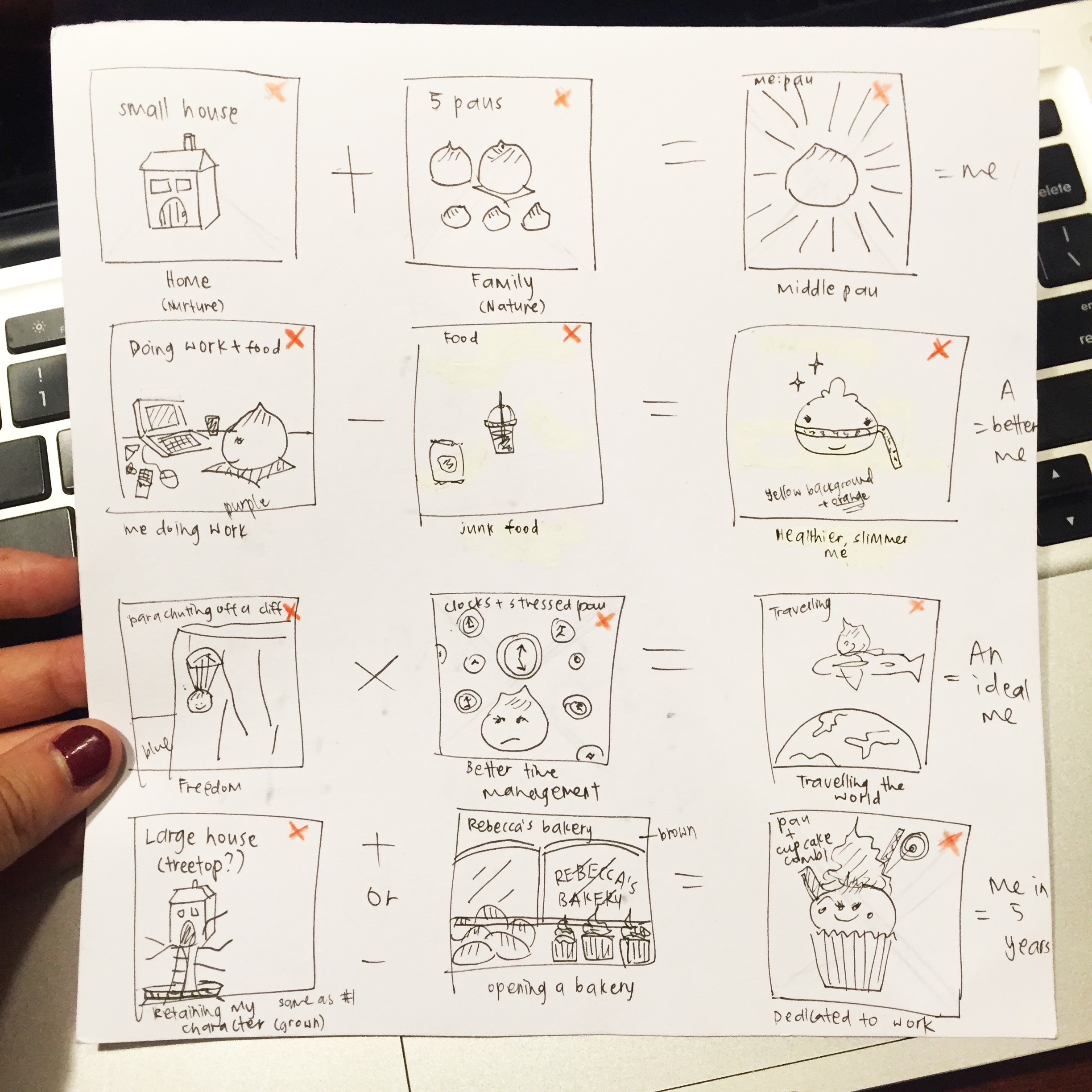
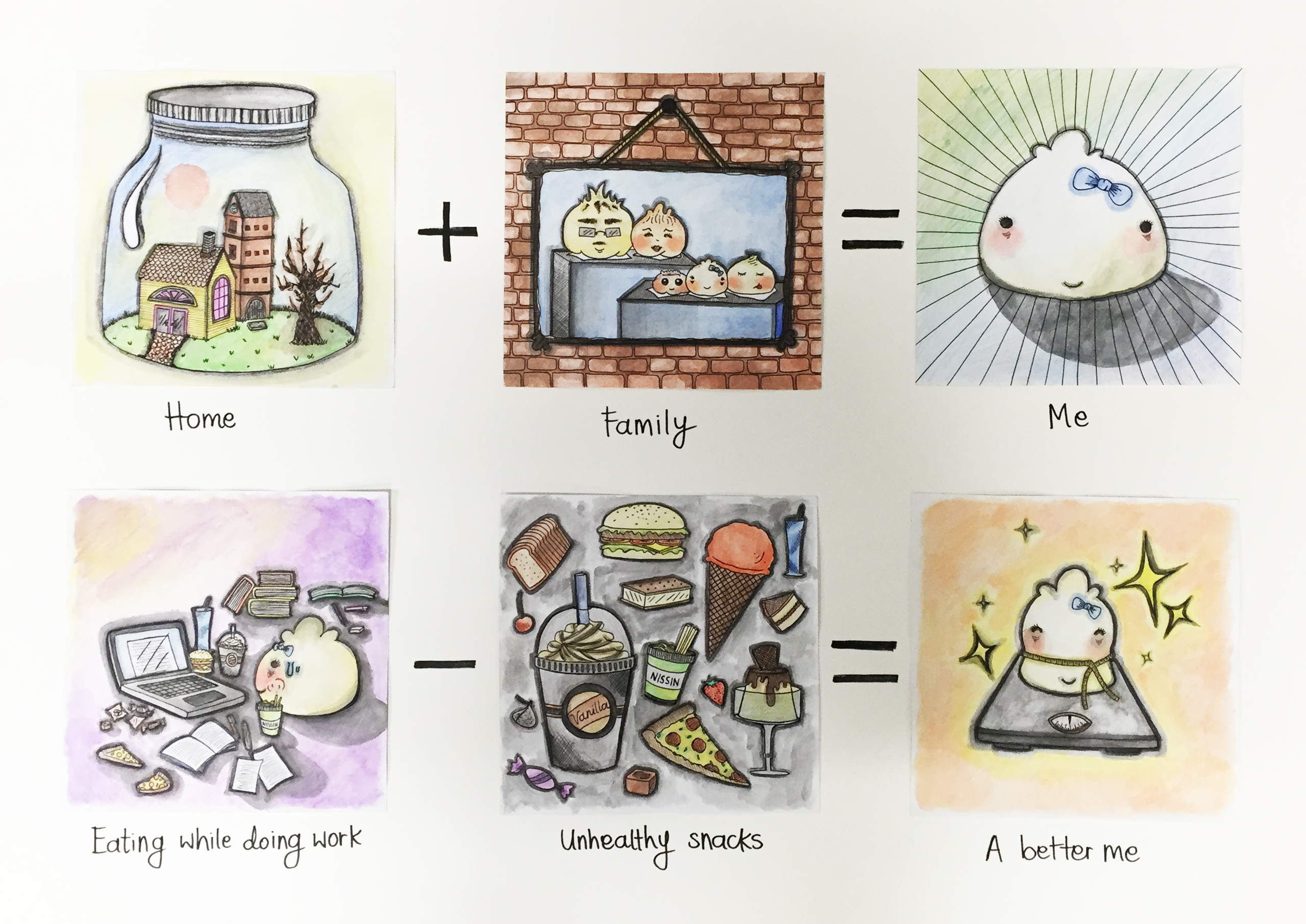
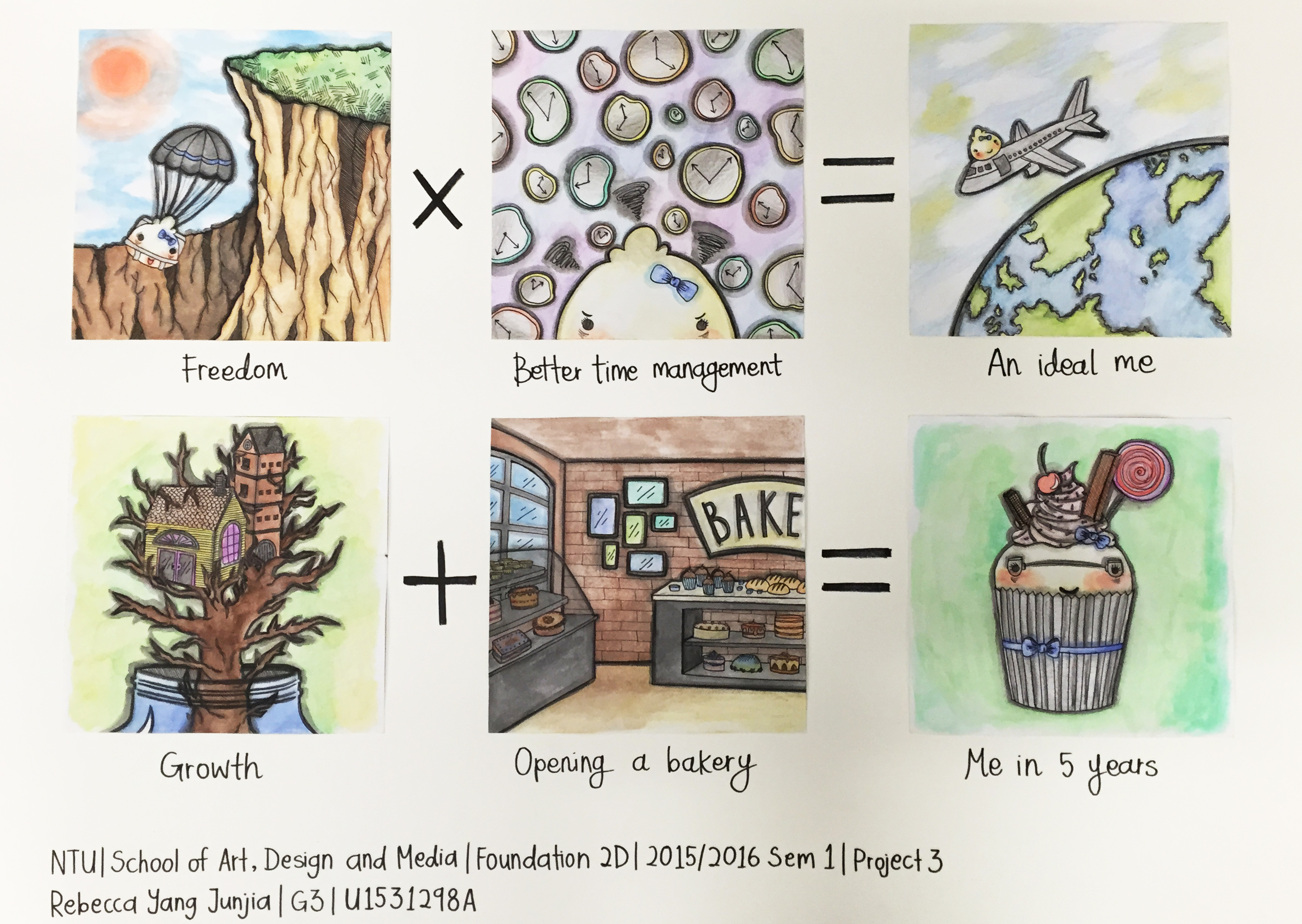
OVERALL DESCRIPTION:

Hello everyone! I just thought I’d separate my process entry from the final work entry so it will be easier to follow.

My final steps for Project 1 included photoshopping, experimenting with materials I had lying around at home, taking photos, and scouting various printing shops.
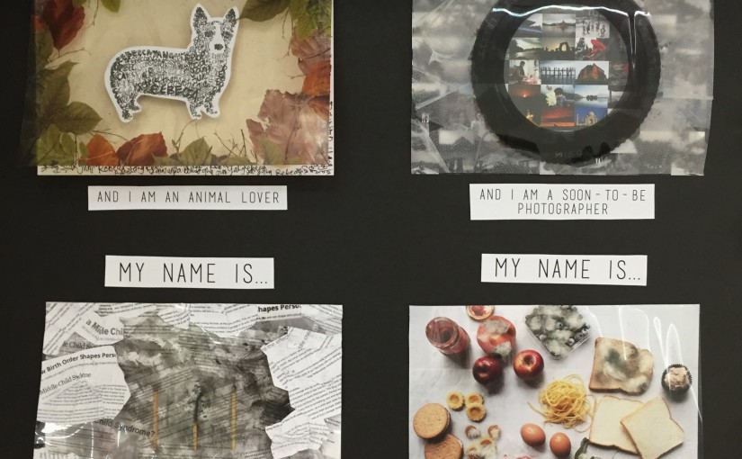
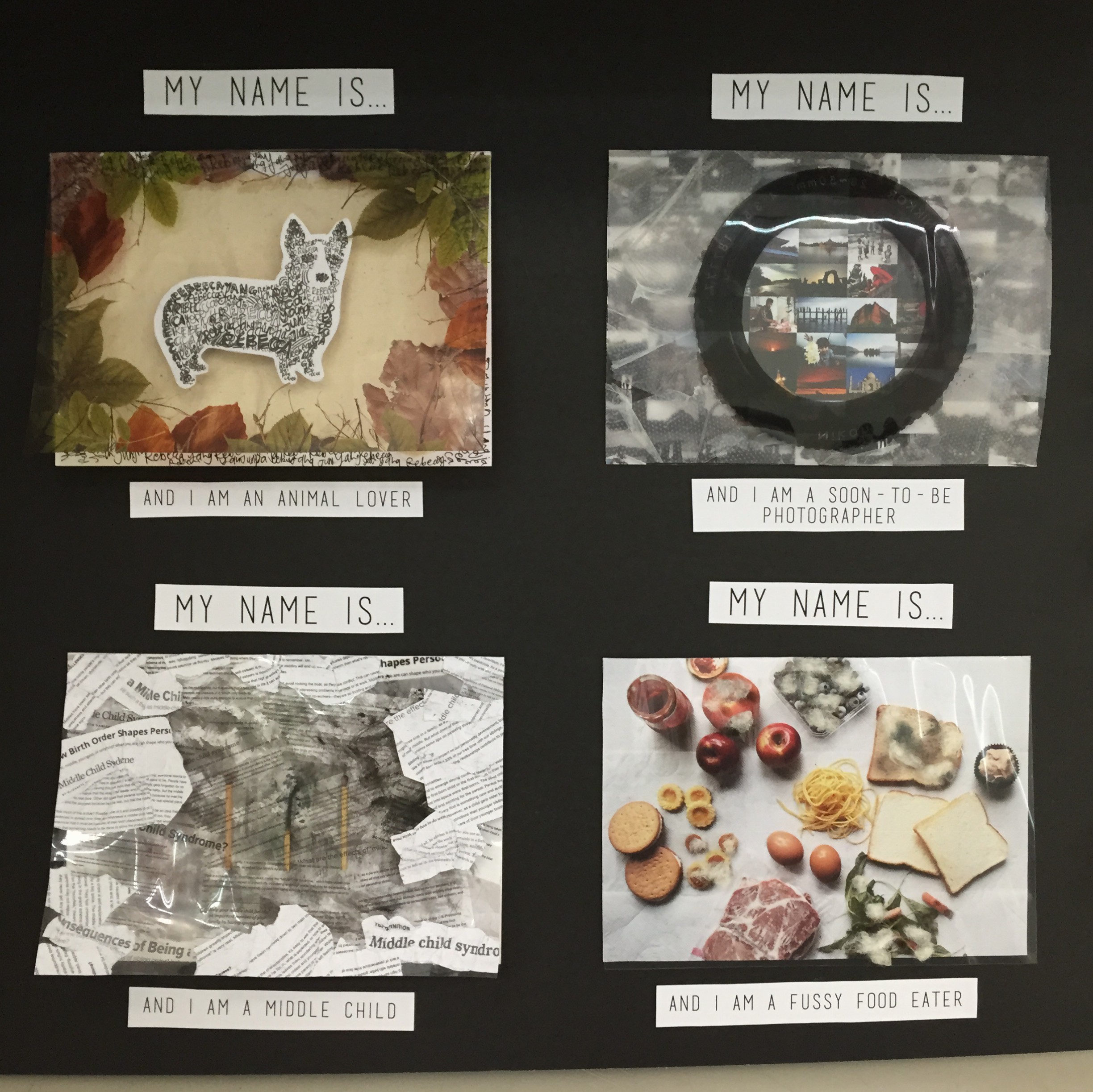
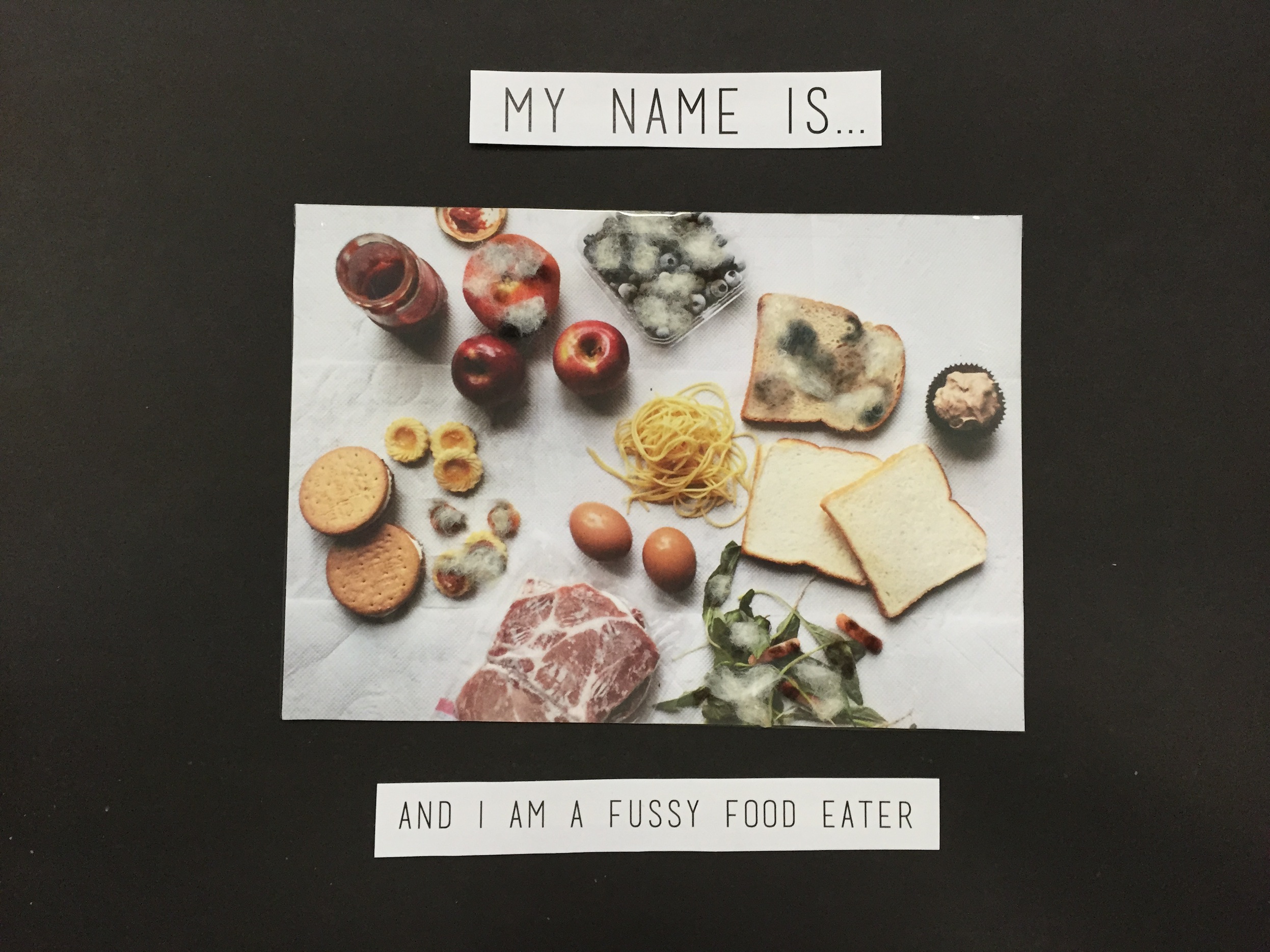
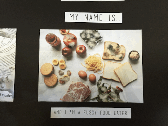

FUSSY FOOD EATER:

For this piece, I started executing it by creating my own photo to be used as a backdrop. I’ve always been interested in both food and photography separately, and I love it when the two are put together and beautifully integrated. I actively follow food bloggers and instagrammers, read recipes and watch cooking videos to get inspiration for my daily life in general, aside from artistic purposes. Therefore, I was super excited to begin my fussy eater piece.

Another thing that is kind of ironic is that although I like things to do with food, when I cook or bake, I prefer feeding people more than myself. This leads me to the fact that it’s because I’m quite picky, and refuse to eat a lot of things. I can eat the same thing for days without feeling bored. So a lot food is wasted on me because they’re too exotic for my taste (although they’re not actually, I’m just strange).

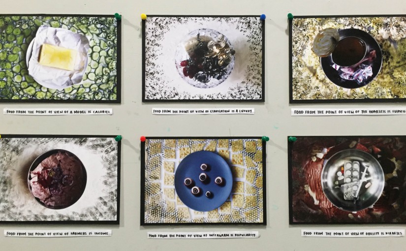
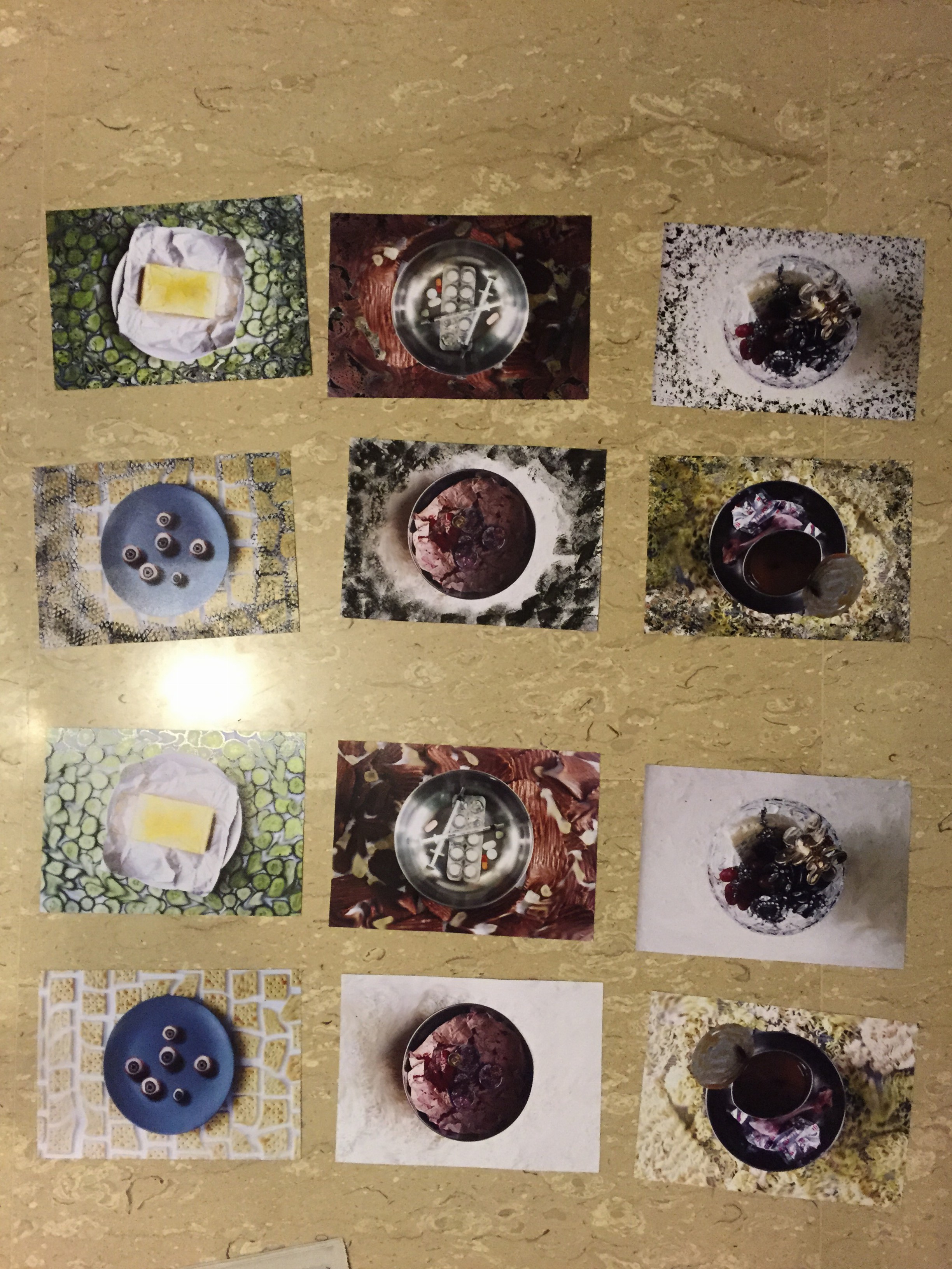
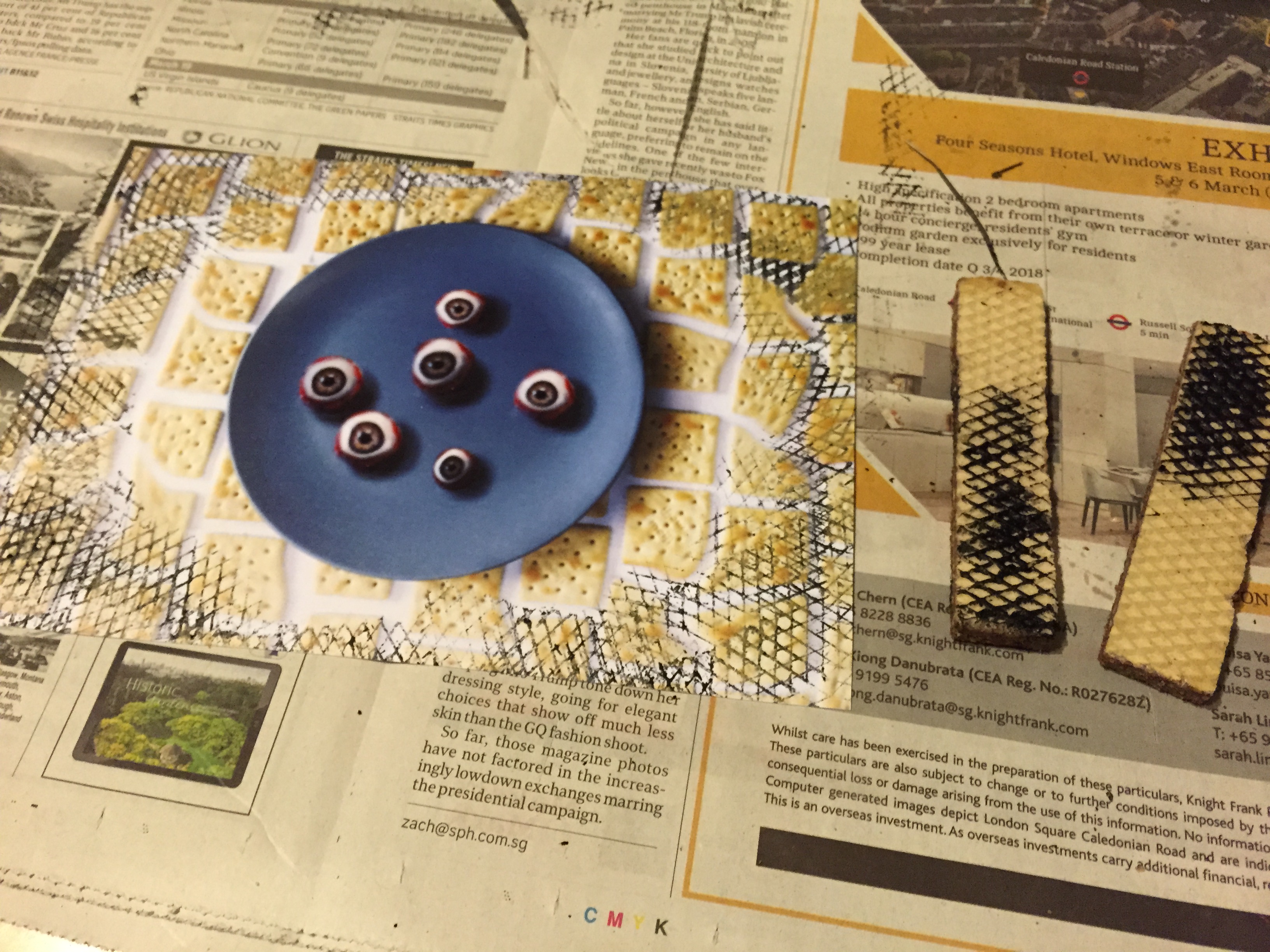
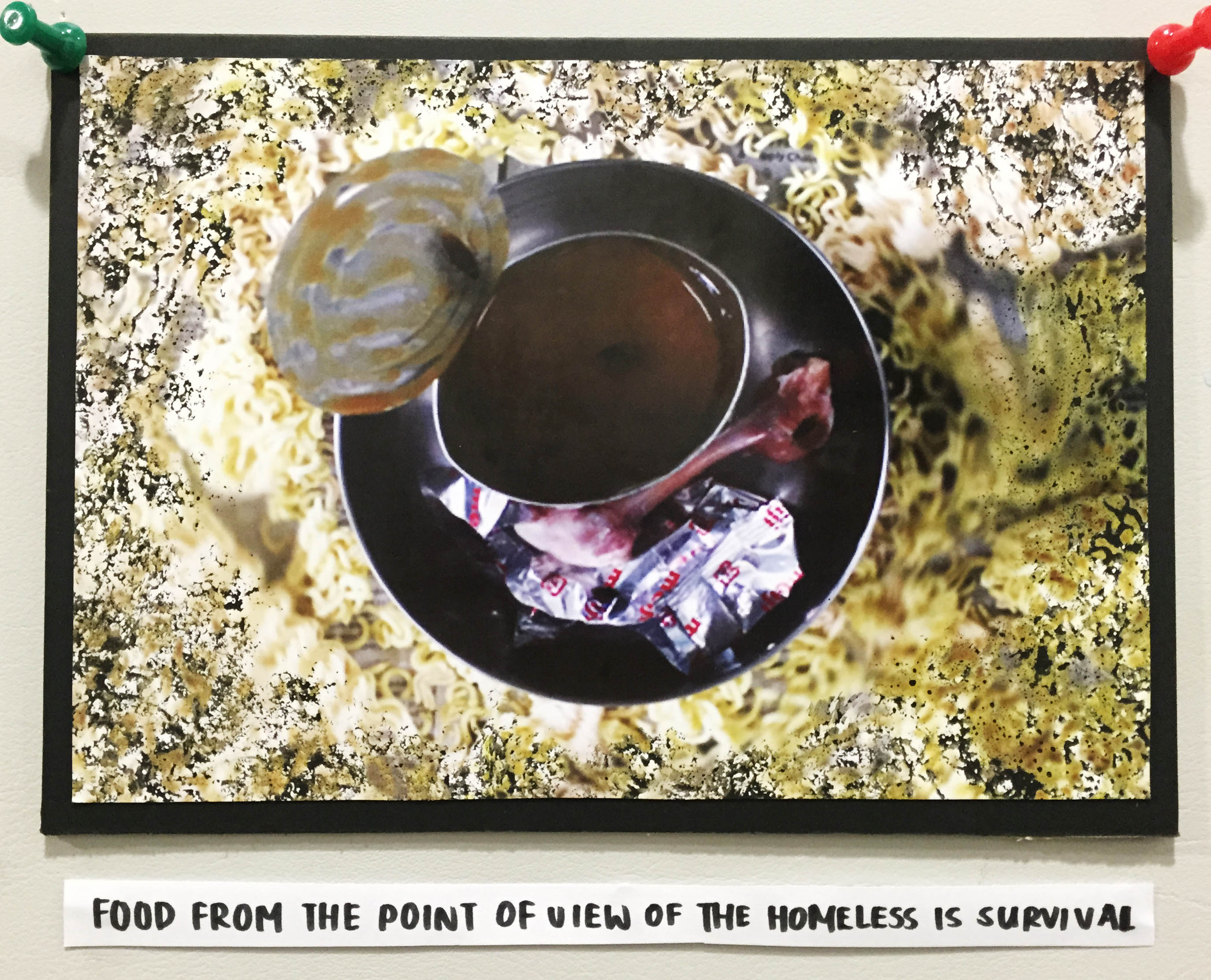
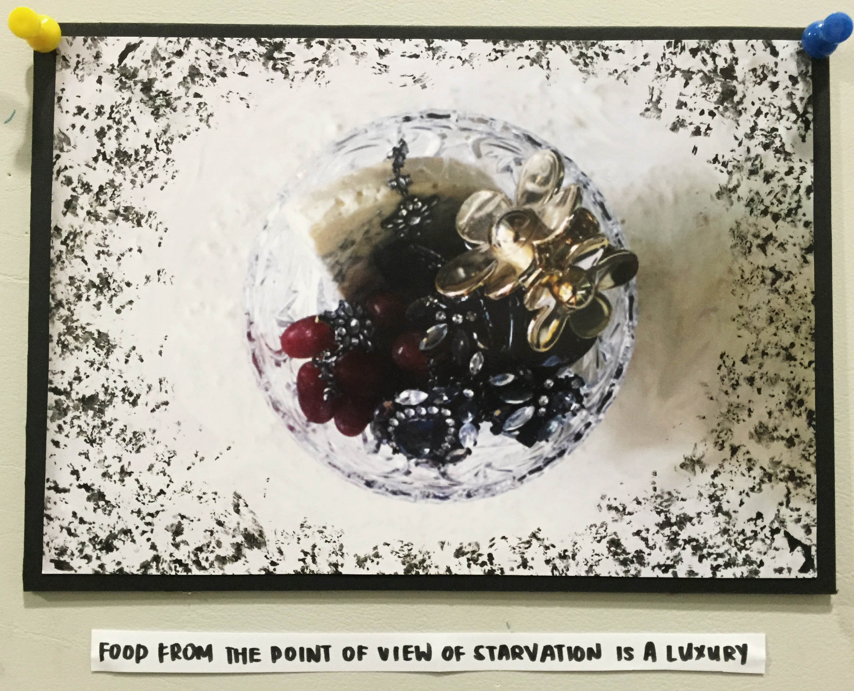
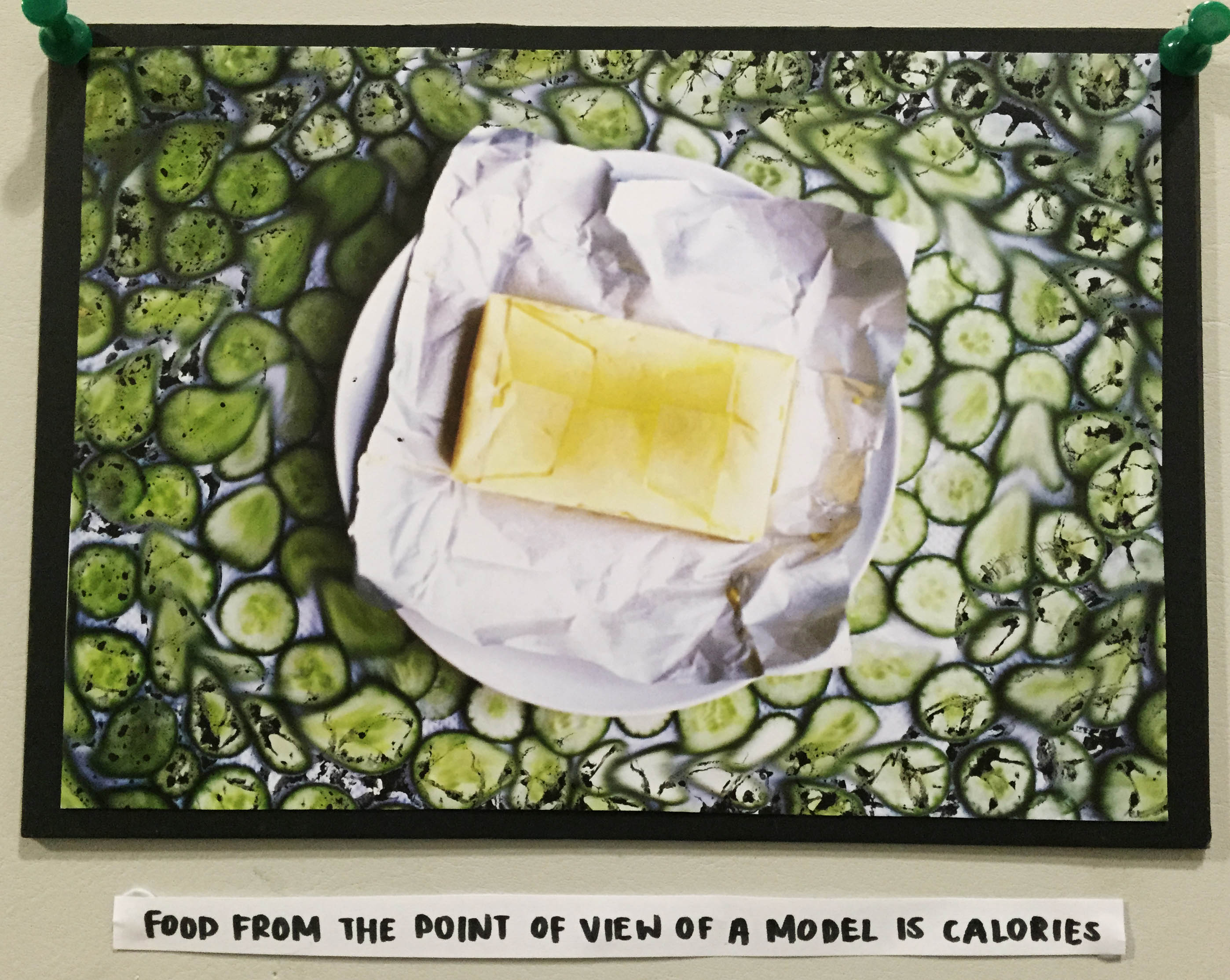
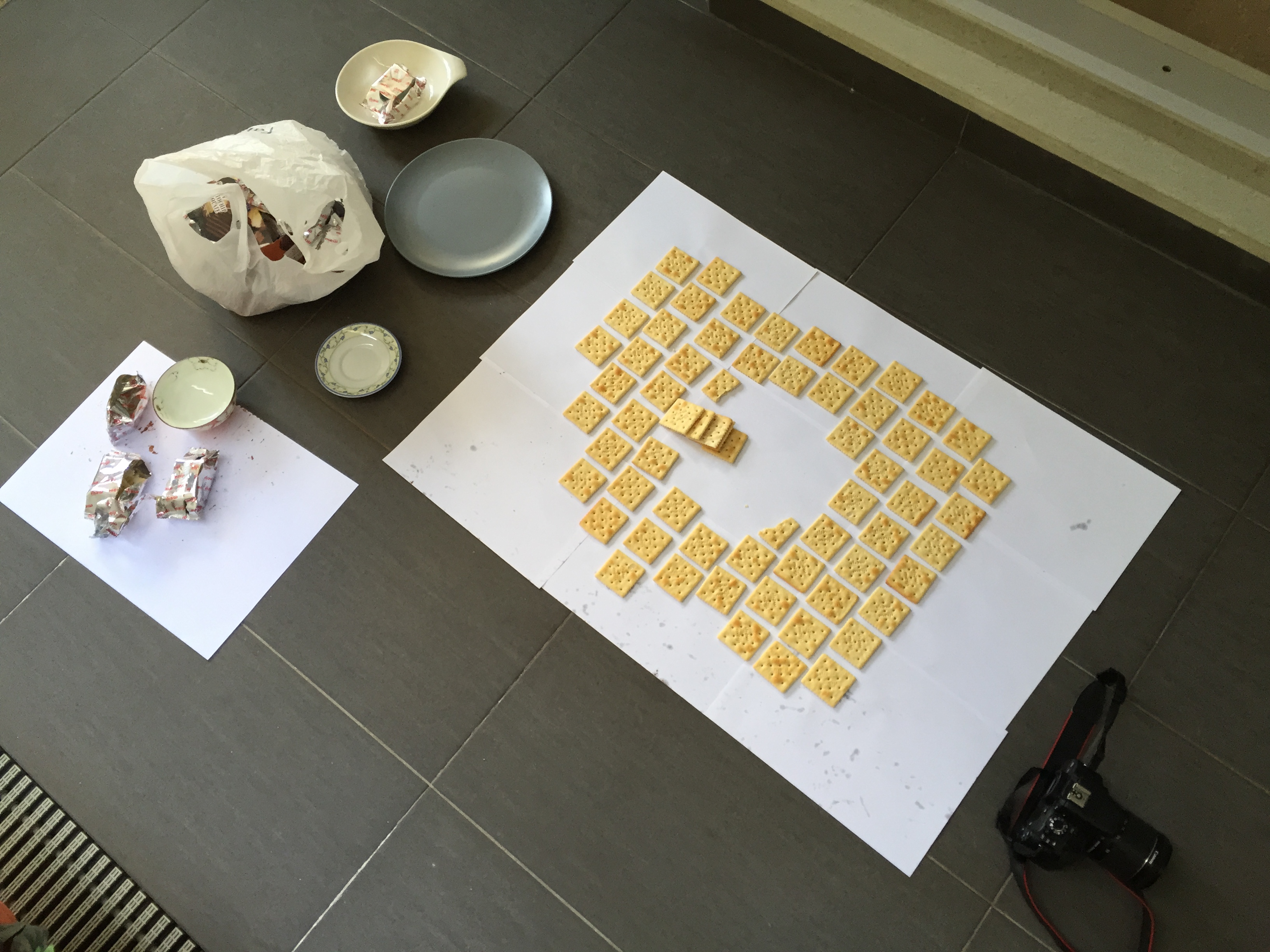
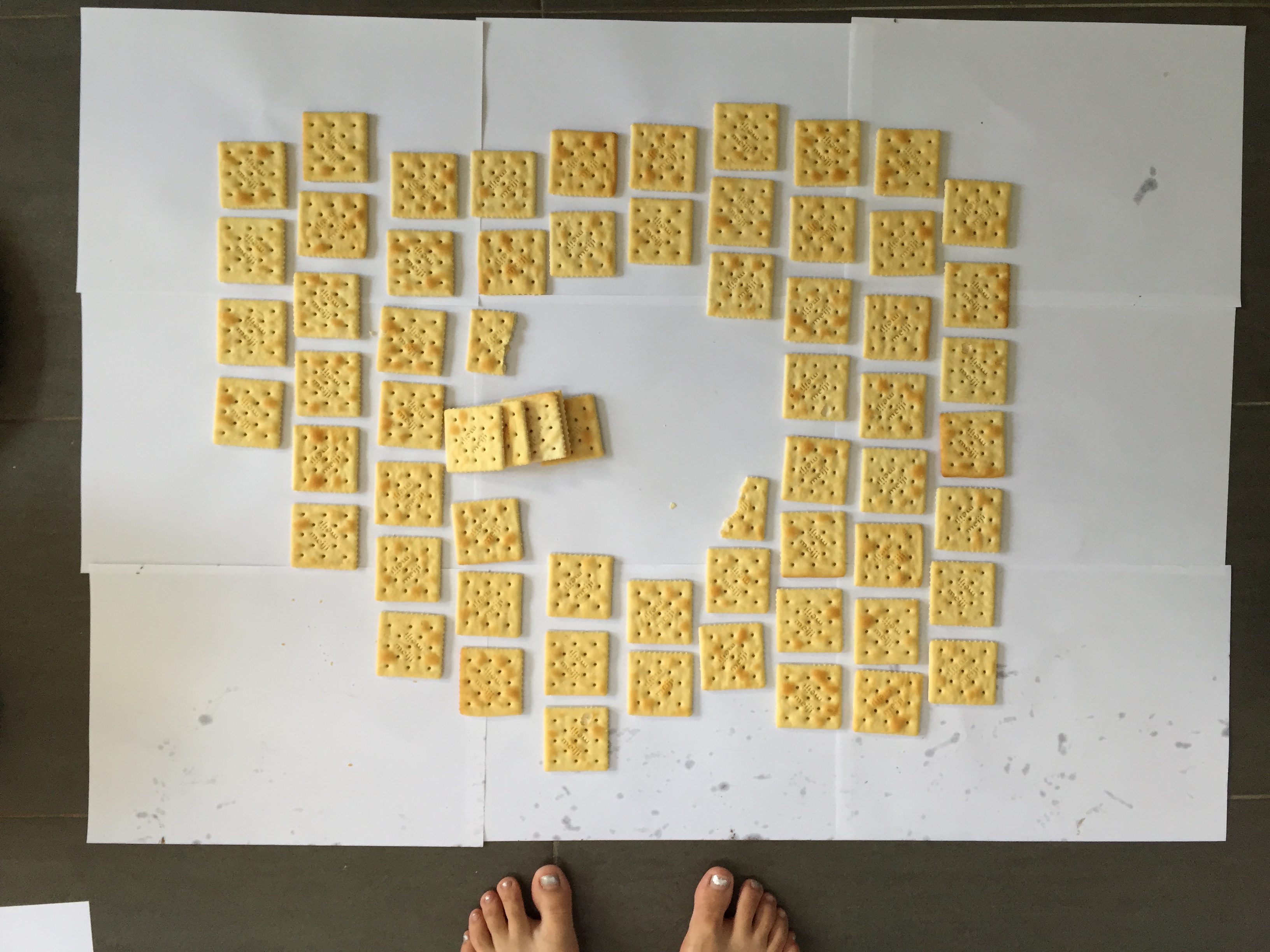
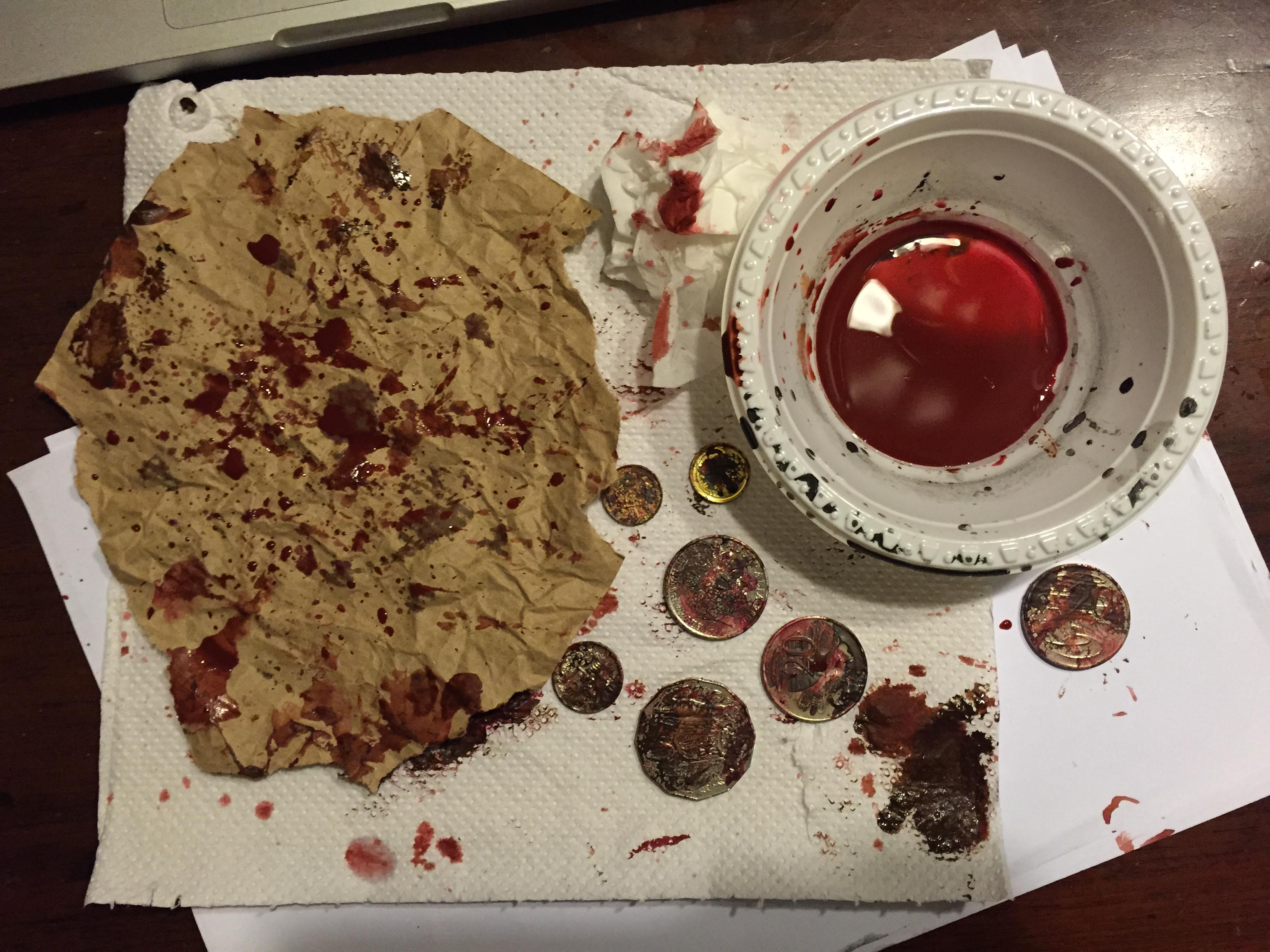
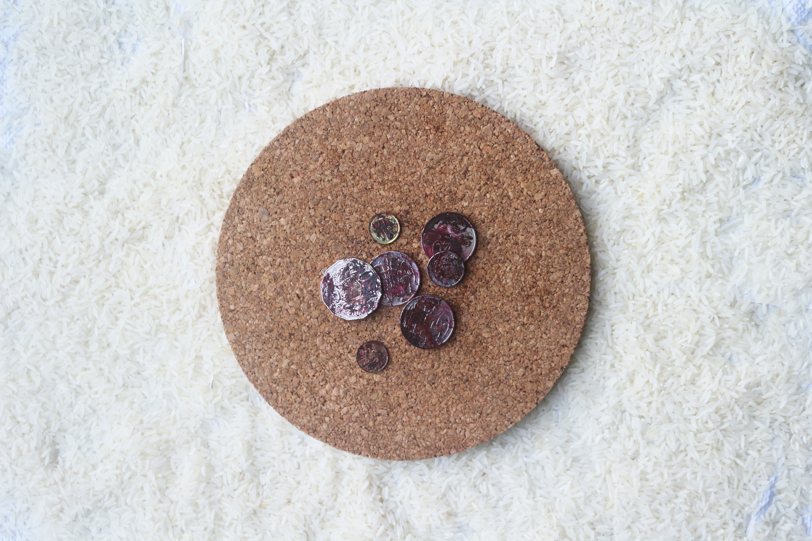
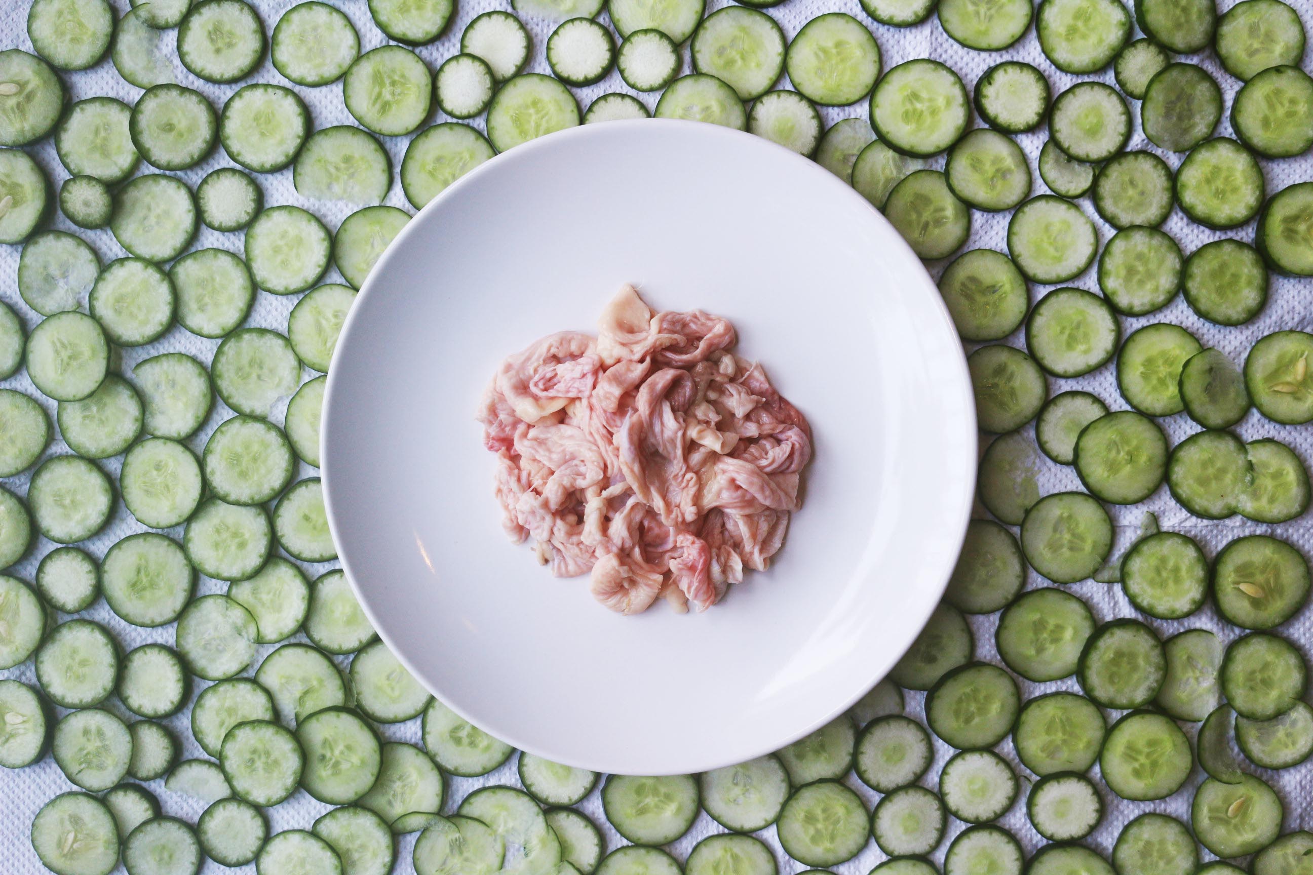
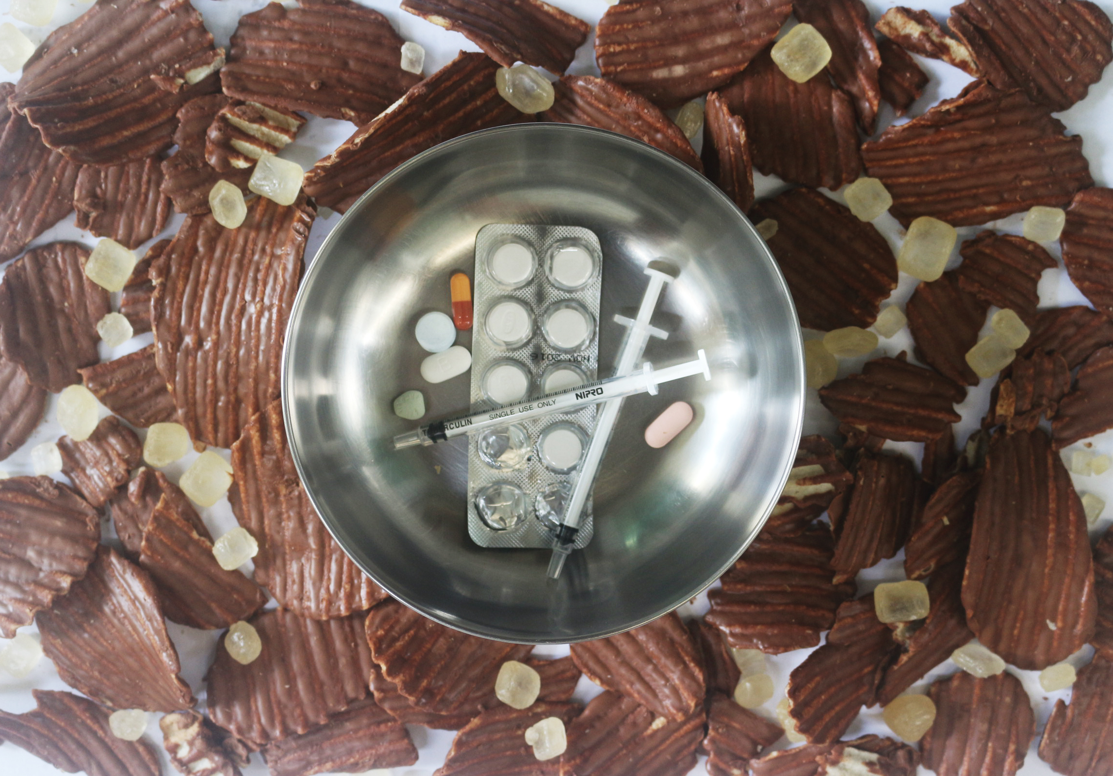
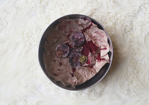
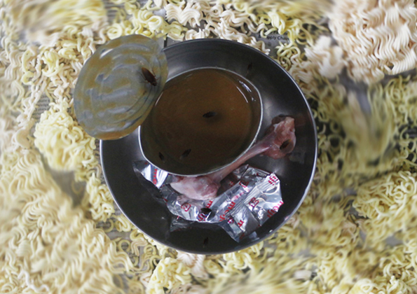
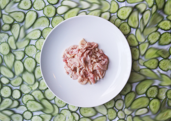
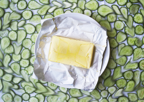
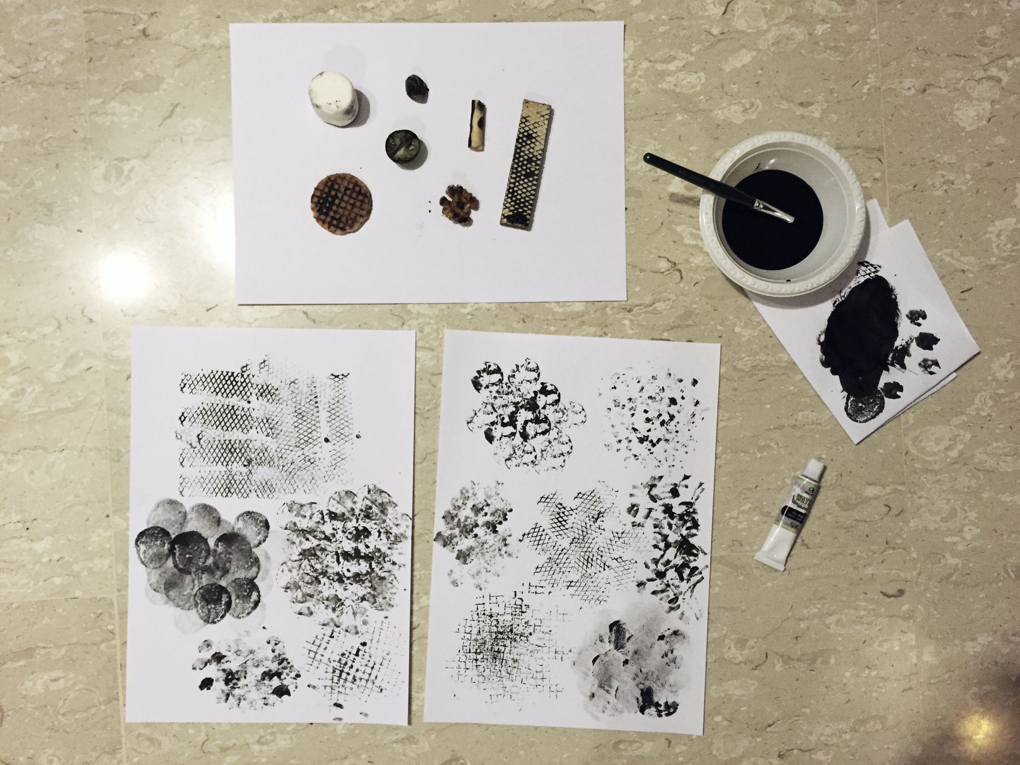
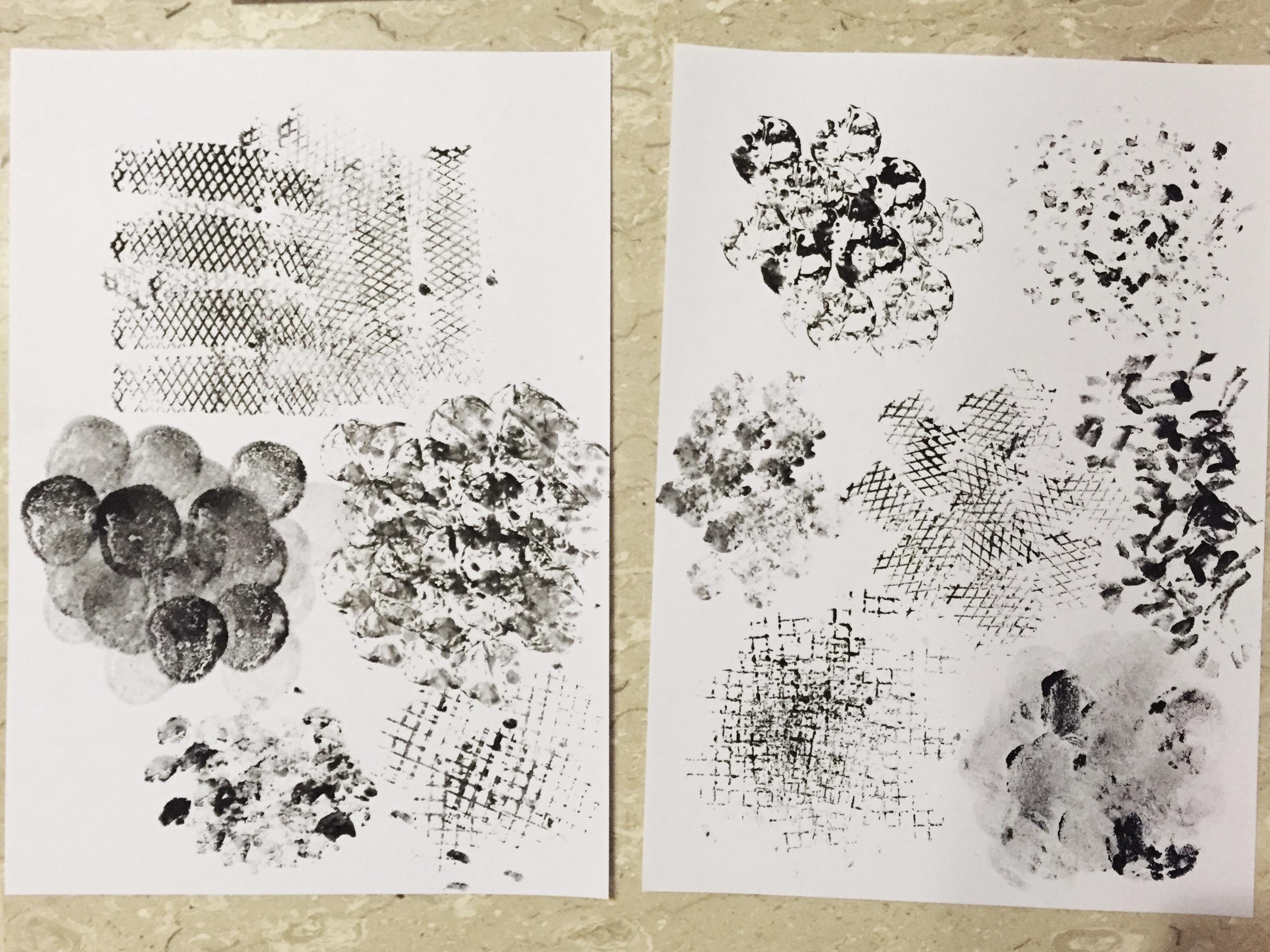
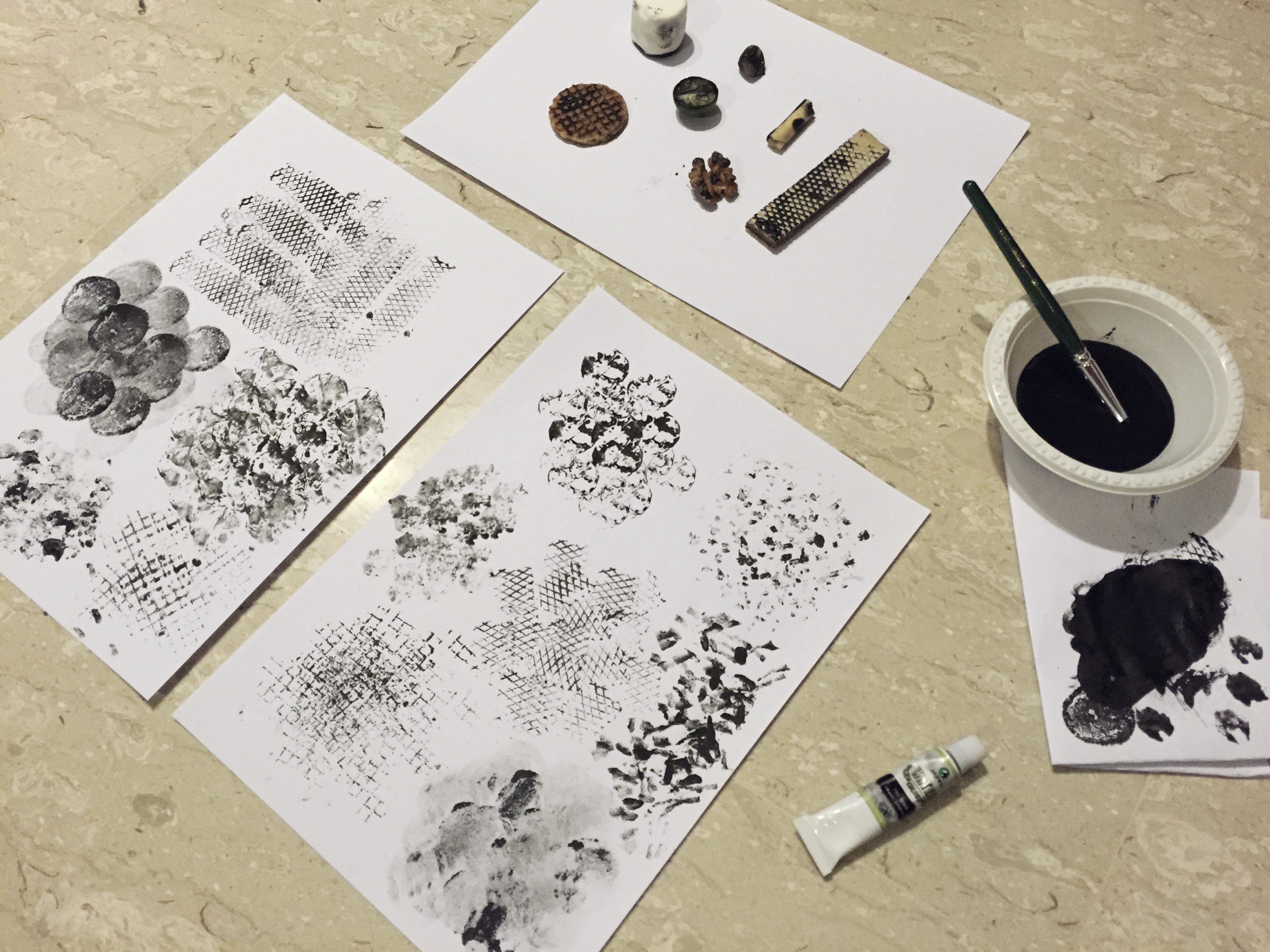
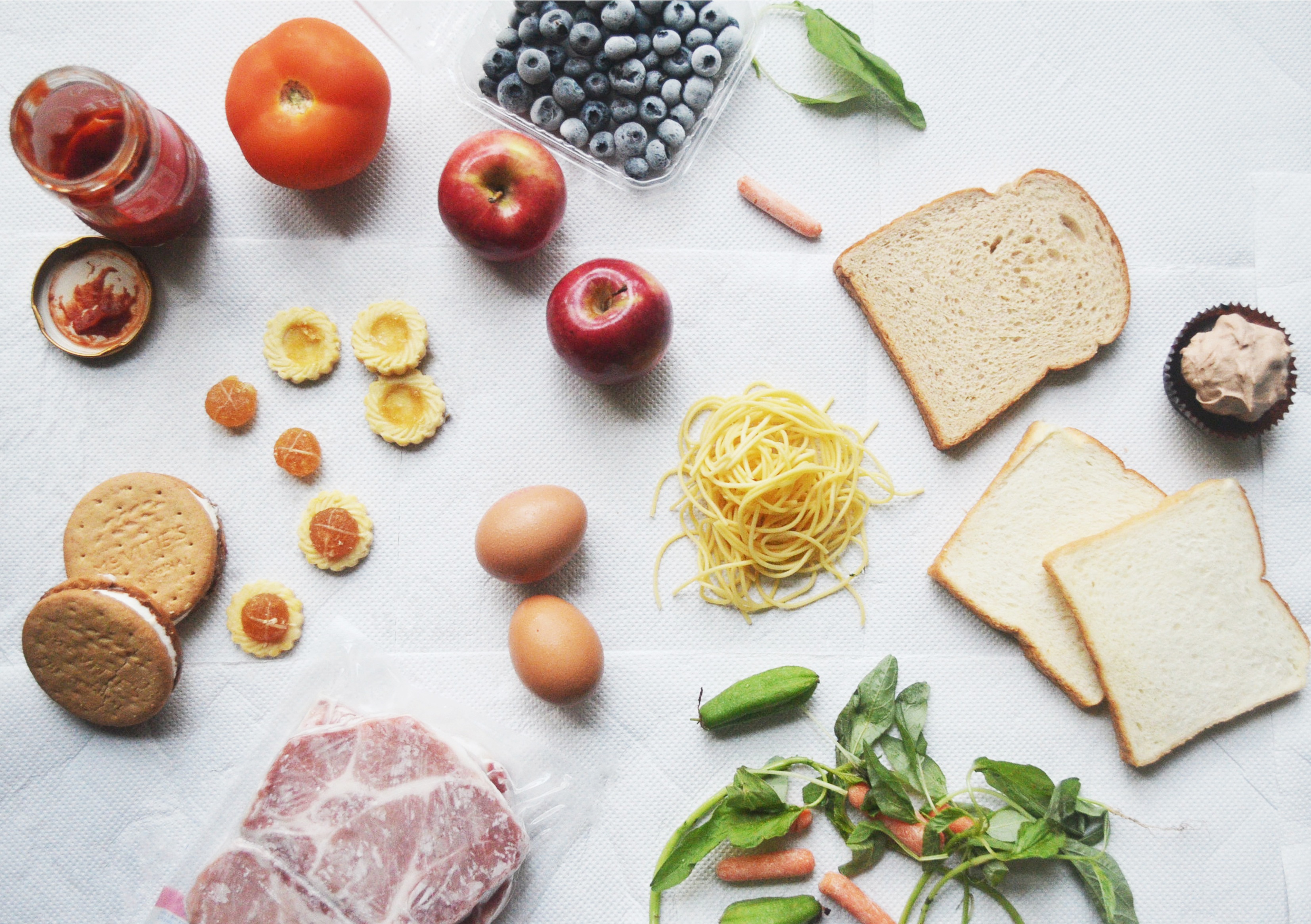
My concept was to show food wastage, using mould to symbolise decay on the ingredient that I don’t eat. I specifically chose to use basic items like bread and raw meat instead of fully cooked plates of food because to me, as long as a dish contains food that I don’t like, I’d rather not eat it, so the entire thing would be mouldy and cannot show the contrast.

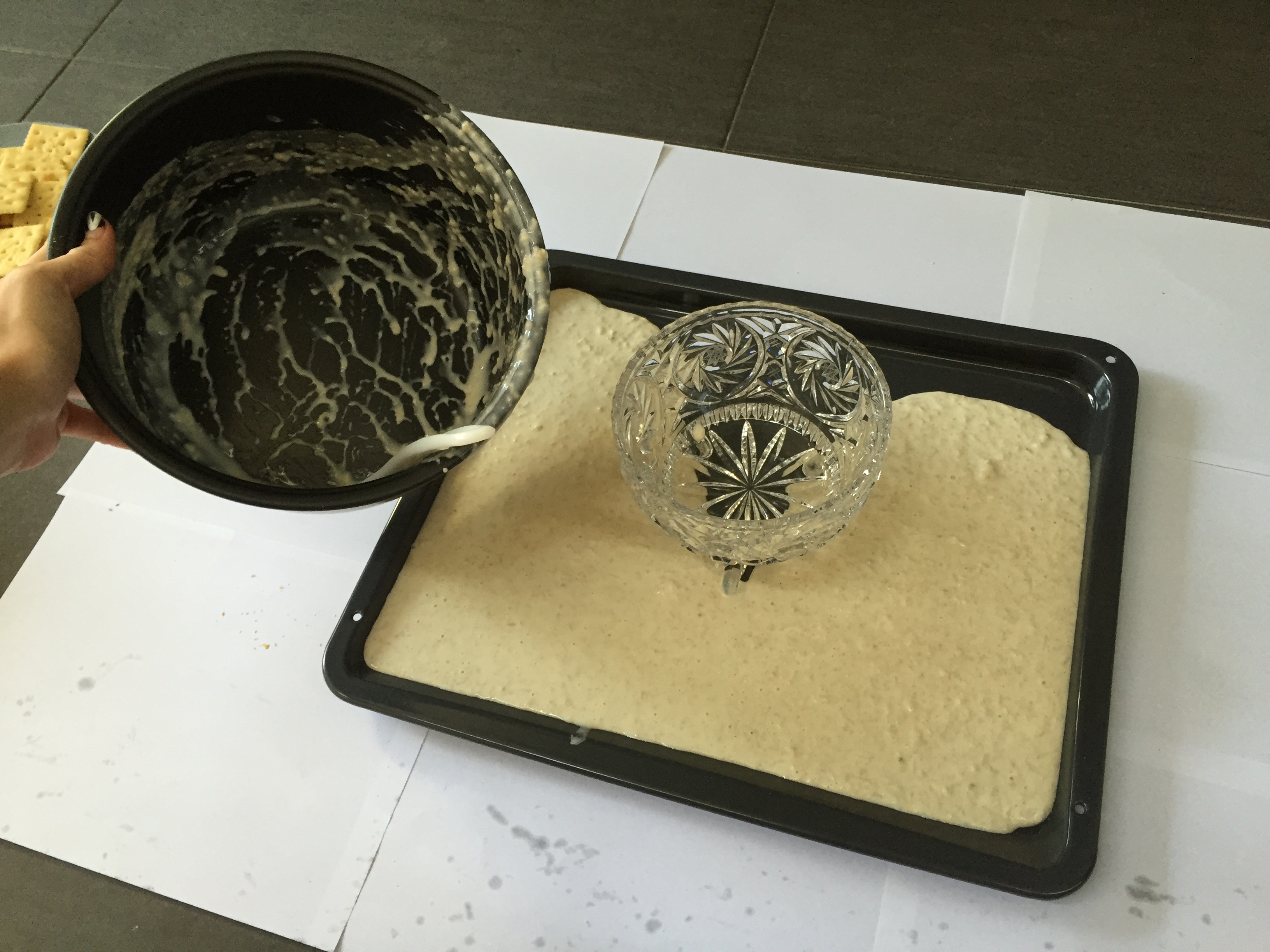
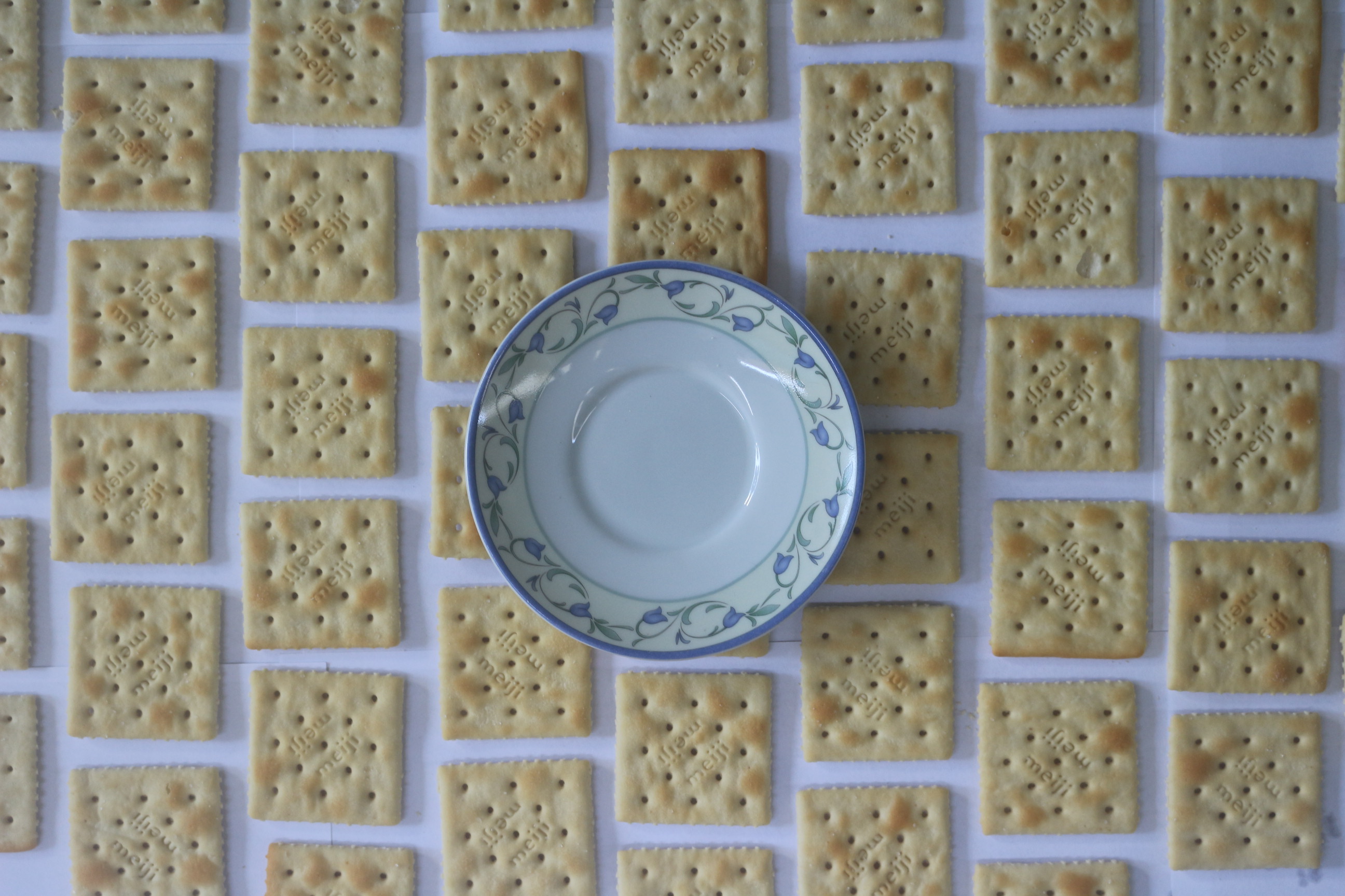
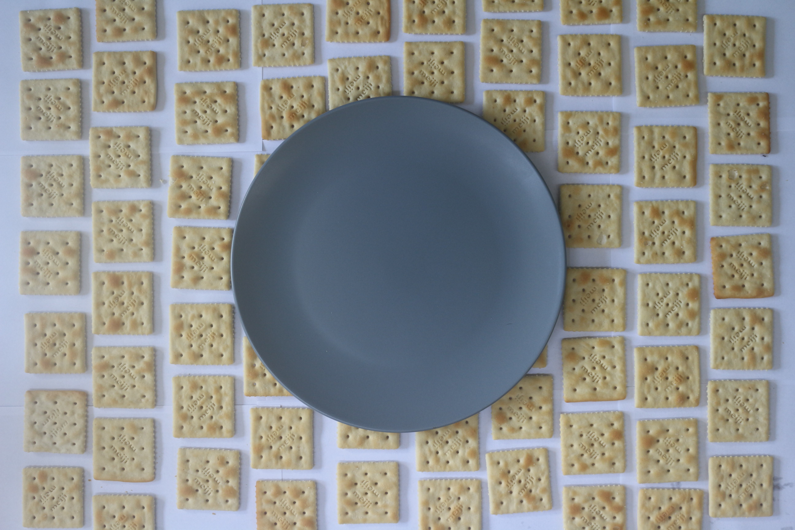
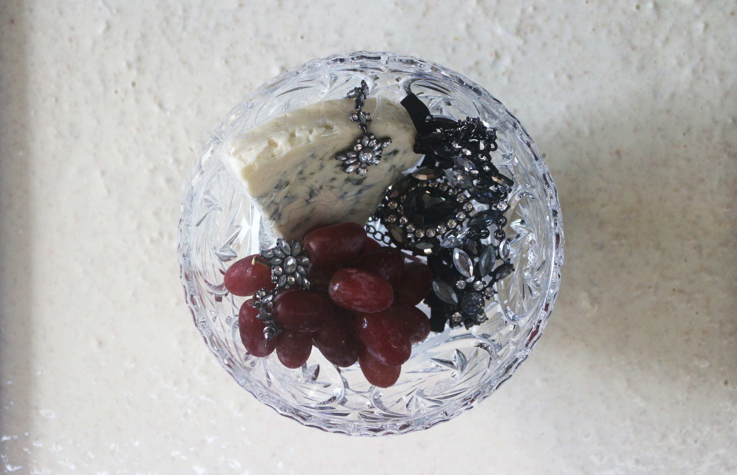
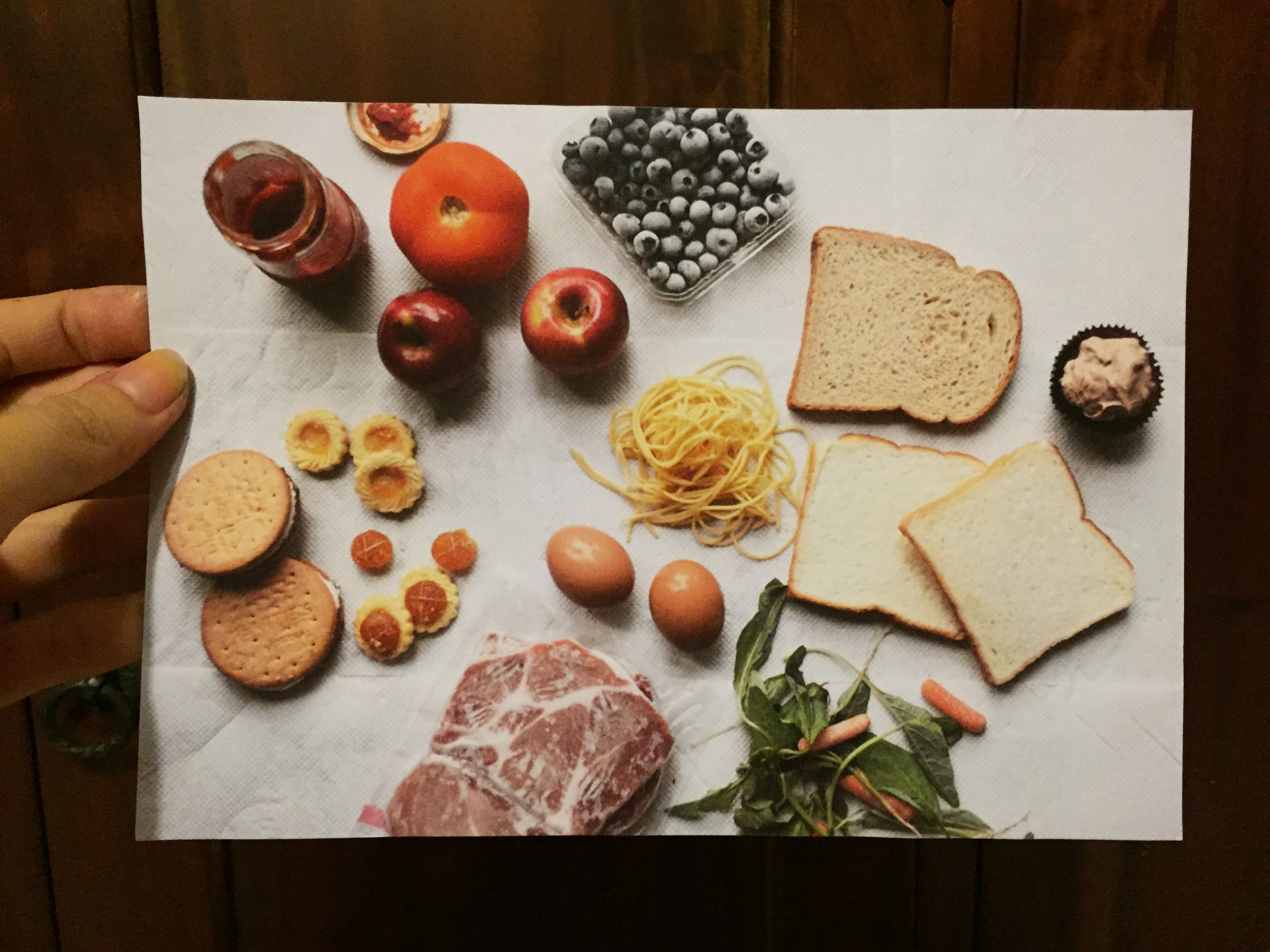
Here are some photos I took with the background set up:

Food 1 Food 2 Food 3

I used paper towels as a makeshift background to give it a little more texture, and because it’s a medium that is related to the kitchen. I decided to go with the last photo because I feel it’s more compositionally pleasing and organised, and shows the slight grouping of food groups – carbohydrates, vegetables, proteins, snacks and fruits (in a clockwise direction), without making the separation too obvious.

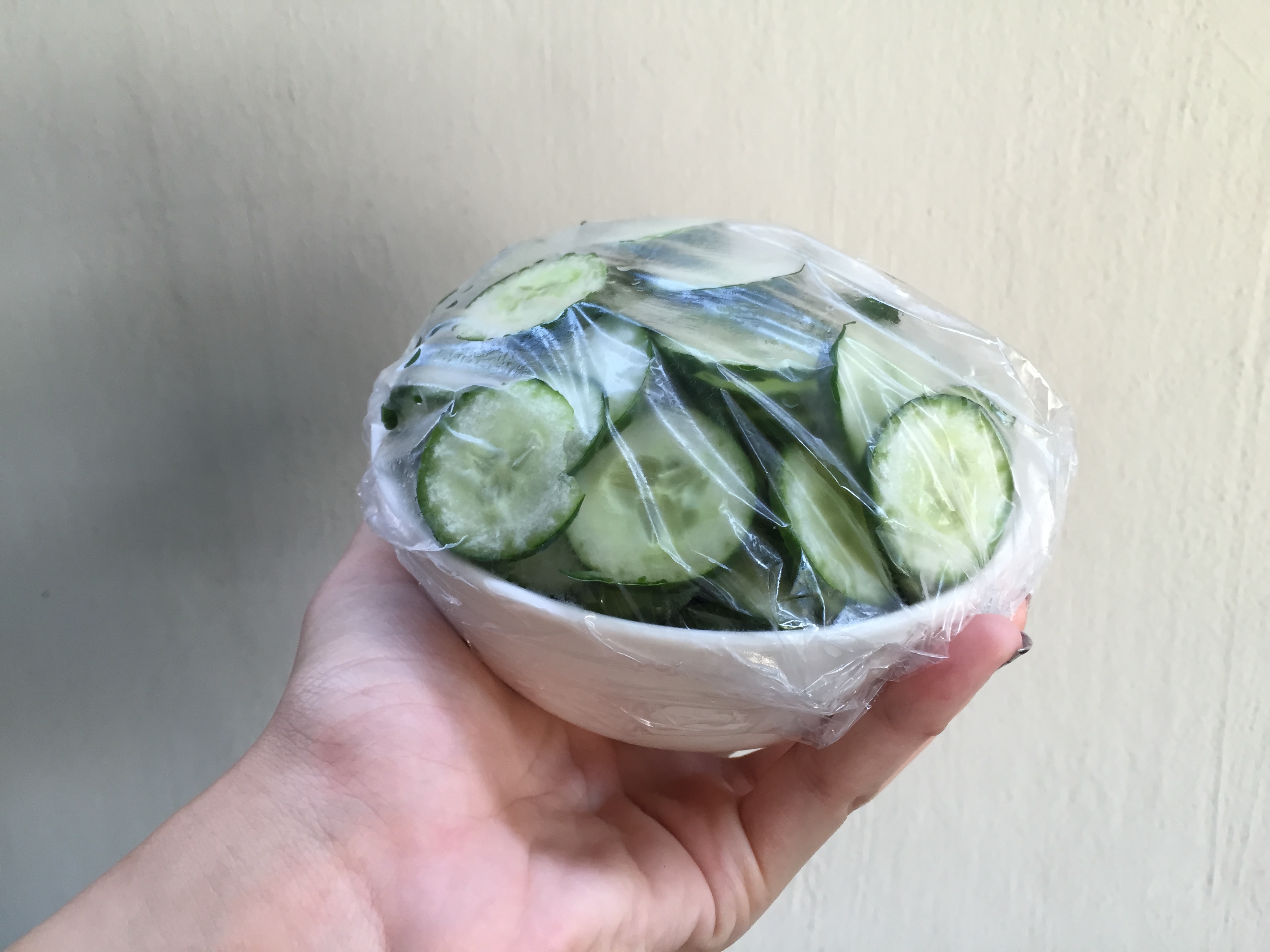
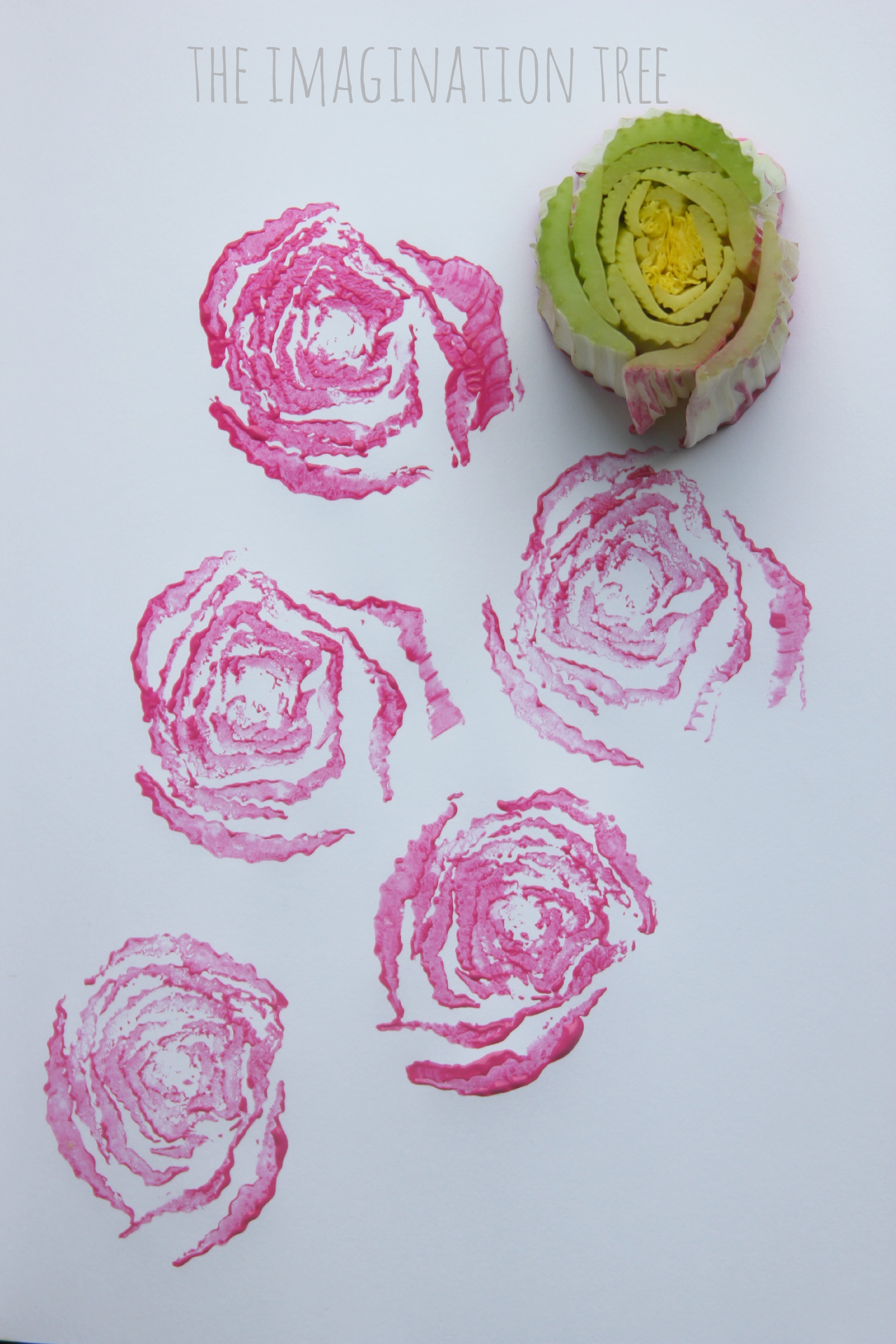
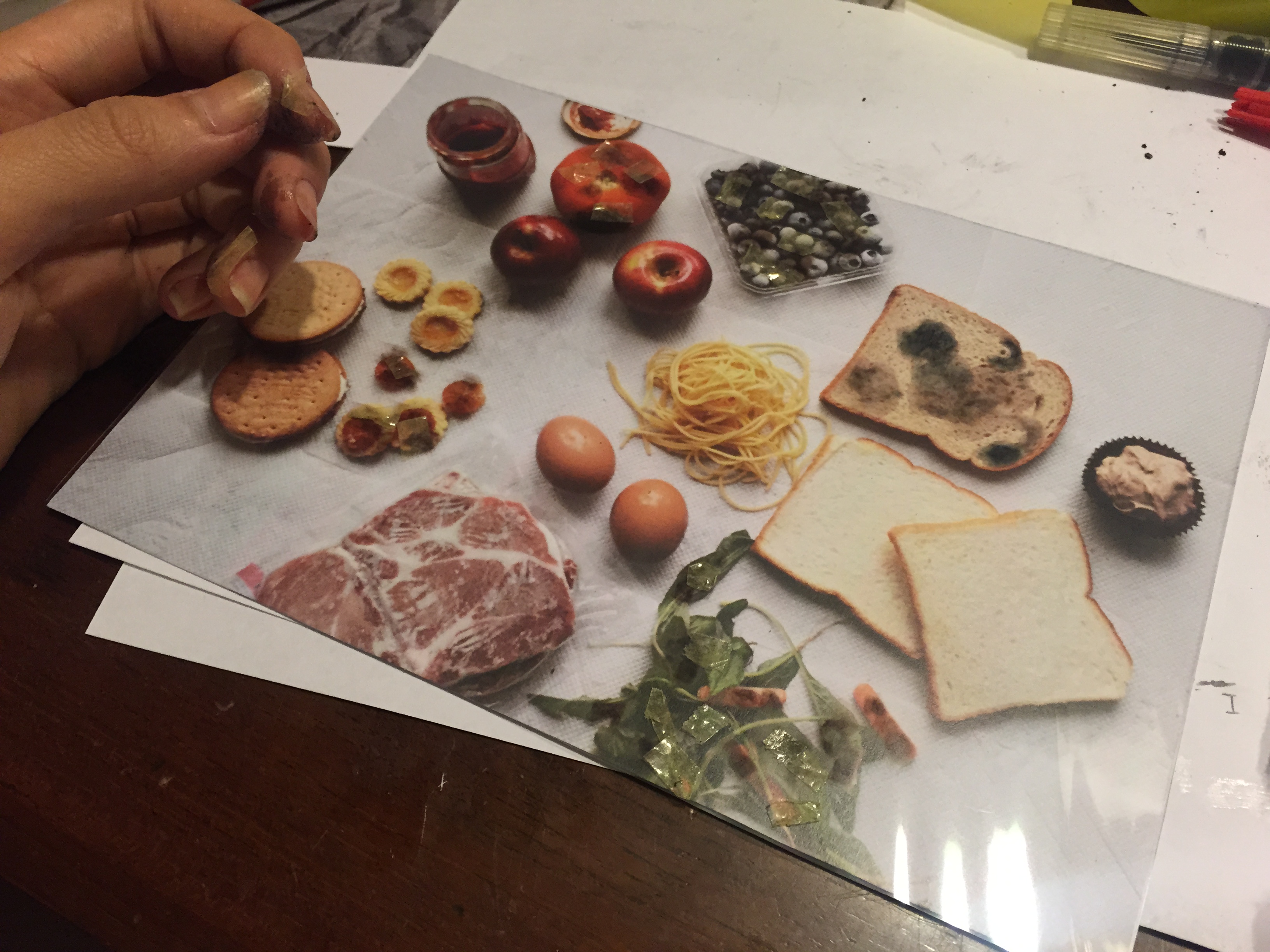
I digitally manipulated the mould effect on each of the food products I don’t eat, which was printed on a transparency to act as an overlay-ish effect, as shown below. Even then, I felt it was still inadequate to convey a rotting sort of feeling. So I used double sided tape to stick cotton bits on top of the photoshopped mould to give it a further fuzzy effect.
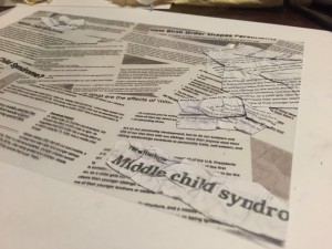
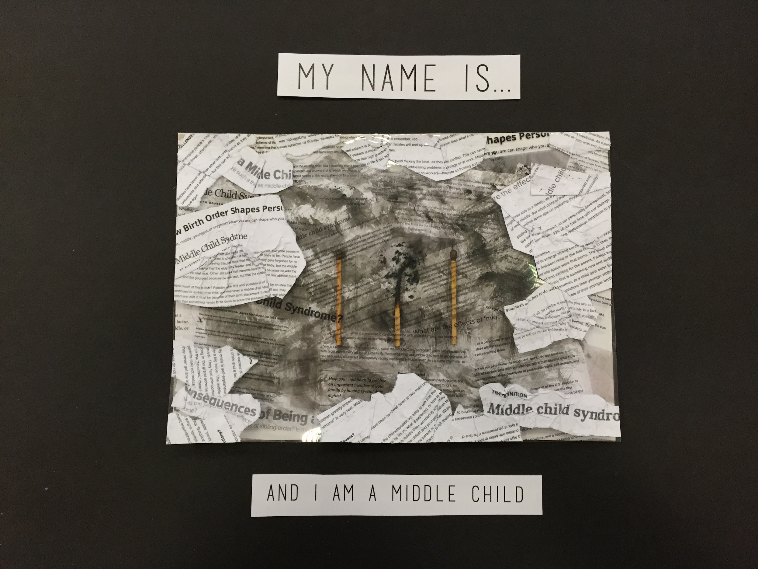
IMG_2587IMG_2590 Mould ForegroundIMG_2604IMG_2597


MIDDLE CHILD:

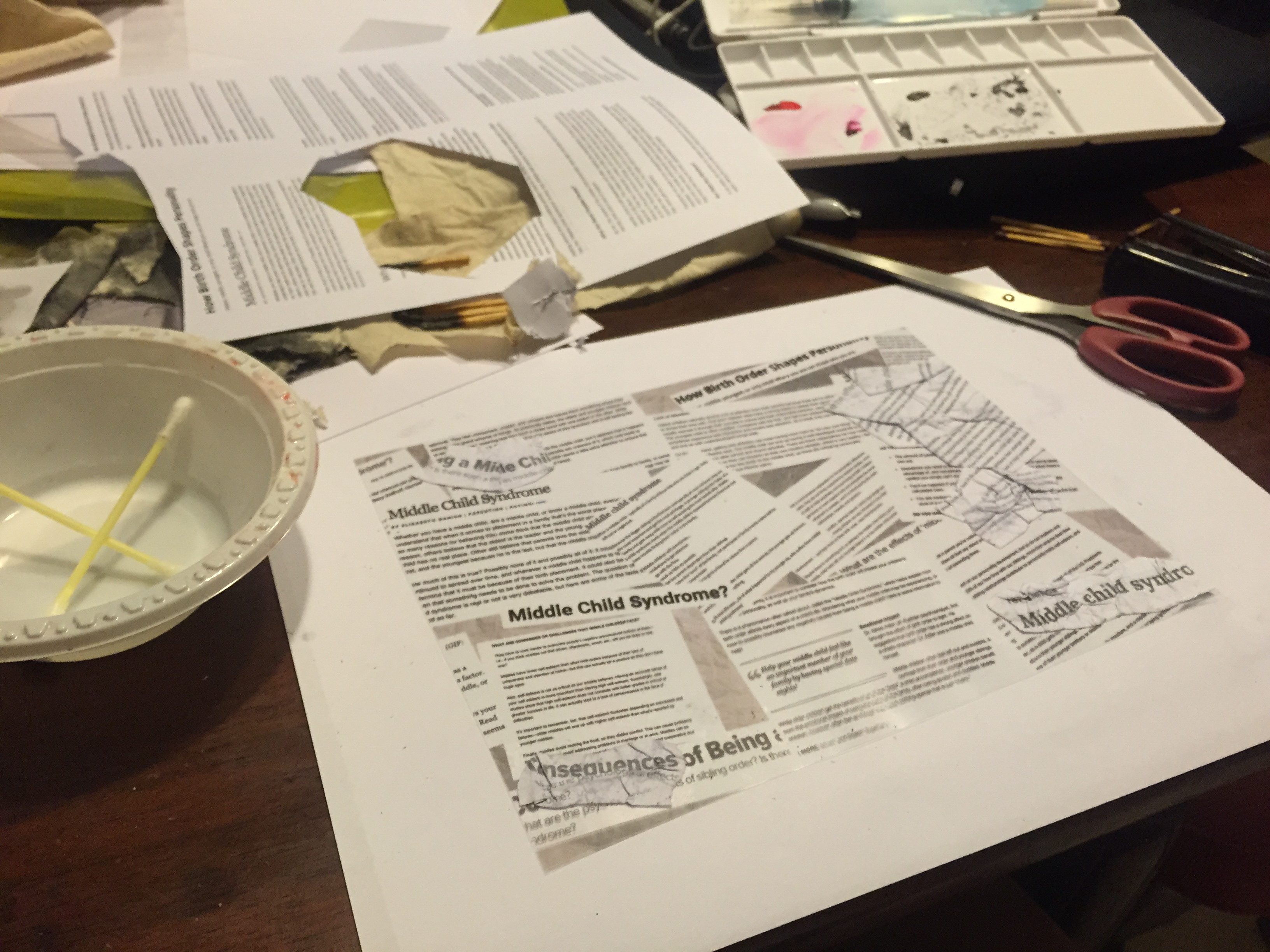
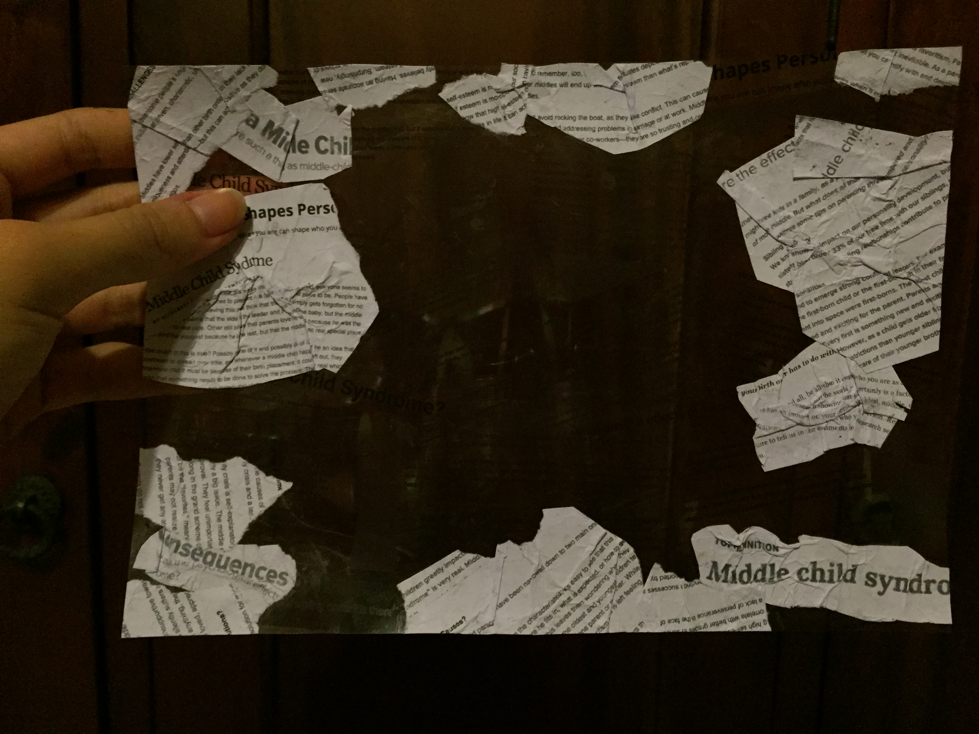
While doing some research on Middle Child Syndrome, I saved some articles, which came in useful after that because I printed those out and used them as a 3D medium for the transparency. I wanted each of my pieces to have certain aspects of digital work as well as experimentation with other physical materials.

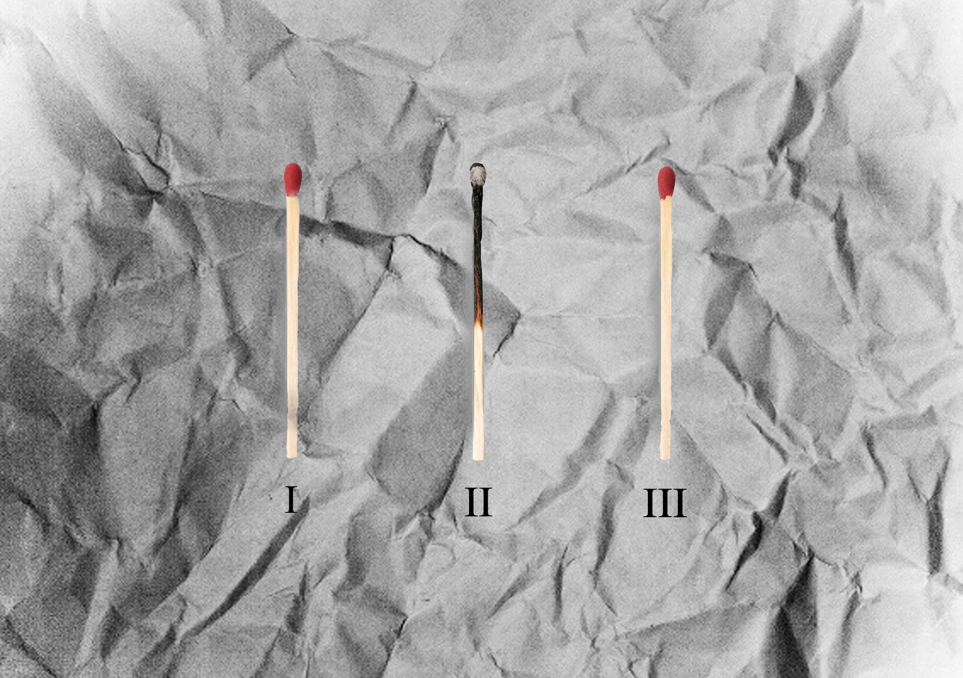
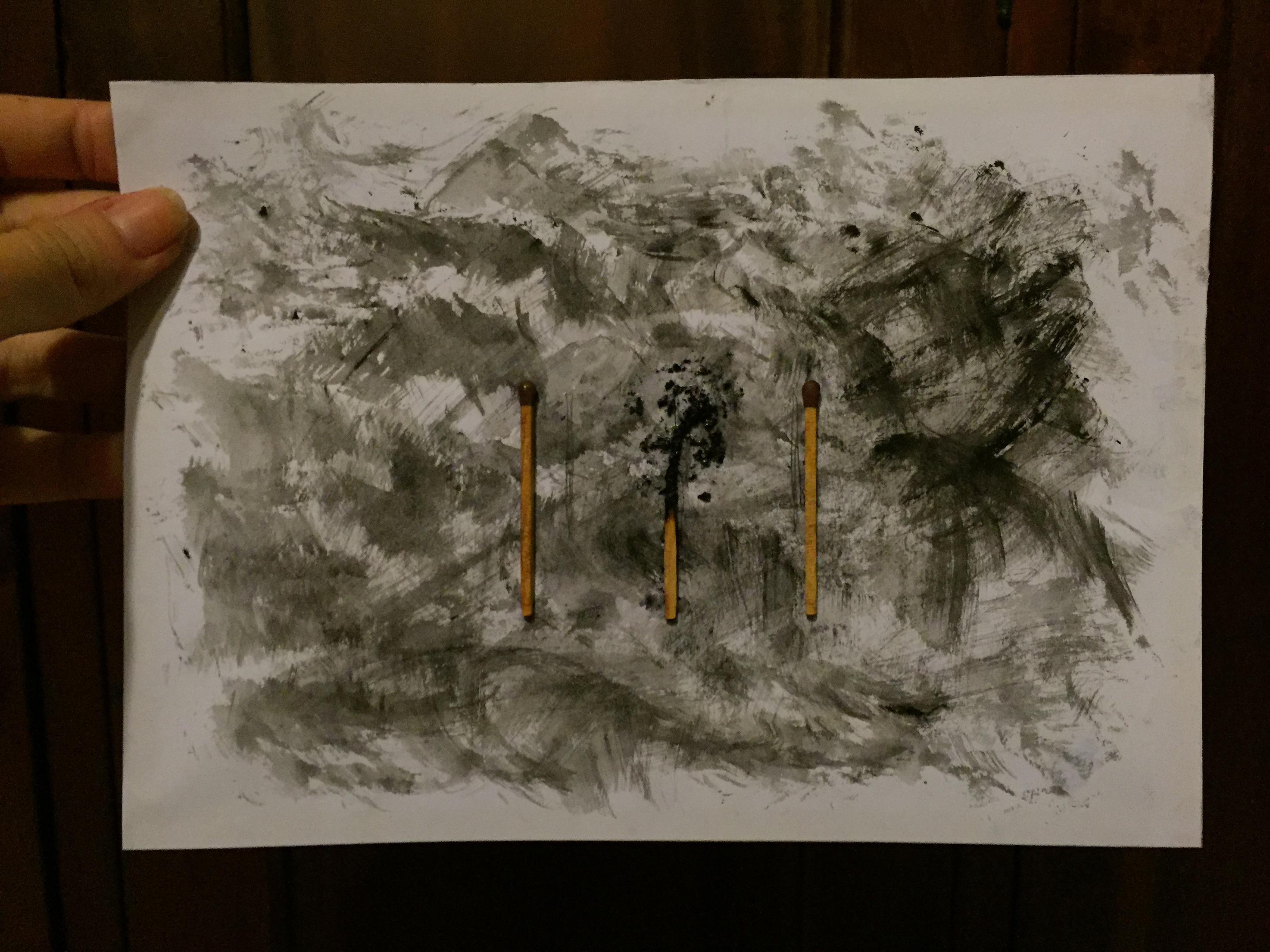
I started by digitally creating a background of three matchsticks lined up, but they were like legit ugly hahaha. I’ll just put them below to show the process!

Matchsticks Matchsticks 2nd editionI was not kidding when I said they were ugly ):

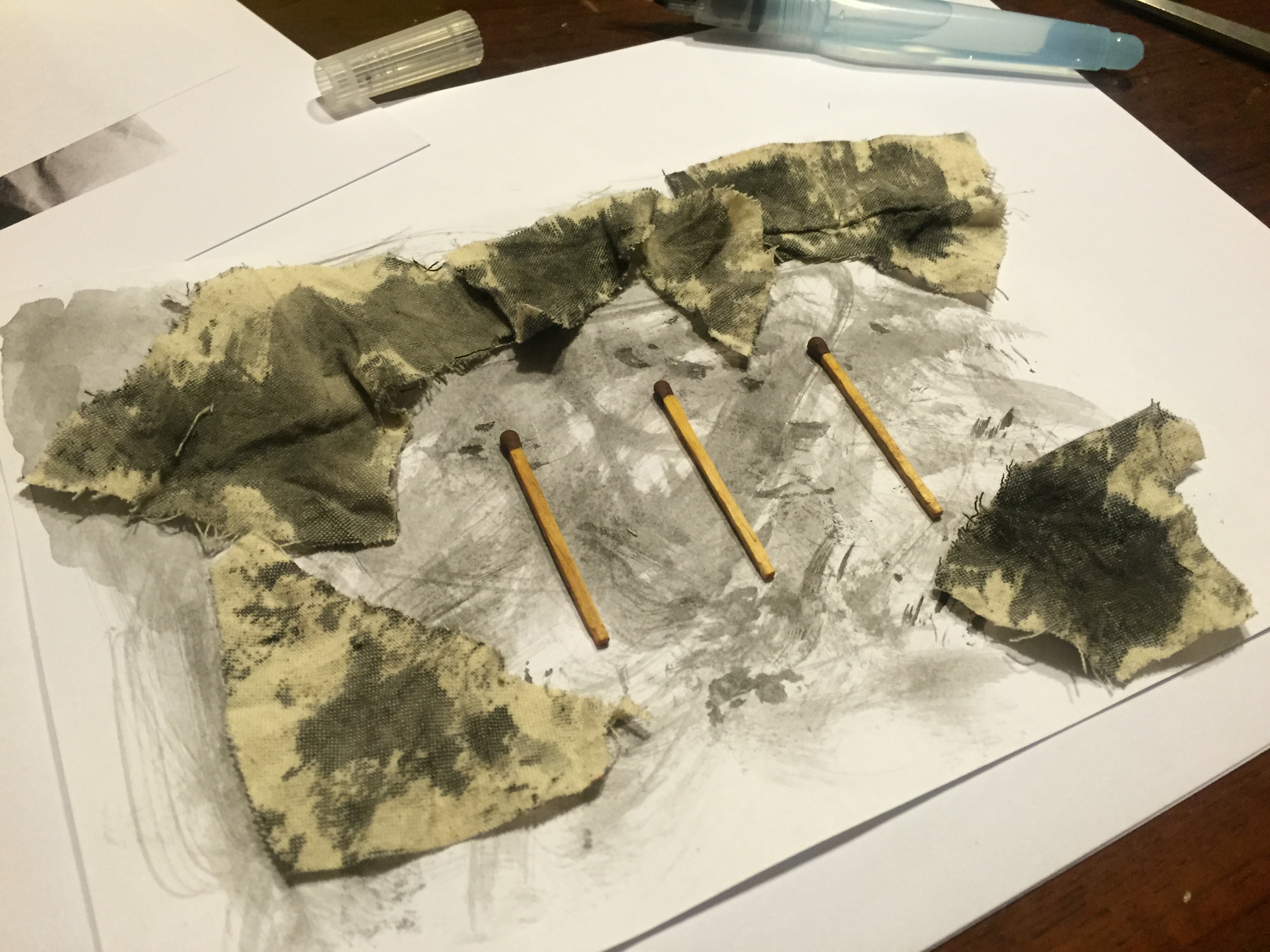
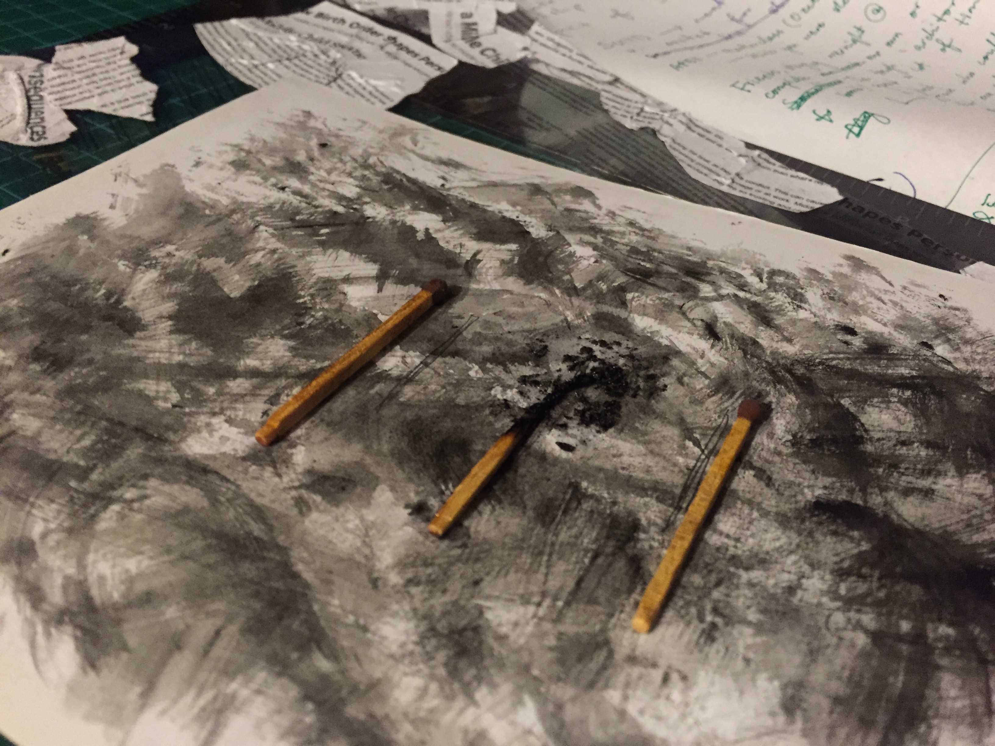
But anyway, feeling very unsatisfied with that, I decided to use real matchsticks and stick them on instead. It was initially very hard to get a visually attractive burnt matchstick without it crumbling away. They were either not burnt enough, or burnt too much that they disintegrated. So I used lit up a box and shortlisted the nicer matchsticks. My other issue was sticking the matchstick to the paper itself because if I only stuck the base, the top burnt bit it would crack up and turn to soot. So I used super glue as a coating to retain the burnt part’s shape, and use the charred pieces from the other test matchsticks and superglued that on too, to give it more effect.

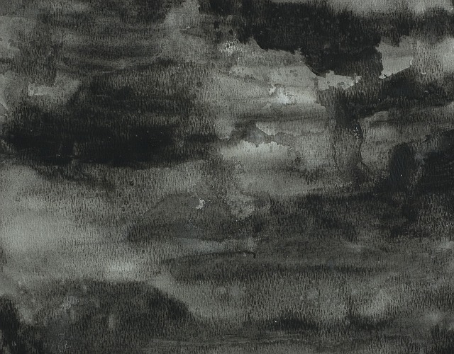
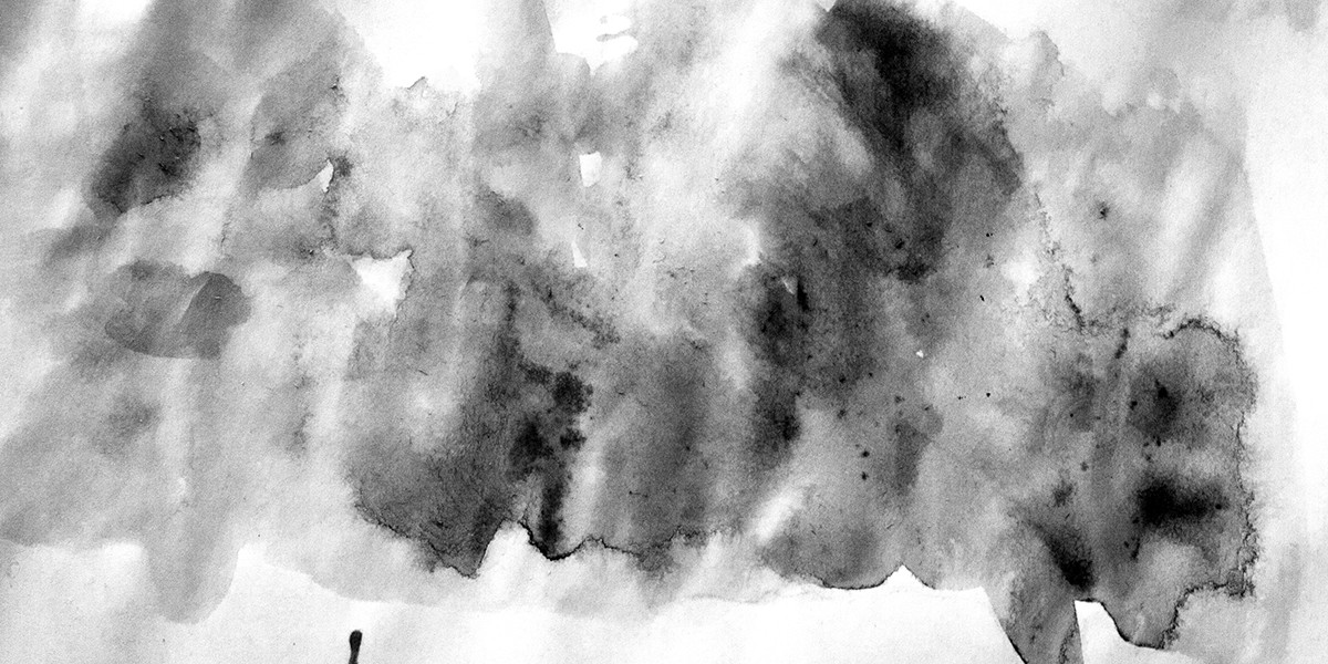
I wanted to further create a negative sort of atmosphere for this one, so I tried burning cloth and painting it with black watercolour to portray a burnt effect. That didn’t work out so well, so eventually I went with using the same cloth dipped in watercolour this time, and using that as a makeshift brush to create a scratchy texture.

IMG_2583IMG_2589

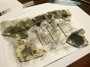
My final step was to paste the articles on the transparency, as mentioned above. I ripped and cut them up, and used white glue with water to stick them on, and created a border so the matchsticks would not be covered.

IMG_2585 IMG_2586 IMG_2601IMG_2599


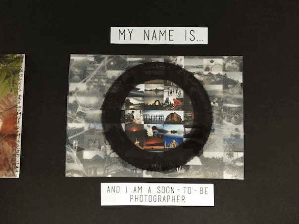
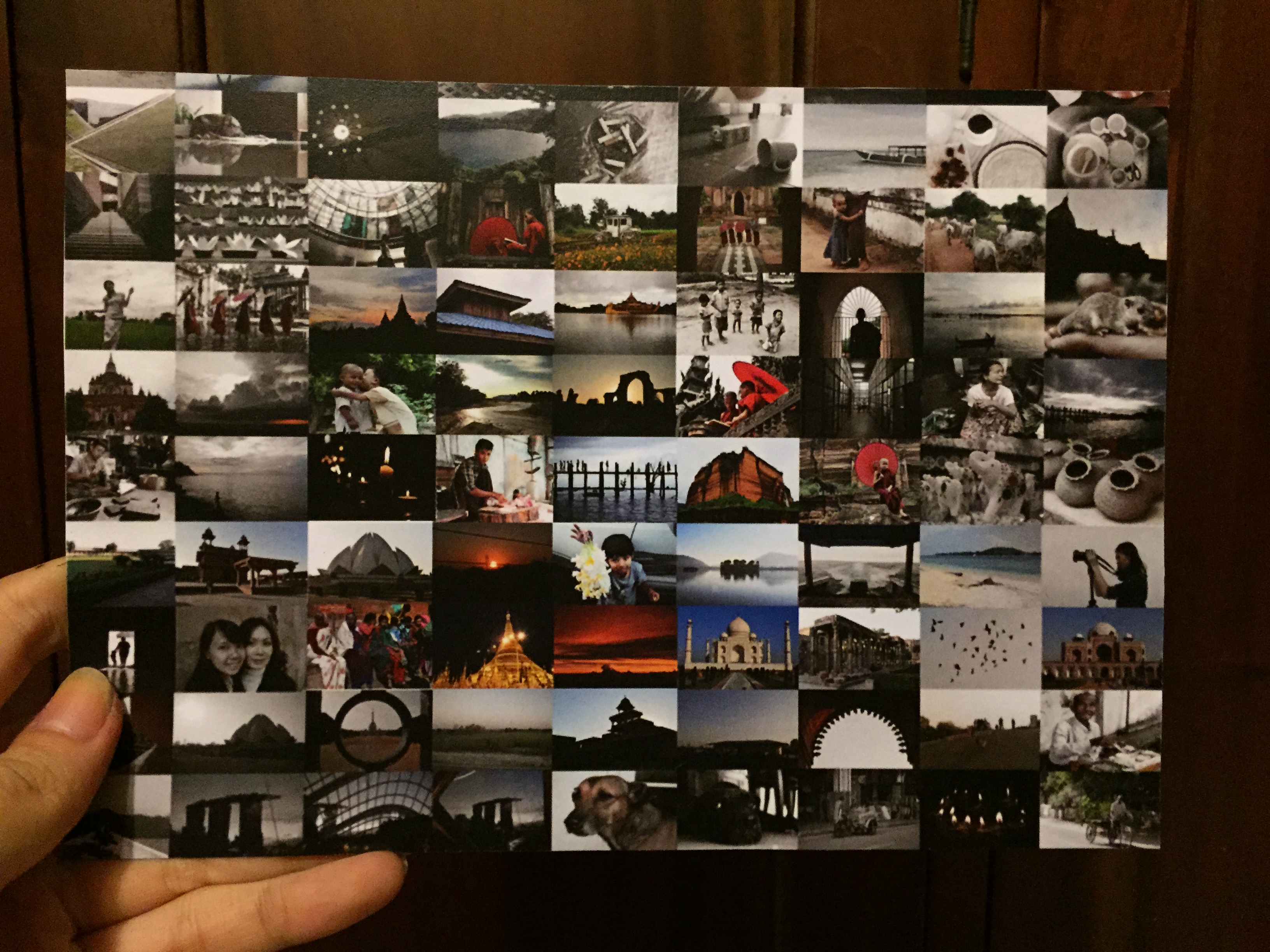
SOON-TO-BE PHOTOGRAPHER:

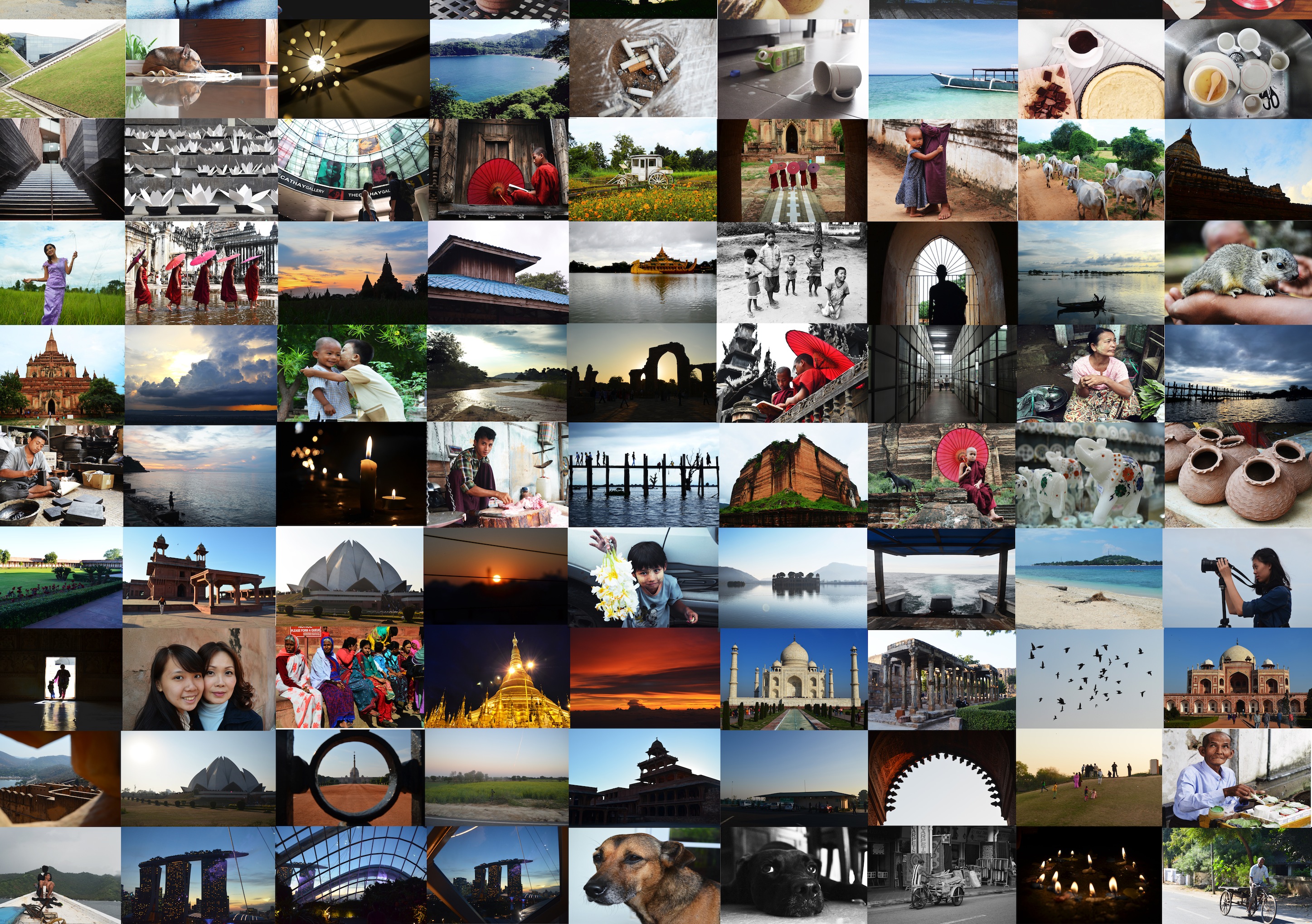
I started by creating a collage of photos from leisure outings or overseas photography trips, etc, that I’ve amassed from over the years since getting more involved in photography. I chose to do this piece because I think photography is a major aspect of my life, as it’s what I will probably be doing in the future. In addition, I also feel that photos have the ability to capture moments in a physical capsule that can be pulled out any time, and acts as a memory holder. When used correctly, it can mentally recreate moments, invoke a sort of feeling (maybe sentimentality, happiness or anger), and basically do what the human mind cannot: remember things clearly.

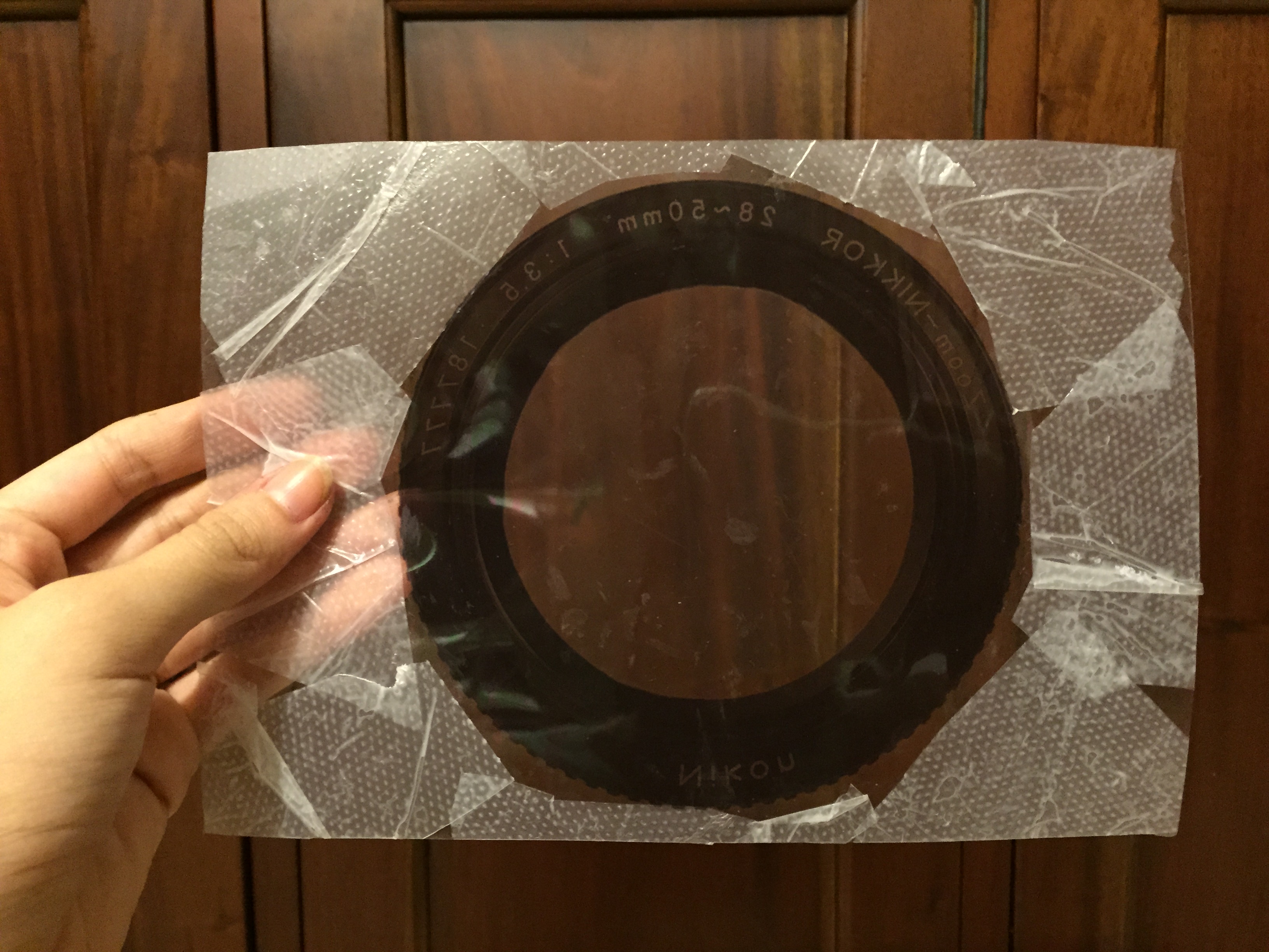
Therefore, I used photoshop tools to desaturate and blur out the photos that are outside of the lens that I printed on the transparency, to show that what is not captured in the camera will eventually become lost in the innumerable memories we hold in our minds. I also tried using a collage with smaller photos, but I felt that the one with larger photos was better because the photos could be seen more clearly, which conveyed the message more accurately.

Smaller photography PHOTO BACKGROUND - BEFORE DESATURATING DESATURATED PHOTOG BACKGROUND

I wanted to use translucent paper instead of transparent ones, but after searching a couple of printing shops, I could not find any of suitable opacity and thickness, so I went with transparencies instead (which is good because I feel like it worked out better this way actually woohoooooo). To further push my idea that moments are clearer through a camera, I used a textured plastic bags to cover the transparent parts, leaving only the lens area completely see through. The photos below show that, as well as an indication to demonstrate what the printed out and desaturated background looks like before they’re both assembled.
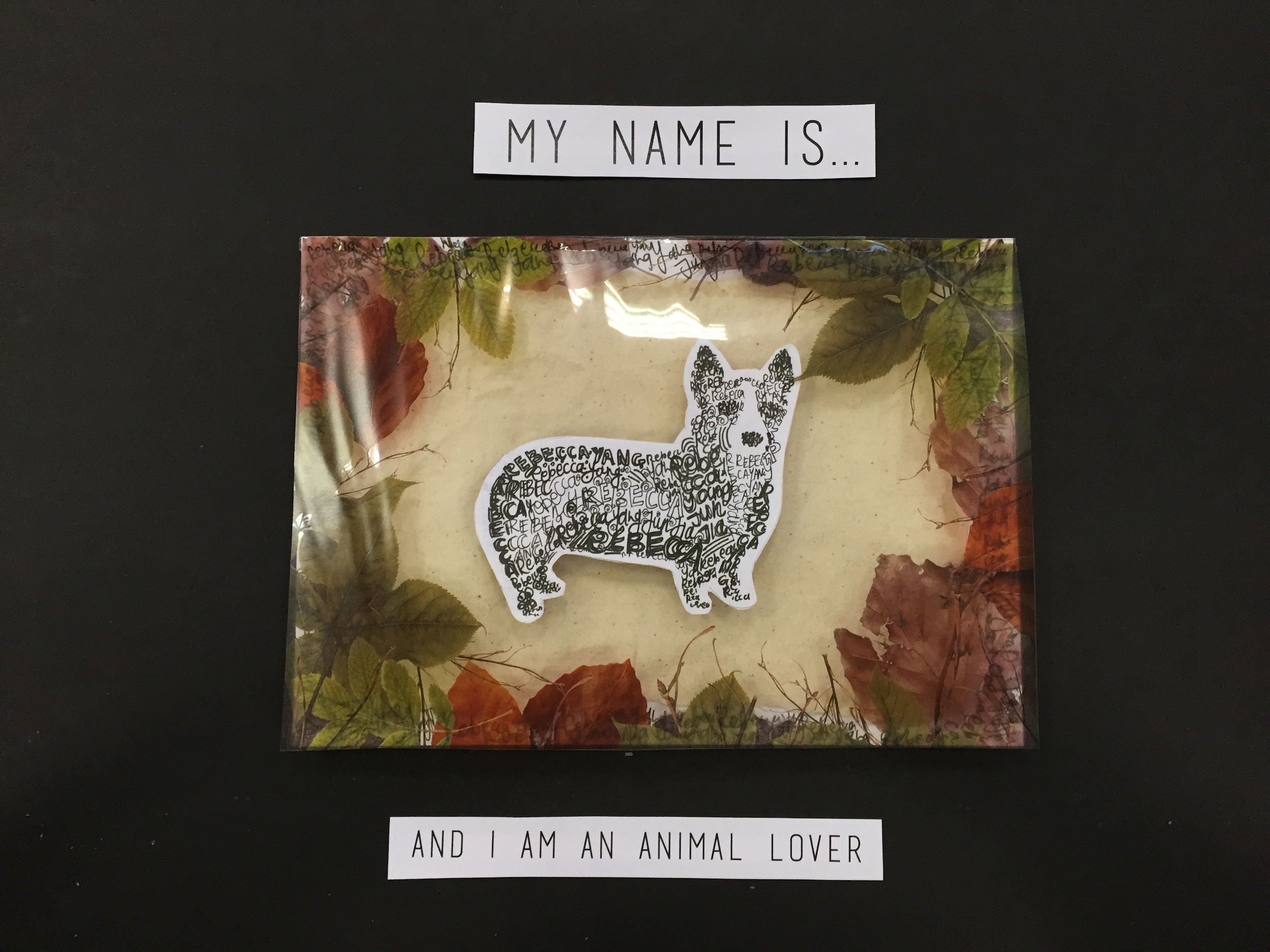
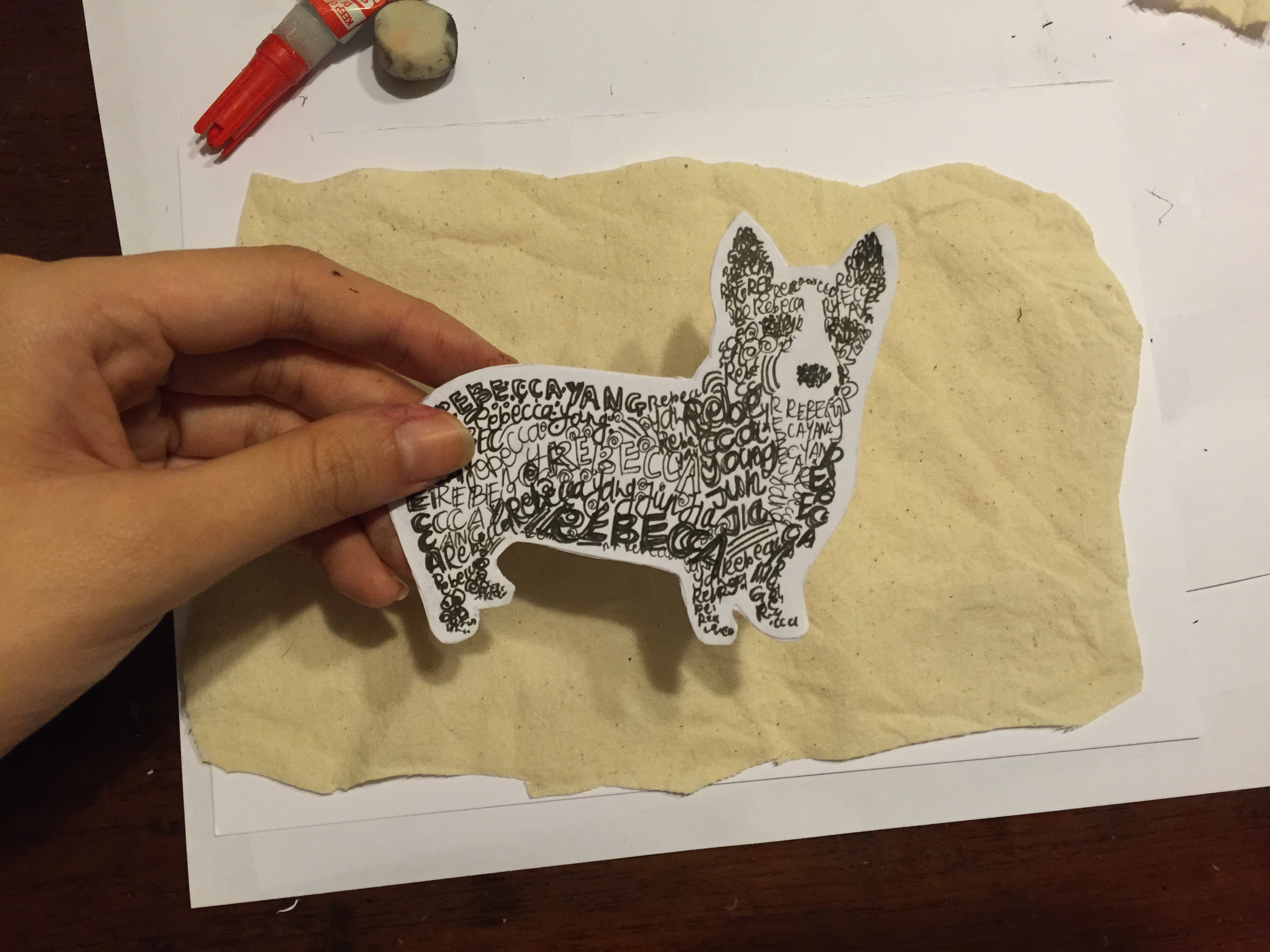
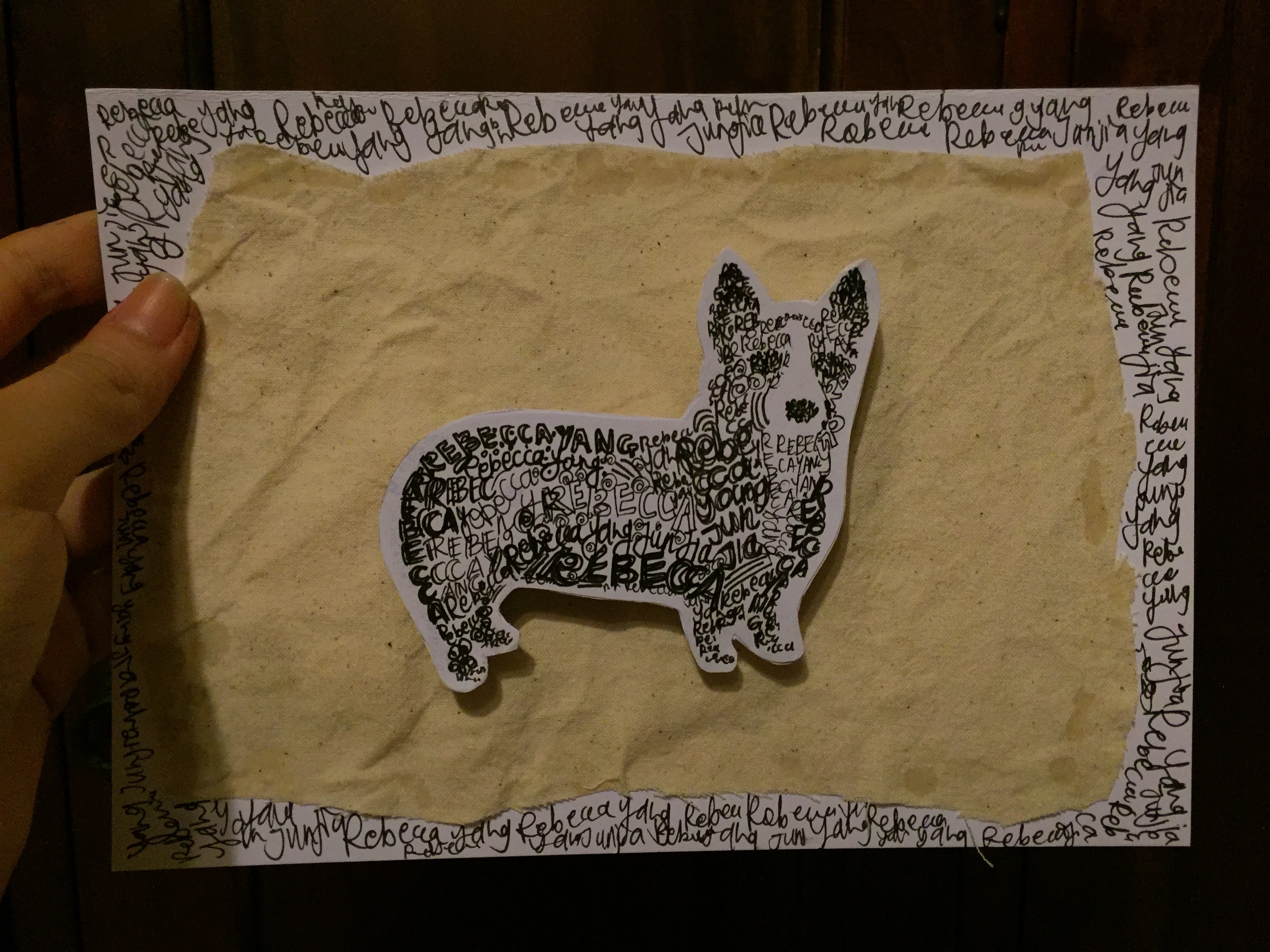
REPRINT LENS IMG_2593 IMG_2603 IMG_2598


ANIMAL LOVER:

I drew a corgi to show the breed of dog I want in the future, as I love all animals, but dogs are my favourite. Perhaps it’s because I grew up being surrounded by animals. In that past, I have had four hamsters, a bird, a rabbit, and two dogs, on top of the three dogs I have now 😀

I made the corgi out of my name, some drawn thicker than others to give it some shading, and I felt that background was too plain, as compared to my other designs which featured a sort of texture. Therefore, I cut out and pasted a sand-coloured cloth to the paper, in lieu with the organic and nature-ish theme of this piece. I added more of my name in the background to give it extra repetition.

After the steps listed above, I still felt it could be a less flat on the paper, so I used thick paper, wrapped in with masking tape to match the cloth’s colour, and created a pop-up effect, so the corgi would obviously be the centre of attention in this piece.

IMG_2594 IMG_2595

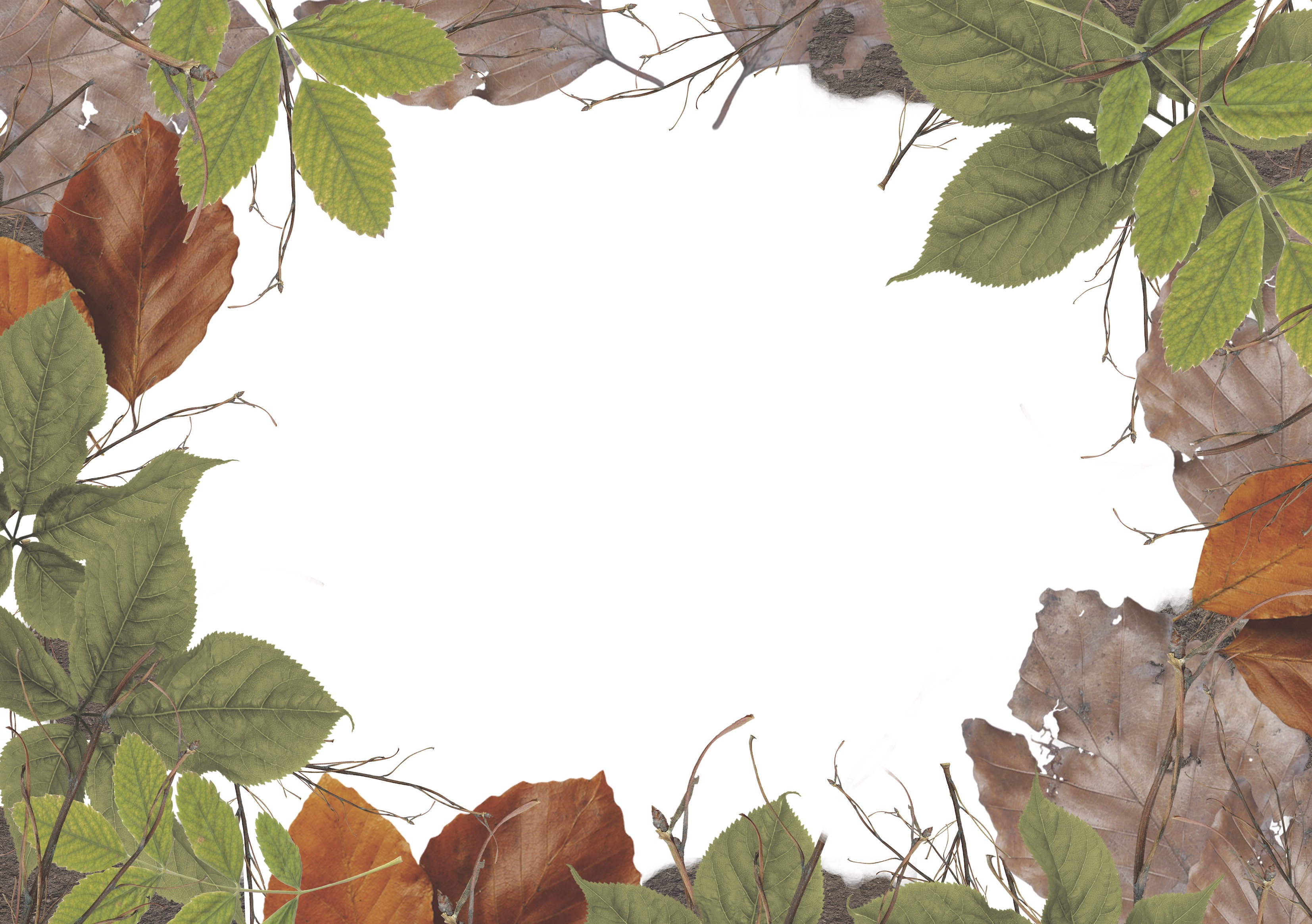
For the transparency, I digitally manipulated leaves, some of which I scanned in, and create a border. I wanted the clear plastic to symbolise that animals should not be kept in places like zoos and circuses, because I’m an advocate of freedom for animals. It’s ironic because I love having them around and being with animals, but personally, I feel it isn’t right to keep them sedated or used as tools and props because they belong in their natural habitats. Especially for wilder ones like lions or elephants. The plastic is sort of like a representation of glass, to be caged in.

I have never printed with transparencies before and wasn’t sure how it would turn out, so I created two versions of the leaves, one more faded with less contrast than the other.

Leaves Cover Lightened REPRINT LEAVES IMG_2602IMG_2600