Project Three: Ego (Process)

Concept and Idea:

When I first read through the assignment brief, I knew at once I wanted to incorporate something about myself that was very intimate and close to home, and something that would capture the essence of what I was like as a person. I did not want the project to be something that people knew about me on surface level.

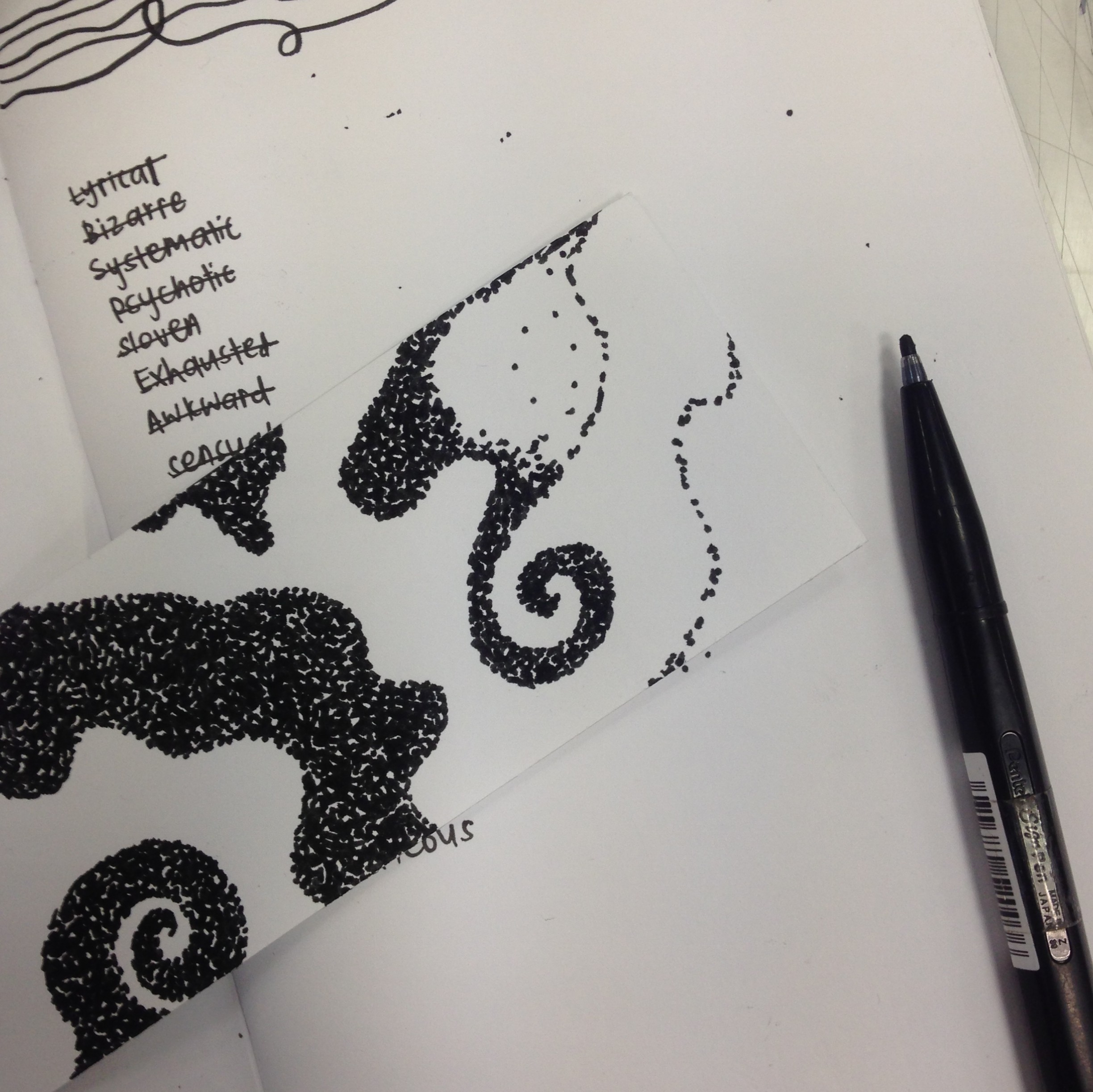
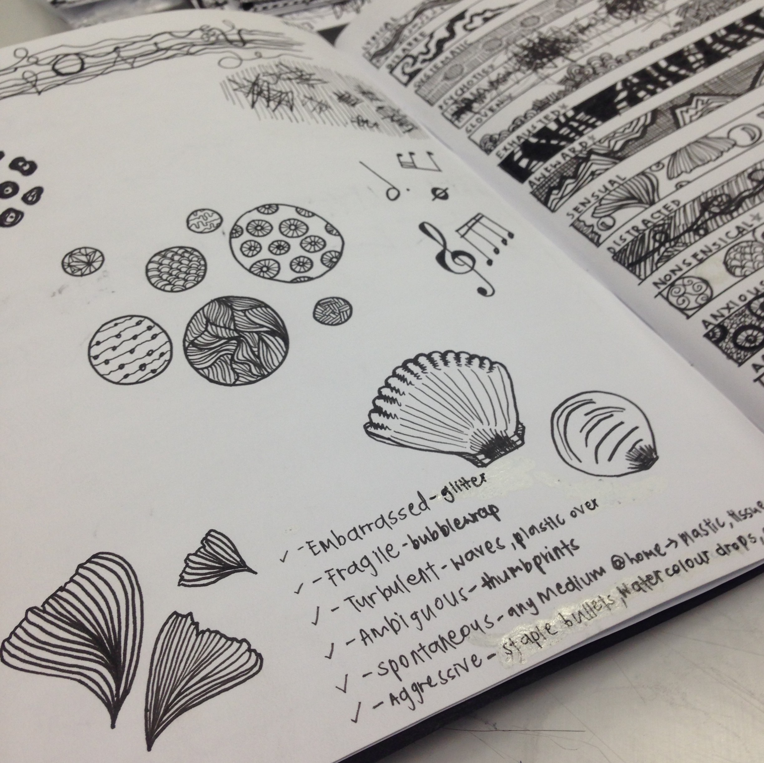
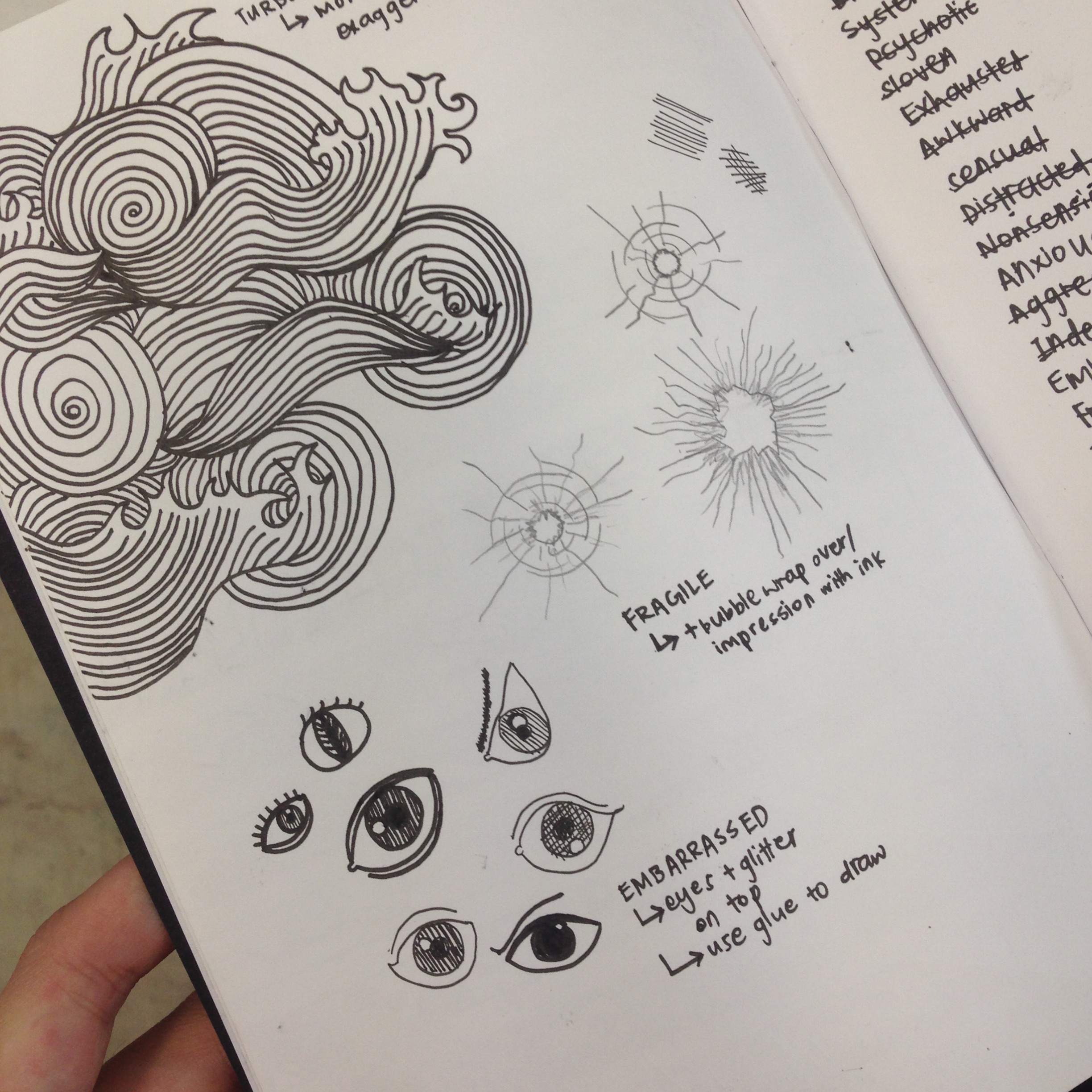
Initially, I thought about using very abstract patterns and designs to express the different characteristics of each square, but I wanted to try something new that I had never done before, and therefore, went for a more whimsical, cartoon-like style. I wanted to portray something that showcased my personality, so I dug deeper and thought about what I was like as a person, and came up with three adjectives – child-like, optimistic and playful. I wanted to use these elements in demonstrating the general feel and mood of the project in entirety.

I have also never attempted a cartoon illustrated approach for any drawings before, and was looking forward to trying it out for this assignment.

Eventually, I decided to go with characterising myself as a ‘pau’, because it has been my nickname given to me by my friends since I was young. The nickname stuck throughout the years, as my face shape has been round since I was a child, and has not changed since then.

Because my family also has the same face shape, I drew them into ‘paus’ as well, because I knew I wanted to depict them inside the assignment, as they are an essential and substantial part of my life that has resulted in the person I am today.

Use of Watercolour:

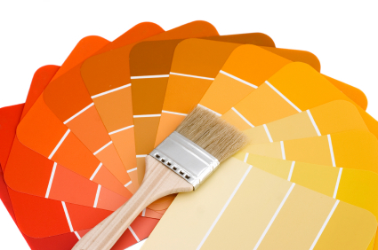
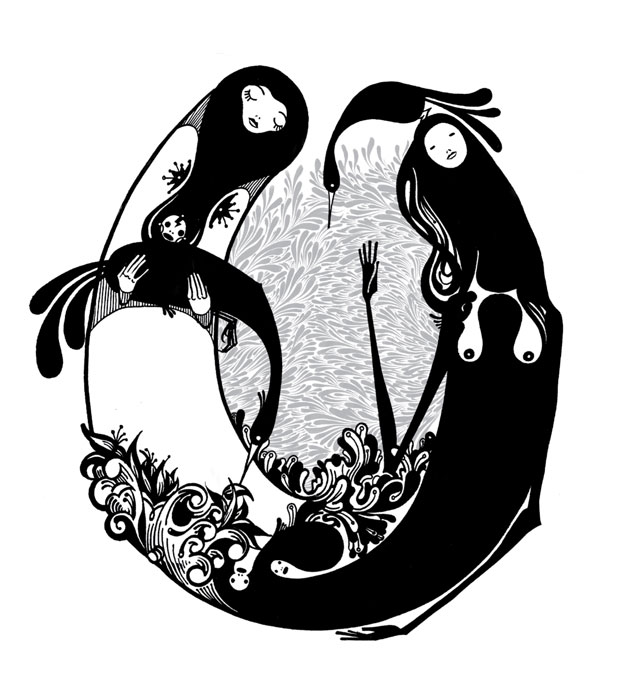
I toyed with the idea of creating the squares digitally, but ultimately decided against it as I wanted to apply watercolour pencils to the project. I chose watercolour pencils as a medium, because I have always found that they have a unique ability to provide movement and show emotions through the murky, blurred texture and various tones used. I also wanted to challenge myself to hand draw each composition, and follow on through the entire assignment using the same theme, style and medium to show continuity and tell a story.

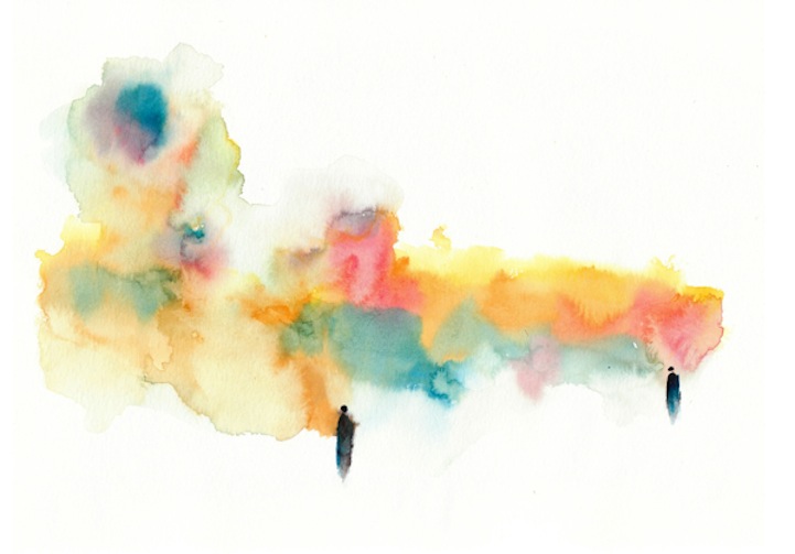
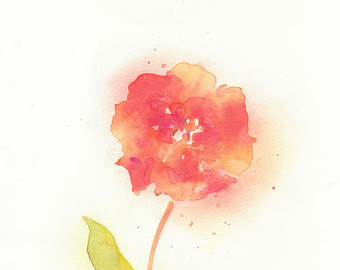
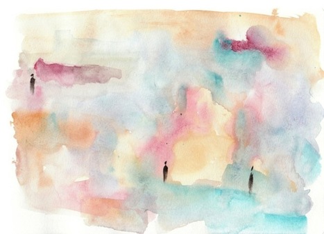
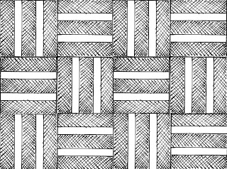
Below are some examples of the style I wanted my watercolour penciled drawings to turn out like:
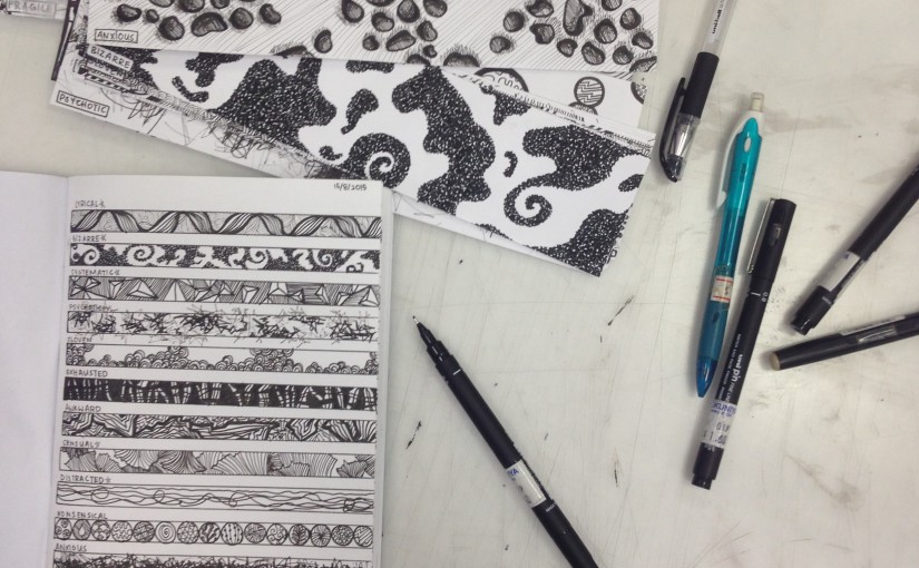
1082109931

il_340x270.425662868_woqo

img-thing

xjXv4ICSv-pKiyURuSq0Wjl72eJkfbmt4t8yenImKBVvK0kTmF0xjctABnaLJIm9

Process:

IMG_2515

I began by cutting out the 20x20cm squares, and then drew out my designs in pencil. Afterwards I traced them out using proper drawing pens in 0.8, 0.5 and 0.1 thickness to give it more texture and variety.

Finally, I ended by using watercolour pencils to give it colour.

Meaning of each design:

IMG_2535

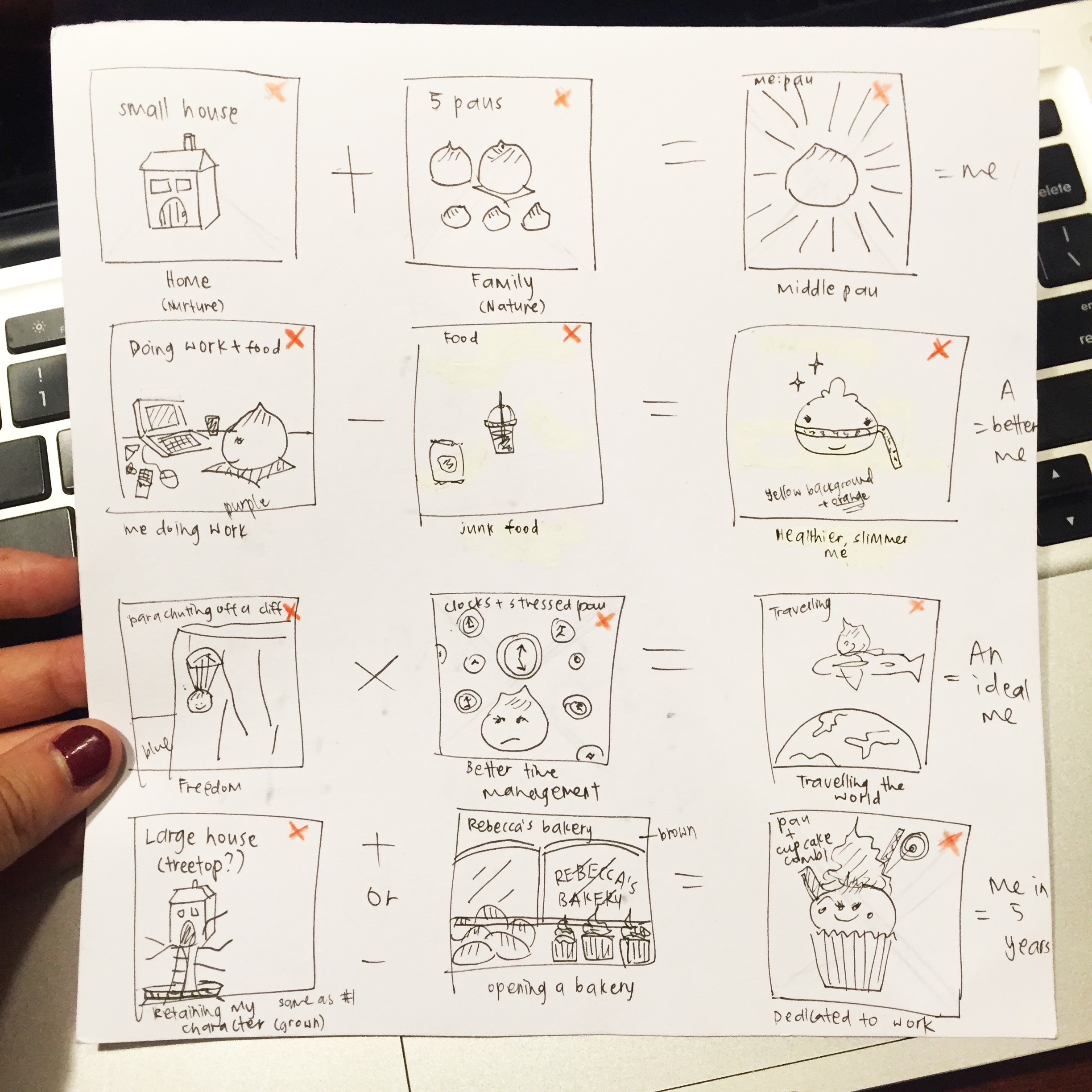
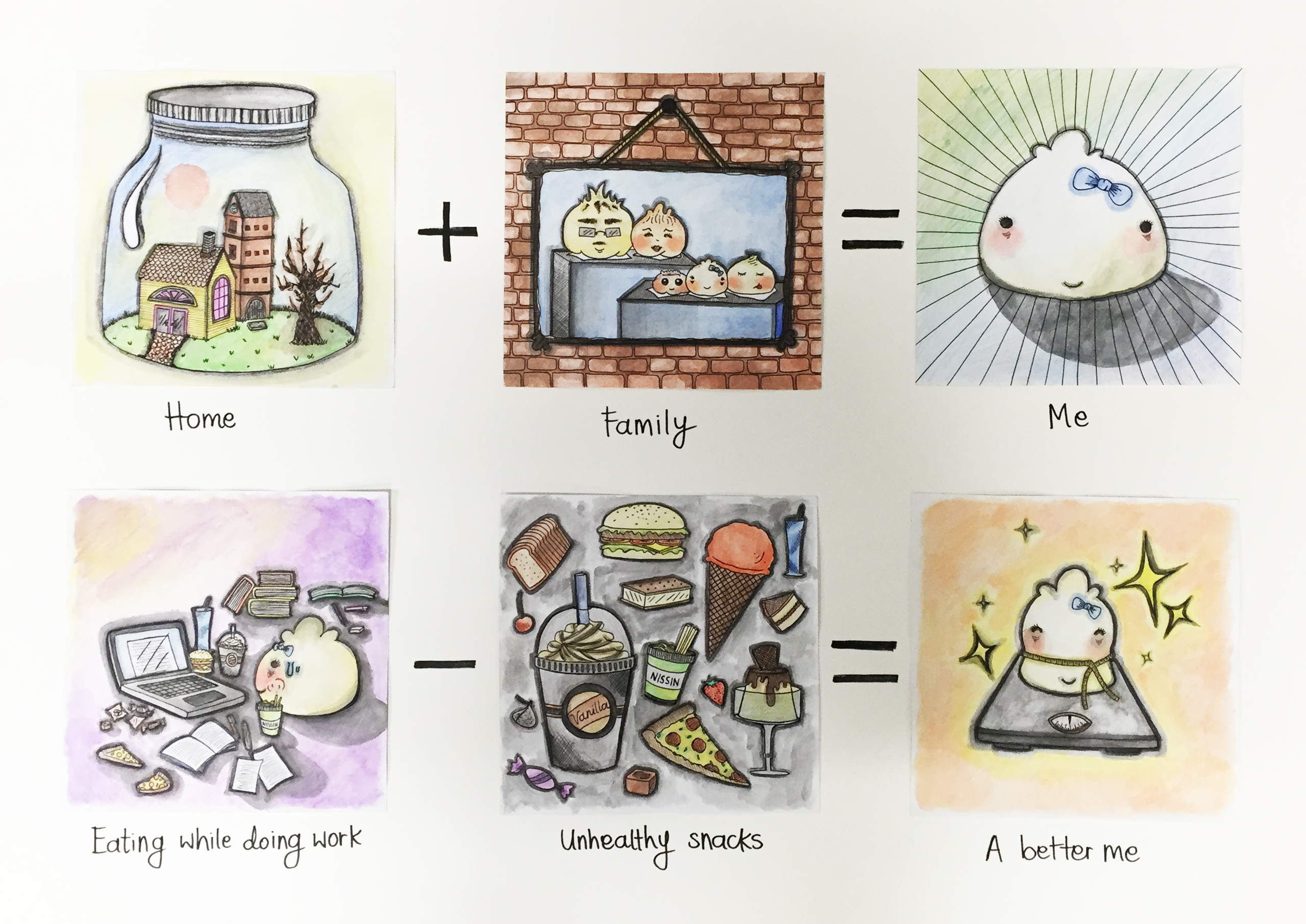
Home (1) + Family (2) = Me (3)

Eating while doing work (4) – Unhealthy snacks (5) = A better me (6)

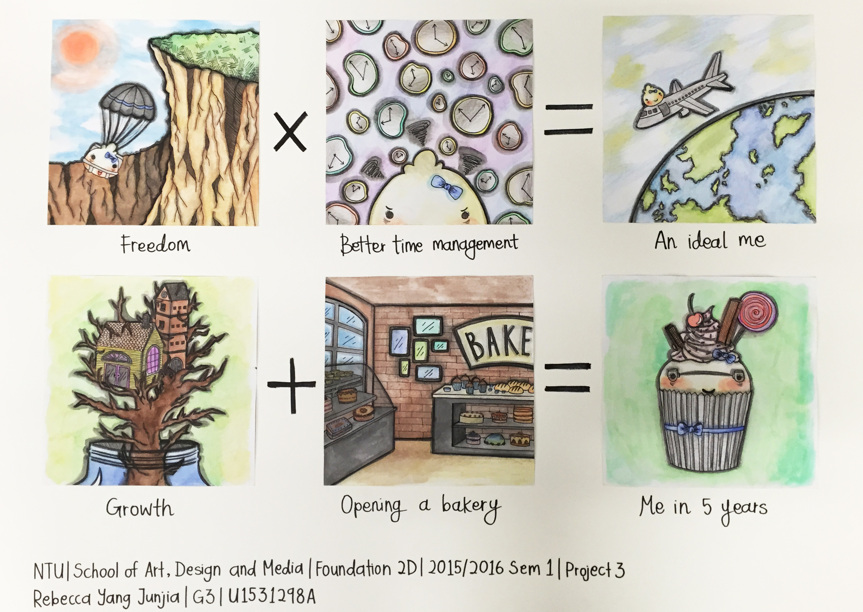
Freedom (7) x Better time management (8) = An ideal me (9)

Growth (10) + Opening a bakery (11) = Me in 5 years (12)

1.

Home – Nurture. The place I have been brought up in has had an effect on the person I am presently. I believe the environment I’ve been growing up in has greatly impacted my life.

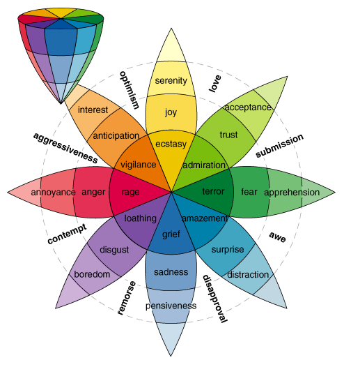
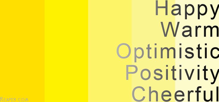
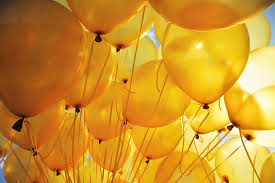
I used yellow in the background to show a happy and positive childhood, one that I remember with good vibes. The use of green and blue also shows youth and a sense of rejuvenation and calm.

2. 

Family – Nature. I think the people who I have spent most time with, and my parents who have birthed me have given me the experience I need to discover who I am, the things I like and dislike, or am good or bad at, etc. A lot of my characteristics comes from the genes I carry as well.

I wanted the brown background to bring forth a sense of security and solidness, the same feeling I get when I am home and with my family.

3.

Me – The middle child ‘pau’. The one who is in the middle of both my sisters. I kept the bow on the head consistent in order to show continuity as well.

The background is green and blue because green shows my positive traits, such as being optimistic, while blue shows my negative ones, for example, where some people have an impression that I am cold and aloof at times.

4.

Eating while doing work – a bad habit that I want to stop, as it results in weight gain.

The purple background is used because purple is shown to stimulate imagination and creativity, two factors that I require when doing work. I also made extra effort in darkening the shadows with grey and black to show an ominous, bad vibe.

5.

Unhealthy snacks – I coloured my various favourite snacks very vividly so they would pop out more at the human eye, sort of in an ‘eat me’ kind of manner. The background is black and grey to show the seriousness and sombre nature of the overeating problem.

6.

A Better me – One who is more confident and slimmer. A healthier version of who I was previously. The orange is used because orange is a colour that is focused widely on physical aspects, and in this situation, losing weight is a physical feat.

7.

Freedom – I wanted to depict diving off a cliff with a parachute, because that is something I have always wanted to experience once in my life, whether is parachuting, bungee jumping or skydiving.

I used a lighter shade of blue to represent the lightheartedness and fulfilling nature of this action.

8.

Better time management – I feel if I had better time management, it would greatly contribute to me being a more controlled and mature version of myself. To be able to manage my time well would mean I have the capacity to do many other things I have always wanted to achieve.

Dark purple is used very dominantly to show gloominess, irritability and frustration, the feeling I get when I realise I am not handling my time properly.

9.

An ideal me – I would love to be able to travel the world when I have the adequate freedom and ability to manage my time. I used spots of yellow in the sky background to show enthusiasm and energy, the emotions I get when I am travelling.

10.

Growth – I wanted to show myself growing out of my childhood home, a representation of developing outside of my comfort zone and as a person. I aim to be a more balanced, level-headed person in the future. I used a mixture of green and yellow to match the first composition, and the emotions of nature.

11.

Opening a bakery – It has been my dream to be able to be the owner of a bakery, as I love baking, and currently do it as a hobby at home. I used brown to show stability and reliability, traits I want to gradually attain even more when I grow up. The many vibrant colours like green and blue are meant to show that I retrain the fresh, calm, optimistic features from my youth.

12.

Me in 5 years – A ‘pau’ and cupcake mix, to show that I am very involved and dedicated to my work and the development of my bakery, which is why I have evolved into half a cupcake as well (something that I personally like baking).

I want to be well integrated with work, but still be true to who I am and remember the child-like innocence children, myself included, possess.

Final Works:

IMG_2529

IMG_2537

IMG_2538

IMG_2608

Colour Harmony – Research

What is Color Harmony?

When two or more colours make sense being placed together, embodying the balance or unity of colours. When colours are in harmony, it is typically pleasing to the human eye. Designers use the colour wheel to create harmonies, which makes the wheel a basic element a necessity to be familiar with. Only when designers are familiar with the colour wheel, they can focus on creating aesthetically appealing colour combinations that explore the relationships between various colours.

What are the 6 main types of Colour Harmonies?

Direct Harmony

Screen Shot 2015-11-06 at 3.52.46 PM

The most basic harmony, pointing opposite to the key colour on the wheel. This ‘opposite’ color is referred to as the complementary color and is also known as ‘complementary harmony’. Almost all colour harmonies, except analogous, are variations of direct harmony.

The high contrast of complementary colours creates a vibrant look especially when used at full saturation but can be glaring if not applied properly. This is the most common color scheme and is easy to find in all sorts of designs. An example would be Christmas colours – red and green show direct harmony.

A single, intense complementary colour is useful to create a standing out effect. However, two saturated complementary colours used together could compete for attention.

Split Complementary

6384720241_c5c41ff2d1

Split complementary colours are ones that takes the two colours directly on either side of the complementary colour. It gives a nicer range of colours while not moving too far from the basic harmony that can be found between the key and complementary colours.

It has the same strong visual contrast as the complementary color scheme, but less tension.  The split complimentary color scheme is a safe choice for most designs.

Triadic Harmony

2de00812b419b660d3df4de07dfcdfe9

Also known as ‘Triadics’ or ‘Triads’, this refers to the color two spaces to either side of the key colour’s complement. It is basically the use of three equally distanced colours on the colour wheel. This incorporates many different colours, and therefore is used best in soft touches, rather than strong, full ones, as too much of each colour can turn the design messy and overpowering.

The colors should be carefully balanced by allowing one colour to be dominating and the other two used to support it.

Analogous Harmony

Screen Shot 2015-11-06 at 3.50.33 PM

This colour harmony refers to colours that are directly on the left and right of the key colour. They usually match up quite well and create a serene and comfortable design. This color harmony can be pleasing to the eye, as it is aesthetically appealing, but it can also come across as monotonous due to the lack of colour contrast.

Use this colour harmony if your design is focused on similar colours.

Tetradic Harmony

images

Tetradic Harmony is similar to Triadic Harmony, except that there are four points, all equally distanced on the color wheel. When done subtly, it is a design simply using two sets of complementary colors, and provides a visually attractive range of colours.

This harmony is good when you have numerous elements that all need to stand out on their own, as each colour receives equal attention. One example would be movie posters with different characters that are equally important.

Monochromatic Harmony

iStock_000001520567XSmall

Monochromatic harmony is a range of colours that are all evolved from the same colour – for example, a range of light to dark orange colours, like burnt orange, terracotta, ginger, paprika, tangerine, pumpkin and caramel.

This is good for designs that feature a single colour to portray a mood, but want to play things up by using different colours within the same one.

Colour Research – Project 3


Plutchikfig6

1) Red

Passionate, Aggressive, Important.

A dominating colour, that adds gravity and heightened awareness – quite literally, as the colour increases blood circulation, breathing rates, and metabolism. Red can take on a variety of meaning, associated with both love and war, but the unifying factor in all meanings is a sense of importance.

b922b3bb69ca98337d32d2da7a4b46d1 (1)

a5ab73399b112f3ed67199ec61b60912 red

2) Blue

Serene, Trustworthy, Inviting

Blue is the colour of calm and serenity, and as such inspires security and a feeling of safety. Blue is also incredibly versatile; its vibrancy has more drastic effects than other colours. Light blue is the colour of water and the sky, so it generally has a refreshing and free feeling. Darker blues tend to be more sombre.

Duron-Paint-Color-Chart-03

modern-bedroom-paint-ideas

3) Yellow

Happy, Friendly, Warning

Yellow is a strange colour: it is often associated with happiness, but also activates the anxiety center of the brain. Like red and orange, it’s able to stimulate and vitalize. Bright yellow may have potential negative connotations. Lighter shades play on the happiness aspects while darker shades, including gold, add more weight and give a sense of antiquity.

superb-matching-paint-colors-8-yellow-paint-color-chart-4704-x-5780

1ca322048497778942ba8c0fac1d0055

images

4) Green

Natural, Stable, Prosperous

Green mostly represents the environment and outdoors, making it the clear choice to suggest nature and an organic quality. As the bridge between stimulating warm colours (red, orange, yellow) and calming cool colours (blue, purple), it is the most balanced of colours, lending it an air of stability.

ch11

GREEN-LEAVES-672x372

5) Purple

Luxurious, Mysterious, Romantic

Long associated with royalty, purple creates an air of luxury, even decadence. Using a purple dominantly is a quick way to create a sense of elegance or high-end appeal. Lighter shades of purple bring to mind spring and romance, especially lavender. Darker shades of purple add more mystery, and can even symbolize creativity. Darkening the shade will also turn the romantic elements more sensual.

screenshot-2014-03-10-11-24-23

Tulips morado

wedding-theme-ideas-purple-colour-scheme-53ce3a7d17fe2

6) Orange

Playful, Energetic, Cheap

Sharing red’s energizing aspects, but to a safer degree, orange is a good way to add excitement to a site without severity. It is generally playful, and some claim it creates haste and plays on impulse. It can even signify health, suggesting vitality and vibrance.

paint-sample-colors-chart_8

images (1)

Lively-Orange-Living-Room

Nursery Rhymes – Project 2

Before starting this project, I felt that I needed to know more about how and what made certain designs work, as I had never worked with these elements before. So I started by researching the definitions of the principles of design:

  1. Balance – Distribution of the visual weight of objects, colors, texture, and space. If the design was a scale, these elements should be balanced to make a design feel stable. In symmetrical balance, the elements used on one side of the design are similar to those on the other side; in asymmetrical balance, the sides are different but still look balanced. In radial balance, the elements are arranged around a central point and may be similar.
  2. Emphasis – Part of the design that catches the viewer’s attention. Usually the artist will make one area stand out by contrasting it with other areas. The area could be different in size, color, texture, shape, etc.
  3. Movement – Where the viewer’s eye follows through the work of art, often to focal areas. Such movement can be directed along lines, edges, shape, and color within the work of art. 
  4. Pattern – Repeating of an object or symbol all over the work of art.
  5. Repetition – Works with pattern to make the work of art seem active. The repetition of elements of design creates unity within the work of art
  6. Proportion – Feeling of unity created when all parts (sizes, amounts, or number) relate well with each other. When drawing the human figure, proportion can refer to the size of the head compared to the rest of the body
  7. Rhythm – Created when one or more elements of design are used repeatedly to create a feeling of organized movement. Rhythm creates a mood music or dancing. To keep rhythm exciting and active, variety is essential.
  8. Variety – Use of several elements of design to hold the viewer’s attention and to guide the viewer’s eye through and around the work of art.
  9. Unity – Feeling of harmony between all parts of the work of art, which creates a sense of completeness.

I realised that personally, I enjoy using emphasis, movement, repetition and rhythm in my finalised art works. In addition, I feel that the rule of thirds plays a major role in the way I design, as I lean towards placing my subject on corners of the image, rather than in the centre.

I also enjoy working with different images and adjusting the proportion, size and perspective to create textures. I think that textures in the background can add a lot of information about the art work. A clean background gives the design a sleek and cool look, while a textured background can relay to the viewer that the image is cluttered or quaint, depending on how it is structured.

Confirmed designs:

Couldn't put Humpty together again

Couldn’t put Humpty together again

Used repeated hammers to form a rhythmic background. Played around with the size and direction of hammers to make it even more vibrant and interesting, as if the background was an optical illusion. Placed a large foreground image on the right side, bottom half of the image to follow rule of thirds, and chose a different type of image in order to allow it to stand out and pop out at the viewer.

I thought it would be interesting to use hammers, as it would provide a sort of irony that would not be too direct for viewers to pick up immediately. Hammers are typically associated with negative emotions, such as rage, leading to the destruction of things. But hammers can also be used for good purposes, for example, nails are effective in hanging items up because hammers make it an efficient process.

In this way, the king’s horses and men who attempted placing Humpty Dumpty together again could have tried assembling him with pure intentions, but made the situation worse with the use of a wrong tool.

Hey Diddle Diddle the Cat and the Fiddle

Hey Diddle Diddle the Cat and the Fiddle

Used a variety of leading lines (thick white/black and thin white lines) to bring the viewer’s eyes to the cat in the foreground. The lines are actually made up of many fiddles, as I used the bridge area, because I felt the shape and lines were fascinating. I liked that there was a variety of different lines to switch things up, as it made the leading lines more wholesome and dynamic.

I also switched the colour of the fiddle in the foreground to white, so that it stands out from the black that outlines the cat in the foreground.

I like the elaborate design of the cats in the background, as I found it served to act as an additional texture for the art work, without being too forthcoming or commanding of the viewer’s attention.

Humpty Dumpty sat on the wall

Humpty Dumpty sat on the wall

Rotated and used the same plates but different perspectives to represent the foreground. I found it engaging that the plates reminded me of moving gears, hence the wall which Humpty Dumpty is sitting on is tilted, representing that it is unstable and about to crumble due to the gears in front.

This is because no where in the rhyme mentioned the reason explained the next line – Humpty Dumpty had a great fall. It is unclear why he had fallen, whether he had slipped or someone had pushed him, etc, and the reason is left up to interpretation. I decided to go with the explanation that it was because the wall began slanting diagonally, and hence used the plates. When gears turn, something else typically is affected and moves with it. In this case, I wanted to capture movement, and represent that the wall tipped over, causing Humpty Dumpty to fall.

The largest plate is on the bottom right side of the image, so I wanted to balance it out by placing Humpty Dumpty on the top left hand side.

Additionally, I liked that the wall had a contrast of black with white spots, to make it a more interesting composition.

Humpty Dumpty had a great fall

Humpty Dumpty had a great fall

Used two of the same images at the left and right side, in order to frame, as well as create symmetry throughout the image. I thought that the shape formed in the middle using the two images at the side made a bold and lively outline, as it is not a typical shape seen. It reminded me of an hourglass, which leads to the fact that time runs out, and it is especially seen in hourglasses, as they act as timers.

The line ‘Humpty Dumpty had a great fall’, to me, is related to death, as following the rhyme, he was not able to be revived by the king’s horses and men. I felt that the shape of an hourglass was apt, as it embodied that he was running out of time to live.

Also repeated the same image of Humpty Dumpty in the centre to act as a focus, so that the viewer would notice that at first glance. Played around with the direction and size of Humpty Dumpty to create variety, and portray the falling, tumbling effect.

Other designs:

All the king's horses and all the king's men

All the king’s horses and all the king’s men

All the king's horses and all the king's men copy

All the king’s horses and all the king’s men

I felt that these two images were too flat, with not enough detail on foreground, background, emphasis, movement and rhythm. Although the both encompass repetition, I discovered that it was still lacking in some aspects to use just one principle of design. It would not captivate viewers, and therefore, did not choose them.

Principles of Design

The Principles of Design:

  • Balance

Distribution of objects, texture, space and colours to make up a stable design. Three types of balance:

– Symmetrical balance – elements on one side of the design are similar to the opposite side

– Asymmetrical design – sides are different but still remain visually balanced

– Radial balance – elements are arranged around a centre, focal point

HERBERT_BAGLIONE_BALANCE Principles-01

  • Emphasis

A part of the design that jumps out at the viewer. Usually made visible through contrasting with other areas of the design, using, for example, size/shape/colour etc.

8538488 emphasis

  • Pattern / Repetition

Constant repeating of an object or symbol in a design to create a recurring form or sequence. Gives unity to the art work.

e76af62c77457fdb1007510d0c31771a pattern 1 using rhythm repetition

  • Proportion

When all parts of a design correlate and work well together, it is good proportion. Parts can refer to sizes, amounts or numbers in the design.

images tumblr_ly7rw3XKYa1r1lgpio1_1280

  • Movement

The path the viewer’s eyes follows through in the design, and usually stops to rest and observe a focal area. Movement can be shown using lines, edges, shapes, or colours, etc.

Design monochrome spiral movement illusion background. Abstract strip lines warped backdrop. Vector-art illustration

images

2D Assignment 1 – Lines (Completed Work)

The completed 18 emotions:

  1. Bizarre – Tiny dots that formed inconsistent and strange shapes, that does not allow the viewer’s eyes to focus on anything at once.
  2. Anxious – Played on the fear, Trypophobia (whether it is proven or not), as many people, including myself, feel uncomfortable looking at multiple holes in a region.
  3. Spontaneous – Used medium, glitter, to represent explosiveness and fun, which symbolises spontaneity. Nail polish used over glitter to prevent it from falling out. Grey outline to further allow glitter to stand out.
  4. Lyrical – Music gets predictable, as the lyrics and chords are repeated in songs. I used a repeated, cursive pattern to represent repeated rhythms.
  5. Awkward – Different but similar shapes to show that people who feel awkward would feel uneasy as they are different from others. Consistent but plain background to allow shapes to stand out more.
  6. Sensual – Emotion is related to feelings of carnal desire or pleasure. The beach is often related to sensuality, so I wanted to create a softer, and more inviting version of seashells.
  7. Distracted – Lines that start of straight, but at various times, differ from the path they are supposed to take.
  8. Indecisive – Used a kaleidoscope of triangles, circles and squares, all fluctuating irregularly towards different directions.
  9. Fragile – Drew bullet holes on the paper, and wrapped plastic over. The plastic was meant to protect the paper, but it shows that fragile things in life will typically be broken eventually.
  10. Embarrassed – Used many types of eyes to show that the spotlight is on the viewer. Whether it is in their minds only or actually taking place, embarrassed people usually feel that many people are scrutinising them.
  11. Psychotic – Portraying a serial killer. Their insanity does not ever leave them, but is more volatile at some timings. Hence, used dark, confusing lines in the middle to show consistent insanity, but overbearing, raw emotions at various points.
  12. Aggressive – Cut the paper and painted over to resemble cuts on skin with dried blood. Used stapler bullets to punch right through the paper as well to show anger.
  13. Ambiguous – Used fingerprints and paint to show ambiguity and mysteriousness. The design is confusing and difficult to follow.
  14. Nonsensical – Drew many different patterns in circles that represent marbles in different sizes, that children usually play with.
  15. Turbulent – Background is tumultuous waves, as the sea can be dangerous and unstable. Added scotch tape over the waves to add a reflective, watery effect.
  16. Exhausted – White parts are like human bones, as people feel exhausted every once in a while. Gave the bones a cracked appearance.
  17. Systematic – Triangles are pointed, and made using straight lines, giving them a structured look. Background and foreground are uniform, an unchanging element.
  18. Sloven – Different pen inks and patterns to show haphazard drawings – lazy and untidy. The peaks are unsteady, displaying carelessness.

Ones that were spoken about in presentation:

Sensual, Aggressive and Turbulent ( photos as follows)

IMG_8033  IMG_8032

IMG_8039

Photos of completed work:

IMG_7853  IMG_7852

IMG_7851  IMG_7850

IMG_7849  IMG_7848

IMG_8037

2D Assignment 1 – Lines (Research)

Research done:

After searching for the word definitions of each emotion, I also searched for photos of ideas of what an emotive art work would look like.

I googled vague descriptions to get a general idea first for inspiration, and then after that, searched for more specific examples of the drawings or mediums I wanted to include.

Photos of research material:

il_fullxfull.328969789  how-to-draw-carnation04

Seashell and flower petals for ‘Sensual’

11954244791861345463rejon_Noise.svg.hi

Messy lines for ‘Distracted’

b306de52d87b8abba3f91077cf60ce1e

Chaotic waves for ‘Turbulent’

 bones_of_arms_and_legs_by_arvalis

Human bones for ‘Exhausted’

f2d76ee3aa98587778384bc2a99bd2aa

Multiple eyes for ‘Embarrassed’

   images

Bullet holes for ‘Fragile’

df58899ab8e9f805569436c2be00de64

Scratches on skin for ‘Aggressive’

2D Assignment 1 – Lines (Journal Process)

Process:

Wanting to incorporate what my perspective was of each emotion onto the strips of paper, I began by googling the meaning of all 18 words.

After understanding the emotions a little more, I started experimenting with all sorts of lines – thick, thin, curly, straight, squiggly, jagged, etc. I practiced drawing these lines first, and then started making patterns or shapes out of them, in order to convey the emotion onto paper.

I always thought that patterns were just for design purposes, but after delving into this project, I realised that various patterns can incur different emotions. Thick lines can mean security or safety, large circles combined with small circles can portray vast comparison between two elements, and triangles can appear rather technical.

Then I also discovered that shading was another way of making emotions more defined. Darker strips could present more negative emotions as compared to lighter coloured ones.

As I am more accustomed to using pens for drawing, I used that as my main medium. However, I also wanted to make use of other mediums, as that would add creative value to my pieces. After using different mediums (e.g. glitter, nail polish, plastic, scotch tape, stapler bullets, and paint), I found that it gave much more room to experiment and let our inventiveness and imagination grow.

Definitions of the 18 emotions:

  1. Bizarre – Weird, strange, unfocused. Out of the ordinary
  2. Anxious – Worried and upset. Can be triggered off at the slightest gesture. Not calm at all.
  3. Spontaneous – Fun. Without any planning. Stands out and very bold.
  4. Lyrical – Smooth and imaginative, has to do with music.
  5. Awkward – Out of place, feeling of not fitting in with the others around. Unpleasant and self inflicted.
  6. Sensual – Relates to carnal desire and pleasure. Thin line between lust and love. Relates to places or things that leads to sex.
  7. Distracted – Unable to concentrate. Breaks free of what was initially supposed to be done.
  8. Indecisive – Consists of many ideas/opportunities/options. Cannot make up your mind due to this reason.
  9. Fragile – Breakable and difficult to protect or keep safe.
  10. Embarrassed – Shameful, feeling of being humiliated and wanting to hide.
  11. Psychotic – Eruptive, crazy, insane. Murderous, serial killer like.
  12. Aggressive – Ready to attack and pounce. Very angry and bitter, wants to release unhappiness through violence.
  13. Ambiguous – Not set in stone, difficult to deduce. Confusing.
  14. Nonsensical – Full of things that have no meaning. Related back to young children.
  15. Turbulent – Chaotic. Classified as a loud, more negative emotion.
  16. Exhausted – Tired, worn out. Have no strength to carry on.
  17. Systematic – Has a technical feel towards it. Very organised and standardised.
  18. Sloven – Haphazard. Lazy and careless. Without giving things much thought as to how and why it’s done.

Process photos:

IMG_7828IMG_7858IMG_7859IMG_7860IMG_8046IMG_8041IMG_7864IMG_8042IMG_8043IMG_8045