How Sweet

Hey everyone! This post will summarize very briefly what we’ve been doing for the entire semester, and display the final works for the banner as well as the media wall.


—–

     “It was now three mornings since they had left their father’s house. They began to walk again, but they always came deeper into the forest, and if help did not come soon, they must die of hunger and weariness. When it was mid-day, they saw a beautiful snow-white bird sitting on a bough, which sang so delightfully that they stood still and listened to it. And when its song was over, it spread its wings and flew away before them, and they followed it until they reached a little house, on the roof of which it alighted. And when they approached the little house they saw that it was built of bread and covered with cakes, but that the windows were of clear sugar.”

 – Hansel & Gretel, 1812, Brothers Grimm

—–


BANNER

How Sweet, 2017, Mixed Media, 3560mm x 420mm

Digital
Test for brightness & saturation: Left – original Middle – +15% brightness, +15% saturation Right – +30% brightness, +30% saturation
Printed Out

MEDIA WALL ANIMATION

How Sweet, 2017, Animation, 3860 x 480 pixels

FINAL STILL – 1
FINAL STILL – 2
FINAL STILL – 3

Final Updated Media Wall Animation

Hello! So I’ve reviewed the first video I made after advice from Ina, and I’ve made the speed significantly slower (about 40% to 50% of the speed of the previous animation). In addition, the video has been extended from 30 seconds to 3 minutes.

Please find the new video below!

Just in case that doesn’t work, the link is: https://vimeo.com/215605189

(:

Media Wall – Progress & FINAL

Hello! For the media wall, I started off by wanting to animate the motifs in a way that made them fall off the screen in a haphazard way, to add on to the colour and chaos in my project, so I came up with these designs for testing.

These three jpegs are designed in a way to be viewed from 1 to 2 and then to 3, so it would look like a sequence and structured falling of the motifs. It was to be arranged such that the streaks of colour would fall down like paint, like it was dripping, and then the cakes and sweets would follow after that. To achieve this, I started anew on Photoshop, using my motifs that I had drawn out in the beginning. I also created a new version of the paint splashes, as the previous one for the banner was more explosive in nature, but this one was more slow moving in a downward motion.

Initial Design – Media Wall 1
Initial Design – Media Wall 2
Initial Design – Media Wall 3

However, after testing it out at the media wall, I decided to go for something less colourful and vibrant, and instead create something simpler. This is because I found that the scale of the media wall, being very huge and wide, made it difficult for a viewer to take in the whole design, and it made the whole thing rather messy instead. The colours were also a lot more vibrant on the media wall, which I found to be slightly distracting, because of the clash of colours from the background (paint) and the foreground (the motif desserts).

So, I came up with a plain white background instead, and spread out the motifs more so that it would look evenly spread, instead of being too top heavy.

Below are my new designs – there are 3 jpeg stills taken from the final 30 seconds animation. I did the animation using two softwares, Premiere Pro and After Effects. I wanted to keep up the motion and movement of the falling motifs, but at the same time, minimise the distraction. If you compare the 3 jpegs, each of them have a different arrangement of the motifs, because the cakes are continually rotating and spinning.

FINAL STILL – 1
FINAL STILL – 2
FINAL STILL – 3

FINAL TEST PRINT

Hello! I’ve altered my final banner, which you guys can see below! (:

I prefer this one as the background looks cleaner and allows the motifs and patterns to stand out instead of sinking into the banner itself, so it adds on to the popping out effect. I did this by retaining a light coloured background, meaning I took away the black gradient effect, and replaced it with a almost white (sort of very faint cream colour) background. I added some colour so it wouldn’t look too stark white.

I also increased the space and area of the colour splashes – all colours blue, pink, green and brown – to fill up the banner more and look messier at the same time, so it would appear more energetic and vibrant. Then I also added more variety and number of food motifs so the banner would not look as empty.

As per the last test print:

  1. Left one = original
  2. Middle = +15 brightness, +15 saturation
  3. Right = +30 brightness, +30 saturation

More process!

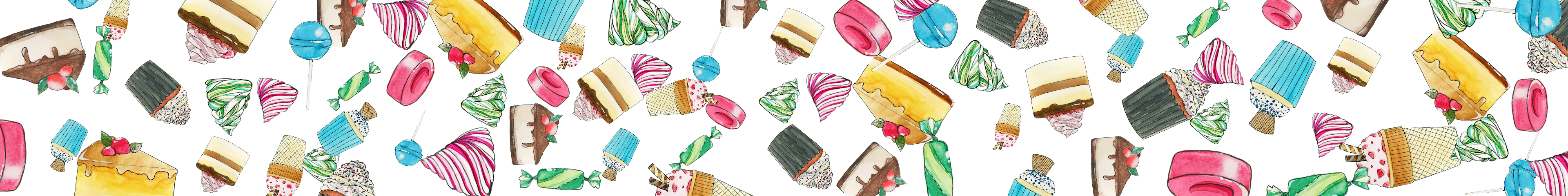
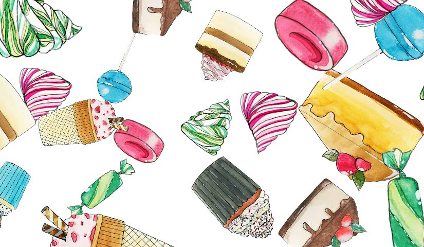
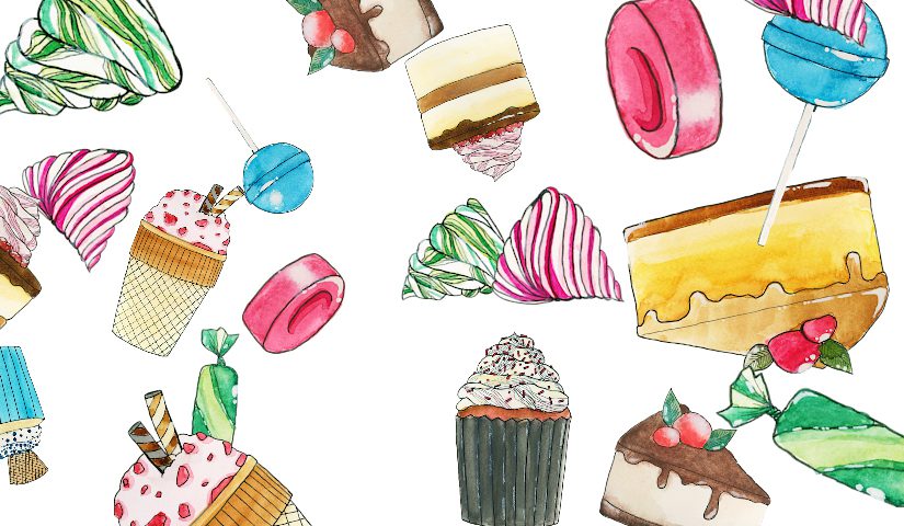
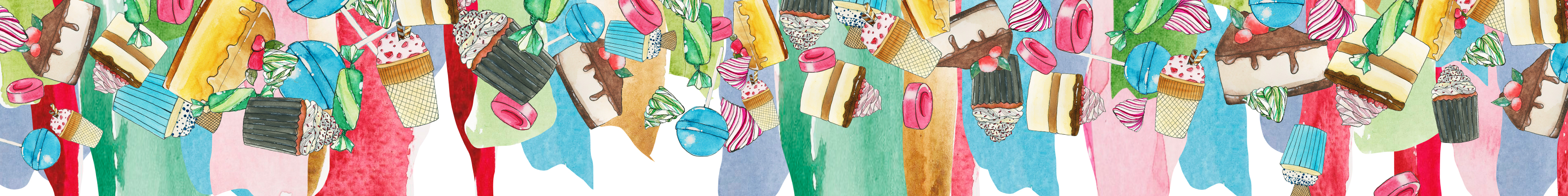
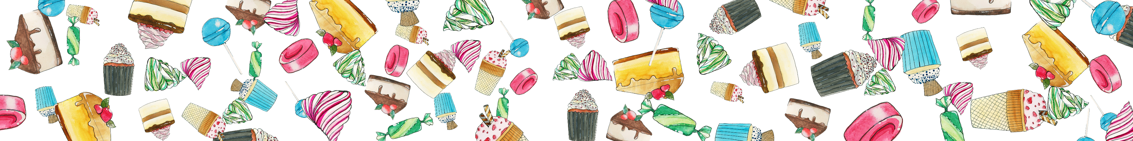
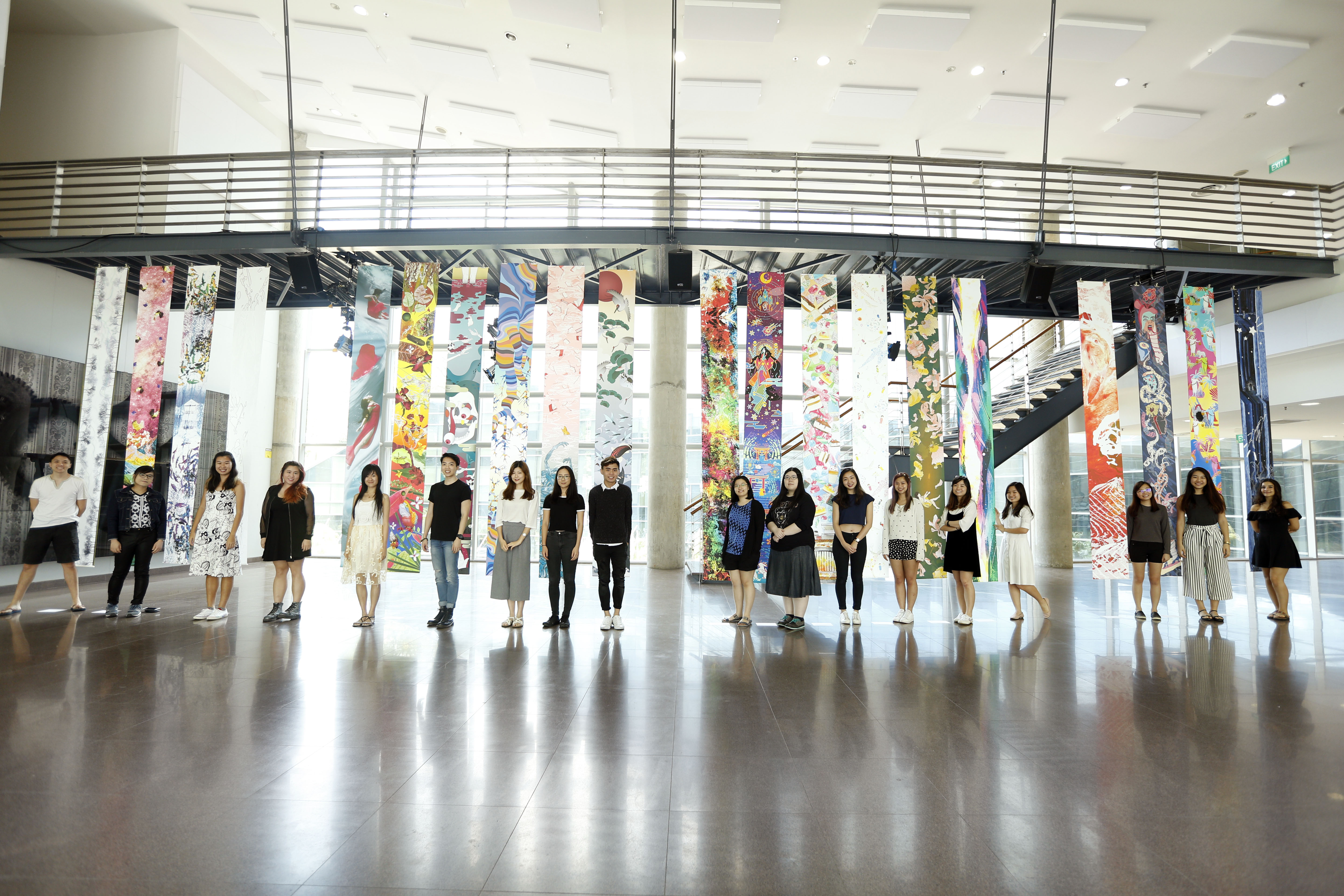
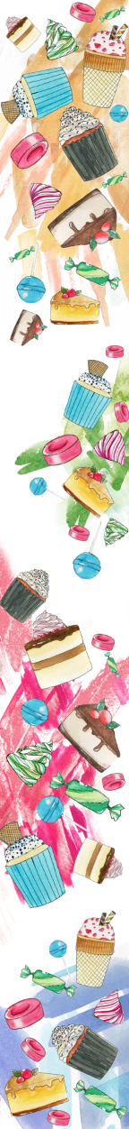
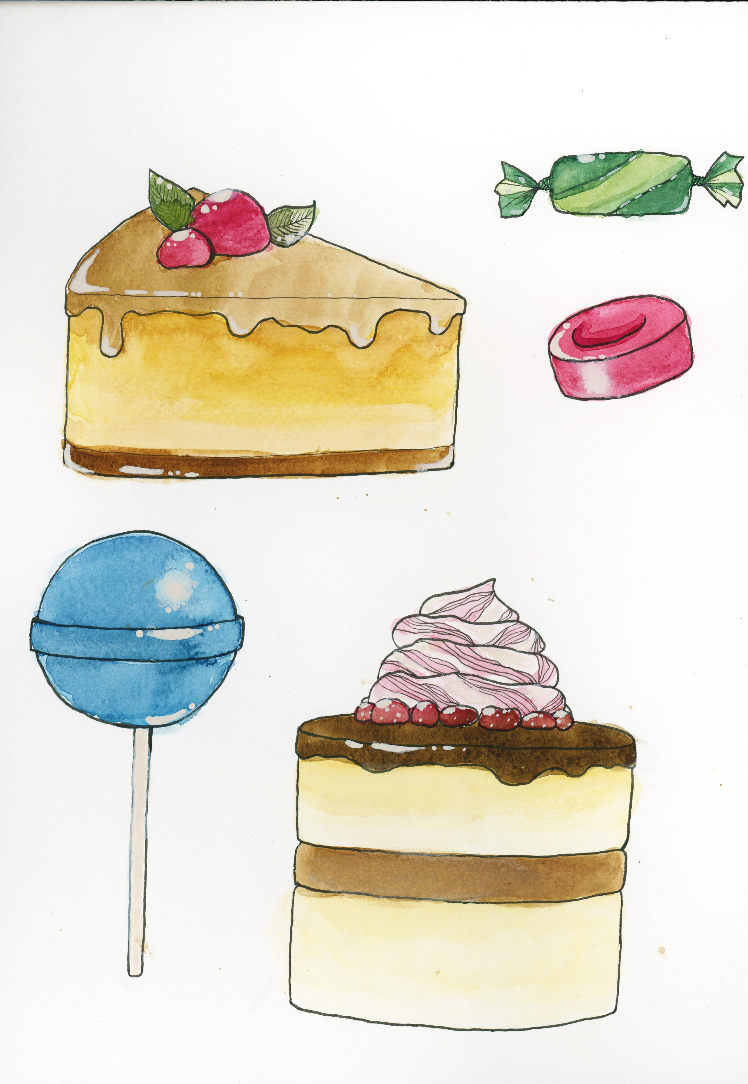
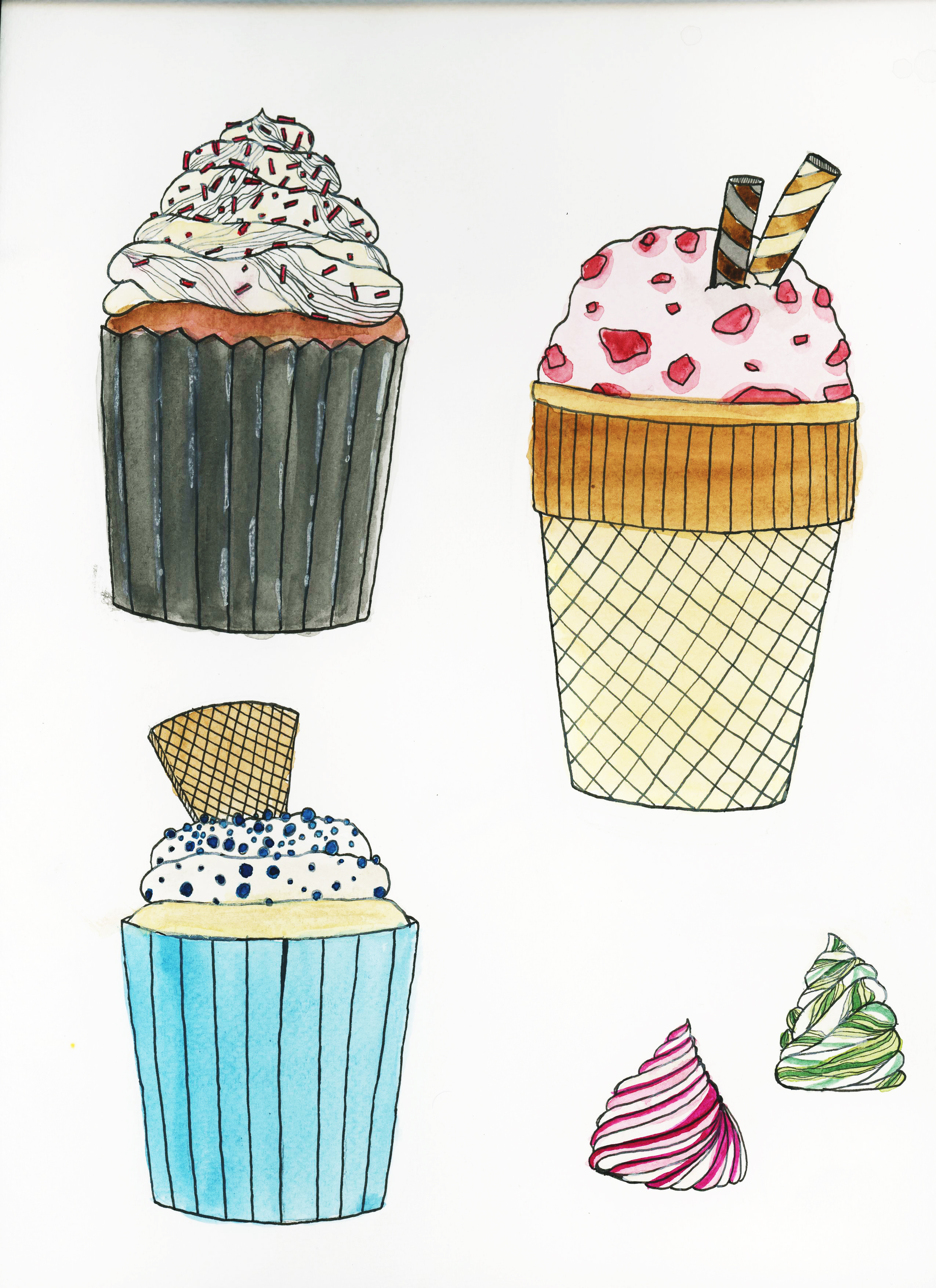
Here’s a quick update with my process for the Pattern banner before we do the printing!

I decided to draw an oven as a motif as well, and my intention is to put is at the bottom of the banner as a statement piece, almost like a full stop to the story, or like to mark the end of a sentence. In this case, it is to symbolise the end of Hansel and Gretel when the children pushed the witch into the oven.

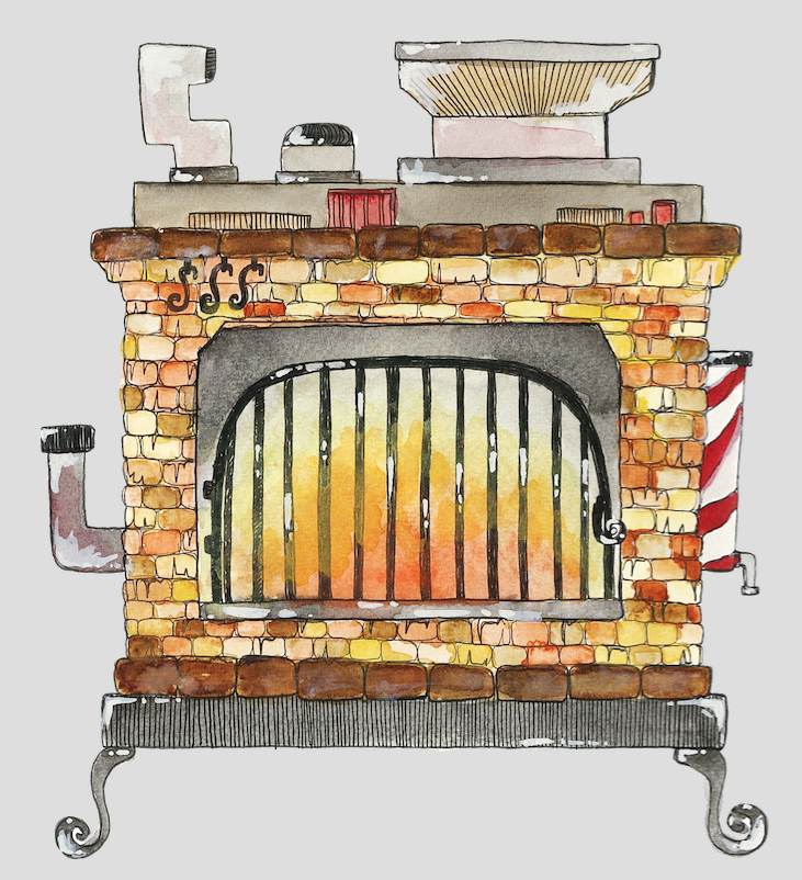
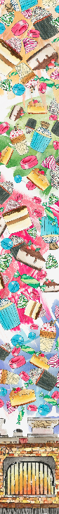
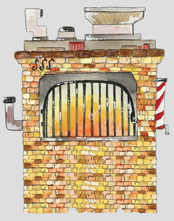
Above is the scanned drawn and watercoloured oven that I’ve done, before I changed into into a PNG on Photoshop. I wanted the fire to look like it was still burning and in action, to create a more dramatic and ongoing look. I also did not want a conventional looking oven, and sought to create a more whimsical version, so I added the extra details like the swirly legs, funnels, pipes and chutes.


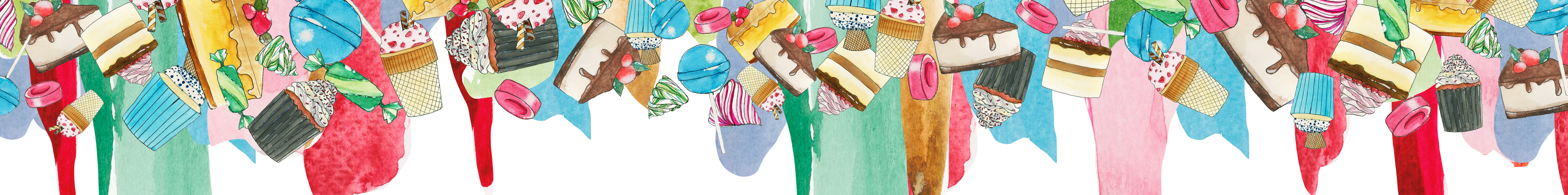
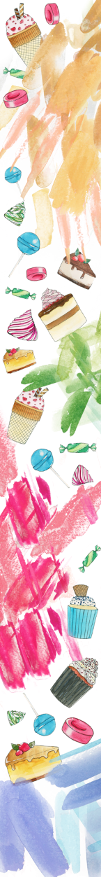
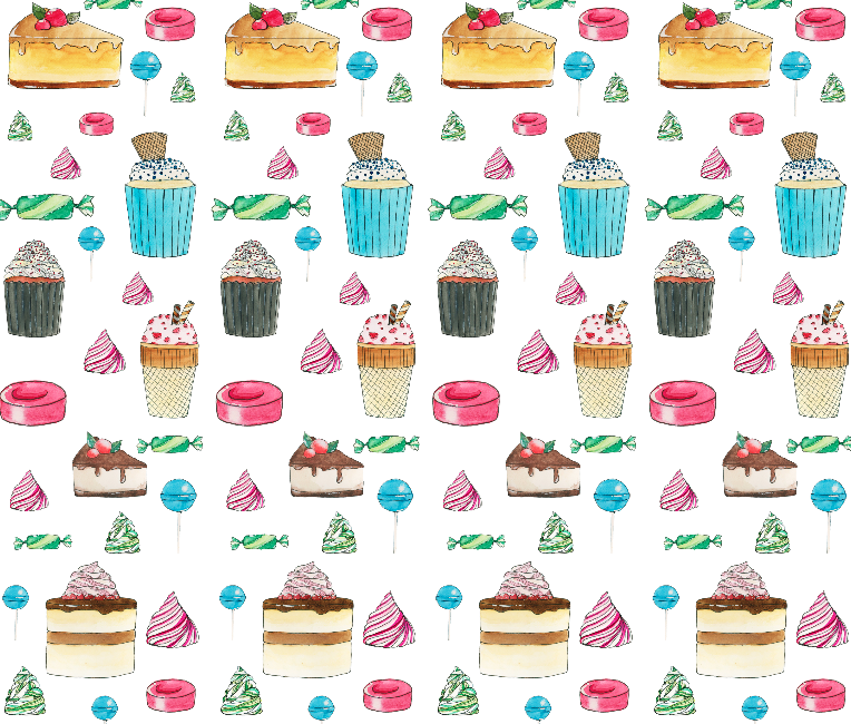
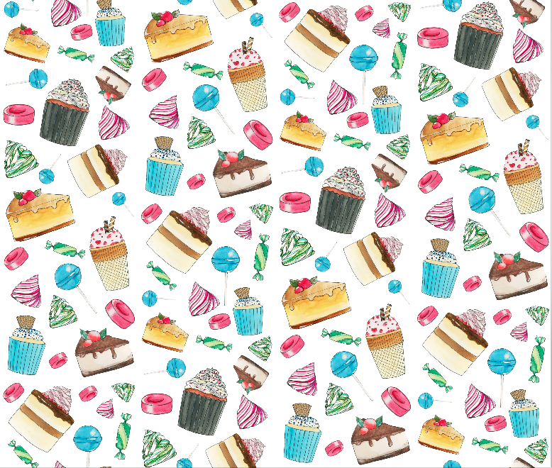
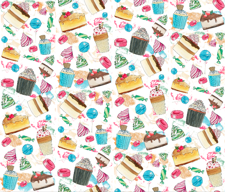
Below are the versions of the banner that I was experimenting with, after incorporating the oven inside. A pity, because I realised the banner is too narrow to place the whole oven in, and to get it to the size I like, which was to be large enough to focus on, so I had to cut out the details at the side, as the main focus was the bricks, metal grills and fire. I also tried layering the bricks on photoshop to make it longer, but that did not look as good (can be seen below).


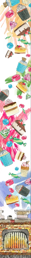
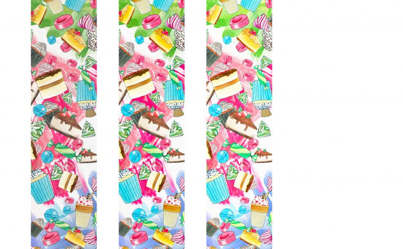
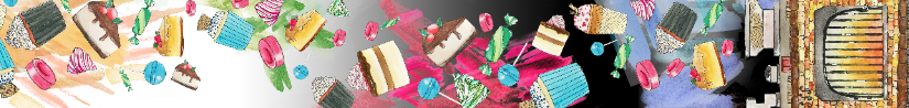
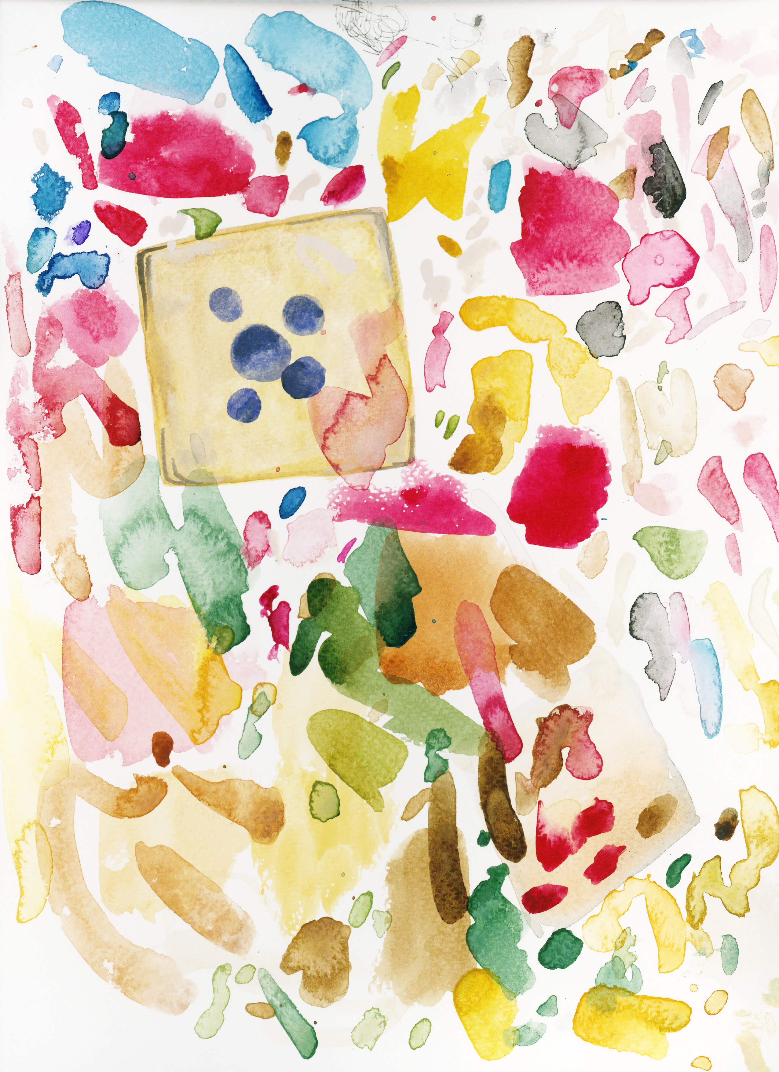
  1. Above is banner 1, the very start of when I placed the oven in. I shifted the falling motifs and colour splashes up and rearranged it a bit in order to fit everything in and keep everything within the banner. I also placed it such that the blue part at the bottom would appear like it was either being sucked into the oven or being blown out of the oven from the funnel, depending on what the viewer thinks.

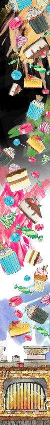
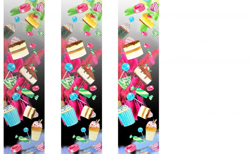
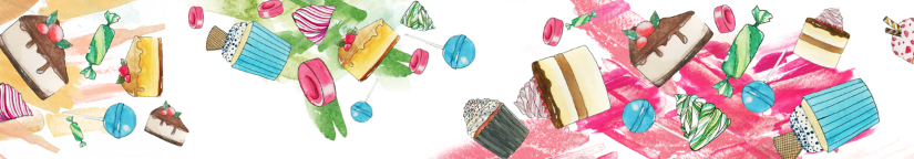
2. My second try was to place the black part using the paint bucket and gradient tool above, to create a more dynamic background, and also add a bit of mystery and sinister vibe to the banner.

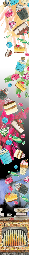
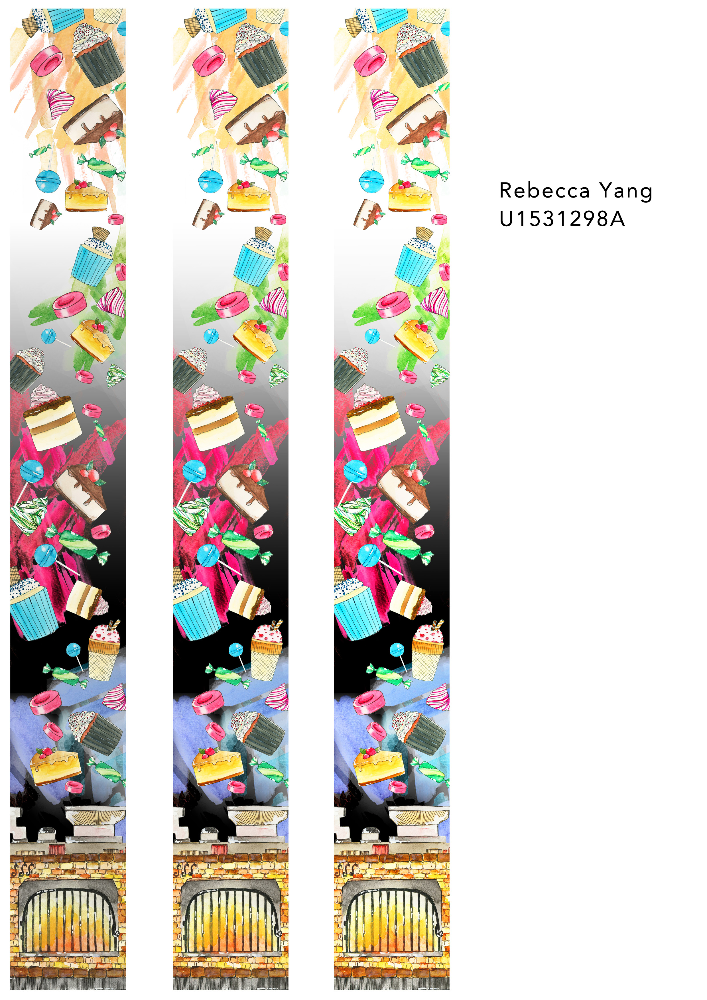
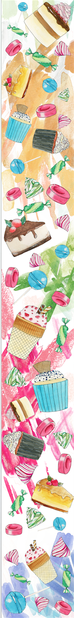
3. This is the last one, banner 3, which I like the most. I swapped the black and white parts, and I prefer this one because I think it suits the whole banner best, and is kept in lieu with the falling down effect. It also brings the viewer to see the black at the oven, which is the demise of evil in Hansel and Gretel, and allows the top to retain a more innocent, pure look. I also wanted to put smoke wisps in the background, but after scanning them and trying a few, I thought it looked slightly messy and was to strong, so I decided to leave it as such.

Thank you! (:


Work in Progress!

I’ve come up with a couple designs for the banners, but I think it still needs more work.

screen-shot-2017-02-21-at-12-10-03-pm       (1) I found this too uniform still, much like the previous design.


screen-shot-2017-02-21-at-12-10-15-pm(2) This was design 2, and I tried to cover the white parts to make the whole design fuller and more complete, but I still did not like the end result as I feel it’s too messy.


screen-shot-2017-02-21-at-12-10-26-pm

(3) This is the last one, which I like the most, I wanted to go for the feeling that the motifs were exploding out of the colours, and create a more fluid, expressive emotion with the colours as well. I think I may add an oven at the bottom, to symbolise the end of the fairytale whereby the witch was pushed into the oven and killed. I’ll also alter the background a bit, as I think the white is too plain, and likely add some texture to the background as well, like smoke coming out of the oven.

Process – Banner

Hello! I have done up three banners, all playing with the various motifs that I have posted earlier on.


Number 1:

screen-shot-2017-02-14-at-1-49-08-pm

This is the first one I did up, which I wasn’t very satisfied with because I felt it looked too rigid and the motifs were too straight and didn’t relay the playfulness I wanted in the banner.


Number 2:

screen-shot-2017-02-14-at-1-49-26-pm

Because I wanted some sort of dynamic component and didn’t like the straightness, I reorganised the motifs and made them slanted and slightly messier, so it would create a sort of falling down effect and the food items would look like they were dropping down from the sky in a haphazard and playful way.


Number 3:

screen-shot-2017-02-14-at-1-49-38-pm

This is the last design I was experimenting with. I kind of like the splashes of colour which I derived from the test sheet 1 and 2, using the colour select tool on photoshop. It gives the background more depth and character, like splashes of paint, so it does not look as flat. I decided to keep the motifs in the falling down/cascading sort of movement from Number 2.

Final Drawn Motifs

Hello!

I have added colour to my motifs by watercolouring them in, and decided to go for very bright, vibrant colours that would work for the fairytale about children like Hansel and Gretel.

Below are the scanned versions of the final work as well as the work in progress to show the kind of style I was experimenting with.


Final Drawn Motifs

Page 1
Page 1
Page 2
Page 2
Vanilla cupcake
Vanilla cupcake
Strawberry ice cream
Red velvet cupcake
Red velvet cupcake
Red sweet
Red sweet
Raspberry cake
Raspberry cake
Pink meringue
Pink meringue
Green candy
Green candy
Green meringue
Green meringue
Coffee cake (same design as chocolate cheesecake as I was playing around with the colour and how it would change the type of food it was)
Chocolate cheesecake (same design as coffee cake as I was playing around with the colour and how it would change the type of food it was)

Test Sheets (To be incorporated into patterns)

Test sheet pattern 2
Test sheet pattern 1
Test sheet pattern 2

Rough Work

Rough work in progress