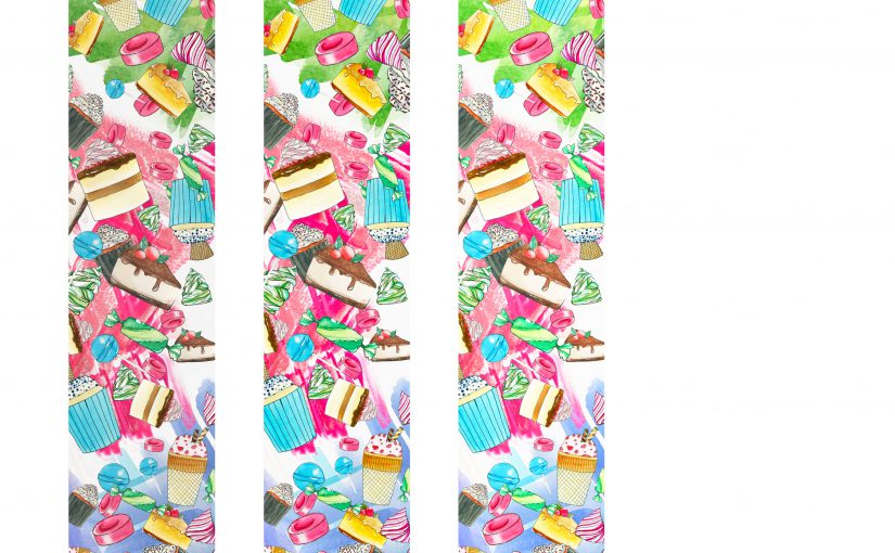
Hello! I’ve altered my final banner, which you guys can see below! (:
I prefer this one as the background looks cleaner and allows the motifs and patterns to stand out instead of sinking into the banner itself, so it adds on to the popping out effect. I did this by retaining a light coloured background, meaning I took away the black gradient effect, and replaced it with a almost white (sort of very faint cream colour) background. I added some colour so it wouldn’t look too stark white.
I also increased the space and area of the colour splashes – all colours blue, pink, green and brown – to fill up the banner more and look messier at the same time, so it would appear more energetic and vibrant. Then I also added more variety and number of food motifs so the banner would not look as empty.

As per the last test print:
- Left one = original
- Middle = +15 brightness, +15 saturation
- Right = +30 brightness, +30 saturation