#1 Deja-Vu
#2 Colour of Light


#3 Monochrome Composition

#4 Freedom of Choice


#5 Favourite Image

#1 Deja-Vu
#2 Colour of Light
#3 Monochrome Composition
#4 Freedom of Choice
#5 Favourite Image
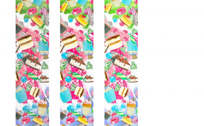
Hello! I’ve altered my final banner, which you guys can see below! (:
I prefer this one as the background looks cleaner and allows the motifs and patterns to stand out instead of sinking into the banner itself, so it adds on to the popping out effect. I did this by retaining a light coloured background, meaning I took away the black gradient effect, and replaced it with a almost white (sort of very faint cream colour) background. I added some colour so it wouldn’t look too stark white.
I also increased the space and area of the colour splashes – all colours blue, pink, green and brown – to fill up the banner more and look messier at the same time, so it would appear more energetic and vibrant. Then I also added more variety and number of food motifs so the banner would not look as empty.

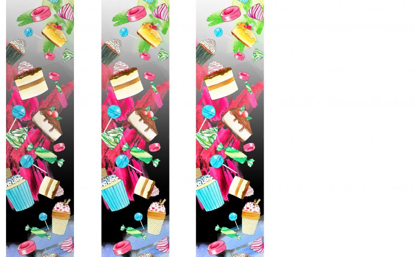
As per the last test print:
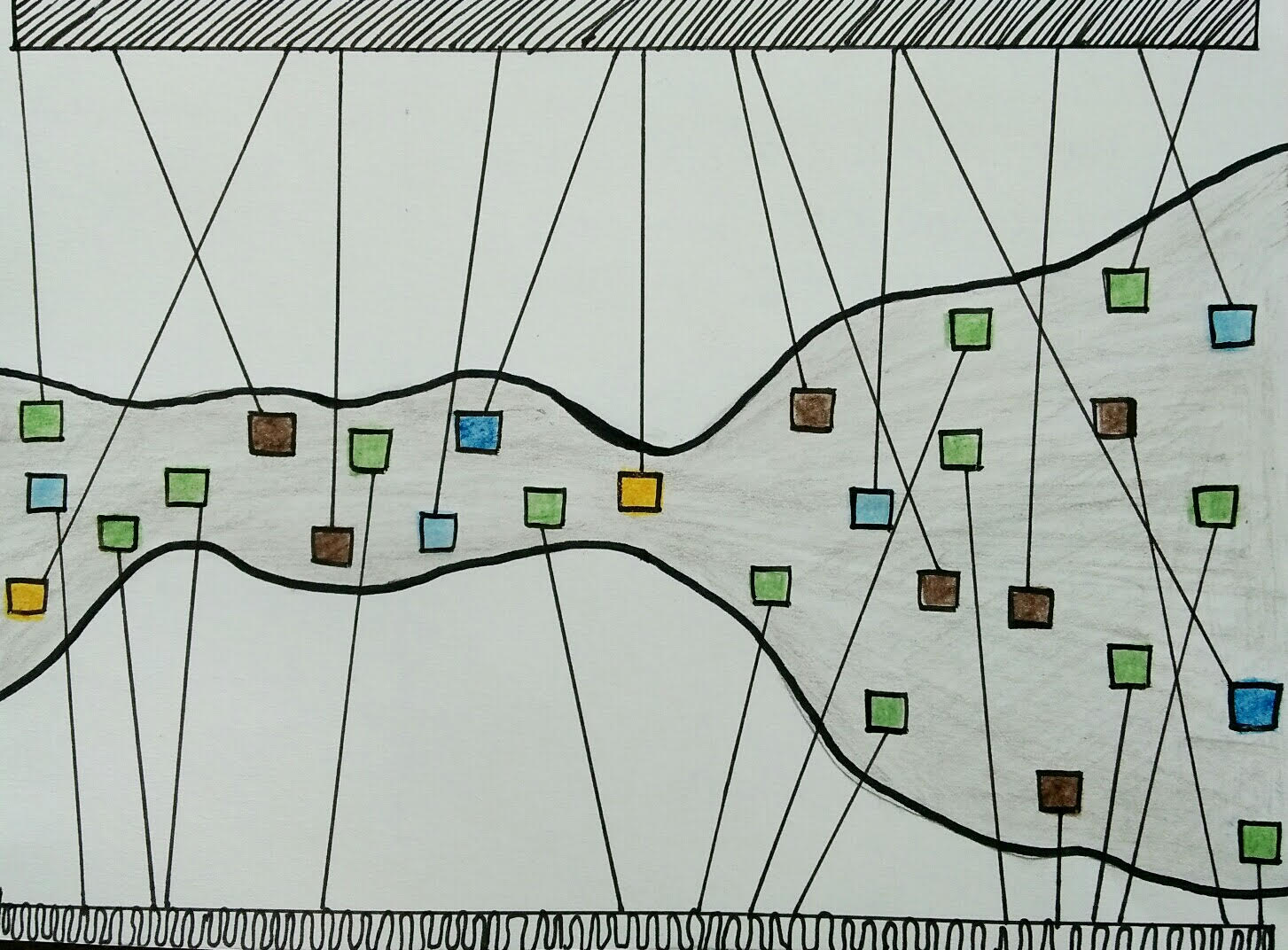
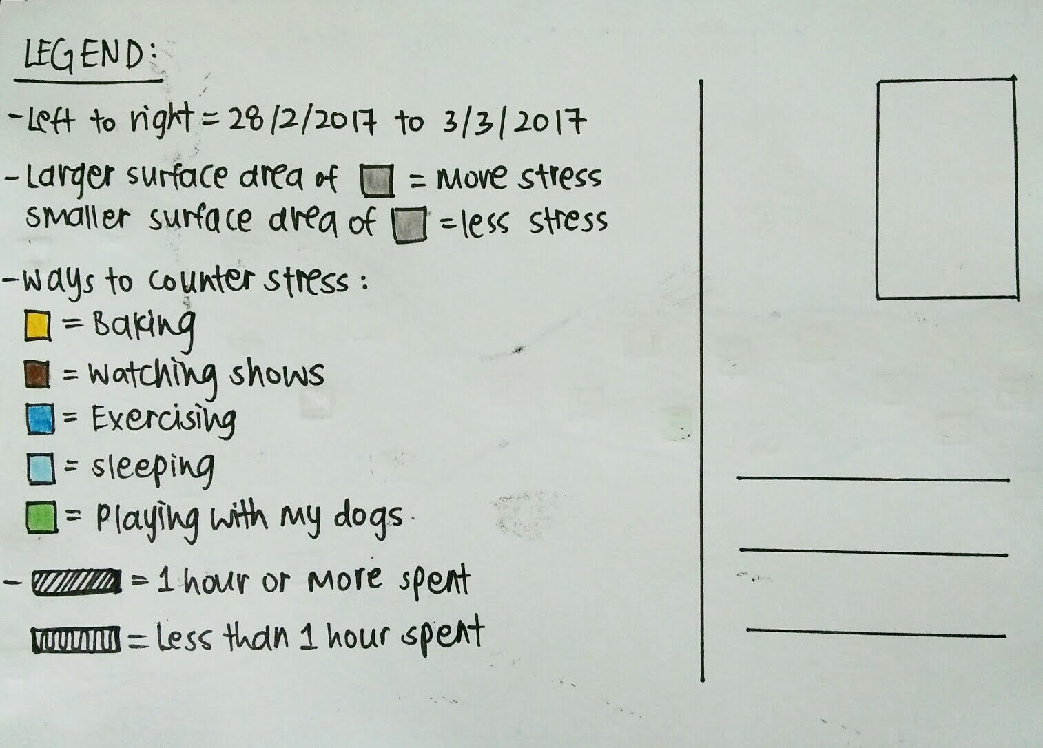
Hello from after recess week! Here’s my postcard for our weekly Dear Data, this time tracking stress.
Here’s what the final banner looks like for the A4 test print, with the second and third ones having 15% and 30% increased saturation and brightness respectively.
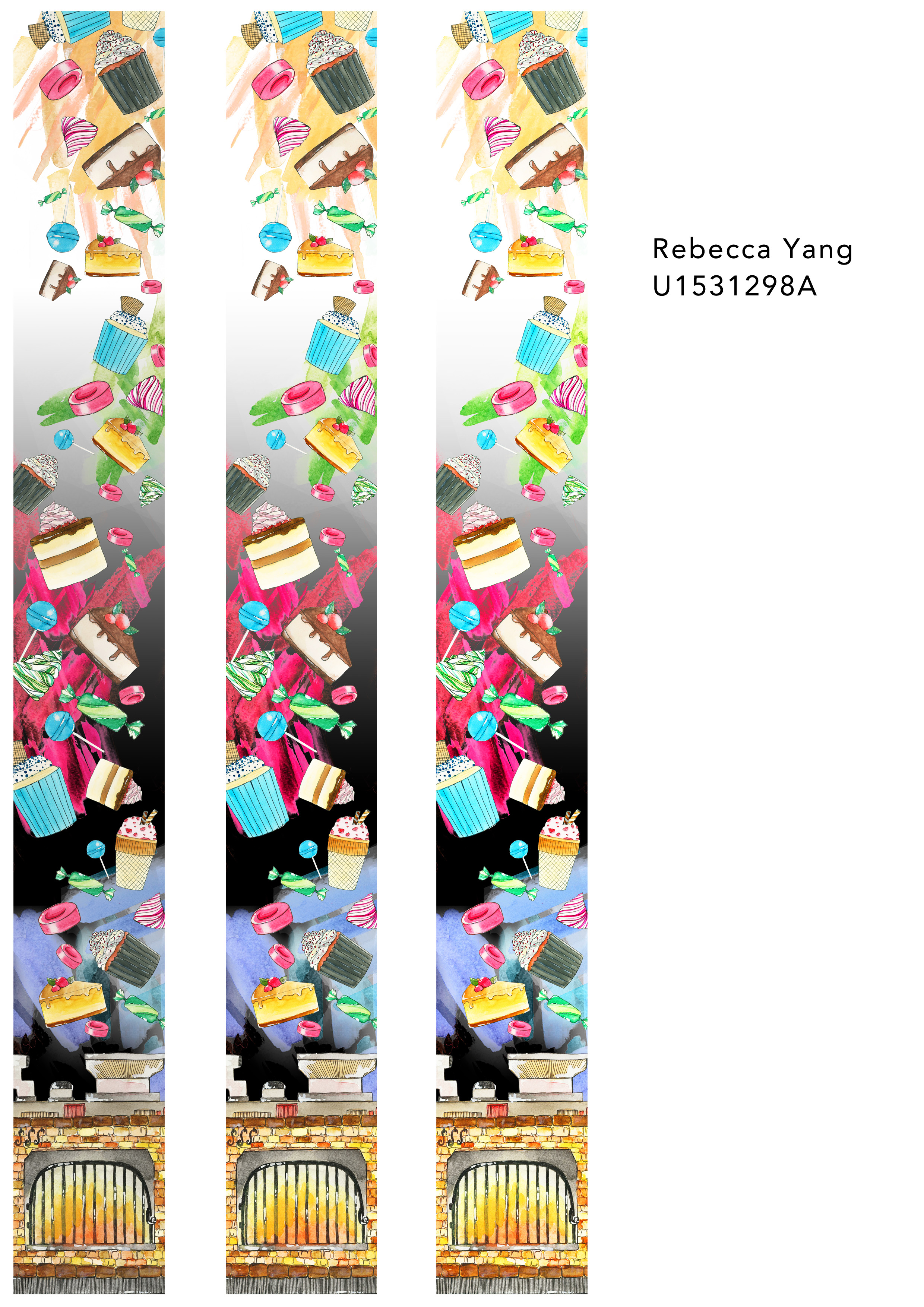
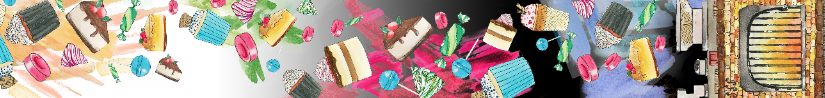
Here’s a quick update with my process for the Pattern banner before we do the printing!
I decided to draw an oven as a motif as well, and my intention is to put is at the bottom of the banner as a statement piece, almost like a full stop to the story, or like to mark the end of a sentence. In this case, it is to symbolise the end of Hansel and Gretel when the children pushed the witch into the oven.
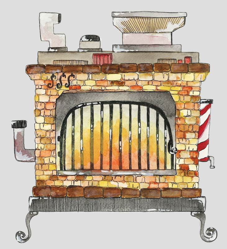
Above is the scanned drawn and watercoloured oven that I’ve done, before I changed into into a PNG on Photoshop. I wanted the fire to look like it was still burning and in action, to create a more dramatic and ongoing look. I also did not want a conventional looking oven, and sought to create a more whimsical version, so I added the extra details like the swirly legs, funnels, pipes and chutes.
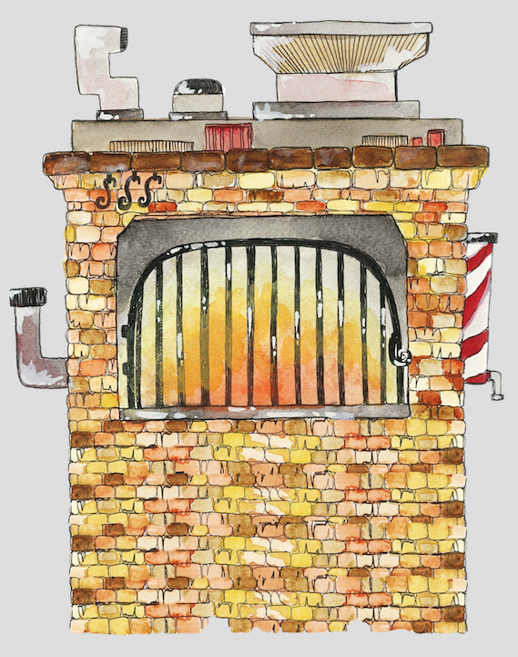
Below are the versions of the banner that I was experimenting with, after incorporating the oven inside. A pity, because I realised the banner is too narrow to place the whole oven in, and to get it to the size I like, which was to be large enough to focus on, so I had to cut out the details at the side, as the main focus was the bricks, metal grills and fire. I also tried layering the bricks on photoshop to make it longer, but that did not look as good (can be seen below).
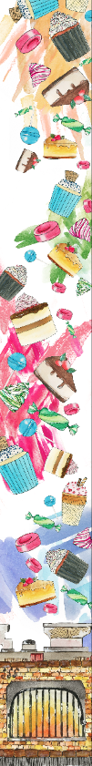
2. My second try was to place the black part using the paint bucket and gradient tool above, to create a more dynamic background, and also add a bit of mystery and sinister vibe to the banner.
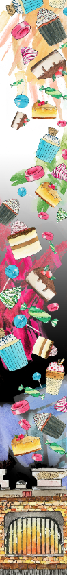
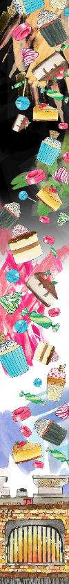
3. This is the last one, banner 3, which I like the most. I swapped the black and white parts, and I prefer this one because I think it suits the whole banner best, and is kept in lieu with the falling down effect. It also brings the viewer to see the black at the oven, which is the demise of evil in Hansel and Gretel, and allows the top to retain a more innocent, pure look. I also wanted to put smoke wisps in the background, but after scanning them and trying a few, I thought it looked slightly messy and was to strong, so I decided to leave it as such.
Thank you! (: