2D ll – Project 3 Research

Hi everyone! Just a quick update!

I’ve thought of creating a book titled ‘My Dark Side’ (or something like that, maybe I’ll change the name hahaha). I want it to incorporate things that are negative of myself, or people in general, such as my fears and dislikes.


Also, for this assignment, I have referenced certain artists or programmes and art forms that I was intrigued with as a child.

Tim Burton:

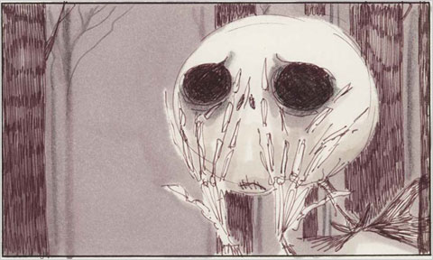
I’ve always enjoyed Tim Burton’s work, whether in its pure art form, or in films. I feel his characters have a certain captivating aspect and consistency. His works are extremely identifiable, and anyone who is familiar with his art would be able to point them out. I particularly like that he can add personality and bring his characters to life while keeping them illustrated in regular mediums and pen.

8a3f53eddb82213dd004f5b5843dd033 lionking tim-burton-sketch xmas

Happy Tree Friends:

Ok, firstly, I won’t put the explicit examples here that I looked at, because they are slightlyvery graphic and gory. But I’ve watched clips of this cartoon when I was growing up, and I like how everything looks so happy, with such vivid colours and children-friendly animal characters, but 30 seconds into the video, things take a violent turn. I found this particularly appealing, because it’s something that amalgamates a cute element with a sinister one, and it basically plays on the shock factor which I didn’t see coming the first time I watched it.

Happy-Tree-Friends hqdefault

2D II – Project 1 FINAL

It’s a wrap for Project 1! I’m happy to say I had a lot of fun finishing my first ever typography assignment, and there were a lot of things I learnt from it – like working on my conceptual and photoshop skills, sourcing for materials, what types of glue to use for various mediums.

I’m definitely looking forward to the next project after hearing the feedback, because I feel there is a lot of room for further improvement of my concepts and I also want to continue honing my photoshop (something that I found very useful during this assignment), photography, tactile and sensory skills.

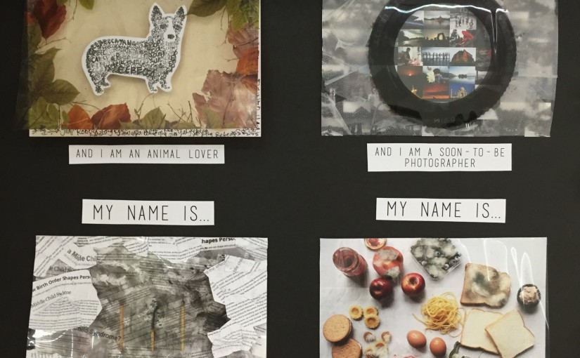
Soooo without further ado, here are my final designs for the project!

IMG_2612IMG_2605

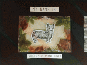
GIF ANIMAL LOVER

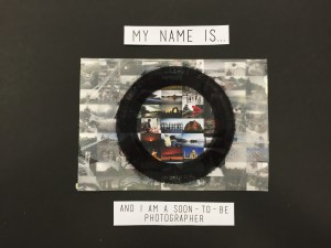
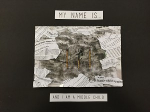
IMG_2607 GIF PHOTOGRAPHYIMG_2608GIF MIDDLE CHILDIMG_2606GIF FUSSY FOOD Continue reading 2D II – Project 1 FINAL

2D II – Project 1 Development (#3)

OVERALL DESCRIPTION:

Hello everyone! I just thought I’d separate my process entry from the final work entry so it will be easier to follow.

My final steps for Project 1 included photoshopping, experimenting with materials I had lying around at home, taking photos, and scouting various printing shops.


FUSSY FOOD EATER:

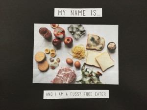
For this piece, I started executing it by creating my own photo to be used as a backdrop. I’ve always been interested in both food and photography separately, and I love it when the two are put together and beautifully integrated. I actively follow food bloggers and instagrammers, read recipes and watch cooking videos to get inspiration for my daily life in general, aside from artistic purposes. Therefore, I was super excited to begin my fussy eater piece.

Another thing that is kind of ironic is that although I like things to do with food, when I cook or bake, I prefer feeding people more than myself. This leads me to the fact that it’s because I’m quite picky, and refuse to eat a lot of things. I can eat the same thing for days without feeling bored. So a lot food is wasted on me because they’re too exotic for my taste (although they’re not actually, I’m just strange).

My concept was to show food wastage, using mould to symbolise decay on the ingredient that I don’t eat. I specifically chose to use basic items like bread and raw meat instead of fully cooked plates of food because to me, as long as a dish contains food that I don’t like, I’d rather not eat it, so the entire thing would be mouldy and cannot show the contrast.

Here are some photos I took with the background set up:

Food 1 Food 2 Food 3

I used paper towels as a makeshift background to give it a little more texture, and because it’s a medium that is related to the kitchen. I decided to go with the last photo because I feel it’s more compositionally pleasing and organised, and shows the slight grouping of food groups – carbohydrates, vegetables, proteins, snacks and fruits (in a clockwise direction), without making the separation too obvious.

I digitally manipulated the mould effect on each of the food products I don’t eat, which was printed on a transparency to act as an overlay-ish effect, as shown below. Even then, I felt it was still inadequate to convey a rotting sort of feeling. So I used double sided tape to stick cotton bits on top of the photoshopped mould to give it a further fuzzy effect.

IMG_2587IMG_2590 Mould ForegroundIMG_2604IMG_2597


MIDDLE CHILD:

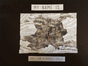
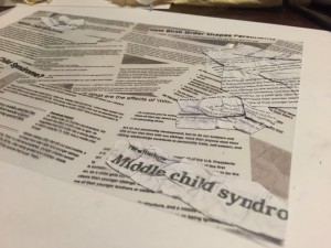
While doing some research on Middle Child Syndrome, I saved some articles, which came in useful after that because I printed those out and used them as a 3D medium for the transparency. I wanted each of my pieces to have certain aspects of digital work as well as experimentation with other physical materials.

I started by digitally creating a background of three matchsticks lined up, but they were like legit ugly hahaha. I’ll just put them below to show the process!

Matchsticks Matchsticks 2nd editionI was not kidding when I said they were ugly ):

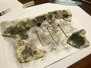
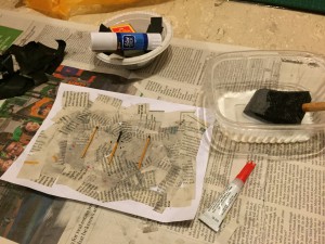
But anyway, feeling very unsatisfied with that, I decided to use real matchsticks and stick them on instead. It was initially very hard to get a visually attractive burnt matchstick without it crumbling away. They were either not burnt enough, or burnt too much that they disintegrated. So I used lit up a box and shortlisted the nicer matchsticks. My other issue was sticking the matchstick to the paper itself because if I only stuck the base, the top burnt bit it would crack up and turn to soot. So I used super glue as a coating to retain the burnt part’s shape, and use the charred pieces from the other test matchsticks and superglued that on too, to give it more effect.

I wanted to further create a negative sort of atmosphere for this one, so I tried burning cloth and painting it with black watercolour to portray a burnt effect. That didn’t work out so well, so eventually I went with using the same cloth dipped in watercolour this time, and using that as a makeshift brush to create a scratchy texture.

IMG_2583IMG_2589

My final step was to paste the articles on the transparency, as mentioned above. I ripped and cut them up, and used white glue with water to stick them on, and created a border so the matchsticks would not be covered.

IMG_2585 IMG_2586 IMG_2601IMG_2599


SOON-TO-BE PHOTOGRAPHER:

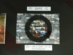
I started by creating a collage of photos from leisure outings or overseas photography trips, etc, that I’ve amassed from over the years since getting more involved in photography. I chose to do this piece because I think photography is a major aspect of my life, as it’s what I will probably be doing in the future. In addition, I also feel that photos have the ability to capture moments in a physical capsule that can be pulled out any time, and acts as a memory holder. When used correctly, it can mentally recreate moments, invoke a sort of feeling (maybe sentimentality, happiness or anger), and basically do what the human mind cannot: remember things clearly.

Therefore, I used photoshop tools to desaturate and blur out the photos that are outside of the lens that I printed on the transparency, to show that what is not captured in the camera will eventually become lost in the innumerable memories we hold in our minds. I also tried using a collage with smaller photos, but I felt that the one with larger photos was better because the photos could be seen more clearly, which conveyed the message more accurately.

Smaller photography PHOTO BACKGROUND - BEFORE DESATURATING DESATURATED PHOTOG BACKGROUND

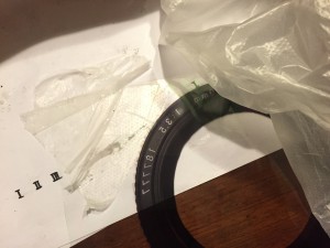
I wanted to use translucent paper instead of transparent ones, but after searching a couple of printing shops, I could not find any of suitable opacity and thickness, so I went with transparencies instead (which is good because I feel like it worked out better this way actually woohoooooo). To further push my idea that moments are clearer through a camera, I used a textured plastic bags to cover the transparent parts, leaving only the lens area completely see through. The photos below show that, as well as an indication to demonstrate what the printed out and desaturated background looks like before they’re both assembled.

REPRINT LENS IMG_2593 IMG_2603 IMG_2598


ANIMAL LOVER:

I drew a corgi to show the breed of dog I want in the future, as I love all animals, but dogs are my favourite. Perhaps it’s because I grew up being surrounded by animals. In that past, I have had four hamsters, a bird, a rabbit, and two dogs, on top of the three dogs I have now 😀

I made the corgi out of my name, some drawn thicker than others to give it some shading, and I felt that background was too plain, as compared to my other designs which featured a sort of texture. Therefore, I cut out and pasted a sand-coloured cloth to the paper, in lieu with the organic and nature-ish theme of this piece. I added more of my name in the background to give it extra repetition.

After the steps listed above, I still felt it could be a less flat on the paper, so I used thick paper, wrapped in with masking tape to match the cloth’s colour, and created a pop-up effect, so the corgi would obviously be the centre of attention in this piece.

IMG_2594 IMG_2595

For the transparency, I digitally manipulated leaves, some of which I scanned in, and create a border. I wanted the clear plastic to symbolise that animals should not be kept in places like zoos and circuses, because I’m an advocate of freedom for animals. It’s ironic because I love having them around and being with animals, but personally, I feel it isn’t right to keep them sedated or used as tools and props because they belong in their natural habitats. Especially for wilder ones like lions or elephants. The plastic is sort of like a representation of glass, to be caged in.

I have never printed with transparencies before and wasn’t sure how it would turn out, so I created two versions of the leaves, one more faded with less contrast than the other.

Leaves Cover Lightened REPRINT LEAVES IMG_2602IMG_2600

2D II – Project 1 Development (#2)

CONTINUATION OF PROJECT 1:

This week, I tried out my initial ideas, as shown below.


MIDDLE CHILD:

IMG_0461 IMG_0466 IMG_0464

I wanted to use newspapers as the background, to bring across the feeling of ‘in the past’, as I personally feel that middle children are affected by Middle Child Syndrome more during their formative years. I used white glue to stick the newspapers on in a collage sort of way.

ANIMAL LOVER:

IMG_0472 IMG_0468

Just to experiment with, I did up a very quick random mock up of a dog portrait, and used glue to stick on materials that I had at the moment, and reminded me of nature – tissue paper, leaves and grass.


FINAL IDEA:

I felt like my ideas were very isolated from one another, in a sense that they did not have anything that linked them together in a way that flowed well as a project. So after giving it some thought, and doing more research, I decided I wanted to use translucent paper (maybe acetate) as a medium that would link all four (YAY LOL) of my typographic pieces together.

I drew inspiration from a design that I had seen previously – it used transparent plastic with mould printed on it as a wrapper for sandwiches, as a deterrent so that people would not steal the food.

$_1 cf3703a4546b280cd9395b520f1c2453 f9beebeac6b41b2ead2b1812758d72cd

The concept that would be a bridge to link all the pieces together would be by using translucent paper with individualised prints or designs on them, and they would be attached landscape to the top of each piece, and act as an overlay.

For example, for ‘Fussy Food Eater’, I will stage a photograph of each food group, and on the separate piece of translucent paper, print our mould to fit over the foods that I don’t eat, to represent being picky leads to wastage.

For ‘Middle Child’, I may print translucent newspaper/book clippings that are related to children on the overlay sheet, instead of using it as a background for the matches.

I will continue to update OSS when I have more precise ideas to show, as well as first-round experimentations of each piece! (:

2D II – Project 1 Development (#1)

THE 6 ATTRIBUTES:

After contemplating which aspects of myself I wanted to attempt to portray with assignment 1, I decided that I wanted it to encompass my feelings, interests, habits, and future aspirations, as I feel that these general factors contribute greatly to the components of an individual.

  1. Fussy food eater
  2. Animal lover
  3. Soon-to-be photographer
  4. Baker
  5. Sentimental hoarder
  6. Middle child

IMG_9808

Screen Shot 2016-01-28 at 8.13.13 AM

I began by going on Pinterest to search for ideas and different types of materials used, as I knew it would be fun and informative to test out various mediums.


FUSSY FOOD EATER:

I usually am quite fussy, unless the situation disallows me to be, and I pick out food that I want to eat, and waste the rest, which isn’t a very desirable habit of mine.

I wanted to use both 3D and 2D materials to challenge my creativity, and therefore thought of using water colour paint to create ice cream cones with actual food or its wrappers to substitute ice cream.

My initial idea:

IMG_9809

IMG_0108

Water colour food inspiration

Screen Shot 2016-01-31 at 5.58.44 PM
After giving it further thought, I may position the food in a manner that looks as though I bit into the ‘ice cream’ and wasted it, showing the downside of being fussy. Another idea I had after consultation was to use rotten/moldy food to represent the ice cream, which increases the feeling of repulsion and wastage, depicting my feelings towards the subject.


ANIMAL LOVER:

I have three dogs at home, and personally, it’s something I hold dear, as I value them very much, and I believe nothing can replace the feeling of having a pet and earning its trust and loyalty. In fact when I’m older, I would like to have dogs in place of kids 😀 Having said this, I do like other animals as well, and it isn’t just confined to dogs alone.

Although, on the other hand, I also feel that an animal’s instinct is to be in the wild, and sometimes I do think it isn’t fair to keep them away from their natural habitats, and keep them domesticated.

My idea is to create a portrait of one of my dogs using patterns (different forms of black and white patterns) and my name. I also want to use bits of nature, like leaves, twigs, cotton, etc, to symbolise that its a large part of animals to long for being in the wild.

IMG_9814

Twigs (1)


SOON-TO-BE PHOTOGRAPHER:

My major for Year 2 onwards is Photography and Digital Imaging, and so, I believe my skills in this area will definitely be honed and sharpened. I wanted to bring across the idea that my opinion on photography is that it is a very important aspect of life, as it captures memories – ones that the human mind cannot remember clearly even if we try, as memories become blurry in time.

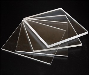
Therefore, I wanted to make a collage of photos that I have taken over the year in a cool blue-ish hue, and blur out it out to create a background. In contrast, I wanted to create my name using some sort of reflective material (like scotch tape or acrylic), to spell out my name, and the areas that is part of my name will be slightly brighter in nature and colour, and of high definition. This is to represent that parts behind the lens will always remain vivid and clear.

IMG_9812

acrylic_sheets_clear-xl


BAKER:

I like to bake as a past time, as I find it therapeutic and calming. I usually bake during my free time, or even if I am busy, I try to make it a point to wake up early and whip up something in the mornings.

Here are some of the things I have done so far:

IMG_0223

IMG_2326

IMG_8864

IMG_9117
I thought of using items like cupcake liners to give texture to the background, and using icing in a piping bag to create my name, and take a photograph of that (playing with lighting and locations), to create typography for this attribute.

However, after consultation, I also thought that the concept for this one was not strong enough, and did not portray my feelings towards baking. I then thought of things that I felt were calming and sort of cathartic, to show my thoughts on the subject. Other materials I have considered using are things like coffee, flowers, cocoa powder, etc.

IMG_9827


SENTIMENTAL HOARDER:

I usually keep things – mementos, items, cards, notes – that I receive from people, as I find meaning and value in them, and it helps me remember good times from the past. As a result, my room is packed with boxes of things, but they’re all neatly in different boxes, labelled with names like ‘cards’, ‘from friends, ‘letters’, etc, and I know where to find the stuff. In other words, I am an organised mess.

Or, as I would call it, a ‘sentimental hoarder’. I find there’s nothing wrong with keeping things, as hoarders would, but due to the lack of space, I have to filter and throw out some things. Ultimately, I only keep the stuff that are very precious to me.

I thought of using old wrappers (either part with the ones I have hoarded over the years or replicate them), to show a timeline of items I have kept. The wrappers I have are creased, but not entirely crumpled because I have taken care of them. I was also thinking of arranging them into my name, with the nicer things being arranged neatly, while the others (trailing off from the end of my name), will be messy, and in darker lighting, to symbolise that I’ve disposed of those items.

IMG_0110


MIDDLE CHILD:

Middle Child Syndrome is an actual tangible issue, perhaps not for all, but being a middle child myself, I can say that I experienced it when I was younger. Growing up, it’s true that middle children sometimes feel out of place, as the elder sibling is viewed as the mature, responsible one who has the respect of the parents, while the younger sibling is frequently doted on, and essentially, very well looked after.

This leaves middle children feeling lonely, always having to vie for attention and eventually, becoming competitive with his/her siblings, and feeling burnt out if the issue is not addressed. Of course, most of the time, if parents treat the kids impartially, it isn’t their fault – it’s just the way things are.

So my idea is to show the tired, angry sort of feeling middle children feel. I thought of using matchsticks or fingerprints, always making the one in the middle different from the other two. I will most likely go with matchsticks, as I feel this medium accurately represents what I feel on the subject.

IMG_9821IMG_982225

CLYRIA – CHAPTER 2

CHAPTER 2: THE JOURNEY CONTINUES

After the close encounter with The Rogues, the both of you rested for the rest of the night on the treetops, in case others attacked as well.

By morning, you two set off again, heading towards Myra, the capital of Uthad, where The Force’s headquarters was at. After hiking for hours, you realise the path you had intended to take to enter through the back door of the headquarters is blocked off by a rock slide, and hugh rocks were now obstructing your path. The ground and area were completely unstable, and the grappling hook or other tools could not be used in the situation because the rocks would tumble and it was life threatening. You could potentially fall off the cliff that is on the right of the rock slide.

However, you are not sure exactly which route you can take now.

There is a small city to the left, about 10 kilometres away, that deviates from your original path. Veggie proposes going to the village to ask for directions and find another road.

Do you attempt to cross the rock slide or go to the village?