2D ll – Project 3 Development

Hello everyone! This will be my process post for this project. In this post, I will be talking about the overall theme, illustration process, photoshopping, using InDesign, binding, type of paper used and difficulties faced (:


overall theme:

My concept for this assignment is based on my ‘darker side’. I wanted to use this Zine as a demonstration of my negative aspects, namely my fears and things I dislike. I chose to go for this theme because I felt that my previous works, whether in semester one or two, have mostly highlighted positive things when it came to representing myself. Therefore, I wanted to challenge myself and try something different.

Another reason was that my projects from semester two have been especially based on photography, setting up, and photo editing. Although it’s what I enjoy doing, I acknowledged that I could try different styles, even more so after reading comments or hearing what my classmates had to say, which was to try something new.

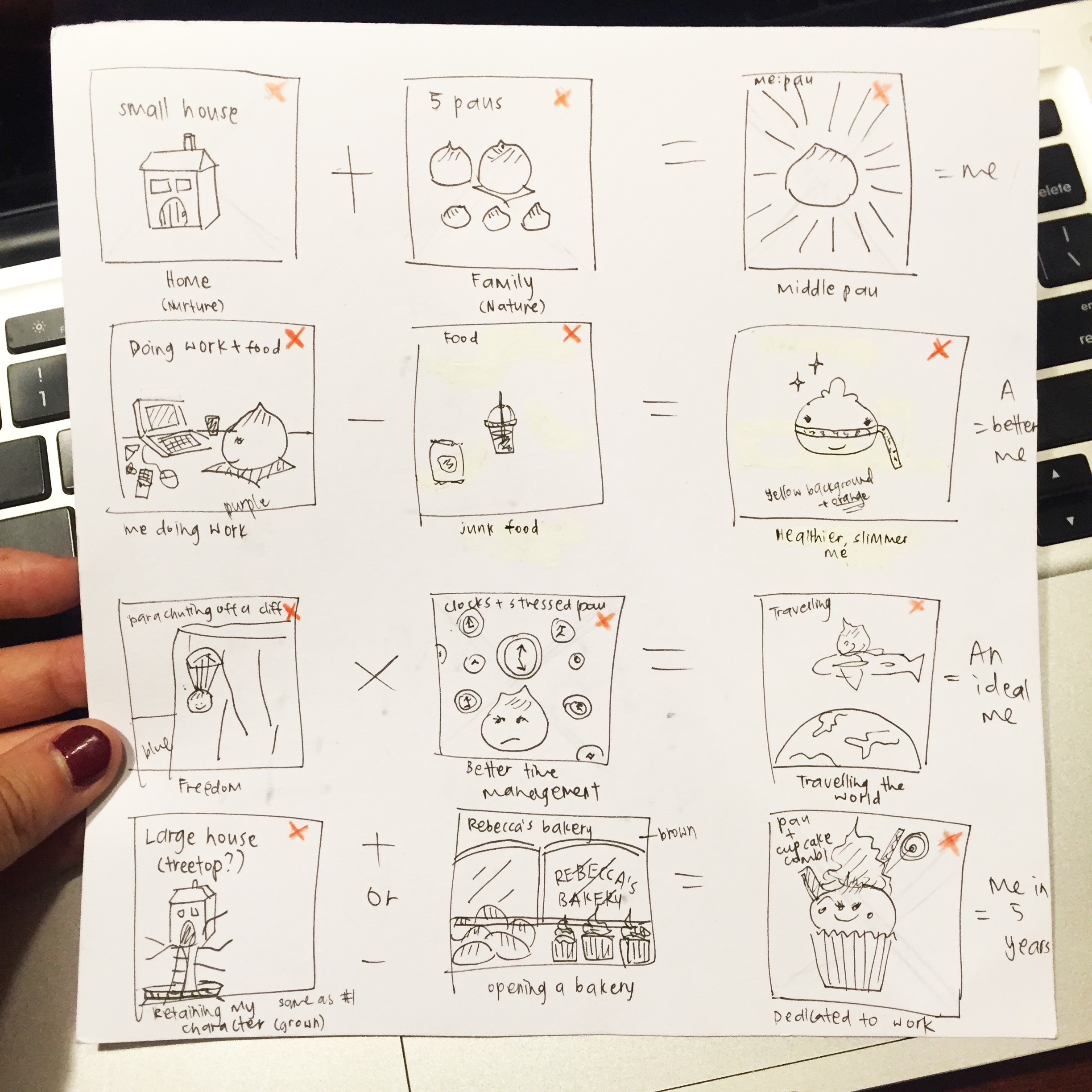
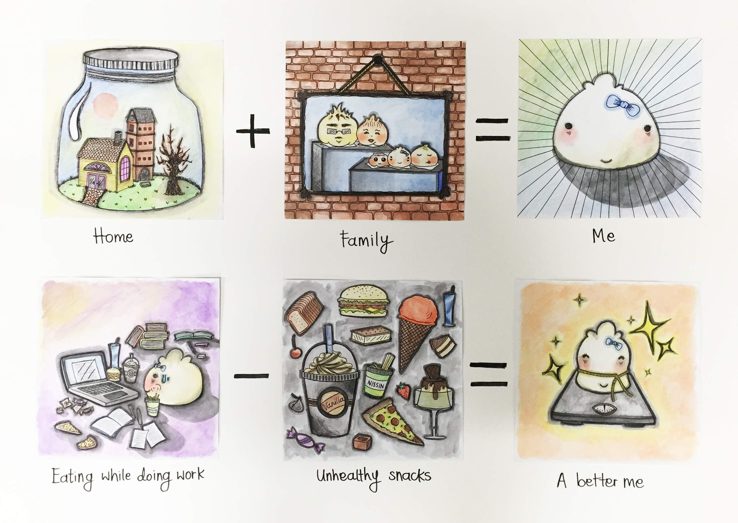
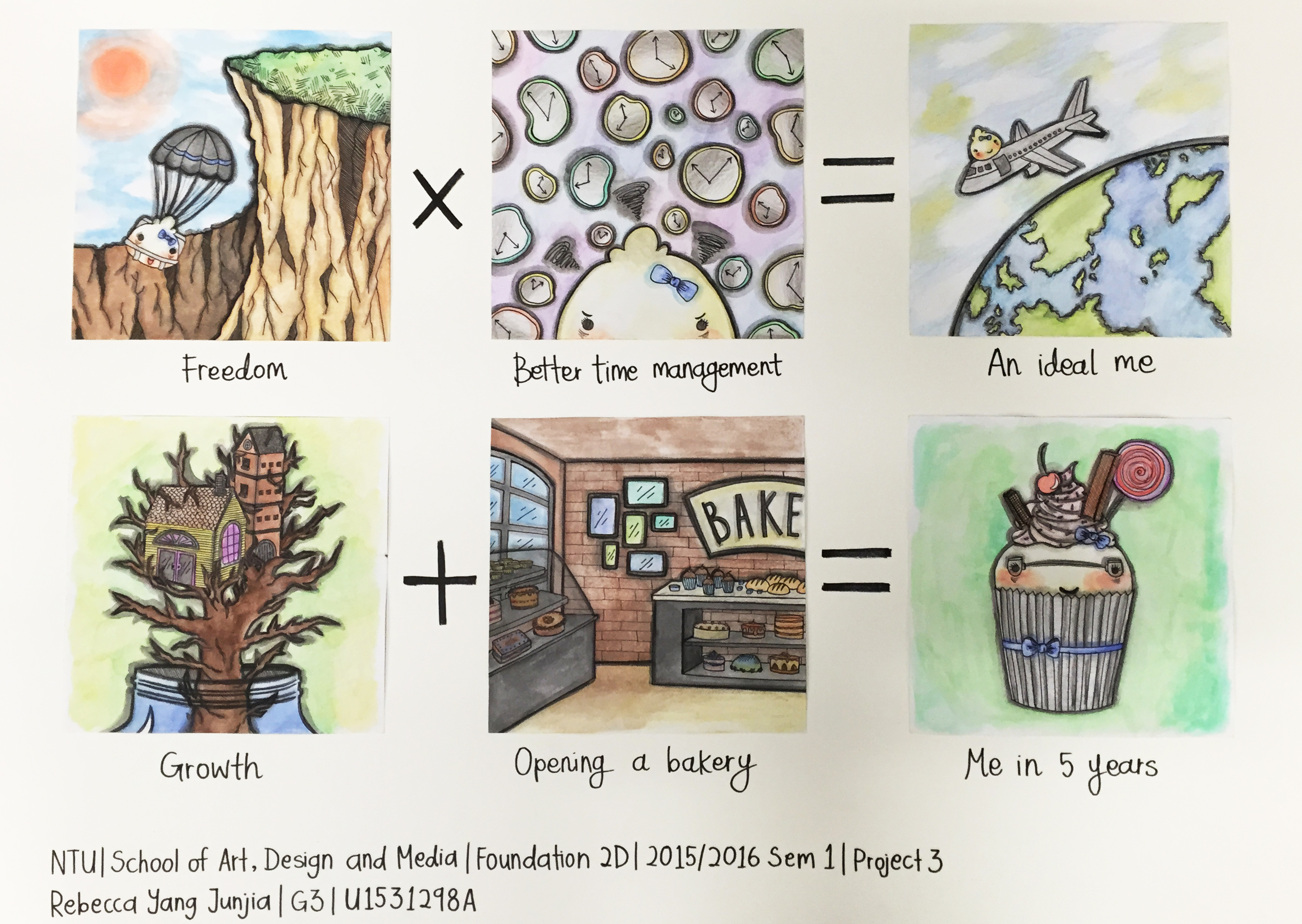
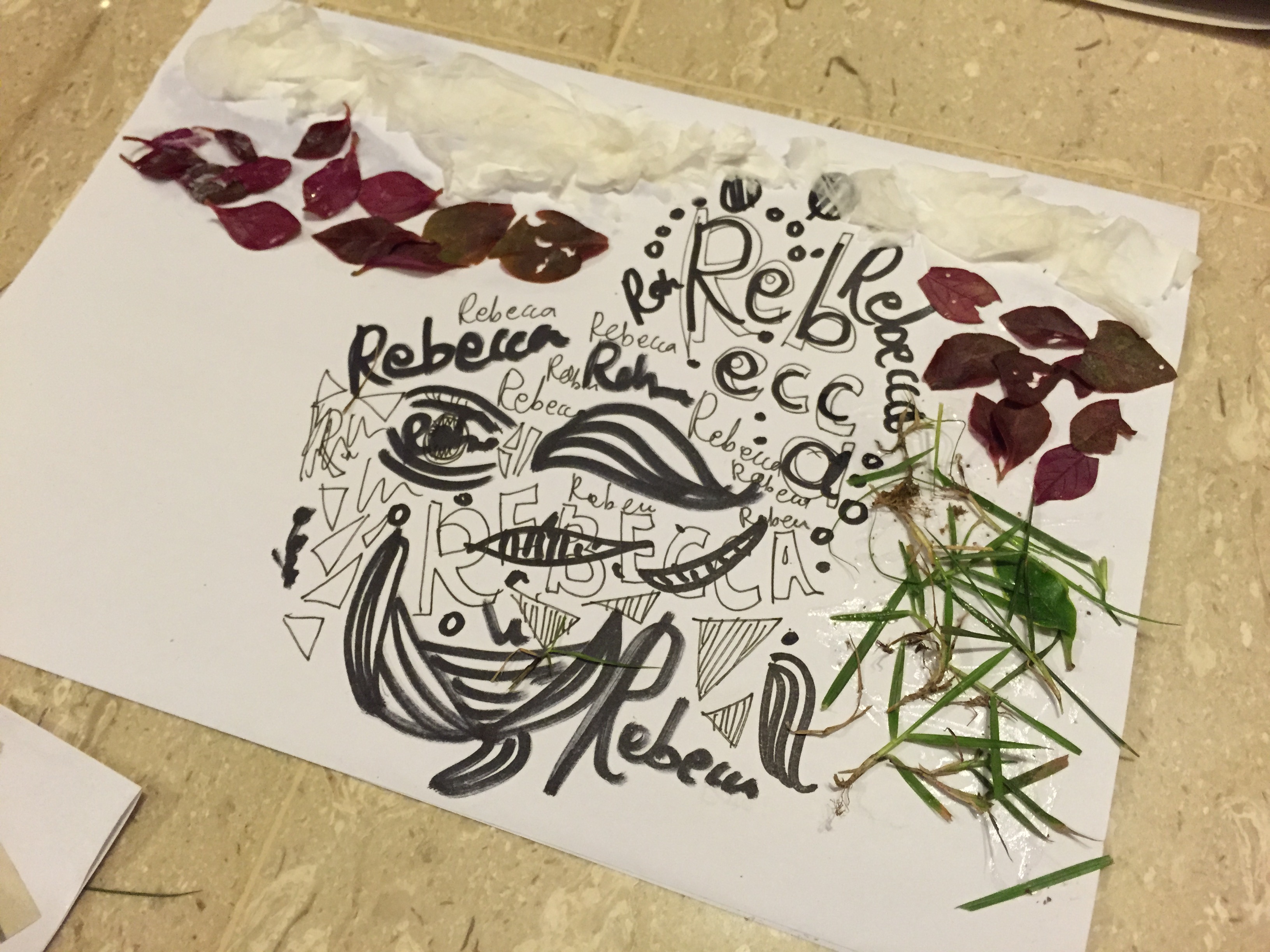
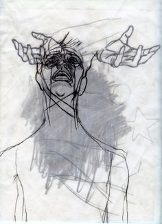
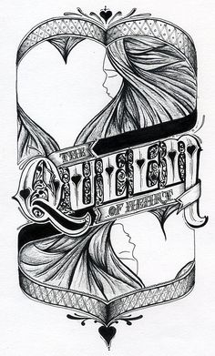
Additionally, because I knew this project should ideally be combined, an extension or a rearrangement of our previous works, I decided to make it relative to my work from semester one’s Ego project. My Ego project was done by illustrating in pencils, outlining in pens and then colouring in with watercolour pencils. You can see it below!

IMG_2535

IMG_2537 IMG_2538

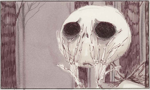
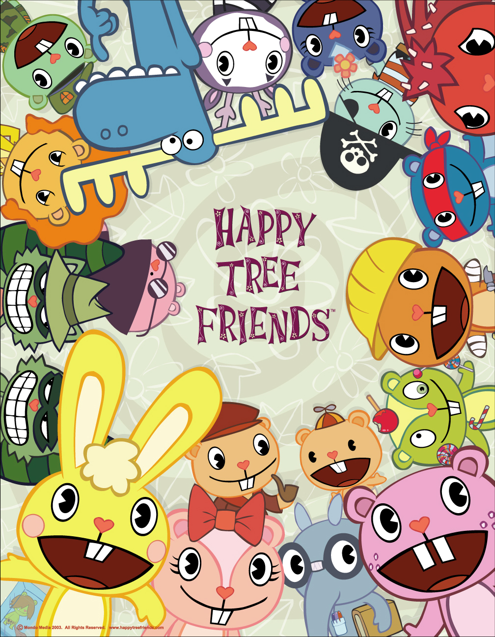
In order to keep the whimsical and child-like nature of the Ego project, I decided to go for a sort of book that would be for adults, however, look like it’s for children. I kind of liked the idea of an illustrated book based on my inspirations like Tim Burton, Happy Tree Friends, and Fran Krause (who did the Deep Dark Fears series, one of my faves). So the style would be dark, eerie, and maybe even slightly sadistic, but look sort of cute at the same time.

I also went along to continue drawing paus, because I’m represented by a pau. So this assignment is full of paus as well. However, in some illustrations, I adapted to pau to have a body.

After consultations, I also decided to go with content that were ‘not so normal’ – things that others would envision to be good things, but to me, they have a negative connotation. For example, things like children, coffee, balloons, high heeled shoes, etc. Joy mentioned that it would be more interesting and less expected, and I’m glad I heeded her advice! I tried as best I could to think of and illustrate less expected ideas, and to follow this direction throughout the Zine.


IllUStration process:

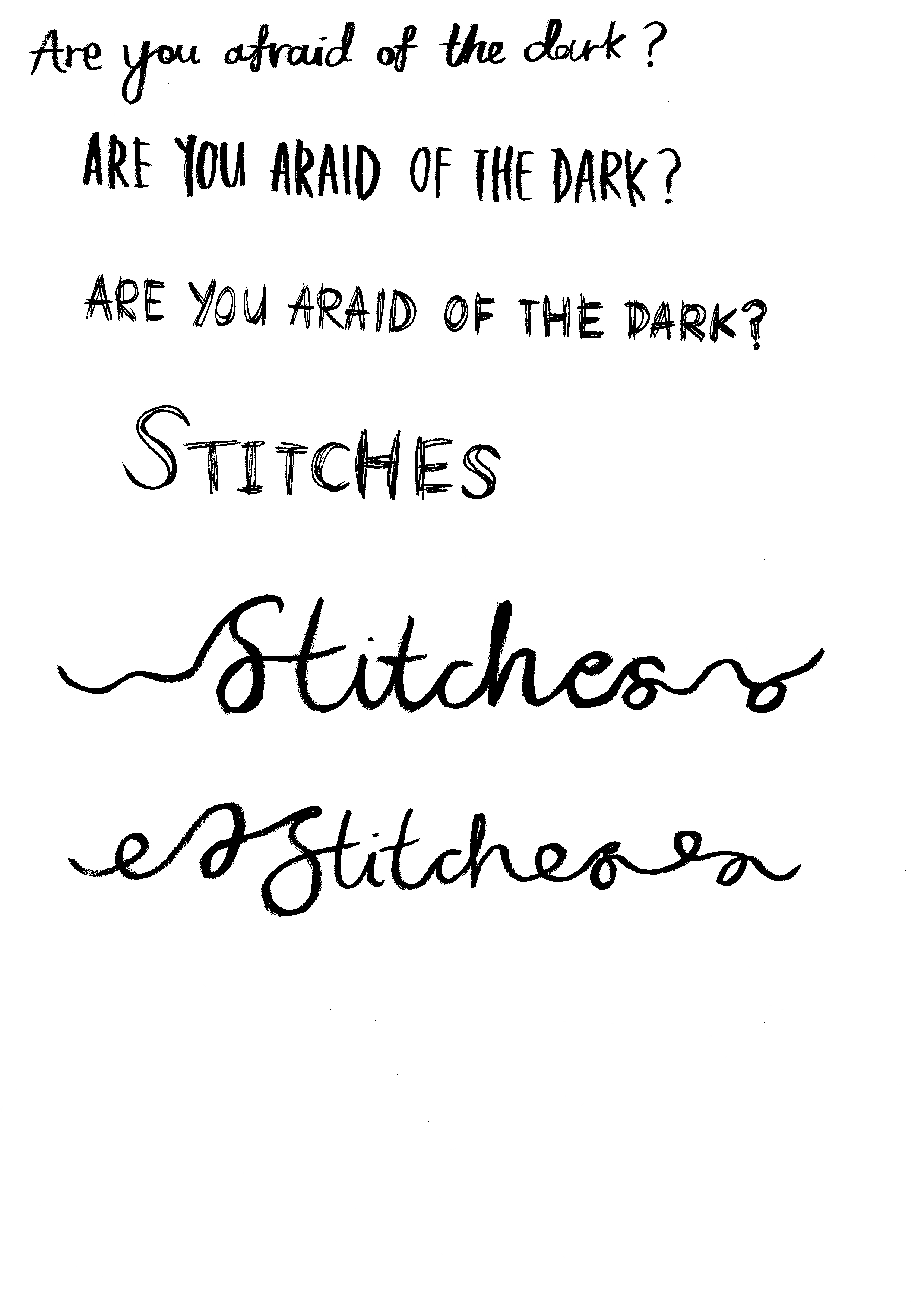
I planned out the content I wanted to generate in my Zine, and then took to trying out the calligraphy (? not sure if it can be called that hahaha) and doodling. I wanted my details to be all in the drawings, instead of being scattered around the pages and focused on the layout.

My planned 8 pages were:

  1. Front cover
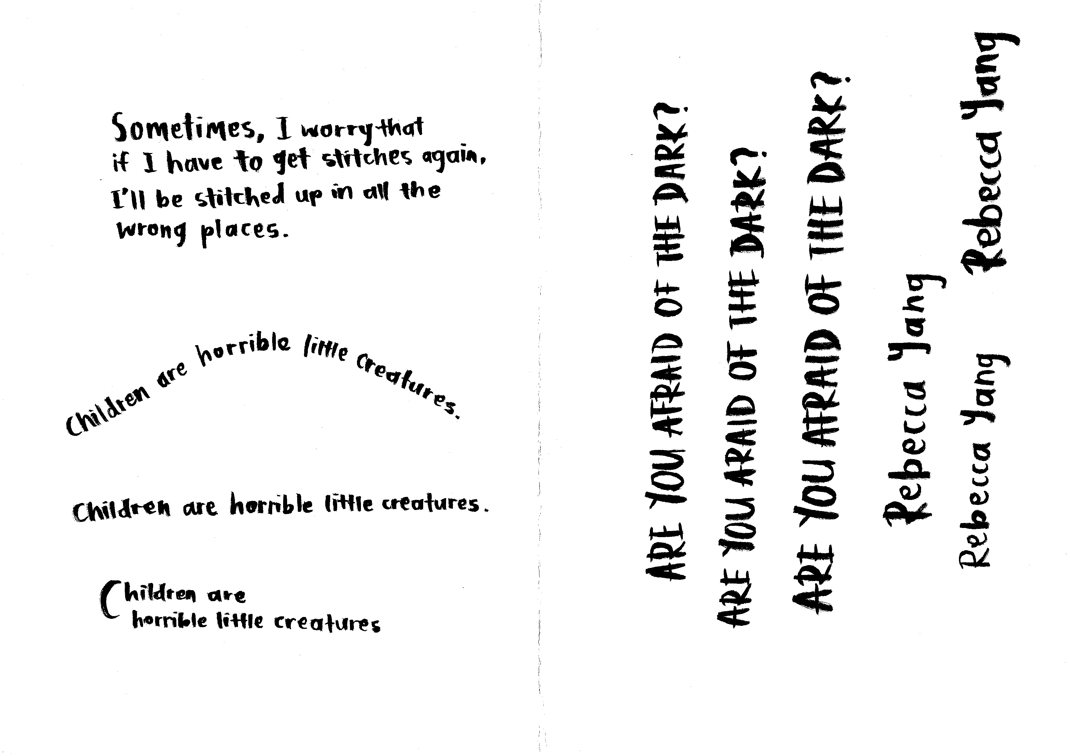
    • Pau standing in the dark, looking afraid.
    • Has title ‘Are You Afraid Of The Dark?’ – Inspired because I personally dislike the feeling of being in the dark. I also wanted to keep the front cover more general, so that people would pick it up if it resonated with them.
    • Has author’s name.
    • Initially, my front cover also had a white background, but then I changed it to a black background, so that it would look more like a cover, and stand out more from the pages inside the Zine.
  2. Second page
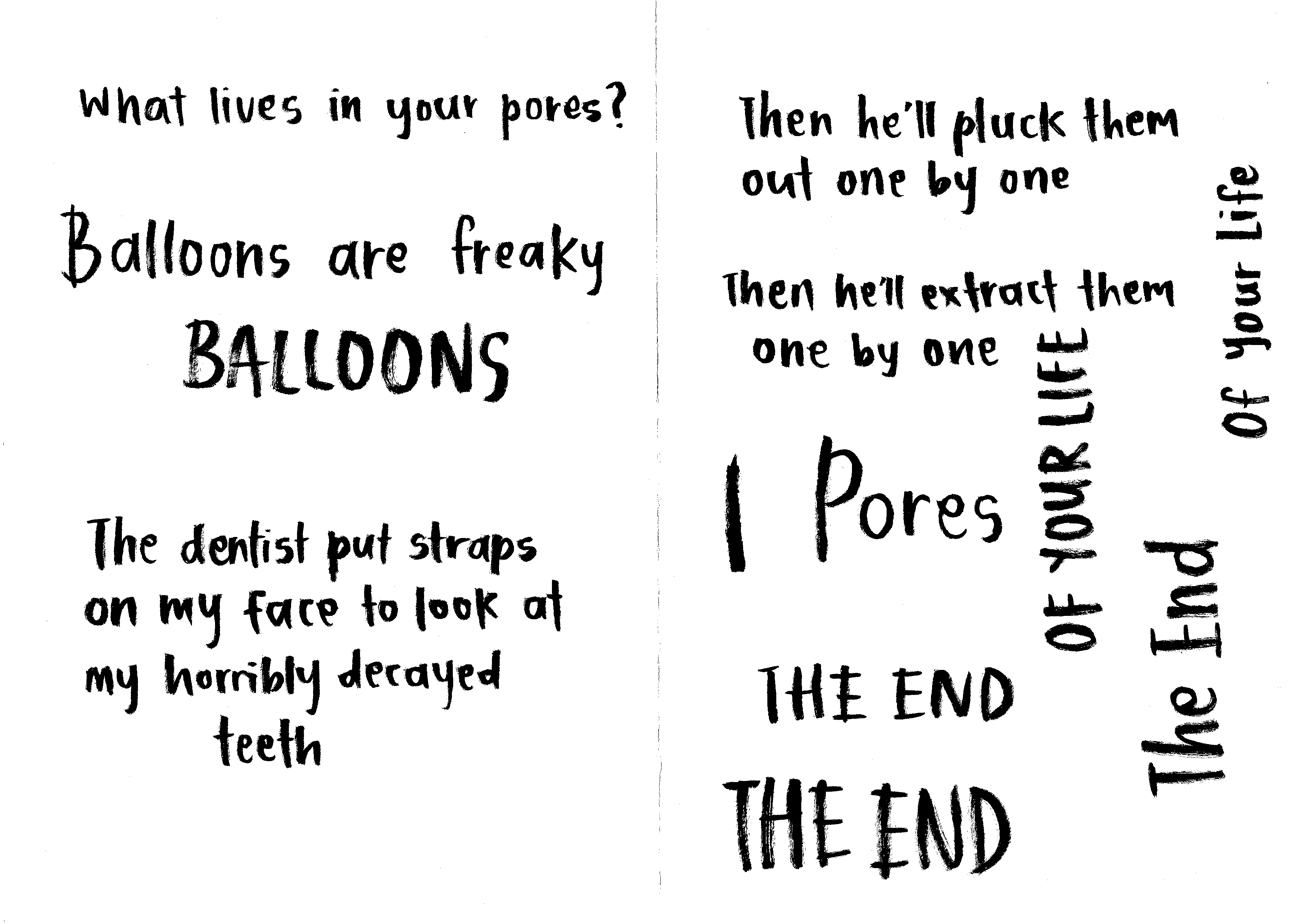
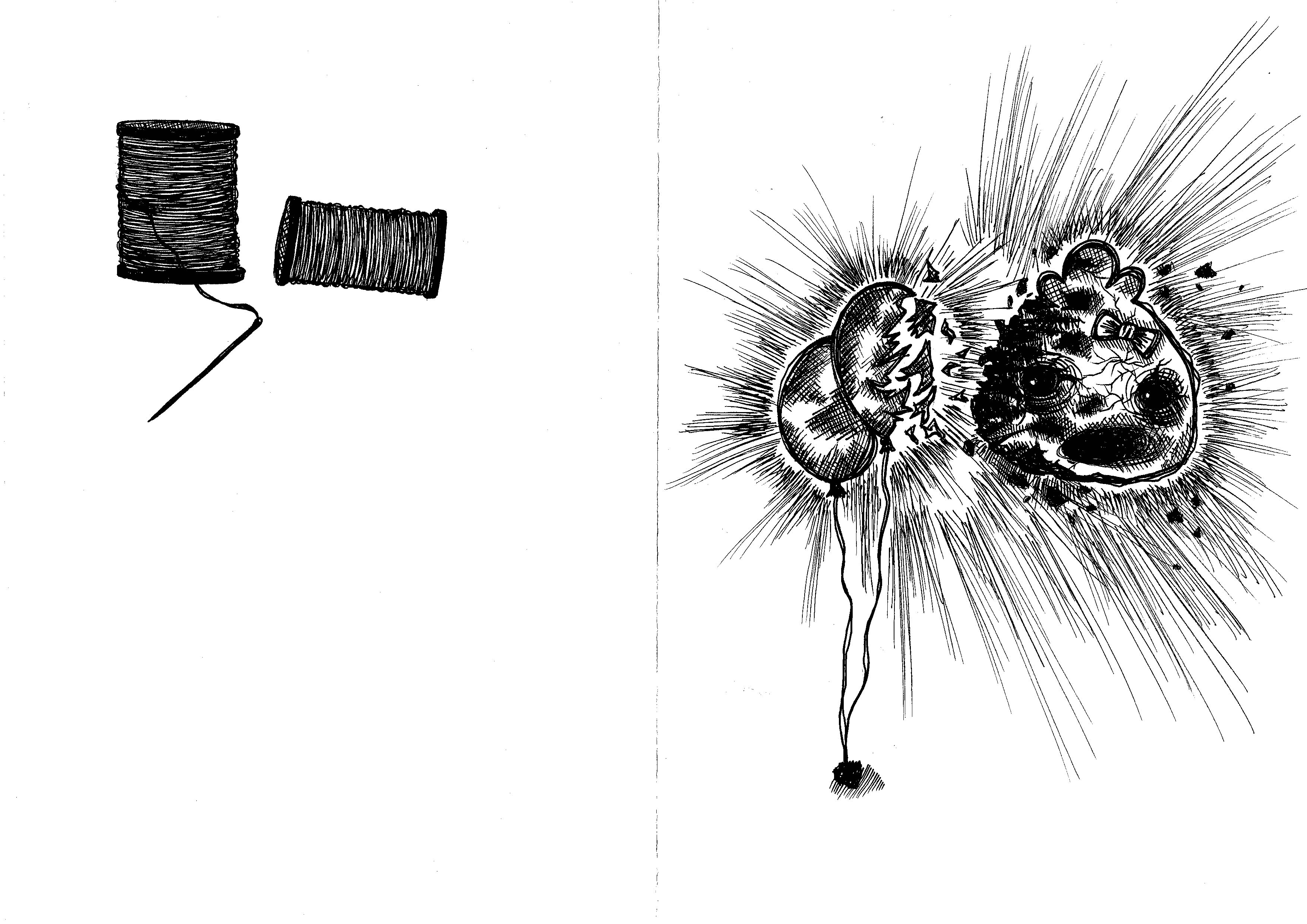
    • Balloons – I’ve had a phobia of balloons since I was a child, after one exploded in my face. Ever since then, I’ve seen people loving balloons and thinking they’re so pretty, but they still freak me out.
    • Illustration of balloons, with one bursting in the pau’s direction.
    • Shows the pau’s skin being peeled and flaking off from the blast.
    • Has words ‘What if a balloon exploded near your face and ripped your skin out?’ to encompass what I was afraid of.
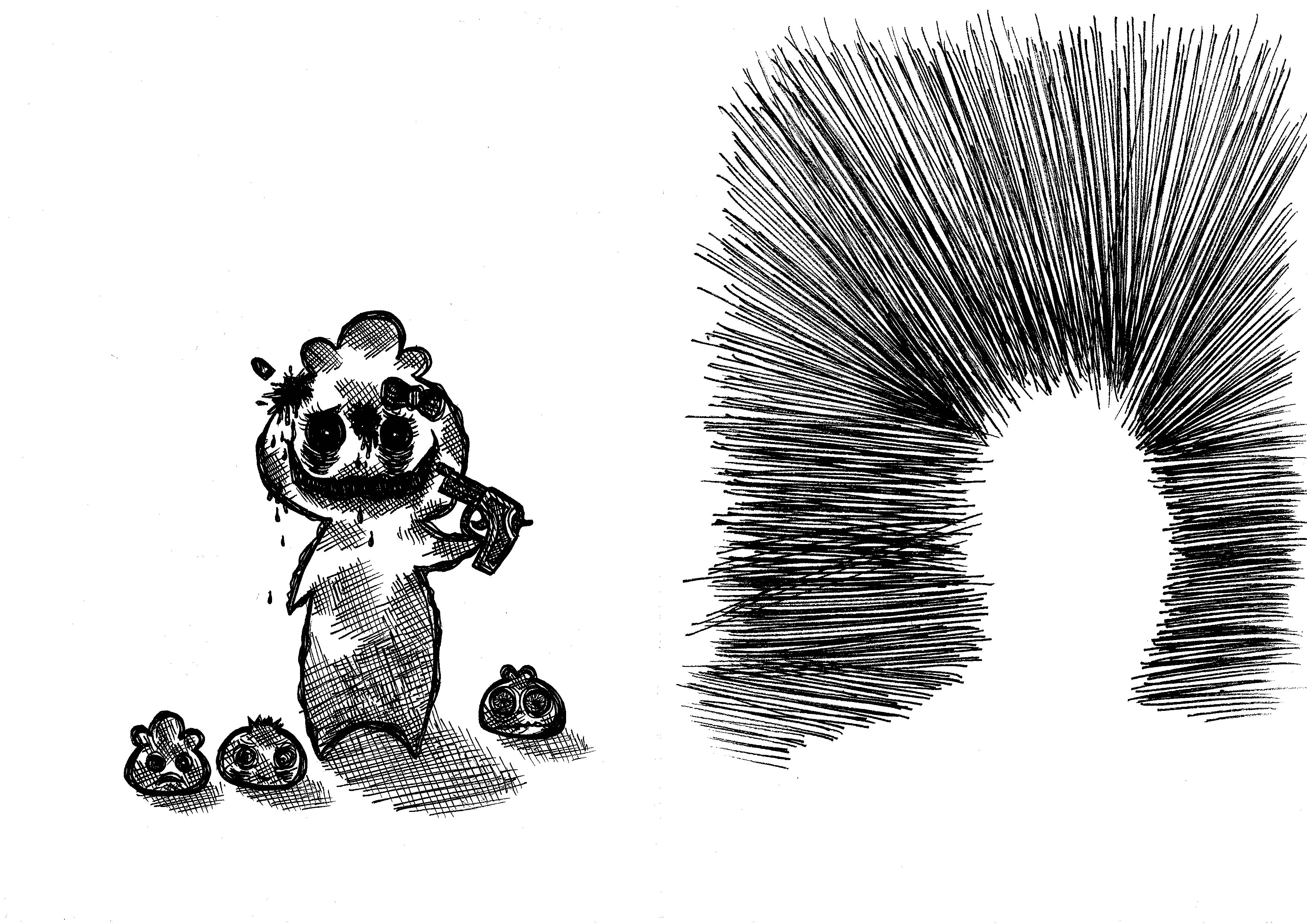
  3. Third page
    • Children – When I was younger, I used to love children, and enjoyed being around them and playing with them. However, as I grew older, I realised I didn’t like children as much, especially when I had to spend more than two hours with them. Or if they started crying, or asking questions. Needless to say, I dislike children.
    • Illustration of three tiny pau children at the older pau’s feet (me), because of the height. I’m shooting myself because I’m surrounded by them.
    • Black lines amasses together in the background and shooting out in this particular direction in order to guide the viewer’s eyes to converge onto what’s taking place in the middle.
    • Words are ‘ Children are horrible little creatures’.
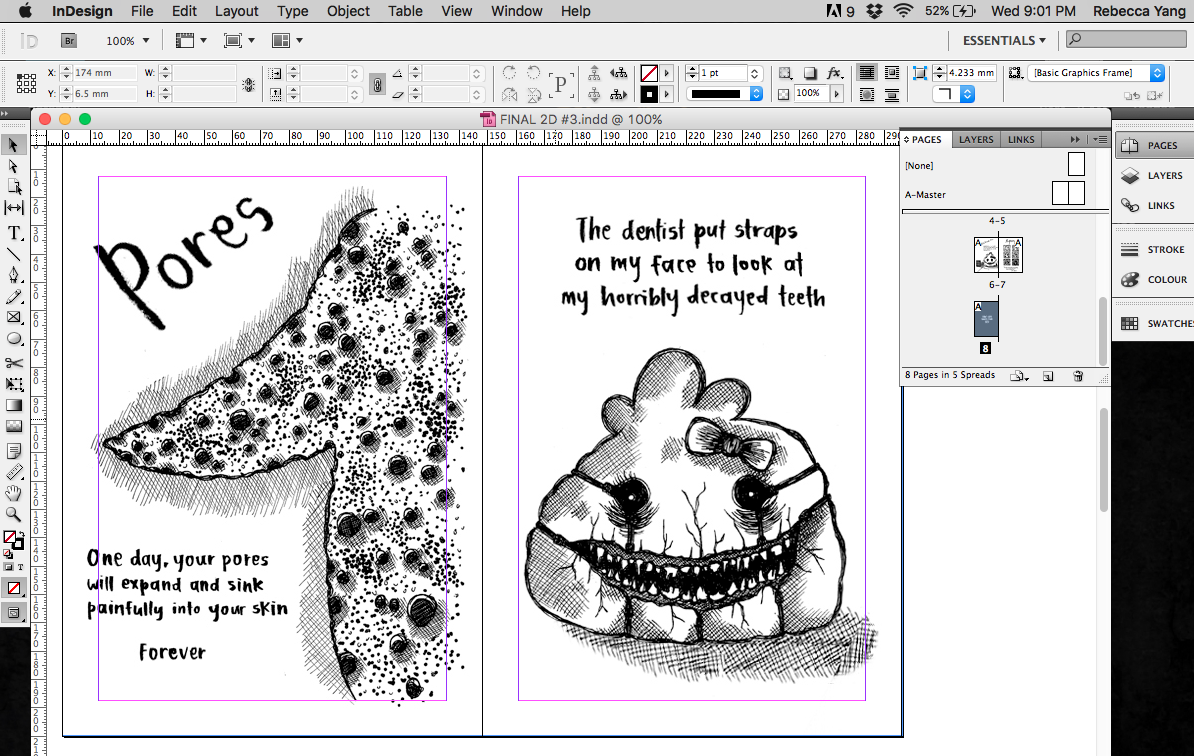
  4. Fourth page
    • Pores – Up till now, sometimes if I stare long and hard at my skin, I wonder what would happen if my pores suddenly shrunk into my skin painfully, leaving indents, like little holes. My skin would then sizzle as the pores retreat deeper into my flesh.
    • Illustration of the pau’s arm with its pores sinking in. Shows the stages of pores leaving holes – some have fully sunk in, while others are halfway through sinking in, on the verge of sinking, or are still regular pores.
    • Words are ‘Pores. One day your pores will expand and sink painfully into your skin. Forever.’
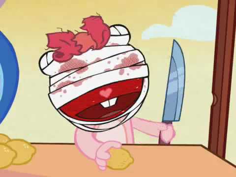
  5. Fifth page
    • Dentist – I’ve had braces in the past, and it was quite a painful process, as I had a severe underbite, which had to be rectified by pushing my lower jaw backwards (as a result, it made my face even rounder LOL so it all links). Since then, I’ve had a phobia of dentists, quite irrationally too, as dentists only want to help their patients.
    • Illustration of a pau with straps on its face, pulling back its eyes, and pulling apart its lips to stretch the skin and show the disgustingly crooked and sharp, jagged teeth. Because of the stress created by the straps, the mouth area has begun to crack and pull apart.
    • Words are ‘The dentist puts straps on my face to look at my horribly decayed teeth’
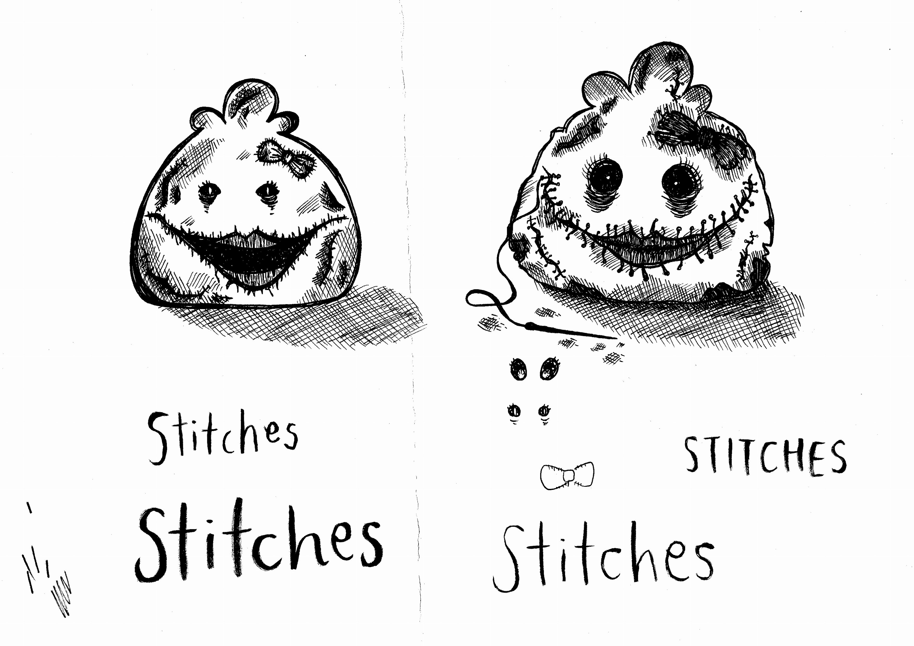
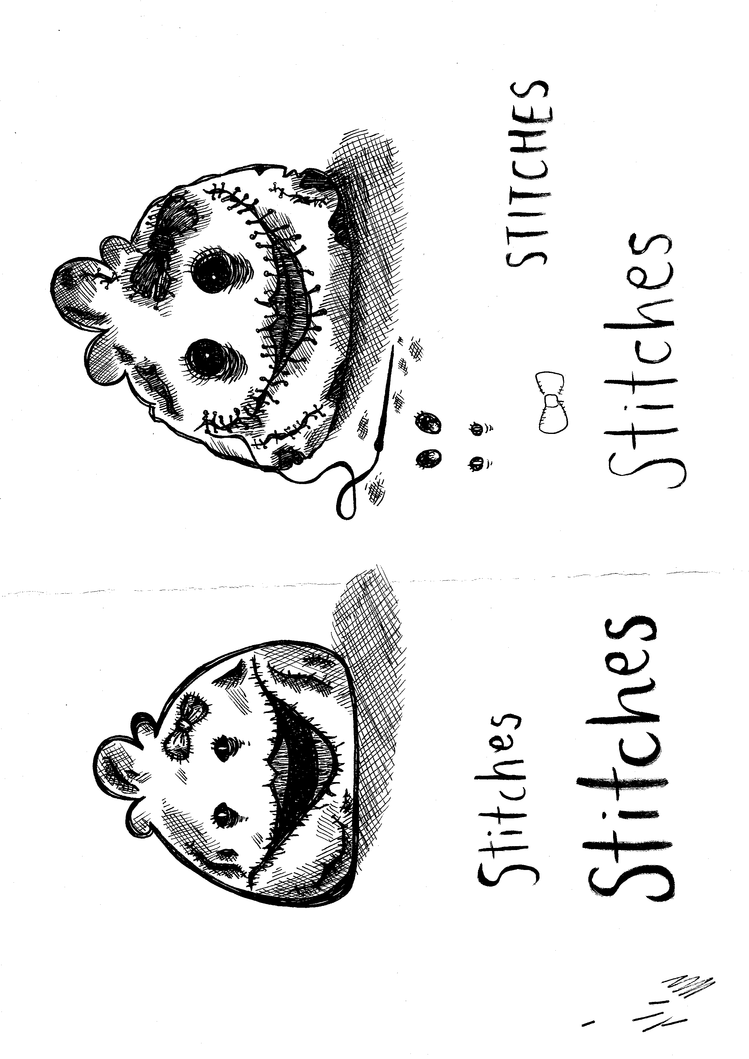
  6. Sixth page
    • Stitches – When I was nine, i climbed up a water slide by running upwards. I slipped, fell and landed on my jaw. Because water slides are build by attaching separate pieces together, the entire slide is not actually 100% smooth. My jaw slid against the uneven plastic pieces, and then my flesh got ripped out. There was a hole deep enough to see my jaw bone from the outside, and yes, ever since then, I’ve hated stitches. I went to the hospital immediately and got an anaesthetic jab right in the middle of the hole, and got 16 stitches. I’ve also been afraid of having stitches on my mouth so I cannot speak.
    • Illustration of a pau with stitches all over the mouth, with the needle and thread still attached. Stitches also scattered around the pau’s ribbon and has cracks that are sewn shut.
    • Spools of thread lie beside the pau.
    • Words are ‘Sometimes, I worry that if I have to get stitches again, I’ll be stitched up in all the wrong places’.
  7. Seventh page
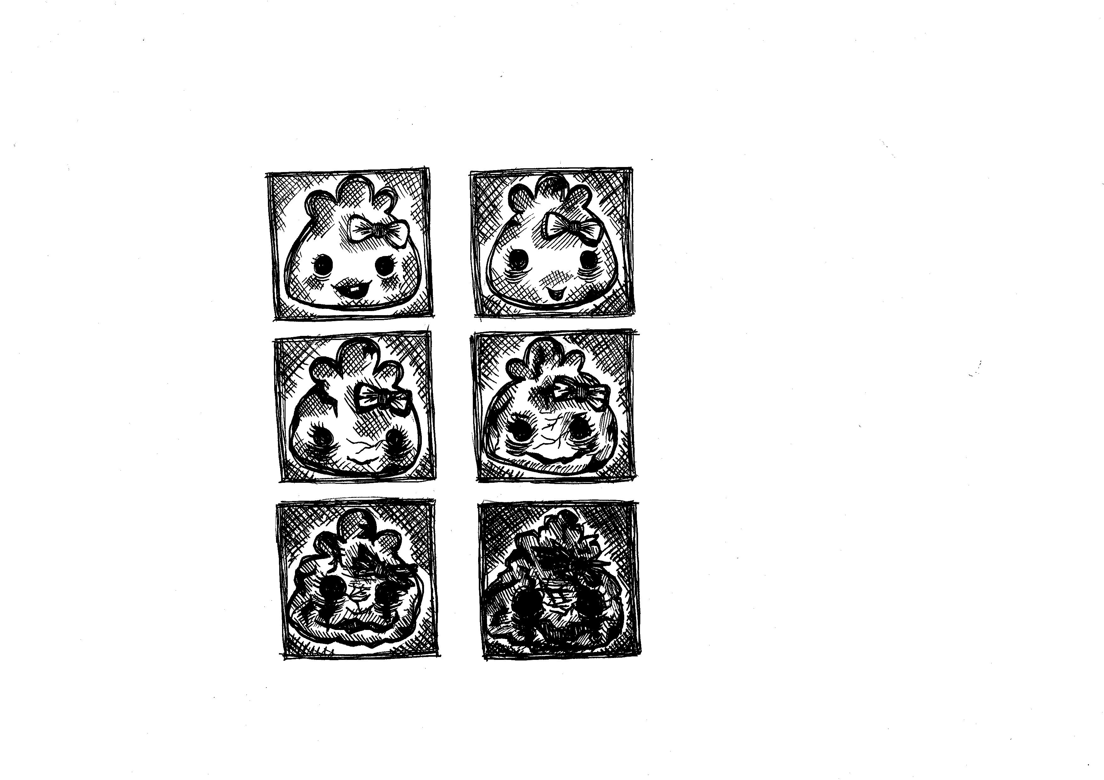
    • Ageing – To me, there is a very big difference between ageing and death. I don’t want to age and become dependent on other people, not being able to do mundane things like eat food, brush my teeth, stand up or walk. I think ageing comes hand in hand with horrible things like dementia and osteoperosis, and thinking ahead, ageing is something I’d rather not face, as compared to death. Some may want to grow up, and achieve things, and even look forward to ageing, but I don’t.
    • Illustration of six small boxes of paus, each depicting a life phase – from young and unmarred, to old and rotting.
    • Words are ‘Ageing’ and ‘To die would be an awfully big adventure. – J.M. Barrie’. I love the second quote, taken from Peter Pan, the children’s book, and thought it was very apt to put inside my Zine.
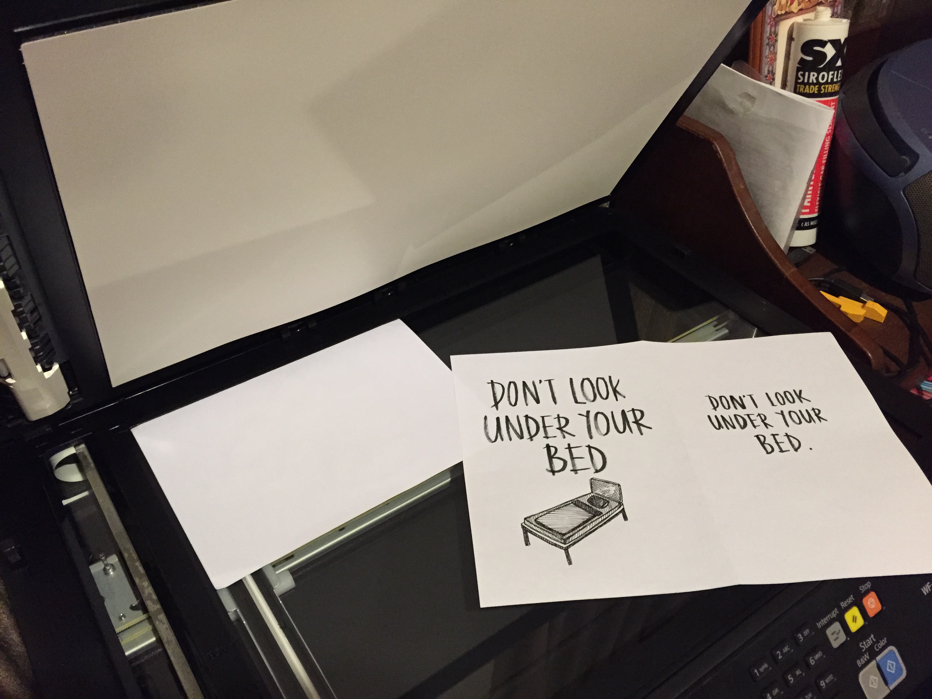
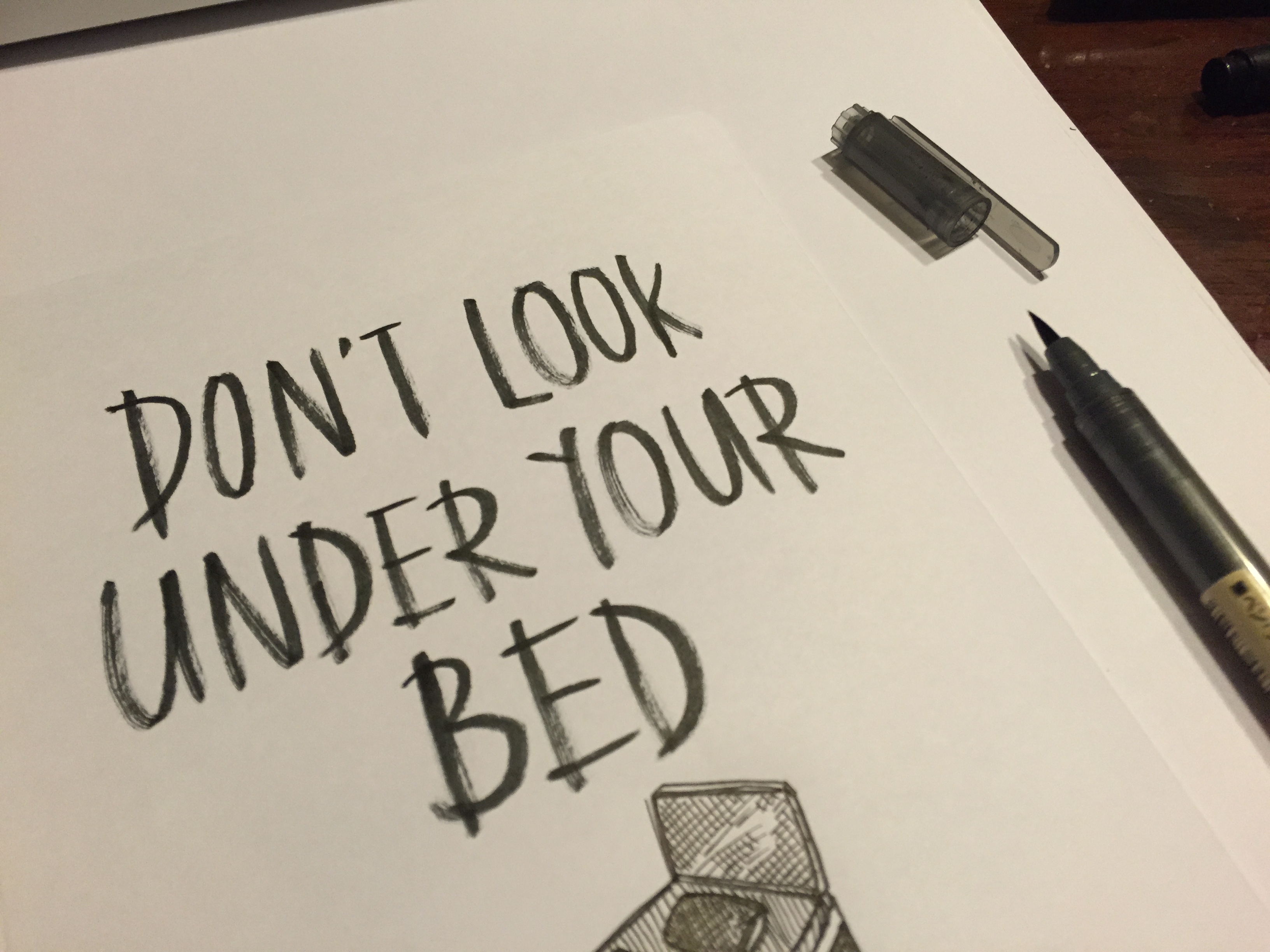
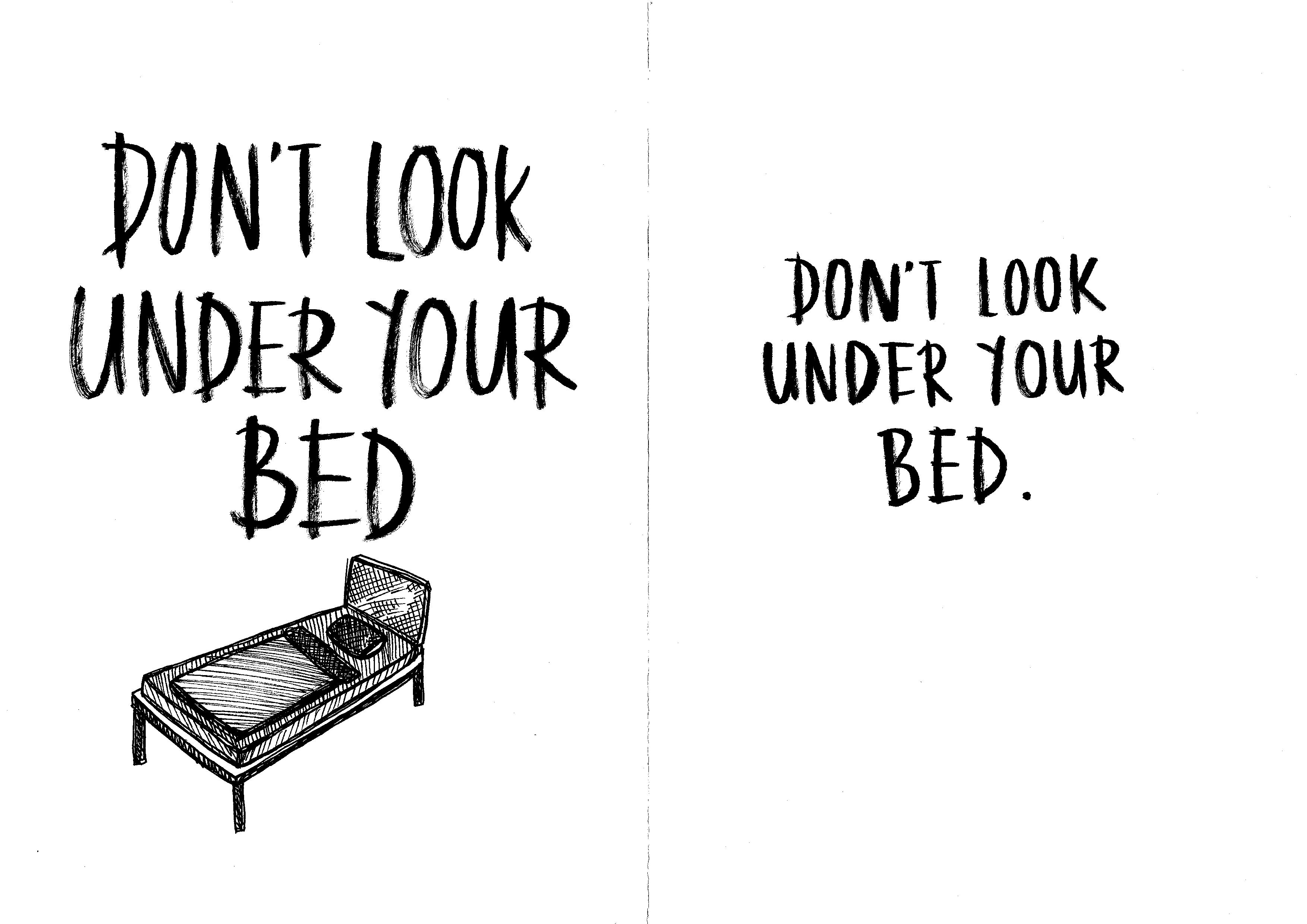
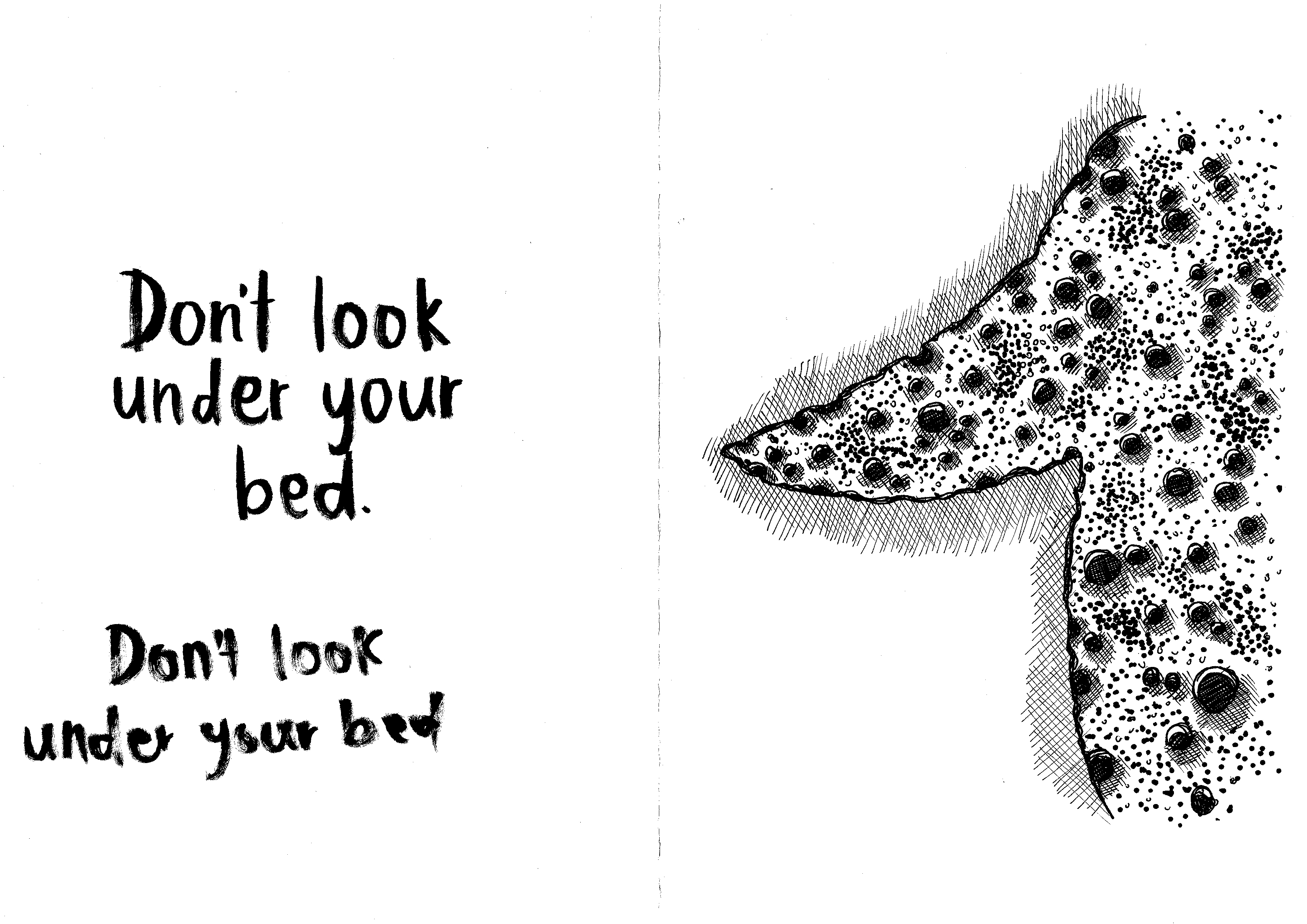
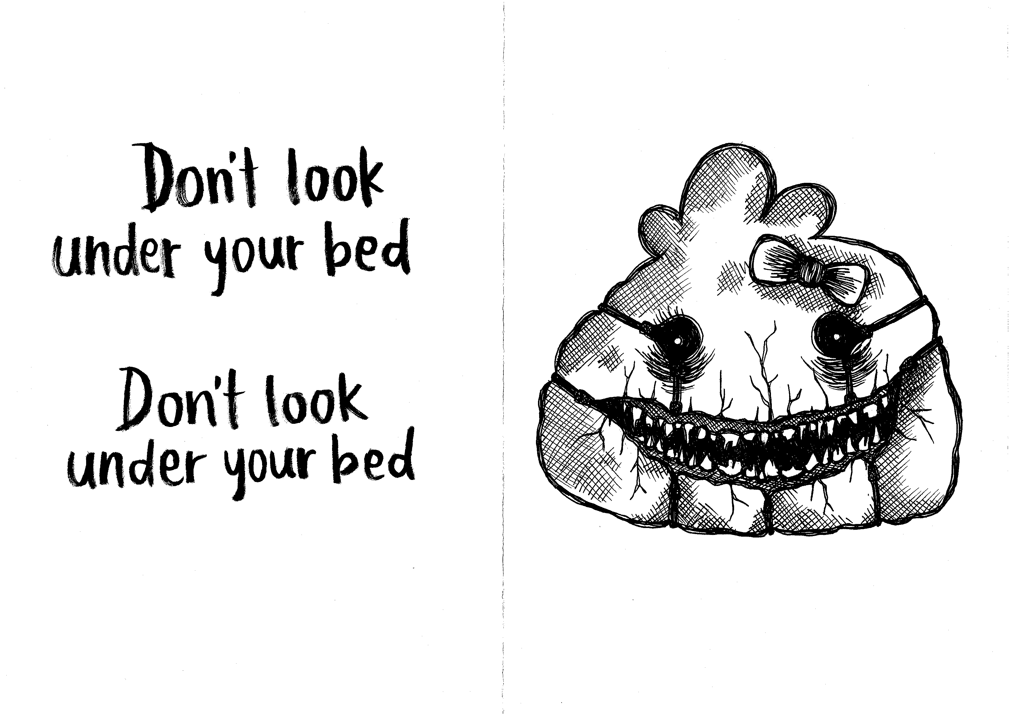
  8. Back cover
    • Plain and simple, with the text ‘Don’t look under the bed’
    • In lieu with cover page. I wanted them to be inclusive of the theme of a child’s room, hence, the dark and the reference of not looking under the bed.

After illustration, I scanned the drawings into softcopy version at 300dpi, so I could edit them on Photoshop and InDesign.

IMG_0264 IMG_0262

EPSON029 EPSON028 EPSON027 EPSON026
EPSON022 EPSON018 EPSON019 EPSON020 wfb j

EPSON021 EPSON025 EPSON024


Photoshop and indesign:

After scanning the illustrations into images, I began arranging them on Photoshop, such as putting the text and main image together, and finalising my compositions. 

I also edited certain parts, like erasing some details, or vice versa. The biggest thing I edited on Photoshop would be the back and front covers. I switched the colours around so that the illustrated parts would be in white, while the background would be in black.

Then, I moved on to InDesign. I finalised some things on the software, and mainly used it to look at my pages as a whole, to see if they fit well together. I felt InDesign was good to look at the entire spread and layout, because it shows you all the pages put together so I could envision what it would look like after being printed out.

I also exported it from InDesign.

Screen Shot 2016-04-13 at 9.00.18 PM Screen Shot 2016-04-13 at 9.00.53 PM


Binding, type of paper selected & printing:

I knew I wanted something slightly shiny but matte. This is because I wanted it to look as close to a children’s book as possible. However, what I learnt at the printing shop was that the thicker the paper, the harder it would be to bind, given the number of pages the Zine consisted of. The staff informed me that thinner paper would be better, and recommended a few. 

I thought this was interesting as I always thought thicker paper would be better, since there were only 8 pages. So eventually, I settled for thinner paper. I’m not sure of the exact gsm as it wasn’t stated, and I forgot to ask the staff, so next time, I will definitely remember to!

Binding wise, I asked for perfect binding. I selected perfect binding as I was thinking of if the Zine could be mass produced in the future. This was also the reason why I chose to scan in my illustrations instead of directly drawing on the Zine. If it were ever mass produced, I would like the Zine to have a hard cover, while the pages inside would be kept thin.


Difficulties faced:

I think the most difficult thing about this project was actually printing! Because my printing initially was really bad, I had to go get it done again. But although it was really tedious and rather upsetting at the moment, I’m glad it happened.

I learnt a lot from it, and now I know the importance of sourcing for a good printing shop, as well as choosing the right paper, etc.

Other parts would be the time spent on illustrating, as well as learning how to use InDesign.

2D ll – Project 3 Research

Hi everyone! Just a quick update!

I’ve thought of creating a book titled ‘My Dark Side’ (or something like that, maybe I’ll change the name hahaha). I want it to incorporate things that are negative of myself, or people in general, such as my fears and dislikes.


Also, for this assignment, I have referenced certain artists or programmes and art forms that I was intrigued with as a child.

Tim Burton:

I’ve always enjoyed Tim Burton’s work, whether in its pure art form, or in films. I feel his characters have a certain captivating aspect and consistency. His works are extremely identifiable, and anyone who is familiar with his art would be able to point them out. I particularly like that he can add personality and bring his characters to life while keeping them illustrated in regular mediums and pen.

8a3f53eddb82213dd004f5b5843dd033 lionking tim-burton-sketch xmas

Happy Tree Friends:

Ok, firstly, I won’t put the explicit examples here that I looked at, because they are slightlyvery graphic and gory. But I’ve watched clips of this cartoon when I was growing up, and I like how everything looks so happy, with such vivid colours and children-friendly animal characters, but 30 seconds into the video, things take a violent turn. I found this particularly appealing, because it’s something that amalgamates a cute element with a sinister one, and it basically plays on the shock factor which I didn’t see coming the first time I watched it.

Happy-Tree-Friends hqdefault

2D II – Project 2 Research

Hey guys!

So I decided I want to use food as a subject for this project, because while doing Project 1, I found it was pretty fun incorporating food into assignments, as it has always been an interest of mine – whether involving cooking, baking or food photography.

Therefore, I would like this project to be a platform for me to express and develop both my conceptual and visual skills in this area, because what better way is there to combine my ‘out-of-school’ passion and art? 😀


Reference artists:

Beth Galton:

img_310974 I_06-82_120328-Cut-Foods-36738 popcorn_soda-beth-galton VT98Tfi

Christopher Boffoli:

canoe+au+lait+150ppi cbm2 christopher-boffoli-1 christopher-boffoli-big-appetites_banana-cyclists_collabcubed cookie+climbers+COPYRIGHTED+IMAGE+Please+don't+repost+without+permission foodies-orange_2018426i

Alison Anselot:

113-800x800 1082114152 pantone-site2 pantone-site22 pantone-site34-1024x1024


18 Points of View:
  1. Food from the point of view of starvation is a luxury.
  2. Food from the point of view of children is play.
  3. Food from the point of view of model is calories.
  4. Food from the point of view of farmers is income.
  5. Food from the point of view of the homeless is survival.
  6. Food from the point of view of a chef is creativity.
  7. Food from the point of view of a food critique is a delicacy.
  8. Food from the point of view of obesity is diabetes.
  9. Food from the point of view of an athlete is energy.
  10. Food from the point of view of a cook is a recipe.
  11. Food from the point of view of Instagram is popularity.
  12. Food from the point of view of parents is love.
  13. Food from the point of view of tourists is cultural exchange.
  14. Food from the point of view of friends is gathering.
  15. Food from the point of view of a photographer is art.
  16. Food from the point of view of a food fight is mess.
  17. Food from the point of view of teeth is decay.
  18. Food from the point of view of tissue paper is dirt.

2D II – Project 1 Development (#2)

CONTINUATION OF PROJECT 1:

This week, I tried out my initial ideas, as shown below.


MIDDLE CHILD:

IMG_0461 IMG_0466 IMG_0464

I wanted to use newspapers as the background, to bring across the feeling of ‘in the past’, as I personally feel that middle children are affected by Middle Child Syndrome more during their formative years. I used white glue to stick the newspapers on in a collage sort of way.

ANIMAL LOVER:

IMG_0472 IMG_0468

Just to experiment with, I did up a very quick random mock up of a dog portrait, and used glue to stick on materials that I had at the moment, and reminded me of nature – tissue paper, leaves and grass.


FINAL IDEA:

I felt like my ideas were very isolated from one another, in a sense that they did not have anything that linked them together in a way that flowed well as a project. So after giving it some thought, and doing more research, I decided I wanted to use translucent paper (maybe acetate) as a medium that would link all four (YAY LOL) of my typographic pieces together.

I drew inspiration from a design that I had seen previously – it used transparent plastic with mould printed on it as a wrapper for sandwiches, as a deterrent so that people would not steal the food.

$_1 cf3703a4546b280cd9395b520f1c2453 f9beebeac6b41b2ead2b1812758d72cd

The concept that would be a bridge to link all the pieces together would be by using translucent paper with individualised prints or designs on them, and they would be attached landscape to the top of each piece, and act as an overlay.

For example, for ‘Fussy Food Eater’, I will stage a photograph of each food group, and on the separate piece of translucent paper, print our mould to fit over the foods that I don’t eat, to represent being picky leads to wastage.

For ‘Middle Child’, I may print translucent newspaper/book clippings that are related to children on the overlay sheet, instead of using it as a background for the matches.

I will continue to update OSS when I have more precise ideas to show, as well as first-round experimentations of each piece! (:

2D II – Project 1 Development (#1)

THE 6 ATTRIBUTES:

After contemplating which aspects of myself I wanted to attempt to portray with assignment 1, I decided that I wanted it to encompass my feelings, interests, habits, and future aspirations, as I feel that these general factors contribute greatly to the components of an individual.

  1. Fussy food eater
  2. Animal lover
  3. Soon-to-be photographer
  4. Baker
  5. Sentimental hoarder
  6. Middle child

IMG_9808

Screen Shot 2016-01-28 at 8.13.13 AM

I began by going on Pinterest to search for ideas and different types of materials used, as I knew it would be fun and informative to test out various mediums.


FUSSY FOOD EATER:

I usually am quite fussy, unless the situation disallows me to be, and I pick out food that I want to eat, and waste the rest, which isn’t a very desirable habit of mine.

I wanted to use both 3D and 2D materials to challenge my creativity, and therefore thought of using water colour paint to create ice cream cones with actual food or its wrappers to substitute ice cream.

My initial idea:

IMG_9809

IMG_0108

Water colour food inspiration

Screen Shot 2016-01-31 at 5.58.44 PM
After giving it further thought, I may position the food in a manner that looks as though I bit into the ‘ice cream’ and wasted it, showing the downside of being fussy. Another idea I had after consultation was to use rotten/moldy food to represent the ice cream, which increases the feeling of repulsion and wastage, depicting my feelings towards the subject.


ANIMAL LOVER:

I have three dogs at home, and personally, it’s something I hold dear, as I value them very much, and I believe nothing can replace the feeling of having a pet and earning its trust and loyalty. In fact when I’m older, I would like to have dogs in place of kids 😀 Having said this, I do like other animals as well, and it isn’t just confined to dogs alone.

Although, on the other hand, I also feel that an animal’s instinct is to be in the wild, and sometimes I do think it isn’t fair to keep them away from their natural habitats, and keep them domesticated.

My idea is to create a portrait of one of my dogs using patterns (different forms of black and white patterns) and my name. I also want to use bits of nature, like leaves, twigs, cotton, etc, to symbolise that its a large part of animals to long for being in the wild.

IMG_9814

Twigs (1)


SOON-TO-BE PHOTOGRAPHER:

My major for Year 2 onwards is Photography and Digital Imaging, and so, I believe my skills in this area will definitely be honed and sharpened. I wanted to bring across the idea that my opinion on photography is that it is a very important aspect of life, as it captures memories – ones that the human mind cannot remember clearly even if we try, as memories become blurry in time.

Therefore, I wanted to make a collage of photos that I have taken over the year in a cool blue-ish hue, and blur out it out to create a background. In contrast, I wanted to create my name using some sort of reflective material (like scotch tape or acrylic), to spell out my name, and the areas that is part of my name will be slightly brighter in nature and colour, and of high definition. This is to represent that parts behind the lens will always remain vivid and clear.

IMG_9812

acrylic_sheets_clear-xl


BAKER:

I like to bake as a past time, as I find it therapeutic and calming. I usually bake during my free time, or even if I am busy, I try to make it a point to wake up early and whip up something in the mornings.

Here are some of the things I have done so far:

IMG_0223

IMG_2326

IMG_8864

IMG_9117
I thought of using items like cupcake liners to give texture to the background, and using icing in a piping bag to create my name, and take a photograph of that (playing with lighting and locations), to create typography for this attribute.

However, after consultation, I also thought that the concept for this one was not strong enough, and did not portray my feelings towards baking. I then thought of things that I felt were calming and sort of cathartic, to show my thoughts on the subject. Other materials I have considered using are things like coffee, flowers, cocoa powder, etc.

IMG_9827


SENTIMENTAL HOARDER:

I usually keep things – mementos, items, cards, notes – that I receive from people, as I find meaning and value in them, and it helps me remember good times from the past. As a result, my room is packed with boxes of things, but they’re all neatly in different boxes, labelled with names like ‘cards’, ‘from friends, ‘letters’, etc, and I know where to find the stuff. In other words, I am an organised mess.

Or, as I would call it, a ‘sentimental hoarder’. I find there’s nothing wrong with keeping things, as hoarders would, but due to the lack of space, I have to filter and throw out some things. Ultimately, I only keep the stuff that are very precious to me.

I thought of using old wrappers (either part with the ones I have hoarded over the years or replicate them), to show a timeline of items I have kept. The wrappers I have are creased, but not entirely crumpled because I have taken care of them. I was also thinking of arranging them into my name, with the nicer things being arranged neatly, while the others (trailing off from the end of my name), will be messy, and in darker lighting, to symbolise that I’ve disposed of those items.

IMG_0110


MIDDLE CHILD:

Middle Child Syndrome is an actual tangible issue, perhaps not for all, but being a middle child myself, I can say that I experienced it when I was younger. Growing up, it’s true that middle children sometimes feel out of place, as the elder sibling is viewed as the mature, responsible one who has the respect of the parents, while the younger sibling is frequently doted on, and essentially, very well looked after.

This leaves middle children feeling lonely, always having to vie for attention and eventually, becoming competitive with his/her siblings, and feeling burnt out if the issue is not addressed. Of course, most of the time, if parents treat the kids impartially, it isn’t their fault – it’s just the way things are.

So my idea is to show the tired, angry sort of feeling middle children feel. I thought of using matchsticks or fingerprints, always making the one in the middle different from the other two. I will most likely go with matchsticks, as I feel this medium accurately represents what I feel on the subject.

IMG_9821IMG_982225

2D ll – Typography Research

INTRODUCTION TO TYPOGRAPHY:

My first step to the project was to search for the meaning of typography, so as to understand the subject on a more in-depth level. I thought it was crucial to know the definition of a subject, before being able to fully delve into discovering its forms, mediums and elements, etc.

Eventually, my final understanding of typography is that it:
  1. Is the visual component of the written word
  2. Is the art and technique of arranging type
  3. Has a goal: To communicate and send a distinct message to viewers.


A few elements to take note of in typography are:
  1. Layout, which includes negative space
  2. Colour scheme (different colour palettes have different meanings)
  3. Sizing
  4. Fonts
  5. Leading (space between lines of text)
  6. Kerning (space between characters)


HANDMADE, 3D & DIY TYPOGRAPHY:

I think the three major mediums for these categories of typography are:

Traditional

Examples: Pencil, pen, chinese ink, water colour, acrylic paint, charcoal, graphite, etc.

fbe0fb84ba3c5e8f93530c6386b8f608 37a4468a519caae662adfeeb3c3de268 696570309_orig f4ae305bf12bd83370621f4a6edec9e5
Digital

Examples: Applications like Photoshop and Illustrator, etc.

Quote-Typography-Poster-by-NeueGraphic a022e194cd55824d38dbb3c9aa0ac0df 8 
Objects

Examples: Thread, candy, dough, petals, rubber bands, concrete, light bulbs, water, etc.

a43d0171edd6c017110a5f841be17556 fb613dbf68f0a7725d3a31a017406387 15 380f32fb4f9429c30d78584cd854bab5 6b8ffb2bd91d5cbb119958eb0c8609b1 ff642d706440a9d28106c362e7f7496e 194f9ac409367c37df89577131bccfba

Mixed mediums/platforms

I thought this was an interesting idea because it opens the mind and generates more ideas, if we can include various mediums and platforms in the design (e.g. as shown below, the alphabets are drawn on with ink, but the leaves are placed on the design to create a 3D effect, and make the typography really pop out).

floralstamp-0


DADA Typography:

Characteristics:

  1. Heavy use of symbols
  2. Plays with vertigo (horizontals and verticals)
  3. Mixes fonts
  4. Unorthodox punctuation

a6a53310991961.560ef26742ca5 yeehaw_dada

Hannah Hoch:

A German Dada artist, and one of the first few women to breakthrough in the design industry.

06_HannahHoch hannah-hoche_da-dandy-1919


Russian Constructivism Typography:

Characteristics:

  1. Focused on the use of materials
  2. To express the experience of modern life
  3. Disorienting elements of space and time

50937f664427dcba917e8fcb63eb0f40 ba628e05693454767a2ae7fe46245f05


Other examples of typography I like:
Sawdust Typography:

A graphic design firm based in London that was created by Rob Gonzalez and Jonathan Quainton. They specialise in a very unique style that I appreciate, one that plays with various mediums, fonts, forms and contrasts. I also like that their designs come off as rather clean, sleek and minimalistic.

http://www.madebysawdust.co.uk/

Screen Shot 2016-01-21 at 9.55.01 AM sawdust-x-ew-8-1024x1392Screen Shot 2016-01-21 at 9.53.55 AM Screen Shot 2016-01-21 at 9.54.43 AM b0400b24eba90d48025635ef7b61ff61

JOachim VU:

He is another graphic designer who works with clients from all industries to assist them with branding and conceptualising ideas. I find his work especially unique because he does custom lettering, and pays extreme attention to intricacies and details.

https://dribbble.com/joachimvu

3793eace54ada2efc8036968734505bc 1319