I’m always interested in exploring new mediums and methods to create abstract pieces that tells a story or to make a particular statement. In this project, it started off with an idea/story related to Southeast Asian mythology and through the use of new media, Cinema4D in particular, recreate a modern and unique visuals for the theme:
1. Case Studies
2. Moodboard
3. Prototype 1
4. Prototype 2
Contact info Student Email: stan141@e.ntu.edu.sg
Personal Email: sylvestertan93@hotmail.com
Contact No: 92995819
For this week’s progress, I tried out different variations and/or camera view on cinema 4D. My final results for this piece will be played with music, hence, I thought it would be best to render out different interesting variations and piece them together using premiere pro.
The Waves and Particles:
The Swordfishes:
I used the same technique of how I created the wave to create random particles to illustrate the movement of swordfishes, but it didn’t turn out looking like how swordfishes will move:
Hence, I tried out another way of creating trails of particles coming into the frame at different time:
For week 5 process documentation, I jump right into Cinema4D and explore the particle generator to produce the fluid form. I am still figuring out how to add more elements into it but I feel that this is a huge progress. I am quite satisfied with what I produced so far and maybe I will start exploring more in-depth.
First, I create a huge amount of particles in cinema4D and let it flow freely. The tutorial that I have posted in my research documentation really helps in learning for sure. However, I was very unsure of how I am gonna frame within the wall and how render works. So this is the first trial that I have created. I spent quite a couple of days to figure out all the function to create this:
I found out that I can actually frame a rectangular shape that contains all the particles. So when they will ONLY flow within that boundary. This is quite useful because it helps to frame the whole composition to the dimension of the Media Wall in north spine, and it’s also quite easy to adjust it to fit into different dimension as well.
I also added a trail effect to those particles and it has this very beautiful look to it:
This is the first rendered version:
and the second rendered version to longer particle trails:
The legendary Himmapan Forest is said to be located in the Himalaya Mountains. It is also believed that the forests are located below the Buddhist heavens and are invisible to the eyes of mortals, who can never approach or enter.
Most of the mythical creatures seen in Indian and Thai art/old literature live in the mythical Himapan Forest. The forest is populated with strange creatures, unknown to human realms. Many of the creatures of this mythical world have been represented in Indian / Thai classical art and architecture for many years and are found in sculptures, paintings, carvings and decorative items.
Concept: Abstract Art in New Media
The Himmapan Forest and the creatures living within are purely imaginary and artists have been interpreting them in a more direct representation of how they supposed to look like. In contrary, my approach to this theme is to use abstract patterns and motions to represent the forest and the mythical creatures to create a immersive experience for the audience. Instead of using literal symbols and motifs such as trees and leaves to represent Himmapan Forest, I will be creating coloured patterns with motion to show the mythical aspect of the place as shown above. These patterns will move according to the audience’s movement. The mythical creatures or “spirit” that resides in the forest will be represented by vapours (as shown below) that will follow the movement of the audience using motion tracking.
Artist Reference & Techniques – Ultra Combos c/o Anarchy Dance Theatre – The Seventh Sense
Seventh Sense is co-authored by Ultra combos and Anarchy Dance Theatre, a council subsidy digital performing art project. The Seventh Sense is an interactive environment containing the performers and the audience; beyond the performing, the piece tries to bring the viewers and the dancers to a mutual and shared space in order to create an unimaginable experience afar from the known senses.
Ultra Combos uses motion tracking of the performers to create visually pleasing interactive motion graphics. The graphics change depends on the performers’ movement, hence allowing the performer/audience takes control of the visual experience.
Theme 2: A Myth of Singapore – Redhill and Tanjong Pagar
A long time ago, the southern coast of Singapore was infested by numerous fierce swordfish. The villagers and fishermen could not ply their trades at the sea, as they would be attacked by these fearsome creatures if they ever ventured near the waters. The people requested help from the Sultan, but even him and his royal army could not do anything about it.
A little boy then proposed a solution to the Sultan. Build a row of barricade made of banana tree trunks along the affected coast, he said. When the swordfish tried to attack the villagers again, their pointed beaks would pierce through the barricade and would be trapped immediately. The plan worked perfectly, and the smart boy became popular among the villagers as their saviour. This invited jealousy from the Sultan. Fearing his rule would be threatened in the future, he sent his soldiers to kill the boy who lived on top of a hill. As the poor boy died, his blood flew down the hill, soaking the whole hill red. This was how Redhill, or Bukit Merah (literally means hill red), got its name.
In turn, the place where the barricade of banana tree trunks were set up became known as Tanjong Pagar, or “cape of stakes”.
Concept: Storytelling through Abstract Art in New Media
The main idea of this concept is to use abstract art to tell the story mentioned above. The movement of water turbulence as well as the moving objects that represent swordfishes that moves within the water turbulence would be an interesting combination that creates a unique visual experience for the audience.
Here are some of the reference photo:
Artist Reference & Techniques
“Virtual Depictions : San Francisco” by Refik Anadol
I was very inspired by this public art project by media artist Refik Anadol when Prof Ina showed the video to us during the first lesson. I did some research on how to create similar motion graphics and I came across this powerful software “Cinema4D” that allows artist to create beautiful 3D motion graphics. I also found out that After Effects can work too, hence I’ll need to figure out both softwares to find out which works best.
David Mcleod
I have been following David Mcleod’s Instagram account for quite awhile and I was very inspired by all his motion graphics. He is a multi-disciplinary Illustrator and Artist based in New York, and his work is similar to what we see in “Virtual Depiction: SanFrancisco”. His works are often very fluid and organic, and it involves alot of graphic motions and patterns. All his works are generated from Cinema4D. Here are some images of his work:
Others:
Some tutorials that I find useful and relevant to my ideas:
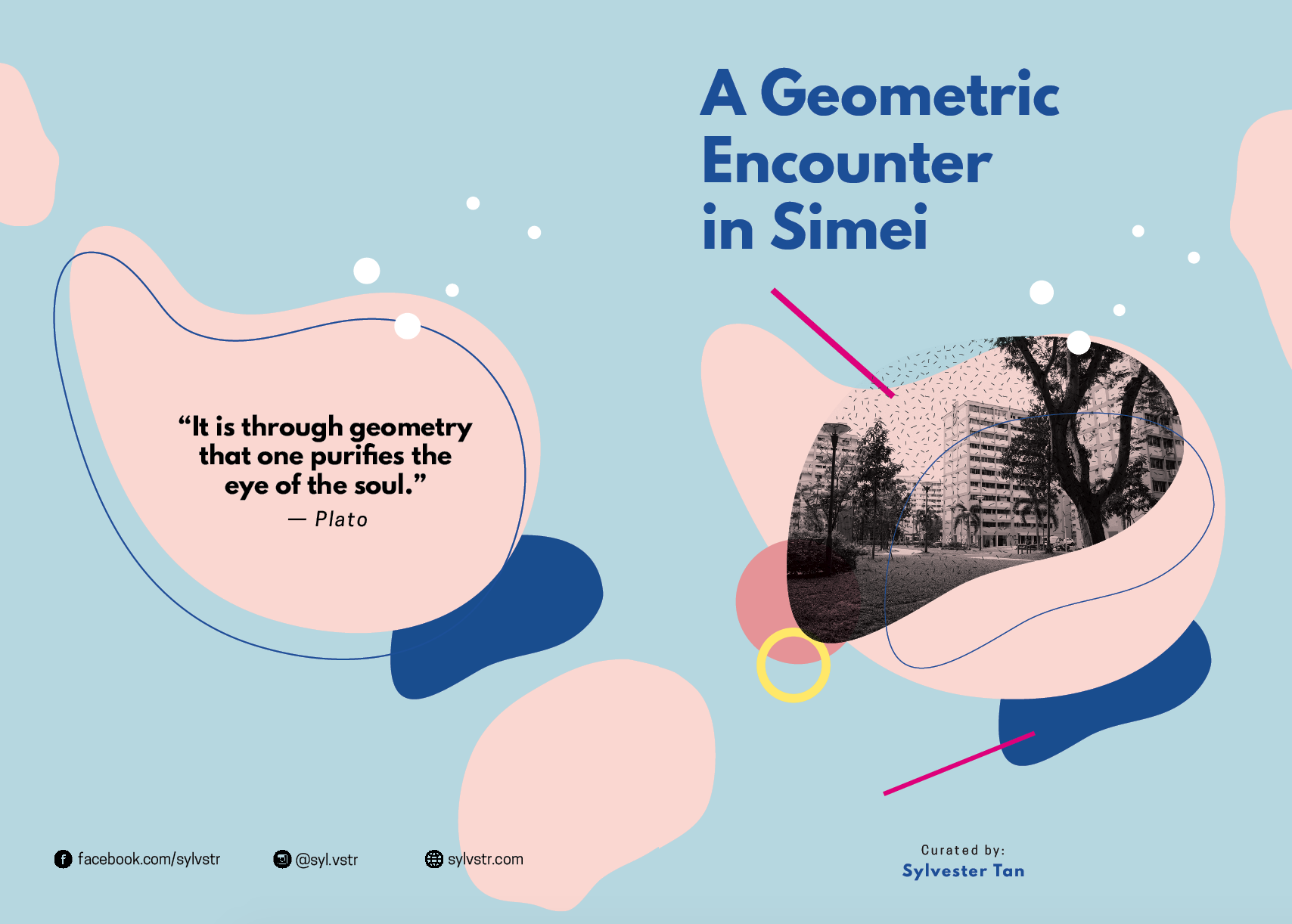
A Geometric Encounter in Simei is a zine that focuses on my visual experience in Simei. In this zine, I draw attention to little details on geometric shapes that are part of Simei’s aesthetic and identity.
Reflection: I was wondering why do we have to take so long to create a 8pp zine and it would be an easy task for me. I was clearly wrong. This project was the toughest in my opinion because I didn’t manage to understand what this zine should be about. I approached this project in a very commercial and informative way initially and I had to do site visit several times to finally get it right: a personal touch to this self-published zine. I honestly feel that I learnt a lot about inDesign from this project that will definitely benefit me when I start majoring in Visual Communication. I was quite happy with the end result because I think I pushed myself a lot to create interesting layout and story out from lousy photography skill and limited content generated from the neighbourhood haha! Done with Foundation 2D II!!!!
As presented in my research presentation, my initial idea for my zine was to focus on the 4 china beauties in Simei and where to find them, using oriental elements for the design. However, I gathered some feedbacks from my peers that it lack a bit of a personal touch to my entire zine, and the information with regards to the 4 beauties can be easily found online. Hence, I decided to focus on the geometric shapes that I saw during my site visit in Simei 🙂
So based on the layout research I did beforehand, I wanted my zine to look minimal and clean. Hence, I tried out a few layouts with that style:
This layout lacks hierarchy for the images and Ms Shirley suggested to remove some unnecessary details on the images so that audience can focus on the main object without distraction. I also feel that I could push the text hierarchy abit more.
After adjustment:
However, I was not very satisfied with my layout and I thought I could make it look more interesting and fun by adding more colour and elements:
I found this poster layout online and I really like the organic shapes that the designer has created. So I started sketching differentorganic shapes on Illustrator and apply it to my layout.
I also tried exploring with typography using only shapes and texture on the chinese character of “Simei”:
I then explore different layout using those organic shapes that I have drawn and play around with texture, colour and placement of elements. I felt that it was very difficult to balance so many elements within a spread, so I took quite awhile to figure out what elements to add in or take out, to make more layout less messy and balanced:
After much struggle exploring different layout and placement of elements for my zine, I finally settled with the design of my first spread:
Version 2:
Final version:
I illustrated the geometric shapes from the window and use it as part of my design elements to enhance the visual and story. I also added in other shapes that will be placed on my cover page and other spreads to achieve consistency.
After settling with a specific style that I was going for, 2nd spread in my opinion was the toughest to design:
The 2nd spread is about pillars, and because it was not well photographed and they were rectangular by nature, it was tough to frame it with the organic shapes like the first spread. Hence, I decided to illustrate and apply texture to the pillars to give it a very fun look that is consistent to my first spread:
Instead of alighting them straight like what I did initially, I decided to give it a 3-dimensional look to make my spread look interesting.
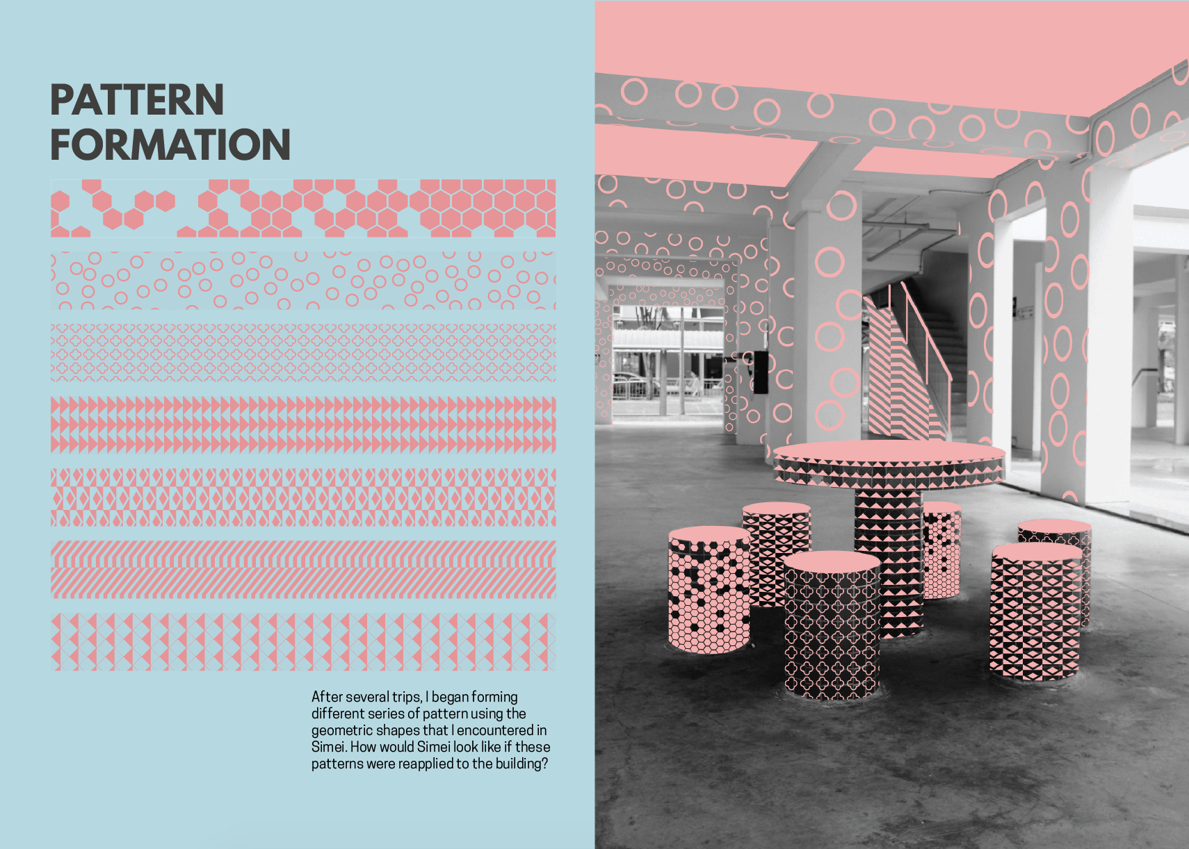
Last spread came quite easily as I already know what I wanted to do right from the start. Last spread is related to forming patterns and applying the pattern back to the void deck in Simei, hence I assigned 1 full page for the image itself.
I illustrated the shapes that were found on the windows and pillars i Simei, then place them together to form different patterns:
I initially place them vertically as shown above and use a different colour for each pattern. However, I think consistency is needed and I didn’t want it to draw too much attention away from the image that I was gonna place next to the pattern. Hence, I decided to keep it to just 1 colour and place it horizontally so that it guides the reader’s eyes from left to right:
After I finished designing all the spread, it was easier to design the Front and Back:
However, I felt that the cover didn’t match the spreads too well. Hence I made colour adjustment to the entire zine. So this was the first draft of my entire zine:
Back and front cover:
Need adjustment: Reduce the font size for the quote on the back cover; change dash to em-dash right before Plato.
First Spread:
Second Spread:
Need Adjustment: Remove the widow in the paragraph.
Last Spread:
Need Adjustment: Change the pattern lines to pink to add contrast from the background.
That’s all for my design process! See my next post for the final zine design!
Que Sera is a typography assignment that allow students to design types, using their name or initial to illustrate their aspire future job. In this project, I created types using digital illustration to show my 4 aspire jobs: Musician, Rock Climber, Table Tennis Player and Interior Designer.
“Pierre” (2017) by Abraham Poincheval Poincheval is a renowned French artist who is no stranger to bizarre performances. His works mostly related to inventing itinerant or sedentary experiences to discover the world from its still unexplored angles. His past works almost always involved endurance-testing solitary performances such as eating worms and beetles while living inside the bear; navigated France’s Rhone river inside a giant plastic corked bottle; spent a week on top of a 20-metre pole outside a Paris train station.
Poincheval poses during his performance of The Bottle in Port-Saint-Louis-du-Rhône.
In 2014, Poincheval spent 13 days inside a bear’s skin at the Parisian Hunting and Wildlife Museum
To continue his exploration, in 2017 he embarked on a new extreme performance entitled “Pierre (Stone)” by enclosing himself inside a giant block of limestone. He entombed inside the boulder where he spent seven days on an ‘inner journey to find out what the world is’.
He carved out a hole inside the rock in his own image, just big enough for him to sit up in, with a niche to hold supplies of water, soup and dried meat. During the performance, people seemed to be very touched. They talked into the crack, read poetry to him, or tell him about their nightmares or their dreams. This encourage audience to participate in his performance, which create a very different experiences from his past work. The audience form some sort of connection with the stone as though it was “alive”.
For his experience, even though he can only move his feet and hands a few inches, he did not feel oppressed by the rock and felt completely at ease, in real connection with it.”It’s this strange feeling of a floating world, an incredible floating in this mineral capsule,” he said.
“A Fire in My Belly” (1986-1987)by David Wojnarowicz
David Wojnarowicz was an American painter, photographer, writer, filmmaker, performance artist, and AIDS activist prominent in the New York City art world. Wojnarowicz was a victim of childhood abuse, he lived for a time during his teenage years as a street hustler. After a period outside of New York, he returned in the late 1970s, where he quickly emerged as one of the most prominent and prolific of an avant-garde wing that mixed media, made and used graffiti and street art.
His first recognition came from stencils of houses afire that appeared on the exposed sides of buildings in the East Village. He also made super-8 films, such as Heroin. Wojnarowicz was also connected to other prolific artists of the time, appearing in or collaborating on works with artists like Nan Goldin, Peter Hujar, Luis Frangella etc. For some years, he and Hujar were lovers until Hujar died of AIDS in 1987. Hujar’s death moved Wojnarowicz’s work into much more explicit activism and political content, notably around the injustices, social and legal, inherent in the response to the AIDS epidemic.
“A Fire in My Belly“ is a visceral meditation on cultural and individual identity, spirituality, and belief systems. It echoed themes explored throughout David Wojnarowicz’s art and writing.
On a trip to Mexico City with Tommy Turner to scout Day of the Dead imagery, Wojnarowicz documented scenes that embodied the violence of city life. A central image is that of a child exploited as a fire-breathing street performer, which resonates in the title of the film and Wojnarowicz’s own experience hustling on the streets at a young age. He later staged scenes in his New York City apartment to combine with this footage, collecting dreamlike images to illustrate thematic sections he planned for the film’s structure and cutting script. Among these images is a dancing, gun-wielding marionette, coins dropping into a plate of blood, vibrantly colored loteria cards, and the now iconic self-portrait of the artist with his lips sewn shut.
A Fire in My Belly was never completed. Wojnarowicz’s cutting script shows that he thought of organizing it into discrete sections. Each section includes notes on general themes, such as “aggression” or “hunger,” accompanied by specific symbols – religious icons, the four elements, or colors.
In 2010, Smithsonian Institution removed an edited version of footage used in the short silent film from the exhibit “Hide/Seek: Difference and Desire in American Portraiture” at the National Portrait Gallery after complaints from the Catholic League and the possibility of reduced federal funding for the Smithsonian.The video contains a scene with a crucifix covered in ants.The Catholic League claimed the work was “hate speech”, against Catholics.
However, many artists and curators thought that it was not anti-religion or sacrilegious. It is a powerful use of imagery. In response, The Andy Warhol Foundation, which had provided a $100,000 grant to the exhibition, announced that it would not fund future Smithsonian projects. Many protests were held and artists sought to withdraw their art from the exhibit.
“The Reincarnation of Saint-Orlan” (1990) by ORLAN
ORLAN is one of the most famous french artist internationally known. She creates sculptures, photographs, performances, videos, using scientific and medical technics like surgery and biogenetic.
She often makes her own body the medium, the raw material, and the visual support of her work. She is a major figure of the body art and of “carnal art*” as she used to define it in her 1989 manifesto.
*Carnal Art: is self portraiture in the classical sense, but realised through the possibility of technology. It swings between defiguration and refiguration. Its inscription in the flesh is a function of our age. The body has become a ‘modified ready-made’, no longer seen as the ideal it once represented.
Her best known work “The Reincarnation of Saint-Orlan” started in 1990 that involves a series of plastic surgeries through which the artist transformed herself into elements from famous paintings and sculptures of women. As a part of her ‘Carnal Art’ manifesto, Orlan’s operating table became her baroque theatre. Poetry was read and music played while she lay fully conscious. Each surgery was captured on video, broadcast in galleries and sometimes fed to audiences around the globe via live satellite link-ups. Some critics have described Orlan as mad, some have written up her interest in cosmetic surgery as anti-feminist.
However, Orlan’s goal in these surgeries was to acquire the ideal of female beauty as depicted by male artists. When the surgeries are complete, she will have the chin of Botticelli’s Venus, the nose of Jean-Léon Gérôme’s Psyche, the lips of François Boucher’s Europa, the eyes of Diana, and the forehead of Leonardo da Vinci’s Mona Lisa. Orlan picked these characters “not for the canons of beauty they represent… but rather on account of the stories associated with them.”
According to Orlan’s Carnal Art Manifesto, it’s “not against cosmetic surgery, but rather against the conventions carried by it and their subsequent inscription”. Instead of condemning cosmetic surgery, Orlan embraces it; instead of rejecting the masculine, she incorporates it; and instead of limiting her identity, she defines it as “nomadic, mutant, shifting, differing.” Orlan has stated: “my work is a struggle against the innate, the inexorable, the programmed, Nature, DNA, and God!” She believes it is important to underline her work as a feminist artist.


 The main idea of this concept is to use abstract art to tell the story mentioned above. The movement of water turbulence as well as the moving objects that represent swordfishes that moves within the water turbulence would be an interesting combination that creates a unique visual experience for the audience.


 I have been following David Mcleod’s Instagram account for quite awhile and I was very inspired by all his motion graphics. He is a multi-disciplinary Illustrator and Artist based in New York, and his work is similar to what we see in “Virtual Depiction: SanFrancisco”. His works are often very fluid and organic, and it involves alot of graphic motions and patterns. All his works are generated from Cinema4D. Here are some images of his work:


 However, I was not very satisfied with my layout and I thought I could make it look more interesting and fun by adding more colour and elements:
 I then explore different layout using those organic shapes that I have drawn and play around with texture, colour and placement of elements. I felt that it was very difficult to balance so many elements within a spread, so I took quite awhile to figure out what elements to add in or take out, to make more layout less messy and balanced:


 Final version:


 Need Adjustment: Change the pattern lines to pink to add contrast from the background.


 Poincheval is a renowned French artist who is no stranger to bizarre performances. His


 David Wojnarowicz was an American painter, photographer, writer, filmmaker, performance artist, and AIDS activist prominent in the New York City art world. Wojnarowicz was a victim of childhood abuse, he lived for a time during his teenage years as a street hustler. After a period outside of New York, he returned in the late 1970s, where he quickly emerged as one of the most prominent and prolific of an avant-garde wing that mixed media, made and used graffiti and street art.
 His first recognition came from stencils of houses afire that appeared on the exposed sides of buildings in the East Village. He also made super-8 films, such as Heroin. Wojnarowicz was also connected to other prolific artists of the time, appearing in or collaborating on works with artists like Nan Goldin, Peter Hujar, Luis Frangella etc. For some years, he and Hujar were lovers until Hujar died of AIDS in 1987. Hujar’s death moved Wojnarowicz’s work into much more explicit activism and political content, notably around the injustices, social and legal, inherent in the response to the AIDS epidemic.
 ORLAN is one of the most famous french artist internationally known. She creates sculptures, photographs, performances, videos, using scientific and medical technics like surgery and biogenetic.
