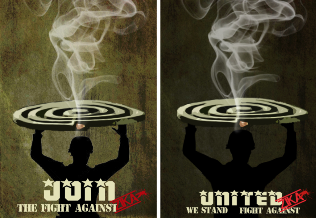
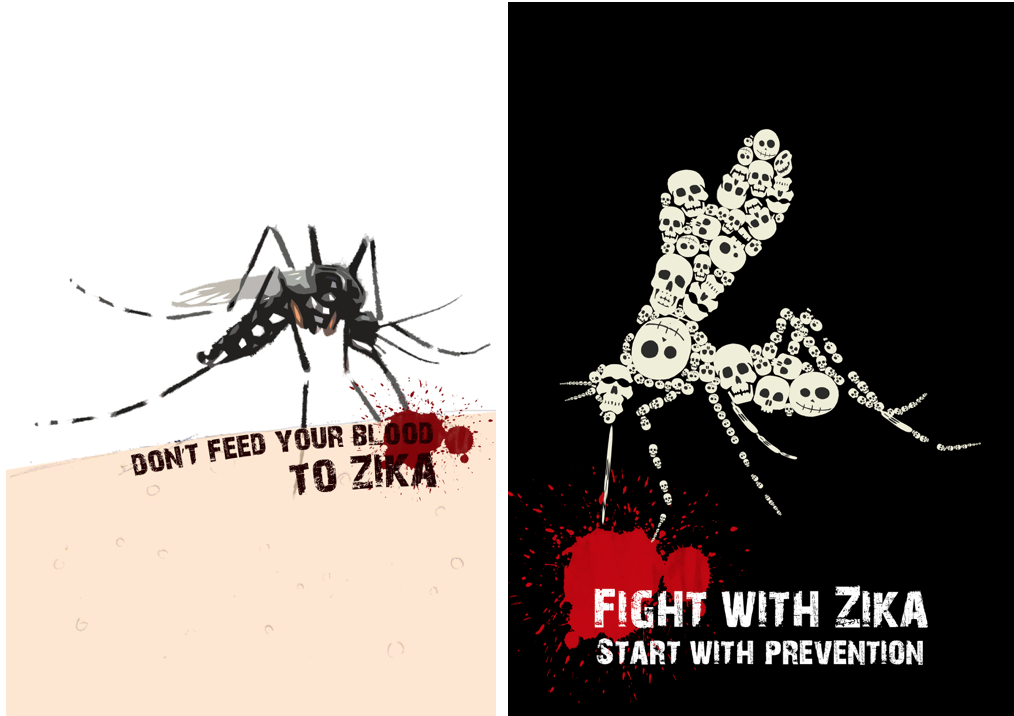
Mosquito coil’s idea
The call of the soldier

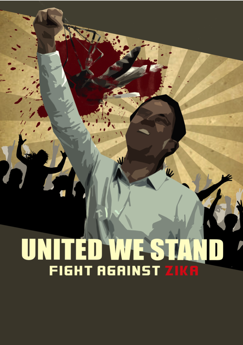
I changed my slogan to “United we stand, fight against Zika. I gave up all the ideas I came out before because I think that they all don’t have the strong message to get rid of Zika.
If we treated the fight against Zika virus as a war, I think a representative character towards a war is a soldier. This means that we should like a soldier to combat Zika bravely. In addition, the soldier is also a charismatic figure because he represents a country to fight against the evil forces justifiably.
For the design of this poster, I took reference from Russian Constructivism. It is because I think for a eye-catching poster, the shapes and the composition need to be simplified which I found Russian Constructivism is similar to this style.
Mock-up

Some suggestion I gained from the group:
- It shouldn’t be a lively mosquito.
- The soldier does’t suit the theme of Zika and the message of UNITED didn’t show in the poster. It can be everyone, a child or a woman but not a soldier.
- Try to add a number of people to support the message of “United”.
- Margin: The word “Fight” is almost out of the margin.
- Try to push the slogan at the middle to make the hierarchy smoothly.
- As the face of the solider is the main focus, it shouldn’t be so dark.
Refinement
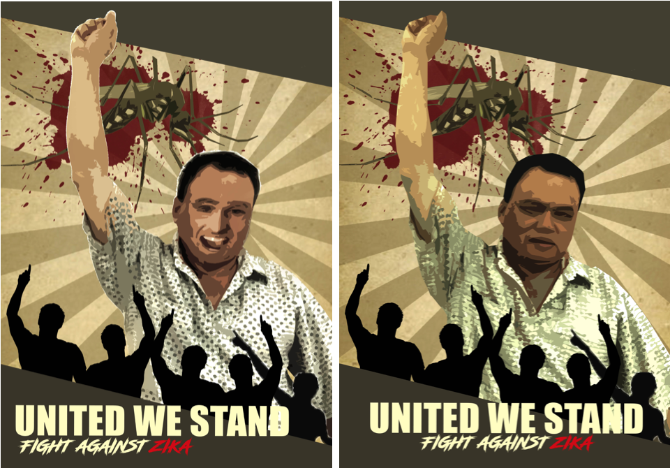
Based on the idea of “It can be everyone!”. I try to take photo of my father to let it feels more local. The face of my father looks awkward and I decided to photoshop a stranger face onto it. I didn’t get what it so humorous and I gave up using my father be a model.
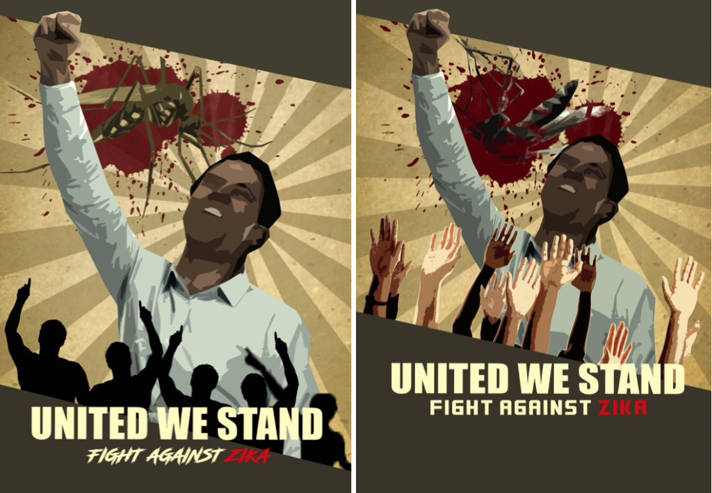 Adding silhouettes hands to support the idea. For the left side of the poster, Michael suggested me that can add more people and why not it could be a family? In addition, the slogan could be more higher until the middle of the poster and it should be a died mosquito! (Yea, I forgot…) Lastly, the people(where is women?)can add it behind too.
And I came out this but errrrr……..
Final
Finally, after keep editing, I came out this!
Reflection
When I was doing research, I found that one of the serious consequences that the Zika will cause is the, most affected target groups would be women. Of course, this type of posters are able to convey a strong message to the audience. So I conceived the idea from the beginning also. After that, I wonder that why not I just set the target audience to the normal people and see how it can bring the strong messages by using the illustration.
Instead of eye-catching color scheme, I would choose the army green specifically as the main color because I think this is a representative of the color of a war like to invite you to join this war.
Through this project, I gained the knowledge of designing not only a poster and also learnt how to get improvement by accepting suggestions from others. The process showed my idea and composition changed drastically, it proved that how well I got improvement when I keep asking opinion around. Although at last still has the imperfection part to improve, for instance, the mosquito was too dark and the poster is so political but the process of the learning fulfill the ending of this project.
