Combating Zika Outbreak (4)

Mosquito coil’s idea 

screen-shot-2016-10-03-at-02-01-51

screen-shot-2016-10-22-at-23-09-53


The call of the soldier 

screen-shot-2016-10-22-at-23-06-54


I changed my slogan to “United we stand, fight against Zika. I gave up all the ideas I came out before because I think that they all don’t have the strong message to get rid of Zika.

If we treated the fight against Zika virus as a war, I think a representative character towards a war is a soldier. This means that we should like a soldier to combat Zika bravely. In addition, the soldier is also a charismatic figure because he represents a country to fight against the evil forces justifiably.

For the design of this poster, I took reference from Russian Constructivism. It is because I think for a eye-catching poster, the shapes and the composition need to be simplified which I found Russian Constructivism is similar to this style.


Mock-up

screen-shot-2016-10-22-at-23-07-19


Some suggestion I gained from the group:

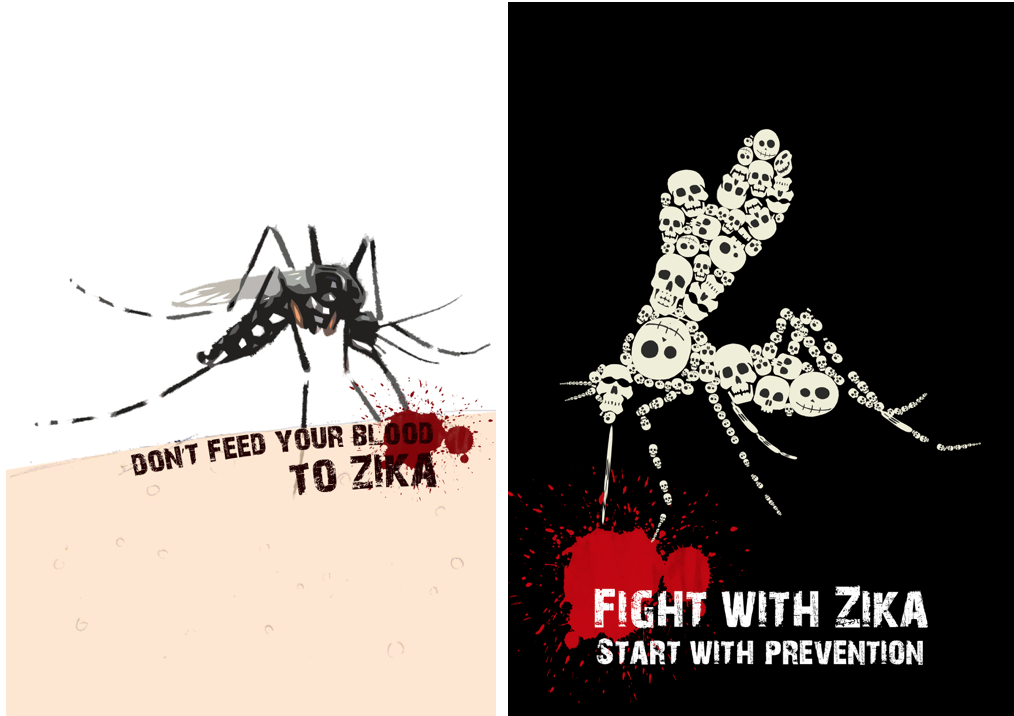
  • It shouldn’t be a lively mosquito.
  • The soldier does’t suit the theme of Zika and the message of UNITED didn’t show in the poster. It can be everyone, a child or a woman but not a soldier.
  • Try to add a number of people to support the message of “United”.
  • Margin: The word “Fight” is almost out of the margin.
  • Try to push the slogan at the middle to make the hierarchy smoothly.
  • As the face of the solider is the main focus, it shouldn’t be so dark.


Refinement

screen-shot-2016-10-22-at-23-21-16

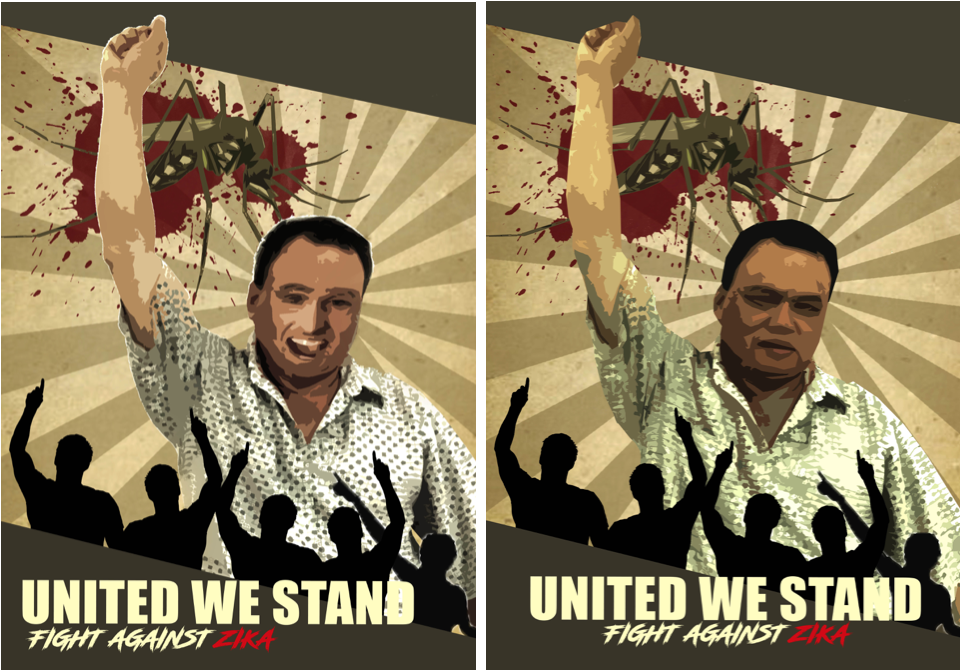
Based on the idea of “It can be everyone!”. I try to take photo of my father to let it feels more local. The face of my father looks awkward and I decided to photoshop a stranger face onto it. I didn’t get what it so humorous and I gave up using my father be a model.

screen-shot-2016-10-22-at-23-22-11Adding silhouettes hands to support the idea. For the left side of the poster, Michael suggested me that can add more people and why not it could be a family? In addition, the slogan could be more higher until the middle of the poster and it should be a died mosquito! (Yea, I forgot…) Lastly, the people(where is women?)can add it behind too.

And I came out this but errrrr……..
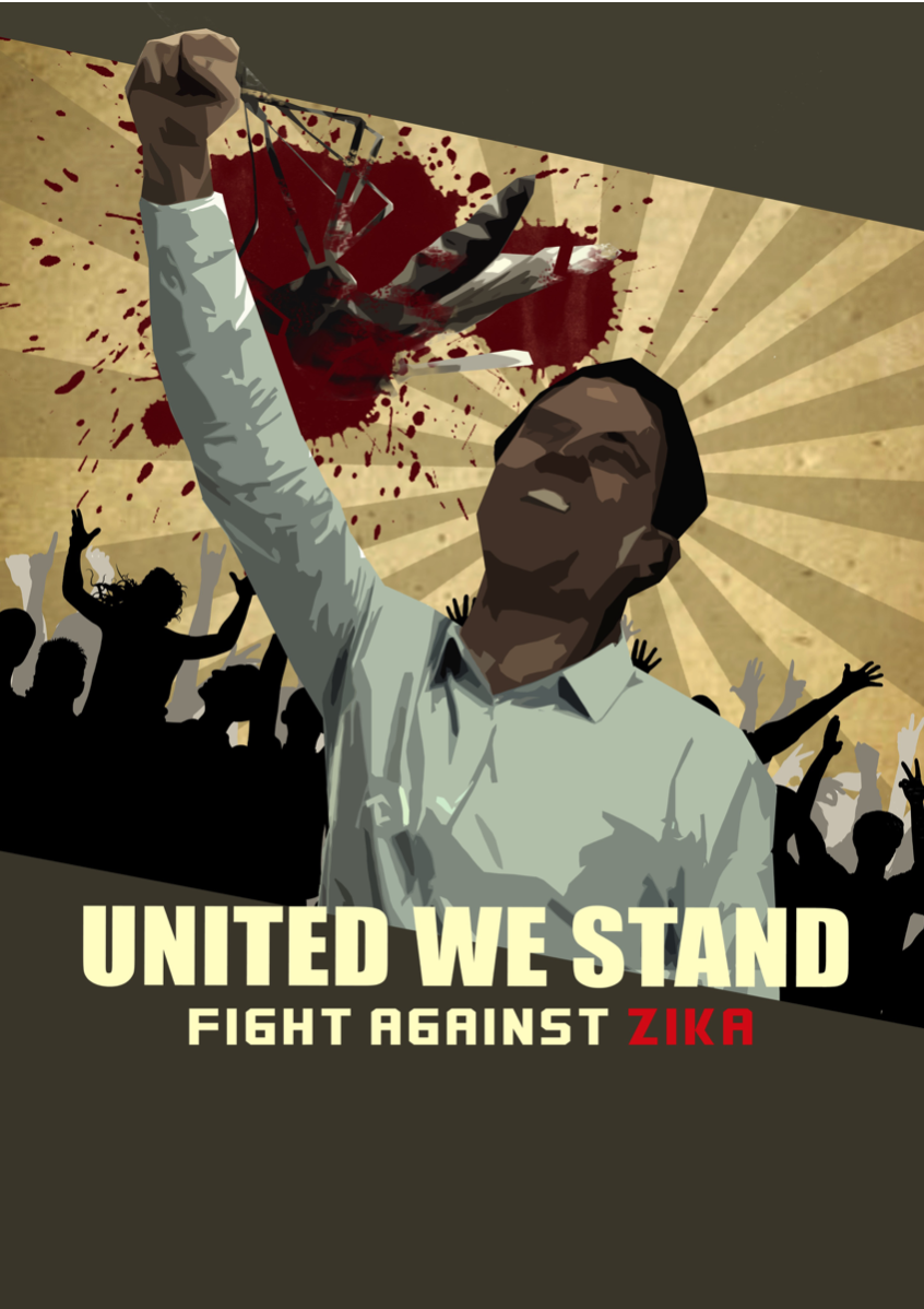
screen-shot-2016-10-22-at-23-37-23


Final

screen-shot-2016-10-22-at-23-22-39

Finally, after keep editing, I came out this!

Reflection

When I was doing research, I found that one of the serious consequences that the Zika will cause is the, most affected target groups would be women. Of course, this type of posters are able to convey a strong message to the audience. So I conceived the idea from the beginning also. After that, I wonder that why not I just set the target audience to the normal people and see how it can bring the strong messages by using the illustration.

Instead of eye-catching color scheme, I would choose the army green specifically as the main color because I think this is a representative of the color of a war like to invite you to join this war.

Through this project, I gained the knowledge of designing not only a poster and also learnt how to get improvement by accepting suggestions from others. The process showed my idea and composition changed drastically, it proved that how well I got improvement when I keep asking opinion around. Although at last still has the imperfection part to improve, for instance, the mosquito was too dark and the poster is so political but the process of the learning fulfill the ending of this project.

Combating Zika Outbreak (3)

After last week’s discussion, I worked on this feasible idea digitally. For the left image, a mosquito is sucking the human’s blood. It’s a simple idea with the figure and ground features which I think can bring out the theme clearly. I am not satisfied with this because the meaning of the poster is only what you can see; it doesn’t have a strong idea that really can influence others.

For the another image, I tried to invert the mosquito. The words” FIGHT” with bloody background and the mosquito is connecting to the bloodstain. The composition won’t look separately but I felt that the sense of symmetry is lost compare to the previous one (The mosquito with the other side).

screen-shot-2016-10-01-at-05-09-09

I found that the concept of my previous ideas were not strong enough and they all don’t have a significant idea to depict on “how to prevent to fight against Zika”. My friend inspired me that the mosquito incense coil is a very good idea to play on and I decided to choose it. It reminds me that my mother always uses this at home when my house was attacked by mosquito. So, I changed the slogan to “Join the fight against Zika” and the idea was being described as a war with the brave soldiers. The numerous number of soldiers also represent that we all must become a soldier to join the war. I think the overall composition and hierarchy look fine in this piece. However, the visual message for the soldiers part is a bit confusing.screen-shot-2016-10-01-at-00-50-58

The colour of mosquito coil inspired me that kind of army poster. I used army green to be the main colour and take reference from Russian constructivism art to form this poster. I found that the position of the mosquito isn’t natural and it looks more like the hand is bitten by the mosquito. Perhaps I will work on the previous idea.

screen-shot-2016-10-01-at-00-51-36


Combating Zika Outbreak (2)

Among the slogans that I came out last week, I chose 1)”Fight with Zika, Start with prevention” and 2)”Don’t feed your blood to Zika” to work on.

  1. By referring these influential and weighty poster from the website, I came out with a mother is hugging her baby with the illness of microcephaly. For the normal people who fells victim to the Zika virus, the illness is often very mild. But for a pregnant woman, it will cause pregnancy loss or a baby born with an abnormally small head and brain. For this composition, it occurred conflict about the knowledge of Zika symptom, which is the symptoms won’t be show for a mother who had already given birth.untitled-1

ad_sprs_softdrink

2. A mosquito is sucking the blood. The positive and negative spaces show in this poster while the colour of the skin will cover half of the poster. The red dots show the Zika symptom – RASH. But I think there is a conflict happened which is same with the previous poster. The man already had the symptom while the mosquito was spreading the virus.

untitled-2


3. A mosquito which formed by numerous of skull. This idea came from a mosquito with Zika virus. At first, I wanted to use bacterium but I think that it is not scary and serious enough so I changed to skull. After the discussion, Michael mentioned that the choices of the skull is crucial and essential also. Besides, he suggested that I can integrate the image and the words to avoid they look too separately. The images below is my reference piece for this idea.

zika h

Combating Zika Outbreak (1)

An effective poster

Stepping in this project, I went to research more on how should a poster to be more effective and also I want to conclude what I learned from the class last week. The first thing is to have the target audience so that we can focus on a single message to them. Next, use the images and graphs to tell the story. As a poster should be an eye-catcher, we should not put too much of information and it will make the audience confused. Besides, keep the sequence well-ordered and obvious.  The key things we can’t neglect are the layout, visual hierarchy and information flow which are we learned last week.

Google search “Health Communication Posters”

The posters which contain a lot of information make me don’t have the desire to click in. So we can see how the importance to control the information and images in a poster.

Screen-Shot-2016-09-12-at-01.56.49

Research on various types of health communication posters

As I know the target audience not only for adult but also for the child, I would make the poster illustrated (?)

c22ac4db63e07a6c76e8254971230f8e 6a5a146628b9ee9d3e6ce5891236dde7 2d0a5557b331579ce4db8bce7d193e53

I found this types of poster by using metaphor very interesting and they bring out the messages clearly.

cb70f00e341ae13e66ff36c15f16a0afb39387eb806b58b0c85df0717f703b8b7abc0f8331c15053ff78821fc3e59a4190ed429605b63b2f0e60b8808ccf4163

4bddc0f7940e42fa6a9d39a74b4ccbeb

afa974b3a98e7c5a38c61dc541c68789

f5359fb554676169fc0cbbf38234cdac

14eb170959a2830773d8b649a221af37
What are the exiting health communication poster?

I chose this become my favourite because it brings out the message obviously and it caught my eyes in “three-seconds hit”. The use of metaphor, a bottle as a child, it really impressed the audience. The back and clean background makes the graph and texts more stand out. The title ” HOW MANY CIGARETTES A DAY DOES YOUR CHILD SMOKE?”, it brings the awareness to parents to stop smoking especially a pregnant woman.

05674e3c90e097a3a58ab29e975cfa20I am weak on thinking this kind of slogan but I tried smilecry

  • Say No to Zika
  • You – Zika = A Healthy Life
  • Combating Zika, Start from You
  • Keep away from Zika, for child
  • Fight with Zika, Start with prevention
  • Fight Zika, It isn’t a game
  • Join the fight against Zika
  • Don’t feed your life to Zika
  • Live with no Zika

Ideas and mood boards

1. For my ideas, I am going to explore the poster with less text and playing around the images and space. The layout is similar to the example of the posters I research above and the graphics should be by photography or illustration. I prefer the layout with just a Aedes mosquito, with a scary look like and the down colour background. Another choice is illustrating a Zika patient with the symptoms.

Screen Shot 2016-09-12 at 13.54.31

2. Setting the target audience to mothers which is inspired by the posters below. Give them the awareness how important the mothesr should prevent the virus of Zika for their child.

Screen Shot 2016-09-12 at 13.34.41

3. I haven’t had any for the third ideas but my mind has been surrounded  by the Zika virus poster by GOV SG. I think it is a good example that the ordered layout and also the informative texts. The colour also catch the attention of the audiences and make them have desire to see that.14231157_10154434122793686_2490761139799190076_o