
Project 2: Locale, this is a project about researching a local area, and expressing our findings visually and then following up with a zine to express it in an abstract, engaging manner.
Concept
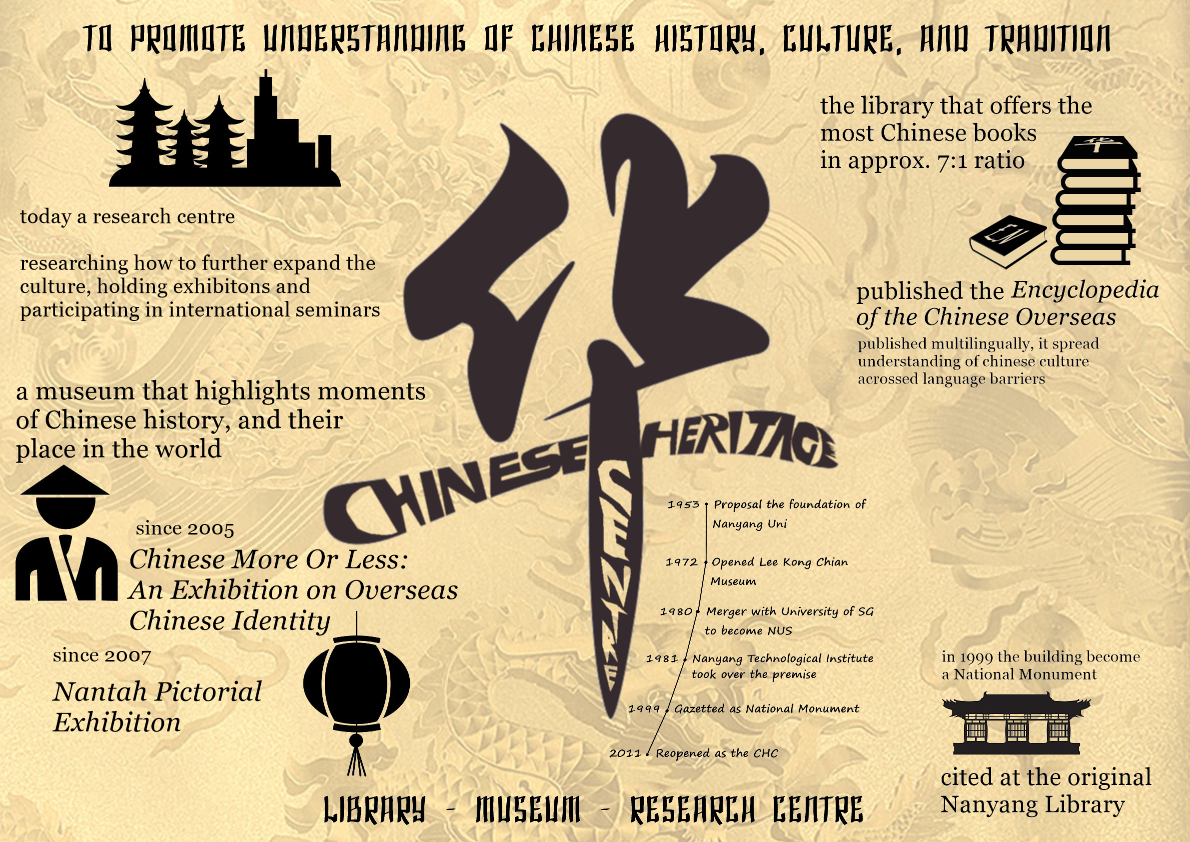
Since we are to present a local place of interest for educational purposes, I decided why not pick somewhere with a history of education. Perhaps even possibly a place of important heritage in Singapore. With some research I learnt that the Chinese Heritage Centre is a national monument that fits those requirements. Bingo! Bonus points as this location is deeply rooted to Chinese culture in Singapore’s education and has ties to both NTU and NUS’ history.
About the site
The Chinese Heritage Centre is a Library, Museum, and Research Centre all-in-one. Originally being the library at Nanyang University, the Lee Kong Chian Museum opened in 1972, but the merger with the University of Singapore to form NUS in 1980 led to a relocation, and the Nanyang Technological Institute took over the premise the following year. After a decade it was promoted to the university status, creating NTU. In 1999 the site was gazetted as a national museum and finally reopened as the CHC in 2011.
Let’s have a look at what they offer inside:
In Chinese photographic studio portraits, Chinese sitters aim at projecting an image that shows themselves to best advantage – it is how they would like others to see them. By their pose, dress and chosen props, some give symbolic expression to their identification with Chinese culture, or more frequently, high Chinese culture. They would wear silk robes, hold a book, gather fancy furniture and pose elegantly even if these are outside the norm of their daily lives.
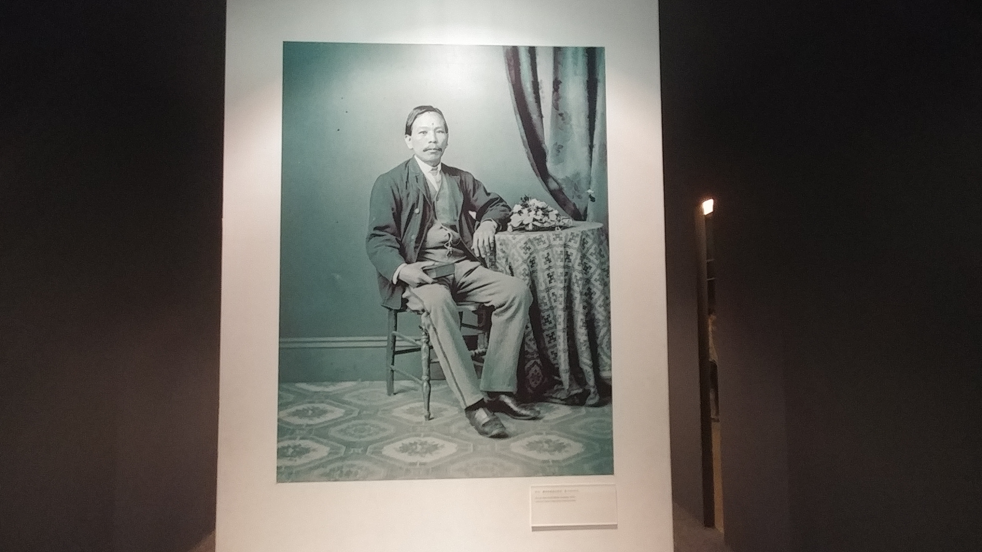
Chinese identity is formed and transformed in the perception of others – the “mirror” in which a person’s reflection is reshaped or distorted by the glass which holds is. What any person appears to be is fundamentally how he appears to others and only derivatively how he appears to himself. And while he may see himself as one kind of Chinese, others may perceive him as another kind, looking as they do through “mirrors” distorted by stereotyping and stigmatisation.
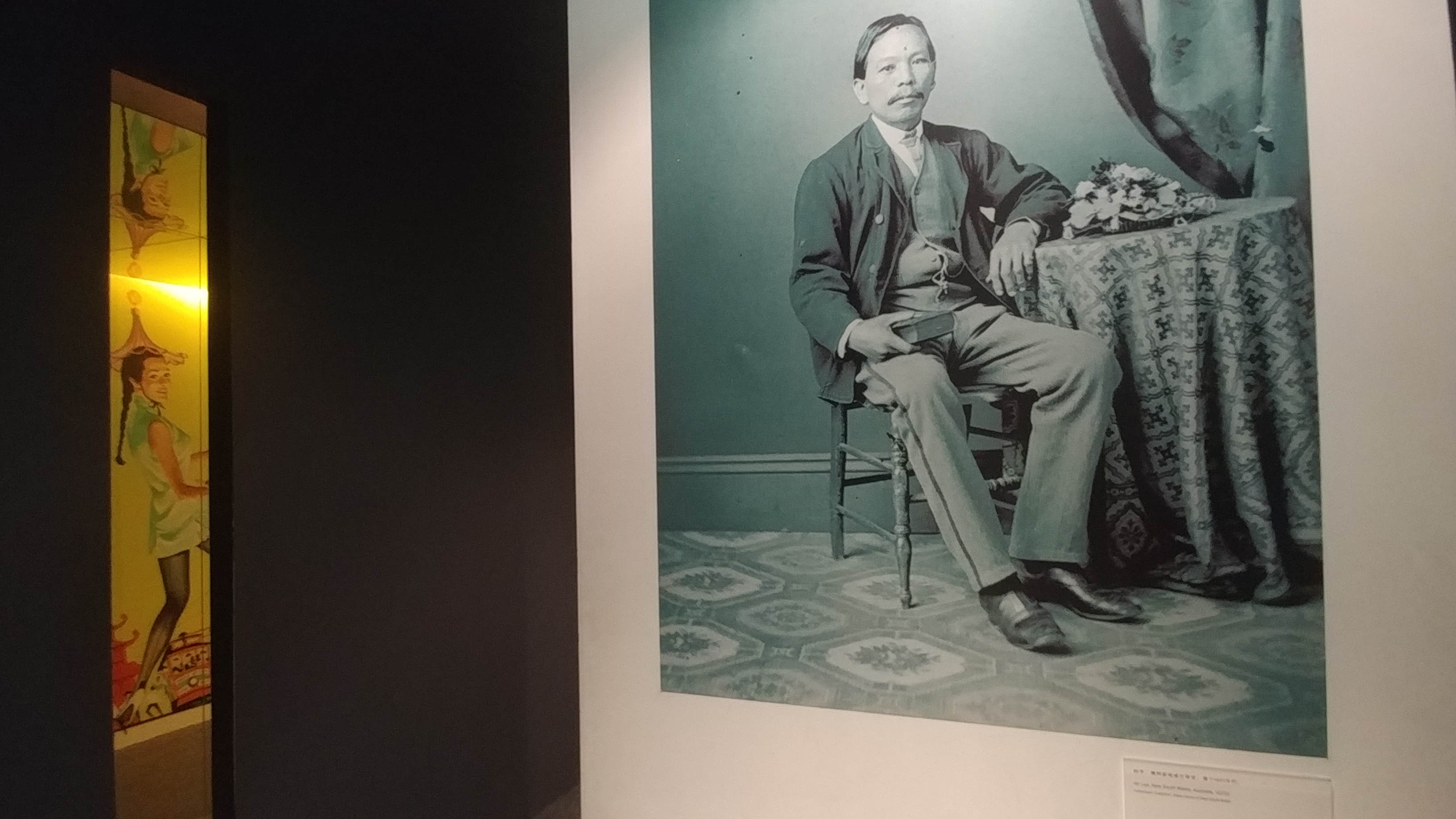


The Chinese are portrayed in pretty interesting way here – the middle columns show nice looking photographs of the Chinese in a blue tint, which is the inside view; this is how the Chinese view themselves, all prim and proper. Surrounded by these columns are walls with thin openings where we can peak through. Yet what we see are mirrors which reflect how the Chinese appear on the other side of these walls.
These reflections are tinted yellow, which is how the Chinese are seen from outside, different in nature (and colour) and usually stereotyped, which isn’t what the Chinese hope to show. I found the curation very interesting, as one needs to take the effort to peek through the thin splits in the walls to be able to observe the reflections from outside; this very much reflects how the Chinese are not particularly open-minded to be able to see the greater picture or how they are actually viewed, they move on with their own visions and ideals.
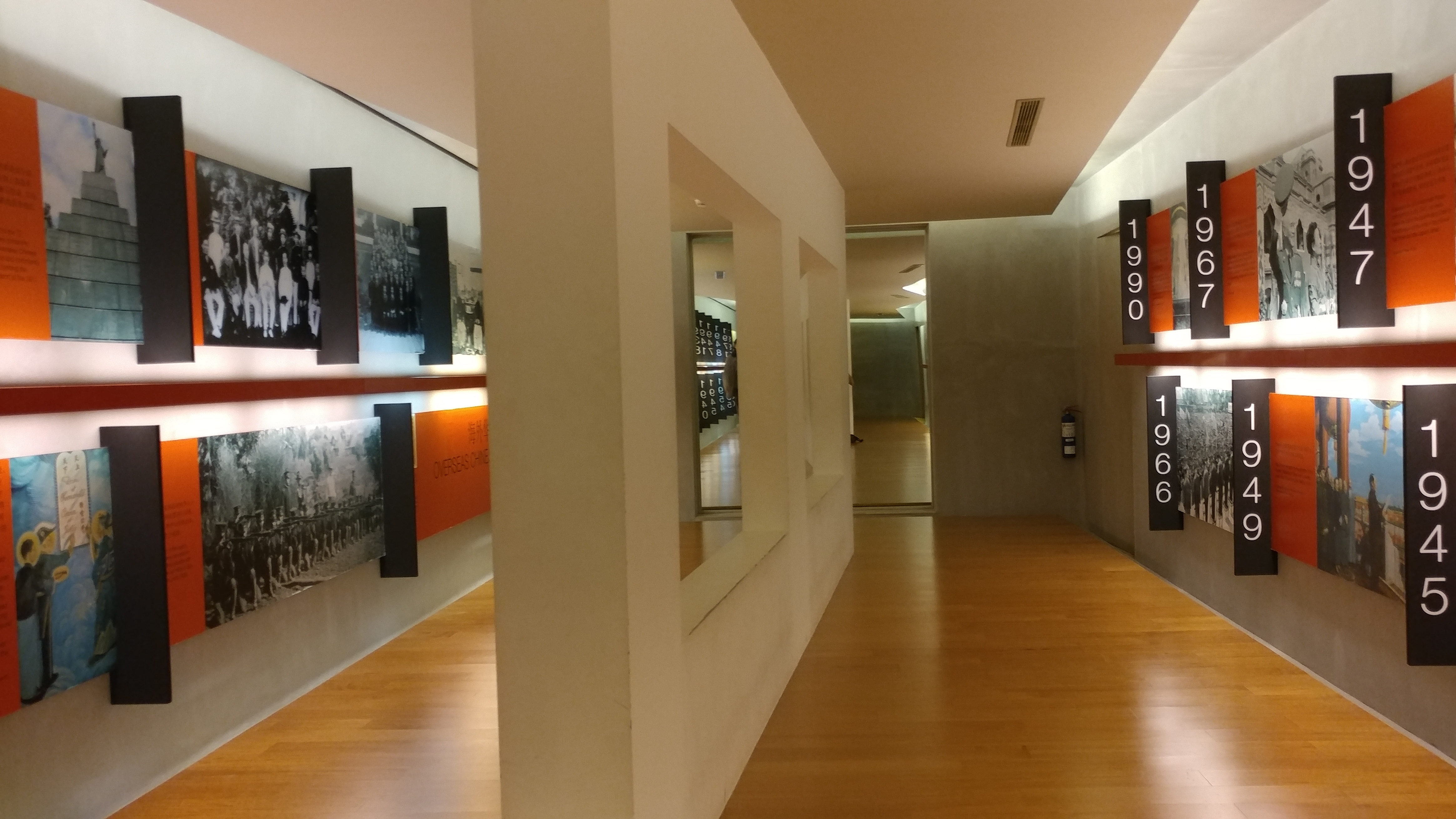
Other than the main attraction, the rest of the museum was pretty standard, although the displays seems more western than I would have expected. By the end of it, does feel sort of like a museum you can find in western countries, but the content is about Chinese culture. So here I decided that I should move on with my zine’s direction about western influence on Chinese culture.
The Zine
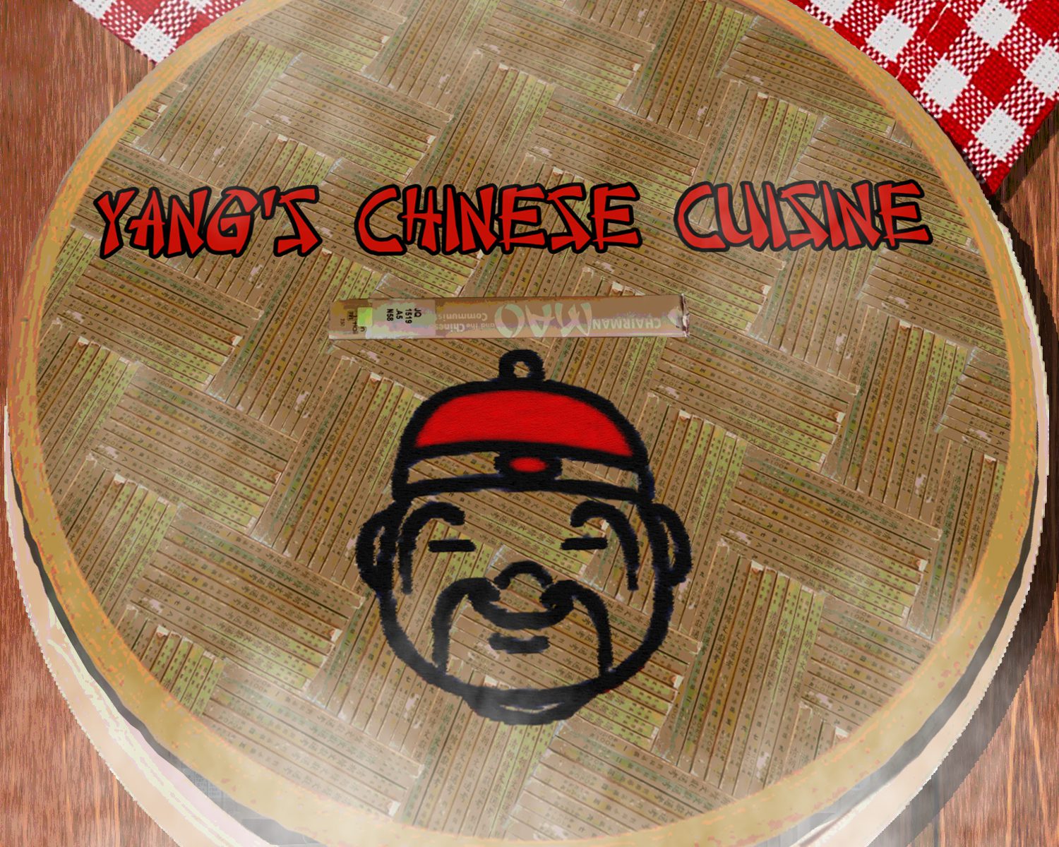
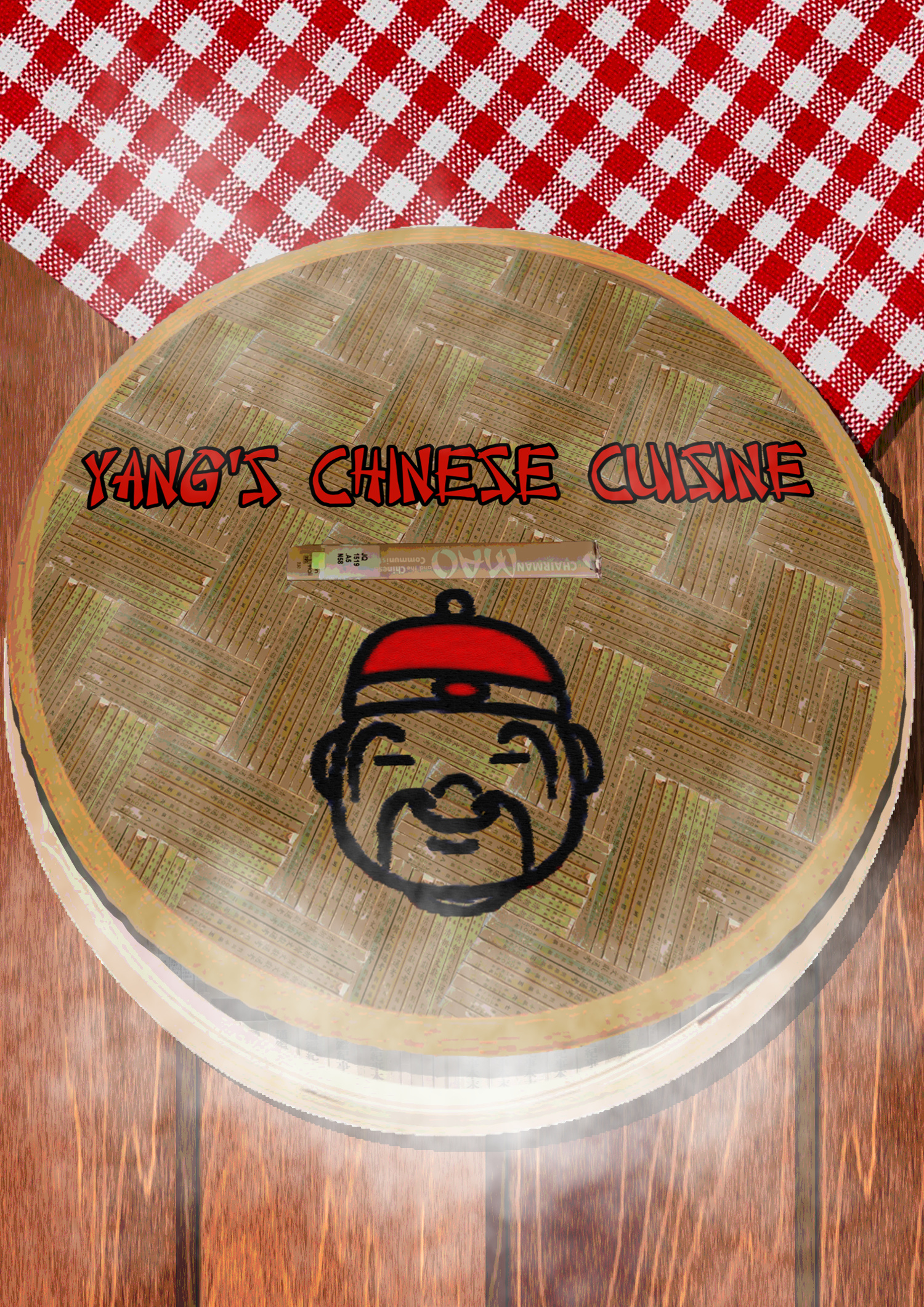
The theme of the zine is “Western influence on Chinese culture”, hence I decided to portray what should be Chinese in manners which lets you think “hold on this doesn’t feel Chinese”, as that was how I felt when I was touring the site. And when I think of what represents Chinese well, I think of dim sum. After all, what better way to capture a culture than through food? Culture requires life, and life requires food; it’s science. So I have designed my zine to appear as a dim sum tray that offers layers of food as you flip through the pages. As the place is about Chinese heritage, I also wanted to emphasise that Chinese culture is well rooted, the base shall not change so easily over the course of time, however it might be influenced and adapt some elements, as seen in how the table changes from clean to having stains from whatever it has went with. And of course, since it is seen from the outside view, as with how the museum’s attraction was done, I made it look as stereotypical as I could, starting from the Chinese face on the cover.
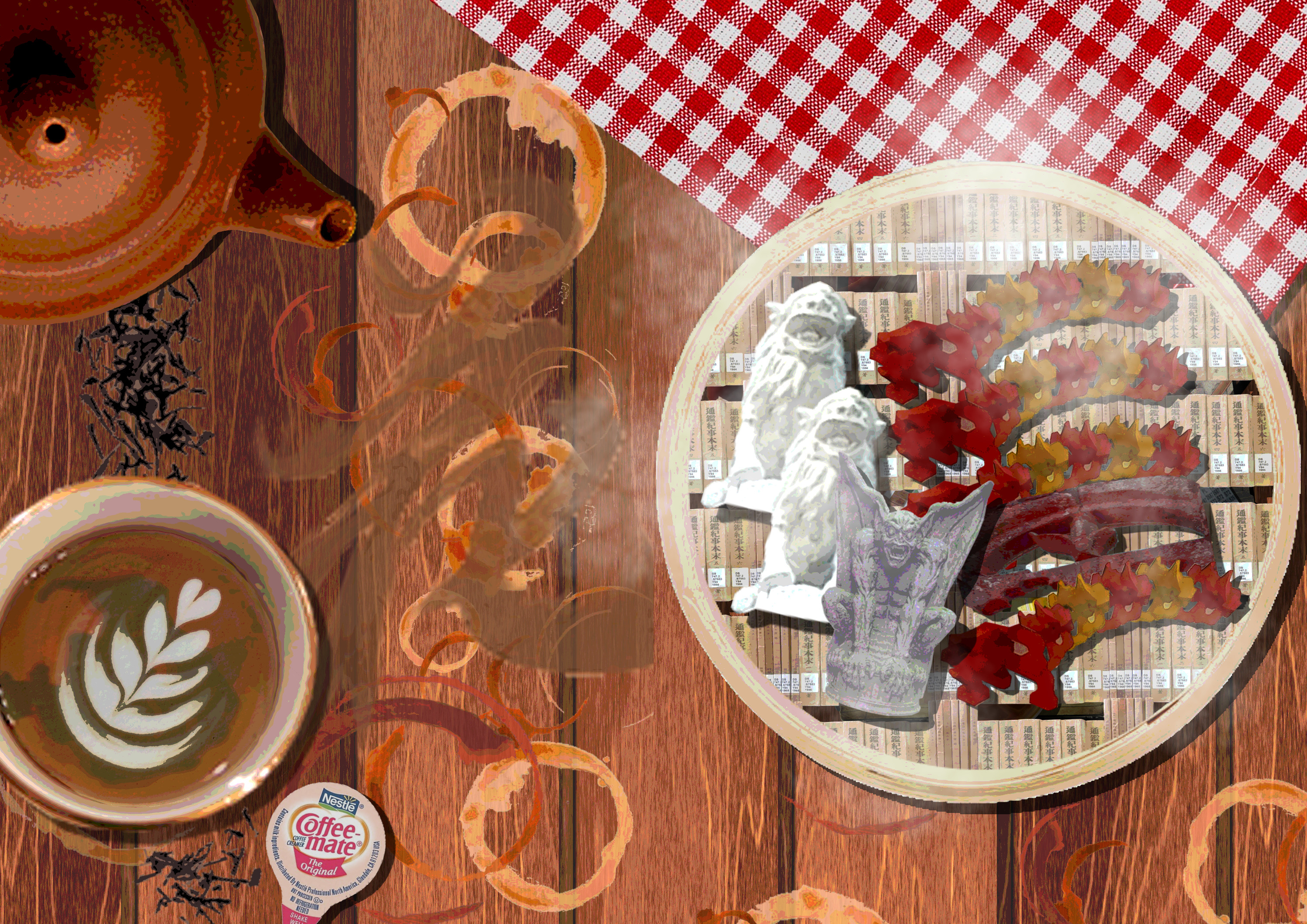
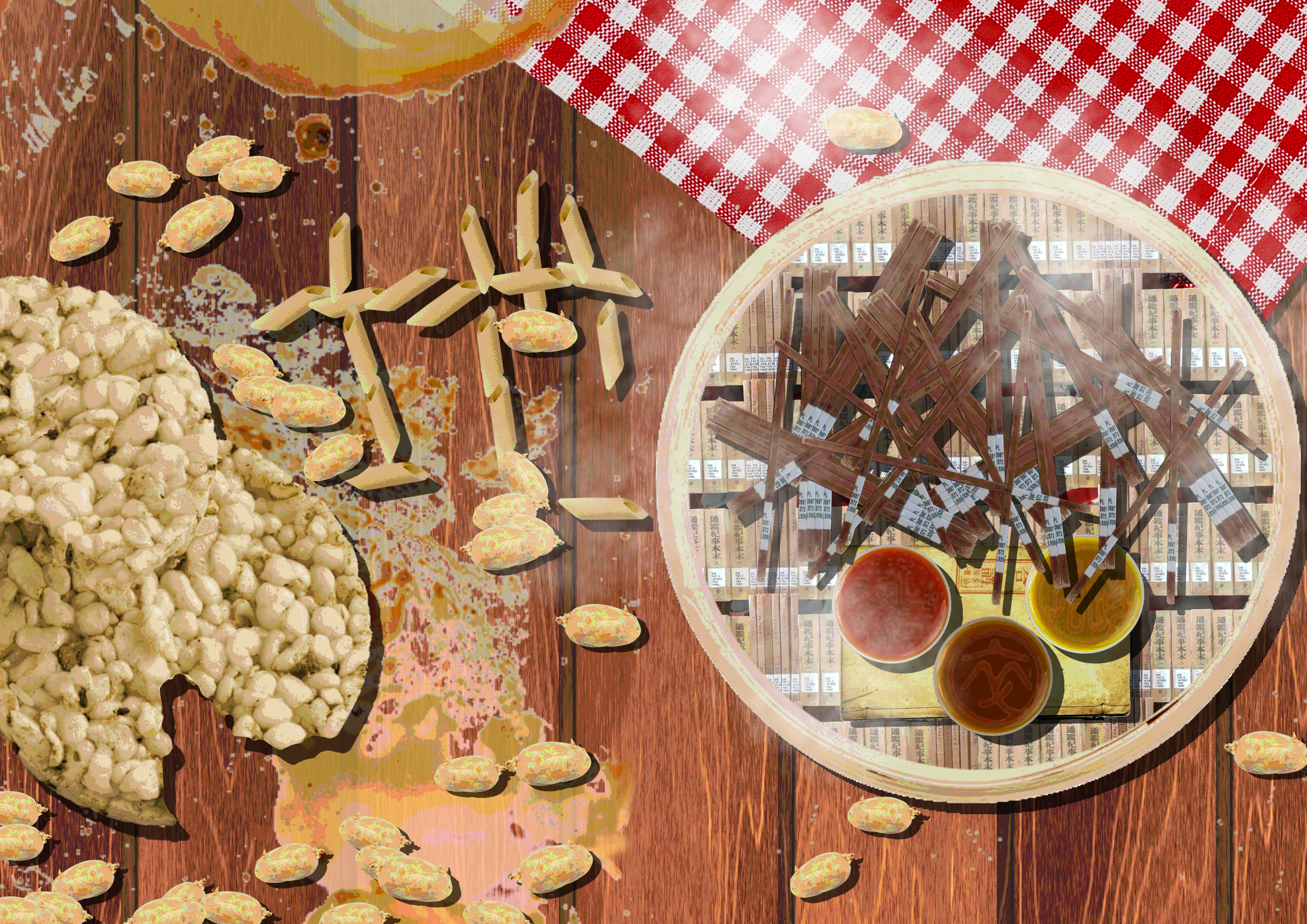
The first spread represents the library element. As I browsed the library, as expected I found a lot of books on Chinese culture. That was all I expected, ’til I ran into the next bookshelf reading “World History”. It was a pretty sudden change in content, when both the preceding and following shelves are on Chinese culture as per normal. Thus the design for the dim sum are shrimps and puffs, however there are out of place changes in design from Chinese to Western; the parts of the shrimp were illustrated using the architecture of the CHC itself, but in the midst I snuck in a stone pillar found in European structures. Same for the puffs, I aligned a gargoyle beside stone lions found from the roof of the CHC. For the left side the spread, I decided to play with tea, making marks around the page with teacup stains. But of course, the western influence has to appear, and one thing I don’t ever expect to see in a Chinese beverage is latte art. Now wouldn’t it be wild to find latte art on Chinese tea? Each spread also has a hidden Chinese character to capture how I feel ’bout the site in a poetic manner. For the library I chose to use “花”, meaning flower. Flowers may bloom beautifully, but they also mean different things to different people; to some they might be a sight to behold, to others they might be something they feel indifferent about. The same holds for the library, only people who are interested or have research to do at the library will visit the place. Due to how it is located in a very old looking Chinese building, unless you have an interest in Chinese culture or heritage and are actively seeking it out, it will be highly unlikely that you will ever step foot into the library. Thus I feel flowers capture the sentiments I feel for the place very well.
The second spread represents the research centre element. The research centre is mostly connected to the library but what I can see are mostly small offices on the first floor, while the second floor is staff-only. From how I can read it, they mostly do free research on promoting Chinese culture, hence I scattered “sweet potato fries” across the tray, simulating the more street-food-like cuisine which is more free and easy. Users may also feel free to dip their own types of sauces to experiment out their own liking and styles as how their free research goes. However there are limitations, which naturally is that their research has to promote Chinese culture and heritage, hence my limitation to three sauces rather than an array of ingredients. The left side of the spread are rice crackers, as I feel a good followup to tea should be snacks. A trait of rice crackers is that they break off and leave many crumbs as you keep on crunching on them, which I replaced with potatoes; the offices that staff work in are modern western offices that you’ll find anywhere hence the juxtaposition of western carbohydrates, potatoes, over the rice crumbs. The Chinese character here is “地” meaning earth. Chinese heritage is grounded, and the research is uncovering our roots and to bring them forth, so I felt that earth was a word that strongly ties to the message I wanted to bring forth. Even if there are Western elements, everything came forth from the same earth, and the means and the ends will be the same.
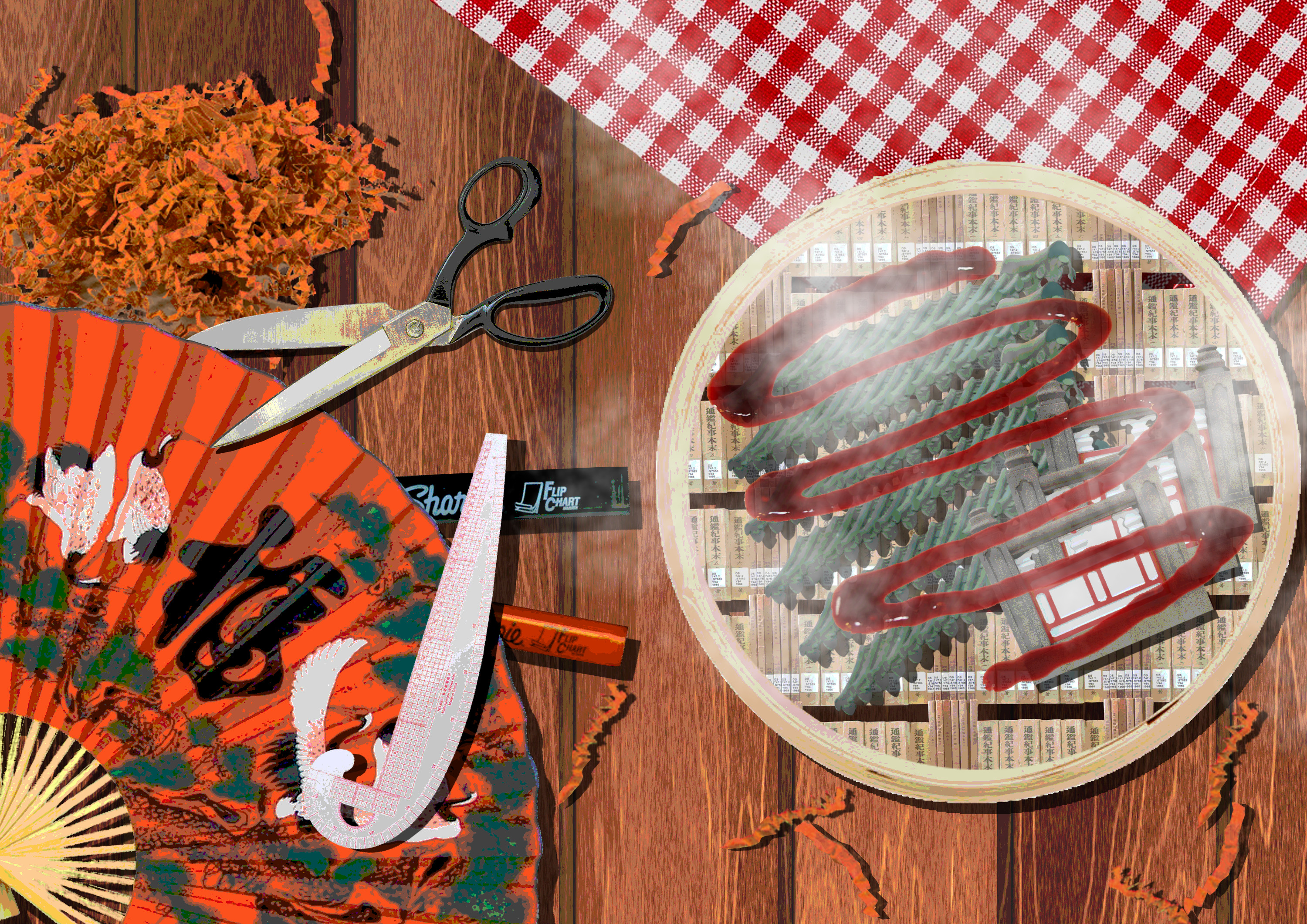
The third spread represents the museum element. The design was to reflect how to museum was, Chinese in the inside but covered in Western tastes, just like how I made the dish: slice of Chinese cuisine but topped with Western flavouring. The zigzag manner of sprinkling sauce is something more popular in European countries as Chinese cuisine follows the previous spread more closely, which are sauce dips. For the left side, I decided to change it up a little but moving onto handicrafts. Naturally the word used is “手” meaning hand. As the museum is the presentation of accumulated research I felt that the idea that someone curated it was brought forward, hence they had to have handpicked what to display and how it is presented. For the jump from tea to snacks to handicrafts, the intention was change the mindset from that you enjoy this dim sum regardless of what is happening, to what you do fits the dim sum. After all, the meal never really changes, just like Chinese culture. It is rooted, and we find new ways to best appreciate it. Chinese heritage doesn’t change, it is us who must change how we see it.
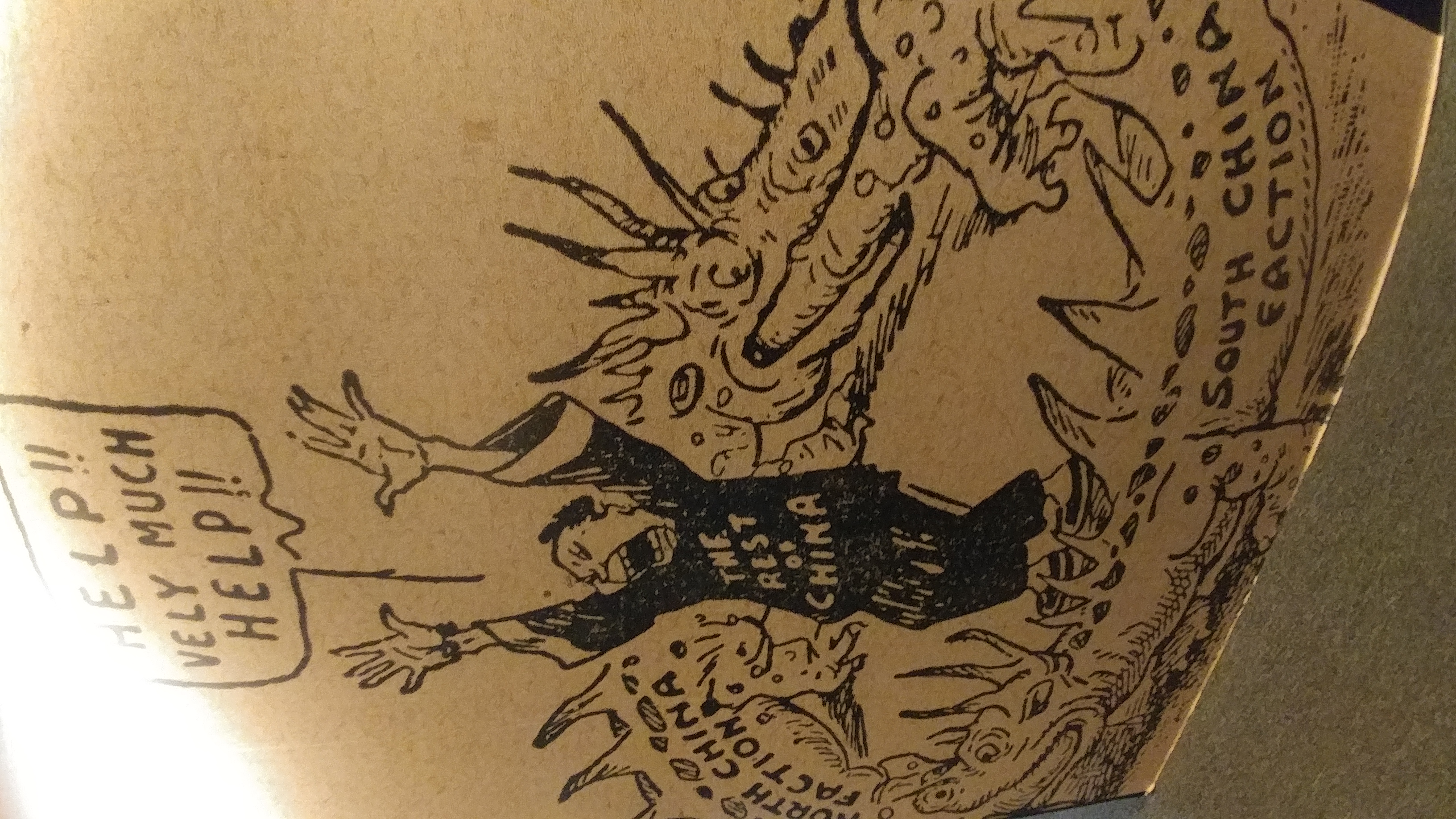
Finally the last page. To follow up with the theme, I wanted to wrap up the stereotypical Chinese image with the broken English. Here without all the dishes, we also get to have a cleaner look at the visual choices I used for the zine: how the tray is made out of books from the library, how the gingham picnic mat is used to make the Western touch sneak in, etc.
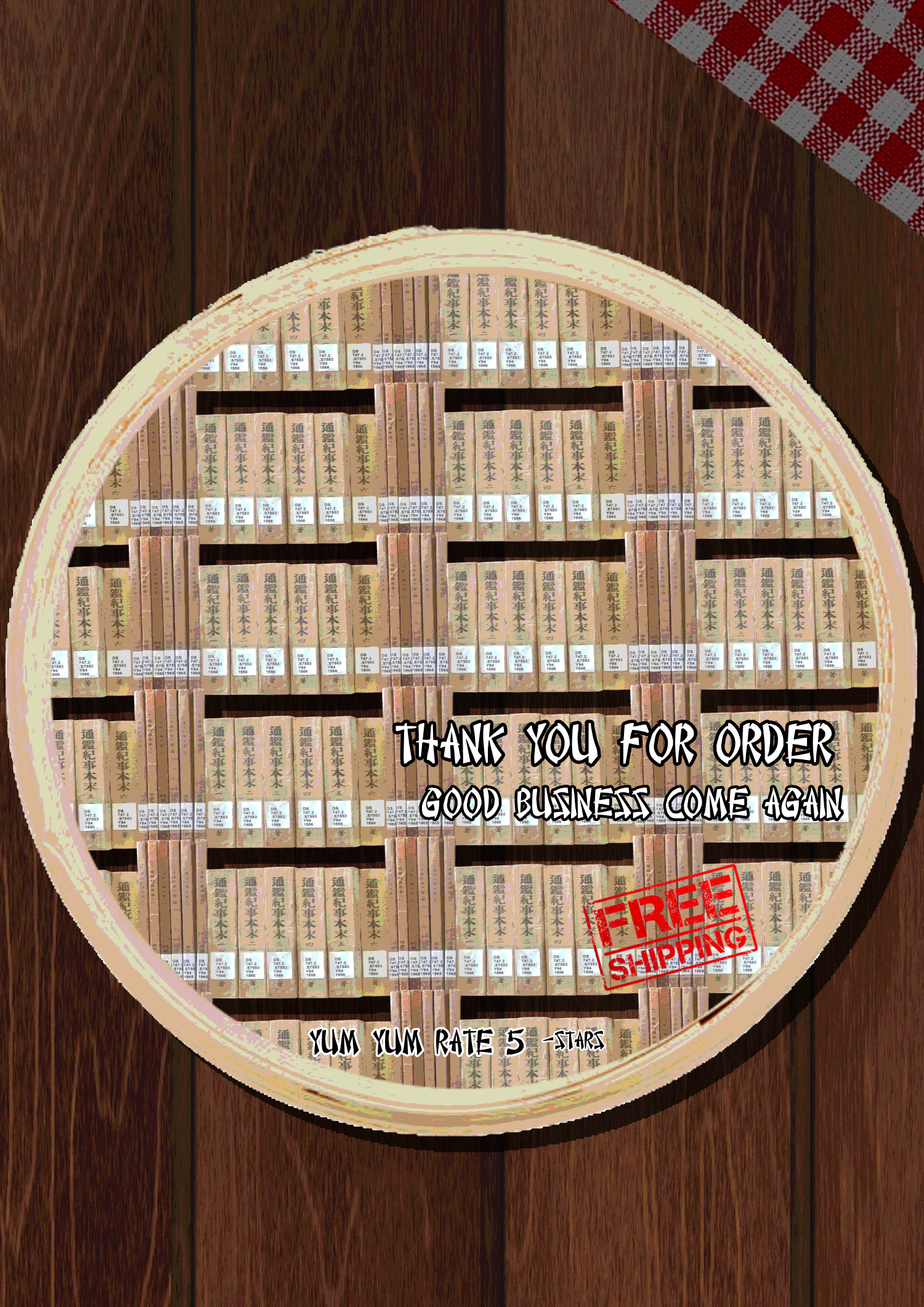
As a whole learnt more about the national monument Chinese Heritage Centre, and I hope that through this project you have learnt more as well. Just as my final page says, if you enjoyed this, do rate 5*.