
For this project, we had to create a series of patterns just by using a single letter of any traditional typeface and this time round I chose to go with a san-serif typeface for variation. We could play around with spacing of the letters to create variations, repetition of rows/columns or even overlapping of the letters to create the form.
Funnily for this particular project, when first heard of the brief I thought it was going to be real fun and easy to create the pattern compositions since right away when patterns were mentioned I had the preconceived idea that it would just be tessellations and more tessellations. Which wasn’t exactly wrong but that would be the easier way out to approaching this project I guess. Furthermore, we had so many things which could play around with. But I guess that was the struggle for me, the same with the other two projects – The freedom that came with it. I guess I was so used to having projects that had to be conceptualised beforehand, a message to be brought across and with restrictions but on the contrary all the three projects were rather free and easy with little limitations except maybe for the last one!
Anyway back to the process, prior to getting started on my patterns here were some inspirations I had in mind:
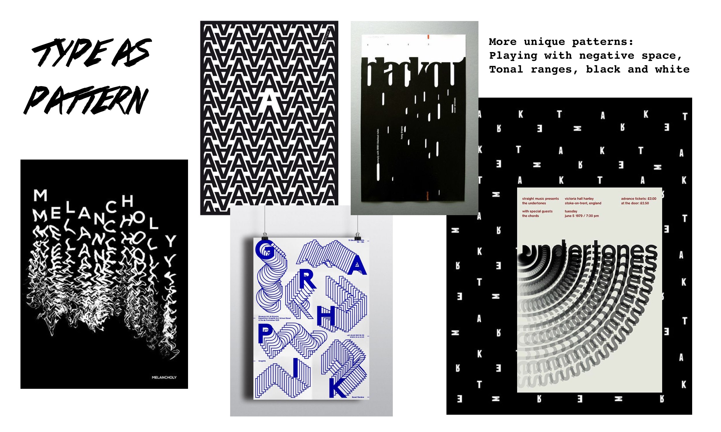

I kind of wanted to veer away from the usual tessellation kind of pattern but I guess it was inevitable at some point as my brain was already adjusted to that as what a pattern would look like. Surprisingly, I managed to get a composition that I really liked. Here are some of the explorations I had before narrowing down to the best two for submission (click on image to enlarge):


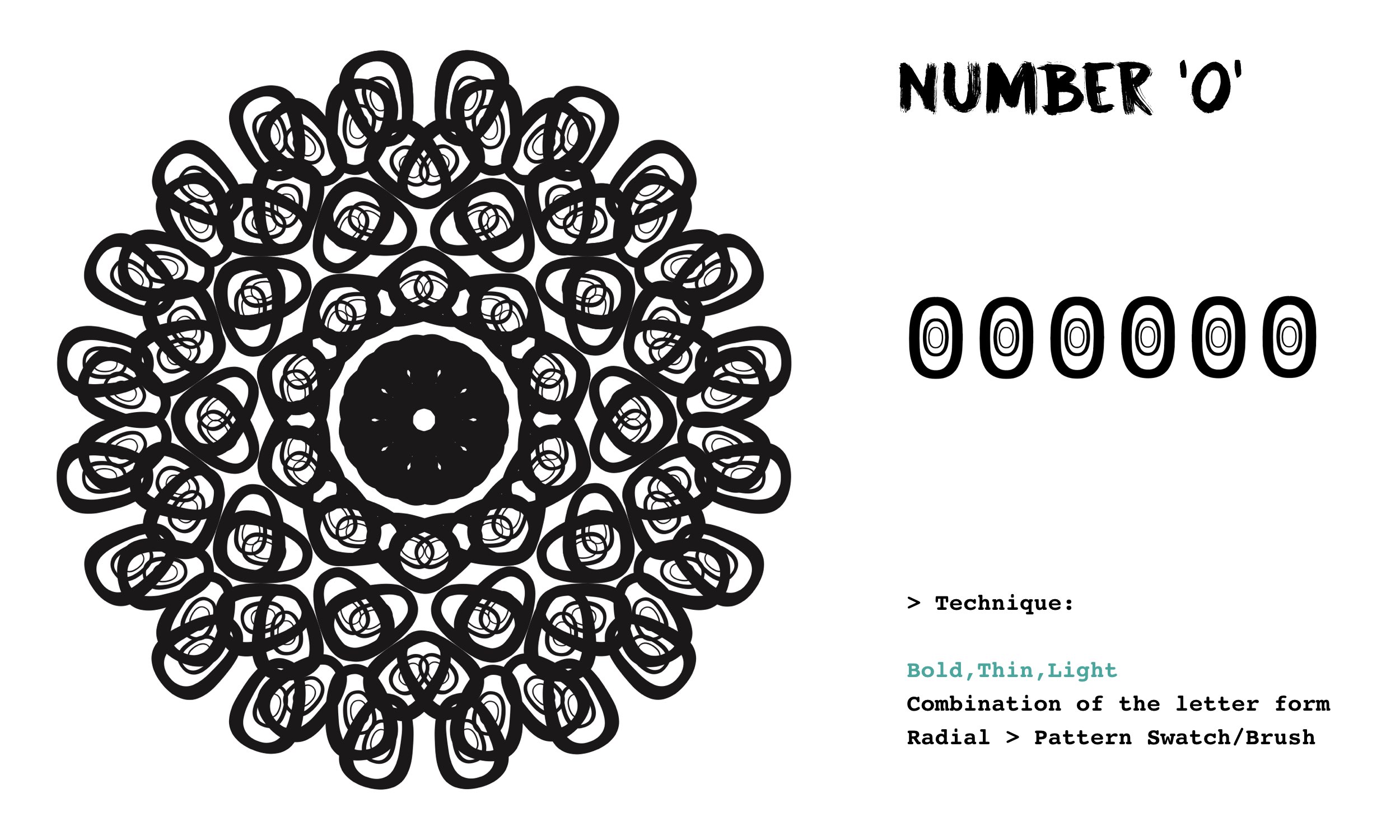

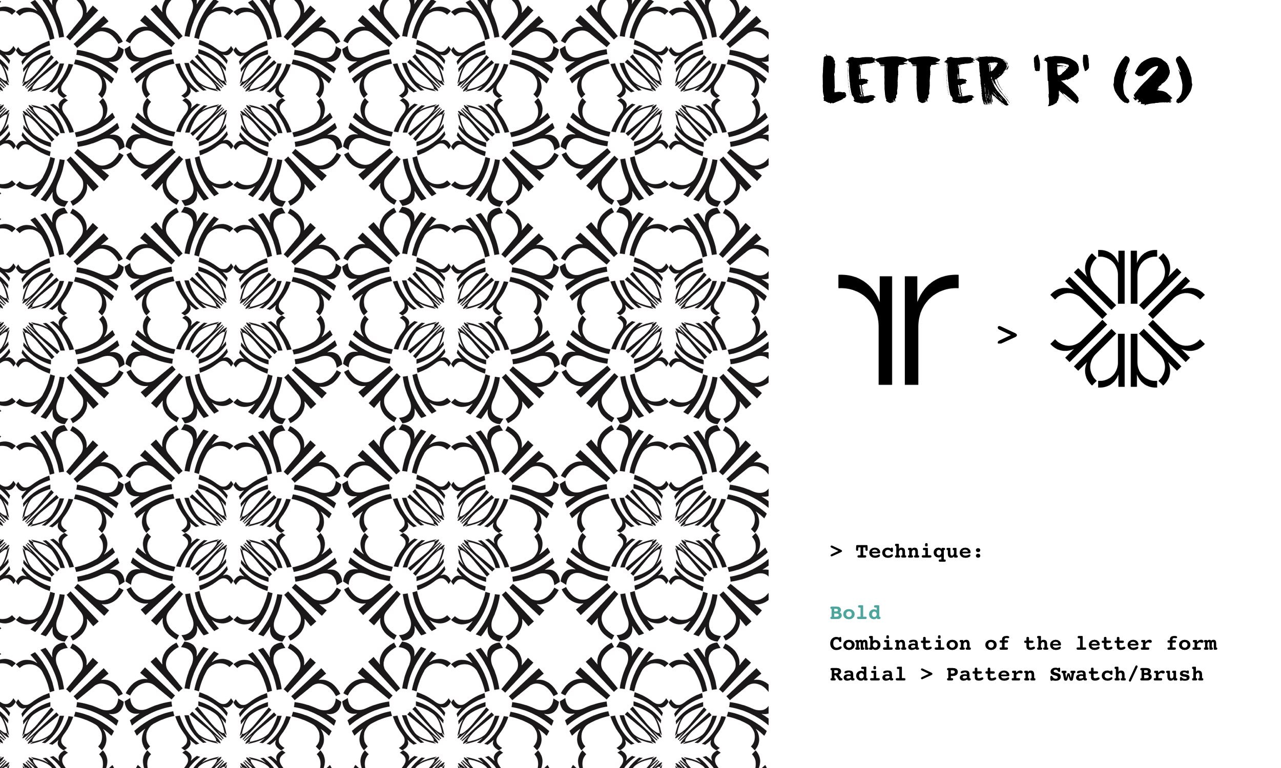


I struggled to even come up with one pattern initially but I think for me it was the momentum. Once I got a pattern out, I realised it could go another way to form way more. Just like the explorations I had for two of the letters/number used: ‘R’ and ‘0’. With just one combined form and the application of different techniques, I was able to create 2 entirely different pattern compositions for each respective letterform. I realised with that endless patterns could be churned out and I’m pretty sure even before looking that everyone’s compositions would be VERY different, unique and one-of-a-kind even though we may use the same letterform and typeface. Super amazing.
The typeface that I went with for this project was HELVETICA NEUE – I love its variety of fonts

And these were the two compositions that I eventually went with for submission reason being for the tessellation looking one using the letter ‘r’, it looks simple yet I liked how there’s thick and thin lines involved thanks to the convergence of the letterform in the centre that was created with the radial method and the application of the swatch onto it.
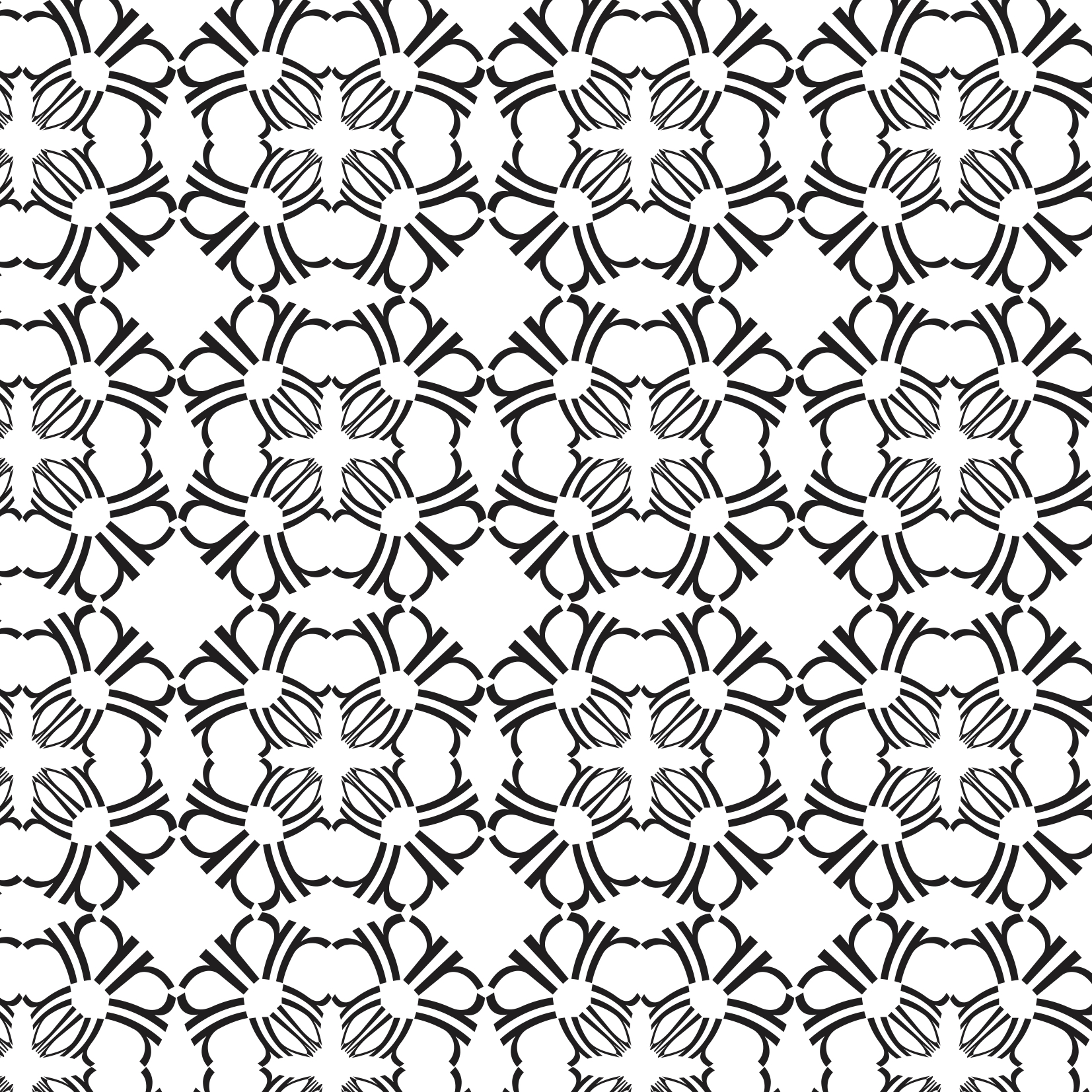
Using the Letter ‘r’
As for the second composition (below), using the letter ‘o’ in varied fonts of the typeface (bold, thin and light) I created a simple motif of sorts and was randomly playing around with scale, overlapping of motifs and angling them differently. Also, I suddenly remembered how we could play with negative spaces and tonal range as well! Played around a bit more and somehow got this!! I liked how it created a 3D kind of effect and dimensionality to the pattern composition thanks to the tonal range. The white motifs would be the foreground and then slowly the others repeated but fading and shrinking in size.

Using the Letter ‘O’
Overall this project was slightly on the challenging side but I’m really happy with all the experimentation especially with the pattern using the letter ‘O’ (above). I was pleasantly surprised by its unexpected outcome, achieving a pattern without the default use of tessellation 🙂