Time really flies, the end of the semester is here and so are all the final submission deadlines! For this final project, we were really “free” in the sense that we got to explore any area of our interest, a physical product/publication etc. produced as an expansion of one of our past few projects – 2A: Vernacular Type / 2B: Organic Type/ 3A: Type As Image / 3B: Type As Pattern / 3C: Type As Emotion
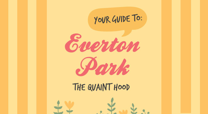
I eventually went ahead with an expansion of Project 3A out of subject interest – A zine titled: Playground of Our Yesteryears and here’s my journey at arriving at my final idea:
Ideation
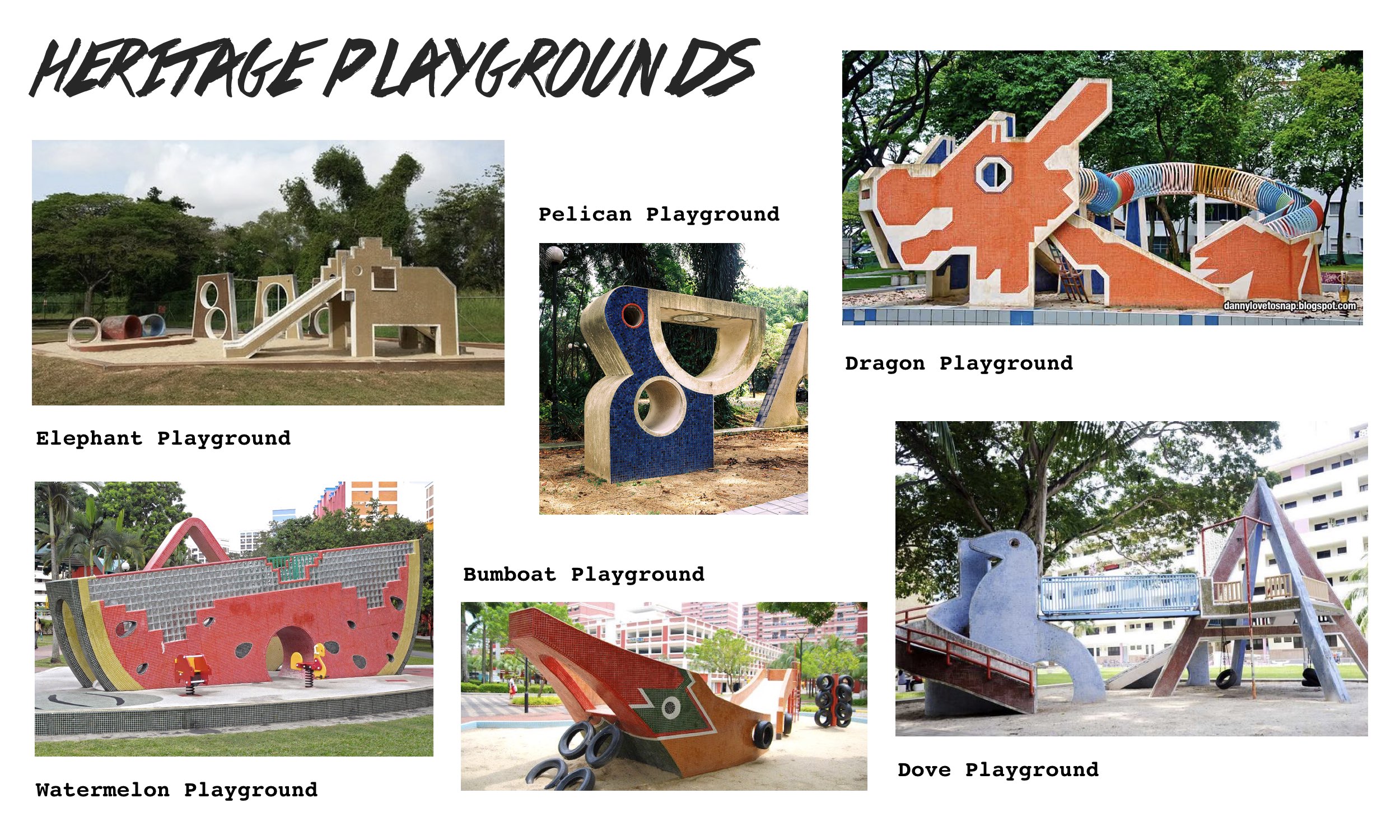
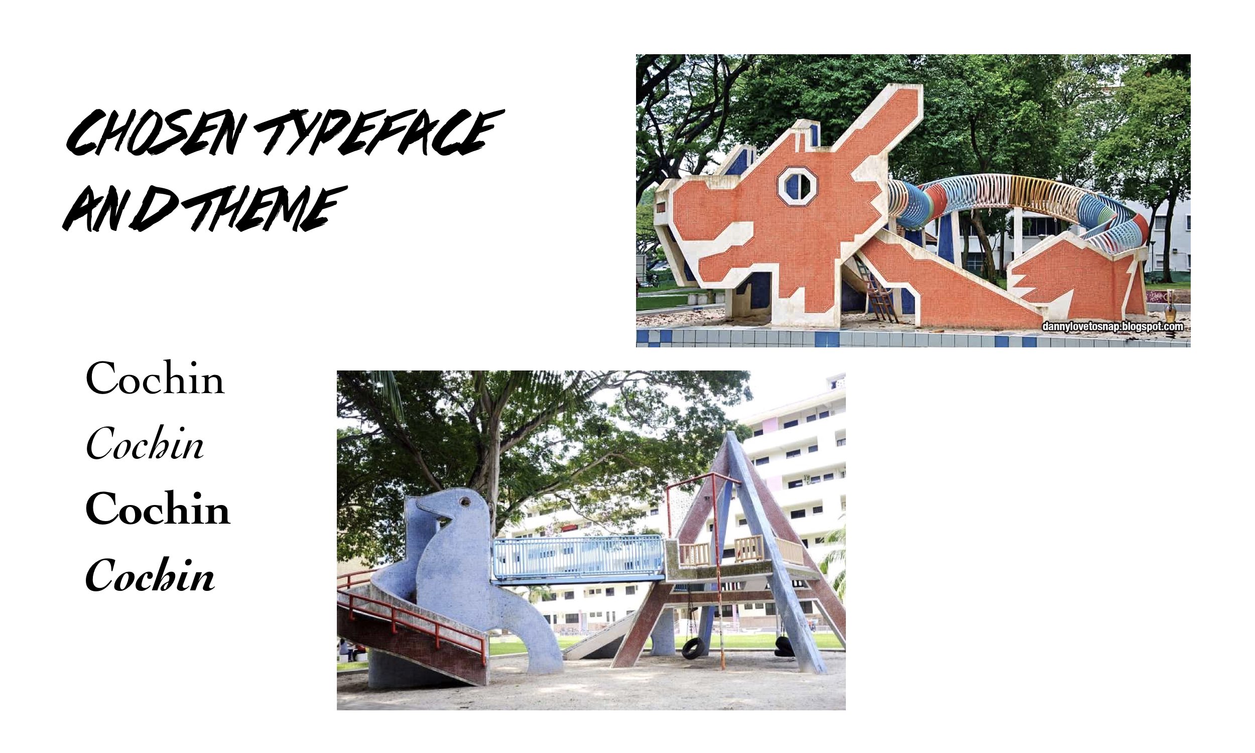
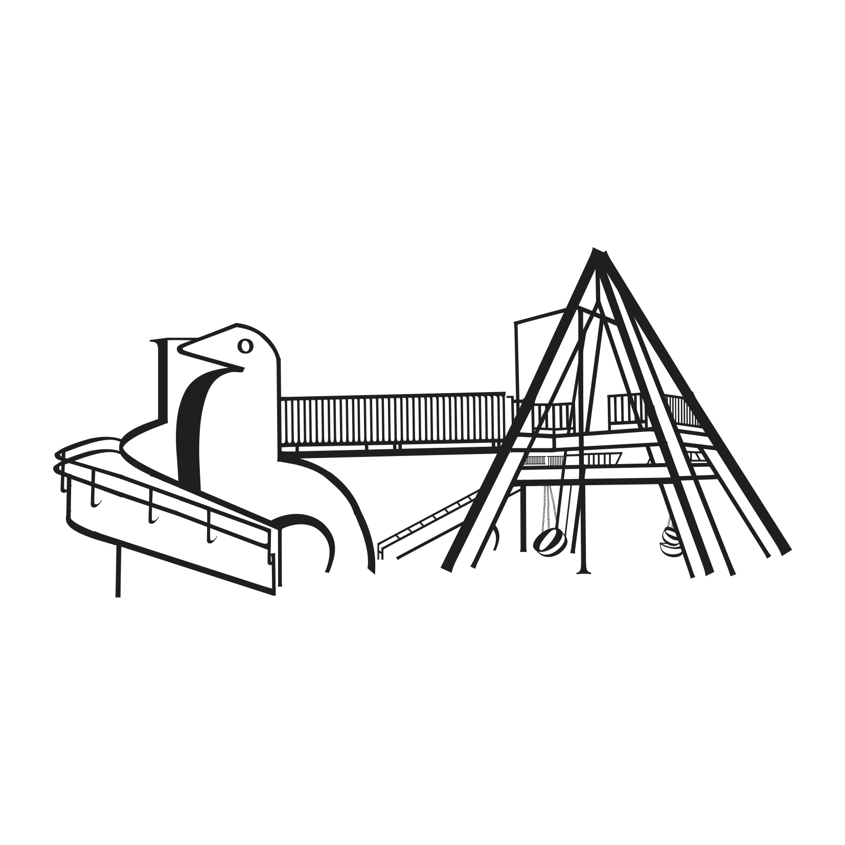
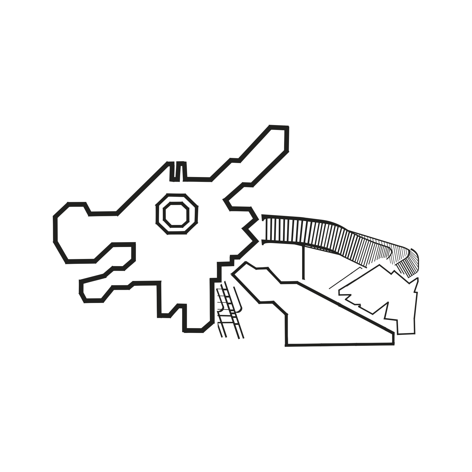
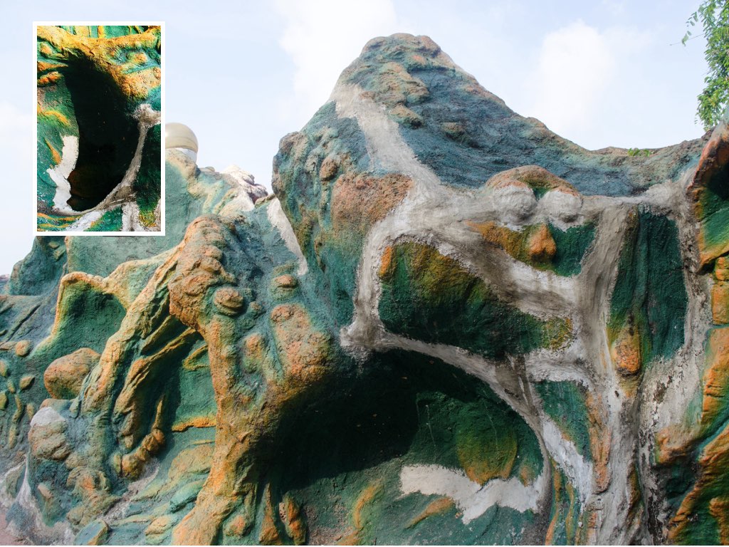
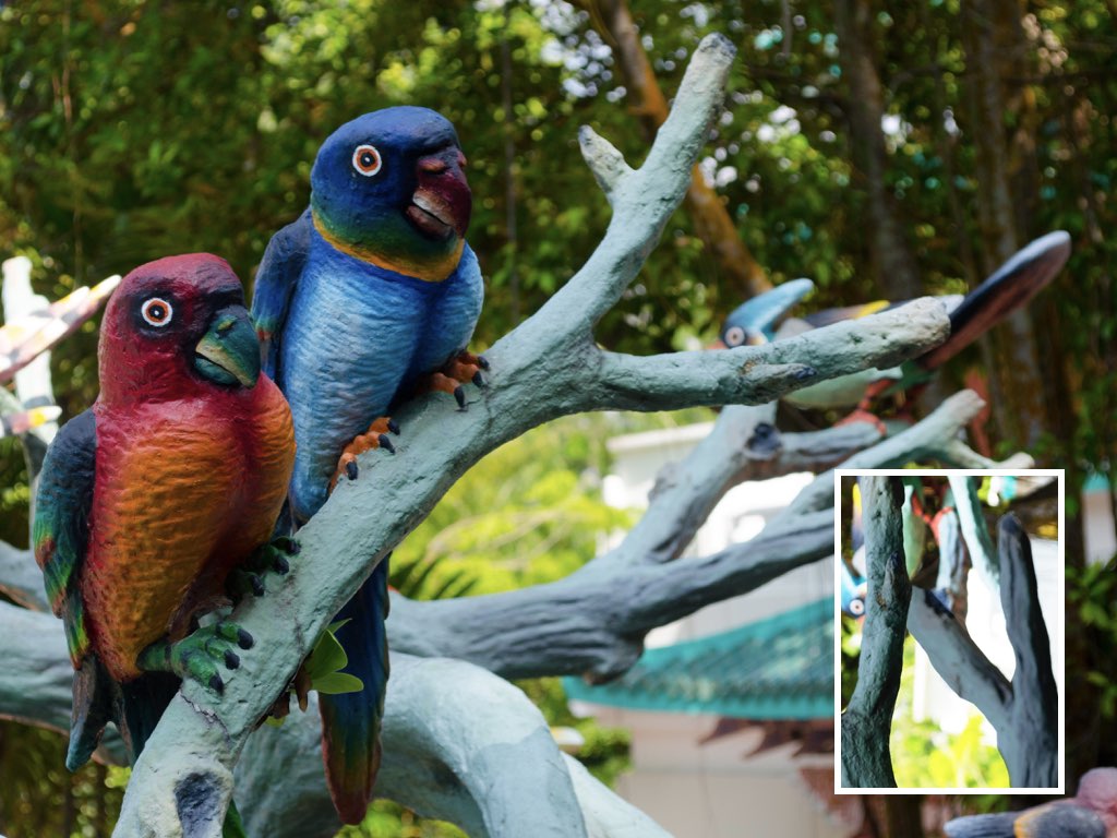
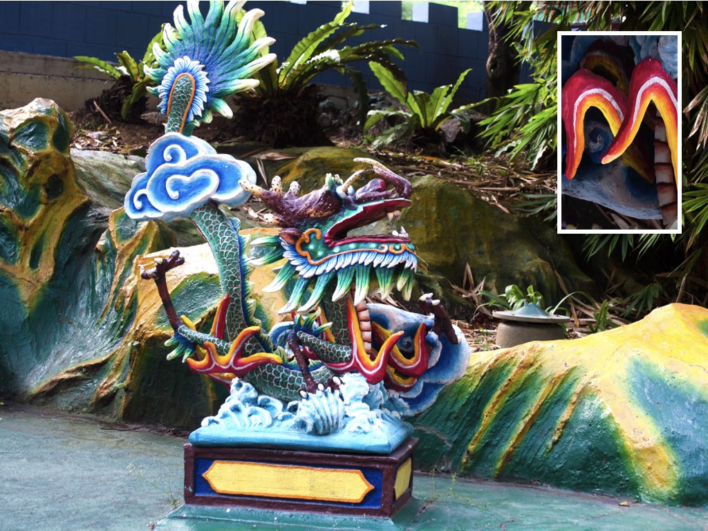
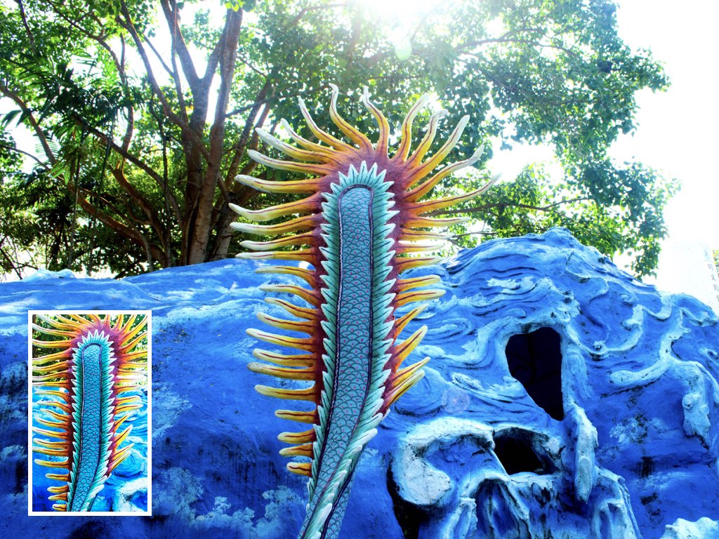
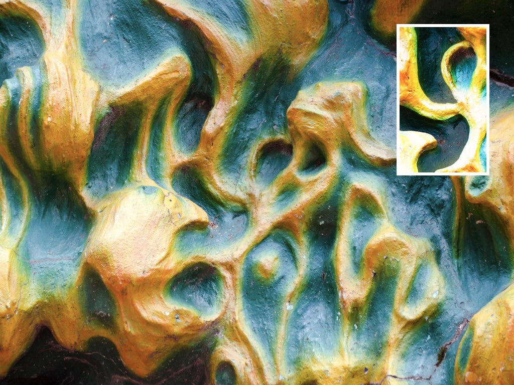
This final project being an expansion of Project 3A, the subject matter I based my compositions on were the iconic mosaic playgrounds in Singapore – the Dragon Playground and Dove Playground respectively. For reference:
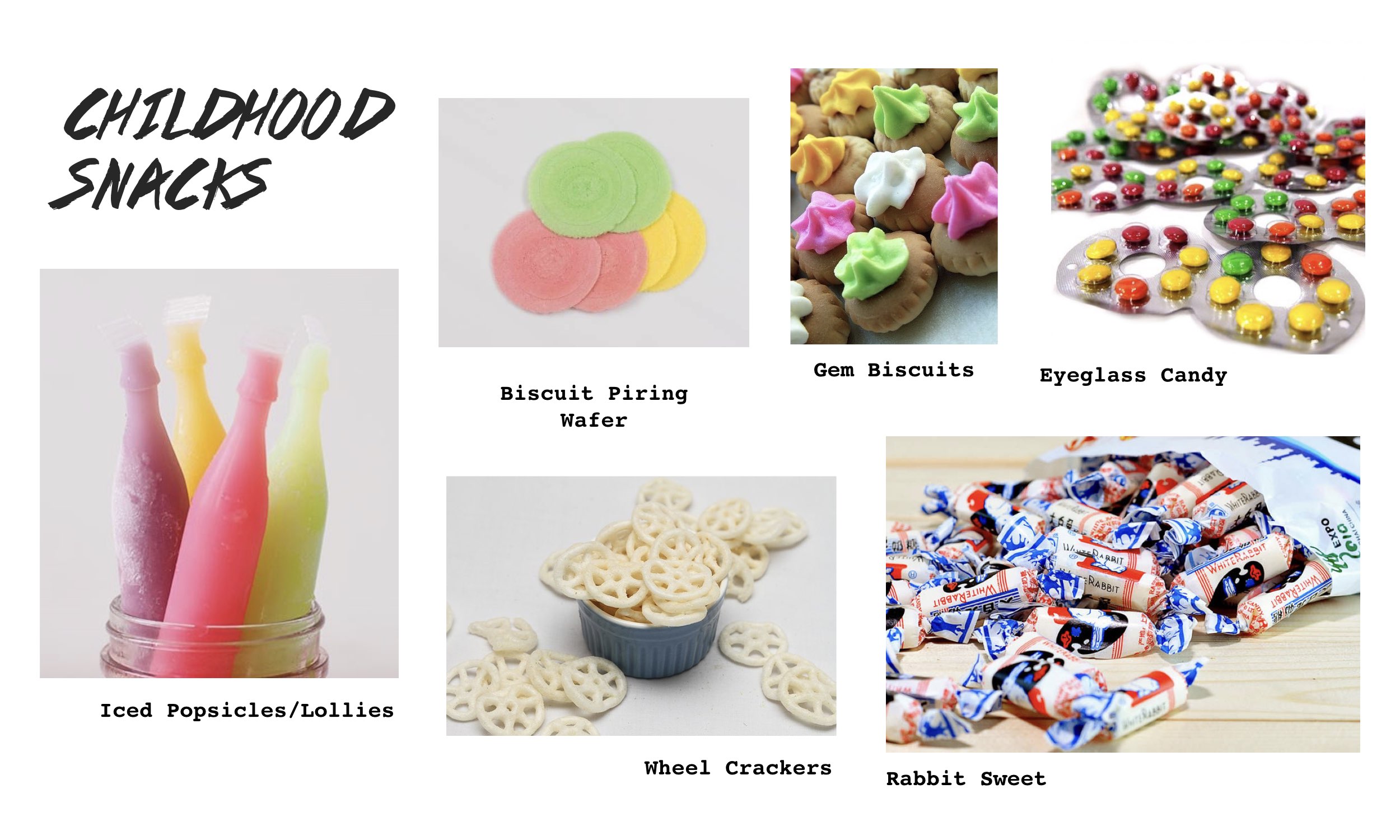
As mentioned in that process documentation, I was naturally drawn to these playgrounds and always had this “something” for nostalgic stuff. I wanted to explore this theme of nostalgia again for this final project. Thus I was considering to create a zine that’s a collection of typographic compositions of several popular childhood snacks or stick with the same mosaic playgrounds.

After much thinking, the playgrounds it was! I initially wanted to have the zine include a little of Project 2A (Vernacular Type) as well, coming up with quotes related or said about the playgrounds and formed with Vernacular Type as observed from the form of the playground structures to strengthen/solidify the concept further. Even with the title of the zine as well on the cover page, I wanted to incorporate the techniques of Project 2A. However after much consideration, it was not practical at all given the tight deadline that we were given for this final project – 3 weeks.
How unfortunate! But I’ll definitely keep this idea in mind if I were to ever expand further on this project 🙂
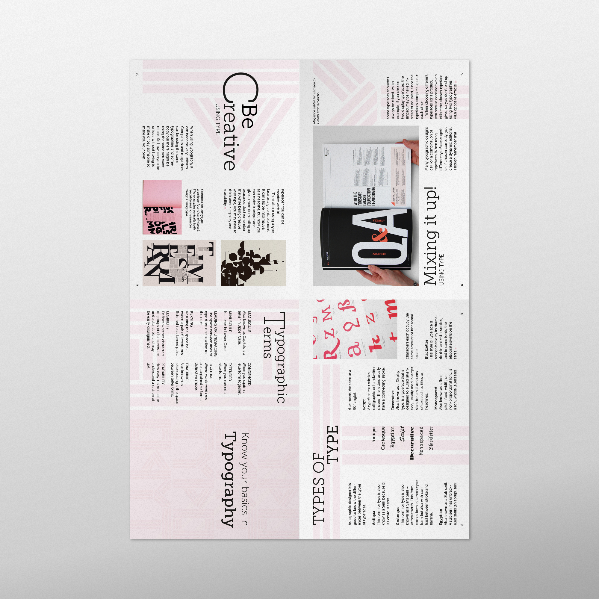
Choice of Typeface
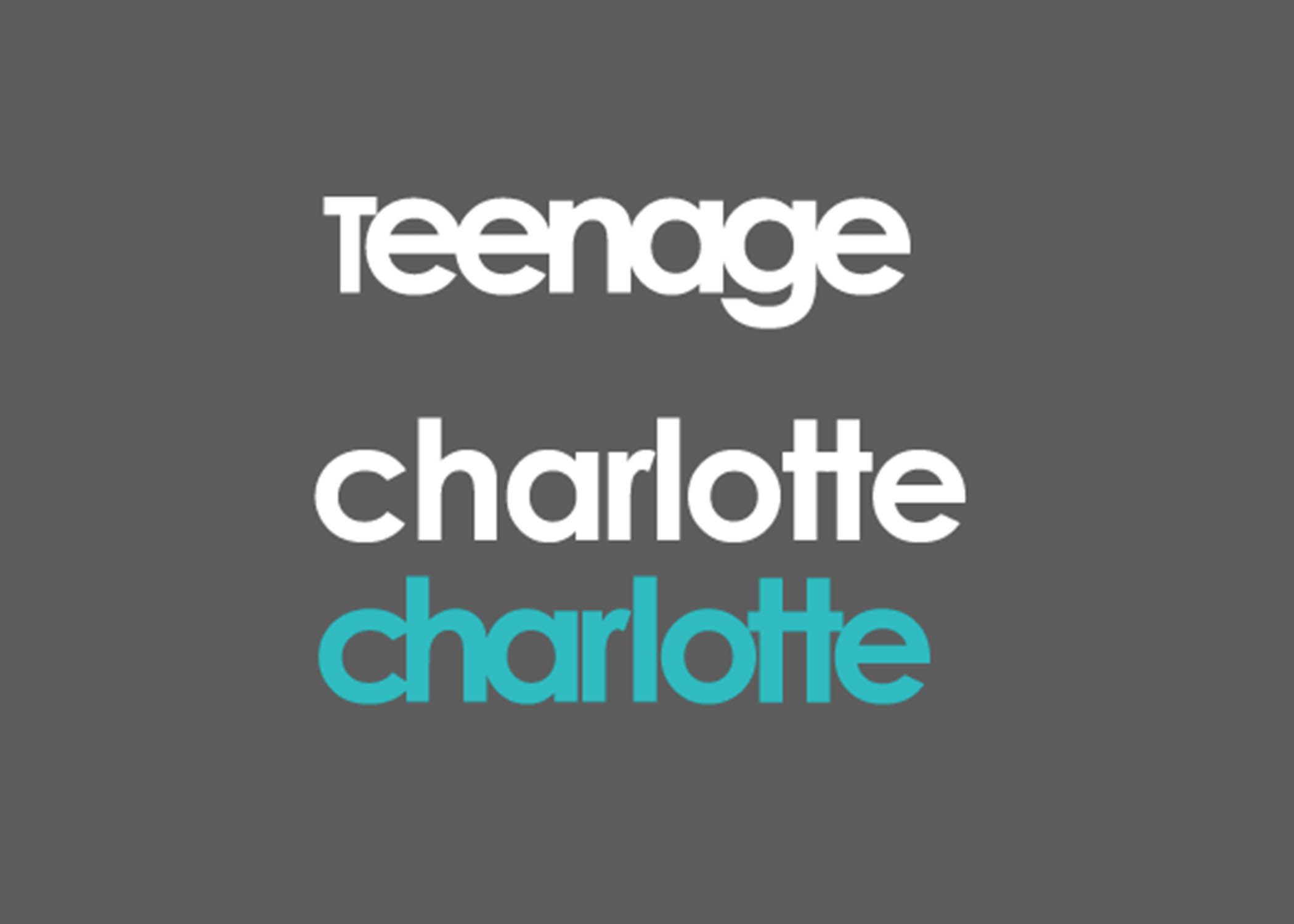
I stuck through with the previous typeface used for Project 3A, Cochin reason being that it evoked a nostalgic vibe and I liked how it had various weights and its Italic font had a unique anatomy to it. Unlike Project 3A where our reasoning for choosing the typeface could be just as simple as this, for this final project the rationale had to be deeper. It must be related/be of significance to the subject matter that the compositions are based on. In this case, the typeface Cochin had to be related to these mosaic playgrounds – The feedback I received during the first consultation for the project.
Thus I had to do further research to see if I could find similarities. If not, I have to change my typeface. Thankfully there were some connections! This was what I found:
In 1977, Cochin was later adapted an expanded for Linotype that is used as a system font that can be found in our MacBooks. This 70’s period that it was adapted is the same period when these mosaic playgrounds were created around the various HDB estates in Singapore
Therefore that similarity, and additionally the typeface has an old text feel that evokes a feel of nostalgia to which I feel is an apt tone to convey with these iconic mosaic playgrounds of the past as they were part of most people’s childhood.
Reference: https://www.fonts.com/font/linotype/cochin/story
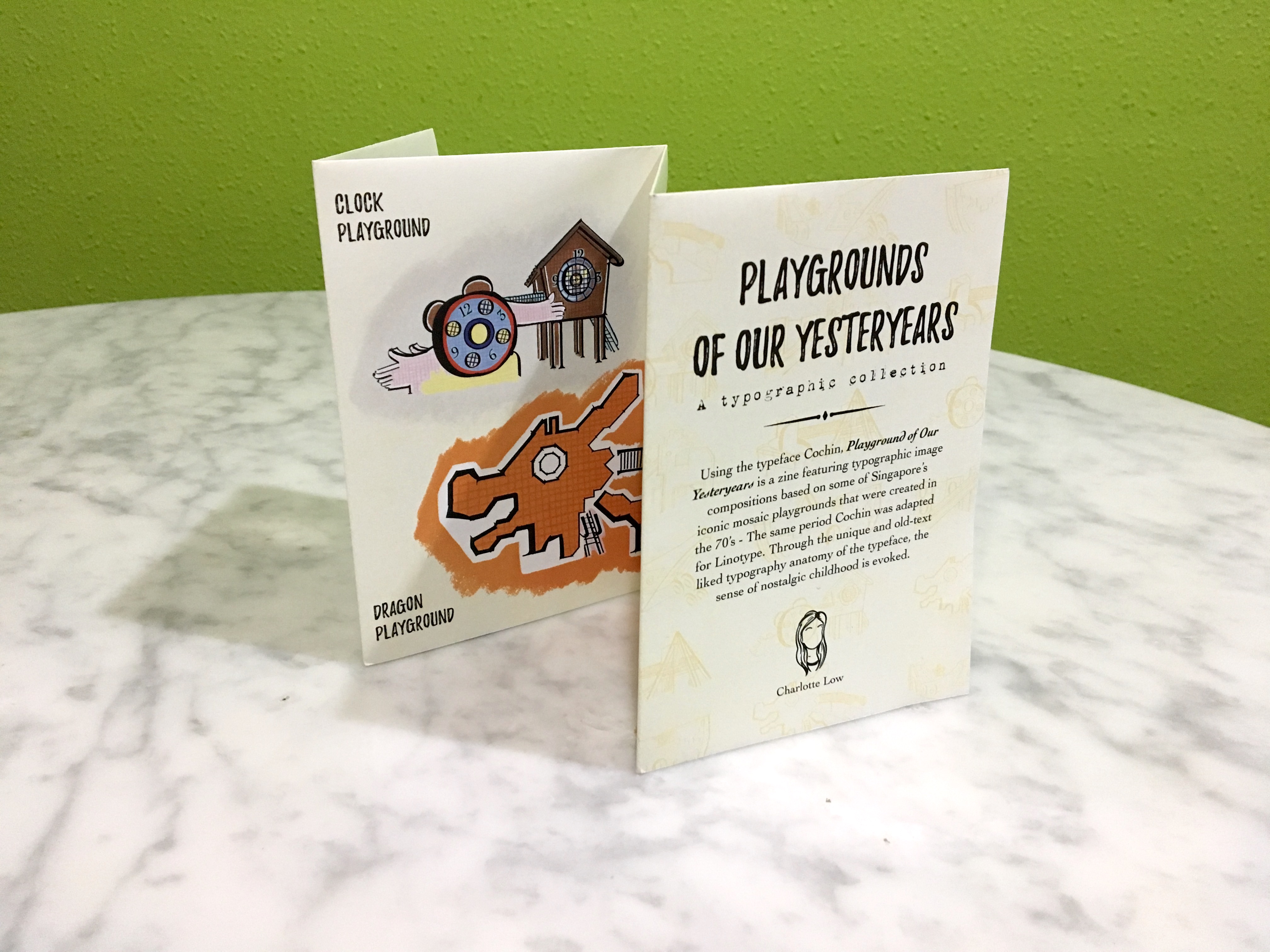
The Zine Format
I wanted to opt for the normal staple bind zine, working with page spreads and all but I was thinking further on how I could make it less “dull”. After much digging around online I found out that there’s really a wide variety of zine formats and actually it’s really up to one’s preference, how they want their zine to look like.
Then I chanced upon the one-page mini zine template! Pretty decent and quite an interesting layout to work with. There’s a slit in the middle though.

Looking further, I came across this typography publication that was one-paged as well just not 8-page and mini. It had a poster on the flip-side (back-side) of it’s front which sparked the idea of packaging it to come with a freebie of sorts in poster form (folded). The contents of the zine and the poster would be further elaborated later on.
Cr: https://www.behance.net/gallery/33539703/Typographic-Zine
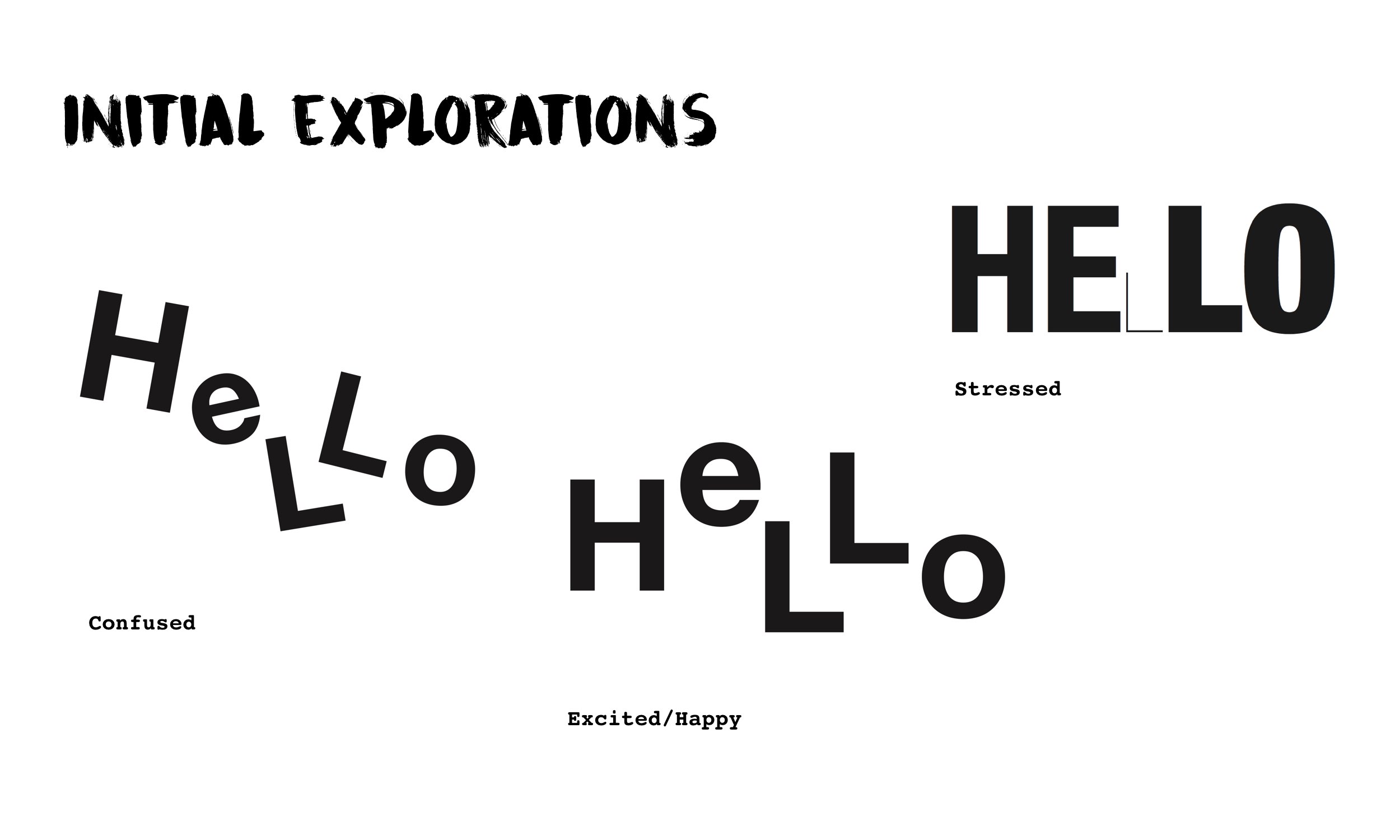
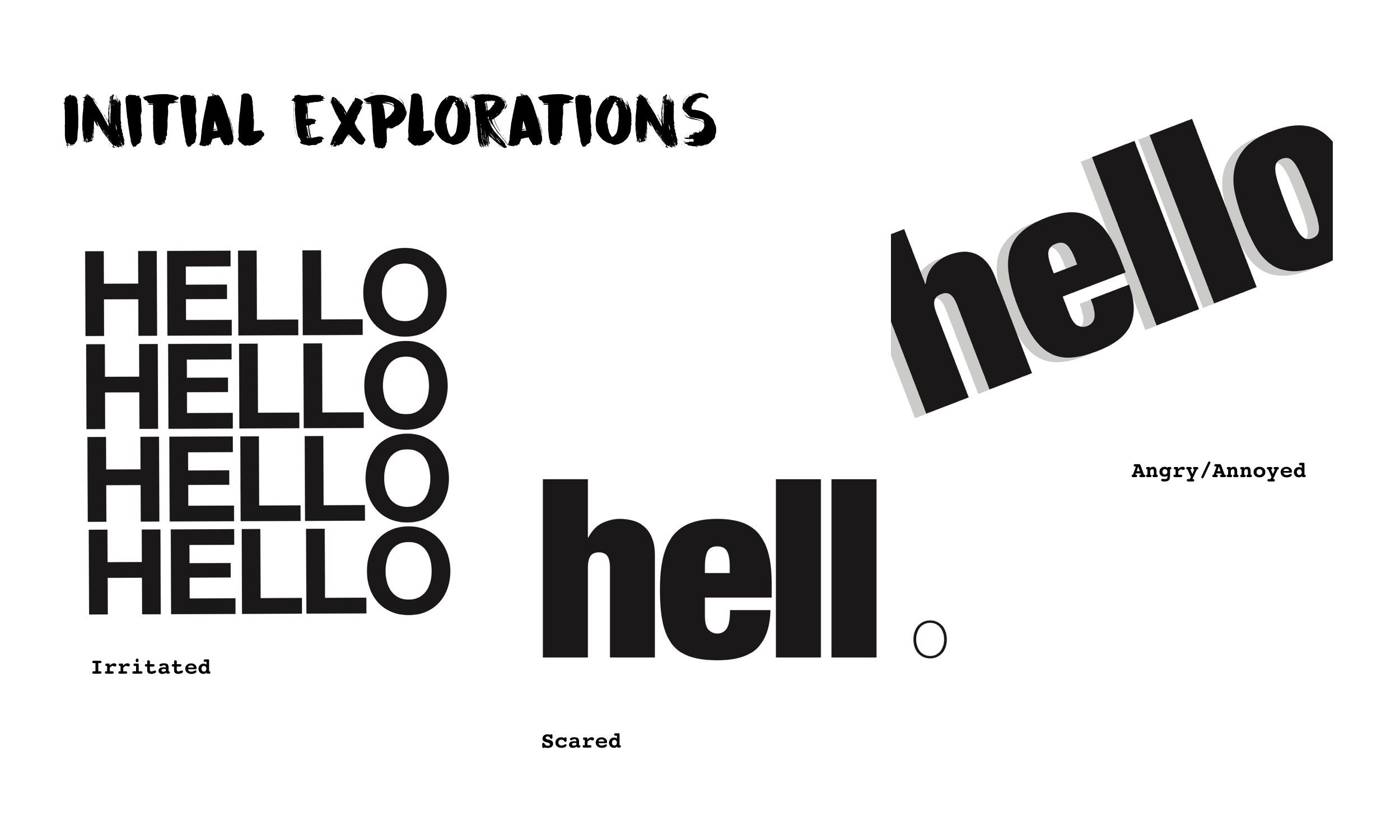
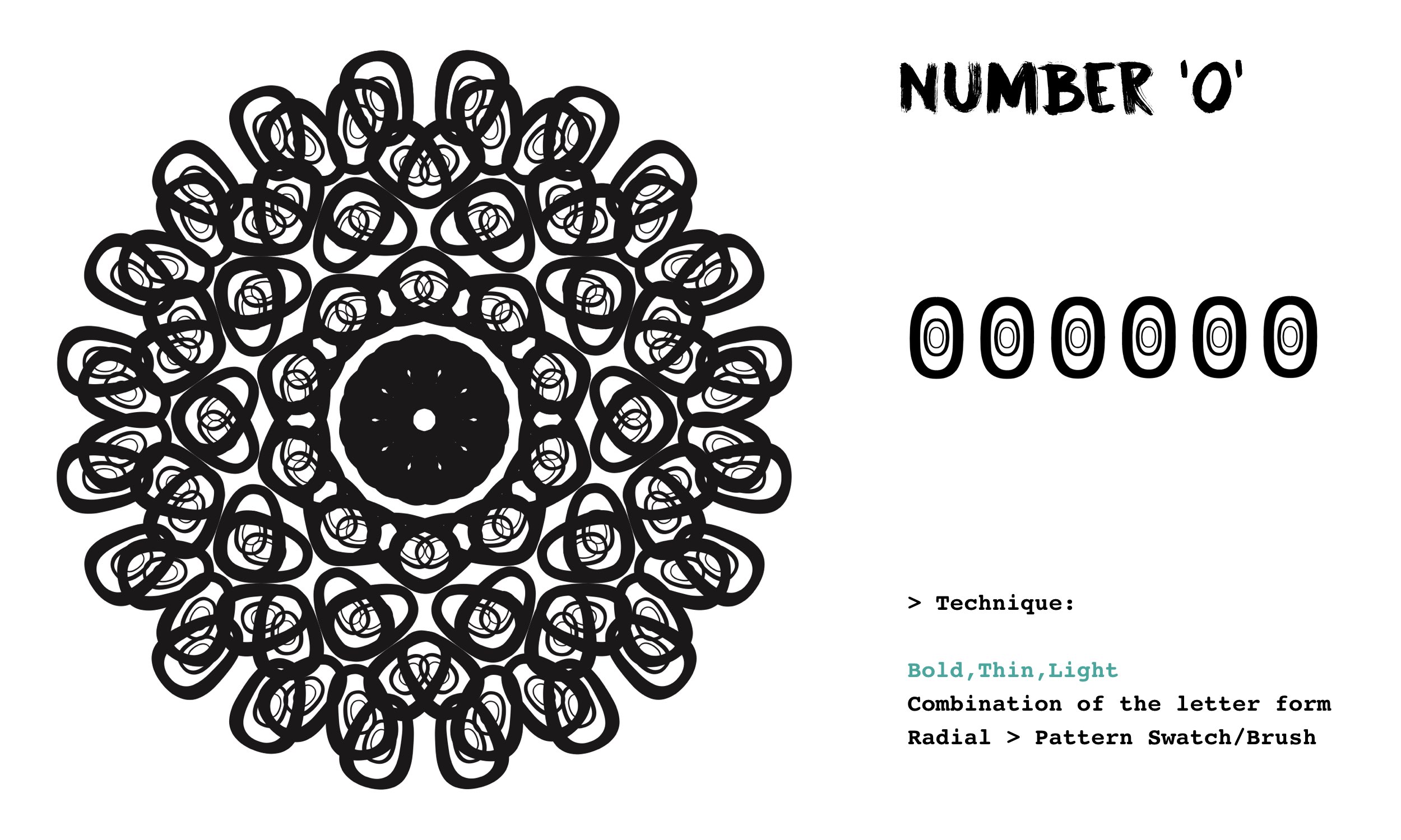
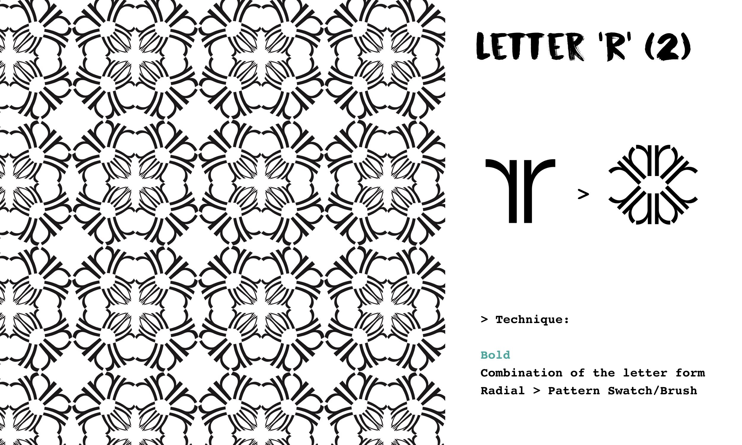
The Compositions
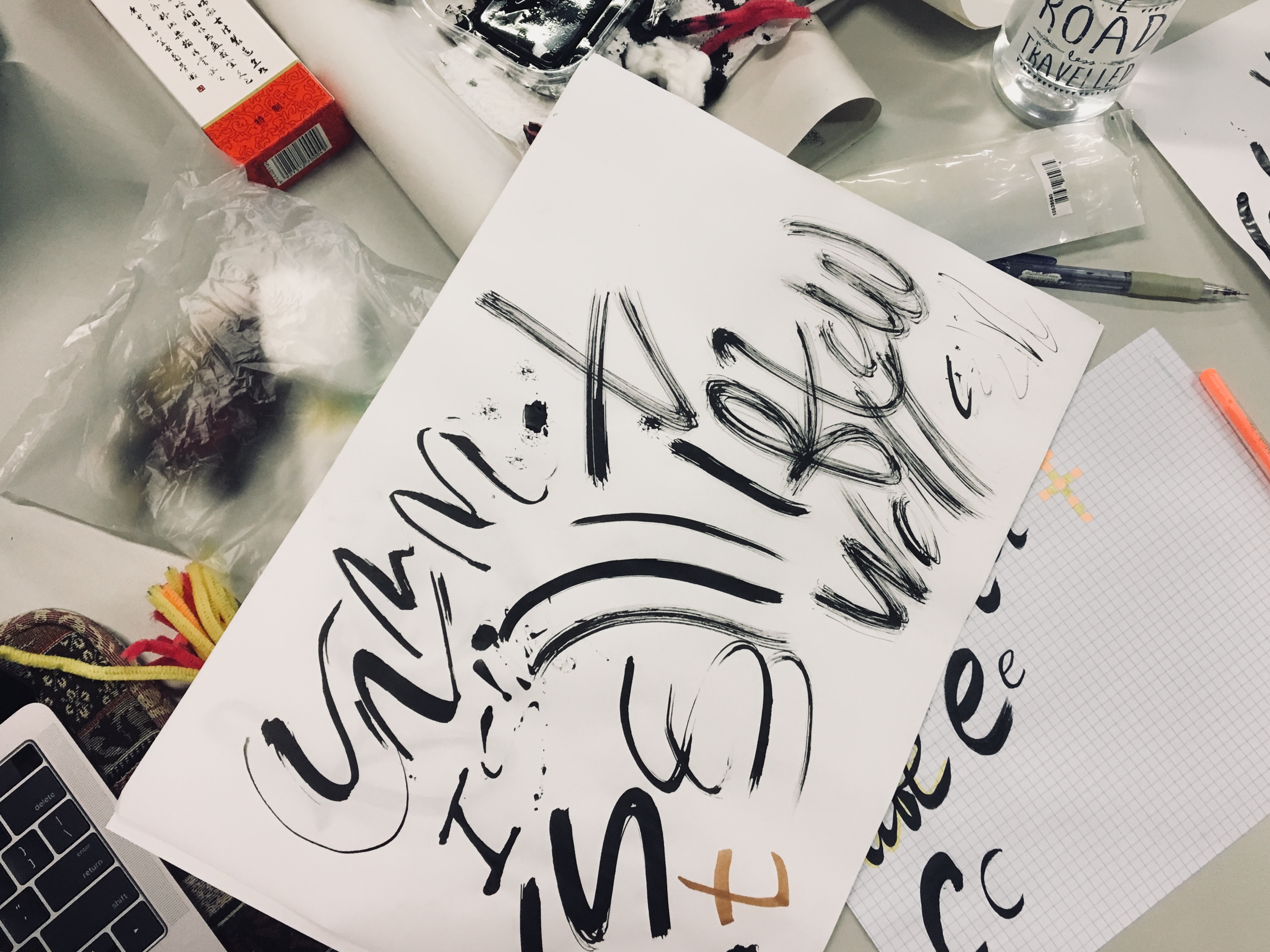
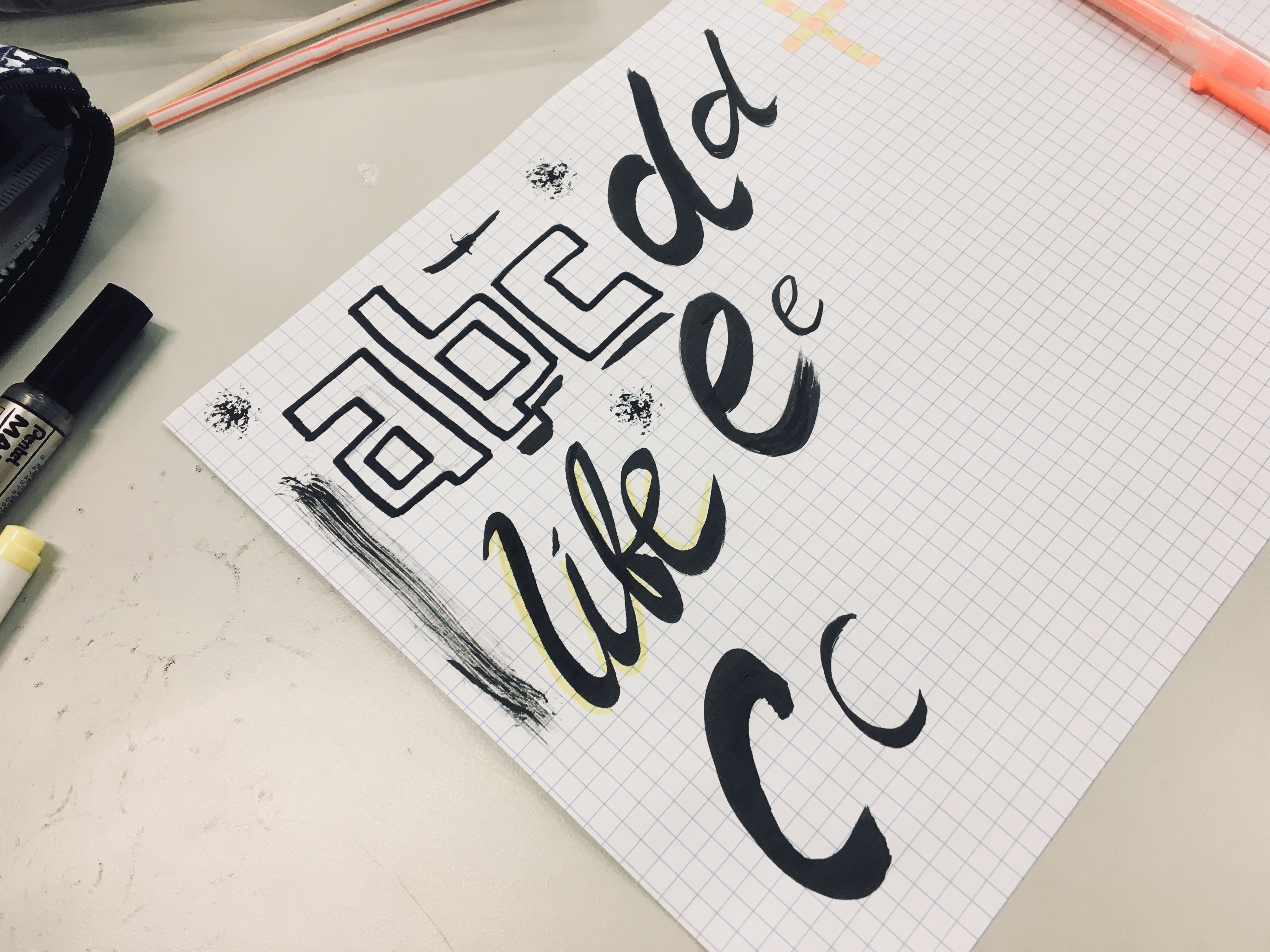
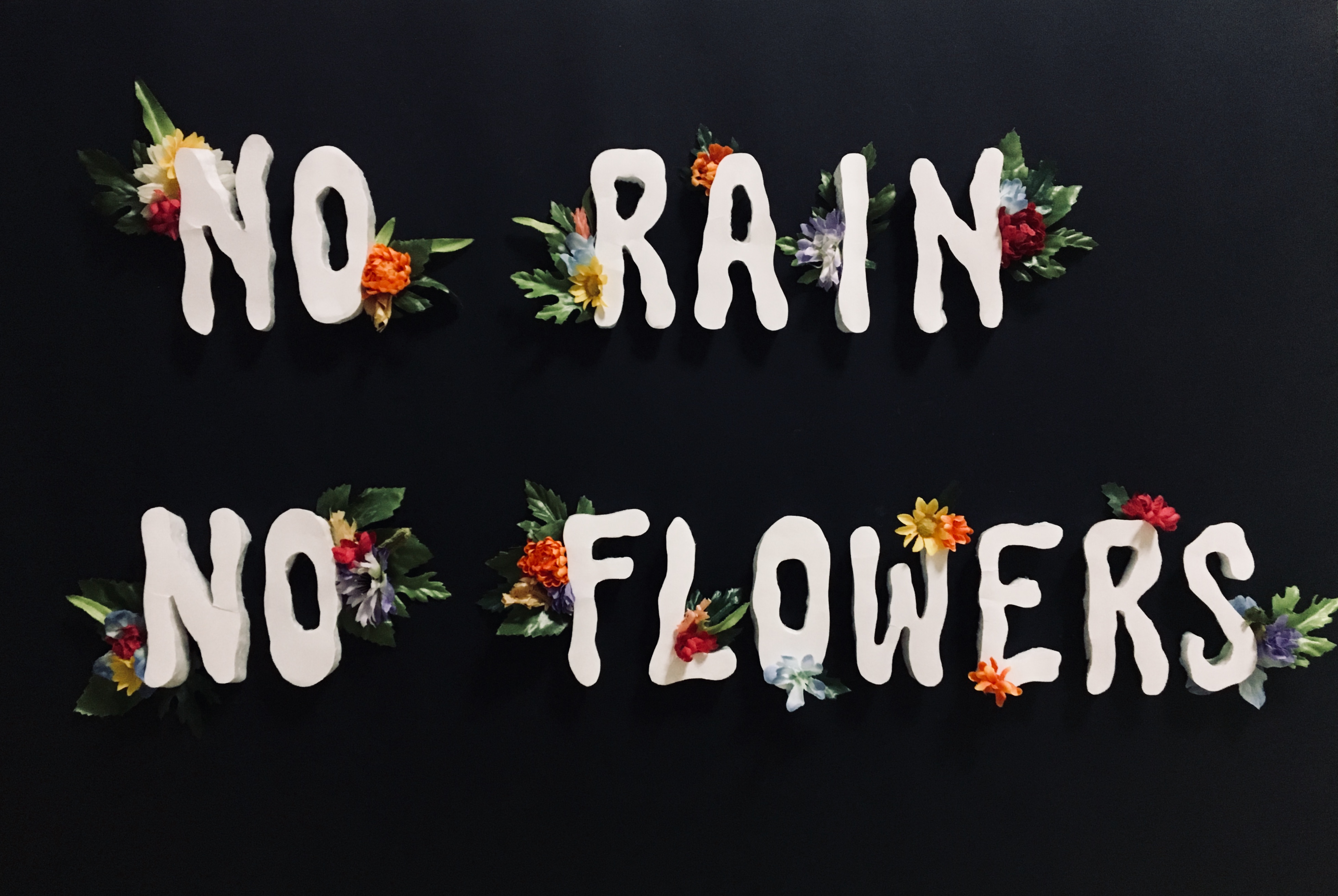
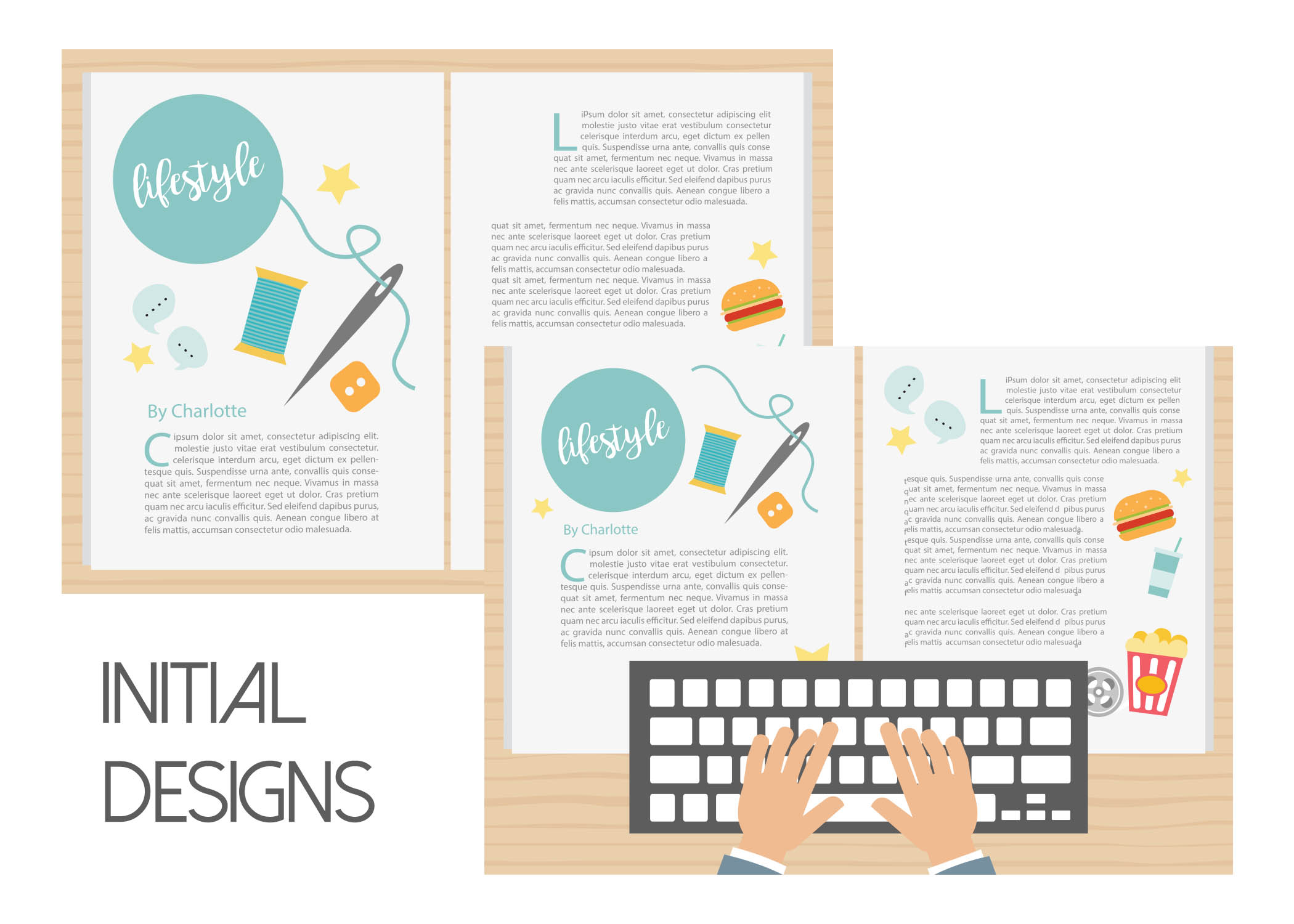
THE BIGGEST STRUGGLE OF THIS PROJECT. Going ahead with the project as an expansion of Project 3A, I could foresee it was going to be quite a struggle as I already was that time during the project. This was the first version of compositions I came up with:
-
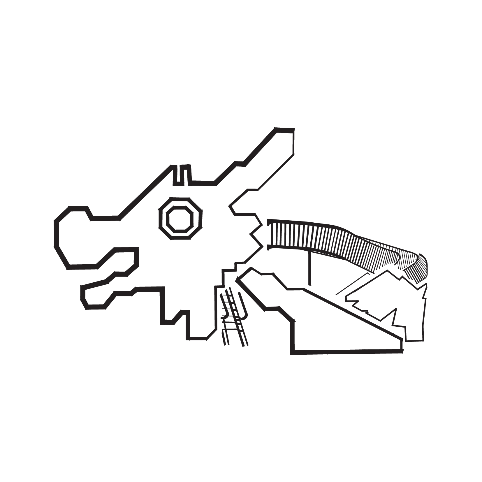
- Dragon Playground
-
- Dove Playground
-
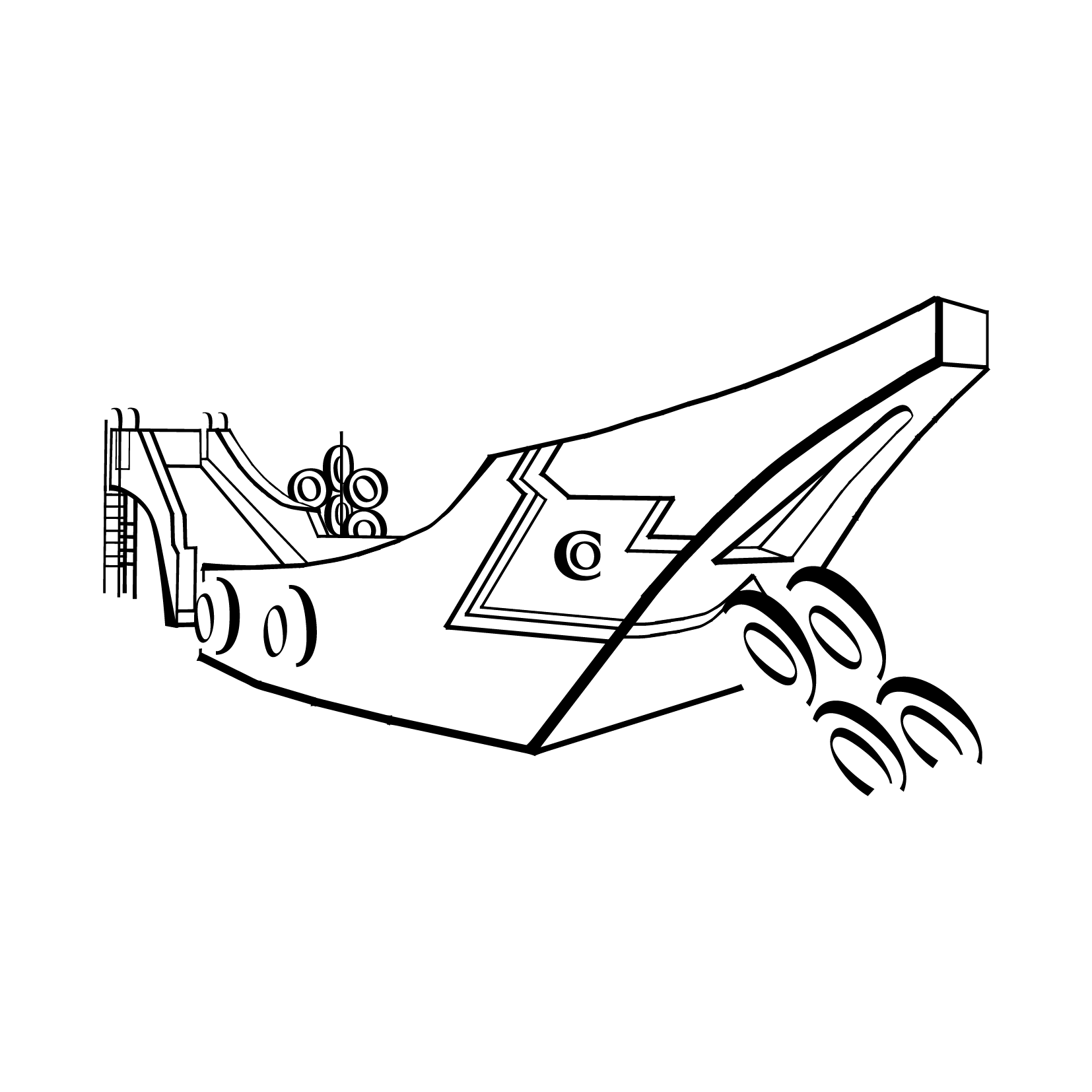
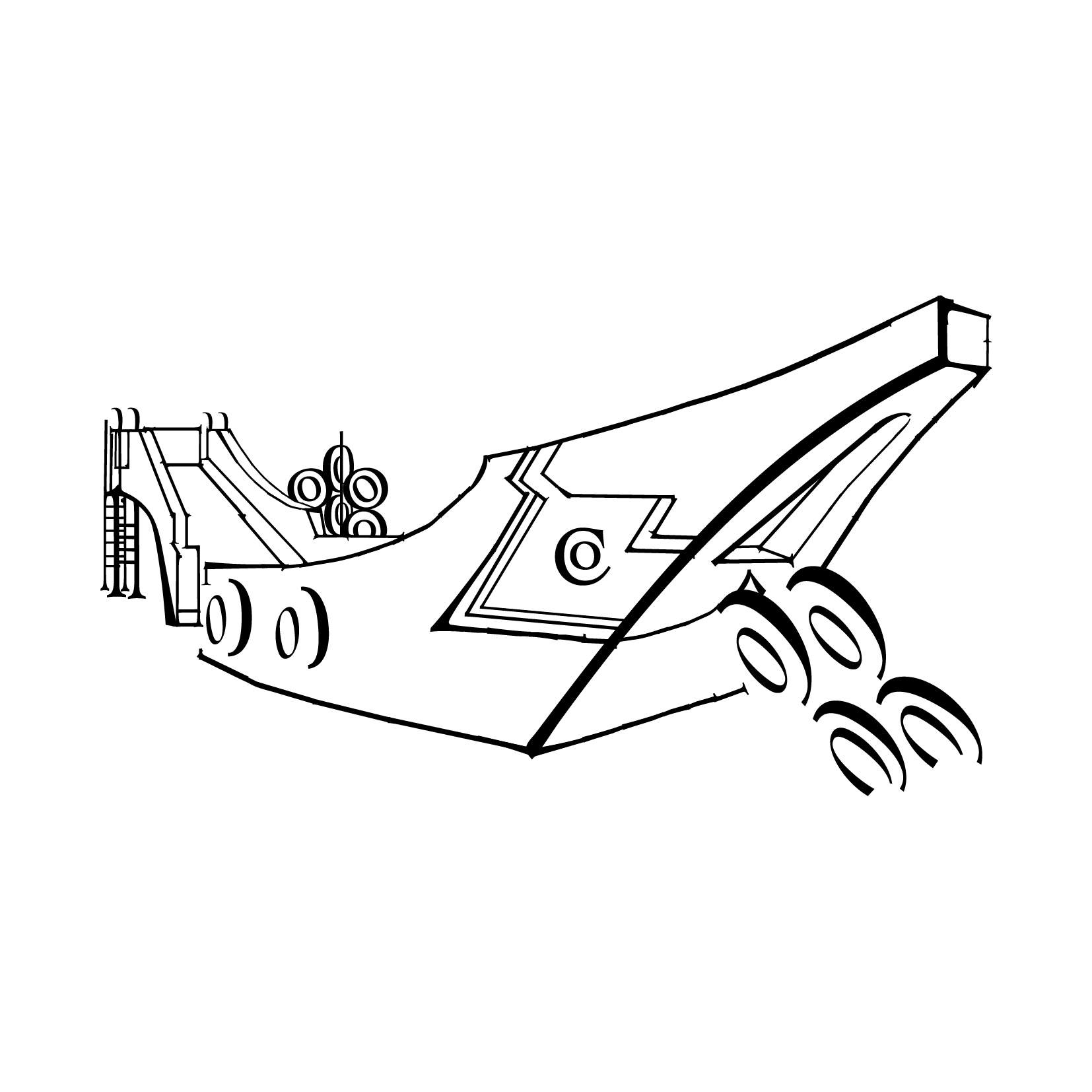
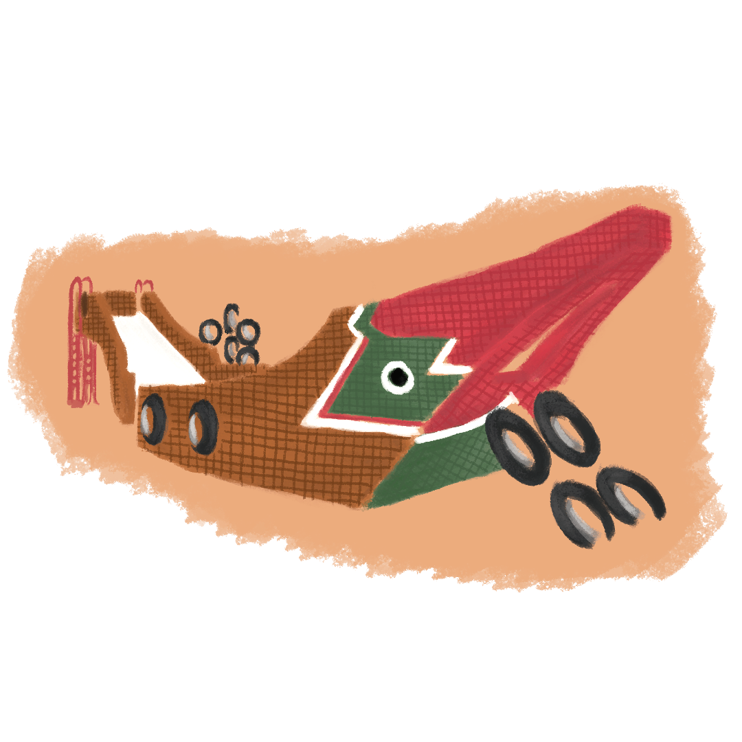
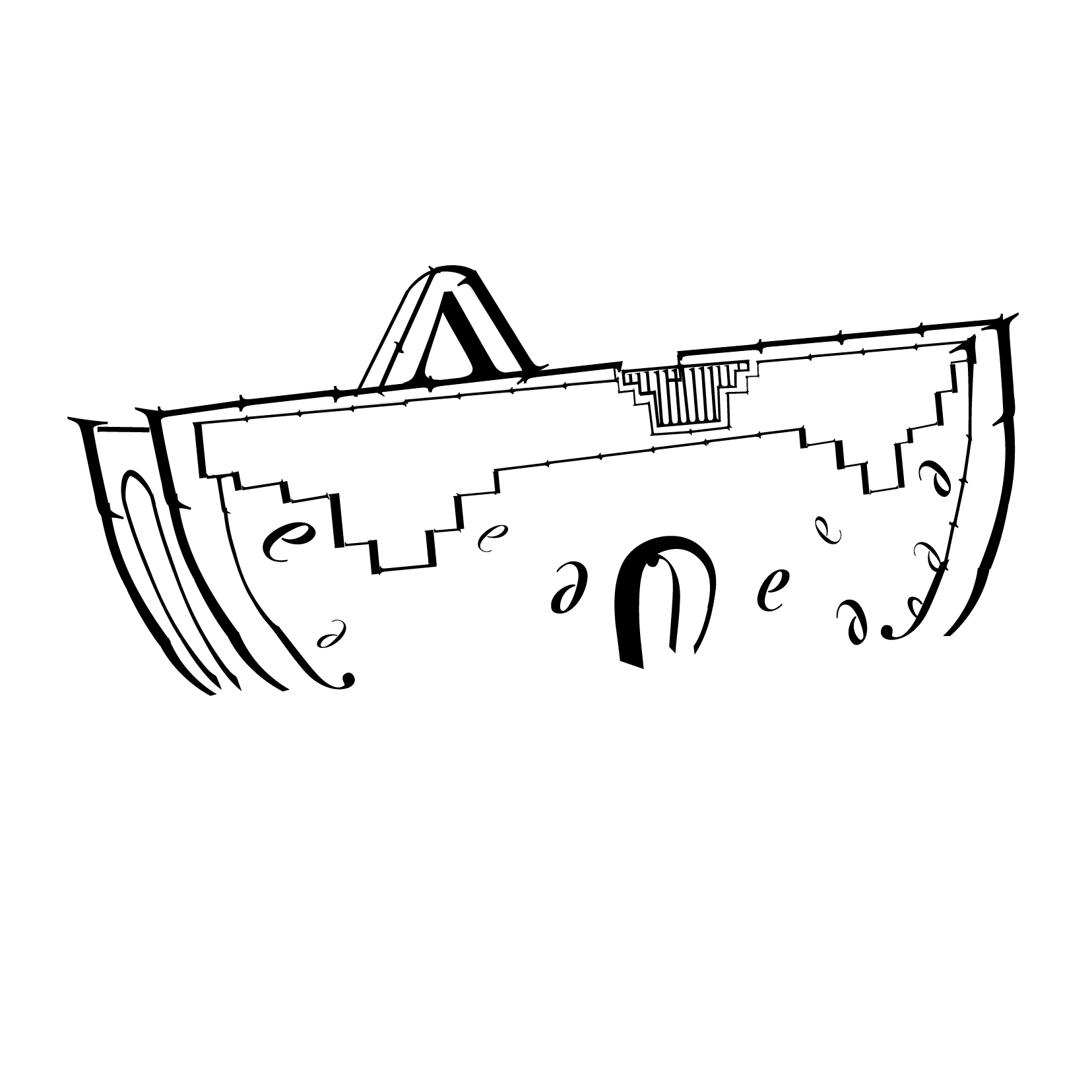
- Sampan Playground
-
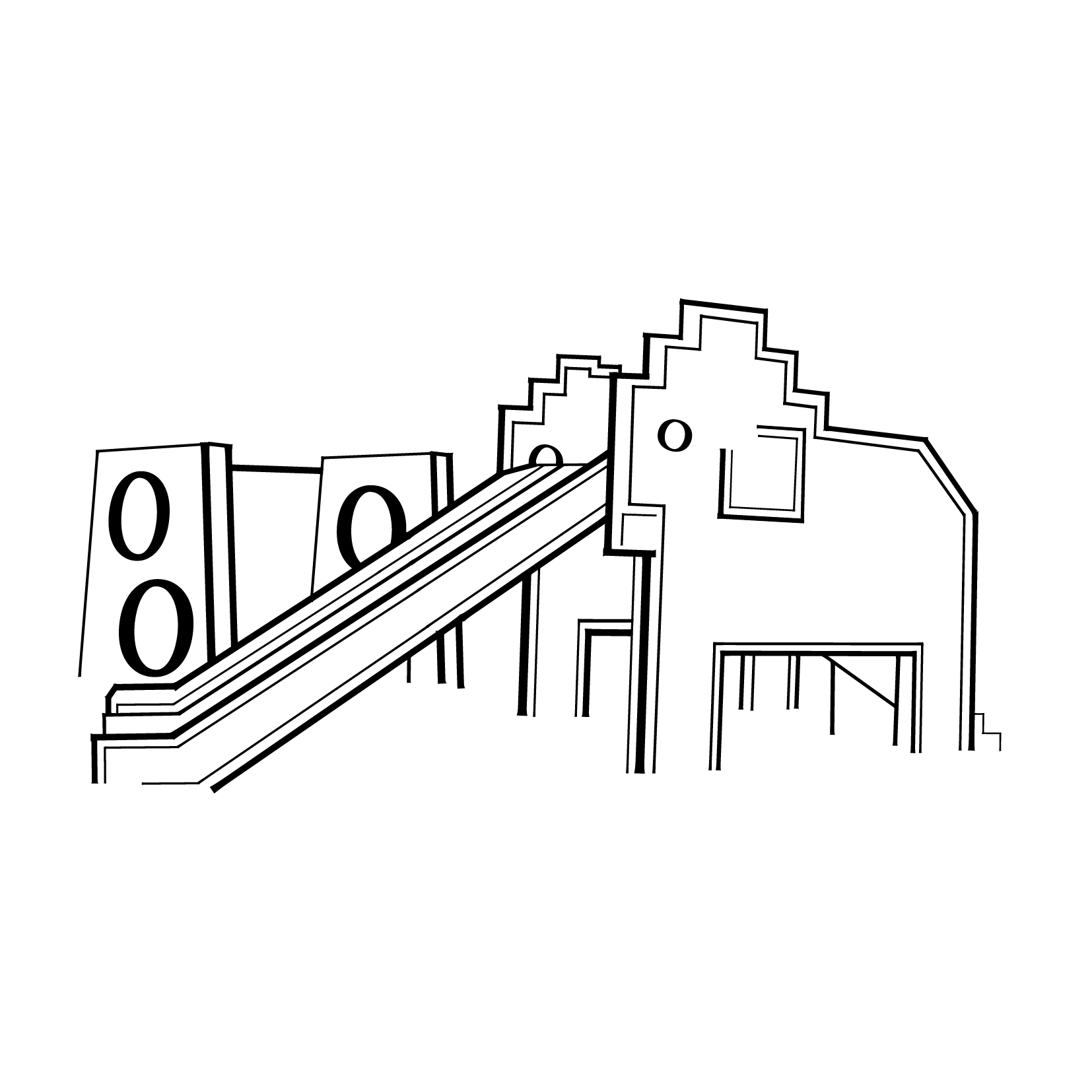
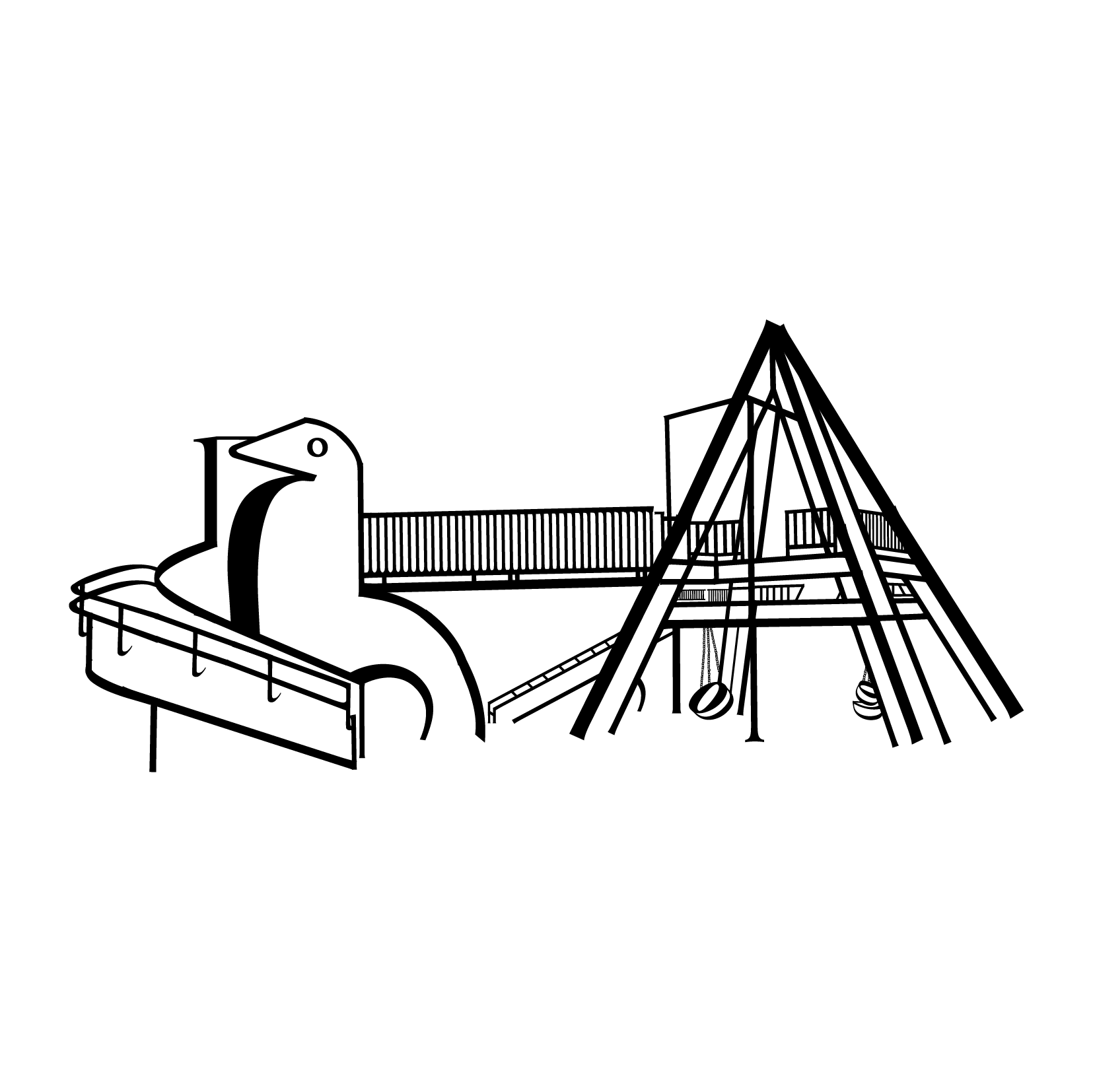
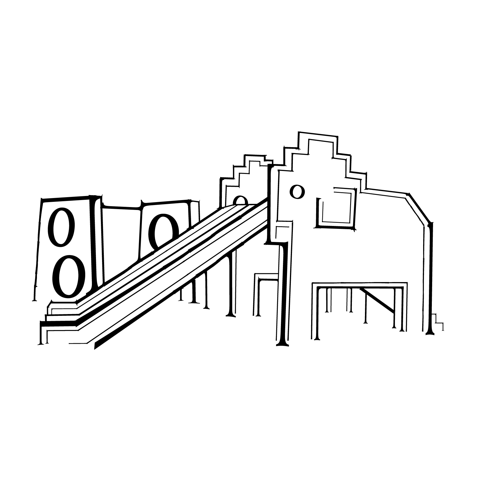
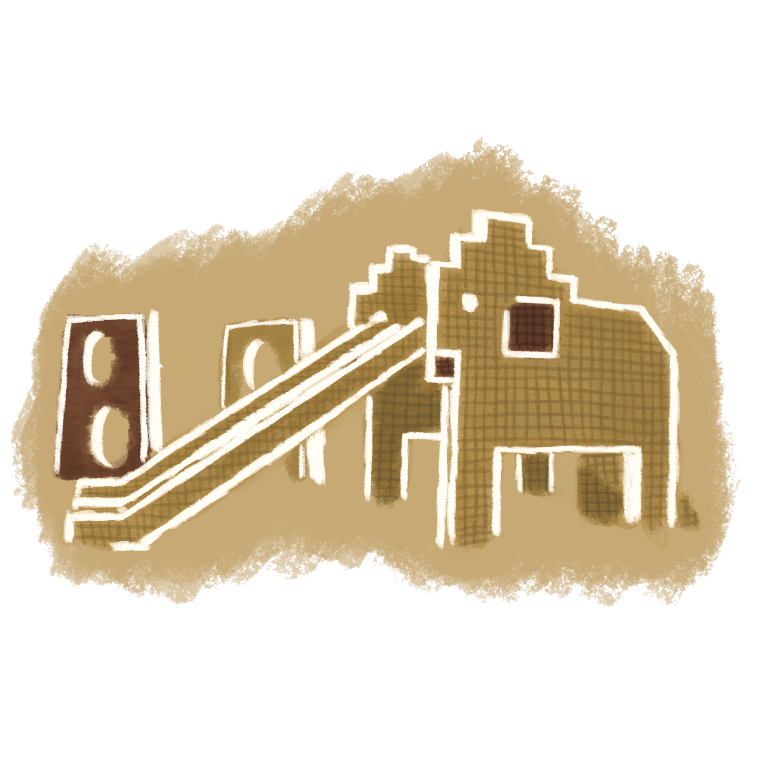
- Elephant Playground
-
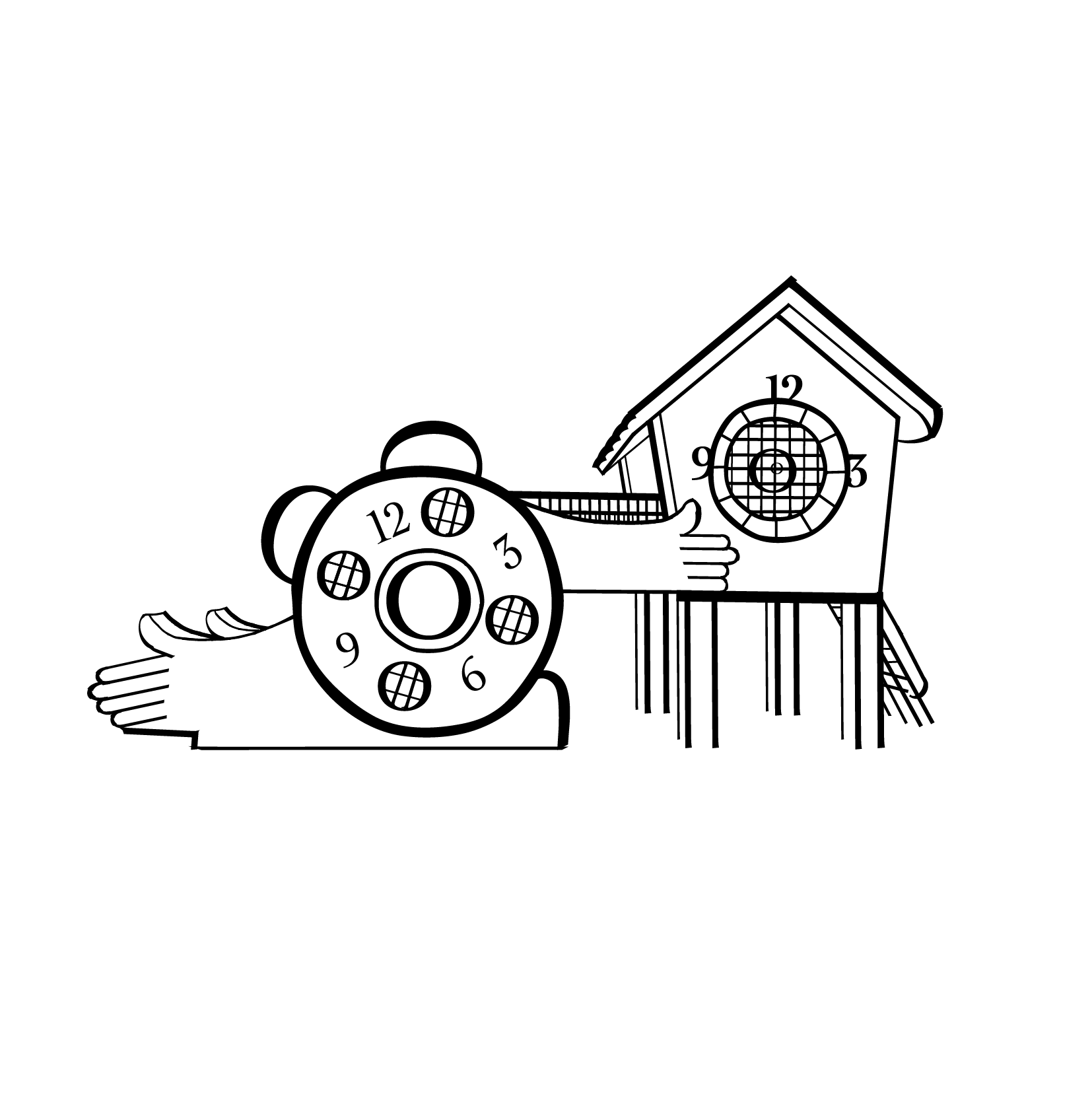
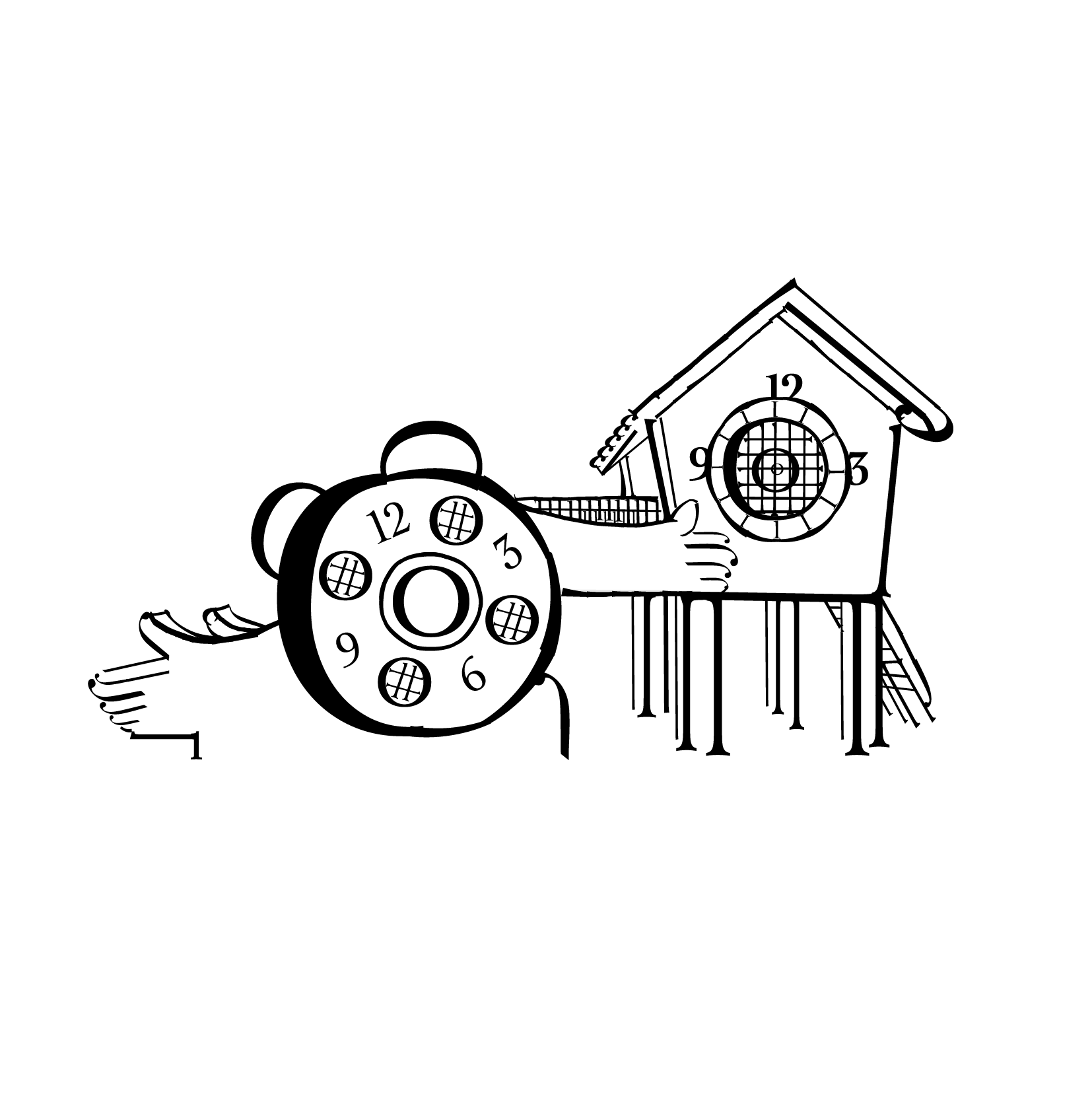
- Clock Playground
-

- Watermelon Playground
-
- Pelican Playground
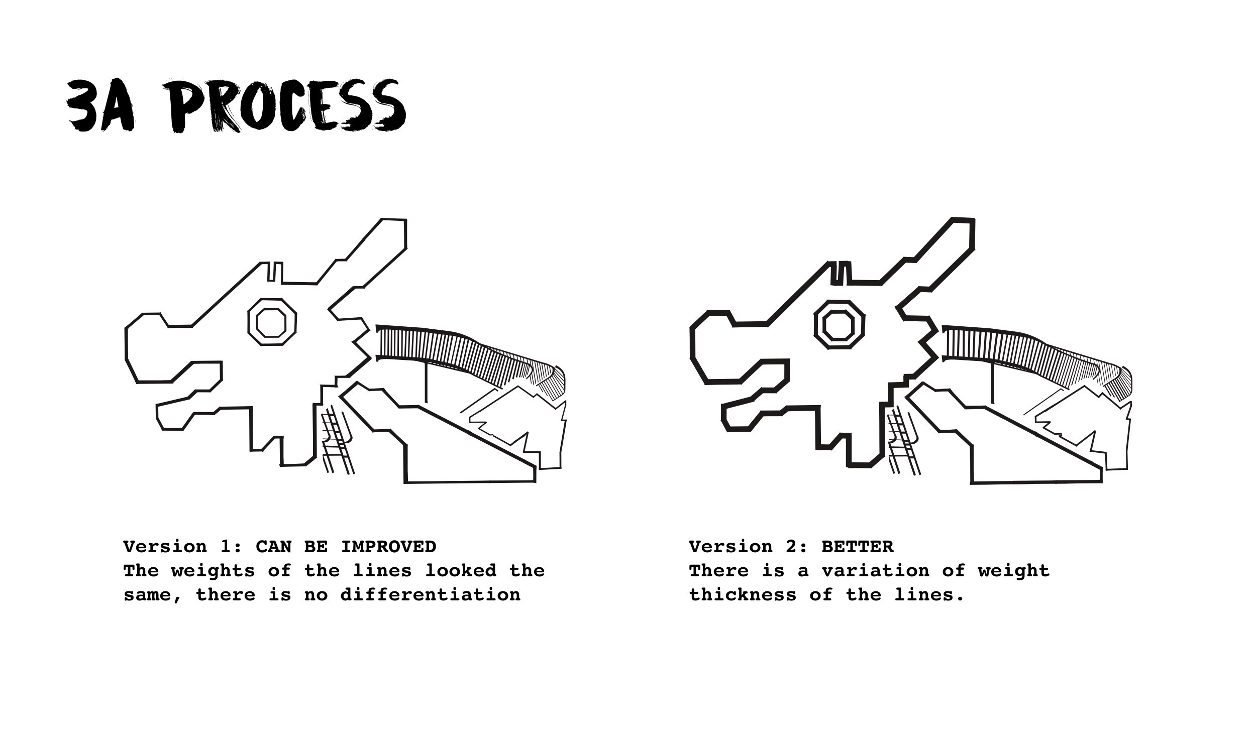
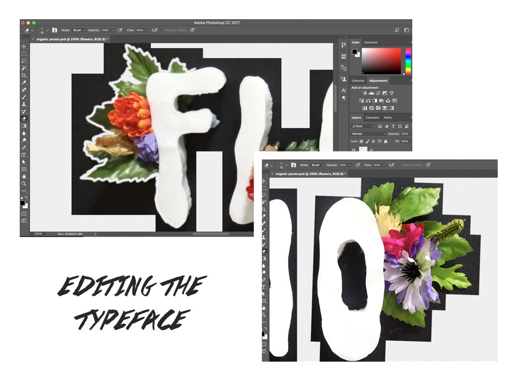
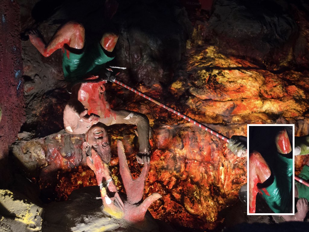
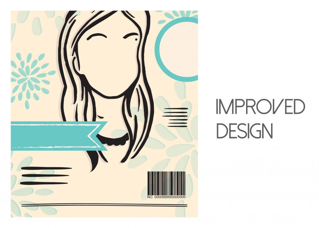
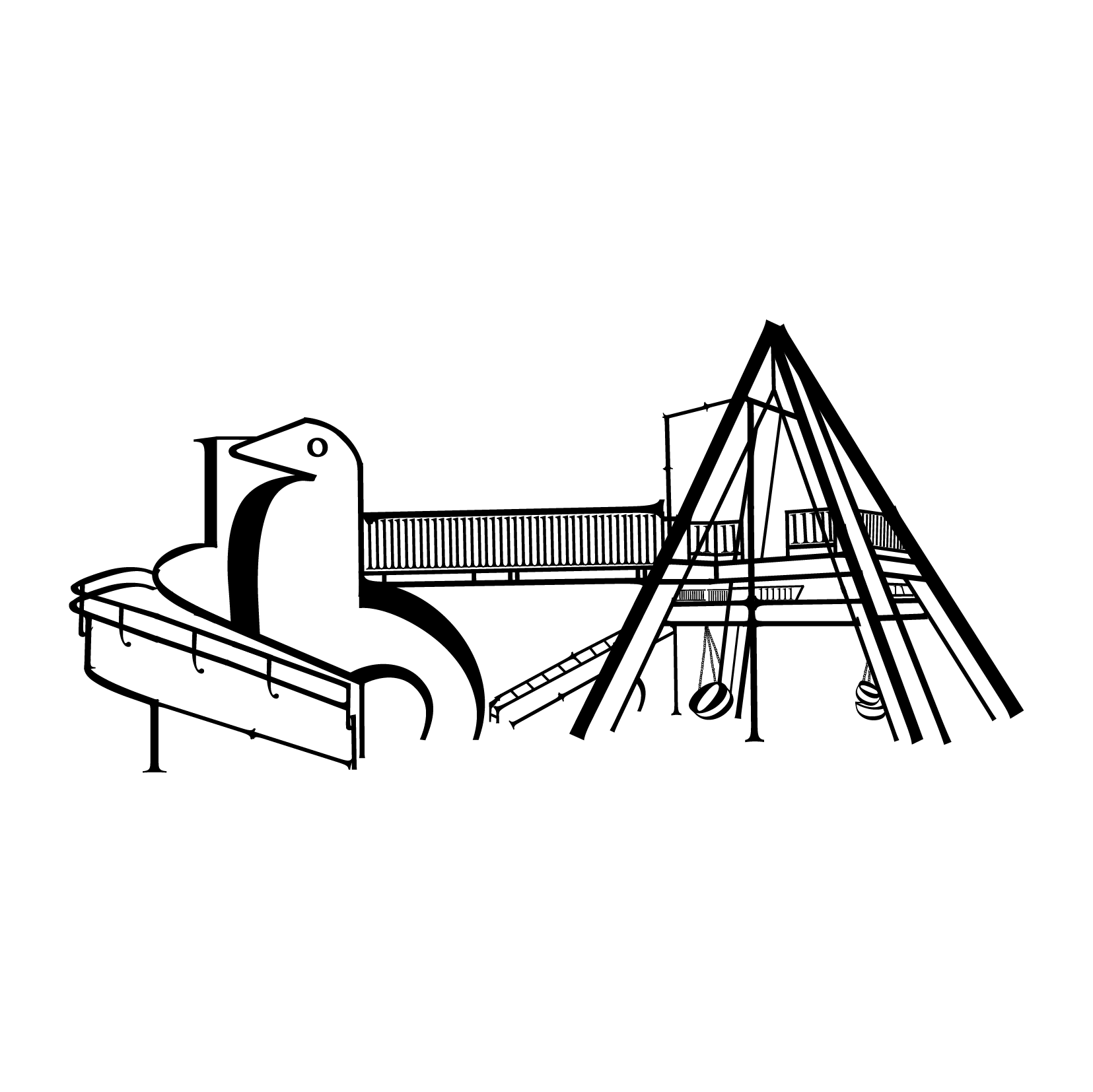
Went in to consultations and sure enough, I struggled. Sure the compositions came out, the respective playgrounds can be identified. However, feedback was that similar to the two that were created in Project 3A, the compositions looked quite flat and way too simplified. The reader would not be able to identify the letters used/see the typeface and the compositions could easily pass off as being drawn using the pen tool.
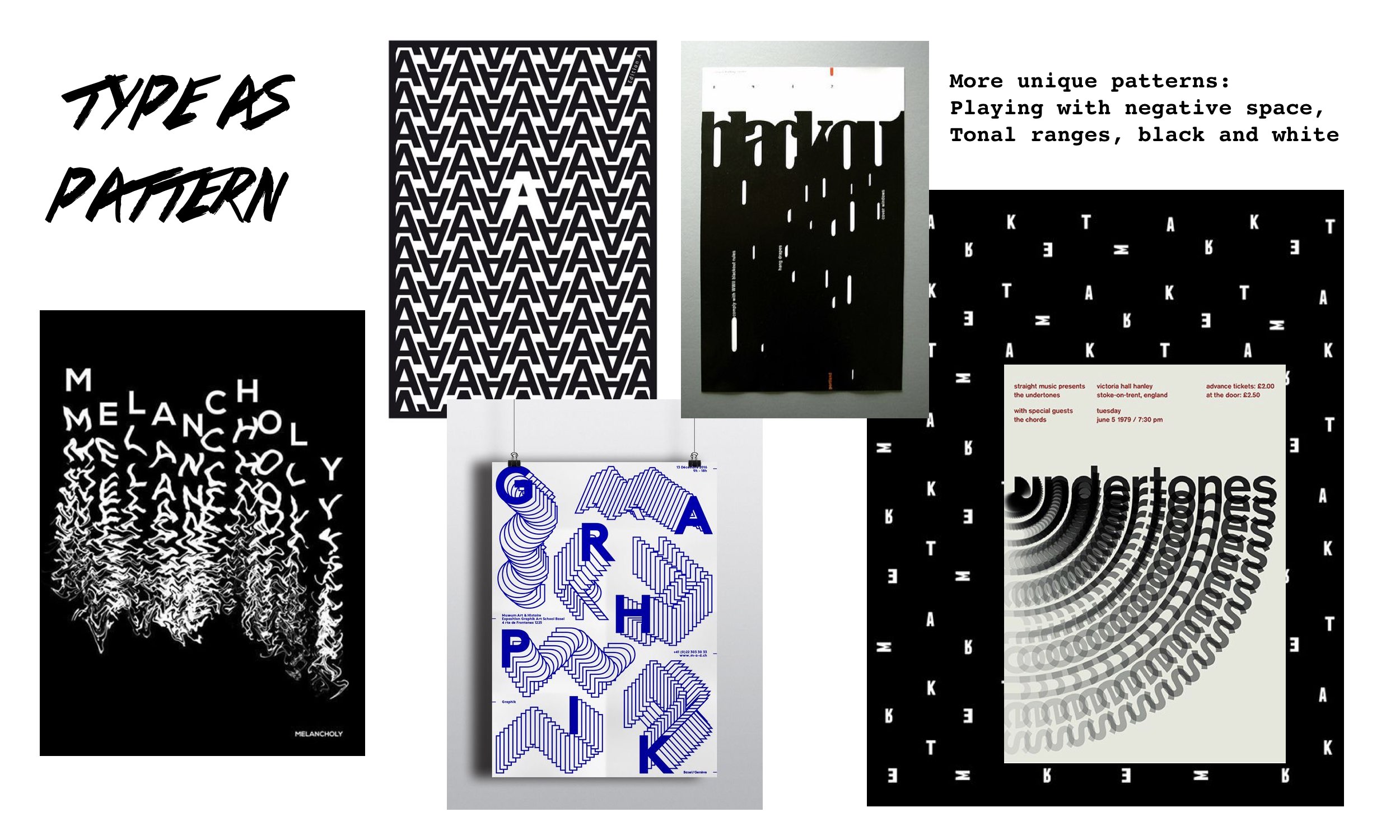
Shirley suggested to search online for examples of Type as Image to get a better sense of how the compositions when formed should look like – Definitely the anatomy of the letters could still more or less be identified and that should be the way to go!
^ Reference Works
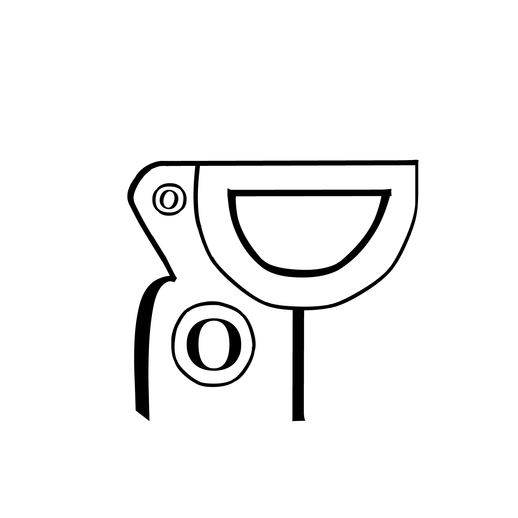
Thus I changed up the compositions a little by cutting up the anatomy less, some retaining it’s full form and the use of the letter’s descenders and ascenders rather than it’s stems. The list of mosaic playgrounds around Singapore is pretty long and people might ask, why feature just these mosaic playgrounds and not all of them? My reason for choosing these playgrounds to be featured is because these seven I personally believe are the more iconic ones around, I see them popping up/being mentioned in most if not all the articles/materials I’ve read about these playgrounds. Furthermore, several of these playgrounds were popular designs till they had replicas of it built about Singapore but these selected ones are the original ones that were created, the first version to exist.
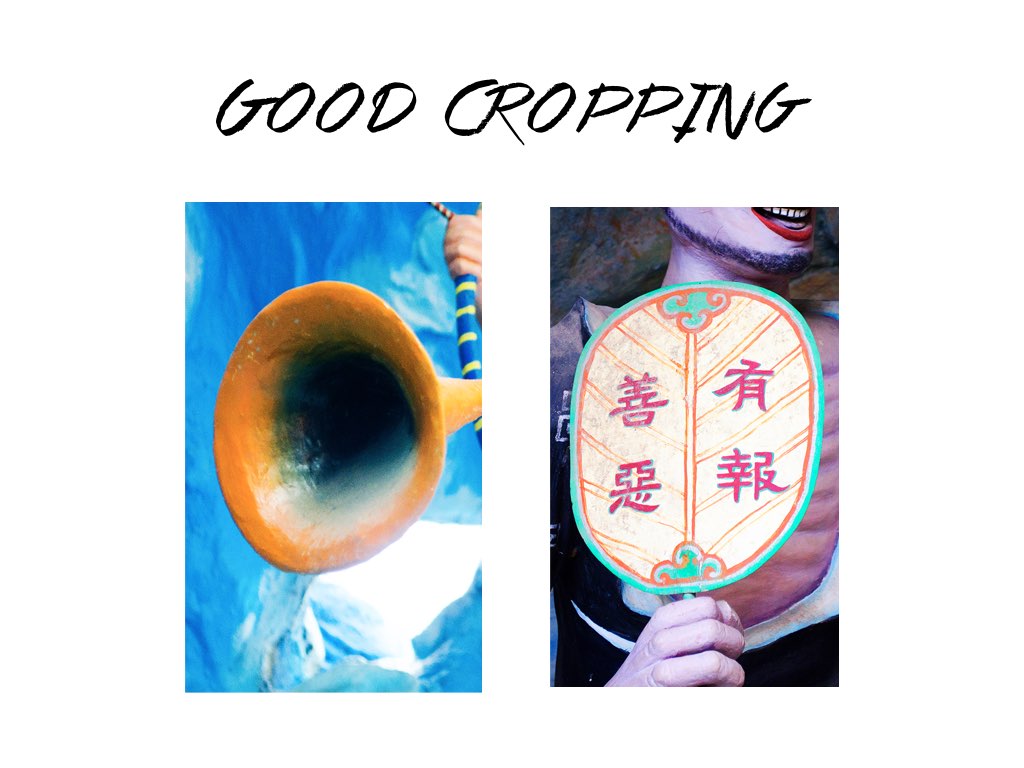
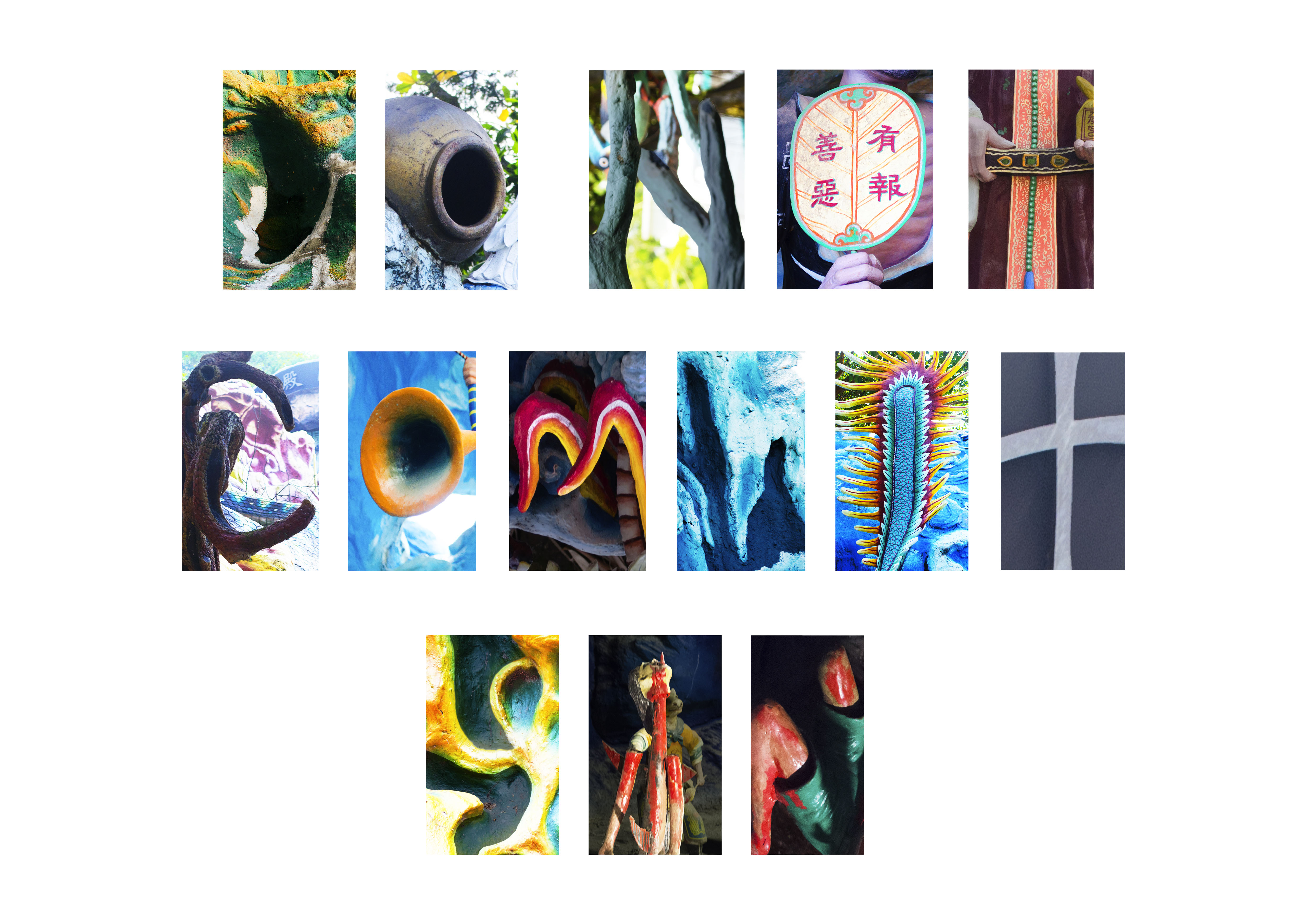
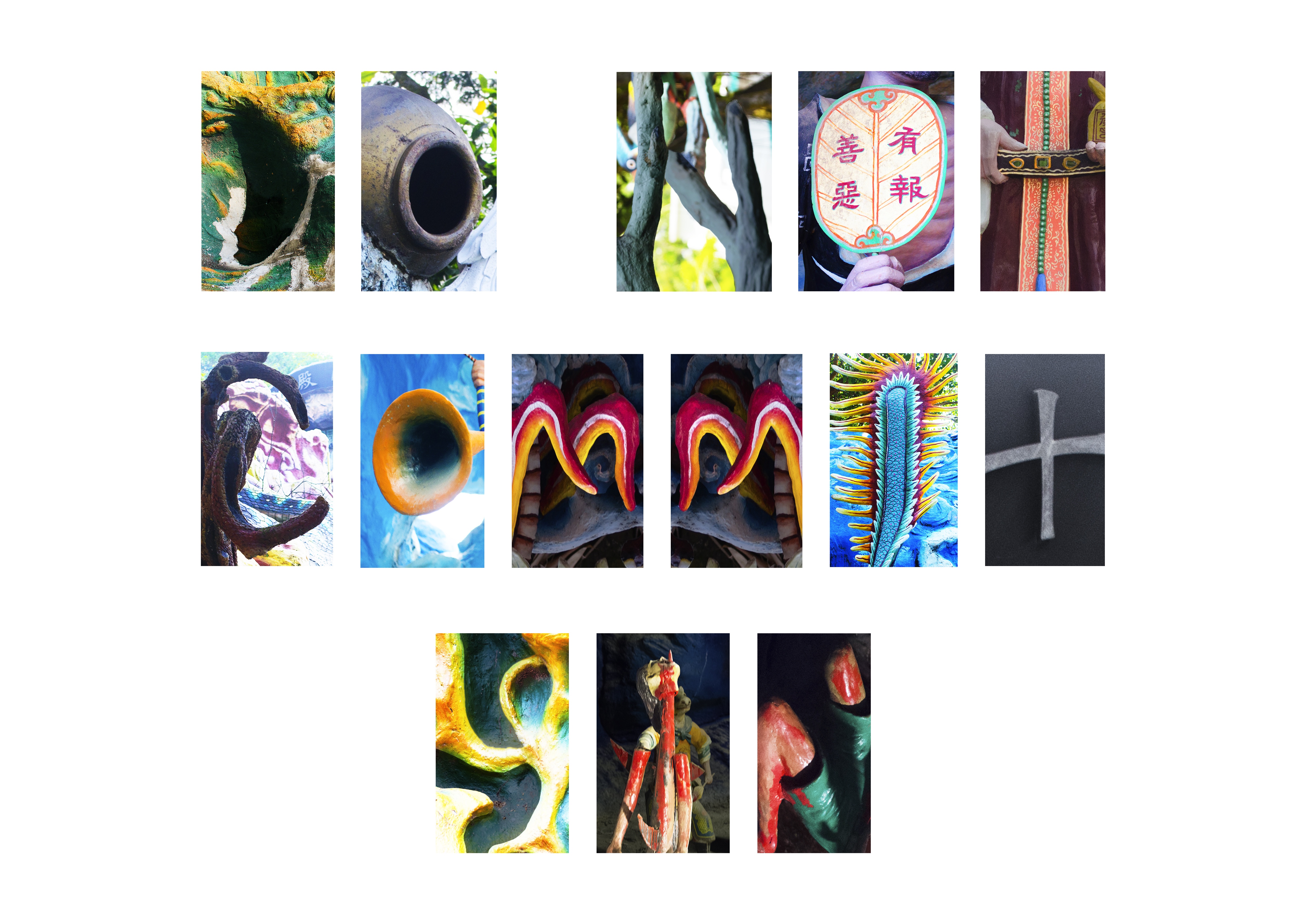
Below, each revised composition labelled as follows in a gallery of its own and the process of getting to the final composition used in the zine with the colouring for some: (click on the images to enlarge as slideshow)
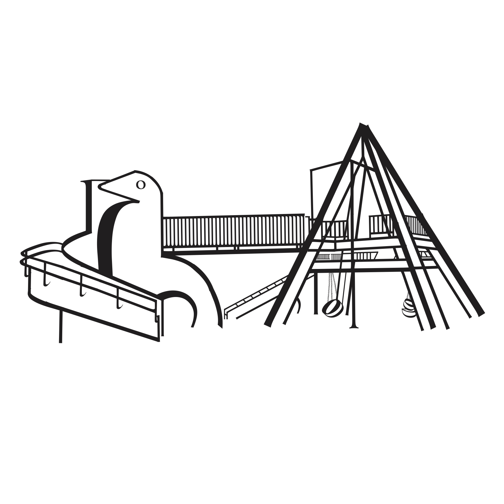
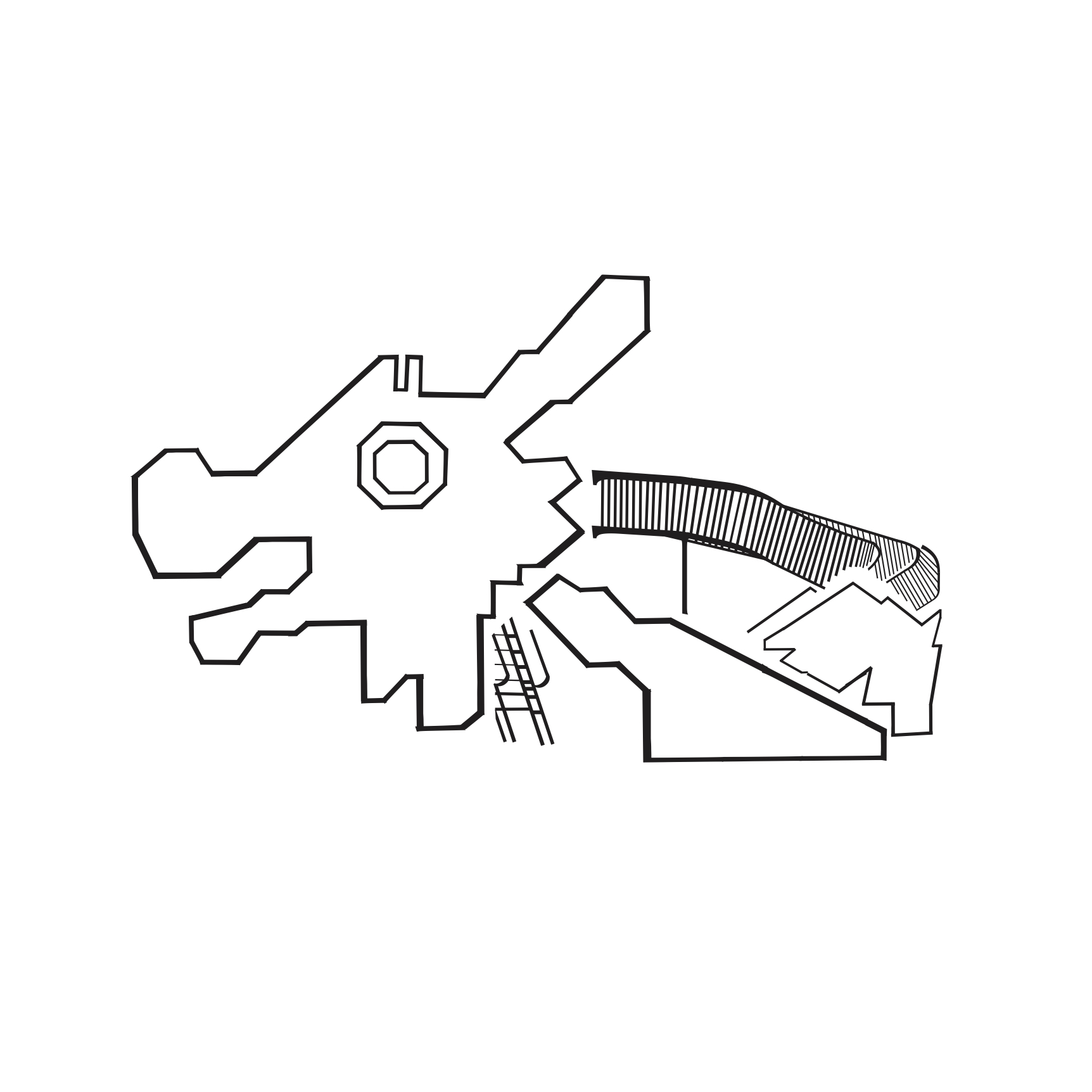
DRAGON PLAYGROUND
-

- Revised
-
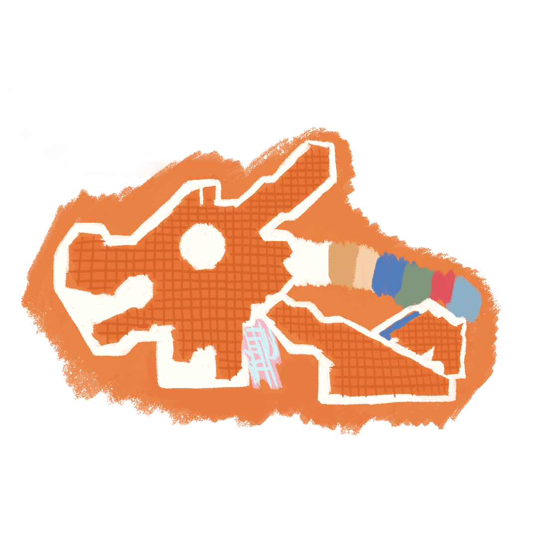
- Colour
-
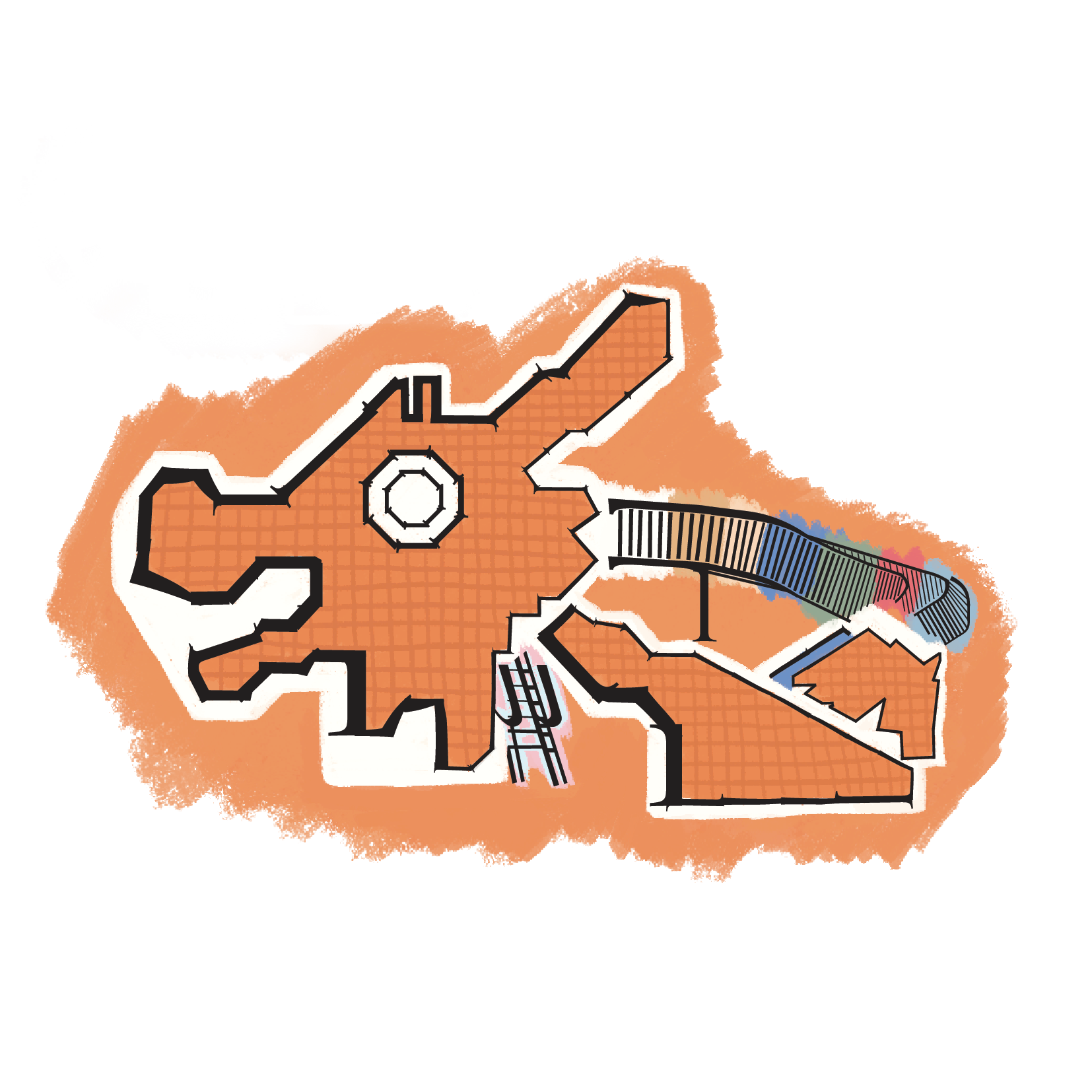
- Final
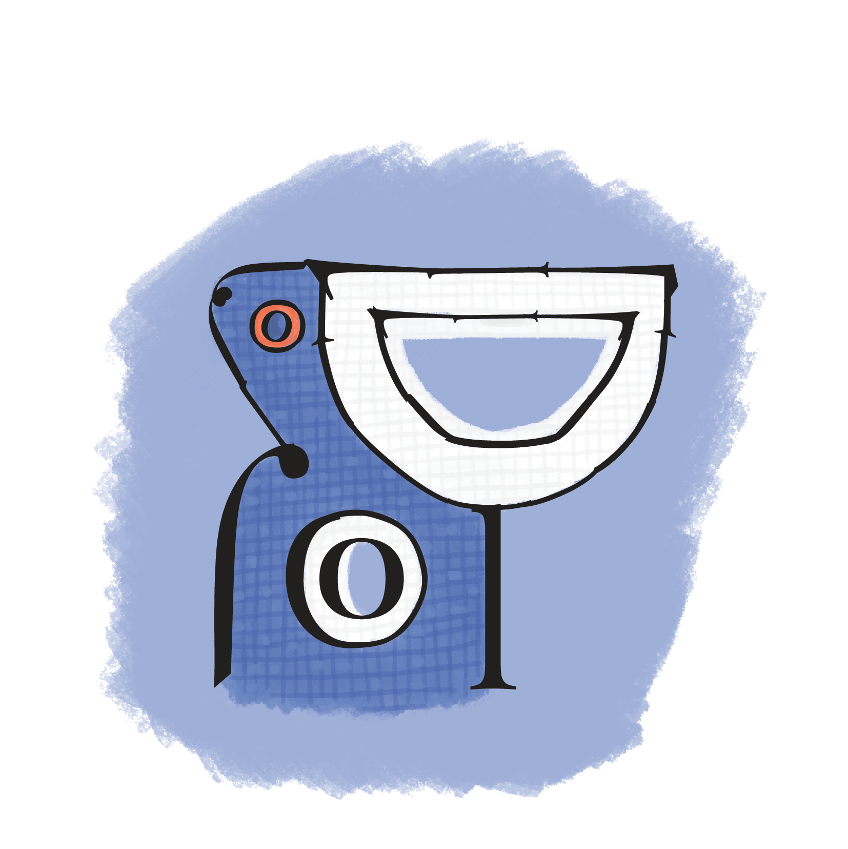
DOVE PLAYGROUND
-
- Revised
-
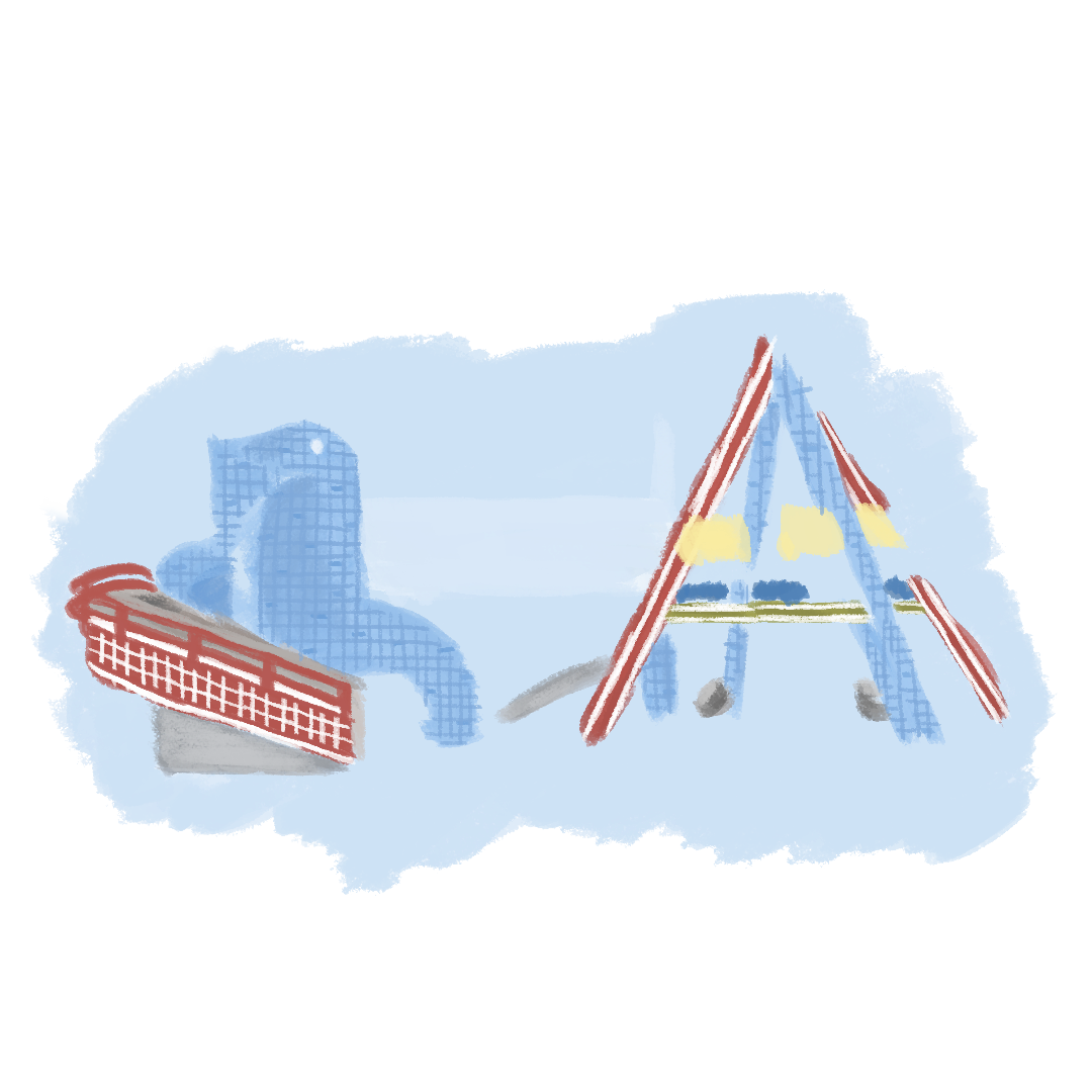
- Colour
-
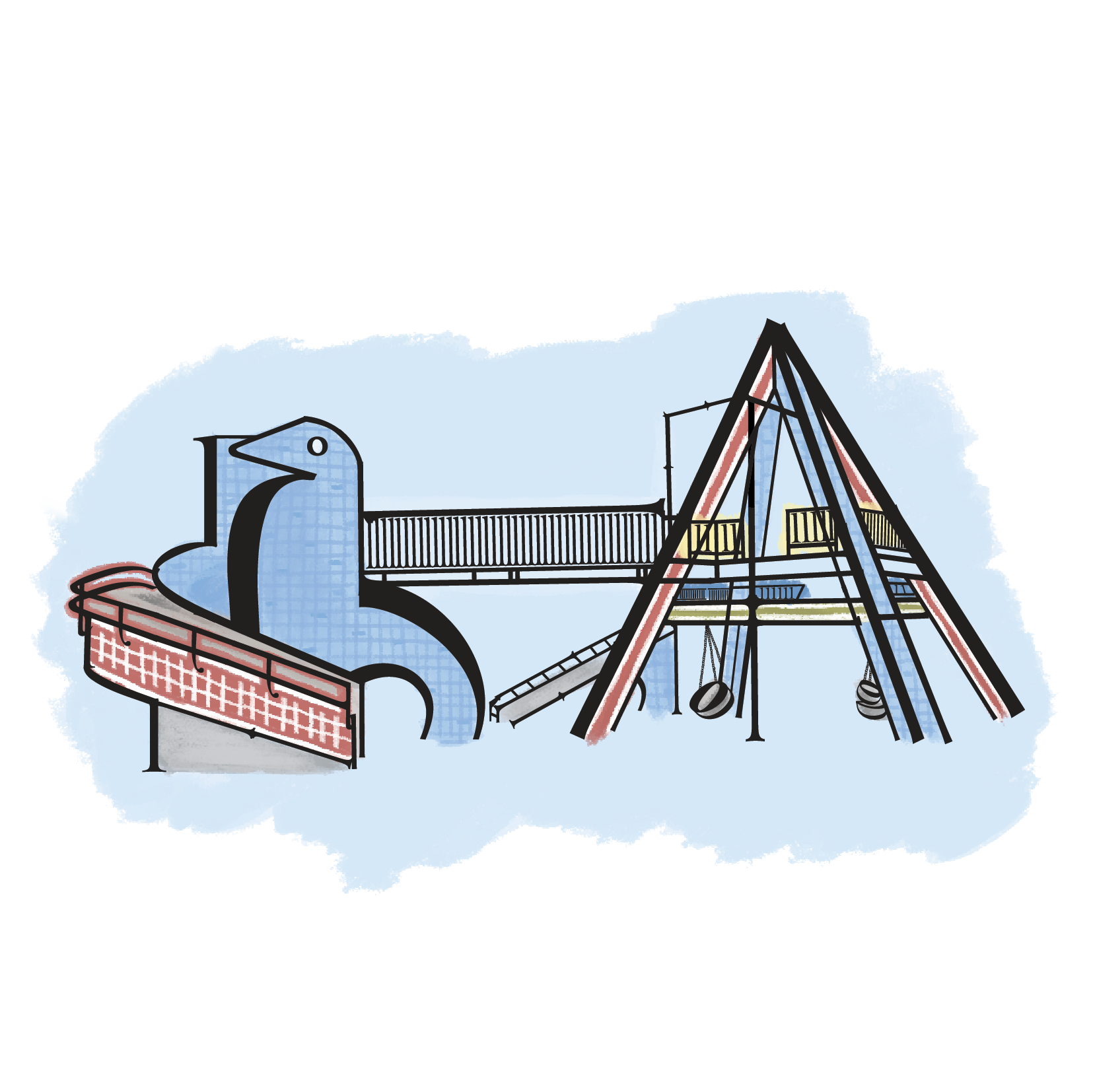
- Final
SAMPAN PLAYGROUND
-
- Revised
-
- Colour
-
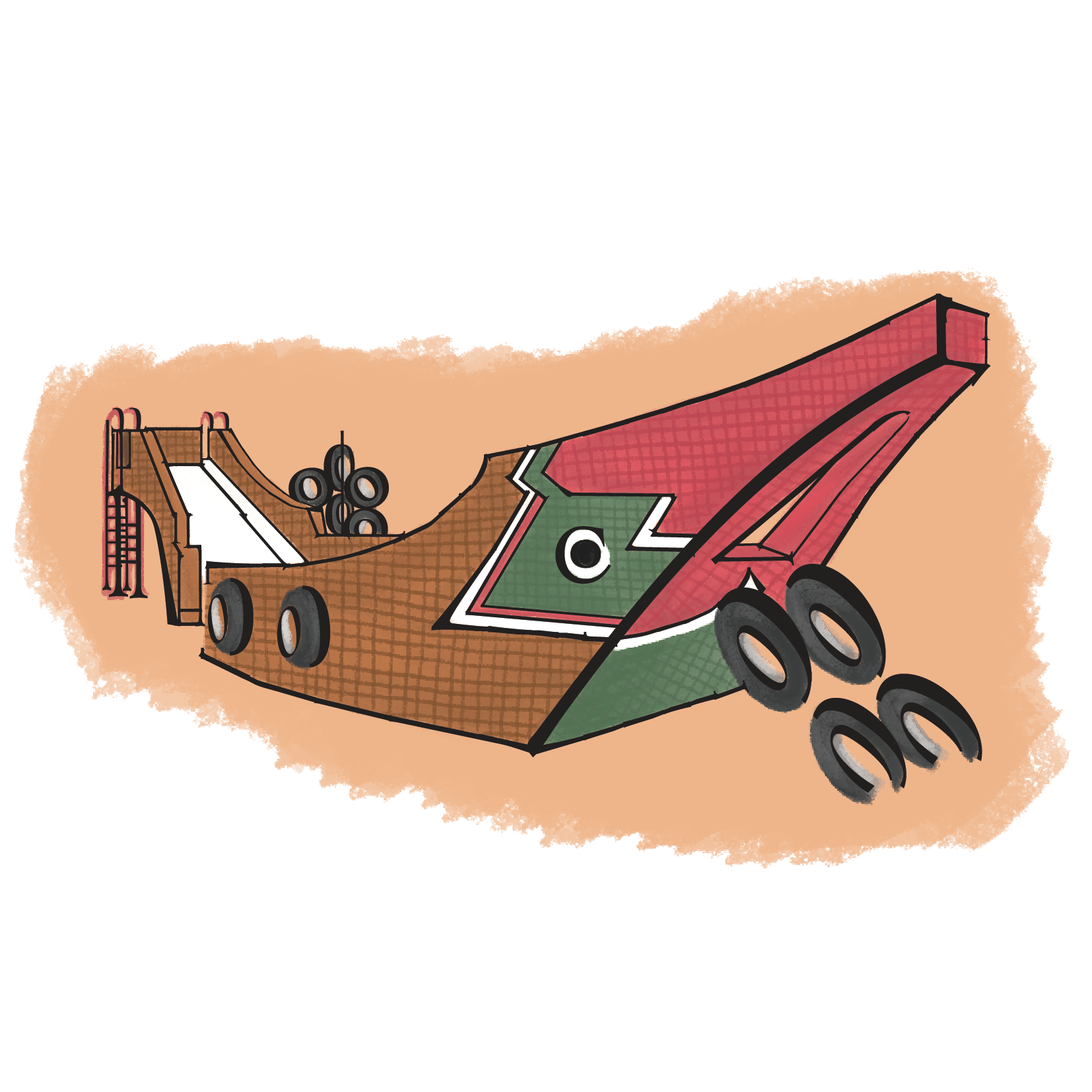
- Final
ELEPHANT PLAYGROUND
-
- Revised
-
- Colour
-
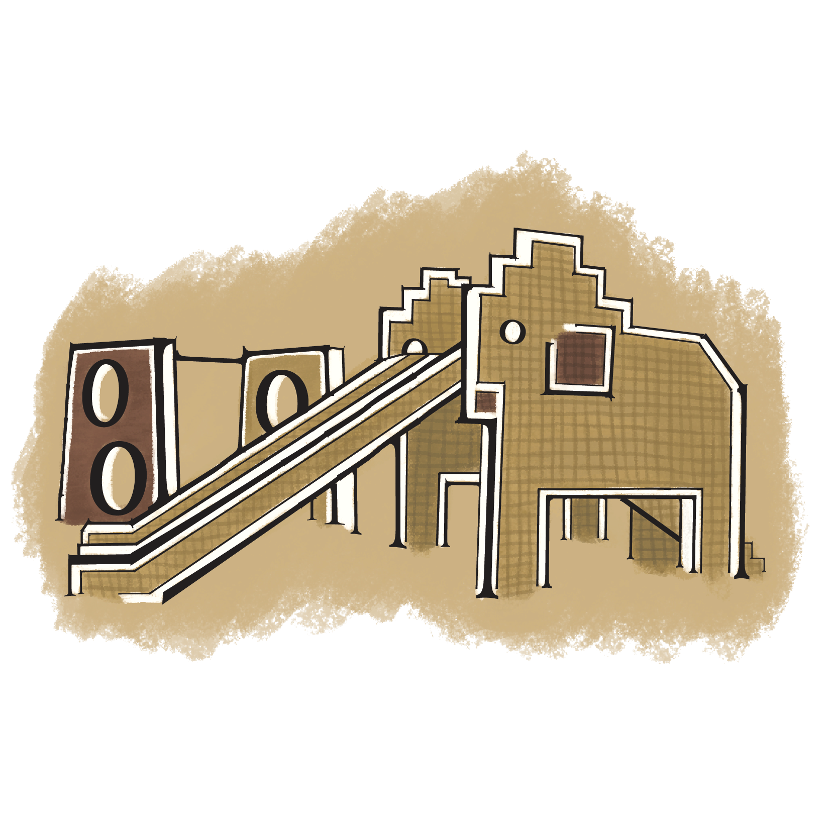
- Final
CLOCK PLAYGROUND
-
- Revised
-

- Colour
-

- Final
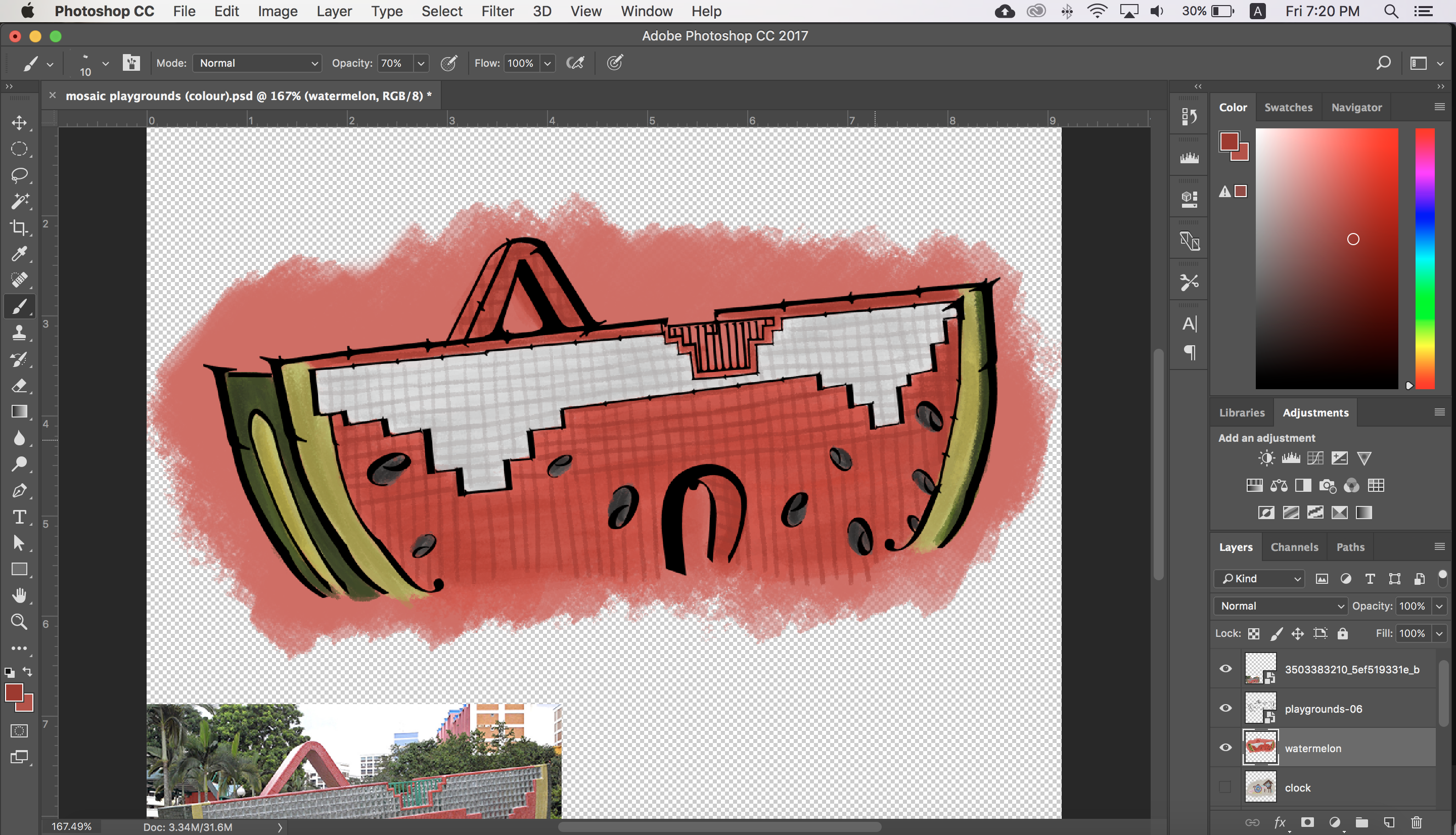
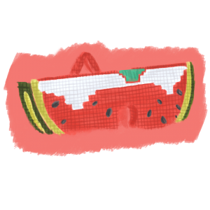
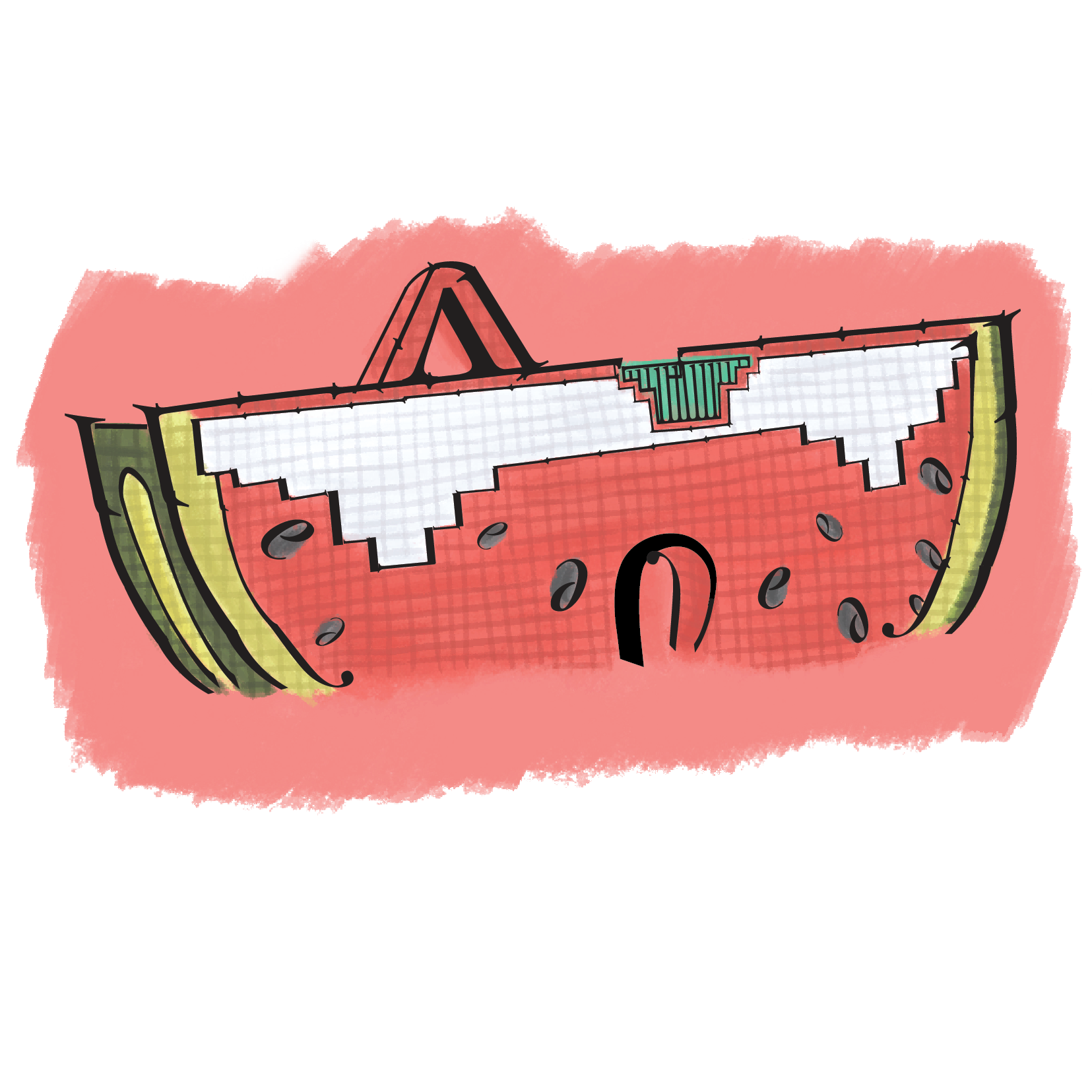
WATERMELON PLAYGROUND
-

- Watermelon Playground (Revised)
-
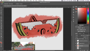
- Process: Colouring in

-

- Process: Adding the details
-
- Colour
-
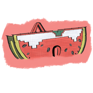
- Final
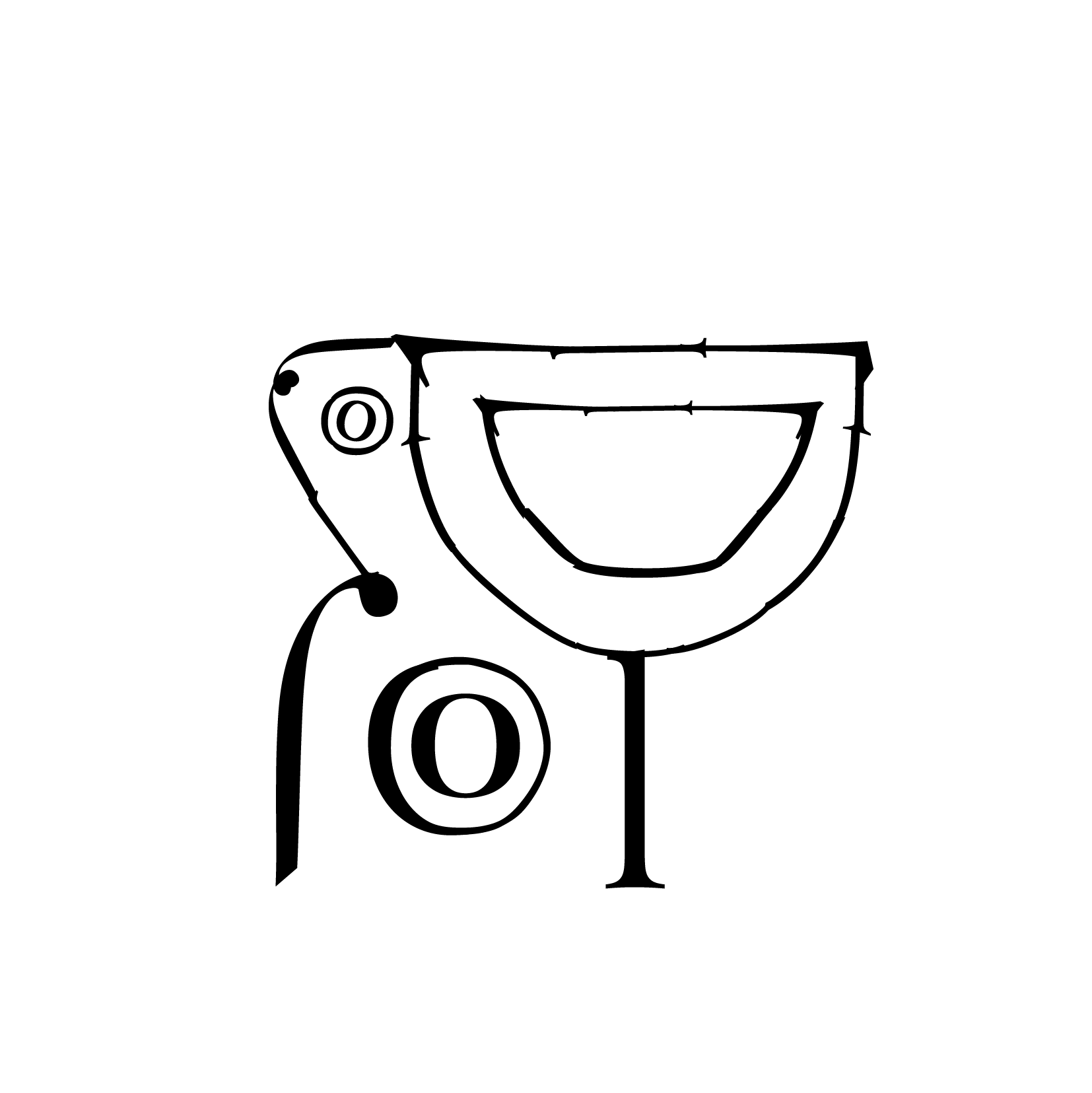
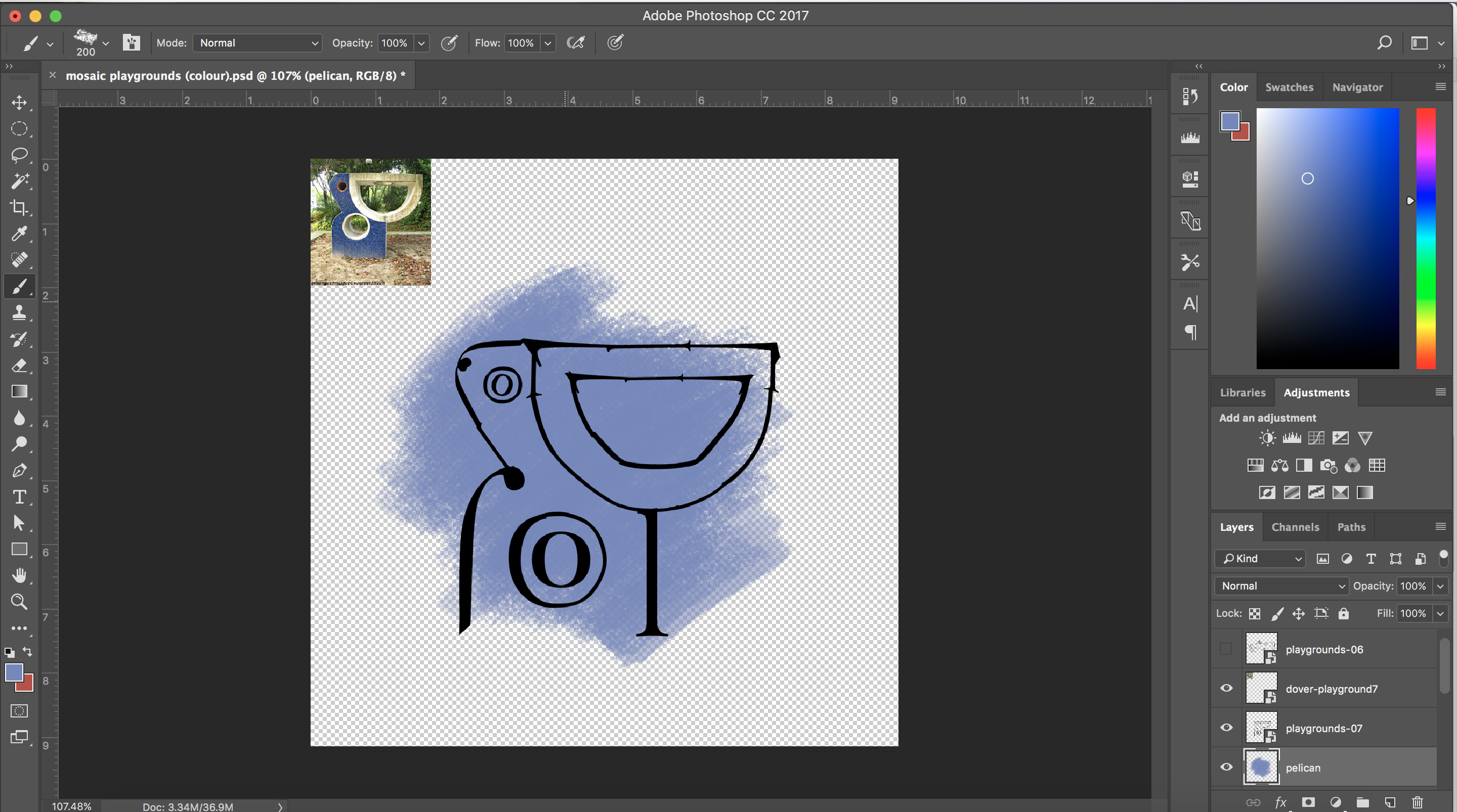
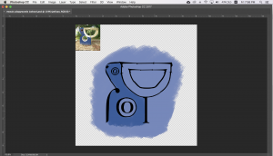
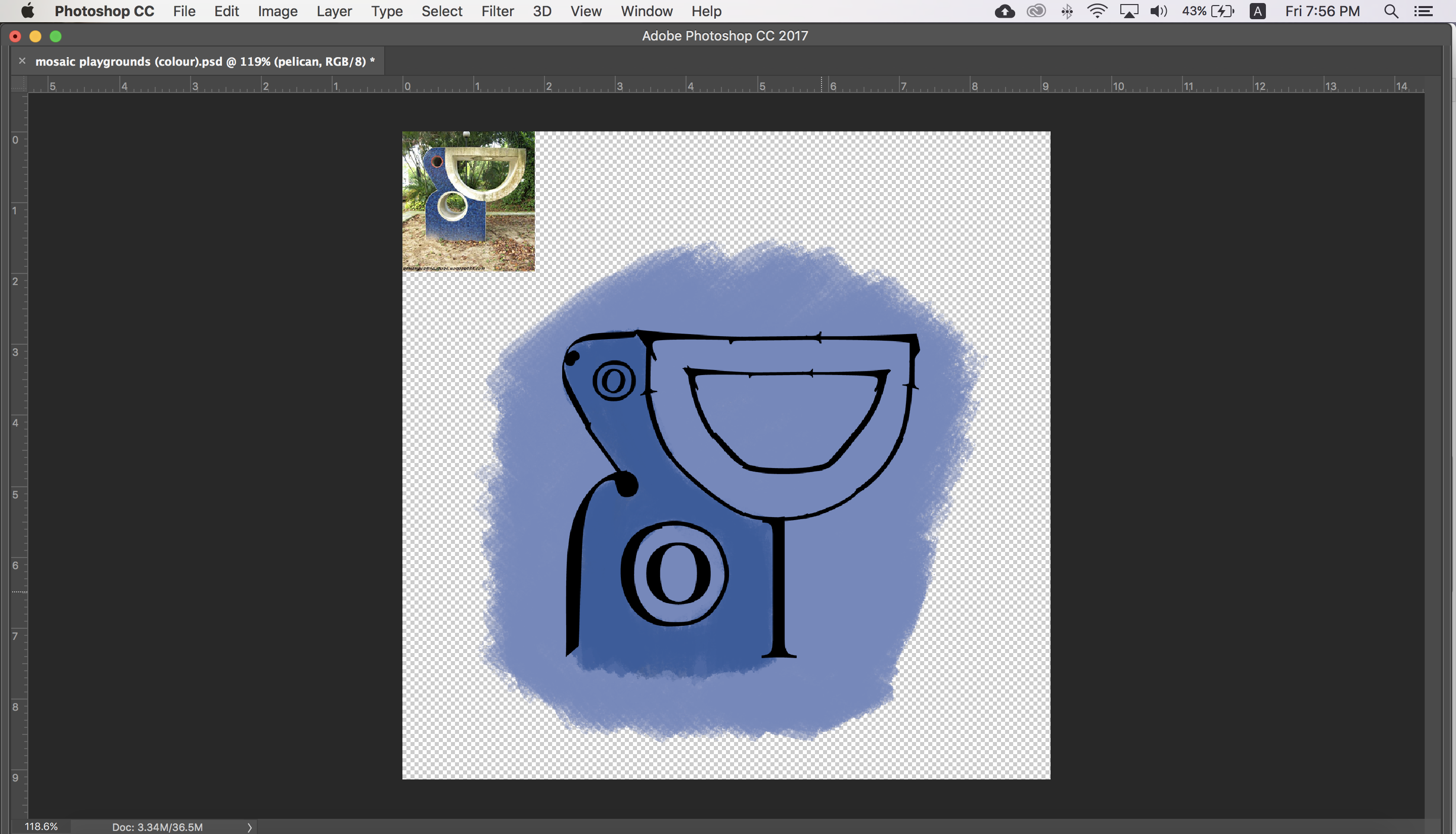
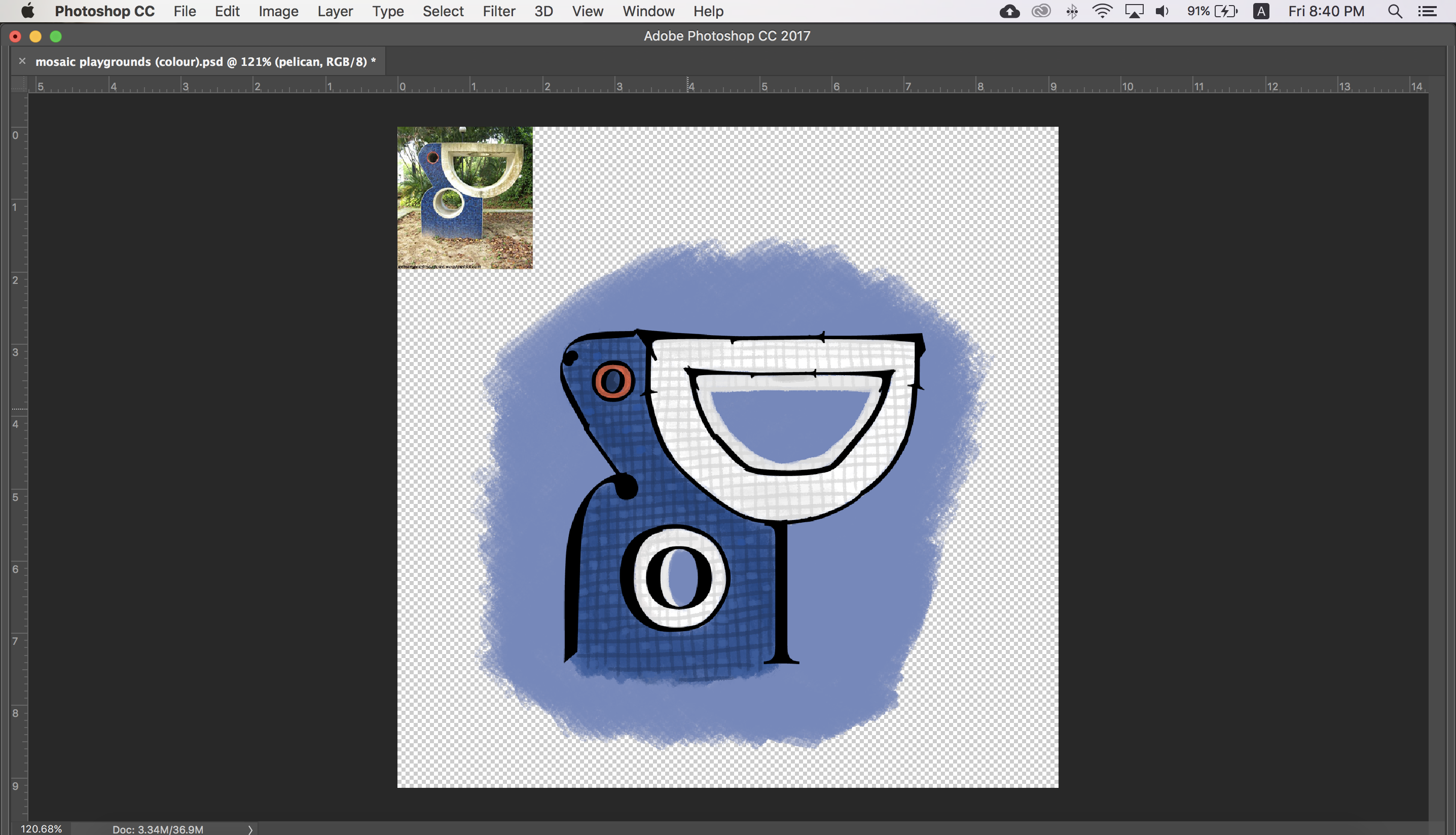
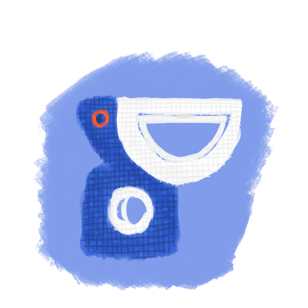
PELICAN PLAYGROUND
-

- Pelican Playground (Revised)
-

- Process: Colouring in the base
-
- Process: Adding the details
-

- Colour
-

- Final
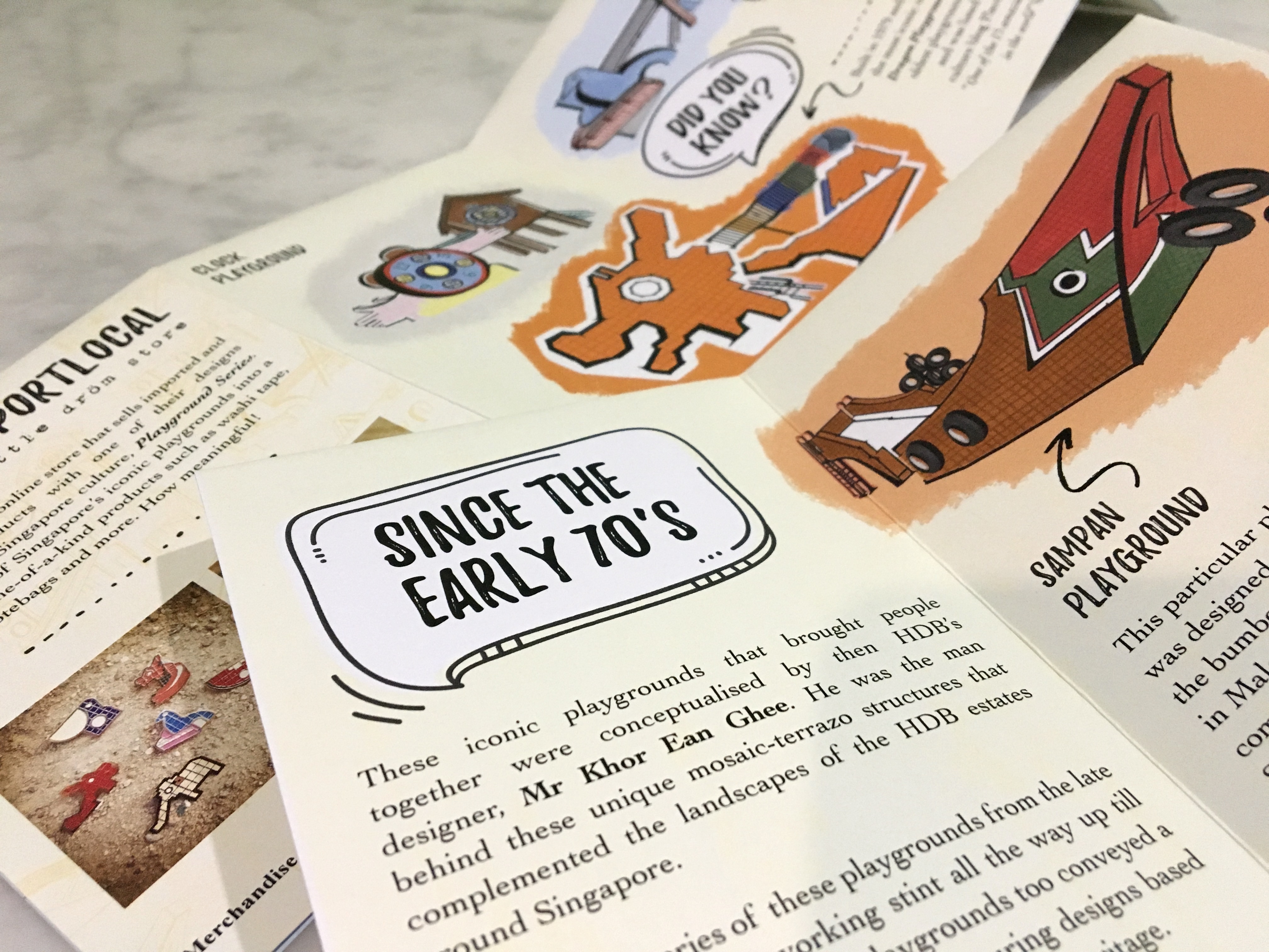
Content
As I felt that it would be rather boring to just have the typographic image compositions make up the content of the zine, I eventually decided to include several fun facts/information that readers will not likely be aware of about these playgrounds complement the compositions.
I have to say, bulk of my inspiration on what should be included in the zine came from this digital pdf that I chanced upon while researching on the playgrounds (link): Mosaic Memories – Singapore Memory Project
From there I got the inspiration for the main content to complement the compositions:
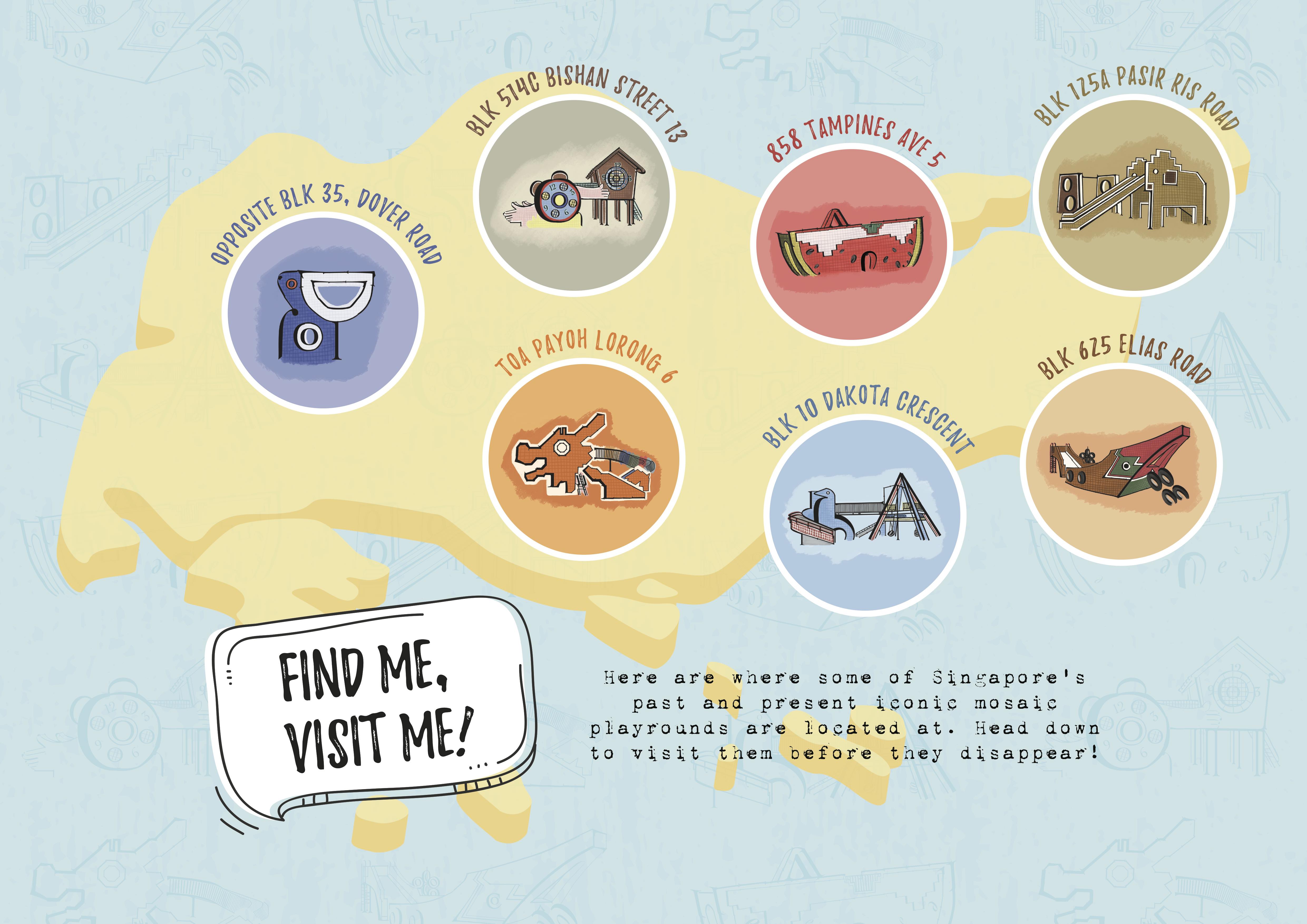
And the poster: Somewhat like the map as seen in the Mosaic Memories project referenced, but in my own take and style. The map that the designer came up with for that project featured way more playgrounds and it was even more detailed with a descriptive paragraph beside each playground. As for mine, I decided to have it just feature the playgrounds that I’ve created compositions for on a map silhouette of Singapore. The playgrounds placed roughly at where it’s located across the island (North, South, East, West side) with simple header text above it made up of their addresses’. The poster works as a tiny prompt/suggestion for readers to visit/re-visit their childhood while they still can (the design can be seen later on below)
And after much revising and printing…. here’s the final look of the zine 🙂
-
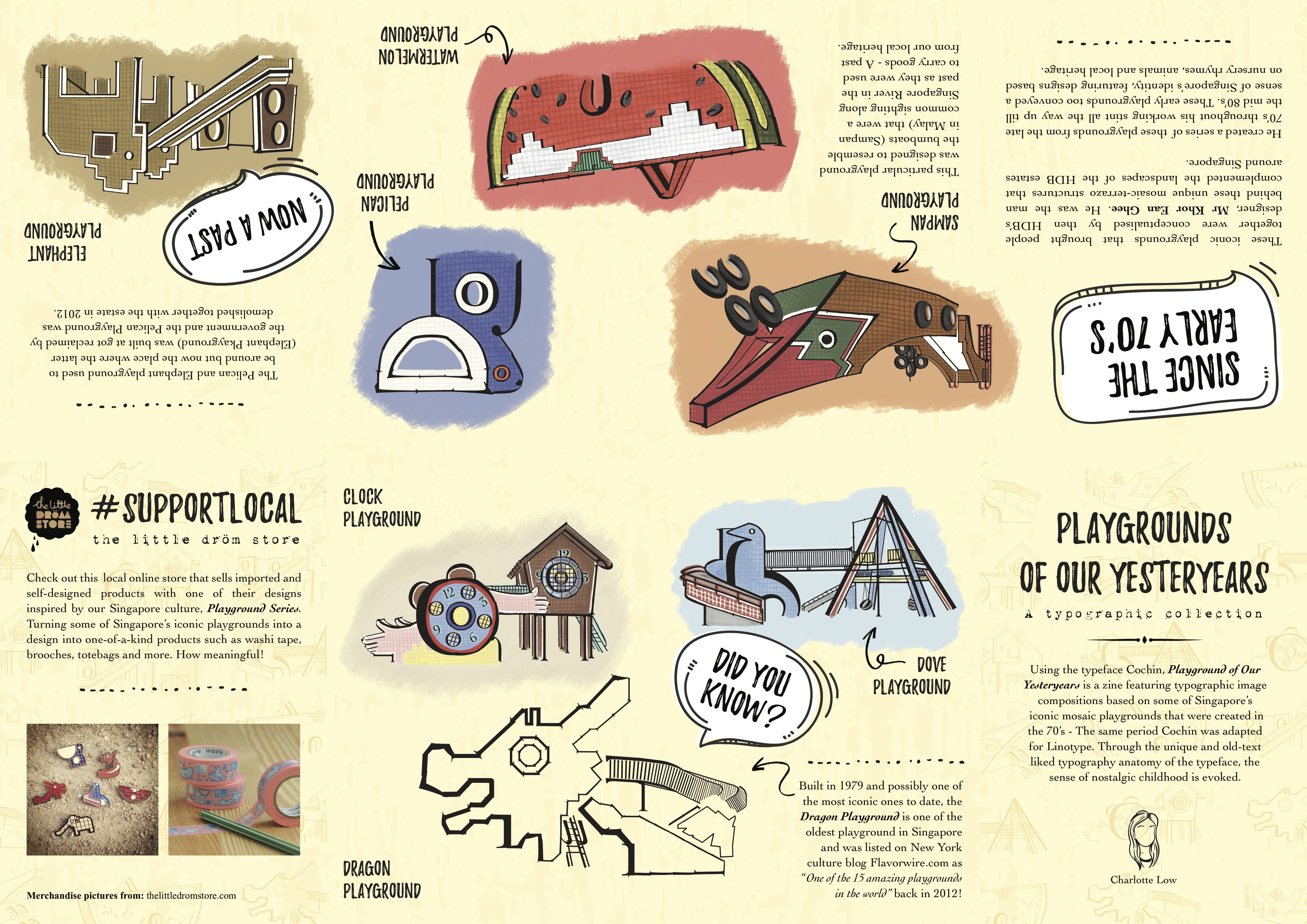
- Zine: Content
-
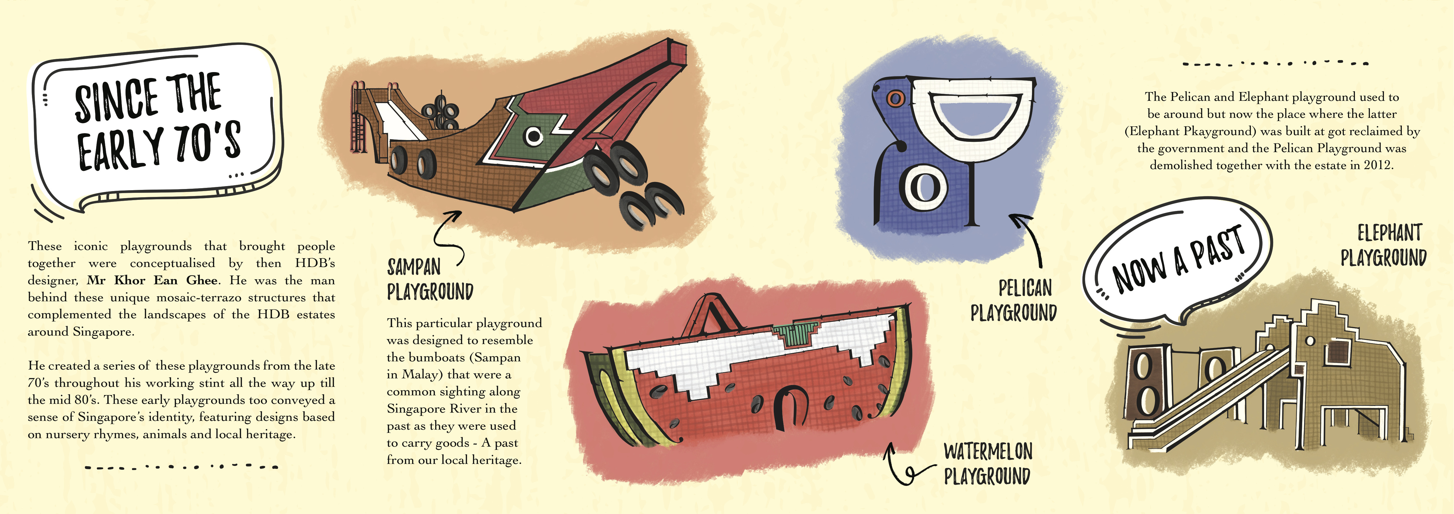
- Content Pt.1
-
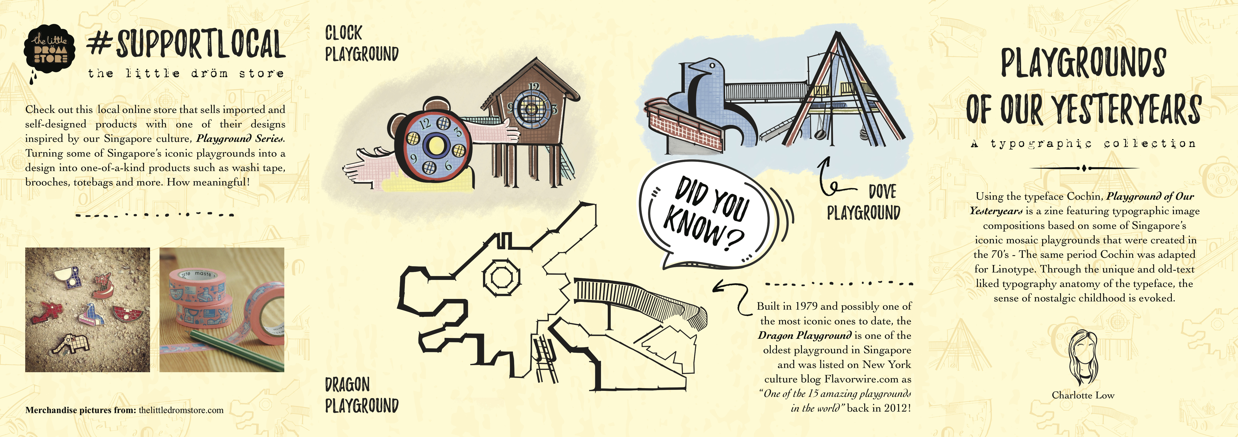
- Content Pt.2
-
- Zine: Poster (Inside)
To make the background of the zine look less flat, I added texture to create a vintage rustic look that somewhat gives a nostalgic feel and also something spontaneous; a pattern like wallpaper design overlay on the already textured background with lowered opacity 🙂
HERE IT IS!!
(click on images to enlarge as slideshow)
-
- How the zine looks like when folded

References:
- https://roots.sg/learn/stories/playgrounds-of-the-past/story
- https://roots.sg/learn/resources/virtual-tours/Mosaic%20Playgrounds%20in%20Singapore
- http://www.homeanddecor.com.sg/articles/94268-5-retro-playgrounds-visit-singapore
- http://www.straitstimes.com/singapore/revisiting-toa-payohs-iconic-dragon-playground
- https://thelongnwindingroad.wordpress.com/tag/bumboat-playground/
- https://thelittledromstore.com/collections/mosaic-playground-series
Overall, I’ve learnt A LOT from this project and module. Not just applying the usual typography concepts that we’ve learnt so far, but in this case to even analyse how the choice of typeface can affect the readers’ interpretation of the work. Also, layout and almost every design aspect needs to be taken into consideration. In fact, all the projects we had throughout this module had its own learning points. But if there’s one biggest learning point/takeaway at the end of the day, I would say is that my observation skills and appreciation for typefaces/fonts have really grown 😀
Looking forward to what Typography II has to offer!!