By this part of the project, I’m pretty convinced that it each part gets tougher and this was the one I struggled the most with. Unlike the first two parts – 3A & 3B where there was so much freedom, (for a lack of a better explanation) based more on the aesthetics we were going for rather than having an intended message/concept behind the composition.. This was the total opposite, the composition needed to make sense and translate the emotion with the word.
To begin, I misread the brief entirely thinking that we could come up with our own emotions when actually we could only chose 4 to work on from a list that was given in the project brief. Similarly like the first two parts of the project, using just one typeface we had to come up with four compositions expressing the word ‘HELLO’ in black and white, varying the weights, caps, spacing, sizing etc.of the typeface. Basically exploring techniques that do not involve manipulation of the typeface.
Once again, I’ve decided to use HELVETICA NEUE for my typeface reason simply being: There’s so many fonts that I can use from just this one typeface! But eventually I didn’t use that many, sticking to a few of the same fonts like Bold, Condensed Bold and Condensed Black as the thin weight fonts were really way too thin and I couldn’t figure out how to make use of Italics in this case.

So… as a result of misreading the project brief, blur me came up with experimentations on emotions that weren’t usable but I figured no harm documenting them. Luckily some could be further revised/explored as the emotions I had in mind were pretty similar to the list.
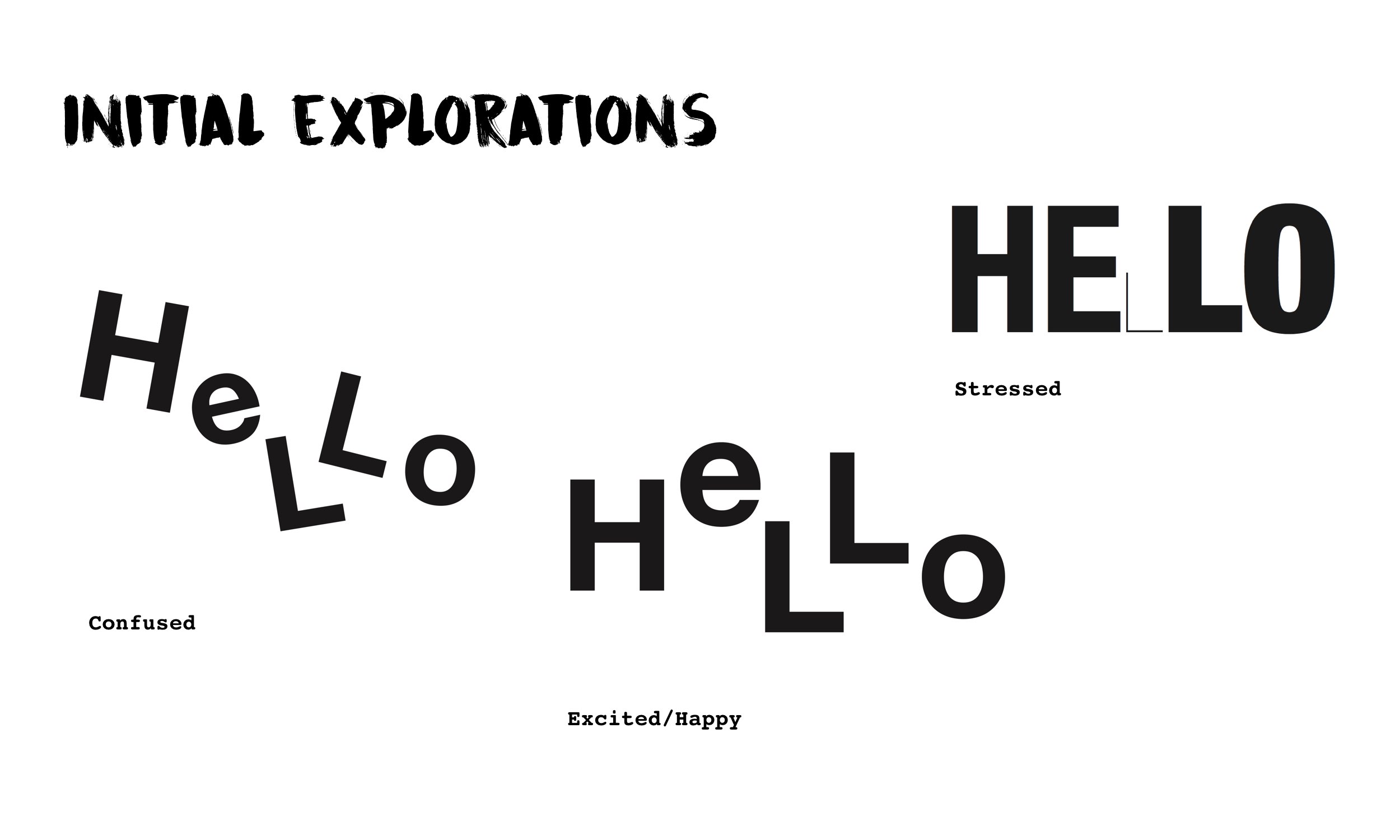
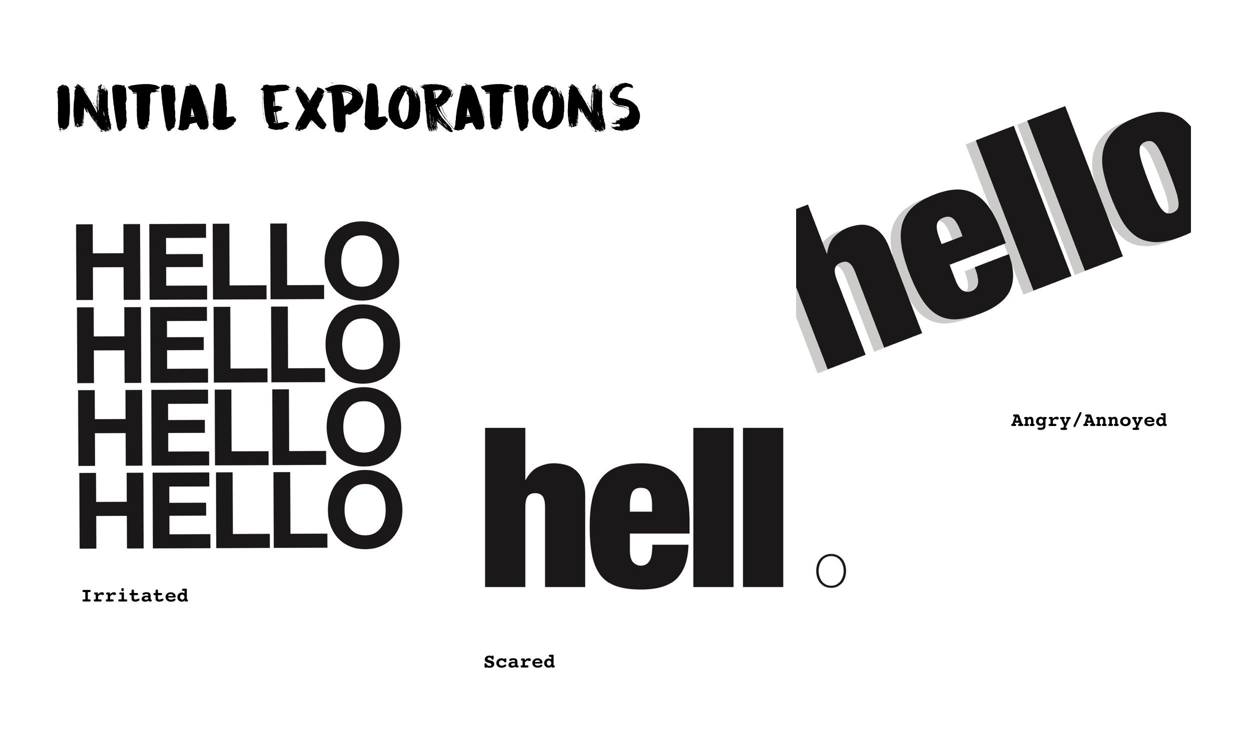
The emotions that eventually followed up with the initial explorations or settled on doing later on were: CONFUSED | ARROGANT | ANNOYED | DEPRESSED
1. CONFUSED
For Confused, I already had it under my initial explorations. My idea to express the emotion was to not have all the letters of the word not sitting on the same baseline and tilted in various angles.
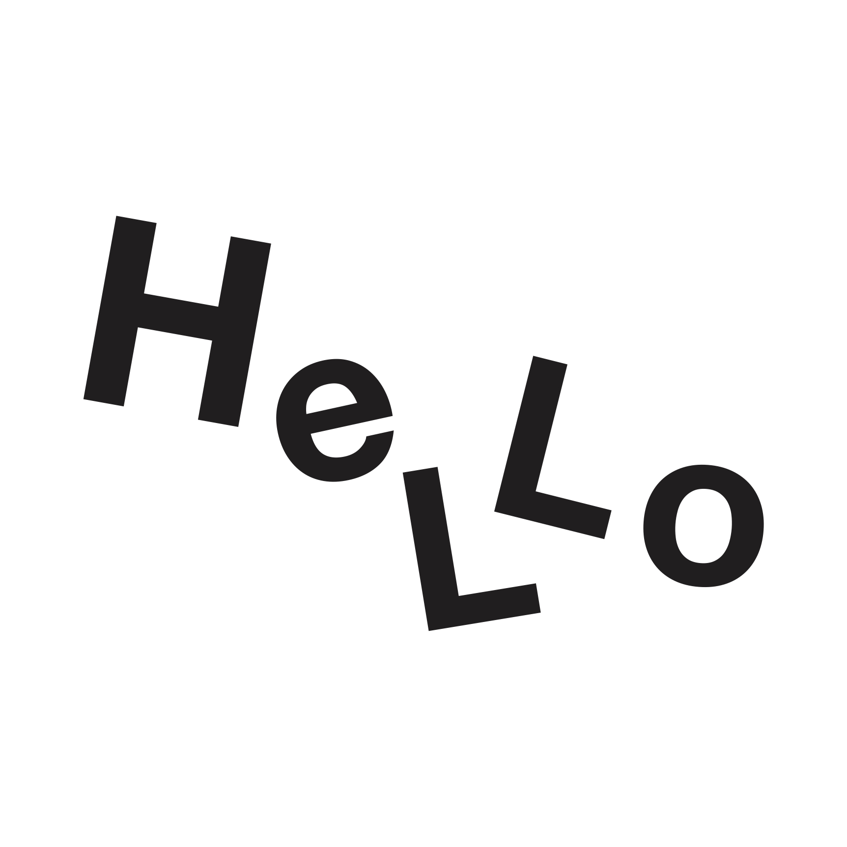
Original Version of Emotion: Confused
However after consulting with Shirley, she felt that the emotion could be better conveyed prompting me with questions like What would make you confused? to even popping ideas on how the image of confusion can be conveyed which led to this, a revised from my initial:
Final Version of Emotion: Confused
The new idea was to have the word jumbled up so much until it doesn’t make sense. Not sure if the emotion was thus brought across but I definitely felt that this revised is way less comprehensible and straightforward as compared to my initial one which creates that sense of confusion!
2. ANNOYED
Under initial explorations I somehow tried creating a composition for this emotion too despite having misread the brief as mentioned. Between the one labelled Irritated and Angry/Annoyed I was leaning more towards the one below that was labelled Irritated:
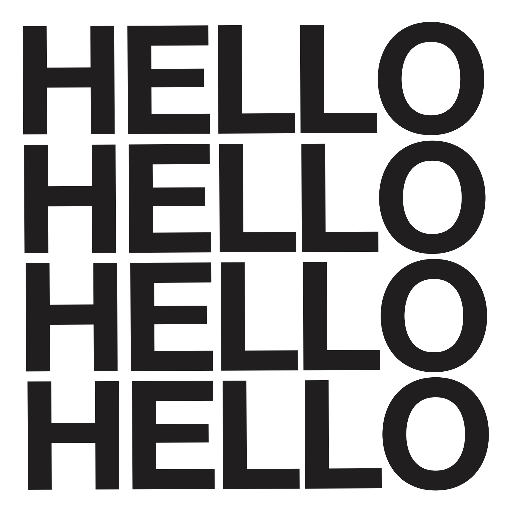
Original Version of Emotion: Annoyed
With the repeated uppercase ‘HELLO’ stacked above one another with tight leading, I was hoping to create a sense of annoyance, making one Annoyed. However feedback from Shirley was that the composition was very stagnant, it didn’t give such a feel as the leading intervals were really consistent. The words spaced out well. It would’ve probably been better if the leading was tighter? But way more room for improvement on this one! With her feedback in mind, here’s the final revised version:

Final Revised of Emotion: Annoyed
Pretty much stacking the repeated ‘hello’ word over one another after majorly reducing the kerning between the letters first. Some of the ‘hello’ words are inverse as well. I’m not sure if the emotion is better brought across this way as I was concerned that it might come off as the emotion of Confused as well. But this was my take on the emotion and idea of what might seem annoying!
3. ARROGANT
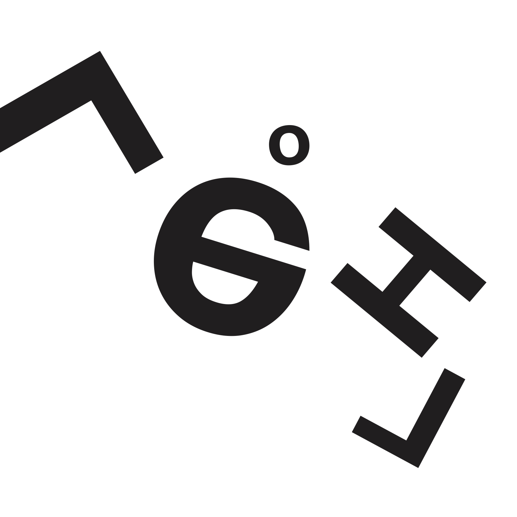
The composition idea for this emotion came after realising that I had misread the brief but looking back at the initial explorations I had, I felt that I was able to develop from the one that I had the initial emotion of Scared (which was unfortunately not in the list that we could choose from) to express it for this emotion:

From initial exploration of Emotion: Scared
With this composition form that I had for another emotion, on adapting it to suit the emotion of Arrogant.. I thought to retain the condensed and bold font of the word, isolating the letter ‘o’ as well. The ideation of this composition form is based of what I think about the emotion reflected on an Arrogant person in the context of thinking that he/she is better than others hence the exclusion from a group or something. Something like the idea of “you cannot be part of this” – leaning more towards a narrative/contextual intention behind it:
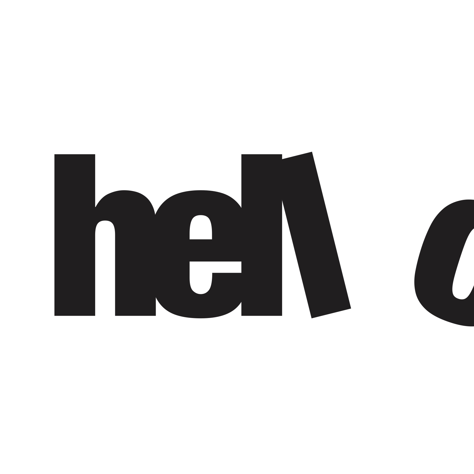
Final Revised of Emotion: Arrogant
So you can see how tight knitted the other letters are (expressed through a tight kerning) with the letter ‘o’ seemingly excluded by having it half out of the frame and the letter ‘l’ looking like a ‘kicking’ action.
4. DEPRESSED
For this last emotion, the composition idea was from scratch but I really went simple and literal for this based on my interpretation of the emotion – Everything, the mood is just dull, bleak, and dark hence the black background and the word ‘hello’ inversed to bring across that opposite mood from a happy and cheerful one and in a tonal range that’s almost close to the black background, and small in scale to show like it’s being drowned, engulfed by the surrounding.
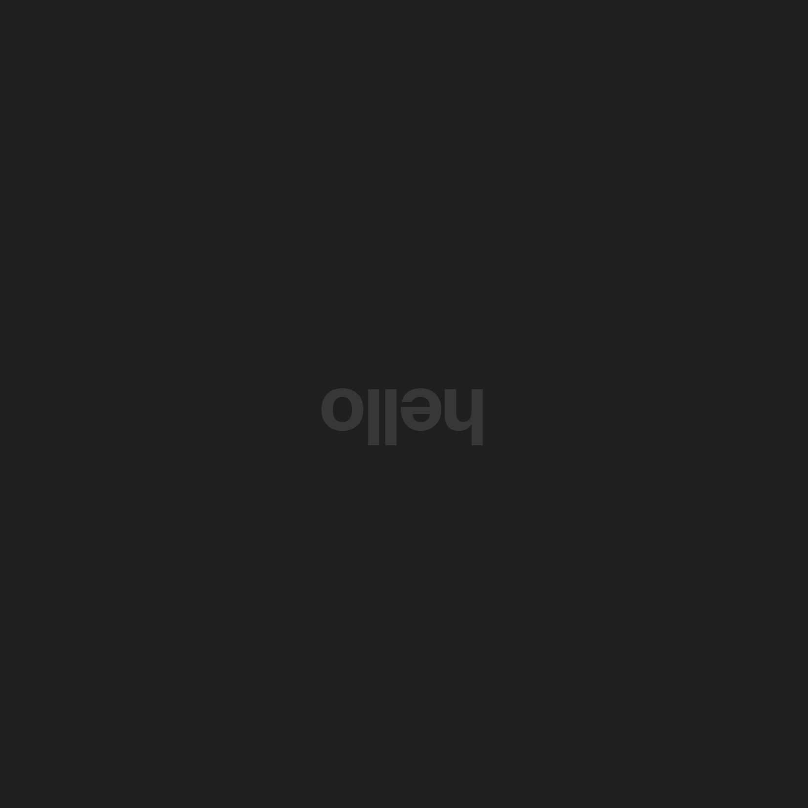
Final Version of Emotion: Depressed
For this project I had my parents, friends looking at the compositions; asking them what emotion they could derive from it. Some were successful, they guessed a similar if not exact emotion I was trying to convey but some didn’t. On the idea of interpretation, I feel it’s really subjective. What one person thinks of this may not necessarily be felt the same by another and perhaps the only way to overcome it sometimes in our works is to be quite literal I guess. In terms of expression. (sometimes simple really does work best!)
Overall I felt that this project though challenging, was a really interesting way to push and train us to communicate a message through typography. Something which I haven’t tried before! 🙂