By Charlotte, Hwee Ann and Leehwa

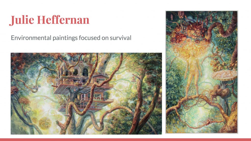
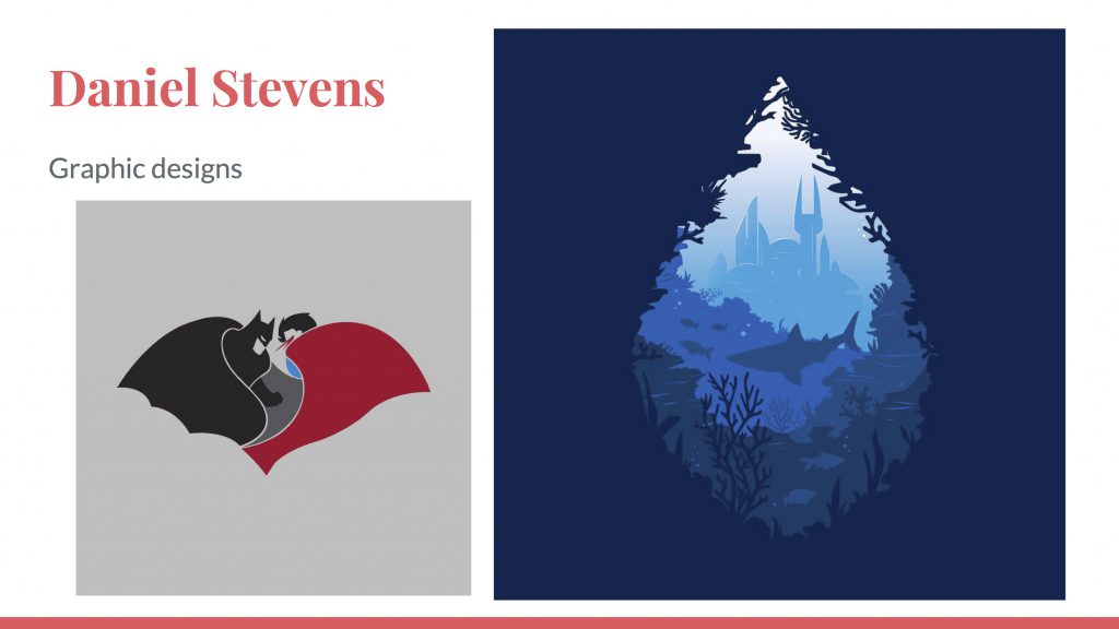
Here’s what that my group and I came up with for our presentation topic for 2D class which would be rather helpful for our final project, Ego In Different Settings.

We covered two areas namely:
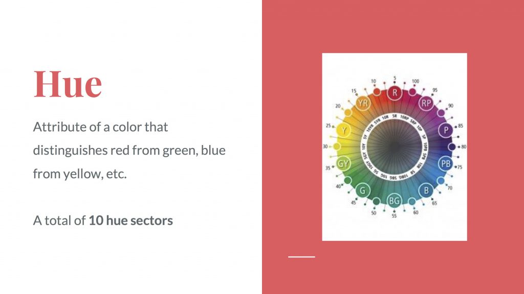
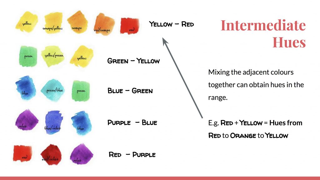
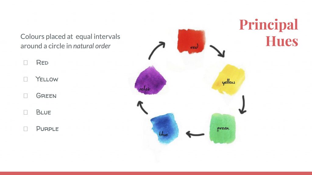
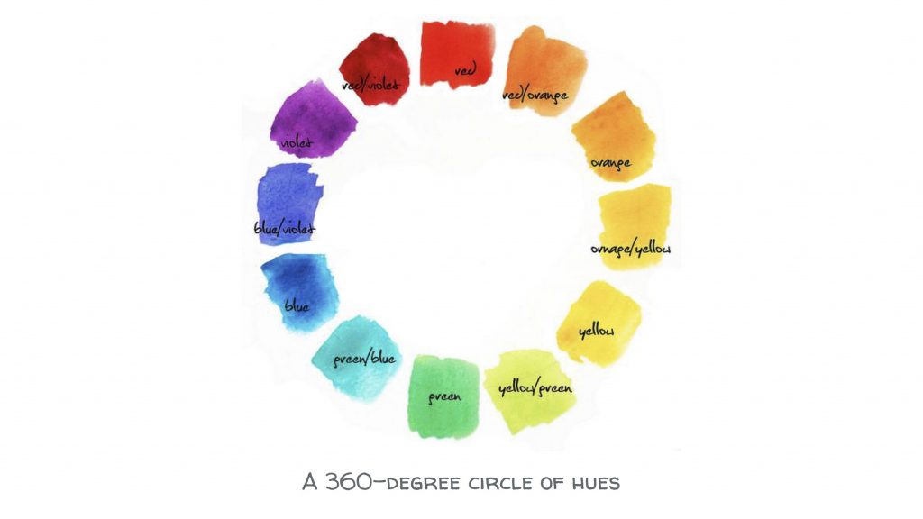
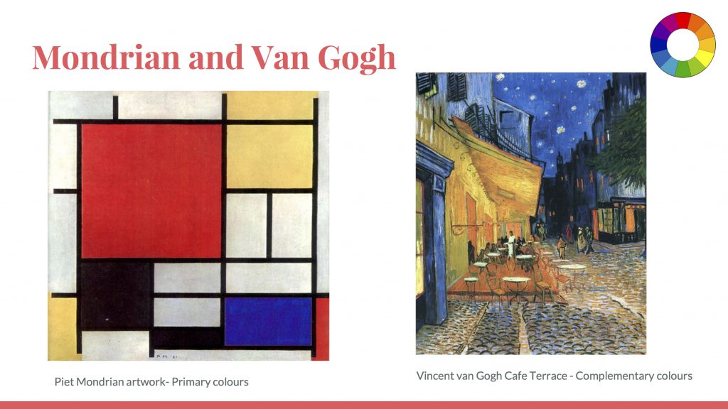
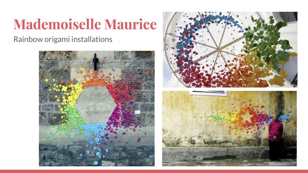
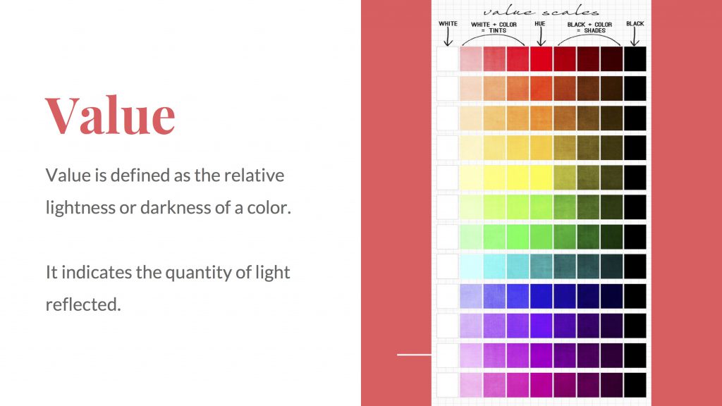
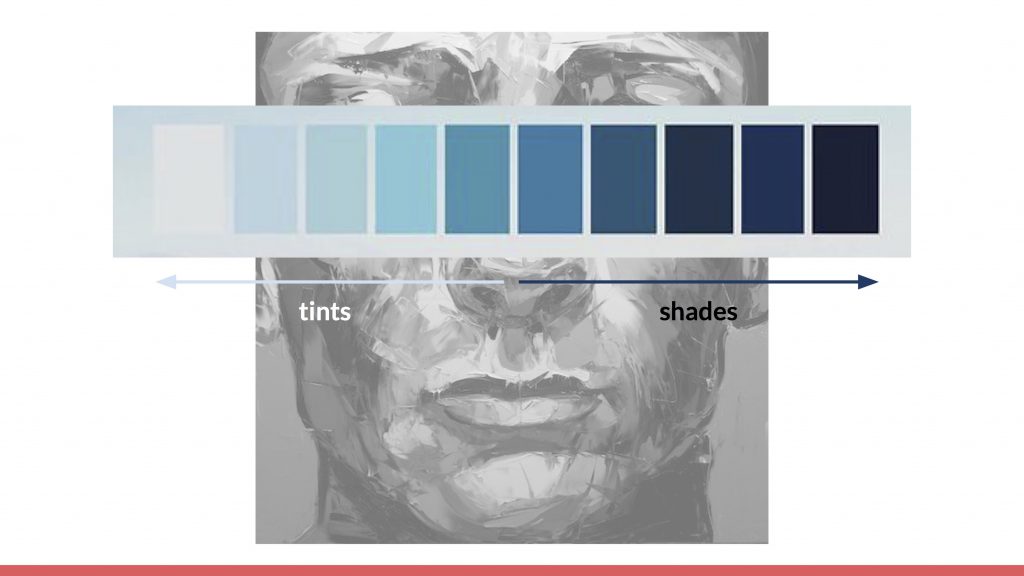
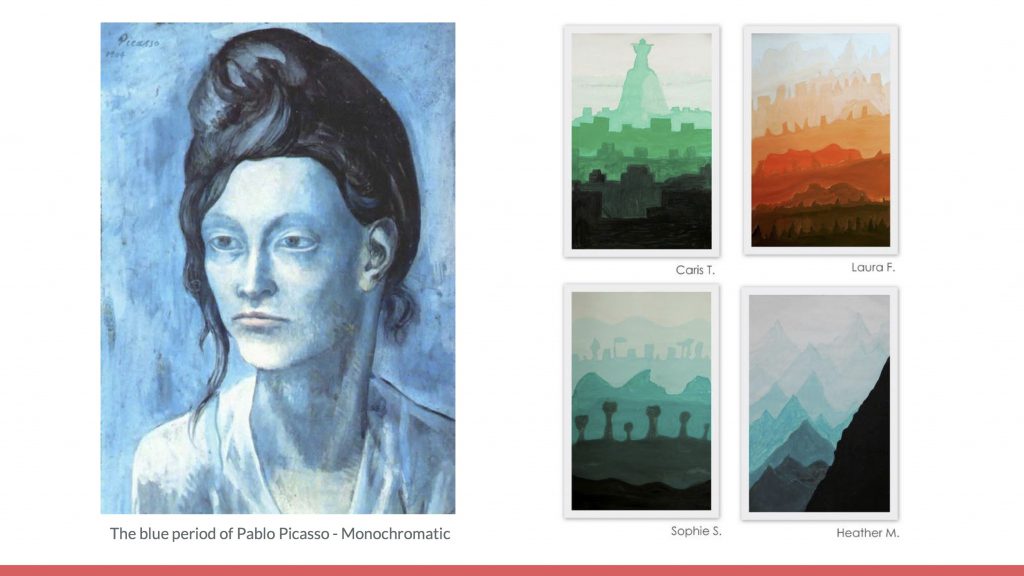
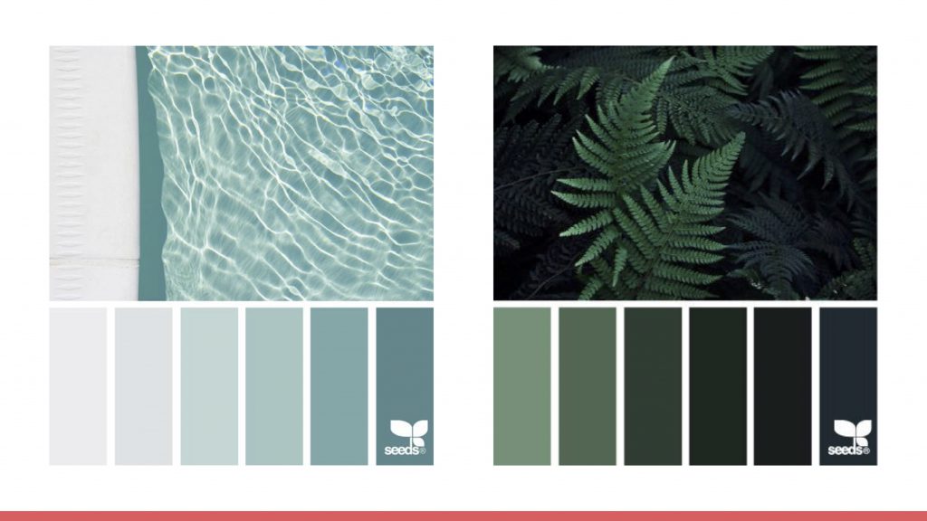
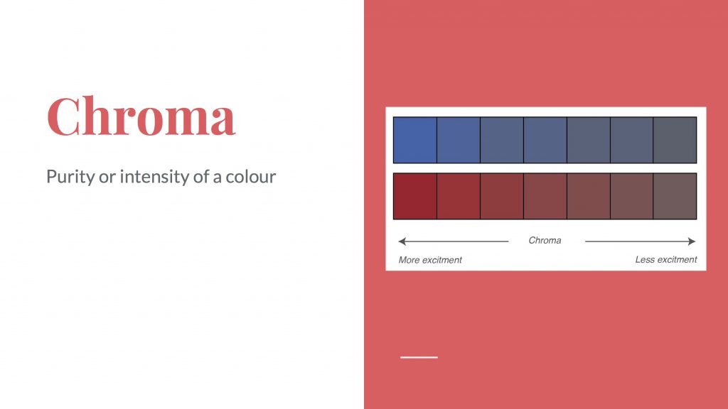
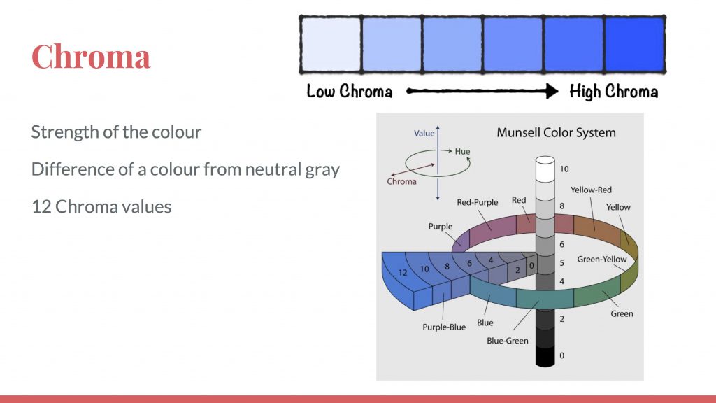
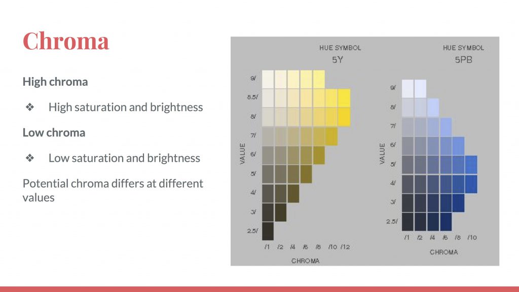
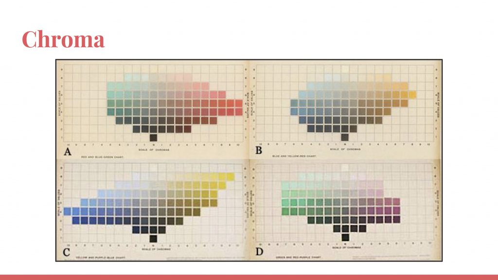
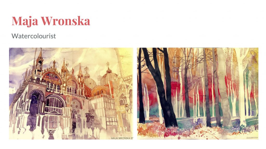
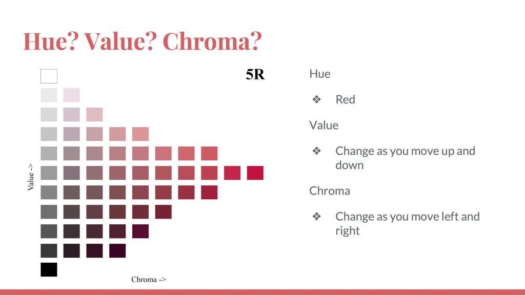
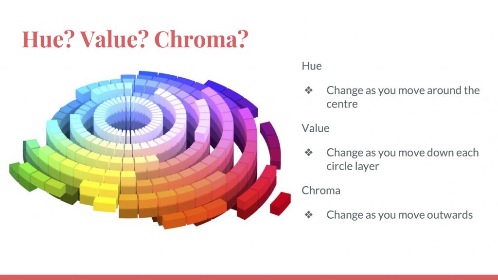
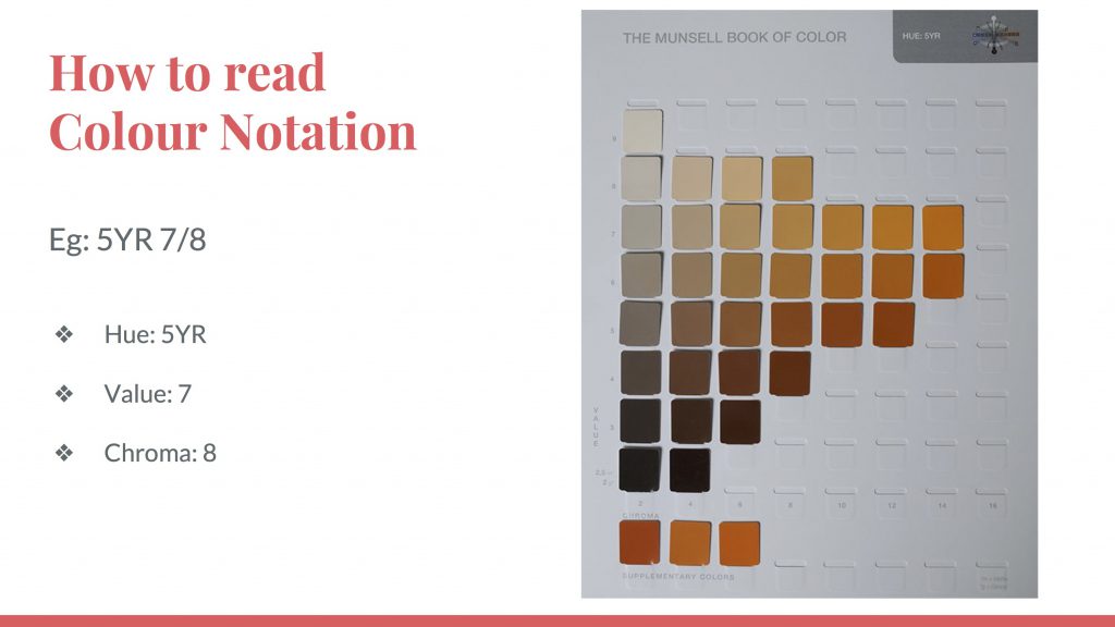
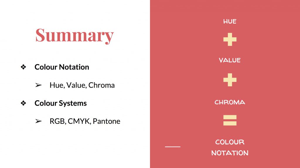
Colour Notation – Hue, Value, Chroma
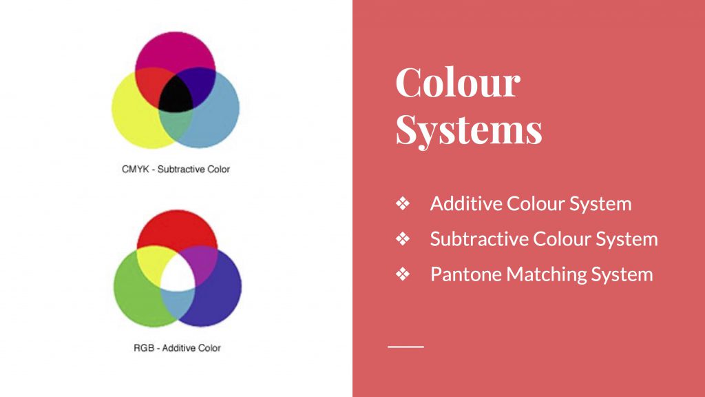
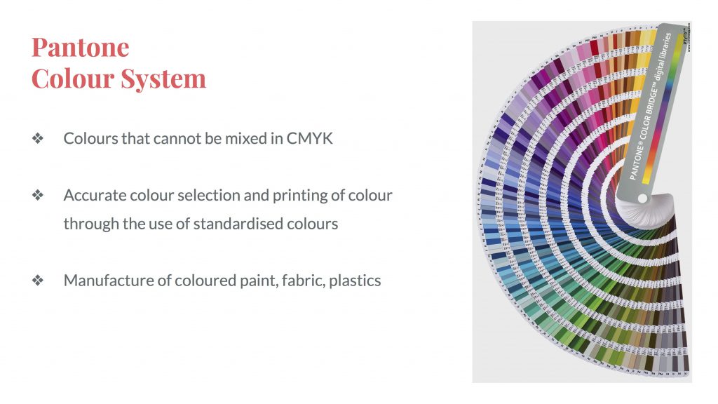
Colour Systems – Additive, Subtractive & Pantone

colour-notation-systems

colour-notation-systems-1

colour-notation-systems-3

colour-notation-systems-4

colour-notation-systems-5

colour-notation-systems-6

colour-notation-systems-7

colour-notation-systems-8

colour-notation-systems-9

colour-notation-systems-10

colour-notation-systems-11

colour-notation-systems-12

colour-notation-systems-13

colour-notation-systems-14

colour-notation-systems-15

colour-notation-systems-16

colour-notation-systems-17

colour-notation-systems-18

colour-notation-systems-19

colour-notation-systems-20

colour-notation-systems-21

colour-notation-systems-22

colour-notation-systems-23

colour-notation-systems-24

colour-notation-systems-25

colour-notation-systems-26

colour-notation-systems-27

colour-notation-systems-28

colour-notation-systems-30

colour-notation-systems-31

colour-notation-systems-32

colour-notation-systems-33

colour-notation-systems-34

colour-notation-systems-35

Here’s a documentation of the final stages of Forrest Gump, a more in-depth explanation of the execution of each of the four compositions, some challenges faced and the concept. Similarly as with the first project, there might be a little overlap of documentation that may/may not have been mentioned in my previous work-in-progress posts.

CONCEPT:  This project somehow took on a patriotism theme where all compositions were in Singapore context – the issues/happenings in the Singapore scene. As the first 2 compositions that I’ve came up with were swaying towards that direction.


EXECUTION: In terms of execution, it took me a few tries for some of the compositions to get to how they looked like for submission but there were some that came naturally too.

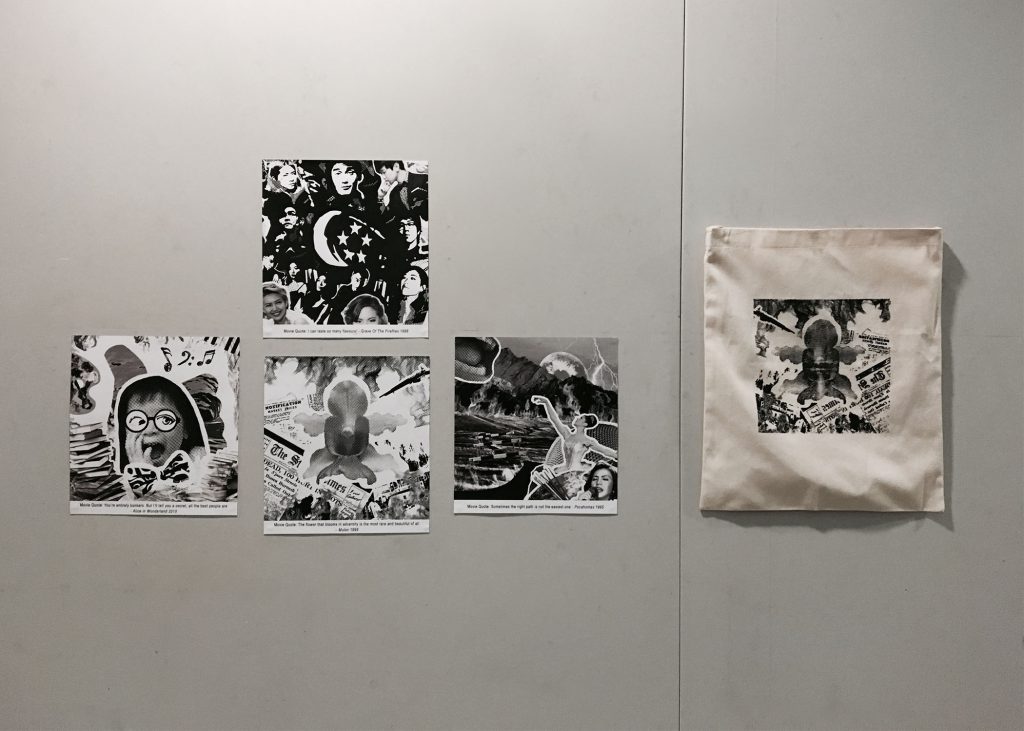
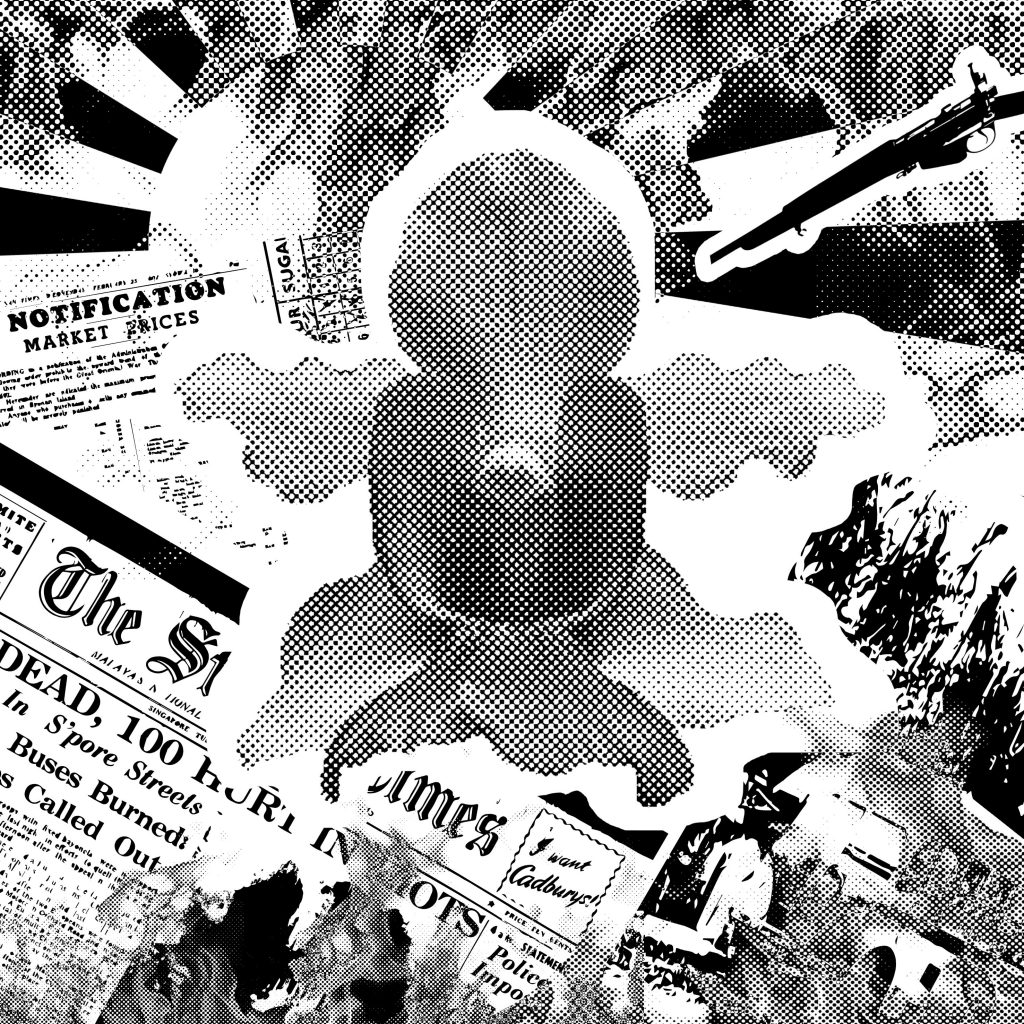
1. “The flower that blooms in adversity is the most rare and beautiful of all.” – Mulan (1998)
adversity-final

Based on Singapore’s history

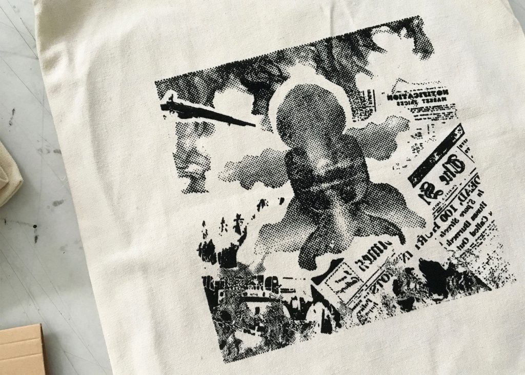
The first composition which also turned out to be the chosen composition for printing onto the tote bag as I felt that it had significance. It felt like the core of all the 4 compositions which would be further explained in the CURATION part of this post at the back.

This quote is based on one of my all-time favourite Disney movies, Mulan and the idea came about after a clarification with Joy on the execution of the assignment and thereafter sharing with her several ideas that I’ve came up with for the chosen quotes. What I did  (as with all the other 3 compositions) was to mark out the keywords from the quote and then bring out its essence in the composition created. So I thought it should be literal but I was then told that the quote could totally take on a whole new interpretation – giving it a storyline etc. It need not be related to the movie.

I went back thinking about the quote, the word flower and adversity was still stuck in my head. Then suddenly the thought of Singapore going through the tumultuous times came to mind. Adversity: Represented through the tumultuous times of Singapore – The bus riots, Japanese occupation etc. I found some visuals from that period online. Flower: The national flower of Singapore, Vanda Miss Joaquim. It could represent Singapore in this case, and I intentionally placed it in the centre of the composition, it in bloom to bring out the phrase “blooms in adversity”  as well as to show the beauty of it having been through all these adversities.

What you see is the revised version of the composition after having gone through consultation with Joy where she suggested for all the elements to be pointing towards the national flower so that when viewed

If you compare the composition shown in the consultation post and this composition , you’d realise that the bus which reflects the Hock Lee Bus Riots was pointing in another direction whereas the bus here is following the approach of convergence.


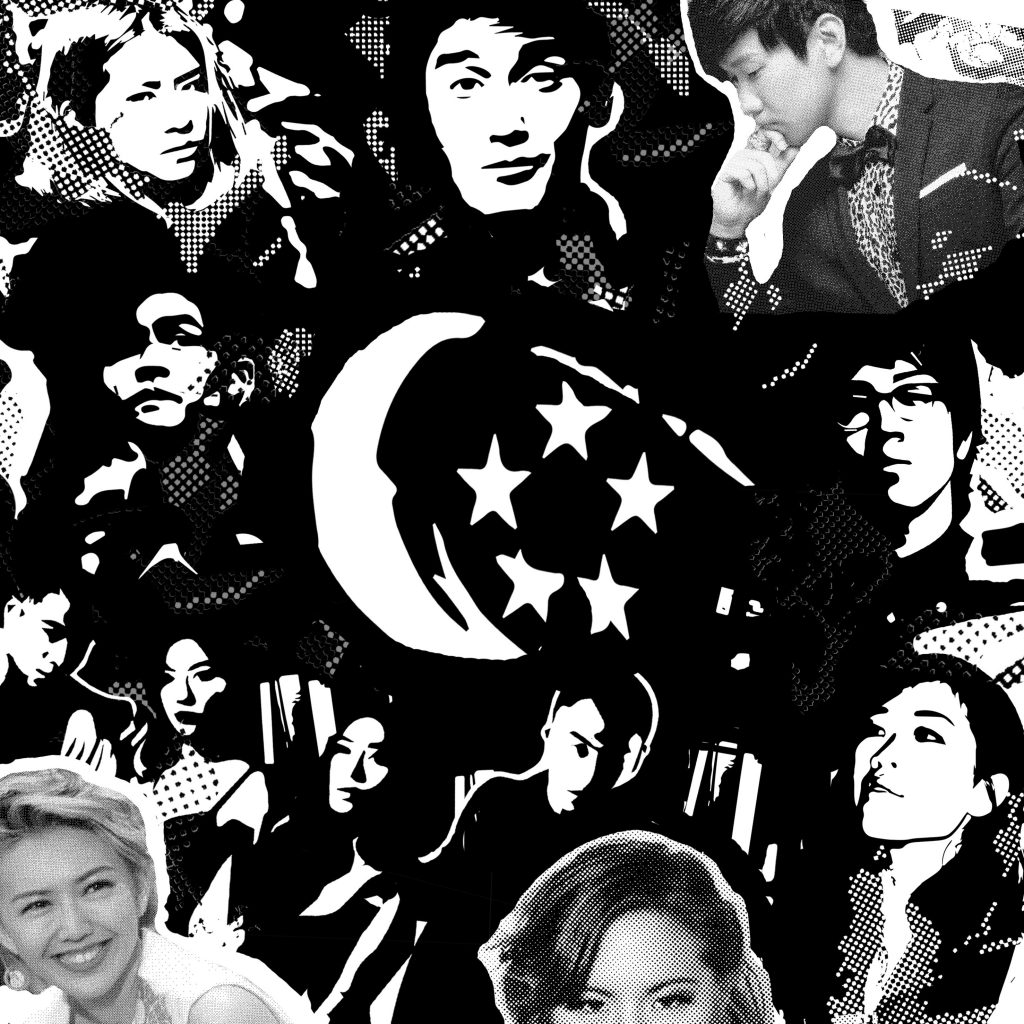
2. “I can taste so many flavours!” – Grave Of The Fireflies (1988)
flavours-final

Based on the Singapore music scene

This was the second composition I came up with. It’s based on a quote from one of my favourite Studio Ghibli movies from 1988, Grave of The Fireflies. I couldn’t think of how I want to  create the composition at first but wanted to closely relate it to the word taste and bring out the word flavours as well (my identified keywords from the quote).

I searched for the definition of taste and found:

taste

v.tast·ed, tast·ing, tastes

v.tr.

1. To distinguish the flavor of by taking into the mouth.
2. To eat or drink a small quantity of.
3. To partake of, especially for the first time; experience: prisoners finally tasting freedom.
4. Archaic To appreciate or enjoy.
v.intr.
1. To distinguish flavors in the mouth.
2. To have a distinct flavor
3. To eat or drink a small amount.
4. To have experience or enjoyment; partake

It could also mean the taste of something you’ve experienced. It need not necessarily be related to tasting food. As I studied Mass Communication in polytechnic, we were exposed heavily to the media scene. Singapore especially. That’s when I slowly got to know of Singapore music and took a huge liking to it. So I figured why not base it on that? This composition is rather personal I guess.

Flavours:  In this context, it is the different music genres in the Singapore music scene and Taste: The different music genres I’ve listened to. My reason for choosing these few singers in particular when there are so many around is because over the years and in recent times, these singers have one way or another represented Singapore in countries like China, Korea and many more. They are pretty much the country’s pride and the more popular and prominent ones around to date. Also, they each represent a different music genre. e.g.

The Sam Willows: Folk-pop
Charlie Lim: Jazz/Blues
iNCH: Indie Rock
Gentle Bones: Pop, R&B
Nathan Hartono: Pop, Jazz
JJ Lin/Stefanie Sun: Mandopop

and more. After creating this composition, I realised I was swaying towards the theme of patriotism.


3.“You’re entirely bonkers. But I’ll tell you a secret, all the best people are.”  – Alice in Wonderland (2010)

bonkers-final

Based on kiasuism in Singapore

The third composition did not turn out like this. If you’ve been following my earlier post on the consultations I had with Joy, you would have realised that it was based off the movie itself (Alice in Wonderland) with the Mad Hatter as the main character not a kid.

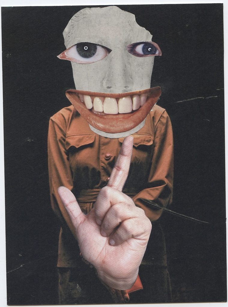
The keywords in this quote were bonkers and best. Since I was going along with the concept of patriotism, I changed up the composition with the intention of showing the kiasu (a.k.a scared lose) culture that’s present in Singapore among parents and their young kids, still preserving some of the elements from the initial composition featuring the Mad Hatter.

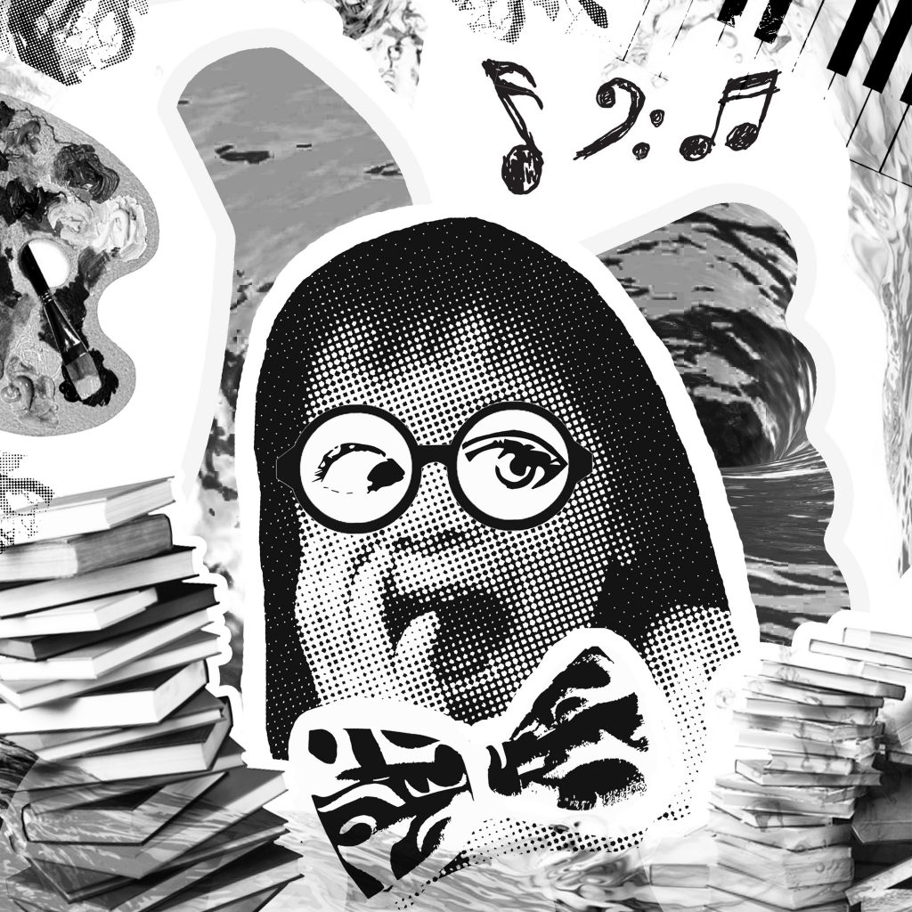
The phrase “you’re entirely bonkers” is directed to the parents who send their kids to pick up many different skill sets when they young e.g. tuition, arts, music – as seen in the images used in the composition and then “all the best people are” is shown through the focus on the kid where they would definitely stand at advantage as compared to other families’ kids by being the smarter one when they grow older (note: the bow tie used as a symbol for smart).

As mentioned in the consultation post, by having a flat bitmap/image traced image I didn’t think it would bring out the word bonkers in the quote. Through the research done for the original composition,  I tweaked the current one to fit the patriotism concept and applied the various art styles of adding a nerdy looking spectacle frame over the kid’s face with blown up proportions of the facial features for emphasis.

I remembered that Joy had suggested that I could use recognisable Singapore logos like the Popular Bookstore logo etc. to give it the additional Singapore touch. I tried but it somehow did not match the aesthetics/look I was trying to achieve for the composition.


4.“Sometimes the right path is not the easiest one.” – Pocahontas (1995)

noteasy

Based on a stigma in Singapore

A little backstory about this last composition… I didn’t intend on using this quote. I wanted to create another composition based on the second quote: “I can taste so many flavours” but with a more literal approach of having many various flavours in food and how it we taste it through our tastebuds: sweet, salty, sour, bitter, spicy and more.

And for a Singapore context, I wanted to use our local delicacies, each dish/food representing one taste but as i got down to doing it it was tough. As there were way too many local delicacies around and placing them in the composition would just create yet another collage-looking direct representation composition of the same quote. It will look very much similar to the music one.

Plus after exploring bitmap and image trace on the dishes and food, they still looked flat despite trying out the various techniques. It didn’t turn out that nice. So based on another quote, I came up with this composition that’s inspired by this stigma in Singapore quite last minute.

The keywords I identified this time round were right path and not the easiest. In Singapore context, right path: interpreted as following what you think is right in your heart, for example chasing/pursuing your passion. And for the passions that has got to do with the arts, it is more often than not not the easiest path to take. Some parents are still apprehensive of such passions and I portrayed it in the composition through the use of symbolism.

  • Path: I literally used a path, a winding one in particular and it seems like there’s no end point to show how arduous the journey might be. Placing further emphasis on the phrase “not the easiest path” in the quote.
  • Hurdles, mountains: Literal representations of obstacles
  • Flames: As fury from disapproving parents on pursuing the arts in Singapore plus a disapproving looking mouth at the top left corner of the composition
  • A collage of various arts in Singapore at the bottom right corner of the composition: Esplanade (representing theatre), famous local singer Kit Chan (for music), a ballerina (for dance), art palette (for fine arts) I purposely chose the images based on Singapore context.

CURATION

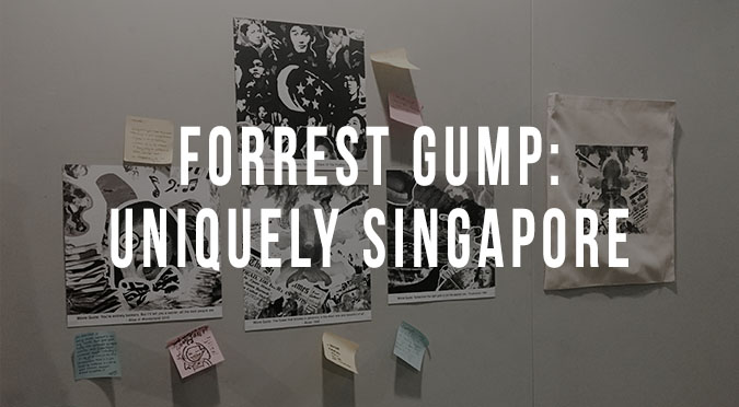
final-02

I had a eureka moment for curating my compositions for presentation day. As I was doing the compositions, the thought of arranging them to form another flower came to mind, bringing me back to the point of the first quote as being the core of all the compositions as mentioned at the start of the post.

The first composition is the bud of the flower (the core) and the other 3 branching out as the flower petals. All of these makes up Singapore, reflects the beauty of the country how it has blossomed over the years.


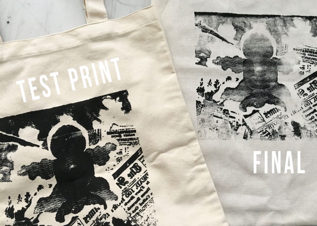
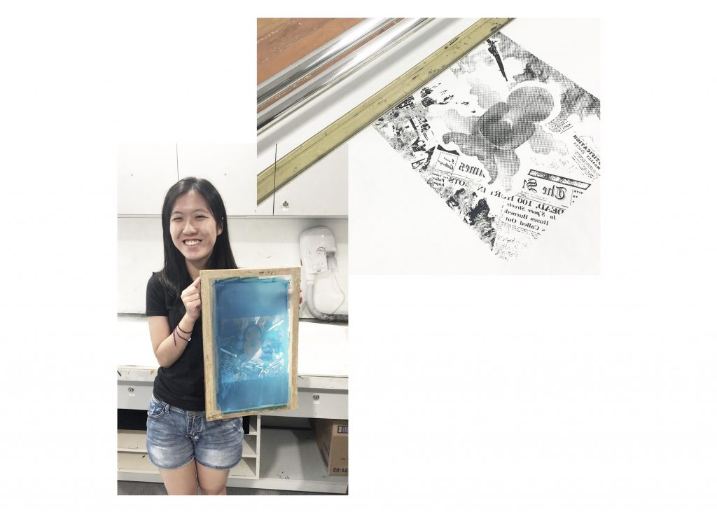
CHALLENGES FACED: As with all assignments, none of it would be exactly smooth sailing. Maybe slightly better but there’s bound to be hiccups along the way. For  this project, it kind of came at close to the end. I believe with most of us, it’s the silkscreen bit where we had to print our chosen design onto the tote bag for submission. Sure it may have turned out fine previously on newsprint paper during the trial week but on the tote bag it came out otherwise… (W-H-Y)

What Joy suggested for us to do before printing onto the tote bag was to test print the design onto a similar material so as to check its results. I only brought one recycled tote bag of similar material to try out but I might have used too much ink and force resulting in a heavily smudged print (bottom left). So I had no choice but to gauge and try out on the final tote bag the second time round.

Failed once again… the fine details of the composition did not come out fully and I was really apprehensive of trying out the third time as it was the last side I had of the tote bag and if I fail once again that meant I had to invest in a new one as it was required for submission on presentation day. Guess it was do or die… Surprisingly the fine details of the composition were printed on nicely this time round and I managed to get l my desired print  (bottom right) so yay and phew! 🙂

final

final-01

Silkscreen end product

Overall I really enjoyed this assignment from start to end. At the beginning of the assignment, I would’ve never expected that I would create 4 entirely different patriotic compositions from 4 very different movie quotes. I guess that’s the beauty of art, you’ll never know what you’ll end up creating.

Even though we all were given the same project brief, all of us came up with very different compositions which were all interesting in their own way.

Now onto the final project!! 🙂

So we went through the individual and group consultations the same as with the first project. Individual consultations with Joy was done the week before we exposed our screens for silkscreening and I’ve already came up with 3 designs by then. Unfortunately, the designs lacked a common theme. I was too fixated on re-interpreting the quotes that I didn’t realise. But somehow 2/3 of the designs that I’ve already come up were swaying towards the theme of patriotism, they were very Singapore contextualised.

adversity

“The flower that blooms in adversity is the most rare and beautiful of all.” – Mulan (1998)

This is the very first composition that I came up with and Joy suggested for me to flip the direction of the bus in the composition such that all the elements are pointing at the flower. Making the flower the focus.

consult

“I can taste so many flavours!” – Grave Of The Fireflies (1988)

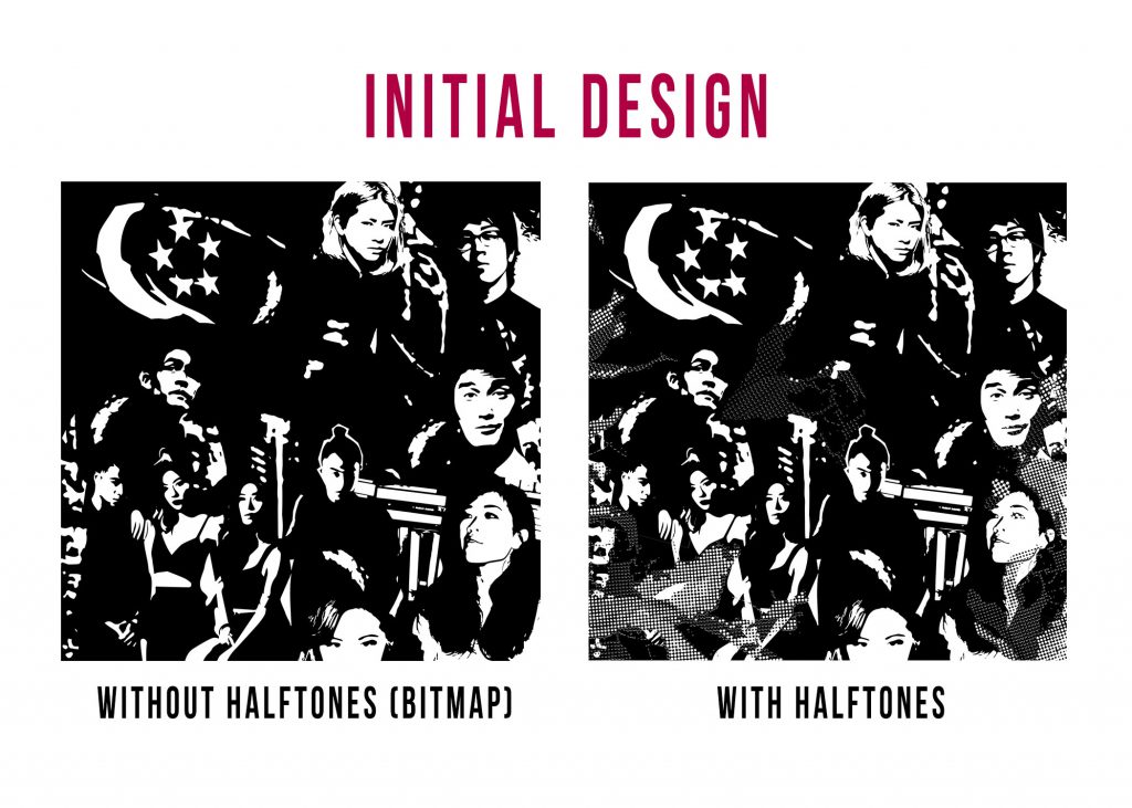
For the above composition the only issue had was that the Singapore flag did not stand out and it looked a little cluttered and too flat (left). I did not know how to go about changing it but added some halftones to enhance the composition (right).

Later on during group consultations, I figured that I could make the flag the focal point of the composition as well which is the approach I took on later for the remaining two compositions for consistency and emphasis.

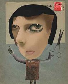
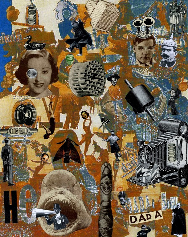
Throughout the project, I explored various techniques and was inspired by several art movements and artists – Dadaism and artist Hannah Hoch were my two main references for the project. In particular for the composition below that’s based on the quote: ““You’re entirely bonkers. But I’ll tell you a secret, all the best people are.” – Alice in Wonderland (2010) 

As I felt that a bitmap/image traced composition wouldn’t be able to bring out the word bonkers within the quote especially when there’s no colours, it felt a little too flat for me but applying these art styles helped.

bonkers

“You’re entirely bonkers. But I’ll tell you a secret, all the best people are.” – Alice in Wonderland (2010)
 

Some works by Hannah Hoch and the Dadaism art movement

hh1 hh

hannah_hoch_fake_dadaism

Joy commented on how it was a good experimentation and since the compositions had to take an overall theme. We bounced off several ideas which was then evident in the composition I had for submission.You’ll get to see the final composition for this quote in my final post that’s coming up next. 🙂

She suggested the idea of parents sending their kids to various kinds of classes learning various skill sets at a young age so as not to lose out which is a crazy act in a sense but turns out it’s the best as their child will turn out smart.

So those were the 3 compositions I had as of then and it was slightly different for group consultations this time round. As it was conducted during the silkscreen workshop week, my group was the last to try out the full silkscreen process thus when it came to our group’s consultation we kind of ran out of time and within my group only a few of us got to share with the rest their ideas. For me it went back to pretty much a one-on-one consultation with Joy again because the rest of my members went to expose their screens as were running out of time haha :). But I managed to see my peers’ works and gave suggestions and input and they all had really interesting ideas.

More sharing to come in the final post, especially on the execution and ideas for these compositions. Stay tuned!  🙂

When we were given the second project brief, the silkscreen part of the assignment brief instantly caught my eye. I was super excited and looked forward to it the most. At long last, there came the week i’ve been waiting for. We were actually going to our very own screens to print one of our chosen compositions onto a plain tote bag that’s provided as a deliverable for submission. (*internally screaming* :D)

I’ve always wanted to experience the silkscreen process from start to end as I’ve only ever tried printing before where there’s already an exposed screen (like a stencil). It was a really fun experience: From emulsifying the screen to exposing the design onto the screen and then trial printing on newsprint paper. Spreading emulsion over the screen to prep for exposing was quite tricky. As to coat the screen evenly, a correct angle is required when applying but everything worked out eventually.

screen

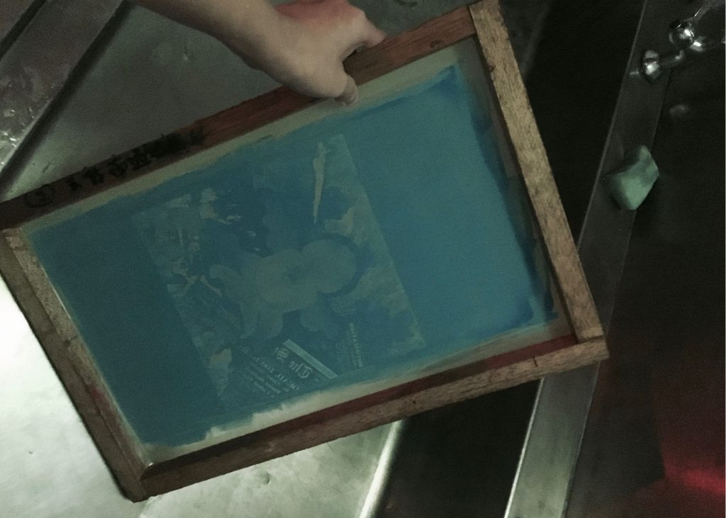
Here’s my screen after exposing 🙂 It was so cool to see the design slowly and magically appear on the screen as we used the water jet to spray.


ss

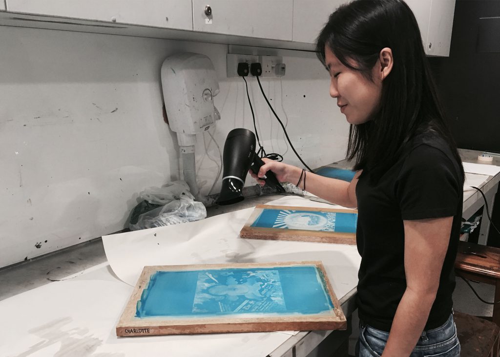
Drying the screen before printing.

Prior to the silkscreen workshop, we were given a quick crash course on Illustrator & Photoshop by one of our seniors, Xiuming and also how to achieve gradients in our compositions when doing silkscreen through halftone that’s achieved by bitmapping the images on Photoshop. That tutorial session was really helpful as I only ever knew that halftones was required to achieve a gradient look for the composition when printed using silkscreen, but didn’t know how to get the effect using photoshop. So thank you Xiuming! 🙂

ss-01

I couldn’t wait to get the design printed onto the tote bag already! But ah, printing on the tote bag itself… that was quite a bit of a mess. I’ll share more about it in my final post under the challenges faced.

Password: wonderland


CONCEPTUALISATION
When we were first given the assignment brief, I was totally clueless as to how I should go about with this project. But after giving it much thought and looking at it simply, I managed to come up with an idea/concept. Since one of the suggested ideas in the brief was “Dreams” I immediately associated it with it as being whimsical of sorts. That led me to gain inspiration from Alice in Wonderland, one of my all time favourite films.

aliceinwonderland

The roadblock faced was when I remembered we have to show at least three key transformations in the sequence. My initial idea was simply to adapt a miniature concept based out of the film by making it have an “everyday life situation” kind of concept but realised I couldn’t bring out three key transformations.

I was stuck for a while but later on realised that I could achieve it by taking a step further having been inspired by the movie. Instead, I decided reference a famous quote from the movie/book:

“Sometimes I believe in as many as six impossible things before breakfast.” – Alice

The six impossible things that she believed in are:

1. There’s a potion that can make you shrink
2. And a cake that can make you grow
3. Animals can talk
4. Cats can disappear
5. There’s a place called Wonderland
6. I can slay the Jabberwocky

I used each impossible thing as the key transitions for my sequence and formulate a storyline out of it, with each impossible thing being tweaked into a more realistic/personal context as follows. They were portrayed in respective frames (according to its order of appearance):

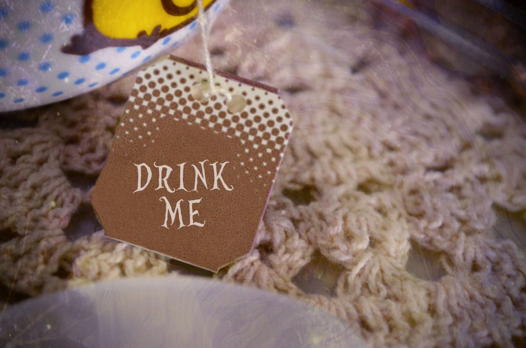
  • There’s a potion that can make you shrink:  I conveyed this idea this through photoshopping a layer of text over the original tagging of the teabag in the font of ‘Alice in Wonderland’ and the same text on the shrinking potion bottle found in the film.

potionshrink

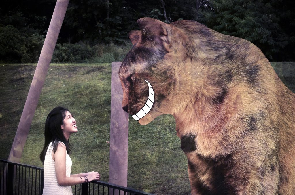
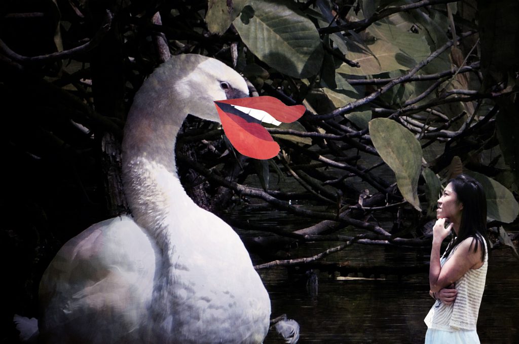
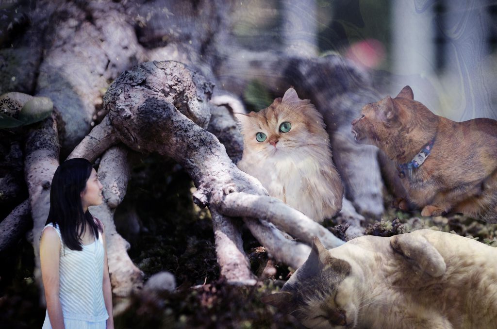
  • Animals can talk:  For this, I got inspiration from medium techniques like Dadaism and collaging, superimposing open mouths over the animals to make them look like they are talking and also, them being significantly larger than me since I was small in that world.An artist reference used here would be Hannah Hoch (below are some of her works) in comparison to my frames.

hh hh1

animaltalk

animaltalk1


  • Cats can disappear: This was shown through consecutive frames, the first one filled with cats and the next without, similar to a stop-motion.

disappear1 disappear2

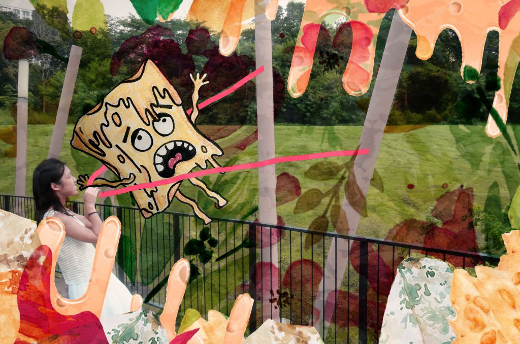
  • I can slay the Jabberwocky: Rather than taking the same story idea of Alice slaying the Jabberwocky (the dragon monster in that world), I decided to take on a personal approach of me conquering my fears instead. As I dislike cheese, the monster in this context is a Cheese Monster as created by me. I drew the monster and tried to portray me overcoming the fear of cheese by “shooting it away” using an imaginary catapult. Afterall it’s a dream haha.

cheesemonster

  • A cake that can make you grow: This is shown through the final few frames when I return back to the normal world. I felt that the idea of this particular impossible thing could have been further developed in the sense that there could have been frames showing me growing back in size since evidently I shrinked before entering the world that is Wonderland.

cake

cakegrow

  • There’s a place called Wonderland: This impossible thing I would say was this whole short sequence of 90 frames itself which conveyed the idea of an alternate universe existing and that I’ve visited that world, in my dreams.

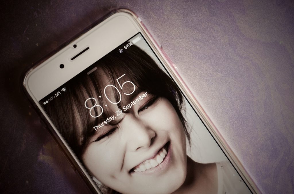
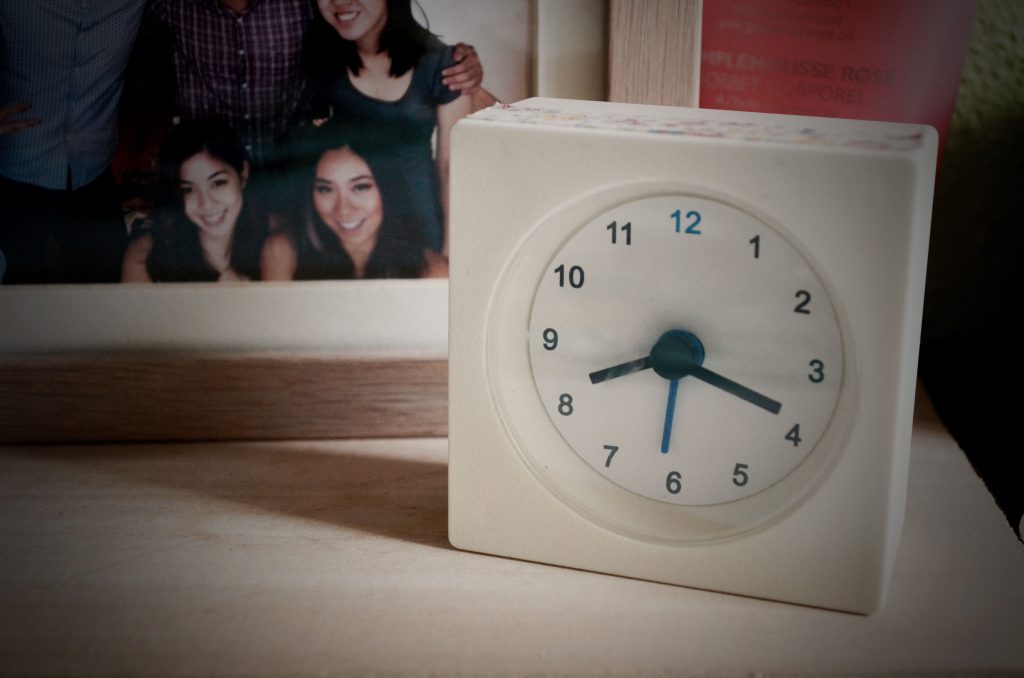
EXTRA EMPHASIS: I made the duration of these two particular frames slightly longer than the rest so as to place emphasis on the timings. The first frame showing 8.05am and the second 8.20am. I wanted to convey the idea that this whole thing has been a dream. However I felt that this idea could have been conveyed better as I think one would only understand after hearing my explanation, that it couldn’t be interpreted without knowing the context.

Starting frames:
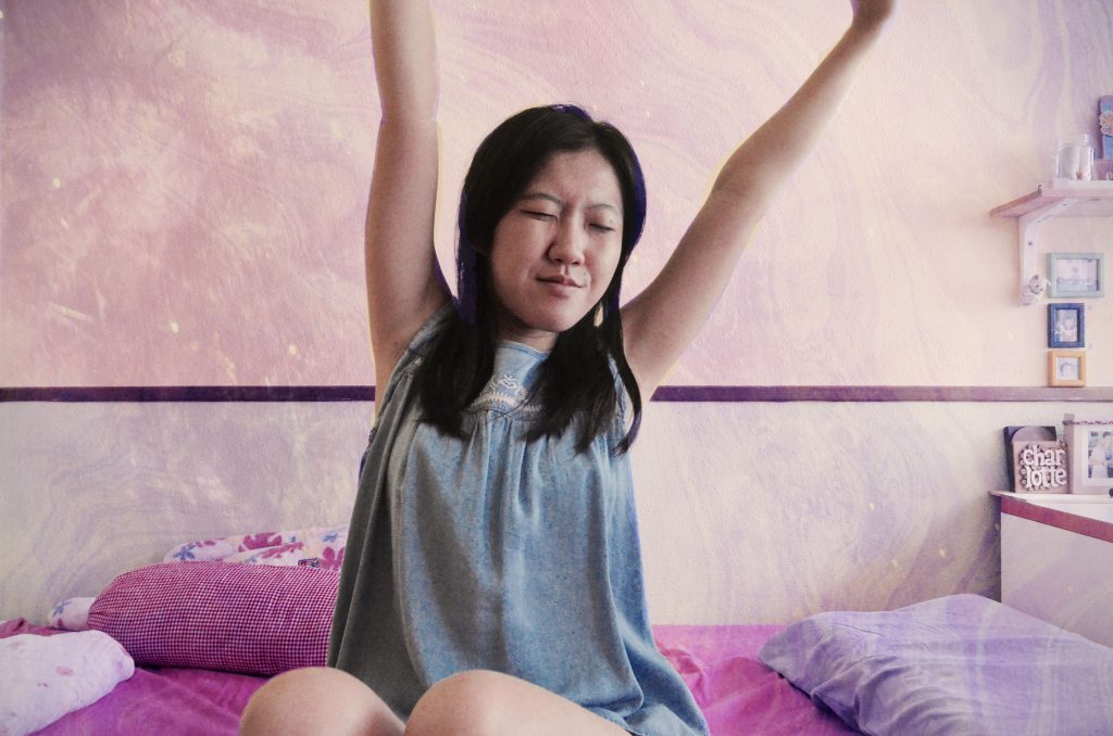
Me waking up to the sound of the alarm when actually it was in my dream that i woke up

wakeup1

wakeup

wakeup4

time0

Final few frames: 
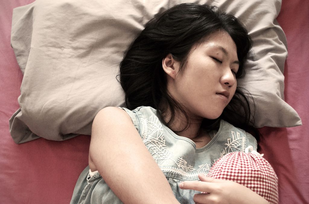
Me waking up to the sound of the alarm again but this time going back to sleep after checking – the real scenario

wakeuptime

wakeup2


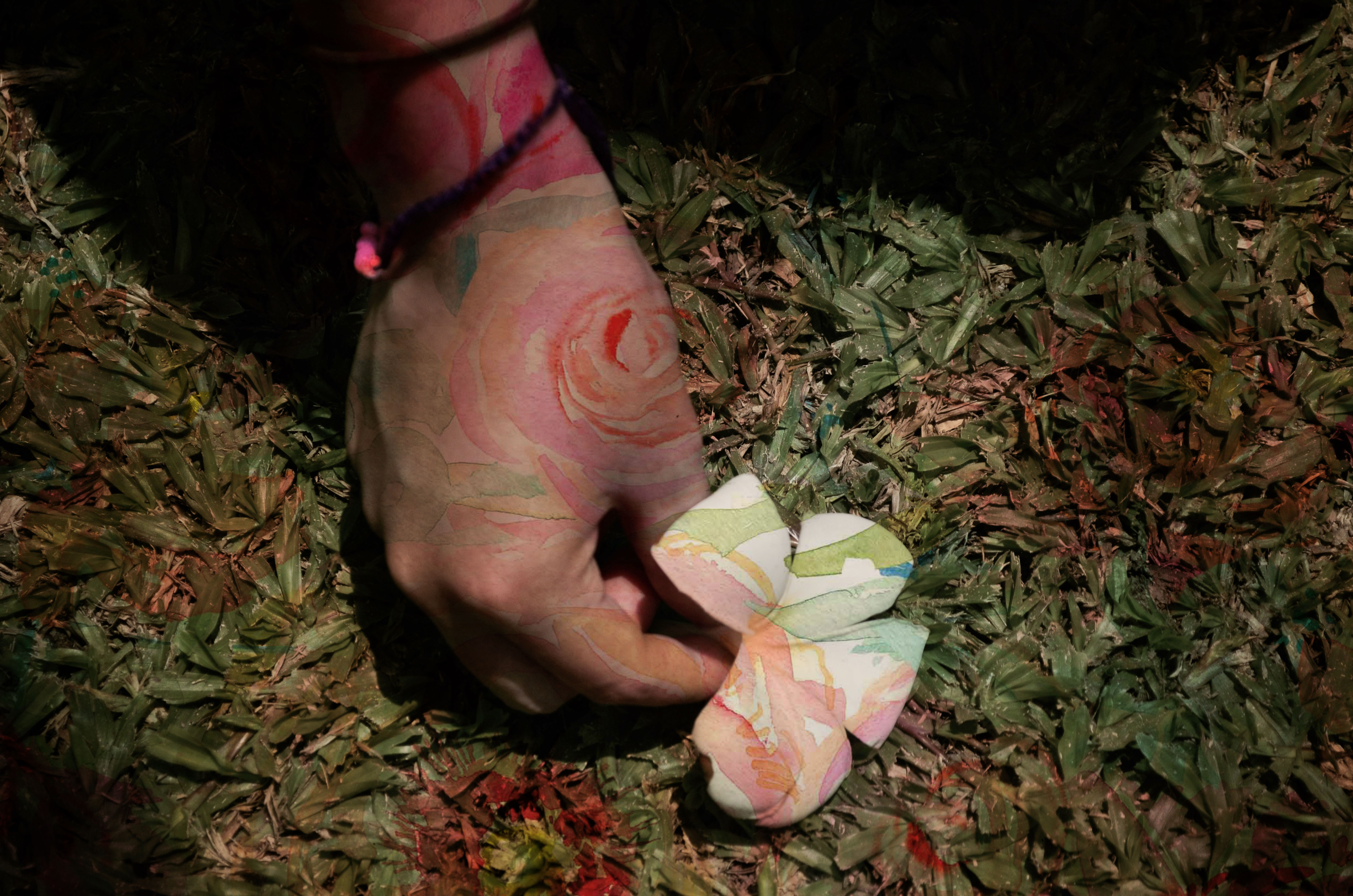
Below are some of the images and textures I created and combined to use as overlays over the frames to achieve the overall whimsical and nature theme of the short sequence. The floral ones were watercolour patterns found online. Whereas the others were images from my archive of photos.

peach-peony-ipad

watercolour-floral

transition

transition1


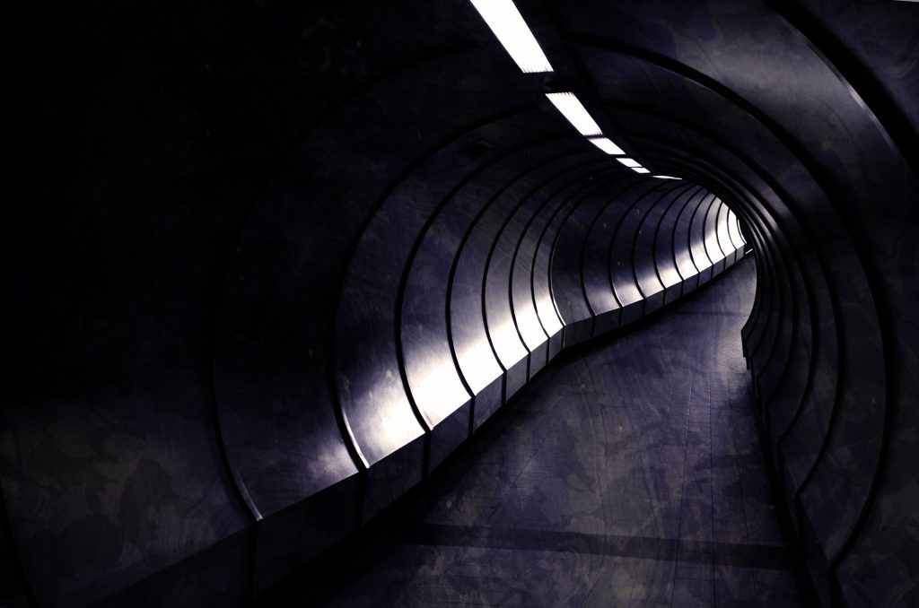
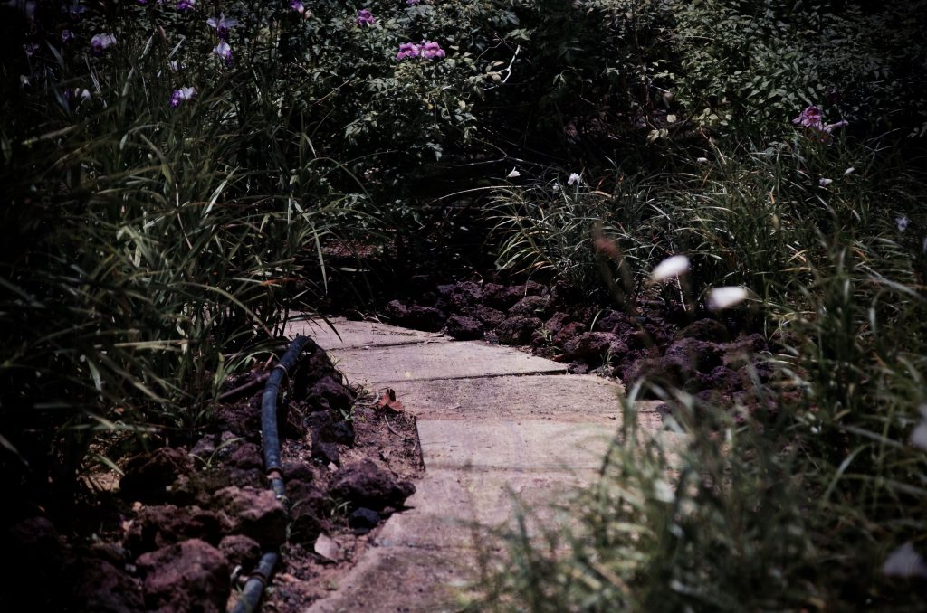
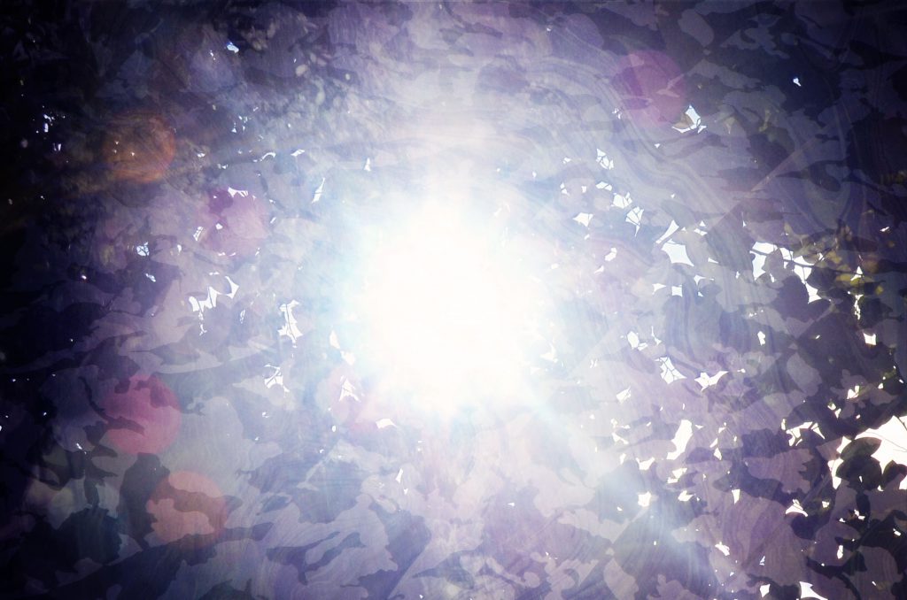
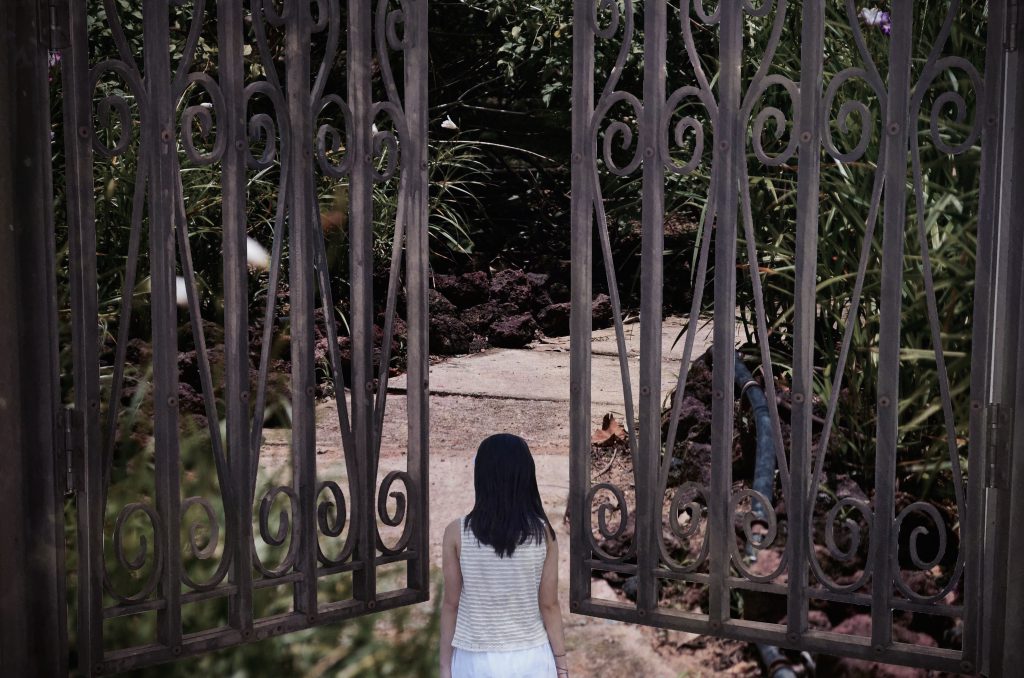
TRANSITIONS & PACING: The following few frames shown below were shot with the idea of using them as transitions. The similarity between these shots would be that they are mostly of converging paths and bright flares. And to give the idea that there’s a transition/I’m walking through that path without me being in that frame, I used the concept of pacing by increasing these frame durations to 3 seconds/frame instead of the usual 1 second/frame.

transition3

transition4

transition2


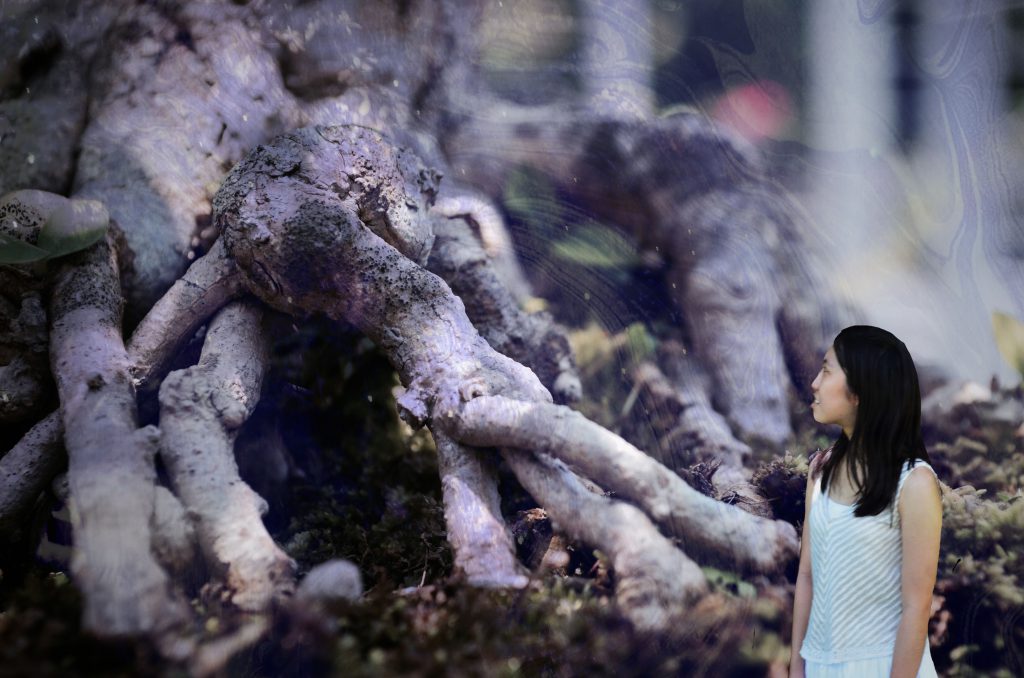
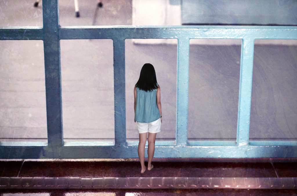
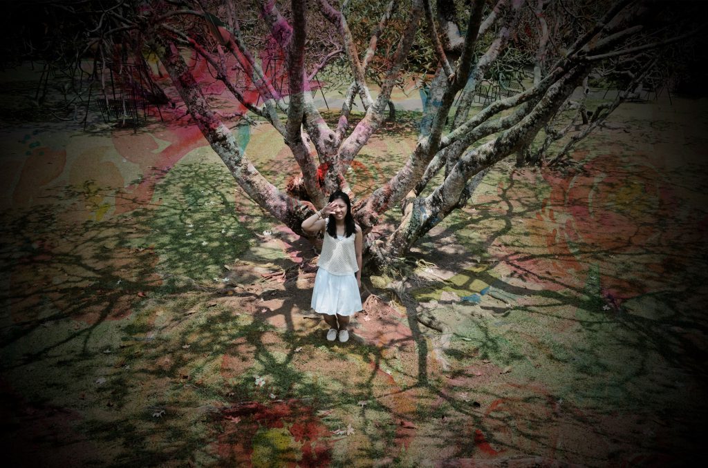
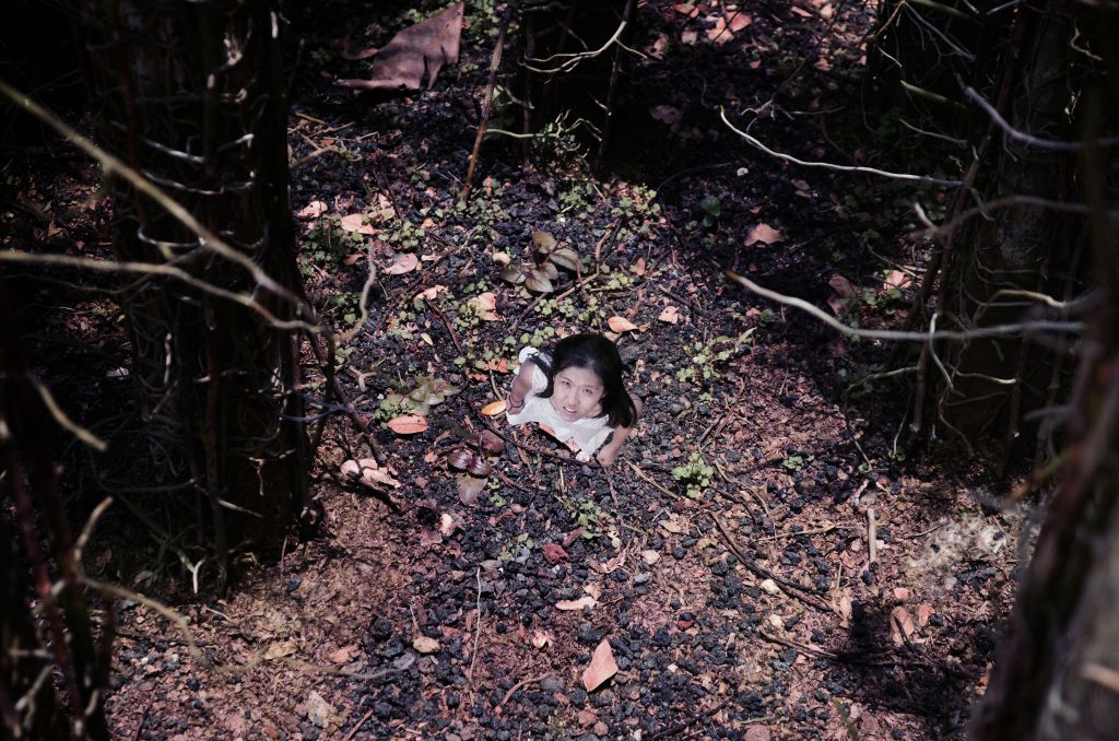
SHOT SIZES: I tried to achieve the idea of me shrinking while the world around me becomes significantly bigger in size through superimposing myself in various environments as a small figure with the help of photoshop. But there were some frames were just shots taken at wide angles/top down to achieve the miniature size with minimal editing required.

size

size1

size2

size3

Lots of close-ups and wide angles were used throughout the whole sequence for emphasis and to achieve the miniature concept in the other world (Wonderland) after I’ve shrunk in size.


MUSIC USED: For the background music, I chose this particular instrumental track from a Korean drama that I’ve watched previously as I feel that it further helps to bring out the whimsical and magical feel of the sequence.


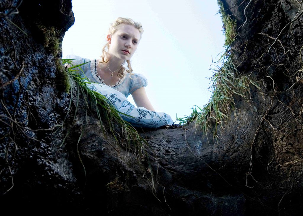
SOME INSPIRATIONS: Prior to conceptualising and shooting my frames, below were some of images i used as reference to help me get an idea of how I want my frames to look like in order achieve the whimsical feel.

c8d562c644539ad6aeb58bf0bc6d5bae

c4lwirwpn4j36iwsbjej

enchanted-forest-1920-1052-fantasy-fairy-dragon

I think the biggest challenge for me while doing this project would be the storyboarding as well as the editing process. Coming up with 90 frames wasn’t easy especially for someone like me who couldn’t exactly visualise it in frames. Rather, I shot the frames based on the on-the spot feeling that I had.

All in all,  I feel that this project has allowed me to exercise my creativity and to apply most of the concepts i’ve learnt thus far in 4D. For example, various shot sizes to achieve a certain mood and message of a frame or a tone as explained above.

I had fun doing this project nonetheless! 🙂