By Charlotte and Lee Hwa

Project Proposal

This project is an interactive soundscape installation that allows participants to experience a series of sounds that are built-up progressively through overlapping and layering techniques to evoke anxiety. This installation is created to show that participants are able to experience anxiety using solely the sense of hearing instead of the commonly paired senses of sight and hearing (Horror Films) or hearing and touching (e.g. Haunted Houses).

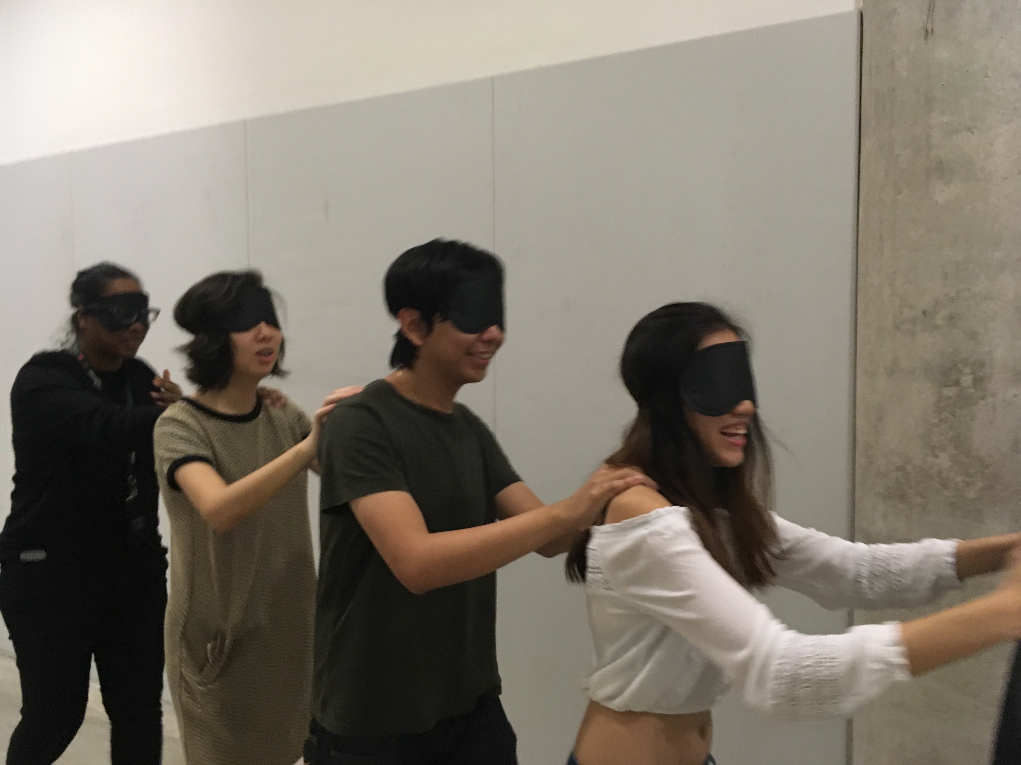
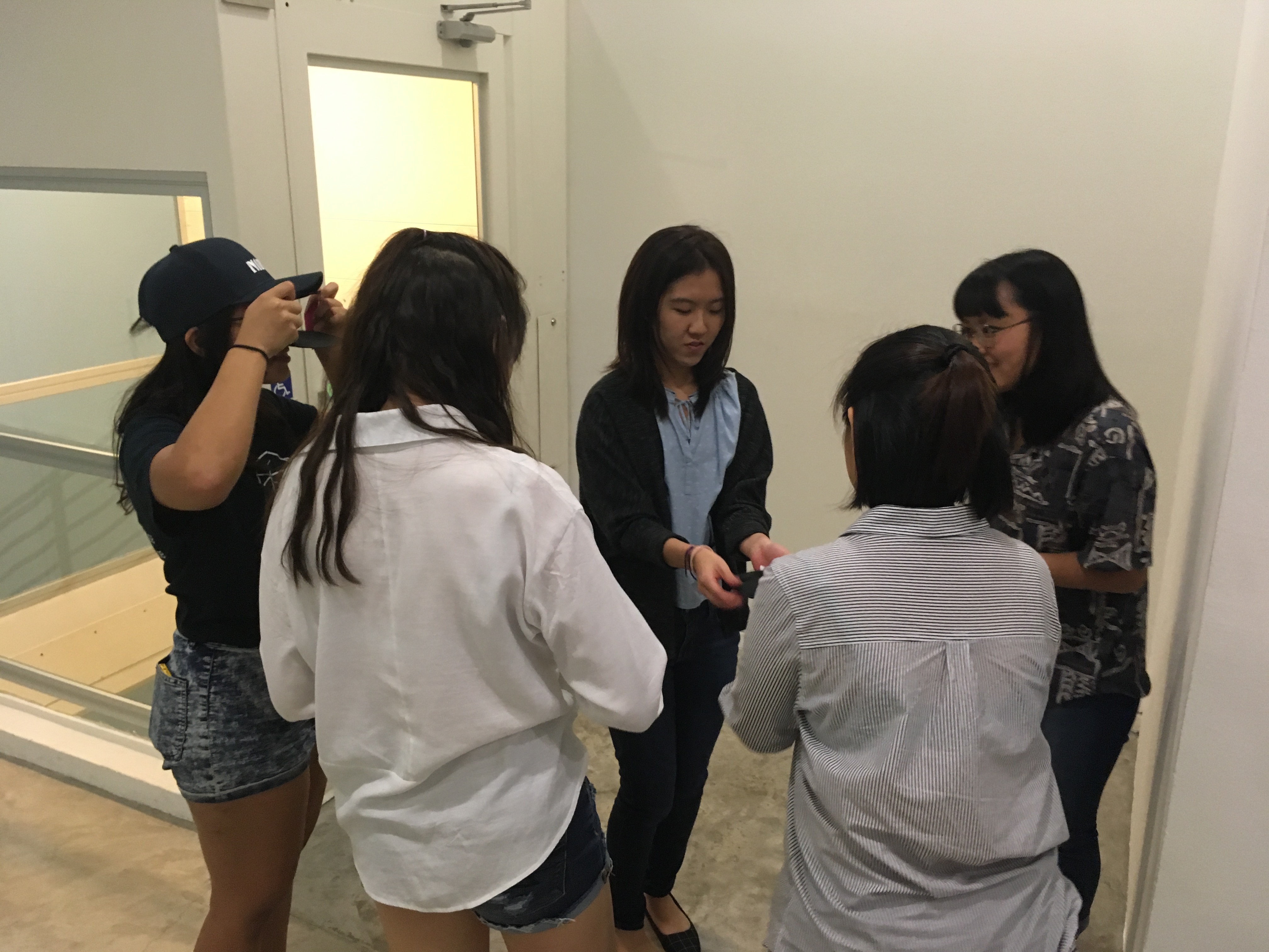
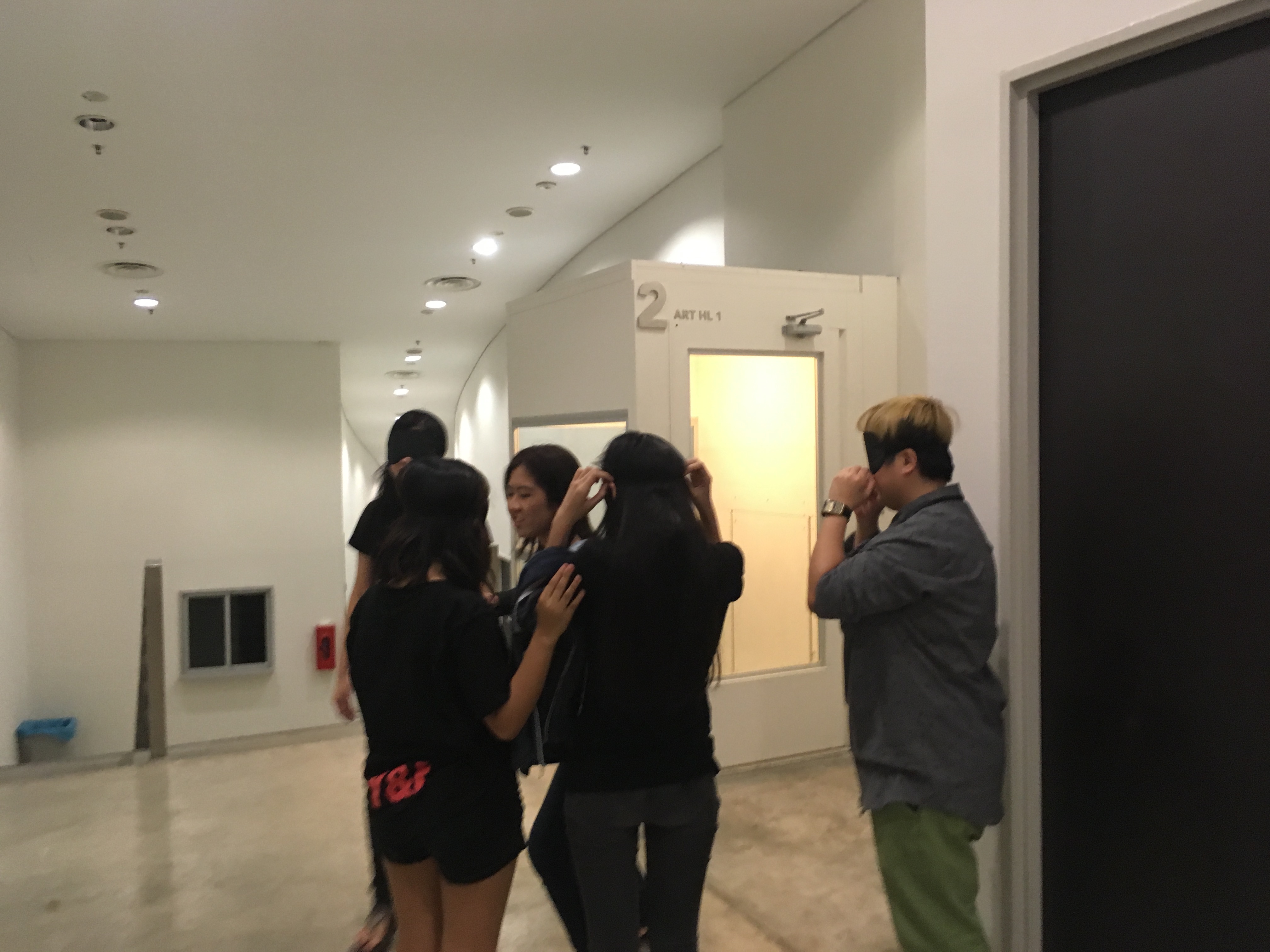
This installation would have participants placed within a brightly lit confined space, blindfolded for 2 minutes. The created space would be empty, with just only a stereo speaker in place for projection of the soundscape. Participants will be split up into smaller groups of four to five people each for maximum experience and asked to put on blindfolds to remove their sense of sight. They will then be guided by the curators to the installation space to experience the soundscape. Once the soundscape ends, participants will be asked to remove their blindfolds so that they can see the space and realise that all the while they were in empty space with nothing but just a soundscape playing in the background; realise that one is able to experience anxiety with just his sense of hearing. Participants will be allowed to stay on and quiety observe the rest of the participants’ experience and all will be invited to share their afterthoughts of the installation experience at the end of the session.

The anxiety-evoking soundscape would be made up of sounds produced and recorded by the foley technique or copyright-free sounds found online. Also, the reason for allowing each group that has experienced the installation to stay on is because alternatively, they can use found objects around them to help contribute to the soundscape they hear. This brings about interactivity in terms of role reversal – From participant to having a reign over the creation of sounds. Overall it is a soundscape created by repetition. Based on David Sonnenschein’s seven categories of sound, the sounds used in the soundscape will be soft to loud in intensity, slow to fast in speed, tonal in timbre and reverberant in shape. The interactive component comes in where participants get to interact with the space as they are able to move around freely while experiencing the installation. Alternatively, they can choose to stay in the same spot; it is up to them on their next move.


Process

Research & References/Material Samples
These were two soundscapes we chanced upon on youtube and used them as reference and inspiration for ours thereafter. For the idea of repetitive sounds in the soundscape:

For the idea of building up on speed of the sounds (fast and slow) in the soundscape:

Inspiration for the ringing noise:

A scene from the movie Saving Private Ryan that we viewed in class where at that one particular moment, the noises become muffled. In the case of our soundscape we got inspired to introduce a high ringing frequency noise. Another reference we had when creating our soundscape for the installation is a sound artist whom Lei suggested to us to check out to get an idea of working with surround sound for our sound installation: Janet Cardiff & George Bures Miller – The Murder Of Crows (2008) http://www.cardiffmiller.com/artworks/inst/murder_of_crows.html Some of the sound excerpts from the installation:

Challenges Faced
We intended to book a four-walled space initially and these are the places we had in mind ranked in order to match our ideal set-up that was submitted in our original project proposal.

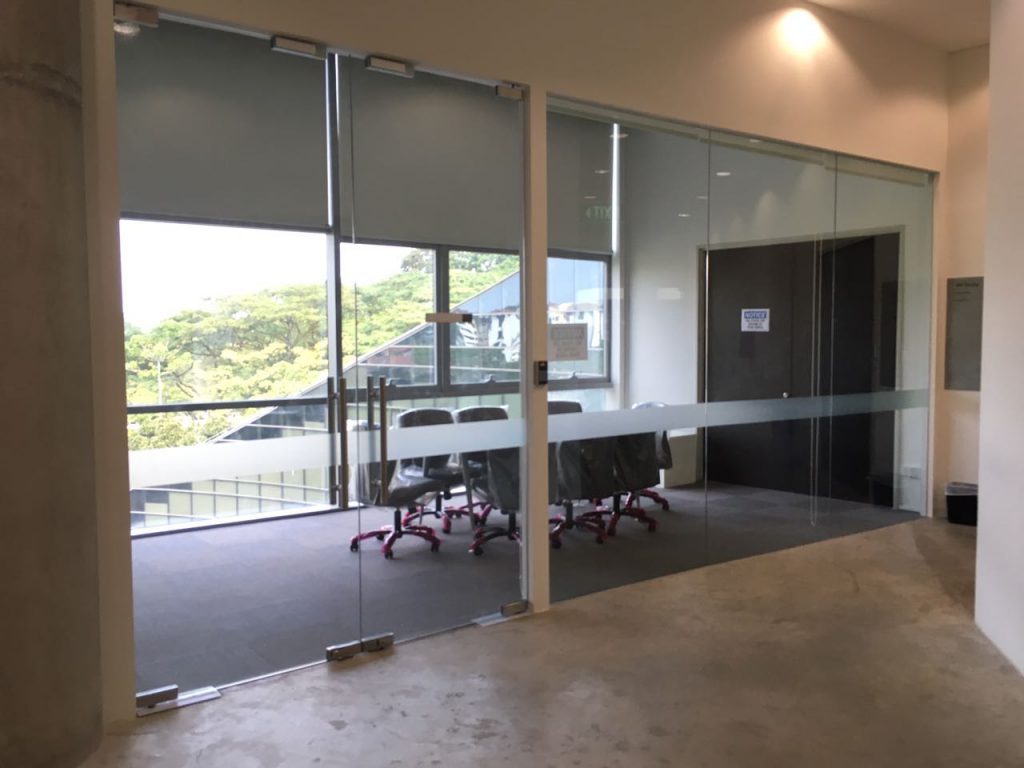
  • Empty space outside 2D Animation Lab (ART B1-4a)

  • The next backup location would be the meeting room on Level 4

  • Lastly, our Foundation 4D II Classroom (ART 02-23A) as a last resort

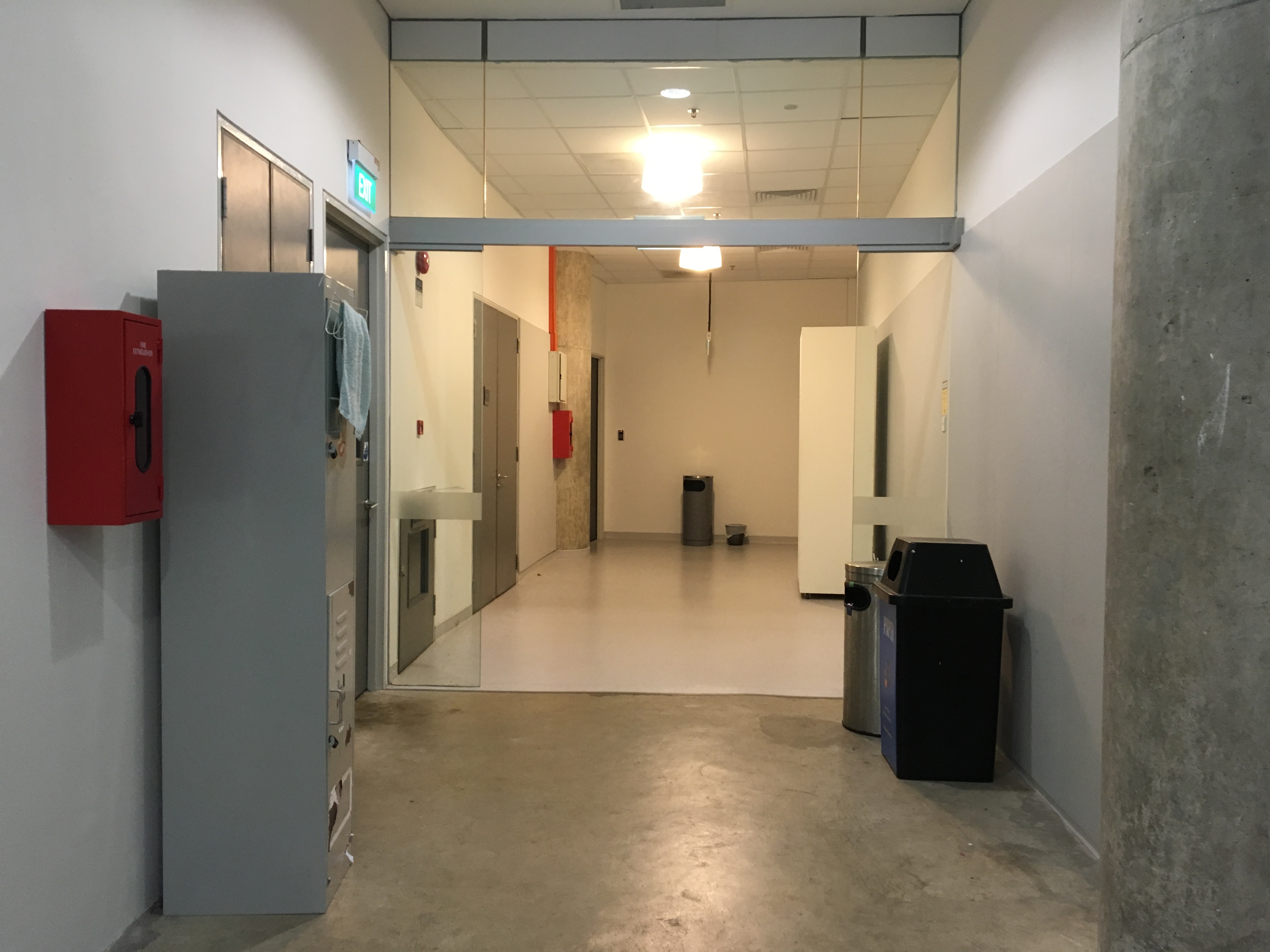
But you know, we eventually settled for our last listed location. Our 4D II Classroom we use for weekly classes only because when we wrote in to check the availability of location we did not get a reply. Not sure why though but settling with the classroom turned out for the better for so many reasons, logistics especiallyWe made use of the classroom to create a more confined installation space rather than using the whole class space. Mainly for safety precaution as participants would be blindfolded it would be less hazardous if they are kept in a smaller area with obstacles cleared. The
“confined space” as seen below.

Our test-trial

We tested out our installation according to our original set-up prior to installation day and here was how it looked like as a scale drawing:

Our scale drawing of the original set-up

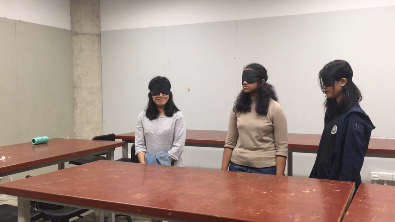
Here’s the documentation of our test trial. We had 3 of our friends who very so kindly spared us a little of their time to help us test out our installation, whether the soundscape had any effect and if the installation space worked.

For the test trial we used just normal bluetooth speakers that didn’t have the surround sound effect so feedback from our friends was that it would be good if we could use stereo speakers instead, like the one in the classroom. Great thing was we happened to find a portable one that was placed below the television set in class and we need not go through booking procedures to use it. The sound system was awesome. The reverb was amazing and the soundscape effect was much stronger.

The soundscape wise, they suggested to make it less monotonous in a way that the one we originally tried out on them sounded very flat. There wasn’t much sounds that would make them anxious, the loudness and softness of the sounds in the soundscape could be more varied and also the ringing noise towards the back could be more intense. There was also suggestion for us to carry out the installation in total darkness as when they put on the blindfolds, they can still vaguely see the light source from below; being in total darkness helps build up the anxiety emotion.


Execution

How the sounds were created:
Our idea for soundscape was to create a tonal background contrasting with a high pitch sound to evoke anxiety. Foreground sound is created by hitting against the stairs rail that moves away from cliche Anxiety soundscape that utilises heartbeat or breathing. Our background tonal sound was created through garageband, that starts from a high note to a lower note. We then overlay it with the sound we recorded from the stairs, the reason why we chose the rail is because of the reverb that it produce and contrasting it to a low tonal background would create a tension. Further editing was then done in audacity.

Additionally to have a more immersive soundscape, we edited the sound perspective to give the feeling on the sound coming closer and to the back, the speed is also increase to build on the tension. We also added a ringing sound as to break away from repetition sound pattern, which helps to intensify the entire sound at the back.

The day of installation:

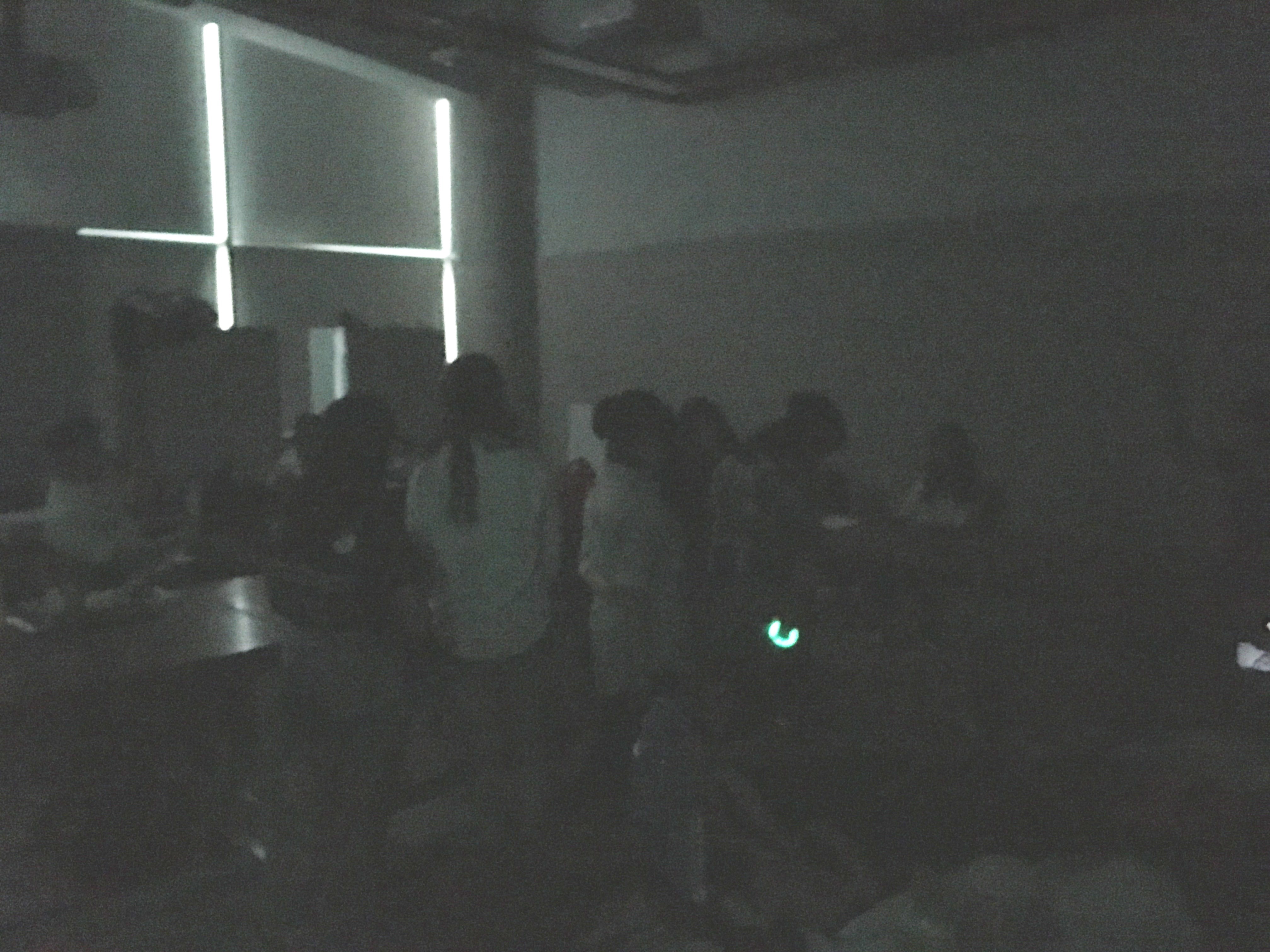
What went well: The impromptu decision of having the front groups of participants stay on to help contribute to the live sounds using found objects made the soundscape sounded even more real and thanks to the favourable weather conditions that day (it was raining). That made the installation space really dark and the extra sounds made by the thunder added on well to the reverb of the soundscape which really helped us achieve the emotion we wanted to evoke through our soundscape, anxiety as most felt fear which is an emotion linked to that. Our initial plan was to have participants stay on so that they do not return to the holding space and discuss it with the rest who haven’t experienced it. It would have spoiled the anticipation and also it would have been too boring just to sit there and observe the rest so why not contribute to their experience?

Some documentation of our installation: Before entering the installation space – giving instructions, leading the way


During the installation – the experience, interactivity between participants and the installation (contributing to the soundscape using found objects in the room)

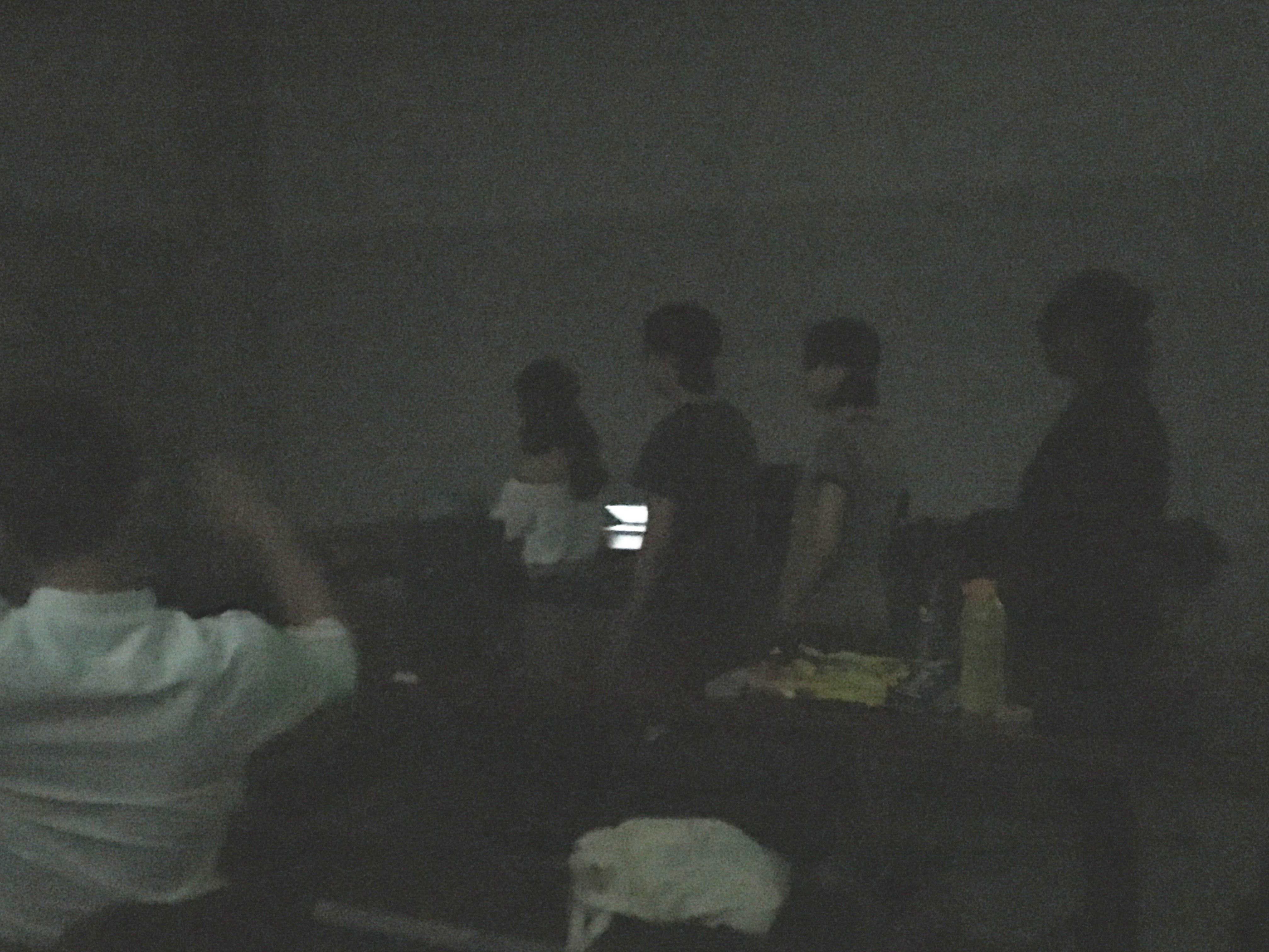
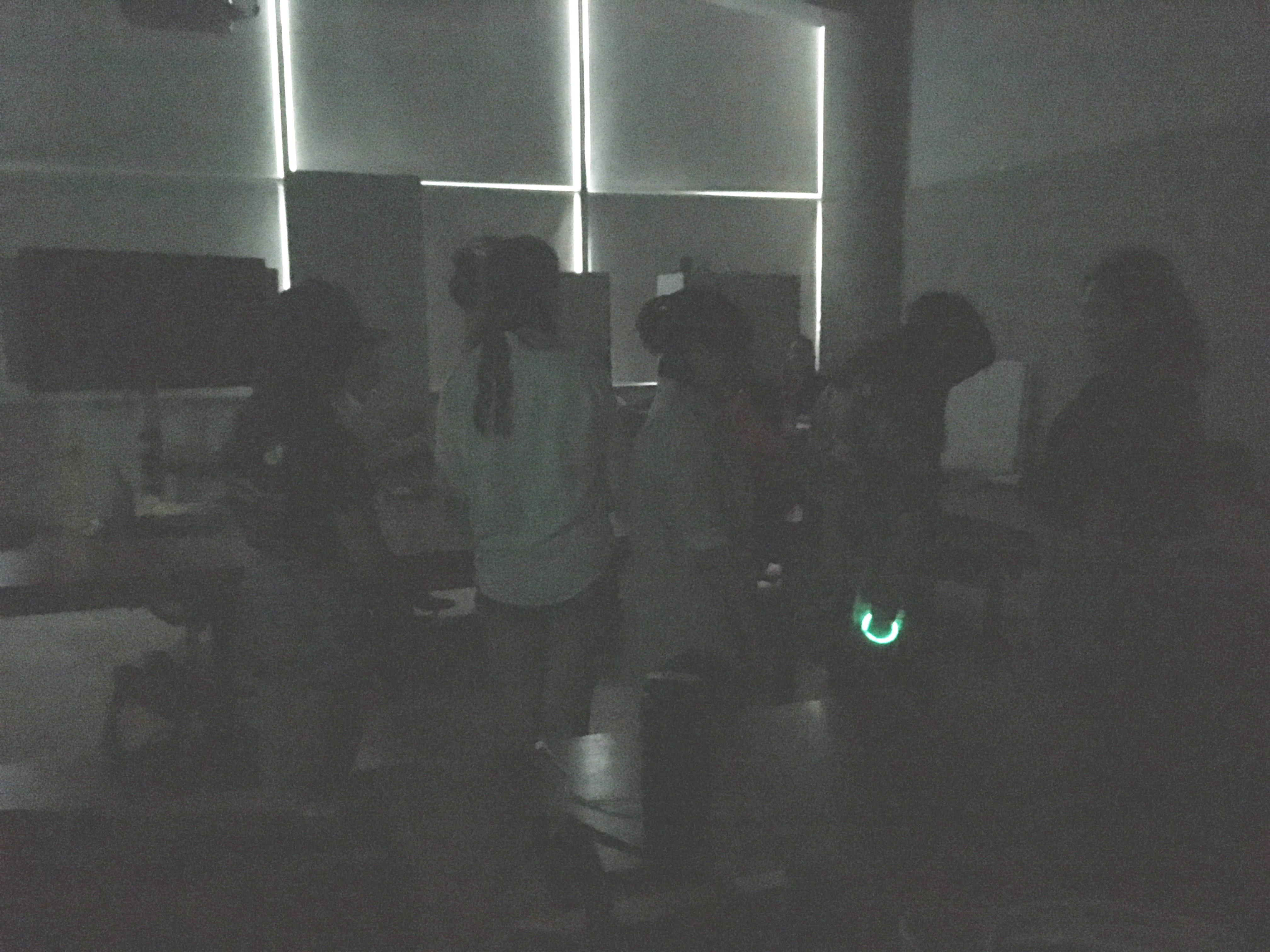
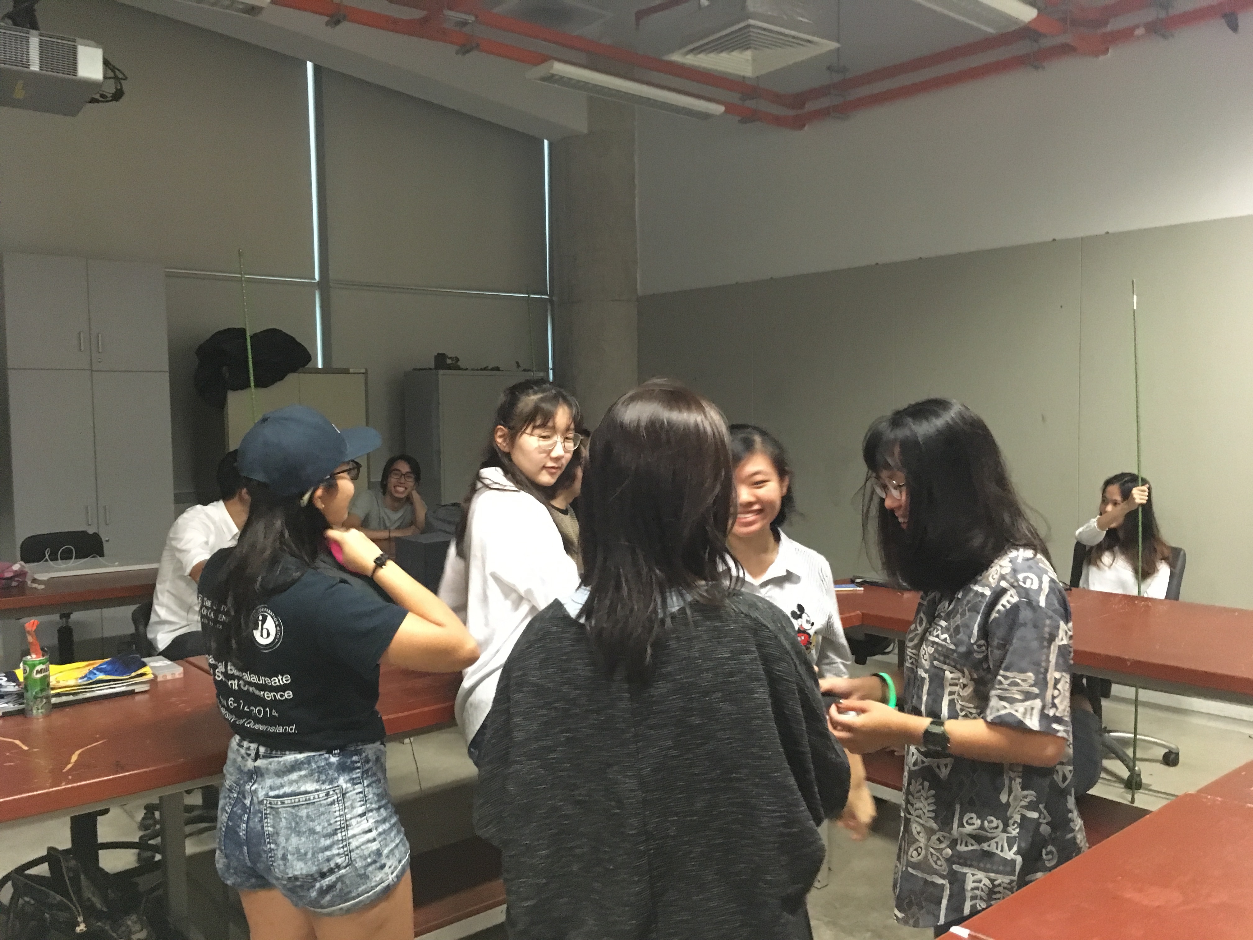
Pardon our blurry and pixelated images (after editing) as this was the best we could get for our installation that happened in total darkness. Video footage wise it was way worse, nothing could be seen only the sounds can be heard thus we settled for image documentation this time round on the official installation day.

What could be better improved: We should have worked out a way such that all groups would be able to experience role reversal interactivity bit of the installation plus have the live sounds created be equal across all groups for a fair experience of the installation. For our case of execution we could have personally added the live sounds for the first group.

Overall, we felt that working with sounds for an installation to begin with is already a challenge what more creating sounds to evoke a particular emotion without trying to go for the narrative style/flow. This soundscape in particular as the emotion we were trying to evoke from participants was anxiety which could seemingly fall under as a sub-emotion under bigger emotions such as depression, stress etc. How one interprets a sound that they hear is very subjective but we think we managed to pull it off thanks to our classmates’ live sound contributions, our impromptu decision and of course the gloomy weather that day which made the atmosphere even better. Even though the deadline was tight, and the stress levels were high especially when it came to logistics, it was still a fun project to work on an explore!

Concept: An informative guide to bring out the best of Everton park, its quaint charm and how it boasts a mix of old and new businesses. The purpose of the guide is to entice people to come visit Everton Park, showing readers what they can check out there, do there and also some facts about the place so that they will have a better understanding of the place as well.

Art direction: Overall I took on a consistent pastel colour scheme for the zine and the original colours were inspired by the architecture colours of Everton Park. However, the original colours of the architecture seemed a little too bright and a bit of mismatch as a publication look thus I took to playing around with the intensity and colour harmonies and went for a more pastel and warm colour scheme eventually. (see image below)

Apart from the use of a consistent colour scheme throughout the zine, you will notice later on that I have also used speech bubbles on most of the pages and spreads for some of the headers and subheaders to bring out the personal touch even further.

Content – I felt that the mix of old and new businesses in this quaint neighbourhood, Everton Park was definitely one of it’s unique charm and I wanted to feature it in my zine so I brainstormed a little and listed down a few things that could be worth including in the zine prior:

  • Ji Xiang Ang Ku Kueh Confectionery
  • The various cafes
  • Unique stores
  • Anecdotes from the residents (for that personal touch)

Curation – I decided to go from broad to narrow after consults and finalising the content I wanted to have in the zine. As for imagery to complement the content, I decided to go for a mix of digital photographs to retain the textures of the food features and used illustrations for the rest.

Typeface – For the typefaces used, I was going for those that were more nostalgic/handwritten to complement the warm colour scheme of the zine.


Inspiration (aka Moodboard)

These were some of the inspirations i got from pinterest to help with the designing of my covers and design layout of the pages and spreads:

The above are some examples of illustration styles I wanted to try out in my zine and the image on the right was an early inspiration I had for the cover design – something simple and minimalistic. Riding on that idea, I came up with a cover design as seen later on in the next section.

As for the above inspiration, it was for the layout design in particular the background. Since I was going for a illustrative look I felt that the background should be left simple and I happened to chance upon this inspiration – geometric looking borders and dual-colour background fills which you can see appearing in my zine later on.

Some more inspirations for the colour and design. I initially wanted to go for a risograph feel you can see but after hearing how it costs a bomb, maybe not. But I really like the neon colours and the very comic/sketchy feel of it. Next section will be the digital look of my zine.


Flow of Zine (What each page/spread features)

  • The Front Cover (right) and Back Cover (left)

For the front and back cover design I initially intended to have it look like a cropped/framed view of one of the HDB block floor in the front with the hint of potted plants and all with the back cover a back view of the block like what you would see – the hanging of laundry, balcony etc. but eventually felt that by having such a design the architecture thing would be too overwhelming as you can tell that on the subsequent pages there’ll be hints of the HDB block again. Plus, doing up the details would’ve been too time consuming and having too many objects to look at takes away the main focus on the covers – the credits and title of the zine.

Thus I only kept the idea same for the front cover, suggesting more levels of the HDB block in the design instead of going with my original look which made the design look more like a frame/border surrounding the potted plants. As for the back cover, I decided to go with just a simple look, the credits: my social media handles and something like a logo design? (i’m not sure what that looks like but i’m very sure i’ve been excessively using that silhouette of mine since last semester’s final project for 2d; i think it’s becoming like an identity of sorts hahaha).

  • Now diving into the contents of the zine. When you flip the cover, the first 2 pages you see forms a spread layout with the contents presented as an infographic.

Going with the idea of having the content flow from broad to narrow, the first spread featured an overview of Everton Park, what the place has to offer in a quirky fun infographic form using phrases, quotes and numbers and making use of the box grids from the architecture silhouette of the HDB block. You would have probably realised that this is an expansion of my earlier infographic for Part 1 of this project (visit the link at the bottom of the post to read more). In addition There’s also a small part which provides readers with directions on how to get to the place by MRT and what they should look out for in order to find the place after.

  • The next spread. Instead of having a second spread, I decided to make them as pages. Continuing the flow of content, from an overview I started narrowing down firstly to a brief history of Everton Park for the page on the left and Ang Ku Kueh for the page on the right.

For the left page, I felt it would be pretty nice to start off with a brief history of Everton Park as with all other publications or anything whenever there’s a subject involved, there would be background information about it in the beginning. As the year it was established and how old the HDB estate was was pretty much all the historical information I could gather online about the place, I decided to pair it up with some anecdotes from the residents who have lived there, store owners and those who are living there to make it more personal and a little nostalgic. One of the interviewees I managed to get an anecdote from was Mr Yip Yew Chong, the local artist whom I have constantly mentioned throughout my past few posts because of the 2 wall murals he has painted just round Everton Park – They look super gorgeous!!

Whereas for the right page, I decided to do a feature solely on Ang Ku Kueh. Why Ang Ku Kueh you may ask, it is because of an observation I gathered. I realised when mentioning Everton Park to others, first thing they would mention about the place would be that it is home to the famous Ang Ku Kueh confectionery, Ji Xiang Confectionery that has been around for close to 30 years to date (since 1988). And rather than having a full boring page of information just dedicated to the store like an interview feature of quotes by the store owners, reviews and what flavours they have to offer etc. I thought it would be more fun to have it as a thematic feature page with Ang Ku Kueh as the theme. So I started with a brief description of the confectionery followed by fun facts and Ang Ku Kueh related content after. How I came up with the fun fact idea was from online research I chanced upon on Ang Ku Kueh. Turns out the Ang Ku Kuehs that you receive at a baby’s full month comes in different shapes and it is determined by the newborn’s gender! For baby boys, the Ang Ku Kuehs you get are in a simple pointed shape whereas for the baby girls, the couple will give out the normal round ones with the intricate mould design that you will usually see when you buy the confectionery. Thought it would be an interesting fun fact to know! I personally was fascinated by it! For the remaining space, I featured some Ang Ku Kueh themed merchandises like keychains, totes, plushies from local designers and their brands like Ang Ku Kueh Girl, wheniwasfour etc.

  • The final spread and the last content for the whole zine features 5 cafes to check out at Everton Park. As simple as it looks, it is really just a quick food guide to follow up on the previous page’s theme of food.

Curation of the content on this page wise is really just the address of the place, its opening hours, and ratings shown through the commonly used stars symbol. I had intended to add descriptions of what each cafe has to offer but to prevent the page from looking too wordy and making the information hard to digest, I settled for simple and short phrases to describe the food place and it surrounds the circle-cropped image for each cafe. As to how I decided on these 5 cafes to feature: Uniqueness (e.g. different country’s cuisine how they prepare their food) and of course, the ratings! This definitely required some researching… and ah, spot the speech bubble that I mentioned early on under art direction too!

Change(s) in idea/execution 

Actually there weren’t much changes in ideas and execution along the way. Overall it was more of change in the order of content (going for a old to new/broad to specific), which content goes onto which page and also playing around with the design layout.

If there were any major changes it would be for this page as during group consults, most of my classmates and Joy brought up the issue of not knowing where to look (the visual hierarchy was missing). The “Did You Know” seemed like the header for both the fun-fact and the “Ang Ku Kueh Companion” bit.  Eventually I went ahead with a classmates’ suggestion of colour blocking since I had this consistent geometric background thing going on as my background and it worked! Thanks Yi Ling 🙂

Challenges

One of the challenges faced was definitely printing the zine. Having printed a publication before in polytechnic, I thought printing wouldn’t be a problem at all.  As mentioned during the inDesign workshop, some printing shops are able to help you settle printing just by saving in pages but some you had to save in spreads and with spreads came proper visualisation of the pagination like which page match would match with which.

A visual aid for better visualisation – Basically what you see in inDesign vs the layout you’re supposed to have when you export as spreads to achieve the correct pagination:

A HUGE HUGE PITY: Firstly, I think I’ve wasted quite a bit of money as I couldn’t get the printing right in terms of alignment (the bulk of it) and pagination (initially) and because of these continuous errors, I eventually got so focused on getting them right that I overlooked if all my content was printed out properly. Only till presentation day and after the silent round-table peer critique did I realise that an image on my first spread got cut off after reading my classmates comments AHHH. Internal panic but I guess I had to acknowledge that, if not the zine would’ve been perfect. The printing shop was super nice to actually help manually align the pages for me so that when printing on double sides, the alignment wouldn’t be off. Lesson learnt!

Enjoyable moments, etc.

Pretty sure that majority would’ve found this particular part of the zine project rather dreadful but as much as inDesign was a “pain” I believe to many, I really enjoyed the process! And especially when you print the zine, that feeling when you see your own fruit of labour… :”) Personally I really enjoy designing, editorial design so this project felt like my way to destress except since we were given a tight deadline it felt rather pressing at times when you get art blocks.

All in all, I really enjoyed 2d so much, those sweet post-it messages of feedback my classmates for every critique session, and being under Joy for the past 2 semesters have been so fruitful. I’ve learnt so much. Thank you Joy for being so encouraging and nice!!

I’m bummed, my utmost favourite foundation module is officially over 🙁

And finally, here you go! The links to Part 1 my of Zine: Neighbourhood Explorer (Infographic): 
Research: https://oss.adm.ntu.edu.sg/char0066/neighbourhood-explorer-zine-research/
Final: https://oss.adm.ntu.edu.sg/char0066/neighbourhood-explorer-infographic/