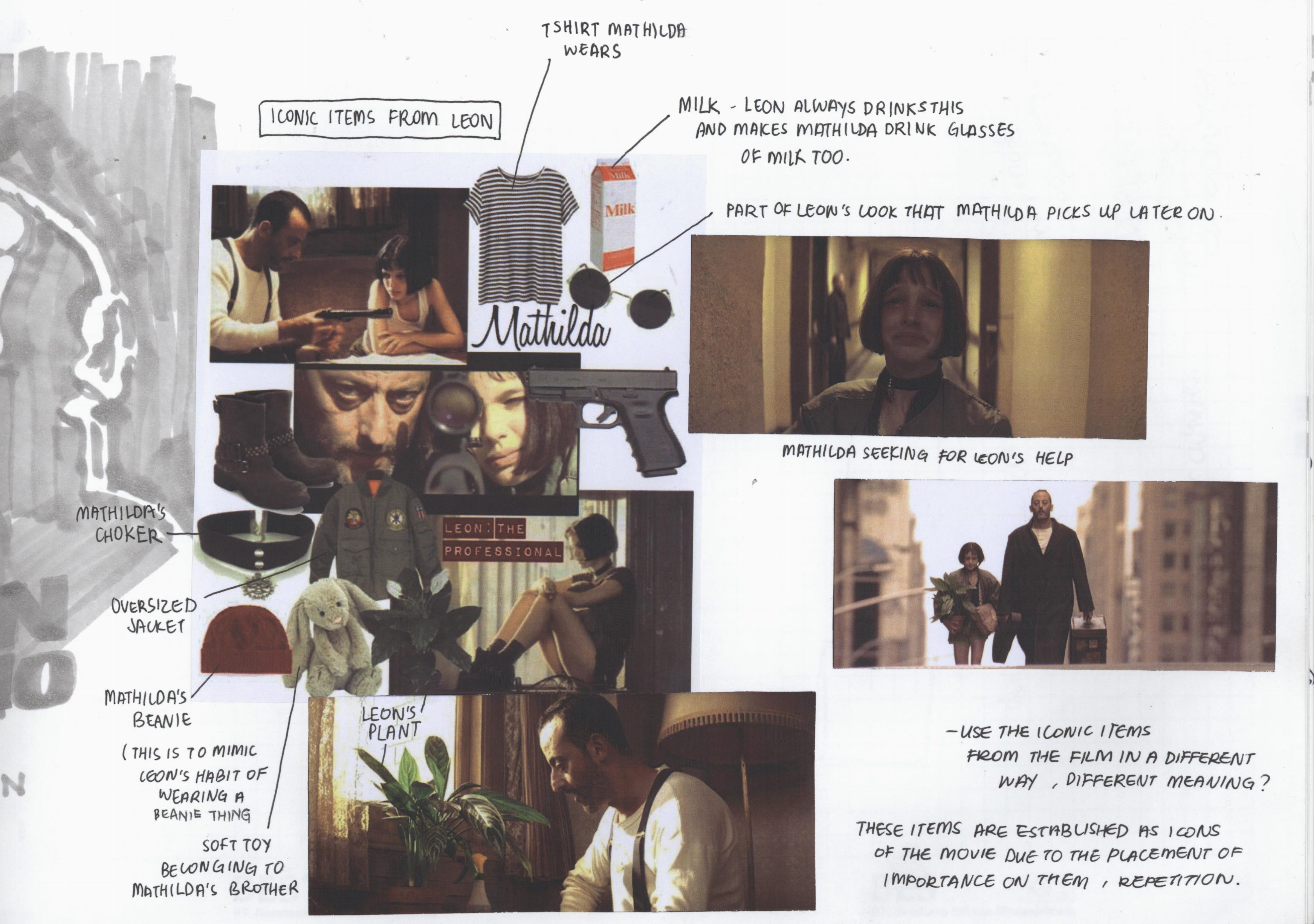
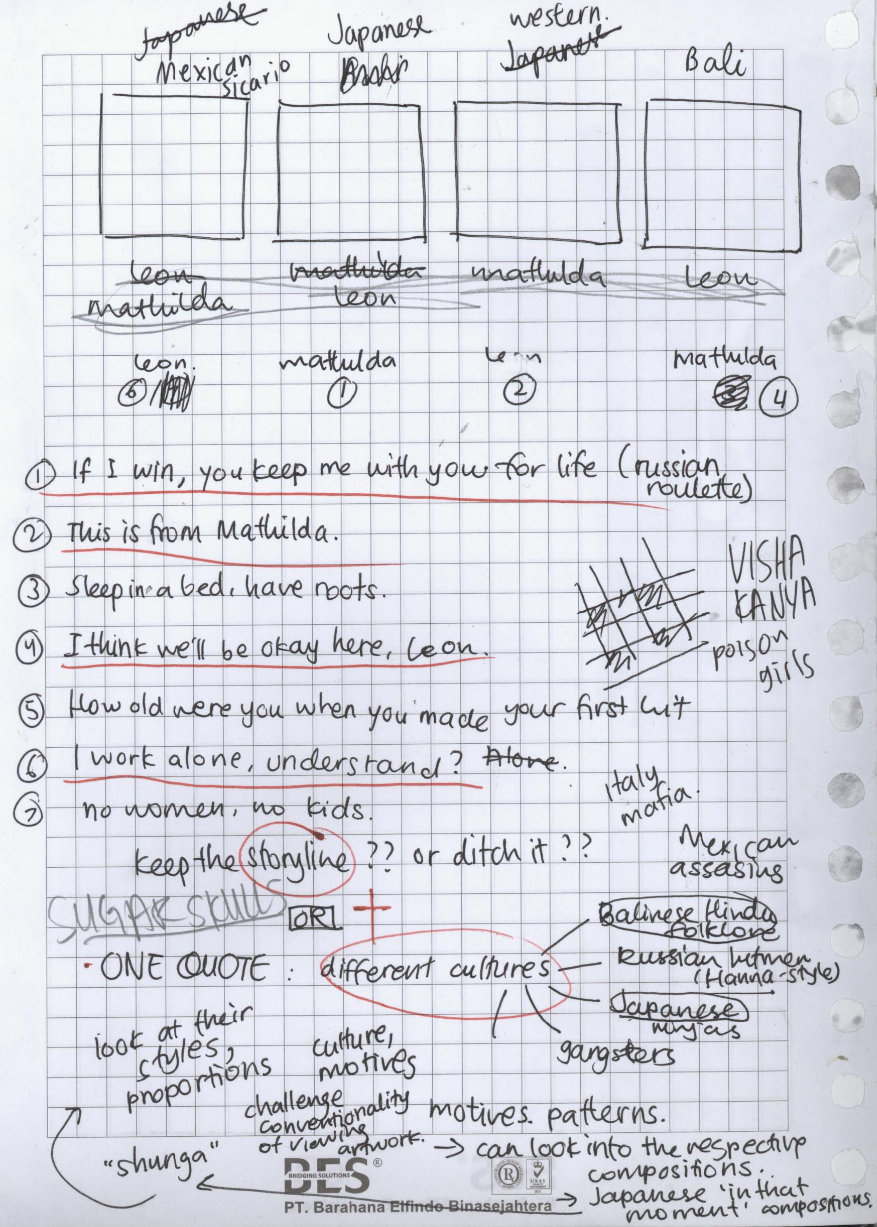
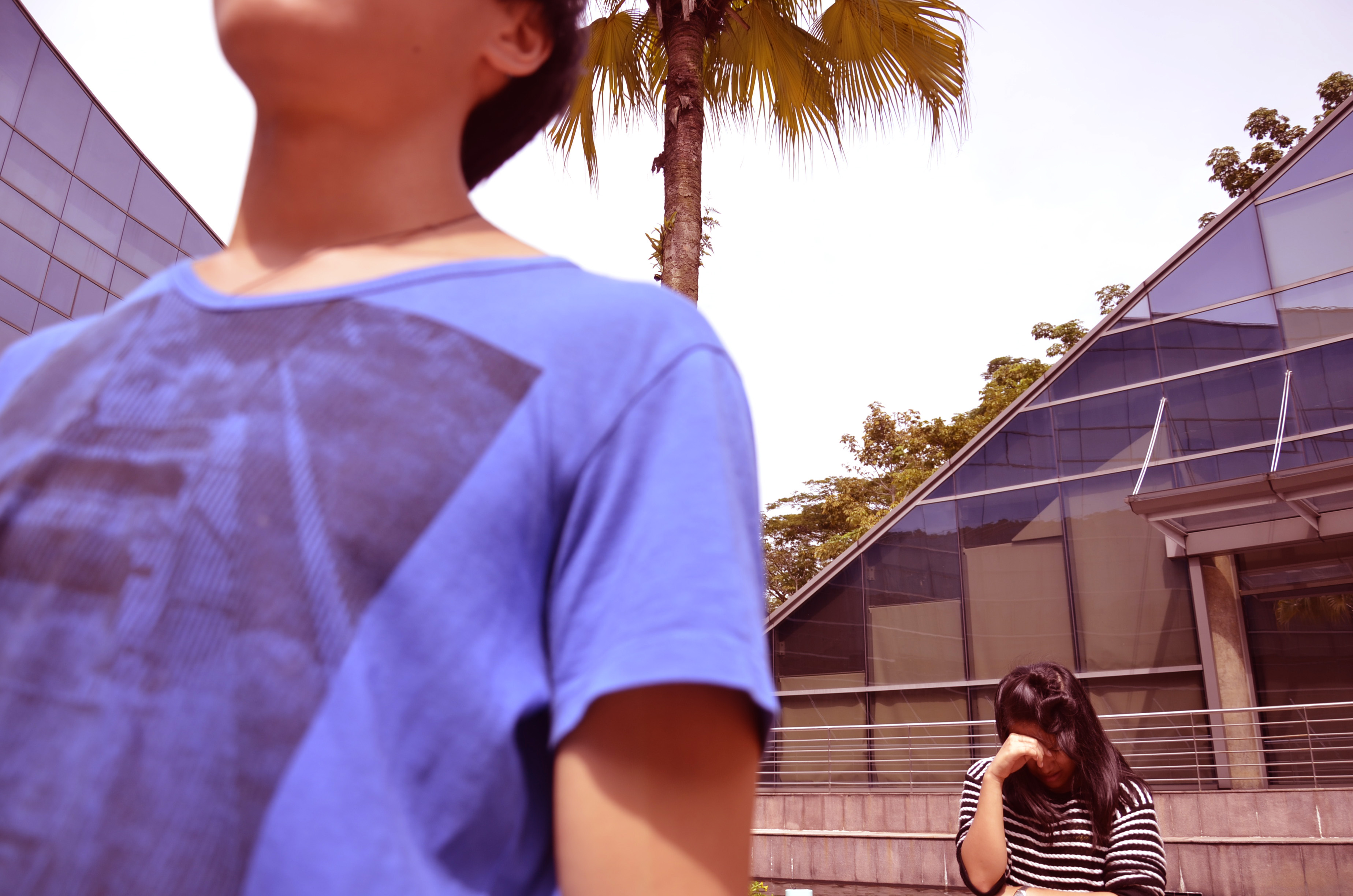
Okay, so I decided to include another process post because I felt like I wanted to elaborate more on the in-depth research that went behind each of the compositions. Following my initial ideas of using different cultures to illustrate the four quotes from “Leon: The Professional”, I went ahead and researched about different assassination cultures from around the world. Some possibilities that came up were Italian mafias, Russian hitmen and Indian Visha Kanyas (poison girls), among others. However, I will only be including research behind the final four compositions.
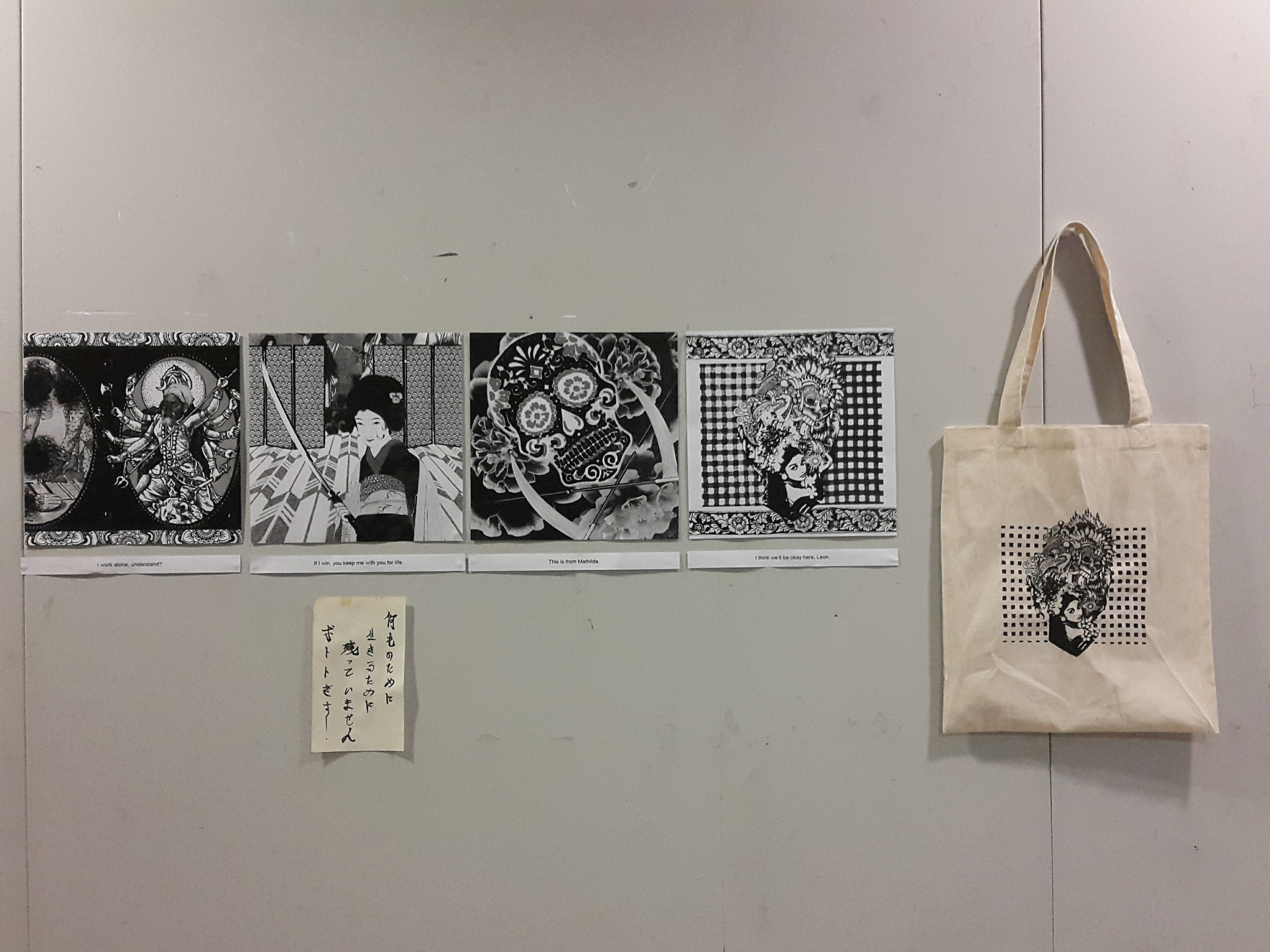
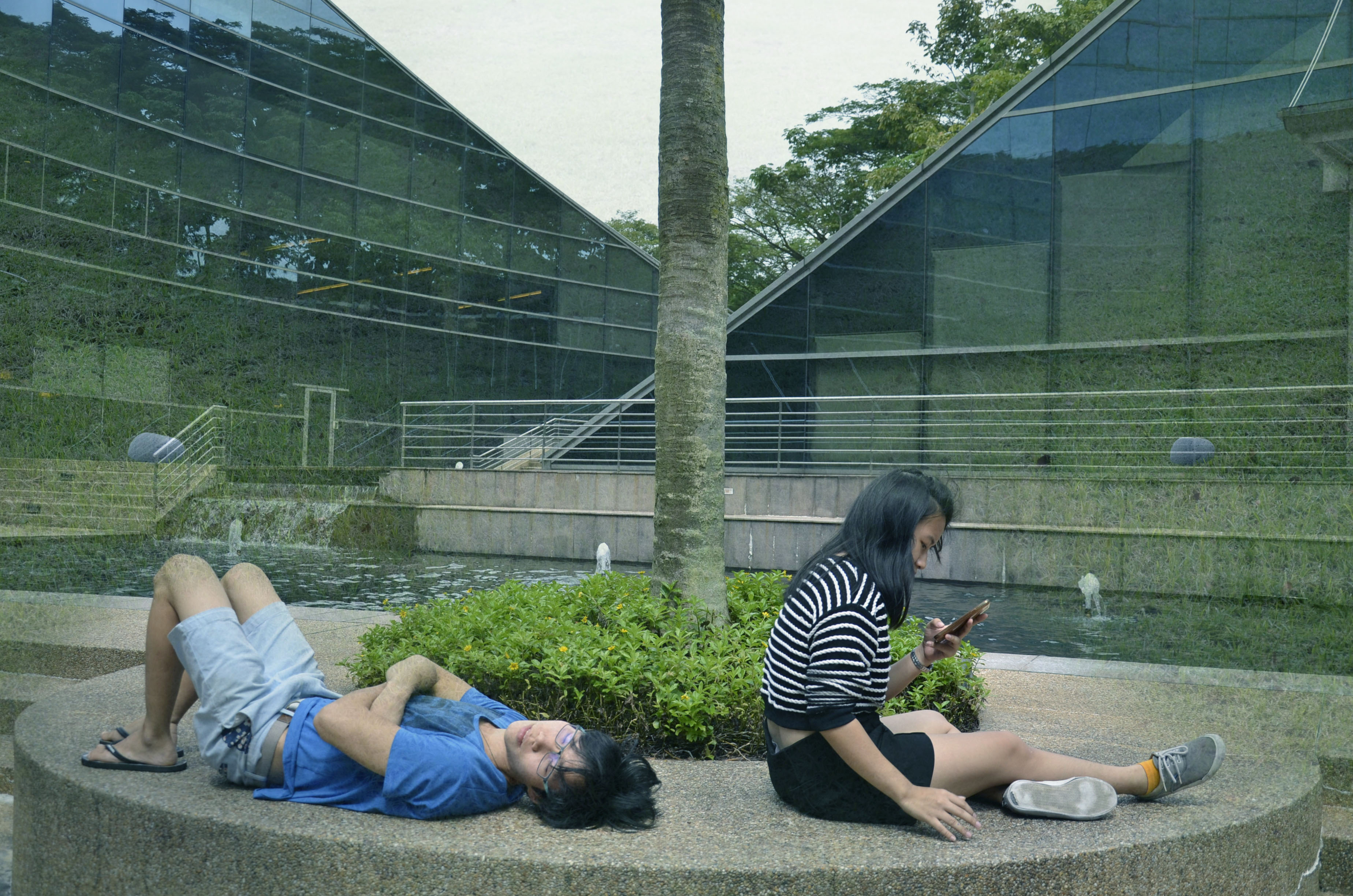
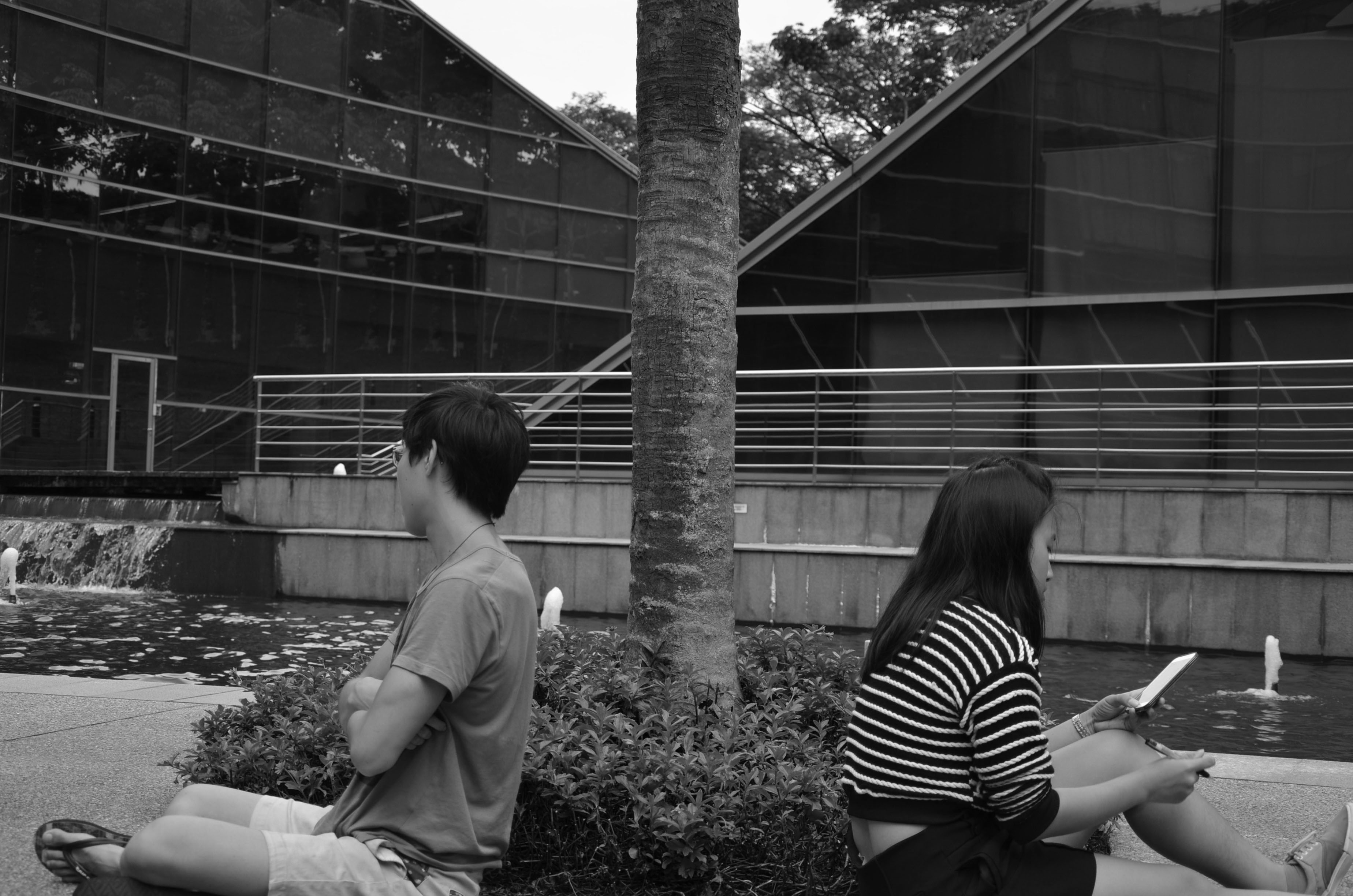
For a start, here are the final four quotes.
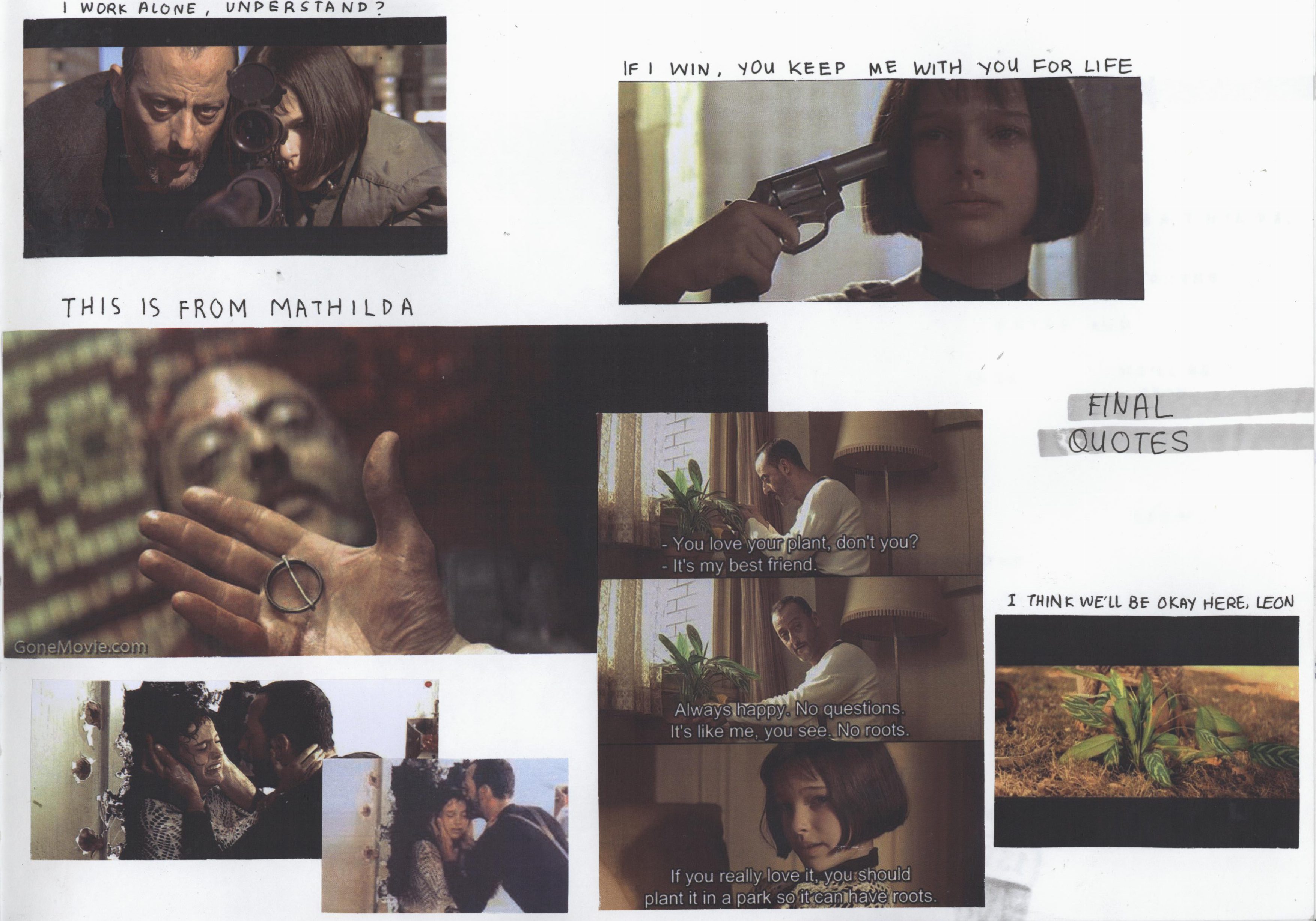
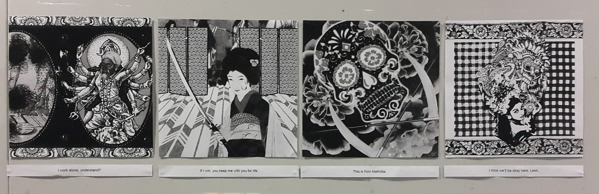
- Leon: I work alone, understand? (Couldn’t find the right still for this)
- Mathilda: If I win, you keep me with you for life.
- Leon: This is from Mathilda.
- Mathilda: I think we’ll be okay here, Leon.
◊ FILM ◊
!!!MAJOR SPOILER OF THE WHOLE MOVIE ALERT!!!
\
\
\
I chose the four quotes as they describe Leon and Mathilda’s relationship throughout the movie.
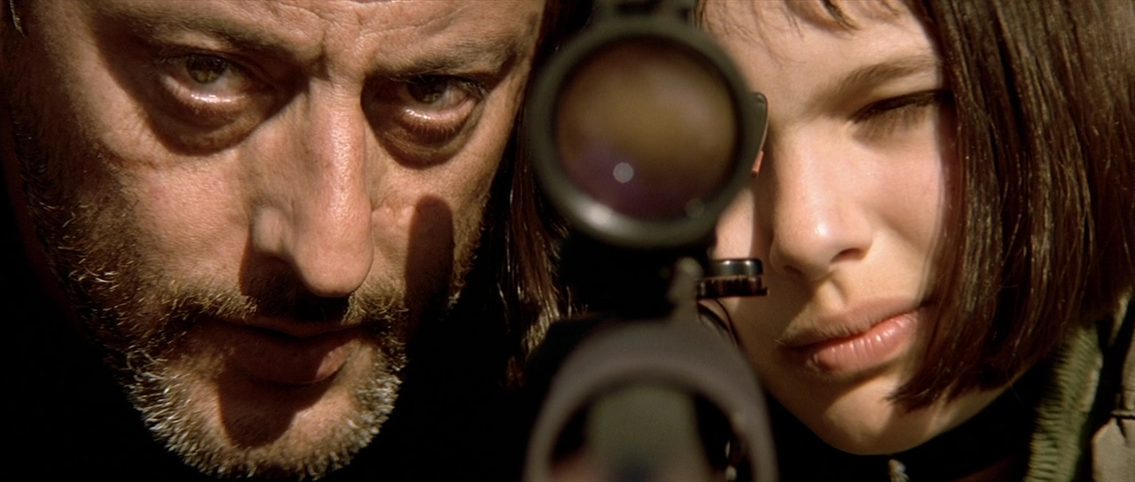
Leon saves Mathilda from the corrupt drug enforcement officers who killed her family, even when he had no reason to. She wants to hire Leon to kill them, but Leon declines. Instead, she asks for him to take her up as an apprentice and teach her to be a ‘cleaner’ too. Leon refuses, stating “I work alone, understand?“, and tries to send her off.
Mathilda tells him that it is just the same as letting her die in the hands of the corrupt officers. She takes a revolver from the table and initiates a game of Russian roulette, pointing the gun towards herself. She says, “If I win, you keep me with you for life.” She says that she hopes he really has no feelings and that he won’t regret this, while Leon tells Mathilda that the chamber is loaded and she will die. Mathilda is adamant and pulls the trigger just as Leon slapped the revolver away, the bullet very nearly killing Mathilda.
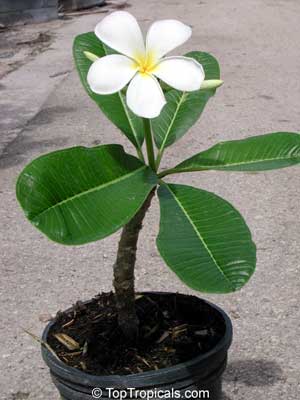
Mathilda undergoes training and develops a bond with Leon, influencing Leon in a way such that he became much more human, as once again he slowly let emotions into his life. Mathilda is trained into Leon’s way of living and routines. The story spins into a heightened conflict and both their lives are in serious danger. Leon and Mathilda profess their affection for each other as Leon forces Mathilda to safety. Leon barely makes his way out when Stansfield, the antagonist, shoots Leon from the back. In a slow and melancholic scene, Leon confirms Stansfield’s identity and hands him the pins of a grenade, saying “This is from Mathilda,” which were his last words. Stansfield discovers active grenades strapped to Leon’s vest, right after which the scene explodes, taking both of their lives.
Saddened by her loss, she finds out that Leon bequeathed his wealth of previous earnings to her. Mathilda finally finds protection under her previous school and goes out to plant Leon’s houseplant in the gardens. She previously told Leon about how he should plant it in a park so it could have roots. The plant here symbolises Leon. She says, “I think we’ll be okay here, Leon.”
With this storyline as an anchor to the project, I took a closer look at each quote.
◊ BREAKDOWN OF FOUR COMPOSITIONS ◊
These would be quite similar to what I had in the final post, but I will be including some pictures too. Meanwhile for the compositions, since I planned them really carefully, there were not a lot of changes except for subtle manipulation of contrast, levels and threshold. Unfortunately I did not really save the compositions from one change to another as I was editing them continuously.
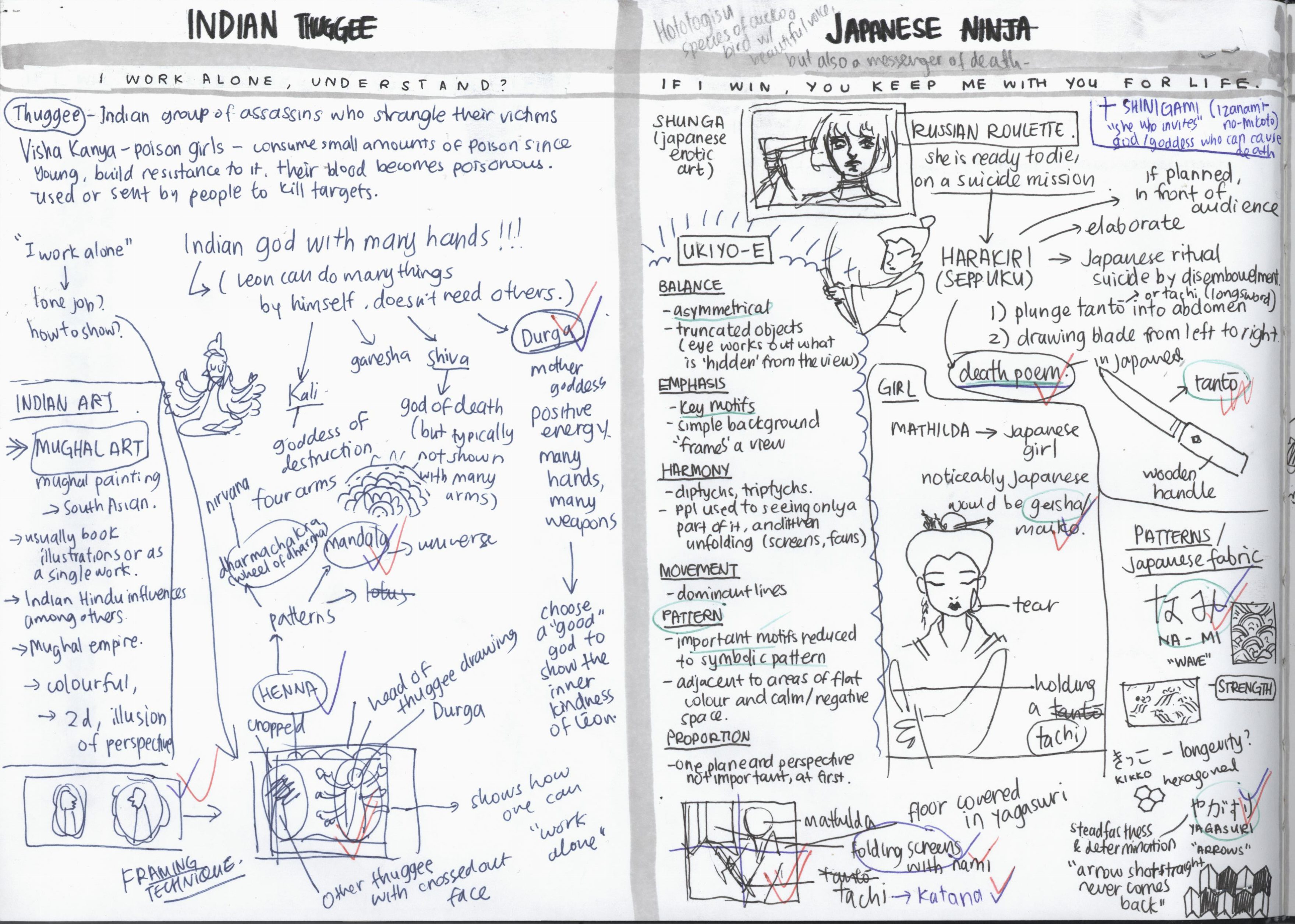
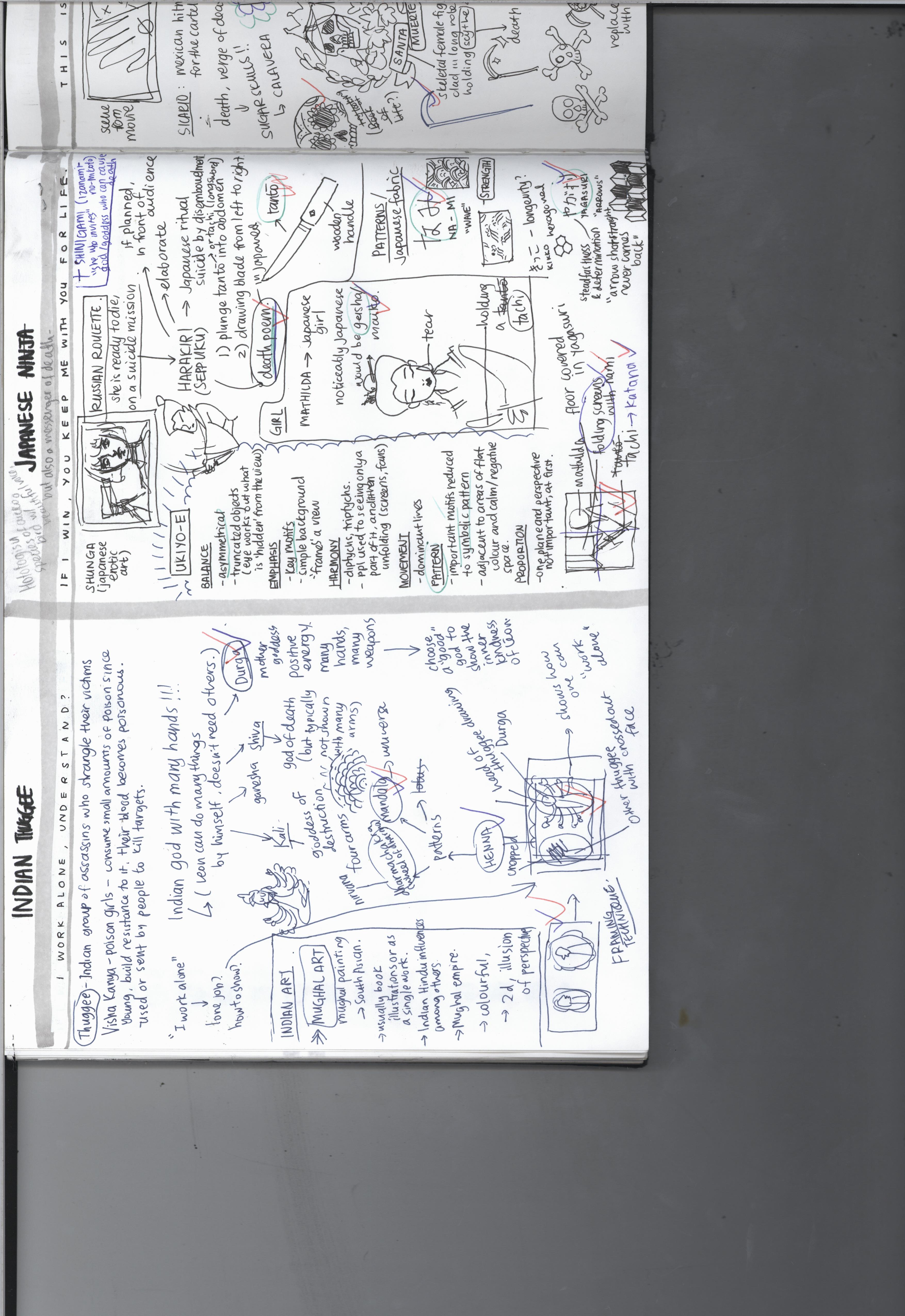
“I WORK ALONE, UNDERSTAND?” ◊ INDIA
I started with researching about assassins in the Indian context. I found the Visha Kanya to be interesting – they are poison girls who slowly poison themselves to the point of being immune to all sorts of poisons, and become poisonous themselves. (Phew so many poison in one sentence) Basically, small doses of poison are administered to girls since young, and the girls build resistance to it. Eventually their blood becomes poisonous and they become weapons. They are sent to kill off targets through seduction and then administering a kiss of death.
Depiction of Visha Kanya holding a scorpion in her left hand
However, I had already reserved the Mathilda pieces for the Japanese and Balinese cultures, and could not include the Visha Kanya in this composition.
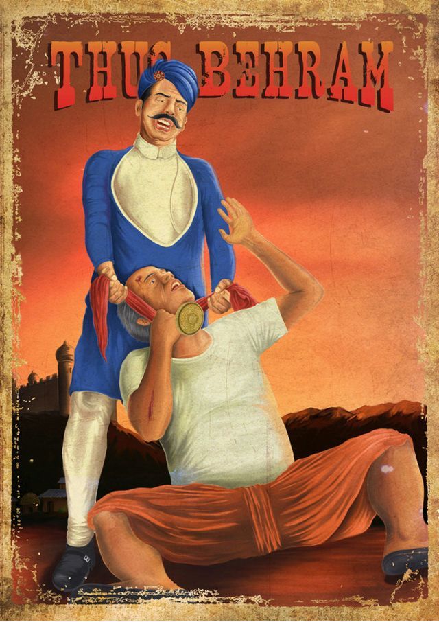
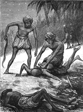
Another type of Indian assassin are the thuggee, a band of organised professional robbers and murderers who work in gangs, who mingle with their victims in their travels and strangle them with a noose or handkerchief to their deaths. This does not really fit Leon as he is a solo act, but I figured out that I could use this character of the thuggee to further emphasise Leon’s individuality.
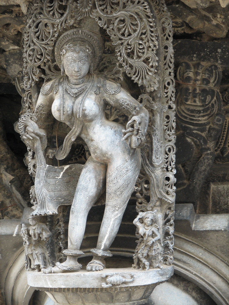
While researching on Indian mythology and folklore, I came across an image of a Hindu god with many hands. I immediately thought that I could use it to describe Leon’s ability to do many things by himself and him not needing anyone else. I researched further and found that most of the gods and goddesses have many different portrayals, with having multiple hands being one of them. I originally wanted to see if there was a god of destruction or death to represent Leon’s job as an assassin, but they are typically not shown with many arms. Indian deities
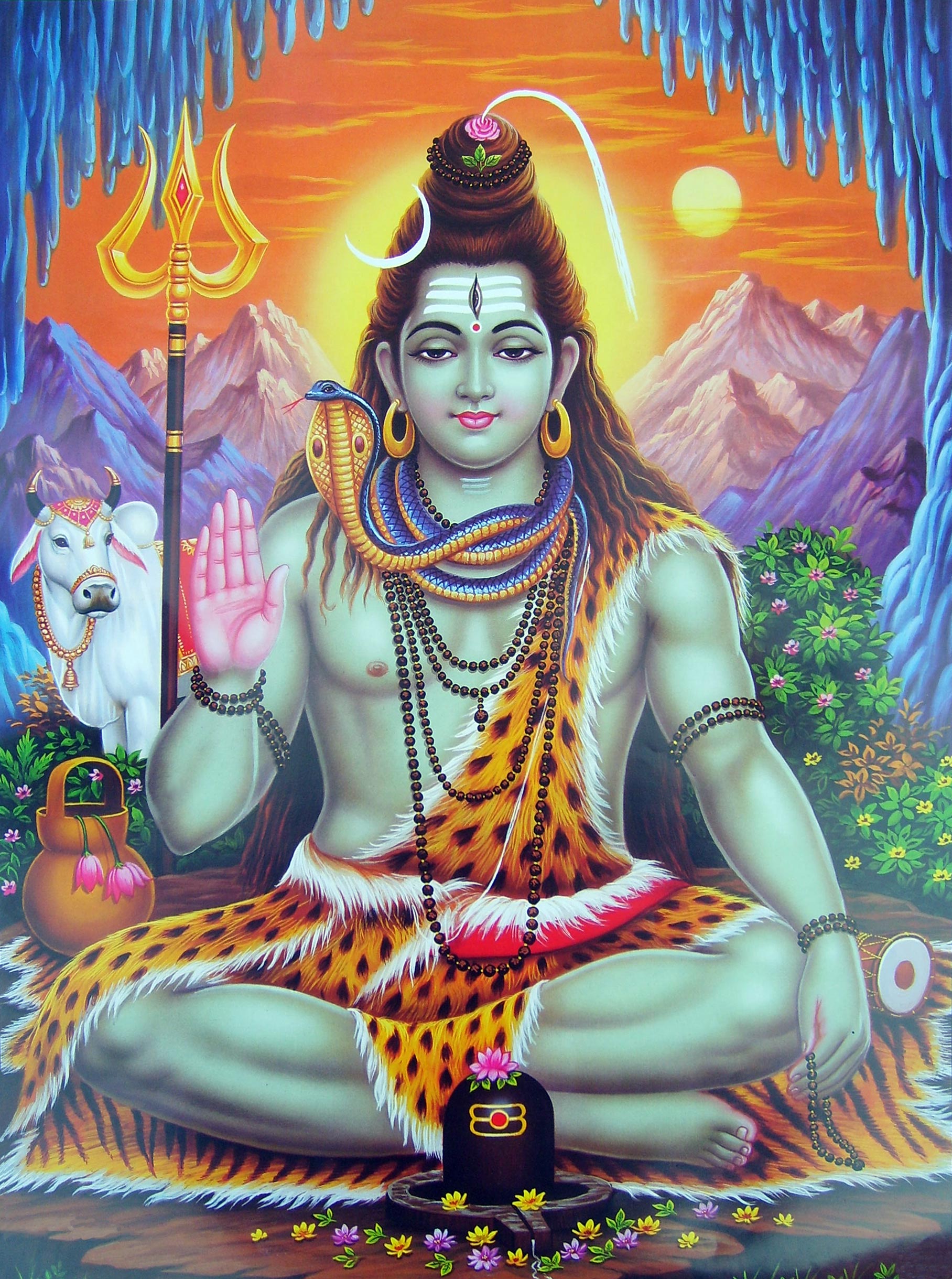
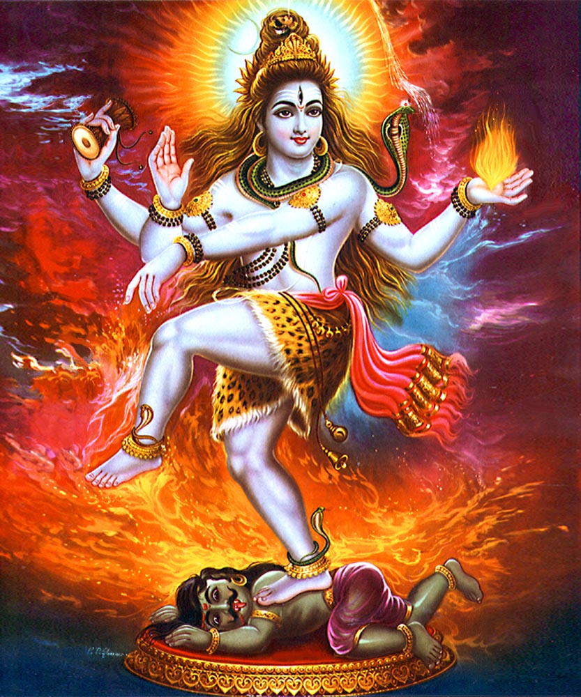
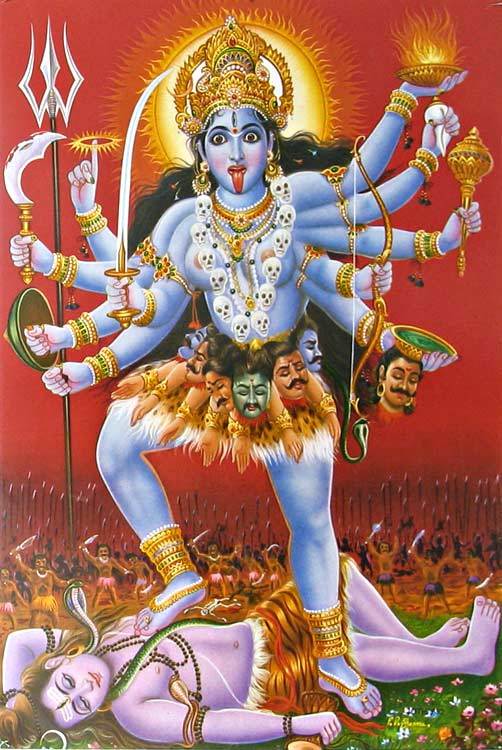
From left to right: Shiva, another depiction of Shiva, Kali with many arms
Durga, the mother goddess who emanates positive energy and wields many weapons in her many hands, is a god who is typically shown with many hands. I thought about it and decided that I could use this to symbolise Leon’s hidden kind nature and goodness, while at the same time wielding many weapons as an indication of his proficiency as a hitman.
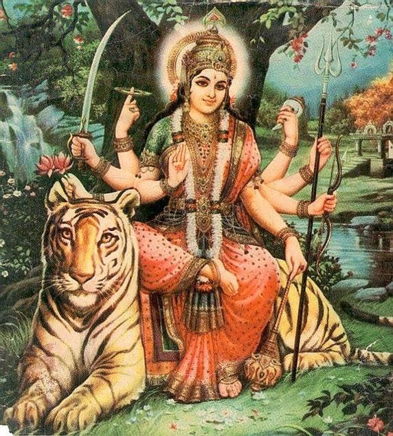
Durga
After settling this, I went on to find out more about Indian art. I stumbled across Mughal art, a type of painting which originates from South Asia, and is typically in the form of book illustrations or as a single work. They are usually colourful and two-dimensional, with the people portrayed in the side profile, most of the time. They are flat and try to create a sense of perspective and depth through the size of elements. In the portraits, different kinds of frames are used. After looking through this list of Mughal paintings, I felt inspired by one of the paintings I saw.
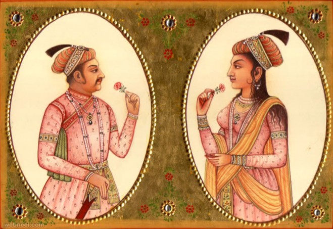
This Akbar Mughal painting gave me the idea of subjects interacting or having a connection whilst being separated by the framing. I immediately thought of how I could put Leon (as Durga/thuggee) in one frame, and other thuggees in the other frame to show Leon’s separation from the world and other individuals, and refusal to work with others. I thought of deliberately cutting off one of the frames to suggest continuity and the presence of other frames with other thuggees. The faces of other thuggees in other frames are crossed out to show how Leon doesn’t need them.
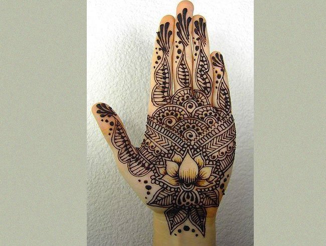
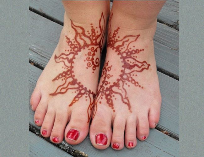
This left an empty space above and below, so I researched on Indian motifs and was led to henna, a practice of temporary tattooing, which I’m familiar with as there is also a culture of henna in Singapore. There were many motifs and designs that each bear a meaning.
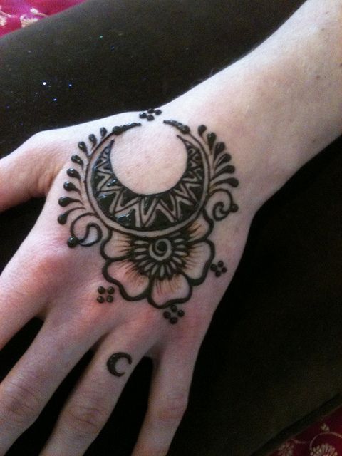
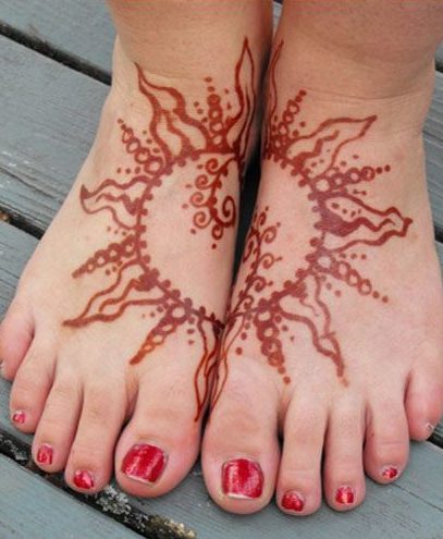
Left to right: Crescent design meaning a baby is on the way, lotus design symbolising the awakening of one’s soul, sun design representing immortality, knowledge and eternal love.
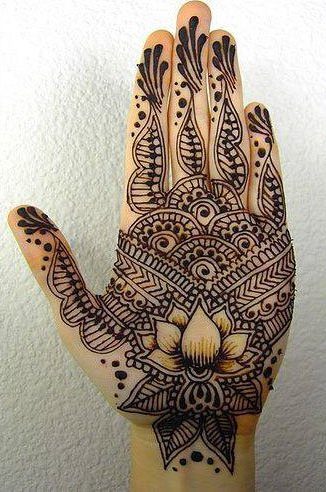
I decided to use the mandala, a typical but powerful motif that represents the universe. I repeated the design around the border, indicating how this is the universe that he lives in, the world Leon had created for himself, in which he is alone. This is the final result.
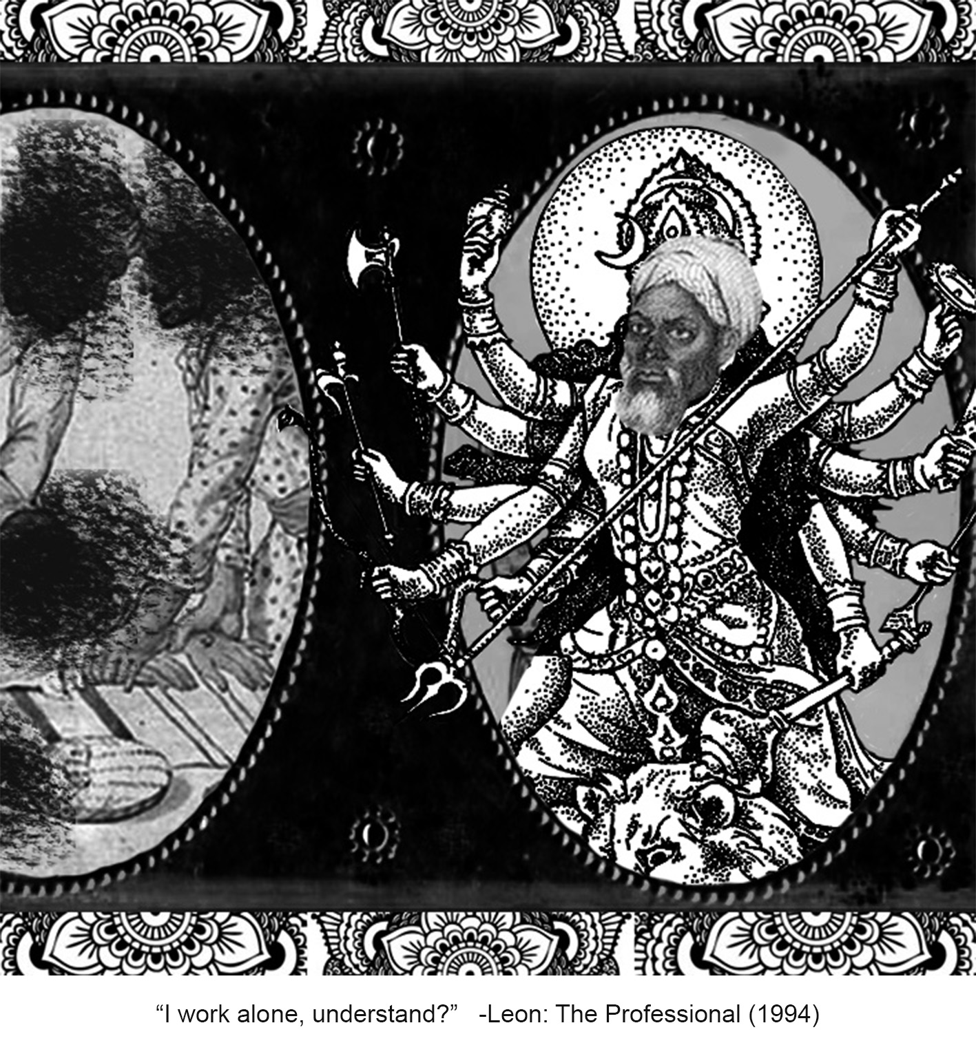
At first, the frame wasn’t black in colour, but since the Mexican (third) composition is really dark and stands out among the four, I decided to darken the frame to balance out the darkness of the third composition, and distribute the focus evenly over the four compositions when placed next to each other.
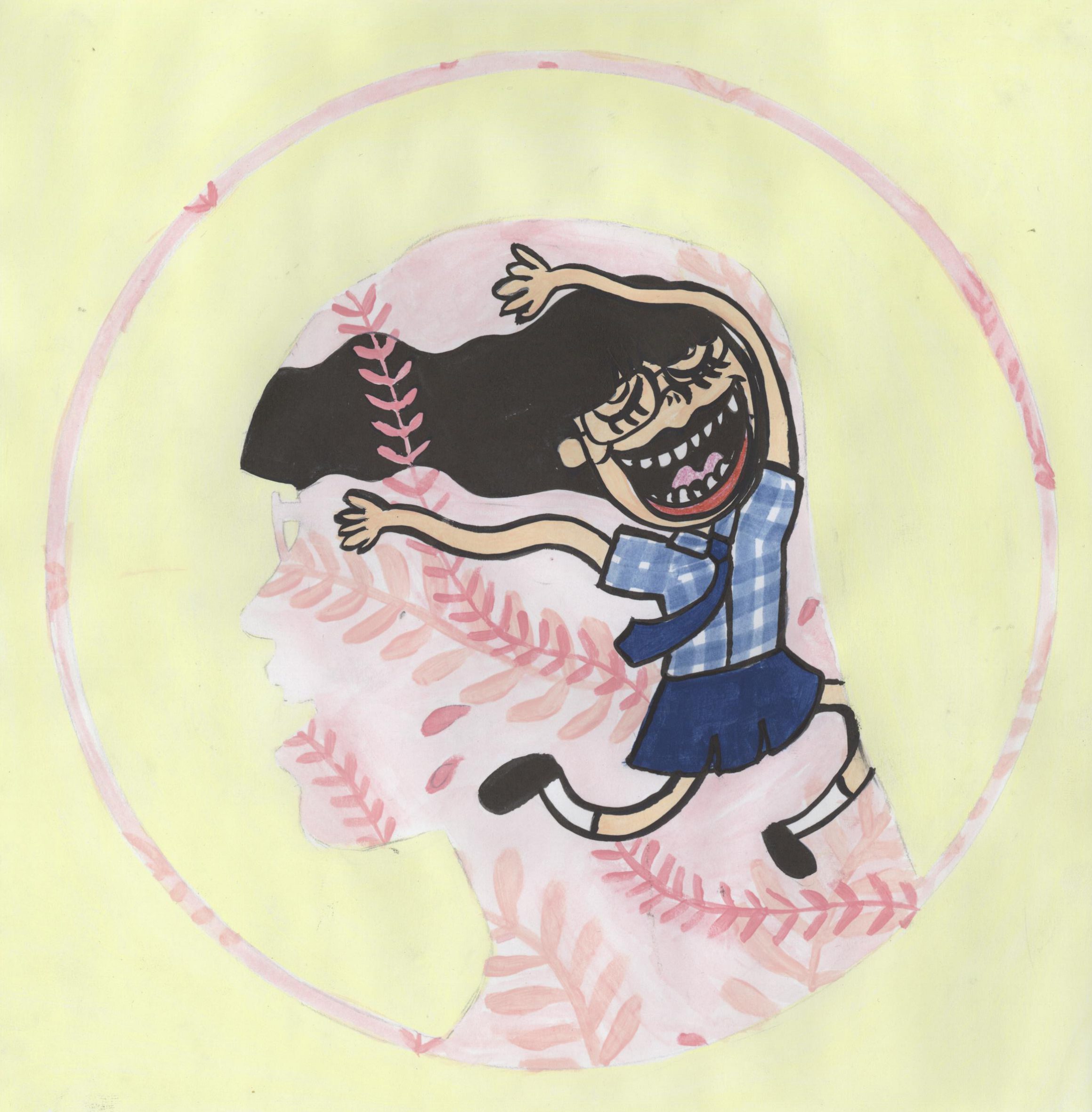
“IF I WIN, YOU KEEP ME WITH YOU FOR LIFE” ◊ JAPAN
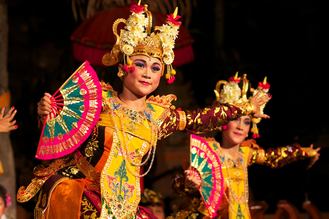
I assigned Japan to this quote because I knew about the Japanese act of suicide called harakiri/seppuku. Naturally, this is the first that I read up on. From my readings, I found out that this act is actually a ritual conducted in front of an audience, if planned. It was elaborate, slow, and as melancholic as it is intense. Usually, a tanto (short knife), wakizashi (short sword), or a tachi (long sword) is plunged into the abdomen and drawn from left to right. Immediately after that, a “kaishakunin”, or the “second”, decapitates the samurai. I chose the katana (a tachi) to be used by Mathilda in the composition as I felt it was most dramatic. Seppuku is usually done to die in honour rather than in the hands of the enemy, or as a capital punishment for samurais who committed serious offences. When in war or other unplanned circumstances, one can also carry out seppuku to save oneself from further torture.
Usually, a death poem is written as part of the ritual, as preparation for the act itself. I find that is is such a beautiful way to leave a part of yourself to the world after our death. I wanted Mathilda to have her own death poem. Hence I researched on death poems and found the hototogisu poems to be enchanting. The cuckoo is a bird recognised for its beautiful voice, but at the same time, it is also considered a messenger of death. “Hototogisu”, or “The cuckoo cries” is such a poetic way of indicating one’s moment of death. Thus, I simply used Google translate (what else) to translate a short English phrase into Japanese.
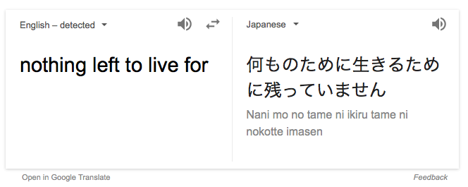
I wrote this phrase, with the “hototogisu” at the end, in the old Japanese style, and in Japanese calligraphy, on a yellowed piece of paper from my notebook.
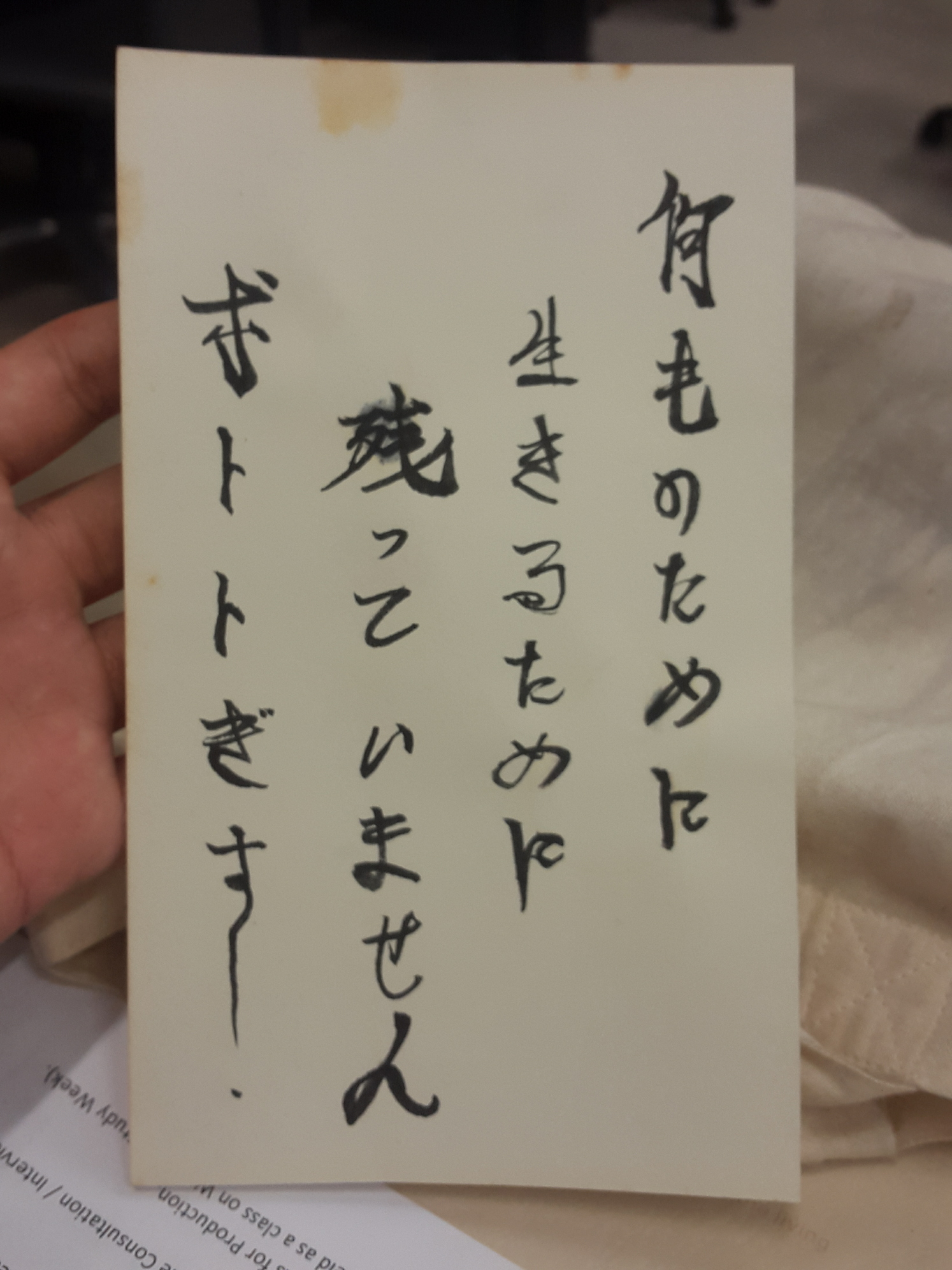
From right to left: Nani mo no tame ni, ikiru tame ni, nokotte imasen, hototogisu.
Translation: Nothing left to live for, the cuckoo cries.
Next, I did a short research on ukiyo-e, a Japanese characteristic style of woodblock printing and painting. Ukiyo-e itself means “pictures of the floating world”, and often depict scenes from everyday life, beauties, sumo wrestlers, and other scenes. They also include harakiri and Japanese mythology, or can also be in the form of shunga, which is Japanese erotic art.
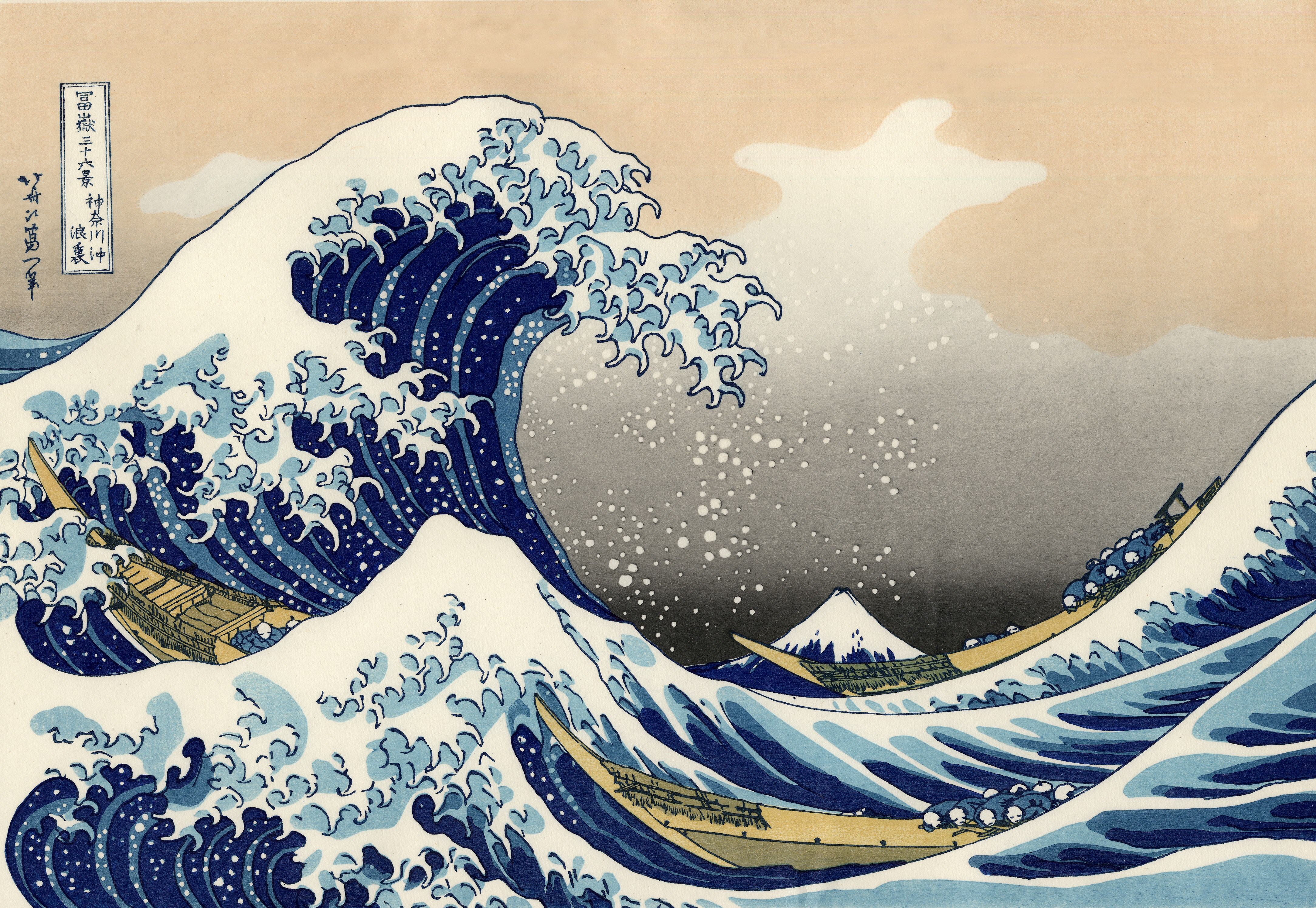
They are very in-the-moment and captures a vitality in movement of the subjects, making it almost voyeuristic. From the characteristics of ukiyo-e, I decided to employ asymmetry, perspective, and the use of key motifs and patterns in my second composition. For more explanation and examples of ukiyo-e, check out these websites. 1) What is ukiyo-e? 2) Ukiyo-e website 3) Ukiyo-e gallery
Other than that, I also researched on the patterns and motifs characteristic of Japan, searching for ones that would fit my intentions. This website gives a nice summary of some Japanese patterns. I chose to use the “nami” and the “yagasuri” motifs in my composition.
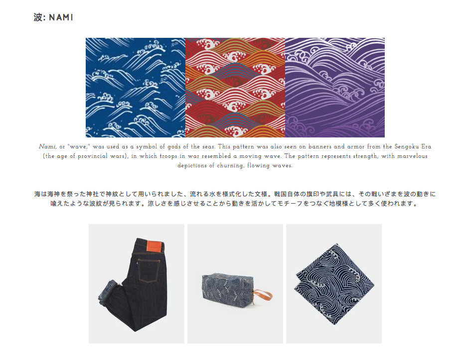
Nami is a pattern of waves. It represents strength, and in the “Leon: The Professional” context, it represents Mathilda’s courage and strength in her decision.
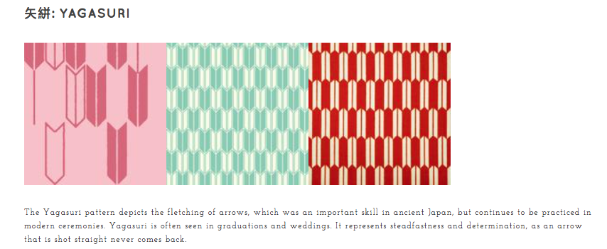
Yagasuri is a pattern of arrowheads. It represents determination, and in this film’s context, it represents Mathilda’s resolve to kill herself if Leon does not take her as his protégé.
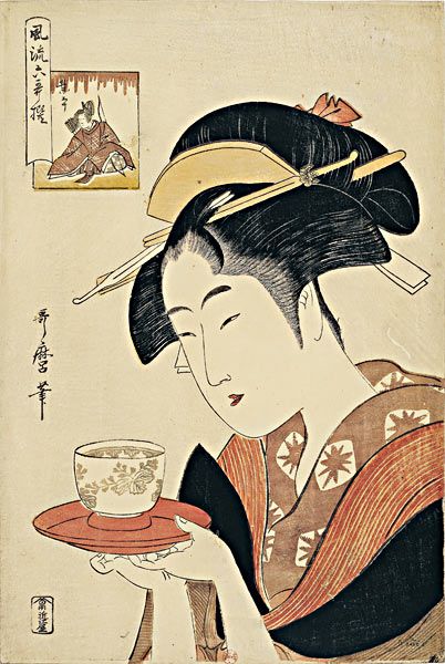
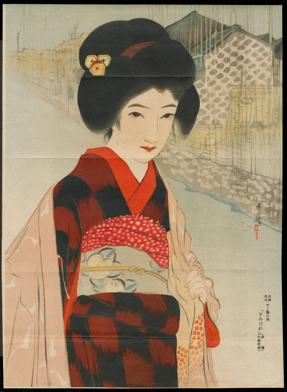
I chose to portray Mathilda as a maiko, an apprentice geisha. Ignoring what a geisha does, I solely took the apprentice quality of a maiko that is similar to Mathilda’s status of Leon’s apprentice in the movie. Also, the traditional garb worn by maikos would give the composition a strong Japanese visual.
Other than that, I included shinigamis at the background. A shinigami, or the “Izanami-no-mikoto”, meaning “she who invites”, is a god or goddess who can cause death by luring the person to kill himself or herself, basically coaxing the person to committing suicide. I thought that this was apt to accompany Mathilda’s suicide attempt and also to symbolise the other world.

As for composition, I made sure that all the elements were slightly off-centre to highlight the asymmetry, like used in ukiyo-e, and also gave the illusion of perspective and depth by dividing the composition into foreground (maiko), middle ground (screen-dividers) and background (shinigami). I made use of the screen-dividers, as a typical imagery used in ukiyo-e, to metaphorically separate the living world from the other world.
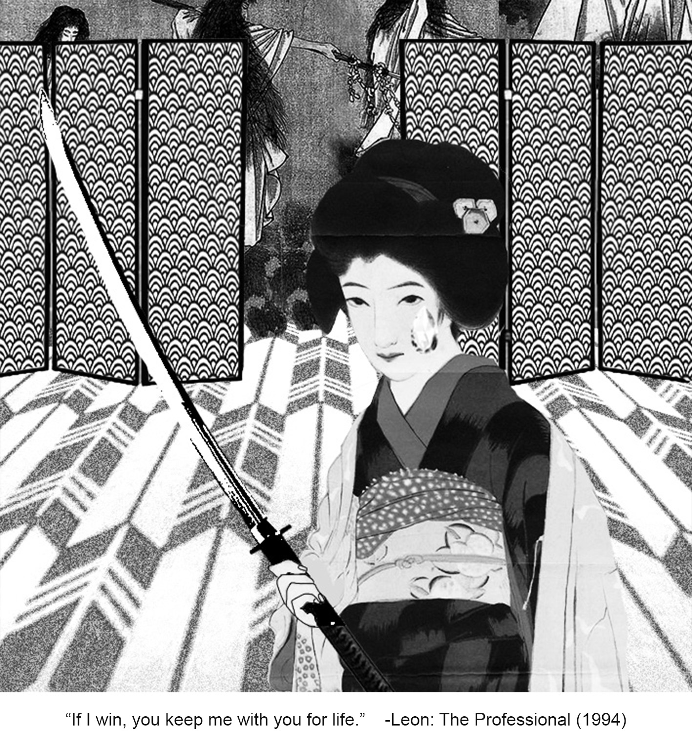
Meanwhile, the yagasuri pattern on the floor, replacing the usual tatami mats, is warped to enhance perspective and this is done deliberately such that the arrowheads are pointing towards the shinigami, showing further Mathilda’s determination in stepping towards the other realm. Mathilda is also placed in front of the opening towards the other world, indicating the shinigamis welcome and lure to bring her over to the other side.
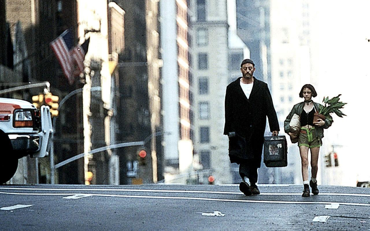
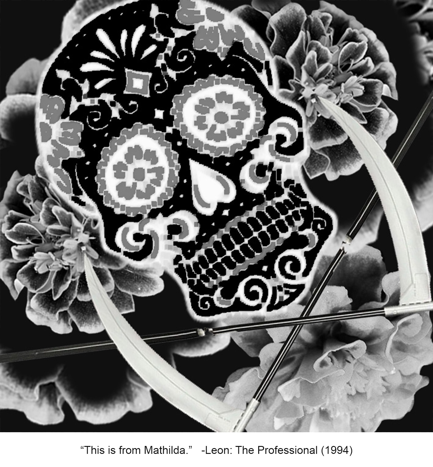
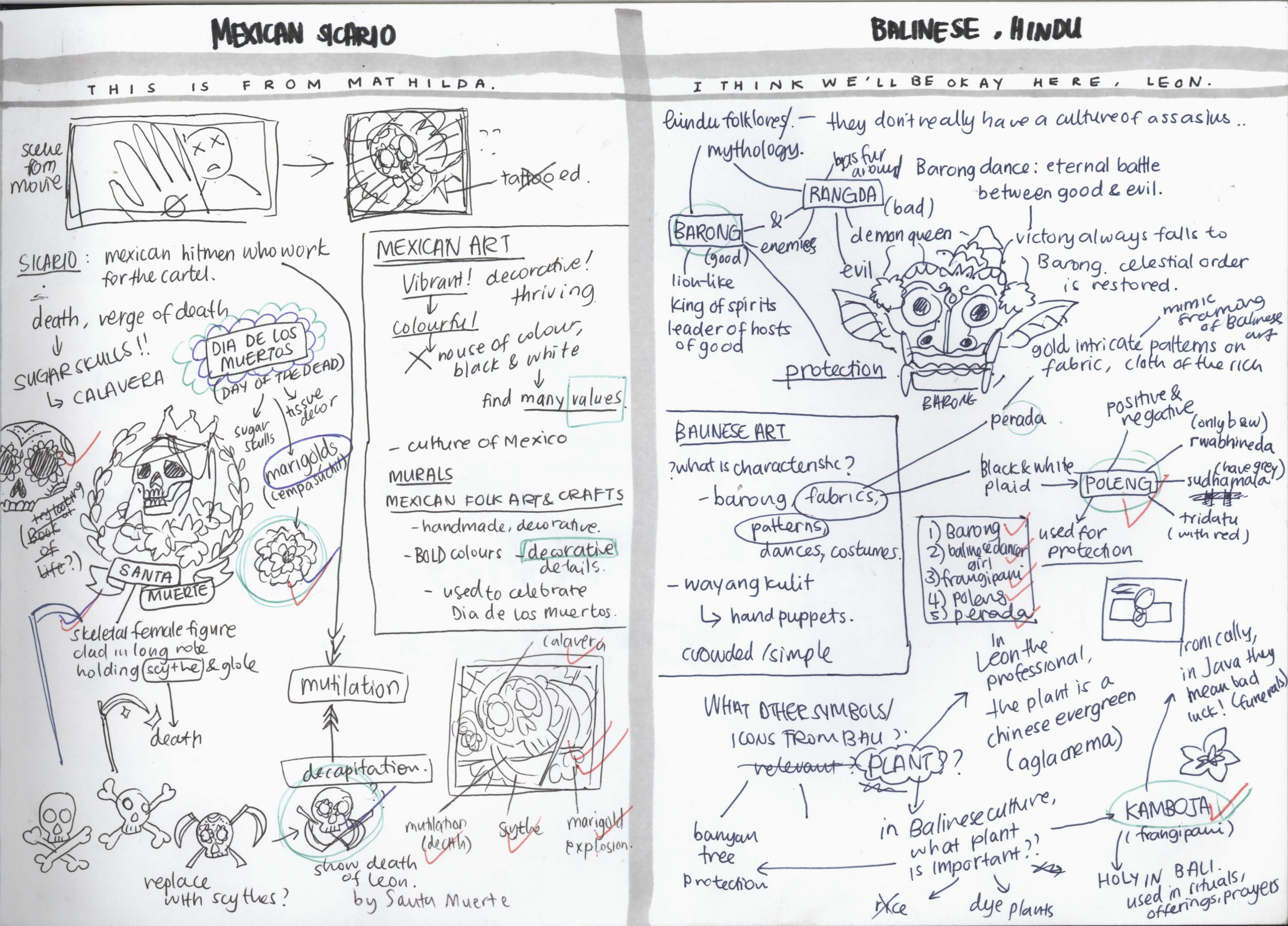
“THIS IS FROM MATHILDA” ◊ MEXICO
I originally only thought of Mexico in terms of their drug lords and hitmen culture, more commonly known as sicarios. I knew about it from the 2015 mystery/crime movie “Sicario”, which was about an escalating drug war in the borders between the U.S. and Mexico.

Emily Blunt in “Sicario”
However, the sicarios’ main weapons are usually firearms and the such, which is similar to those used in “Leon: The Professional”. This made me hesitant to follow through my plans of portraying Leon as a sicario.
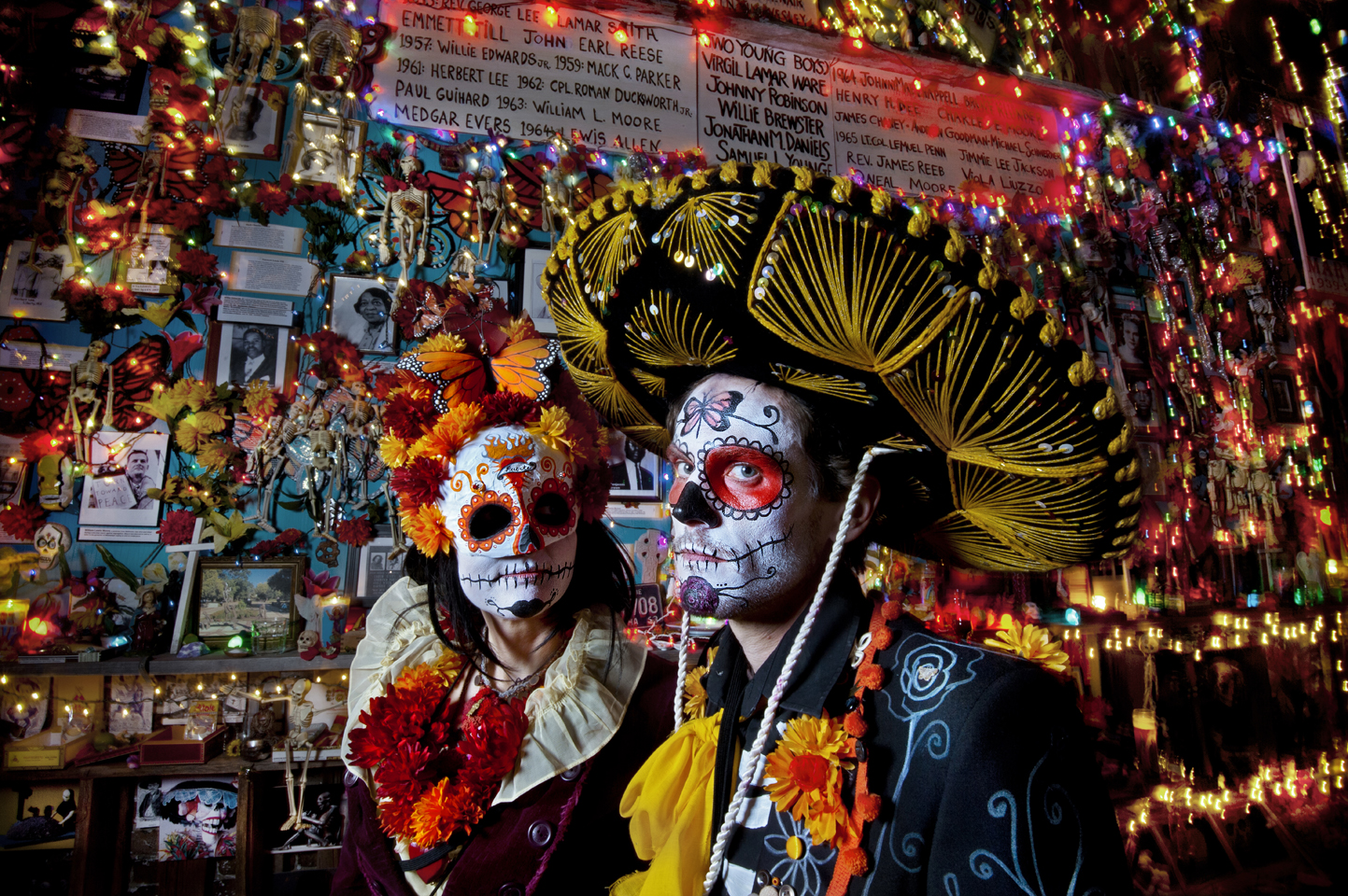
To my delight, while researching about Mexican art, I was reminded of sugar skulls! As someone who loves colour, sugar skulls and Dia de los Muertos have always had a special place in my heart.
Love it!!!

Sugar skulls, or known also as calavera, is an iconic element of Dia de los Muertos, which is the Mexican Day of the Dead festival. In this festival, Mexicans celebrate and honour the lives of the deceased, and spend a day with them, as they believe that during a particular day, the spirits make their way back to enjoy a day with their loved ones who are still alive. Happy with this, I continued to develop ideas on how to make the composition and what icons or symbols to use from Mexican culture and art.
Mexican art is usually vibrant and colourful, thriving and decorative. They proudly showcase the culture of Mexico. There was a strong presence of murals and also folk art and crafts. I chose to look closer at the folk art and crafts, which are decorative and used in their festivals, particularly Dia de los Muertos.
Another characteristic icon of Dia de los Muertos are marigolds, particularly the cempasúchil. In Mexico, they are called flor de muerto, which means “flower of the dead”. The cempasúchil can be seen covering the streets, as they are believed to attract the souls. I personally find the marigold to be a beautiful flower.

Look at this beautiful altar covered in marigolds!
I decided to use the marigold in the background, as the petals create an interesting pattern. They can also be seen as a sort of explosion, like fireworks, which alludes to Leon’s death by explosion, which is sad yet beautiful at the same time, because he sacrificed himself for someone whom, for the first time in his life since many years, has made him love again.
Also in my research, I found out about Santa Muerte, the personification of death. She is a female folk saint, depicted as a skeletal figure clad in a long robe and is typically holding a scythe and a globe. When I read the word scythe, I immediately thought of how I could use that to replace the bones in the typical skull and bones arrangement.


The typical skull and bones arrangement that I thought of was like of the left image. However, I got an idea and decided to arrange it more like the right image, with the blades of the two scythes against the neck of the calavera (which represents Leon). This signifies the taking away of his life by decapitation carried out by Santa Muerte, and also very subtly alludes to mutilation, which is also a common sicario way of brutal execution.
The tilted position of the calavera in the final composition is inspired by the scene from the original movie.
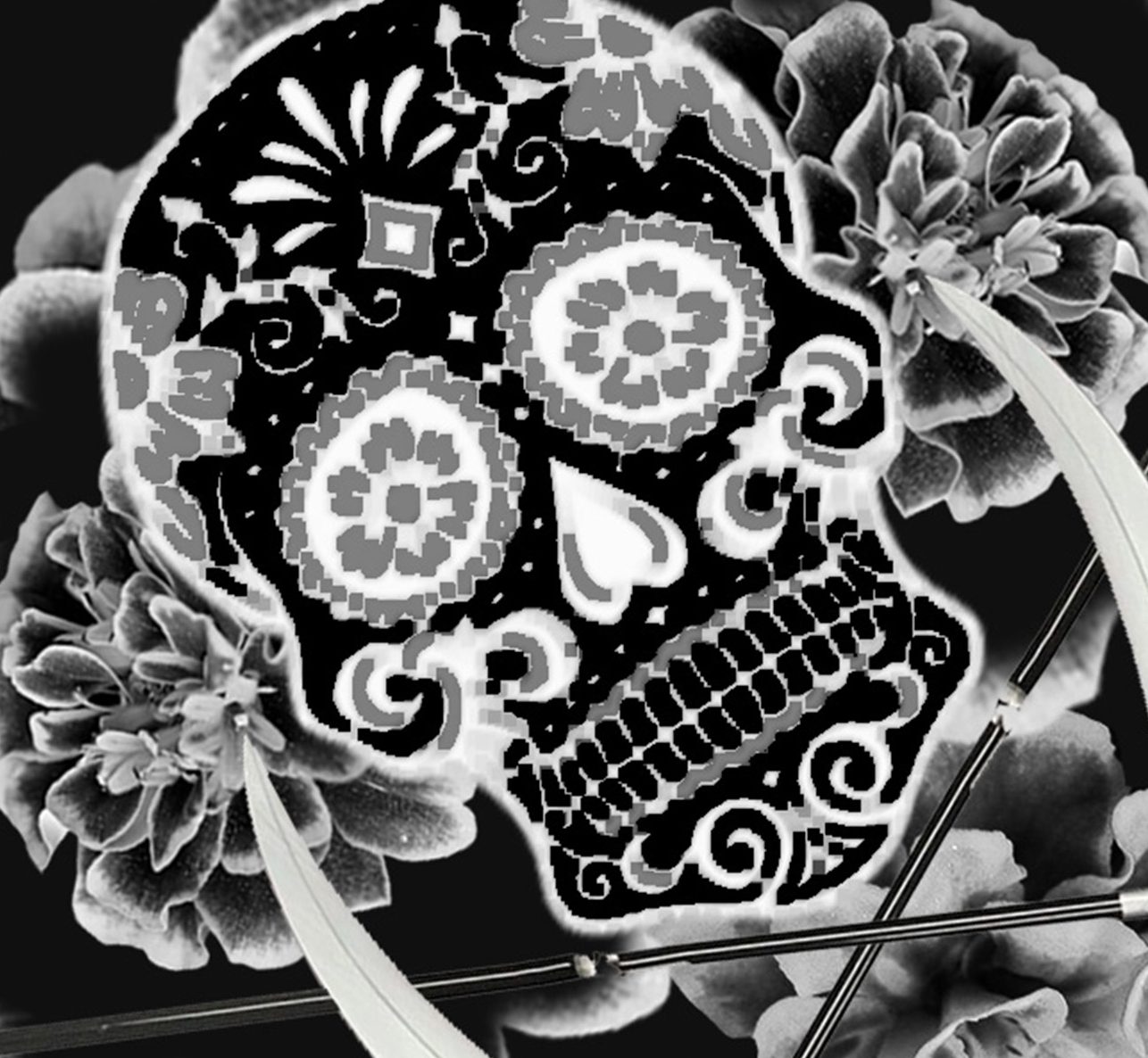
After looking at it again, I found that the tilted and off-centre position is much better than having it just frontal and straight, because it made the composition more dynamic and somehow more dramatic. Since the composition has to be in black and white, to showcase colour, I made sure that values were well represented through dark and light. I also finally chose to invert the colours because it made it look much more vibrant, almost as if the lines are glowing like neon lights.

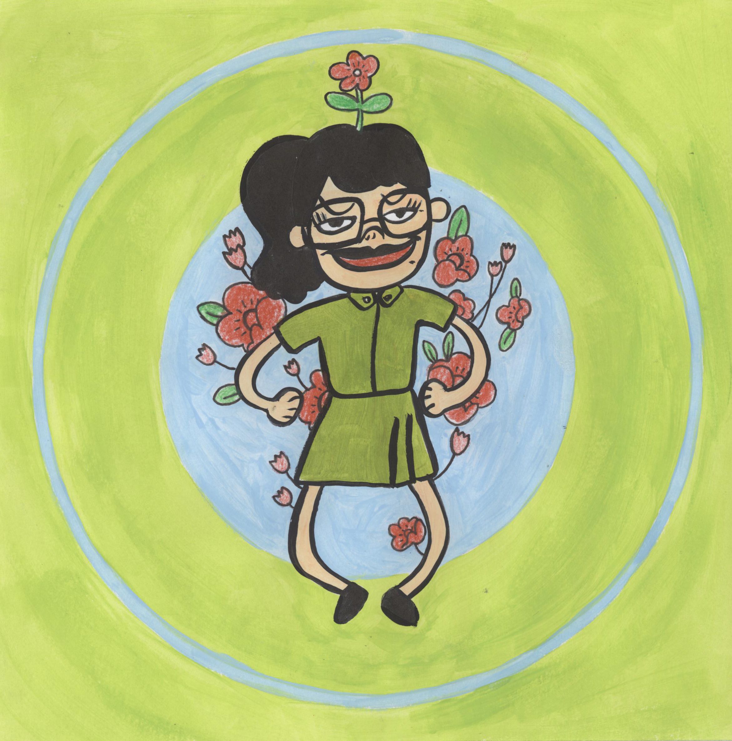
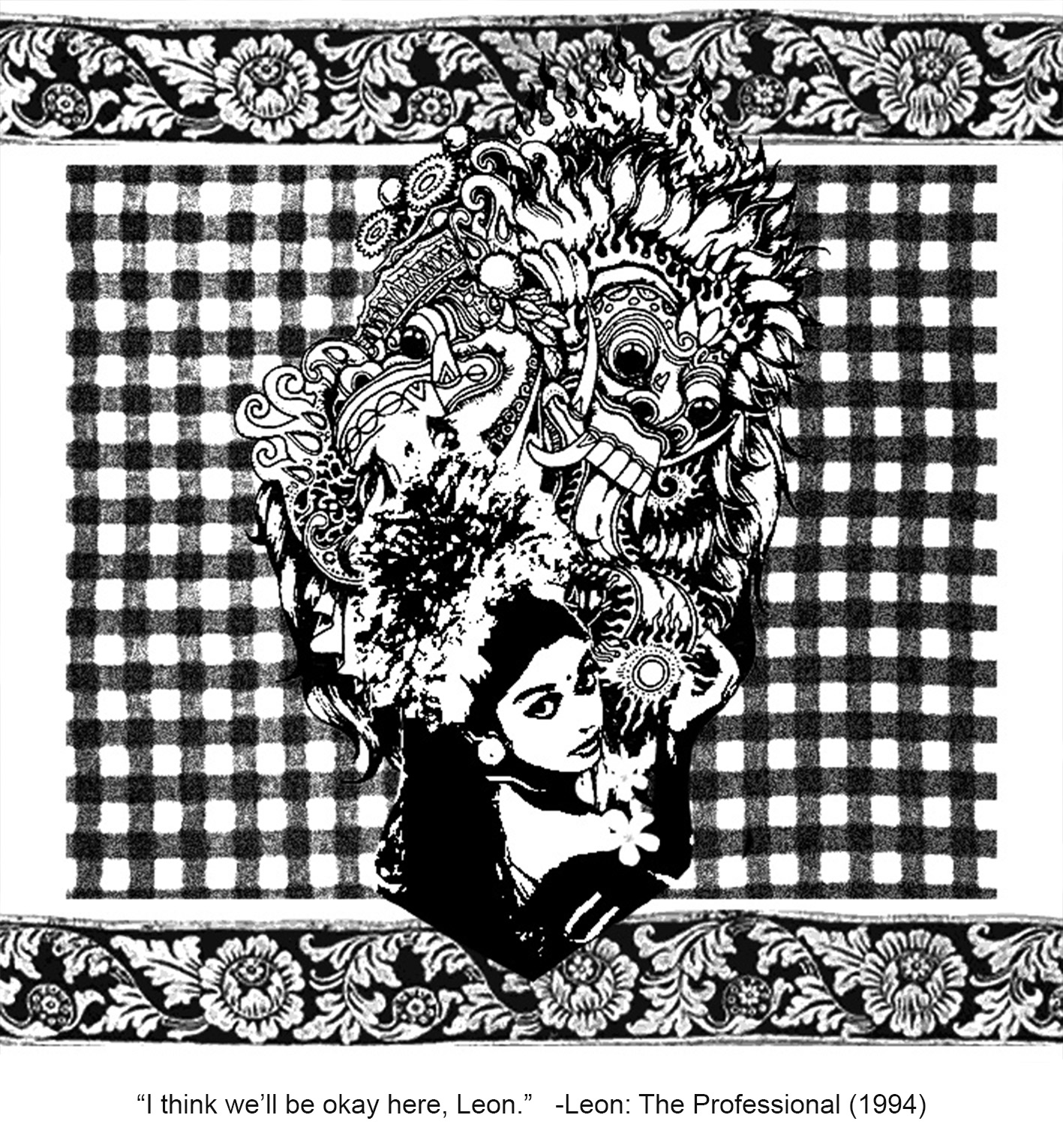
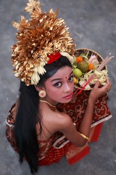
“I THINK WE’LL BE OKAY HERE, LEON.” ◊ BALI
We have finally come to the last composition, one that is closest to home for me. When I was young, my mom put me in a traditional Balinese dance class, which I was in a couple of years, and ever since then, I have always had a special connection with Balinese dance and culture. I love the costume, the colours, the music. The dance, of course, but the aesthetics was what really intrigued me.
There were some things that I knew I wanted to include. I knew I wanted to portray Mathilda as a young Balinese dancer. Since costumes differ from dance to dance, I decided that the tari pendet, or pendet dance, is a suitable one. This was the first dance I learned, like any other Balinese dance newcomer. It was the first I had to conquer, a dance that marks the start of our journey in traditional Balinese dance.
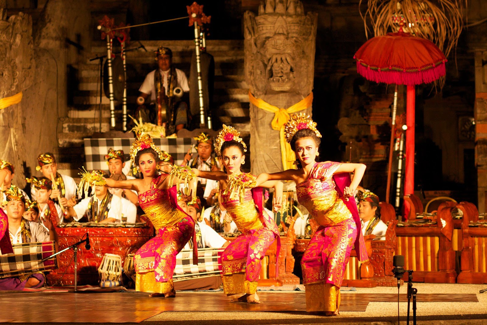
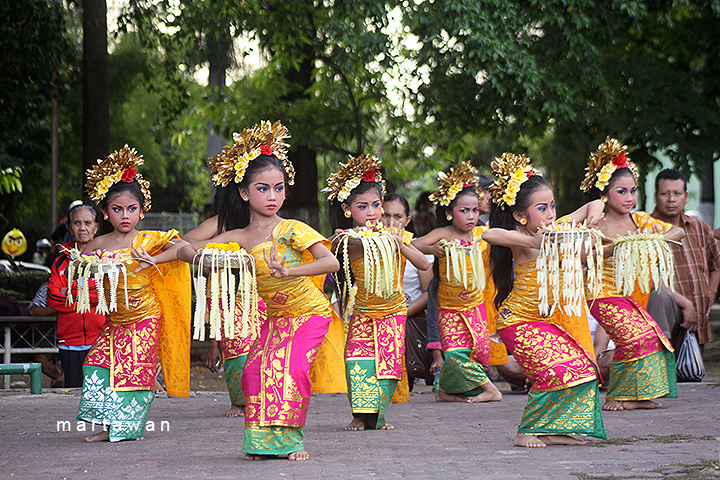
The dance itself is a welcome dance, a greeting. It is a dance to welcome the audience, invite the spirits to a performance, welcome the gods to the temple. In Mathilda’s case, I saw it more of a welcome of a new life. Like how the pendet was how I was welcomed to the world of Balinese dance, I wanted to use the pendet dance to symbolise Mathilda’s transitioning into a new life after the death of her loved ones. I think that the headpiece characterises the dance well enough, so I looked for a bust of a girl in the pendet costume.
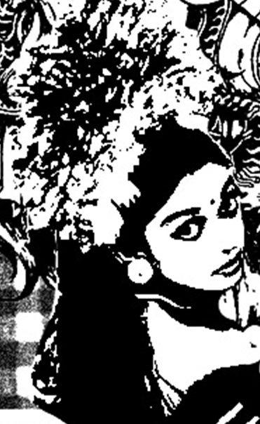
Then I adjusted the levels and threshold to not make it look so realistic.
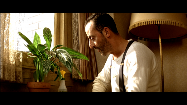
In the film, Leon’s plant was also an icon. It eventually serves to represent Leon himself. In the film, the plant was a Chinese evergreen. I knew that for a replacement, I wanted to use the kamboja, also known as the frangipani.
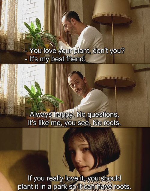
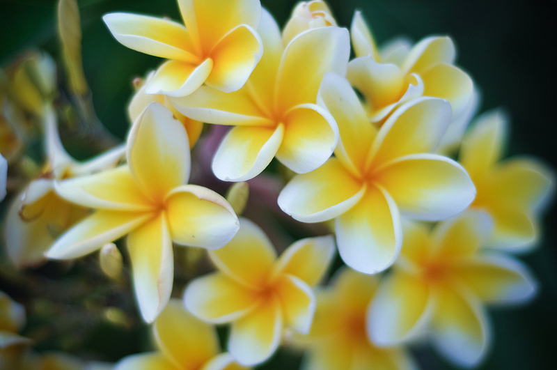
It is a beautiful, fragrant flower that is characteristic of Bali. An interesting thing is that while it is considered holy in Bali, it is actually a symbol of bad luck in Java because it is a funeral flower. This, I thought, was interesting as I was using the plant to symbolise Leon, and the act of burying the plant is like giving Leon a funeral.
Other than that, I knew I wanted to use the poleng, which is a checkered fabric widely used in Bali as a symbol of protection. I read up more on it and found out there are three kinds of poleng, which are the rwabhineda (only black and white), the sudhamala (black, white and grey), and the tridatu (black, white, grey and red). The poleng basically represents the positive and the negative in life, yin and yang, good and bad. It reminds us of the balance of the two and thus serves as a symbol of protection and reminder to the people of Bali. I decided to put the poleng as the background so that Mathilda is enveloped by protection, in addition to the looming Barong figure, which I will explain in a bit.
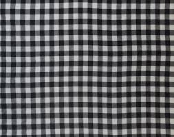
Sudhamala, which I used for my composition.
Other than the few elements that I already knew I wanted to include, I researched more on Hindu folktales and mythology of the Bali region. They do not really have any significant assassins of the region, so I looked into two popular icons: the Barong and the Rangda. Barong and Rangda are enemies. Barong is the lion-like king of spirits, leader of the hosts of good, while Rangda is the evil demon queen. In the Barong dance, they fight in an eternal battle between good and evil, even though Barong always comes out victorious in the end, restoring celestial order.
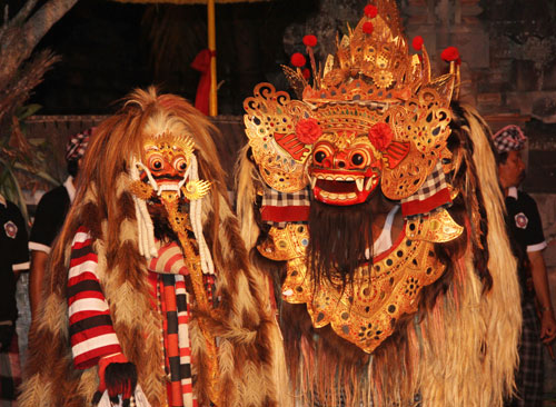
Barong on the right and Rangda on the left.
The Barong is also a symbol of protection, and I wanted to illustrate the film’s message to the audience that Mathilda is finally safe and settled, so it felt apt to include the Barong, which is significant to the Balinese, as Balinese Mathilda’s protector, in a sense.
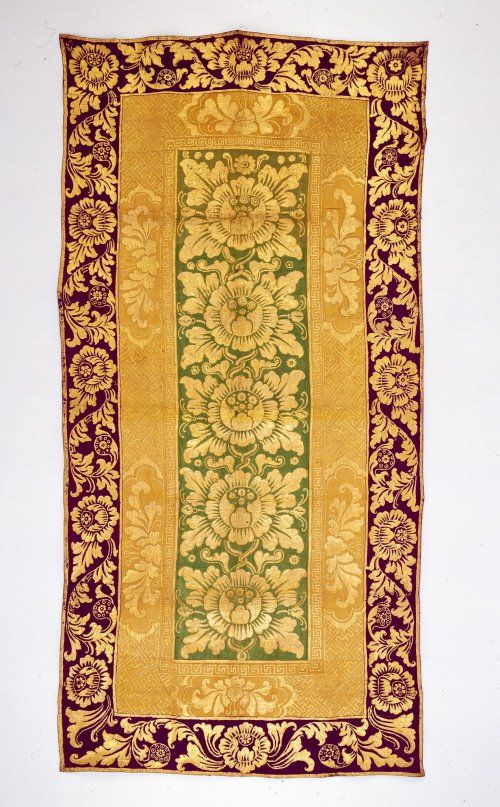
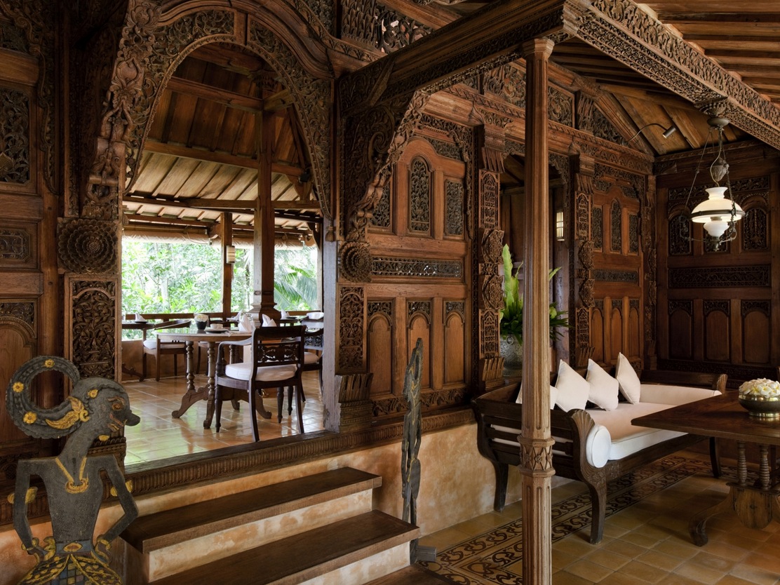
With regards to Balinese art, I found many interesting paintings, and wayang kulits (hand puppets) or wooden sculptures, but I felt that what was most interesting to me was the patterns, like those seen in Balinese wooden furniture, which are always meticulously hand-carved. These patterns are also often seen in the architecture of Bali, decorating the interiors.
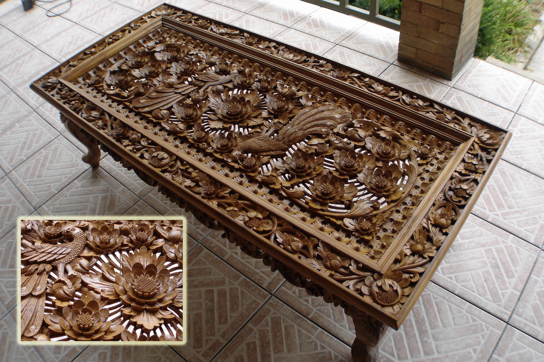
LOVE IT!!!
Similar to this, another type of fabric, the perada, also makes use of similar patterns. The perada is a fabric used by rich Balinese. The patterns are usually painted in real gold over a bright-coloured or expensive, luxurious fabric.
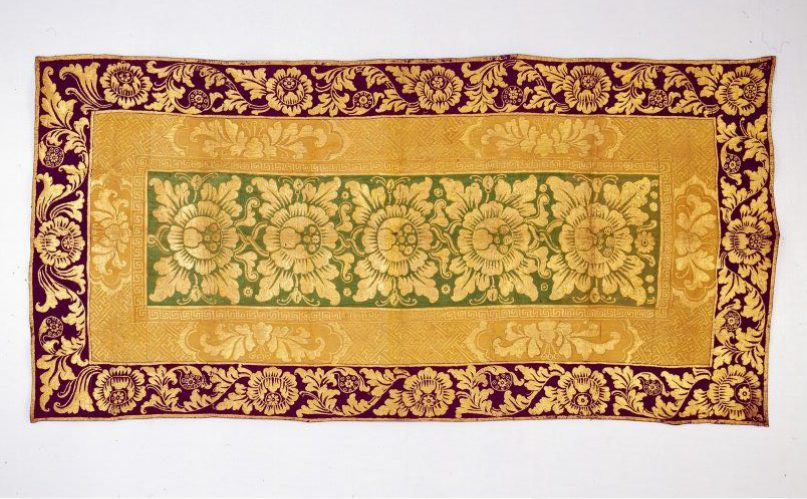
I decided to include this pattern as a border to mimic the use of a patterned border in many traditional Balinese furnitures. Thus, this completes my fourth and final composition!
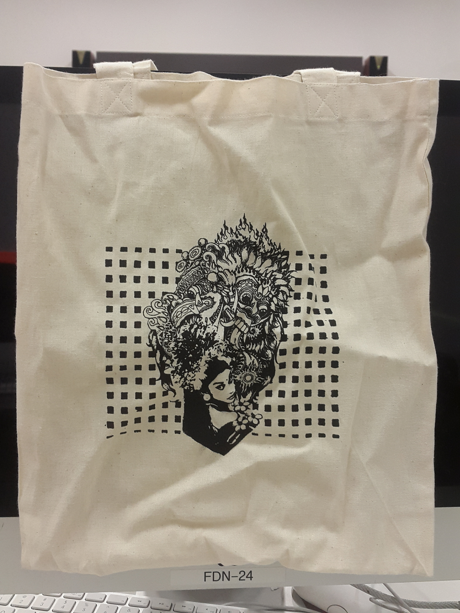
This is also the design I chose to print on my tote bag. I adjusted the levels and threshold, such that the colours all became block colours with no gradient, so that it would come out nicely in the screenprinting. I kept in mind that this design would be on a tote bag, and imagined how I would want the tote bag to be. Due to this, I decided to remove the perada border as I wanted the top and bottom parts of the Barong and the girl to sort of protrude out of the poleng background. After many tries, this is the final result, which I am satisfied with because I managed to make all the designs come out nicely!
That’s all! Thanks for making it through my long long explanation 🙂
(At this point I’m super tired because I had to type half of this twice because it was lost sigh but I made it anyways yay)