2D Project 3: Ego – Bloom

Our final 2D project for this semester is finally over. I cannot believe how fast it feels! This project was a fun one! (well everything else was fun too) This is our first project in colour, and I was excited because I like colourful things! This caused a little bit of problem because I couldn’t just choose colours because I like them, but with research and careful thinking, I made it work out in the end. Without further ado, here is the final work! For more in-depth explanation behind each composition, check out the process post! And to read up more about my research on colours, check out this post!

◊ BLOOM ◊

2d3-1 2d3-2 2d3-3 2d3-4 2d3-5 2d3-6 2d3-7 2d3-8 2d3-9 2d3-10 2d3-11 2d3-12


◊ CONCEPT ◊ 

The twelve compositions illustrate my growth as a person. The equations all have the format of

(Me at the start of the school duration) + (School experience) = (Me at the end of the school duration)

Up till now, I have identified myself by the academic institution I am in at any point of time, hence I decided to base each equation on that. The first row is about when I was back in Jakarta. I was naive and carefree, just a seedling. I was kept in a sheltered, reserved world by parents, school and friends, and as a result I was still naive and extremely carefree. When I got to Singapore in Sec 3, I was so keen to continue doing well in school and was extremely eager to please. I was still a bud. However, the school workload was much more intense than I anticipated and coupled with my general apathy towards my Singaporean classmates at the time, I was quite sad and discontented with myself. After going through such experience, I grew into a young flower and was exceptionally determined to turn over a new leaf in junior college. I was ready to face my challenges head on. Needless to say, JC wasn’t always smooth sailing. I have to say, they were some of the best and worst years of my life, it was just like a roller coaster. As a result, by the end of the two years, I feel like I have grown in strength and resilience and matured as a person too. This leads me to enter university with a much calmer attitude and resolve to face whatever comes up with a positive outlook. With graduation still far ahead, I have no idea how this experience will change me, but I’m positive about what is yet to come.


STYLE ◊ INSPIRATION

I chose to do the illustration in my casual style instead of my normal style, as this is the style more of my classmates know (and it saves time). I’ve had this style since way back, and it is characteristically me, so I thought that it was apt to make the series coherent and stylistically strong. The main inspirations for this work are the double exposure tattoos by Andrey Lukovnikov and posters of We The Fest Indonesia. 

lukovnikov-1
Andrey Lukovnikov
64e707d9b2b15b972918ee9b71264500
We The Fest collateral

I liked the use of circles in the posters and collaterals of the festival, and thought that I could use it as a frame for my compositions. I felt that the circle framing serve as a distinctive style that wraps the compositions together, and employed different styles to distinguish between the columns.


◊ PRESENTATION ◊

I did not include any supplementary materials this time, as there was no need to. I simply put them up on the wall in the default layout and without the plus and equal symbols. Presentation generally went well except that I still forgot to mention some things due to nerves and the time limit, although I did write down the points that I wanted to say. However, I am glad that I got to go back to the basics and stop thinking too much for once. I feel that I have expressed myself and my journey in a simple way that others can understand, and I feel that I have also done this project in a style that is characteristically me, which I’m happy about.

I still have a long way to go in terms of work ethics and time management, but I’m glad that I’ve learnt quite a bit this semester. Looking forward to dying more in the future!

fb31df6232f2362d35d5a4914888202e

2D Project 2: Forrest Gump – I Think I’m Kind of Falling in Love with You

I find it a little hard to believe that the project we just finished was only the second one. It felt as if we have been doing this forever. Albeit it being a challenging project, I had lots of fun, and am happy that I finally got to try my hands on silkscreening.

On this post, I will be giving a summary of my four compositions and an explanation of the overall concept. Enjoy!


◊ OVERALL CONCEPT ◊

The main concept for this project is the relationship between Leon and Mathilda from the 1994 Luc Besson film “Leon: The Professional”, one that I really enjoyed watching. I’m about to spoil the whole film here so if you don’t want it ruined for you, go and watch it first HAHA.


Okay so you’re here either after watching it or you don’t mind spoilers.


Here’s your last chance to watch the movie first if you haven’t.


In the film, Mathilda’s family is killed by a crazy corrupt DEA (Drug Enforcement Administration) officer and she seeks refuge from her neighbour, Leon, who is a hitman. Mathilda, who is only 12 years old at the time, asks Leon to take her as his protégé so that she could take revenge on, in her own words, “the dirtbags who killed her brother”. Long story short, Leon refuses at first, eventually accepts her and the two develops an unlikely bond throughout the rest of the film, each taking a place in the other’s heart that never existed before. I finally selected four quotes from the movie that are key points in the film and describes what happened to Leon and Mathilda, and their relationship in the film.

While initially I wanted to use the many iconic objects from the film to make my compositions, I realised that doing so would make my renditions too literal, which is exactly what the project is NOT about. It was really confusing because after watching the movie, one would definitely have preconceived images directly related to the film.  After enlightening consultations with Joy, I finally understood that there are many ways in which to tackle the project brief. I decided to take a look at the relationship between Leon and Mathilda from the point of views of different assassination cultures from around the world. I used icons and symbols from the different cultures, and also, by Joy’s suggestion, explored the compositions based on the art practices of the area, which I really want to thank her for. (Thanks Joy!!)

Without further ado, here are the final four compositions!
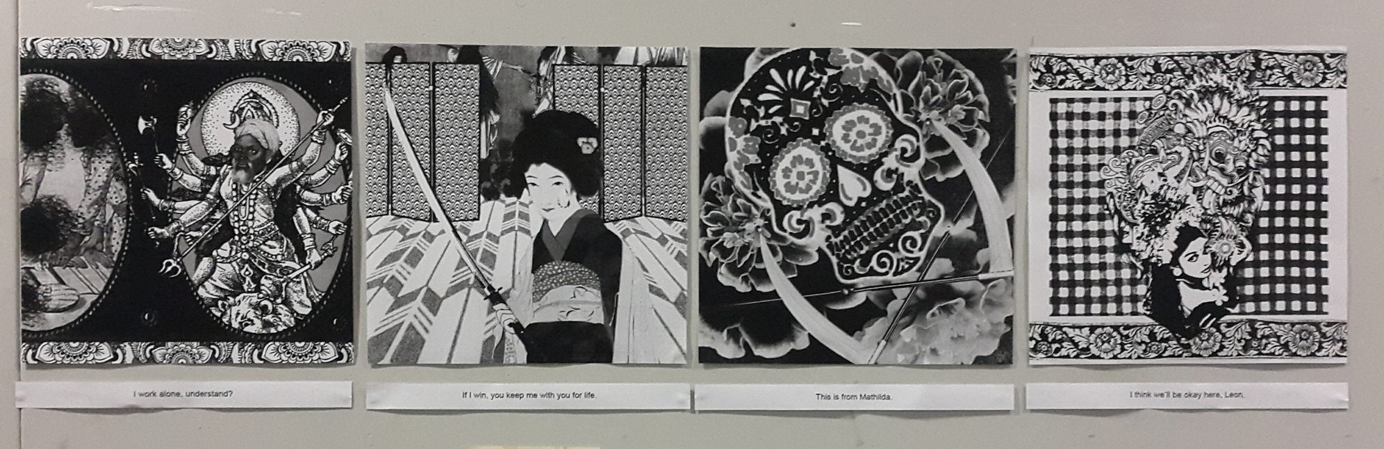
 

NUMBER ONE ◊ INDIA

clarita_saslim_leon_the_professional_1

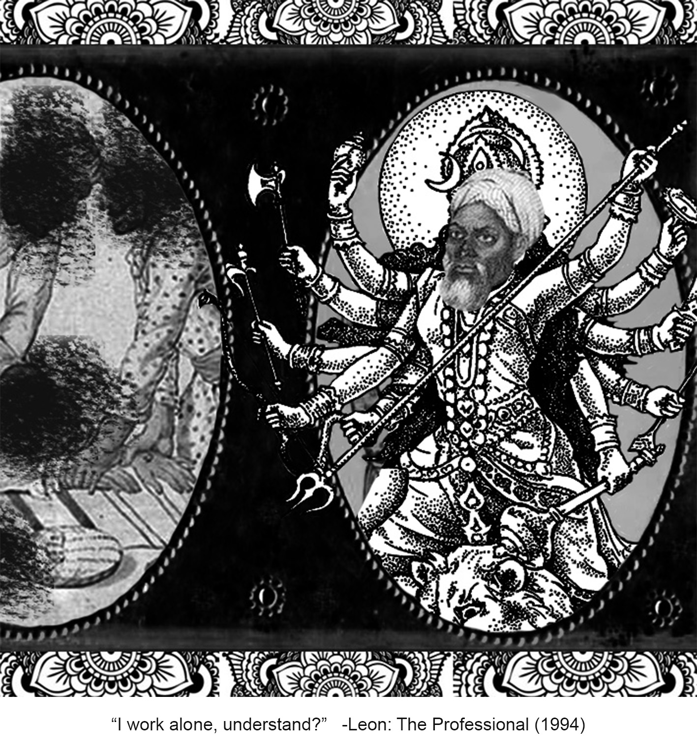
The quote here describes Leon’s inherent cold-heartedness towards Mathilda, after spending a lifetime of putting aside emotions as part of his job. This was him rejecting Mathilda’s request of taking her as an apprentice.

I chose India for this piece. I took the Indian Hindu goddess Durga, a multi-dimensional goddess of power and strength, mother of the universe, to represent Leon. The many hands wielding different weapons symbolise Leon’s individualistic and independent nature, as he does everything by himself. Instead of choosing Kali or Shiva who are deities of destruction and death, I chose Durga to symbolise Leon’s hidden kind and caring nature, that he is actually good.

I replaced the head with the head of a thuggee/thug, an Indian professional robber/murderer who typically travels in gangs, gains trust of his victims and strangles them to death during the journey. To describe Leon’s defiant nature, and also his personal code of working alone, I included a group of thugs on the left frame with their heads marked out, showing their irrelevance to Leon. Moreover, the placement of the frames, which is cut off-centre, is done to suggest the presence of other frames containing other pictures of thugs outside of the composition. The framing is inspired by Mughal art, paintings that originate from South Asia, and I used one particular painting to create this piece.

I also used the traditional Indian henna design of the mandala, which symbolises the universe, as a border, to indicate how this is the universe that Leon lives in.


NUMBER TWO ◊ JAPAN

clarita_saslim_leon_the_professional_2

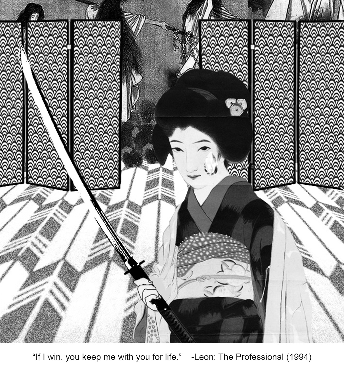
This quote is what Mathilda says when she is about to shoot herself in the head in a self-initiated game of Russian roulette. At this point of time, she has nothing to live for anymore if Leon does not take her in.

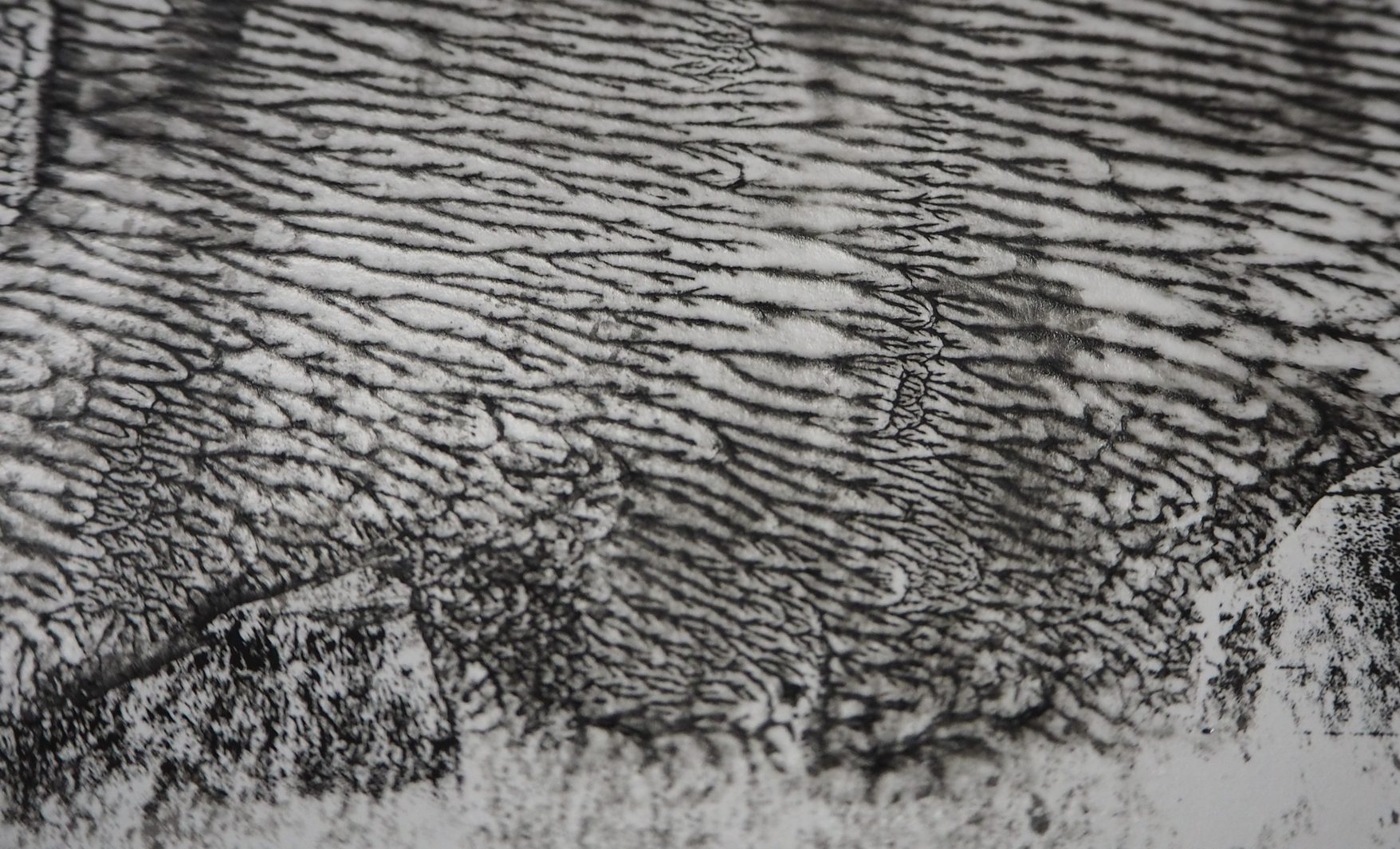
I chose Japan with the ninjas in mind, but then I remembered about the old Japanese act of voluntary suicide, harakiri/seppuku, and thought that it would be perfect for this scene. The ceremonial disembowelment is usually done with a tanto (short knife), but can also be done with a tachi (long sword). I chose to use a katana (which is a tachi), to heighten the feeling of risk and intensity, making it look more dramatic.

Shinigamis, death gods who lure people to take their own lives, can be seen in the background, giving the piece a slightly eerie feeling of looming death.

I also included two characteristic patterns from Japan, “Nami“, meaning waves, on the screen-dividers, and “Yagasuri“, meaning arrows, on the floor to replace the usual tatami. Nami means strength and represents Mathilda’s courage in her decision. Yagasuri means determination and represents Mathilda’s resolve to kill herself.

Mathilda is represented by the maiko, or apprentice geisha, in an illustration style that is typical of Japanese paintings and ukiyo-e, which I referred to when making this composition. Ukiyo-e, a genre of art that features woodblock prints and paintings, makes use of asymmetry and slight perspective, which I applied in this composition. I divided the piece to foreground (maiko), middle ground (screen-dividers) and background (shinigami), with all of the elements placed slightly off-centre. 

I carefully planned the arrangement such that it is hinted to the viewers how Mathilda is on the verge of death. I made use of the screen-dividers (common image in ukiyo-e) to create a clear division between the living world (where the maiko is) and the underworld (shinigamis). Directly behind her is the opening towards this underworld, and together with the yagasuri pattern deliberately pointing towards the underworld, this illustrates Mathilda’s resolve to head towards death. The yagasuri pattern pointing towards the background also helps to create an illusion of depth and perspective, which is an element of the art of ukiyo-e.


NUMBER THREE ◊ MEXICO

clarita_saslim_leon_the_professional_3

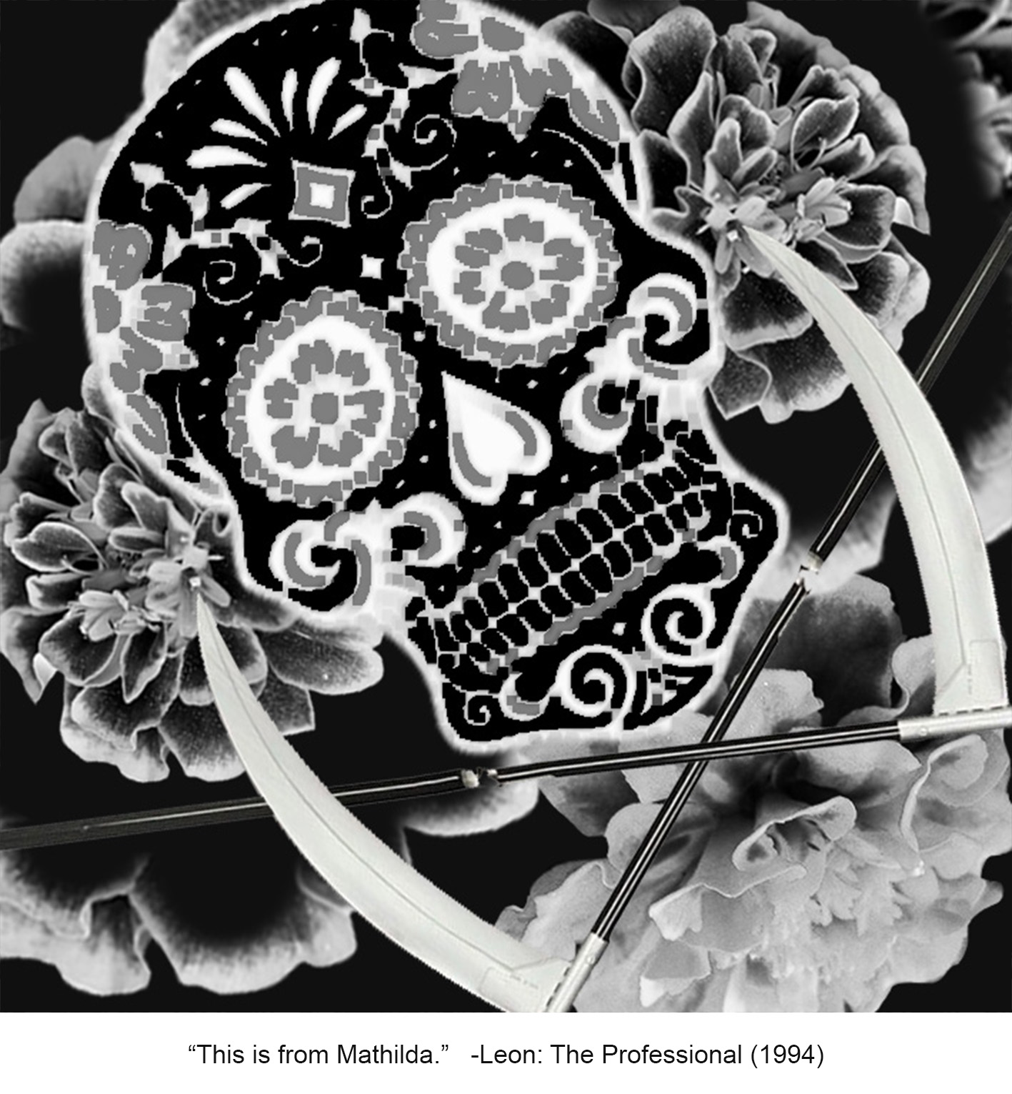
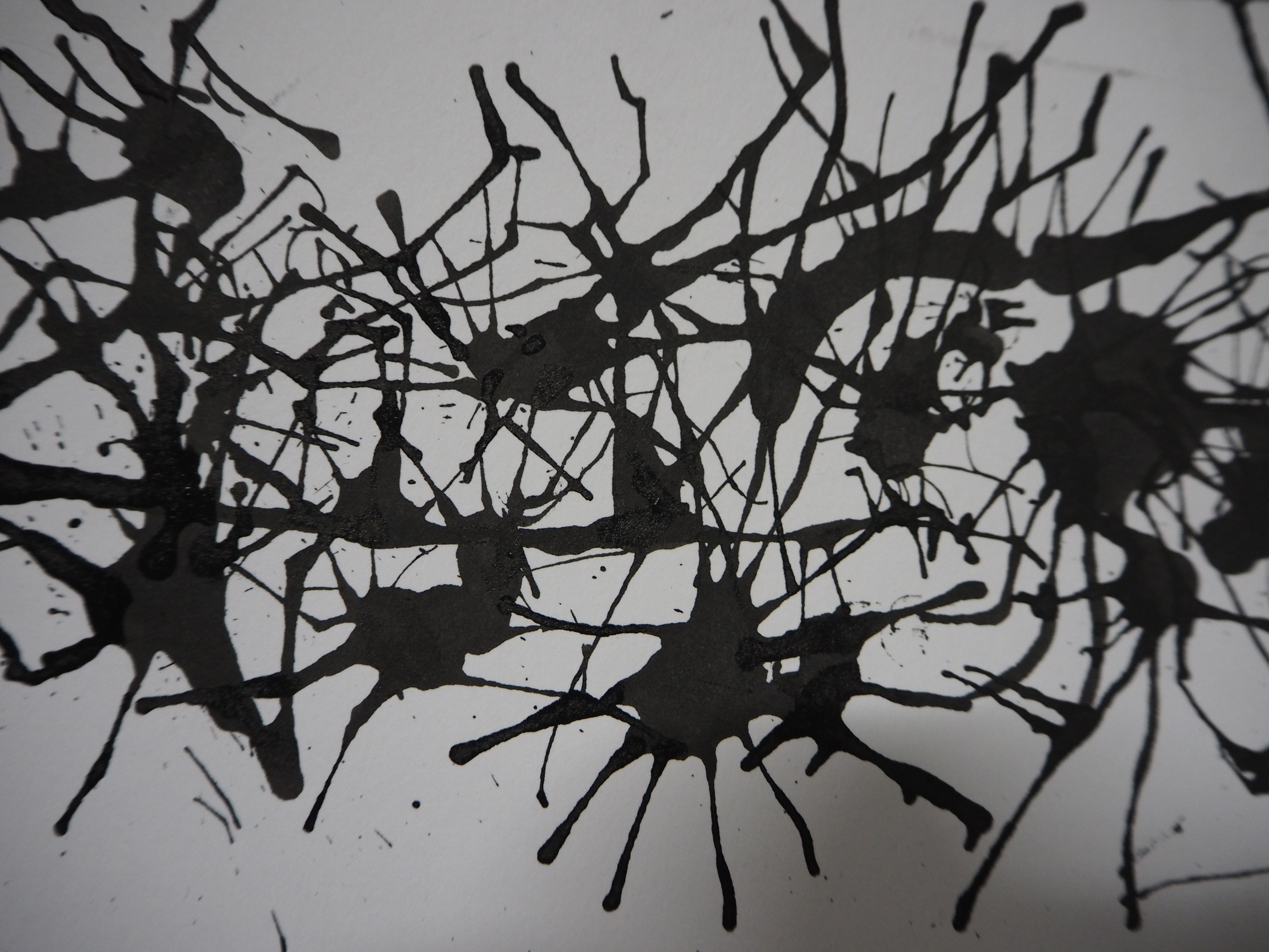
These were Leon’s last words (cries) as he sacrificed himself to save Mathilda. He has gone from an aloof, cold-blooded murderer to a man who is again, capable of feeling love and care for another person.

I chose Mexico for this scene, originally just because I wanted to portray Leon as a Mexican sicario, a hired professional assassin that works for the organised drug cartels in Mexico. However, sicarios also used guns primarily, and I thought that this was too similar to the movie’s Western usage of firearms. When I researched about Mexican art, I am reminded of the famous and beautiful sugar skulls symbolic of the Day of the Dead and realised that I could also use this to recreate Leon’s death scene. Branching from Mexican folk art, this colourful, decorative style is used in the Day of the Dead celebrations, or Dia de los Muertos.

I chose a few symbols from the art style and celebration to use as elements of this piece. The calavera, or sugar skull, represents both Leon and death. The scythes are representative of Santa Muerte, the Mexican female folk saint who is a personification of death. She is believed to deliver people safely to the afterworld, and typically holds a scythe, along with a  globe, or other things. The skull and scythes are arranged in a typical skull and bones arrangement, and further emphasises death, with the blades placed at the nape of Leon’s neck. This also alludes to the act of decapitation, characteristic of the sicarios’ way of finishing off their targets by mutilation. Behind is a blooming pattern of marigolds, specifically the cempasúchil, or the flor de muertos (flower of the dead), which is the main flower used for the Day of the Dead celebrations. They are arranged to create a haunting yet beautiful aura that looks like fireworks, and also to represent the explosion of grenades in the movie.

I also did not put the skull in an upright position to mimic Leon’s position of death in the film, where he lied on the floor. I feel that this also made the composition more dynamic and less boring.
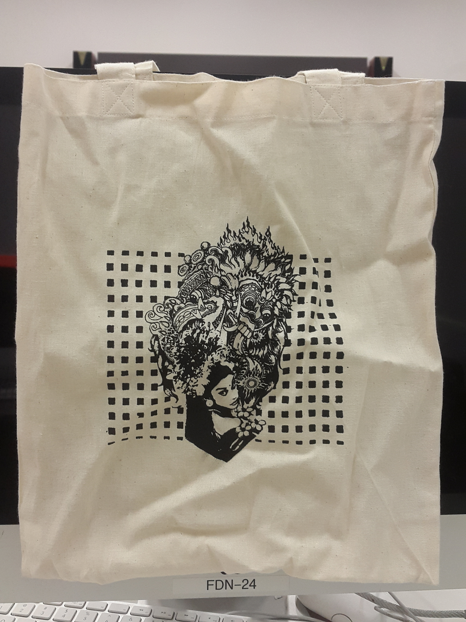
 

NUMBER FOUR ◊ BALI

clarita_saslim_leon_the_professional_4

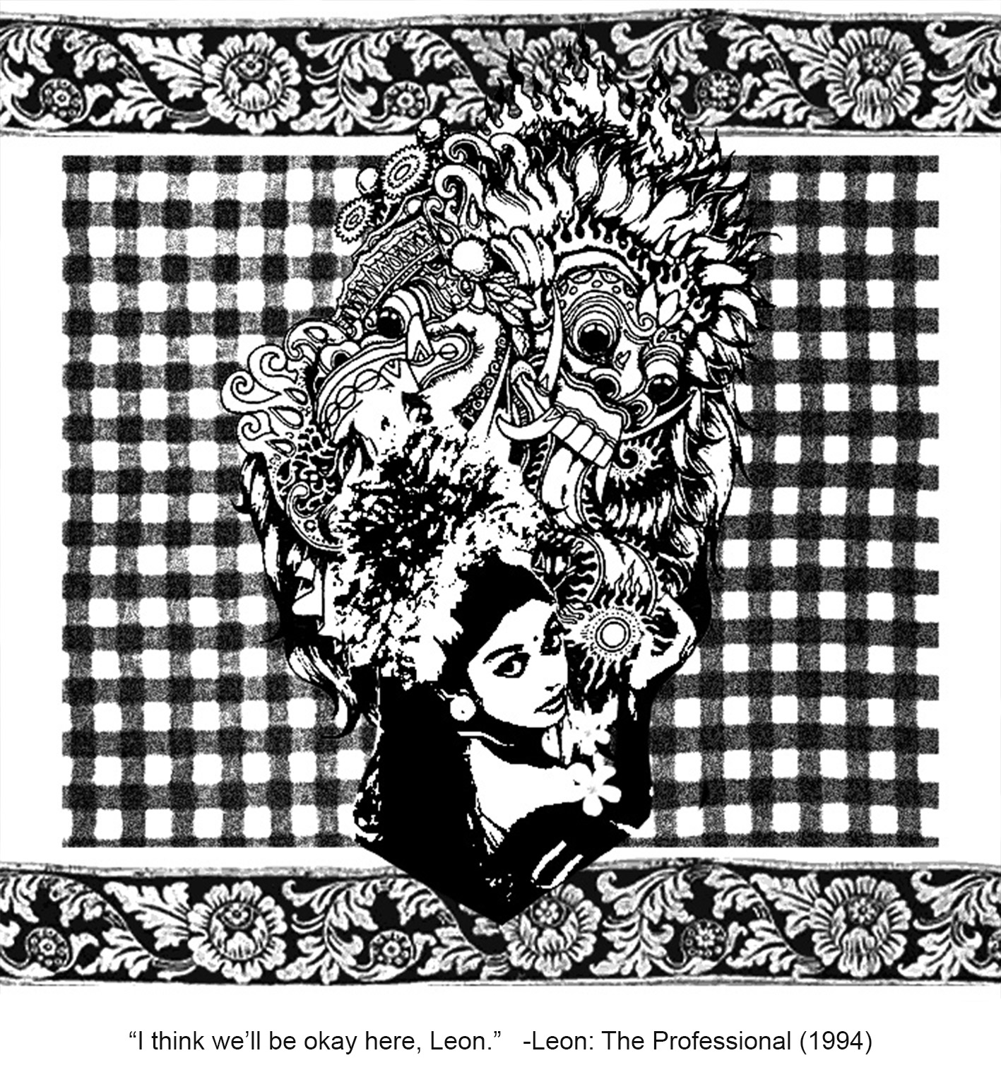
The last quote is the scene where Mathilda buries Leon’s plant (also an icon of the movie) in the garden of the school where Mathilda found refuge in, after Leon’s death.

I chose Bali for this scene. I have always had an attachment to Balinese culture, and this was the first culture I researched further on, based on my then knowledge of it. I already knew some of the patterns that I was going to use, such as the poleng (which I will explain soon). Mathilda is represented by the girl in traditional Balinese costume used in the pendet dance, a dance that I am familiar of. The dance is characterised by the headpiece. The pendet dance is a welcome dance, a dance of greeting. Here, I used it to represent Mathilda’s welcoming of her new life, and the transition between her previous life and her life after the death of her family and Leon.

The original Chinese Evergreen plant from the movie is replaced by the kamboja (frangipani), a flower that is considered holy in Bali. I made use of its interesting duality as it also represents death and bad luck in the Javanese context.

Behind her is the Barong, a lion-like king of spirits, leader of hosts of good, of the Balinese Hindu mythology. The Barong is a symbol of protection, looming over Mathilda, that hints at Mathilda being safe from then on, after Leon’s sacrifice. Moreover, I used a sheet of poleng fabric at the background to emphasise protection, as the black, white and grey plaid is a pattern used for protection typically seen in Bali.

To complete the composition, I added a border of perada, a fabric used by the rich, inspired by its similar pattern seen in the carvings of typical Balinese furniture.
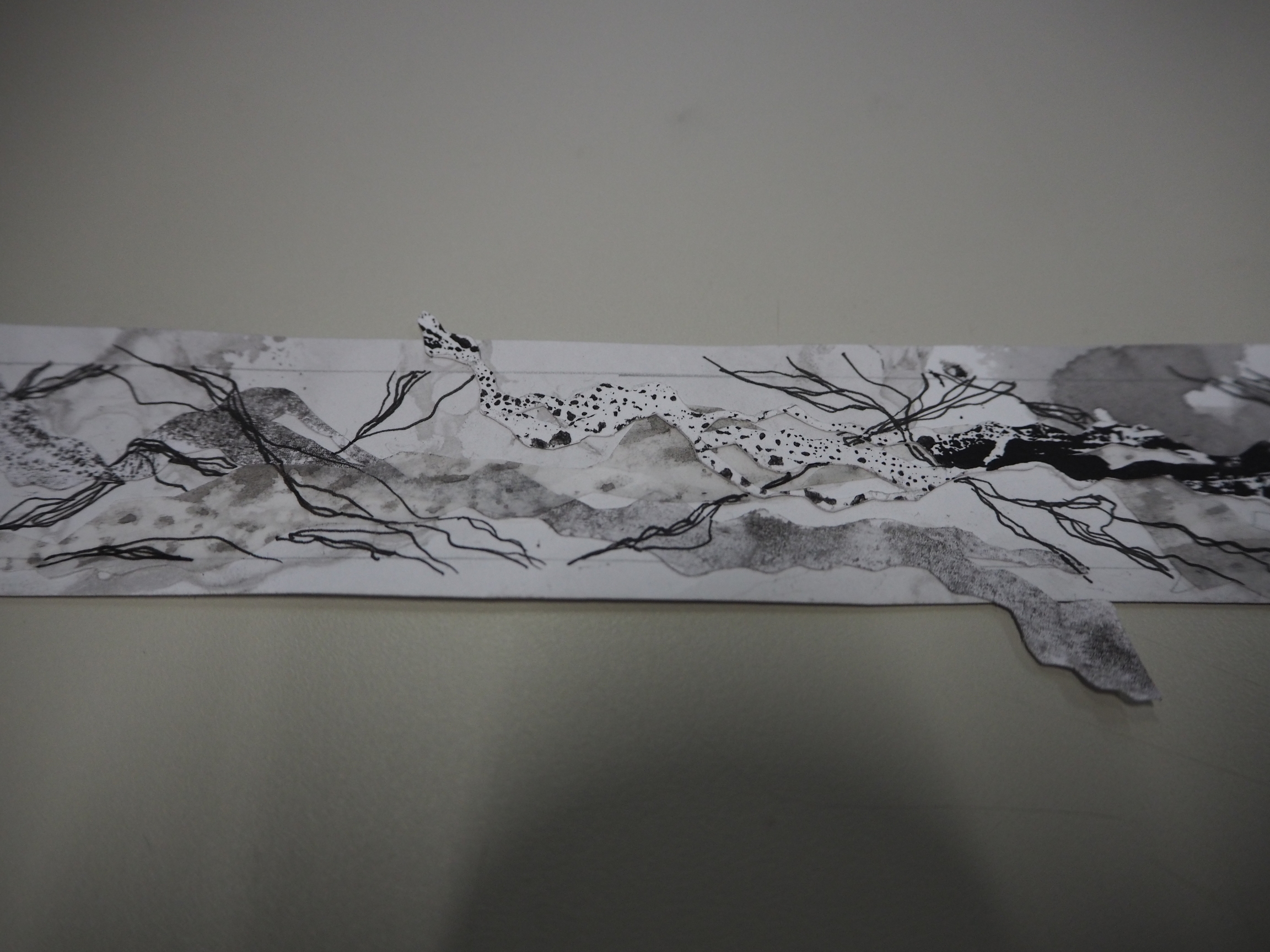
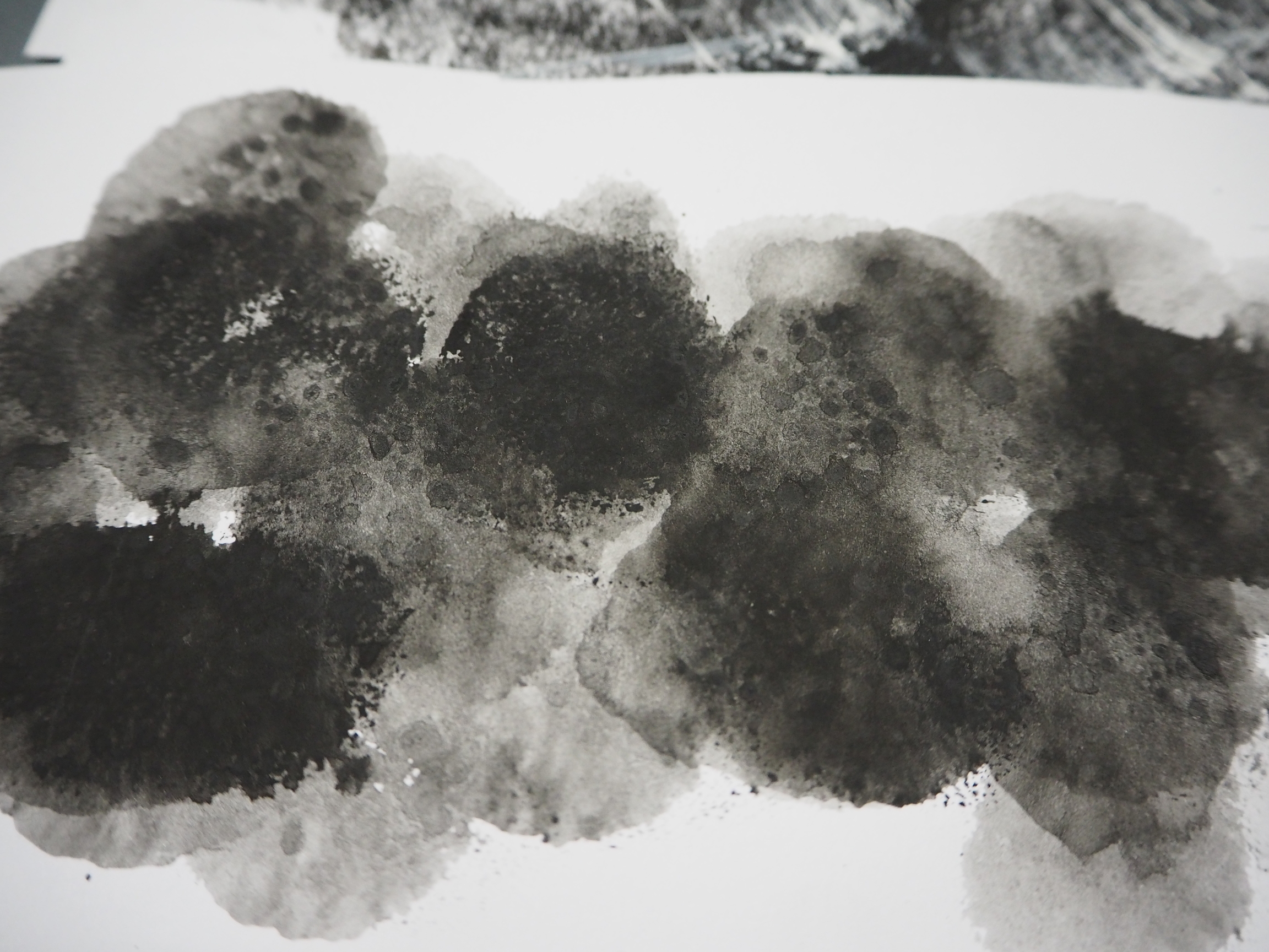
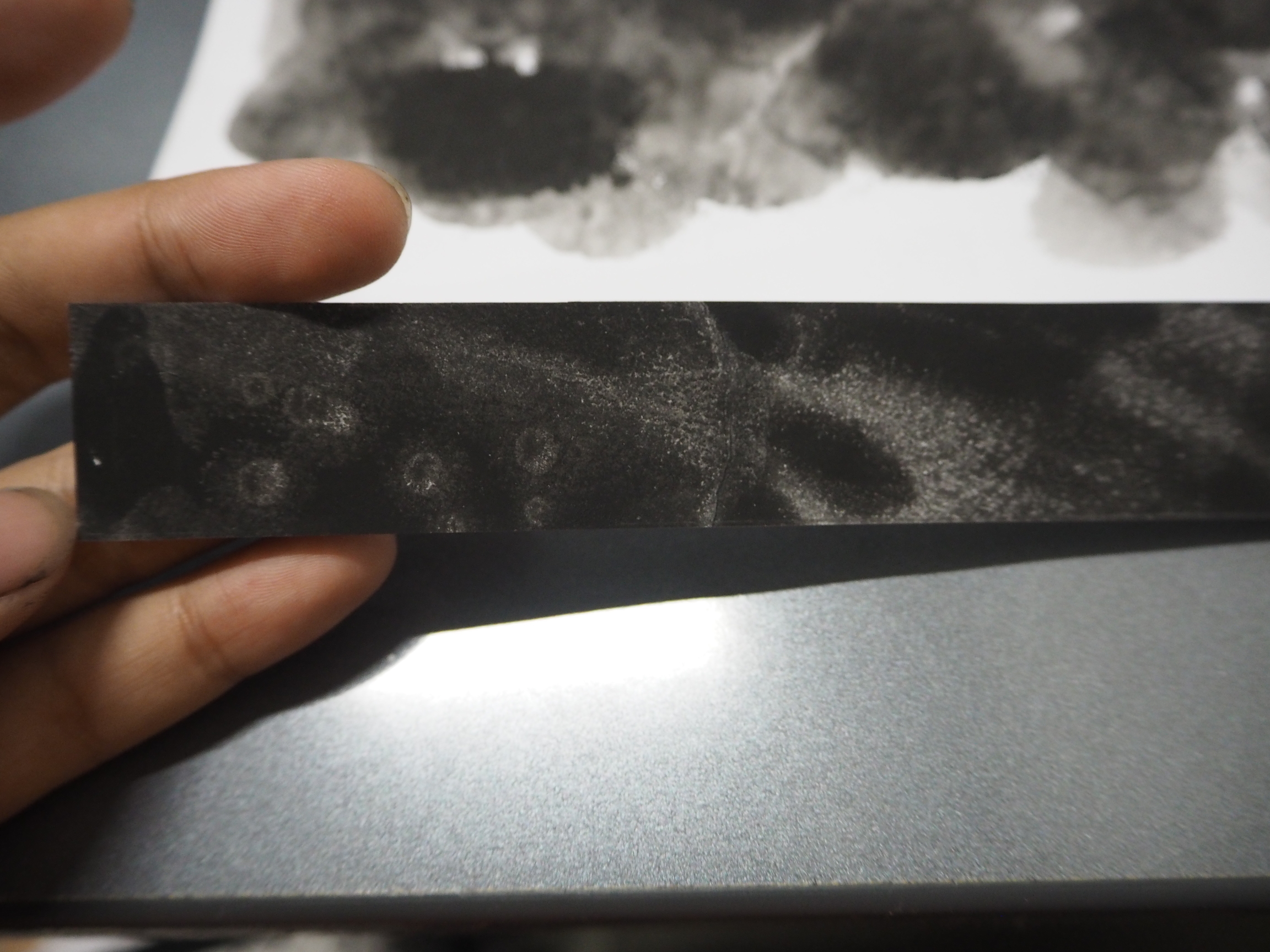
 

◊ SILKSCREEN ◊

Silkscreen was fun to do. Although I faced some difficulties in the second silk-screening session, when I had to get it printed on the tote bag, I am quite happy with the final result.

2016-10-23-083531-1

(I will upload a better picture when I get to iron it out)
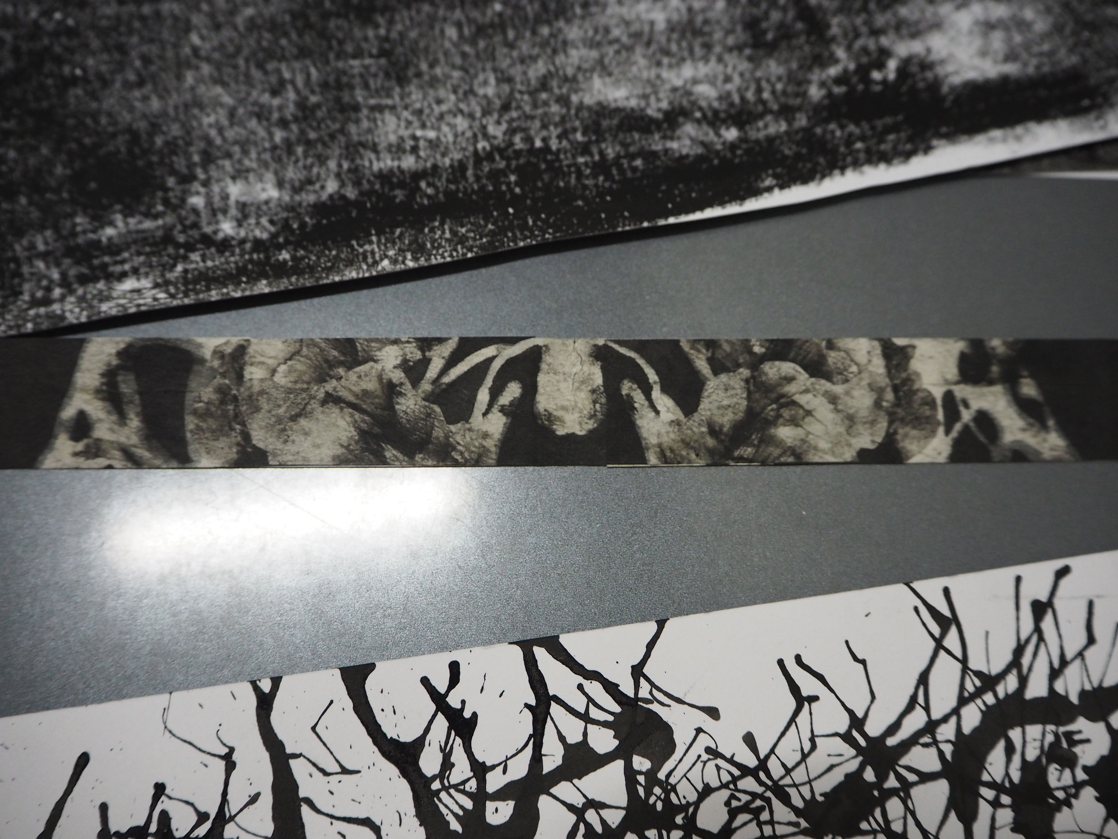
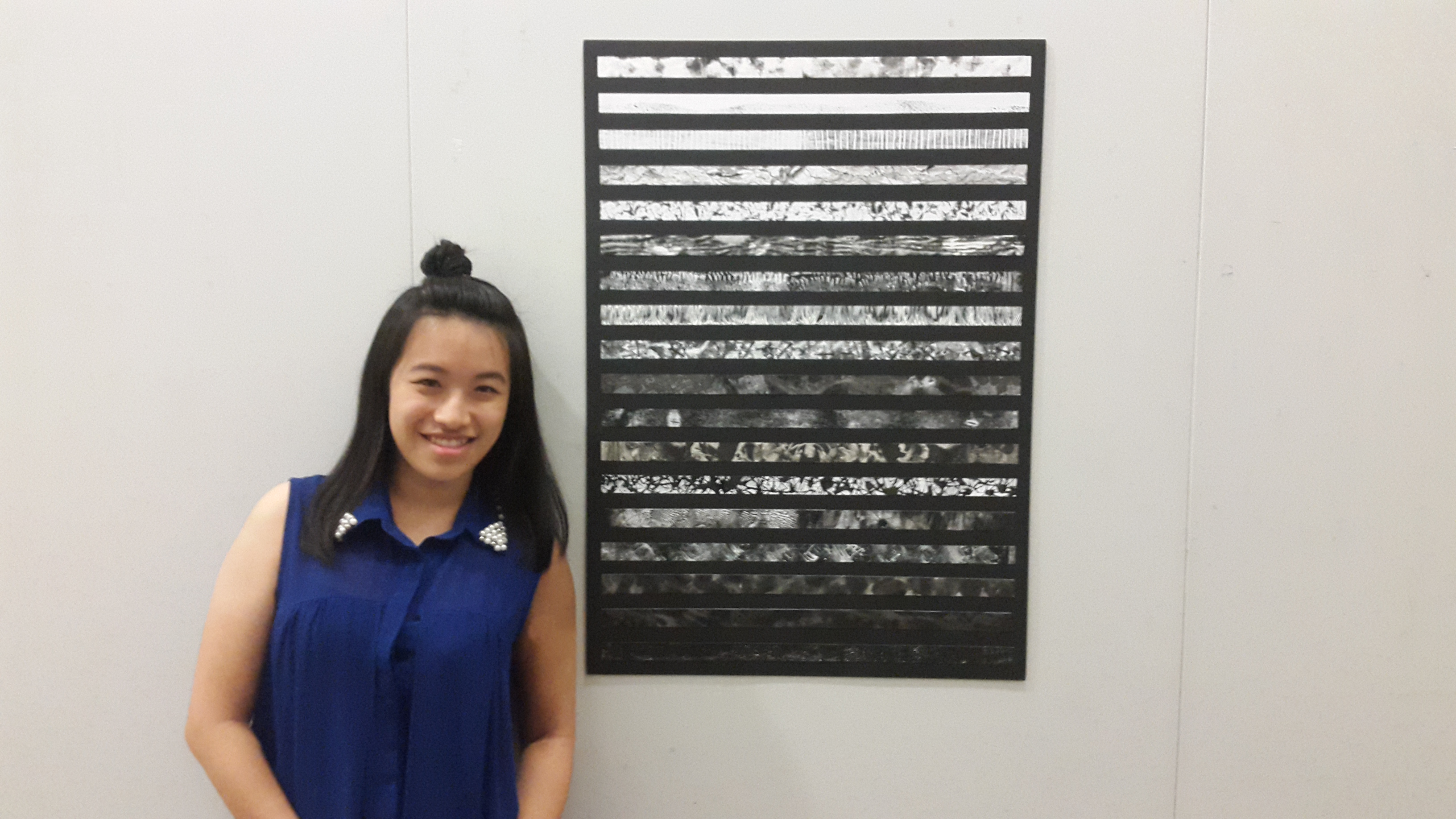
 

◊ PRESENTATION ◊

This is how I presented my final work.

2016-10-20-055247-1

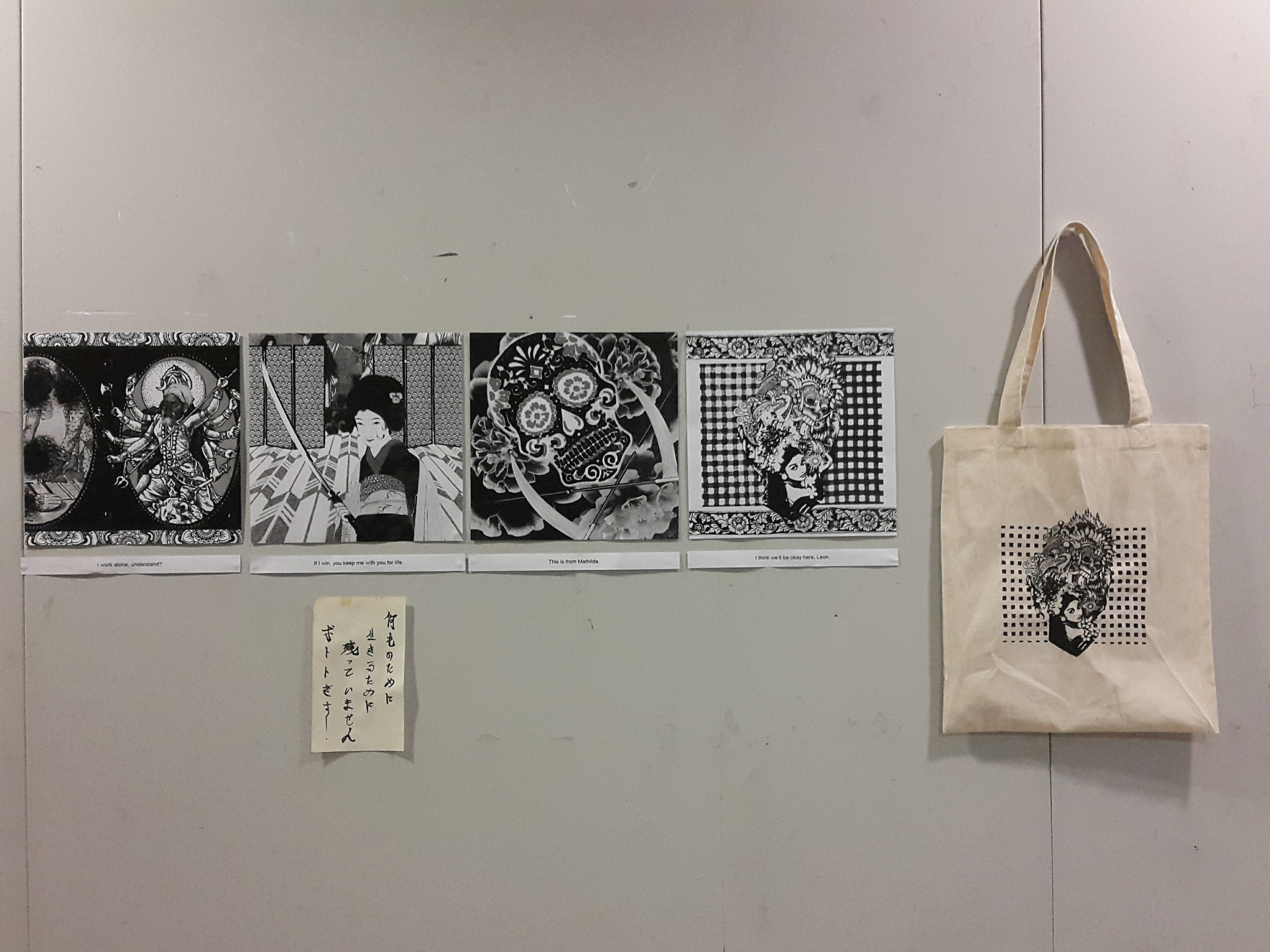
I decided to include a supplementary element in the presentation. Under the Japanese composition, I pasted a death poem, in Japanese, that I imagined Mathilda to have written before proceeding to kill herself. Writing a death poem is part of the ritual of harakiri/seppuku, and I felt that it was such a melancholic and beautiful way to leave with your last words in a string of poetry.

2016-10-23-083044-1

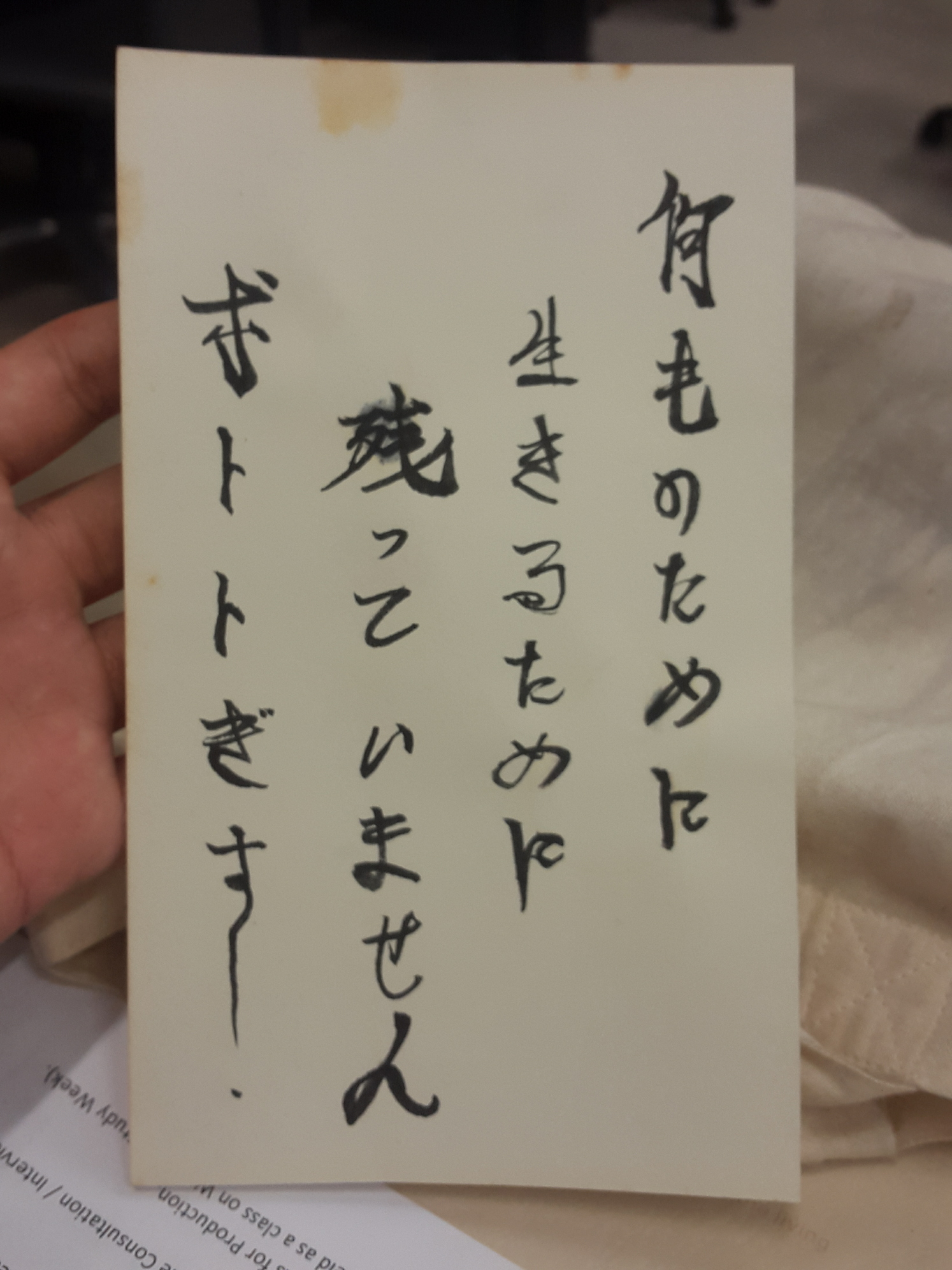
From right to left: Nani mo no tame ni, ikiru tame ni, nokotte imasen, hototogisu.
Translation: Nothing left to live for, the cuckoo cries.
The poem describes how at the point of time, Mathilda has lost everything and is ready to die. “Hototogisu”, or the cuckoo bird, is a bird recognised for its beautiful voice, but is also considered a messenger of death. It is a phrase usually used to poetically signify death.

These are a few things that I tried to make sure were consistent in the four compositions.

  • Overall balance in the composition, even when I arrange the elements in an asymmetrical way. 
  • Presence of central character.
  • Simplicity and subtlety of hidden messages through the symbols.
  • Very subtle dark, light, dark, light look. This is purely for aesthetics (It felt weird with only the third composition one being very dark), to balance the look of the four compositions together, and to create rhythm as the eye gazes from the left to the right.

Presentation generally went well, and I managed to say most of what I wanted to say in the time limit, but I did forget to mention a few things due to a slight panic when the alarm rang. Hopefully next time my nerves don’t get the better of me.

Overall, I really enjoyed the process, getting to know so many different cultures and really putting a lot of meaning into my work, which I noticed is what I like to do. I also got to keep the essence of the movie and managed to bring forth the feelings I have for the movie, and made this project a meaningful one.

On to the last project of this semester!

2D Project 1: My Line is Emo – Sea My Emotions

At last, our first 2D project has come to an end. It was not a smooth sailing journey, but as they say, a smooth sea never made a skilful sailor.

This post will be the summary of this project and a break down of all 18 lines. For a much more detailed explanation, check out my process post for my thought processes and theme research, and my execution post for a behind the scenes look of how I achieved my final lines! I am quite happy with the final product, and I hope you like it too! Presenting, “Sea My Emotions”!


FINAL LAYOUT ◊ CONCEPT

rsz_final

My final layout is a portrait A1 board with 554×25 mm strips. 

On the first monoprinting session, I brought along random things from my room that I thought would make interesting patterns or prints. From all of the prints produced, I found that most of them reminded me of the ocean. I also found that a toothbrush could make really intriguing patterns. It reminded me of how since I was a child, I would associate bath time with the ocean. This was how the idea of making the ocean my theme and bathroom objects my materials came about. While the association is made from personal experiences, I felt that the bathroom and the ocean are not too disparate for people to be able to make a connection between.

After several revisions of the layout, I finally settled on the A1 portrait as I thought that it would best capture the depth of the sea and could also deliver what I felt about the sea. The lines are divided into layers of the ocean (epipelagic to hadalpelagic), and each line represents a certain animal or plant that lives in that layer of the sea. I also controlled the values of each strip such that when viewed together, a gradual effect of light to dark can be seen. This is not only to showcase the physical nature of the waters (darker as it gets deeper), but also to heighten the visual connection of the emotions being arranged from positive to negative. The reason for this is my love-hate relationship with the sea. I am honestly quite terrified of the deep, dark waters, but I am also in love with its ethereal quality. I love just simply watching the waves break on the shore and the sea disappearing into the horizon. This is why I chose to arrange the emotions according to how I feel about the different layers of the ocean. I imagined myself sinking to the bottom of the ocean and visualised how I would feel while being in every layer. For a more detailed explanation, check here.

Without further ado, here is a break down of my 18 lines.


JOY

◊ RELIEF ◊  

P9080779JPG

Every time I dive down into the sea, there is always a huge sense of relief that washes over me when I resurface, take a huge breath and look up to the sky. This is why for me, the sky represents relief. This piece is done by monoprinting on tracing paper using cotton to create a dreamy, cloud-like texture. 

◊ BLISS ◊ 

P9080780JPG

As I mentioned before, I love watching the waves in motion. Whether it is still or raging, I like to just watch the waters go up and down, forwards and backwards. When I focus on the waves hitting the shore, I feel as if I am being sucked in and out of an otherworldly realm, even though in reality I am not moving at all. The sea is one of the places that can make me feel bliss. This piece is done by spraying Chinese ink on paper using a toothbrush.

◊ ELATION ◊

P9080781JPG

Elation is represented by a clownfish. The striped pattern particularly reminds me of Nemo from “Finding Nemo”. For this strip, I came up with the specific emotion after creating the print. This for me is elation, because the vertical lines exude positivity and directs the eye in an upwards motion, hence showing how when happy, we are usually looking “upwards” and reaching for greater heights.

LOVE

◊ INFATUATION ◊

P9080783JPG

This pattern represents jellyfish and infatuation. Jellyfish is one of the recurring inspiration in my art-making. In one way or another, I am sort of infatuated with the creature. The collage of water prints on  cartridge and tracing paper, along with the penned lines create a whimsical visual that I feel describes the state of mind of someone who is infatuated by someone when in love.

◊ PASSION ◊

P9080785JPG

Ripped cotton with Chinese ink creates a really cool pattern on paper. There are fine lines and darker blocked areas which together creates a very organic form. I thought that this was reminiscent of clutters of coral reefs in the sea, beautiful in their many shapes and forms, and the dynamism of the lines, I feel, evoke passion.

◊ AFFECTION ◊ 

P9080784JPG

While the tiger shark seems to be an unlikely candidate to represent affection, I chose to look at the patterns on its body and replicated it on tissue paper using block printing ink and shampoo. The result was a mellow-looking pattern, which is enhanced by the texture of the tissue paper. The overall softness of the look was what I feel demonstrated affection.

SURPRISE

◊ ASTONISHMENT ◊

P9080786JPG

At this point of time, I do not really know what is under the sea anymore, and I imagine being surprised when encountering the different animals in this layer of the sea. I have never before seen giant tube worms, and was quite astonished when I Googled images of them. Hence, I tried to translate this onto the print by making swift motions of the wrist to create the dynamic lines using a toilet brush. I also used cotton bud for the heads of the tube worms.

◊ ALARM ◊

P9080787JPG

Angler fish, with a light hanging from their heads, can come as quite a surprise, especially with their carnivorous nature. If encountered, one would feel quite alarmed and would panic for their safety, especially because you do not spend everyday actually meeting an angler fish. This piece is done using a comb to create the jagged teeth of the angler fish.

◊ BEWILDERMENT ◊

P9080788JPG

The creation of this piece was quite experimental. After rolling ink using a stencil, I added white whiskers to mimic the limbs of a brittle star. After looking at the final result, I felt bewildered as I did not know how to feel about it. There are many things going on in the pattern, with the ink, the pattern caused by the stencil, and also the feathered acrylics. Hence I felt ‘bewilderment’ was most-fitting.

SADNESS

◊ SORROW ◊

P9080789JPG

The eel is slimy and and moves in a slithery motion that feels slow and melancholic. I thought that this particular print looks like tears too, other than looking like the gliding bodies of eels. Hence I felt that sorrow is appropriate for this strip.

◊ GLOOM ◊

P9080790JPG

This print replicates the texture of the skin of a dumbo octopus by haphazardly adding baby oil onto an ink-rolled linoleum. The grainy and dark quality of the print makes me feel a little depressed, especially with the overall pessimistic feel of the piece.The darkness enhances the sense of gloominess in the strip.

◊ WOE ◊

P9080791JPG

Inspired by Rorschach, I used shampoo, block printing ink, water and Chinese ink to create this piece. Afterwards, I dissected the print and arranged the pieces side by side so as to create a line showing the gliding effect of a manta ray. The quality of spreading ink, as if caught in a paused moment of time, along with the dull colour of the newsprint, felt very sad and ethereal, hence I chose to assign ‘woe’ to this strip. 

ANGER

◊ TRAUMA ◊

P9080792JPG

This depiction of a basket sea star is rather explosive and horrific in nature, reminding me of overgrown, abandoned forests with branches that poke the life out of you. It looks rather painful and almost physical, as if like thorns in your mind that grow after a painful experience. Therefore I felt that this represents trauma.

◊ ENVY ◊

P9080793JPG

This was one of the most interesting prints that I created, and it was quite a spontaneous result. By adding facial foam on top of ink and pressing it down, This vein-like texture, which looks extremely similar to gills, is created. I felt that the spreading effect of the veins, very meticulous and fine, creates a haunting feeling of how envy could spread throughout our bodies. 

◊ FURY ◊

P9080794JPG

This line is quite similar to the angler fish line in terms of execution. However, I created the finer, sharp teeth of a stoplight loosejaw by using a toilet brush instead of a comb. I also angled them to create the illusion of many wide open jaws, which is a key feature of the stoplight loosejaw. The intensity and movement shown through the line quality mimics a bout of fury perfectly.

FEAR

◊ TERROR ◊

P9080795JPG

While replicating the physical form of the ping pong tree sponge, I also found out that the circular pattern creates a haunting ink spreading effect that reminds me of evil lurking from within the darkness. This I feel exudes terror in its simplest sense.

◊ NERVOUSNESS ◊

P9080796JPG

I have always visualised nervousness as a dark, empty room. And at this layer of the sea, everything is dark with no light at all. There is a feeling of some glowing light like when you close your eyes for too long and start imagining what light would look like. Hence I linked this with bioluminescence, a feature owned by animals who actually live in this depth of the ocean.

◊ DISTRESS ◊

P9080797JPG

We have finally reached the bottom of the ocean. I chose to use hair rollers to create disturbing patterns to represent the ocean floor as this is the most distressing part of the ocean, where I feel that there is no hope at all and there is a culmination of panic, worry, and a high level of fear in my mind. In the final strip, I selected the crop mostly the darker area.


PRESENTATION ◊ CONCLUSION

20160908_172639

In the presentation, I played a sea soundtrack to accompany my work. For the first ten seconds, I allowed my classmates to just stay still and listen to the sounds of waves while looking at my work. I included the audio as I felt that this would better let the audience know that my work is about the ocean. I also wanted to create a calm ambience that would naturally lead their eyes to the lighter coloured strips on the top of the work, and afterwards moving their gaze slowly down. Sadly I forgot to document this process and I also did not take a picture of the speakers set-up (which was placed on the floor just under the work).

Sea soundtrack that I used.

The presentation went well and I generally managed to say what I wanted to say within the time limit.

Overall, I had good fun doing this project and managed to pick up some new skills along the way. The feedback given to me by Joy and my classmates were motivating and helpful. I would definitely keep them in mind for upcoming projects. One of the most important improvement that I should work on is to do more actual work and experimentation instead of dwelling too much on ideas. After all, ideas will stay as ideas unless they are acted upon. I also need to work faster, this will allow me to perhaps open up more possibilities in my art-making. For a more detailed reflection on my processes, check out the execution post

Also, I loved watching my classmates’ presentations as they were really intriguing and inspiring. From using scents, mindful placement of their final work, well-thought concepts, beautiful technique to participatory arts, I think G09 has definitely done a good job for project 1. Really, a huge round of applause to my classmates!


mNbL7