So, I decided to add in an execution post. Here I will be elaborating on the creation of each line in my final work. For my main thought processes and elaboration on my theme, you can check the process post and for a short summary of everything, check out my final post!
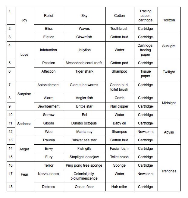
This is a summarised table form of my final work layout. Before going into making the final prints themselves, I would do several tryouts on loose sheets of paper. I also tried different backings. For some of the lines, I replicated an existing texture that I have from previous experiments. In these cases I did the patterns first and associated it with a sea creature afterwards.
Journal page recording my thought processes as I started on the final strips.
RELIEF ◊ SKY
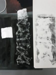
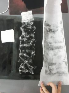
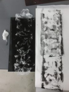
To represent clouds, I tore cotton pads into thin strips and placed it onto an ink-rolled linoleum tile. Then I placed a backing of choice on top of it and used the roller to transfer the ink onto the backing. I tried a couple of different backings, from normal cartridge paper, to newsprint and tracing paper.
From left to right, cartridge paper, tracing paper (but clouds not defined enough), final print used.
Eventually I chose the tracing paper as the backing as it gives a slightly translucent effect that I felt fits the quality of soft clouds. I also included a layer of white cartridge paper behind it so that the line will look lighter in shade. To the sky line, I assigned the emotion relief, as I felt that the open sky is very liberating. Every time I go for a dive, when I resurface and take a gasp of breath, I would feel a huge sense of relief. Relief that I am still alive, relief that I could breathe again.
BLISS ◊ WAVES
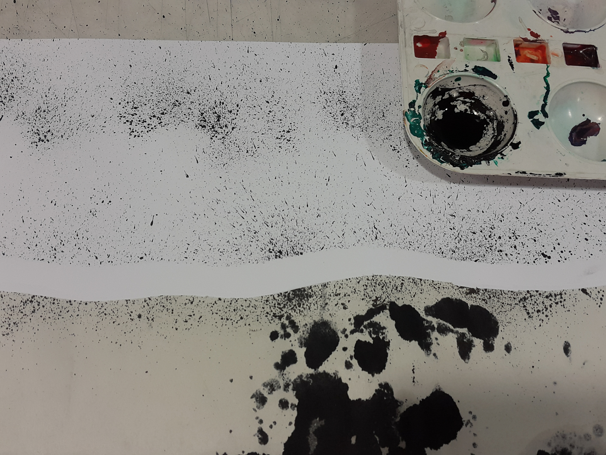
Bliss is represented by waves, the boundary between sky and sea. I like watching the waves move about, whether it is still or turbulent. There is this hypnotising feel waves give you. I particularly like standing by the shore, gazing at the waves lapping at my feet, which makes me feel as if I the ocean was pulling me in its embrace and letting me go, pulling me in and bringing me back to shore, while in actuality I was just standing there, still. The waves make me feel happy, in a lighthearted way.
To achieve the mark, I cut the outline of the waves on a waste sheet of newsprint and laid it over a sheet of cartridge paper. Then I used a toothbrush, dipped it in Chinese ink, and started flicking the brush all over to create an ocean spray effect.
ELATION ◊ CLOWNFISH
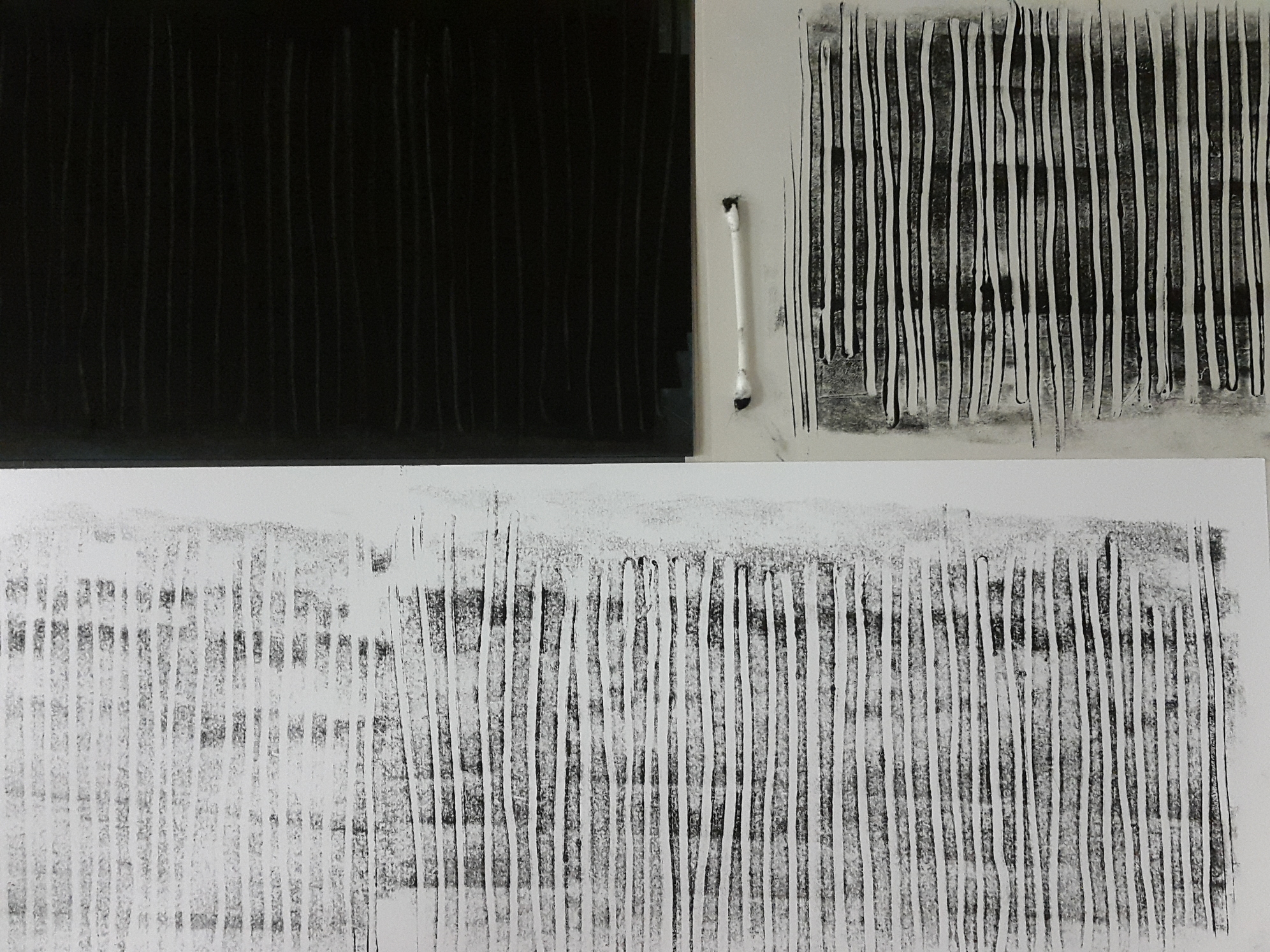
I made the same type of marks during the first monoprinting session, and thought that it reminded me of Nemo from “Finding Nemo”, so I recreated the mark, but this time using a cotton bud to create the lines. I had to make sure to put enough pressure so that the ink would be removed from the lino.
To me, the verticality of the lines represent the action of going upwards, and this symbolises positivity. This highlights how we tend to look “upwards” when we are happy, and especially when we are elated, we tend to brighten up and become positive in our disposition!
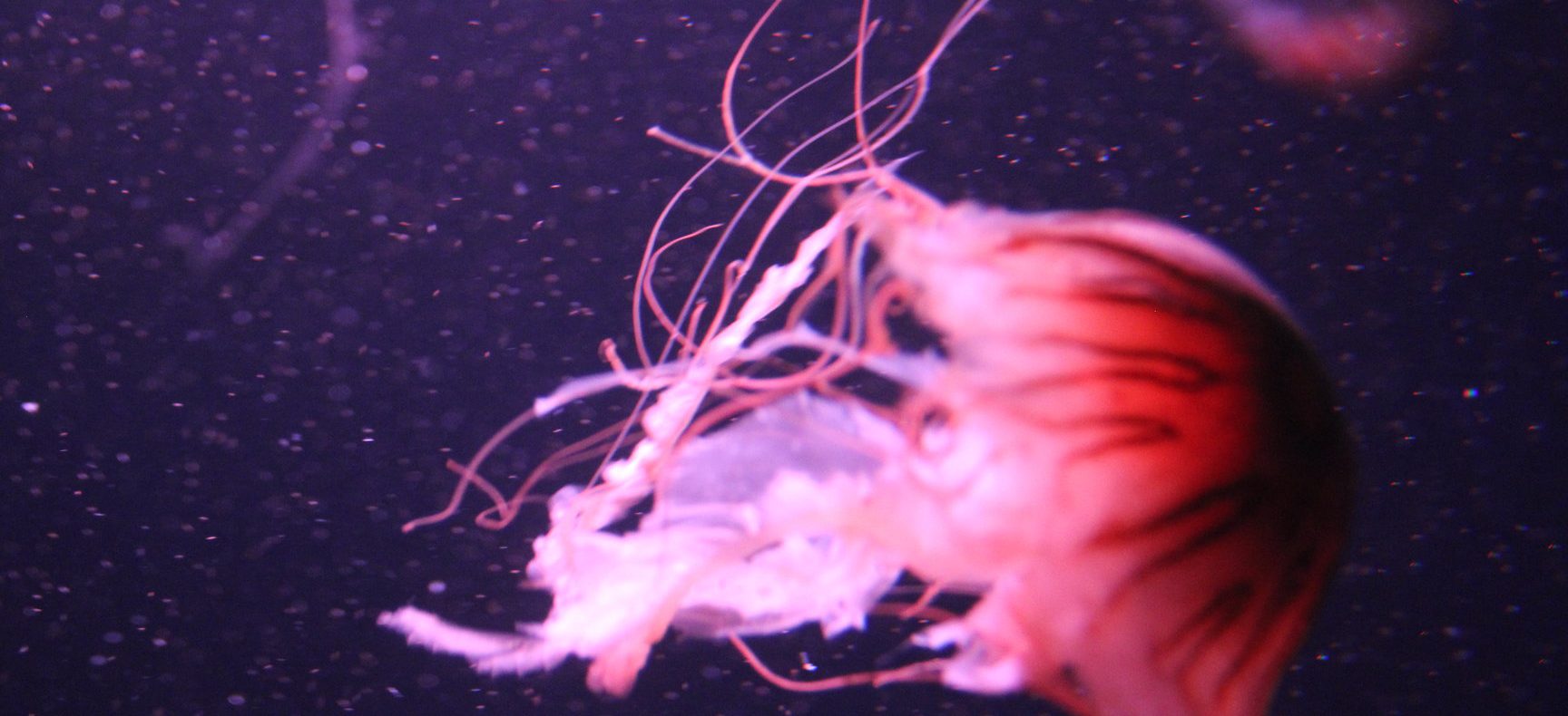
INFATUATION ◊ JELLYFISH
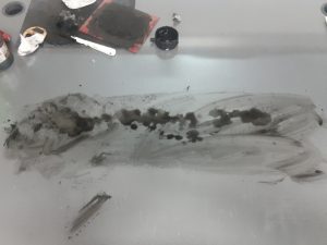
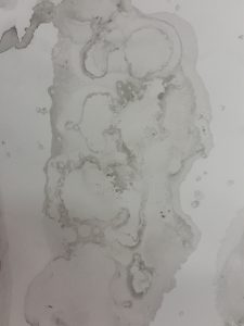
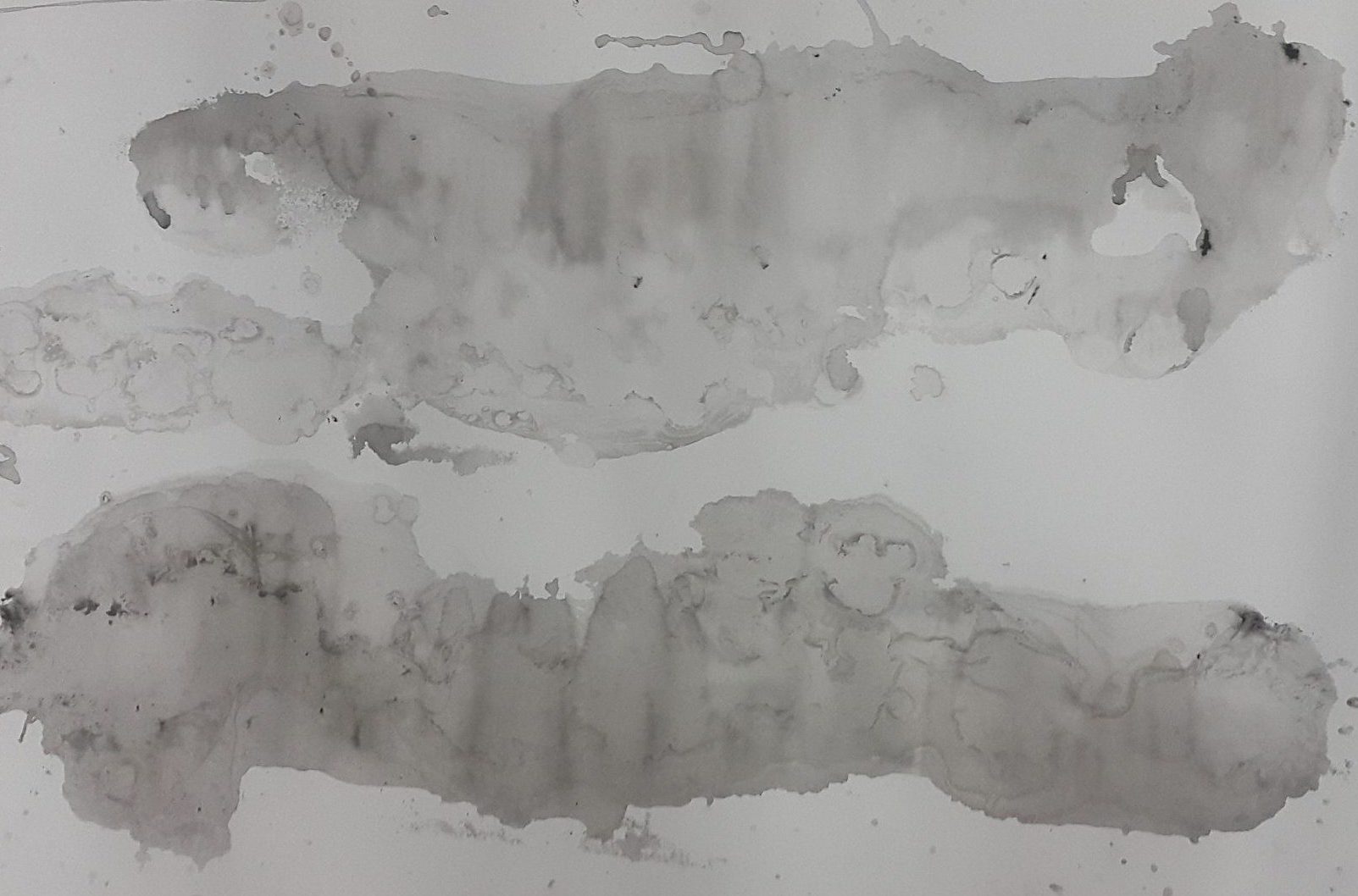
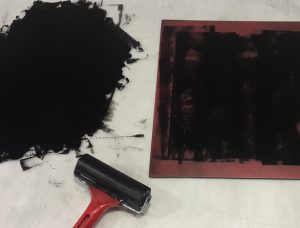
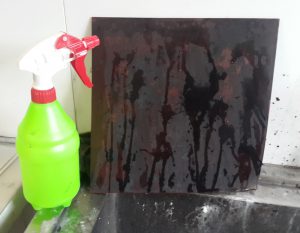
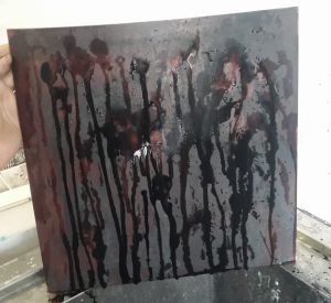
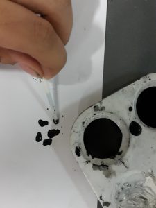
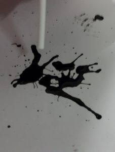
This line was one of the more complicated ones in terms of execution. There were several steps to it as I did a collage of several prints. I wanted to recreate the ethereal, flowy quality of jellyfish. I was cleaning ink off the table using wet tissue and found that it created a pretty cool texture on the table surface. Just out of curiosity, I put a sheet of paper over it and pressed. The result was a cool exact water droplet texture replica as shown in the bottom right picture. I thought that it looked like the frills of a jellyfish. I decided I would need a base layer so I tried to drip more diluted ink (top left picture) and then pressed the paper on top of it. The results were as shown in the two other pictures, a cool marbling effect with a softness to it that I felt could represent a jellyfish. I did more of the water droplet texture print on tracing paper, and using a penknife, created frill- like strips out of the print. In the end, the collage consisted of the water marbling print as the base layer, frills from the water droplet prints on cartridge and tracing paper, and also drawn lines using an ink pen.
The resulting collage felt very whimsical and intense, since there are so many elements to it. I likened this to the feeling of infatuation over someone you love, as it is almost as if there is an overwhelming sensation of emotions.
PASSION ◊ MESOPHOTIC CORAL REEFS
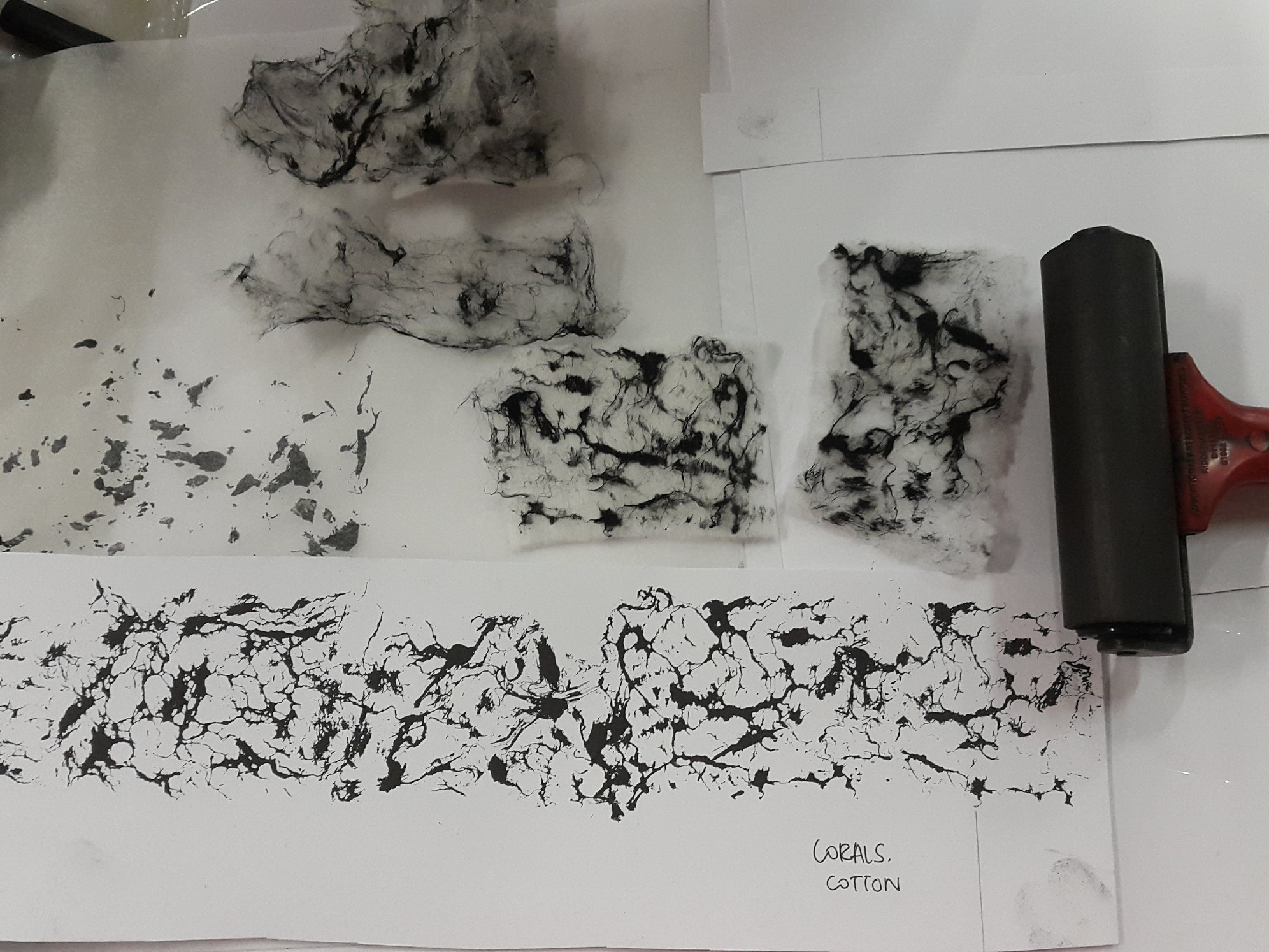
The creation of this line was a result of a experimentation. I painted Chinese ink lightly over the fibres of a cotton pad, placed it on the paper, and added pressure using the roller. I really loved the resulting print – a mesmerising, organic pattern. This pattern reminded me of a cluster of coral reefs, and hence I researched to find out whether coral reefs grew in the mesopelagic (twilight) layer of the sea. Turns out they did! They are slightly different, though, from the coral reefs that grow in the epipelagic (sunlight) layer.
The amalgamation of soft, thin lines and denser areas create a dynamic and organic flow about the strip. It felt as if the corals were swaying a little bit in the currents, a passionate affair.
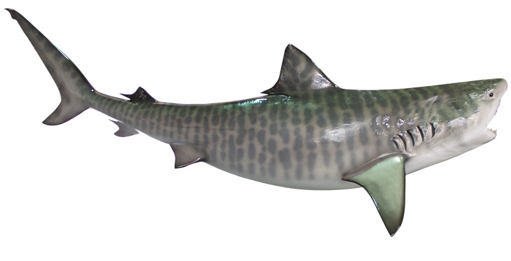
AFFECTION ◊ TIGER SHARK
I was starting to play around with shampoo and figuring out how to use it in my printmaking. I randomly squeezed shampoo on an ink-rolled linoleum tile.
The result was a beautiful striped pattern! I absolutely had no high expectations, but shampoo proves to be quite versatile in terms of making marks (elaborated on other lines). Sadly I do not have any pictures of the freshly finished result! I was probably too excited to have taken a picture of it. After the first print on cartridge paper, I laid a sheet of tissue paper over it and made another print, which also gave wonderful results. The print on the tissue paper was what I decided to use for the final work. It smells really good!
 A section of the tissue paper that is saved and pasted on my visual journal.
The quality of the seemingly blurred out lines and the softness of the tissue paper gives an overall fuzzy quality which I likened to affection.
ASTONISHMENT ◊ GIANT TUBE WORMS
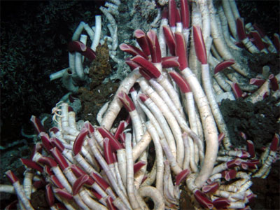
I simplified the giant tube worm into the stem and the head. To mimic its physical features, I used a toilet brush to create swift strokes representing the stems, and pressed the tip of a cotton bud on the linoleum tile repeatedly to create the heads.
I was really quite astonished when I saw pictures of the giant tube worm as I have never seen such a creature before. I tried to express my astonishment through the print by using quick flicks of the wrist to create the rapid lines, and quick dabbing of the cotton bud tips as if each stroke was a shocked gasp (which was my literal reaction when I first saw a picture of the worm).
ALARM ◊ ANGLER FISH
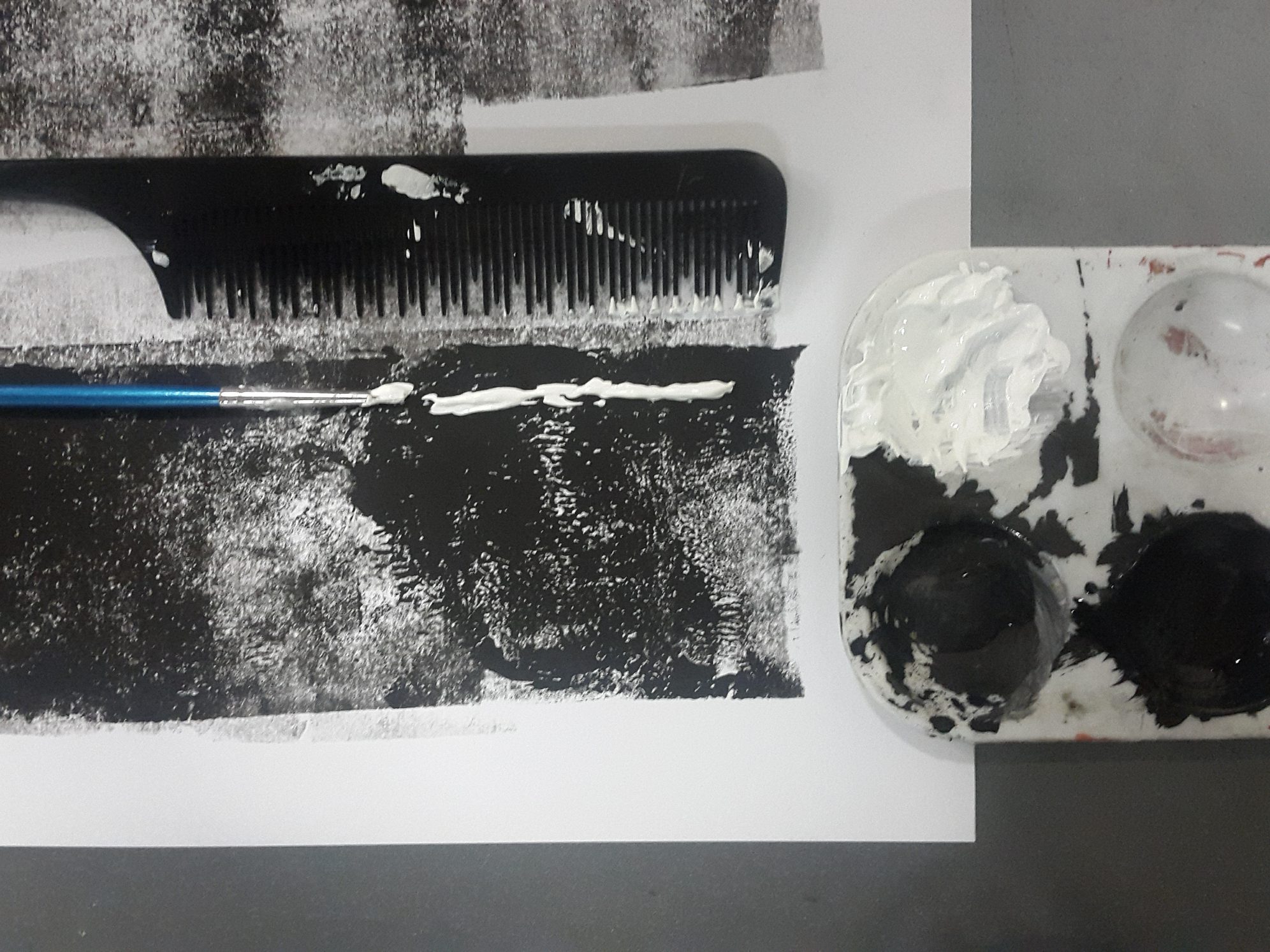
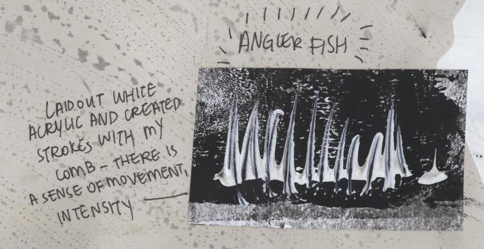
To create the angler fish line, what I did was I rolled a layer of ink directly onto cartridge paper, added two thick lines of white acrylic down the page, and afterwards, I dragged the paint vertically using the comb, creating a thorn-like effect.
This effect is supposed to mimic the jagged teeth of an angler fish.
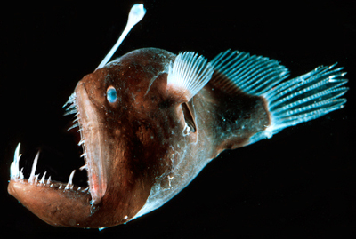
I assigned alarm to this strip because of how the teeth sort of overlap, creating a messy, almost claustrophobic feel due to the tightness of the darker area (background) surrounded by the lighter areas (teeth). I thought that there was a sense of danger that is imbued in the pattern, and I would imagine myself tone quite alarmed if I ever encounter an angler fish in the sea.
BEWILDERMENT ◊ BRITTLE STAR
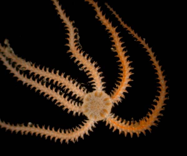
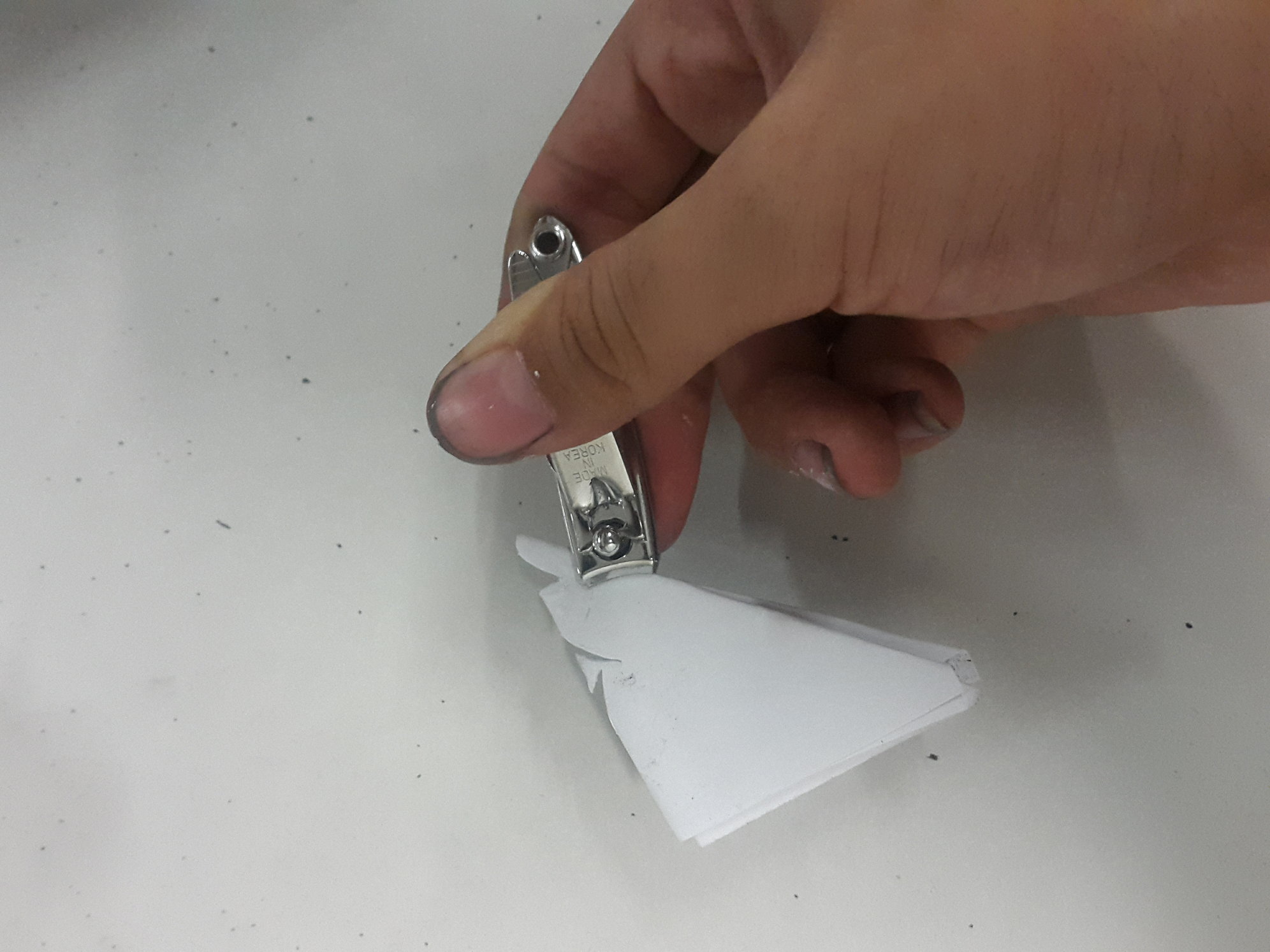
The creation of this line is one the most experimental. I had no clear pattern in mind that I was aiming for, but I just wanted to sort of replicate the body of a brittle star, roughly. I actually created a stencil, which was cut using a nail clipper.
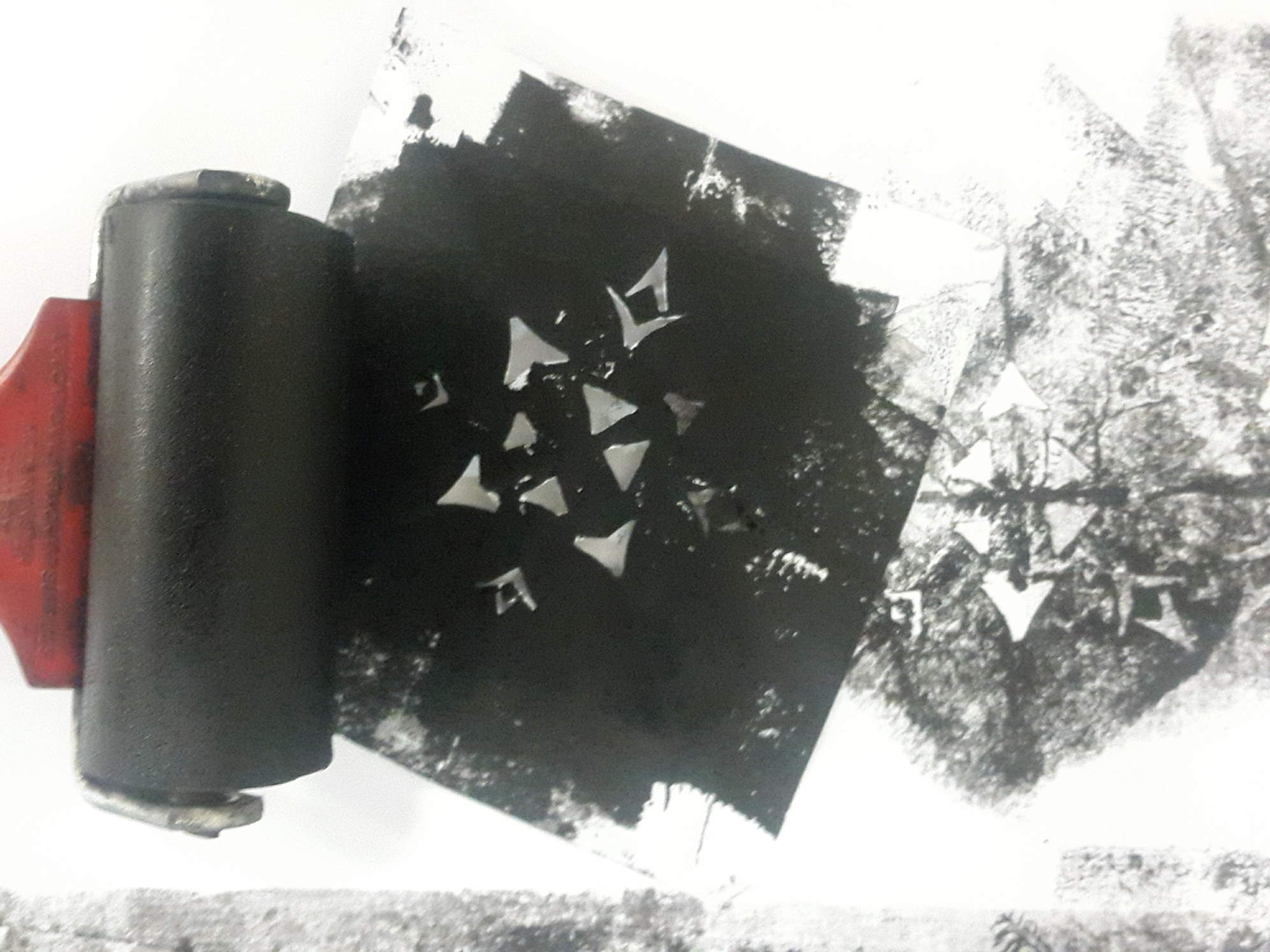
I used this stencil to create multiple star shapes on a sheet of cartridge paper, by rolling ink on top of the stencil.
Afterwards, using acrylic, I added feathery extensions to mimic the limbs of the brittle star. I also added some extension using the hair roller.
The resulting pattern was an all-over composition of stencil pattern and acrylic paint, and I was literally quite bewildered when I looked at the strip. Hence, I thought that ‘bewilderment’ would be most fitting. I also cross checked with friends, and they too felt bewildered when looking at it closely, as there are so many elements to look at. The feel is similar to when you look at Jackson Pollock paintings, which also have all-over compositions.
SORROW ◊ EEL
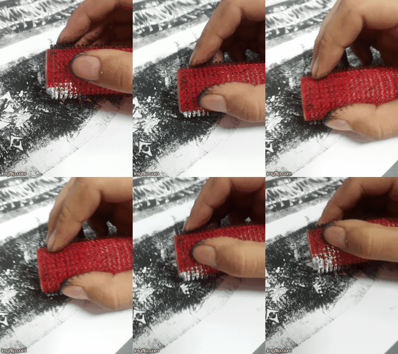
Eel was quite fun to do. I wanted to see if just adding water would create any interesting effect, and it absolutely did. I first rolled some ink onto the linoleum tile, sprayed water on it, laid a sheet of paper over it and rolled it under the press. Without adding any more ink, I repeated the process several times, and this resulted in a et of very different looking prints of differing values and line quality, which I thought was super cool. This was the method that I used for making the eel strip, as a section of the print reminds me of slithering eel bodies.
There was a sort of melancholy to the pattern that is also reminiscent of teardrops, and I thought that ‘sorrow’ was an apt word to describe the feeling when you look at the strip.
GLOOM ◊ DUMBO OCTOPUS
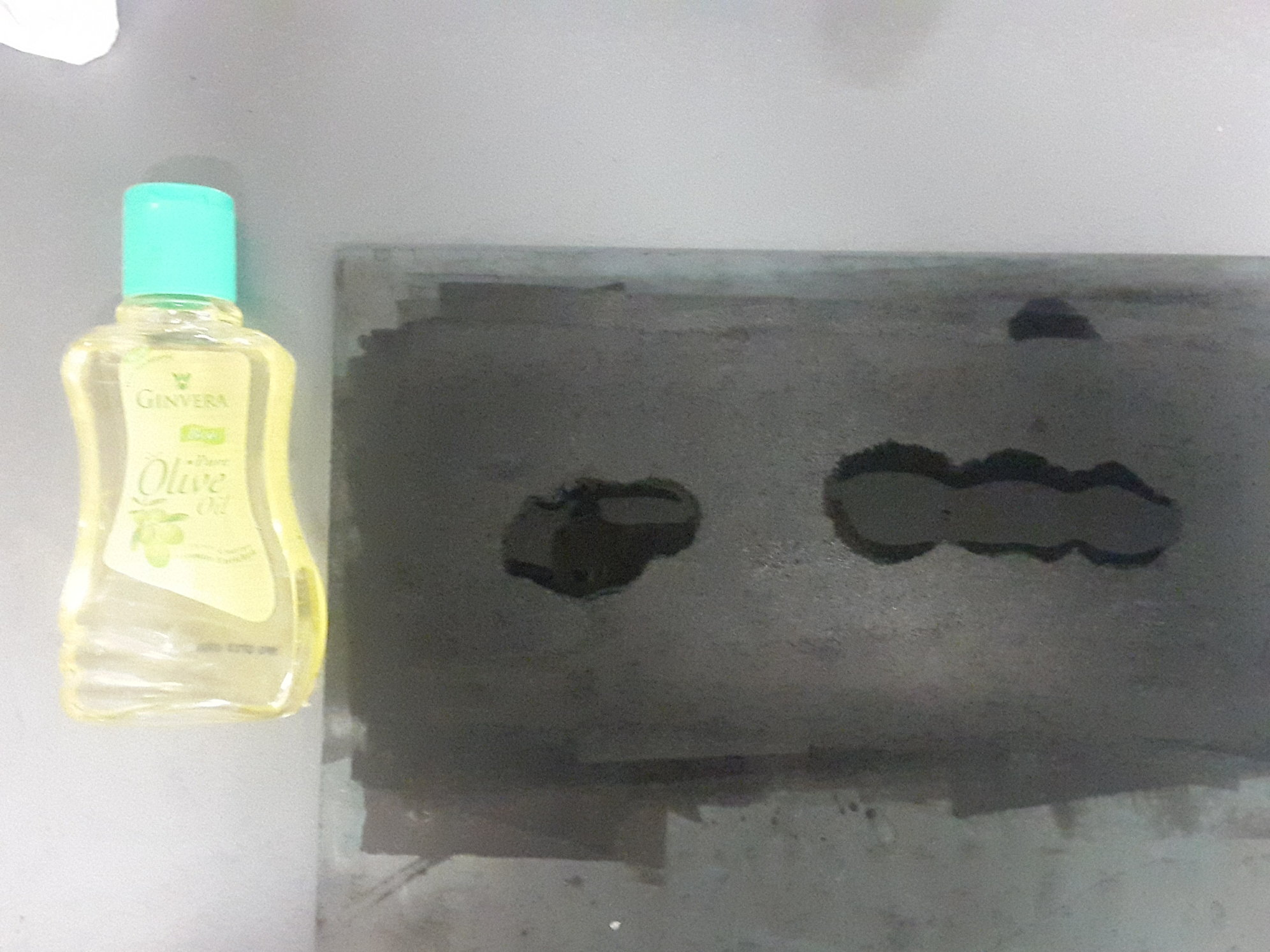
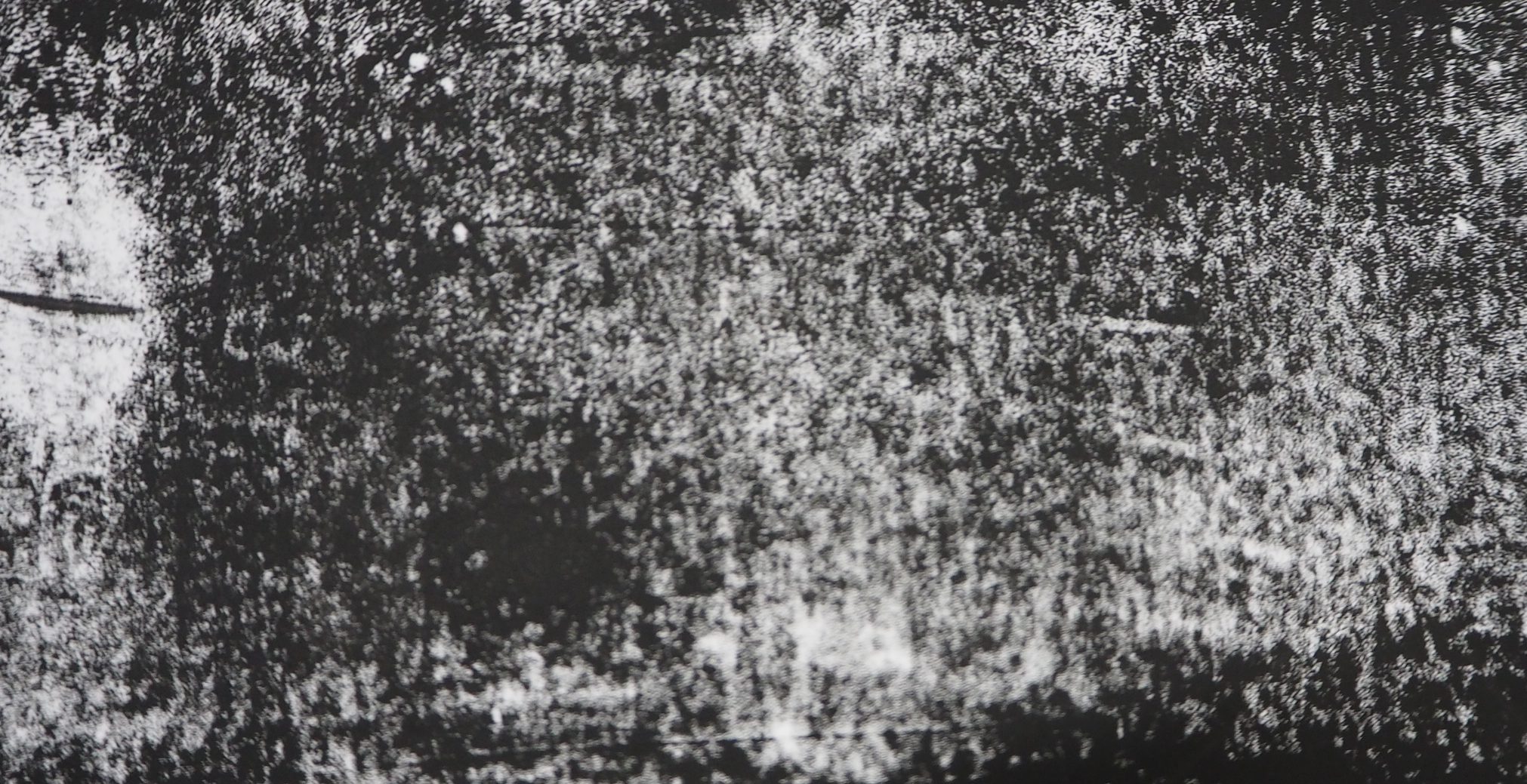
This was also one of the more unexpected outcomes. Like the shampoo, I also had no idea what the outcome would be. I randomly dripped some baby oil onto the ink-rolled linoleum and pressed down a sheet of paper on top of it. I was expecting some sort of marbling effect, but what came out was this coarse-ish texture that really reminds me of some kind of animal skin. Plus it smells amazing.
I already had the dumbo octopus as one of the animals in mind, and thought that it could actually represent the dumbo octopus. The overall grainy and dark look of the print emits a pessimistic aura that feels like a dark, rainy day, and hence I felt that ‘gloom’ was an apt emotion to assign it to.
WOE ◊ MANTA RAY
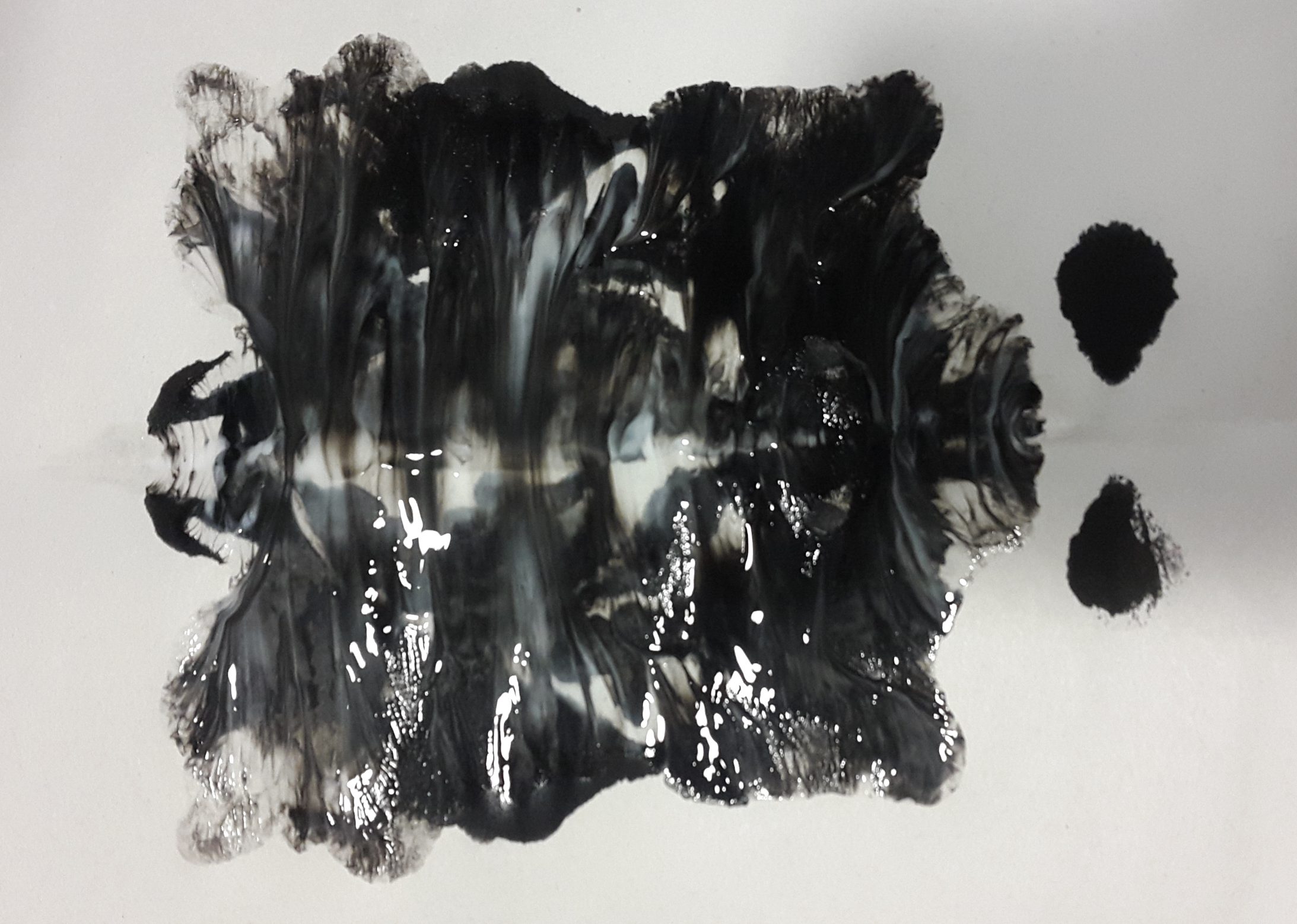
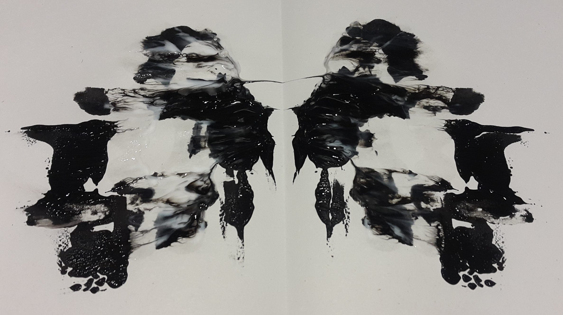
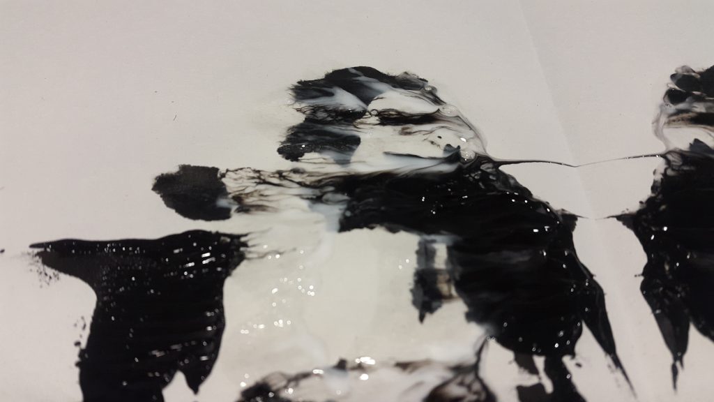
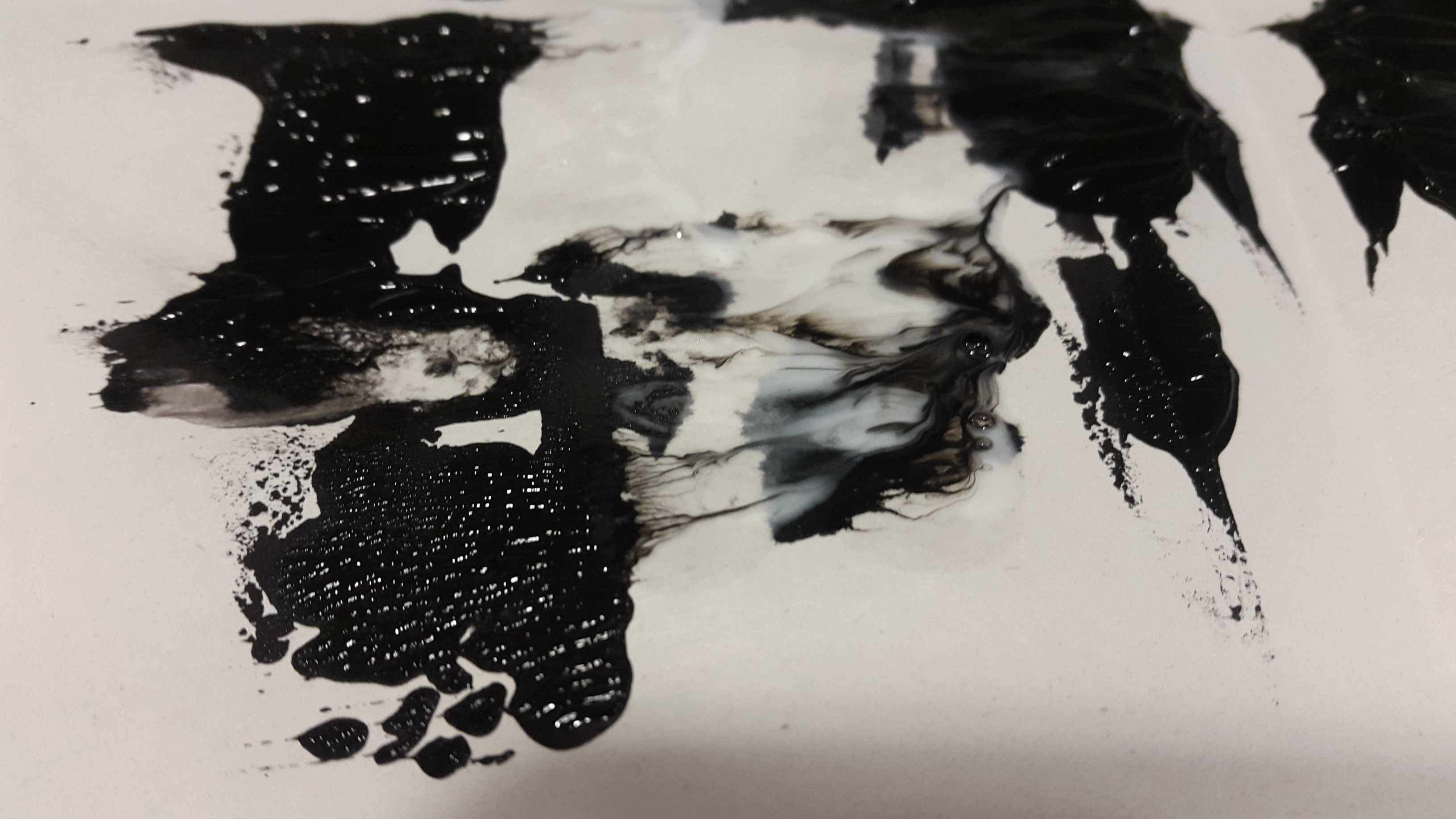
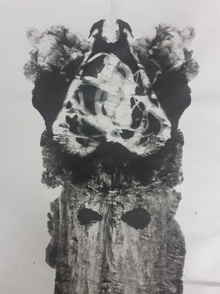
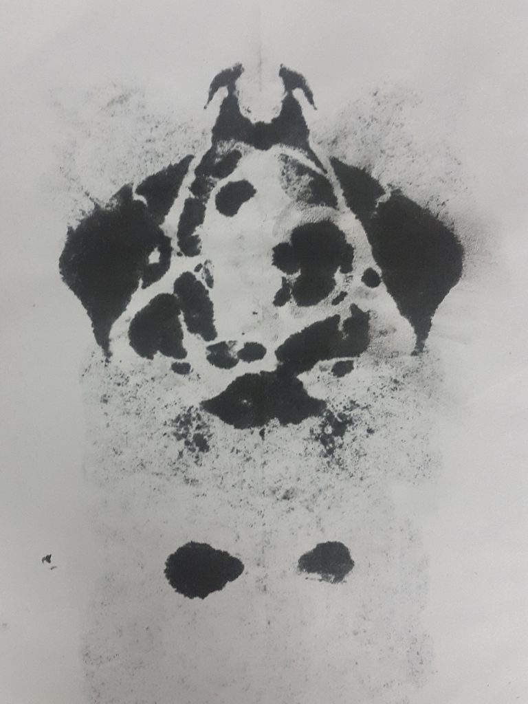
I was inspired by Rorschach to try this method. I randomly dripped block printing ink, Chinese ink, shampoo and a little bit of water to a sheet of cartridge paper, which I then folded into half. I did not have any expectations for it so sadly, I did not document the process where I added all the condiments to the paper. Here is a picture of the result.
At this point, it was only meh, so I tried a couple more times. Here is another result.
I love the rorschach pattern created. I was thinking that the shampoo would act as a white paint, but it turned out that it would evaporate when I left them to dry. This gave a completely new look to the first print that I thought was meh.
It immediately reminded me of a manta ray! I decided to use it for the manta ray line. One problem is that I would need one long strip, whereas this was just a short strip of design. I figured that I could cut a strip of the top part that looks like the head, and then dissect the body into different sections and assemble them together next to each other to make a line.
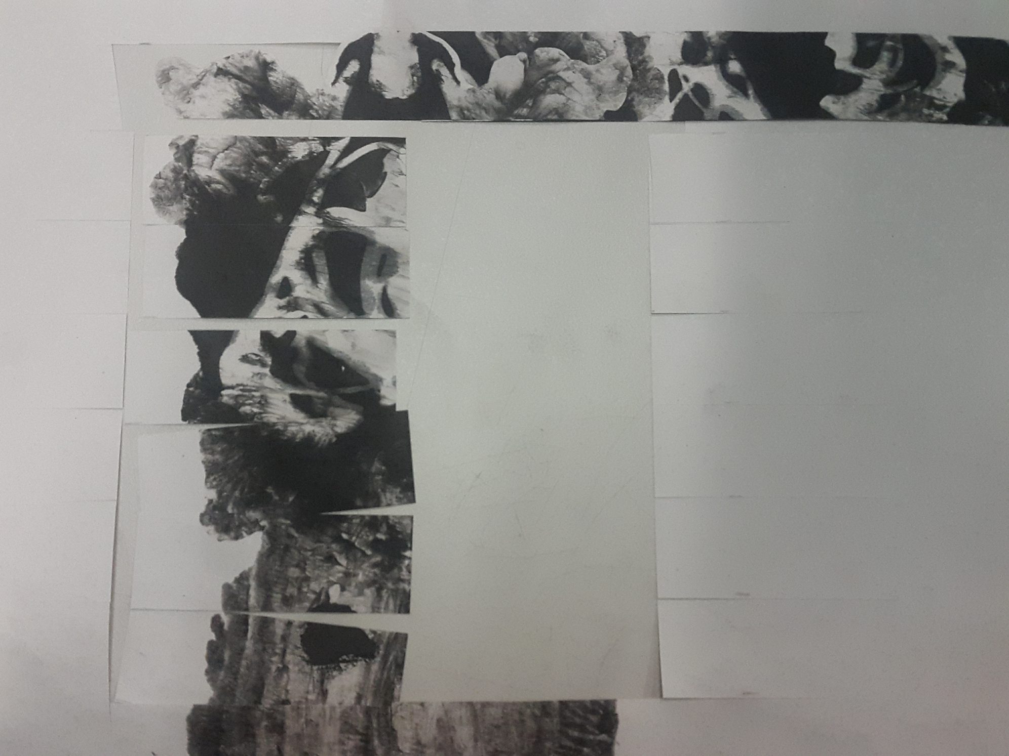 Left side shows cut strips, right side shows reassembled strips.
The overall spreading effect and the haunting negative space created by the shampoo lines, along with the dullness of the newsprint backing, feels like a lament of misery, hence I felt that ‘woe’ was a fitting emotion to assign this strip to.
TRAUMA ◊ BASKET SEA STAR
In one of my explorations, I tried blowing ink through a straw, and it create this veiny, mesmerising effect that I thought was pretty cool. It really reminded me of a basket sea star.
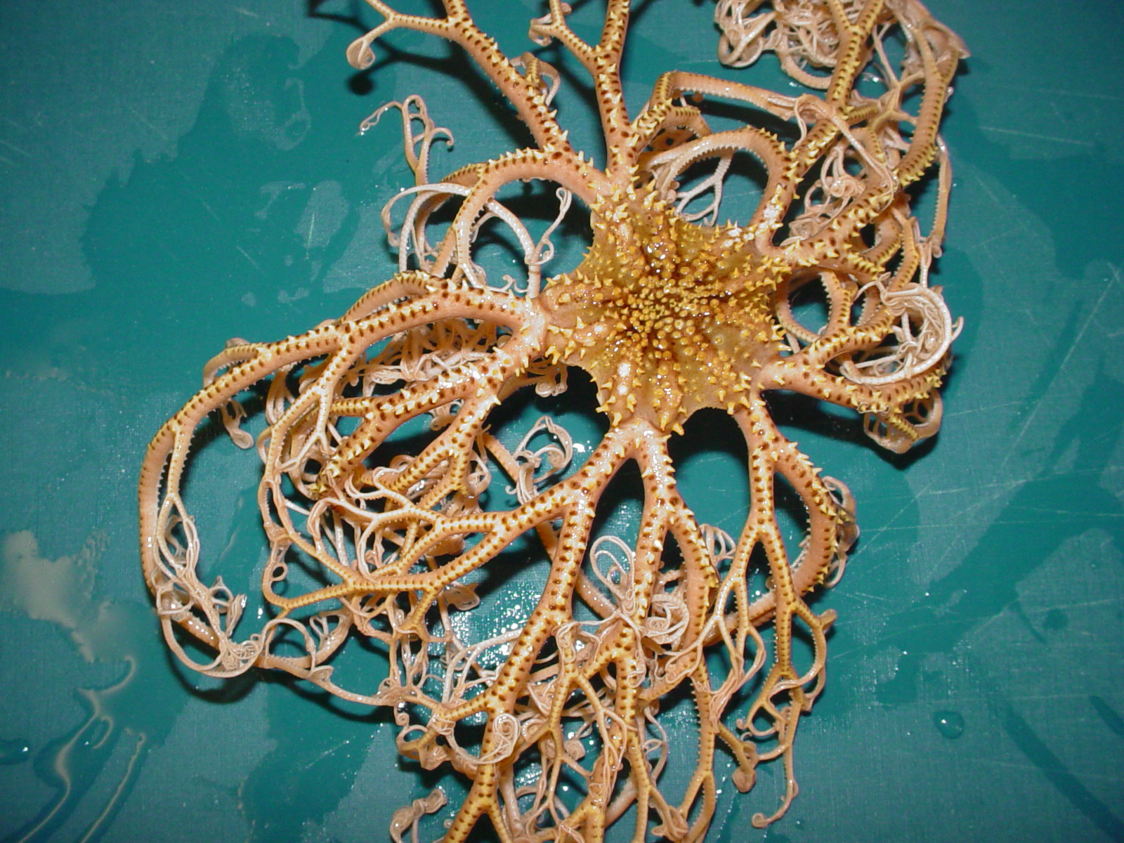
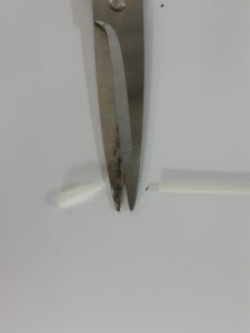
The problem is, the straw is not a bathroom object! I eventually thought of a way to improvise: I could cut the edges of a cotton bud, and voila! A mini straw! I have to admit, it was a tough and long journey to produce one long line of blow painting but it was worth it because the results are really cool!
There is a sort of vitality and vigour to the lines created that suggests an explosive reaction to something. It also reminds me of overgrown forests in fairy tales where the branches would poke you in all directions and give an overall eerie feeling. I thought that this could really represent the feeling when going through a traumatic experience.
ENVY ◊ GILLS
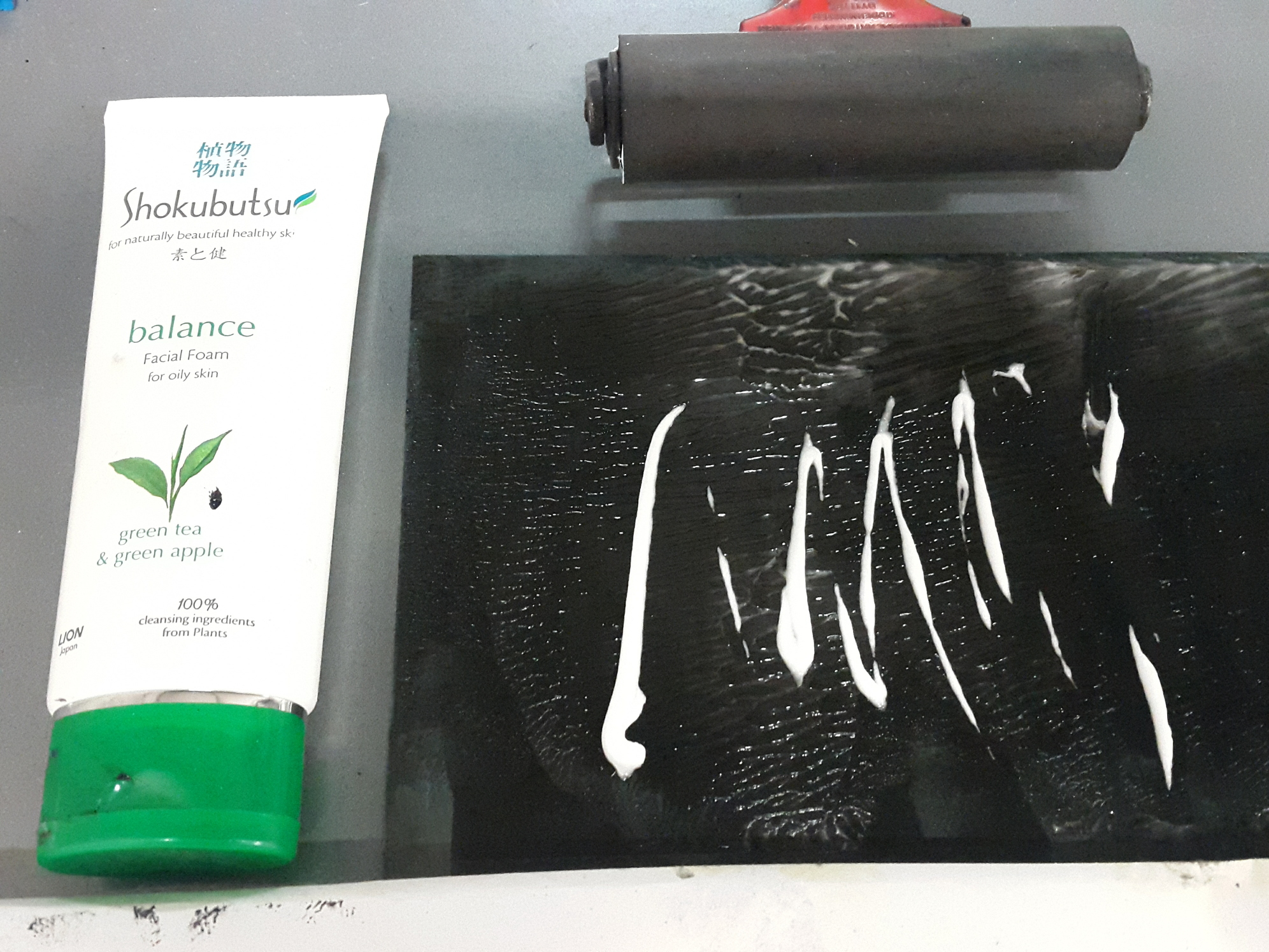
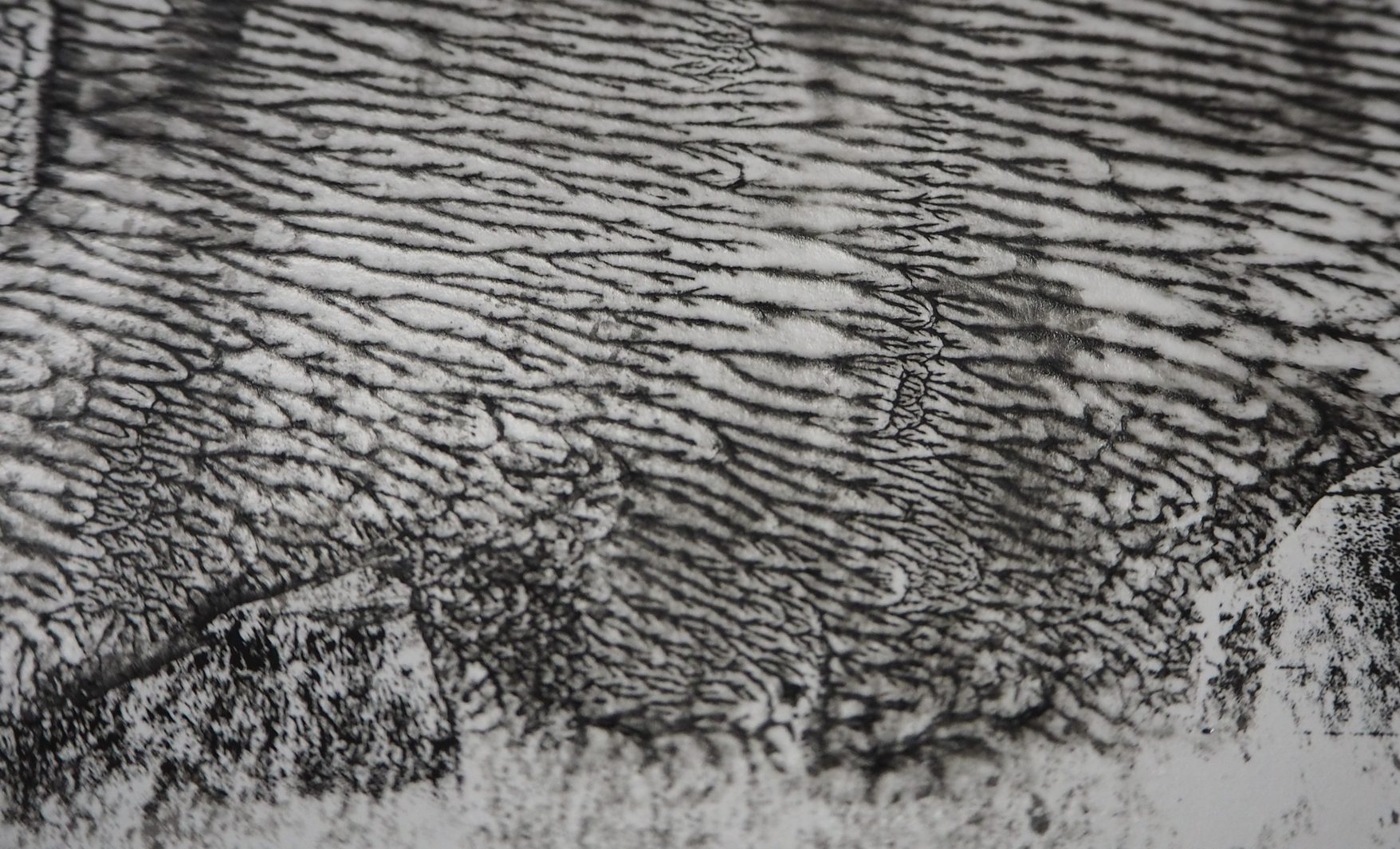
This line was a result of experimenting with facial foam. Honestly I thought that I would get a similar effect to the shampoo prints, except maybe a little bit less diluted as the foam has a firmer texture. I did not expect for the resulting print to be so visually different! The slightly beady texture and the viscosity of the foam created a beautiful network of veins on the paper. While this is not exactly representative of any sea creature, I thought that it definitely resembles gills.
The tiny spreading of the veins reminds me also of the circulatory system. I felt like this could represent envy because I visualise envy as a feeling that creeps through your body slowly.
FURY ◊ STOPLIGHT LOOSEJAW
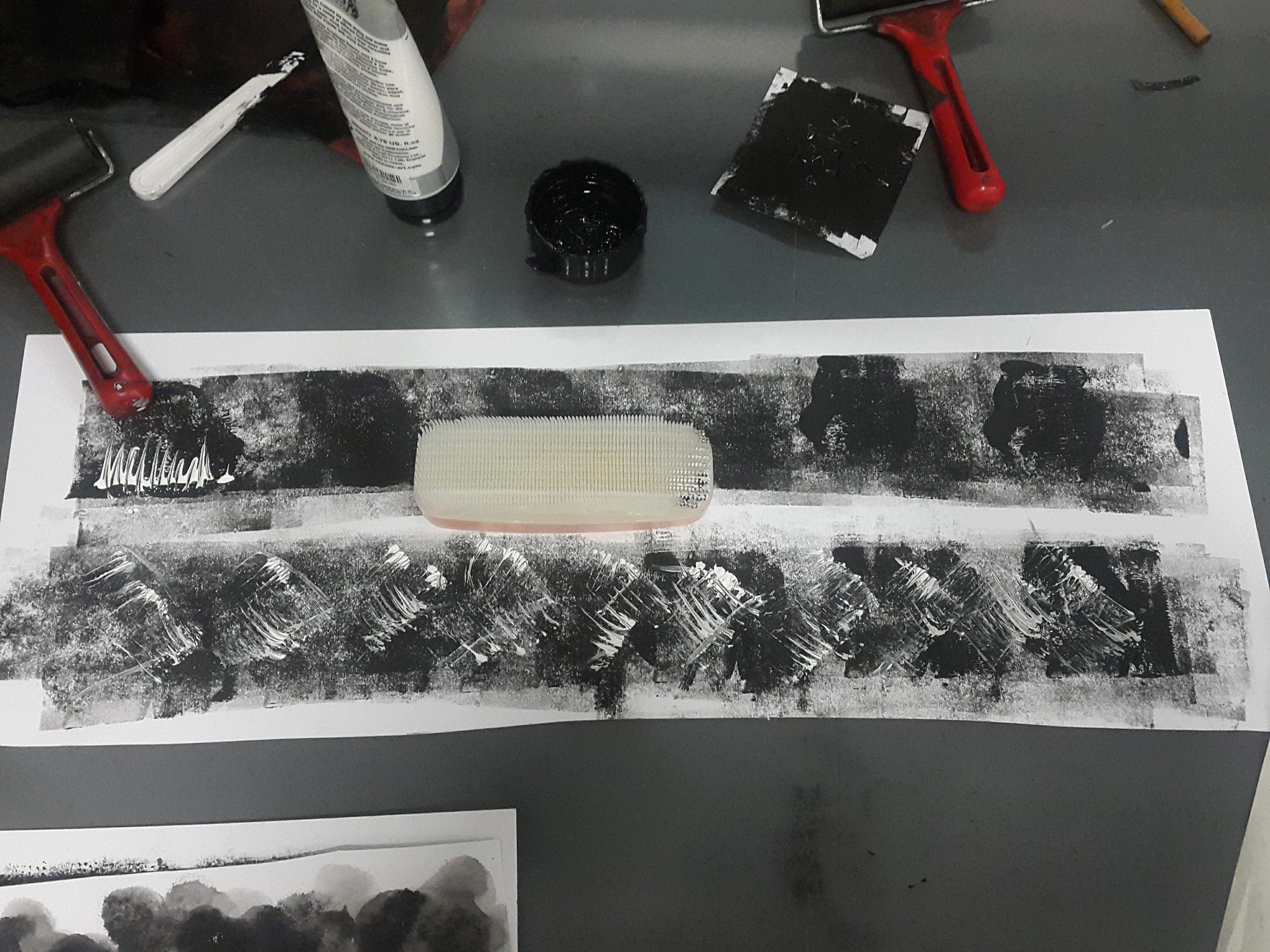
Fury is represented by the stoplight loosejaw, a fish that lives in the Mariana Trenches. Similar to an angler fish, it has sharp teeth, but unlike the angler fish, whose defining feature is its light, the stoplight loosejaw’s defining feature is its wide gaping jaw. Its teeth are also relatively thinner and longer.
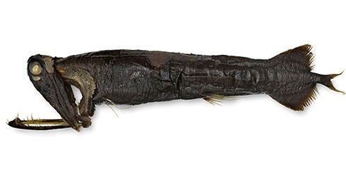
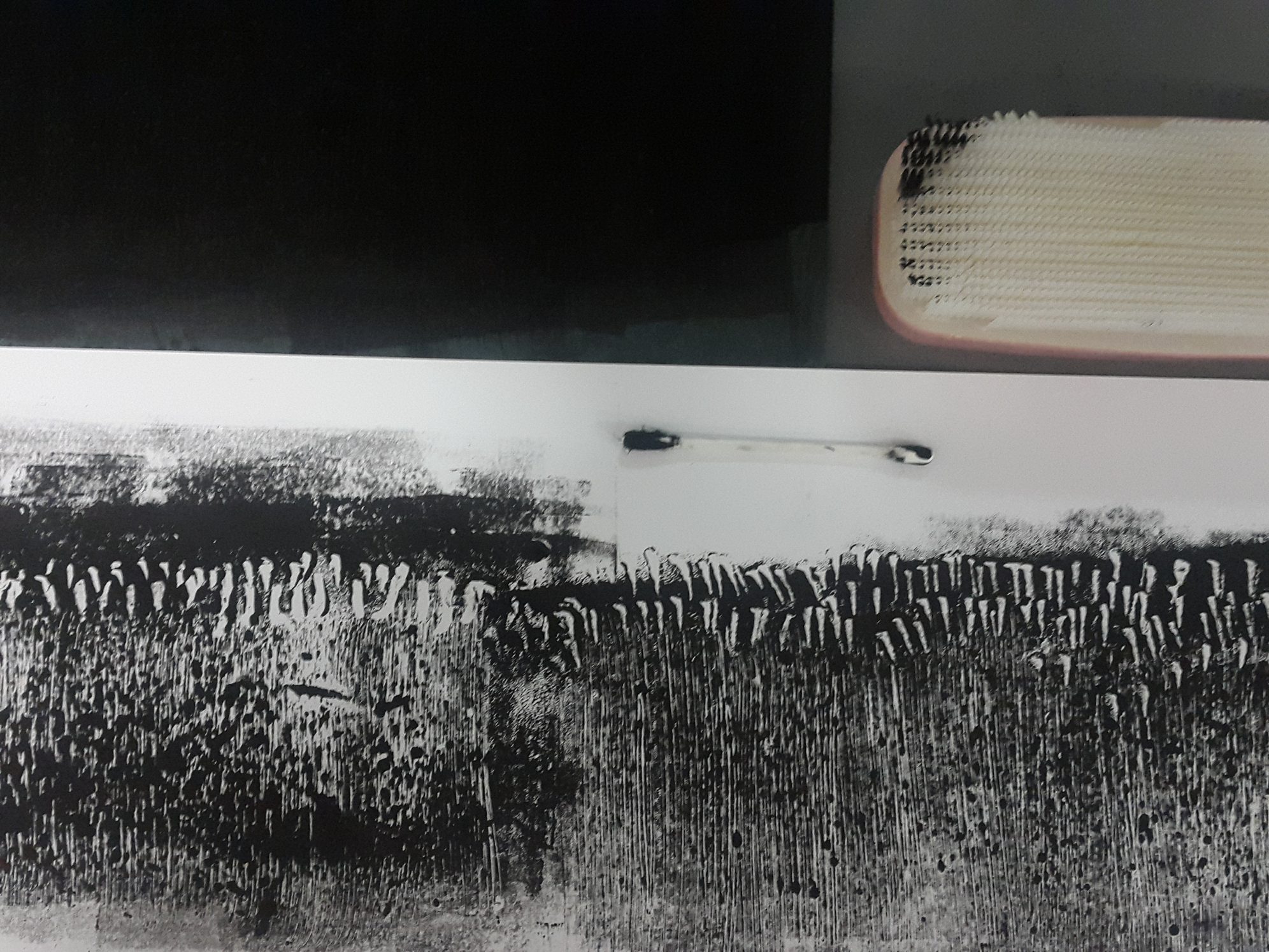
To achieve this, I used the toilet brush instead of the comb. As seen in the picture above, the toilet brush makes finer lines compared to the thicker, more defined lines created by the comb (small section on the top line).
I thought that the overall composition looked angry and violent, with the gaping jaw filled with razor sharp teeth, especially. Hence, I linked this pattern with fury.
TERROR ◊ PING PONG TREE SPONGE
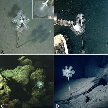
The ping pong tree sponge is characterised by its appearance which literally looks like a tree with ping pong balls attached to it.
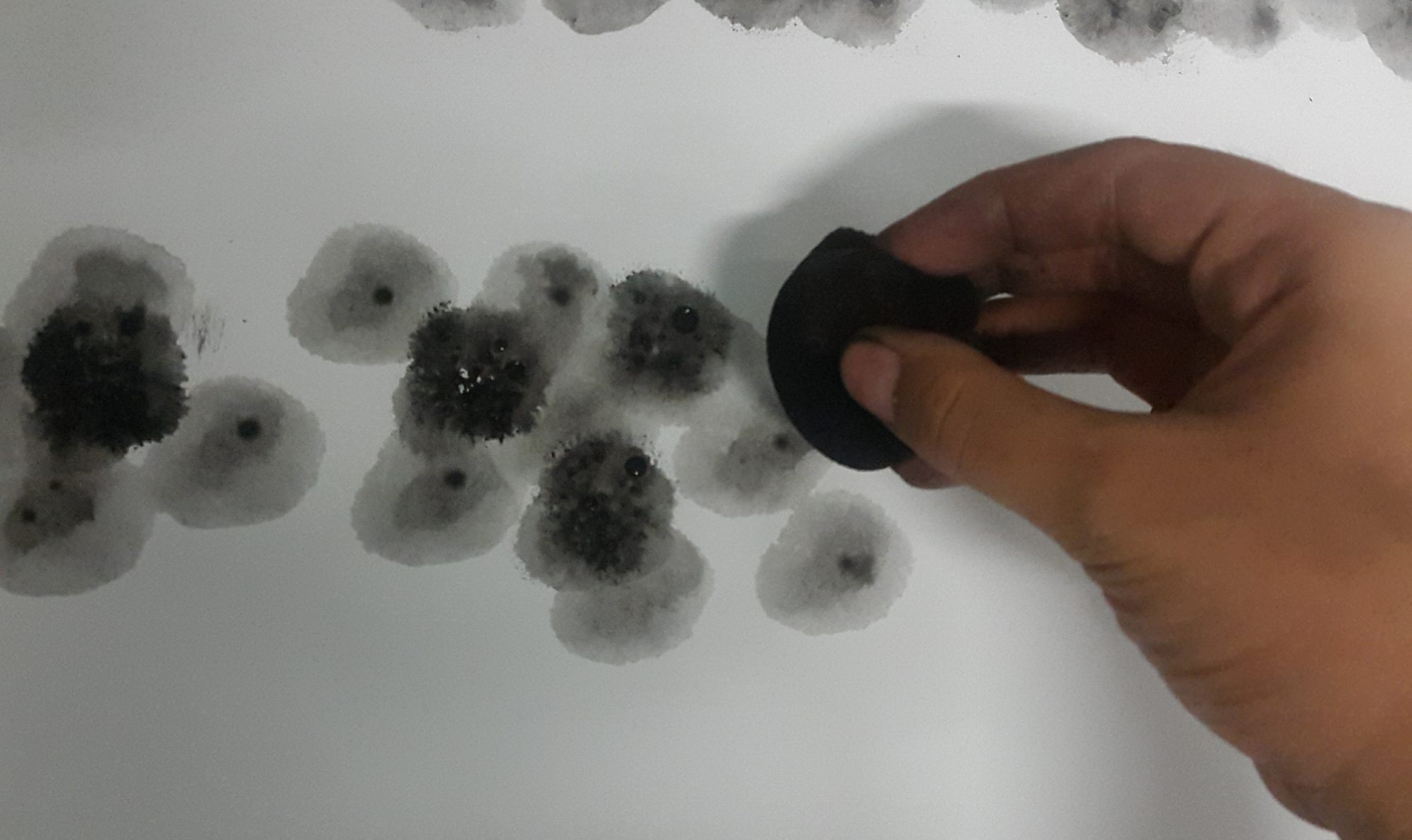
To replicate its physical features, I squeezed a sponge into a ball shape, moistened it, tapped it in block printing ink and dabbed it on the paper. I did this repeatedly with varying concentration of ink. I was mindful of creating an overall dark tone as the ping pong tree sponge is found in the trenches, and I need the print to be dark so that I could achieve the gradual darkening effect. Even though in reality the ping pong tree sponge seems to be light in colour, I chose to capture its physical quality instead in order to comply with my concept.
The spreading effect in each of the circles give a scary feel of something evil lurking in the darkness, or like many pairs of eyes in the darkness. Therefore I thought that this piece speaks terror in its simplest sense.
NERVOUSNESS ◊ COLONIAL JELLY/BIOLUMINESCENCE


One of the key features of animals that live in this layer of the ocean is bioluminescence. Remembering how I created a luminous effect using water in my earlier experiments, I decided to use the technique to try to create a bioluminescent effect, but just a subtle one so that the overall line would still look really dark.
I did this by rolling a thick, even layer of block printing ink on the linoleum, and spraying water on the tile. Afterwards it was the typical process of laying a sheet of paper over and rolling it under the press. I do not have pictures of the process of making the final ones, but it is the same idea as earlier elaborated under the “Sorrow – Eel” line.
I likened the print to the emotion of nervousness, when your heart beats so fast and you do not know how to act such that it feels as if you are surrounded in darkness. I imagined that if I sank this deep into the ocean, I would feel so agitated and panicked to an extreme level until it becomes sort of a numb, nervous tingling that is visualised by the dim glow of bioluminescence.
DISTRESS ◊ OCEAN FLOOR
We have finally reached the ocean floor! Execution for this line was simple. I applied a thick layer of block printing ink on the linoleum, and rolled the hair roller on the mat, picking up traces of the ink. Afterwards, I laid over a sheet of cartridge and applied pressure using a roller. The result was a disturbing pattern of small swivels that feel almost distressing due to its disorderly manner.
The original result is of a darker black, the slightly warm colour seen here is because of the picture quality.
Reaching this layer of the ocean, there really is no more hope, no more light, no nothing. It is a very distressing situation, I feel, because you have absolutely no control, and this is one of the things that fear me the most. Other than the unpredictability, there is also no sense of safety at all, and while distress may not be a strong enough emotion to describe this feeling, I feel that it is an apt emotion to describe both the pattern and the feeling of frustration when you have finally reached a dead end.
◊ REFLECTION ◊
A few things I learned throughout this project are:
- Line qualities and tonal qualities contribute a lot to the perception of emotion through sight. Thick or thin lines, neat or ragged, dark or light, all of these qualities affect the overall feeling of a line and pattern.
- Limited materials do not mean limited artistic explorations. By choosing to restrict the materials I used to only bathroom objects, I pushed the boundaries of how these materials could be used, and learnt to improvise when needed be. This resulted in me finding new techniques that I never knew existed before.
- Inspiration can come from anywhere.
- Work faster to reflect the amount of thinking I have done.
- Research more about artists and artworks relating to the project as more ideas may be able to be generated and developed from doing so.
- Try out more materials and techniques, do not be afraid of failure.
- DOCUMENT MY WORK
Overall, I find the journey to be quite fruitful in terms of figuring out my artistic direction and learning new things. I knew that I am someone who needs to think of something well before carrying it out, but the problem is that I take way too much time reconsidering things and pondering over ideas. This resulted in me not being able to produce enough materials to reflect the extent of my thinking processes. This has been a recurring habit since way back, and with the constant amount of projects, I hope that I will be able to change and work faster, slowly but surely (ha the irony). I think that if I can work faster, I would be presented with more opportunities to grow and develop my ideas, instead of letting the ideas simmer and just remain as they are.
