In class, we’ve learnt that Expanded Cinema is to think about how our works can engage the audiences. While curating an act or artwork, we will have to consider not just the narrative, but also its time and space, and how the emotions from the visuals can affect its audiences’ mood and thoughts.
This dance performance / interactive show was choreographed and created collaboratively with my former workplace (events company) as well as 1 dance mate. To fully enjoy the projection display alongside the dance, we had to black out the section of the exhibition in Suntec Convention Centre. Thus, I felt that it is really interesting to recreate a similar concept where dance meets technology for this installation. http://circusmax.com/vae.html
Our group discussed and decided that we want to expand on the Chinese Ceramics for our final project!
We felt that the Chinese Ceramics in the past and now is really different in terms of functionality. They used to have ceramics as decorations at home on shelves, for offerings, and for storing items, and they are usually being owned by royalties in the past.
Taken in South Korea
Now, anyone can purchase ceramics, and we use it mostly to place food and as a tool for us to eat.
We’d want to combine the two, tackling on the issue of using plates as decorative, and if it is only a utilitarian function, how can the print on the ceramics help push any idea we want to raise awareness about.
We are still in the midst of discussing how we should execute the prototype but here are some that we are considering:
Purchase a plain ceramic plate, paint it
Make a ceramic plate from scratch
Use paper plates, and then acrylic paint or white lacquer to try and paint it to look like ceramics
Use wood to shape it like a plate, then use white lacquer to paint and make it look like ceramics
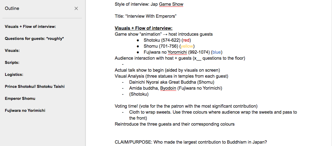
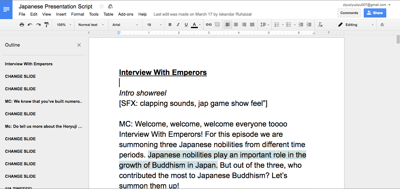
Create an imaginary interview of the three Buddhist Japanese royal patrons: Shotuku, Shomu, and Fujiwara no Yoromichi
When we first saw the topic, Iskandar and I immediately said “Let’s do a talk show together!” and the rest were quick to agree as well! I was so glad that the decision was so unanimous. We then went back to research on the three patrons and inserted into a shared document on Google Docs.
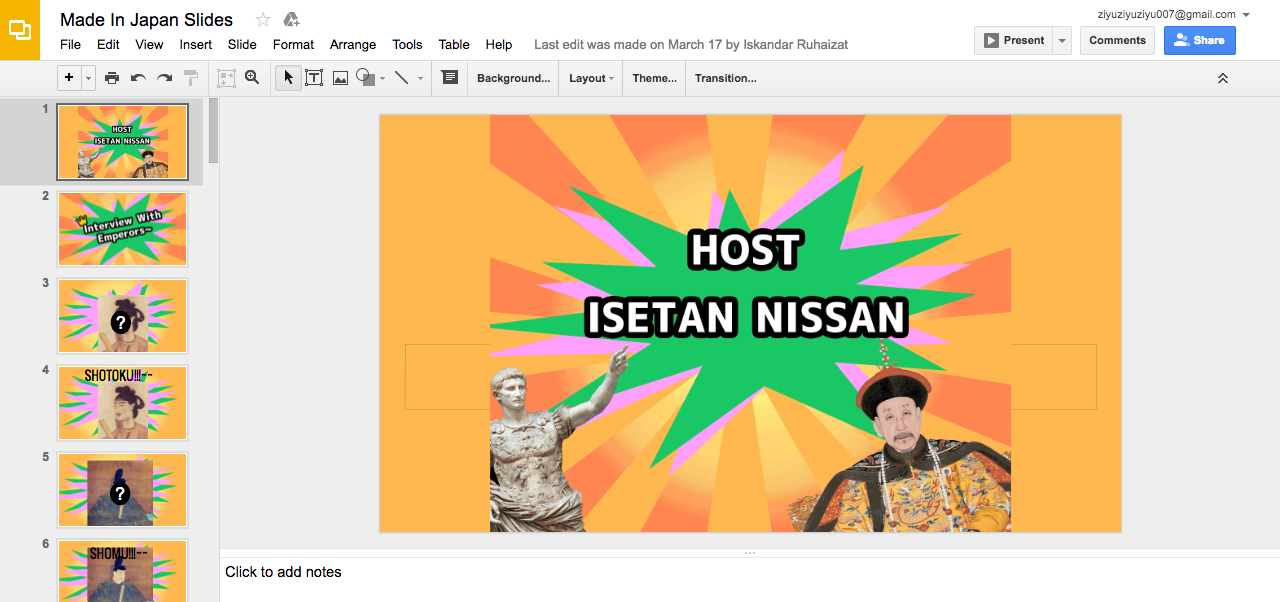
After which, We transferred the words to a shared Google Powerpoint and started editing and adding visuals into it.
After that, we did a script that can aid us in the flow of presentation.
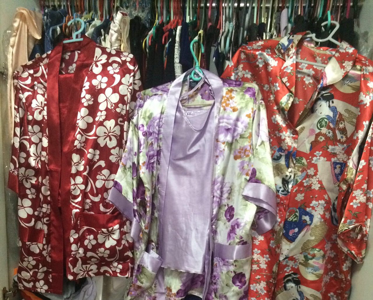
Now that all contents were in, we have to be in character to make sure that this talk show is convincing!
I managed to dig deep enough in my closet for 3 japanese-looking kimono for the team to wear! (it is supposedly 3 pajamas!). And Iskandar has his own Japanese looking outfits, so there we go!
At the initial stage of this module, we already received the timeline of what we will learn, and also, the topic for our presentation. We were not very sure of what to do because we saw other groups visiting museum, and the fact that our team is doing a topic on Japan, we were left confused…not knowing if we were supposed to visit a Japan related museum here in Singapore or not (is there one?) Later, we managed to find out that we are only required to do research and a mock interview or a role play. So as I’ve mentioned above, our group was really cooperative and this project is really a smooth sailing one!
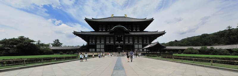
Through this project, I really found out a lot more about Japan. I have always thought that Buddhism was from China, and Japan solely has got Shintoism as a religion and the other minorities are just small influences. I am awed and can’t wait to visit Japan one day to see those sculptures and temples in real!
I wasn’t very confident of illustrating graphic art, but decided to try it anyway, because I really liked the idea of photography combining with illustrations! Overall, I really had fun exploring and trying out various ways of directing a shoot and drawing digitally, and below are some of the process work for my final artwork!
Water from the point of view of a flame is death.
I first shot an empty bottle with the motion of pouring water to an lighted candle.I then illustrated water flowing out of the bottle towards the candle. However, my friends from group consultation suggested that the idea of a dying flame was still not as strong.. Thus, I’ve made the flame extinguish and water overflowing everywhere for my final piece
2. Water from the point of view of feng shui is flow of money.
I took a picture of the fountain of wealth at Suntec. Concept being, wealth=money, water=flowing, which already depicts my line! In addition, fountain of wealth is also known as the world’s largest fountain in 1998! It also is the representation of fengshui, thus my selection on this!
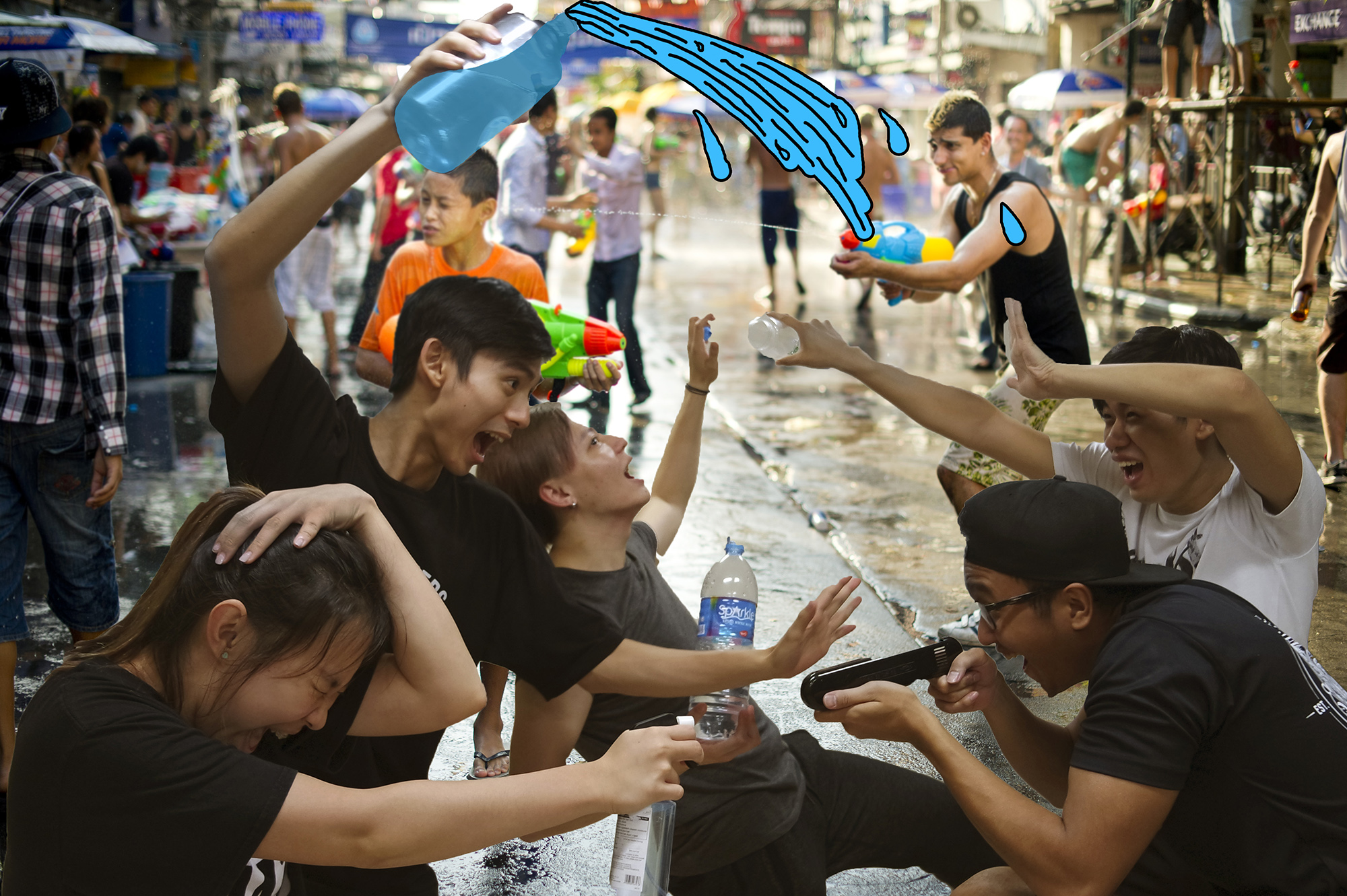
3. Water from the point of view of a Thai citizen is Songkran Festival.
I directed the scene of Songkran with the help of my friendsThen i started editing the water illustrations inTried to have a Thailand city Songkran background but it looks a little messy?Tried removing the background but I felt that it seems a little fake and flatThus, I kept the background but muted the colours a little, and also illustrated the existing water on the stock image to blend both the stock image and my photography together!
4. Water from the point of view of Singapore is contract.
We all know NEWater bottle is iconic, and its existence is also significant to Singapore’s water and its contractual terms with organization or regional countries. Thus, I decided to incorporate this element into this line.had to use this toilet bowl because I wanted to illustrate and portray the idea of what people perceives – toilet water = NEWater
I illustrated the water and incorporated NEWater’s logo into it too!
5. Water from the point of view of instant noodles is completion.
I tried out with this image but I did not quite like the composition and the background was too messy…So I tried to remove the background but it still doesn’t seem to portray the look that I want…Thus, I changed to cup noodles instead!
6. Water from the point of view of Science is ph7.
I can’t find the correct tools and apparatus for this science experiment, thus, I used a stock image for this. As we know litmus paper test can determine the pH value of a substance, thus I used this visual to portray my idea!
All in all, I really had fun exploring and learning while on this project. Can’t wait for the next project already! 🙂
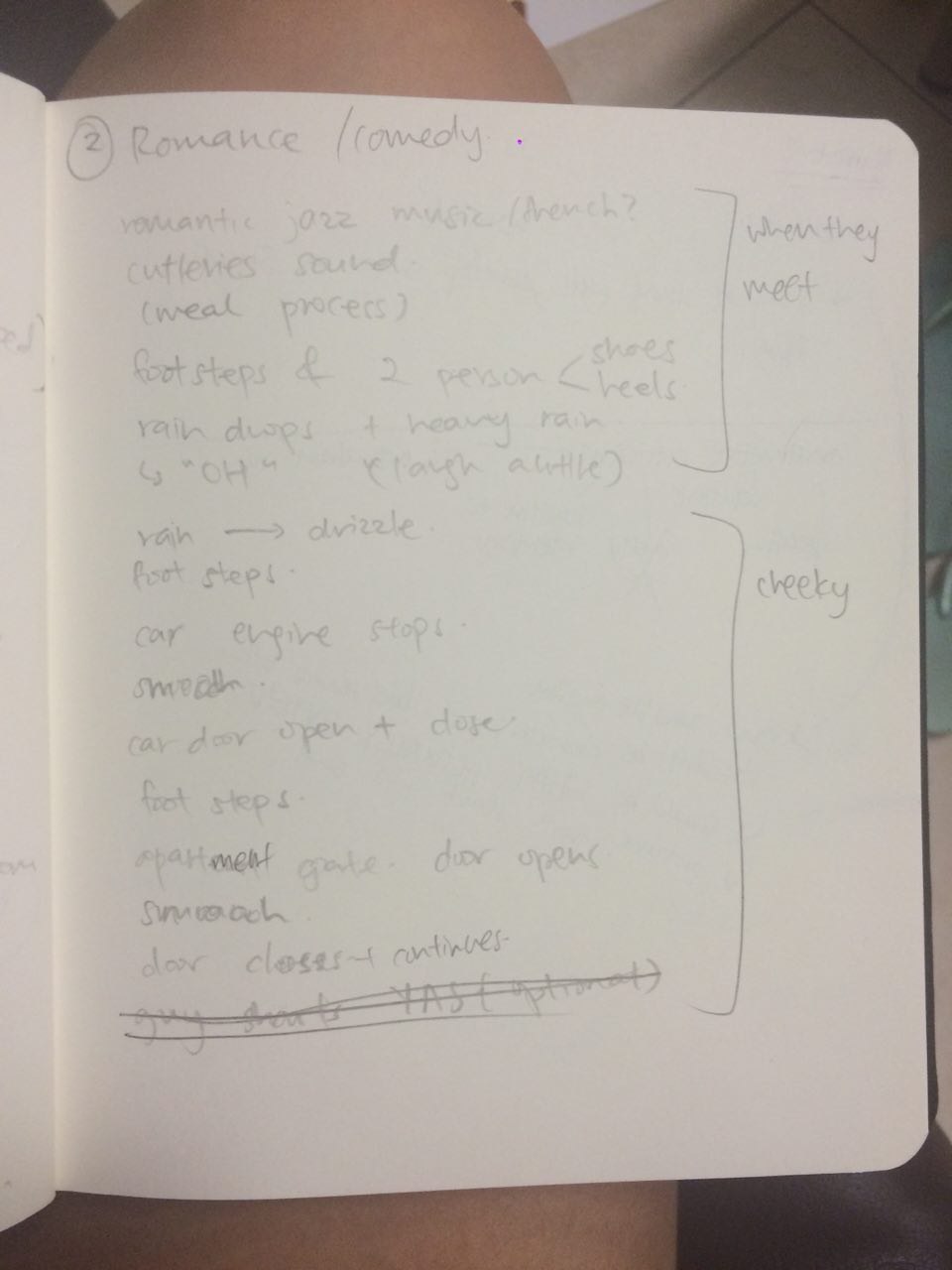
In this project, we had to use only audio/foley to present our narratives. This is a really interesting assignment and it also helped me understand how much music and sound effects can affect the mood and setting of a “film’, and how important it is to choose a suitable piece to fit at suitable place.
Story 1: Psycho Murder
Genre:Thriller
Scene description:
Sarah is being kidnapped in a dark room, she couldn’t see anything, and the silence was deafening; until the door finally creaked open, and the mysterious sound of footsteps slowly approached her.
As the footsteps reached beside her, all she could hear was voices calling out her name in the creepiest way ever. She then heard the mysterious person giggling, and then going a distance away from her, ransacking items, and then she hear him carving knives….In no time, the mysterious person ran towards Sarah and attacked her, and she passed on.
Soundtrack:
Story 2: A Chance Encounter
Genre:Romance-Comedy
Scene description:
The scene started off with a romantic jazz music in a French setting that leads us back to around 1940s. The protagonist would be having their meals, and as they got the bill and leave the restaurant, it started pouring and the male and female lead bumped into each other. Feeling the same way for each other, the two immediately had feelings for each other and they went off into a car, back to the apartment to “get a room”!
Soundtrack:
References:
To start off with the project, I searched on silent films to see how each narrative flows and also to see if the visuals still play a big part of the film, or is it heavily reliant on the audio effects.
Below are some of the reference videos that I used as a guidance to my assignment or some of which I found really interesting.
We have presented on our initial ideation and direction of this project – point of view, and I have received many constructive feedbacks from my classmates (THANK YOU ALL!)
Moving forward, here are my final 6 phrases that I will be working on for the visuals:
Water from the point of view of a flame is death.
(Plan: to pour the water on the flame, but the water doesn’t touch the flame OR water touches flame and and it extinguishes)
Water from the point of view of feng shui is flow of money.
(Plan: Using the idea of Fountain of Wealth at Suntec)
Water from the point of view of a Thai citizen is Songkran Festival.
(Plan: Direct a scene of songkran with my friends)
Water from the point of view of Singapore is contract.
(Plan: incorporate newater – still planning!)
Water from the point of view of instant noodles is completion.
(Plan: Photograph the adding of water into the noodles)
Water from the point of view of Science is ph7.
(Plan: Show the litmus paper test and that water is ph7 – still planning!)
I will be focusing on illustrating only the WATER, since this is the topic I have chosen for this project. The other objects or setting will all be real, directed and photographed.
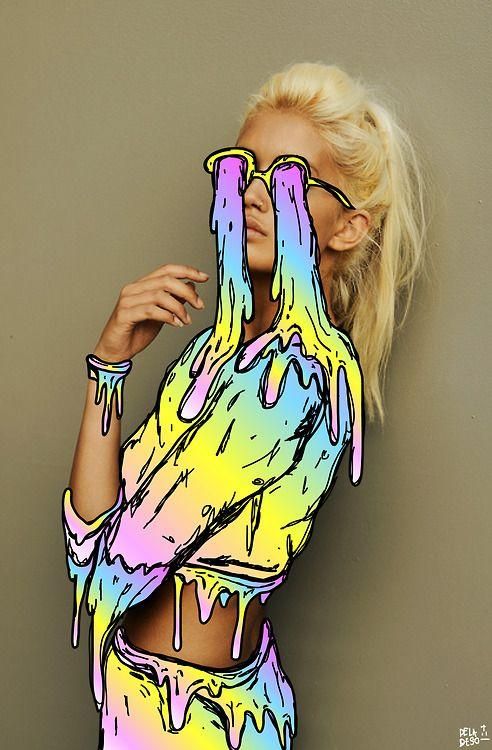
In the midst of planning my edits, I found a reference artist with a similar execution style that I am looking at – Hattie Stewart
On my previous post, the artist incorporated 2D into a 3D object, and snapped an image to make the 3D object look 2D. But Hattie Stewart’s execution is definitely closer to what I am looking to achieve. Graphic illustrations on top on an image or photography. Hattie’s designs are very elaborated, almost giving the idea of dadaism? For mine, I will only focus on her execution, on how she blend her illustration and photography that it will complement each other!
Potential topics: 1. Dance 2. Camera 3. iPhone
4. Water 5. Fire
Brainstorm process:
Water from the point of view of an athlete is motivation.
Water from the point of view of an African child is hope.
Water from the point of view of sea creatures is home.
Water from the point of view of cleaner is a means to an end.
Water from the point of view of a chef is an ingredient.
Water from the point of view of a plant is sustenance.
Water from the point of view of a swimmer is career.
Water from the point of view of a flame is death.
Water from the point of view of instant noodles is completion.
Water from the point of view of a desert is miracle.
Water from the point of view of feng shui is flow of money.
Water from the point of view of firemen is weapon.
Water from the point of view of hose is ammunition.
Water from the point of view of an eye is heart break.
Water from the point of view of a Thai citizen is new beginning. (Songkran)
Water from the point of view of a pair of lungs is pneumonia.
Water from the point of view of Singapore is contract.
Water from the point of view of a bottle is purpose.
Water from the point of view of Bruce Lee is battle cry
Water from the point of view of Science is ph7.
Inspiration:
I’ve always loved the idea of combining photography and graphic art. It could be executed in digital painting or physical drawing, which could be combined as one. It gives off a typically clean overall look and feel and an illusion of 2D animation instead of the actual 3D object. The artwork could also symbolically represent an alternate reality in which all these objects could be viewed from varying perspectives.
Just a recap, my previous oss post mentioned about my thematic approach being “The understanding of body parts – making use of different parts of the body to portray the concept, idea, or keyword.”
And notice the flow of my presentation? From a wider angle of me, to a much intimate and close up image of myself, very very concentrated on the whole idea of ME! Hahaha
Also, this whole project actually reveals that, I am a night person, for sure.
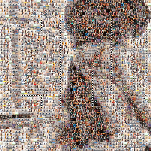
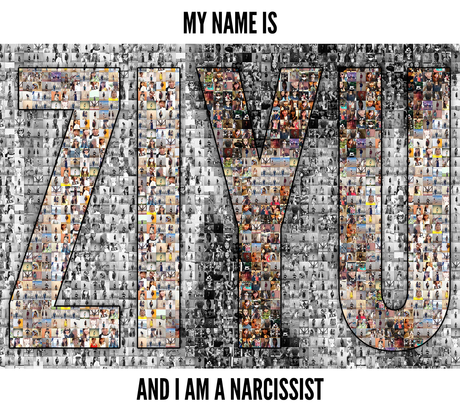
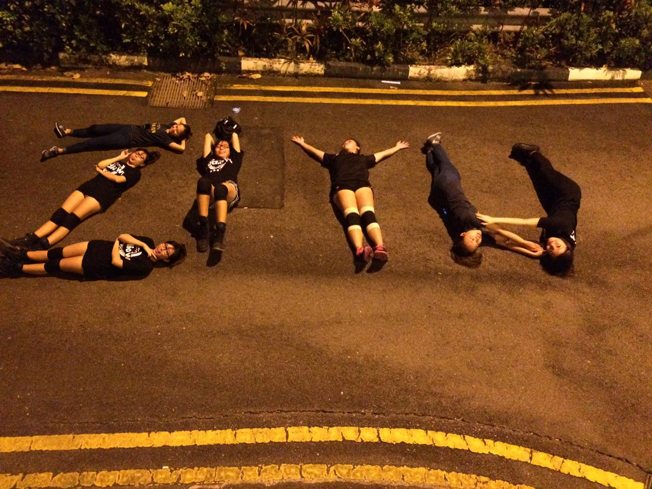
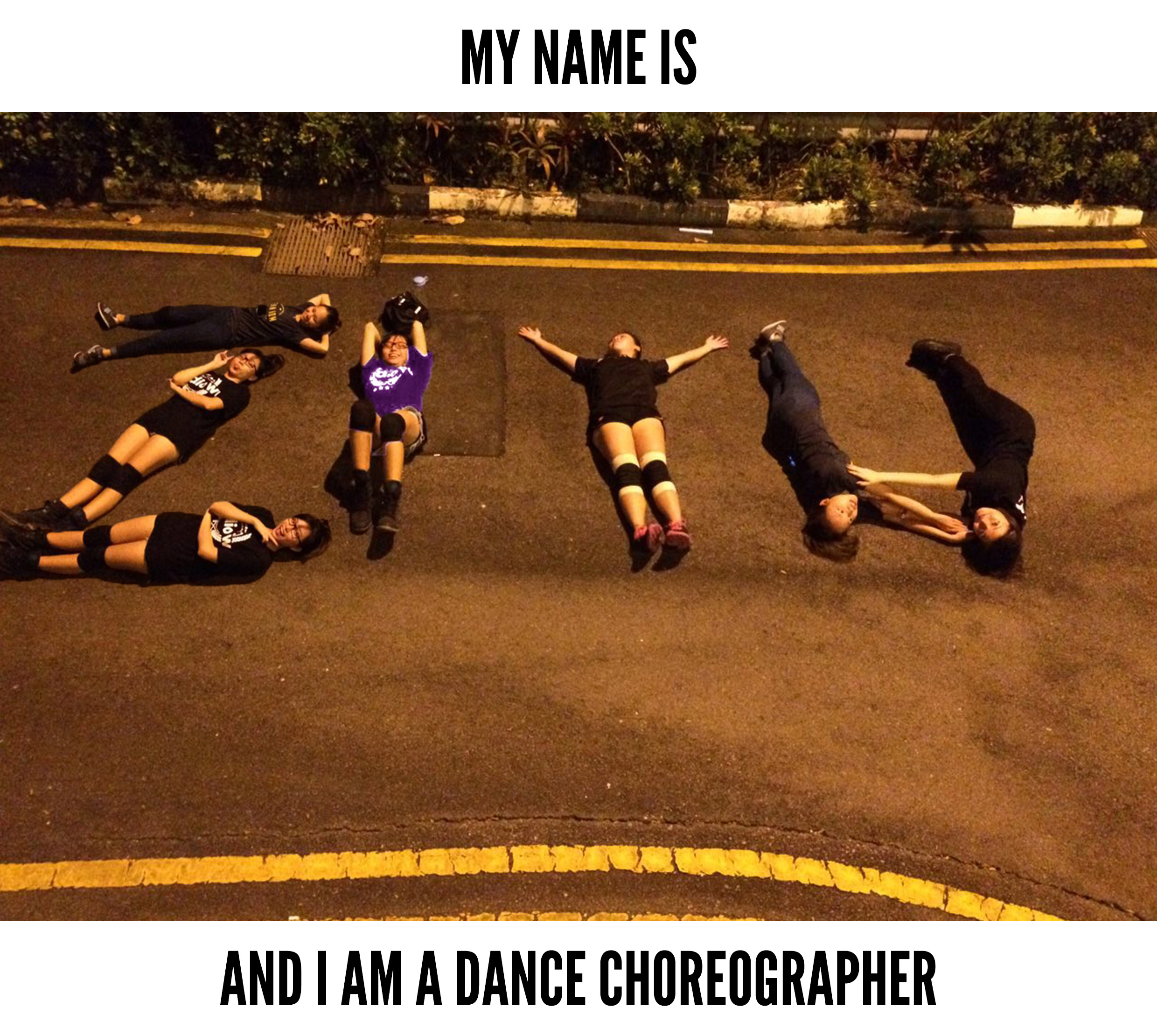
– MY NAME IS ZIYU AND I AM:
A dance choreographer
Being a dance choreographer, I told my dancers to just lie down on the floor (they followed my instructions even though they don’t understand why haha). Because this was shot during one of the rehearsal, I wasn’t able to get the number of people I need as most of them are still having practises for other segments. Hence, I got some of them to stay in position while I did the switching, lying in different positions and forming my own name! Previously, I named this header “a dancer” instead of “a dance choreographer”, but after much consideration, I realized that I do not only portray that I am a dancer, I actually choreographed and directed the dance, this image, their poses and positions! I chose this location and setting, a road at night, because I’d like to emphasize on the idea of me being a night person – it’s so late that no cars are even passing by this road!
To further push this image, I photoshopped my shirt to purple on the I in my ZIYU; as this whole project is really concentrated on myself, thus “I”. I chose purple because my name Ziyu is usually mispronounced as 紫玉 (purple jade) instead of the actual 姿羽. So it’s purple me, and I am a dance choreographer!
A Narcissist
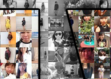
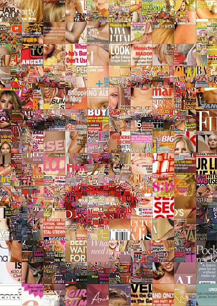
In my previous post, I mentioned that I wanted to make use of Dada art to form my name, playing with black and white, child and current me respectively to portray how much I’ve grown into the current narcissistic me.
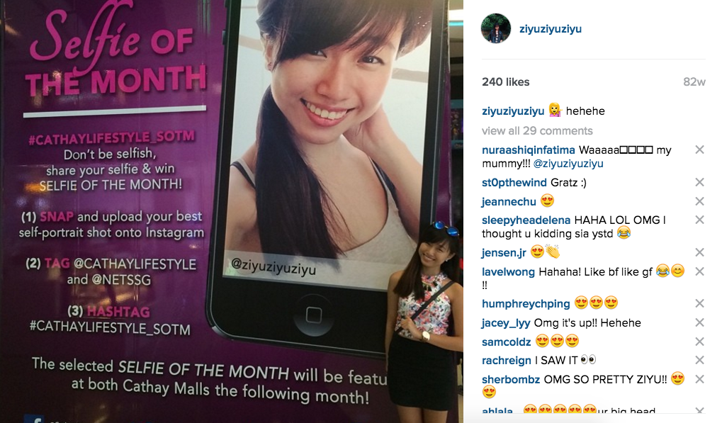
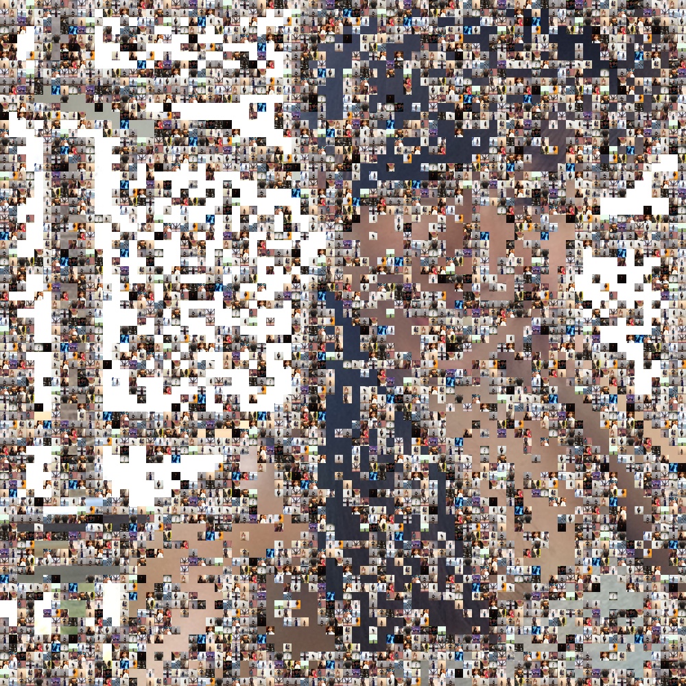
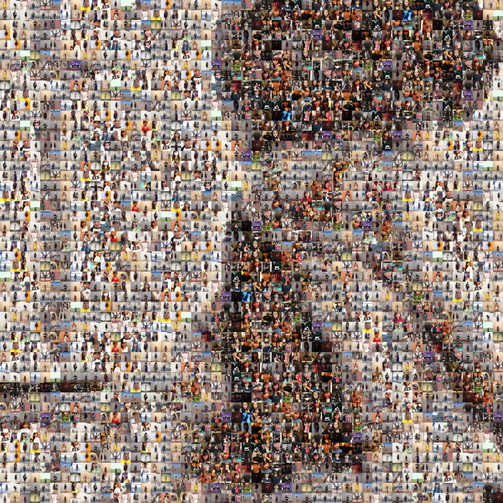
However, an idea suddenly struck as I was having my shower, #showerthoughts haha and I tried out using mosaic tiles to fill up my name, and form an image larger image of myself – so it’s a lot of myself, in my selfie, within my name, for the “my name is” project! Is this Ziyu-ception?! HAHA but yes I got the inspiration from a marilyn monroe mosaic as seen here: And upon which, I did one on myself, the choice of my larger image selfie came when I recalled that I won the selfie of the month hosted by cathay. My selfie was printed in large format, pasted on the huge wall beside cineleisure and cathay, published on their website and instagram and I received a $100 flashpay ezlink card! That was a really memorable image of myself, thus I picked that. 😛 So from this large image and the other pictures I have of myself, I created the mosaic, but was too satisfied because of the random empty spaces here and there, so I compiled even more images of myself!
and formed this full mosaic of myself as seen below! Then, I used the Horizontal Type Mask tool on photoshop to form my name and separated out the name and the background. Then I adjusted the background to greyscale, and my name to remain as colourful and vibrant to portray me! I then added fx like stroke and drop shadow to make my name more outstanding.
Here’s a close up of the final work And here it is!
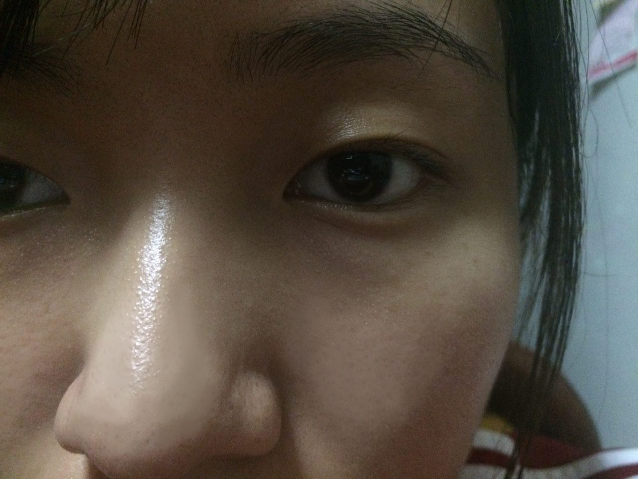
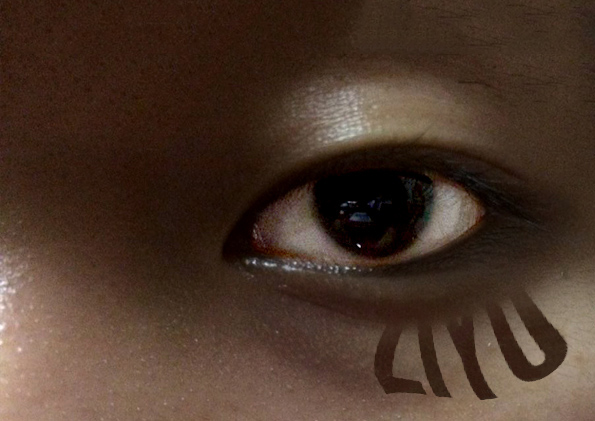
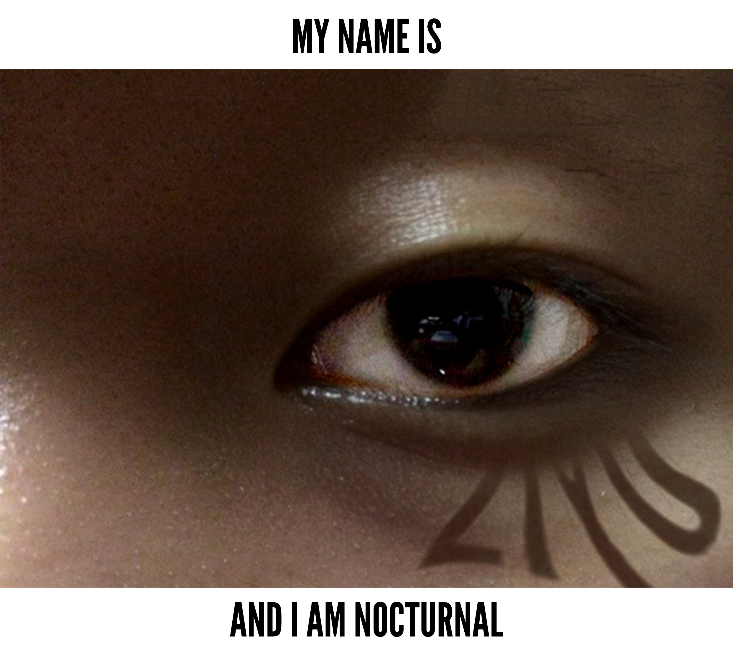
Nocturnal
In my last post, I mentioned that I wanted to try neon lights as it brings out the night life, using the same concept, I tried to execute but it didn’t turn out as expected, thus I changed the idea, which I will elaborate further in awhile, but take a look at my process!
I was inspired my The Sam Willows’ take heart, with a dark setting and neon paint on their faces.
However, executing it physically and digitally is really different and I felt like my neon looking fonts looks really amateur.
So I changed my concept to shadowy, ghostly fonts, and this it why:
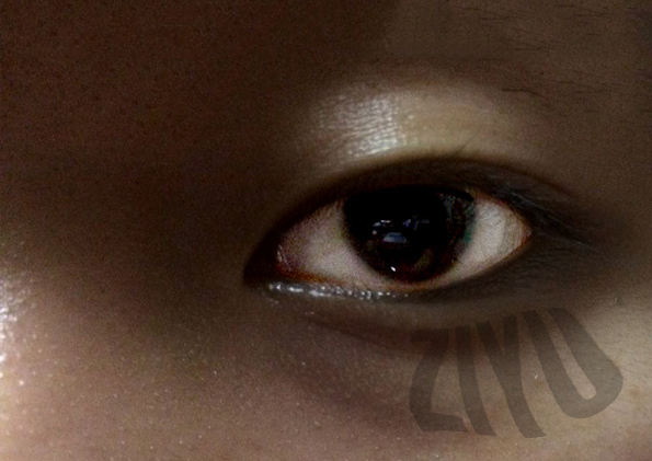
As a dancer, especially this period of time with a lot of competition, I don’t get to sleep much. Dance rehearsals are usually 7pm to 4am, choreographers will then stay back to continue editing music, videos, deciding on costumes, reviewing rehearsals and planning for the following days’ agenda. I’d usually end and get ready to sleep when sun is about to rise, and if there are classes the next day, I’d usually not sleep, go for class, and try my best to survive, then when it ends, I’ll rush back to hall for a good nap. So yes, I am nocturnal. Legit. Hahah. I am totally enjoying this whole process as I am pushing and learning, but I am not so sure if I’d live this nocturnal lifestyle for long, this is really taxing and bad for my body and health, thus, you can see from my final work, it overall feels I tried to portray is dark, gloomy and slightly ghostly. Here’s the original picture i took. and then i cropped it to just focus on the eye, shift the position to the rules of third so that the composition would be slightly more interesting, edited it, make my eyes more bloodshot, and the surroundings to be darker. I used the same colour of my eye bags to droop my name down to show that I am the cause of my own eye bags. But i didn’t really like the contrasting edges at the right side of my name. I adjusted the opacity, but now I think it doesn’t look blended enough. I tried transforming and wrapping the font and it felt a little more ghostly! So I edited the shape, the thinness and thickness of it, and created a shadow of of it. The idea of shadow also portray that it has got to do with lights or night time, and here it is!
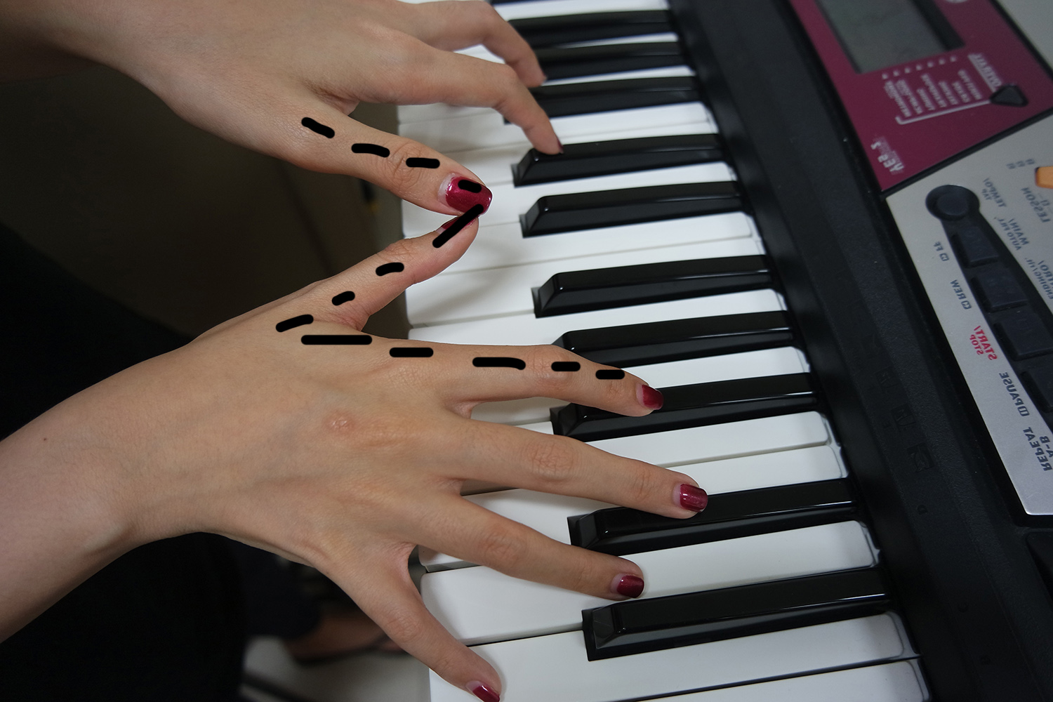
A Musician
I learnt piano till I was grade 4 and then gave up when I was young… But that being said, I was groomed and am more musically inclined! Also, to dance and to choreograph dance pieces, I must be very sensitive with the different layers of songs and be strong in my musicality. Thus, I am a musician!
I tried various finger positions to form the letter “Z”, but I wasn’t exactly convinced by it initially, so how would my audience be convinced? I wanted to go for the easy way out, place my fingers at a position that the “Z” is obvious, but that would mean that the finger position and techniques of a pianist is wrong! So I abandoned that idea and continued trying different positions.
And then I thought, why don’t I play some thing in slow motion, and ask my friend to help me snap a tons of picture and then I select from the entire batch? And so, I narrowed down to the picture below and started editing.
I managed to spot a Z from my thumb to thumb and index finger, so I based my edit on this. I didn’t like that the keyboard has a lot of details, so I cloned it away to make it full black.
I wanted to blur out the sides of the image and only macro focus the Z, however, it didn’t work out as expected. Then I experimented on lighter and darker shades. Upon reaching this stage, I thought why not expand on the idea of a single spotlight?
I added rays of the same intensity to show the effect of a follow-spot (light) on stage. So again it’s me, Z, under a single spotlight! Through this project, you can see that I am obviously a night person, I love the limelight (on stage) and I love anything linked to music!
As I’ve mentioned during presentation, my whole project revolves around the night setting – dance choreographer, as mentioned above. Narcissist – there’s always a prime time to post photos on instagram and that is at night! Nocturnal – it’s self-explanatory. Musician – theatre shows, performances, recitals are usually held at night. Therefore, I am definitely a night person!
I hope you guys enjoyed my presentation as well as my concepts! Do let me know if you guys have any suggestions for me to improve on my work, thank ya all!!!!! 🙂
THEMATIC APPROACH
The understanding of body parts – making use of different parts of the body to portray the concept, idea, or keyword.
DANCER
Typography: Humans
To relate my whole project as one, I decided to create a night setting and as I shoot “ZIYU”. Due to the lack of manpower, I had to work within my means and edited myself multiple times into the artwork.
However, I’m not exactly satisfied with the outcome yet, thus I will be trying out variations but still stick to this idea to see if other methods may work out better!
NARCISSIST
Typography: Dada/collage
I’ve always believed that everyone is a narcissist to a certain extent. As for me, I think I may be a little bit more narcissist than an average person…… ^.^” but I embrace this fact! So I browsed my photo album and compiled a folder of images to form “ZIYU”. With dada art, I would be collaging 2 different set of images, playing with greyscale and coloured image to show the letters Z-I-Y-U clearly. Some classmates suggested that I should stage some images to contrast the letters even more; for instance, greyscale images on the background to be straight face or blank expression while the colour images that will be forming the letters would be with big smiles and contrasting expressions.
Another concept of mine would be to put my current self as coloured images forming Z-I-Y-U and as for background, it will be greyscale of my younger self. This concept would portray another meaning behind the selection of images – to show that when we were younger, we weren’t sure of being vain or to dress up more and stuffs, so that would be quite dull, thus B/W at the background. As for now, I love myself and how I look more, so the poses, expressions and the whole look and feel for the letters would be outstanding and vibrant; hence, explaining the growth of myself as well.
– images are compiled but not collaged
NOCTURNAL LIFESTYLE
Typography: Neon lights/digital
Beng a commercial dancer cum student is quite tough on the body as dancing usually happens in the evening or night while studies in the day. During holidays or competition period, it is clear that I turned into nocturnal mammal as I usually start my day at about 4pm, and end dance around 4am, then shower, rest up a little and sleep till late afternoon again. So with studies in the schedule as well, I usually only get 2-3hours of sleep a day, which is really really damaging on my health, but I do enjoy all that trainings and performances, so I named this nocturnal lifestyle instead of lack of sleep!
So my concept is to snap a picture of my tired eyes after practices end at 4am or 5am, and that would be the background of the picture. Z-I-Y-U would then be included in neon fonts as it gives a more saturday-night-out feel (like bars or theatre or places people usually visit at night).
I refer this idea to Dan Flavin, an artist whom does a lot of projects on neon lights, I learnt how he places different coloured lights together and made use of colour theory. He also had varying methods like reflections, the abstract placement of lights and so on, white I would experiment on the my eyes – Z-I-Y-U multiplying on the pupil of the eye to portray a look of the contact lenses. Useful link : https://www.artsy.net/article/artsy-editorial-10-artists-who-work-with-neon
TRAVELLER
Typography: digital/positive and negative space
When I think “traveller”, I’d picture a pair of legs in the motion of walking; a camera; a luggage, a many many smiles! My initial idea was to use dingbats and play with positive and negative space, like Shigeo Fukuda.
However, if I make use of this method, it would be off the thematic approach I have in mind for this project. Thus, I will adopt this idea, and make use of my friend’s leg as I direct this photoshoot and still play with positive and negative space, except that it would not be dingbats, but it will be real physical humans and items.
Gabriella Montez (Vanessa Hudgens in High School Musical) In the movie, Gabriella is a person who loves to perform singing and dancing in her college days, and she is also madly in love. I felt really relatable when I watch her because I really enjoy singing and dancing and I am heavily involved in these activities in school, just like Gabriella.
Remy (Rat in Ratatouille) Remy is an idealistic and ambitious rat in the show, feeling inspired, he wanted to become a chef so bad that he hid in the protagonist’s hat to cook. Just like me, whenever I feel inspired or have the determination to do some thing, I would give my all and become quite stubborn in a positive way!
Shen Jia Yi (Michelle Chen in You are the Apple of my Eye) A couple’s romance – they liked each other but they didn’t confess…… ^.^”
Robin Scherbatsky (Cobie Smulders in How I Met Your Mother) Outgoing, slightly indecisive, jump ship (career) very often
Cheon Song-Yi (Jun Ji-Hyun in You Who Came from the Stars) She thinks that she is actually very fabulous and glam (some times she really is, because she is a celebrity), but she’s actually quite candid and spastic
Five Public Figures
Beyoncé Everyone knows that Beyoncé is a really independent woman, and she is a feminist. The main quality that I found between the both of us is not feminism, but performing. She always characterizes herself on stage in such a way that she is as queen or a diva, which happens to me a lot on stage too!
Sylvia (NightOwl Cinematics) Sylvia is the owner of Night Owl Cinematics (Local YouTube Channel) and the reason why I find us relatable is that I came across her vimeo doing corporate videos or wedding videos. Thus, she does film for a living and that is what I am considering. Also, she often self-direct and act at the same time, which is also what I aim to do. Thus, I really find a strange connection between the both of us.
ChaeLin (CL)
She used to be in a performing group, but now she’s exploring much more on her solo career. She is very daring at trying new styles and things and not afraid of people judging her.
Parris Goebel Very successful dancer, tour around and danced for many international artistes. Recently directed a movie, and also assisted Justin Bieber in his new album.
Tyra Banks
Professional model and she used to have her own talk show. Now, she is just focusing on America’s Next Top Model, nurturing new talents and creating opportunities!
Five people I know/have known
Uli Chan (Fashion blogger+model) Uli is my secondary school friend and she has since gained a lot of knowledge and skills from her past experiences. From her own hobby of collecting magazine cut-outs of fashion column, she started blogging about herself and her fashion and is now a pretty famous fashionista. She was featured in many magazines like Nylon, NuYou and I feel a connection with her because I love to do video-blogs!
Gavin (Mediacorp Artiste) Gavin is my polytechnic friend, and through the Mediacorp Hey Gorgeous scouting, he managed to earn himself a contract and is now in the local showbiz industry! He also does a lot of music covers and that is also why I feel relatable to him.
Xavier (Dancer)
Instructor in Singapore, but travelled around and got scouted – he ended up touring with a USA instructor over in Europe, Japan, and back in Singapore too. Recently participated in Mediacorp Channel 5’s The Dance Floor and got 1st Runner Up.
Carmen (Dancer-student)
My best friend! Cliques really well and we have many things in common! Most importantly, we dance and participate in competitions together. 🙂
Aprilia (Dancer-student)
Dance mates since 2010, and we only recently realized how much things in common we actually have – life goals. And we would always get performance opportunity together, which allows us to grow together as well 🙂
[SELECTED CHARACTER]
BEYONCÉ
Whenever I have a performance regardless whether it is singing or dancing, I’ll usually remind myself that I am not Ziyu for that hour, I am Beyoncé, or Zeyoncé; so that I can get into the mood and character and portray my alter ego instead of this usual Ziyu you see everyday. Many people think I am just a girl next door, but has anyone encountered the other side of me off-stage?


 Then, I used the Horizontal Type Mask tool on photoshop to form my name and separated out the name and the background. Then I adjusted the background to greyscale, and my name to remain as colourful and vibrant to portray me!