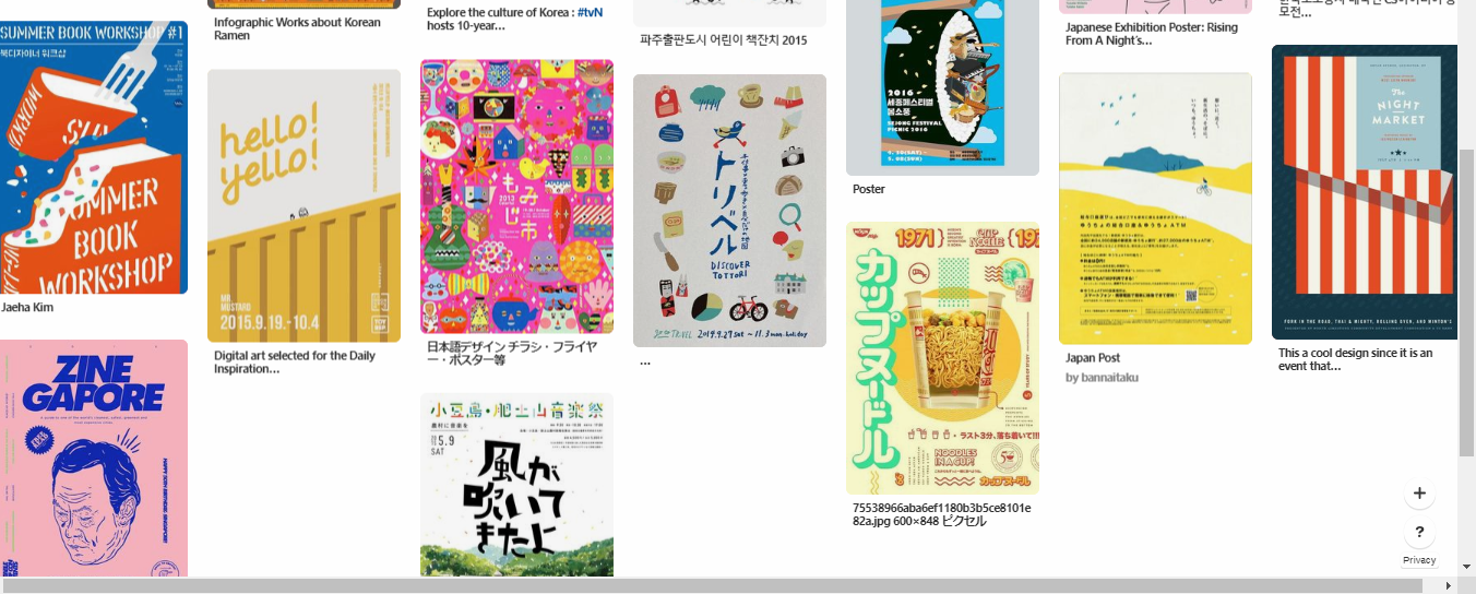
Poster: Moodboard and Process

Brainstorming:

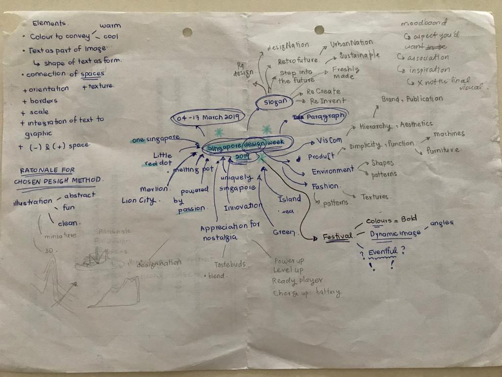
1st Idea: Design Nation

For the graphics I wanted to created to create a little leaf shaped country with oversized objects from each from the 4 sectors of design, since here I wanted to implement nature and sustainability as part of the image.

2nd Idea:  Get your taste buds ready

For this, I wanted a kueh tutu shaped infrastructure on a leaf-shaped platform as part of the graphics, because I wanted something that is a part of Singapore culture and again nature.

3rd idea: RE: invent

As for this, I wanted to base it on the vintage radio that I saw back at the National design centre.


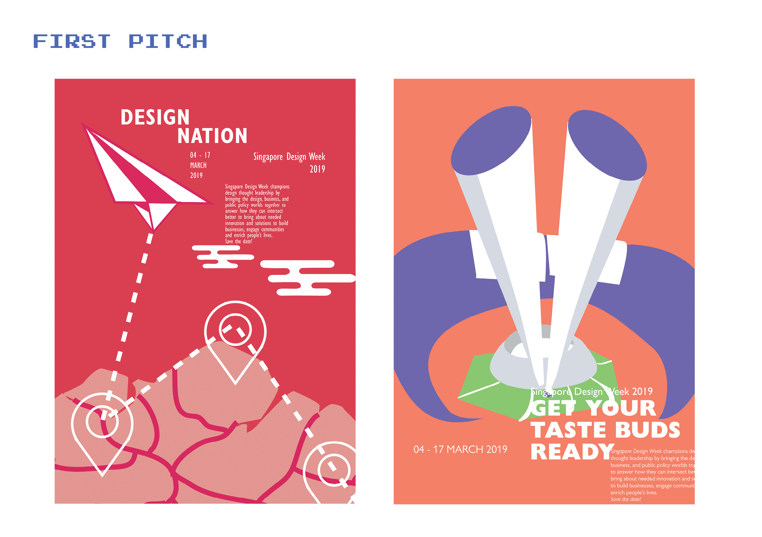
I decided to work on the first 2 ideas that I had, but it wasn’t exciting without any dynamic angles and seemed rather still and cold. And as for the 2nd poster, I kept emphasizing on making food graphics that it failed to look like a design festival. So I decided to carry on with my 1st Idea.

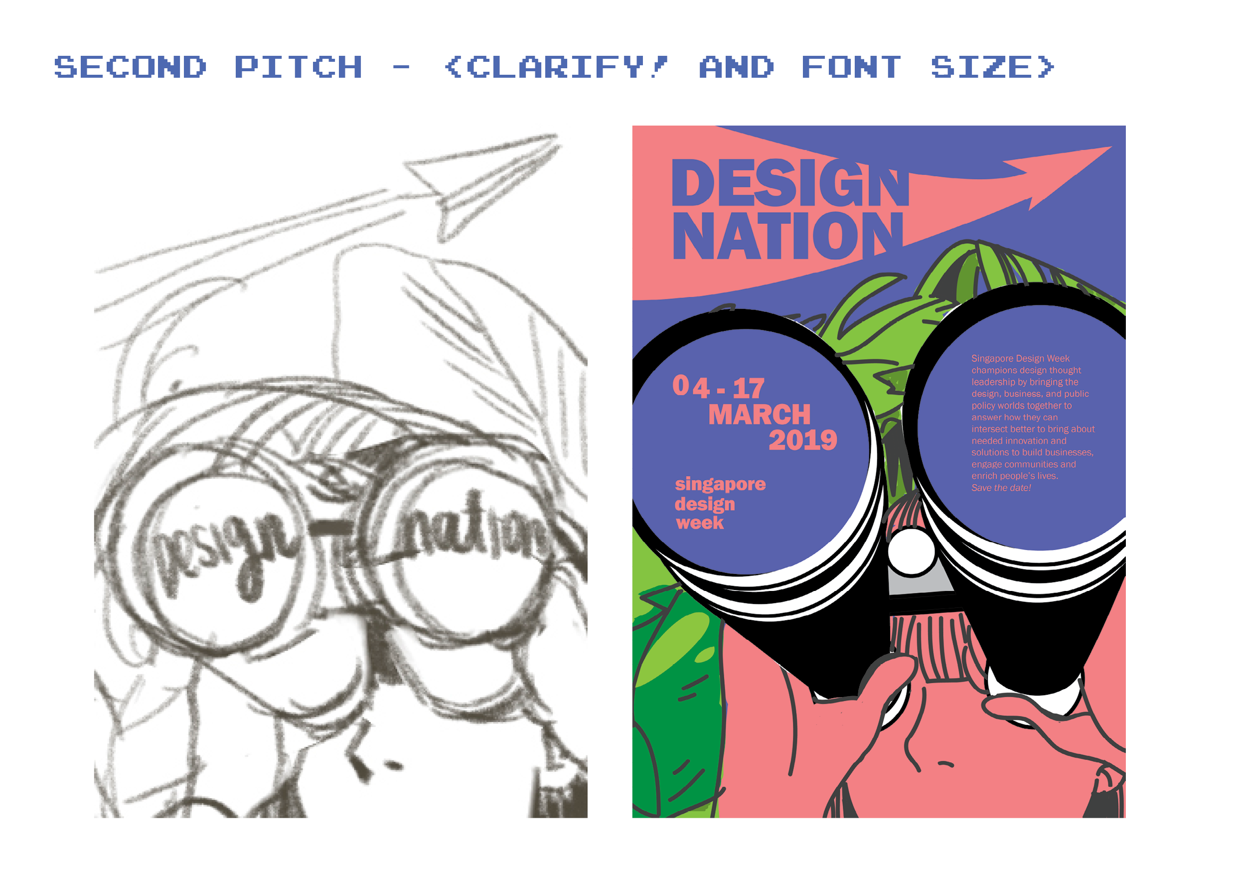
Since I’m working with the slogan Design Nation, I tried to incorporate the idea of discovery while trying to put in more dynamic angles, I came up with this where I have a girl looking out of her binoculars with greenery behind her. However, because of the graphic I created first, I had trouble finding space for my text and end up just squeezing everything in whatever space I had.

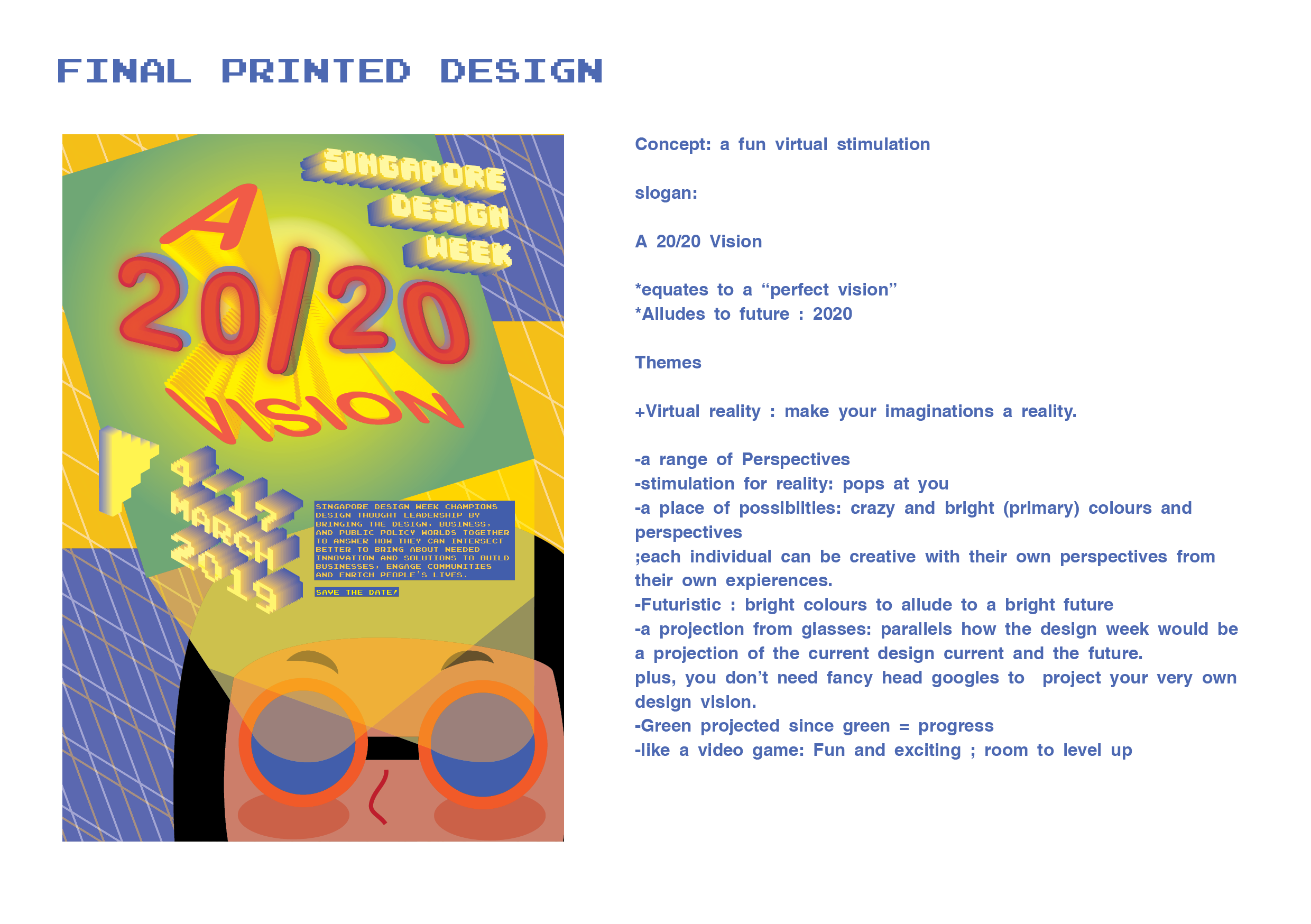
As for the graphics, again I was being a bit too literal, and I decided to take some of the advice given in the class; the binoculars could be swapped out with projects out of the eyes. I also really liked another suggestion from the class to change the slogan to “a 20/20 vision” instead.

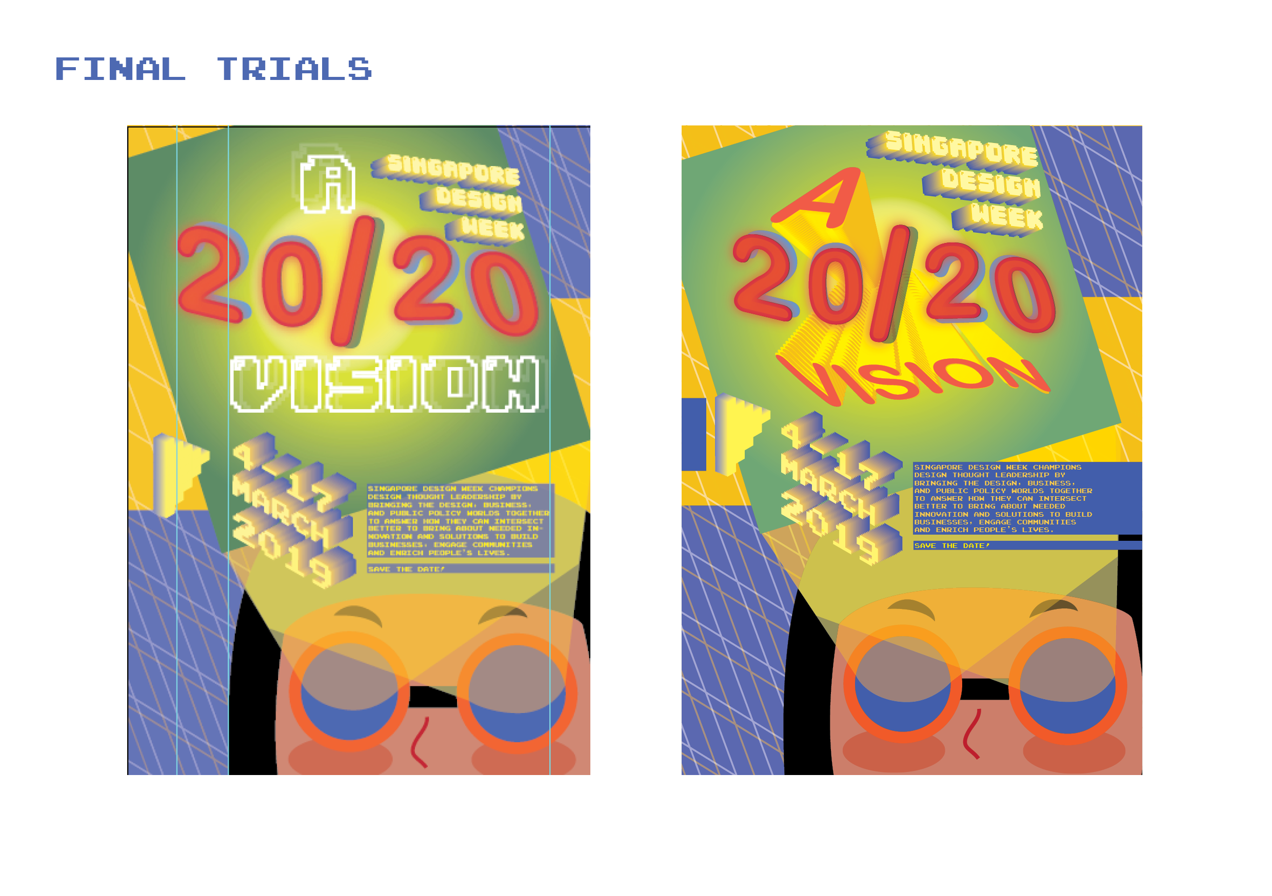
Since I’m working with a new slogan to do with vision and projections, I decided to change the graphics again to create a game-y graphic like a virtual reality. I also left out all the leaves and instead replaced it with simple grids to imply guides for building anything to imply endless possibilities.

But, my font sizes especially for the  date and the festival, were way too small, when they are supposed to be important. It was also still lacking the playfulness, so I decided to give it some pop by changing the text to Isometric graphics to make it look more dimensions. And I decided to test out using different types to create more contrast.

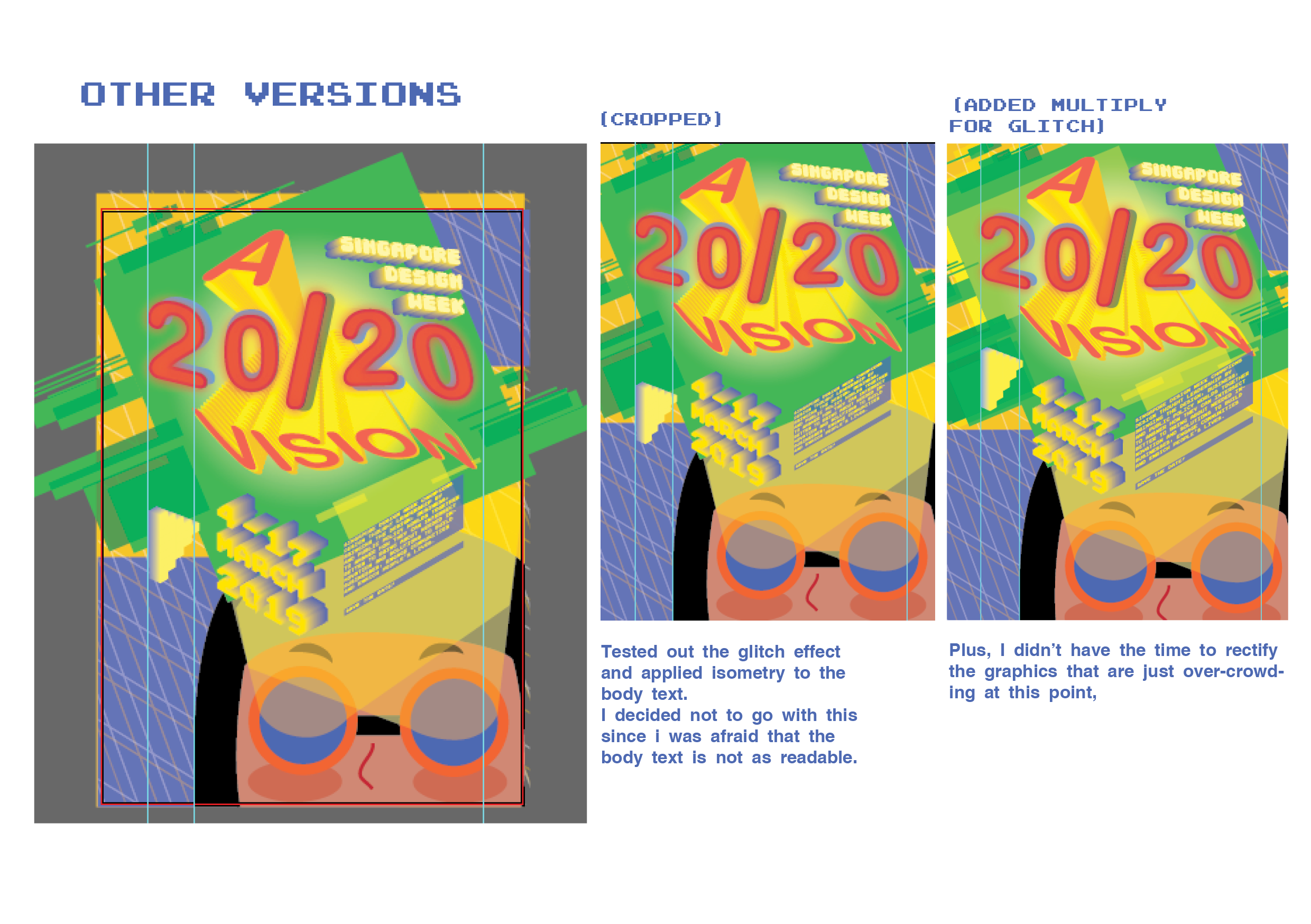
One thing that I definitely learned from this project is to not let the graphics control the texts, like I was doing for many of my previous attempts. I learned to practice taking everything out and putting in text elements in first and put in more graphics later, although i still have some problems locking them in to create a balance and a sense of unity.

Although I still struggle with hierarchy and locking my elements in the graphics, I think I managed to come a long way from the beginning of this project.


Visual Research + MoodBoard

I decided to analyse some of the more illustrative ones as I am personally more interested in those..

  1. Hello!Yello! Solo Exhibition

This poster uses a Monochromatic tones and tints of yellow to compose the entirety of the poster. I thought it was charming of them to deliberately stick to monochromatic yellows to  reflect the theme of the event, to celebrate the Yellow faces aka the Asian people (according to google translation of the event). At the same time, the yellow acts as a brand for mrmustard studio as it can easily be associated with its namesake.

As for the illustration, the yellow wall creates an interesting diagonal yet symmetrical cut keeping the poster balanced overall. This line of division also makes the small and playful black lineart stands out in the center.

All the textual elements on the poster are all placed at the four edges, framing an imaginary margin.
All four textual elements are easily legible as yellow fonts are contrasted over the off-white background and vice versa. Our eyes go over first to the Event title : Hello!Yello! which is the largest amongst all of them. In addition, the slightly tilted angle and the availability of wide space around it easily grabs our attention. In addition, visual interest is created with the title being written in a causal handwritten type in yellow, as if promising that this exhibition will be fun and entertaining.

Then our eyes get drawn to the bottom left as we go along the sub-margin that frames the title, where the Studio and the dates are displayed, which are technically the two other important elements after the title. We then go to the text with the vertical alignment at the top right corner, and this orientation creates another form of visual interest. It then directs us along its own sub margin to the sponsors.

I think the overall simplistic style of illustration with the repetition of yellow aligns itself well with the message of this exhibition; to embrace the charms of fun yellow as a part of the Asian identity.

2.  Hackathon 

drag to resize or shift+drag to move

I think the most outstanding thing from this poster is how it manages to capture the important features of coding with its play on the visual combination of both the illustrations and the text, which takes up almost the whole center of the poster.

Firstly, the largest text for the title (HACKATHON) is placed interrupted into 4 lines with the white lines, but still forms the word when read conventionally from left to right, and top to bottom. This disconnected imagery reflects how codes make use of individual alphabets as a component to communicate its functions in data instead of using it for mere communication.

The imagery of the hands intertwined with the text also further reinforces how coding requires layers and layers of work in order to make it function. It also perhaps suggests having to think outside of the boundaries in order to make the coding work, suggesting that the event is bound to challenge you to think creatively.

The textual elements of the posters also frame themselves around the central imagery, creating an implied margin. The difference between the colours of the frames around the texts also separates each textual information from one another.

Again, the poster, only uses limited colour palettes, and uses the split complementary system to bring attention to the detached hands from the orange-yellow background, which creates an impression that coding can be fun and creative.

Here are the other posters that I found interesting:

『第6回マイ・フレンチ・フィルム・フェスティバル(myFFF)』ビジュアル

Japanese Poster: Souvenir Square. Satoru Morone / Sakiko Sudo. 2013

Field Trip: National Design Centre

Design Practices in Singapore

Environmental Designs (EN)

Product & Industrial Designs (PI)

Fashion and Accessories (FA)

Visual Communication (VC)

Future Goals for Singapore

In addition to its rich multi-cultural roots, it has already cemented its place in the international community as one of the fastest growing and most innovative metropolitan states. As such, Singapore has revenue and confidence to explore more creatively and we do see the fruition of this advent with the recent influx in the general interest of design in all of the sectors of Singapore.

With this continued interest and investment in design all over Singapore, people from all age range will begin to see the significance of design in keeping all the sectors of Singapore flourished and at the same time, paints Singapore as a vibrant and attractive country to the rest of the world.

At this rate, I’d like to believe that Singapore will very soon find its own charm in the design scene globally if it continues in this direction that encourages venture.