


my stuff


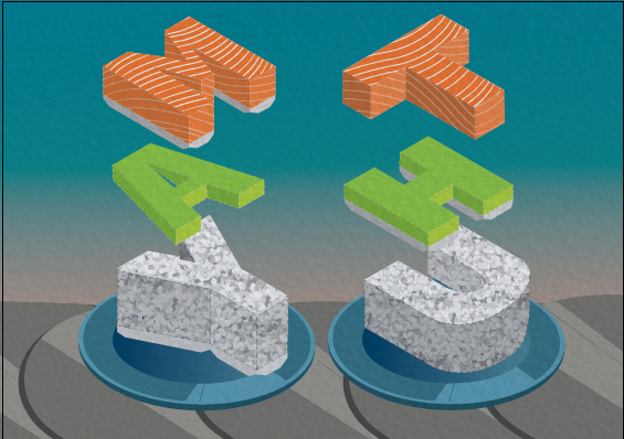
Both the art of sushi and paper folding requires precision and measurements. So i thought that these two jobs would fit each other really well when they are combined into one.


So here are the visual elements that I borrowed from the two jobs:
a.
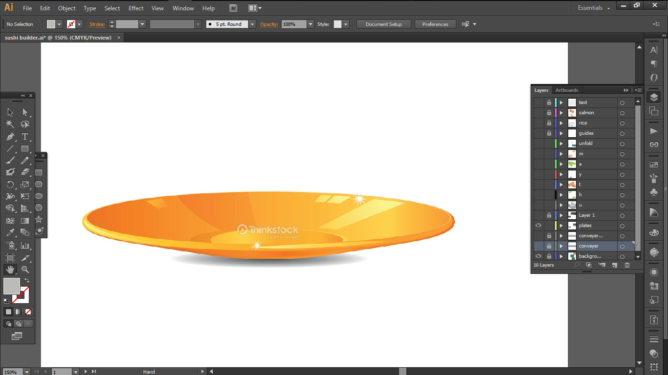
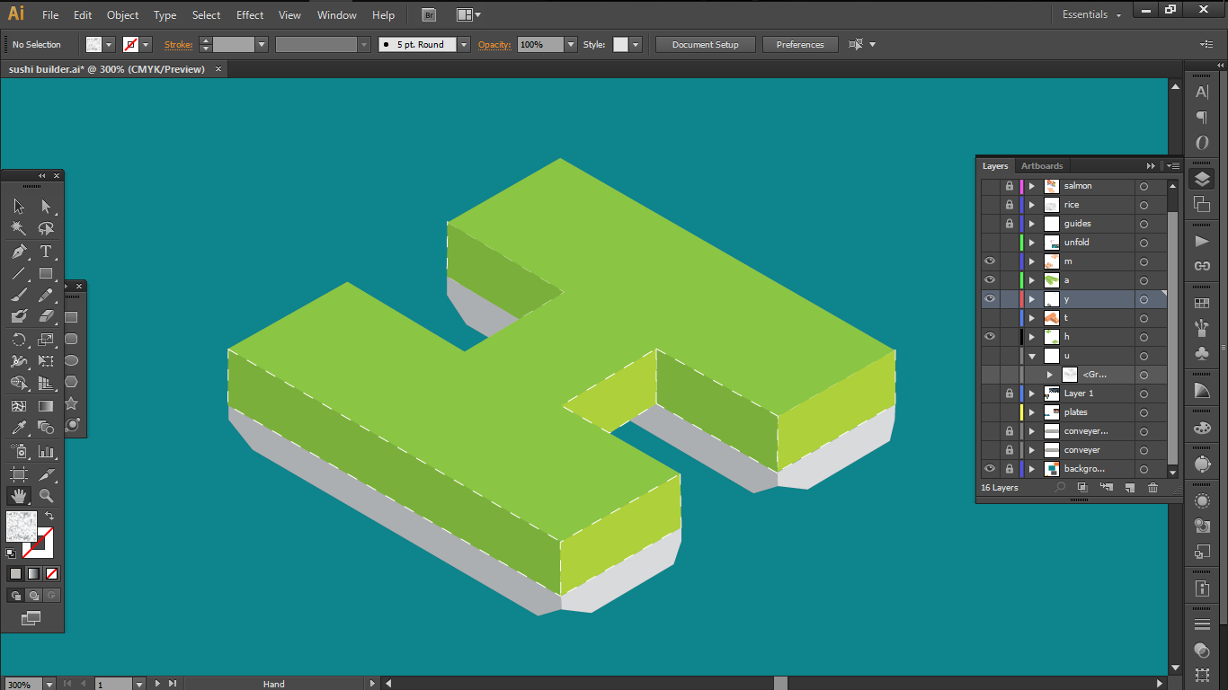
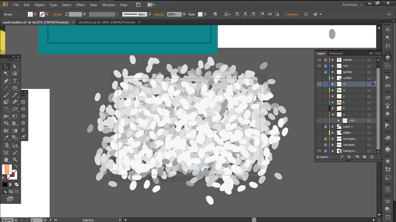
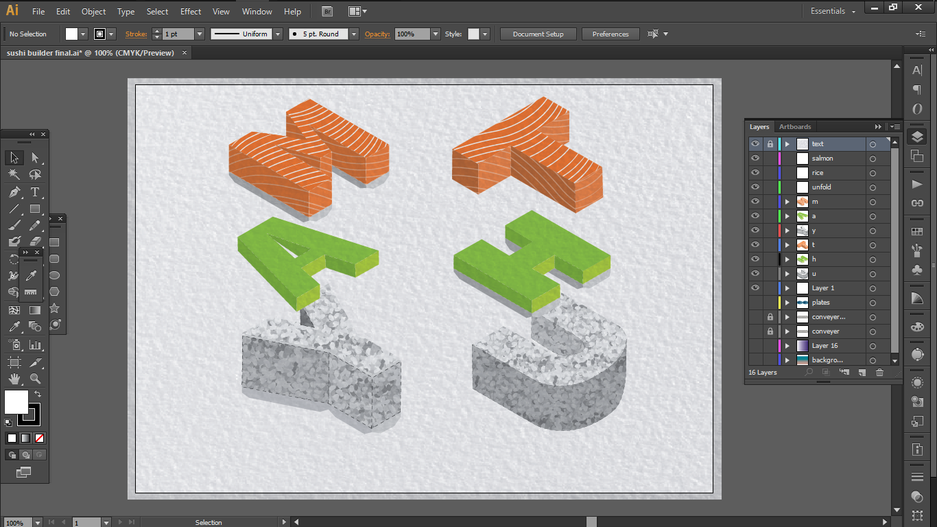
A basic make up of a simple sushi : Salmon + Rice + Wasabi

b.
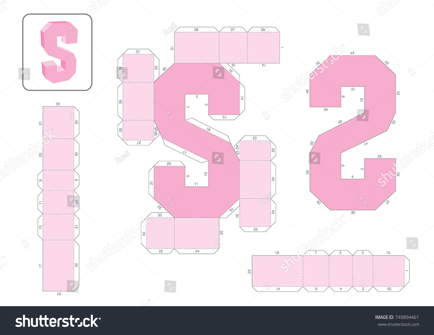
The template for the alphabets with paper extensions for folding
c.
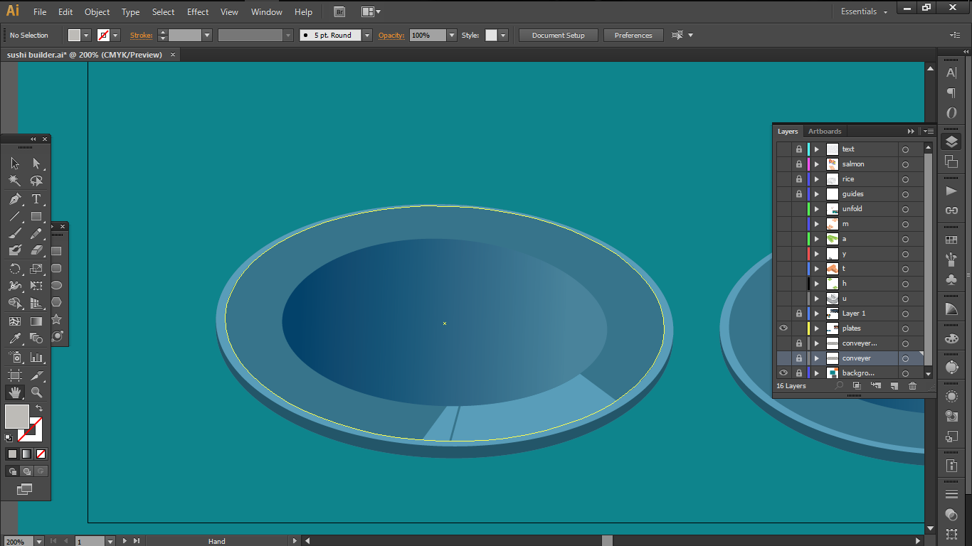
sushi plates
d.
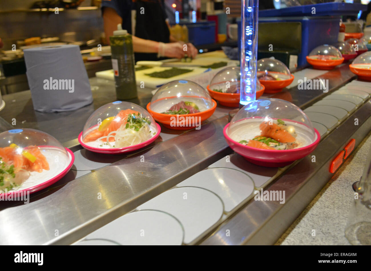
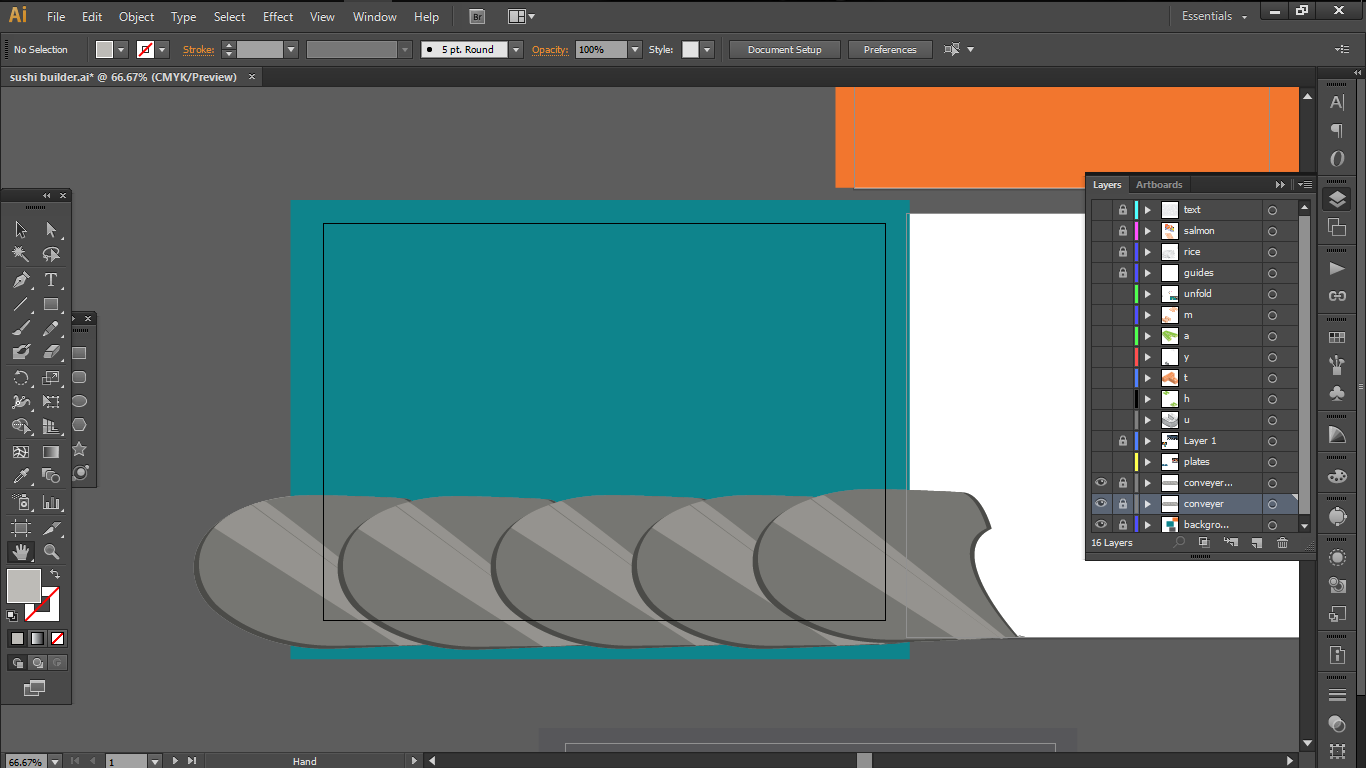
Conveyor Belt
So i decided to work with Swis721 Blk BT Black font because I believed that its clean cut corners without any serif, plus its thick stem could be used to convey the blocky structure of a paper model.

I also decided on the complementary colour scheme as I wanted the main attraction a.k.a the salmon to pop out.
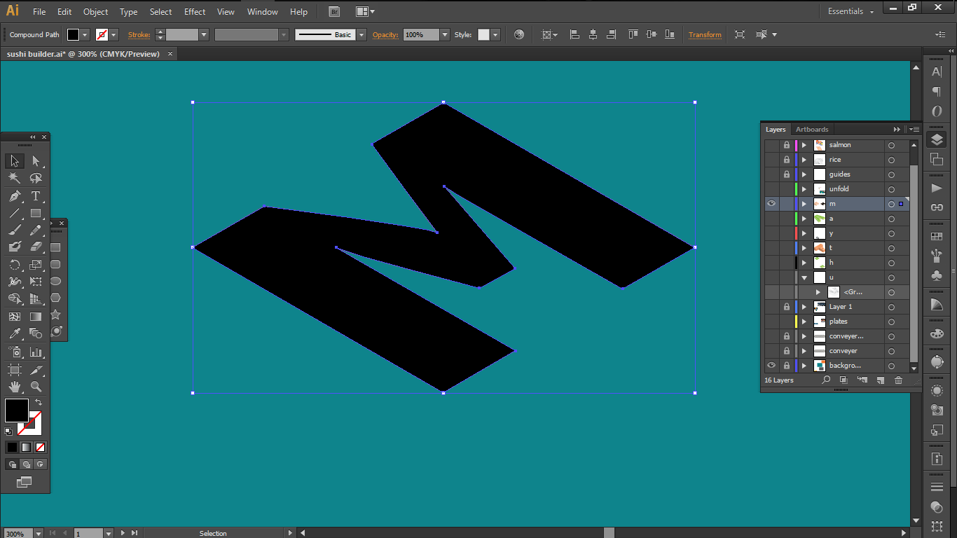
So first, I started off by extracting the outline of the fonts using the pen tool and laying the down in a 30 degrees angle to construct a 3-D model.
Then i constructed the 3D-models in varying heights with proportional reference to the actual sushi

As for the patterns
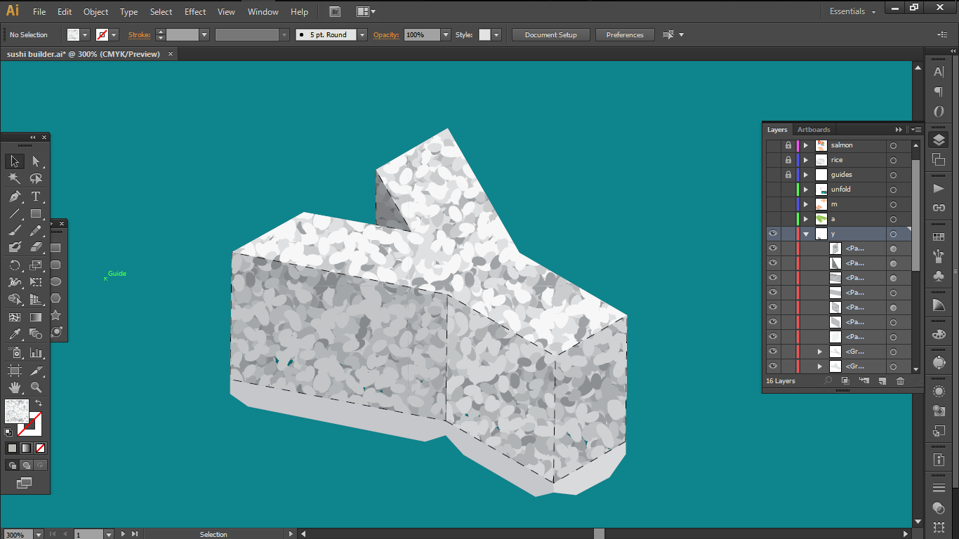
Salmon
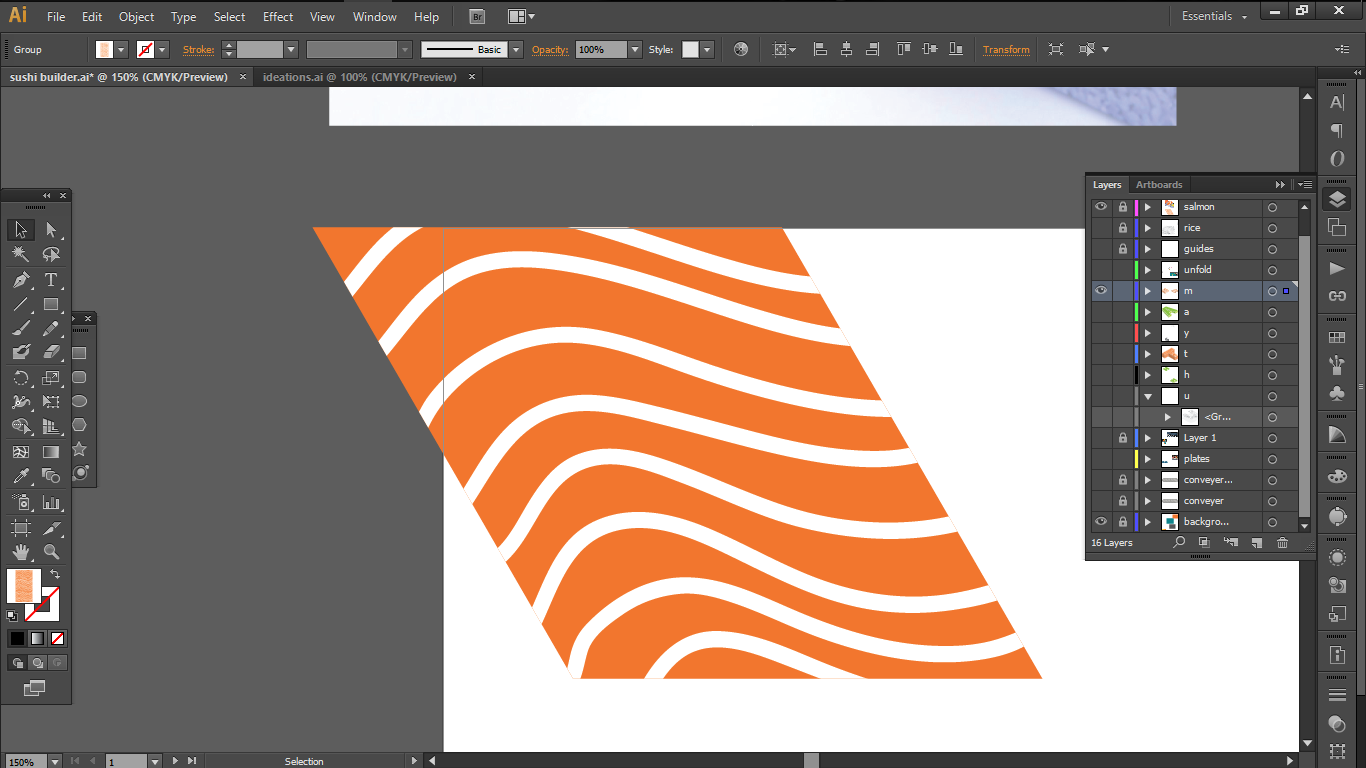
In my first attempts, I drew white vector lines over an orange box to imitate the patterns of the salmon and create a clipping mask on the text. But that didn’t work out too well

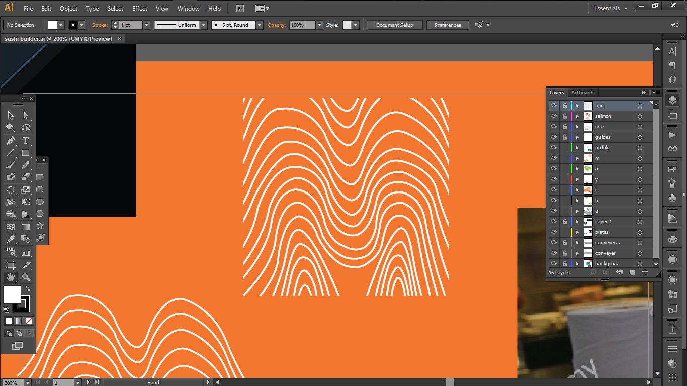
So I simplified the designs and made my own pattern.
I also created a custom brush for each rice grain to create a rice pattern for myself.
For the finishing touches, I added the paper extensions from some of the letters in an alternating fashion and dotted lines as folding indications to reinforce the paper model folding aspect of my job.
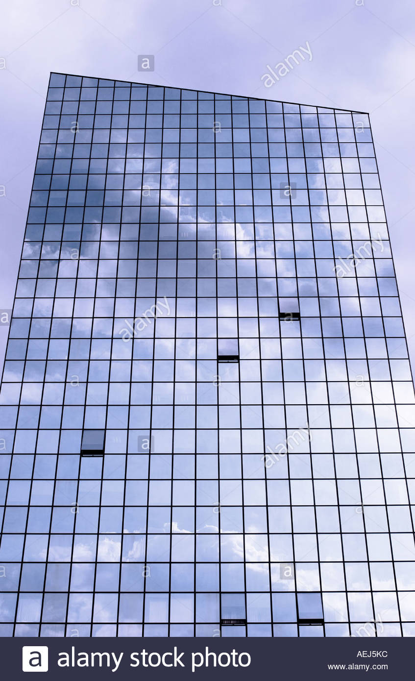
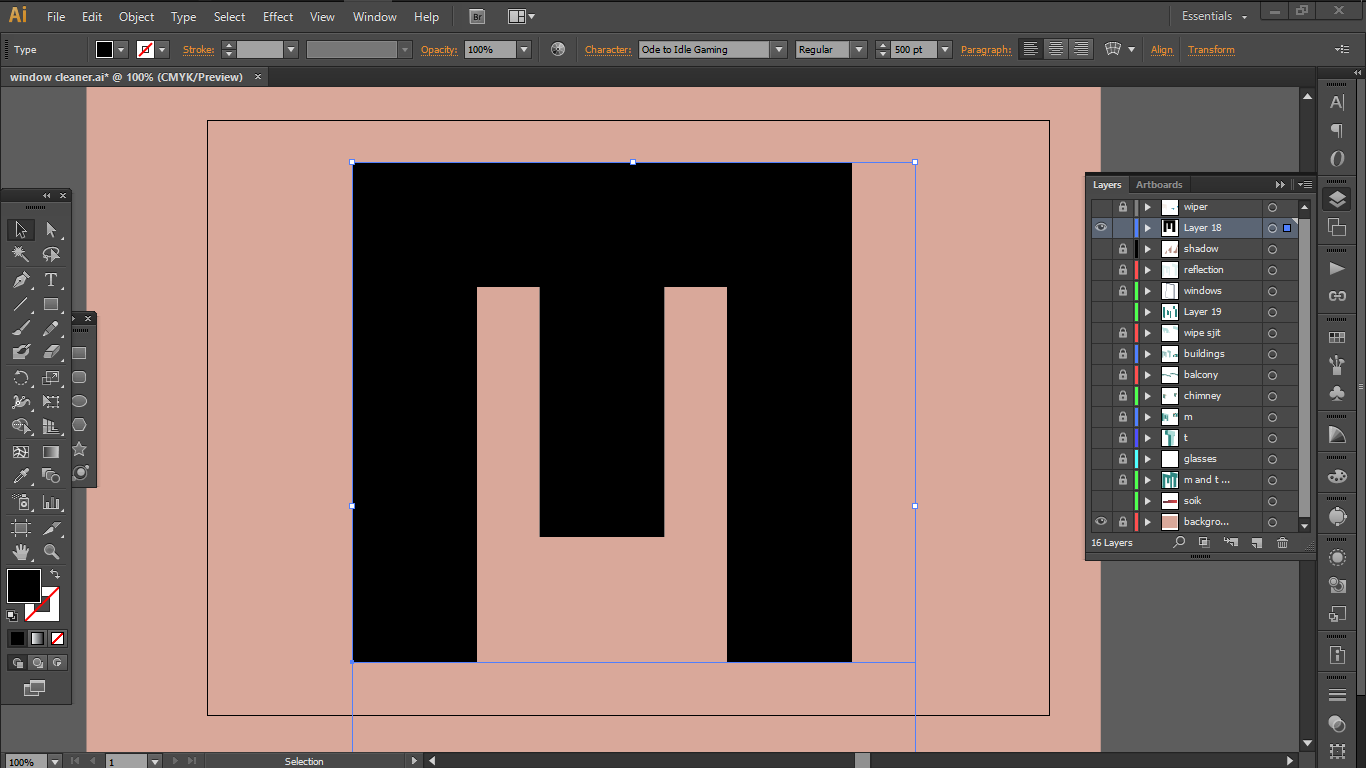
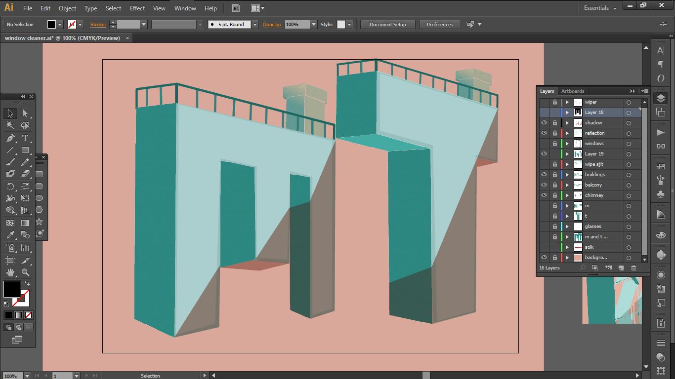
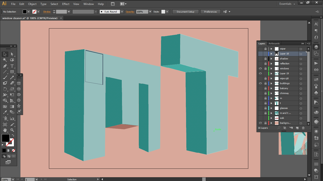
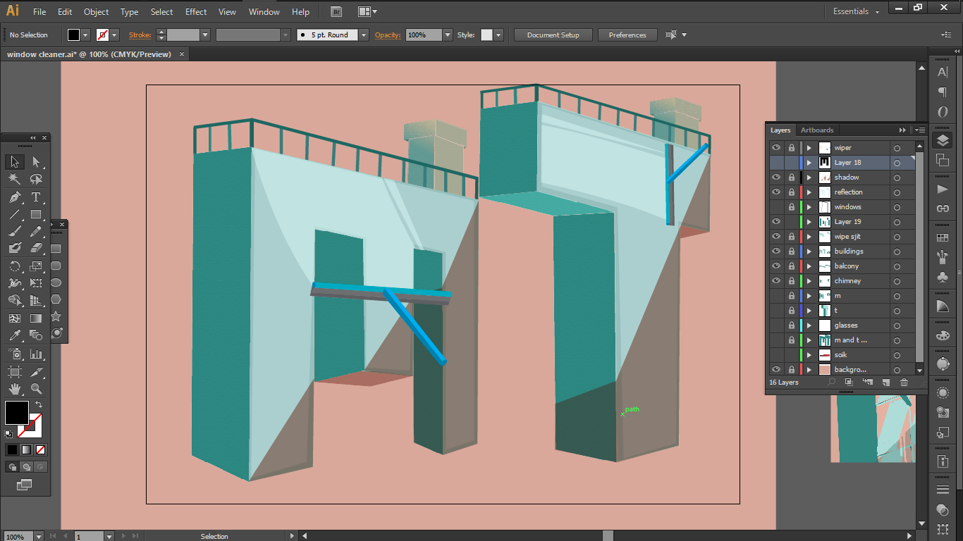
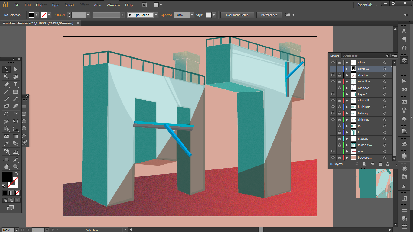
2 ) Window Cleaner
As for this, the visual elements that I picked up were

a.
the reflective window and the clean wipe
b.
the window cleaning tool
c.
tall glass buildings

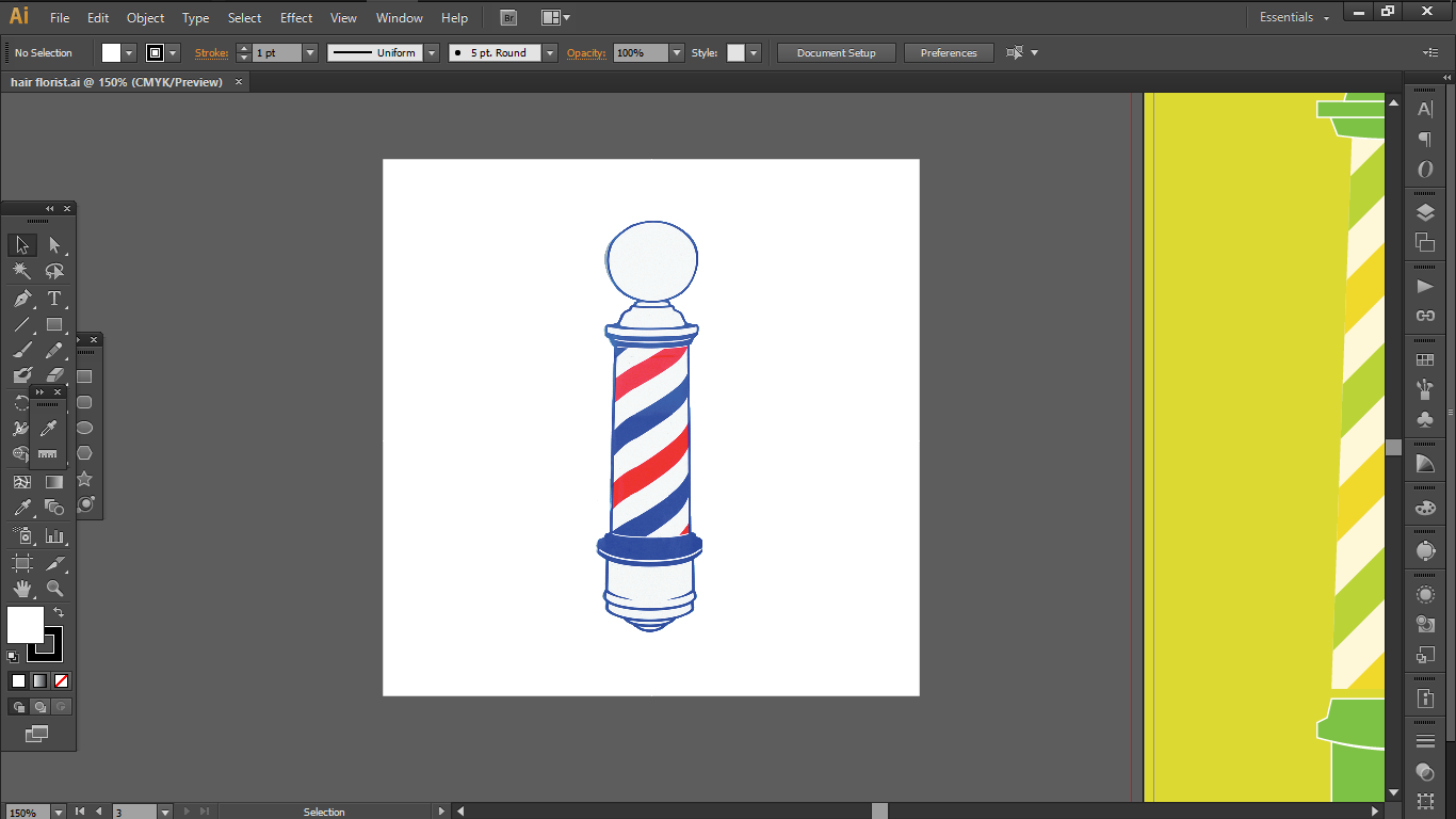
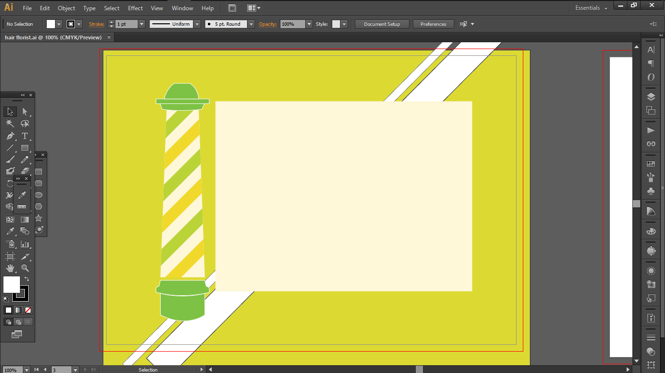
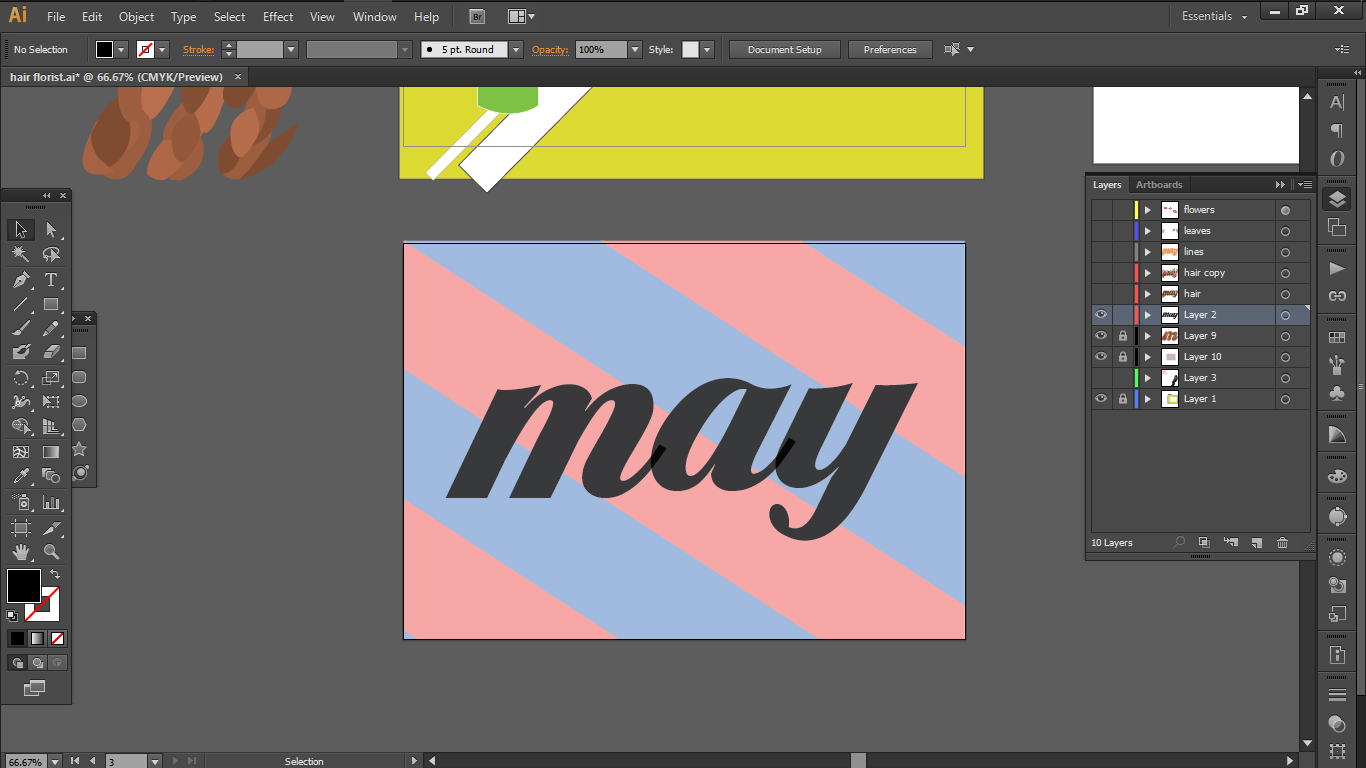
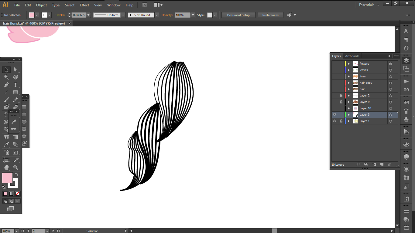
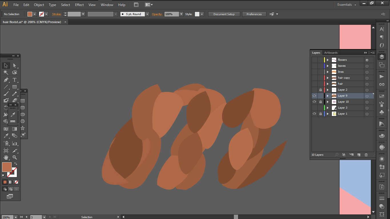
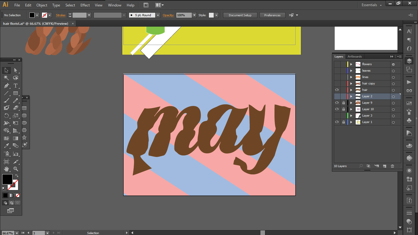
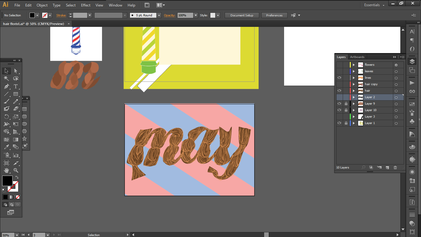
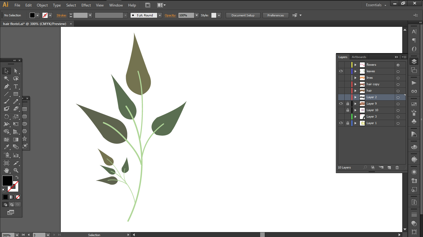
3 ) Hair florist
Over here, I wanted to combine the elements of braiding and vines as they seem to be similar in nature, in respect to the intertwining visual.
So the elements that I wanted to bring in were
a.
The interlocking braids
b.
Vine flowers and leaves
c.
Barber pole


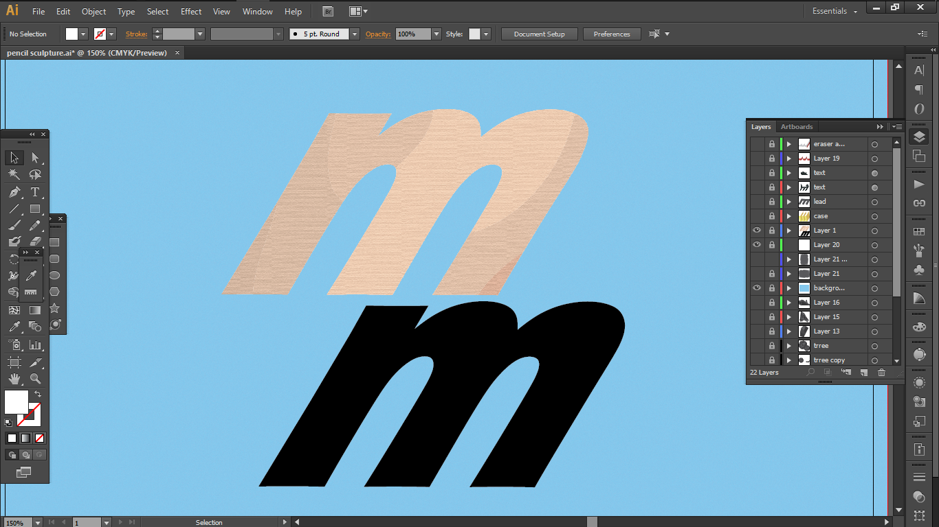
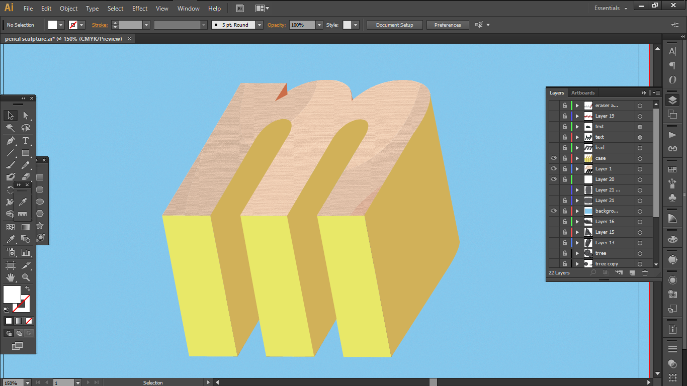
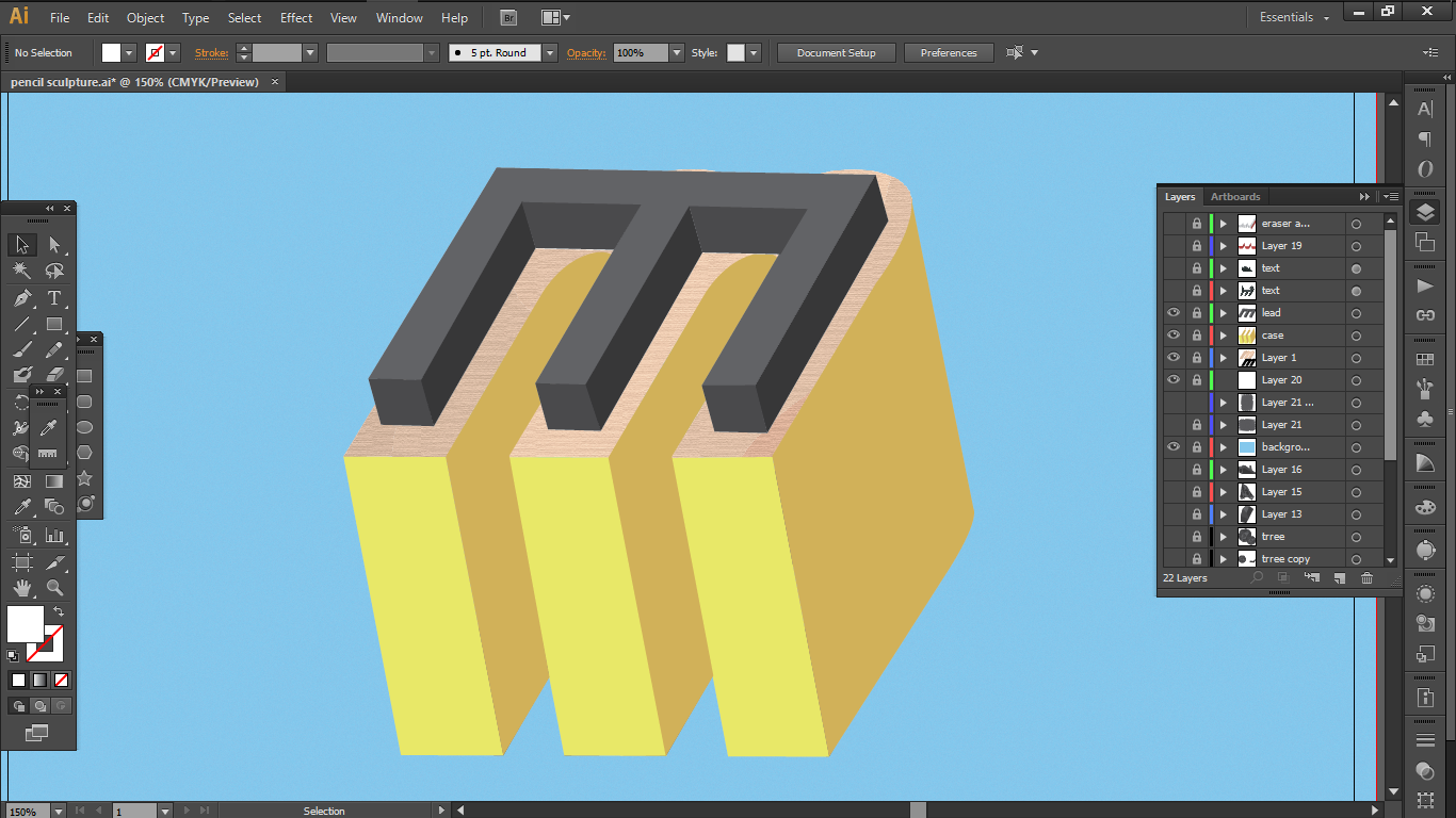
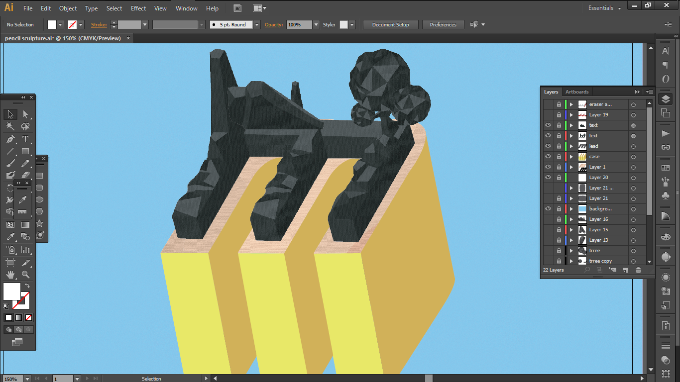
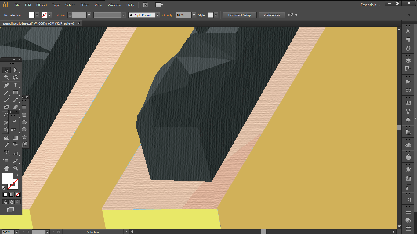
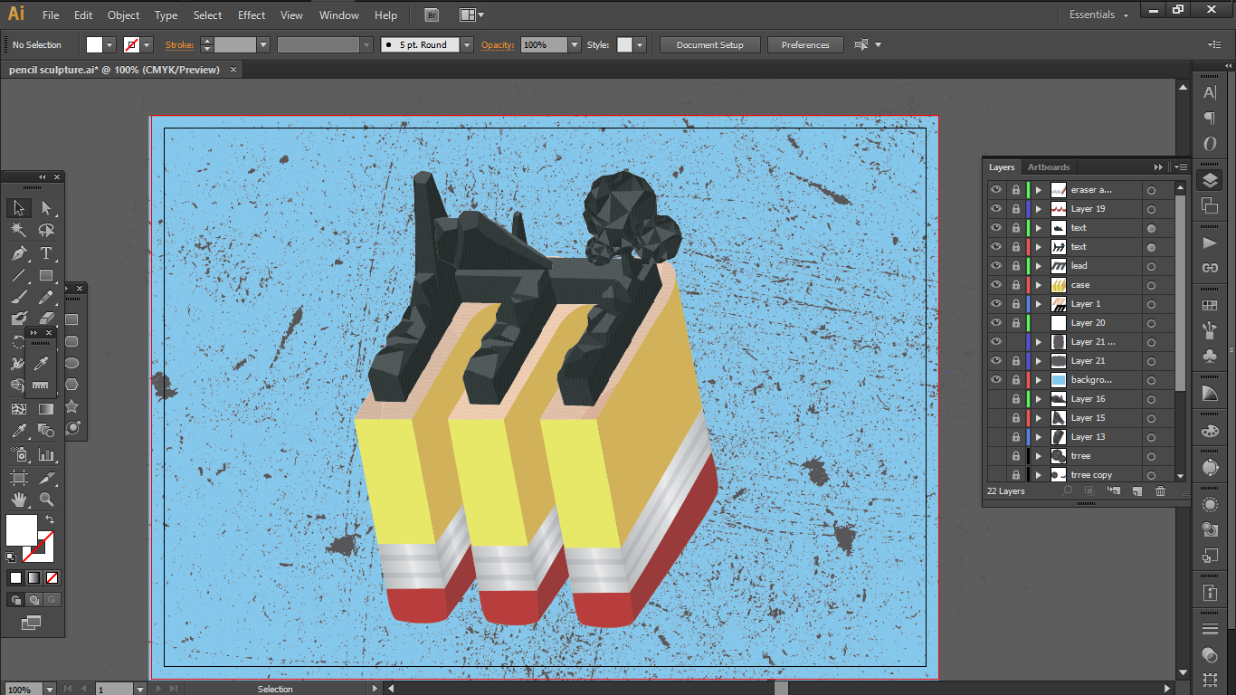
4) Pencil Sculptor

So for this, I extracted the following elements
a.
The texture of the wood
b.
the texture and the hard edges of the lead
c.
the basic elements of pencil; the metal ring holding the eraser
As for how I wanted to create this job, I discovered Low Poly art from pinterest and decided to attempt a very simple scenery in this style.

This project has taught me in learning to detect the important essence of any subject and extracting it to create our own work by applying the elements of design in other ways.
On the technical side, this project has pushed me to be more self initiative when it comes to learning new techniques and programs. Without the project, I actually wouldn’t have touched the tutorials or even the program itself.
Here is the link to my final work:
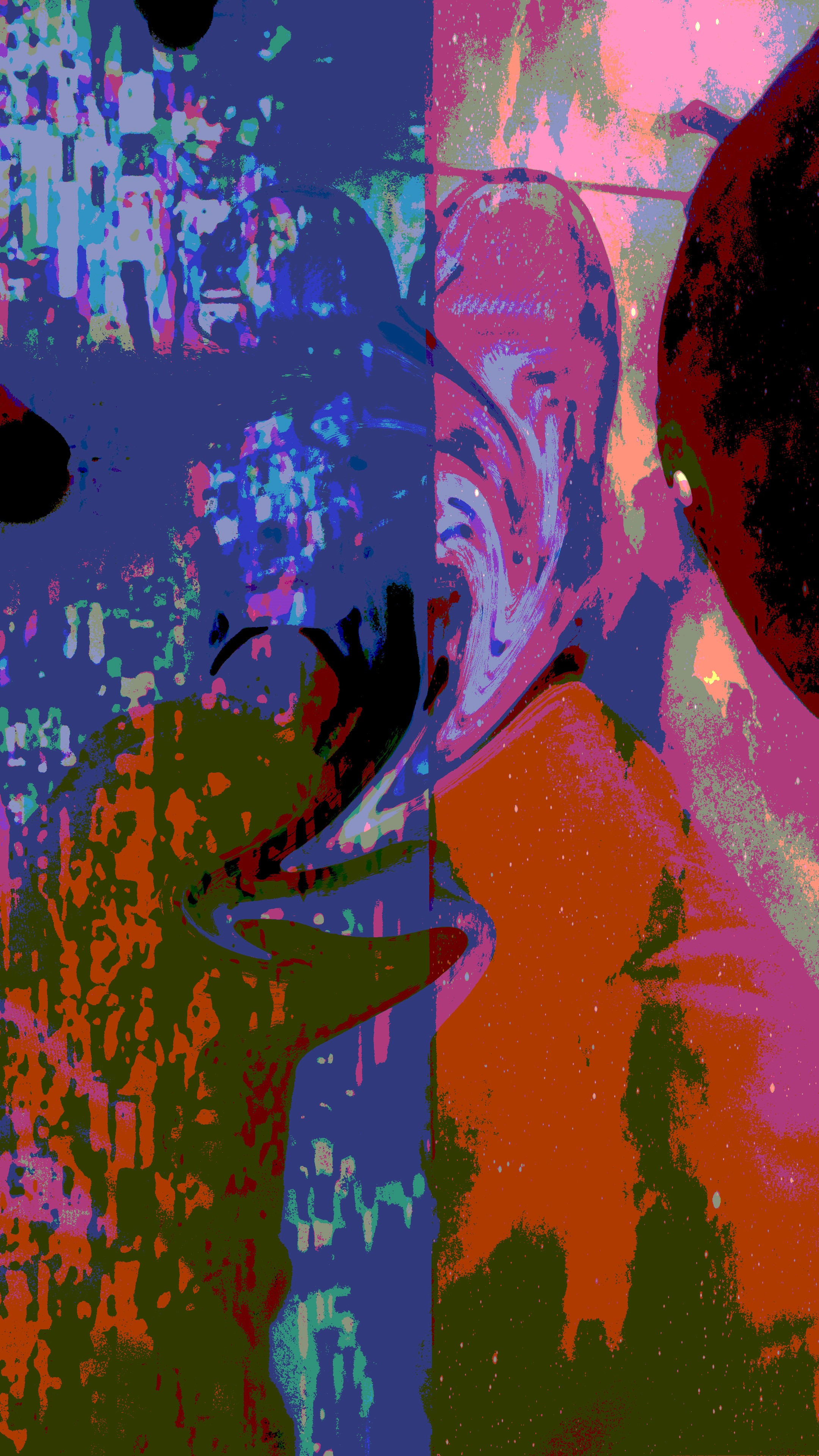
For this micro project, Brendan, Jia Ying and I edited our self portraits using Photoshop.
Original image
1st Edit by me
Not knowing what to do, I started off by testing out some random filters and decided on the “distort” function as I felt that I needed to distort the visuals of the original photo first and foremost in order to render it unrecognizable as much as I could so that the “glitch” element stands out in the most obvious way possible.
I decided on “twirl” for this edit.

2nd Edit by Brendan
Since I have already distorted the physiques of the elements in the image, he went with the overall colouration of the image. All the previous colours are now lost only leaving behind reddish and bluish hues. These two hues appear to be divided into 2, blue on my left and pink on my right. The picture is visually further divided by pixels on the left and grains on the right.
3rd Edit by Jia Ying
Again, I think Jia Ying here tried to distort the visual proportions of the elements by warping and twirling the make ups of the image.

Final Edit by me again
Here I tried to distort both the colours and the visuals of the image by cropping to replace parts of the image, as well as changing the colour and texture properties to certain parts of the image marked by the selection tool.
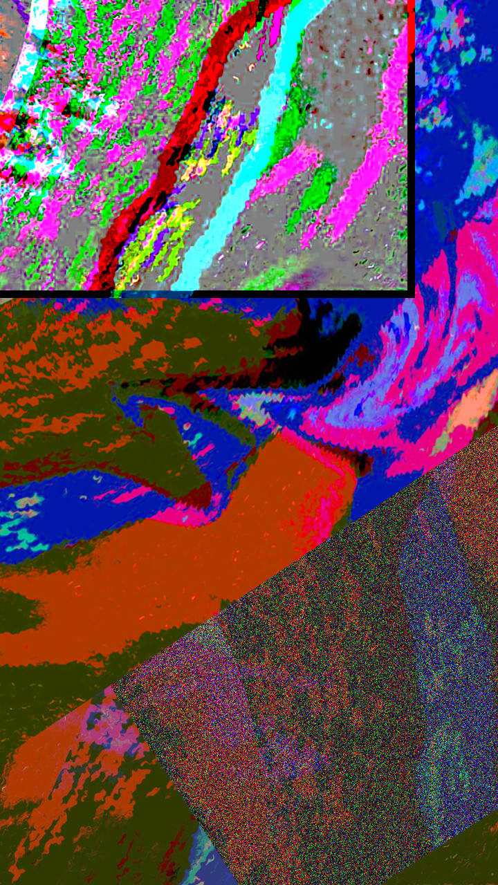
Through the collective image manipulation by passing it around from one person to another, we are able to distort and manipulate the original image into an unpredictable combination that still possesses the essence of the original.
The modifications and the final art work also embraces the imperfections, creating its own form of aesthetic from deconstruction and re composition.
By applying different forms of glitches in our own interpretations, we are able to create an artwork that deviates from the original completely, in both visual and stored data, which gets altered collectively as we pile up one edit over another.

With the completion of the Micro-project 3, the third space to me is a manifestation of spaces when fused together, enabling people around the world to connect and collaborate beyond the time and physical constraints.
With the current technological advances, the limits of the physical boundaries can easily be overcome with online presence and live projections.
Maria Chatzichristodoulou studied such projects that utilizes these aforementioned features of technology, from Multi User Dungeons (MUDs) to telematic performances.
Through studies of MUDs, she showed the possibilities of enhanced real-time social interactions through virtual reality stimulations which enables users to interact with other users alike from all around the world, which allows for a new experience of intimacy.
The MUDs also encourage users to showcase their creative sides, by giving them the freedom to create their own online personalities in immersive ways, such as the abilities to customise their own characters and choose their own narrative amid other possible narratives.
Studies on Telematic performances also showcased the availability of a wide array of resources users can easily access to without having to spend any money, showing how anyone with an internet connection can participate in projects of their own.
Not only that, works like The Electronic Disturbance (1996) prove that collaborations in fields such as art and dance, are made especially easy, regardless of where you live.
Although on a small scale, through our micro project, I believe that we are able to explore these features of the third space. Namely, we explored to a certain extent, continuity of perspectives, movements and spaces in order. In a sense, we were able to create a facade of a newly formed continued third space, where movements and perspectives are aligned without having to be in the same space.
In my opinion, this immersive virtual engagement with both yourself and others all around the world creates a unique intimacy without having to be physically present in the same space, allowing internationalism to be a much deeper and personal experience no longer detained by physical barriers.
There are more opportunities to explore our pre-existing relationships with others and the space we live in,at the same time, explore new ways of interaction through new spaces with fresh persepctives.
To collate all these features of the third space, I would like to summarise this research with Randall Packer’s apt description of the third space as ” a space of invention and possibility, like lucid dreaming, where participants might assume their avatar identities, engage in post-human, cyborgian manifestations, or perhaps reinvent the world in the image of their own making.”
In week 3, we were tasked to explore the third space by performing with the use of the facebook live feature, specifically its ability to host 2 different people at the same time with its split screen feature.
After some technical difficulties, Joel and I decided on a performance piece where we utilise the third space to act as a portal that connects the 2 different locations at the same time, in this case are 2 different enclosed classrooms. Perhaps because the classes looked similar to each other, a convincing creation of a new unified space between 2 different places was made possible.
We decided to perform a couple of simple acts to create a facade of continuity between these 2 separated spaces by translating these activities from one screen to another as fluid as possible, which was the main challenge of this project, as it was hard to get the right timing for the objects to be in the right place.
First was the money being transferred from one place to another where we explored continuity using first perspective views. Second was climbing up and down stairs, exploring the continuity of movements. And lastly we attempted to throw the tissue paper across the 2 spaces thus creating a continuity between spaces.
Posted by Joel Lee on Wednesday, 31 January 2018
Although on a small scale, I believe that through this activity, we were able to explore the essence of time and shared space in the third space, and how it can pave way to creative ways for more collaborative art performances that are no longer limited by the physical boundaries.

In this project, the viewer is tasked to interpret the given image and draw out a physical manifestation of their feelings in response to the image they see, with the materials made available to them, which are in this case are markers varying in colour (3 to be exact) to be used on the canvas offered, our arms. The images given also varied in tone and appearance, from recognizable subjects like dogs and cats,
to more unusual ones, like a photoshopped frog-kiwi.

These factors act as limiting reagents to shape the audience’s output in the form of drawings.
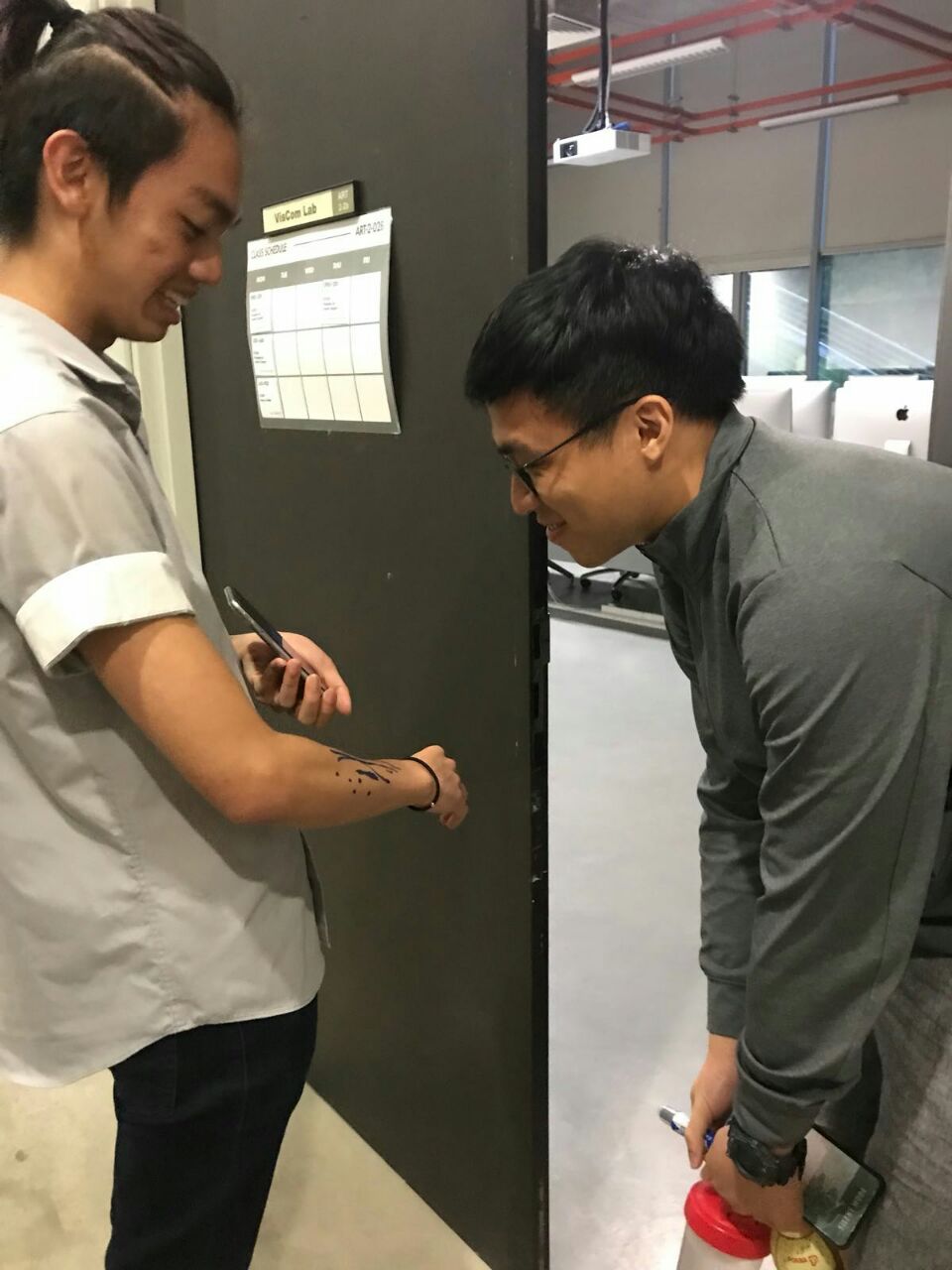
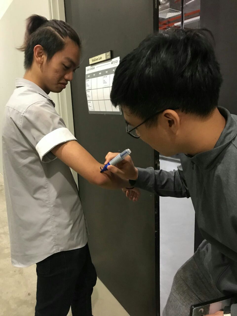
Since the audience were mostly students in ADM, they were all cooperative with our instructions as they are probably aware that this is for an assignment.
The end result was a collection simple drawings, though they vary in visuals whereby the ones who chose the cat and the dog photo, all drew a more representational impression of dogs and cats. On the other hand, those who chose the northern lights and the photoshopped frog, tended to drew more abstract depictions of the subject or their feelings.
By the end of it, each of our arms held an array of strangers’ personal reactions to each image in the physical form of marker drawings.

Research Critique
The DIWO aspect of our project has enabled us to gain an insight on how a diverse art work can be put together when the final outcome is essentially unpredictable as the number of different ways a collective of individuals can interpret a subject is much vaster than what a single individual can.
It embraces the need of social interaction, in this case where we borrow the creativity and skillsets of other artists to create a collective artwork made in reaction to a single subject from multiple points of view and interpretations. This can be seen to a certain degree in Yoko Ono’s Cut Piece where the audience given the same set of instructions are shown to carry them out in different ways based on their own interpretation.

This rich array of expressions would have proven to be far more difficult to conjecture without implementing the characteristics of DIWO projects which allows for “an effective form of artistic collaboration with others, and to a wider culture”, as stated in Marc Garrett’s article.