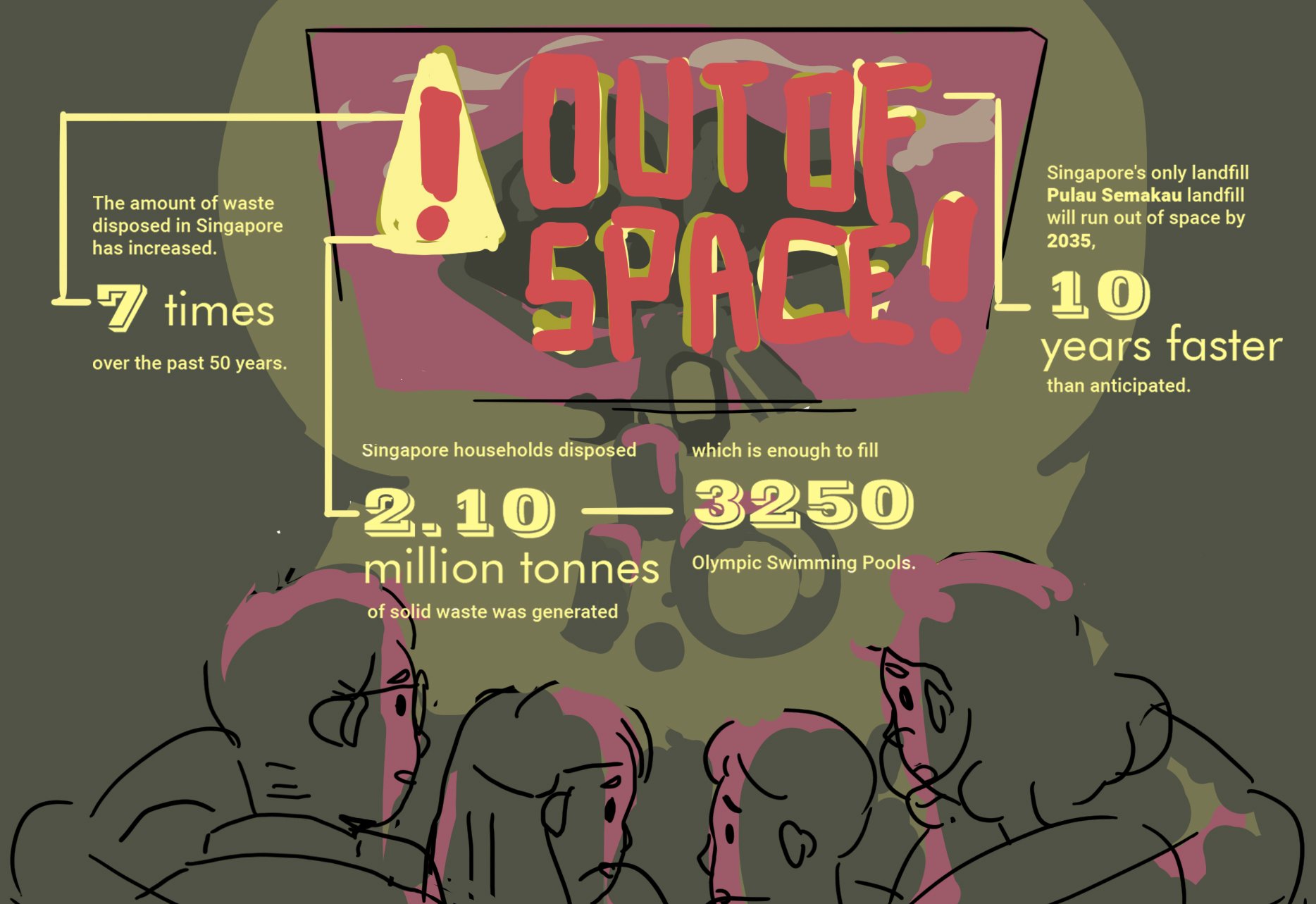
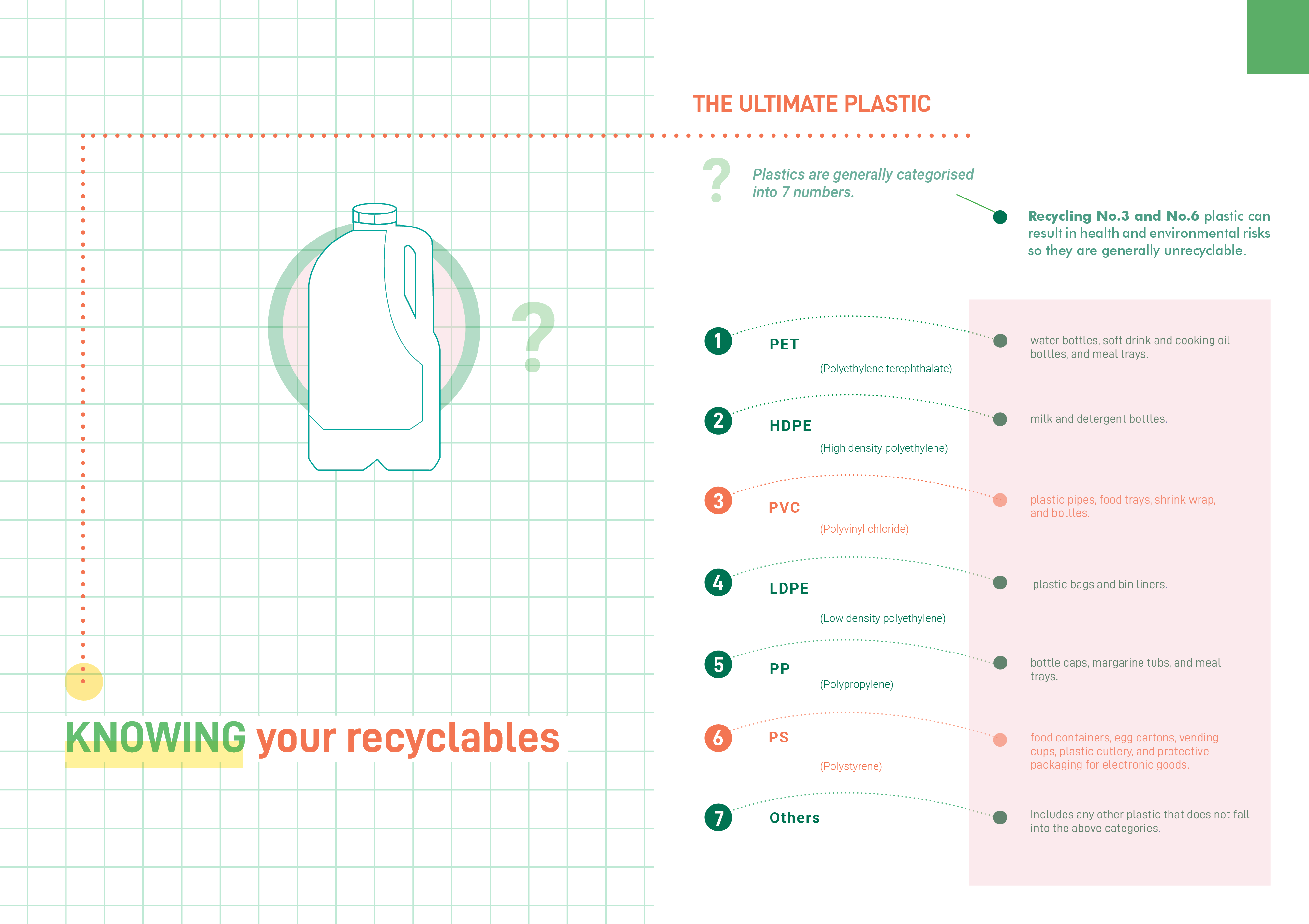
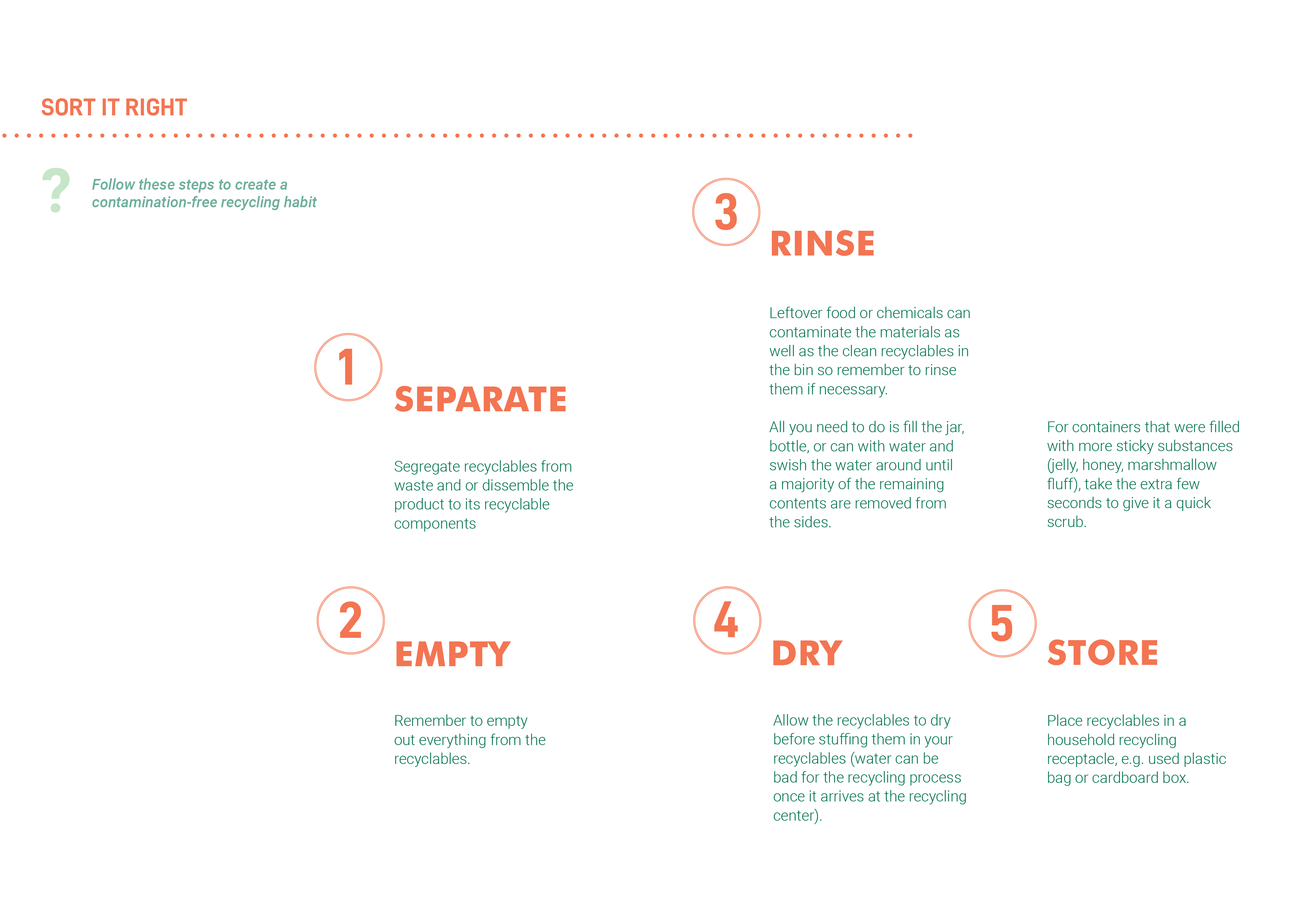
Dadaism was an art movement formed during the 1st World War in Zurich in negative reactions to the horrors and folly of the war, in forms of art, poetry and performance. The art pieces usually consists of collage, cut-ups, readymades and assemblage.
They also tend to be satirical, nonsensical, anti-bourgeois and politically charged.
They reject logic, reason and aestheticism of modern capitalist society.
Surrealism questions the nature of reality by seeking to channel the unconscious as a means to unlock the power of imagination, as the rational mind tends to repress it with taboos.
They are usually made in a hyper realistic style, with the illusion of 3-dimentionality, highlighting its dream-like characteristics.
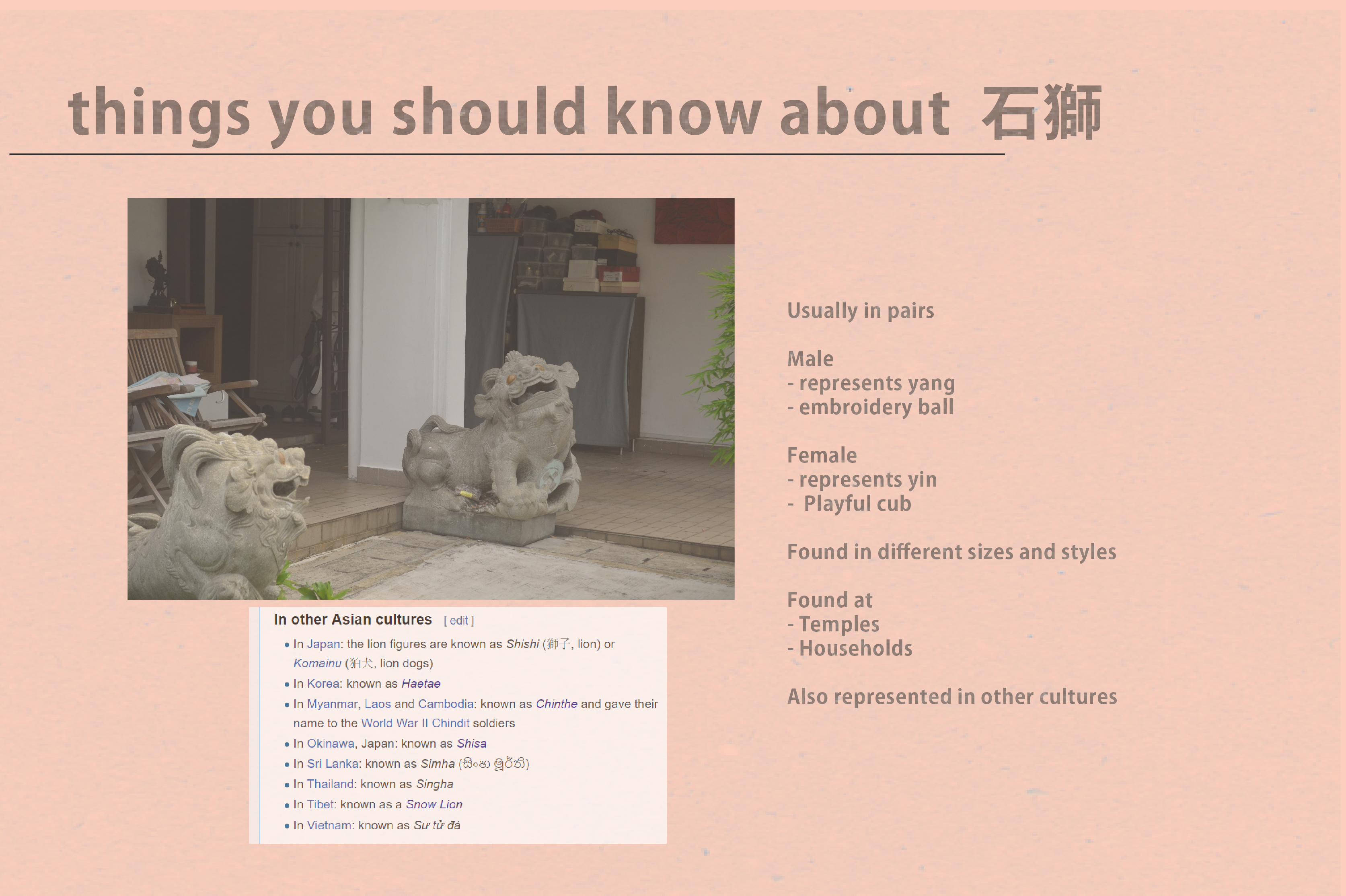
Here are a few of the pieces that caught my attention:
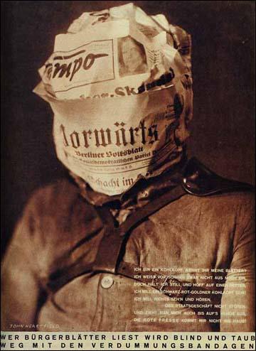
John Heartfield, Those who read capitalist newspapers will
become blind and deaf. Away with These Stultifying Bandages! Arbeiter-Illustrierte-Zeitung (AIG) (February 1930)
(Copyright The Official John Heartfield Exhibition & Archive)
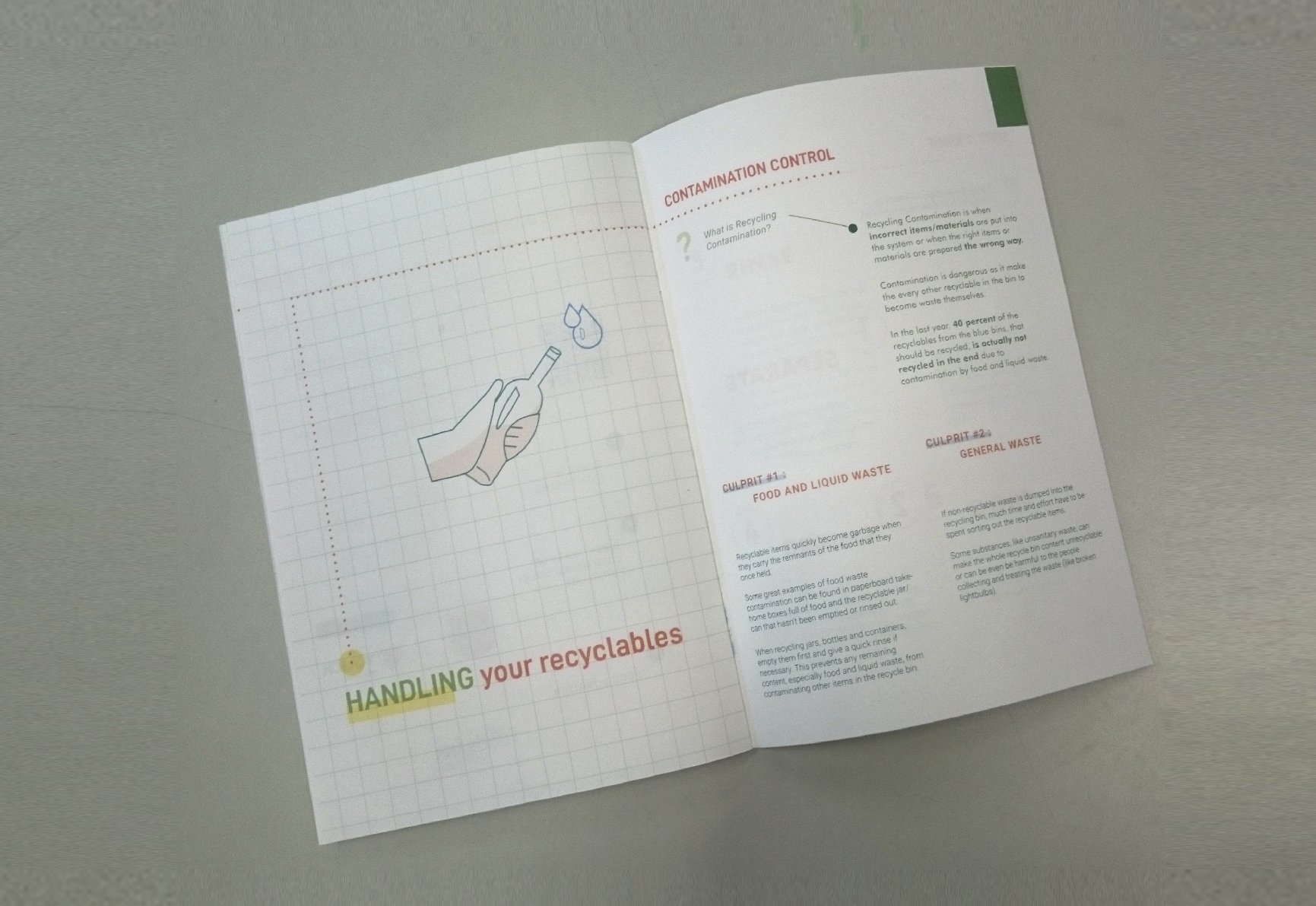
The seemingly realistic photomontage illustrates a cabbagehead covered with 2 newspapers, Tempo and Vorwaerts, which were both the press organs of the Social Democratic Party of Germany. The police harness wrapping the upper body represents the collaboration between Social Democratic Party of German and the security forces of the state. The verses shown on the work is a parody of a well-known nationalist song of the German people: “Ich bin ein Preuße, kennt ihr meine Farben?” (“I am Prussian, do you recognize my colours?”):
I am a cabbagehead, recognize my leaves?
Sorrows make me lose my mind
But I’ll stay quiet and hope for a saviour
I want to be a cabbagehead, black, red and golD
Don’t want to see or hear
Stay clear of politics
And even if they strip me naked
The red press won’t come in my house!”
This photomontage, in essence, criticizes the Nazis’ political regime that created a political blindness and deafness, eliminating actions and oppositions from other parties and the people. It also highlights how photographs are manipulated for reasons that suits the narrative.
I really liked how in this case, exempts were manipulated and used as satire as well as the realism of facial modifications which creates an irking atmosphere.
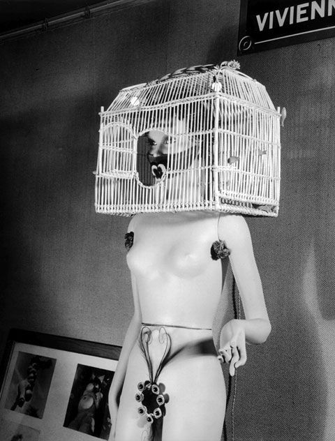
Man Ray Mannequin (1938)
Weird morphing of Mannequins by Andre Masson, with the design from Salvador Dali, Maurice Henry and others were photographed by Man Ray in this set of art pieces. The mannequins were that of uncanny female forms that looked monstrous and sexually alluring at the same time. It also underlined Man Ray’s interpretation of ultimate embodiment of male desire, thus his obsession with the female forms.
In this piece, I am particularly drawn to the conflicting of viewership experience it evokes, which I thought would be an interesting quality to add to some of my works.
While researching surrealism and Dadaism, I was enamored by the effect that the pieces have on me; the fact that there is always something off, the pieces are composed in such a way that they defy our expectations either discreetly or distinctively. I was particularly interested in the pieces with human figures in it as they tend to draw me in the most, especially those with facial or body mortification of some sort.
I thought that it would be interesting to experiment with different elements of design to emphasize this effect of eeriness in conveying the idea of perfection, where protagonists in my pieces are blindly immersed in their world of lies that they have been forced to live in. My goal is to use the elements of dadaism+surrealism and design elements to create images that suggest that there is always a flaw in a “fabricated” ideal world that has been manufactured.
As for the quotes, I decided to go with 2 of my favorite movies, The Perks of being a Wallflower (2012) and Sing Street (2016), both stories of misfits and adolescence.
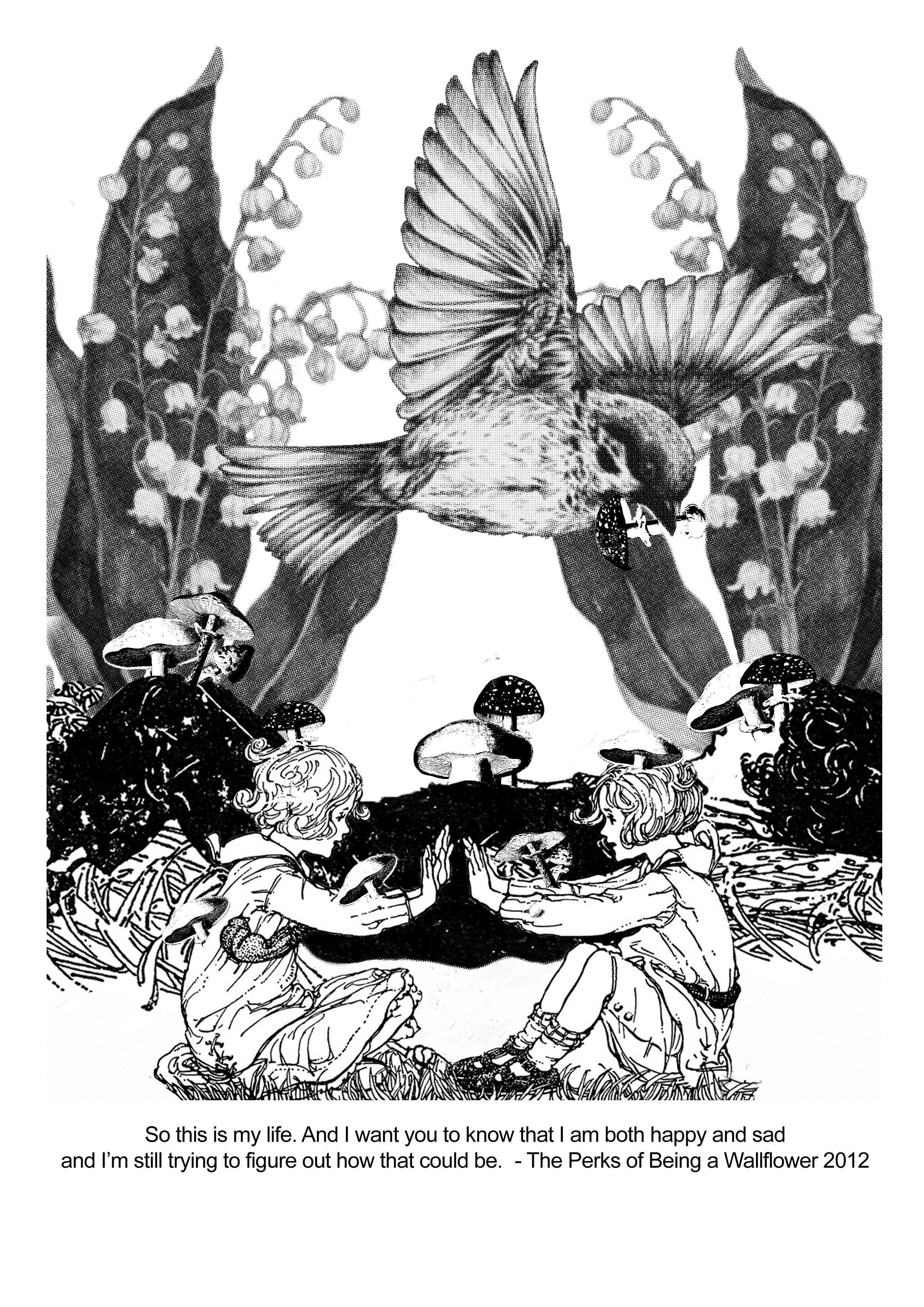
“So, this is my life. And I want you to know that I am both happy and sad and I’m still trying to figure out how that could be.” – The Perks of being a wallflower 2012
I found the duality and the co-existence of conflicts in the quote compelling. I wanted to take that element of duality to portray a composition that looks pretty at the first glance but is deceptive in actuality in a discreet manner. I thought that this effect could be used to best convey the idea of appearances versus reality, particularly on how people choose to gloss the harsh reality over with superficiality, in a child-like manner by only choosing what they would want to see. I decided to use storybook illustrations for this piece as I thought it would best create this scenario, giving the elements new meaning to what it might be associated with storybook context.
Process:
I start off by thinking of some of the elements that I would like to put in the piece when I have conceptualized my concept. I start off by browsing through vintage illustrations for:
- at least 2 children playing nonchalantly to represent the people who avoid confronting the hard truth with all their will
- a child lying down to represent a dying girl aka the hard truth/death
- a sparrow and a mouse as they are usually associated as friends of the protagonists in numerous storybooks
- mushrooms for this aesthetic representation of death
- forest background to suggest they are all closed off in the space, there is no true escape.
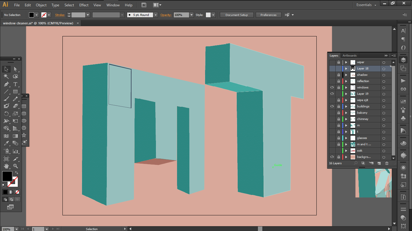
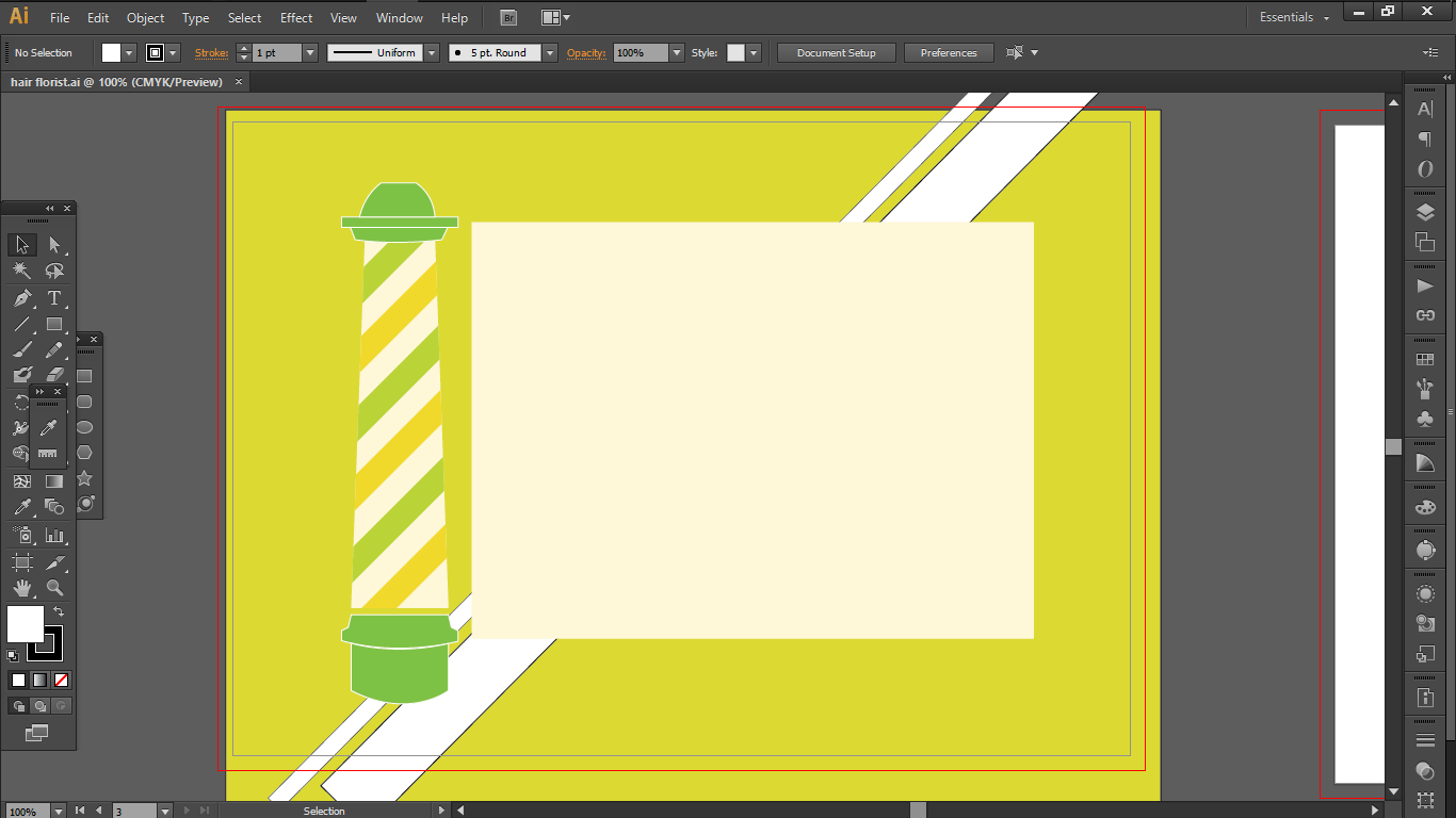
And here’s the image that I quickly came up with for class consultation:

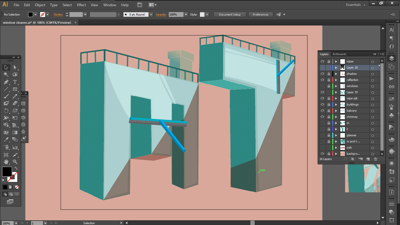
There were of course many flaws to fix so here is my progress from this to my end product.
- I took out the mouse from the picture as it overcrods the picture and that one animal, the sparrow was enough to suggest the role of a predator.
- Instead of the forest, I changed the background into a pair of symmetrical lily of the valleys as I liked their contradicting innocent appearance and poisonous nature and believed that that feature could reinforce the concept of deception.
- I centered the sparrow in the middle as it provides a leading line to the dead girl’s face.
- I contrasted the scale between the two children and the dead girl to emphasize the escapism, they still choose to ignore the devastation of death happening behind them, even if it is hard to miss as it is much larger in scale compared to them.

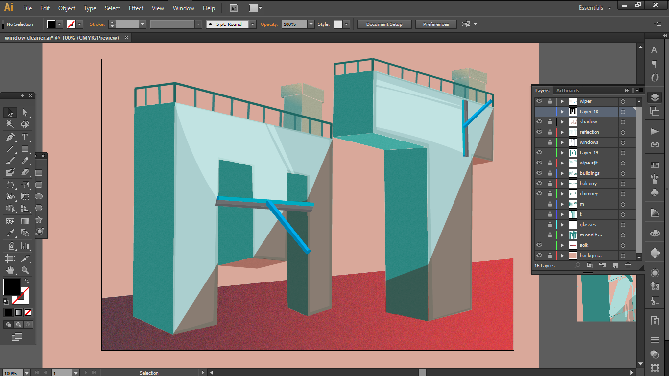
Elements of design:
- Foreground and background: To separate the two entities as if they are in separate realities although they are in the same space
- Clarity: use of half colour tone to create a separation between reality and daydream
- Scaling: To highlight the level of blissful ignorance; choosing to ignore the truth even if they are clearly visible right behind you.
- Symmetry: To create an impression of a false order, this impossible perfection that surrounds them
I decided to use this design for my tote back thus begins my battle with silk screening.
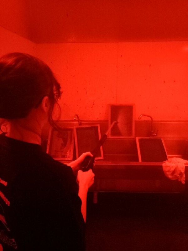
I had to remove the previous screen that I have tried on from the class before in order to put this on with the emulsion remover paste aka the coconut paste, leave it for 20 mins before I washed it off to reclaim my screen.
Then, I had to put on a layer of blue emulsion on the now-washed clean screen in the dark room. I learnt about the importance of waiting for all the ink to flow and touch the screen before swiping up and the extra swipes needed to get rid of the excess cake of emulsion. The hard way.
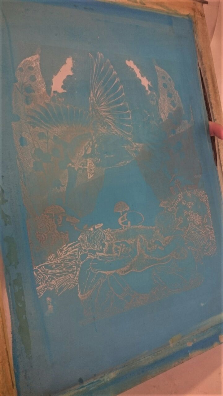
The screen is left to dry for 20 mins to dry in the “oven” and once it’s dried, the transparency print is placed in an inverse manner on the top layer of the screen and is exposed in strong light for about 18s. Then I washed it with a jet spray to remove all the blue emulsion from the parts that are to be open for the ink to flow through.
However, my design was difficult to get right as the designs like the lily of valley were very rather too detailed making it hard to pop out from the white background. The dead girl who was initially half-toned has to be changed to black and white as well as she did not appear well in the screens.
The designs were very hard to wash away too, even rubbing with a sponge and spraying with the water jet. I even had a mishap, where the design of the lily of the valley just broke apart under the pressure of the water jet spray.


[ Rest in pieces my child ]
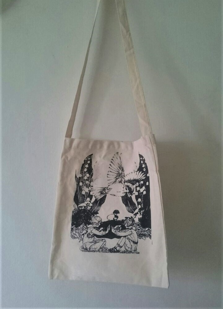
I managed to finally get a working screen after 2 days of attempts during the holidays and was able to print it on tote bag. One important tip that I learnt was that if you’d like a darker piece, the key is to press lighter on the tool and vice versa. And it’s important to wash away the ink after trying out a few times as dried ink can block out some of the designs.
The ink must be swiped with the wooden tool at a 45 degrees in one clean swipe covering all the spaces of the design. There were other variations to lay out the ink too such as swiping the ink down once while lifting the screen first before putting it down onto the paper.
It is also recommended to stick tapes around the corne–rs of the screen, either at the front or the back part, ( I prefer the front ) to prevent the unwanted flow of ink from the sides.
I also learnt about this trick to make sure your work is centered, which is to fold the bag to create this crease leading to the center and placing a edges of a piece of paper to find the center.
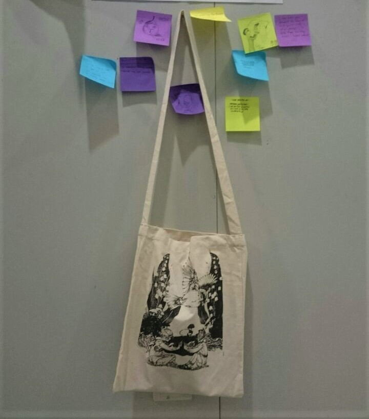
And finally after many mishaps, here is my tote bag (the prettier side)

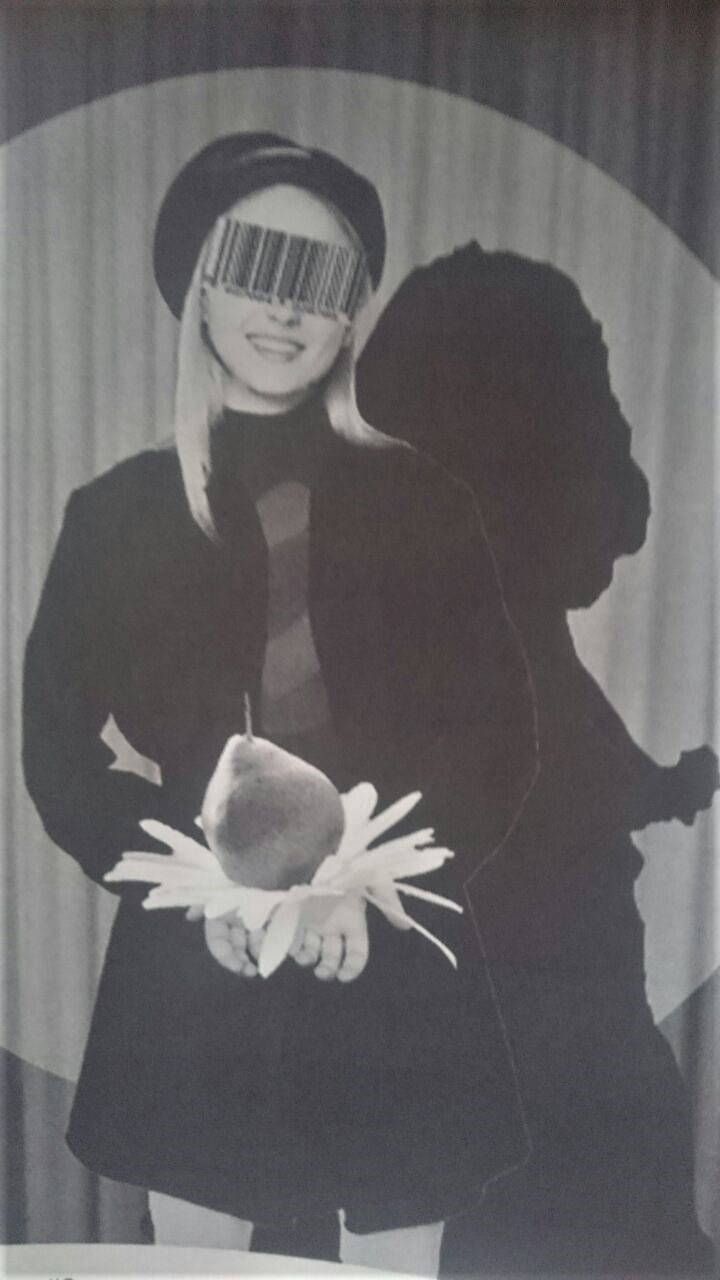
“You’re a wallflower.” – The Perks of being a Wallflower 2012
In the movie, Patrick labels Charlie, the protagonist who doesn’t fit in with the rest, as a wallflower based on his character traits. In the movie, Charlie feels relieved to be labelled as it gives him a form, an identity that he yearns for when ignored by everyone else.
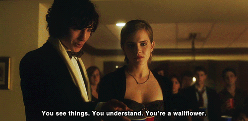
But, in my interpretation, I decided to touch on situations where such labels are unwanted, given to a person, based on an observation of traits or impressions that are impeded on the group that the individual is seen as a part of, whether or not they are right or wrong.
I decided to illustrate how the society views and oppresses the expression of women based on this preconceived notion of what is acceptable by the society. I focused on the common expectations of the women’s role that have been embedded in the society, old and new and the act of constant surveillance for the girls to act accordingly to these stone-set rules.
I wanted to imitate a vintage look of photographs where the person is aware of the photographer and poses, which they would curate carefully and prepare, in ways they would like to be seen as.

These are the elements that I first put together for this piece:
- A young girl in a preppy outfit
- Fruits with old Christian symbolism, particularly those associated with women ;
- A fig: a symbol of lust and loss of innocence
- A pear: martial faith
- A half-eaten peach: woman who has tarnished her reputation with immoral behavior
- Daisy: innocence
- A spotlight on stage causing a harsh shadow
And this is the piece that I came up with.

After the consultation, I started to work into changing some of the elements based on some of the feedback.
- The fig is replaced by a barcode : which suggests the act of labeling women as products
- The peach is reduced in scale and made more transparent to make it more hidden under her clothes just like how women are expected to be clothed accordingly to the society’s standards to be acceptable.
- The scale of the transmutation of the pear and daisy are increased in scale so that it grabs the attention of the viewer more; this is what the girl wants the public to see, a curated representation that does not exist in reality.
- Her shadow is changed to a silhouette of a barbie bride which the barcode codes for, to accentuate women’s assigned roles as housewives and brides.
And here is the final piece.

Elements of design employed:
- Contrast in values to create an emphasis on certain elements: such as the transmutation of a pear-daisy while drawing your attention away from the hidden peach
- Scaling to emphasize the off-putting feel of the image
“You’re a wallflower”- The Perks of being a Wallflower 2012
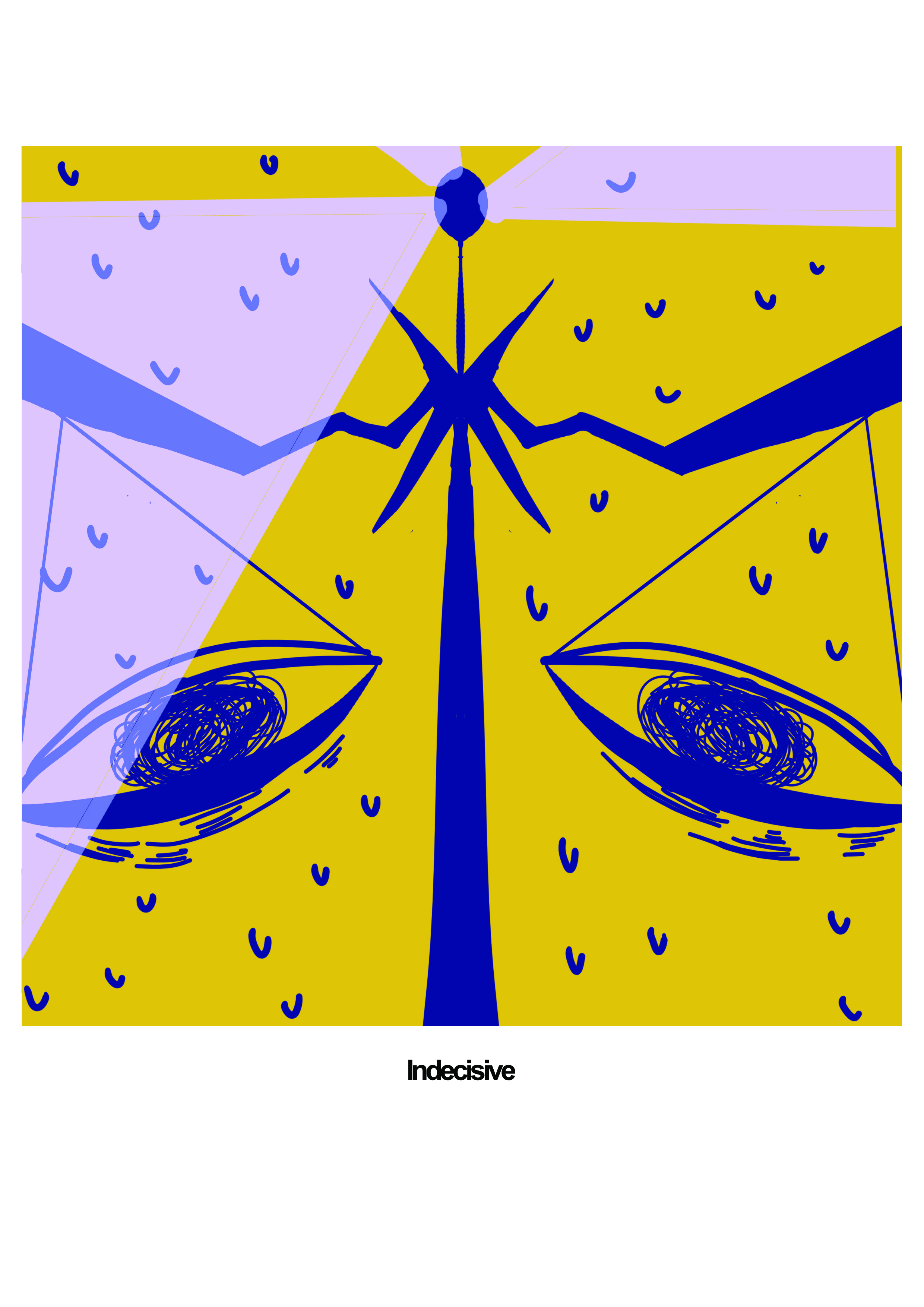
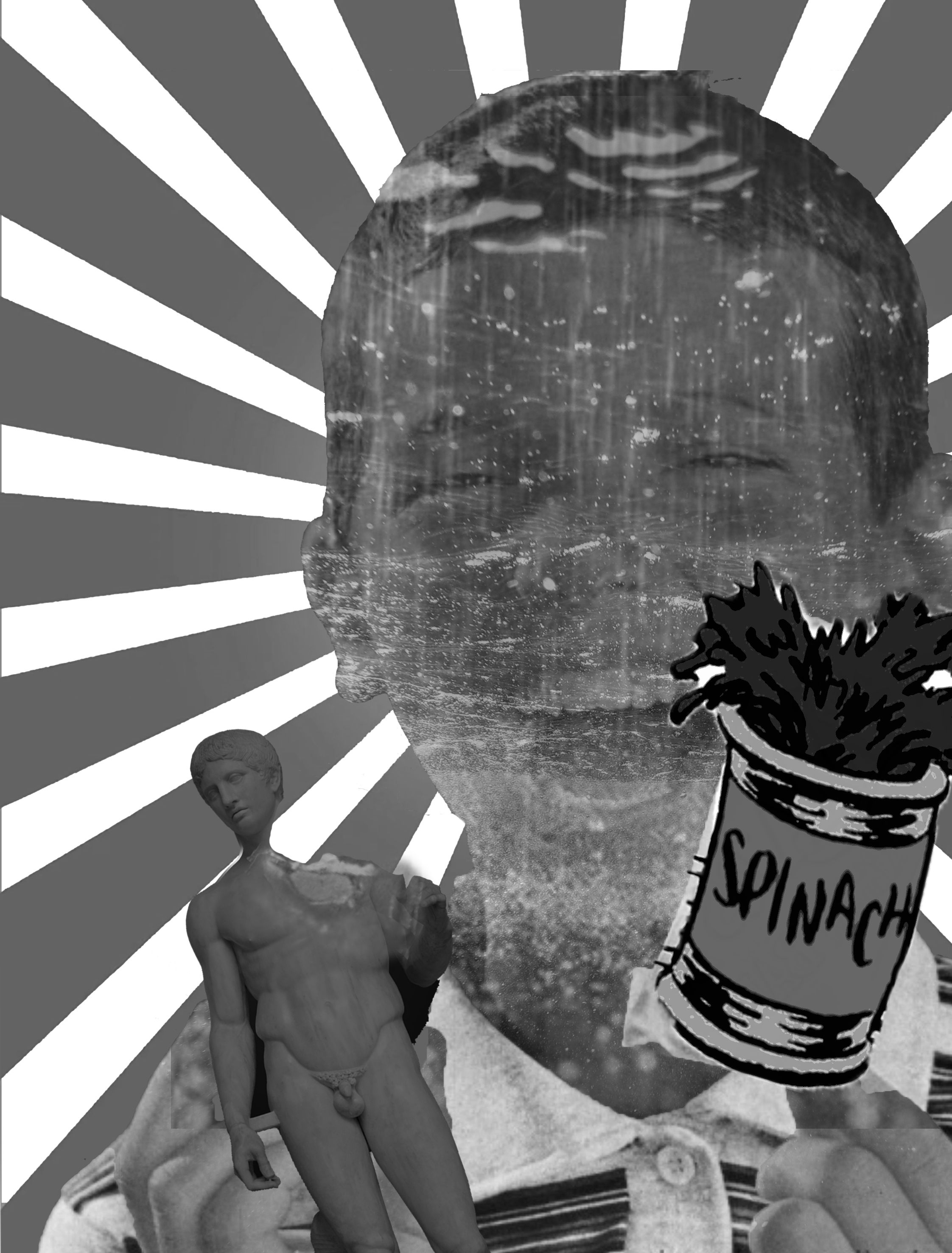
For my third piece, I reinterpreted the same quote but this time concerning boys. In the movie, Charlie does not get offended being associated with a demure and gentle image, a wallflower.
However, there is a societal expectation for man to be tough and to be in charge instead. This usually entails that a man needs to show their superiority over other men or women constantly, usually through means involving some for of aggression and violence. When they are not or become slightly involved in effeminate activities, they are ridiculed and ostracized. These kinds of scenarios are not hard to find especially in media with younger boys.
Thus, I decided to touch on the societal expectations for boys to be masculine which entails that the use of violence is somewhat is expected to be accepted. The source of inspiration for this piece are vintage posters for recruitment of soldiers during World War that appeal to the young, impressionable boys. They are usually about how being a soldier makes you valiant even though it involves killing lives of others and possibly hurting themselves in the process.
This also highlights how this tough act is constantly encouraged in media and their environment, forcing the impressionable boys to take in and digest internally this expectations and thus, I try to imitate a vintage poster for my third piece that is food related to allude to the fact that this expectation is constantly advertised and fed to young boys.

So while brainstorming for the piece here are some of the elements that I wanted to make use of:
- A smiling young boy from a vintage poster
- Converging lines reminiscent of communist posters
- Statue of David to represent a symbol of a perfect man
- A can of spinach, a reference to Popeye the cartoon
- An overlay of rain, waves, ripples to represent the emotional turmoil they seal shut as men are to be less emotional.

After consulting with the class, I decided to
- keep the chocolate in his hand but instead of the statue of David, I changed it into a pistol gun instead to emphasize the perpetuation of violence as a food item that is loved by children, diminishing the real implications and dangers of gun use which is a representation of human violence,
- change the can of spinach from a packet to a cigarette, to accentuate how impressionable boys blindly copy what is expected of them not exactly knowing why they are doing this. It also emphasizes how boys are made to think that by being tough, they will be considered as grown ups instead.
- add in a packaging with an old catchphrase of “Mars are Marvellous”, to use the allusion of Mars as man to emphasize the advertisement of violence.
- add in smokes coming out from the gun which covers on of his eyes to suggest the lack of fair judgement.
This is my final piece:

Elements of design:
- Leading lines converging to the boy’s face
- A triangular shape that leads the eyes again to the boy
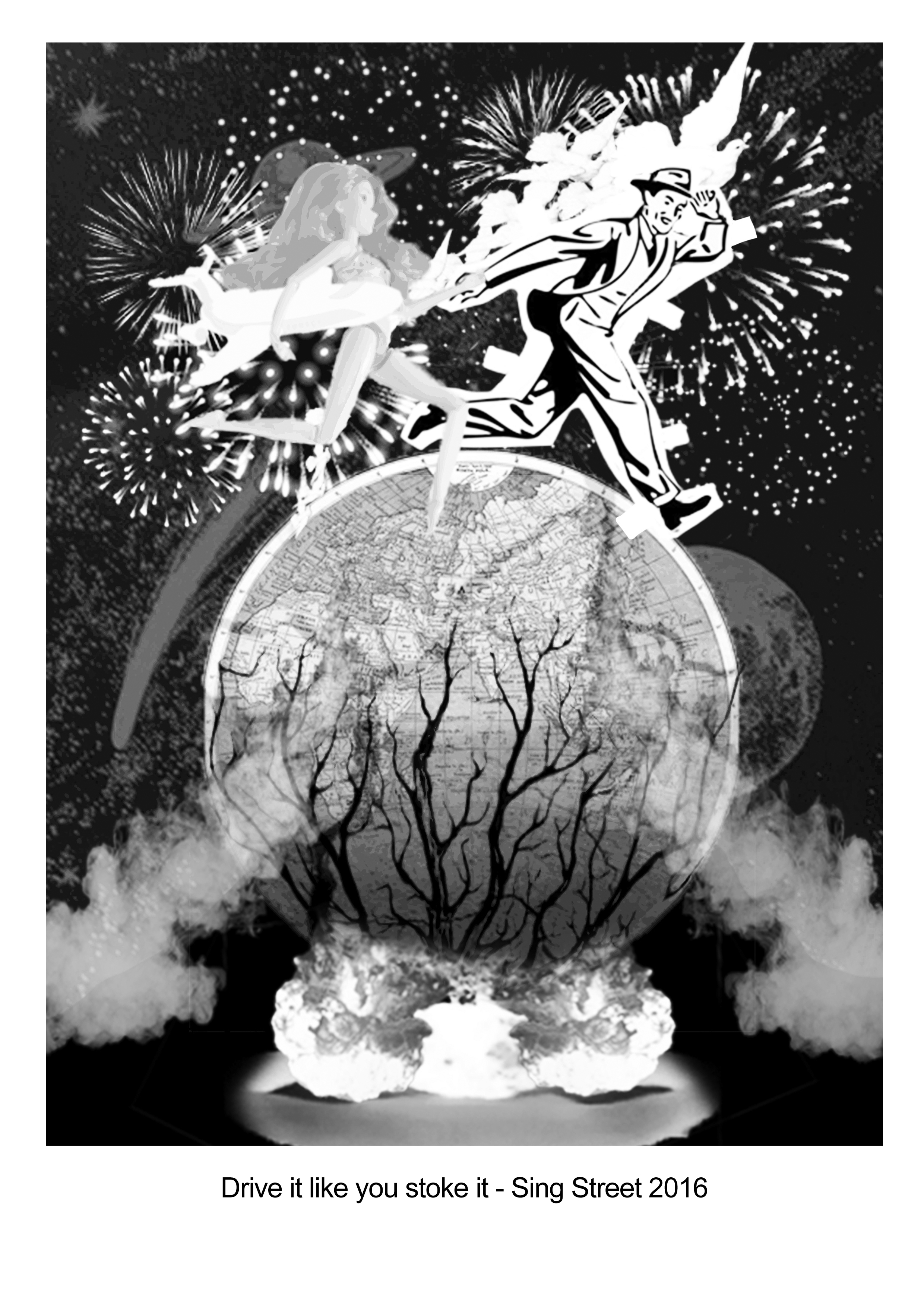
“Drive it like you stole it.”- Sing Street 2016
As for the fourth piece, I wanted to create a scenario concerning the recent surge in the culture, of what I would say, nonsensical spending spree. It can be widely observed in celebrities, using private jets and living in overtly lavish mansions to shows like Buzzfeed, finding the most expensive versions of the dish they could find.
If I interpret the quote in a different way, it seems to justify the impulsive actions and decisions people make with the mentality that you only live once anyway. However, sometimes it may isolate the people to their own bubbles where they take things for granted and become ignorant to much more pressing problems.

A $100 donut covered in 24 karat gold flakes
However, I thought about how I myself am taking things for granted myself, even though on not such a big scale as this since most of the things that I buy are to satisfy my wants and not my needs. Plus, many basic things such as electricity and food are taken for granted by many of us, even though we are aware that there are factories churning out pollution and cases of starvation still prevalent in many parts of the world.
Thus, I decided to create the piece concerning the blissful ignorance of the people in general, selfishly chasing after their dreams, ignoring to acknowledge the impact of our actions that contribute the destruction of the world around us.
I composed this piece with a mixture of illustrations and real images to convey a nihilistic view on the mass mentality that you could do selfish things since you only live once, usually prevalent in first world countries.
So here is the piece I came up with first before consultation:

And the elements include:
- a paper doll cut of a man and a barbie doll to represent the common need for a lover in the society as well as to accentuate that all humans are just playthings of fate.
- A illustration of earth and universe to suggest that what we know to be true might not be the case as the truth is merely what we decide as a mass to believe in such as the shape of the earth, the way of the universe, etc…
- Cracks on earth, nuclear bombs and trash piles to suggest the destruction of earth
- Fireworks surround them to create this isolation around the two people in contrast to the surrounding to suggest that they choose to be in their own bubble.
- A string of doves flying to suggest the destructive effects of our actions on animals as well as to question our superiority as species.
After the consultation, I had to tweak some of the elements to work towards a more harmonious piece, which includes:
- removing the trash pile as it was pretty much not recognizable in black and white
- moving the nuclear bomb directly opposite the people and making them more symmetrical to create a more orderly visual which helps to separate the top and the bottom clearly, again highlighting the act of blissfully ignoring to solve the pressing problem
- adding in a pair of symmetrical smokes that help to reinforce the orderliness of the piece as well as separate the two events from one another
- Dark root-like shadows emerging from the bombs to suggest the effects of human actions slowly creeping in to damage us back.
- adding in a float shaped like a private jet to represent our selfish needs.
So here is the final piece:

Elements of design:
- Symmetry: to create an overall orderliness to the piece to create this fake sense of perfection fabricated by our views and our failure to acknowledge our flaws.
- Contrast in values to bring attention to the top and the bottom of the piece
- Triangular implication caused by the smoke
- Leading lines: shadows towards the top
Overall, I would say the greatest challenges were the technical difficulties of the silk screening process as well as inputting the principles of design into my work instead of jumbling all of them in one space as you can already probably tell from my process if you have reached this far in the post. I also ran in some problems with the printer as the values were much different from my piece, and some of the details became washed out in some of the prints, such as this piece where the barbie’s features were totally blocked out.

With all that said however, I am at the end satisfied with my progress on my compositions and the silk screening activity as I have always been fascinated with silk screening and this project has taught me what I need to know about it.


And with that, I bid Project 2 fareweEEEeeeeeeeeeeeeell.


 dESIGN SOLUTION


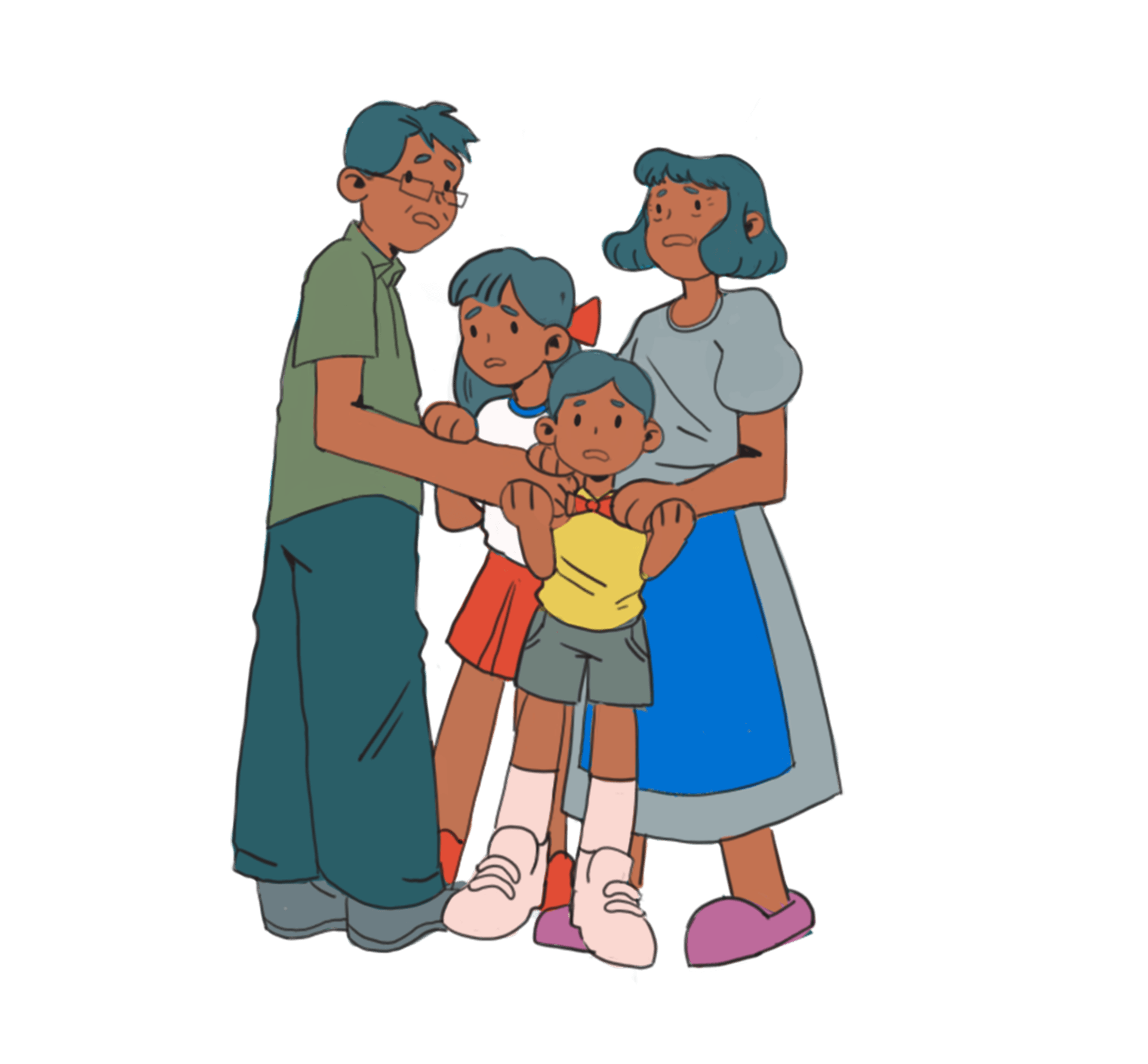


 Setting: New people
 So I decided to edit the composition again which led me to this. However, I got carried away and forgot to take the colour scheme into consideration again as I ended up pairing blue-green with red instead of red orange.

 Joy suggested that I should try to change the colour of the hands as in my first attempt, the colours were too brown when they should be red as a triad scheme suggests.
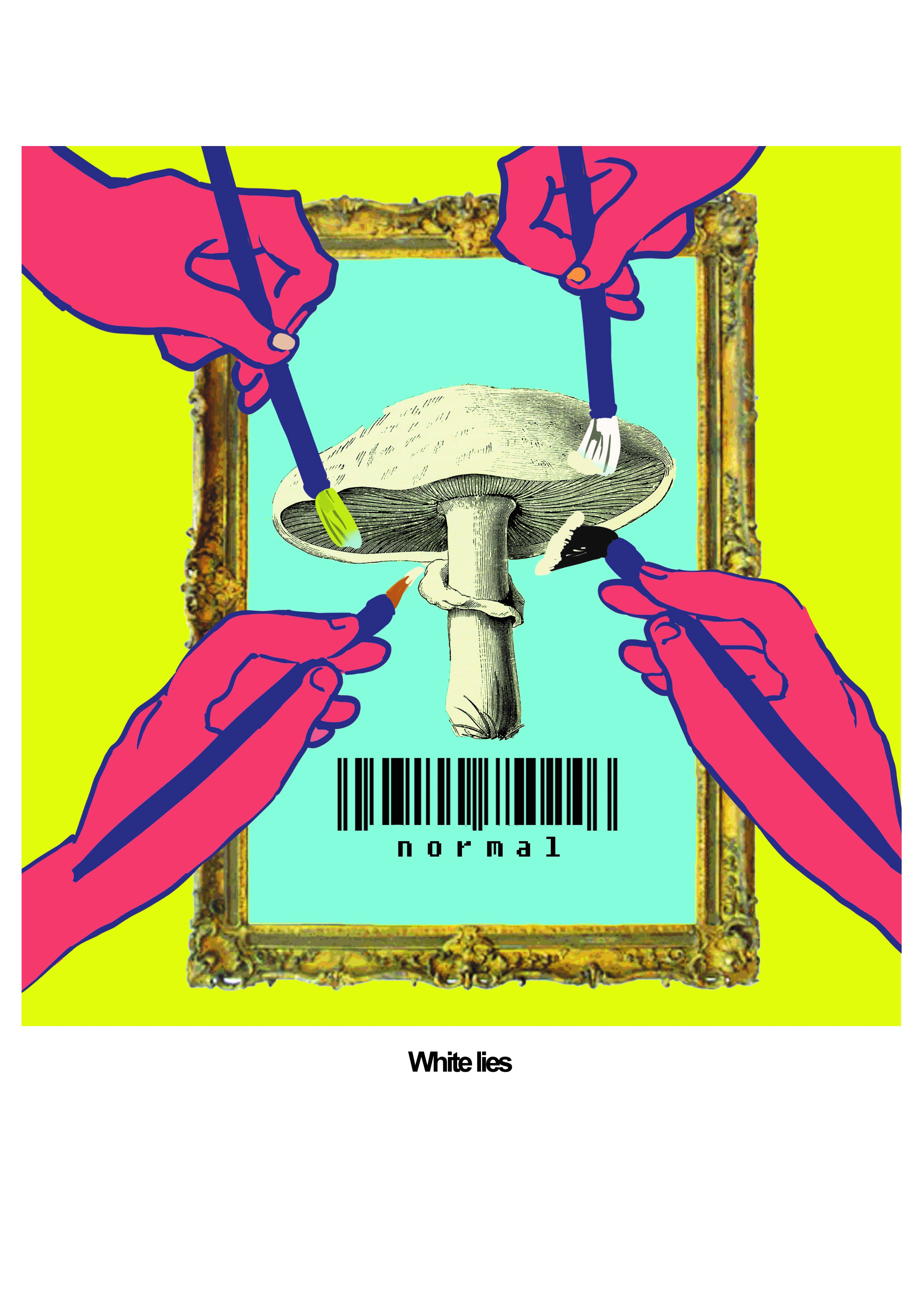

 I however decided to use complementary colours of the same intensity as I wanted to highlight the severity of each decision and its differing outcomes. This further implicated by how each diverging road and each leg corresponds to each coIour. I also added in some spotlight to further suggest this immense pressure one might feel before making a decision.
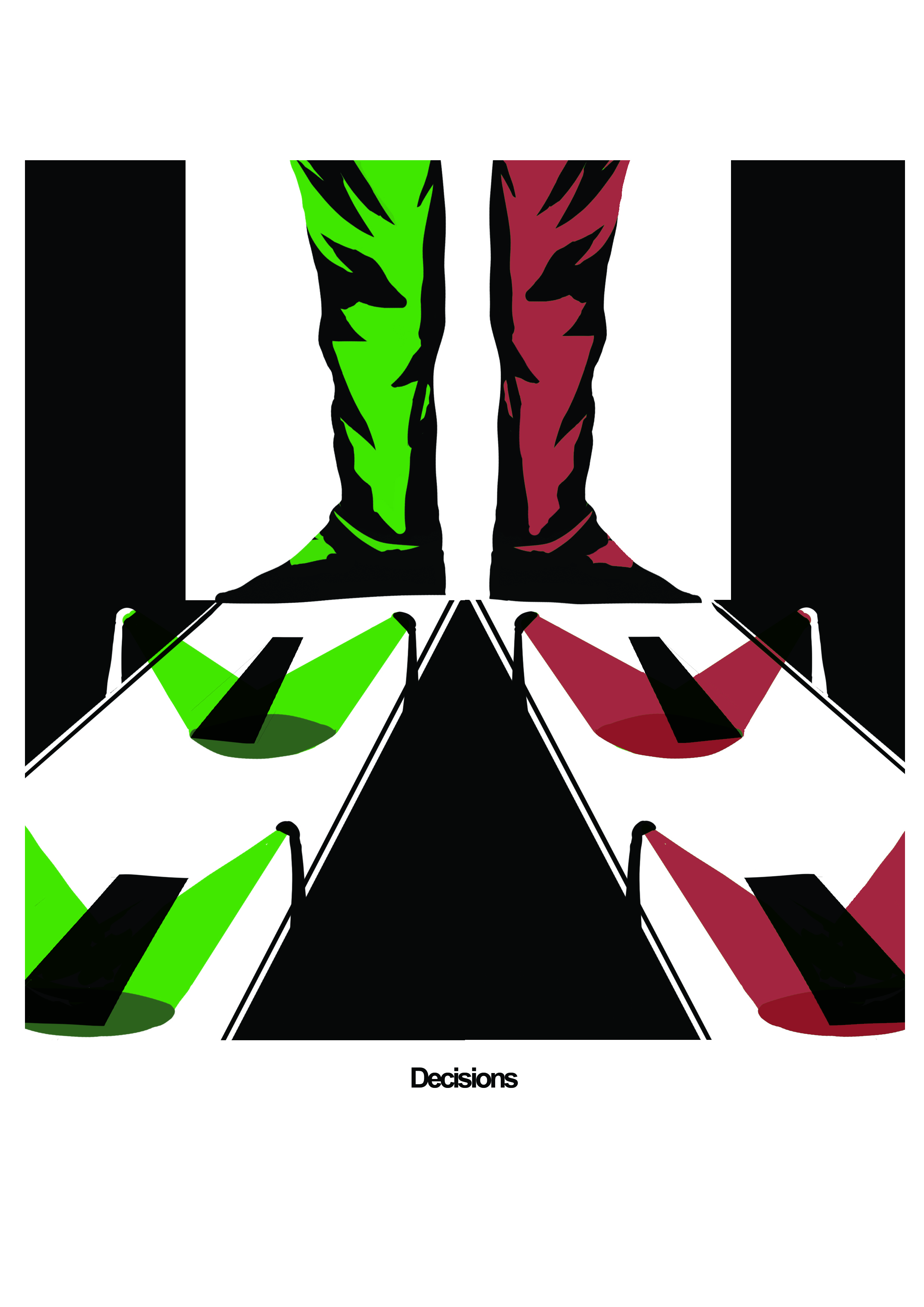


