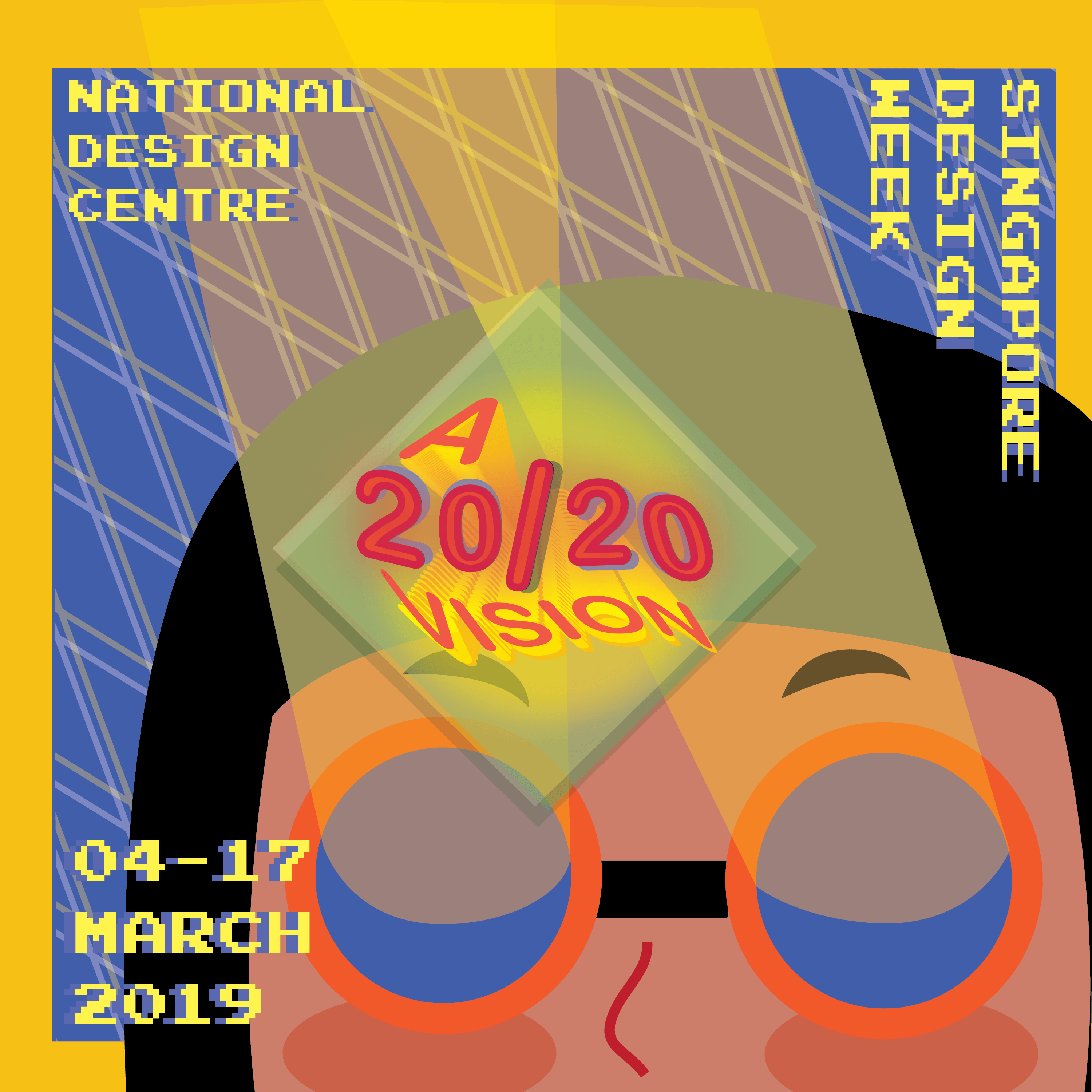
Brochure : 5 Artists

Local

Image result for qimmy shimmy

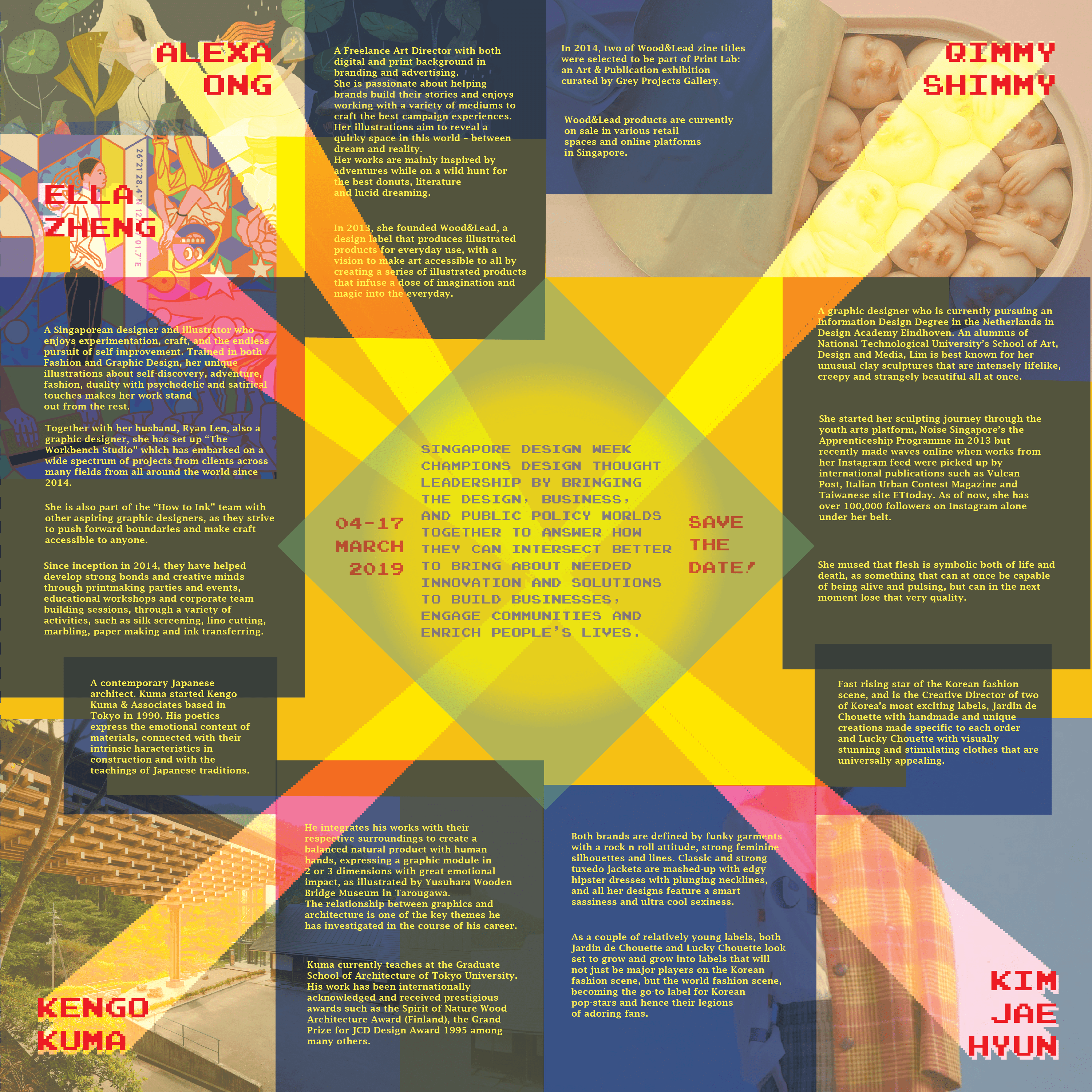
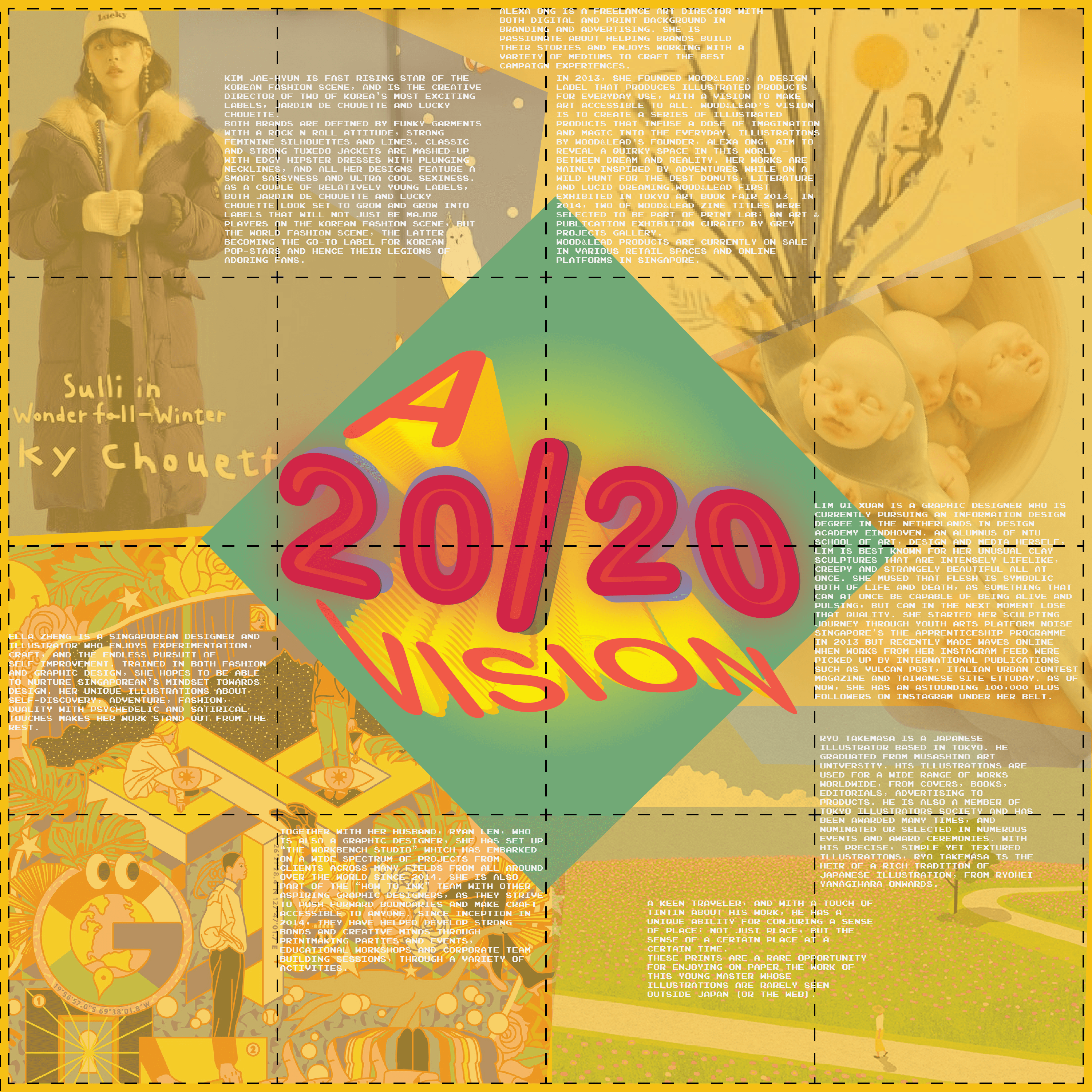
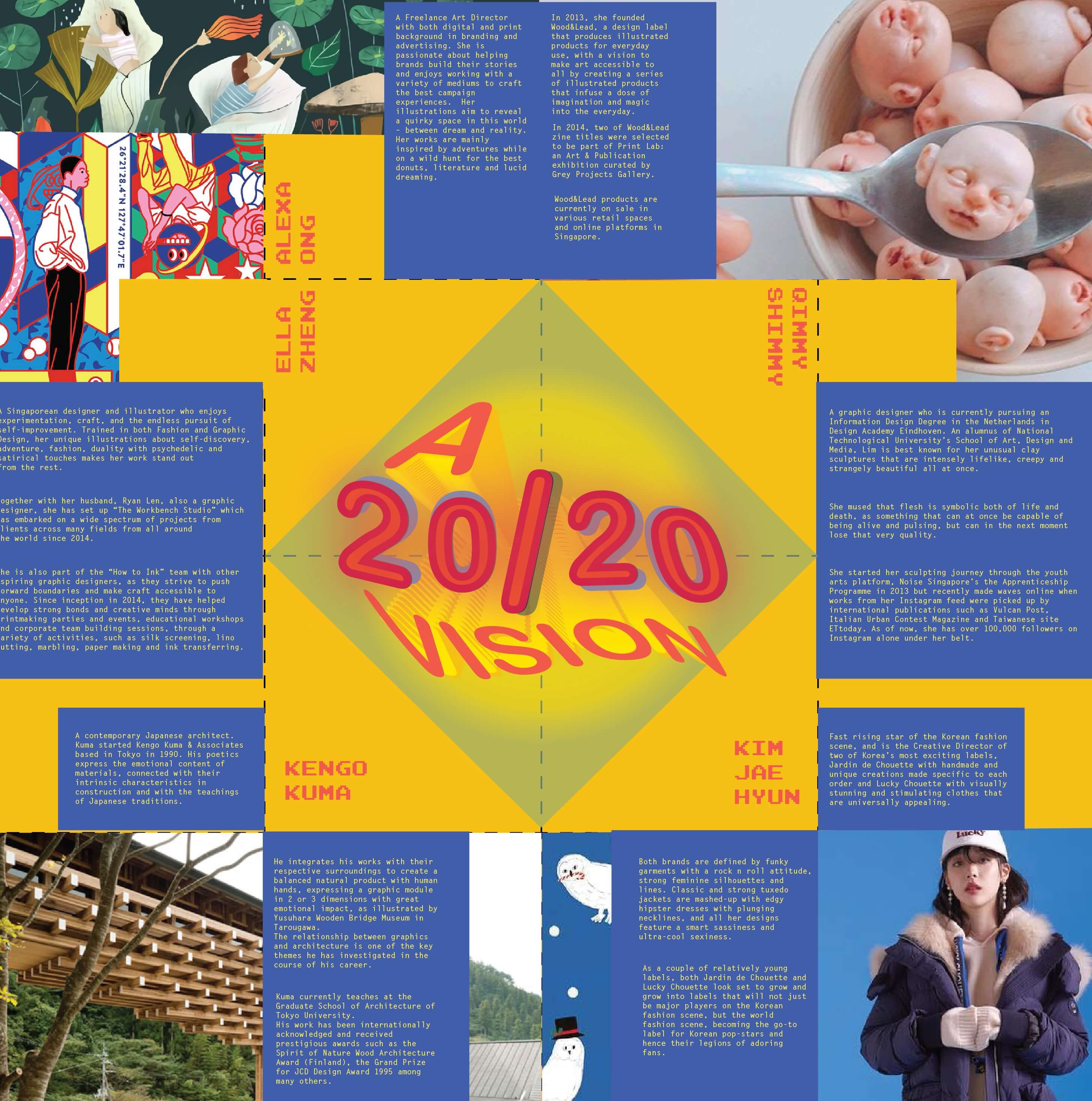
Lim Qi Xuan is a graphic designer who is currently pursuing an Information Design Degree in the Netherlands in Design Academy Eindhoven. An alumnus of National Technological University’s School of Art, Design and Media, Lim is best known for her unusual clay sculptures that are intensely lifelike, creepy and strangely beautiful all at once. She mused that flesh is symbolic both of life and death, as something that can at once be capable of being alive and pulsing, but can in the next moment lose that very quality.

She started her sculpting journey through the youth arts platform, Noise Singapore’s the Apprenticeship Programme in 2013 but recently made waves online when works from her Instagram feed were picked up by international publications such as Vulcan Post, Italian Urban Contest Magazine and Taiwanese site ETtoday. As of now, she has over 100,000 followers on Instagram alone under her belt.

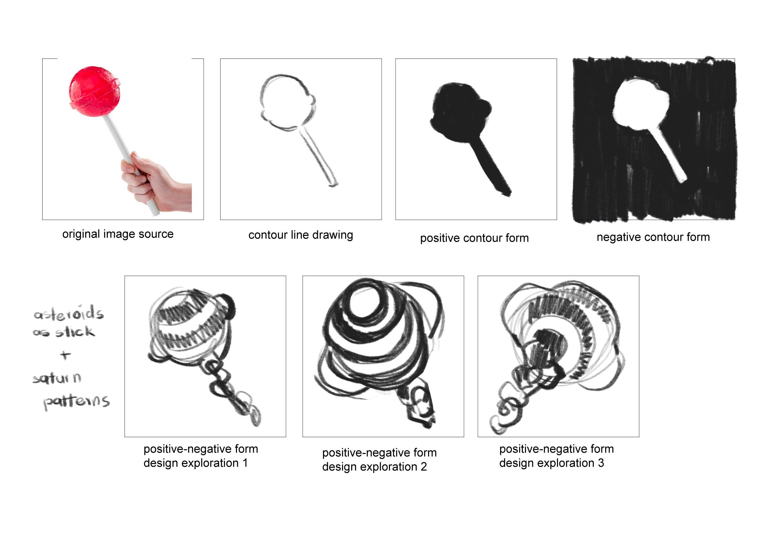
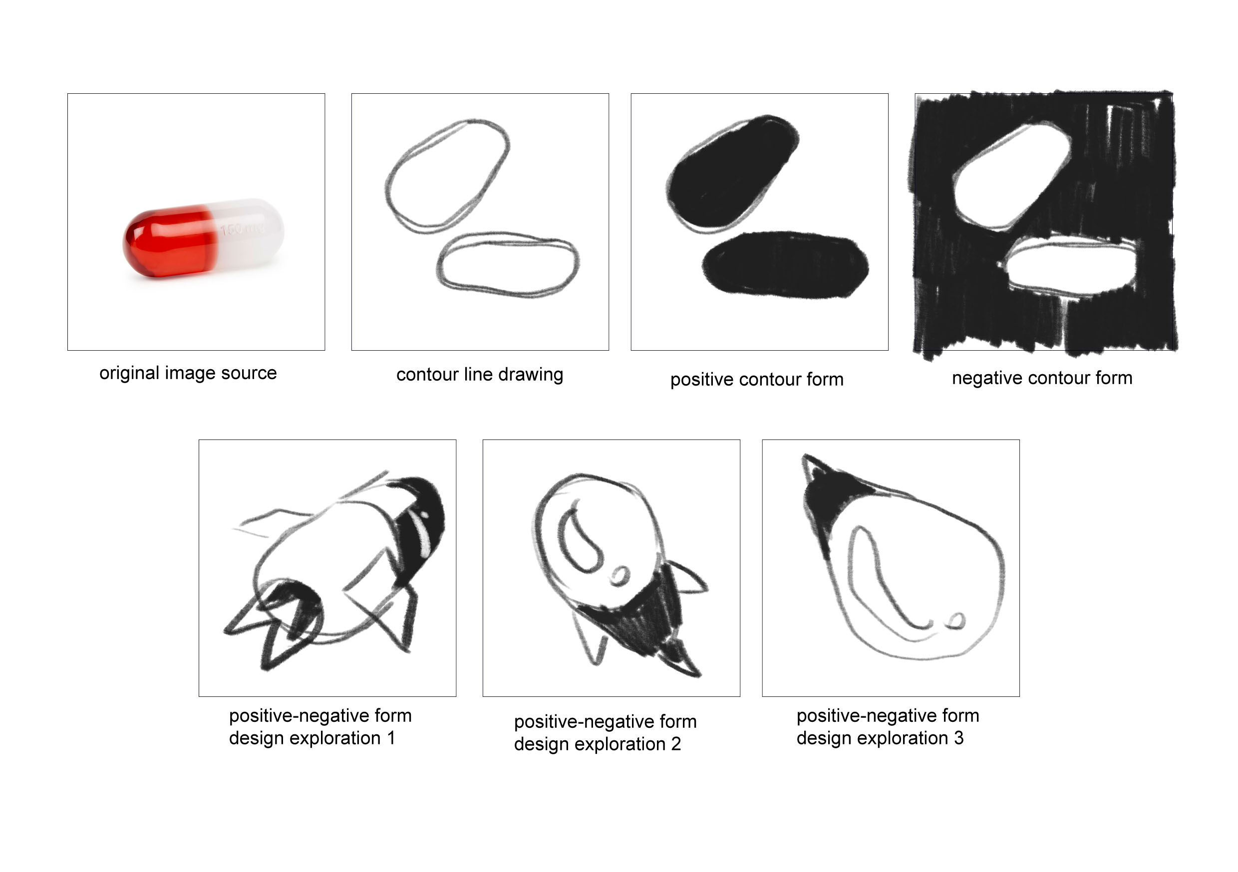
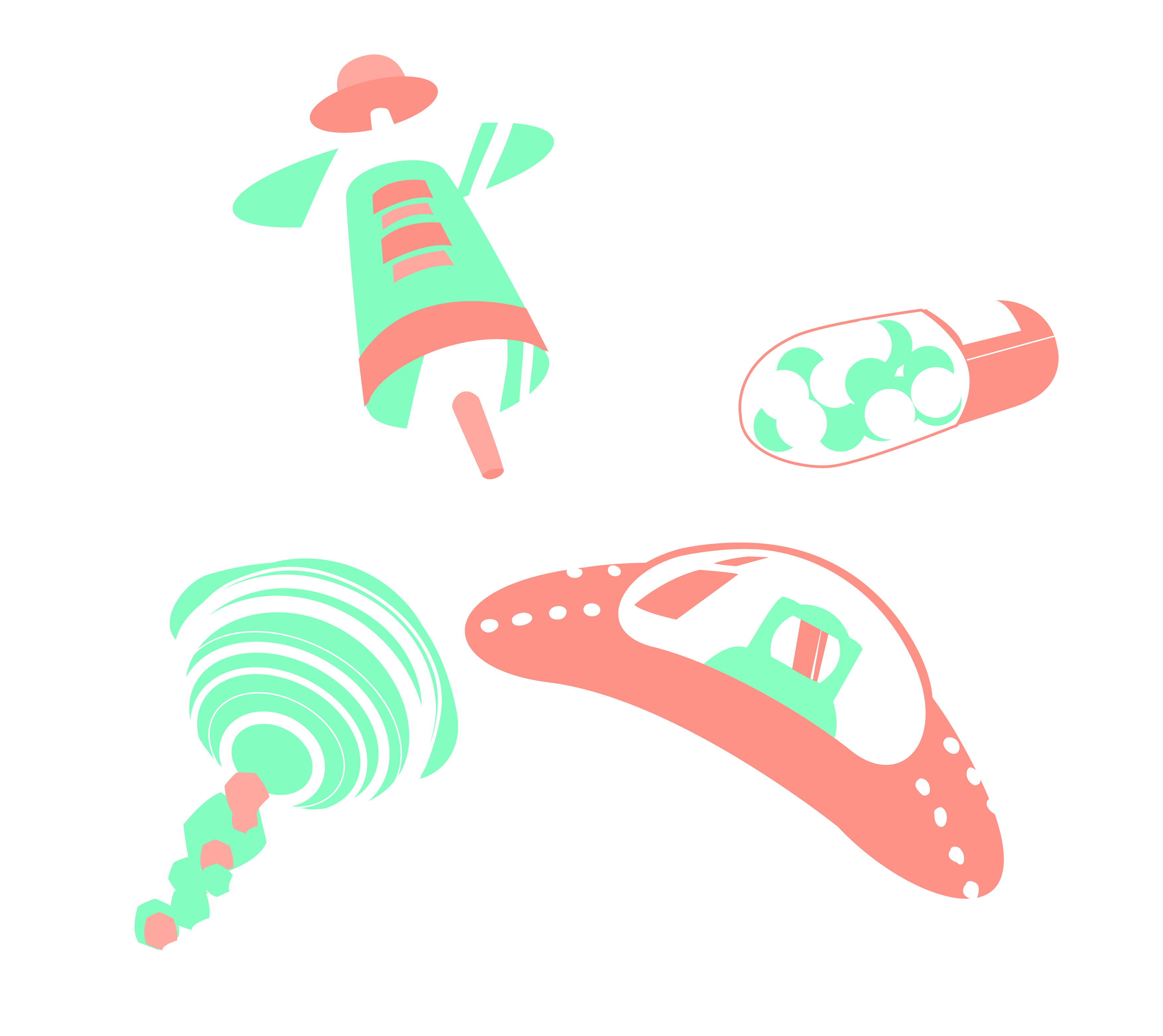
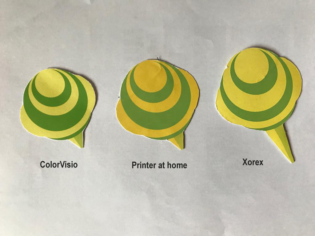
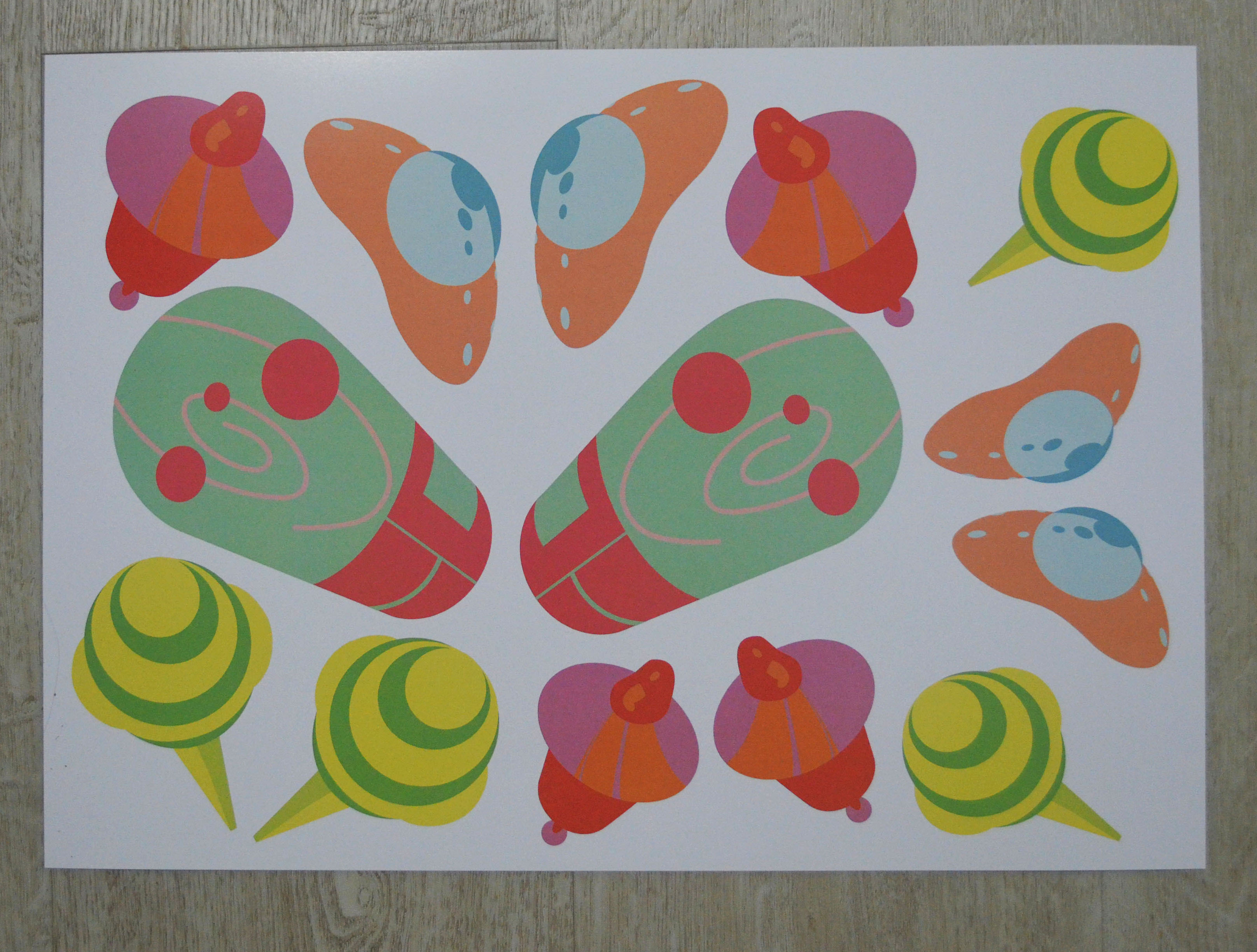
Qimmy Shimmy (PRODUCT)

Image result for ella zheng

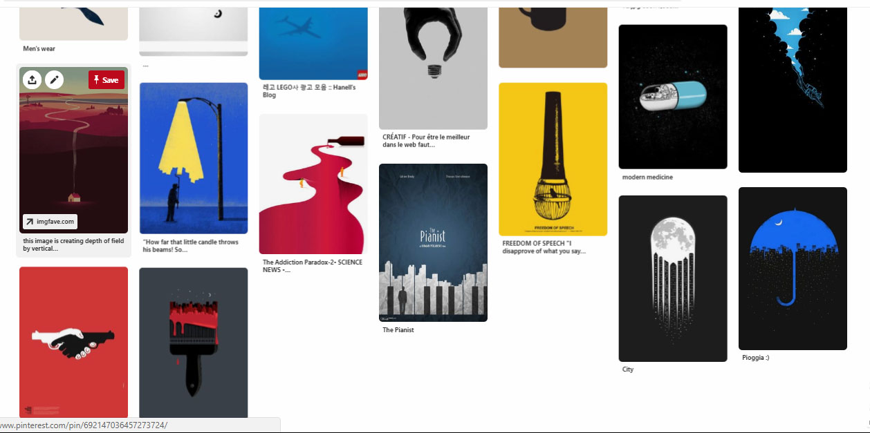
Ella Zheng (GRAPHIC)

Ella Zheng is a Singaporean designer and illustrator who enjoys experimentation, craft, and the endless pursuit of self-improvement. Trained in both Fashion and Graphic Design, her unique illustrations about self-discovery, adventure, fashion, duality with psychedelic and satirical touches makes her work stand out from the rest.

Together with her husband, Ryan Len, also a graphic designer, she has set up “The Workbench Studio” which has embarked on a wide spectrum of projects from clients across many fields from all around the world since 2014.

She is also part of the “How to Ink” team with other aspiring graphic designers, as they strive to push forward boundaries and make craft accessible to anyone. Since inception in 2014, they have helped develop strong bonds and creative minds through printmaking parties and events, educational workshops and corporate team building sessions, through a variety of activities, such as silk screening, lino cutting, marbling, paper making and ink transferring.

Image result for alexa ong uniqlo

Alexa Ong (GRAPHIC)

Alexa Ong is a Freelance Art Director with both digital and print background in branding and advertising. She is passionate about helping brands build their stories and enjoys working with a variety of mediums to craft the best campaign experiences.  Her illustrations aim to reveal a quirky space in this world – between dream and reality. Her works are mainly inspired by adventures while on a wild hunt for the best donuts, literature and lucid dreaming.
In 2013, she founded Wood&Lead, a design label that produces illustrated products for everyday use, with a vision to make art accessible to all by creating a series of illustrated products that infuse a dose of imagination and magic into the everyday.
In 2014, two of Wood&Lead zine titles were selected to be part of Print Lab: an Art & Publication exhibition curated by Grey Projects Gallery.
Wood&Lead products are currently on sale in various retail spaces and online platforms in Singapore.

International

Image result for kim jae hyun designer

Kim Jae Hyun (FASHION)

Kim Jae-Hyun is fast rising star of the Korean fashion scene, and is the Creative Director of two of Korea’s most exciting labels, Jardin de Chouette with handmade and unique creations made specific to each order and Lucky Chouette with visually stunning and stimulating clothes that are universally appealing.

Both brands are defined by funky garments with a rock n roll attitude, strong feminine silhouettes and lines. Classic and strong tuxedo jackets are mashed-up with edgy hipster dresses with plunging necklines, and all her designs feature a smart sassiness and ultra-cool sexiness. As a couple of relatively young labels, both Jardin de Chouette and Lucky Chouette look set to grow and grow into labels that will not just be major players on the Korean fashion scene, but the world fashion scene, becoming the go-to label for Korean pop-stars and hence their legions of adoring fans.

Related image

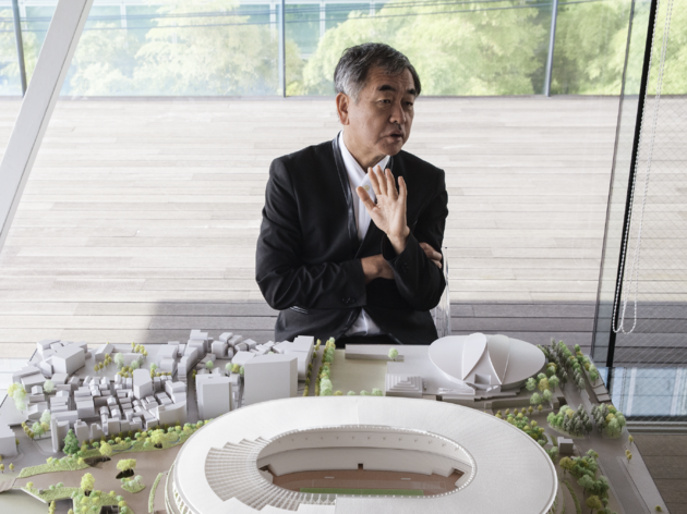
Kengo Kuma (ENVIRONMENT)

Kengo Kuma is one of the most significant contemporary Japanese architects. Born in Yokohama in 1954, Kuma studied at Tokyo University and in 1990 Kengo Kuma & Associates, based in Tokyo.

His poetics express the emotional content of materials, connected with their intrinsic characteristics in construction and with the teachings of Japanese traditions. He integrates his works with their respective surroundings to create a balanced natural product with human hands, expressing a graphic module in 2 or 3 dimensions with great emotional impact, as illustrated by Yusuhara Wooden Bridge Museum in Tarougawa.

The relationship between graphics and architecture is one of the key themes he has investigated in the course of his career.

Kuma currently teaches at the Graduate School of Architecture of Tokyo University.

His work has been internationally acknowledged and received prestigious awards such as the Spirit of Nature Wood Architecture Award (Finland), the Grand Prize for JCD Design Award 1995 among many others.

Brochure: Moodboard + Process


Final Fold:

I decided to go with this fold in the end, because the first fold idea’s die cut might be too fragile to hold itself together. Plus, I thought the graphics in my poster were pretty square as well so I thought it would fit well with the fold itself.

1st attempt:

I wasn’t getting anywhere for a long time because I attempted to break out of the square and triangle grids, by literally breaking everything down and place them at whatever spots I could fit to one side of the page. I had a hard time dedicating equal parts to the 5 artists on one page while trying to vary the arrangement to make it look more exciting while fitting into the folds. To summarise it was a whole mess.

So after that I had to clean up, which led me to dedicate each corner to each sector of the 4 design areas. So I had to swap some of the previous artists as most of the artists I previously found were all graphic artists.

I also decided to keep my graphics in varied grids as I found the shapes that I previously attempted to be too overwhelming.

Process:

Here I laid everything out accordingly, from with each corner dedicated to each sector of design, with the local artists on the top and the international at the bottom. However I find that the type I was using was not legible at all when printed small. I had to rearrange all the text boxes as choosing a new bigger font also created the need to make more space.

Therefore. I decided to make the graphics with a lowered opacity and I also wanted move the names to be seen on the folded corners so I decided to try a projection as well in my next attempt. I also tried to vary the text boxes to create more dynamics.

I also decided to swap out the slogan to the information in the centre as I find that it would make more sense to put the information along side the artists.


As for the back, I decided to avoid putting the textual elements in the folds that will appear when its folded. I also had the slogan placed in the center so that it can appear when it is folded.

Reflection:

For this project, I had a hard time with the laying out and creating equal importance for 5 different artists. I also failed to treat text as image as I found that I could only handle them as text boxes at this point, which would have had the potential for more surprise and visual interest. But it was still fun to learn interesting paper folds, and I think I can say that I definitely at least managed to put order into the final work.

Poster: Moodboard and Process

Brainstorming:

1st Idea: Design Nation

For the graphics I wanted to created to create a little leaf shaped country with oversized objects from each from the 4 sectors of design, since here I wanted to implement nature and sustainability as part of the image.

2nd Idea:  Get your taste buds ready

For this, I wanted a kueh tutu shaped infrastructure on a leaf-shaped platform as part of the graphics, because I wanted something that is a part of Singapore culture and again nature.

3rd idea: RE: invent

As for this, I wanted to base it on the vintage radio that I saw back at the National design centre.


I decided to work on the first 2 ideas that I had, but it wasn’t exciting without any dynamic angles and seemed rather still and cold. And as for the 2nd poster, I kept emphasizing on making food graphics that it failed to look like a design festival. So I decided to carry on with my 1st Idea.

Since I’m working with the slogan Design Nation, I tried to incorporate the idea of discovery while trying to put in more dynamic angles, I came up with this where I have a girl looking out of her binoculars with greenery behind her. However, because of the graphic I created first, I had trouble finding space for my text and end up just squeezing everything in whatever space I had.

As for the graphics, again I was being a bit too literal, and I decided to take some of the advice given in the class; the binoculars could be swapped out with projects out of the eyes. I also really liked another suggestion from the class to change the slogan to “a 20/20 vision” instead.

Since I’m working with a new slogan to do with vision and projections, I decided to change the graphics again to create a game-y graphic like a virtual reality. I also left out all the leaves and instead replaced it with simple grids to imply guides for building anything to imply endless possibilities.

But, my font sizes especially for the  date and the festival, were way too small, when they are supposed to be important. It was also still lacking the playfulness, so I decided to give it some pop by changing the text to Isometric graphics to make it look more dimensions. And I decided to test out using different types to create more contrast.

One thing that I definitely learned from this project is to not let the graphics control the texts, like I was doing for many of my previous attempts. I learned to practice taking everything out and putting in text elements in first and put in more graphics later, although i still have some problems locking them in to create a balance and a sense of unity.

Although I still struggle with hierarchy and locking my elements in the graphics, I think I managed to come a long way from the beginning of this project.


Visual Research + MoodBoard

I decided to analyse some of the more illustrative ones as I am personally more interested in those..

  1. Hello!Yello! Solo Exhibition

This poster uses a Monochromatic tones and tints of yellow to compose the entirety of the poster. I thought it was charming of them to deliberately stick to monochromatic yellows to  reflect the theme of the event, to celebrate the Yellow faces aka the Asian people (according to google translation of the event). At the same time, the yellow acts as a brand for mrmustard studio as it can easily be associated with its namesake.

As for the illustration, the yellow wall creates an interesting diagonal yet symmetrical cut keeping the poster balanced overall. This line of division also makes the small and playful black lineart stands out in the center.

All the textual elements on the poster are all placed at the four edges, framing an imaginary margin.
All four textual elements are easily legible as yellow fonts are contrasted over the off-white background and vice versa. Our eyes go over first to the Event title : Hello!Yello! which is the largest amongst all of them. In addition, the slightly tilted angle and the availability of wide space around it easily grabs our attention. In addition, visual interest is created with the title being written in a causal handwritten type in yellow, as if promising that this exhibition will be fun and entertaining.

Then our eyes get drawn to the bottom left as we go along the sub-margin that frames the title, where the Studio and the dates are displayed, which are technically the two other important elements after the title. We then go to the text with the vertical alignment at the top right corner, and this orientation creates another form of visual interest. It then directs us along its own sub margin to the sponsors.

I think the overall simplistic style of illustration with the repetition of yellow aligns itself well with the message of this exhibition; to embrace the charms of fun yellow as a part of the Asian identity.

2.  Hackathon 

drag to resize or shift+drag to move

I think the most outstanding thing from this poster is how it manages to capture the important features of coding with its play on the visual combination of both the illustrations and the text, which takes up almost the whole center of the poster.

Firstly, the largest text for the title (HACKATHON) is placed interrupted into 4 lines with the white lines, but still forms the word when read conventionally from left to right, and top to bottom. This disconnected imagery reflects how codes make use of individual alphabets as a component to communicate its functions in data instead of using it for mere communication.

The imagery of the hands intertwined with the text also further reinforces how coding requires layers and layers of work in order to make it function. It also perhaps suggests having to think outside of the boundaries in order to make the coding work, suggesting that the event is bound to challenge you to think creatively.

The textual elements of the posters also frame themselves around the central imagery, creating an implied margin. The difference between the colours of the frames around the texts also separates each textual information from one another.

Again, the poster, only uses limited colour palettes, and uses the split complementary system to bring attention to the detached hands from the orange-yellow background, which creates an impression that coding can be fun and creative.

Here are the other posters that I found interesting:

『第6回マイ・フレンチ・フィルム・フェスティバル(myFFF)』ビジュアル

Japanese Poster: Souvenir Square. Satoru Morone / Sakiko Sudo. 2013

Field Trip: National Design Centre

Design Practices in Singapore

Environmental Designs (EN)

Product & Industrial Designs (PI)

Fashion and Accessories (FA)

Visual Communication (VC)

Future Goals for Singapore

In addition to its rich multi-cultural roots, it has already cemented its place in the international community as one of the fastest growing and most innovative metropolitan states. As such, Singapore has revenue and confidence to explore more creatively and we do see the fruition of this advent with the recent influx in the general interest of design in all of the sectors of Singapore.

With this continued interest and investment in design all over Singapore, people from all age range will begin to see the significance of design in keeping all the sectors of Singapore flourished and at the same time, paints Singapore as a vibrant and attractive country to the rest of the world.

At this rate, I’d like to believe that Singapore will very soon find its own charm in the design scene globally if it continues in this direction that encourages venture.

Mobile of Hope

THEME

Hope to me is seeing things in a positive light whenever you are stuck in difficult times. So the final way that I decided to convey this idea is to represent  the medical tools as space objects. I wanted to visually reshape the medical tools to a set of fun space components, since space to me is the representation of new possibilities in hopes of highlighting that getting treatment is to take care of yourself to get better.

So here are my final list of 4 designs:

  • Plaster as Space ship
  • Syringe as a Satellite
  • Pill as a Space pod
  • Lollipop as Saturn

Idea generation


Pinterest board:


1st Attempt

I ran into some difficulties when it comes to simplifying the shapes into forms instead as they are very illustrative. I also was thinking illustratively, adding details that are not really necessary to convey what I want. I was also not nailing the perspectives. So my goal was to get rid of the flames and details like the little windows and rework on the forms so that they are more simpler.

2nd Attempt


After consultation, I realised that I was still focusing on details, so I decided to take out even more details like the astronaut and the medical beads in the pills. I also decided to further simplify the asteroids on the lollipop and the details on the syringe to make it look less syringe-like.

3rd Attempt

Again, I was still thinking illustratively, instead of symbols. Therefore I decided to forgo even more details and instead focus on getting the outlines and the colours to convey the idea of hope.

FINAL

As for the forms, I generally steered clear from sharp edges and instead tried to round all my outlines so that they are smooth and soothing to look at. I also tried to vary the perspectives to give them depth and make them resemble less of their origin as medical objects.

As for colours, I decided to go with complementary colours that are not too loud but colourful enough, and to balance the contrast, I added some analogous colours as well. I also chose colours based on their healing properties and  ensure that they go well with my intentions.

E.g: I used red and its tints to represent energy as core of the life pod pill.

Here is my reference.

As for the arrangement, I wanted to create an orbit with the designs I have with the core (pill) in the middle.

(One of the lollipops died however while I was redoing the mobile so I came up with another arrangement)

Problems Encountered:

I definitely struggled a lot with the form making, and to the end, did not resolve all the simplifications that needed to be done, just like how the orbit in the pill was still relatively detailed.

As for the technical parts, I ran into multiple problems.

Printing:

I decided on printing at ColorVisio with 250 gsm white card, so that it won’t be too thick but thick enough to withstand the white glue that I was planning to use. However, when I got back home and started assembling I realised that the two sides don’t match up as I had forgotten to reverse the image…

Since I didn’t have time to reprint, I ended up printing at home with the thickest paper that I had – 160 gsm. The colours were sadly not as vibrant as the printing shop.

Lastly, since we were given time to fix the mobile after presentation, I decided to go to print at Xorex, with a 250 gsm art paper. The colours were not as vibrant as ColorVisio to me, but it was definitely better than the printing at my home so I decided to go with that.

(Final print)

Craftsmanship:

I ran into quite a lot of problems here as well. I decided to use metal wires to create an orbital frame of the mobile since I thought that the width span needs to be at least 30 cm.  But I had a hard time trying to bend them into a perfect circle even after hammering and bending them with pliers. I also had some difficulties trying to balance them with threads.

Sticking the designs back to back with a thread in did not go as smoothly as I thought. After the presentation, I went back to stick the designs with spray mount but I ended up destroying one of my lollipops. :,)

I think it would definitely have been easier if I inserted a transparent sheet in between the designs first before stringing the sheet instead of the design like one of the classmates did.

To wrap everything up, I unexpected learnt many things about form making and craftsmanship. 

As for the technical process, I learnt the importance of using the right crafts for maximum efficiency, which I definitely learnt the hard way since I ended up spending way too much time making things. (I got myself an exacto knife the second time, and it was way faster and neater than I did with scissors.)

As for form making, even though I have not yet nailed at the process, I am definitely more conscious of the need to convey meanings without explicit details but instead with form and colours.