

So before I moved on to my deliverables based on my survey, I decided that I would try to brain storm for a number of solutions that those who took the survey have suggested would be effective which were:
- Better labels
- Better instructions
- Incentives
And with that in mind I tried to come up with a few ideas
- New labels for the recycle bins
- A program that lets you trade your recyclables for a recycled product
- for example for every bulk of paper you recycle, you get back a recycled notebook
- An app that helps you track your recycling with
- with an interactive plant/character that grows on your recycling efforts
- Calendar in an app
- Educational game
- Magnets
My first idea was to create a calendar in an app in order to help remind the people to recycle regularly. However, as Michael pointed out, it wouldn’t work out that well if it was in Singapore context as we do not have a schedule to follow in order to recycle. He also pointed out that I should be looking for ways to urge the family to recycle at their homes first before I move on to changing the state and labels of the recycling bins. He suggested perhaps I create stickers that would be useful in helping these families categorize at home.
From there I decided to look at pinterest to look at ways I can make a sticker that will hold a lot of information, such as types of plastics, etc…

However, after trying to design, I feel that putting labels on the stickers was not a good idea from me as different recyclables had different specs; while there are a lot of categories for plastics, almost all metals can be recycled. As such the stickers would not be able to look uniform.
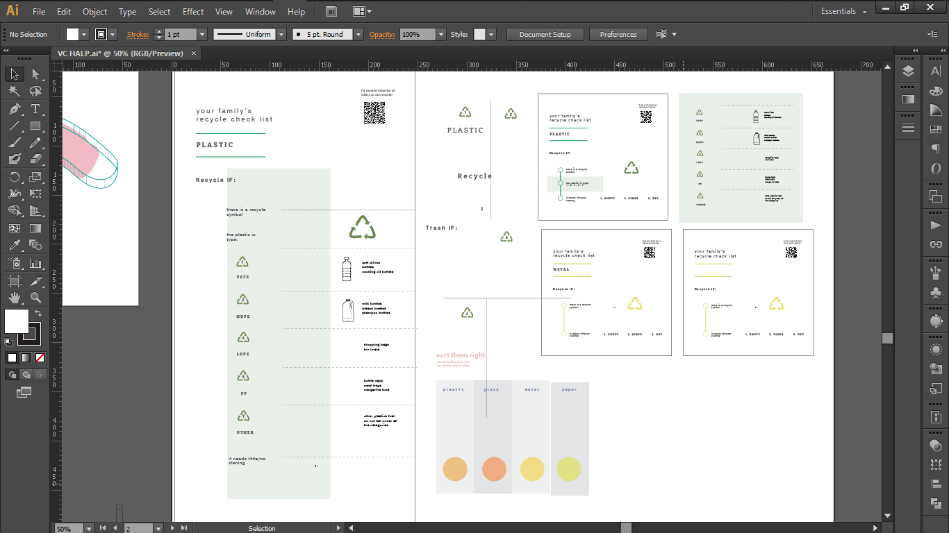
So instead making these label stickers as my main deliverable, I decided to keep the stickers simple and instead make them part of an instructional booklet, that instead would teach the readers what the categories are and such.
So for the booklet here is my initial brainstorm for what could be inside the booklet
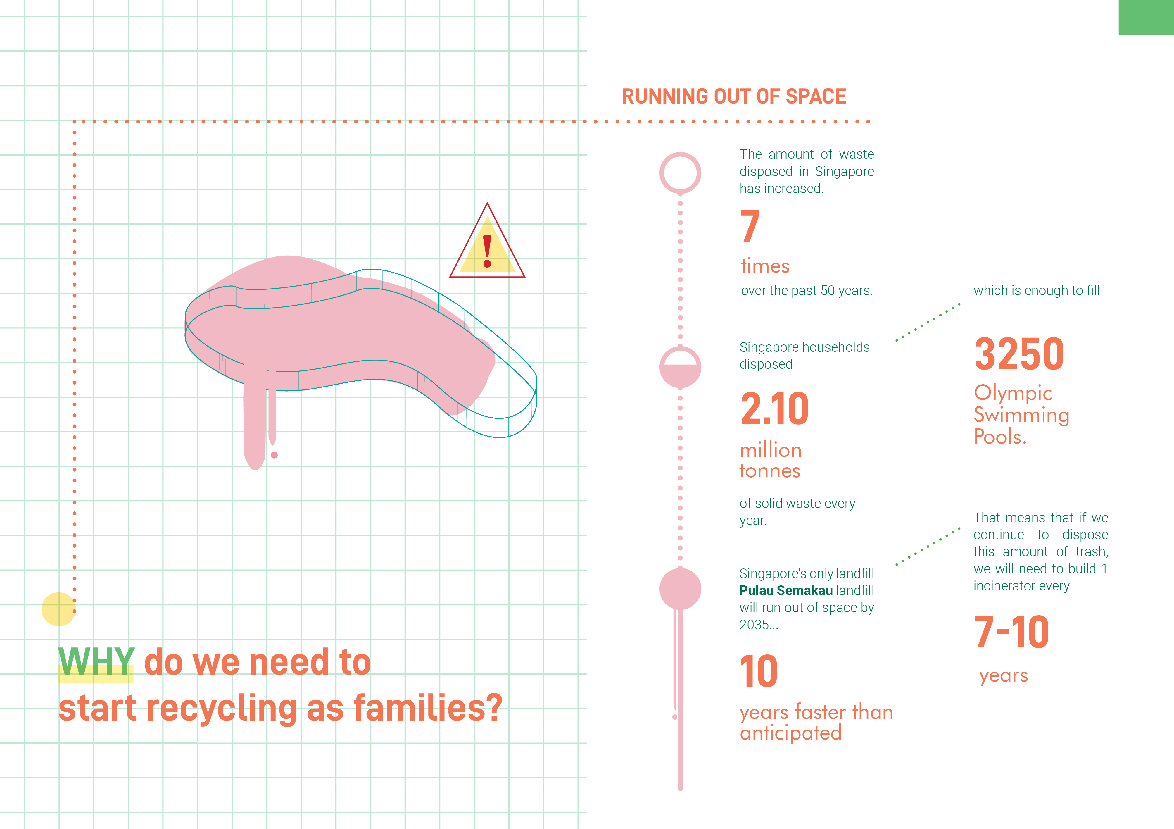
- Why the need for families to start recycling
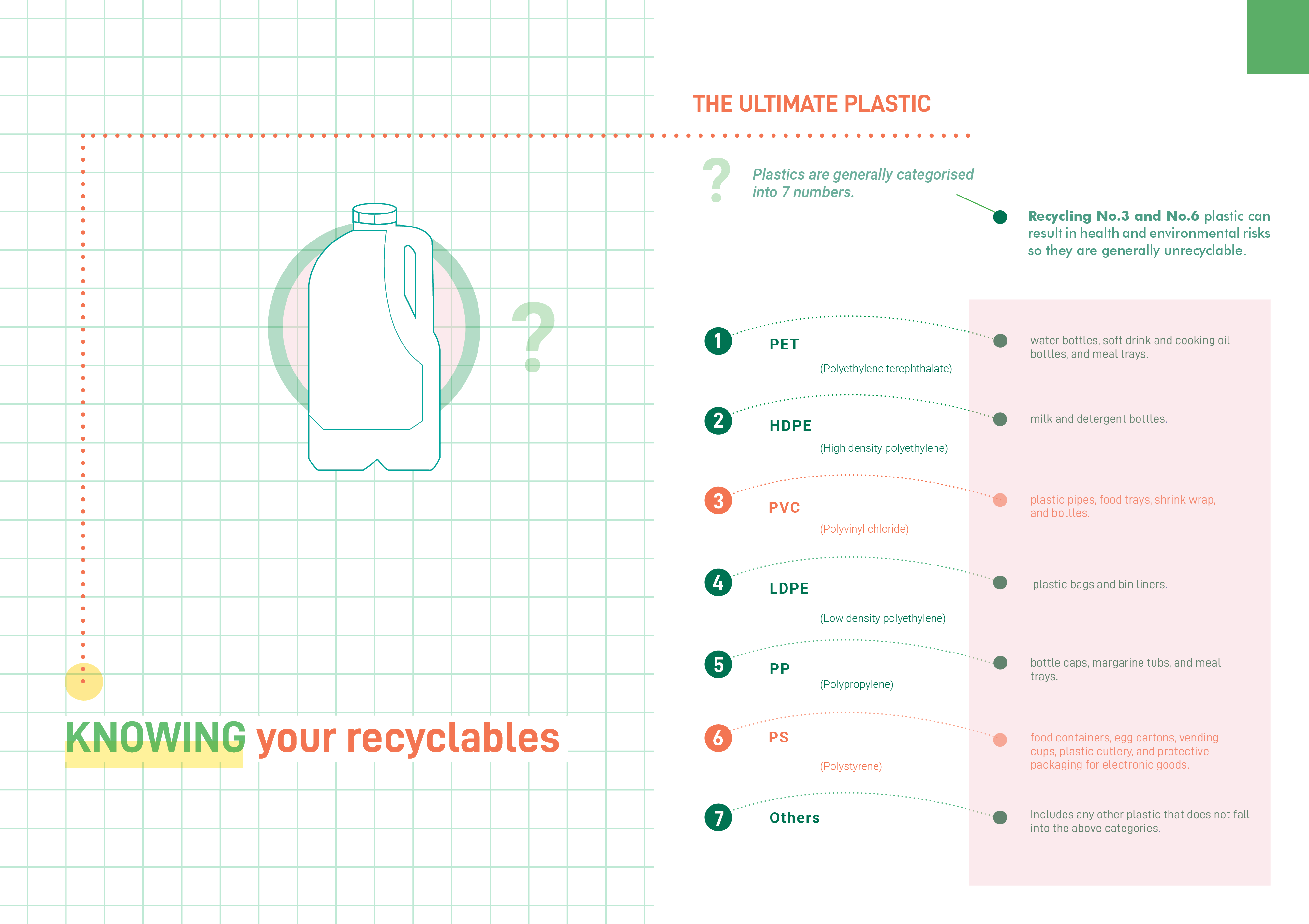
- Classification of plastic types
- What types of paper cannot be recycled
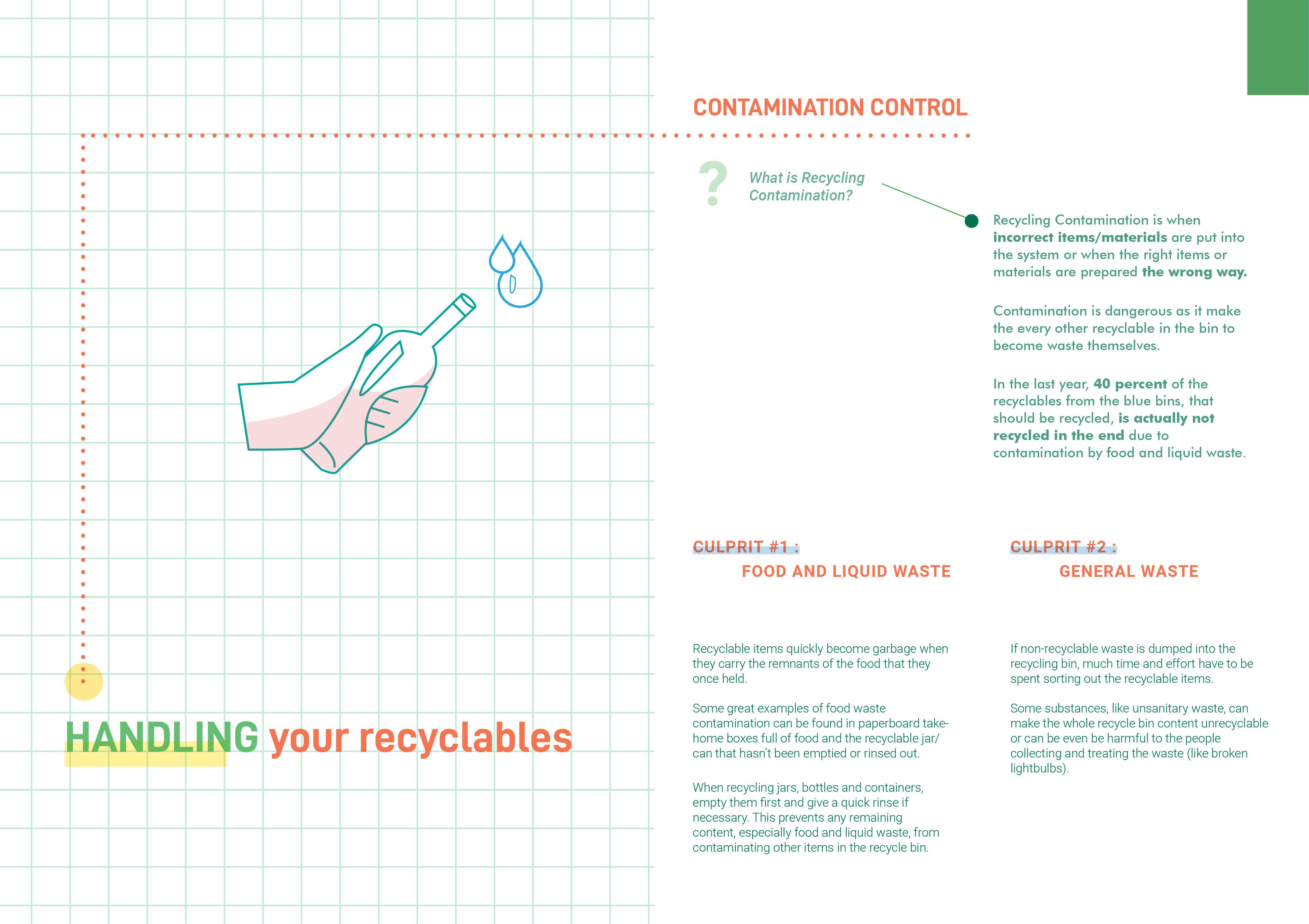
- Contamination of recyclables
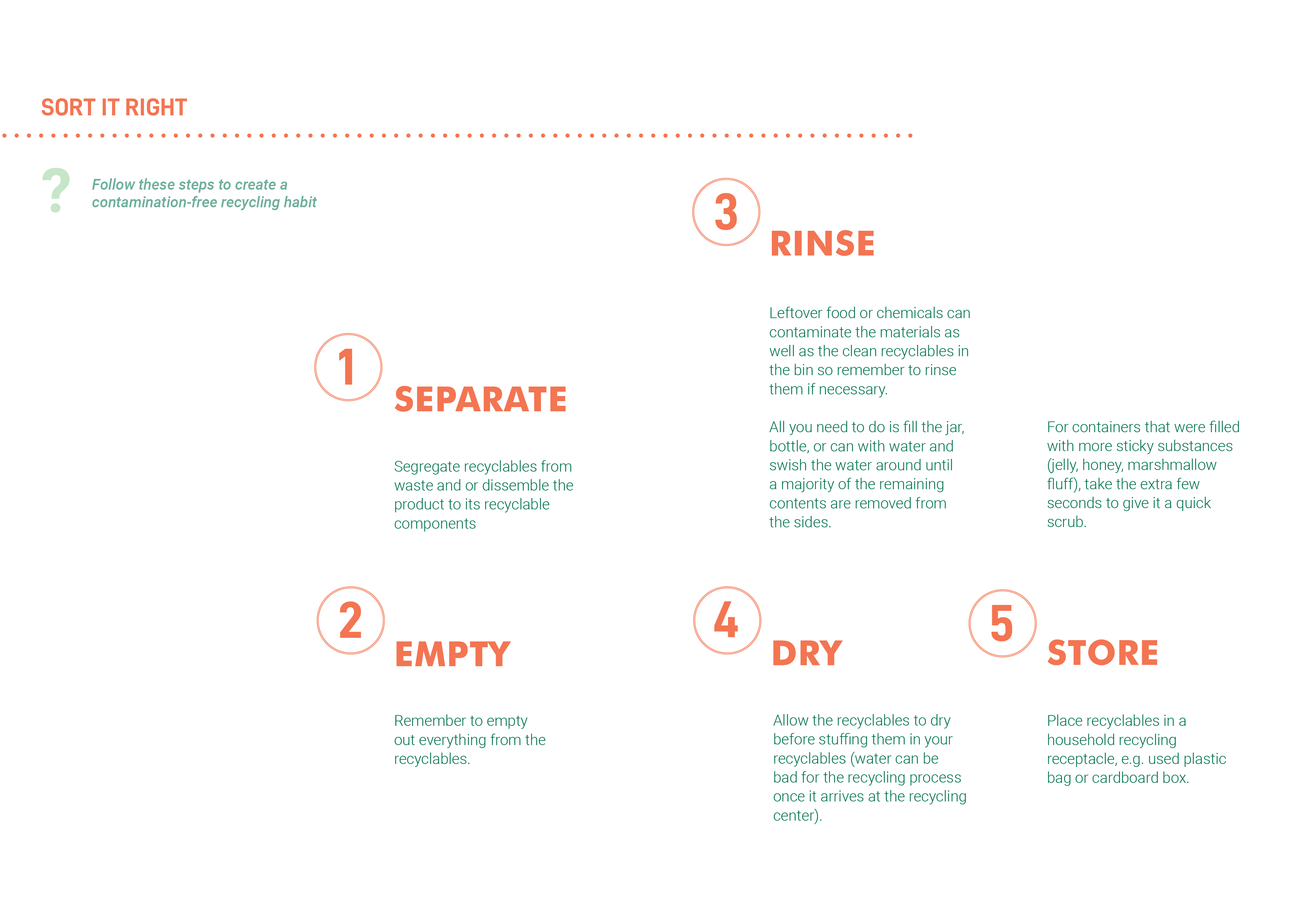
- How to prevent that by Emptying, rinsing and drying your recyclables
- Places to look out for donation
- Articles that have to do with recycling
- for e.g: Tampines eco-digester
However in the end, I decided to leave articles out, as if I intend this to be mailed to the family households monthly with new articles, then the instruction part of the booklet would be redundant after a few issues as it will just get repetitive for no reason. Therefore since my priority is getting the instructions out, I decided to instead make it an issue that gets reprinted only when necessary changes are to be made.
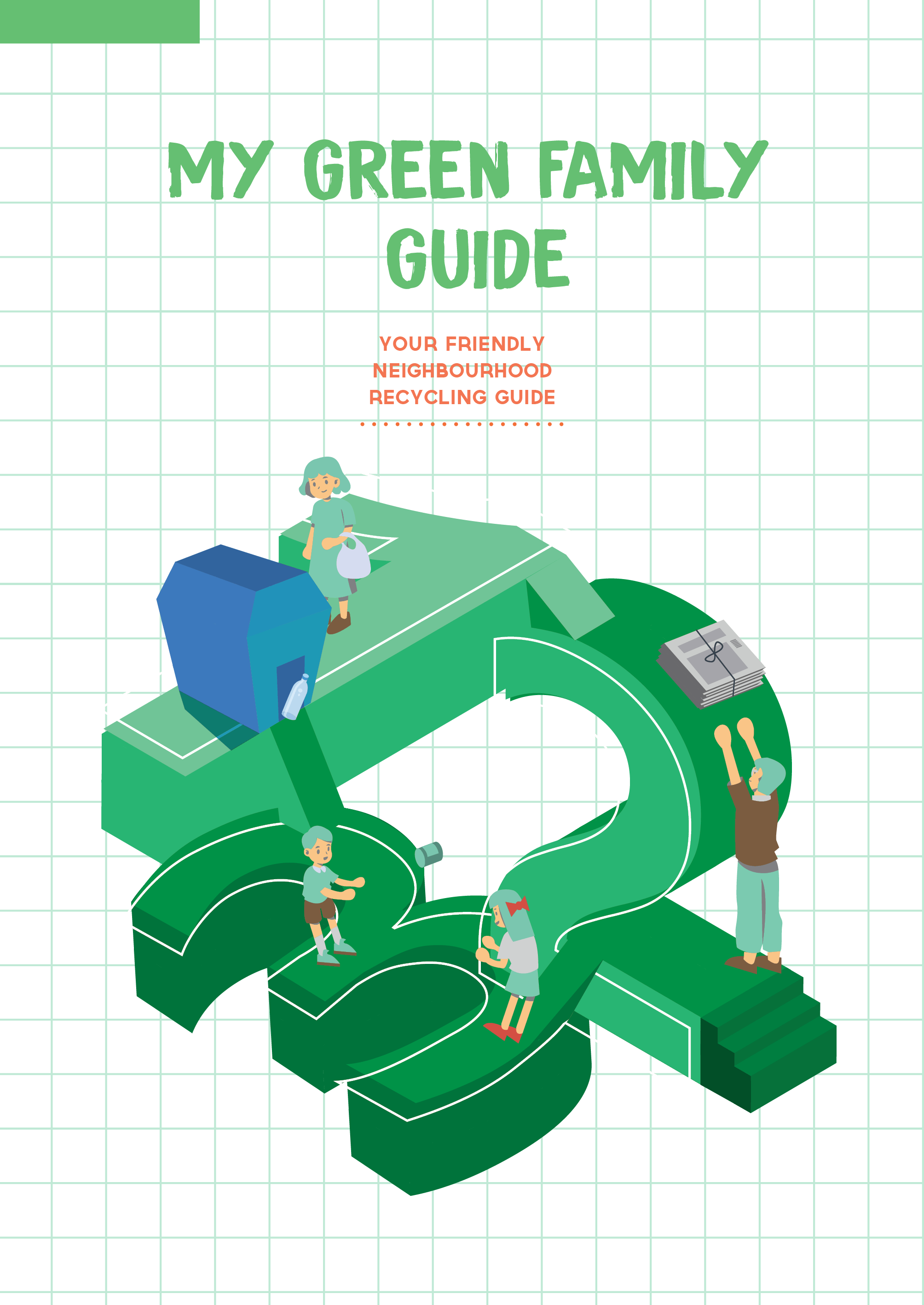
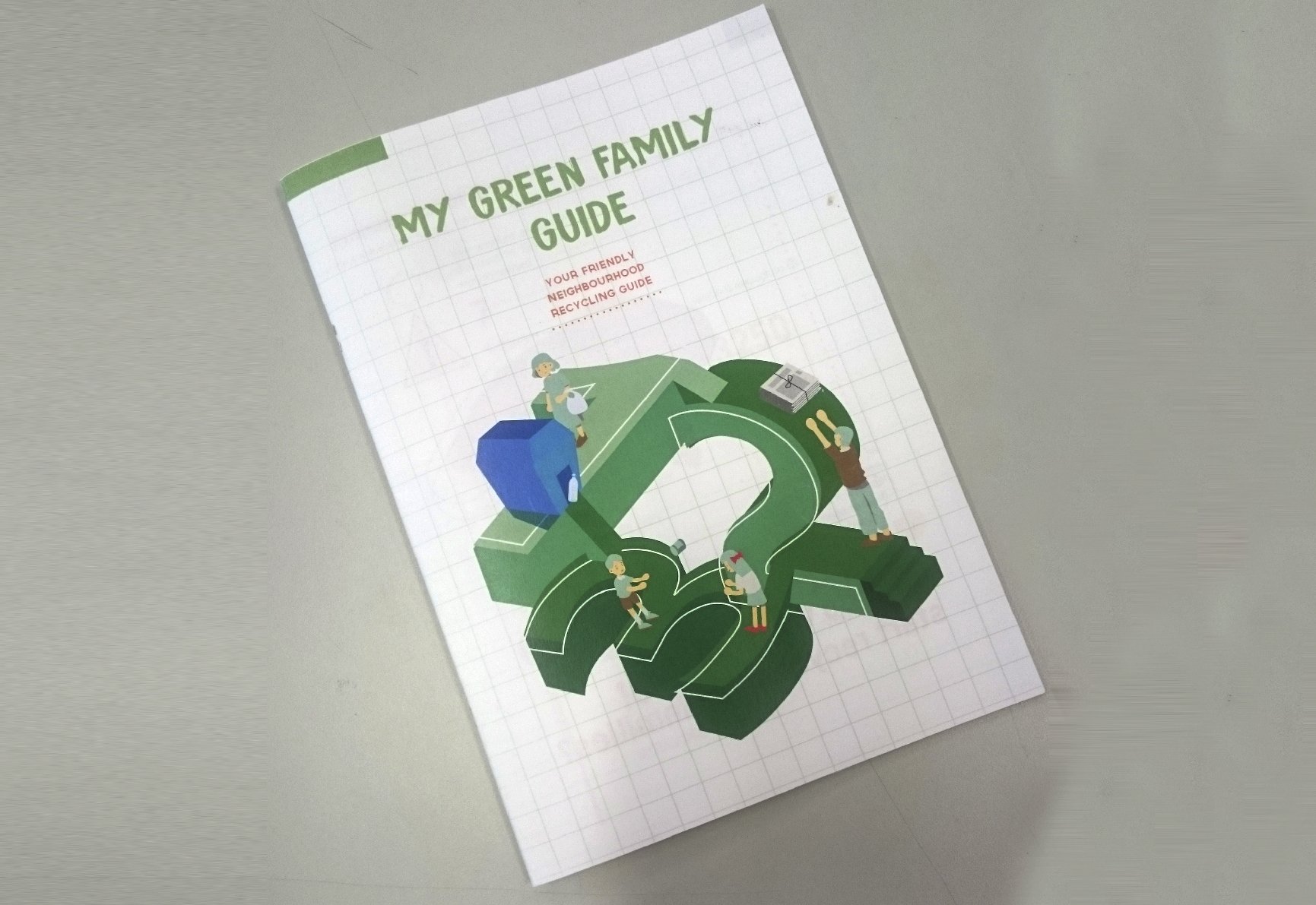
So first off when designing the cover, I was thinking of how I can convey these ideas in one image:
- A guide to recycle right
- Recycling or green living
- Following the right steps when it comes to recycling
- Family
- Habit
So after going through my old pictures, I thought that a project that I have previously mentioned in my first few weeks had the imagery that might work in my favour.

I thought that this imagery was a good way to depict the triangular recycle cycle, at the same time shows a cyclic nature of encouraging recycling as a continuous habit. And I thought that if I replace the platfroms with the numbers 1,2,3 it would reinforce the idea of following the steps in order correctly in order to recycle right. I thought that adding the grids at the background would also suggest that its a literal guide book while providing background structure for the skeleton of the isometric graphic that I intend to make.
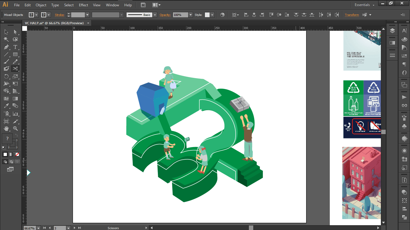
After coming up with the structure, I added the family members doing their parts in recycling different items that can be recycled.
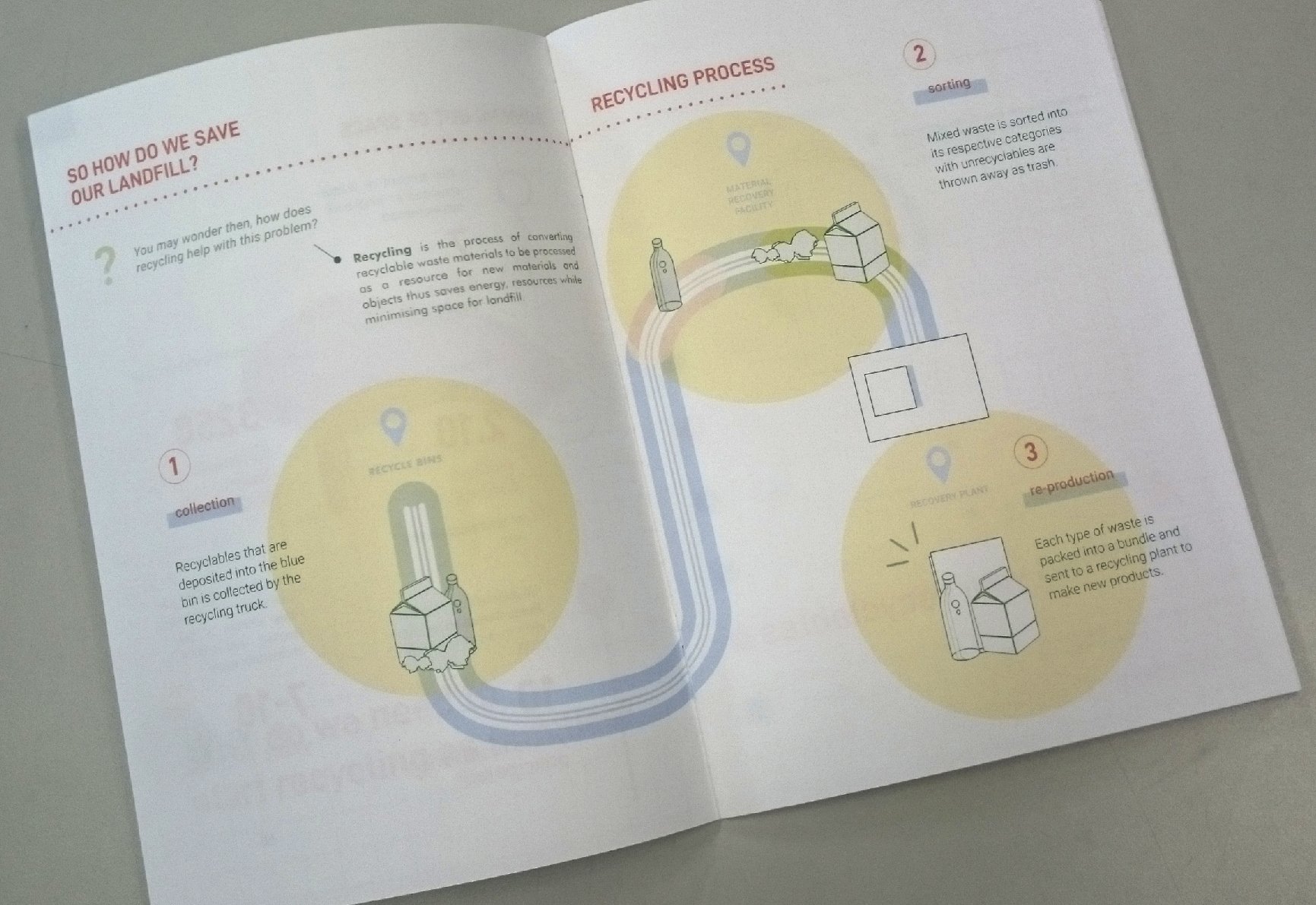
And as for the page inside:
At first I was planning to take a more graphical approach but decided against it as it does not match the cover spread and also I found it hard to fit my text in my graphic centric spread that I drafted.
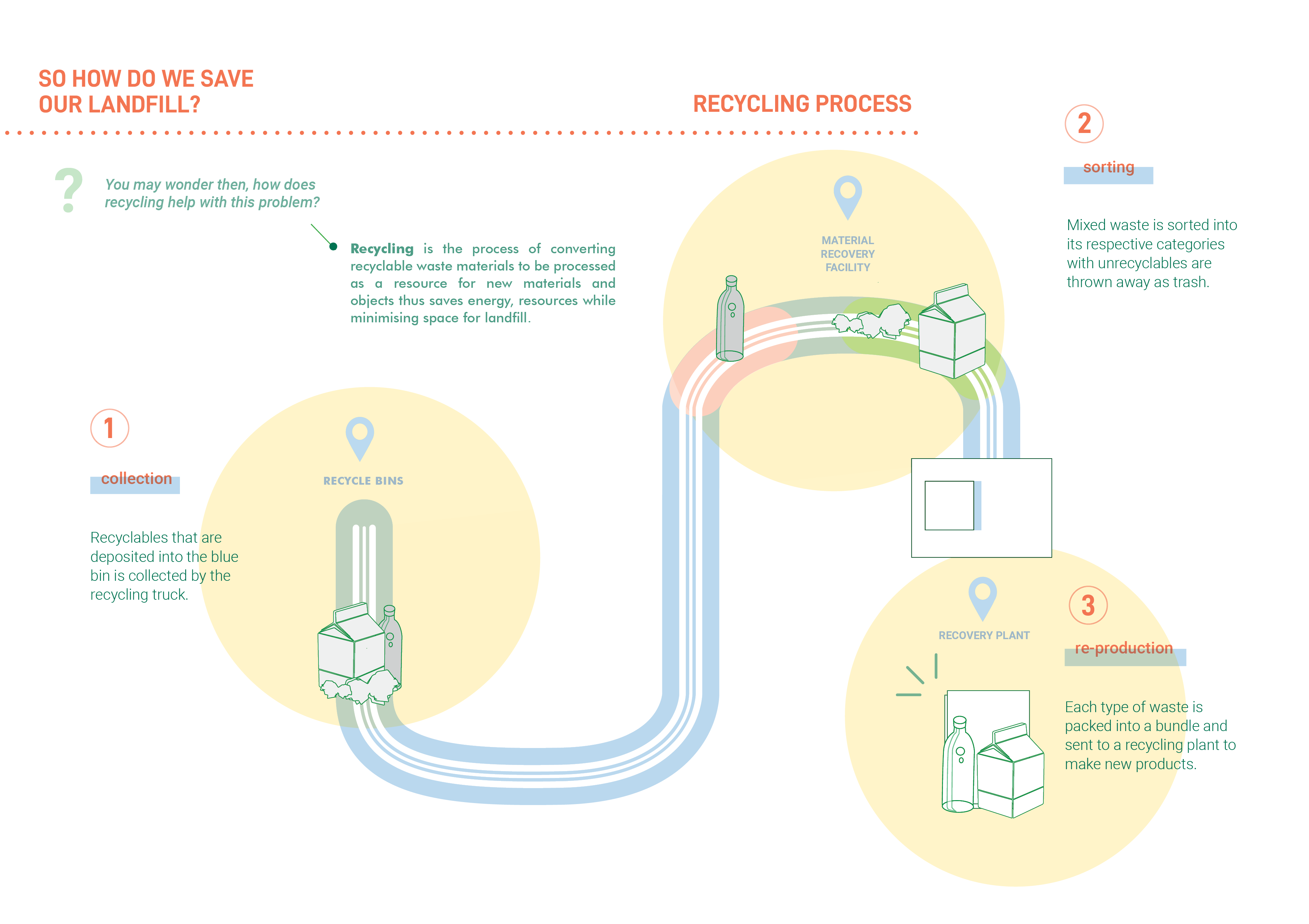
So in the end I just decided to create a much more simple and clean graphics so that the texts can be easily read. To do that I tried to limit the colours that I use to green and orange for text so that it can have a cohesive look.
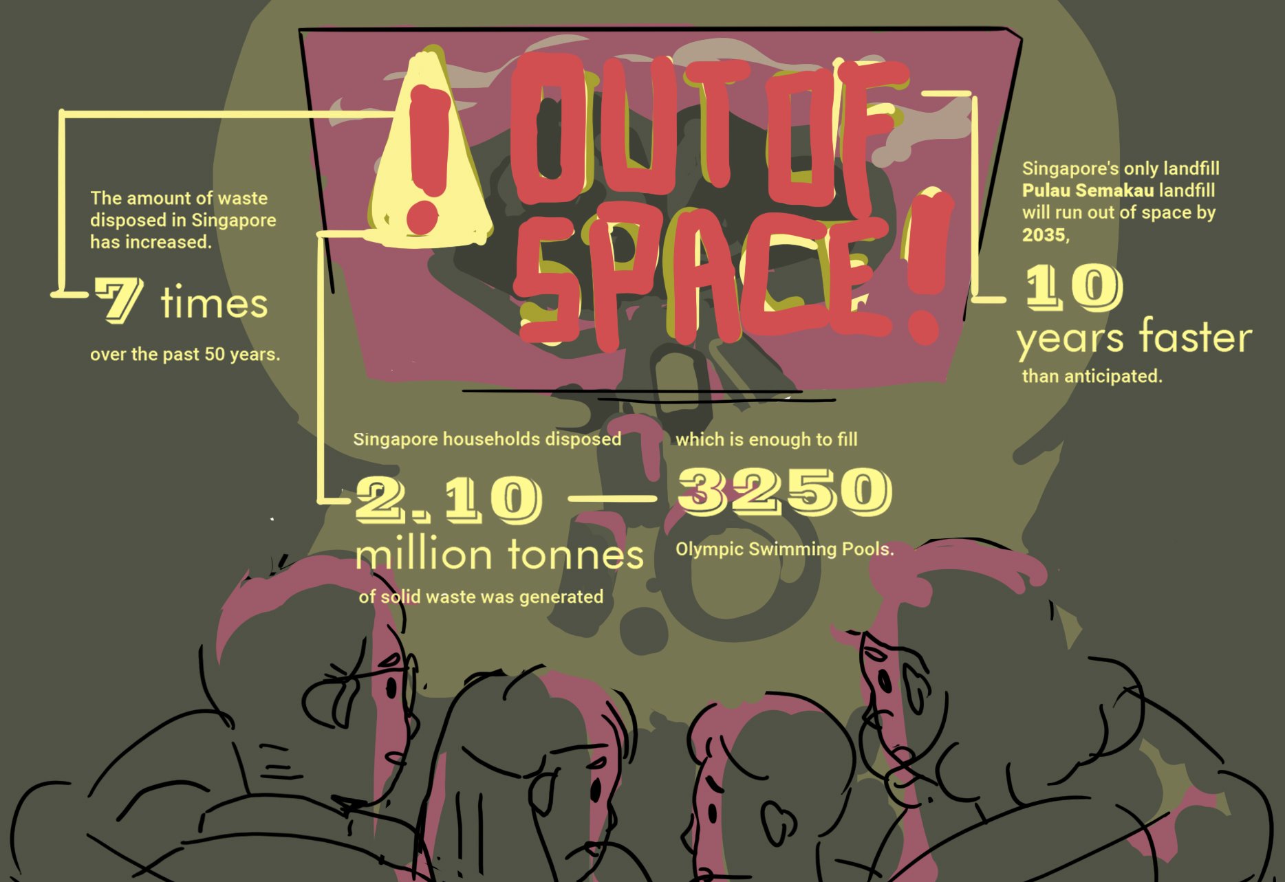
And for the rest of the spreads, I decided to collect the information from websites and compile them accordingly to each section.
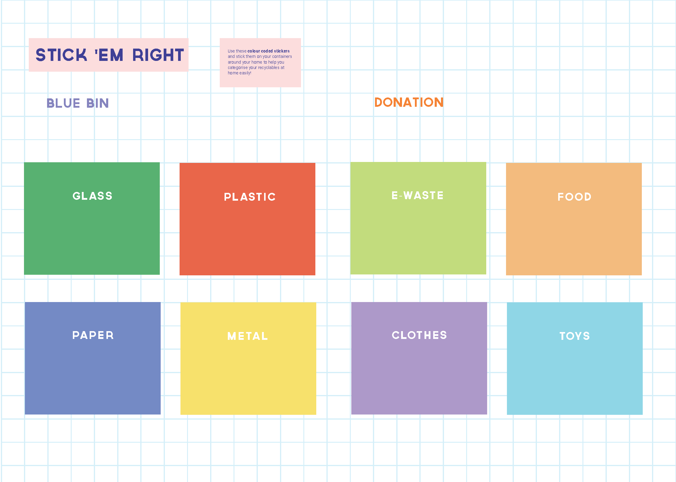
As for the middle page, I decided to insert a sheet of stickers that can help the families to categorise their containers at home.


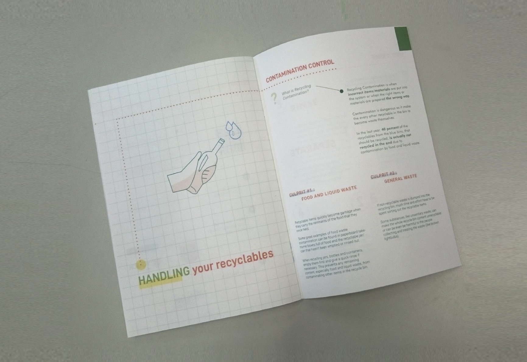
I had a really hard time trying to organise all the information that I have collated from the websites to make them look cohesive as a whole but overall I’m really glad that I managed to make them look like they are part of the same aesthetic! And also learnt a few things about kiss cut stickers and also about the whole recycling process in general so I’m glad I took up this project! :,D