Local
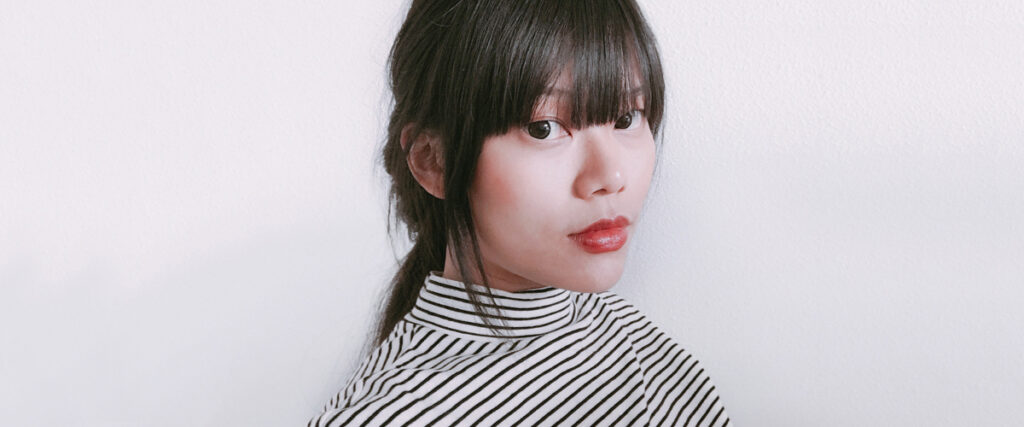
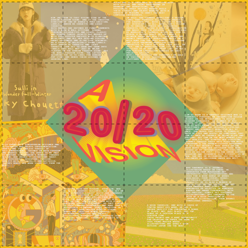
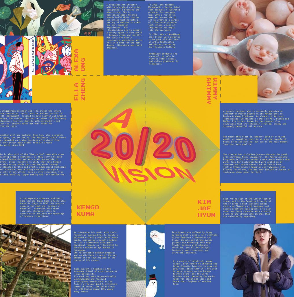
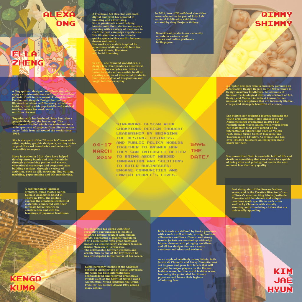
Lim Qi Xuan is a graphic designer who is currently pursuing an Information Design Degree in the Netherlands in Design Academy Eindhoven. An alumnus of National Technological University’s School of Art, Design and Media, Lim is best known for her unusual clay sculptures that are intensely lifelike, creepy and strangely beautiful all at once. She mused that flesh is symbolic both of life and death, as something that can at once be capable of being alive and pulsing, but can in the next moment lose that very quality.
She started her sculpting journey through the youth arts platform, Noise Singapore’s the Apprenticeship Programme in 2013 but recently made waves online when works from her Instagram feed were picked up by international publications such as Vulcan Post, Italian Urban Contest Magazine and Taiwanese site ETtoday. As of now, she has over 100,000 followers on Instagram alone under her belt.
Qimmy Shimmy (PRODUCT)
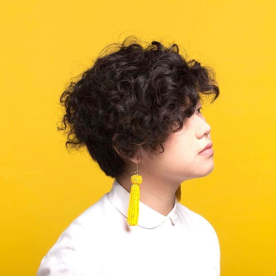
Ella Zheng (GRAPHIC)
Ella Zheng is a Singaporean designer and illustrator who enjoys experimentation, craft, and the endless pursuit of self-improvement. Trained in both Fashion and Graphic Design, her unique illustrations about self-discovery, adventure, fashion, duality with psychedelic and satirical touches makes her work stand out from the rest.
Together with her husband, Ryan Len, also a graphic designer, she has set up “The Workbench Studio” which has embarked on a wide spectrum of projects from clients across many fields from all around the world since 2014.
She is also part of the “How to Ink” team with other aspiring graphic designers, as they strive to push forward boundaries and make craft accessible to anyone. Since inception in 2014, they have helped develop strong bonds and creative minds through printmaking parties and events, educational workshops and corporate team building sessions, through a variety of activities, such as silk screening, lino cutting, marbling, paper making and ink transferring.
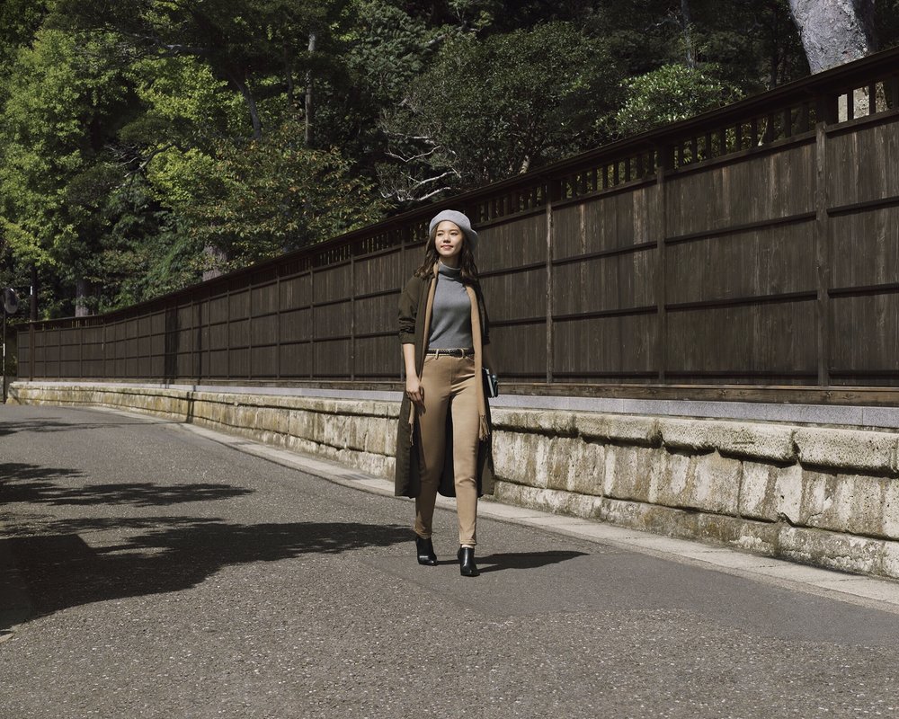
Alexa Ong (GRAPHIC)
Alexa Ong is a Freelance Art Director with both digital and print background in branding and advertising. She is passionate about helping brands build their stories and enjoys working with a variety of mediums to craft the best campaign experiences. Her illustrations aim to reveal a quirky space in this world – between dream and reality. Her works are mainly inspired by adventures while on a wild hunt for the best donuts, literature and lucid dreaming.
In 2013, she founded Wood&Lead, a design label that produces illustrated products for everyday use, with a vision to make art accessible to all by creating a series of illustrated products that infuse a dose of imagination and magic into the everyday.
In 2014, two of Wood&Lead zine titles were selected to be part of Print Lab: an Art & Publication exhibition curated by Grey Projects Gallery.
Wood&Lead products are currently on sale in various retail spaces and online platforms in Singapore.
International

Kim Jae Hyun (FASHION)
Kim Jae-Hyun is fast rising star of the Korean fashion scene, and is the Creative Director of two of Korea’s most exciting labels, Jardin de Chouette with handmade and unique creations made specific to each order and Lucky Chouette with visually stunning and stimulating clothes that are universally appealing.
Both brands are defined by funky garments with a rock n roll attitude, strong feminine silhouettes and lines. Classic and strong tuxedo jackets are mashed-up with edgy hipster dresses with plunging necklines, and all her designs feature a smart sassiness and ultra-cool sexiness. As a couple of relatively young labels, both Jardin de Chouette and Lucky Chouette look set to grow and grow into labels that will not just be major players on the Korean fashion scene, but the world fashion scene, becoming the go-to label for Korean pop-stars and hence their legions of adoring fans.
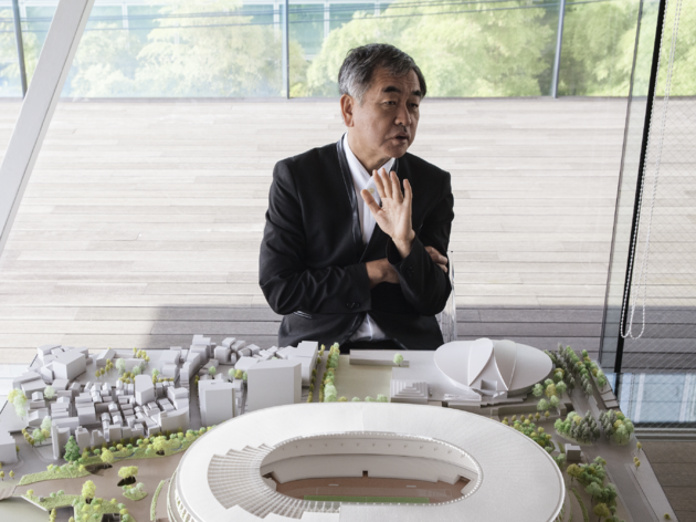
Kengo Kuma (ENVIRONMENT)
Kengo Kuma is one of the most significant contemporary Japanese architects. Born in Yokohama in 1954, Kuma studied at Tokyo University and in 1990 Kengo Kuma & Associates, based in Tokyo.
His poetics express the emotional content of materials, connected with their intrinsic characteristics in construction and with the teachings of Japanese traditions. He integrates his works with their respective surroundings to create a balanced natural product with human hands, expressing a graphic module in 2 or 3 dimensions with great emotional impact, as illustrated by Yusuhara Wooden Bridge Museum in Tarougawa.
The relationship between graphics and architecture is one of the key themes he has investigated in the course of his career.
Kuma currently teaches at the Graduate School of Architecture of Tokyo University.
His work has been internationally acknowledged and received prestigious awards such as the Spirit of Nature Wood Architecture Award (Finland), the Grand Prize for JCD Design Award 1995 among many others.

