Project 2 – Locale (Research, Process & Final)

RESEARCH

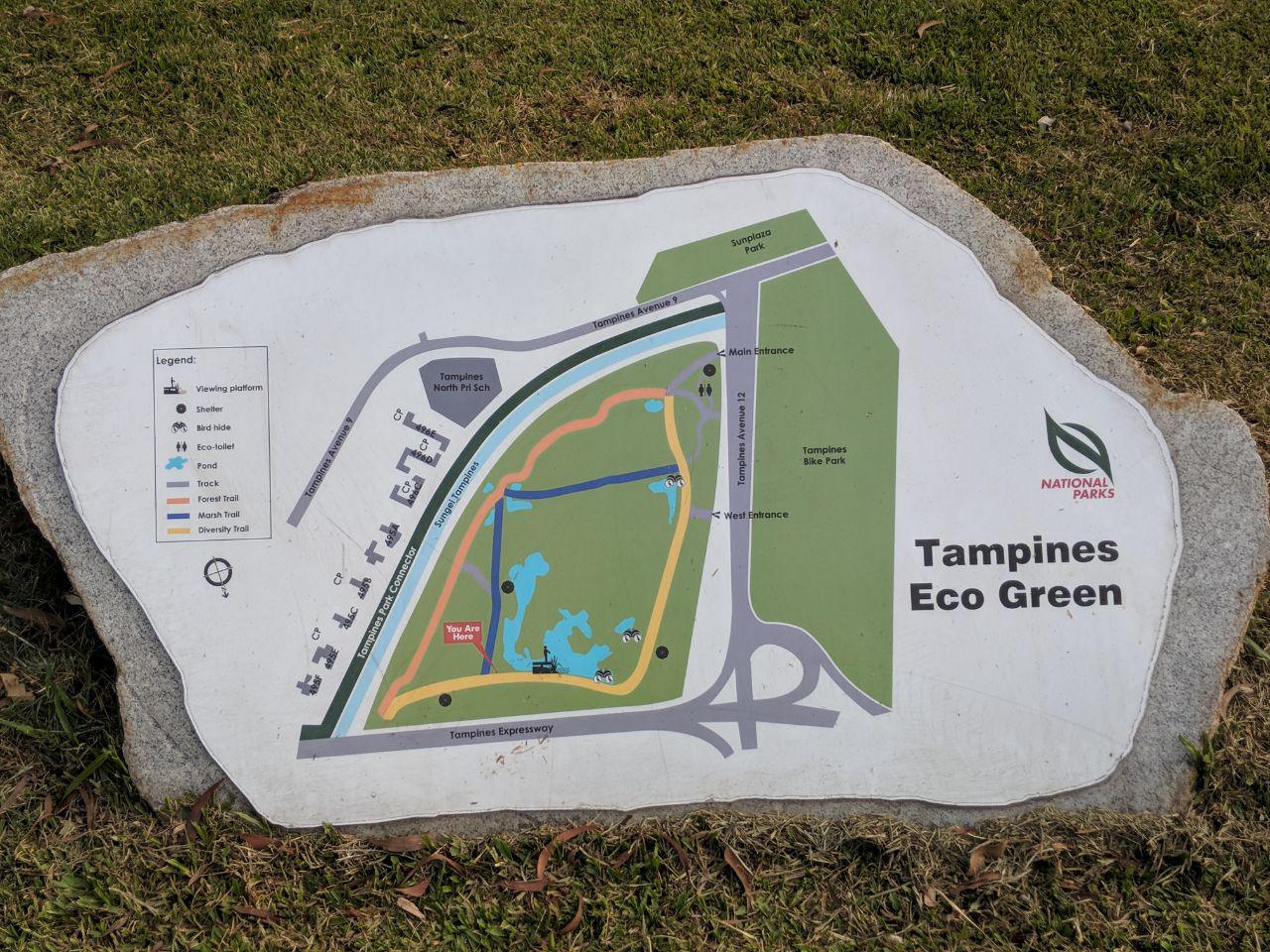
Initially intending to research on Little Guilin, my studies of untouched parks led me to a rare find: Tampines Eco Green, a unique nature spot.

Here is my experience of studying TEG, compiled into one video:

The video is accompanied by the following text:

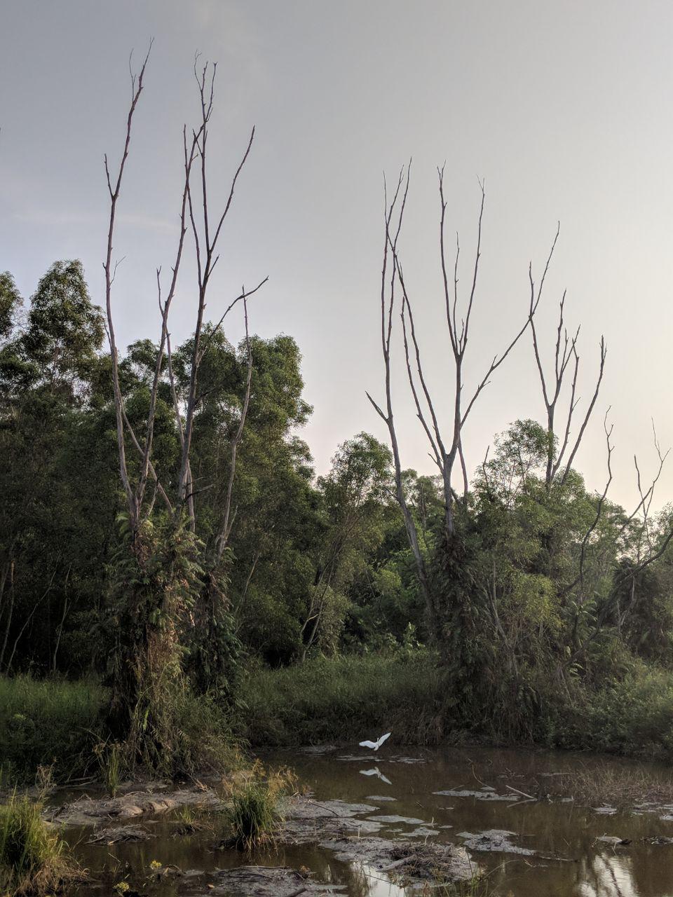
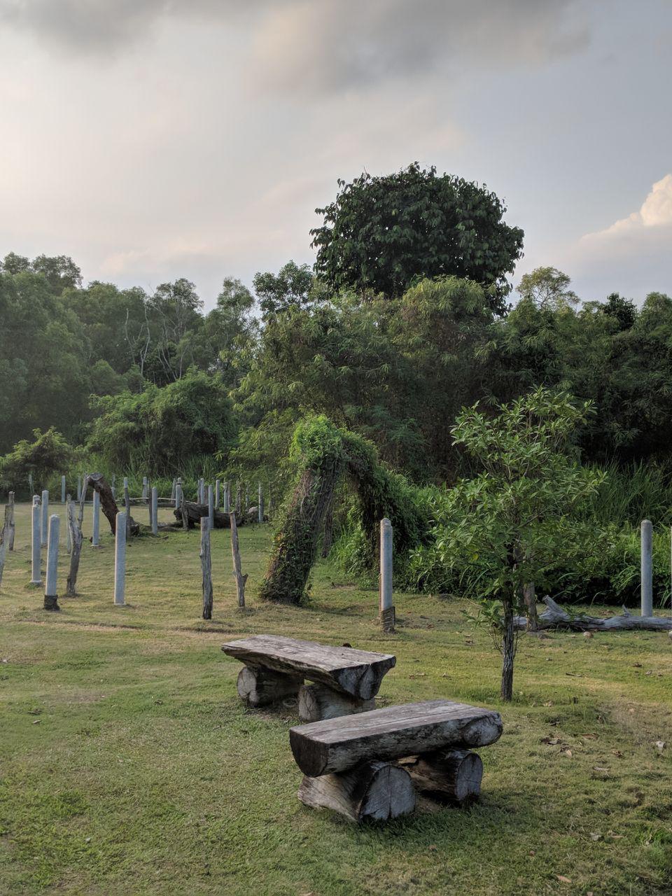
From the outside, TEG looks like any old forest, nothing like a park. No large signs, no gimmicks, just a pathway in hidden at the end of a canal, with a warning – no smoking.

When you enter, it’s flat grassland, no concrete pathways, shaded by large evergreen trees. Actually, all you see is green, there aren’t bright, colourful flowers, only wild tiny ones.

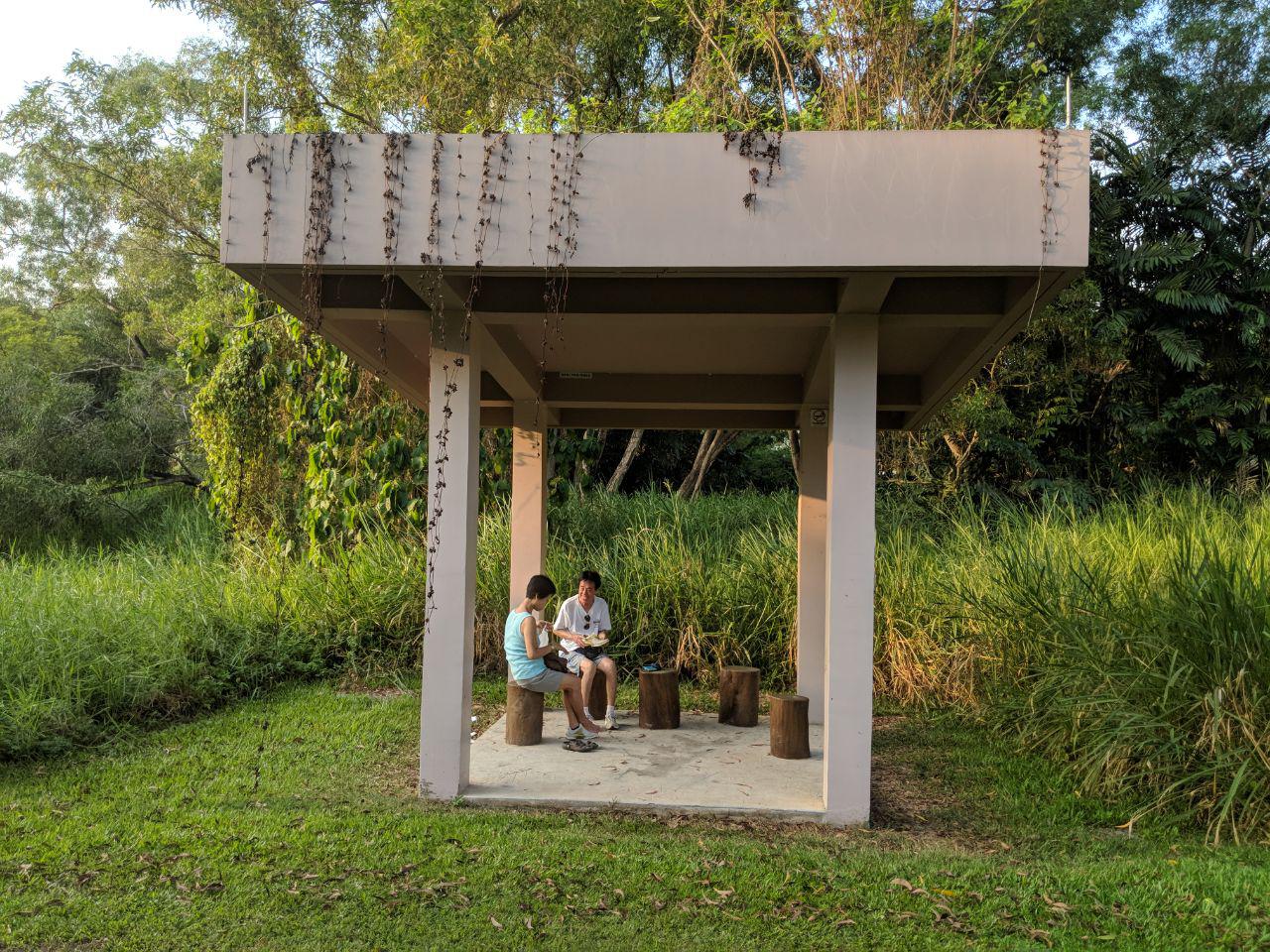
Then you spot a few unusual seats. They are made solely from tree stumps and parts. So are the signs. The bird hide is made from recycled tree parts too.

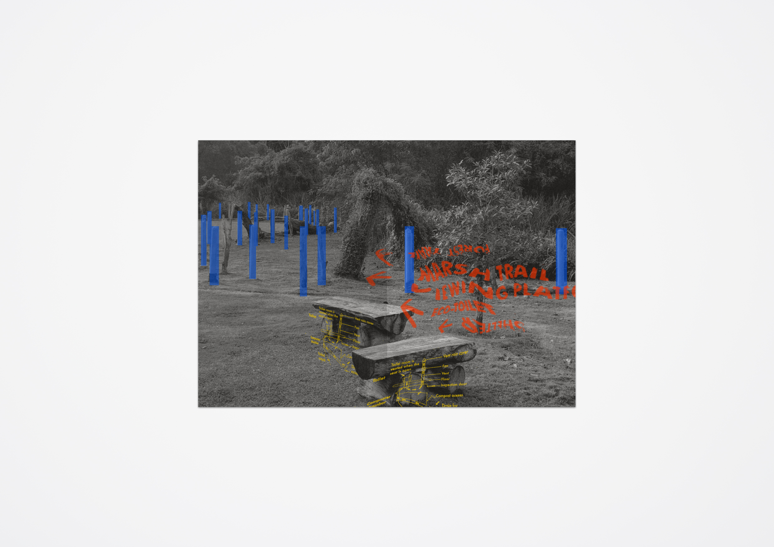
Further in, there is an eco toilet with a green roof. The only one in the park, that runs on a waterless disposal system. Combined with wood shavings, waste is broken down into compost underground.

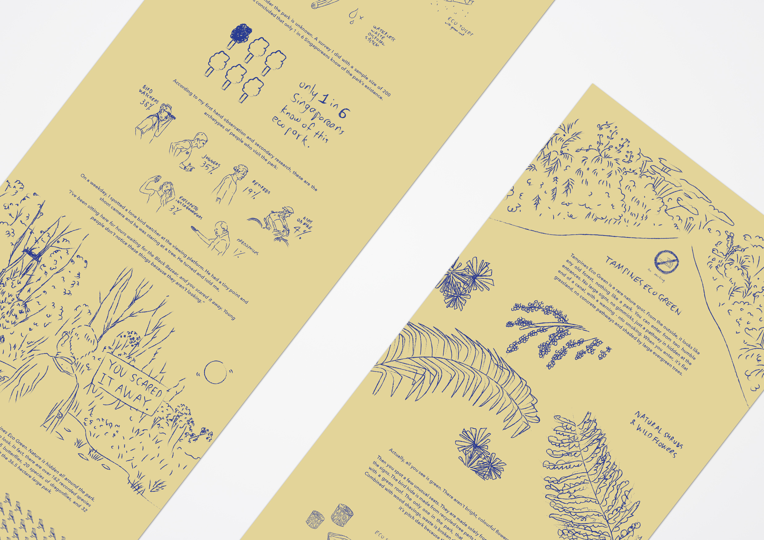
At night, it’s pitch dark because there are no street lamps. It’s no wonder the park is unknown. A survey I did with a sample size of 200 locals concluded that only 1 in 6 Singaporeans know of the park’s existence.

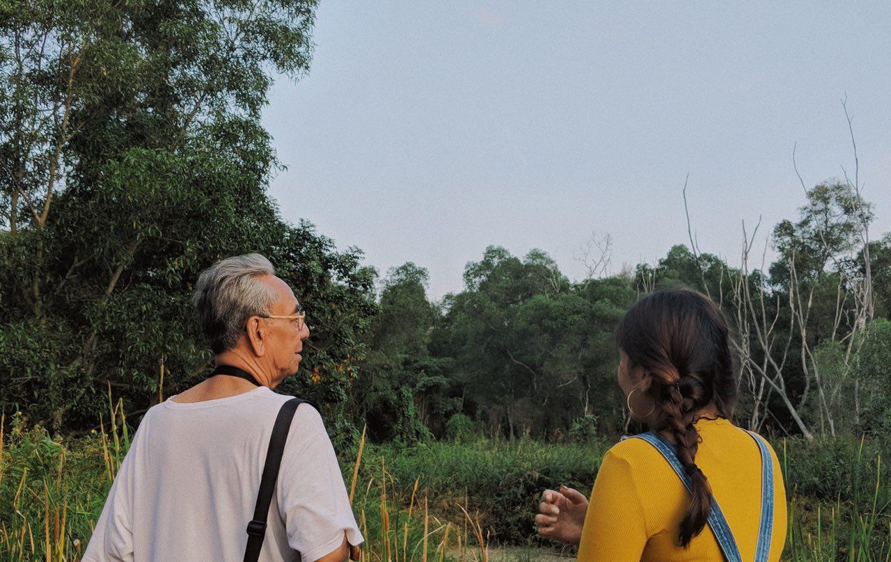
According to my first hand observation and secondary research, these are the archetypes of people who visit the park: 38% of the visitors are birdwatchers. 35% are red faced, ex army men jogging through, trying to keep in shape. 19% of them are neighbourhood retirees who finally have the time but not the energy to stroll. 4% are kids whizzing through on oBikes and 3% are exploreSG Instagram photographers. So we’re left with 1%. That’s for the old man I read about in the news who offered a secondary school boy $2 to follow him into the park so he could do dirty things to him.

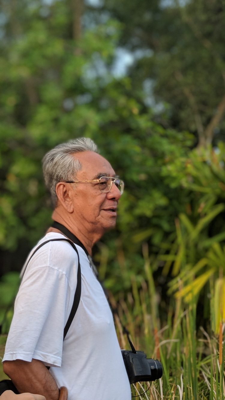
On a weekday, I spotted a lone bird watcher at the viewing platform. He had a tiny point and shoot camera and he was staring at a tree. He turned and told me, “I’ve been sitting here for hours waiting for the Black Bazaar, and you scared it away. Young people don’t notice these things because they aren’t looking.”

Me interviewing Vernon Alex, 70, bird watcher

And that’s what’s so special about Tampines Eco Green. Nature is hidden all around the park. You only see it if you are patient enough to look.

In fact, there are over 162 recorded species of birds and insects. 75 species of birds, 35 butterflies, 20 species of dragonflies, and 32 species of spiders that inhabit the 36.5 hectare large park.

I created an infographic to illustrate my research as well:

My infographic and video is an attempt to recreate the experience of visiting Tampines eco green. I chose an earthy greenish colour for the background to look like eco friendly recycled paper and a striking blue for the sketchy graphics to stand out from the dull background. The blue also represents the hidden gems in the park and what I discovered from visiting it. I chose to use sketchy drawings so it would look like a journal of somebody scribbling down their little observations. The outcome is something quite raw, just like the outlook of the park. I used sound effects to recreate the sounds I heard, like the rustling of the bushes and the flap of birds wings even though I couldn’t really see where the sound was coming from.

All in all, it was a really fun exploring this side of Singapore and learning what it had to offer, even if it were the little things that made it unique.

PROCESS

For my zine, I intended it to be a personal experience of the place through primary and secondary research.

I wanted to have a slightly sinister and ironic feel to my zine to show the dark side of Tampines Eco Green.

Here are some pictures I took that were used in my zine:


First Draft: Extracting and thresholding images from the park

I used red, blue and yellow as primary colours on a cream background. Three colours represents three different sides to the park I wanted to show.

Front & back: I turned both the map and the logo of TEG in three directions to use for my front and back cover.

Feedback: Front is too messy, can’t make out what it is.

Page 2-3: Abstraction of warning signages and wildlife, trail manners and rebellion.

Feedback: Signs too much like a pattern, try integrating into the forest.

Page 4-5: Abstraction of toilet signs and eco aspects of the park such as toilet, bird hide and chairs. (Location where paedophile molested boy)

Feedback: Arrows from from diagram are distracting because of directions, and too much text, extract more.

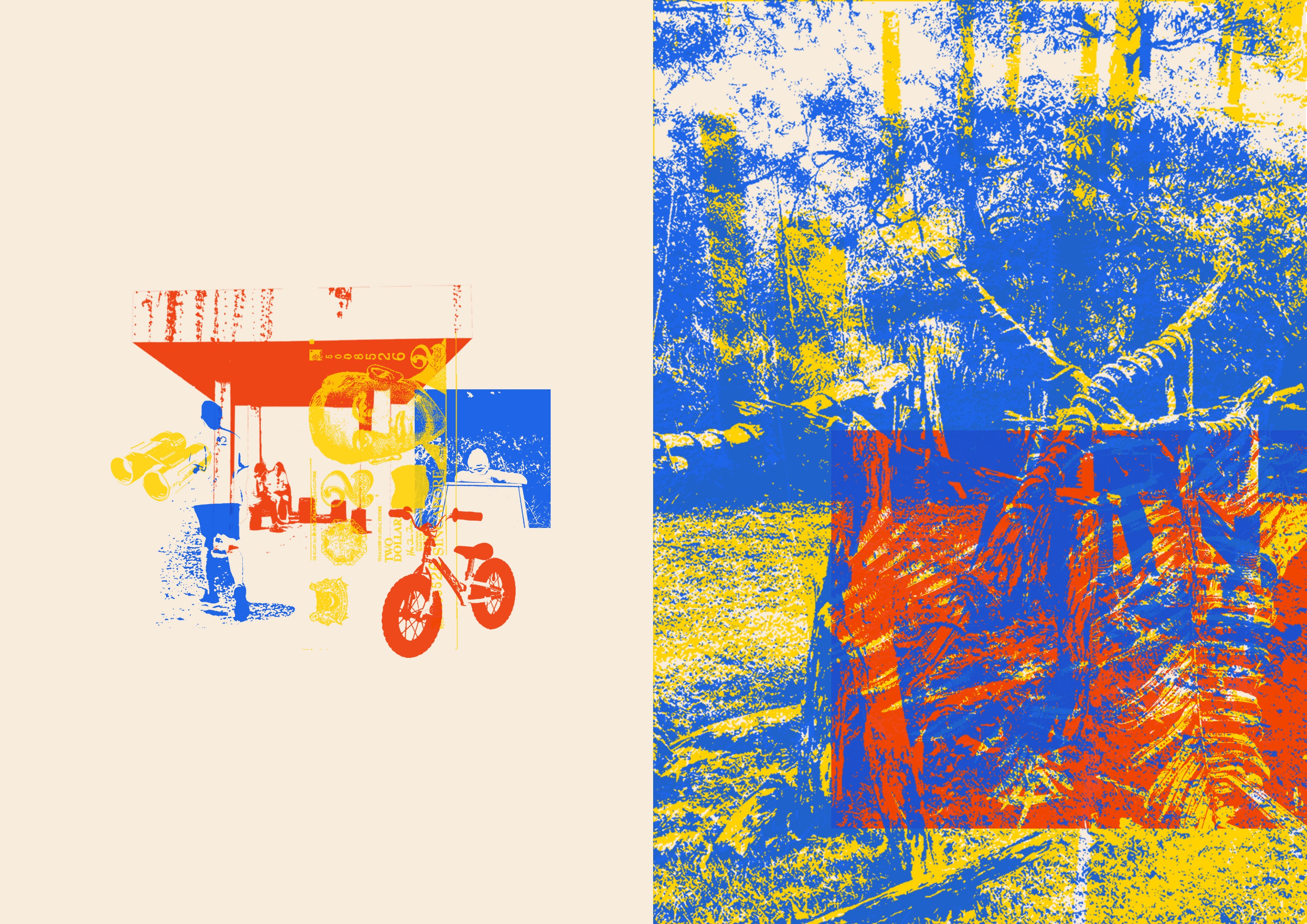
Page 6-7: People visiting the park and what they do there, impact of man on nature.

Feedback: Too much space on left, too little on right, right too cluttered.

After revisions, this is what I came up with:

FINAL

Final zine
Front and back cover

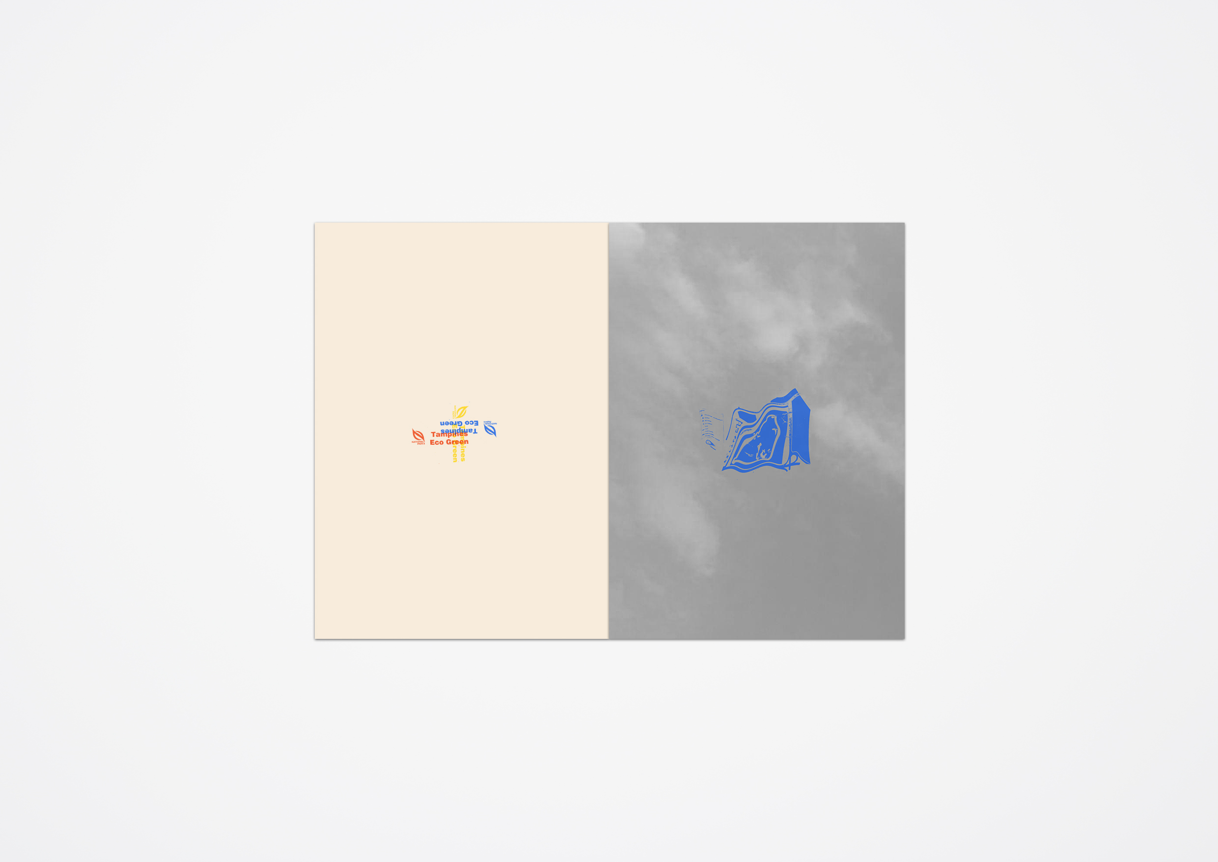
Left: Image of looming sky of TEG to foreshadow a dark theme. The blue map of the park is also warped.

Right: End page of TEG signs inside out in three colours to show three aspects of the park that we explore in the zine

Page 2-3

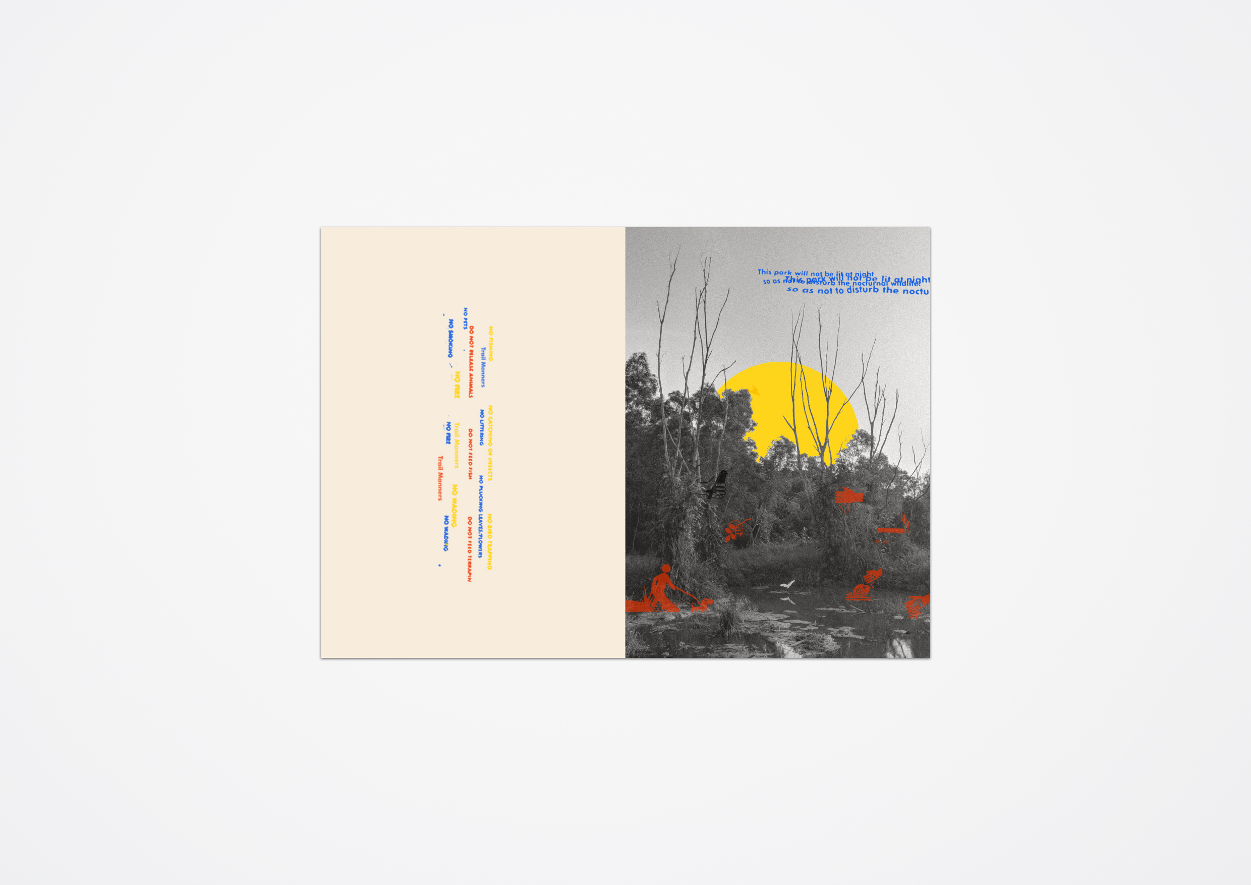
Left: Multicoloured warning signages of don’ts: ‘No smoking’, ‘No feeding animals’ etc. on linear path emulating the path in park

Right: B&W image of park and blue words to inform public of the park not being lit at night. Filled in yellow sunset to signal night approaching. Extraction of signages in red acting as people performing rebellious acts in the pond, doing everything the signs said they shouldn’t.

Page 4-5

Full page spread: Eco benches, red text and arrows directing the eye to eco-toilet. System drawing of yellow toilet represented through the bench. Man made structures are blue to signal man’s stark impact on the park. Leads in to story on next page.

Page 6-7

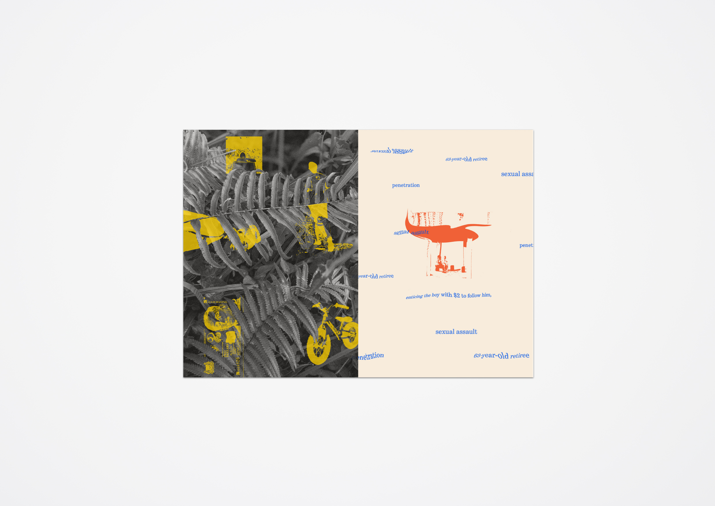
Left: B&W photo of leaves with extracted elements of visitors in yellow hidden in the leaves to represent the sparsity of visitors: $2 note represents paedophile who molested boy, bicycle for the kids that ride through, thresholded bird watcher I interviewed, jogger and Instagram girl.

Right: Constructed shelter in red with elderly under, separate from the raw untouched nature on the left, blue words of the sexual assault ringing around them like a stain, tainting the park.


Gallery – Melo’s Sem 2

1 Jobs I would never have by Melodie Edith James is a self exploration of flaws and the portrayal of personal anecdotes through 4 panels of vector illustrations that have hidden letterforms.


2 Tampines Eco Green by Melodie Edith James is an experiential take on the unique nature spot of TEG through a series of infographics, a video and 8 page zine.

Infographic for Tampines Eco Green

TEG Zine – Back and Front
Page 1-2
Page 3-4
Page 5-6

Project 1 – Imaging Making (Research, Process & Final)

RESEARCH

I started out this project with isometric vectors in mind. It was a style I hadn’t explored before and the idea of hiding text within isometrics appealed to me.

I looked at some modern isometric vector graphics from pinterest. Here is one I found that used the shapes of objects to create a block-like letterform.


I also looked at Ryo Takemasa’s vector illustrations of landscapes. I enjoyed the texture and colours he used and how his shapes interacted with each other. He also adds a rough, sandy texture to his vectors to give a muted and stamped effect which I really liked. There is also lot of negative space and the use of visual hierarchy in his illustrations.

PROCESS

My concept was to choose 4 jobs I would be really bad at and represent them with the objects that the job concerns.

· Scientist

· Lost-and-found receptionist

· Housewife

· Gym trainer


1 Scientist

I chose scientist because I suck at science. I think its horribly difficult to remember the terms for internal bodily processes and how everything works. I have the tendency to ask strange and illogical questions too, to the point my father calls me ‘scientist’ ironically.

Following my first artist reference, I did a draft by creating an obvious letter D shaped as a microscope with bacteria like vectors surrounding it but I didn’t like how the letterform dominated the image.

Joy suggested I could incorporate the letterforms more into the bacteria and let it interact with the central object, like how Ryo did his with landscapes. I chose to bacteria to show my letter9forms because of its negative connotations and how the organic shapes of the bacteria can morph to create the letters of my name: MELODIE.

The microscope is the main D, with o in the eyepiece and E in the magnifying lenses. The bacteria seeping out of it is M and all around it are the other letters like e, O and L are repeated in the bacteria around it. This is my process:


2  Lost-and-found receptionist

I am a loser because I lose things like crazy. I’ve lost quite a few items ever since entering ADM: Freshmen Orientation hoodie, AJAYS-five earpiece, matriculation card, NETS card & hard drive with all my work in it (update: i found it!!).  Being a lost and found receptionist would be the last job I choose because I’d probably lose the found items too. 

To illustrate this idea, I decided to incorporate the letter forms in the items that I’ve lost, with an empty lost-and-found tray as the central object. It would act as a letter D in the center, while the other letterforms would be around it in the lost items.

At first, I used a coloured-scheme to represent the objects, but later on, I realised a monochromatic red scheme would emphasise the seriousness of my lost items, especially with striking red.

I used the earpiece control buttons to show the letter ‘O’ since the natural button shape is already an O. Letter ‘M’ is represented in the usb sign, ‘e’ is in the tangle of the hoodie drawstrings, ‘L’ is in the implied lines of the earpiece on the bottom right and ‘i’ is in the earpiece on the left side of the image.


3 Housewife

Housewives have a certain set of skills to do their mini jobs like cleaning the house, making sure the chicken isn’t rotten, watering the cactus just right, and not overspending. In my illustration, I represent everything going wrong for this housewife. 

I chose blueish green as the background to emulate the dishwashing detergent-like hygienic colour. In the first image you can see the grid I used to keep the coloured object in isometric perspective.

The red vacuum cleaner spells ‘m’ with the curve of its tube and ‘d’ with its wheel and body. The letterforms can be see in the elements surrounding the vacuum: ‘E’ in the drips from the rotting meat and ‘L’ in the flies emerging from it, ‘o’ in the symbol on the dollar symbol.


4 Gym trainer

I have a $157/month membership with Fitness First gyms and it’s practically wasting away. I barely have the time to go and when I do, my gym bud and I will either get distracted by the shopping in the mall or spend more time in their pool and sauna facility. The only machine we use is the treadmill because we don’t do weights. Most of the time, we get frozen yogurt after our gym sessions and put back the calories we burned. 

I chose a yellow background with bright colours around to give a summery look because we began our membership in the summer break when we were free. The central object is a treadmill and the letterforms are also in the luxury items surrounding it.

My central object spells a ‘D’ with the belt of the treadmill. The treadmill handles and display also form a letter ‘E’ with its natural structure. On top, the shopping bags imply a letter ‘M’ with 3 bags and the curve of their handles. The strawberry is dripping with the letter ‘E’ and the yogurt tubs spell ‘O’. Lastly, the lines on the swimming pool spell out the letter ‘L’.


Overall, I really enjoyed working with isometric vectors for this project and stepping out of my comfort zone. From Joy and my classmates’ comments (thanks fr all of them), what they enjoyed were the stories behind the illustrations but I could do better in making the letterforms more visible and emphasised.


FINAL

These are the final outcomes.

My name is Melodie and I am a scientist.
My name is Melodie and I am a lost-and-found receptionist.
My name is Melodie and I am a housewife.
My name is Melodie and I am a gym trainer.