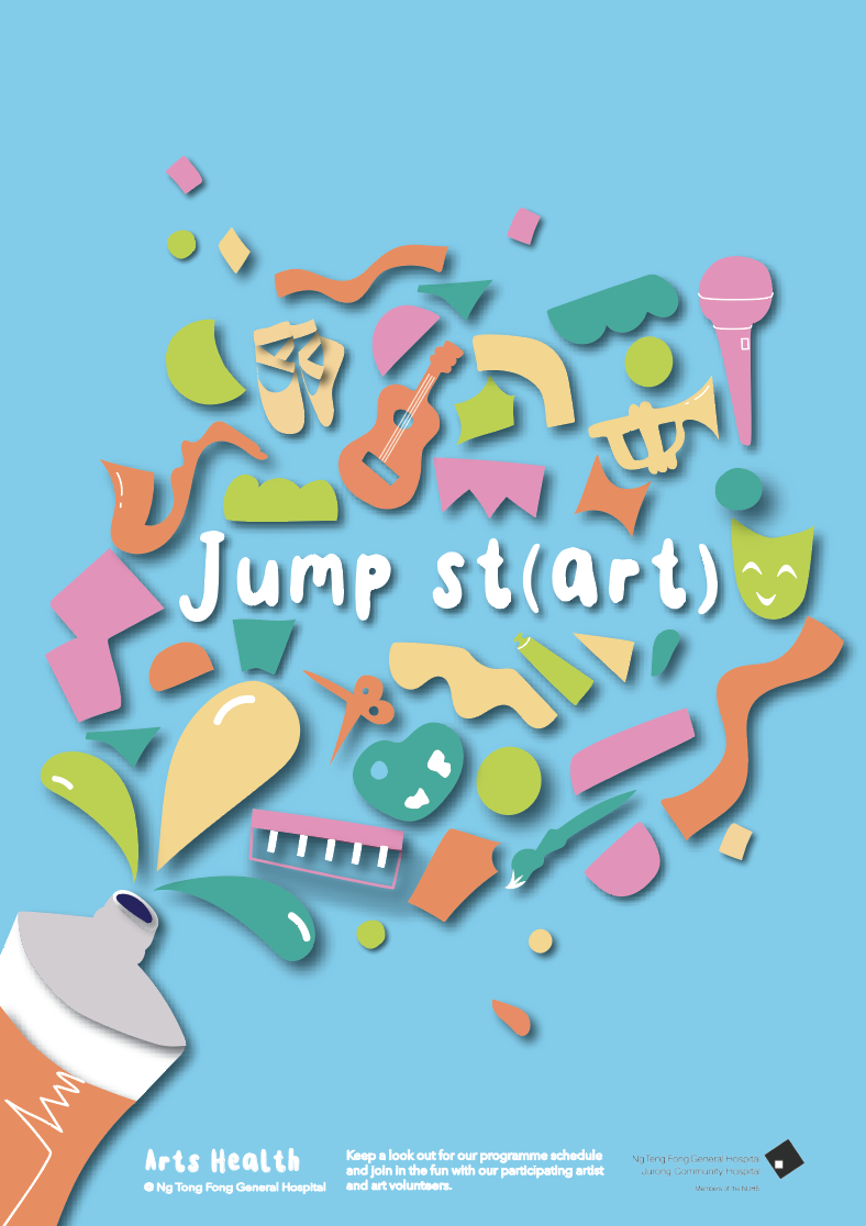
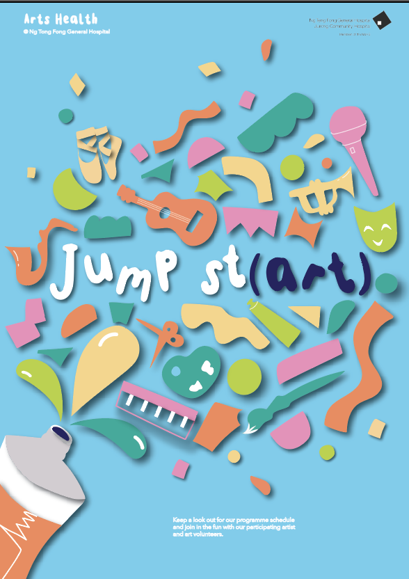
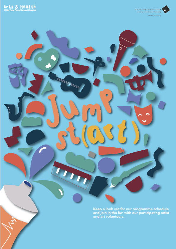
move to the right – Jump St(art) – brackets colour or capitalise
the main drive of shape
create tension point – focus point – created by lines and etc
move up- twist shapes
a little bottom heavy – lift closer
the orientation of shapes
introduce colour
Jumpstart could have shadow
Original: Removed the lines and made the text with drop shadow
Moved around the letter to create more movement
changed the colour of the bracket to add emphasis
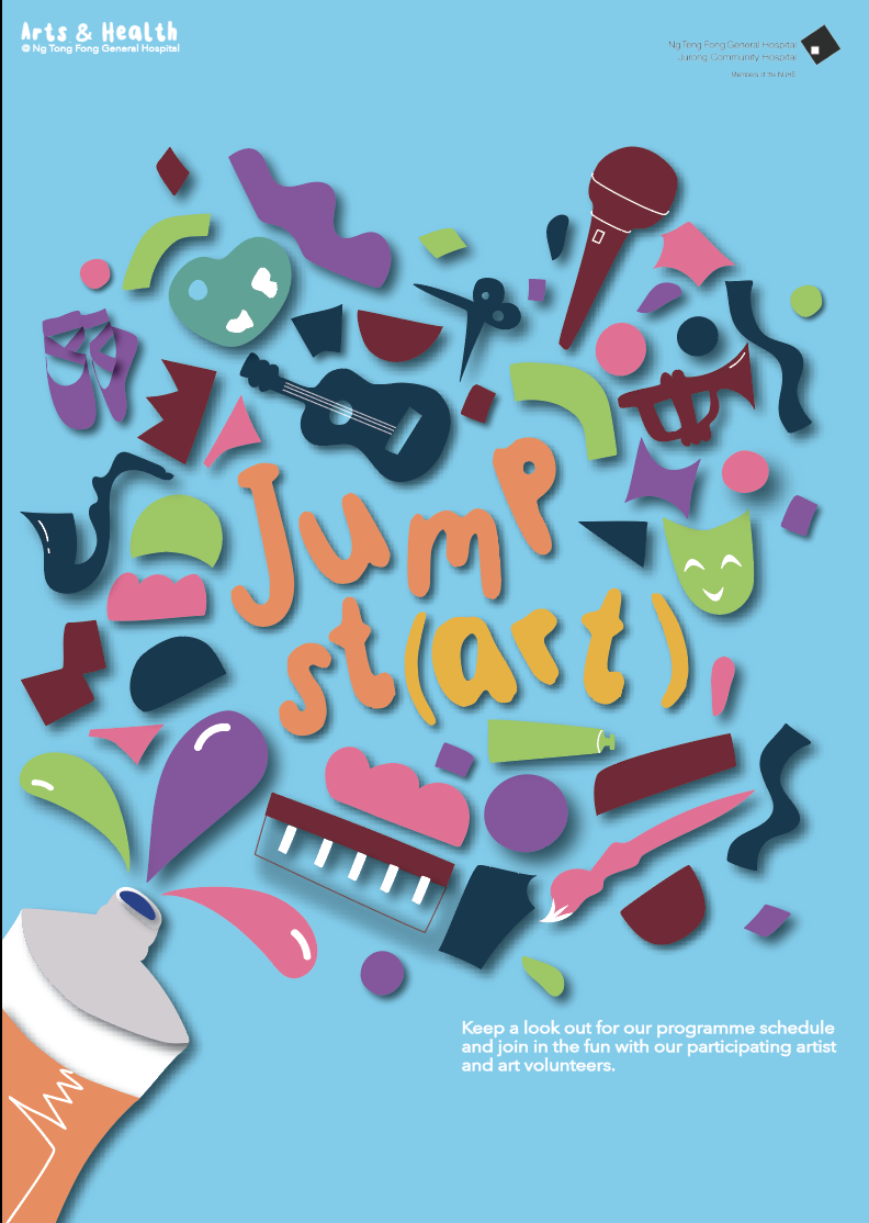
doesn’t quite emphasis the art enough – only the brackets
highlighted not only the bracket but the whole (art)
changing the layout of the heading – making it larger, orange and red
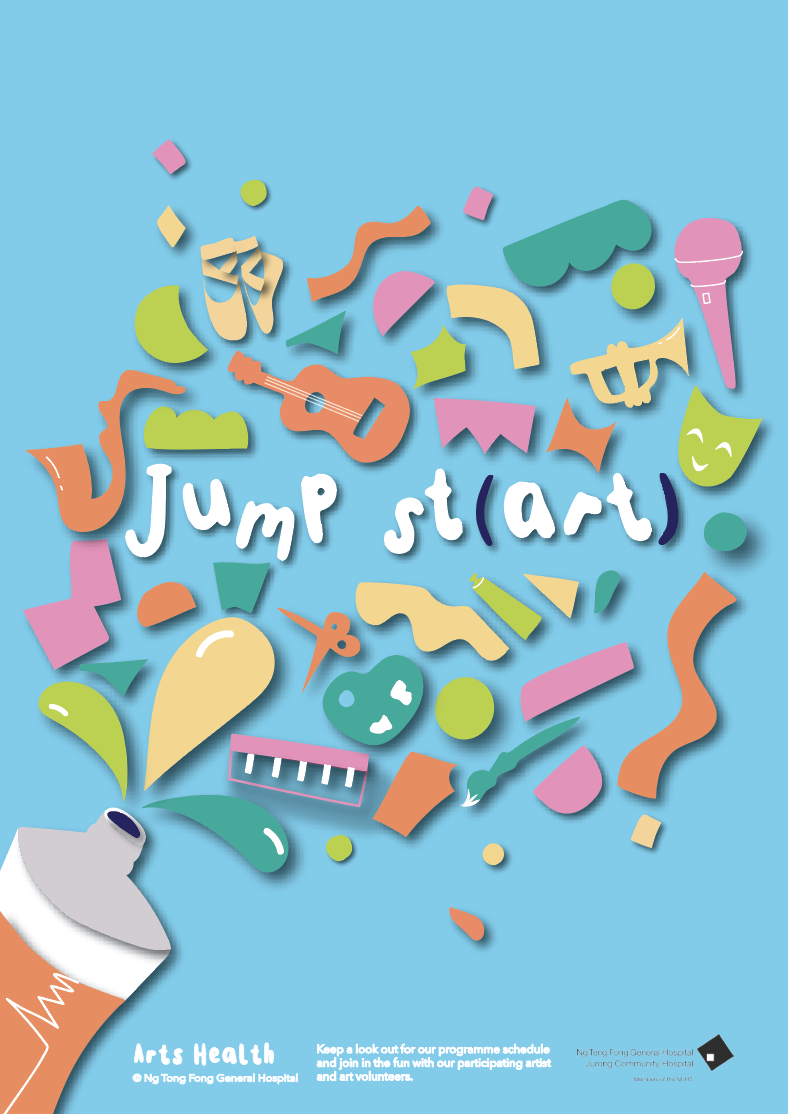
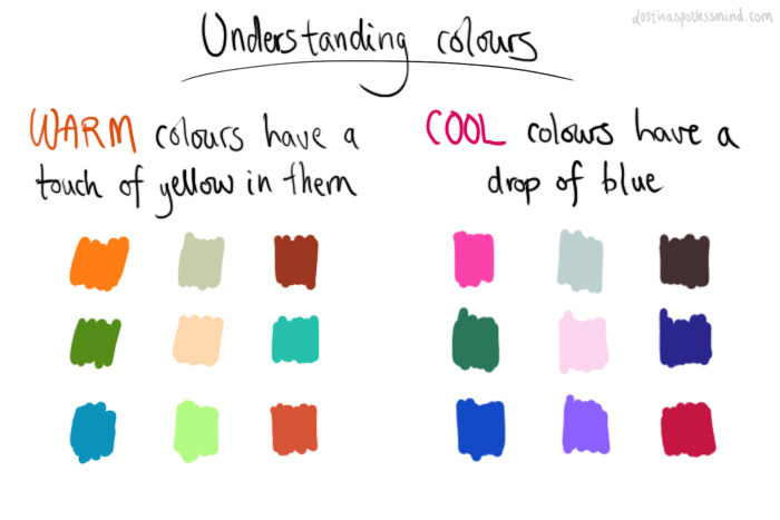
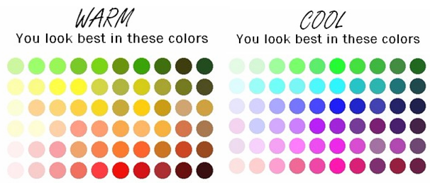
Research on warmer colours
research on warmer colours
the warm red doesn’t shout exciting or fun
Same problem with the emotional result of the colours
the maroon and dark blue is also too warm and sinks into the background
Same problem with the emotional result of the colours- makes the poster look very sad
tried changing the highlight colour to see if it would make a difference but doesnt
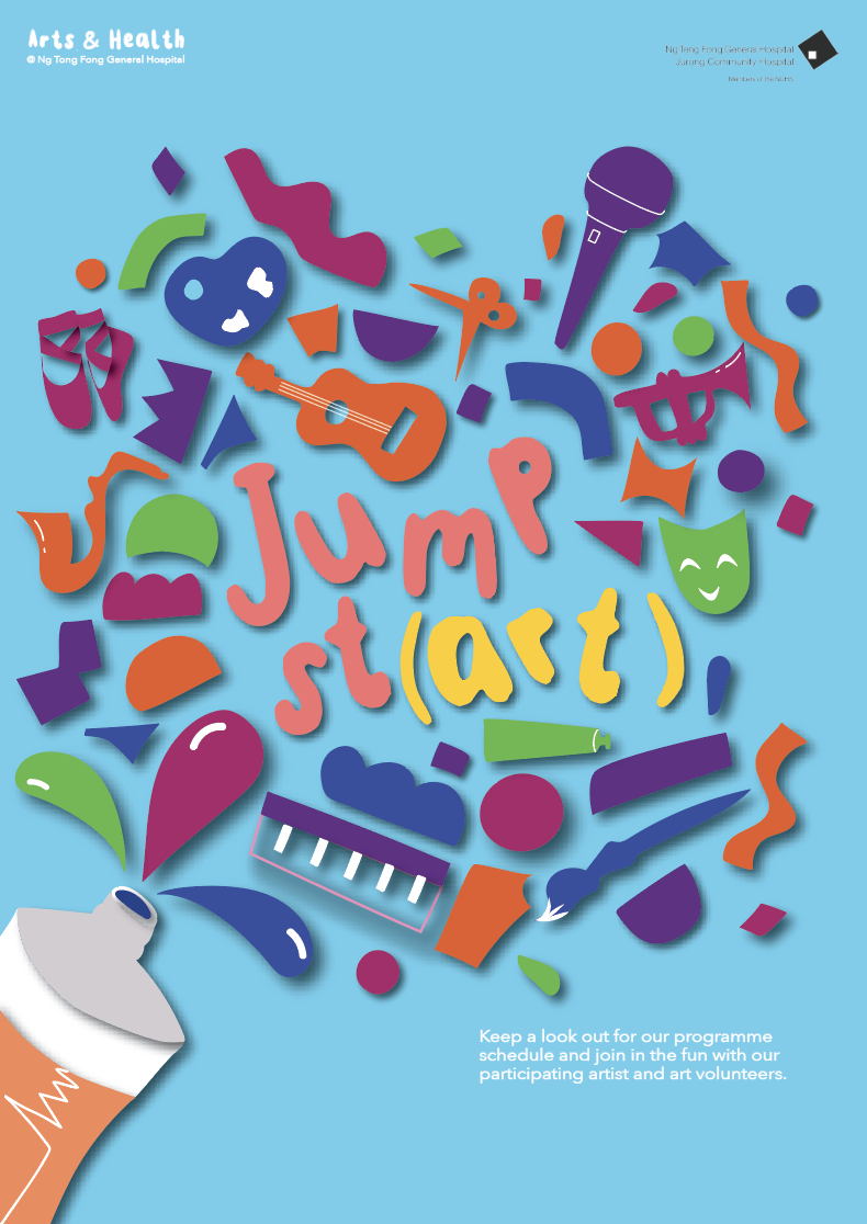
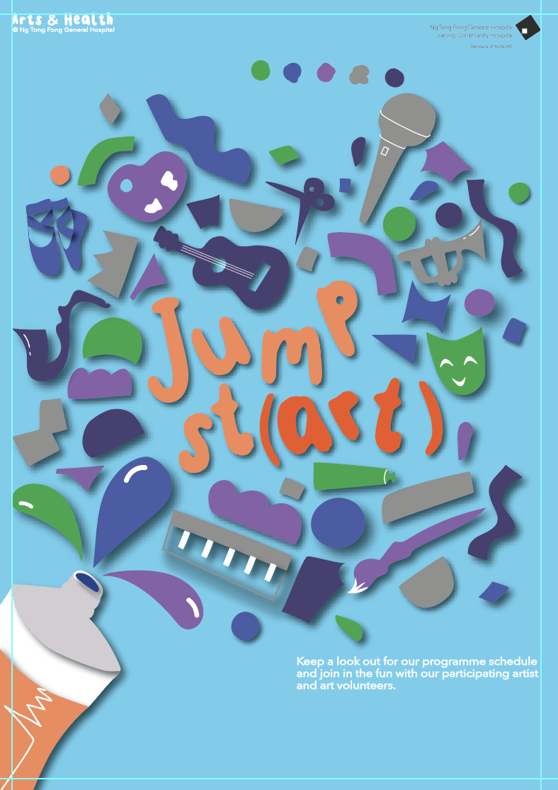
changed back to original colours and made the highlight colour blue like the tube hole
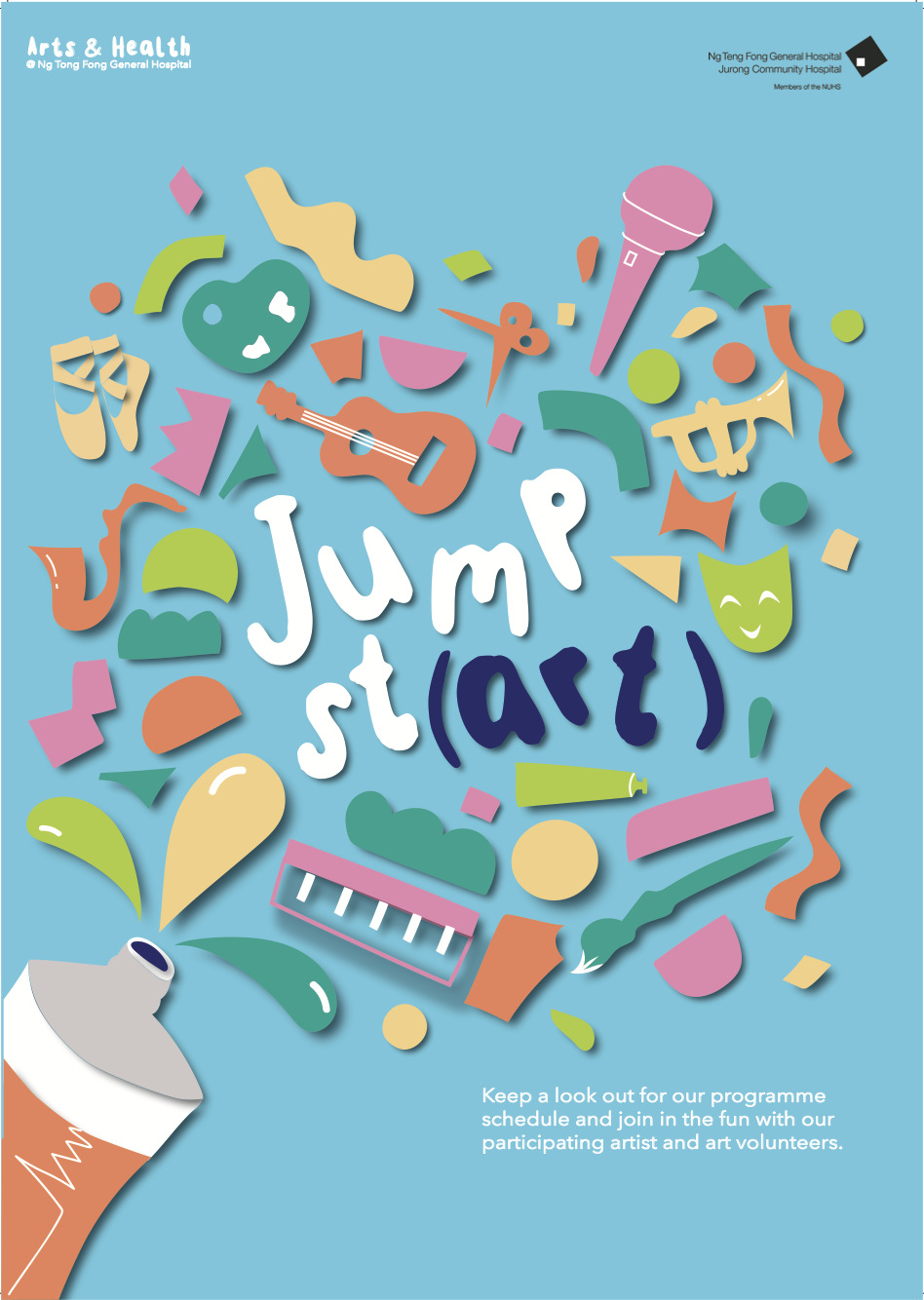
Finally I changed the shape to create more of a ‘splash of paint’
As I only had Monday and Tuesday of the final week to tweak my work as I was travelling up until Sunday, I should have let myself have more time to explore the colour range.