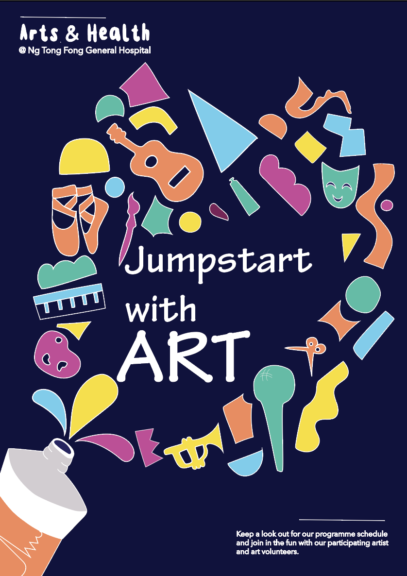
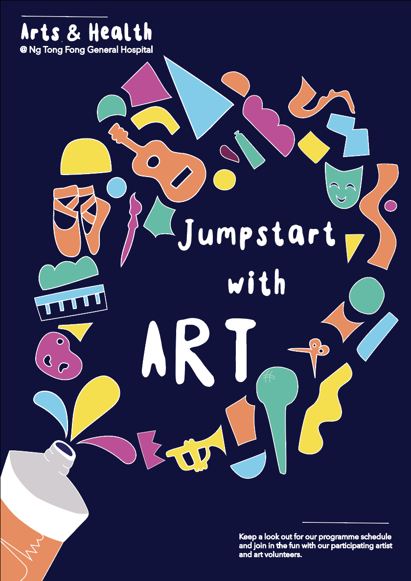
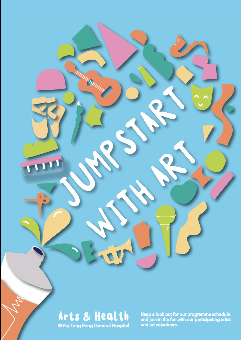
Used two handwritten fonts and emphasised the Art. Doesn’t work very well composition wise.
I changed the composition to a centered one, works a little better. But typeface doesn’t convey the message to well.
Changed the typeface and reduced the space between the title and increased the size of the top font to balance out the large ART.
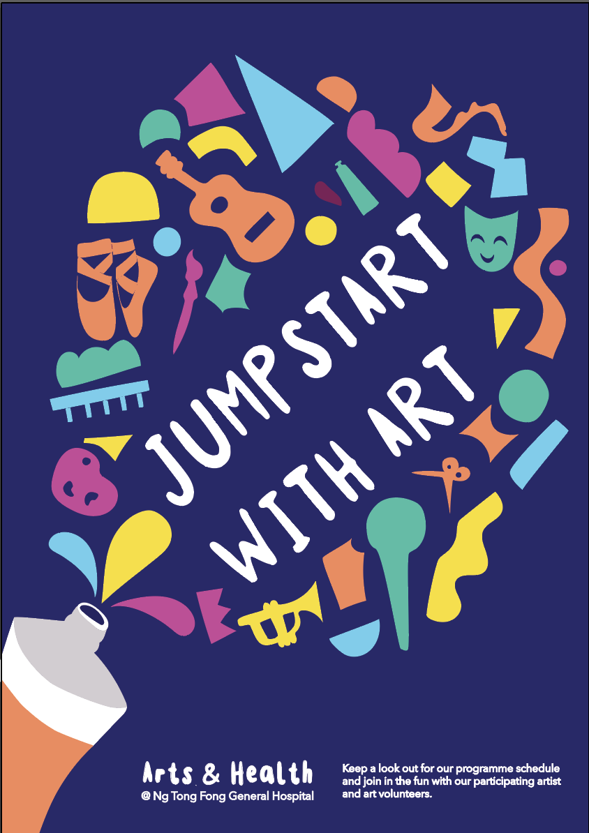
This one I changed the typeface to a more serious design and doesn’t convey the message either. I put the space back in between the words as it was too tight before.
I centered the title and it looks much more balanced and emphasises the art a little too strongly
I returned to my original typeface as it conveyed handwritten and creativity.
Design Refinements:
Feedback from Peers:
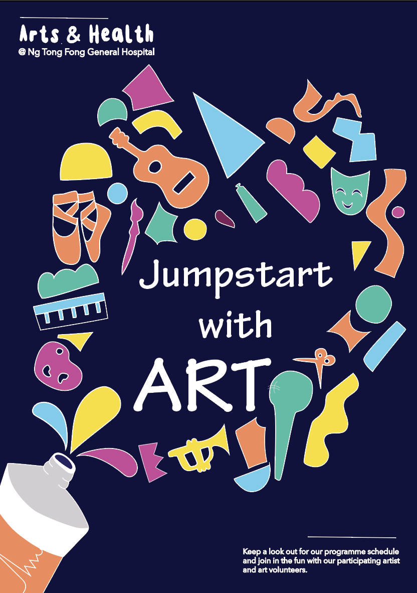
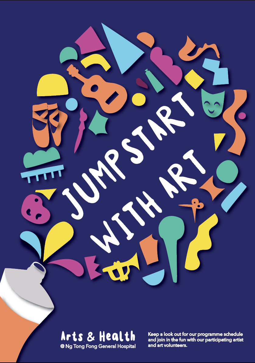
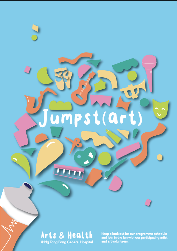
no outline
more details – strings and palette
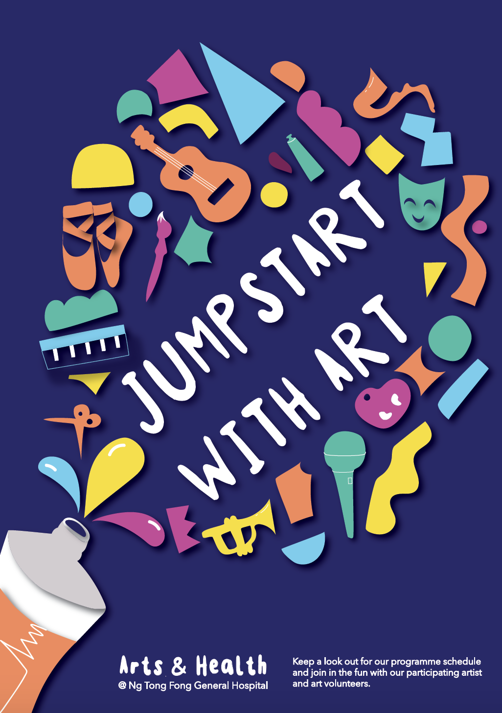
confetti – vibrant, joy
continue splash
look into text details – a different voice emphasis – play with size and orientation
the orientation of shapes – how to play with the elements
try a different palette
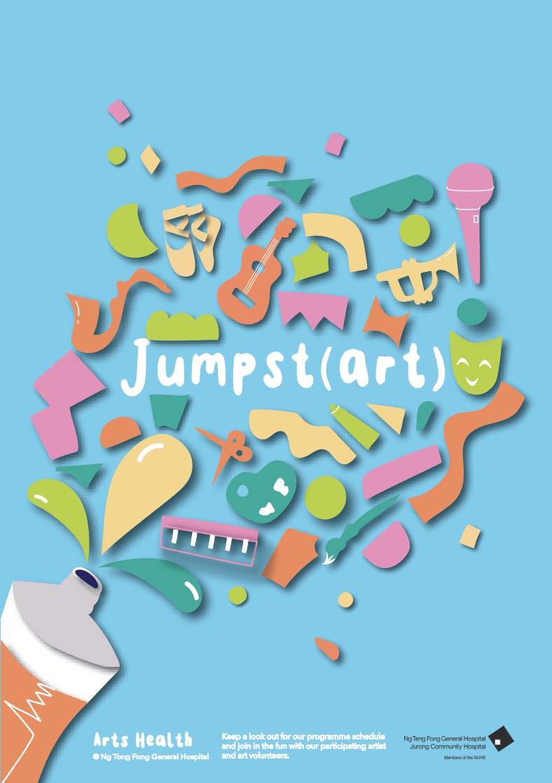
add Jurong Health Logo – monochrome can do
accent – 3D the objects like the tube
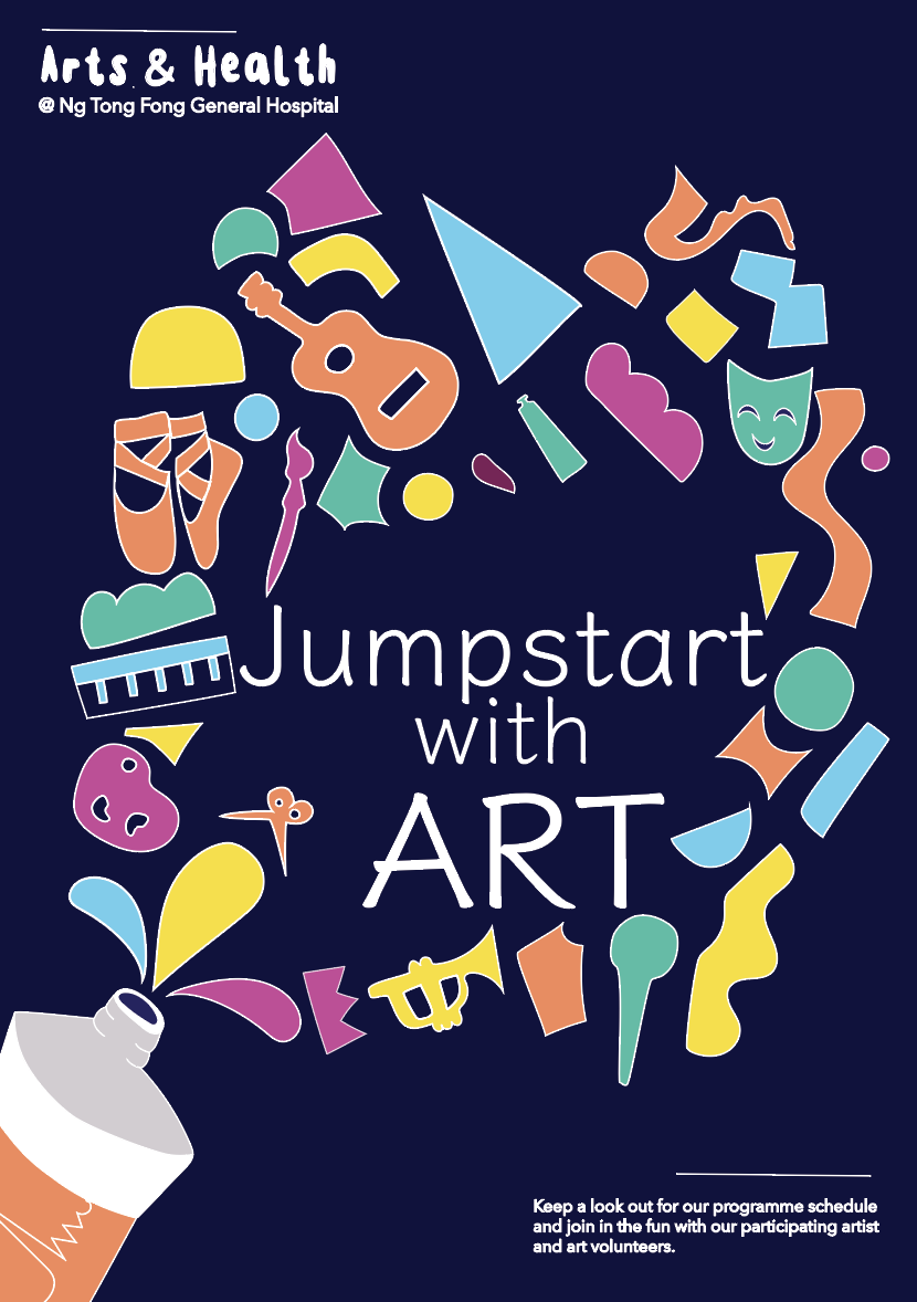
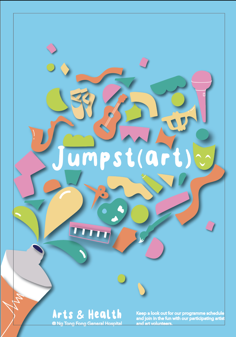
Got rid of outline
Added a drop shadow to add dimension
The two different colours look like day an night unintentionally. I prefer the light blue one as it is brighter and more cheerful.
adding white highlights to elements to make it pop
Changed the colours to a lighter palette
Changed Jumpstart with art to Jumpst(art) for shorter words. Also rearranged the items so looks like confetti