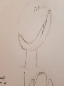
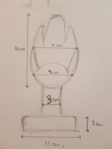
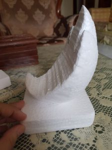
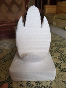
From the start we knew we wanted to incorporate fashion into our game as Bodoni is often used in the fashion/beauty industry:


We printed out Bodoni, Baskerville and Didot typefaces. We chose Baskerville and Didot as Bodoni evolved from them. Also, them being quite similar will make it a challenging game.

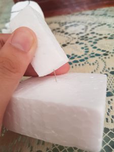
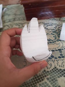
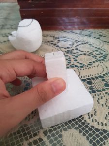
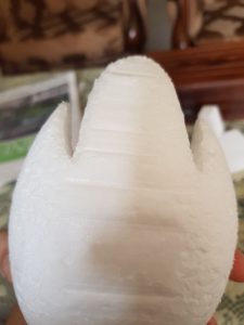
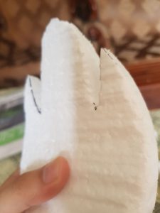
Participants are required to find the Bodoni and fit them perfectly into a dress outline. We tried it ourselves:


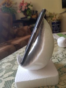
We tested it by blanking out the screen(wasn’t as easy as it seemed)


We had 2 different sizes to try. In the end the smallest dress size was more appropriate and able to nicely fit all the Bodoni.


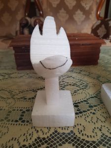
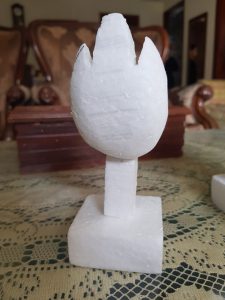
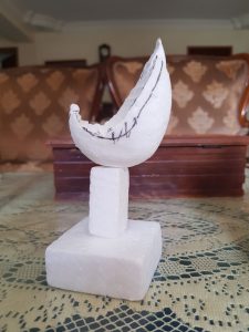
END RESULTS!!! Our individual reflection is as follows:
YOLANDA
Bodoni
Project 1 has allow me to be more sensitive about the different typeface. It’s interesting how different typefaces that belong to the same type classification can have subtle differences. For instance, my group did our research on bodoni. That’s when I noticed the differences in the details such as the serifs, stem, ears and tails of the different typefaces in the modern typeface classification. In my opinion, modern typefaces like didot and bodoni are difficult to use appropriately because they cannot be used at small sizes. I personally think that didot is more elegant as compared to bodoni because of its elongated outlook as compared to bodoni’s appearance. After knowing the differences between them, I am surprised that fashion magazines like bazaar, vogue and tatler would choose to use bodoni over didot. Personally, I would choose to use didot instead. In addition, if I were to own a clothing line, I would choose to use didot over bodoni for my brand name. This is because I feel that modern typefaces will be popular among young adults and the working class alike. I find this target audience to be more attracted to the minimalistic aesthetic. I feel that didot gives off a minimalistic vibe. However, it is minimalistic with some edge due to the contrast between the thick strokes and thin strokes. Why I feel that didot has a more minimalist outlook as compared to bodoni? Other than the more elongated appearance that I’ve mentioned earlier, it has a flat serif as compared to bodoni which gave it a cleaner outlook.
Baskerville
Firstly, what I really like about baskerville is the capital ‘Q’. Among all the typefaces that I’ve seen thus far, it has the most elegant and beautiful Q due to its tail. Just like bodoni and didot, I would associate baskerville with the fashion world too. However, my target audience will be different. Since baskerville is inspired from calligraphy, I find that the typeface has a traditional outlook to it. However, I find that baskerville has a traditional outlook with a modern touch.. Just like Alexander McQueen, I would use it for the logo of a high-end clothing line. Additionally, I would produce a line of clothings that are traditional but with an avant garde touch. For instance, I would design a qipao to have higher slits with say snake prints instead of the usual oriental prints.
Trajan
As for trajan, I did not realise that it is so popular among movie posters before the group presented about it. Now that I know of it, I feel that it is an overused typeface among movie posters that I find that trajan has lost its uniqueness. This is because since different movie genres are using trajan as their movie title, you will not associate trajan to one type of genre. I find this to be a pro and a con.
I feel that some typefaces can speak for the movie itself. In the era of hand crafted movie posters, you can see that the typeface created for the particular reflect the genre of the movie so it can evoke a certain feeling among audience when they see the movie poster. For instance, you can take a look at two the horror movie posters below, the typeface used for the Nightmare on Elmstreet poster speaks for the genre of the movie itself as compared to the poster of Mama.
So how would I have used trajan? I guess I would use trajan for a brand that is different and exclusive because I find that trajan speaks for itself in terms of being one-of-a-kind. This is because of its asymmetrical serifs that make trajan really unique so I associate trajan with innovative and ingenious stuff. For example, I will use it as a shop name for a fusion restaurant/cafe where I have dishes that have “weird” fusion such as ice cream pizza. Or perhaps a name of a museum where hundreds of different unique art pieces are housed in.
Univers
I like the fair and generous perception that the univers typeface had established for itself. I would associate brands that use the univers typeface with the characteristics such as widely available and fair use. As compared to trajan, I wouldn’t think that univers is an overused typeface because of its unselfish characteristic. It has a kind vibe to it. It seems like a typeface that can gain empathy among the public. It is warm-hearted due to its lack of serifs which make the typeface less rigid. Therefore, I find that it is an appropriate typeface to use for a charity organisation.
FARZANA
Learning about Typefaces through this project was interesting and I felt that it was a fun and
creative way to do so. While at first our group struggled to even choose a typeface from the beginning(we jumped from Bodoni to Comic Sans, then back to Bodoni), we stuck to Bodoni in the end as we wanted to ave a game related to fashion. What I learnt and focused for my part of the project was to learn the influence of Bodoni from Baskerville, and their differences. As mentioned during QnA, what can be improved from our presentation I feel, is that we should have included when to use Bodoni and when to use Didot. I feel that since Bodoni has more contrast in thick and thin strokes as compared to Didot, Bodoni would be better suited from busy backgrounds or for bolder poster. Due to the difference in the very bold and the very thin strokes, Bodoni seems more sophisticated and classy. Didot on the other hand, is almost a similar but thinner version of Bodoni, and thus I feel that it should be used in visuals that are simpler and less bold.
I really enjoy the other presentations, especially the Trajan presentation. I felt that they really incorporated the use of Trajan(by making their whole presentation a movie concept). The cuts of paper were really tedious too and great to watch. I enjoyed the game where we had to find Trajan fonts from the library disk shelves. It wasn’t as easy as I thought. I have learnt how Trajan came about and how it can be used, especially in politics. That was an intersting point to bring up. How Trajan implies power and dominance.
Through this project I have come to appreciate the typefaces more and I understand the context they come from, and the reason they came about. I actually find myself comparing and staring at typefaces now at supermarket products and labels (which is good, as I am now more aware of typefaces around me).
NADIAH
I thought this project was really interesting as it is not always that we get to present in whatever format we like. However, precisely because we could do it in whatever format we liked, it was challenging. Having to think of a creative way to present with not much means to base off of was tricky to me. Our group took quite some time to decide not only on the way to present but on the typeface itself. Nonetheless, we came up with something; embodying the typefaces. It sounded really interesting when we discussed it but I am not satisfied with the presentation itself. I think it was due to our lack of practice and nerves got the best of us. Our game however, I hope, would pull us up. It was fun and interactive. I definitely enjoyed myself. All in all, if I had the opportunity to redo the assignment, I definitely would and avoid all the mistakes we made.
To answer the Q&A question on when is the appropriate time to use Bodoni and Didot respectively, I would personally say that Bodoni is used where class, sophistication and elegance wants to be portrayed such as fashion magazines. Didot looks really similar to Bodoni but is more elongated and wider.
MAY THU
Before this project, my familiarity and knowledge of typefaces and diverse set of characteristics each typeface, extended only from the in class lectures of this class. It is definitely a first time for me, to go in-depth with the research of each typeface, regarding its origins, creator, and influence by myself. As part of the team Bodoni, I was in charge of researching the origin of Bodoni, and was pleasantly surprised by the experience. Although I have already been made aware of the importance of the time period each typeface originated from, I unexpectedly found the relationship between the creator and the typeface itself fascinating as well.
For instance, It was interesting to learn that Giambattatis Bodoni, was a multi-faceted designer, in addition to being a typographer, having built his experiences through official press jobs in places, like Propaganda Fide and Stamperia Reale. In addition to the rather serious and royal feel of the press, the imagery of Bodoni’s Italian Baroque workplace now comes into my mind, amplifying the regality of works to me. It somehow helped me to attach a more memorable overall elegance to the typeface Bodoni and allows me to connect the font to the neo-classical revival period better.


And besides all that, Bodoni had really useful tips when it comes to designing type, from work ethics to designing tips.


As such, I am more willing to dive into researching history of other typefaces, unlike in the past, as in addition to obviously giving me the historical context, it has been proven to help me grasp the mood that particular typeface exudes better.
As for the features of the font itself, through this project, I was able to differentiate between the transitional and modern typefaces, mainly the Baskerville versus the Bodoni much better. It is even easier now to differentiate Bodoni among its modern typefaces, like Didot, thanks to the research of my groupmates. And I’m really glad that our game had managed to let our classmates apply these tips of differentiation immediately after being informed of them.
And as for when to use which modern typeface, personally, the higher contrasting thin and thick strokes of Bodoni gives the typeface a more edgy elegance when compared to Didot, so if it was up to me, I would use Bodoni if I was to type to represent something that wants to showcase its elegance and edginess at the same time. As such, I think it helped me to more aware of what slight difference in a type anatomy can do so that I can better train myself to notice them better in the future.
Last but not least, I really enjoyed the rest of the groups’ presentation as well, all for being innovative and engaging while informative at the same time. If I have to choose one thing I enjoyed the most from each group;
Trajan : I really enjoyed the theater routine and the fun movie trailer from the group. Since I am personally more familiar with Trajan as a fun font, I thought the whole lightheartedness of the presentation fitted extremely well.
Baskerville : I really liked that the group decided on a series of fun skits as it draws our attention more when it is contrasted with its sophisticated typeface.
Univers : The aesthetics of the slides and the game were extremely well-executed and matched well with a futuristic modernity that I associate it with. I also enjoyed the bit where they asked for the mood of the Univers with different colours as it does helps us practice attaching a characteristic to the font.