Burn Media BURN

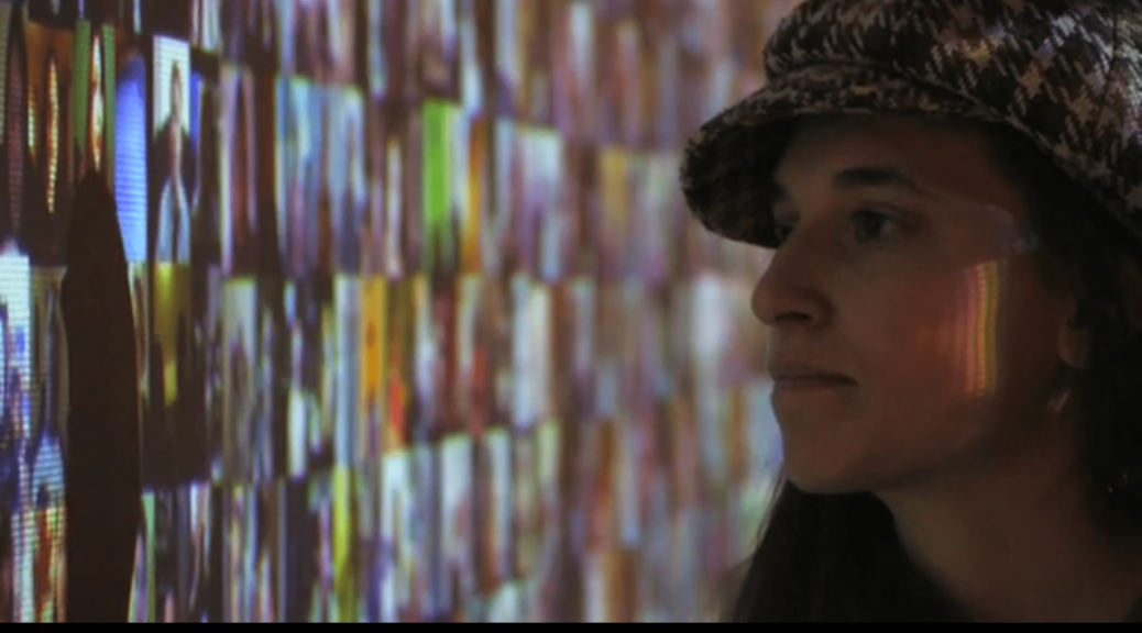
Ant Farm started in San Francisco in 1968 Chip Lord and Doug Michels. In the interview with Lord Chip, they sported ‘hippy’ culture along with their media van. An art work ‘A hundred TV sets’ is something similar to Media Burn(1975), where the TV sets were built in an architectural manner, instead of seen as mere entertainment boxes. It was conceived as an environmental sculpture, as if the sets were surfacing out of the swamp. In Media Burn, the TV sets used represented the media and propaganda.

Mentioned in the research critique,  Ant Farm pointed out that ‘Media Burn integrates performance, spectacle and media critique’. I couldn’t agree more wth this analysis and to add on, I feel that Media Burn is a work that richly blends political and social issues. The whole work is a performance, right from the start when the two ‘artist dummies’ appeared in front fo the audience, receiving applause from the crowd. Before they got into the car, they stood on top and had their hand over their heart, marking the performance as an important political ceremony.

This familiar act of waving to the crowd, the cameras, and the welcomes, almost as if the artist dummies were important people like the president, emphasises how the media is propaganda-like and enforced. The whole recording was done in a news coverage theme, which again reinforces the idea of how Media is so powerful to the extent that the performance itself had to be recorded in a prim-and-proper media method.

Doug Hall, who acted as John F. Kennedy, questioned “Who can deny that we are a nation addicted to television and the constant flow of media? Haven’t you ever wanted to put your foot through your television?” I quite like this in-your-face quote. The performance literally had a car smash into a pile of television sets.

The act of driving a ‘political car’ straight into a set of television might imply the control the government have over the media, and they have the ability to maintain, create, and destroy media content.


Hand(y)phone holder

These were the 2 sketches I came up with.

After consultation I realised I was too ambitious. So I changed my design into something more minimalist and simple. I’d like to think of it as a dragon’s egg.

I started with a small scale prototype.

Using small pins to stick them together


The stand looks really extra so for my full scale model, I decided to take the stand out. Also, taking out the stand made it look more like a dragon egg.


Made the base have rounded corners, to complement the gentle curves of the egg. Also made a slight dent so that the round base of the egg sits nicely.


Collective Genius: DIWO!!

The Furtherfield community is a common space for individuals from all over the world to to collaborate, critique and share works. Connections in art is very important. When art is shared with and collaborated with others, the outcome and extent of the art can be further pushed.

‘As an artist-led group, Furtherfield has become progressively more interested in the cultural value of collaboratively developed visions as opposed to the supremacy of the vision of the individual artistic genius.’ Furtherfield acknowledges that the individual has the capacity to create amazing works and produce great ideas, but with collaboration works can be even more culturally intriguing. During the adobe connect session with Marc Garrett, he mentioned that individualism is important. Being special is something we need to have. However, we also need to work together to create art. The main outcome from these collaborated works is the rich presentation of culture, especially when you collaborate with many people and people from different areas. DIWO culture breaks individualism and speciality into something positive, and makes art more material.

One such artwork Marc Garrett discussed about a collaborative project using Blockchain, where the public sends in different instructions and characteristics for how a plant is going to look like. The artist then has no choice but to make the plant according to the set of instructions given. I find this work very intriguing as no one plant is the same, and the plant is basically a shared work by many.

The artist has no control over the end product, although he is the one constructing it.

For the past 5 micro-projects we were all doing art with others. I find it fun and interesting at the same time because our other modules are just individual projects and it gets bit boring, because you’re only stuck with your own ideas. But with others, you can share your efforts (and laughter!).

In micro-project 2, we were supposed to take a tele-stroll with a partner. The concept of DIWO comes in as you are making a strolling documentary with another person, you’re both at different locations. It was amazing to see how my other classmates actually had a story line and great concepts. I especially liked Felicia and Bala’s, where they made a video of ‘real life tinder’.

They weren’t only doing the tele-stroll by themselves, but also roping in the public. Similar to the Plantoid project, both Felicia and Bala’s work has the element of surprise, as both of them cannot fully take control of what the public will say or do.

The adobe connect session was beneficial and really emphasised the pros of working with others. I will now end this essay with a phrase that really provide thought:

“The genius is in others, not yourself— A collective genius”

-Marc Garrett during Adobe Connect, 2018


#Imagemakingthroughtype: Final

M A K E U P  A R T I S T

I went with a marble abstract pattern as the background to show the makeup is resting on the table. Also when I do my makeup I have this cool small marble top I lay my makeup on. Adding the marble gives the work personalised touch I feel.

F A S H I O N  D E S I G N E R

I decided to use a simple recurring pattern as the background. I felt that the cloth folds I used in my process was too much, and took the attention away from the main subjects.

L O G O  D E S I G N E R

Final design for my logo. Added a circle border to make it look more sophisticated.

W A T E R C O L O U R I S T


#Imagemakingthroughtype: Process

M A K E U P  A R T I S T :

This is probably my favourite one out of the 4 because I have a whole lot of old makeup and I also loveeee playing with makeup.

I first started by aligning the tools and creating a composition with them on photoshop.

Then I went on to illustrator and traced it out.
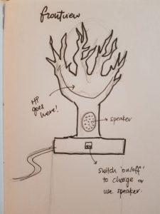
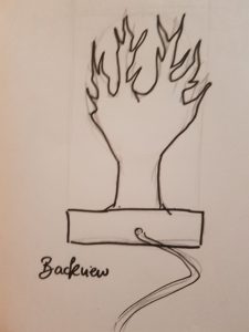
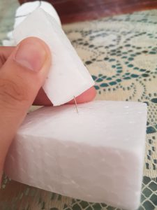
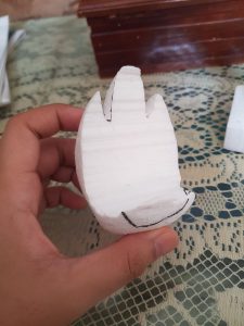
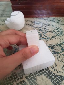
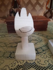
But after completing the tracing I didn’t really like the technical and clean cut outcome. Everything was too neat and I didn’t fancy that because doing makeup shouldn’t be neat!!! It’s a fun and messy process. So I decided to try photography.

I played around with makeup, tried out different strokes and colour tests.

Link below to videos of me experimenting with makeup tools!! Please switch on your volume because it sounds relaxing HAHA:

Trying out different strokes with mascara wand

Scraping eyeshadow powder

I came up with different compositions:

I then edited them in photoshop, placed some more makeup along the borders to create a ‘frame’.

It looked a little off and it might be because of the plain background, and wayyy too many things to look at.

F A S H I O N  D E S I G N E R :

I thought of sewing at first but then I didn’t want to focus on the sewing aspect of the job. I wanted to show the process of designing and drawing out the designs.

Sorted out a composition on photoshop first to make ‘ANA’

Traced out and coloured the image on illustrator:

I wanted a light-washed watercolour and sketchy effect similar to the references. I also tried different backgrounds:

L O G O  D E S I G N E R

I decided I want to make minimalist logos for my name. Came up with different designs:

This looked like ‘Fatz’ instead of ‘Farz’. Scraping that and tried going for ‘Faz’ instead.

I didn’t like that there were too many different alphabets in my name. SO I went with ‘ANA’. I want to have some recurring motifs (2 A’s) thus the change of name.

Too simple.

Still not feeling it.

I also tried inverting the colours to see which one works better.

Ok definitely better and at least I get the logo feels from this final design.

Artist (watercolorist)

I decided to focus on one medium as an artist— Watercolour!! I love painting in watercolour because its very therapeutic and fast. I started with colour schemes first:

After which I scanned in my watercolour splashes and created some background colour:

I used the font lucky turns because I also liked doing brush lettering, especially with watercolour.

I liked the second one, but it felt like a normal brush letter design. So I used illustrator pen tool to make a paintbrush, to show myself as an artist who paints.

#Imagemakingthroughtype: Research

Before I first started I actually had a lot of occupations I knew I was interested to explore. But as I go deeper into this project, it wasn’t as easy as it seems. So I cut out a lot of my options, and infact changed lot of my occupations even when I was halfway doing them, because ART BLOCK!!! 🙁 yes sadly I did waste a lot of time

Below are the finalised ones:

  1. Makeup Artist
  2. Logo Designer
  3. Fashion Designer
  4. Artist

I kept changing the medium halfway too because I couldn’t decide.

For makeup artist I went to explore the different types of tools I could somehow use to make alphabets:

:

For Logo Designer I googled some logos for inspiration. I am quite smitten(lol) by cool minimalist B&W logos sooo yep my final work will be something similar.

Fashion Designer reference:

For  Artist, I’m using Monet’s works as reference because I love his works so much.


Project Glitchhhh

Adding on piles of glitch for a group collaboration in class. I really enjoyed editing the photos because you are supposed to screw up. I always feel stressed when I used photoshop and ‘command-Z’ would always be my emergency button whenever I screwed up but today in class I felt REAL freedom!! I didn’t have to think about what I was doing and screwing up has never felt this great.

I also loved how my (half-faced) selfie turned out. The final piece is amazing you can’t even tell it was a selfie to begin with. The progress pictures were great too and contributed to the work. It made the whole collaboration more interesting because you can really get to see how each of us contributed to the glitch.

Who’s talking?

The video starts with a zoomed in clip of a girl in a video talking. The camera slowly zooms out to reveal more videos of other individuals. Their voices start to merge and you cannot hear a single voice.

Hello World is ‘an immersive video installation featuring over 5000 video diaries found on the internet’, all framed on a big screen that towers over the viewer. The visuals and sounds are quite overbearing, but this work is more than it seems to offer.

Christopher Baker has successfully portrayed the concept of today in this work. The tiny videos organised in tiles, and the mashed up voices is almost a soothing experience to watch and hear. The world today is fascinatingly interconnected. Anyone can broadcast themselves and allow others to view it online. By collating multiple videos of individuals and placing it in a gallery setting where anyone can visit, Christopher Baker emphasises how easy it is for people to get connected.

Part of the title of the work itself, ‘how I learned to stop listening and love the noise’, to me, is what makes this work even more interesting. I love the play of words and the irony of it. It might also imply that the world has become too easy for anyone and everyone to share their thoughts, that nobody is even listening. This is further interpreted by the muffled voices, where then viewer cannot hear a lone voice or cannot even hear a proper sentence. The voices are just a muffled mess, and doesn’t sound like voices anymore,

The work, despite showing the video diaries of strangers, still gives off a sense of familiarity. Viewers can step up and watch the individuals closely. There is no barrier whatsoever, and a viewer can hover his/her hand over the projection and watch the videos over his/her hand.

Projections on hand

The individuals recorded in their visual diaries are all in a different setting, some personal like their bedrooms, houses and some in public places. Viewers get a sense of connection with these people, seeing their settings and familiarising with the way they talk, sit and carry themselves. When viewers step forward, a shadow is created. The shadow reminds one that the space between the virtual and reality is still there, and cannot be entirely diminished.

Shadows over the wall

Christopher Baker’s work revolves greatly around the concept of virtual and reality, and even psychology.  Are the people really there? Should they be seen as real individuals, or is this merely just a collective group of videos? His work intrigues the viewers through this concept that will definitely spur discussion.

#Nofilter

It was the first time I used Adobe connect and it was so COOOOOOOL!! When I first heard about it, I thought it was probably going to be similar to the same boring old Skype. But nope I was wrong.

I had a lot of fun and it was nice to see the whole class communicating with each other and trying to co-ordinate our body parts. I loved the fact that our whole class can be involved.

A particular activity that I really enjoyed was the part where we used a transparent bottle. We could still see our faces and it looked like we were using really cool filters. Of course the only problem was that some of us didn’t have a water-bottle.