Exploration:
Firstly, i made this by scraping paint (already on my palette knife) onto newsprint.

Secondly, i used the ridged edge of my snack packet (pipagao) to scrape the paint (already on the packet) onto the newsprint.

Thirdly, I then tried putting the paint onto the paper directly first. After that, i scraped a clean palette knife along the paper.


In another paint exploration, i tried overlaying paint and doing the kindergarten style of folding over half a page to reveal a symmetrical pattern.

what was the result? overall it was kind of boring because the inks did not mishmash as much as i had hoped for them to. However, when you look at it closely (as shown as the image below) : the white paint merged very nicely into the blank ink. 
I tried another version of this in a composition with more black ink and it resulted in something very grey toned.

I pleated a piece of paper at 0.5cm intervals, sandwiched them into a tight bunch then dipped them ever so slightly in paint and stamped them onto another sheet of newsprint.

BUBBLE EXPLORATION:
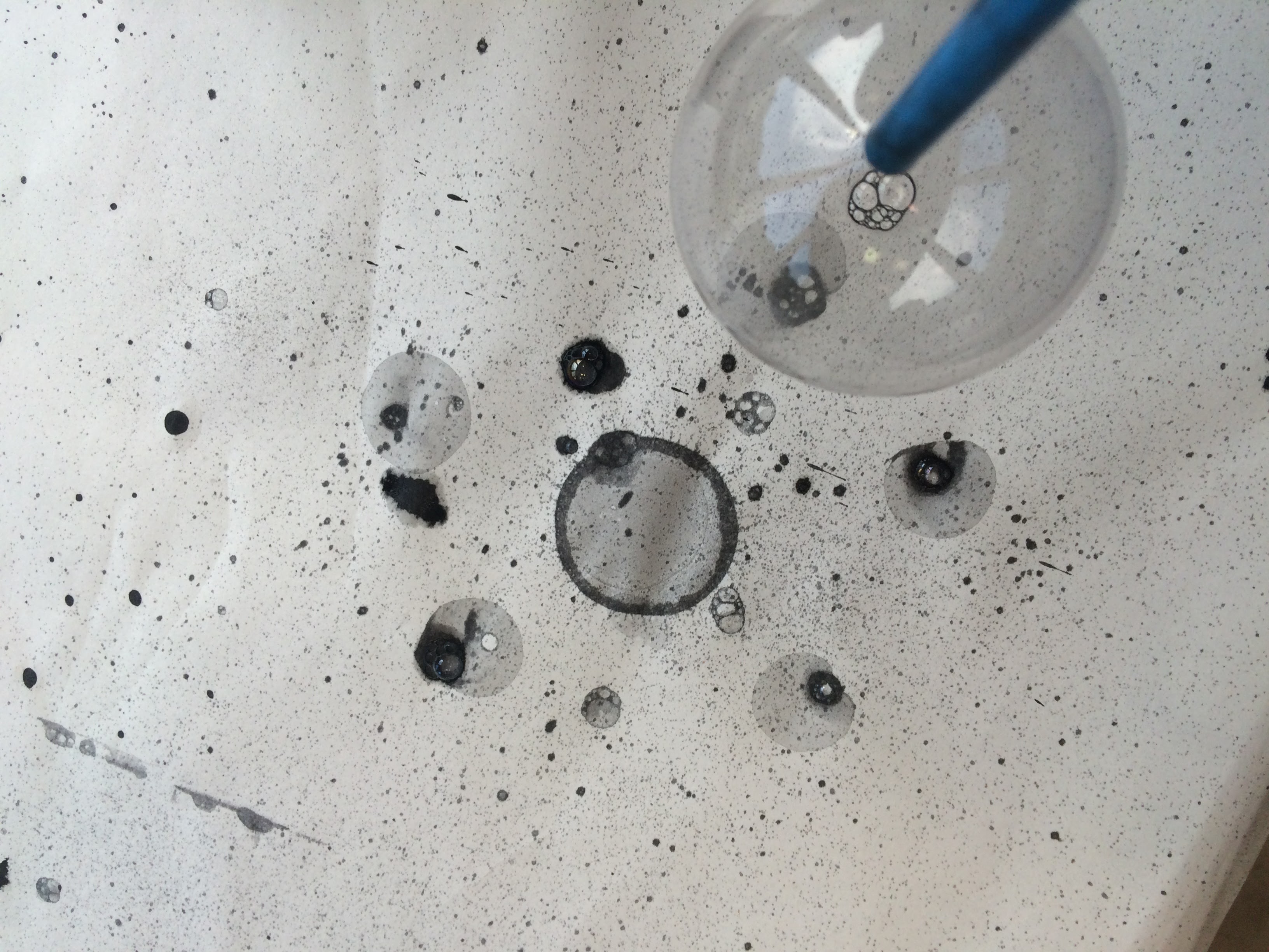
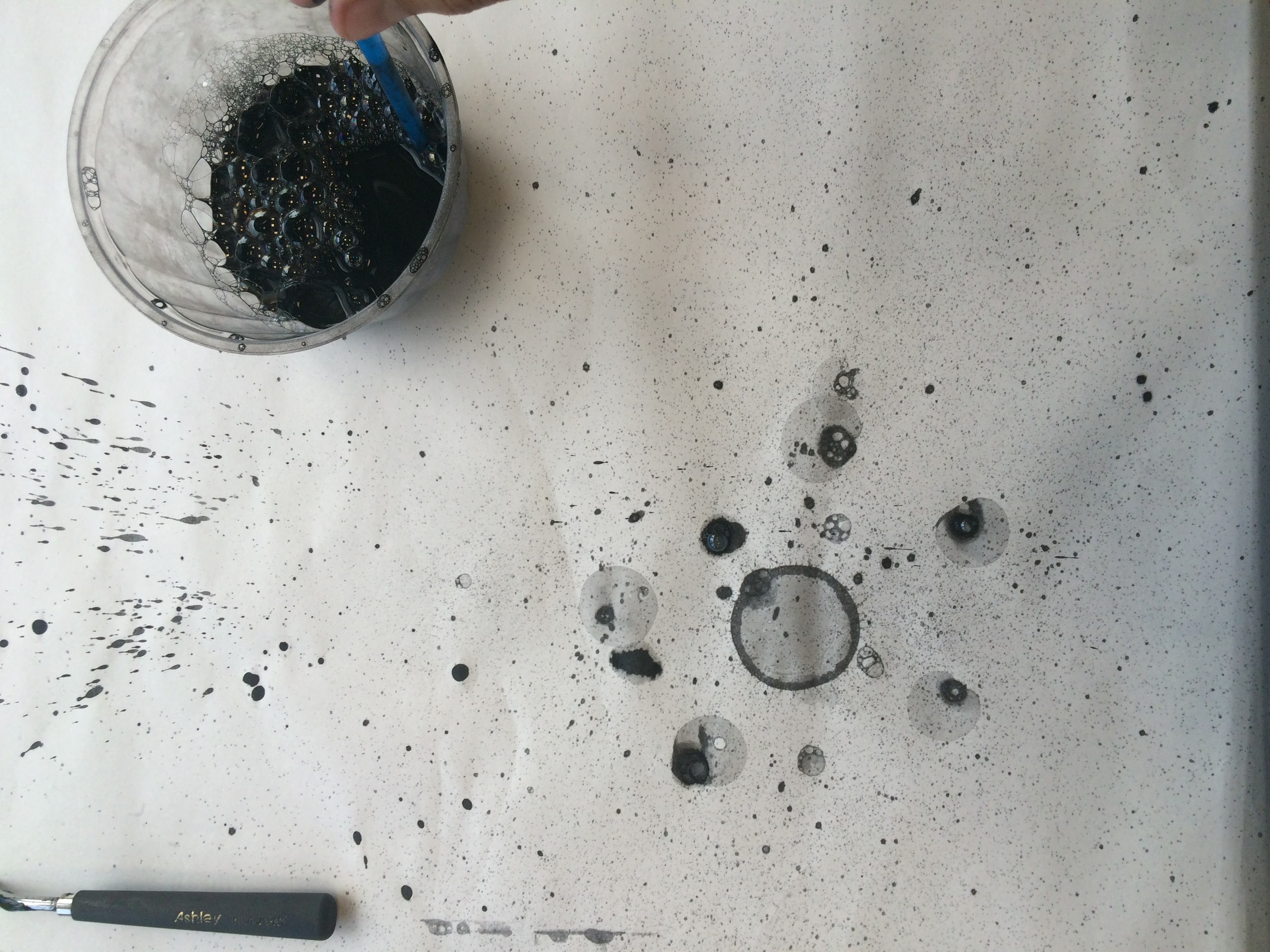
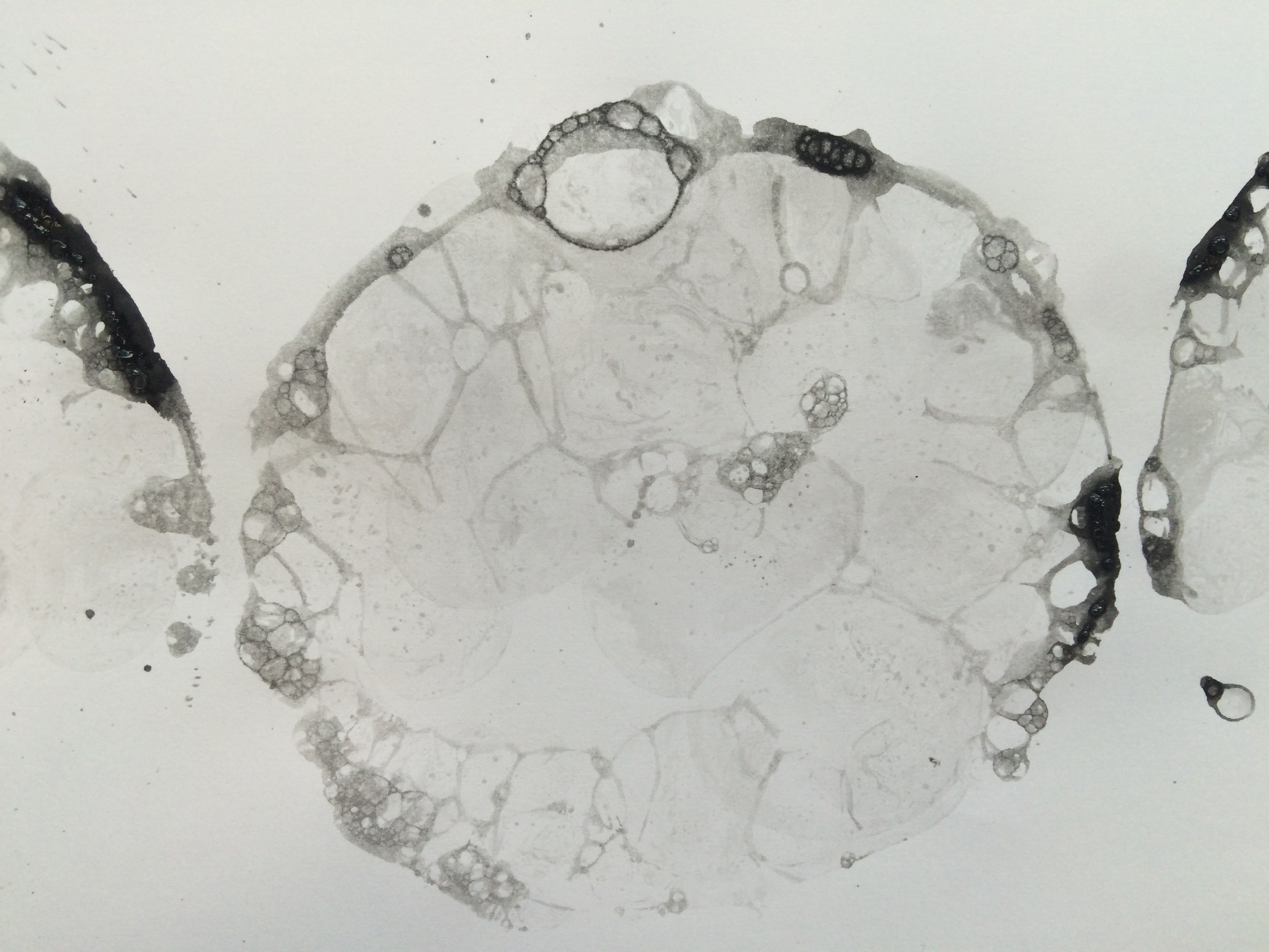
I started this firstly with mixing some soap solution and chinese ink into a container and blowing air into the solution using a straw. when the bubbles were overflowing the container, i just lay the piece of paper over the container. TADA!
The results are shown in the top half of the picture below. The ink was too diluted and offered no contrast. Therefore i tried using Block printing ink in the solution instead and it is shown in the second piece of paper!
 This is the result of the second attempt, using block printing ink mixed into the solution. This captured the bubbles much better. It even captured the movement of the ink on each bubble.
 Lesson learnt: do not mix the solution manually (meaning mixing the solution vigorously) as it creates many small bubbles that would not pop on the surface of the paper. It would distort the image instead.
As my second attempt, i dipped the straw into the solution and blew the bubbles directly onto the newsprint.
This direct application allowed the contours of the individual bubbles to appear more and it even captured the specks of ink as the bubble burst.
 As i was intrigued by the splatter stains, i took the straw and dipped it in the ink solution once again. However, this time i blew it forcefully near the paper to create this strong splatter of ink!
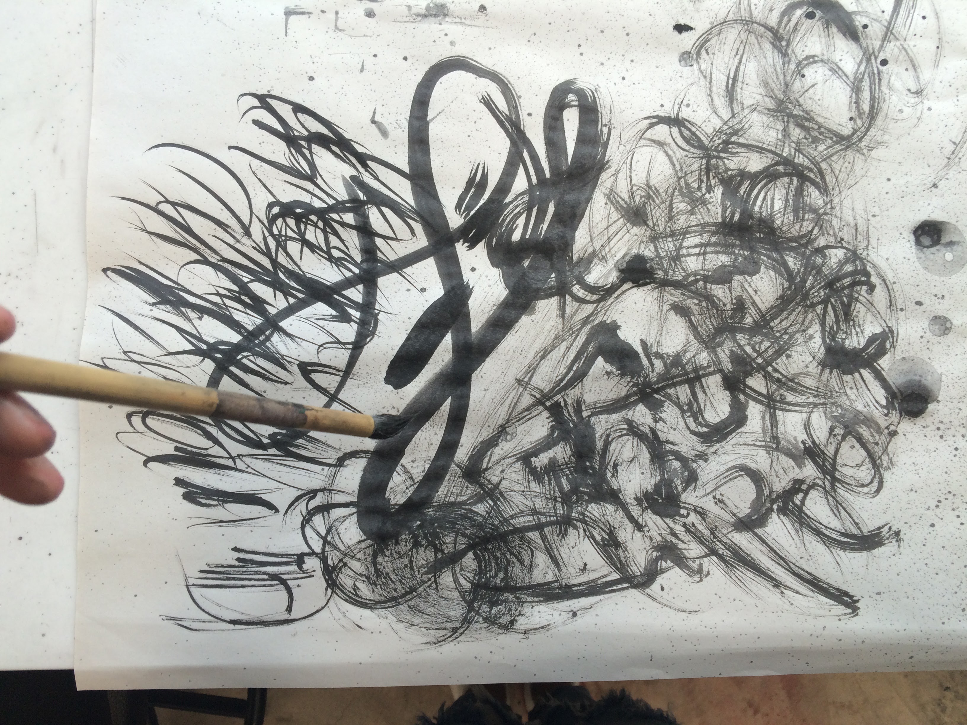
BRUSH EXPLORATION:
I explored different brush strokes. Firstly, by placing the brush horizontally and secondly, perpendicularly. As shown by the following two photographs.
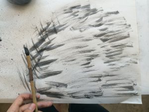

In the end, i tried the dry brush technique using chinese ink and created the following. i found myself holding the brush more horizontally.
In comparison, i tried a less vigorous version of the top painting. I used a fairly wet brush (dipped in chinese ink) and swept the tip of the brush ever so slightly onto the newsprint.

I then tried creating a pattern onto a toned background. I started by drawing mismatched strokes into ambiguous shapes that melded around each other.

i changed the pattern slightly by making it contain thinner lines and have more interesting shapes (more pointy and rounded etc.)
LINO CUT EXPLORATION:
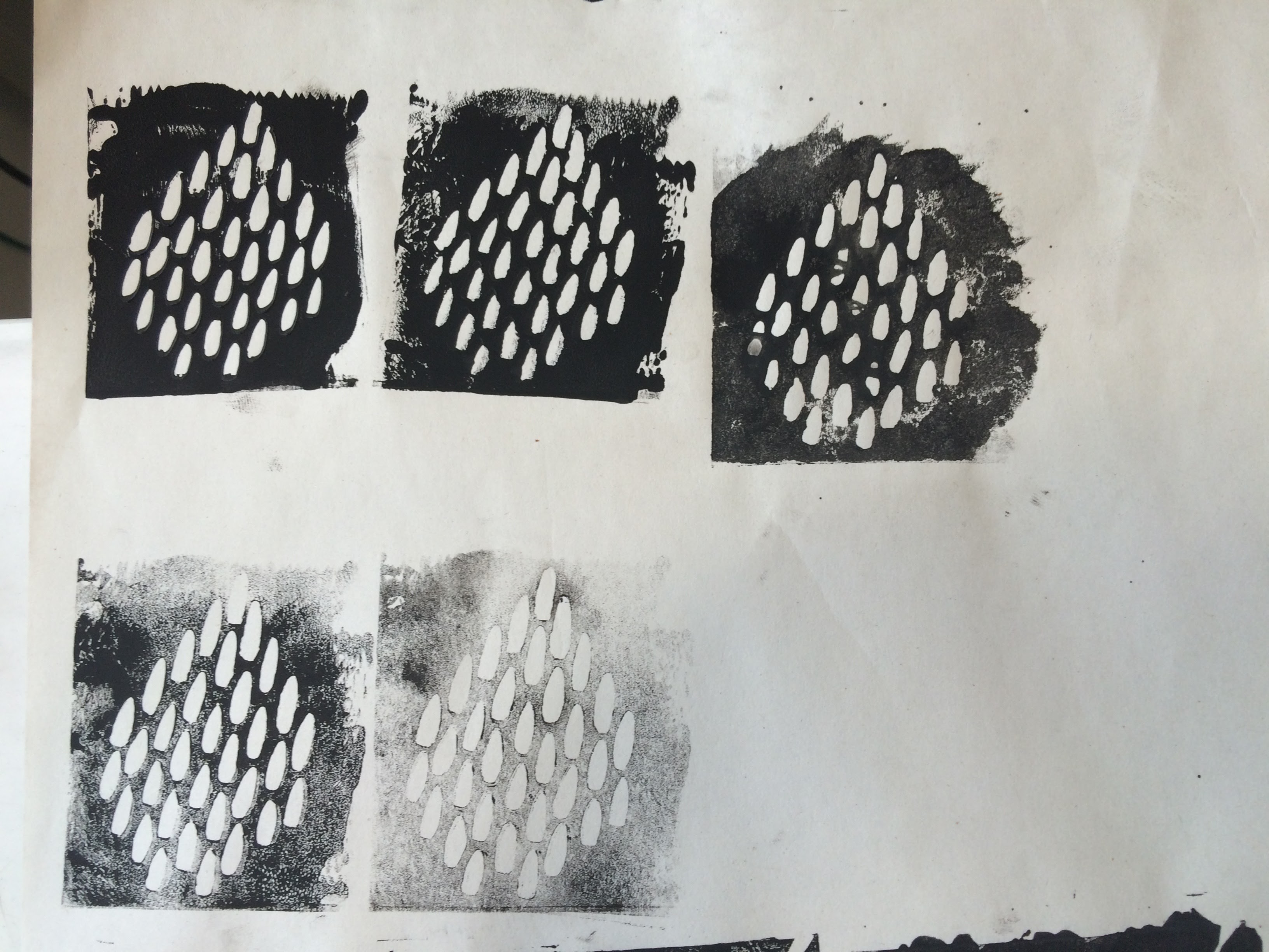
This was my first lino cut where i started making a pattern using repetitive egg-shaped cuts.
 I found the pattern very interesting so i did one in a more slender form where it ended up looking like a school of fish. Then i added more small cuts to one portion of the print and it started to look like a school of fish under other fishes. It gave it an illusion of space.
 For the last cut, i made long straight cuts, then i created more fluid looking shapes by turning the cuts ever so slightly with more space between them.

Smoke printing exploration:


MATCHING UP EMOTIONS WITH MY PATTERNS:
A. ANGER:
1. Annoyance: whipping hair/ dry brush
How did i do it: i created this print by dragging a dry brush in loopy patterns.
I relate this pattern to Annoyance as it is almost as if this is the trail left behind by my hair as i would shake my head and flip my hair whenever i am annoyed.
2. Slow burn: one line of paint w splotches
How did i do it: This is from the pleated paper print, where i pleated newsprint then dipped it into block print ink. I only took one line from the actual print and enlarged it.
This illustrates slow burn well as it gradually fades along the horizontal line.
3. Exasperation: Direct bubbbles
How did i do it: I made a bubble solution with black paint, dipped a straw in the solution and blew bubbles vertically onto the paper.
This print captured not only what the bubbles once were, but it also captured the act of them bursting. With specs of paint distributed throughout the print and also contrasting ink splotches, this creates a emotion likened to a type of explosion which i relate to exasperation – the desperation to burst/open up.
B. LOVE:
4. Enchantment:
How did i do it: I created this print by drawing lines in different directions bound by invisible boundaries.
I associate this pattern with being in a forest. Almost like being in a fairytale, the lines look like the trees in the forest. But the implied shapes of the pattern make it as interesting as the feeling of being enchanted.
5. Worship: embroidery
How did i do it: I did Embroidery on paper where the threads are all directed towards the center.
This allowed me to illustrate the beams of light descending down from the heavens and the halo of Angels. This creates a sense of space and the threads have a certain tension aspect to them which could be likened to the divine power bringing you to a greater place.
6. Crush: lino print
How i did it: I made the print first by making a lino cut then i scanned the print to enlarge it.
The gradual change from wavy lines to straight lines illustrates the feelings you get when you have a crush. When you first have a crush, you feel funny and all over the place! Then slowly you realise that therefore it gets straightened out.
C. JOY:
7. Amusement:
How did i do it: I covered paper with a layer of white gel crayon, went over it with squiggles of black crayon and went over it again with the white crayon.
The texture of the crayons are quickly associated with our childhood where we would just make random squiggles on paper thinking that they are the best artwork ever.
8. Ecstasy: bubble cluster
How did i do it: I took the print of the Bubble cluster (please refer to top to see how i did the print) then i scanned the image and enlarged it to draw attention to the details of the print.
This print contains the visual of bubbles which annotates pure joy. However, even in the print the movement of the bubble solution on the bubbles were captured. This movement looked very trippy and drug like, therefore i associate it with ecstasy.
9. Satisfaction: one line one breath
How did i do it: I repeatedly drew lines horizontally and varied the spaces in between the lines ever so slightly.
This creates a very calm drawing that looks like waves
D. FEAR:
10. Anxiety: circular squirtles
How did i do it: I scanned the original print (done by blowing ink through a straw), duplicated the image, played around with the transparency of the print and finally changed the angles of the duplicates.
This allowed me to create a print which has 2 planes of motion, one in the direction of the sprayed paint and the circular direction of the layered prints. This creates a dizzy print which i associate with anxiety. Through personal experience, having anxiety gets me really dizzy and my brain and body moves in different directions.
11. Doubt:
How did i do it: I scanned the image of the Lino cut print of the school of fish.
This print has a variation of density of similar shapes and that creates an illusion of space in the 2d print alone. The most likely association with this print is a school of fish, and the emotion of doubt is shown through how i can get out and be by myself but i doubt myself and continue being in a group.
12. Revulsion: pipagao packet
How did i do it: I created this print by scraping an end of a snack packet as it is loaded with ink.
This created a gradually patchy outcome which relates to revulsion as it can be likened to regurgitation.
E. SADNESS:
13. Cheerlessness:
How did i do it: I took a whole strip of watercolour paper and soaked it in plain water for a minute. Then I took a brush dipped in Chinese ink and dragged it across the top of the paper. I dipped the brush into plain water again and dragged it along the bottom of the paper.
This created a very gradual diffusing of the ink throughout the paper. This allowed me to create a texture that was rather dreadful the more i look at it.
14. Grieving:
How did i do it: palette knife painting. I dotted the paper with varying blobs of Ink, then went in with a clean palette knife and scraped past the blobs to create this pulling motion.
This allowed me to create a sense of longing much like one experienced when one is grieving.
15. Heartbreak:
How did i do it: symmetrical paint. I spread a base of white paint first then added some small spots of black paint on only half the strip of paper. I then folded the paper in half into itself. After the paint has smoothened out, I slowly pulled the ends of the paper to extend the paper and reveal the goodness inside.
This created a very wispy interaction between the paints, this is like what i feel under heartbreak. The feeling of not being able to fully let go, the wispy intertwining of the two bodies still lingering.
F. SURPRISE:
16. Adruptness:
How did i do it: I dragged a charcoal block across the strip again and again. I liked the texture already however, there seemed to be a rhythm in the strip itself. Therefore i naturally had to draw on the strip so hard so that it ripped :’) AND that was a blessing in disguise as i was able to achieve adruptness through that.
17: Revelation: pleated prints
18: Unforeseen: smoke screen.


 REFLECTION TIMEZZZ:


 Above is the print that Ms Shirley did in 10 minutes? She experimented further with the contours of the background, playing more with the negative and positive spaces of the composition. She also skewed my composition more to the side, out of the frame so that there is more visual interest in the print.


