After sharing the three concepts that I had come up with last week, I have received various feedback from the class and our tutor Michael. The feedback has helped me see pointers that I could not, and also help me focus on what can be done or should be done to improve my designs.
Among the three designs, I have decided to continue exploring the first two that I came up with, namely the one with a sapling, and the one with water droplets. I have decided to drop the idea of the farm as it did not seem as good an idea as the other two, thus deciding to focus more time on improving these two. The farm design seemed more suitable for kids, and might not work as well to other age groups, even though the concept of cuteness is applicable, audiences might not receive the same message as I have intended.
So, this is the next stage where I start to think more about the composition and color choices.
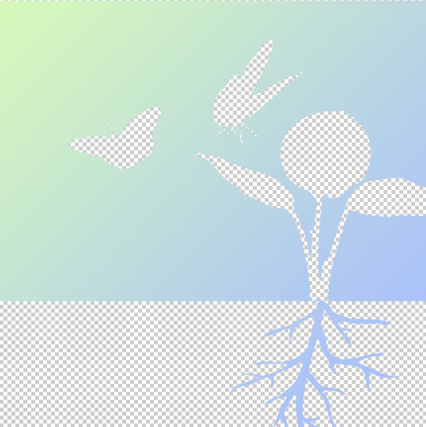
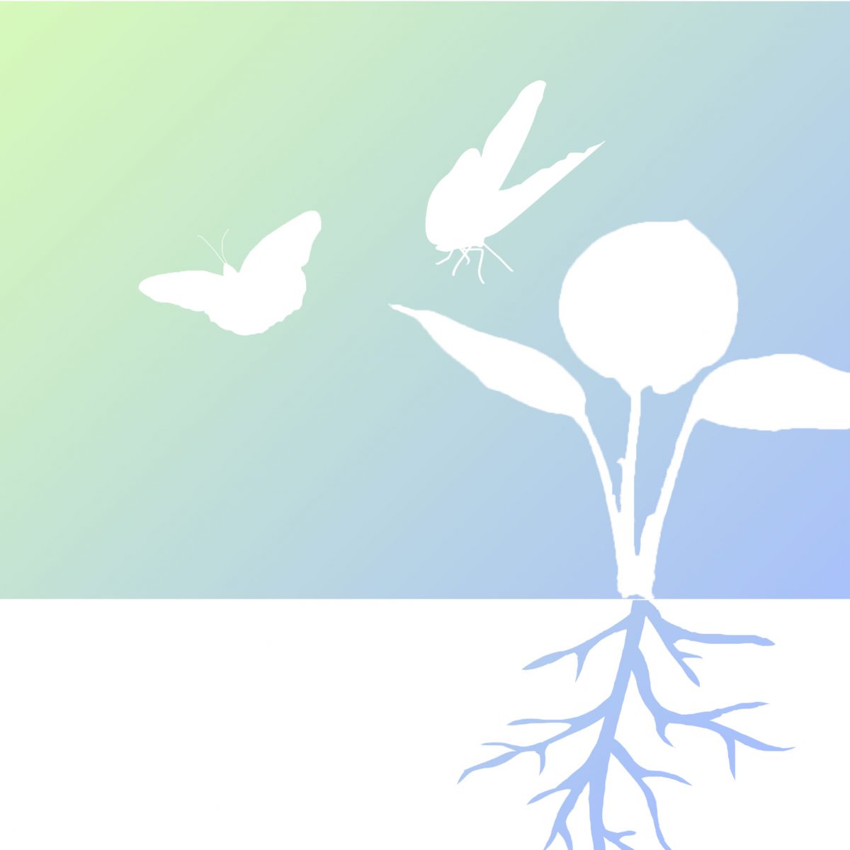
This is based on my first concept, the one with a sapling. As planned, I decided to go with the contrast of opacity, playing with transparent and opaque parts. I have shifted the sapling towards the right one third of the composition, following the rule of thirds which the eye focuses. Different postures of the two butterflies also serve to add more motion to the design, giving it more life despite the simple design and colors. I have chosen to use a gradient of green and blue as these colors largely symbolises nature, such as the sky and grass. The colors also come in a more pastel shade for it to feel more comfortable and soft. These plain background would also serve to work well against the background, which would be a myriad of colors as the bridge is surrounded by buildings, roads, trees and so on.
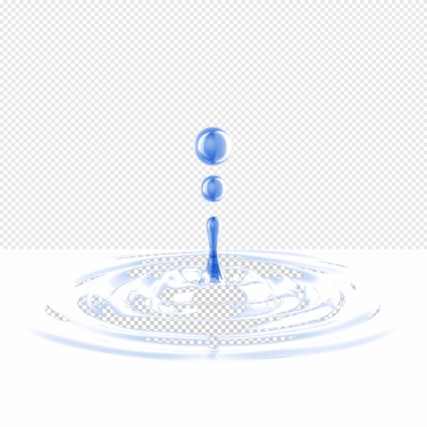
This design is based on my second composition, the water droplets and the ripples effect. This design more be more towards a calm and tranquil mood, thus the choice of white and blue, which are very clean and soothing colors. The main background is actually translucent, which allows the environment to fill up the background, yet the colors and images from the environment would be blurred. This allows the design to be visible, yet not just a plain flat image. The ripples are then made to be transparent, as this seems to be the “focus” of the design. As viewers walk along the bridge or move along the travellator, the background would then change accordingly, making it seem as though the ripples are moving, giving the design more dynamics and visual interest. I have decided to keep the entire composition centralised as opposed to the first design, as I felt the it seem more complete being right in the middle. The ripples would radiate from the middle of the composition, making the design well balanced and give an idea of “wholeness”, along with the spherical shapes of the droplets.