On the first day of school, 8th August, we went on a visit to Ng Teng Fong hospital, and were briefed to come out with a two dimensional therapeutic graphic to be placed along a bridge which connects Tower A clinics to Tower B wards.
With the luxury of staying in the west, I went back there for more observations on Saturday, 13th August. I wanted to see if there were any difference in the crowd as well as the environment there between a weekday and a weekend, and also between a morning and an afternoon. The crowd would determine the groups of audiences that my design has to cater to, while the environment would give me a clue of what would work and what might not.
With the observations, I then generated some considerations that I had in mind. This considerations would then bring me forward in coming out with concepts that I deem therapeutic and appropriate for use there.
One key consideration that changed my idea of the designs was the sunlight. Initially, I wanted to have a transparent design where the sunlight can project the image onto the ground. However, I noticed that the sunlight there was not very strong, and did not have a very low angle that can project the image large enough onto the ground, thus I decided to change the idea and work towards another direction. Another would be the viewing time, which is short of about two seconds on the travelator, which means my concepts have to be clear, concise, and visible.
[ Observations > Considerations > Concepts / Themes ]
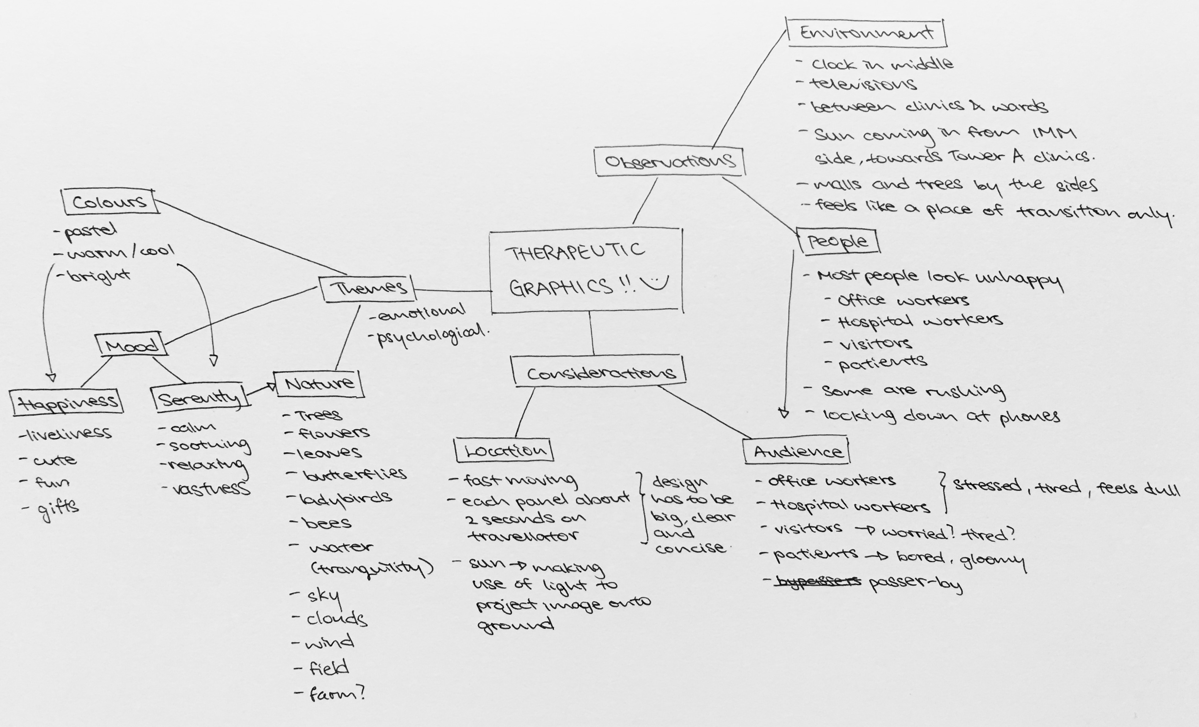
After coming up with the mindmap, it was simpler to understand what direction I would be heading towards. I went online to search for ideas of therapeutic graphics and pictures with a healing element, and most of them had the idea of “nature” in them.
The following are three main concepts that I came up with after the considerations and references.
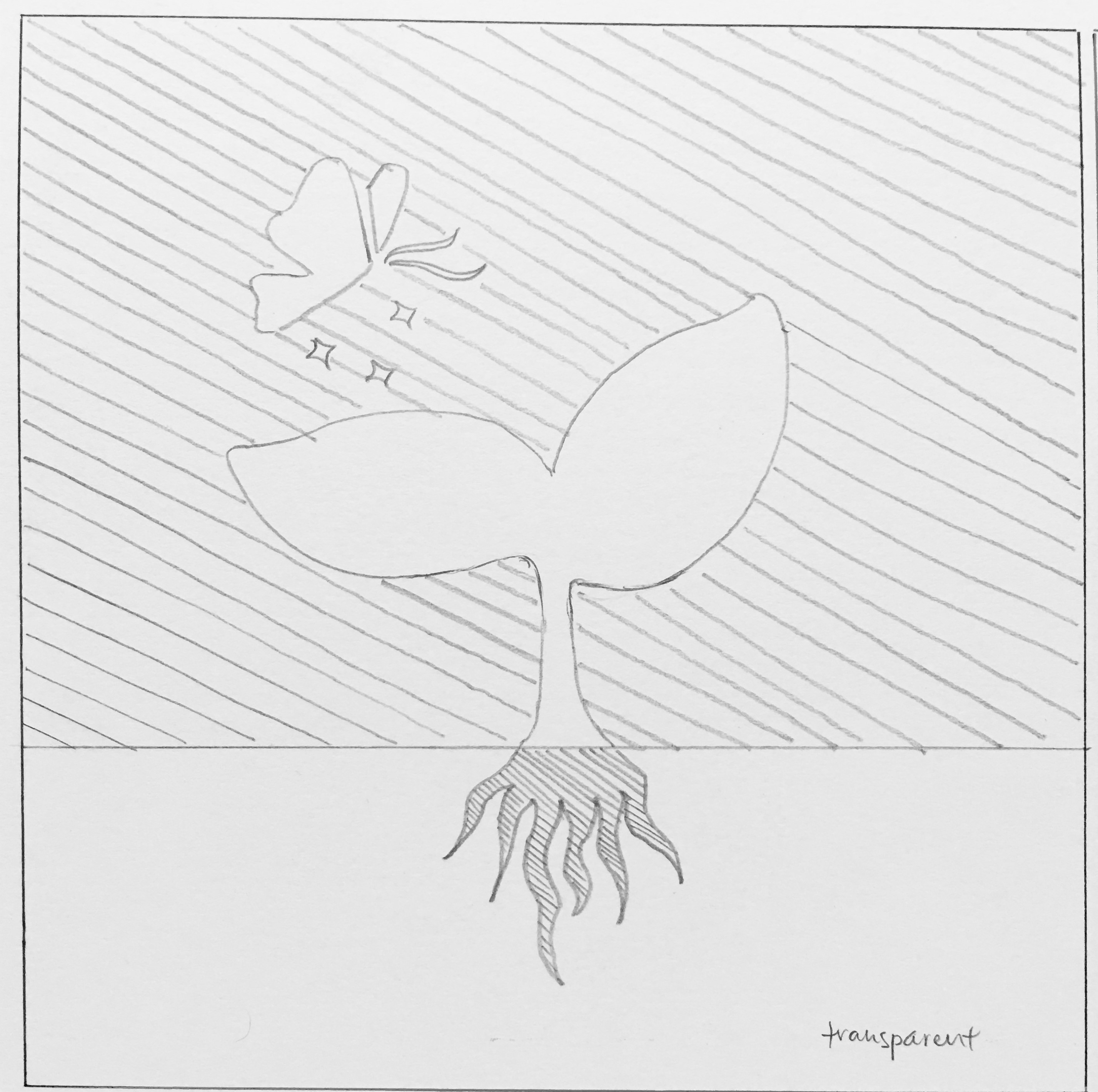
The first one makes use of the light and surrounding elements to play with the contrast of opacity. The top portion would be an opaque background with transparent graphics of a sapling and a butterfly, whereas the bottom portion would be an opaque root against a transparent background. This concept uses the surroundings to fill up the image, giving the design more dynamics. The sapling would symbolise growth and recovery, with the butterfly serving to enhance the experience by sort of providing some movement and “smell”.
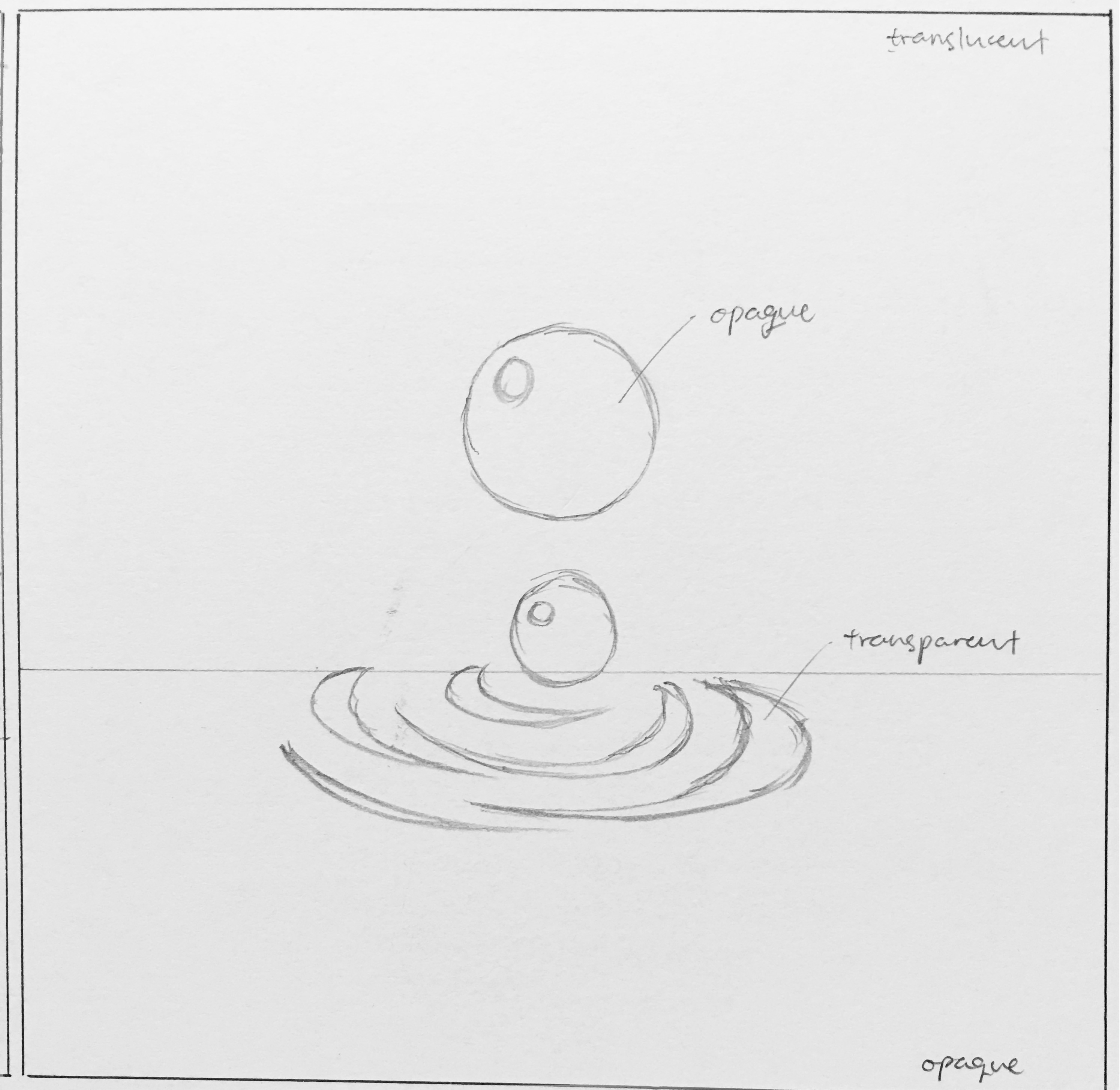
The second is similar in that it uses the idea of opacity. The top portion would feature a translucent background, while the bottom is opaque. The water droplets are opaque as well, leaving ripples transparent only. This would allow the ripples to “move” as the audience move along the bridge as the background surroundings would change along the movement. I wanted to give a feeling of tranquility of a calm water surface, as well as the vibrancy of the ripples. The water droplets also symbolises “wholeness” as water droplets tend to the form of a sphere by itself.
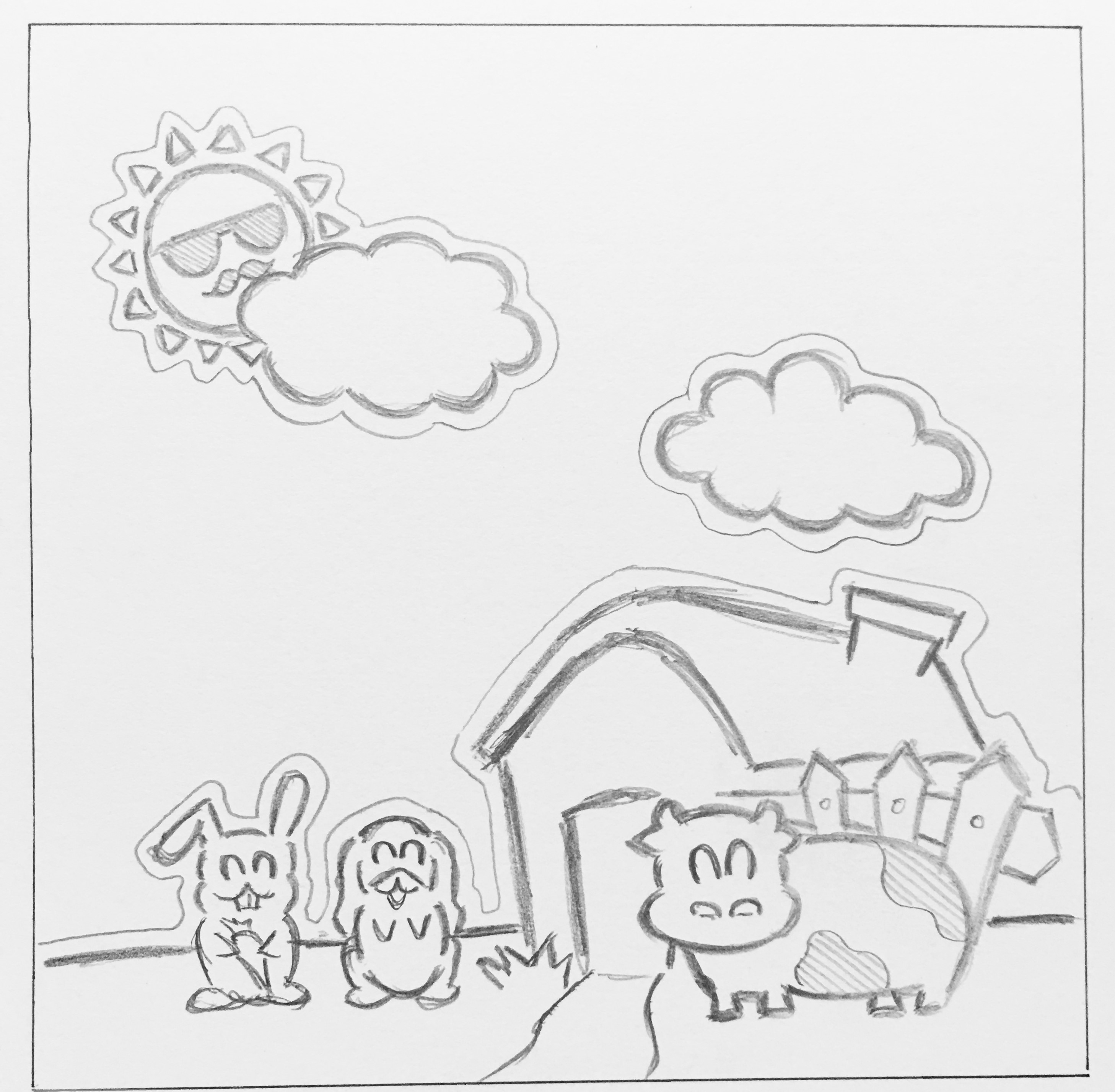
Lastly, in my third concept, I decided to change a point of view and have a different idea altogether. While coming up with concepts for the first two, I had a random idea that struck me, which is that basically almost anything cute would help to liven up somebody’s mood. I wanted to use the idea of “cuteness” to make people more happy and relaxed, and not forgetting some sort of therapeutic elements in it. I decided to come up with a farm, where a farm is largely related to being a place for retirement, for relaxation. I did it as a sticker / decal style to have some sort of a child-like touch to it, where the lines are black and bold and have a ring of white space around it. Very simple shapes and objects make up this composition to make it simple to view despite having more objects in it.
Subsequent improvements on these concepts would include how to make these compositions interesting despite having a simple design as well as the choice of color use.