moving img + layers

Lately I keep thinking about how the installation will come together. Working a bit on each aspect of my project, I realised that they shouldn’t exist as separate outcomes. I wanted to see how I could fuse both digital and print together. I also hope I can set up my work early so that I can work in situ. I really want to put things up as I go and rearrange them.

I played around with the projector in the VC lab and layered some animated collage against my process book.

Photo 14-3-16, 2 07 37 PM Photo 14-3-16, 2 07 40 PM

What I wanted to do was to make the animated collage a part of the giant map that I am doing and see how I can do away with viewing the ‘live data’ part of my work on the computer and incorporate with the big map and the blog archive.

moving collage 2

moving collage

Some gifs I made in attempt to capture the moving images against paper. I really love it, it makes the work come alive in such an exciting way. I want people to be able to immediately immerse themselves in this installation space of mine and my hybrid processes of making my work. Like I was saying in my previous post, I really wanted to see how I can go for a tactile approach to digital media. Which brings me to the next part of this post…

Photo 15-3-16, 9 51 14 PMPhoto 15-3-16, 9 51 20 PMPhoto 15-3-16, 9 51 23 PM

I made a prototype to show how I am putting together my big map, connecting all the concepts existing in my work. The elements of the map is set against my blog archive:

  • collages that I put together to reflect virtual nostalgia.
  • collages are connected using pink “branches” to the entries that are colour coded.
  • coloured entries are part of the database that I’ve been building and collecting on Google Sheets

Hopefully I am able to project the animated gifs on the wall space. Alternatively, I am considering installing iphones or ipads on the wall to display the animated work.

Lots of ideas going on this week… hope to share all on Friday.

3D data visualisations

Printed my blog archive yesterday. After looking at the first batch of blog rolls for a full year, I finally came up with a solution to improve it. I really like the material of transparency and I want to use it throughout my body of work. It ties in perfectly with my concept of digital art making and being online.

Previously the typeset was in Courier New, and I changed it to Neue Haas Grotesk for a cleaner, sleeker look.

Photo 5b

Photo 5c

How it looks like, all rolled up. I’m still thinking about how I can install this. Perhaps glueing them to thin acrylic/metal rods and hanging it with fishing line from the top of the installation space. But I will worry about that in late April when everything else is mostly printed out and completed. I don’t want to stick too closely to any plans yet.

Photo 5dPhoto 5a  Photo 5f

My friend kindly loaned me his b&w laser printer. I really like how the text came out slightly pixelated, it does add a nice contrasting texture.

revised outcomes

tsklist mar

visual-mar4

Updated list of project outcomes:

  1. Physical data visualisations of blog archive
  2. Map of growing up in the age of Internet (Timeline), to be mounted on installation wall
  3. FYP report (formal)
  4. FYP report (publication accompanying the artwork)
  5. Process journal

I’m in the process of clearing things that have already been finished, like the 3d data vis and my process journal. Just rearranging them for print. Next week I will begin to make the map. Will share more on that. I’m alternating between report writing and making, as I feel that both will affect each other.

I have already printed out a part of my process journal and am quite satisfied with the outcome. I like the outcome a lot and even though I did this as a test print, I might just use it as the actual. I will bring it in for critique and feedback next Friday to see if there is anything else I can work on to make it better.

Images that are sourced online or are made on the computer are printed on transparency sticker. I kept the doodles and sketches from the notebook black. The paper I chose is called ‘sugar paper’ (what a cute name) from Art Friend. It feels really nice and suited for the nature of the ‘process journal’. It works beautifully to convey the handwritten nature of my text. I up the contrast and amount of black, and the laser print gives it that touch of shine on the paper which really looks like I’ve used my own pen to write in it. I decided to go for laser printing because my inkjet printer is simply unable to replicate that shiny black that I wanted.

In terms of material and paper choice, I wanted to highlight the dual nature of my process. I enjoy both doing work on paper and on computer. Transparency sticker and paper is used throughout the book, as it resembles the glossy nature of the computer screen, in contrast to the textured paper. I also feel that it makes the colour of the images pop, which would otherwise be slightly washed out if I had just printed it on the slightly greyish sugar paper.

Here’s a surprisingly high-res and accurate photo of the paper texture.

sugarpaper


Photo 4-3-16, 10 24 51 AM Photo 4-3-16, 10 25 03 AM Photo 4-3-16, 10 25 16 AM Photo 4-3-16, 10 25 22 AM Photo 4-3-16, 10 25 27 AM Photo 4-3-16, 10 25 35 AM

This is one of my favourite spreads.Photo 4-3-16, 10 25 52 AM Photo 4-3-16, 10 25 58 AM Photo 4-3-16, 10 26 07 AM


installation update

installationoptions

installationsketch_V1

Idea 1

installationsketch_V2

*update, idea 2.

I’ve opted for a combination of B+D.

With the wall space, I intend to have a print out of my visualisation (of which i am still working on…). I am also going to remake the calendar project I did last year, in a more refined manner, and am thinking of integrating it together with the print out of the visualisation. I will be designing the work with the calendar project in mind. I will be including QR codes in my work as well, to make the work more interactive. An iMac will display the work in virtual, animated form.

*Update for idea 2:

After doing a little research on paper installation, I think I would rather have the physical visualisation as a hanging installation. This makes for a more impactful artwork, and also technically easier to install.

I will be working on a prototype of the updated calendar project, and bringing that in during the next meet.

Works from Venice Biennale

1907504_10153486141284553_4983460573938238491_n

11010004_10153486141389553_4527701412585987810_n

11267053_10153486141704553_6926056586629850961_n


I forgot the name of the artist who did these boxes, but I think this gives me an idea of how i can store the blog-rolls that I made last semester. One of the things that I would like to get started on and finish this semester is to think about how I can improve on that work.

11692506_10153486142914553_9073202435864724732_n

11009960_10153486143219553_4498728138886200671_n

Peter Friedl’s The Diaries, 1981-2014

More than 300 closed notebooks are displayed in piles within specially designed museum showcases. The Diaries is an epic staging of real time, memory, volume, and text on paper. Thousands upon thousands of densely filled pages covering a period of over 30 years testify to the impossibility of capturing bare life in words. His diary installation is a study in narration and is open to change. As private books and authentic documents authored equally by professional writers and amateurs, diaries sit ambivalently on the threshold of literature and history. Their centuries-long tradition has given rise to many ways of constructing, documenting and revoking subjectivity. By blocking access to the contents of his enshrined, closed diaries, Peter Friedl invites the viewer to contemplate the multi-layered meaning of how aesthetic experience and imagination work. In an era of open access and ubiquitous surveillance, overabundant communication and information, the artist’s “real allegory” takes on critically new importance. It questions the power of display and imagination, the drama of form and content as well as the fragility of autonomy.

The Diaries plays with notions of the anachronistic, precarious, and unfinished. Yet Friedl’s installation subverts the myth of immediacy in order to offer an alternative composed of withdrawal, silence, and introspection. Simple, mundane activities such as reading and writing become tools and aids for potential resistance and emancipation.

As a visual prologue to the diary project, the exhibition will include a selection of Friedl’s own childhood drawings from the 1960s. Like the notebooks, the authenticating medium of the drawing can be experienced as a piece of material culture. — e-flux journal

This work is particularly relevant to my own work, definitely. The printed archive of my blog could be seen as the technological counterpart of collecting journals. Will be referencing this work in my report.

11028010_10153486148554553_6834944647573020246_n

11214263_10153486140909553_9221313424968829972_n

samson kambalu

I have no real idea what this work is about. But I like the presentation of this one. Framed pictures are purposefully installed on the wall, against the text (an angry letter which was written quite humorously).

Installation Space = Work Space

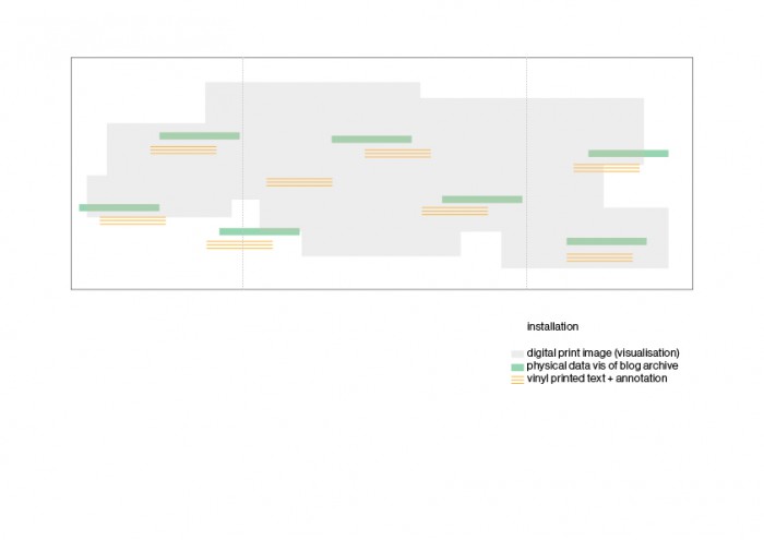
The installation space for my work should put the outcome in context. As I am working with my personal archive, I think that the best way to house the works is to build a space that centers around my own identity and practice as an individual/artist. I always tend to think that I am my work, and my work is me. It is not really meant to sound that self-absorbed, but I feel that the process and documentation of my art-making is as important (sometimes more than) as the outcome. I find a personal joy and fulfilment in making the works, and this is what makes me happy.

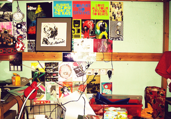
That sort of gave me an idea for the installation space. The following pictures are from my blog and documented my workspace throughout the years.
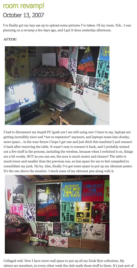
Workspace, 2007

colourfulz_by_astrosaurus

workspace2

Workspace, 2009installationspace02


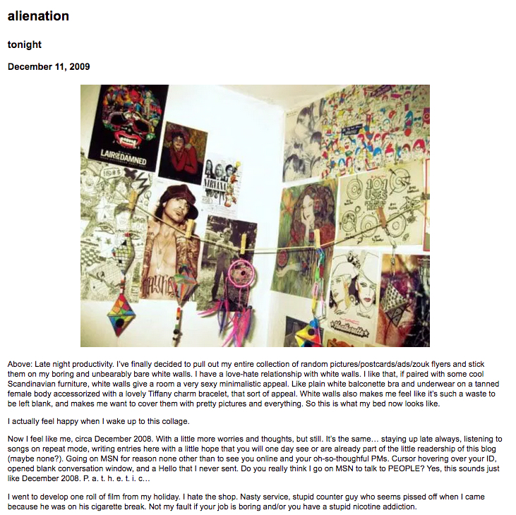
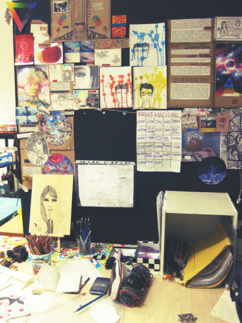
Workspace in the art room, 2010

workspace1


Current workspace

installationspace03

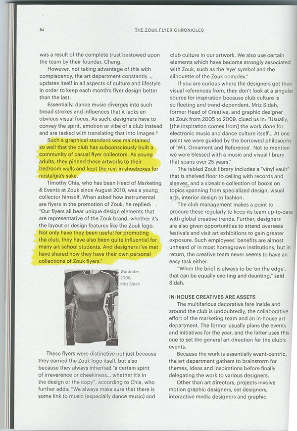
Having a moodboard is important. I built a visual vocabulary out of these amazing Zouk flyers that I collected as a teenager. They have inspired me so much over the years, and I would even go as far as to say that these flyer artworks influenced my direction in life. If I didn’t collect them and take them seriously, maybe I would never be interested to pursue art and do visual communication.

Found a really interesting article from The Design Society Journal, written about the impact of these flyers as an effective visual communication tool for established clubbing spot and as influential, memorable things that are part of the Singapore design scene. I thought it was quite a sweet homage to the flyers and it was nice to finally read about some of the graphic designers behind the works I loved for so long, and also to know that many other local designers share the same love for these flyers that I do.

zouk01 zouk02

In my installation space, I don’t intend to include my collection of Zouk flyers and other print materials. I consider this a part of my archiving and art process, as they make up the bulk of my workspace and inspired me greatly. But I am thinking about how illustrating and writing can come together in my practice. So I might propose that my installation space could include a wall decal, an illustrated piece about my feelings on this.

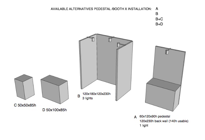
For the display of my outcomes (print, digital…) I am thinking of using a metal rack.

metalrack_b82220_metal_strong_display_strong_style_color_b82220_rack_strong_wire_mesh_display_stand_r


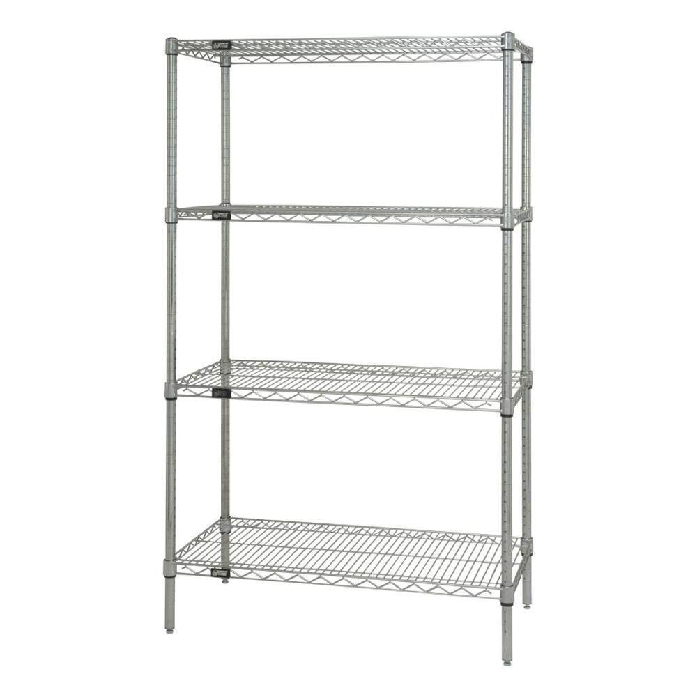
Something very generic. Depending on the outcome of my wall decal, I might change the material of the shelving to match the decal. For me, the metal rack is a symbol of the workspace. I think having a table or some pedestal is way too literal of the workspace, and honestly a bit too formal. At the same time, it is not my intention to recreate my teenage workspace or something. The FYP is important to me because it’s my last project that I will make as an art student in an institution, and I would like my outcome to reflect this idea of documentation/journey/destination, growth as a individual, and overall, a sense of maturity, I hope. Hahaha. I understand that my work do contain some teenage angst and that kind of stuff, but I want it to be kind of humorous, reflective, but I also don’t want to give the impression that this is who I will always be.

I had a conversation with my friend and we briefly made some plans about having a studio together in the future. As he is a photographer, we both agree that working with someone of a different discipline could be beneficial to our own practices. We spoke of building a library together and having a bookshelf in the middle of the studio as a representation of this collaborative way of working. Likewise, the bookshelf is a repository of resources. I think it ties in with this whole idea of archiving and documentation as well. The bookshelf also represents this idea of transition: who or what I am going to be next, and where do I see myself later on.