moving img + layers

Lately I keep thinking about how the installation will come together. Working a bit on each aspect of my project, I realised that they shouldn’t exist as separate outcomes. I wanted to see how I could fuse both digital and print together. I also hope I can set up my work early so that I can work in situ. I really want to put things up as I go and rearrange them.

I played around with the projector in the VC lab and layered some animated collage against my process book.

Photo 14-3-16, 2 07 37 PM Photo 14-3-16, 2 07 40 PM

What I wanted to do was to make the animated collage a part of the giant map that I am doing and see how I can do away with viewing the ‘live data’ part of my work on the computer and incorporate with the big map and the blog archive.

moving collage 2

moving collage

Some gifs I made in attempt to capture the moving images against paper. I really love it, it makes the work come alive in such an exciting way. I want people to be able to immediately immerse themselves in this installation space of mine and my hybrid processes of making my work. Like I was saying in my previous post, I really wanted to see how I can go for a tactile approach to digital media. Which brings me to the next part of this post…

Photo 15-3-16, 9 51 14 PMPhoto 15-3-16, 9 51 20 PMPhoto 15-3-16, 9 51 23 PM

I made a prototype to show how I am putting together my big map, connecting all the concepts existing in my work. The elements of the map is set against my blog archive:

  • collages that I put together to reflect virtual nostalgia.
  • collages are connected using pink “branches” to the entries that are colour coded.
  • coloured entries are part of the database that I’ve been building and collecting on Google Sheets

Hopefully I am able to project the animated gifs on the wall space. Alternatively, I am considering installing iphones or ipads on the wall to display the animated work.

Lots of ideas going on this week… hope to share all on Friday.

3D data visualisations

Printed my blog archive yesterday. After looking at the first batch of blog rolls for a full year, I finally came up with a solution to improve it. I really like the material of transparency and I want to use it throughout my body of work. It ties in perfectly with my concept of digital art making and being online.

Previously the typeset was in Courier New, and I changed it to Neue Haas Grotesk for a cleaner, sleeker look.

Photo 5b

Photo 5c

How it looks like, all rolled up. I’m still thinking about how I can install this. Perhaps glueing them to thin acrylic/metal rods and hanging it with fishing line from the top of the installation space. But I will worry about that in late April when everything else is mostly printed out and completed. I don’t want to stick too closely to any plans yet.

Photo 5dPhoto 5a  Photo 5f

My friend kindly loaned me his b&w laser printer. I really like how the text came out slightly pixelated, it does add a nice contrasting texture.

revised outcomes

tsklist mar

visual-mar4

Updated list of project outcomes:

  1. Physical data visualisations of blog archive
  2. Map of growing up in the age of Internet (Timeline), to be mounted on installation wall
  3. FYP report (formal)
  4. FYP report (publication accompanying the artwork)
  5. Process journal

I’m in the process of clearing things that have already been finished, like the 3d data vis and my process journal. Just rearranging them for print. Next week I will begin to make the map. Will share more on that. I’m alternating between report writing and making, as I feel that both will affect each other.

I have already printed out a part of my process journal and am quite satisfied with the outcome. I like the outcome a lot and even though I did this as a test print, I might just use it as the actual. I will bring it in for critique and feedback next Friday to see if there is anything else I can work on to make it better.

Images that are sourced online or are made on the computer are printed on transparency sticker. I kept the doodles and sketches from the notebook black. The paper I chose is called ‘sugar paper’ (what a cute name) from Art Friend. It feels really nice and suited for the nature of the ‘process journal’. It works beautifully to convey the handwritten nature of my text. I up the contrast and amount of black, and the laser print gives it that touch of shine on the paper which really looks like I’ve used my own pen to write in it. I decided to go for laser printing because my inkjet printer is simply unable to replicate that shiny black that I wanted.

In terms of material and paper choice, I wanted to highlight the dual nature of my process. I enjoy both doing work on paper and on computer. Transparency sticker and paper is used throughout the book, as it resembles the glossy nature of the computer screen, in contrast to the textured paper. I also feel that it makes the colour of the images pop, which would otherwise be slightly washed out if I had just printed it on the slightly greyish sugar paper.

Here’s a surprisingly high-res and accurate photo of the paper texture.

sugarpaper


Photo 4-3-16, 10 24 51 AM Photo 4-3-16, 10 25 03 AM Photo 4-3-16, 10 25 16 AM Photo 4-3-16, 10 25 22 AM Photo 4-3-16, 10 25 27 AM Photo 4-3-16, 10 25 35 AM

This is one of my favourite spreads.Photo 4-3-16, 10 25 52 AM Photo 4-3-16, 10 25 58 AM Photo 4-3-16, 10 26 07 AM


betwixt festival 2016

sarahmamt1 sarahmamt2 sarahmamt4

I was interested to see the Betwixt Festival at the Art Science Museum. I am unable to make it down to see the works (it was a crazy week) but I went online to do more research on the works. I find it encouraging that there is increasing exposure to the public about software and net art. One of the works that I found on the website is #dataselfieme by Sarah Mamat. That was the only work with the most information I can find. The project makes use of the self-tracking app called Moment, which is designed to help you keep track of the amount of time you pick up and use your phone. She combines the information with a GPS app to track her movement around Singapore in a day. Anyway this project makes me think about a couple of things that I personally feel I should look out for in my own work:

1. drawing with data: I find that the use of GPS drawing is quite a cool concept. I just feel that there could be more to these abstract lines than well… just abstract lines. Perhaps it is a matter of presentation, but many times, these minimal lines look good just because. I think that there is more than can be done for these GPS lines to enhance their meaning. If this work was interactive/animated, there will be more potential for such abstract linework to be put in a more meaningful context that is relevant to the theme.

2. being relevant vs context of the work: I struggle with this in my own work and I see this issue existing in this work as well. The exhibition describes the work as a “contemporary digital self-portraiture”, which I am not sure if it is at all a good description of the work. On the artist’s website, she describes this it as a “portrayal of detailed movement while capturing the essence and totality of the artist, presenting it in a different perspective.” I think what we can glean from the work is that the artist picks up her mobile phone pretty often throughout the day, and certainly this is relatable for most viewers, because it is not uncommon for us to pick up the phone plenty of times. Through her documentation in the few months, I find the data quite repetitive. It makes me think about what makes a good piece of data visualisation and why it works for the really good ones: that it is really important to find something meaningful to highlight from the dataset and tell a story from there. The dataset can always be made available, as something separate from the work, to provide a more detailed insight. In the case of this work, it is a lot of info that doesn’t translate to much, especially about something that we do everyday, and so often. It’s not really a strong dataset that could simply exist on its own and carry its meaning well.

3. lingo: I feel that when it comes to making works using apps that we make use of in our everyday life, there is always a tendency to self-reference by peppering the work with trendy buzzwords. I am a slight detractor of the use of hashtags. I think it has its place on social media platforms and it is part of the language there, but other than that, taking it out of that context often seems like a contrived need to keep up with being relevant to our world today.

That said, I think I also need to pay more attention to how I can properly context my work so that (as far as possible) it doesn’t fall trap to these things. I’m generally concerned about how some parts of my work is deemed ‘trendy’, something that I only quite recently discover why, thanks to Chloe and Qixuan who shared with me some interesting articles and websites. I think it’s the imagery that I’ve been using: screenshots of dated, defunct applications, which are also part of the visual vocabulary of a Tumblr subculture that makes references to those applications. Being able to easily find these screenshots was really helpful for me to try and illustrate the idea of the impermanence of technology, particularly of tools such as Microsoft Word and Microsoft Paint, where most people my age probably started with in making any digital art. I hope to make this point a little more clearly so that people don’t confuse this with an existing Internet art trend and then trivialise the nature of my work by the associated (negative) connotations of making Tumblr-inspired artwork.

visualisation concept


Photo 18-12-15, 6 48 28 PM

This was my final work for Facts & Fictions. I made this booklet on the day of the exhibition… it was a really packed month for all of us. It’s not the most refined piece of work I’ve ever made, but I am quite happy with the concept for visualisation and this is something I will work on next semester, after I am finished with making the dataset.

A group critique made me consider a lot more about what would best capture the nature of my blogging journey. I have also received comments that it would be great if I can incorporate some illustrations too. I came up with the germination process as a metaphor, not the most original, surely, but the concept is pretty basic and there is a lot of room to play with.

Photo 18-12-15, 6 48 40 PM

Photo 18-12-15, 6 48 45 PM

Screen Shot 2015-12-18 at 6.47.41 pm

This page was made using the sketch I created on Google Sheets, using a radial treemap as a reference. (Google Sheet is able to generate a treemap chart too – very cool)Photo 18-12-15, 6 48 53 PM

I think having this overarching concept to go along with the visualisation will make my work more relatable and meaningful to others, rather than being this abstract data vis-y thing that people just look at with no clue what it is about.

week one reflections

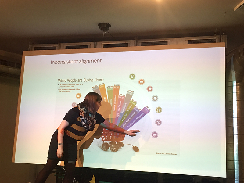
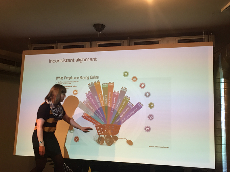
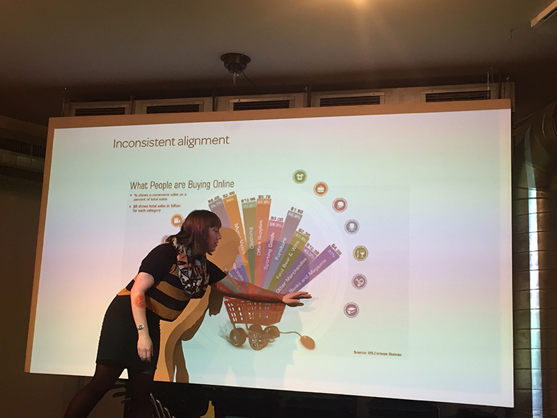
It’s been a really packed and intensive week! I have so much to share, and it’s amazing how much I’ve learned about data visualisation in just these few days alone. Here’s a quick recap of what I’ve learned over the week.

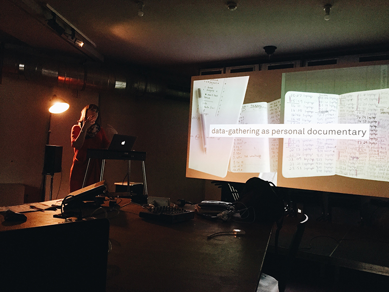
First, we have Stefanie Posavec, who was with us Monday to Thursday. On Monday, we gathered a dataset that represents the spirit of Berlin. I went to a local supermarket to collect some information on the products sold there. We learned how to make a physical visualisation out of the data we collected.

Photo 4-11-15, 8 02 32 PM

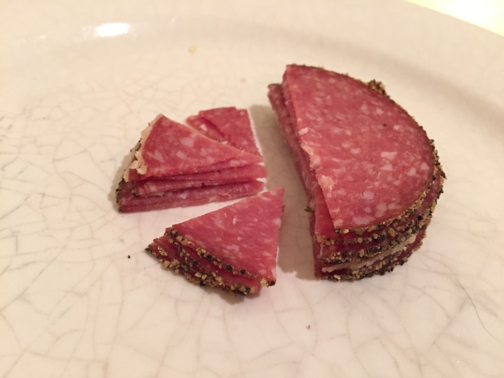
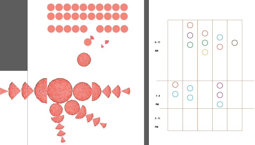
I made this pie chart out of salami, to represent the different kinds of wursts that can be found in a typical German supermarket.

Photo 5-11-15, 7 54 43 AM

visual

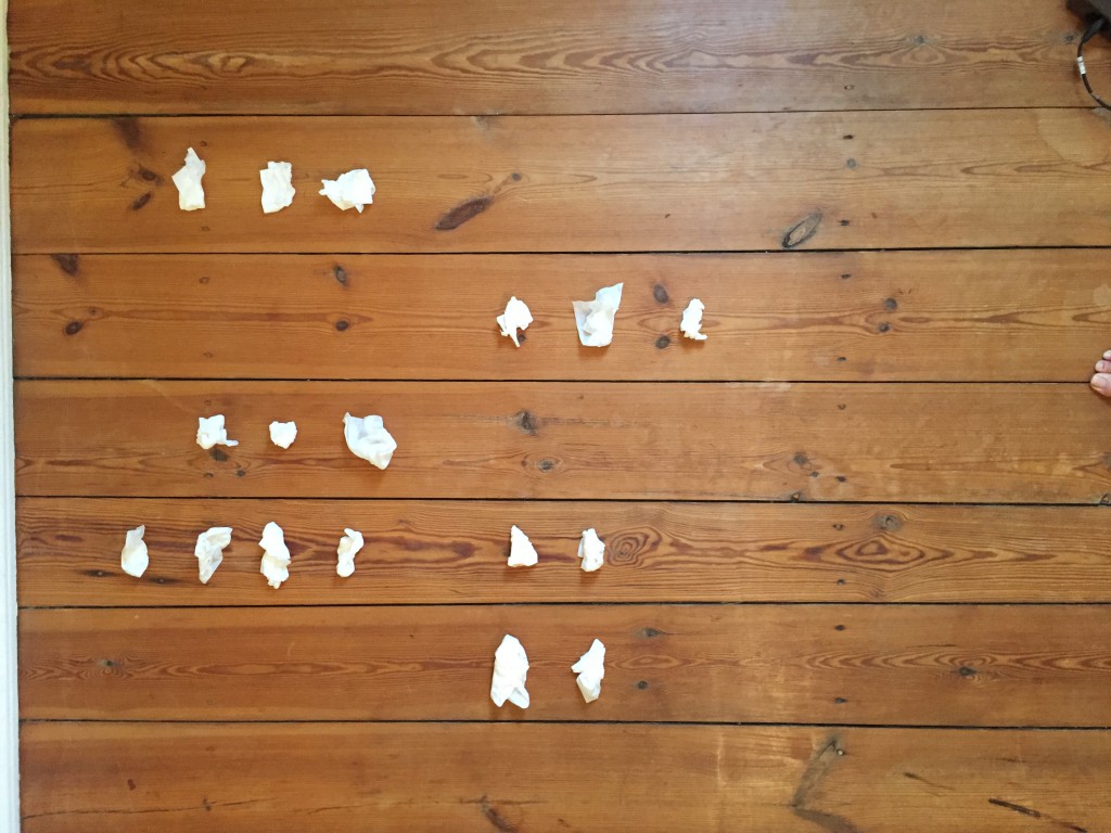
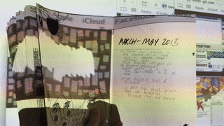
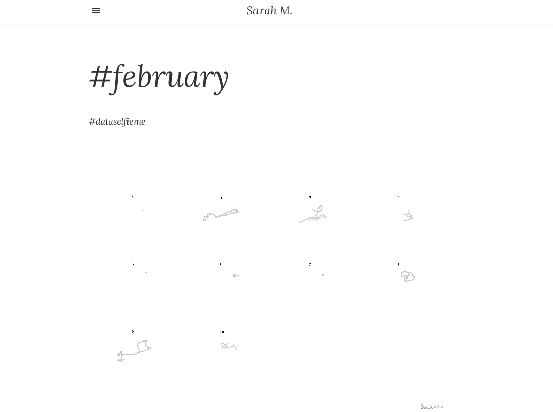
I also collected another data set on the number of times I checked in with my family and friends over the week. I was having a cold this week, and the tissues were used as a form of visualisation.

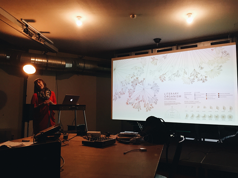
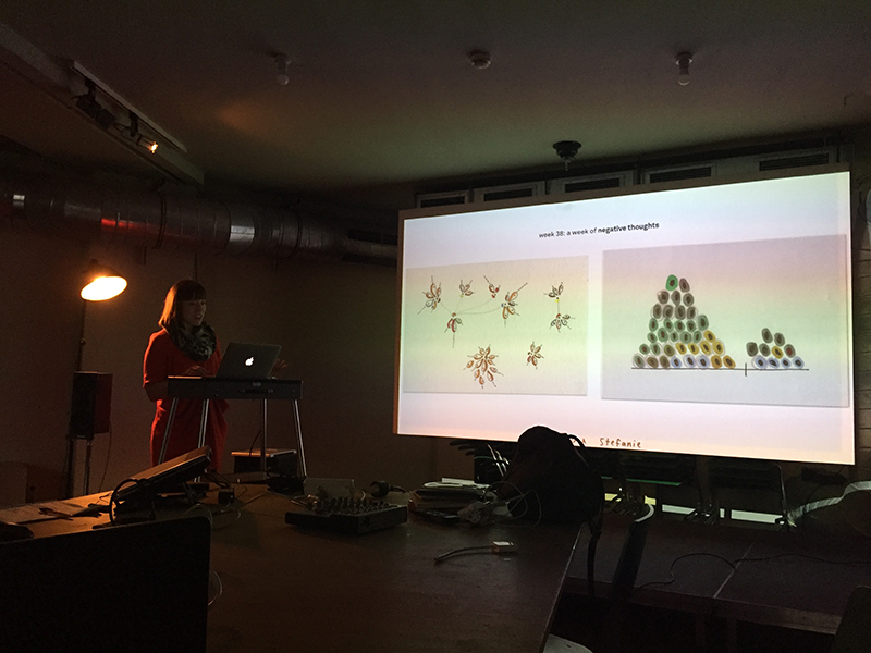
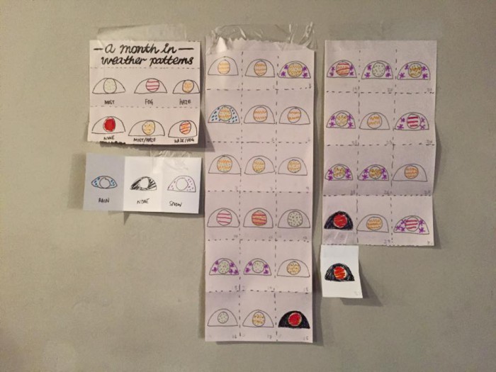
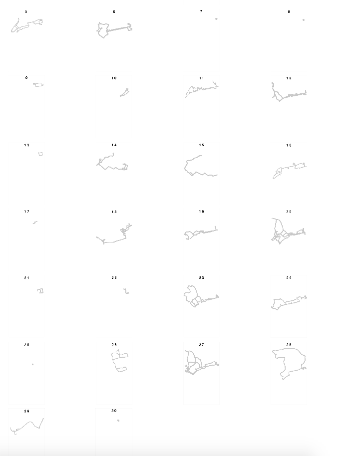
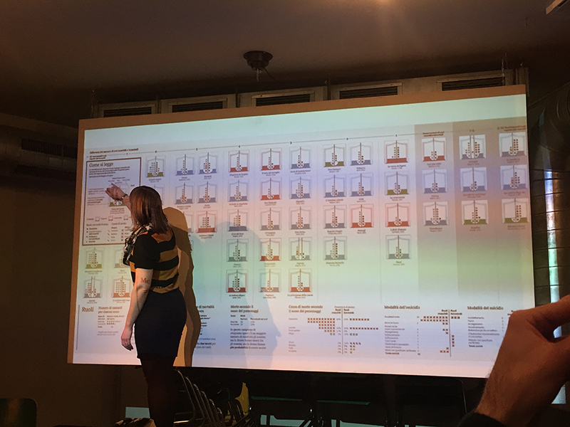
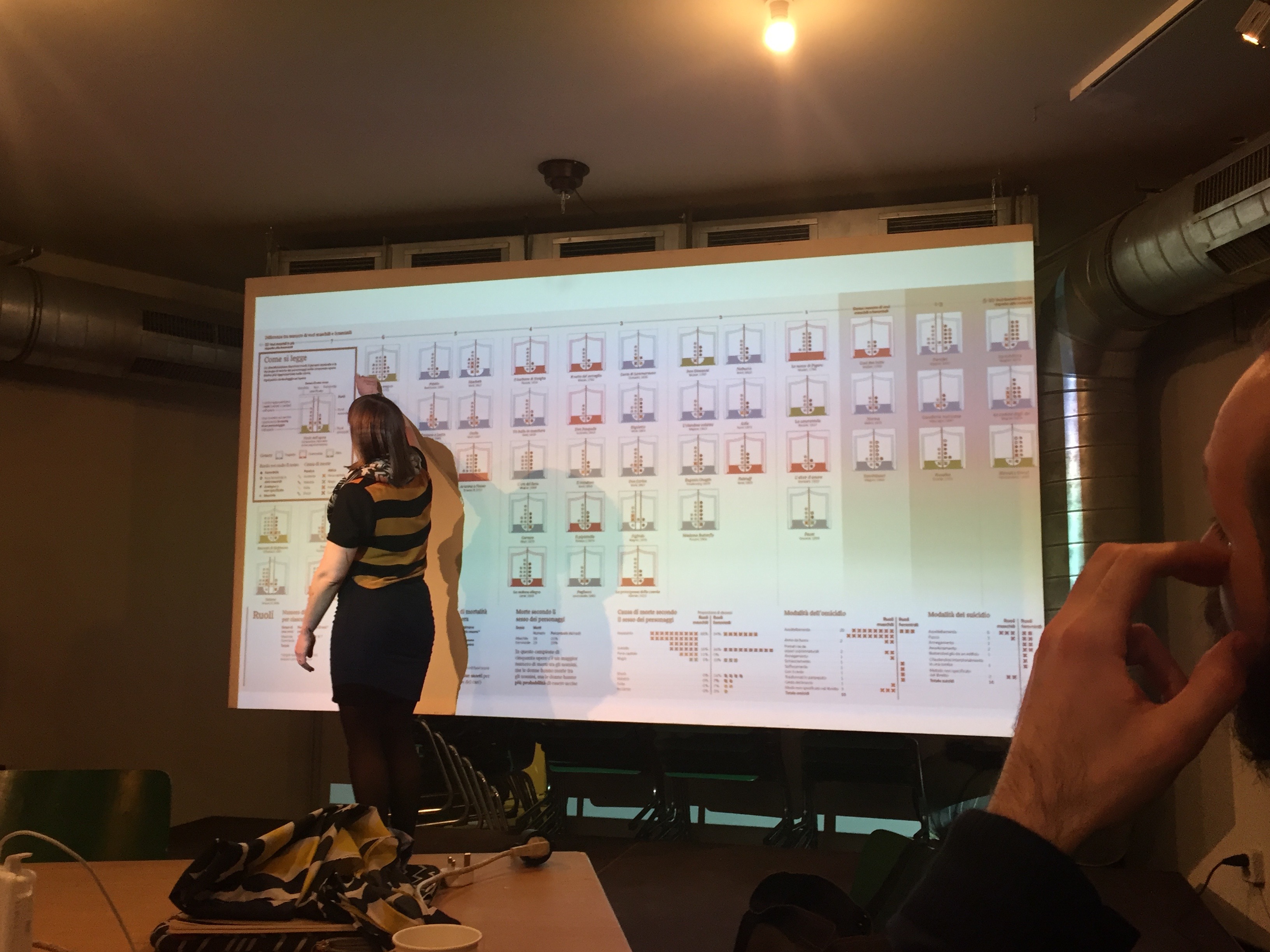
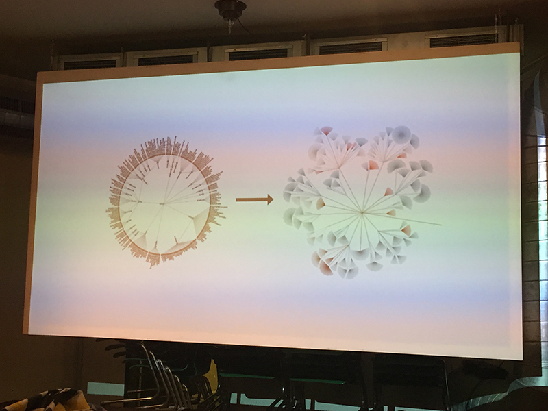
Stefanie’s approach to data visualisation is very hands on: she does not do programming. Instead, she draws everything by hand. Her process is very well documented, and her slides contain many photos of her sketches from her notebook. She encourages us to try this approach on our last day with her, where she gave us a set of data on the weather patterns in a month.
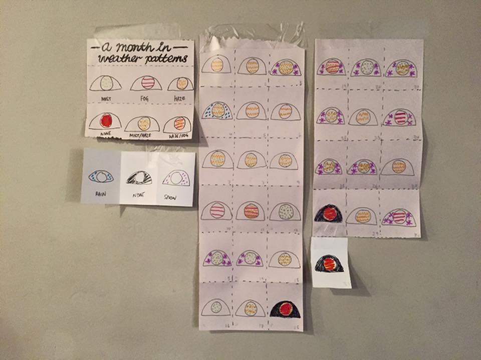
11219106_10153760738479553_4754221288298612195_n

This is my outcome.

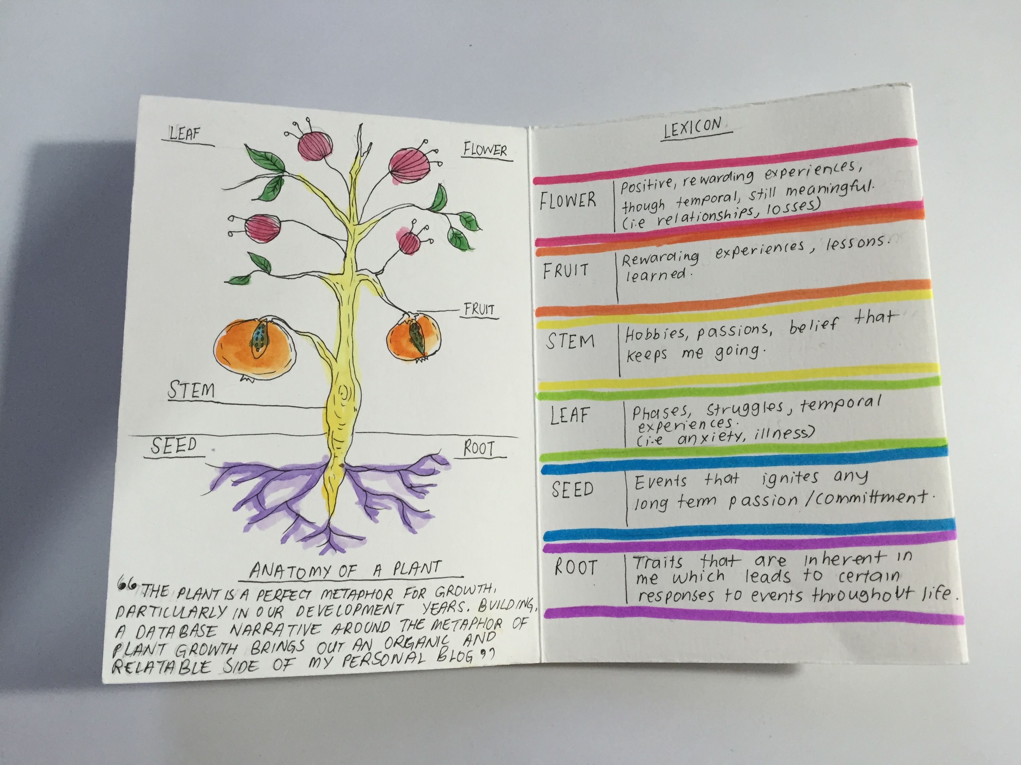
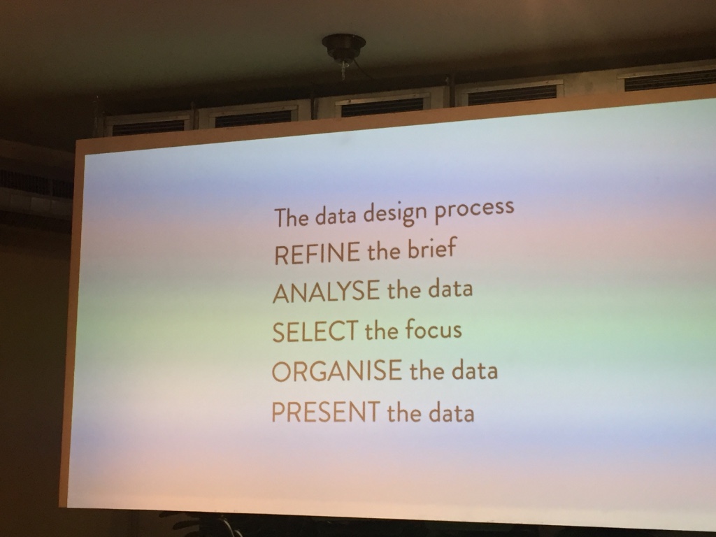
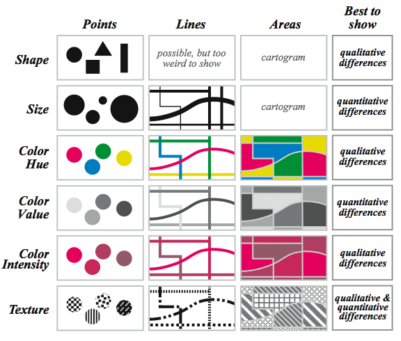
Key things we learned with Stefanie: find a pattern in your data, select your focus, and always remember than form follows function. Set up rules. Create hierarchy within your focus helps to make your visualisation even clearer. Always create a scaffolding before inputting your graphical elements.  Think sequentially, incrementally.
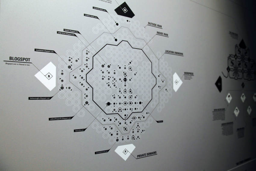
blogosphereViz_MP

(this-is-maral.com)

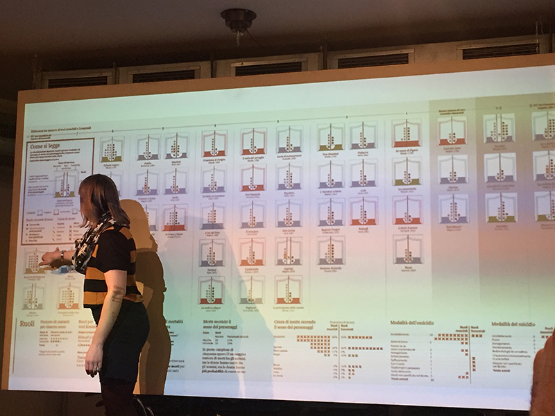
On Thursday evening, we had an artist talk by Maral Pourkazemi. Maral is a very passionate designer. She has Iranian roots, which shapes most of her design work. She calls herself a design activist, where she uses her data vis skills to create powerful works to highlight the issues faced by Iran. This is one of the most interesting talks I’ve ever heard, as she shares the potential threats that surround her as a designer, because her work involves politics. Like Stefanie, her master thesis was the work that propel her to the world of data vis, and offered her many opportunities and led her to where she is today. For her masters, she made a work about censorship of Iranian internet.

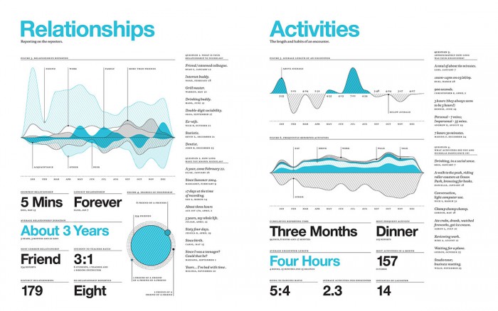
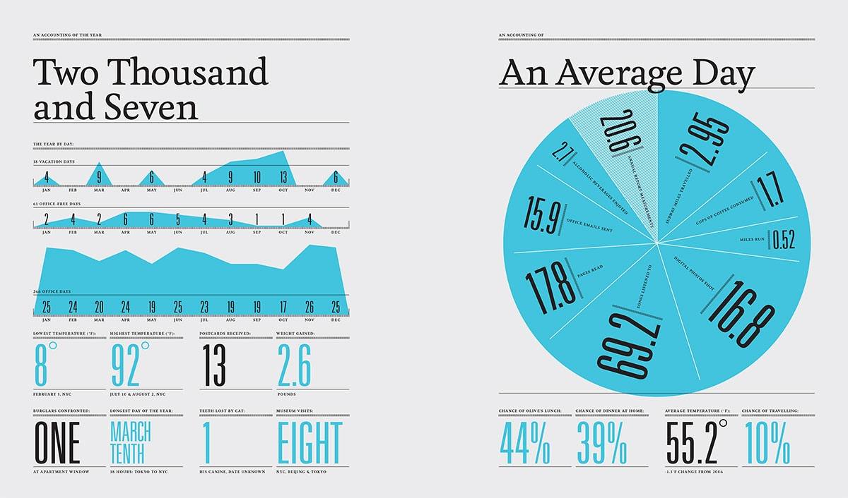
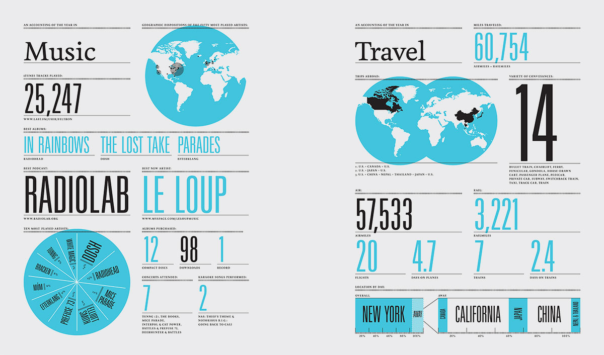
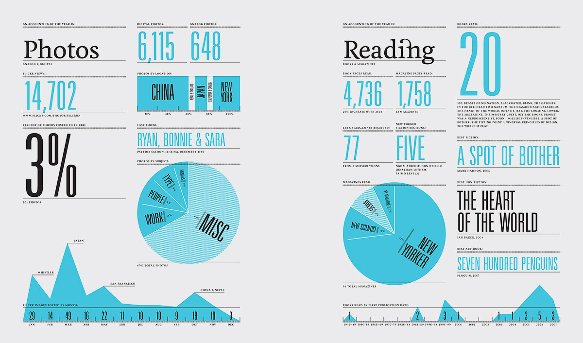
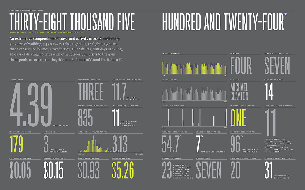
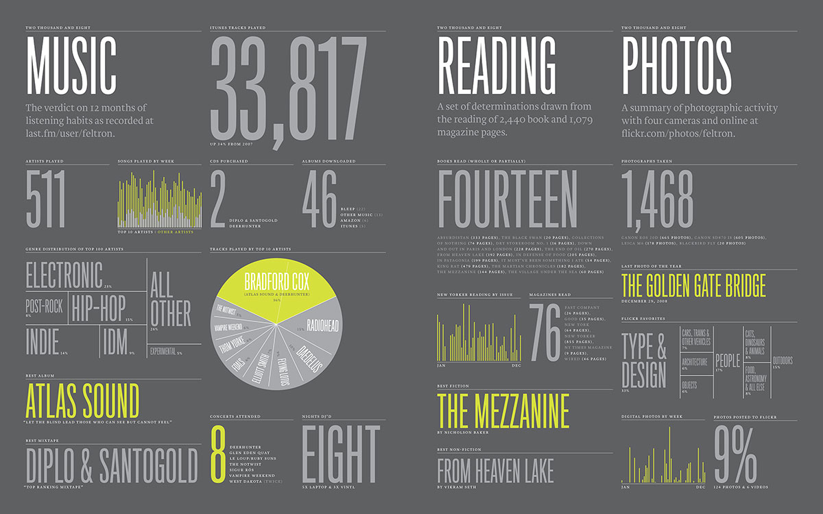
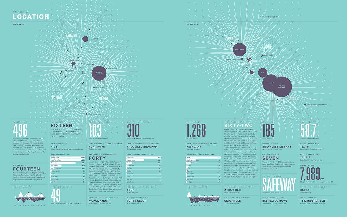
We ended the week with Nicholas Felton, who shared with us the programming side of data visualisation. I was very interested to hear how he made all his Annual Reports, and everyone was curious about this whole effort of collecting data actively, consciously, for ten years and putting them together in his report. Each year, he challenges himself to make a better report than the last. His last few reports were made with the help of applications, a few that he developed by himself.

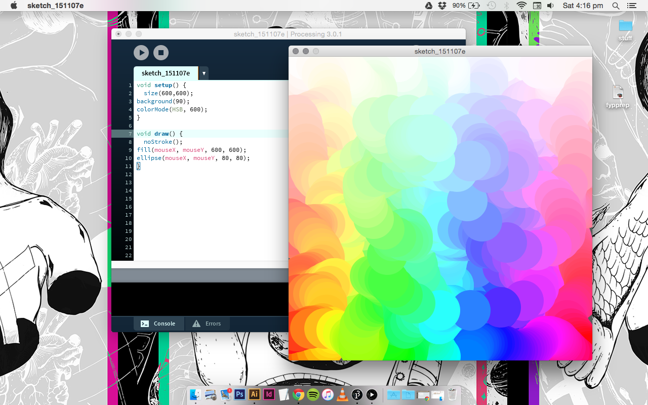
This weekend, Nicholas walked us through the program Processing. I’ve gone through a beginner’s tutorial the week before I came, so thankfully I was no stranger to this. Having just a bit of introduction and some background in coding helped me a lot in picking up Processing as I go along.

Screen Shot 2015-11-07 at 4.16.57 pmScreen Shot 2015-11-08 at 1.38.33 pm

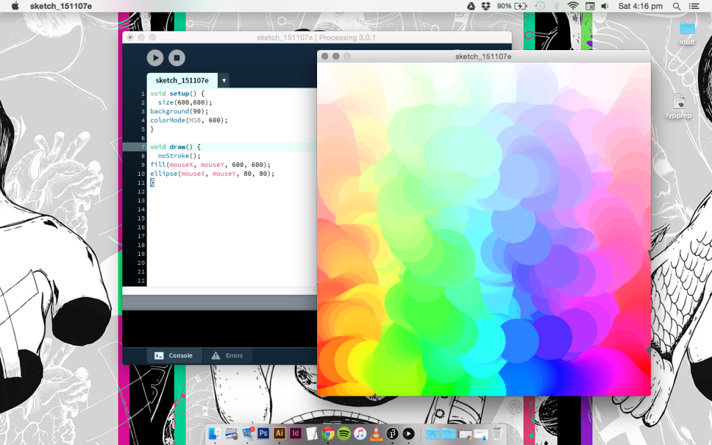
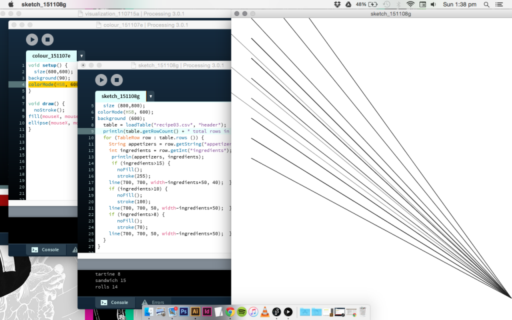
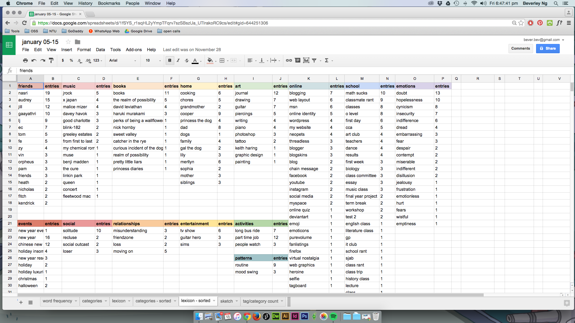
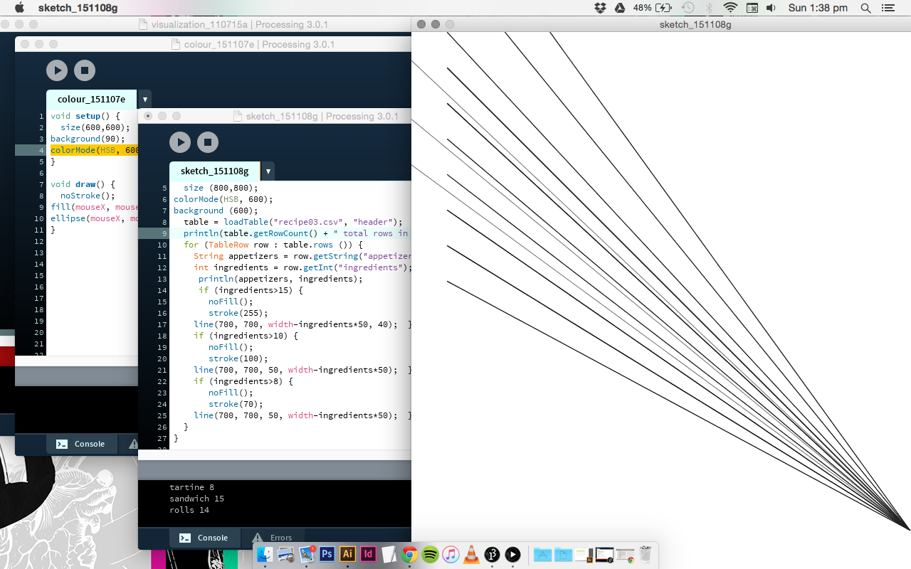
The possibilities of what you can do with Processing is limitless. Learning the programming script is akin to learning another foreign language. One of the key things I’ve learn with Nicholas Felton on Processing is actually how to input data into the program. We made spreadsheets on Google Sheets, converted them into a .csv (comma separated values) file, which is readable on Processing, and then using coding, we are able to create visualisations out of it. The above screenshot with the lines is an exercise I am working on right now. The number of lines is generated by the values from my spreadsheet. This is all very sketchy at the moment, and I’m working on adding the graphical elements later on. This is another really important thing I’ve learned this week, and something I probably will not be able to figure out on my own.

So, week one in summary is learning how to create visualisations with the help of coding, or by hand, and I am really glad to be able to learn from Stefanie and Nicholas, who are very, very good at their work.

Something else I’ve picked up this week from them is actually how to present your work. Watching these designers speak about their work is so, so inspiring. They are very confident and clear about what they are trying to say, and this helps a lot particular at this point, when I am simultaneously working on my FYP prep. Everyday I have something new to add to my presentation.

This week is particularly intense, but I hope I will polish up my presentation and be good to go by Tuesday.


learning with stefanie posavec: day 2

thumb_IMG_8649_1024Today we learn how to visualise data. Some basic techniques are introduced, as well as some general rules of thumb as a guideline.thumb_IMG_8652_1024  thumb_IMG_8651_1024

Using statistical knowledge to work with design. Looking for an overarching conclusion may help make your work more meaningful. Patterns and rhythms in data can be translated visually – using various methods like analog, coding, etc.

Have a spreadsheet! Use Google sheets. It helps you to identify patterns.

Take notes on what you find: rate of change, hierarchal relationships, and so on. Get to know your data.

Select your focus. Form your message, find the highlight.

Assign visual variables to data (shape, tonal values, texture, orientation of a line, etc)

IMG_8662  IMG_8660 IMG_8659

Stefanie highlights the elements that makes for a strong data visualisation:

  • Good architecture + arrangement
  • Annotate appropriately: labels, legend, titles, axis, units, sources, attributes.
  • Don’ts: improper scaling, truncated axes, differences in perspectives (particularly in 3D visuals)
  • 3 to 8 groups or categories is good enough to communicate

IMG_8658

This form of visualisation is the basis for her style of visualisation: the node link tree diagram. It’s good to research on data visualisation styles to give you a headstart.

IMG_8674

IMG_8673

Do a sketch first: how it works, then add graphical elements, and then annotations.

IMG_8665 IMG_8664 IMG_8663

Critiquing bad data visualisations: it should not be too confusing.

Lastly: some methods to organise data:

  • grouping information according to location (geo-spatial data)
  • alphabetical order
  • time
  • category (comparing categorical values)
  • hierarchy (relationship between entities)

Jacques Bertin’s visual variables

Gestalt laws of grouping.

That’s all for today! We are to work on an individual project for this program as well. I won’t be using my FYP for this due to the time constraint of the program. I’ll share more as I go along.


learning with stefanie posavec: day one

Photo 2-11-15, 11 55 21 AM
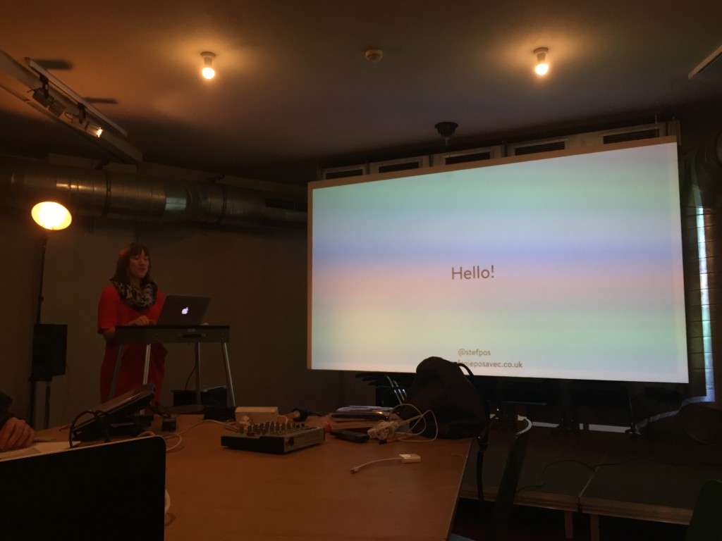
The first week of the program is kicked off with a series of lectures and workshops by Stefanie Posavec. What a wonderful way of begin the program, because it was her work that really pointed me in the direction of my FYP.

An interesting note: she’s my flatmate too. We share the apartment of our host Rachel, and on the first day we went to school together. It was a really ~wow~ moment, and as much as I wanted to, I didn’t ask too much of her work and things like that because I didn’t want to sound too eager and fangirly… I told her a bit about what I am doing, that’s all. Also, the stuff I wanted to ask her was all covered in her presentation in the morning.

Processed with VSCOcam with a6 preset

Talking about Dear Data: this project is about quantifying everything around and visualising it in analog form. The result is 52 weeks of 2 different visualisations. This is currently in the midst of being printed into a book so yay… we will get to see this in its full printed glory. Stefanie says it was challenging to do this, it took around 8 hours of her week, and making a conscious effort to take down notes about each week’s theme.

Processed with VSCOcam with a6 preset

Stefanie sharing her work Writing Without Words.IMG_8533

Even though this is the first week of the program, I am pretty certain this is quite the highlight already, being able to hear Stefanie share her working process, the ideas that go behind the works that she’s known for. Most artist/designer’s portfolio websites are often pretty straightforward, telling the work like it is, so it’s a real opportunity to hear her own thoughts about the work. She mentions that Writing Without Words was a project that she made almost ten years ago, which really directed her to her current career path as a data illustrator. It got really big on the Internet, and people were really receptive and curious about that work. This is really inspiring to hear, because you might never know that you’re on to something that people would be incredibly supportive of, and might open doors to much more exciting opportunities.Photo 2-11-15, 11 56 54 AM

The first part of her presentation addresses her identity as a designer – Stefanie calls herself a data illustrator, and uses data as a material to create a graphic and to tell a story. She shares her data visualising skills and process from a designer point of view, and she often collaborates with someone who’s trained to do research and statistical analysis, like Miriam Quick, (who will be us next week to share with us how to work with datasets – the technical stuff) and they work in tandem to create a data story using graphics.

Some key takeaways from her presentation about using data as part of art and design:

  • data visualising aims to communicate beyond the data – it is therefore important to make sure the visualisation is effective.
  • as a designer, you can look for patterns within the data and translating them into visual language. Data as an aesthetic output.
  • data gathering can be used as a personal documentary: data is everywhere in the physical world, and it’s not impossible to visualise them.
  • a good dataset is interesting, rigorously researched by you, or from a reliable source. Honesty and integrity is key.
  • dataset can be a souvenir (referring to her work Dear Data with Giogia Lupi)
  • the process of collecting data can be performative, an endurance test, a self-portrait.
  • data can inspire feelings. It’s not all dry facts!
  • data is a scientific and cultural material.
  • data visualisation explains, explore, exhibit.

Next post will be about the visualisation techniques.

Research Critique: Feltron Annual Report

FAR07_02 FAR07_03 FAR07_05 FAR08_02 FAR08_03 FAR08_04 FAR12_02 FAR12_03 FAR12_04

(images from Nicholas Felton’s website)

Since 2005, Nicholas Felton have been collecting data on almost every facet of his life and presenting his findings in a series of beautiful graphical posters. Each poster focus on the statistics that makes up a topic. For example, while looking in to his relationships, he breaks down the frequencies he meet people, who he communicates with most often, the amount of time he spends socialising and more. All of these data is presented in a variety of graphs and charts. Through this project, Felton hopes to explore how to graphically encapsulate a year.

Felton is inspired by the concept of annual reports, which are often generated by corporate companies at the end of each business year, as a comprehensive document that charts the company’s activities, earnings and progress. The Feltron Annual Report project is a very refreshing and humorous take on a typically corporate documents. Through my part-time job, I’ve had the opportunity to work on annual reports before, and truth be told, they are not the most interesting project to work on. Looking at Feltron’s Annual Reports really made me think of the annual report in a totally new way.

Felton’s approach to making these personal reports is exactly what I hope to do with my own blog, conceptually. He pairs the impersonal, corporate style of annual reports with personal details of his life, and through the various infographics embedded in each poster, we piece together activities and life in each year. It is a really brilliant example of how data can be used to tell a story.

FAR09_03

What I also observe in this work is that Felton weaves in his sense of humour in this work, which you can see from the titles he give to each statistic group. “Most Common Relationship? Friend.”

Felton uses a variety of tools to help him log in data: some are apps which are available commercially, and some he built himself. He also acknowledges that while it is possible to collect data on almost everything, what can be done with the data is almost endless.

“The data set itself was messy and overwhelming, and filled with enough information for several more reports. There are inherent shortcomings (like the unrepresentative amount of water recorded), and endearing strong suits (like the exploration of mood).”

Felton on report 2009

In the span of this ten year project, each report progressed from collecting information about everything to focusing on just one area. For example, in the report 2013, Felton explores his communication data, which breaks down his usage patterns from sources like texting, calling, emailing and being on social media. In the report 2011, he explores how his personality varies in different settings or with someone.

Overall, I find the Feltron Reports a very inspiring way for me to look at how I can work with the data from my blog for each year, by highlighting some of the more interesting details and experiences. I also observe that he each year, his infographics take on a fresh, new style. This also inspires me to use graphic design as a way to sum up my year, and to include (in a subtle way) my graphic influences along the way. I think it can be part of my narrative as a visual artist.