revised outcomes

tsklist mar

visual-mar4

Updated list of project outcomes:

  1. Physical data visualisations of blog archive
  2. Map of growing up in the age of Internet (Timeline), to be mounted on installation wall
  3. FYP report (formal)
  4. FYP report (publication accompanying the artwork)
  5. Process journal

I’m in the process of clearing things that have already been finished, like the 3d data vis and my process journal. Just rearranging them for print. Next week I will begin to make the map. Will share more on that. I’m alternating between report writing and making, as I feel that both will affect each other.

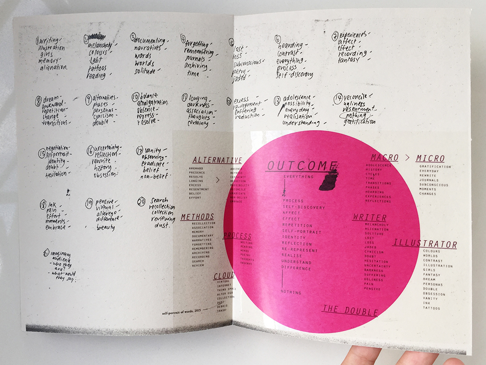
I have already printed out a part of my process journal and am quite satisfied with the outcome. I like the outcome a lot and even though I did this as a test print, I might just use it as the actual. I will bring it in for critique and feedback next Friday to see if there is anything else I can work on to make it better.

Images that are sourced online or are made on the computer are printed on transparency sticker. I kept the doodles and sketches from the notebook black. The paper I chose is called ‘sugar paper’ (what a cute name) from Art Friend. It feels really nice and suited for the nature of the ‘process journal’. It works beautifully to convey the handwritten nature of my text. I up the contrast and amount of black, and the laser print gives it that touch of shine on the paper which really looks like I’ve used my own pen to write in it. I decided to go for laser printing because my inkjet printer is simply unable to replicate that shiny black that I wanted.

In terms of material and paper choice, I wanted to highlight the dual nature of my process. I enjoy both doing work on paper and on computer. Transparency sticker and paper is used throughout the book, as it resembles the glossy nature of the computer screen, in contrast to the textured paper. I also feel that it makes the colour of the images pop, which would otherwise be slightly washed out if I had just printed it on the slightly greyish sugar paper.

Here’s a surprisingly high-res and accurate photo of the paper texture.

sugarpaper


Photo 4-3-16, 10 24 51 AM Photo 4-3-16, 10 25 03 AM Photo 4-3-16, 10 25 16 AM Photo 4-3-16, 10 25 22 AM Photo 4-3-16, 10 25 27 AM Photo 4-3-16, 10 25 35 AM

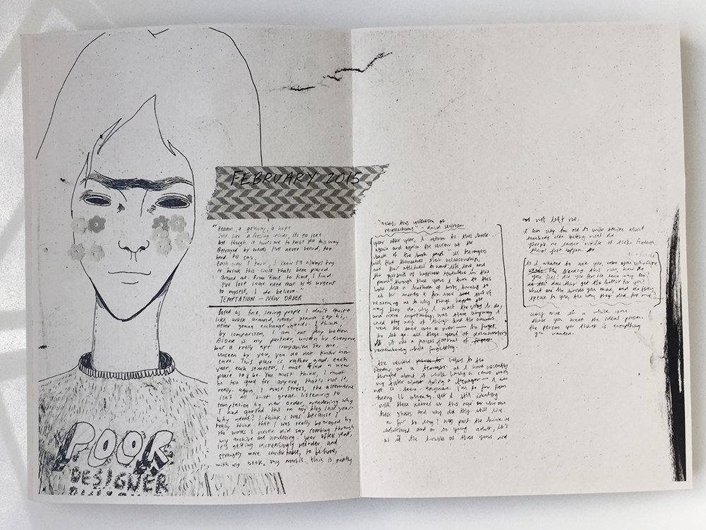
This is one of my favourite spreads.Photo 4-3-16, 10 25 52 AM Photo 4-3-16, 10 25 58 AM Photo 4-3-16, 10 26 07 AM


John Craig

johncraig02

THE SMASHING PUMPKINS' career-defining 1995 double album MELLON COLLIE & THE INFINITE SADNESS has earned Diamond certification for sales of 10,000,000 discs and digital equivalent per disc. This news comes in the midst of EMI Music's extensive reissue campaign honoring the legacy of the iconic alternative band. It continues December 3 with the PUMPKINS' fourth album MELLON COLLIE & THE INFINITE SADNESS receiving the fully remastered treatment for the first time. This follows last year's acclaimed reissues of the band's groundbreaking first two albums, Gish (1991) and Siamese Dream (1993), as well as this past summer's Pisces Iscariot (1994). (PRNewsFoto/EMI Music)

johncraig04


I came across an image of a collaged galaxy on Pinterest while researching ideas for my new tattoo and subsequently pinned it. Sometimes you see an image/artwork and you feel =a sense of familiarity… like you’ve seen something like it before. Anyway that bugged me and I couldn’t really find the artist who made it. Pinterest doesn’t really give proper credits for images. Later on, I collected some more images for my illustration references and I found out at last who made that fantastic galaxy collage. The illustrator is John Craig, who was the designer for one of my favourite albums Mellon Collie and the Infinite Sadness by the Smashing Pumpkins. It’s a gorgeous album, a two-CD set with the themes night and day, so throughout the album art design, there are lots of planetary/astronomy references. I would say John Craig’s style is quite similar to Eduardo Recife: think vintage, ephemera collages. Craig’s stuff is slightly more surreal and kitschy.

I’m including him as a reference for my illustration. In terms of composition, I might go with a montage. John Craig’s collages look like they are composed using kitschy, dollar stickers and I quite like that look. My illustration style is quite feminine and pretty, and while it’s not necessarily a bad thing, I feel it might be rather predictable and safe. Boring even. Also, keeping in line with my main ideas of remixing and deconstructing, I’m also thinking about how I can bring that to my illustrations.

WIP: type + collage

1409_01

03 01 02 03


Been spending these haze-filled days making these collages and experimenting with type layout. The first gif image of type shows my process of creating a few character styles on indesign. I think that would help speed up my process since I have tons of type to go through. Also, with just a click I can see how they come together. Been flipping through Carson’s books for this.

Then these are the scans of the collages I’ve been making. I will eventually print the manipulated type on tracing paper and wrap it around the printed collage, rather than directly on the collage itself. Helps to give the work some texture and dimension.

I’m working on a few different things at once, and I’m not really sure if it’s clear what I’m trying to do for each outcome, but writing here helps a lot. Also have tons of references that I got to categorise… I will work my way through slowly. All exciting and good stuff!!


Eduardo Recife

misprinted04  misprinted02


Eduado Recife is a total collage god. I’ve followed his work for about ten years now, and he inspired me a lot when I was making my old websites. I tried so hard to copy his style. It was so fun to be able to make these collages on the computer.

His collages and illustrations include a lot of old-fashioned stock images and vintage magazine cut-outs. The screenshots above were older versions of his website. He used to change them quite a bit, and I look forward to visiting his website each time, and then run off to make something inspired by his new things.

What I like about his work is that, like David Carson, he really plays with type. Working so much with collaging also inspired the way he viewed type, and he created a bunch of ‘deconstructed’ typefaces. His new website is much cleaner now, and easier for people to view his works, but he used to make longform websites too. I can’t find any of that on Google now.

Collage is often a big, experimental mess. But what I learn from Eduardo Recife’s work is that white spaces and minimalism is possible too. When he shrinks down some of this collages and place them right at the edge of the screen, it becomes quite an interesting visual experience.

misprinted03

These are some of his new works which I also enjoy:

Screen Shot 2015-09-14 at 12.59.35 pm Screen Shot 2015-09-14 at 12.59.41 pm


Recycled mix process

IMG_9550  IMG_9562 IMG_9563 IMG_9564 IMG_9565 IMG_9566 IMG_9567


I’ve been making stacks of these collages, from torn magazine papers. Trying to layer different patterns and elements to form a texture, which will be the background for the type from my blog. Will make a couple of spreads this weekend.IMG_9570IMG_9568  IMG_9571 IMG_9575

Thinking about layering text over the collage surface to give it some dimension rather that having it all printed on the page.


IMG_9576 IMG_9577


Recycledmix

dirtyprogress02 dirtyprogress01


Think it’s time to get my hands dirty and start cutting some things up before reassembling them again in photoshop. Can’t do much of these stuff on the computer, and I think I enjoy cutting and pasting.

I also printed my journals out, and will get to work cutting them up and physically remixing/deconstructing them. Can’t wait…