 Today we learn how to visualise data. Some basic techniques are introduced, as well as some general rules of thumb as a guideline.
Using statistical knowledge to work with design. Looking for an overarching conclusion may help make your work more meaningful. Patterns and rhythms in data can be translated visually – using various methods like analog, coding, etc.
Have a spreadsheet! Use Google sheets. It helps you to identify patterns.
Take notes on what you find: rate of change, hierarchal relationships, and so on. Get to know your data.
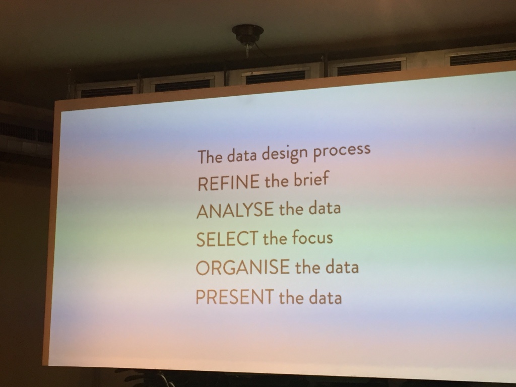
Select your focus. Form your message, find the highlight.
Assign visual variables to data (shape, tonal values, texture, orientation of a line, etc)
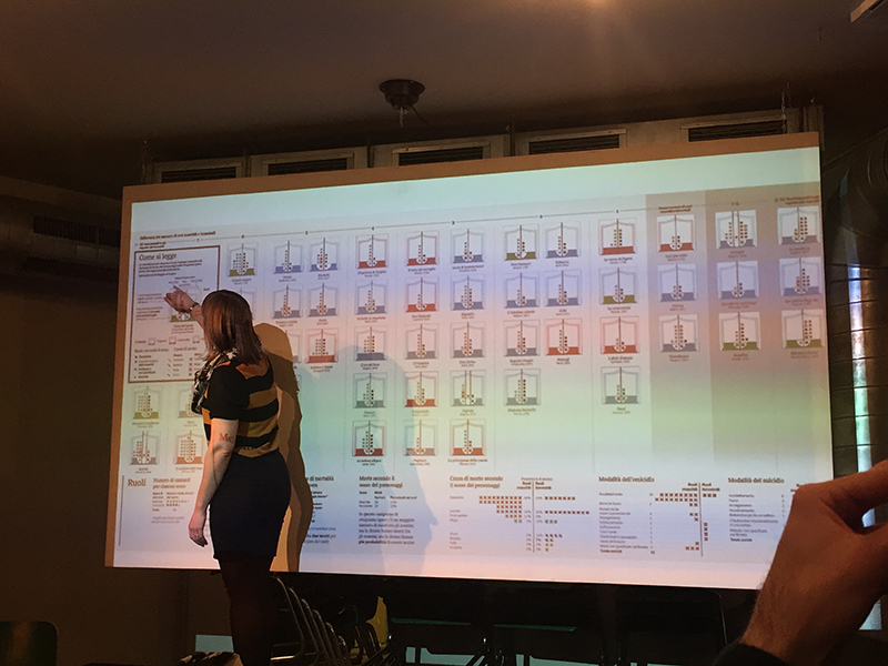
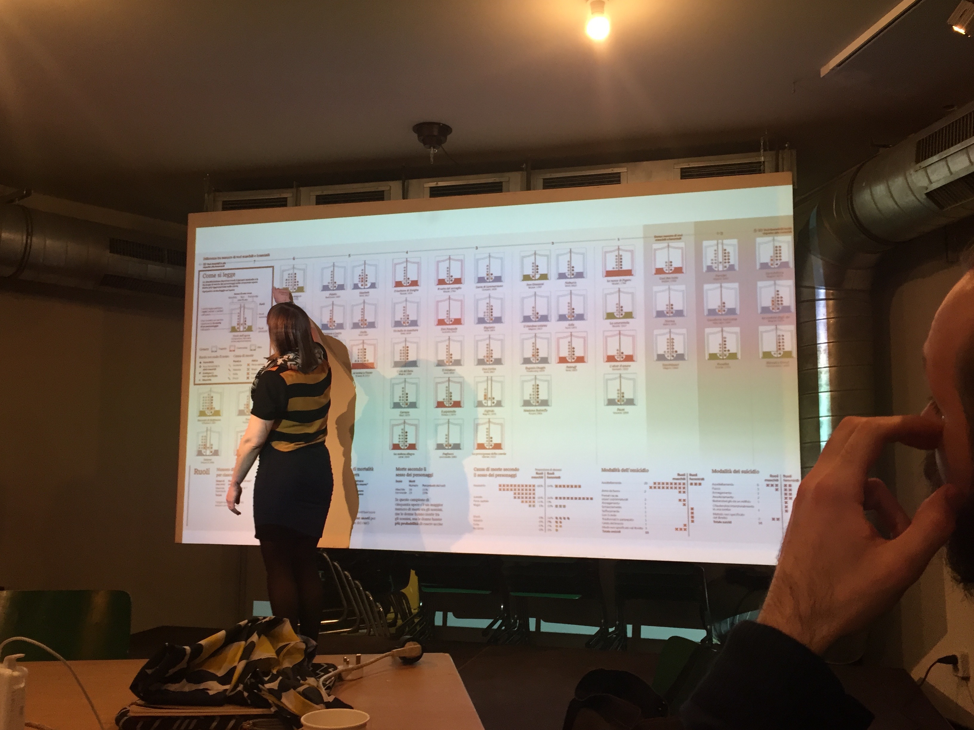
Stefanie highlights the elements that makes for a strong data visualisation:
- Good architecture + arrangement
- Annotate appropriately: labels, legend, titles, axis, units, sources, attributes.
- Don’ts: improper scaling, truncated axes, differences in perspectives (particularly in 3D visuals)
- 3 to 8 groups or categories is good enough to communicate
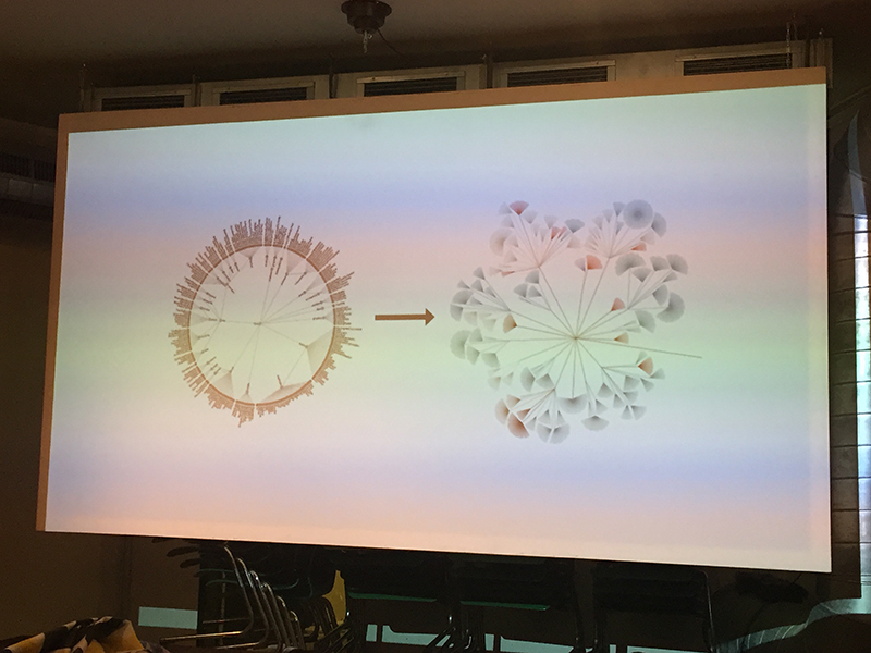
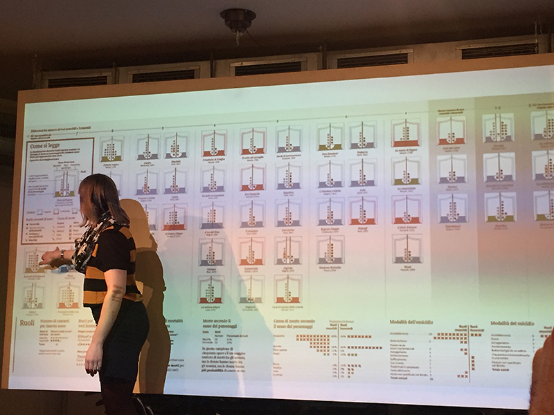
This form of visualisation is the basis for her style of visualisation: the node link tree diagram. It’s good to research on data visualisation styles to give you a headstart.

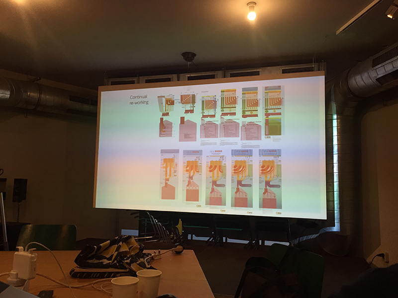
Do a sketch first: how it works, then add graphical elements, and then annotations.
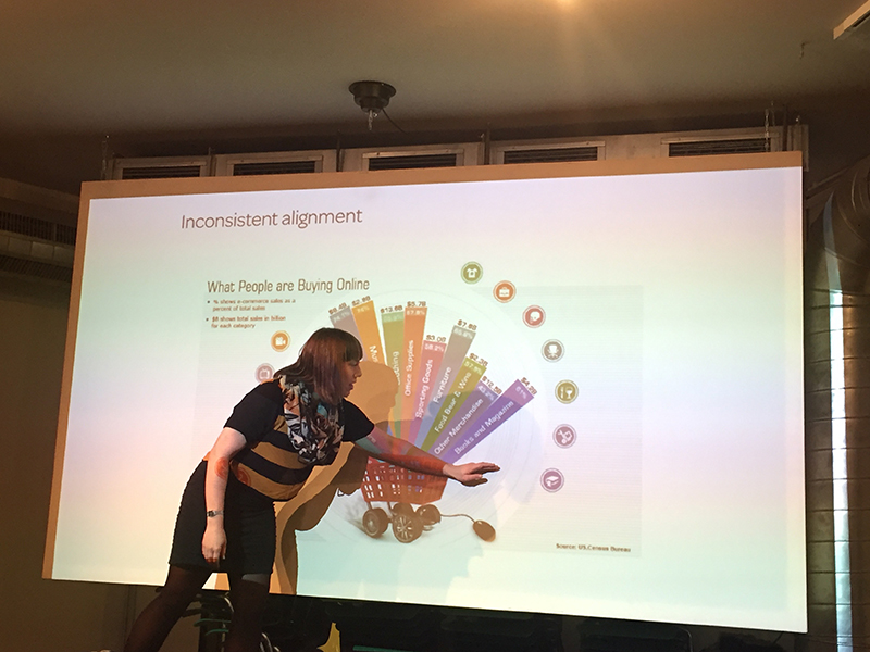
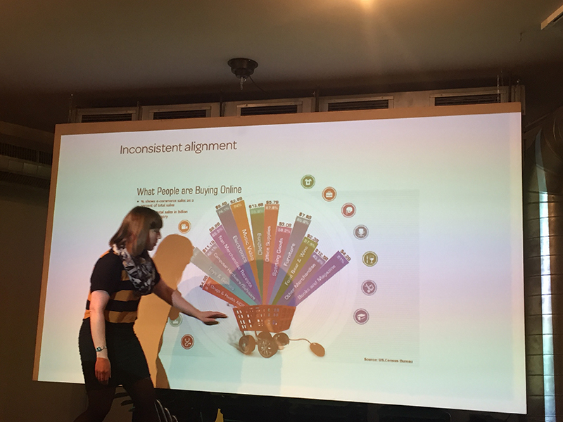
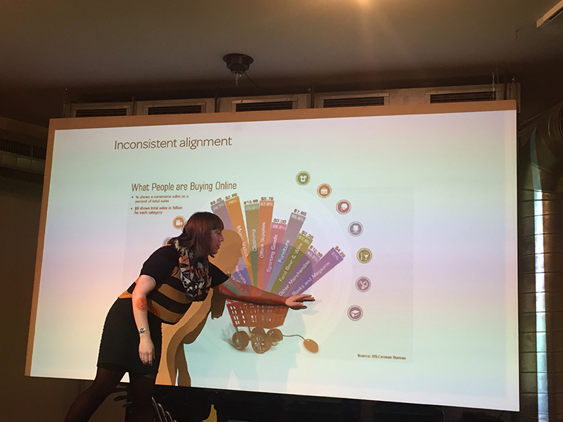
Critiquing bad data visualisations: it should not be too confusing.
Lastly: some methods to organise data:
- grouping information according to location (geo-spatial data)
- alphabetical order
- time
- category (comparing categorical values)
- hierarchy (relationship between entities)
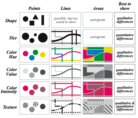
Jacques Bertin’s visual variables

Gestalt laws of grouping.
That’s all for today! We are to work on an individual project for this program as well. I won’t be using my FYP for this due to the time constraint of the program. I’ll share more as I go along.