process journal

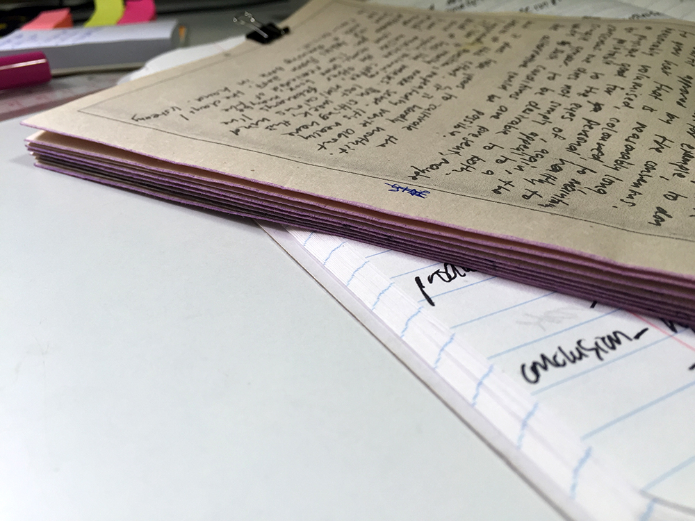
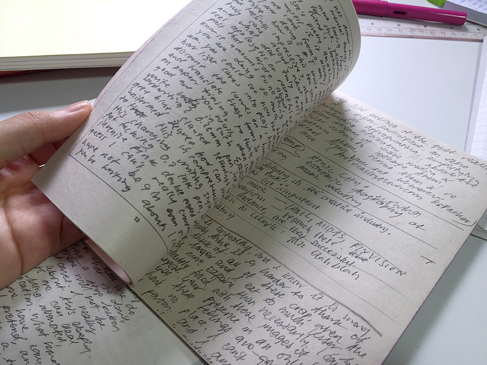
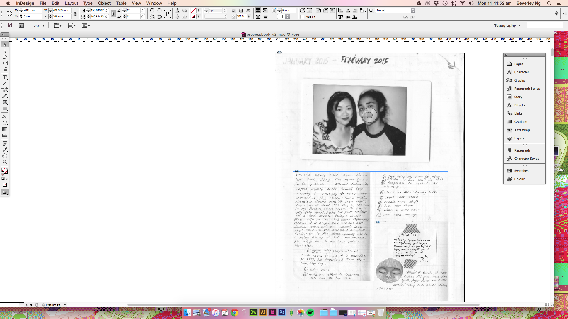
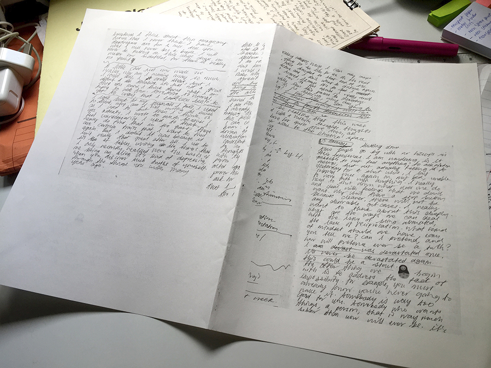
I started work on my process journal. I’ve designed the publication with a couple of key things in mind:

  • to allow for addition of more spreads. This is to accommodate future documentation of the project, especially of the actual output when I begin production next month.
  • to emphasise the “work-in-progress” nature of my project. For design, I am going for an industrial, tactile approach, reflecting the dual, by-hand/digital nature of my working process.
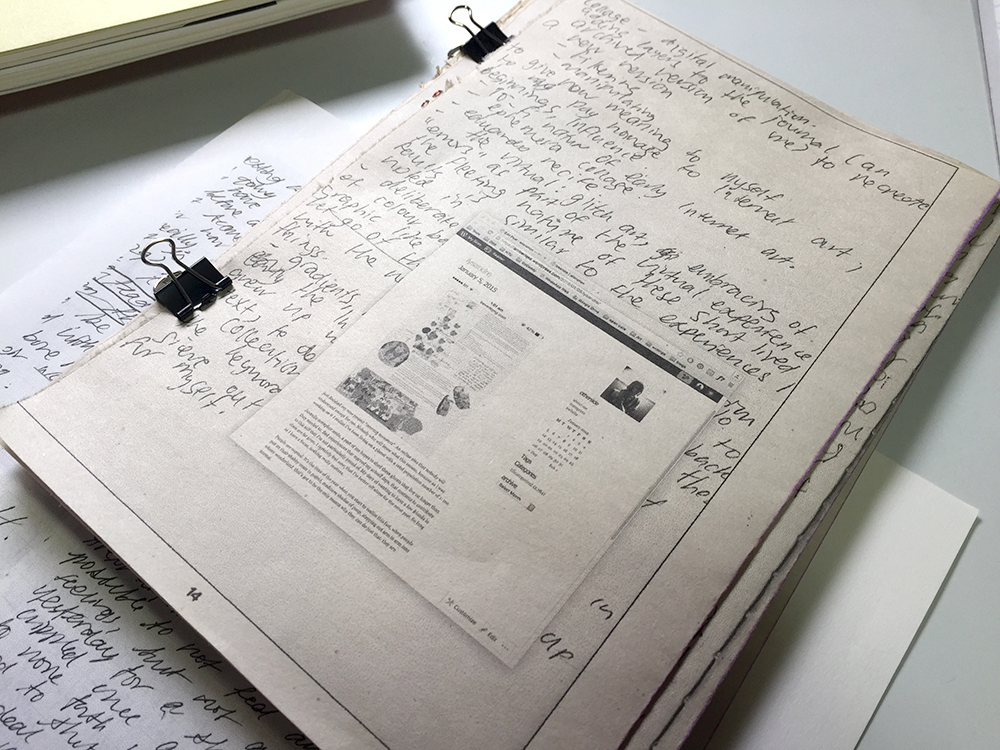
  • images scanned from my notebooks will be printed b&w on newsprint paper, and accompanying screenshots will be printed (colour) on transparency film.

At this point, I’ve settled the materials for the process journal, but I don’t have a fixed outcome of the journal yet. Above points are just some of the main ideas that I want to convey through the design of the process journal. I might have to print everything and then go for a more intuitive outcome for the finishing.

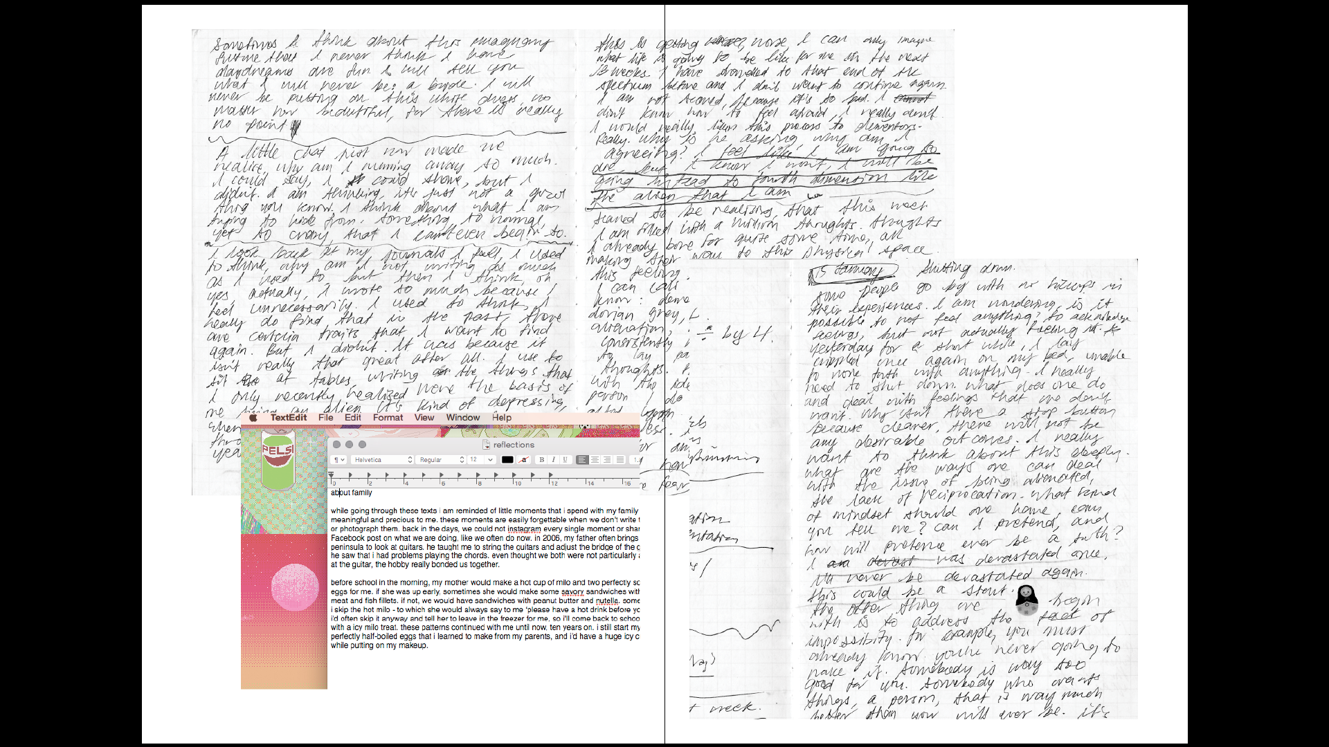
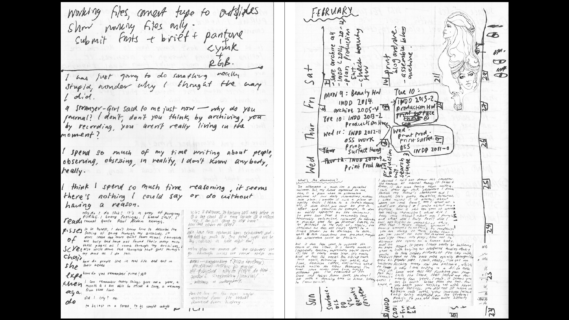
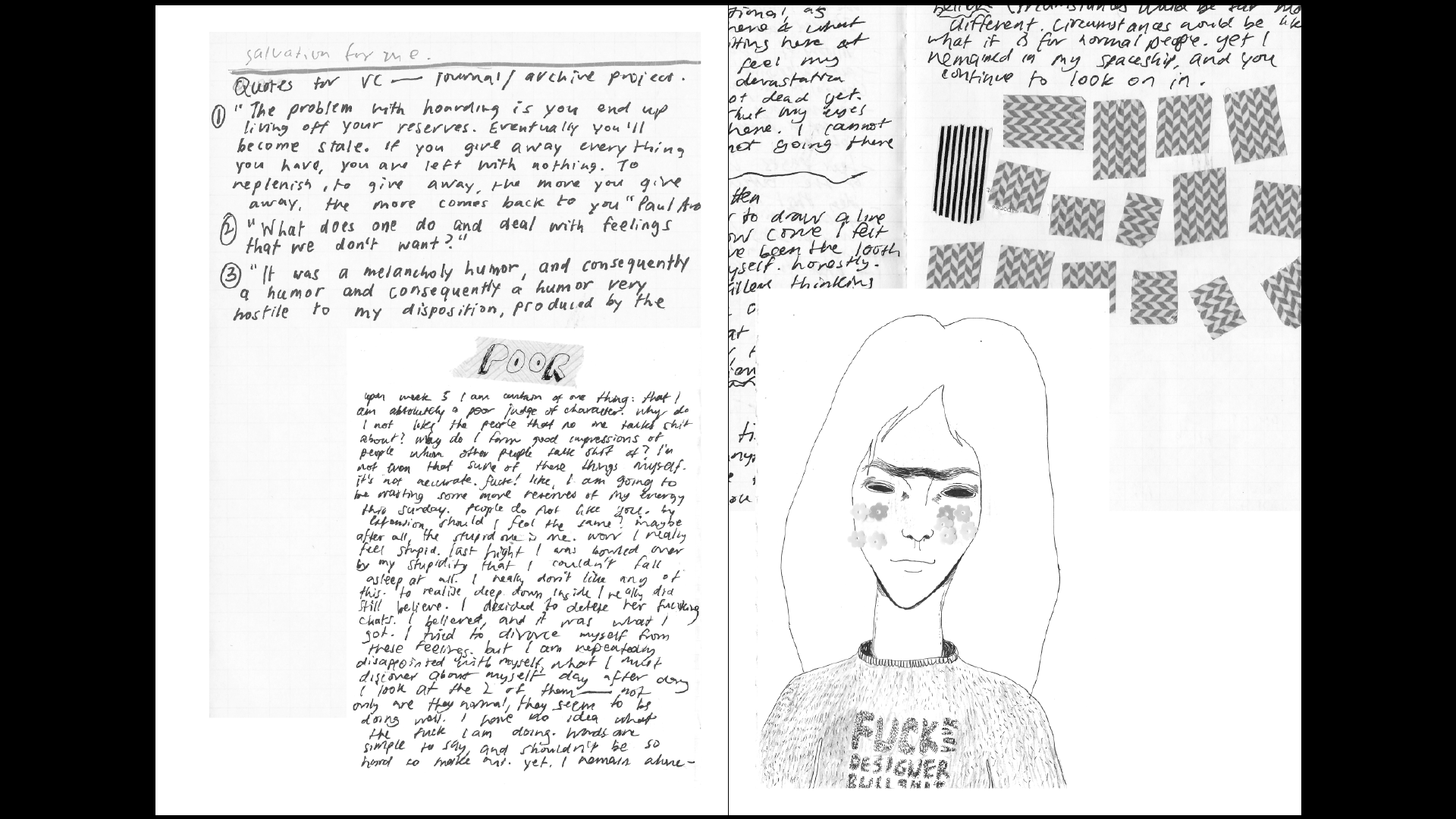
Some spreads and experimentation:

Photo 22-2-16, 11 45 48 AMPhoto 22-2-16, 11 47 42 AM

I will be printing this from my home printer, for convenience and for more opportunities to experiment. Most print shops are not likely to allow me to print on newsprint because it will jam their printers. I’ve found a way to bypass the A4 limitation of my home printer and printing on an A3, although that took quite a few trials and errors that made me reconsider how I will design the publication.

If you’re wondering how that is done: I begin with a folded A3 piece of Advocate Rough (I forgot the gsm, it is the lowest one available from Fancy Paper). Pressed really hard on the crease. Exported InDesign file as Pages. Print as per usual (don’t check the double-side printing), feeding the paper twice. Best results would be on low gsm paper. I’ve changed my pagination to accomodate this printing technique. It is still perfect bind, just that it’s printed on one side and folded in half. There’s probably a name for this style of binding or something, but I honestly don’t know what it’s called…

Photo 22-2-16, 11 46 39 AM

Also tried painting on the sides of the paper. Ran a sponge from a cheap ink set along the edges. I find it works well for the newsprint I’m using, it kind of seeps into the paper in a nice way. Just need to use a more pigmented ink.

Photo 22-2-16, 11 47 17 AM Photo 22-2-16, 11 47 25 AM Photo 22-2-16, 11 47 50 AMPhoto 22-2-16, 11 47 32 AM

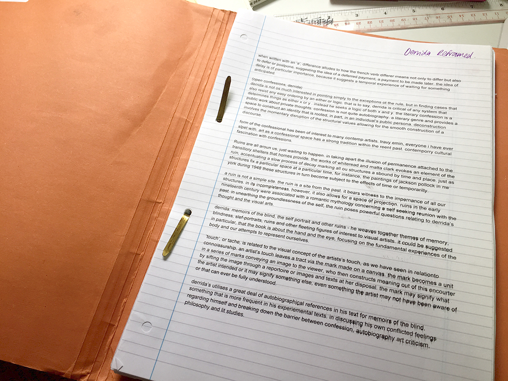
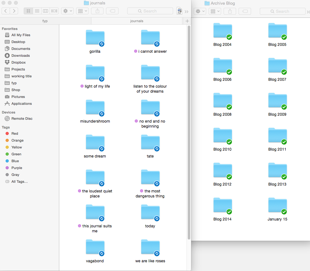
Taking design inspiration from the file that I use to keep my fyp notes.

Screen Shot 2016-02-22 at 11.41.52 am Screen Shot 2016-02-22 at 11.42.32 am Screen Shot 2016-02-22 at 11.42.54 am Screen Shot 2016-02-22 at 11.42.57 am

InDesign spreads. Adding the screenshots layer in a separate document and sending it for laser printing on transparency film.

Goal for today is to complete this document.

This weekend I will be starting work on visualising my blog entries. Printing it all out on transparency film too.

Trying to get these things out before March, which I’ve designated for production on actual output.

Also writing my report at the same time. Going back and forth between writing and making refreshes my thinking and lessen the chances of feeling stuck at one thing (and then not doing anything).
Eduardo Recife

misprinted04  misprinted02


Eduado Recife is a total collage god. I’ve followed his work for about ten years now, and he inspired me a lot when I was making my old websites. I tried so hard to copy his style. It was so fun to be able to make these collages on the computer.

His collages and illustrations include a lot of old-fashioned stock images and vintage magazine cut-outs. The screenshots above were older versions of his website. He used to change them quite a bit, and I look forward to visiting his website each time, and then run off to make something inspired by his new things.

What I like about his work is that, like David Carson, he really plays with type. Working so much with collaging also inspired the way he viewed type, and he created a bunch of ‘deconstructed’ typefaces. His new website is much cleaner now, and easier for people to view his works, but he used to make longform websites too. I can’t find any of that on Google now.

Collage is often a big, experimental mess. But what I learn from Eduardo Recife’s work is that white spaces and minimalism is possible too. When he shrinks down some of this collages and place them right at the edge of the screen, it becomes quite an interesting visual experience.

misprinted03

These are some of his new works which I also enjoy:

Screen Shot 2015-09-14 at 12.59.35 pm Screen Shot 2015-09-14 at 12.59.41 pm


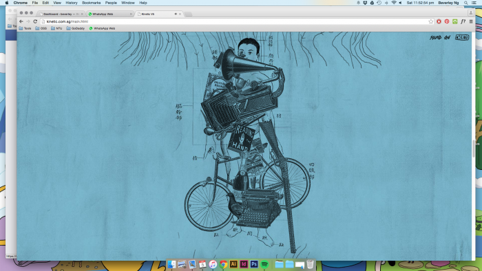
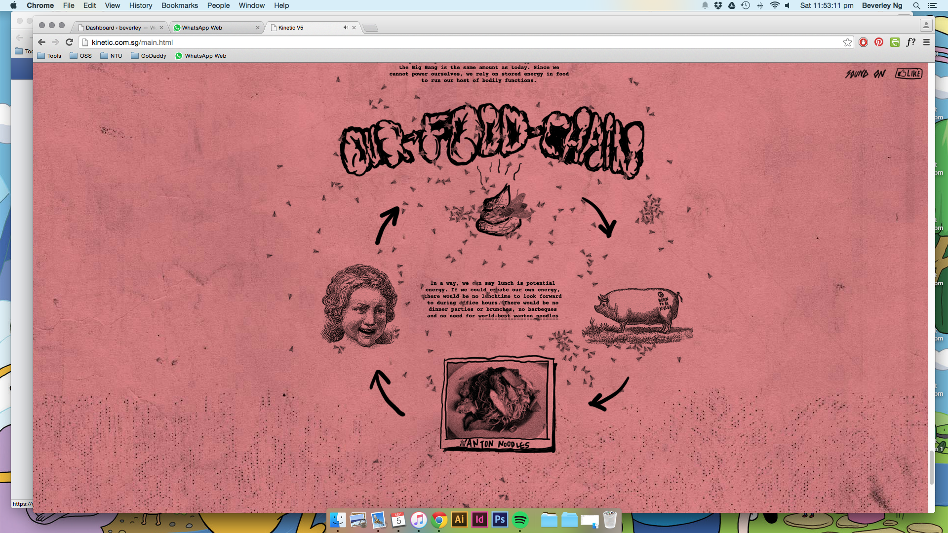
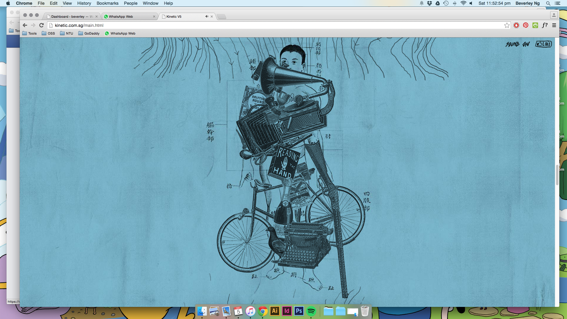
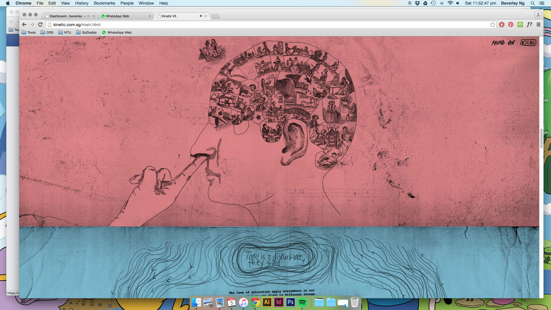
Longform websites: kinetic.sg

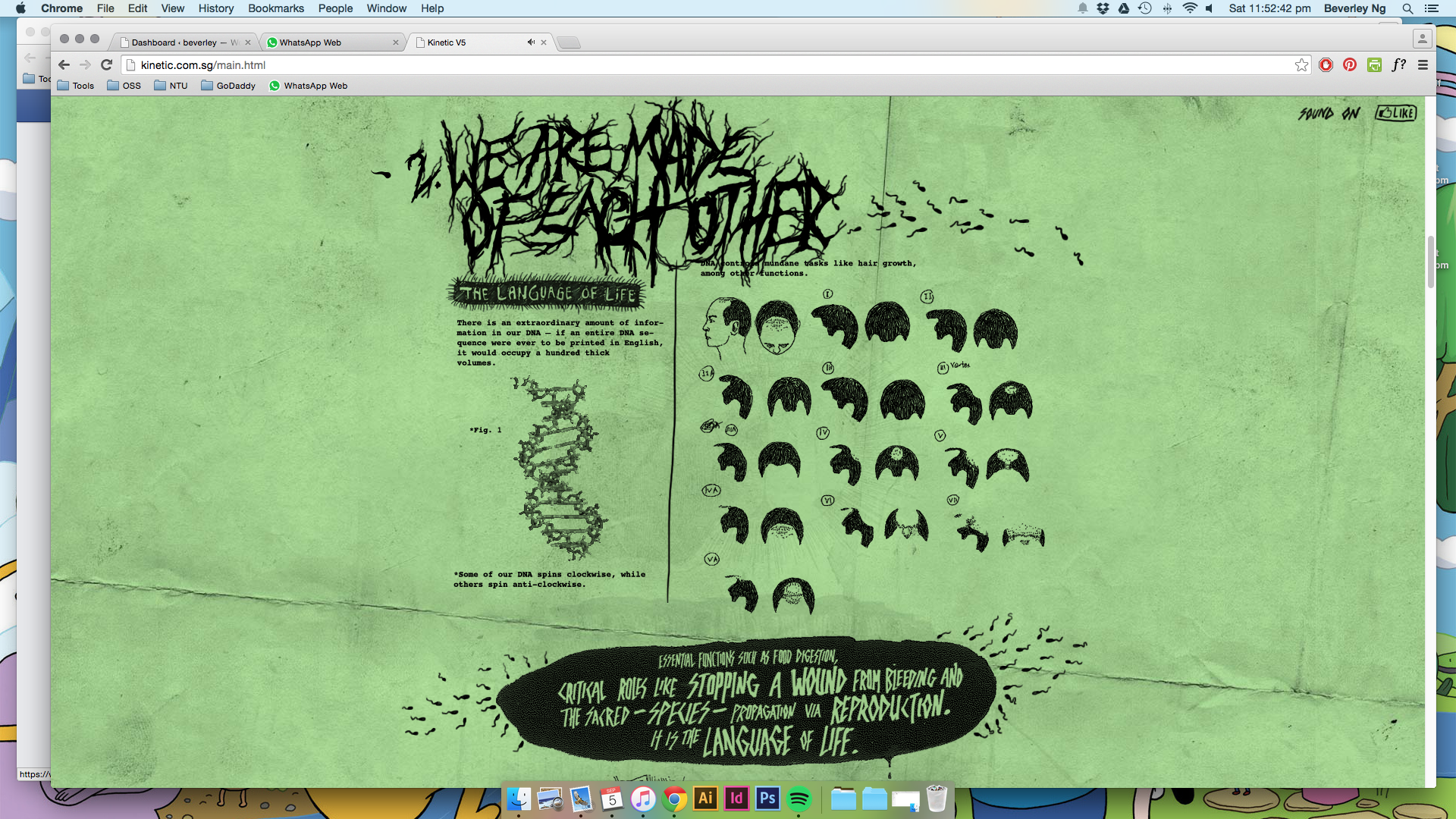
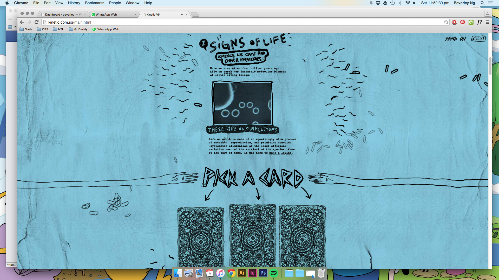
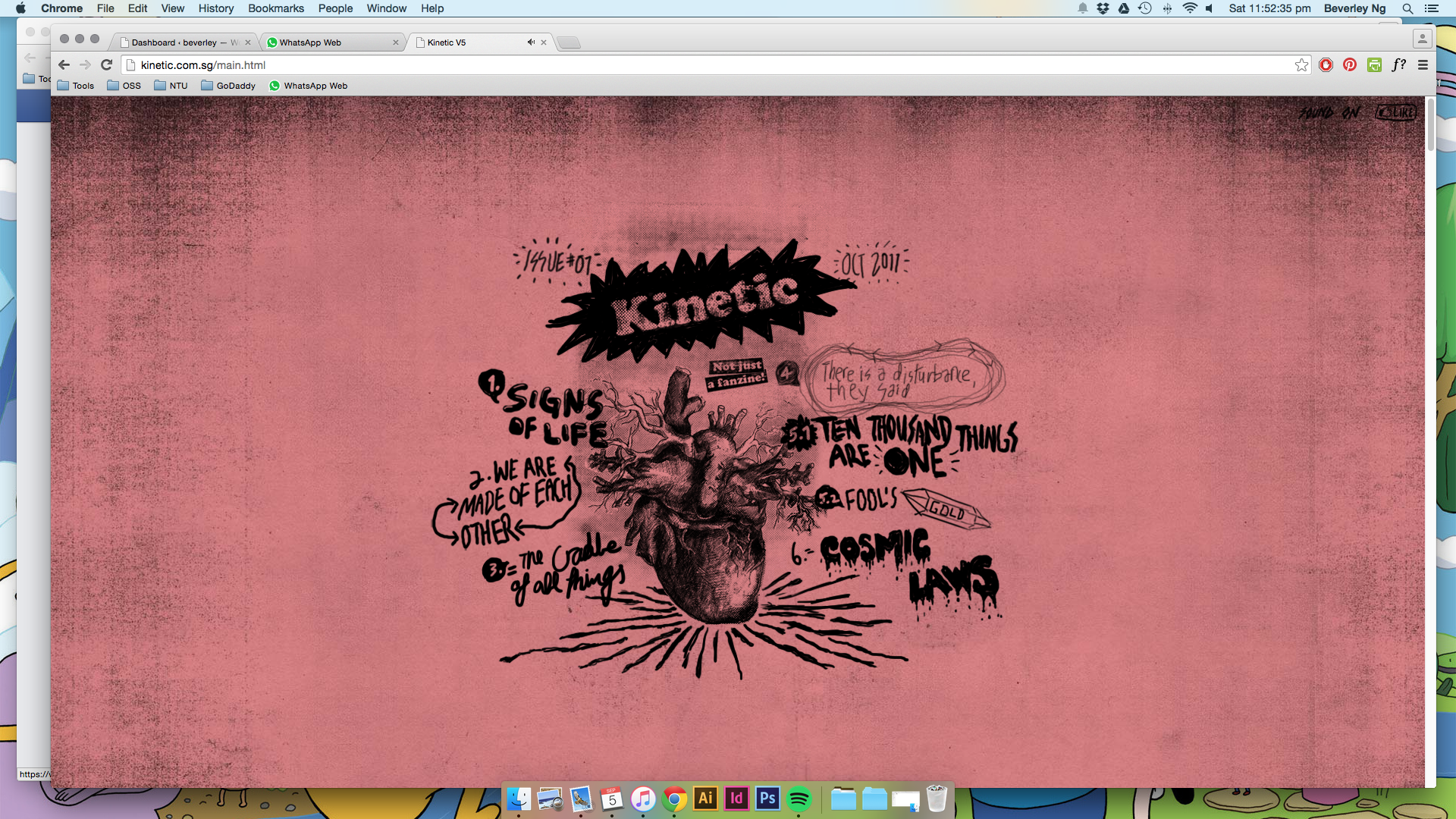
kinetic06 kinetic05 kinetic04 kinetic03 kinetic02 kinetic01


(images from Kinetic.sg, mute your computer if you are opening the link, the sound is a bit loud)


This is the homepage of local creative group Kinetic. I really like their approach to design, and I feel they definitely stand out from the rest of the prominent design groups in Singapore. That’s not to say that the rest are not good or anything, but I feel that Kinetic brings something different to the table.

Their homepage is a pretty excellent example of what I hope to achieve for the virtual part of my work, using the idea of longform storytelling to bring together different media in one place.

In terms of design, there are some grungy elements that I like a lot. The whole page looks like a photocopied creation, and it’s interesting to see how they bring this style to the virtual, and incorporate javascript and animated things to create such an engaging website. I love websites like these: it invites you to scroll down and look at each and every part closely. This is why I want to use the longform method as well. I think of it as entering a deep, fantastical forest that you just keep on walking through. (Think I’ve been watching too much Adventure Time.)


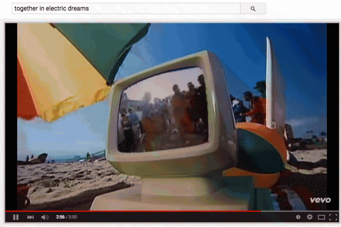
Together in Electric Dreams


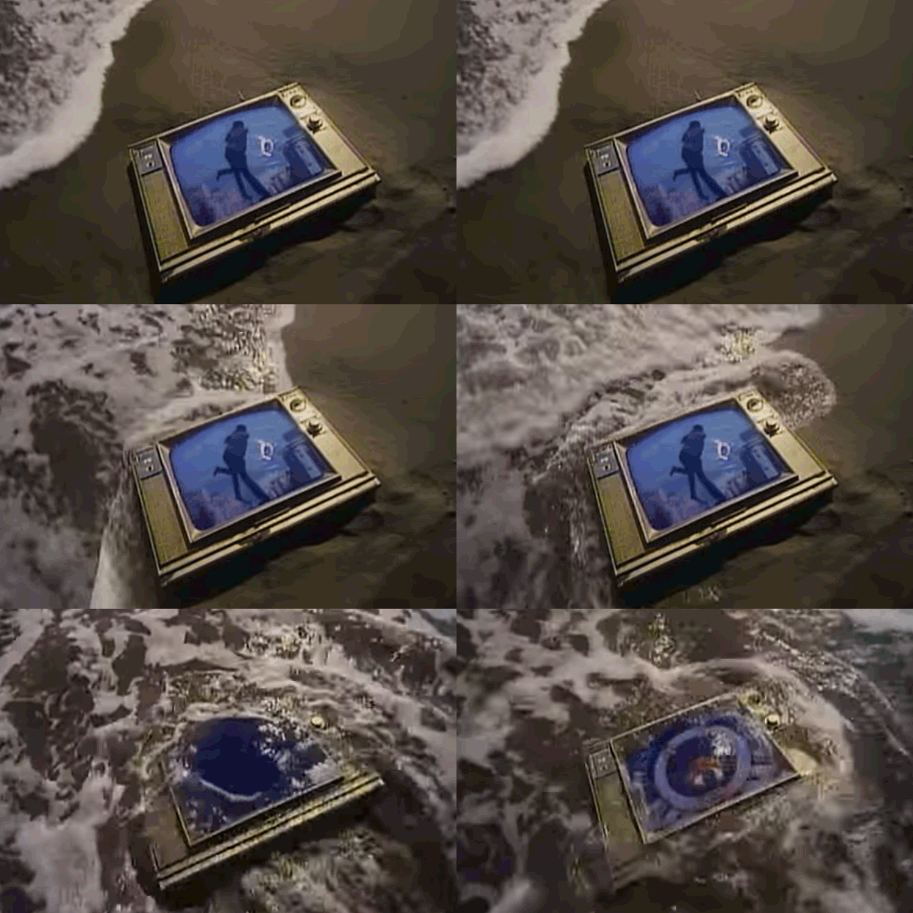
tgt03

Spent the last few days looking at stuff on the internet for my WordPress theme sketch. Anyway, here’s a song that I like a lot called Together In Electric Dreams, by Philip Oakey and Giorgio Moroder. It’s from a film called Electric Dreams (which I’ve never seen…). The film is about a love triangle between a man, a woman and a computer. Computer becomes involved in man’s love life, and both shared a mutual love for the woman. Eventually the computer accepts the love between the humans and then self-destructs as a results.

The movie is made in 1984, when computers are still quite a new thing. I thought it is quite fascinating for the director Steve Barron to come up with such a storyline that humanizes the machine. There are definitely many films out there are does the same thing with machines and electronics, but perhaps few that envisioned the machines to mimic the emotions that we go through.

Electric Dreams was definitely an attempt to try and weave the early eighties music video genre into a movie.”

— Steve Barron, director of Electric Dreams

After watching the video, I went to look up some of the other popular 80s music that I kind of like, and I find that there’s a very distinctive aesthetic that runs through the videos: fascination of machines and electronics, saturated colours, a glowy, blurry effect all around.

Here’s another one I found by The Buggles, Video Killed the Radio Star

videoradio01

I personally enjoy the aesthetics of these music videos. They are comparably low-fi music videos, unlike much of modern music videos. (Do people still watch those stuff?) And these musicians are all singing about this new form of technology with a kind of wide eyed wonder. I thought maybe for my WordPress theme sketch and my final illustration piece, I could try and dig out what are the aspects of the Internet world that I was acquainted with that strikes me with the same feelings. I think that would help bolster my concept for the theme creation.


World of Lumpy Space

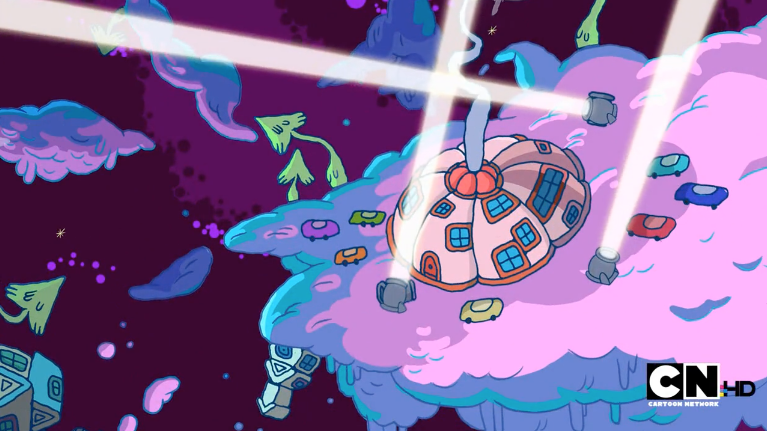
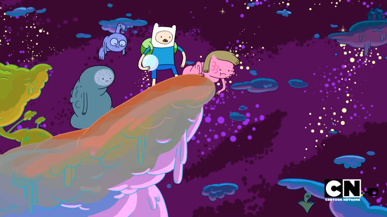
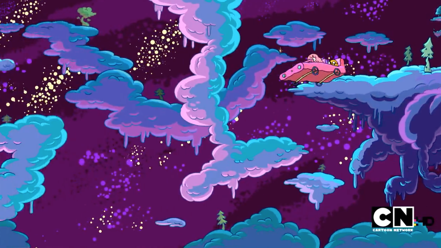
Screen Shot 2015-08-30 at 8.02.32 pm Screen Shot 2015-08-30 at 8.02.35 pm Screen Shot 2015-08-30 at 7.57.04 pm Screen Shot 2015-08-30 at 7.57.35 pm Screen Shot 2015-08-30 at 7.58.34 pm Screen Shot 2015-08-30 at 7.59.21 pm Screen Shot 2015-08-30 at 8.00.02 pm  Screen Shot 2015-08-30 at 7.54.39 pm Screen Shot 2015-08-30 at 7.54.43 pm Screen Shot 2015-08-30 at 7.56.53 pm


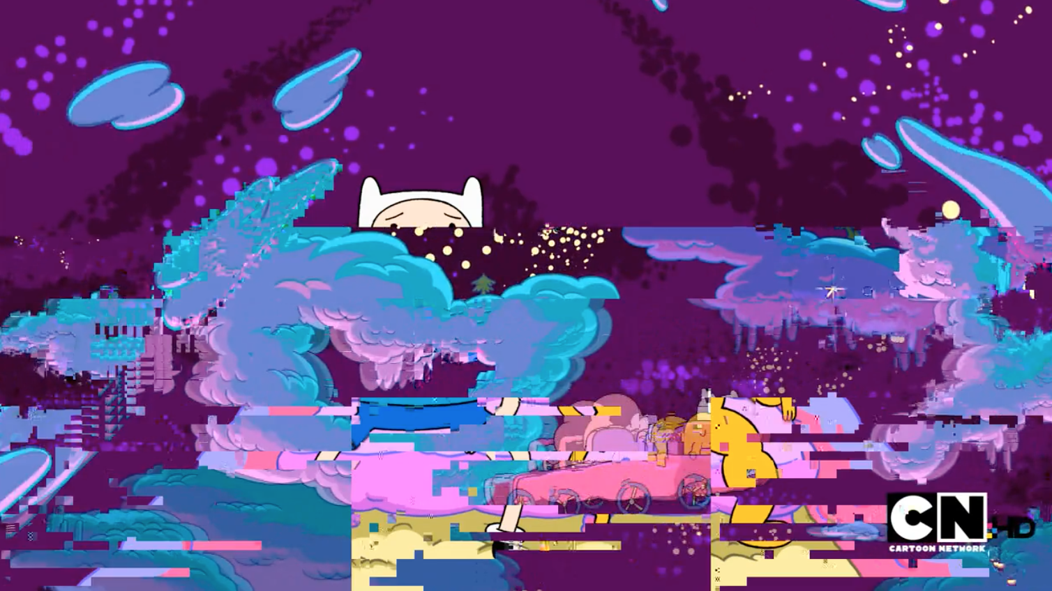
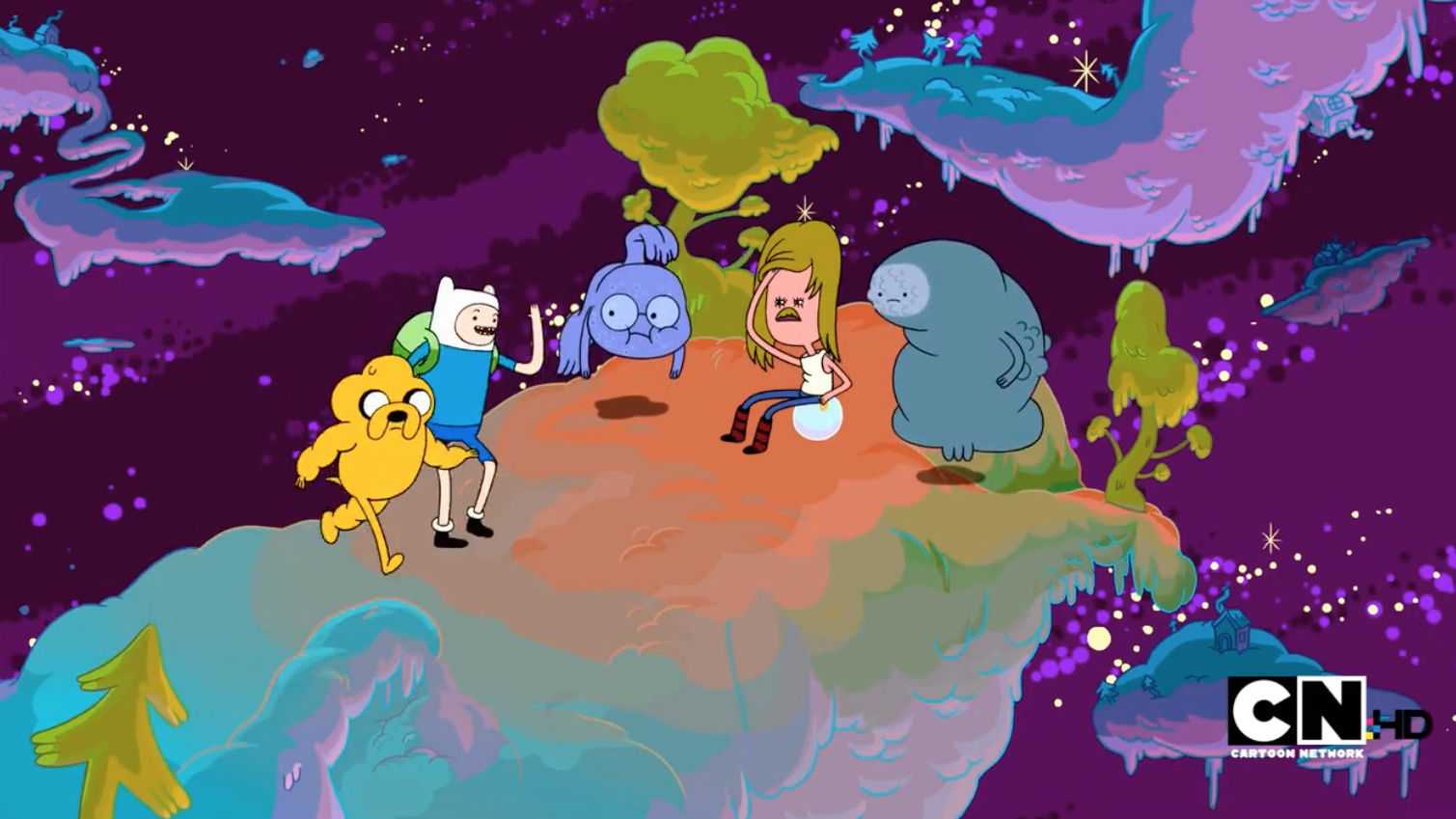
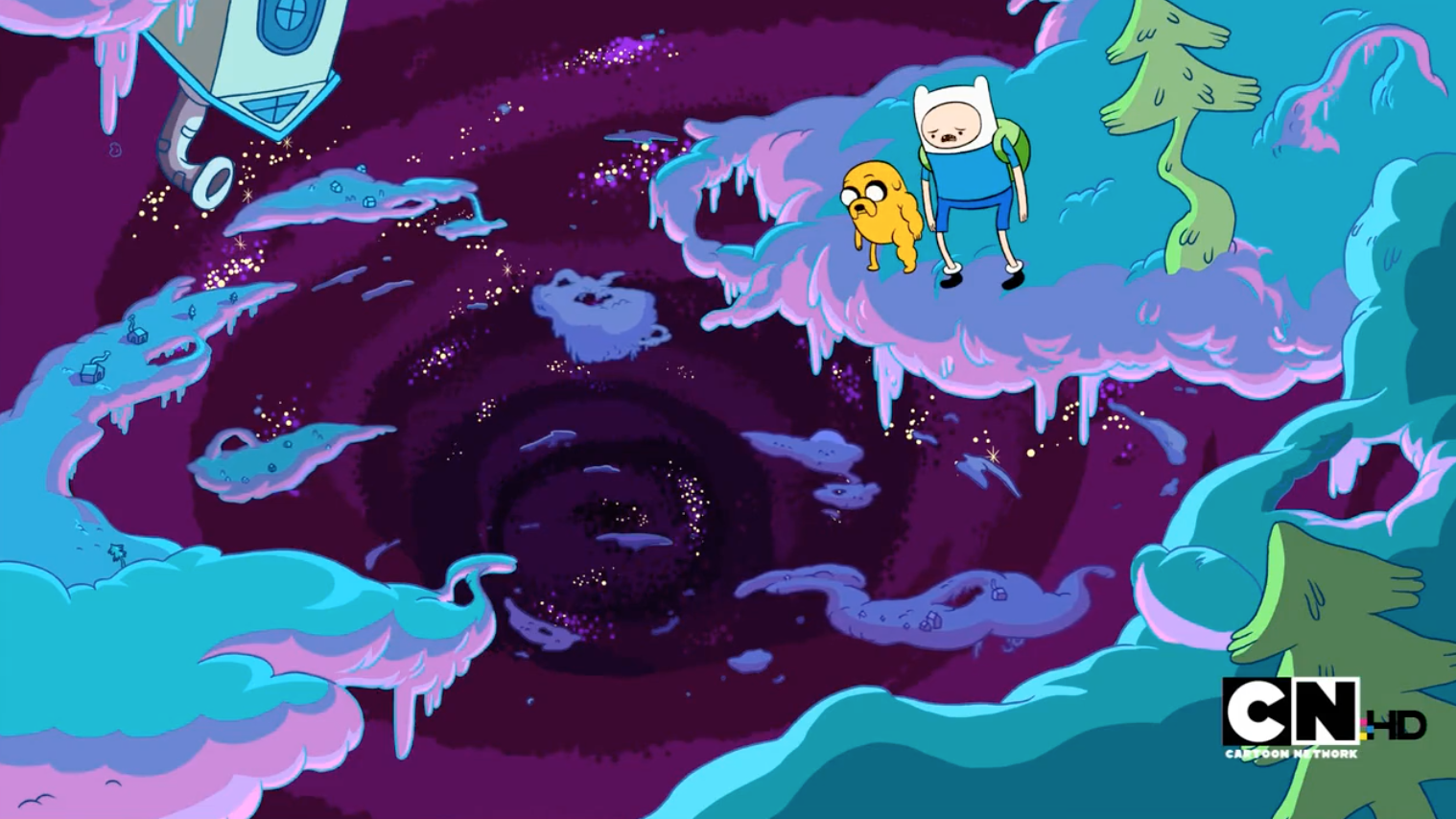
Particularly find this episode of Adventure Time really beautiful. Slowly compiling these screen grabs to use as reference when it comes to compositions and colour palettes, especially the rendering of background.

Holycrap: Google Translating Tokyoto


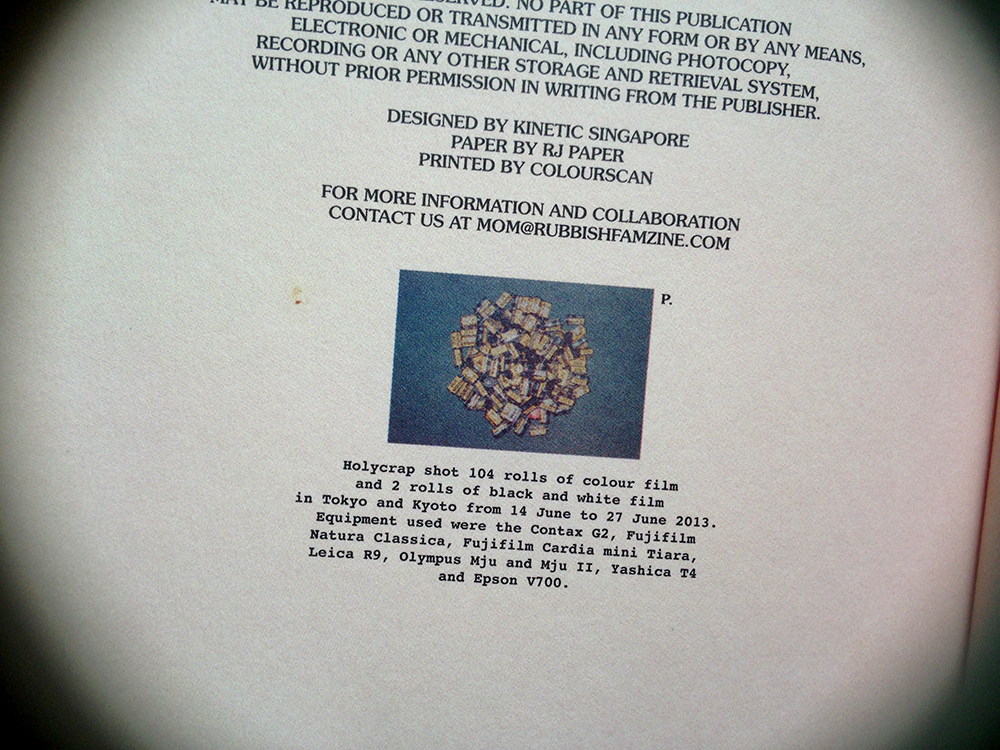
A good friend gave me the brilliant Rubbish Famzines by Holycrap. I’ve been looking through this over the last few weeks. These are some really inspirational work in terms of design and documentation which I will be looking at quite plenty for reference in the course of my FYP.

Holycrap is a local art collective made up of Pann Lim, Claire Lim, and their two children Renn and Aira. They have been making the Rubbish Famzines for two years now and recently launched their fourth famzine entitled “The Incomplete Herbarium and Other Garden City Exploits”.

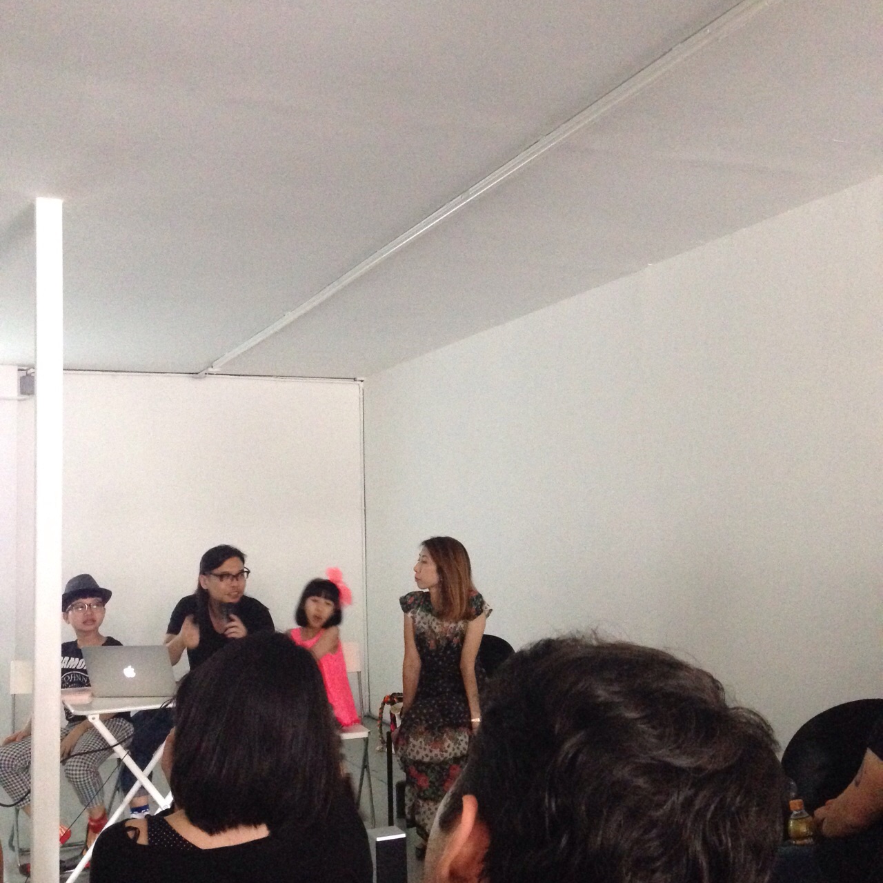
A few weeks ago, I had a chance to listen to the family share about their project and how they work together to make these brilliant famzines. The family defines the famzines as a family magazine, a compilation of all that they find interesting and memorable to them as a family.

Photo 16-8-15 1 20 29 pm

Holycrap at DECK two weeks ago.Photo 16-8-15 11 43 22 am

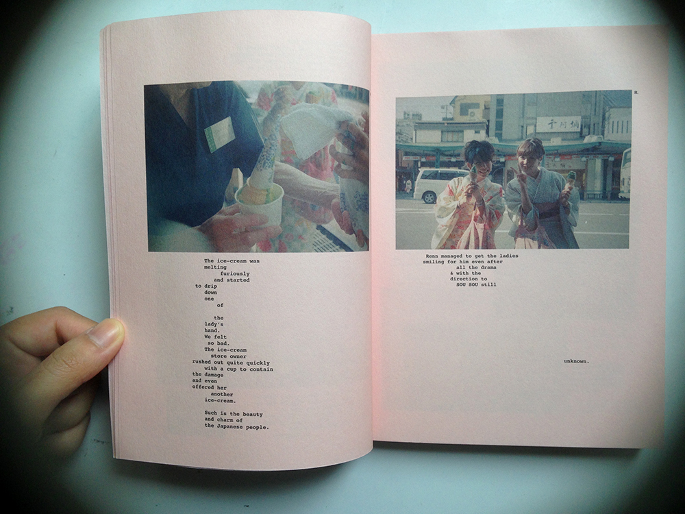
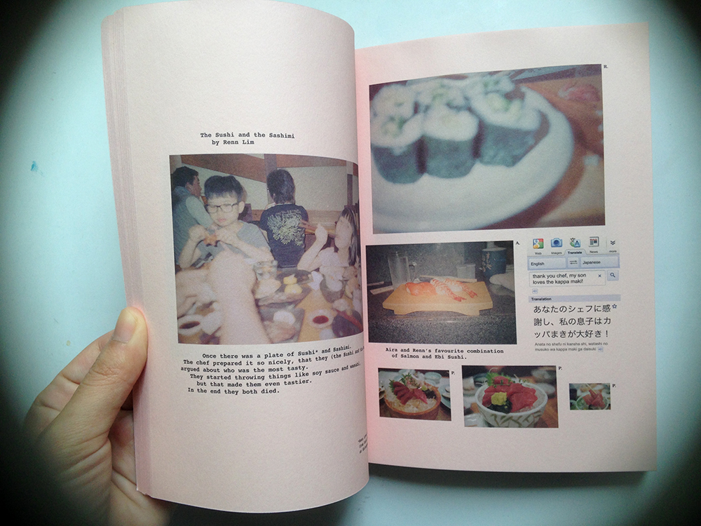
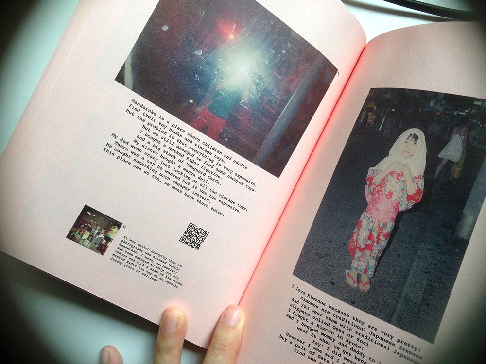
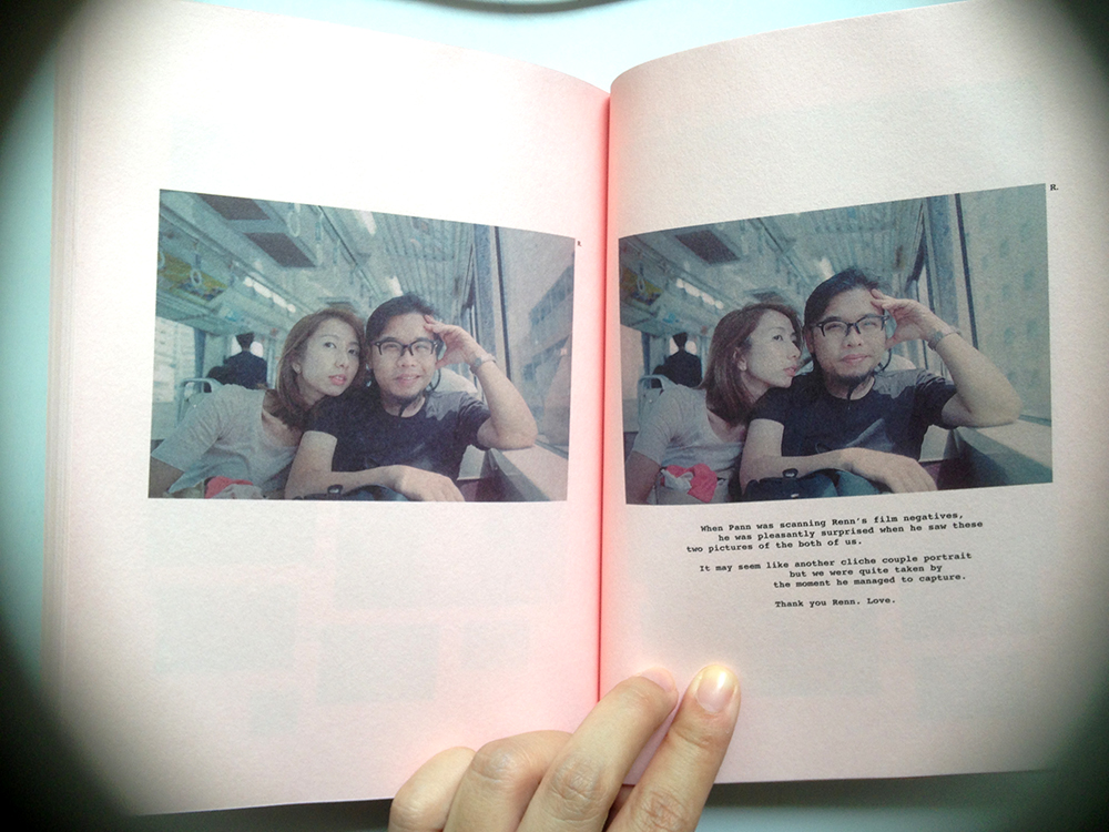
Google Translating Tokyoto is the first famzine that they made in 2013. It is a brilliantly pink book documenting their first trip together as a family. Some pages from the zine.Photo 16-8-15 11 43 19 am  Photo 16-8-15 11 43 30 am

Incorporating screenshots, film photos and text.Photo 16-8-15 11 43 47 am

Never thought of it, but QR codes are actually a brilliant way of incorporating virtual content with print. During the talk, the family demonstrated the use of these QR codes, which leads to funny YouTube videos and Vimeo clips. Photo 16-8-15 11 43 55 am Photo 16-8-15 11 44 07 am Photo 16-8-15 11 44 13 am Photo 16-8-15 11 44 33 am

is this the real life

lolfyp gg

first fyp post!

this is where it all begins. been spending some time converting my physical journals to digital formats. now i have my digital/physical archives all housed neatly in folders on my dropbox. it’s time to wade in and sieve through the contents. it’s going to be a massive project, but i’m looking forward to it!