WIP: type + collage

1409_01

03 01 02 03


Been spending these haze-filled days making these collages and experimenting with type layout. The first gif image of type shows my process of creating a few character styles on indesign. I think that would help speed up my process since I have tons of type to go through. Also, with just a click I can see how they come together. Been flipping through Carson’s books for this.

Then these are the scans of the collages I’ve been making. I will eventually print the manipulated type on tracing paper and wrap it around the printed collage, rather than directly on the collage itself. Helps to give the work some texture and dimension.

I’m working on a few different things at once, and I’m not really sure if it’s clear what I’m trying to do for each outcome, but writing here helps a lot. Also have tons of references that I got to categorise… I will work my way through slowly. All exciting and good stuff!!


Longform websites: kinetic.sg

kinetic06 kinetic05 kinetic04 kinetic03 kinetic02 kinetic01


(images from Kinetic.sg, mute your computer if you are opening the link, the sound is a bit loud)


This is the homepage of local creative group Kinetic. I really like their approach to design, and I feel they definitely stand out from the rest of the prominent design groups in Singapore. That’s not to say that the rest are not good or anything, but I feel that Kinetic brings something different to the table.

Their homepage is a pretty excellent example of what I hope to achieve for the virtual part of my work, using the idea of longform storytelling to bring together different media in one place.

In terms of design, there are some grungy elements that I like a lot. The whole page looks like a photocopied creation, and it’s interesting to see how they bring this style to the virtual, and incorporate javascript and animated things to create such an engaging website. I love websites like these: it invites you to scroll down and look at each and every part closely. This is why I want to use the longform method as well. I think of it as entering a deep, fantastical forest that you just keep on walking through. (Think I’ve been watching too much Adventure Time.)


Together in Electric Dreams


tgt03

Spent the last few days looking at stuff on the internet for my WordPress theme sketch. Anyway, here’s a song that I like a lot called Together In Electric Dreams, by Philip Oakey and Giorgio Moroder. It’s from a film called Electric Dreams (which I’ve never seen…). The film is about a love triangle between a man, a woman and a computer. Computer becomes involved in man’s love life, and both shared a mutual love for the woman. Eventually the computer accepts the love between the humans and then self-destructs as a results.

The movie is made in 1984, when computers are still quite a new thing. I thought it is quite fascinating for the director Steve Barron to come up with such a storyline that humanizes the machine. There are definitely many films out there are does the same thing with machines and electronics, but perhaps few that envisioned the machines to mimic the emotions that we go through.

Electric Dreams was definitely an attempt to try and weave the early eighties music video genre into a movie.”

— Steve Barron, director of Electric Dreams

After watching the video, I went to look up some of the other popular 80s music that I kind of like, and I find that there’s a very distinctive aesthetic that runs through the videos: fascination of machines and electronics, saturated colours, a glowy, blurry effect all around.

Here’s another one I found by The Buggles, Video Killed the Radio Star

videoradio01

I personally enjoy the aesthetics of these music videos. They are comparably low-fi music videos, unlike much of modern music videos. (Do people still watch those stuff?) And these musicians are all singing about this new form of technology with a kind of wide eyed wonder. I thought maybe for my WordPress theme sketch and my final illustration piece, I could try and dig out what are the aspects of the Internet world that I was acquainted with that strikes me with the same feelings. I think that would help bolster my concept for the theme creation.


Experimental print

Today I am sharing two publications: a zine with no name that I bought from Ti Pi Tin, and an alternative music magazine called Ray Gun.

Both are inspirational to me in terms of their experimental methods.

Here’s the zine with no name:Photo 16-8-15 2 10 04 pm Photo 16-8-15 2 10 08 pm Photo 16-8-15 2 10 13 pm Photo 16-8-15 2 10 20 pm Photo 16-8-15 2 10 26 pm Photo 16-8-15 2 10 34 pm Photo 16-8-15 2 10 39 pm

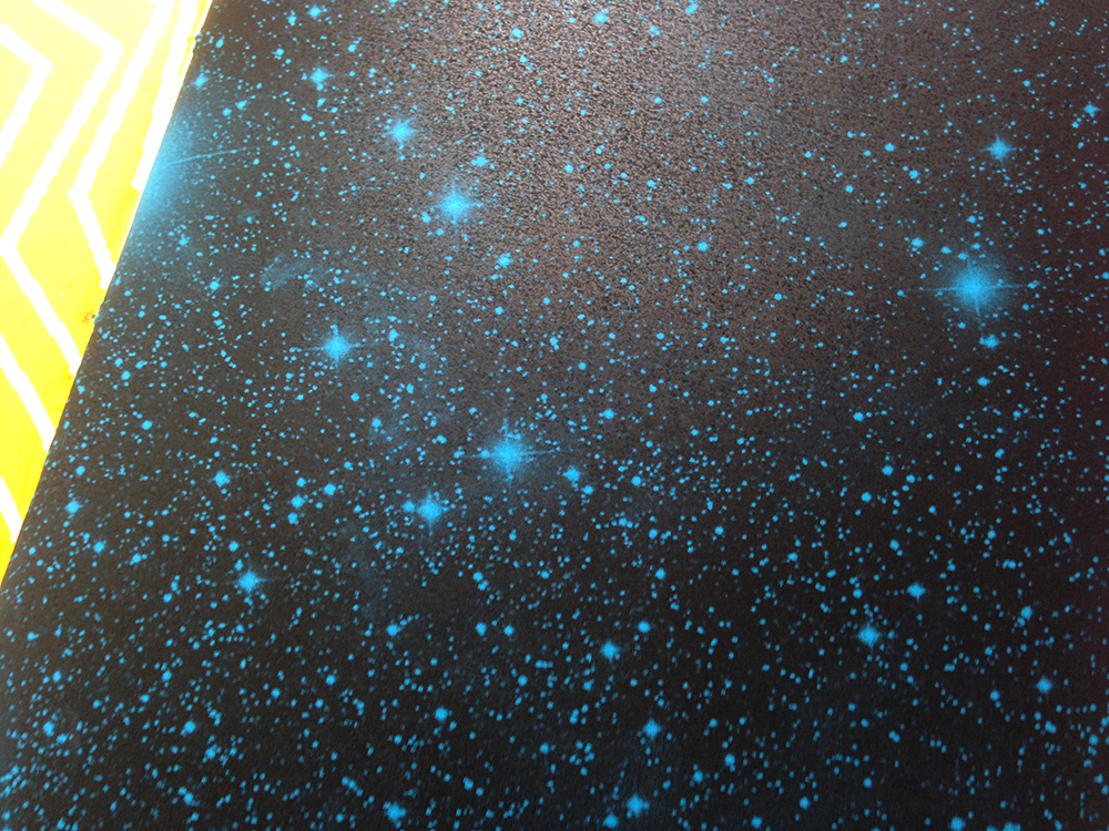
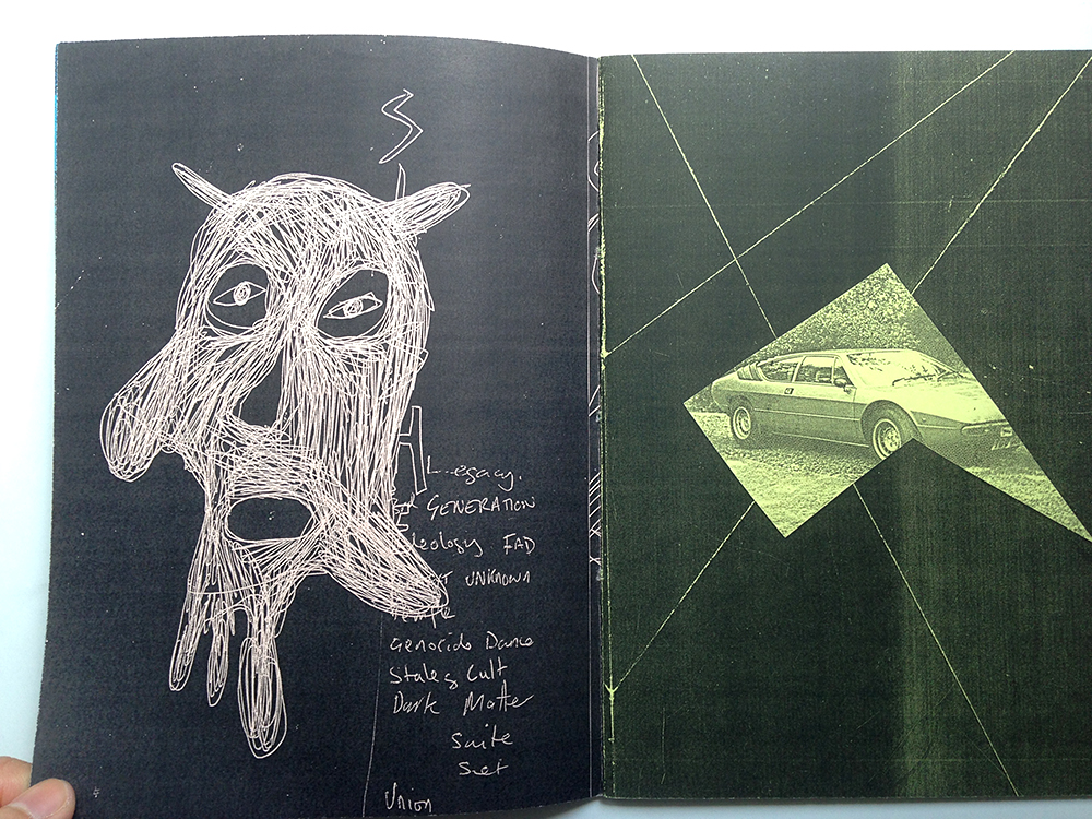
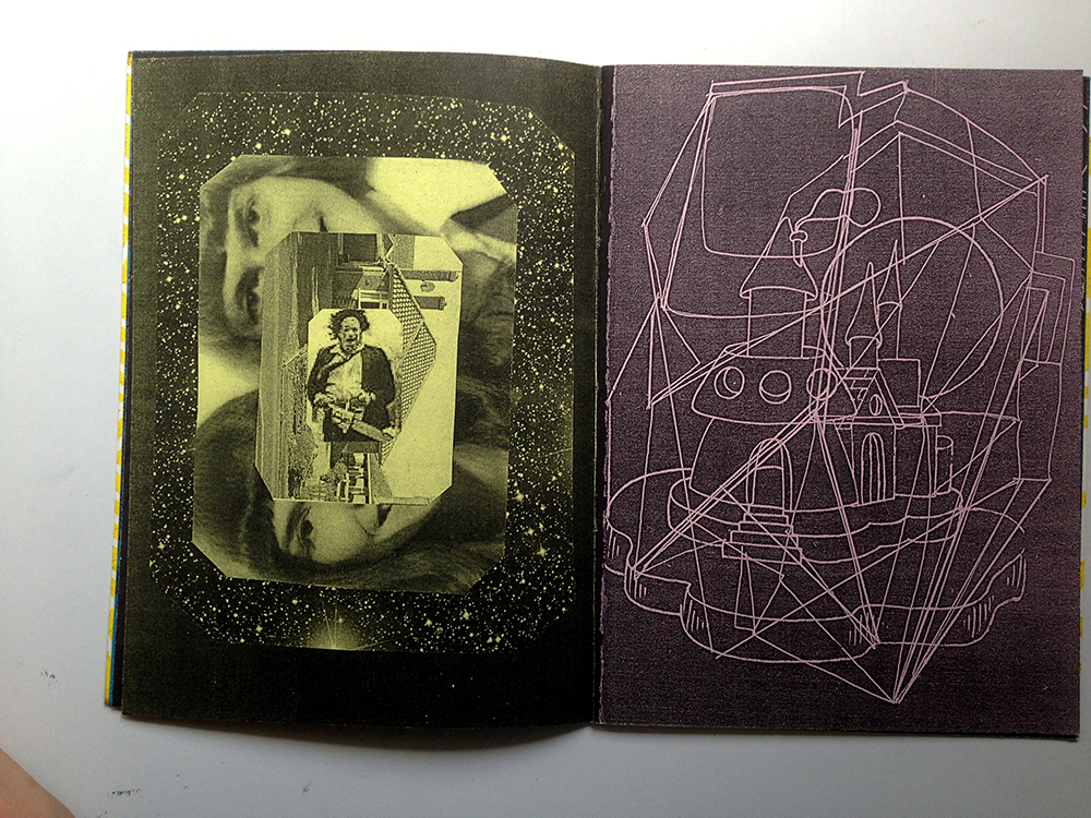
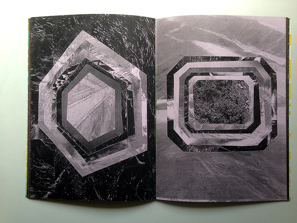
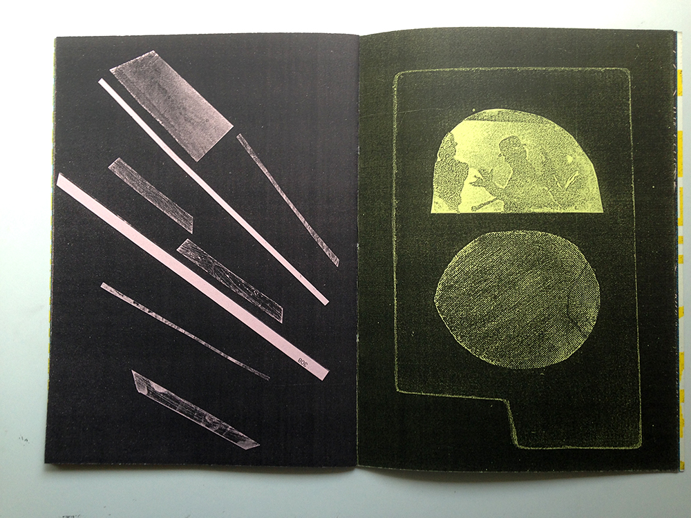
It is very simply made, staple bound, printed with a photocopier on generic coloured paper. I like it a lot because I thought it looks quite polished and cool for a zine that is made with a photocopier. It makes me think about how it is possible to use such low-cost methods to produce a print work that does not discount on quality. The images used in the zines have a good range of tonal values, and the black produced by the printer is rich and saturated.

I personally feel that in my experience of learning design and making publications, it is constantly implied that in order for work to achieve a polished look, it is necessary to invest (i.e spend a lot of money) in materials and printing. What does looking polished even means? I also hear a lot of my peers complaining about shops that don’t do good printing. I don’t completely disagree, but I find that as creatives we must be resourceful and work around what is perceived as weaknesses and turn them into something worthwhile. Given the right resources, most of us are able to make outstanding publications. But I also think it will be quite fun and challenging  if we were to make publications using low-fi methods such as collaging, stamping, scanning, or experimenting with the photocopier. Does good design = expensive paper + printing + hours of working on InDesign + referencing Behance portfolios to death?

Anyway I don’t really believe in that and I would want to try something like this for my FYP.

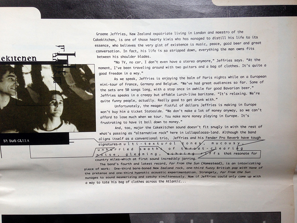
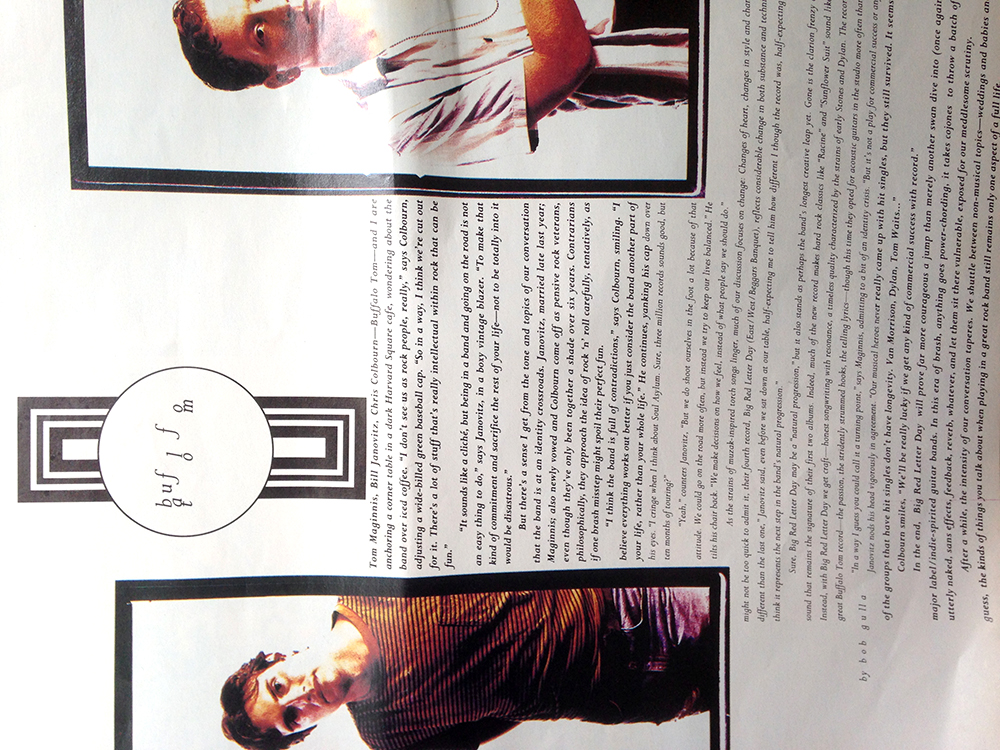
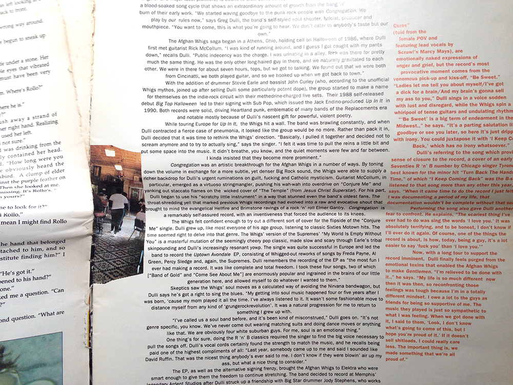
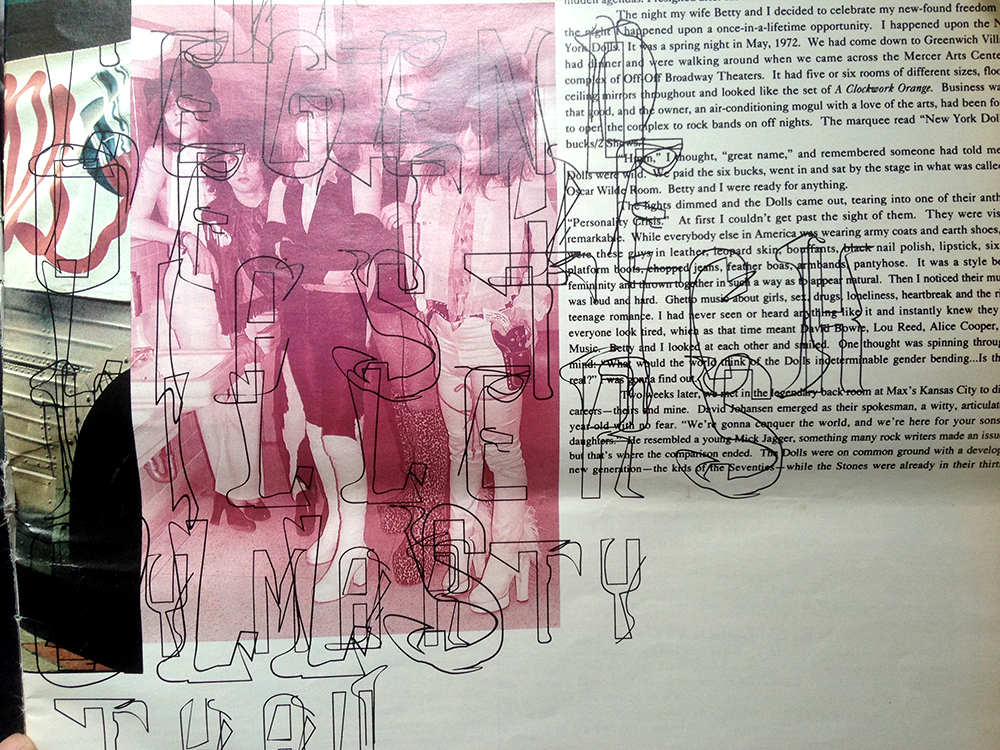
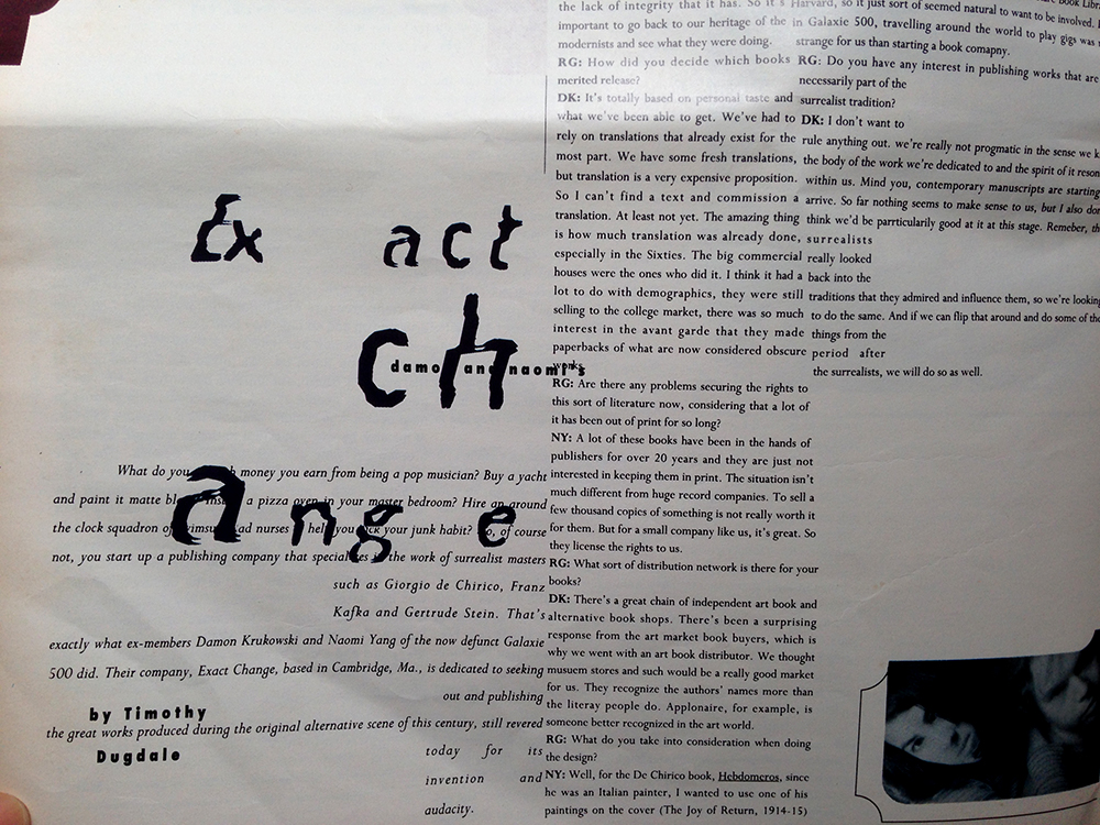
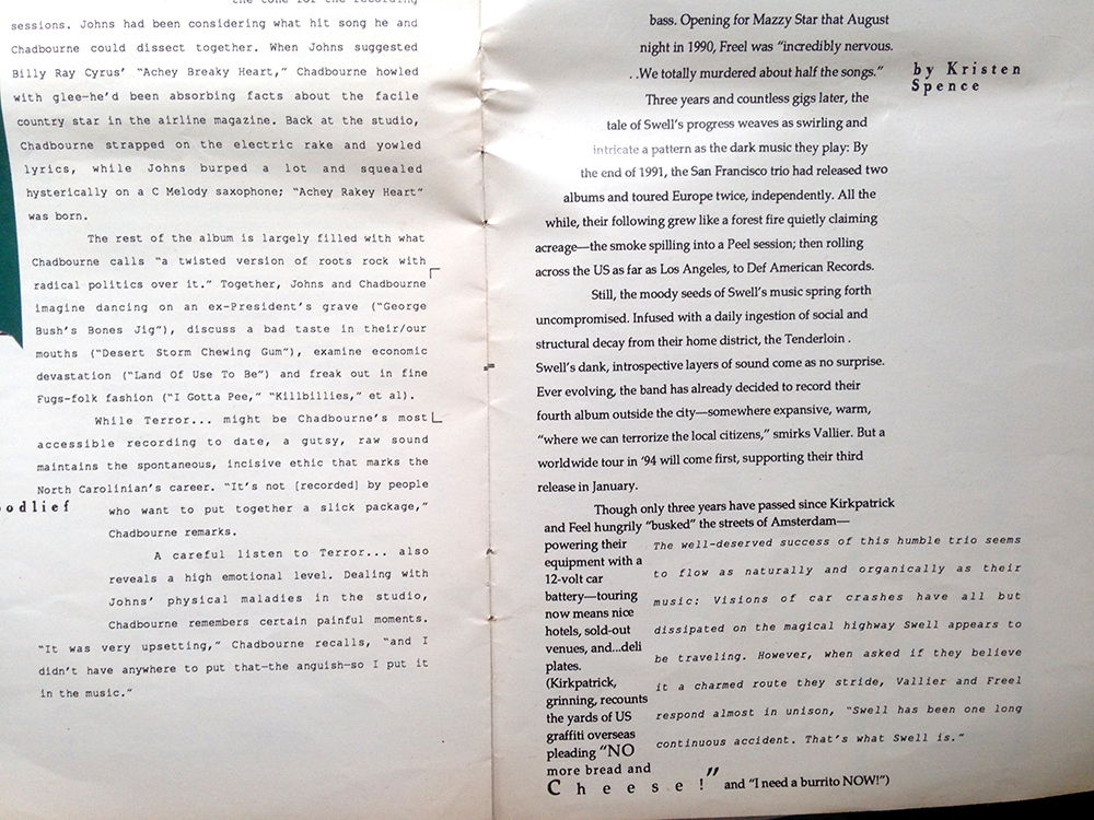
The second publication I’m sharing is called Ray Gun, which is an alternative music magazine which had since ceased its run. The magazine’s editorial designer was David Carson. There is something very distinctively 90’s about the design work. I remember seeing these magazines in my cousins’ room when I was much younger. Both of them are trained in graphic design, and their own works have a bit of David Carson in them. I managed to salvage just one magazine many years ago from their home when they moved out and it has remained one of my go-to publications for design inspiration for a long time.

The type in this magazine is absolutely awesome. Text in a single article can have varying kerning and line height, which makes for an exciting visual experience.

Everytime I have to make some boring work that requires me to put some text and images side by side, I always ask myself, how do I make this thing look cool? I always reach out for this magazine and I feel inspired.Photo 16-8-15 2 18 50 pm Photo 16-8-15 2 18 58 pm Photo 16-8-15 2 19 12 pm Photo 16-8-15 2 19 20 pm Photo 16-8-15 2 19 29 pm Photo 16-8-15 2 19 34 pm Photo 16-8-15 2 19 40 pm Photo 16-8-15 2 19 55 pm