tactile approaches to net art and aesthetics

One of the key things I want to explore through my visuals is to find the sweet spot between tactile art making and digital art. I’ve saved a collection of images to my Pinterest.

KEYWORDS

Throughout 2015, I was a little obsessed about finding a balance between making words and pictures. I feel that they have always been very separate processes. In the last few months, I think I’ve started to find a way to fuse them together. These are some of my thoughts and reasonings behind my visual output. I am paying close attention to how these areas are linked.

These are some works I found online by a Melbourne-based artist Rashee:

2_2_670 1_670 1_670-1 3_670-1 2_670 2_670-1 3_670 1_1_670

Rashee uses graffiti, painting and drawing to create artworks. His imagery is borrowed from system errors. What I like about his work that he takes a little inspiration from his borrowed imagery and let it expand into an abstract piece of shapes and beautiful mark-making. As a standalone piece, it is beautiful. It allows you to see the patterns that exist in these errors as marks made by the computer in an automatism fashion.

Micro-Project: Glitched Abberations

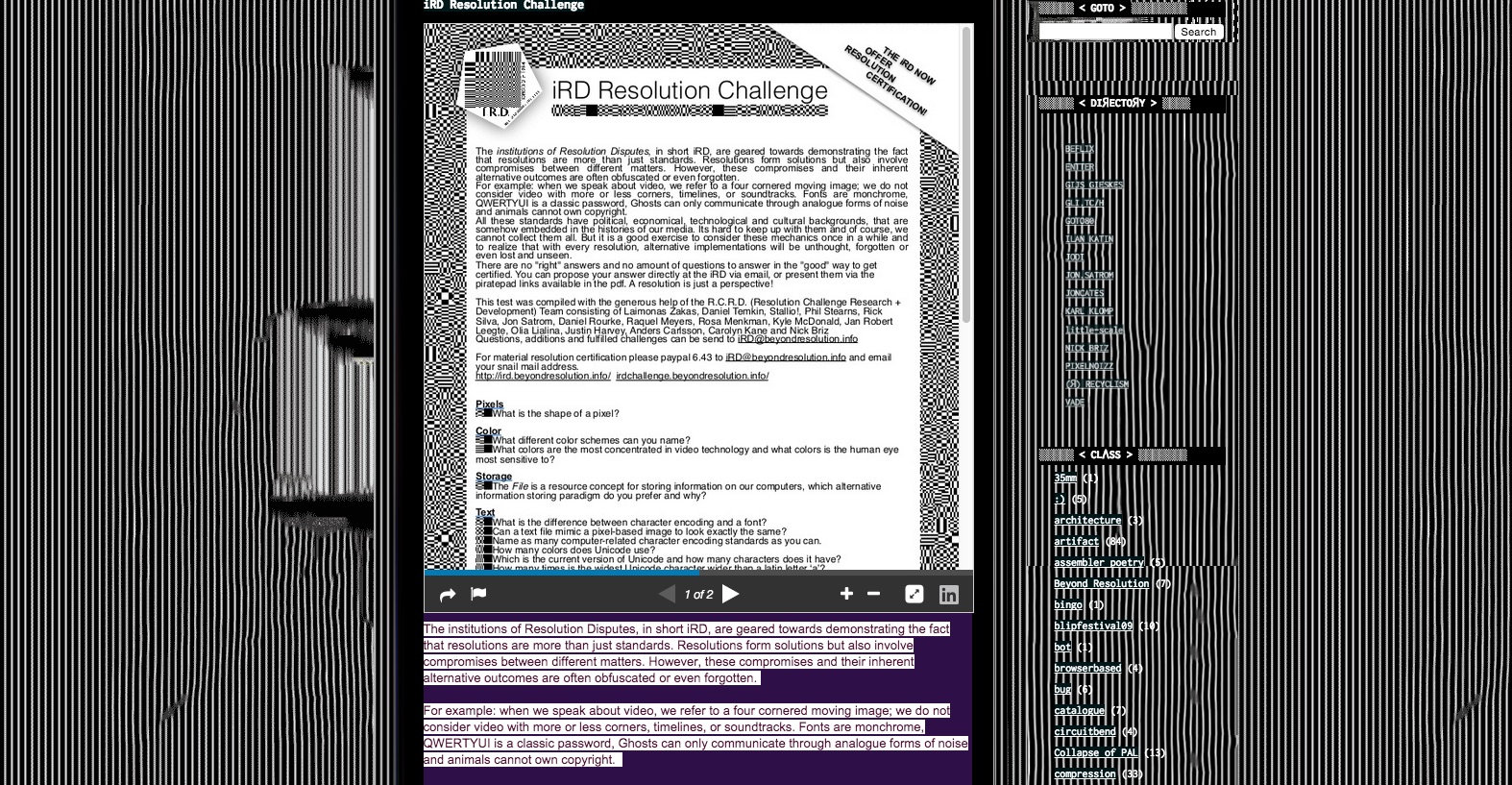
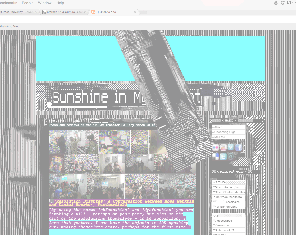
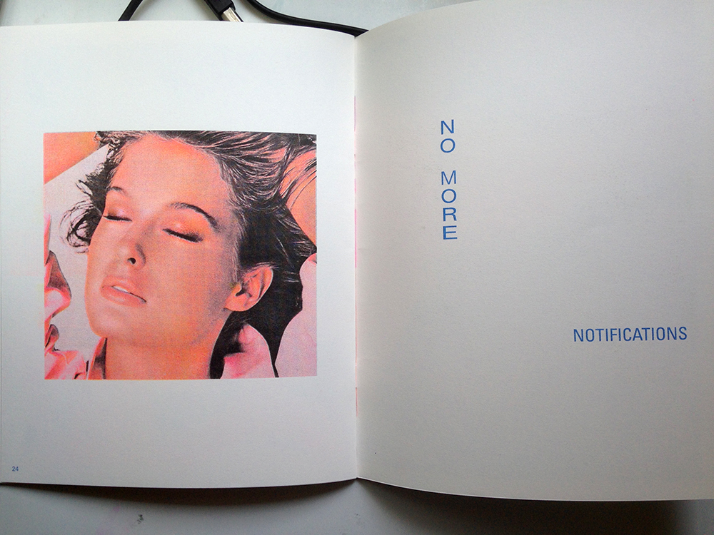
These experiments were really fun to make. The results are all really unpredictable. I chose a variety of images (slightly overexposed, dark, greyscale, etc) to edit and see what effects I can achieve from the experiment. I took screenshots each time I make an edit to the text file, so here are some of the process shots. I’m glad I took the screenshots because the end result were so different from the saved .jpg, when I go back to Photoshop to save them. Still interesting results, nonetheless!104grrb01

I started off by editing only the top part of the code, which seem to break the image into monochromatic layers. I like the result of this one, it really transform the original image into something quite exciting.103grrb02

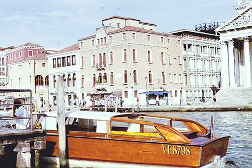
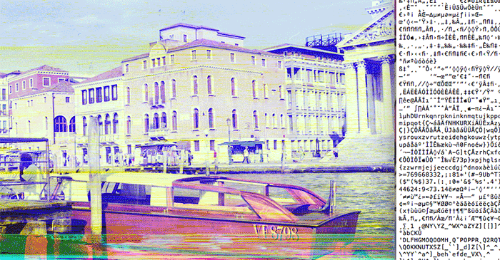
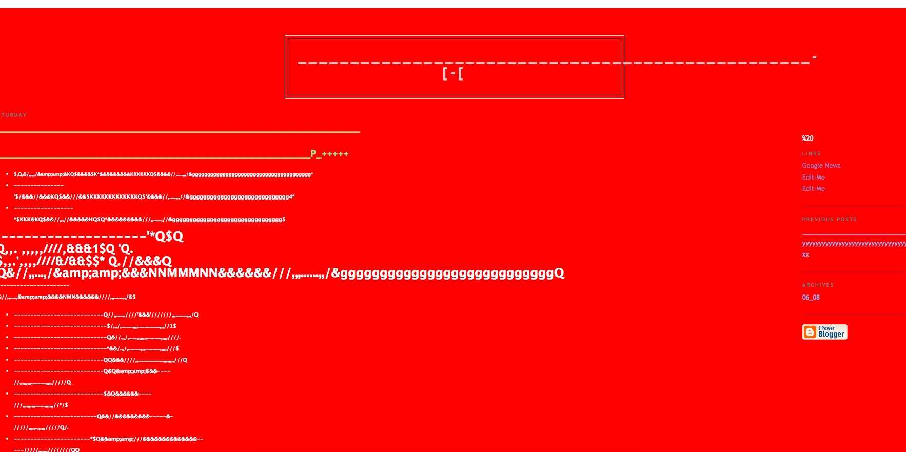
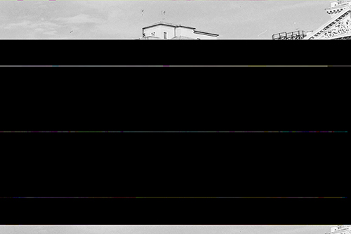
The colours in this photo is rather flat and faded. For the next image, I scrolled down all the way to the bottom and edited the code there. The effect was comparably drastic to the first: after a second edit, the image became a series of lines. The lines were also quite flat, nothing very saturated, like the original photo.55grrb04

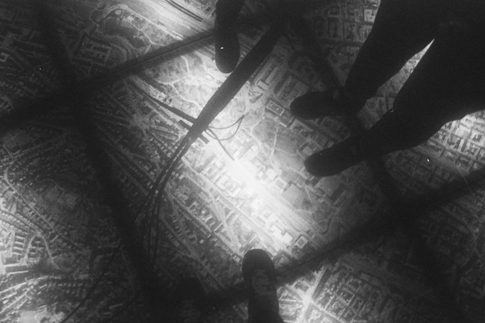
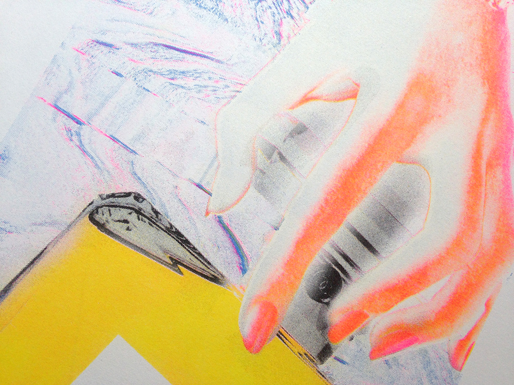
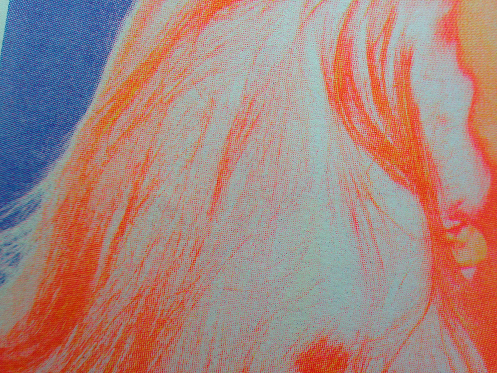
Next, I tried a greyscale photo. The result is absolutely exciting.  It’s quite interesting to see how this one produced such a colourful results. My favourite part is how the glitchy lines, after rounds of edits, became a smooth streak of gradient.28grrb06

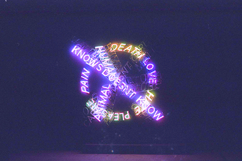
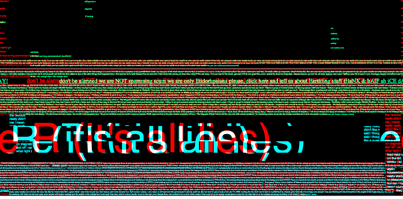
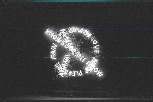
This is one of the more exciting result out of all the images I’ve tried. It has the same result as the greyscale photo; both have streaky gradient glitch lines, but what is interesting is how at one point of the edit, the “glow” of the text seemed to be separated from the text itself, creating a ghostly glitchy effect. It kind of reminds me of what you can do with slow shutter speed on a camera.38grrb05

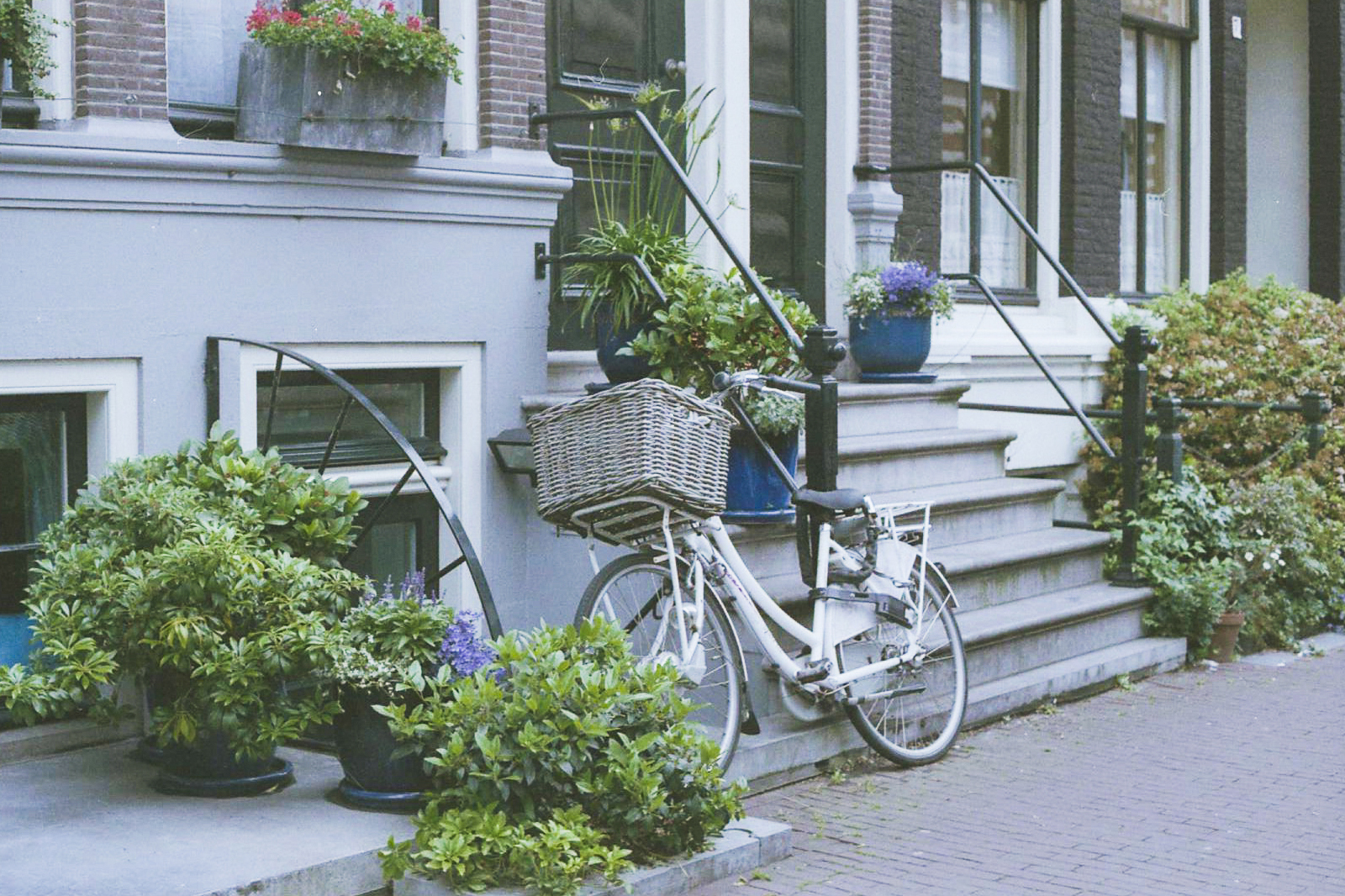
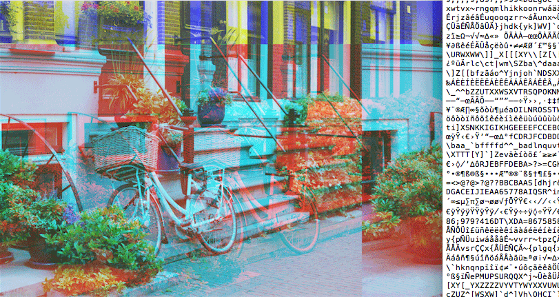
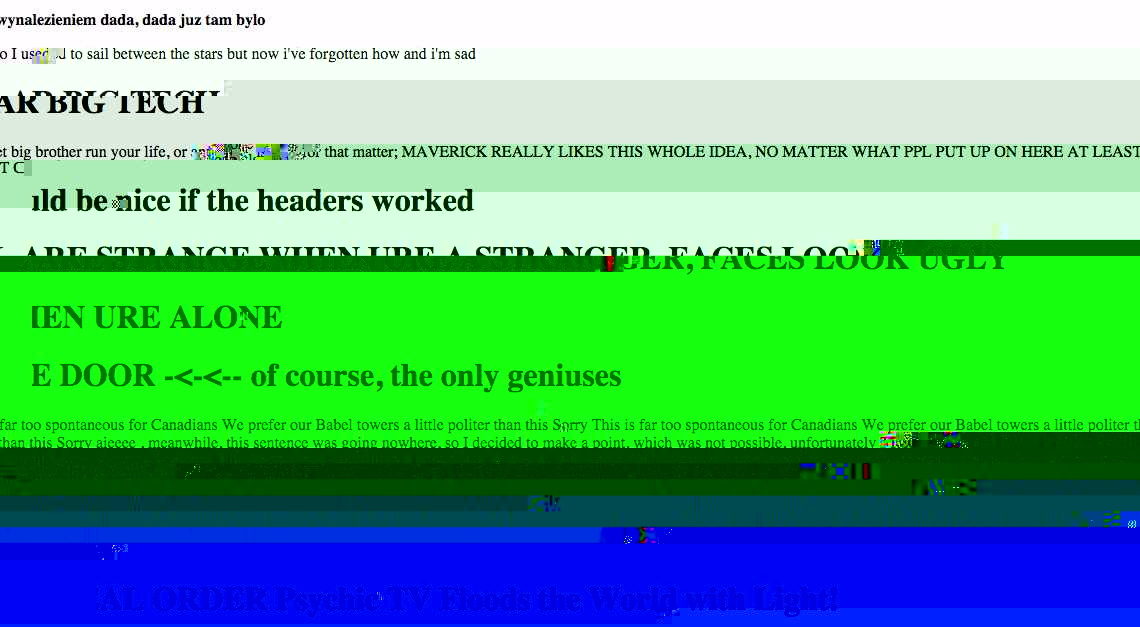
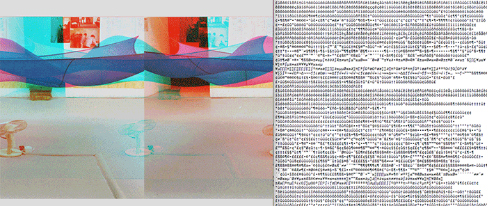
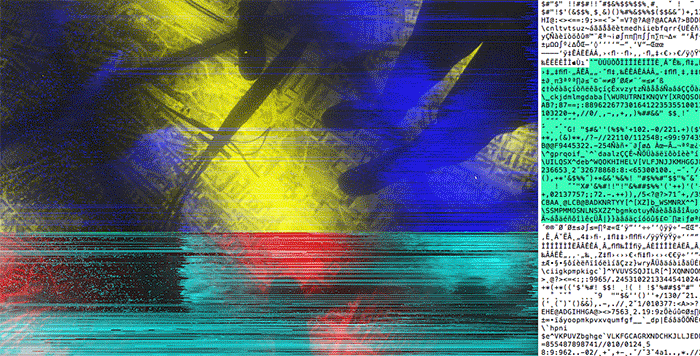
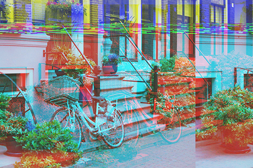
This one looks like a 3D image. After the first edit, the result didn’t seem to change too much, the image just separates into different segments.

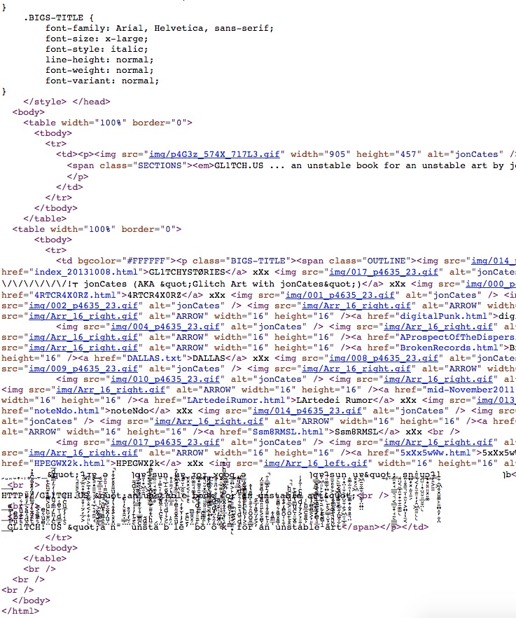
Here are the images opened in Photoshop:glitchab01 glitchab02 glitchab03 glitchab04   glitchab07

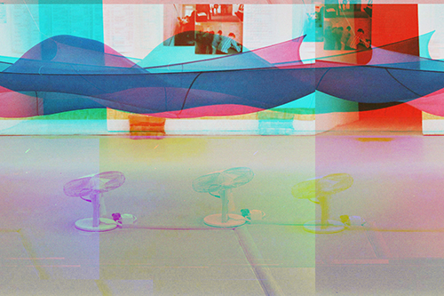
These experiments were surely exciting, but as with experimental art, sometimes I ask myself, when is it complete? I try not to over-do the glitching as a result of being encouraged by a previous outcome, because I’ve gone through a few images that became totally ‘destroyed’, and previous outcomes couldn’t be ‘saved’. Anyway, after I opened them in Photoshop, I realised they are all different from my desired outcome. Perhaps this is the nature of chance aesthetics.

the glitch moment(um) by rosa menkman

Was introduced to this reading in Internet Art & Culture class. Rosa Menkman is a Dutch artist who is specialised in glitch art. She is also a theorist, specifically in the area of glitch art, so this piece of writing is a key reading for my project.

Some relevant points for my research:


brief history: the notion of glitch art was just crossing over from sound culture, and leaking into visual art cultures only sporadically. The bugs Goto80 used gave a very specific texture to the sound (the result of noise artifacts) and I began to develop and recognize visual equivalents to this process. I found more and more artifact-based correspondences between audio and visual technologies, such as compres- sions, feedback and glitches.

the collapse of pal (2010): I tried to underline that there is more to glitch art, and more at stake, than just design and aesthetics. The work addresses themes such as planned obsolescence, built-in nostalgia, critical media aes- thetics and the gentrification and continuing development of a glitch art genre.

definition of glitch according to rosa: I describe the ‘glitch’ as a (actual and/or simulated) break from an expected or conventional flow of information or meaning within (digital) communication systems that results in a perceived accident or error. A glitch occurs on the occasion where there is an absence of (expected) functional- ity, whether understood in a technical or social sense. Therefore, a glitch, as I see it, is not always strictly a result of a technical malfunction.

relationship between technical and metaphorical or cultural dimensions of glitch culture. Focusing on the glitch within this broader perspective makes it possible to think through some of the more interesting political and social uses of the glitch within the field of digital art.

Moreover, glitch transitions between artifact and filter, or, in other words, between radical breakages and commodification.

glitch studies manifesto:

2. Dispute the operating templates of creative practice. Fight genres, interfaces and expectations! Refuse to stay locked into one medium or between contradictions like real vs. virtual, ob- solete vs. up-to-date, open vs. proprietary or digital vs. analog. Surf the vortex of technol- ogy, the in-between, the art of artifacts!

4. Employ bends and breaks as metaphors for différance. Use the glitch as an exoskel- eton for progress. Find catharsis in disintegration, ruptures and cracks; manipulate, bend and break any medium towards the point where it becomes something new; create glitch art.

5. Realize that the gospel of glitch art also tells about new standards implemented by corruption. Not all glitch art is progressive or something new. The popularization and cultivation of the avant-garde of mishaps has become predestined and unavoidable. Be aware of easily reproducible glitch effects automated by softwares and plug-ins. What is now a glitch will become a fashion.

.gif + dither: Graphics Interchange Format is a bitmap image format that supports 8 bits per pixel. This compression can therefore consist of no more then 256 colors. The format supports animation and employs dither (a grain or block artifact). Dither helps to prevent images from displaying or transforming into large-scale patterns such as ‘banding’ (a stepped process of rendering smooth gradations in brightness or hue).

what happens to glitch? However, if the cause of the glitch remains unknown, the glitch can either be ignored and forgotten, or transformed into an interpretation or reflection on a phenomenon (or the memory there- of) defined by a social or cultural context (conventions, histories, perspectives) and the technology that is malfunctioning.

humanizing errors: A glitch represents a loss of control. The glitch makes the computer itself suddenly appear unconventionally deep, in contrast to the more banal, predictable surface-level behaviors of ‘normal’ machines and systems. The glitch has become a new mode; and its previous uncanny encounter has come to register as an ephemeral, personal experience of a machine.

accident of art: Notions of disaster, aesthetics of failure and accidental events have been integral to modern and contemporary art, Avant-Garde progressions and turnings.

To invent the sailing ship or steamer is to invent the shipwreck. To invent the train is to invent the rail accident of derailment. To invent the family automobile is to produce the pile-up on the highway. To get what is heavier than air to take off in the form of an aeroplane or dirigible is to invent the crash, the air disaster. As for the space shuttle, Challenger, its blowing up in flight in the same year that the tragedy of Chernobyl occurred is the original accident of a new motor, the equivalent of the first ship-wreck of the very first ship.

— Paul Virilio

cultural meaning: Virilio argues that although many people encounter ac- cidents as negative experiences, an accident can also have positive consequences. The accident doesn’t only equal failure, but can also ‘reveal something absolutely necessary to knowledge’. The accident (and thus the glitch) shows a system in a state of entropy and so aids towards an understanding of the ultimate functioning of a system. This opens up space for research and practice, and the arts are a special domain for this. Dadaists and Surrealists cannot be understood without World War 1. Virilio explains how WW1 blew reality into pieces and how the cubist painter Georges Braque collected those pieces and put them back together, not just as a formalist experiment or as a destruction of perspective but as an artistic realism appropri- ate to the techno-cultural present. Thus, many artists could only use some (destroyed or mutilated) form of figuration. This understanding leads Virilio to conclude that in the art of the accident. In the digital realm, what has come to be known as glitch art deals with the digital dimension of error, accident and disaster from different angles, within a larger context of cultural meaning.

defining glitch art?  Their destructive or disfiguring processes have no technological name, definition or explanation (yet). For this reason, it is necessary to not only define and categorize glitch at technological levels, but also to look closely at how specific media are exploited on a more complex techno-cultural level.

databend generative artists such as stAllio!, glitch-irion Pixelnoizz and Hellocatfood.

inherent openness of glitch as a concept makes glitch art difficult, if not impossible, to define.

binary approach to glitch art? 

Design-driven glitch art has tended to be referred to as artificial or ‘glitch-alike’. Iman Moradi has gone so far as to develop a true-false binary to deal with these matters of glitch imitation, which he explains with the following statement and schema: Because of the intrinsic nature of this imagery and its relation to pure glitches, both in terms of process and viewer perception, I felt the need to form a word that adequately describes this artifact’s similarity with actual glitches and present it as an obviously separate entity. Thus the term “Glitch-alike” came about to fulfil this role. […] Glitch-alikes are a collection of digital artefacts that resemble visual aspects of real glitches found in their original habitat.

binaryglitch

intentional faux-pas: They challenge the ideological aspects of proprietary design by misrepresenting existing relationships between specific media functionalities and the aesthetic experiences normally associated with them.

You cannot prohibit the catastrophe, you must surf it!11

– PAUL VIRILIO

the perfect glitch: The perfect glitch exists, momentarily, at the shocking tipping point between (potential) failure and a movement towards the creation of a new understanding. The glitch’s inherent moment(um), the power it needs or has to pass through an existing membrane or semblance of understanding, helps the utterance to become an unstable ar- ticulation of counter-aesthetics, a destructive generativity.

built-in obsolescence and pop culture: technological progressions causes built-inp obsolescence. things are designed to last x number of years before they become obsolete. I would like to argue that this economical reasoning is very much connected to the growing fetishization of nostalgic imperfection in (glitch) art, which over the last decades has become a kind of conceptual virus. Today it is completely normal to pay extra money for aesthetically appealing plugins like Hipstamatic or Instagram, that imitate (analogue) imperfections or nostalgic errors, like ‘faux vintage’ lens flare and lomographic discolorations.


blogspot.jodi

jblog_01 jblog_02 jblog_03

During 2006 and 2007, Jodi made the work <$blogtitle$>, based on the social publishing tool Blogger, from Google.13 <$blogtitle$> looks like a Blogger page in a broken state. The pages generated by Jodi’s (mis)usage of the tool are either filled with gibberish or in ruins. It’s hard to say: perhaps you are looking at back-end code.

Jodi indeed plays with different language systems, for instance the visual and the non-visual source (code) of the Blogger software. Template formats such as the title of the blog, the post headers and certain blog addresses in the link list appear all in ruins, while Blogger-specific images like comment-icons, dates and additional otherwise functional visual elements are now reduced to theatrical objects.

glitch’s formal fragmentation signifies that the work is ‘open’ to inter- pretation and meaningful engagement.

By ruining the Blogger medium, Jodi’s use of formal fragmentation opens the platform itself up to deconstruction, interpretation and further active engagement. As a result, the meaning of the ruined work is never finished, whole or complete.

However, for the reader to actually give meaning to the ruins, they must take the initiative of imposing (their own select) new constraints, new frameworks of analysis and limitations on other possibilities.

this openness also had a negative consequence: Blogger interpreted the blog as a malicious spamblog and consequently blocked it. This act could be described as a rather rigorous ‘death of the author’, in which the meaning of the work is not negotiated, but instead dismissed and deleted.

<$blogtitle$>, Jodi shows that a glitch can be com- pletely constructed (by the artist), but also that such constructs can in turn reveal the con- structedness of software-generated knowledge and expression.

— Rosa Menkman, The Glitch Moment(um)

Jodi.org is the brainchild of two Internet artists, Joan and Dirk. Keying jodi.org into your address bar spawns a series of webpages that are rather crazy, like they are taking over your browser. Some of the effects generated by the website include: constant page redirects, flashing images, auto-downloads, wacky URLs. Their style of internet art/glitch art have been described by Wikipedia as “the work of an irrational, playful, or crazed human.”

One of the side projects that resulted from Jodi.org was the duo’s experiments with Blogger pages. I came across the work while reading Rosa Menkman’s Glitch Moment(um) essay.

Jodi deconstructed the standard Blogger pages, causing it to look broken. The pages looked like what would happen if you enter the source code of the pages and remove some important parts of coding, that renders certain functions useless (i.e incomplete HTML coding to display an image, that resulted in a broken image icon).

I find this work quite an important point of reference for my WordPress theme sketch, which Boyan, Cynthia and I are working on, especially when I think about how I can deconstruct my blog archive by manipulating the functions of a WordPress blog: perhaps altering how categories/tags are being displayed.


Research Critique 5: Shredder and Riot


shredder02shredder01 shredder03 shredder04

Shredder, 1998


shredder05 riot01 riot02

Riot, 1999

Mark Napier’s Shredder and Riot were alternative web browsers made in the 1990s. The main aim of these browsers was to deconstruct the webpage as it is conventionally viewed, by manipulating the underlying source code and re-presenting the data in their own elements. It is like taking apart a Lego sculpture and rearranging the bricks around.

In Rosa Menkman’s essay, she examines the beginnings of glitch art in sound culture:

The notion of glitch art was just crossing over from sound culture, and leaking into visual art culture only sporadically. Glitch more fully entered my vocabulary for visuals and networks when I began an artistic collaboration with the musician Goto80 (Anders Carlsson) in 2007. He explained to me how he exploited the Commordore64 sound chip for the creation of music. The bugs Goto80 used gave a very specific texture to the sound (the result of noise artifacts) and I began to develop and recognize visual equivalents to this process.

I feel that there is a textural element to both Shredder and Riot. The deconstructed website produces interesting outcomes.

shredder03

Take this screenshot from the Shredder browser, for example. The blue part is made up of the source code: the line height of these coding text have been tweaked drastically. The extreme condensing of these lines produces a solid area of blue, and some of the background elements peek through the spaces in between, creating an interesting, textural effect. The blurry, pixelated images look like marbled texture too. The outcome of these glitched elements look like a collage made by a machine.

In the Glitch Studies Manifesto, here’s a description of glitch art as a progressive art form:

4. Employ bends and breaks as metaphors for différance. Use the glitch as an exoskeleton for progress.

Find catharsis in disintegration, ruptures and cracks; manipulate, bend and break any medium towards the point where it becomes something new; create glitch art.

Most of the works we discussed in recent weeks were artworks that were made with a piece of technology that is relatively new; artists who are keen to experiment with the purpose that these kind of technology have been designed for. Like Douglas Davis’s work The World’s Longest Sentence, Mark Napier’s Shredder and Riot were made in the late 1990s, when the Internet phenomenon was still rather young. It explores what can be done with the Internet browser than using it purely to surf the internet or to obtain information. Taking apart the surface of a website, “manipulating the medium”, was the creation of something new in the realm of something that is still new.

The machine no longer behaves in the way the technology was supposed to. Its glitching interface, strange sounds and broken behavioral patterns introduce tension into user intentions; an astonishing image (or sound) must be some how negotiated amidst a normally much more boring masquerade of human computer relations.

I also found this point very relevant to what the Shredder and Riot was designed to be like, particularly for Riot. The Riot browser really created this chaotic effect: elements of a webpage strewn all over, and the web page look really wild and crazy. If a user were to navigate a website using the Riot browser, it must have been quite an interesting experience, particular in that time, when websites looked simple and it was not diffucult to get around. A Riot-ed website probably would have made navigation way more interactive, with the user having to forage through this chaos to search for the links and to demystify text and images that have been layered over each other.


Glitch maker chance art

glitcher01 glitcher02 glitcher03 glittcher04


I haven’t quite written anything about making chance art yet, but this weekend I think I’ll do some research and include a few more references for chance art. Last semester I fooled around with some glitch makers online and I got some pretty crazy results. I used a couple of the outcomes in the large Photoshop artwork, but I mostly used it as a starting point for glitch experiments.

glitcherexperiemtn01

Made with image glitcher experiment

This online app manipulates a .jpg image, so that it creates all this weird, fancy errors. What I did was to play around with the sliders until I achieve some effect that’s quite nice: often it’s the colours that are produced, or how an area of the image is distorted. Then I make screenshots of the various results.

I’m currently doing bit more research into each area of my report as I work my way through the desired outcomes. A few days ago I had my meeting with Randall and we discussed making a longform WordPress theme. One of the girls in my fyp group, Boyan, is very good at making themes, so I thought maybe this time I’ll produce a sketch and rope in the help of someone who’s better at coding. To be honest, I think I will struggle quite a bit with learning the coding for WordPress theme. I don’t think it will be impossible for me to learn, or that I’ll not have the patience for it. But it has been a long time since I did any coding, and I quite look forward to working with Boyan to make something cool for the virtual part of my project.

While doing some reading on David Carson’s works, I wondered how he ever thought of making deconstructed typography. I feel that the experimental quality of his design is reminiscent of the Surrealist automatism concept. Automatism art taps into the subconscious mind of the artist, and allow that subconscious to work itself onto the paper. Sometimes I feel it is not as easy as it looks or seems, to create experimental artwork. It’s almost like meditation: you got to just kind of shut down a small part of your brain, and just make an artwork without really thinking about it. just go with the flowwwww~~

What I like about the image glitcher experiment is that it pushes that button: stop thinking! I glitched some body of text just to give me some visual ideas of what I can make, typographically, and then I can expand from there. I love this part of the work, definitely. Having no idea of the outcome can be an exhilarating thing, and from my experiences, is a pretty damn good!

To more experimenting!

Art of the glitch: Jon Cates, Rosa Menkman

gl1tchus

Jon Cates, Gl1tch.us

In the interview by Randall Packer, Glitch Expectations: A Conversation With Jon Cates, Jon Cates’ works are referred to as ‘dirty new media’, which is an apt description for the low-fi, hypnotic quality of his animations.  In the homepage of Gl1tch.us, the header image and layout brings to mind the work of David Carson.  Grungy, pixelled, deconstructed… It’s like the virtual version of what you get if you made printer ink smudges or colour half-tone. The low-res quality of gif images is both nostalgic and analog. Another description of the dirty new media I resonated with in the article is that the ‘dirtiness’ in this form of new media work suggests that there’s a human touch to it. I thought it’s a good thing to take note of and try to weave into my work online so that in terms of aesthetic and concept it’s congruent with my print work.

gl1tchussource


A closer look at the source code of Gl1tch.us site. I find the layout of source code fascinating sometimes. I’m no programmer and I’ve not done much research into why the layouts look like this, but from a typographical point of view, it makes for an interesting visual experience. One of the things I want to include in my virtual work is this idea of coding. Coding as the backbone and underlying side of what you see on a webpage. Perhaps in order to make this concept accessible for viewers, I could arrange my text layout online to resemble the source code. While typographical explorations on print are always fun, I’m quite excited to see what I can come up with online. I briefly showed the class one of the projects I did over the summer break with my friend where we made ‘glitch poetry’ using predictive text, and then we played with the type and layout. I think I can definitely take it further online by incorporating animated sequences.


sunshine01 sunshine02


Here’s another interesting web layout. This is Sunshine in My Throat by Rosa Menkman. I thought the animated bits were absolutely wacky and psychedelic. Just a visual reference of what I can do…

(ps. need to get started on some work too)


sunshine03

Risograph references


I bought some of these beautiful zines printed with risograph over the summer as well. I have been quite interested in this printing technique for some time, although I have not personally tried printing my own work with it. Over the last year I have been trying to collect some good examples of risograph works and learning more about the process.  My aim for this semester is to print a section of my work with risograph.

Why am I interested in this technique? Last semester I made some glitch art. They didn’t look very good when they are printed with the laser printer. I’m trying to find out ways that I can bring the “virtual to print”, and I think overprinting with risograph using such bright and neon colours, could help achieve this effect.

Below are some examples of overprinting with risograph.

From the work Aqua Solo by Double D‘s.

Photo 16-8-15 2 05 42 pm Photo 16-8-15 2 05 49 pm Photo 16-8-15 2 05 54 pm Photo 16-8-15 2 05 57 pm Photo 16-8-15 2 06 08 pm Photo 16-8-15 2 06 15 pm Photo 16-8-15 2 06 23 pm Photo 16-8-15 2 06 34 pm Photo 16-8-15 2 06 47 pm Photo 16-8-15 2 06 55 pm Photo 16-8-15 2 07 06 pm

Unmatter by Dominic KestertonPhoto 16-8-15 2 07 44 pm Photo 16-8-15 2 07 49 pm Photo 16-8-15 2 07 58 pm Photo 16-8-15 2 08 05 pm Photo 16-8-15 2 08 10 pm Photo 16-8-15 2 08 14 pm Photo 16-8-15 2 08 18 pm Photo 16-8-15 2 08 32 pm


What is a Grid?


Photo 16-8-15 2 08 52 pm Photo 16-8-15 2 09 00 pm Photo 16-8-15 2 09 03 pm Photo 16-8-15 2 09 15 pm Photo 16-8-15 2 09 19 pm Photo 16-8-15 2 09 22 pm

Project Hyperessay 3: Conclusion

Project Link

outline

g.r.f.e experiments with the idea of having the ability to manipulate and eradicate certain areas of our personal history on the virtual realm, using glitch art and the aesthetizing of errors to break apart and censor fractions of content.

online

Working on my archiving project while taking Media and Performance class reveals that active participation in the third space even before I realised what it meant. I live most of my teenage years online and on the virtual space, and actively documented my life on my blog. Having a large part of my personal history stored away on a cloud server and being permanently there is like a massive time capsule. Every episode in my life is a click away on my archive page.

Looking through my history of blogging reveals my relationship to the virtual space and how it had shaped me, as an individual and as an artist.

As a visual artist, I ask myself, what can I make out of this archive, of the raw, unedited content? My main focus working on this archiving project is to re-present this content again in a fresh manner that gives new meaning to old identities. It is a bridge that illustrates the transition from adolescence to adulthood, to remember and also to let go.

performative chance art

Each collage created in this webpage is by chance. They are unplanned works of collages. First I begin with a page from my blog or my physical journal. The content is chosen based on how the memory that is recorded on the page made me feel. Some of the entries describe some embarrassing memories in school, some documented certain experiences of loss, anger and sadness from my adolescent years. These are words that painted my teenage self portrait. Then, I manipulated the image in Photoshop, repeating/highlighting text, cancel words or blank out areas completely.

Each collage is also performative way of acknowledging the temporal nature of these issues, and above all, a kind of celebration.

This project experiments with the idea of having the ability to manipulate history and eradicating certain points in that history. It also helps me to find the ability to look at it from a more controlled and mature perspective. Glitching helps to break apart and censor fractions of words that are too confrontational.

long form content

The final work is presented on a webpage built with basic HTML, just tables that help to align the images neatly. This is an open ended project that I will continue to work on as part of my final year project, adding new collages as I sieve through my virtual archive.

The nature of this long form content alludes to my blogging practice as well, a beginning with no end.

reflections

Working on this project had been really fun and I enjoyed the performative and experimental quality of making the gifs out of these collages. I am rather pleased with the outcome of the project as it had come a long way from the ideas that I first presented in the first hyperessay. At first, the scope of my project is quite large: I want to talk about the changing landscapes of social media, from sites like Myspace, tools like MSN Messenger, virtual nostalgia, and the relationship between myself and these sites, but as the semester progresses, I realised that my blog is a better source for me to examine my relationship with the virtual reality.

If I could improve on the project, I would make some of the gifs more engaging: perhaps screenshots of MSN chat windows that mimics a real conversation.

Mobile Cam Exercise: we r here[now]

Photo 17-3-15 9 40 06 pm Photo 17-3-15 9 40 53 pm Photo 18-3-15 1 09 10 pm Photo 18-3-15 1 09 34 pm


It was rather challenging to work on the mobile cam exercise due to connection issues. Diana and I have tried communicating at two different places: she’s at home and I’m in school. We both decided that we will try this exercise with wifi and not data plan to ensure a more stable connection.

The first screencap is from our communication which lasted for a few minutes before Diana disappeared (second cap). I also experience lag in connection. I was at the ADM cafe area and walking around a lot to test the stability of wifi. It is not too bad, and I hope this works just as well on the day of the symposium!

The next few caps were tested on my data plan on the bus to school. It’s pretty stable, although i must comment that the video quality is much more pixelated on data plan.