photoshop spreads + videos

Screen Shot 2016-03-29 at 7.00.36 pm Screen Shot 2016-03-29 at 7.00.37 pm Screen Shot 2016-03-29 at 7.00.40 pm Screen Shot 2016-03-29 at 7.00.42 pm Screen Shot 2016-03-29 at 7.00.45 pm Screen Shot 2016-03-29 at 7.00.47 pm Screen Shot 2016-03-29 at 7.00.50 pm Screen Shot 2016-03-29 at 7.00.53 pm

I’ve finished putting together my physical process books, and my challenge for the last two weeks was thinking about how to present my OSS and video documentations. Opened up InDesign and played around with some layouts. Truth be told, I don’t like InDesign. When I open it, the interface makes me feel like I ought to be putting things in neat, orderly fashion. Grids and columns stresses me out. I haven’t quite had the energy to try and make friends with InDesign yet. Perhaps not now. I left work on hold for the past week and sank into a pitiable state of self-pressure. No one is stressing me out or doubting me, but my own search for perfection is wearing me out. I went back to the comfort of Photoshop to make the spreads instead and I felt better than I had in weeks. I am reminded how enjoyable it was to make layouts in Photoshop with nobody to tell me how to put things in order. It was what this whole project is about: to go back, re-love, rediscover old methods of working, to find what made my art process work, and hold on to it.

Anyway, making the process book was really fun. I always feel happy every time I hold the prototype in my hands.


moving img + layers

Lately I keep thinking about how the installation will come together. Working a bit on each aspect of my project, I realised that they shouldn’t exist as separate outcomes. I wanted to see how I could fuse both digital and print together. I also hope I can set up my work early so that I can work in situ. I really want to put things up as I go and rearrange them.

I played around with the projector in the VC lab and layered some animated collage against my process book.

Photo 14-3-16, 2 07 37 PM Photo 14-3-16, 2 07 40 PM

What I wanted to do was to make the animated collage a part of the giant map that I am doing and see how I can do away with viewing the ‘live data’ part of my work on the computer and incorporate with the big map and the blog archive.

moving collage 2

moving collage

Some gifs I made in attempt to capture the moving images against paper. I really love it, it makes the work come alive in such an exciting way. I want people to be able to immediately immerse themselves in this installation space of mine and my hybrid processes of making my work. Like I was saying in my previous post, I really wanted to see how I can go for a tactile approach to digital media. Which brings me to the next part of this post…

Photo 15-3-16, 9 51 14 PMPhoto 15-3-16, 9 51 20 PMPhoto 15-3-16, 9 51 23 PM

I made a prototype to show how I am putting together my big map, connecting all the concepts existing in my work. The elements of the map is set against my blog archive:

  • collages that I put together to reflect virtual nostalgia.
  • collages are connected using pink “branches” to the entries that are colour coded.
  • coloured entries are part of the database that I’ve been building and collecting on Google Sheets

Hopefully I am able to project the animated gifs on the wall space. Alternatively, I am considering installing iphones or ipads on the wall to display the animated work.

Lots of ideas going on this week… hope to share all on Friday.

tactile approaches to net art and aesthetics

One of the key things I want to explore through my visuals is to find the sweet spot between tactile art making and digital art. I’ve saved a collection of images to my Pinterest.

KEYWORDS

Throughout 2015, I was a little obsessed about finding a balance between making words and pictures. I feel that they have always been very separate processes. In the last few months, I think I’ve started to find a way to fuse them together. These are some of my thoughts and reasonings behind my visual output. I am paying close attention to how these areas are linked.

These are some works I found online by a Melbourne-based artist Rashee:

2_2_670 1_670 1_670-1 3_670-1 2_670 2_670-1 3_670 1_1_670

Rashee uses graffiti, painting and drawing to create artworks. His imagery is borrowed from system errors. What I like about his work that he takes a little inspiration from his borrowed imagery and let it expand into an abstract piece of shapes and beautiful mark-making. As a standalone piece, it is beautiful. It allows you to see the patterns that exist in these errors as marks made by the computer in an automatism fashion.

3D data visualisations

Printed my blog archive yesterday. After looking at the first batch of blog rolls for a full year, I finally came up with a solution to improve it. I really like the material of transparency and I want to use it throughout my body of work. It ties in perfectly with my concept of digital art making and being online.

Previously the typeset was in Courier New, and I changed it to Neue Haas Grotesk for a cleaner, sleeker look.

Photo 5b

Photo 5c

How it looks like, all rolled up. I’m still thinking about how I can install this. Perhaps glueing them to thin acrylic/metal rods and hanging it with fishing line from the top of the installation space. But I will worry about that in late April when everything else is mostly printed out and completed. I don’t want to stick too closely to any plans yet.

Photo 5dPhoto 5a  Photo 5f

My friend kindly loaned me his b&w laser printer. I really like how the text came out slightly pixelated, it does add a nice contrasting texture.

revised outcomes

tsklist mar

visual-mar4

Updated list of project outcomes:

  1. Physical data visualisations of blog archive
  2. Map of growing up in the age of Internet (Timeline), to be mounted on installation wall
  3. FYP report (formal)
  4. FYP report (publication accompanying the artwork)
  5. Process journal

I’m in the process of clearing things that have already been finished, like the 3d data vis and my process journal. Just rearranging them for print. Next week I will begin to make the map. Will share more on that. I’m alternating between report writing and making, as I feel that both will affect each other.

I have already printed out a part of my process journal and am quite satisfied with the outcome. I like the outcome a lot and even though I did this as a test print, I might just use it as the actual. I will bring it in for critique and feedback next Friday to see if there is anything else I can work on to make it better.

Images that are sourced online or are made on the computer are printed on transparency sticker. I kept the doodles and sketches from the notebook black. The paper I chose is called ‘sugar paper’ (what a cute name) from Art Friend. It feels really nice and suited for the nature of the ‘process journal’. It works beautifully to convey the handwritten nature of my text. I up the contrast and amount of black, and the laser print gives it that touch of shine on the paper which really looks like I’ve used my own pen to write in it. I decided to go for laser printing because my inkjet printer is simply unable to replicate that shiny black that I wanted.

In terms of material and paper choice, I wanted to highlight the dual nature of my process. I enjoy both doing work on paper and on computer. Transparency sticker and paper is used throughout the book, as it resembles the glossy nature of the computer screen, in contrast to the textured paper. I also feel that it makes the colour of the images pop, which would otherwise be slightly washed out if I had just printed it on the slightly greyish sugar paper.

Here’s a surprisingly high-res and accurate photo of the paper texture.

sugarpaper


Photo 4-3-16, 10 24 51 AM Photo 4-3-16, 10 25 03 AM Photo 4-3-16, 10 25 16 AM Photo 4-3-16, 10 25 22 AM Photo 4-3-16, 10 25 27 AM Photo 4-3-16, 10 25 35 AM

This is one of my favourite spreads.Photo 4-3-16, 10 25 52 AM Photo 4-3-16, 10 25 58 AM Photo 4-3-16, 10 26 07 AM


refreshed

Screen Shot 2016-02-29 at 5.28.45 pm Screen Shot 2016-02-29 at 5.31.16 pm Screen Shot 2016-02-29 at 5.31.19 pm Screen Shot 2016-02-29 at 5.33.25 pm

I had a chance to visit a really inspiring designer last weekend. A short chat gave me a refreshed perspective on how I can improve my process journal, which I was working on last week. Some updated spreads of my process journal. I really like to listen to creative people talk about their work and their working process, it almost always push my own work just a little further.

betwixt festival 2016

sarahmamt1 sarahmamt2 sarahmamt4

I was interested to see the Betwixt Festival at the Art Science Museum. I am unable to make it down to see the works (it was a crazy week) but I went online to do more research on the works. I find it encouraging that there is increasing exposure to the public about software and net art. One of the works that I found on the website is #dataselfieme by Sarah Mamat. That was the only work with the most information I can find. The project makes use of the self-tracking app called Moment, which is designed to help you keep track of the amount of time you pick up and use your phone. She combines the information with a GPS app to track her movement around Singapore in a day. Anyway this project makes me think about a couple of things that I personally feel I should look out for in my own work:

1. drawing with data: I find that the use of GPS drawing is quite a cool concept. I just feel that there could be more to these abstract lines than well… just abstract lines. Perhaps it is a matter of presentation, but many times, these minimal lines look good just because. I think that there is more than can be done for these GPS lines to enhance their meaning. If this work was interactive/animated, there will be more potential for such abstract linework to be put in a more meaningful context that is relevant to the theme.

2. being relevant vs context of the work: I struggle with this in my own work and I see this issue existing in this work as well. The exhibition describes the work as a “contemporary digital self-portraiture”, which I am not sure if it is at all a good description of the work. On the artist’s website, she describes this it as a “portrayal of detailed movement while capturing the essence and totality of the artist, presenting it in a different perspective.” I think what we can glean from the work is that the artist picks up her mobile phone pretty often throughout the day, and certainly this is relatable for most viewers, because it is not uncommon for us to pick up the phone plenty of times. Through her documentation in the few months, I find the data quite repetitive. It makes me think about what makes a good piece of data visualisation and why it works for the really good ones: that it is really important to find something meaningful to highlight from the dataset and tell a story from there. The dataset can always be made available, as something separate from the work, to provide a more detailed insight. In the case of this work, it is a lot of info that doesn’t translate to much, especially about something that we do everyday, and so often. It’s not really a strong dataset that could simply exist on its own and carry its meaning well.

3. lingo: I feel that when it comes to making works using apps that we make use of in our everyday life, there is always a tendency to self-reference by peppering the work with trendy buzzwords. I am a slight detractor of the use of hashtags. I think it has its place on social media platforms and it is part of the language there, but other than that, taking it out of that context often seems like a contrived need to keep up with being relevant to our world today.

That said, I think I also need to pay more attention to how I can properly context my work so that (as far as possible) it doesn’t fall trap to these things. I’m generally concerned about how some parts of my work is deemed ‘trendy’, something that I only quite recently discover why, thanks to Chloe and Qixuan who shared with me some interesting articles and websites. I think it’s the imagery that I’ve been using: screenshots of dated, defunct applications, which are also part of the visual vocabulary of a Tumblr subculture that makes references to those applications. Being able to easily find these screenshots was really helpful for me to try and illustrate the idea of the impermanence of technology, particularly of tools such as Microsoft Word and Microsoft Paint, where most people my age probably started with in making any digital art. I hope to make this point a little more clearly so that people don’t confuse this with an existing Internet art trend and then trivialise the nature of my work by the associated (negative) connotations of making Tumblr-inspired artwork.

process journal

I started work on my process journal. I’ve designed the publication with a couple of key things in mind:

  • to allow for addition of more spreads. This is to accommodate future documentation of the project, especially of the actual output when I begin production next month.
  • to emphasise the “work-in-progress” nature of my project. For design, I am going for an industrial, tactile approach, reflecting the dual, by-hand/digital nature of my working process.
  • images scanned from my notebooks will be printed b&w on newsprint paper, and accompanying screenshots will be printed (colour) on transparency film.

At this point, I’ve settled the materials for the process journal, but I don’t have a fixed outcome of the journal yet. Above points are just some of the main ideas that I want to convey through the design of the process journal. I might have to print everything and then go for a more intuitive outcome for the finishing.

Some spreads and experimentation:

Photo 22-2-16, 11 45 48 AMPhoto 22-2-16, 11 47 42 AM

I will be printing this from my home printer, for convenience and for more opportunities to experiment. Most print shops are not likely to allow me to print on newsprint because it will jam their printers. I’ve found a way to bypass the A4 limitation of my home printer and printing on an A3, although that took quite a few trials and errors that made me reconsider how I will design the publication.

If you’re wondering how that is done: I begin with a folded A3 piece of Advocate Rough (I forgot the gsm, it is the lowest one available from Fancy Paper). Pressed really hard on the crease. Exported InDesign file as Pages. Print as per usual (don’t check the double-side printing), feeding the paper twice. Best results would be on low gsm paper. I’ve changed my pagination to accomodate this printing technique. It is still perfect bind, just that it’s printed on one side and folded in half. There’s probably a name for this style of binding or something, but I honestly don’t know what it’s called…

Photo 22-2-16, 11 46 39 AM

Also tried painting on the sides of the paper. Ran a sponge from a cheap ink set along the edges. I find it works well for the newsprint I’m using, it kind of seeps into the paper in a nice way. Just need to use a more pigmented ink.

Photo 22-2-16, 11 47 17 AM Photo 22-2-16, 11 47 25 AM Photo 22-2-16, 11 47 50 AMPhoto 22-2-16, 11 47 32 AM

Taking design inspiration from the file that I use to keep my fyp notes.

Screen Shot 2016-02-22 at 11.41.52 am Screen Shot 2016-02-22 at 11.42.32 am Screen Shot 2016-02-22 at 11.42.54 am Screen Shot 2016-02-22 at 11.42.57 am

InDesign spreads. Adding the screenshots layer in a separate document and sending it for laser printing on transparency film.

Goal for today is to complete this document.

This weekend I will be starting work on visualising my blog entries. Printing it all out on transparency film too.

Trying to get these things out before March, which I’ve designated for production on actual output.

Also writing my report at the same time. Going back and forth between writing and making refreshes my thinking and lessen the chances of feeling stuck at one thing (and then not doing anything).

free flow writing: introduction

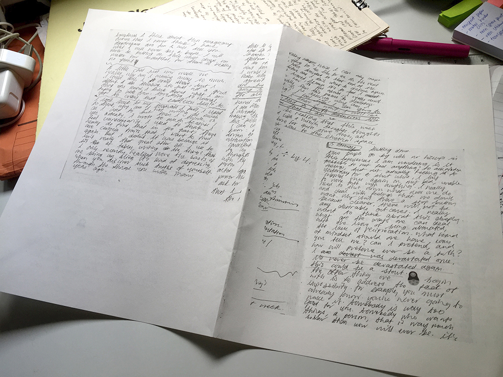
I am working on writing about my work a little more freely, here’s an attempt at doing the introduction. Just to be more comfortable and forget about that structure for a bit.


Introduction

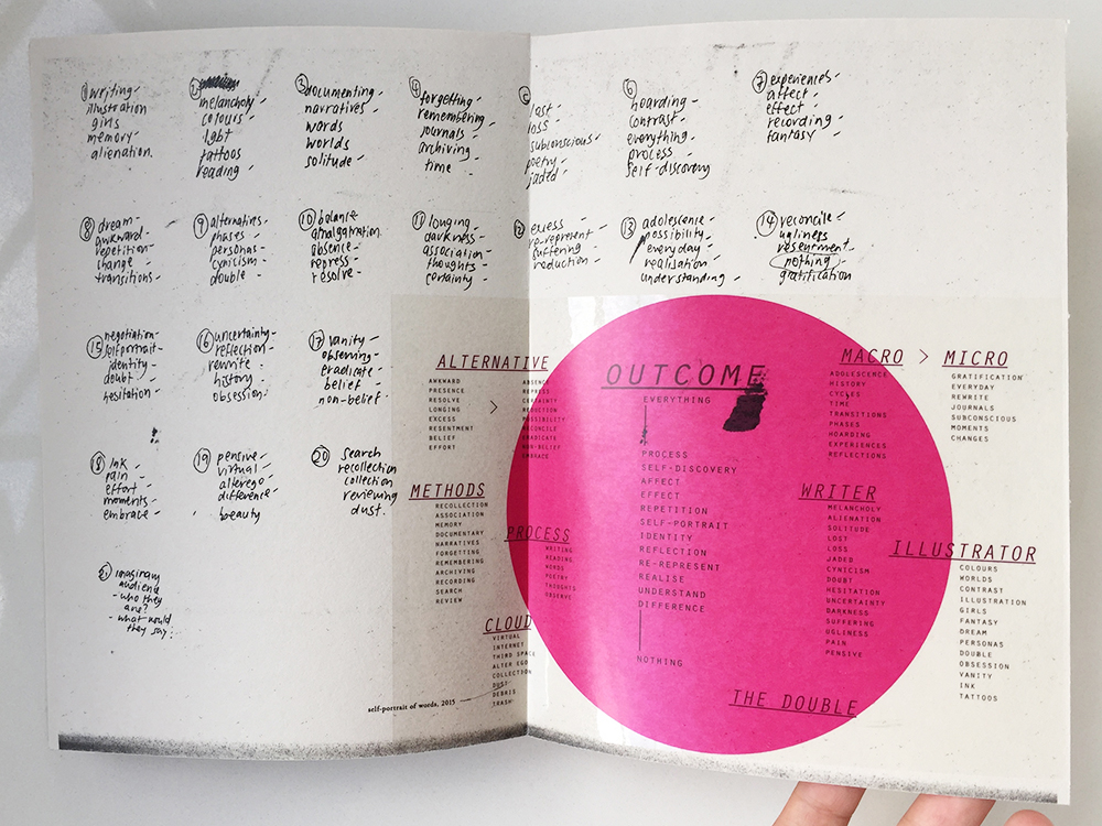
My project is an ongiong research about understanding my art practice and how I have lived my own life so closely with this process. The key concepts that surrounds my work is looking at the source material, raw data, and the process as a form of narrative and art. This report is a conclusive summary of the ideas that influence and drive the conceptual process.

My project is an ongoing research about understanding my art process through remixing and experimenting with the source material that is my blog archive.

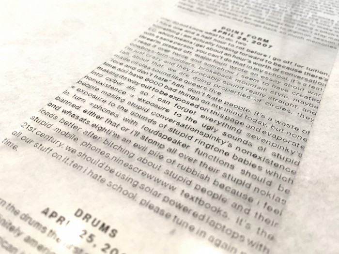
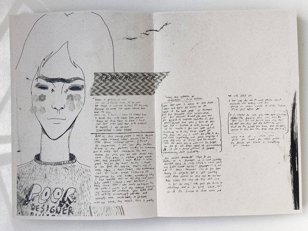
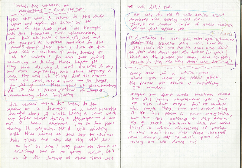
My project is an ongoing research and exploration of the important of self-documenting through primarily virtual methods, using the soruce material that is my blog and making sense of the raw data that is the unedited voice of my youth. My personal art practice, my attitude and perspective on life and art is driven by the need to do a personal rebranding of the self, as a way to forget/move on/heal from the experiences of adolescence. Inspired by the literary genre of the bildungsroman, this project takes on a more experimental approach in narrating the traditional coming-of-age story. The bildungsroman refers to a novel dealing with one person’s formative years, focusing on the psychological and moral growth of the character. Writing in my blog actively for the last ten years of my life makes me attached to the memories and the experience of documenting my life in this virtual journal. The act of writing compulsively becomes both a liberal feeling and a burden to my memories. As my blogging activity declines in my university years, I have pinpoint the reason to be the need to fully rebrand myself, both internally and externally, in light of the experiences of my teenage-hood, in an attempt to move forward.

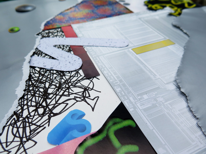
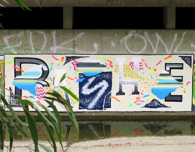
The source material is an art by itself. My objective in this body of work is to present a personal truth, maintaining an artistic voice that is true to the unedited and spontaneous nature of self-documentation and journal-writing.

My approach to the project is reflective of the interdisciplinary processes of my art practice, of skills I’ve learned over the years, combining a mix of traditional and digital methods to narrate this story of personal transition and also to place emphasis on the virtual, web-based nature of my story and my art.

My project is an ongoing research and exploration of self-documenting through primarily virtual methods, using the source material that is my blog, and making sense of the raw data that is the unedited voice of my youth. My art practice, attitude and perspective on life, is emcompassed by the need to reinvent and rebrand myself, in light of the negative experiences that i have been through in adolescence. Inspired by the literary genre bildungsroman (a novel that describes the formative years of a character), my project takes on an experimental and interdiscplinary approach to the traditionally linear format of telling this story. My objective in this body of work is to present a personal truth and maintaining a voice that feels as genuine as possible to the source material – my blog which I’ve written actively for the last ten years. The act of compulsively writing becomes both a liberal feeling in helping to alleviate some of the negative emotions, but also means that it becomes a burden. As my blogging activity decreases in my university years, I have pinpoint the reason to be a need to fully rebrand myself, to change my outlook in life and the way that I present myself, such that it doesn’t suggest any past struggle. The outcome of the project is reflective of the interdisciplinary processes that surrounds my art practice, combining a mix of traditional and digital methods, and aims for a further discussion on the impact of the Internet culture on today’s youths.

Concepts

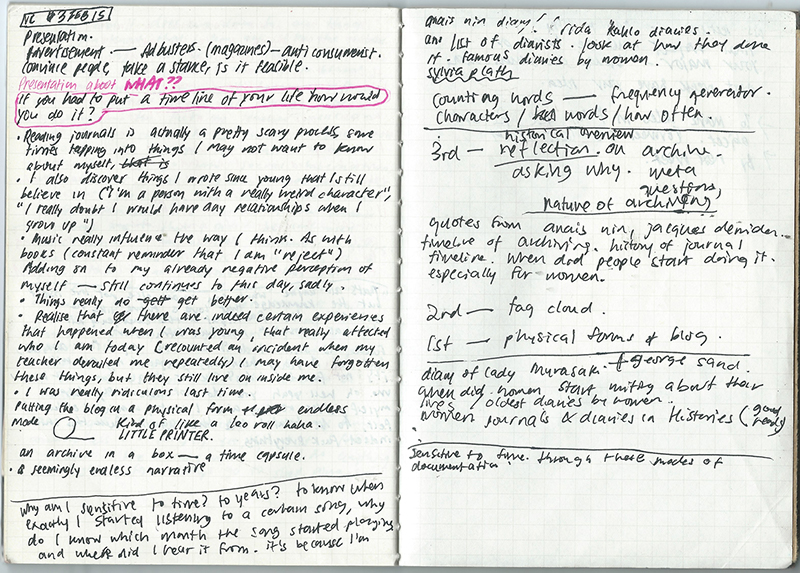
This section looks at an array of interconnected themes in my project.

Source material as art

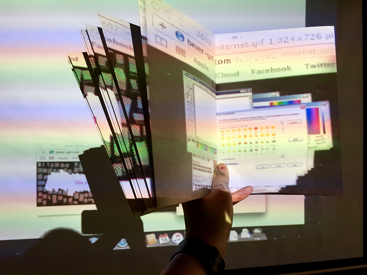
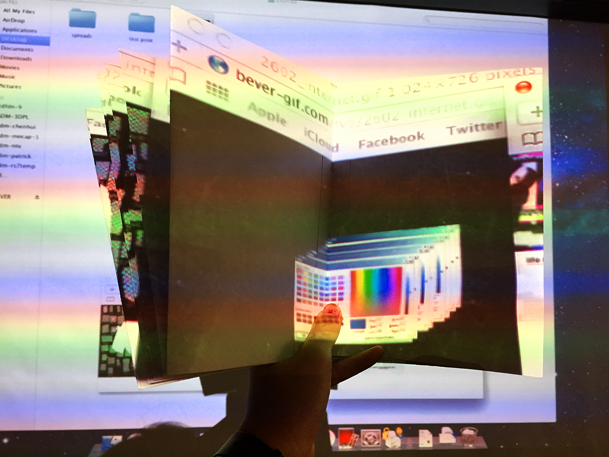
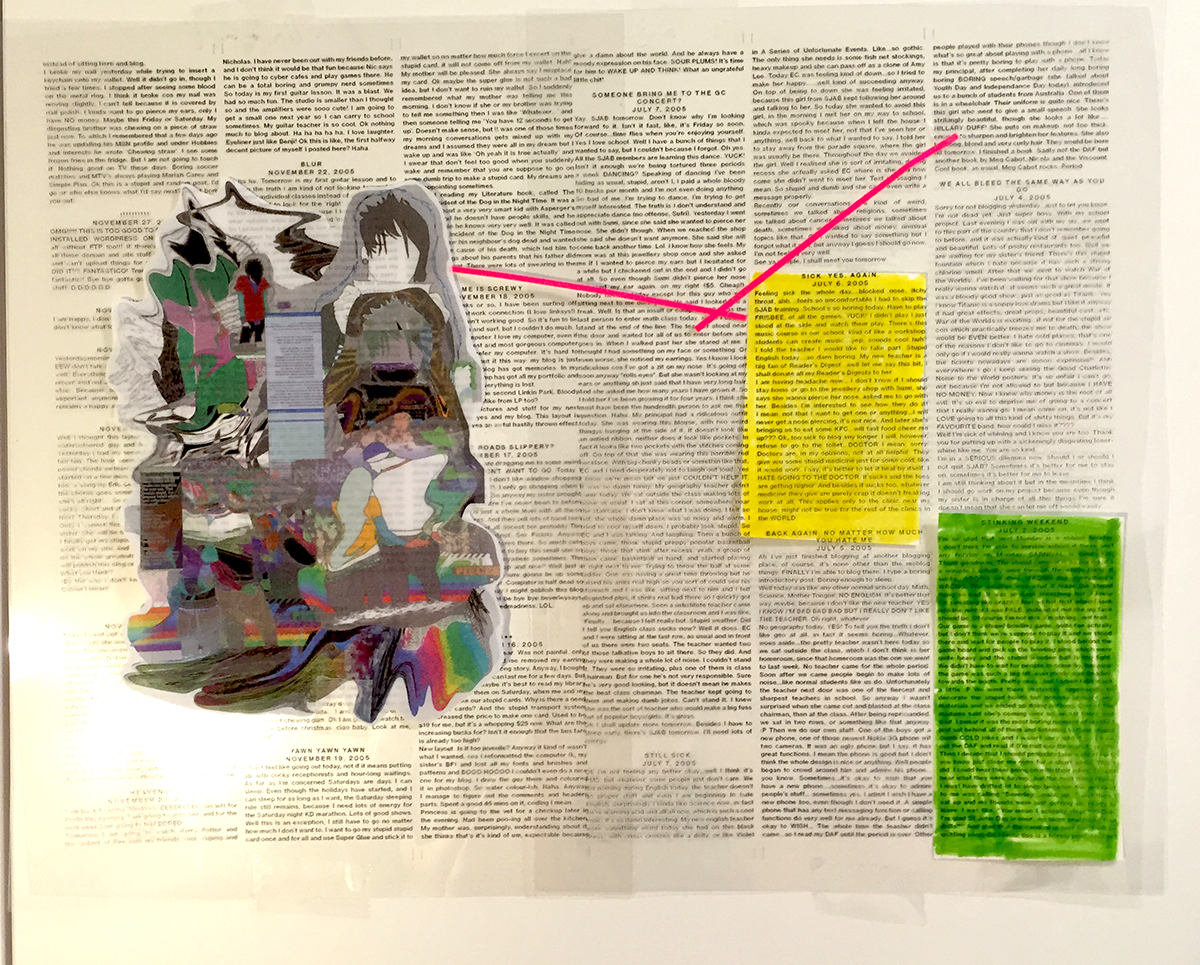
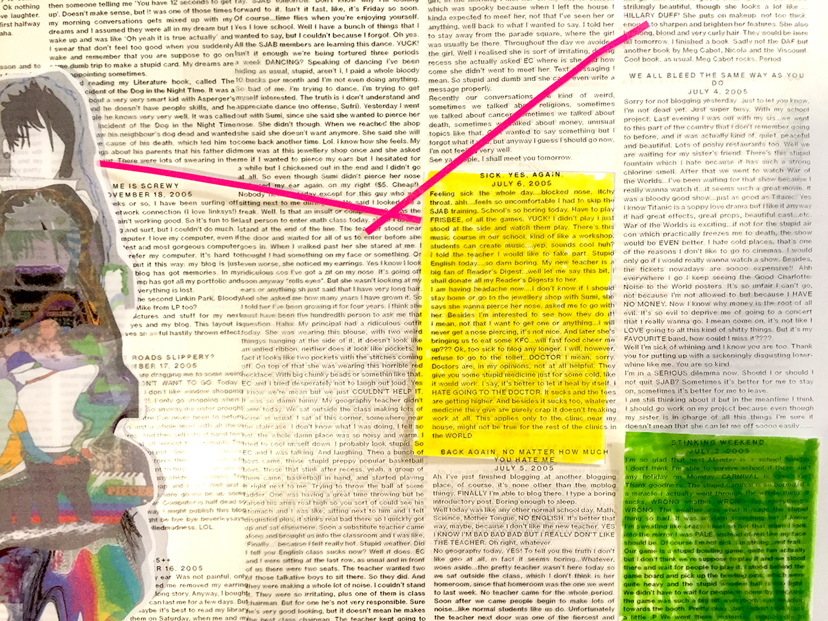
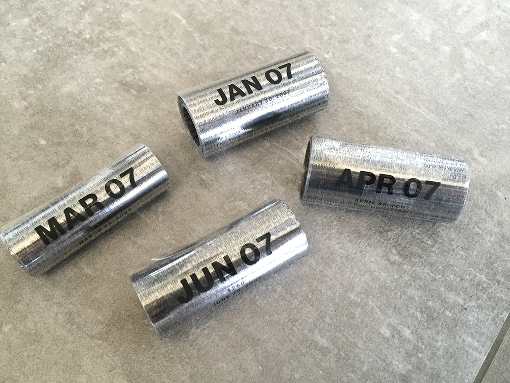
My project is an autobiographical work-in-progress that involves mining the digital terrain for source material. My personal blog is a rich source of experiential content, a database that holds not only my own personal thoughts but also nostalgic virtual memories. This is a fundamental difference between the blog and the traditional journal. The multimedia nature of the digital space means that we are able to surf for information in a variety of formats, collect them and exhibit them in a space that is more than just a diary website (mark amerika ‘what is a blog). Looking through my blog archive, I am able to find traces of what I refer to as “virtual nostalgia”, of bits and pieces of certain websites and applications that have since shut down which were used by many like me, during their teenage years.

By highlighting this virtual nostalgia, I am learning to find out what these online data and activity means for our own experience of memory. Vannevar Bush said it best in his 1945 essay As We May Think: “…trails that are not frequently followed are prone to fade, items are not fully permanent, memory is transitory”. Each Internet application, website or even devices have a sense of built-in obsolescence. For most average users, personal data that holds some significance for our memories are transient in nature. Technology changes quickly to better suit our needs: web applications become obsolete quite quickly, therefore we might not find traces of our virtual past as easily. There is also a shift in conversation: a gradual, increasing need to express ourselves without words. At the heart of this change, I find a need to rediscover what conversation means on the Internet and to examine the psychological impact of instant gratification, and the arbitrary concepts of acceptance and approval that comes along with such wordless conversations.


fyp process journal

Screen Shot 2016-02-17 at 9.22.44 pm ppb18 ppb31

Currently in the process of scanning my physical journals that I kept in the past year, documenting my FYP thoughts. I want to put together a process journal with material from my notebooks, as I feel that a lot of my personal thoughts and reflections about the project (or any ideas relating to the project) are often kept in those books.There are more sketchy, and not so much as polished as the entries that I write on this site. Not that anybody would really read the entire thing, but this journal would reflect more accurately of the process and particularly, the act of active documentation, which is at the core of my whole project. Not that anybody I will be doing a little of each thing (the output, process journal, and the report) as I go along. It probably sounds like a lot of work, but it is mostly shifting around the information and material that are already existing.