
Finalise design
To show my process obviously, I made a GIF to show how the design changed from the beginning to now.
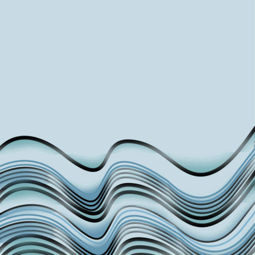
From the design below compared to the above, I felt the waves was too heavy and I decided to add more white lines and also changed the black curve lines to white line instead.
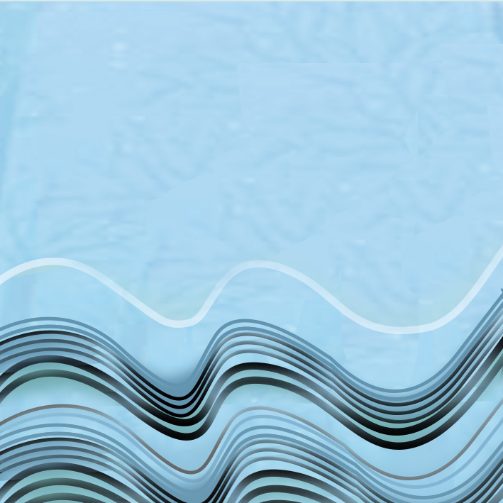
The colour for this looks smooth but the lines are too flat 🙁
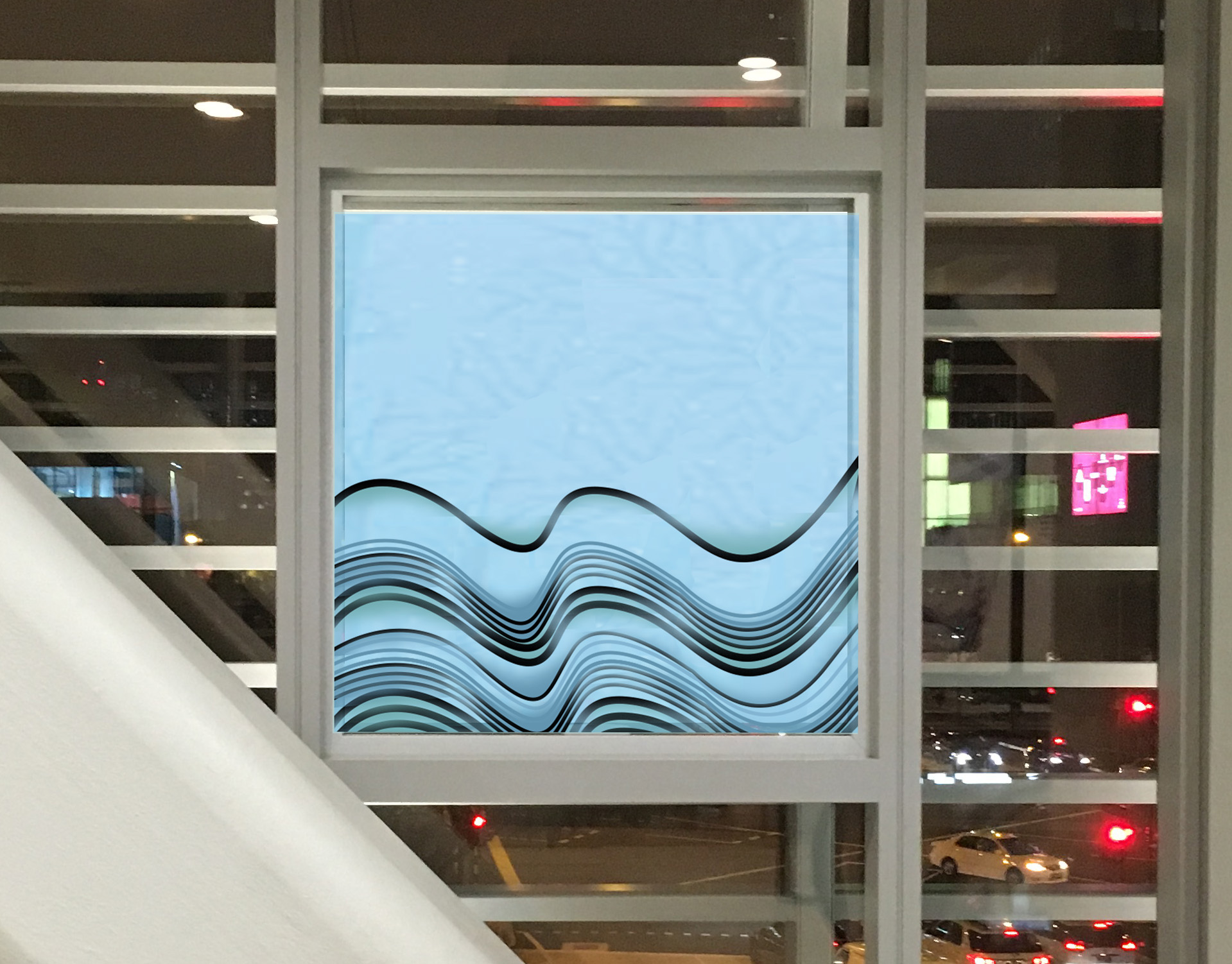
After keep changing the design, finally I get the most satisfied design I tried to apply it on the window. Siqi said that this one looks more 3D and from far it will look better.
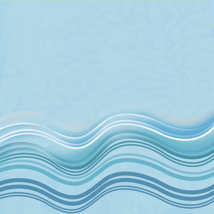
Finally, I chose this! 
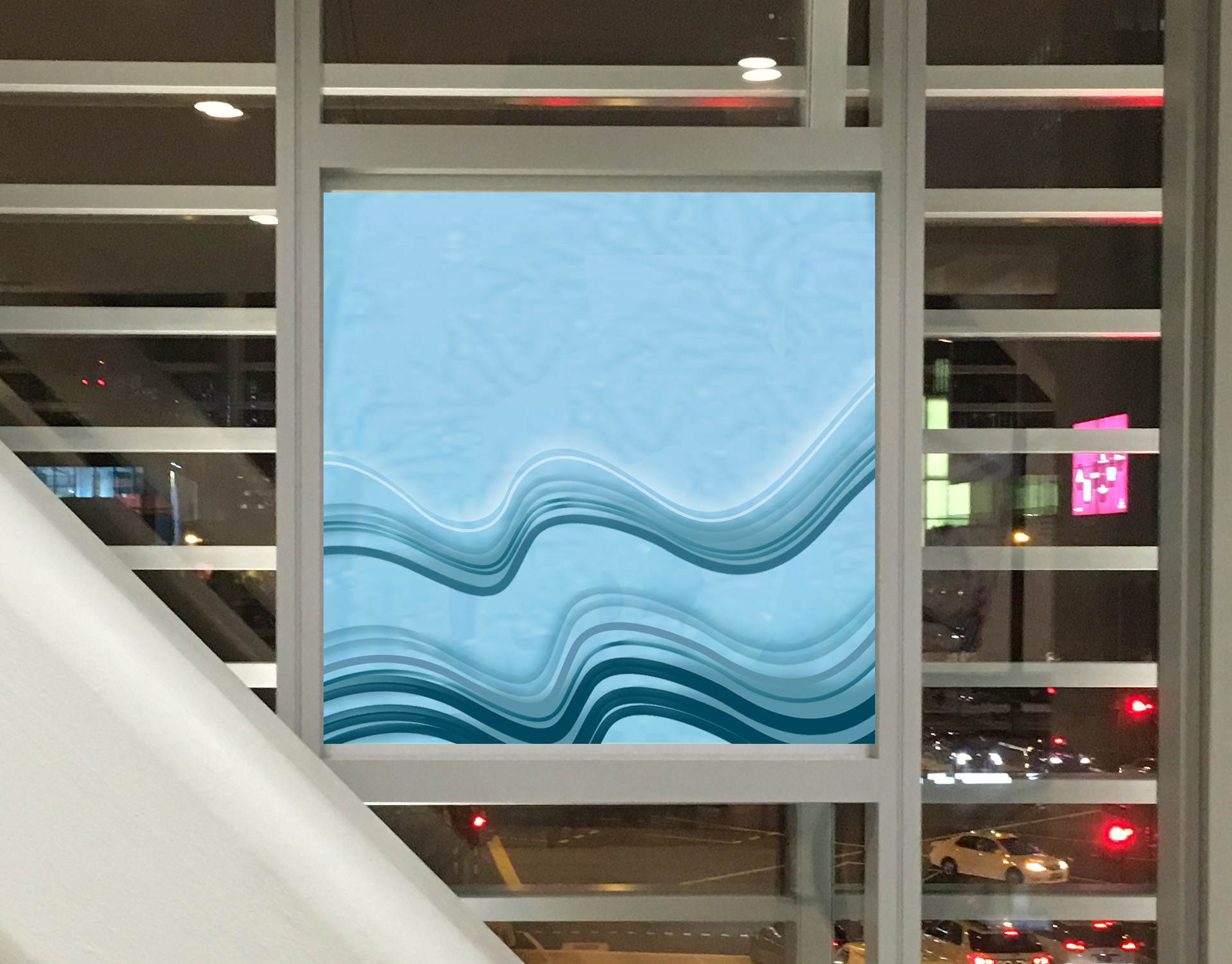
For my concept, actually it looks like the waves nearby the shoal. This waves depicted in many horizontal and curly lines, it reminds us of a calm horizon or a person lying down. It gives us a sense of calm and clarity. The reason why I chose horizontal lines because to balance the visual effect between of the waves and the iron bar and also you can imagine the sound of calming or soothing waves and it is touching your feet. Lastly, in terms of colour scheme, cool colour schemes make you feel more soothing.