TYPE OF PLANES 2D planes: Straight axis, bent axis, curve axis, complex axis
3D planes: Curve plane, folded plane, twisted plane
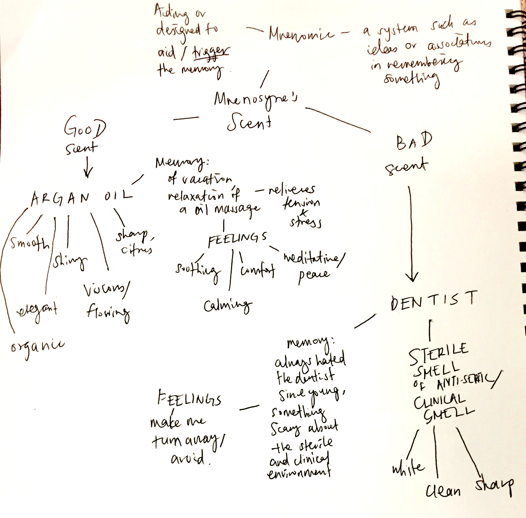
MNENOSYNE’S SCENT
Mnenomic: a system such as a pattern of letters, ideas
or associations which assists in remembering something
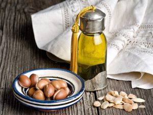
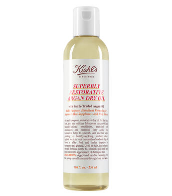
Good scent – Argan Oil
Bad scent – The smell of the dentist
Mindmap
Memories of:
– Argan Oil: Reminds me of body oil massage, a moment of relaxation during my trip to Bangkok. Bought a bottle to use weekly.
– Dentist: Connection to pain and fear. Memory of me avoiding the dentist.
Similarities in experience:
– I am lying down in both the body massage and at the dentist, a position of comfort, but experience a difference in emotions due to the smell.
– I would like to capture the similarity of the comfort of lying down in the sculpture and the contrast between smells and feelings.
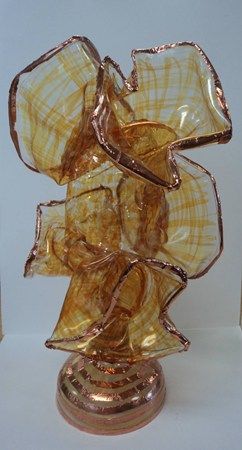
Chihuly-inspired Faux Glass sculpture – permanent markers to draw on clear plastic cups
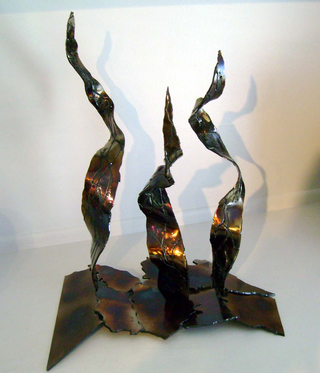
abstract metal sculpture
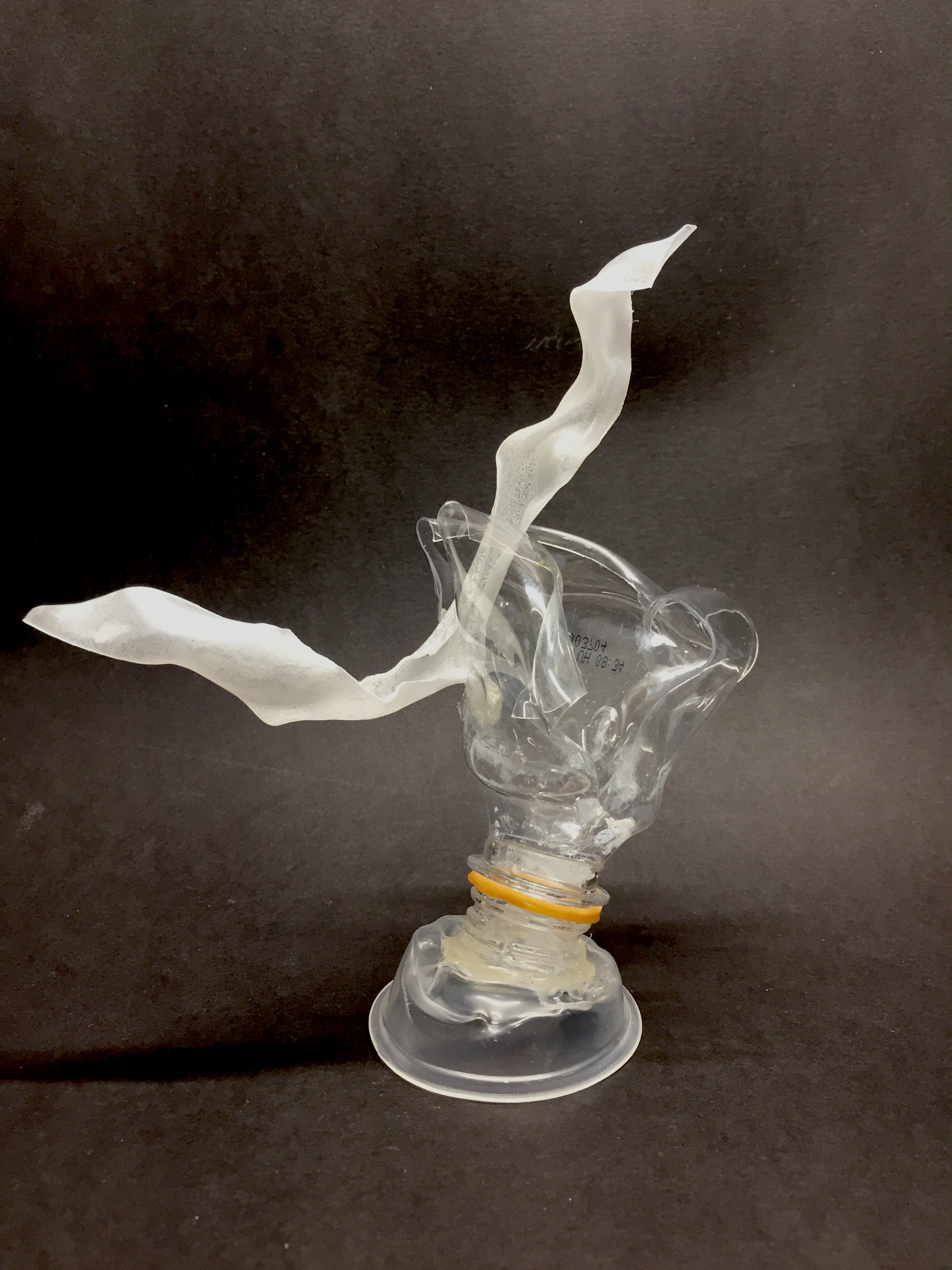
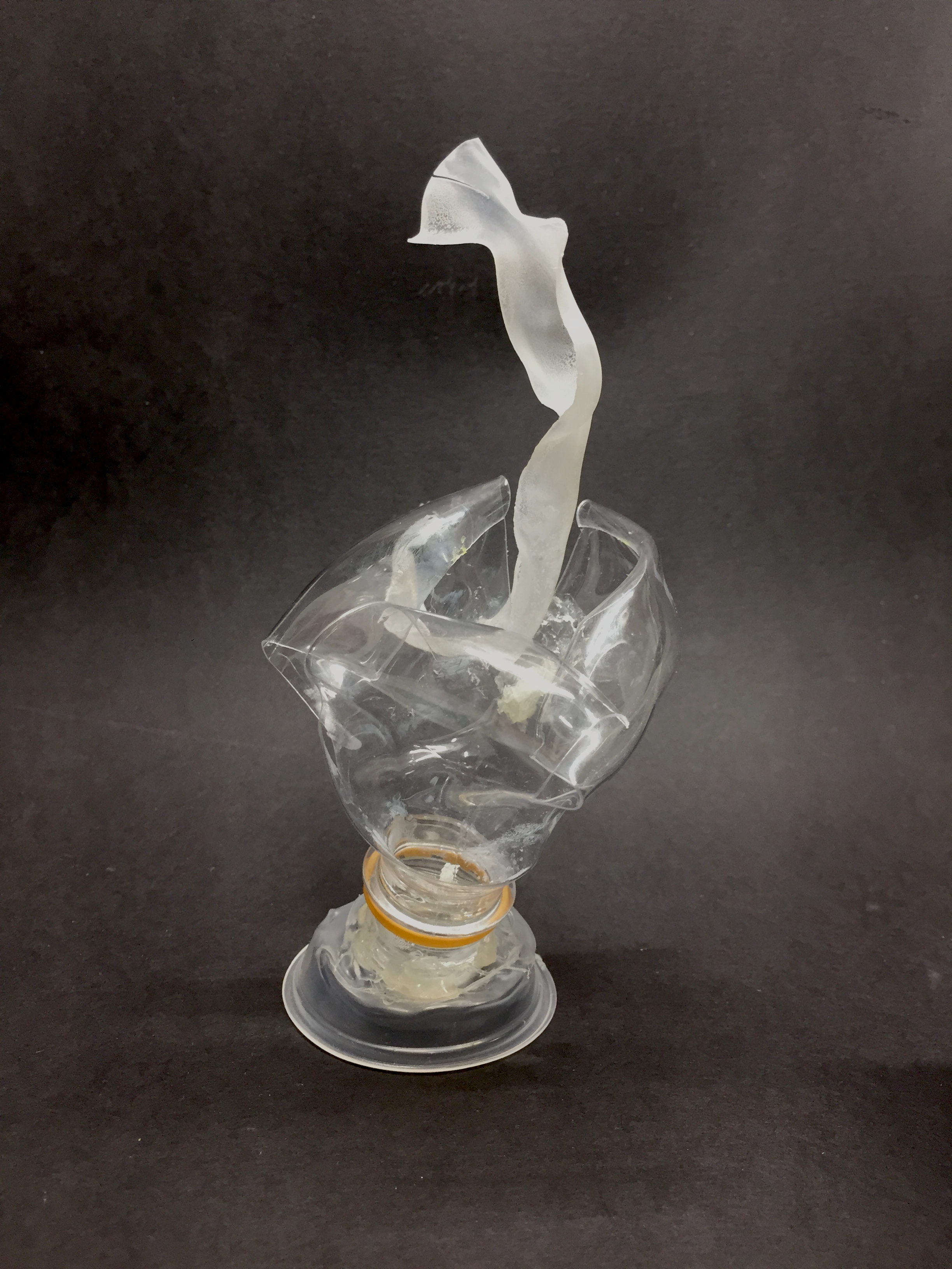
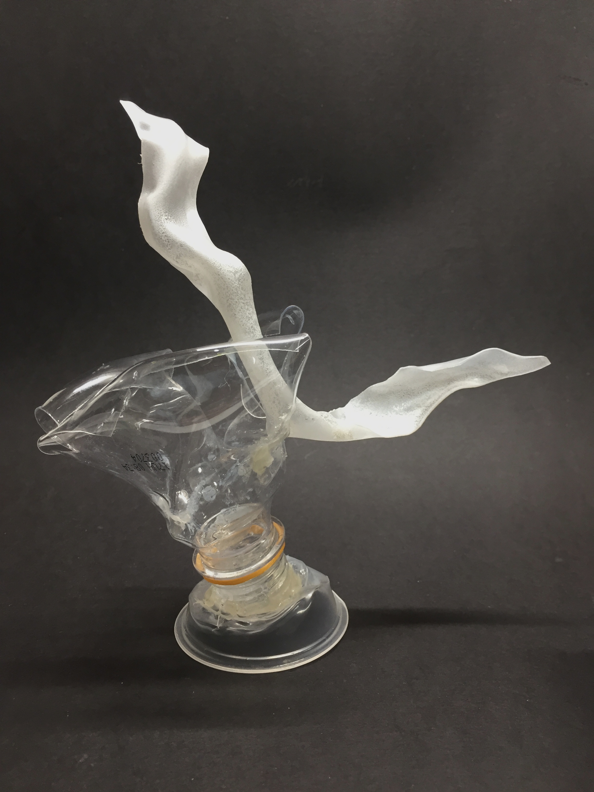
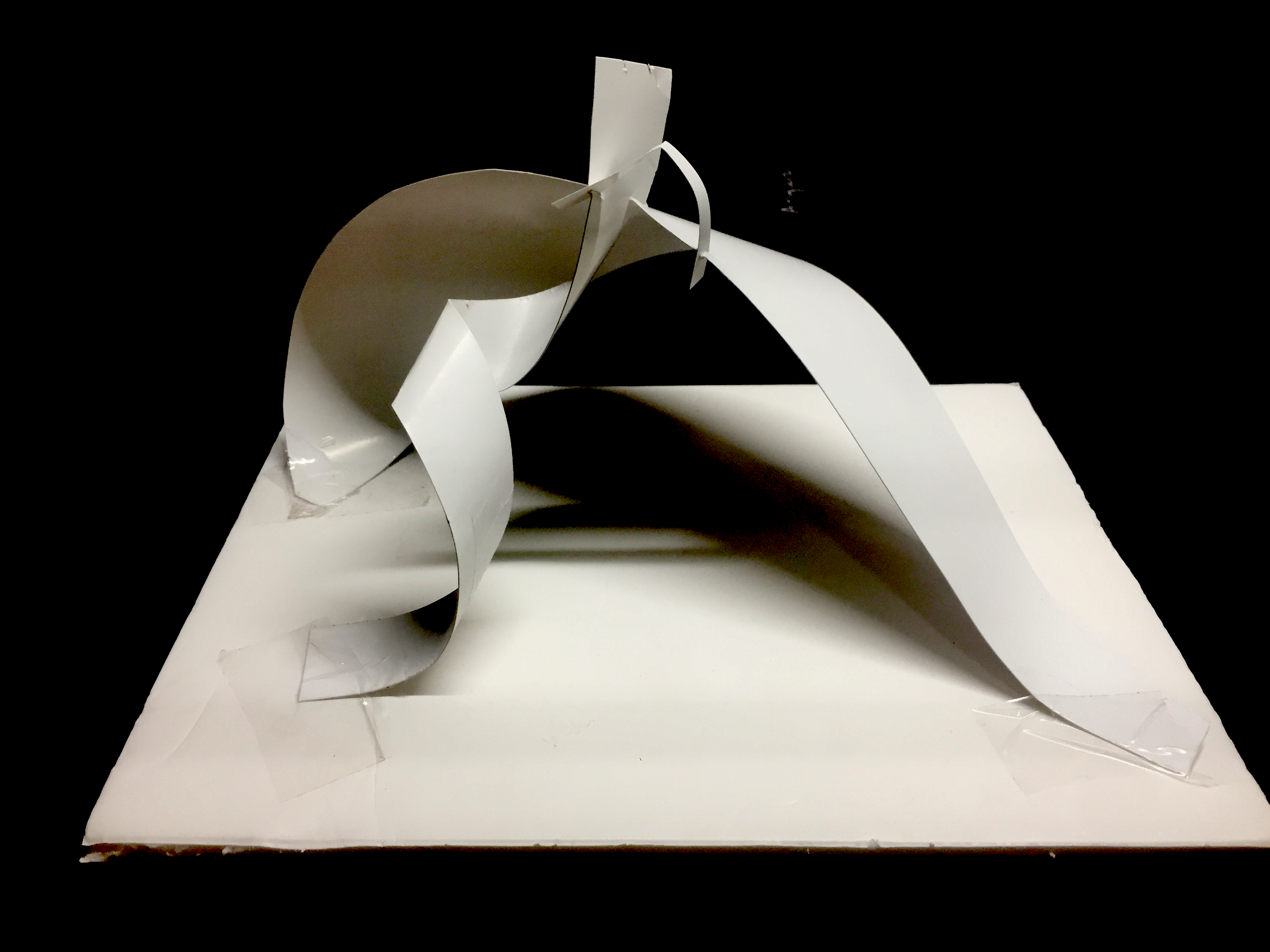
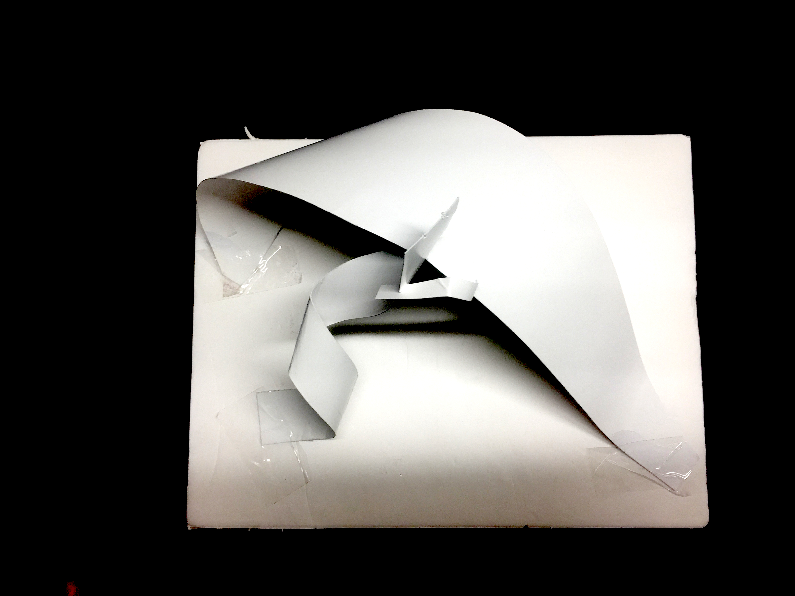
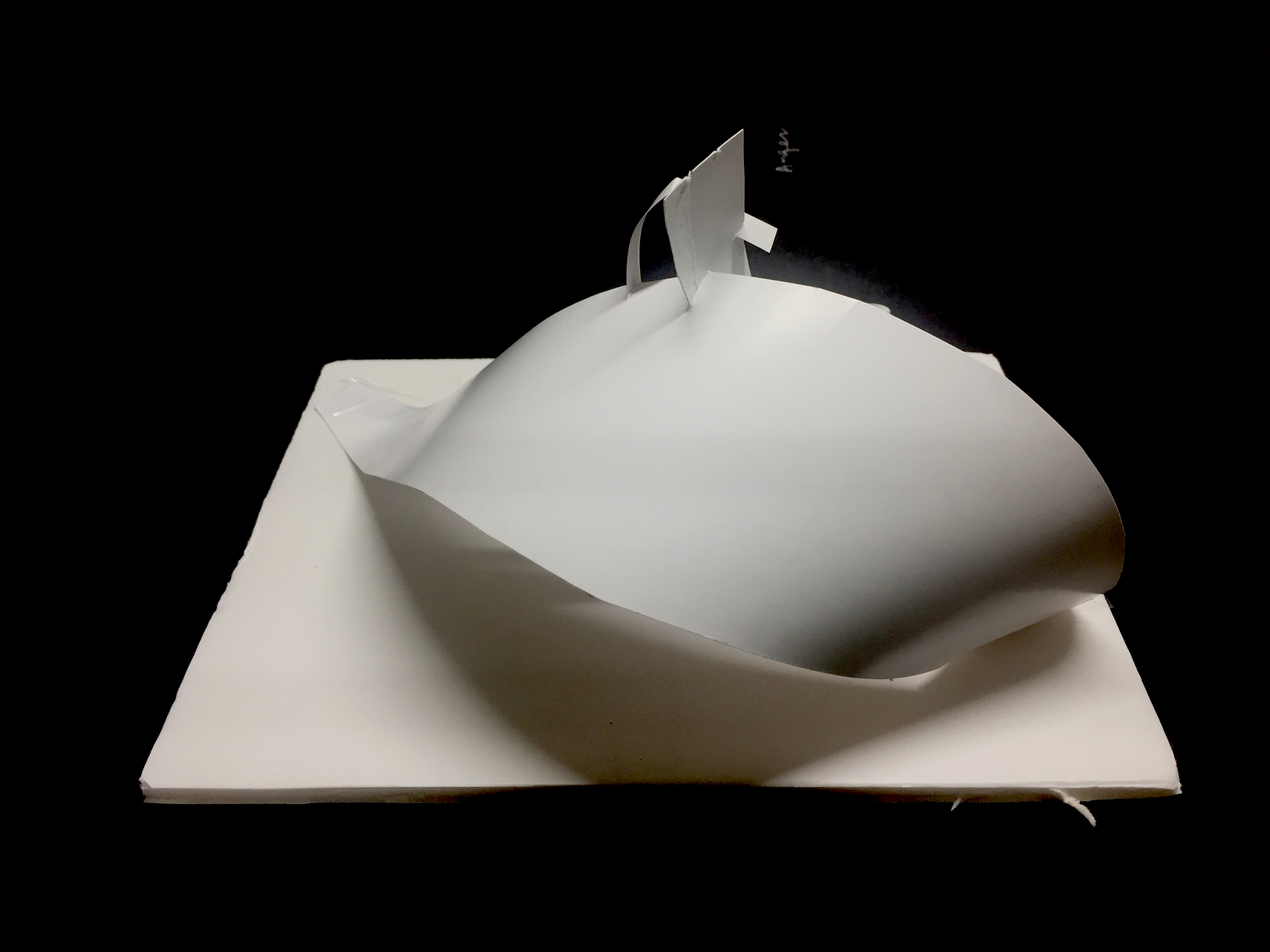
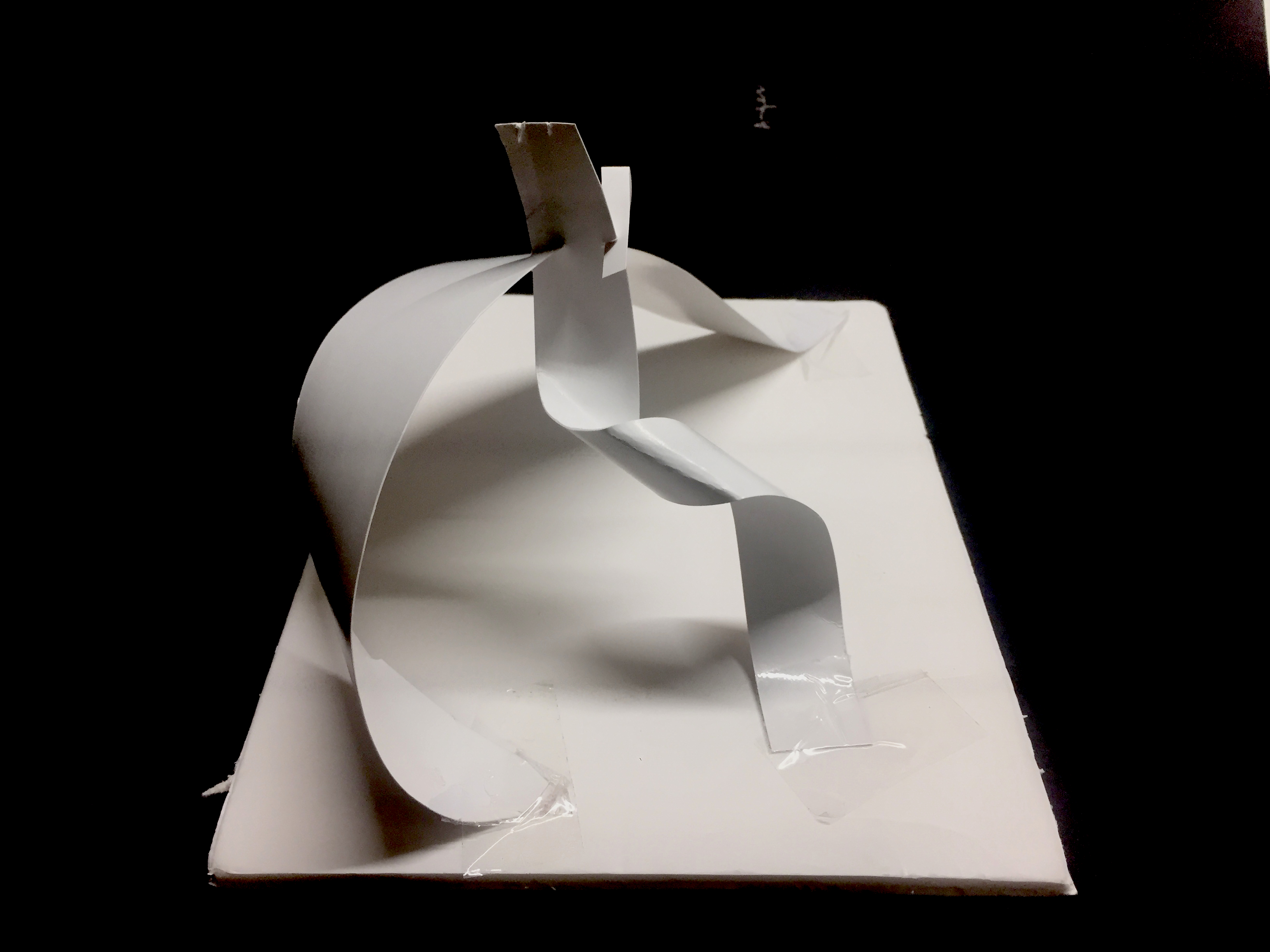
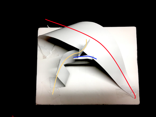
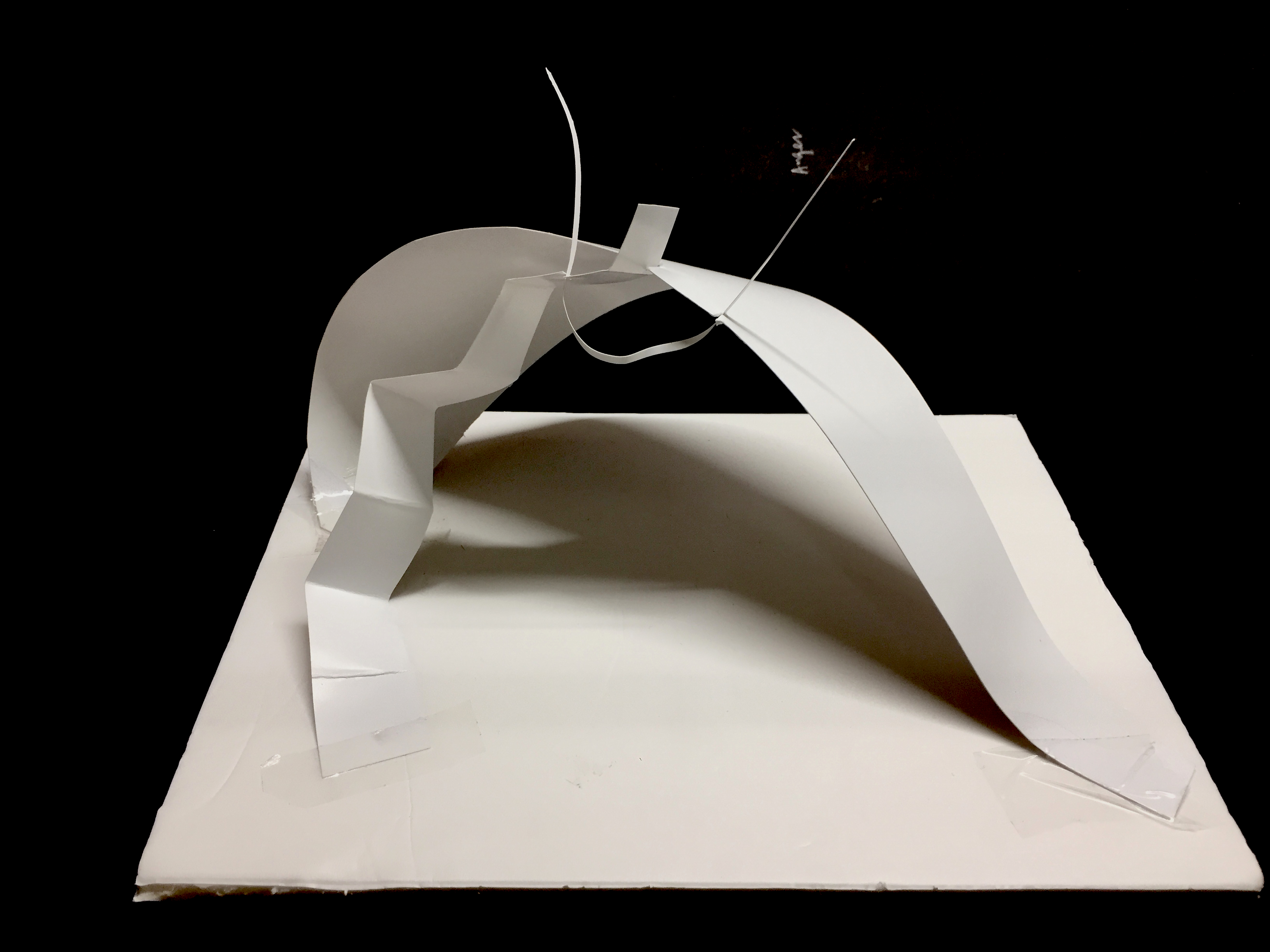
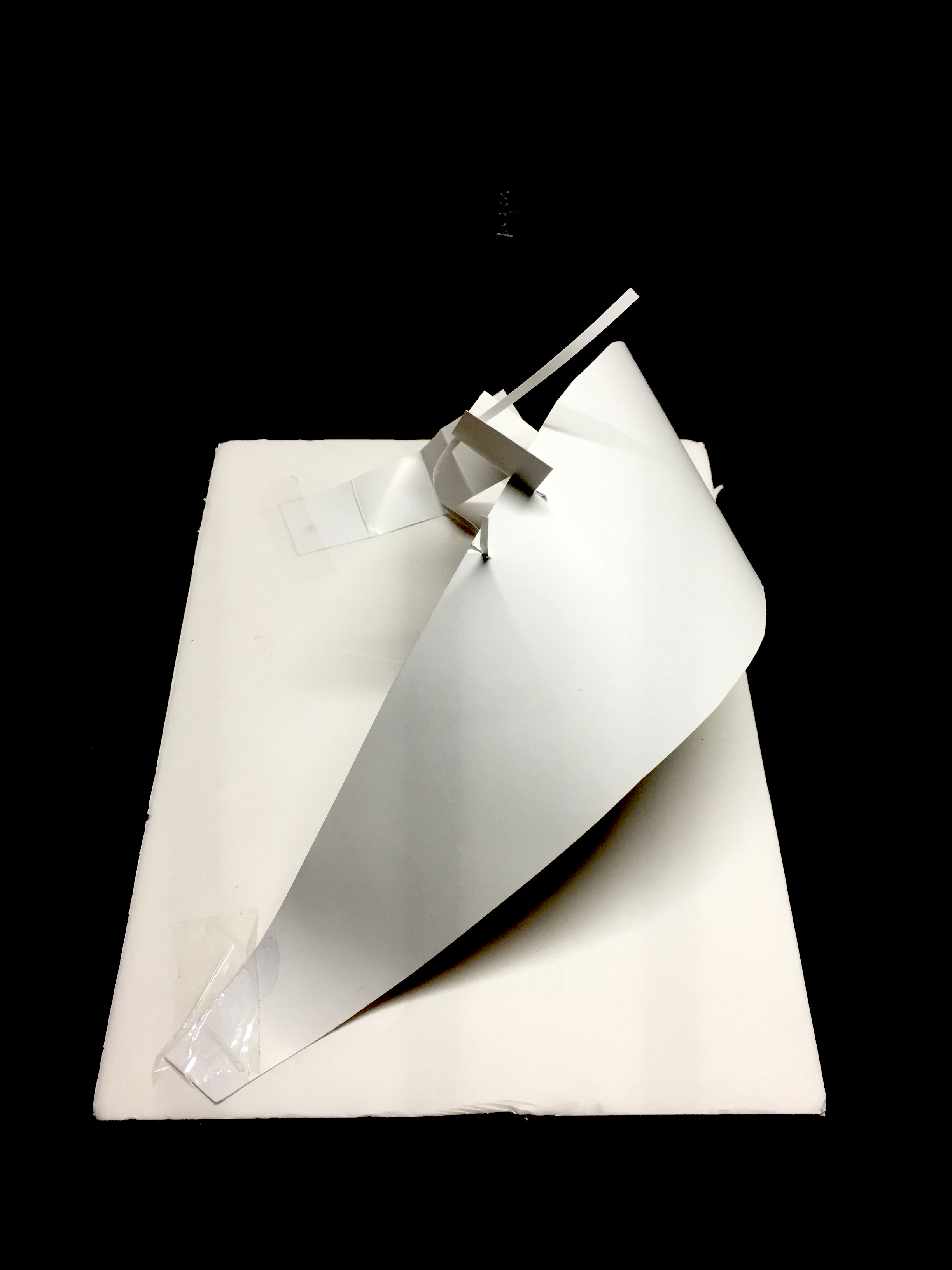
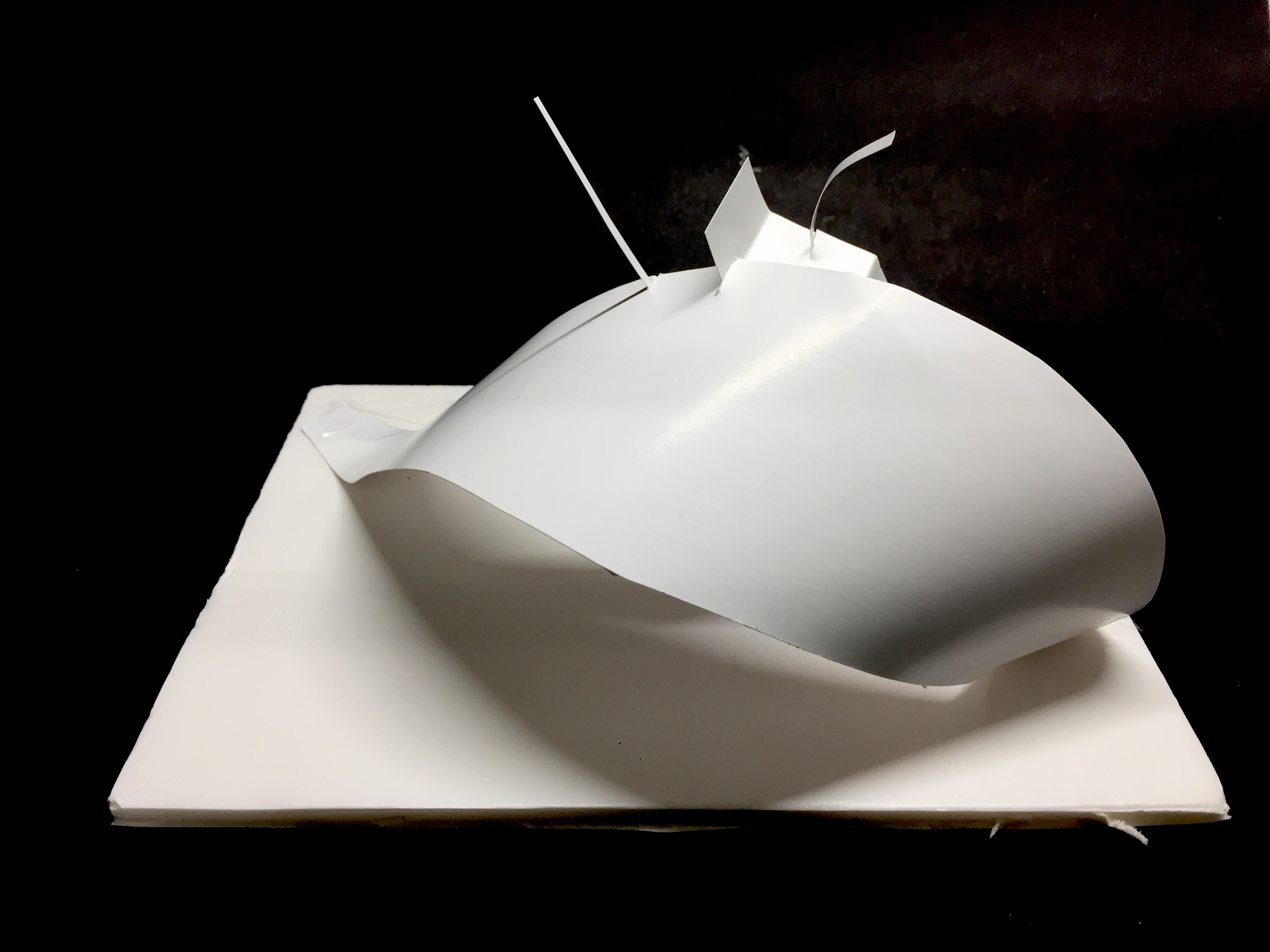
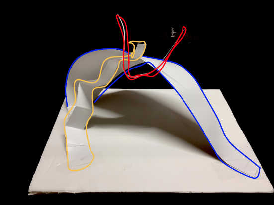
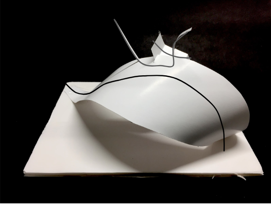
FINAL MODEL
Initial model – I used light blue plastic and a clear plastic base, but i changed it to a white plastic strip.
Final Model
White component – represents the clean smell of the dentist
Clear plastic and gold rim – Represents the smoothness of Argan oil
Contrast: Colour – White vs. Clear and gold Texture – the white component has a more textured and twisted surface while the clear part has a smooth and flowing surface. The bumpy surface of the white component represents the squirmy feeling I get while I am in a dentist’s chair, while the smoothness of the clear part represents the calmness of the argan oil scent Structure – The white part curves outward while the planes of the clear plastic component curves inward.
I chose my movie quotes to portray the irony of being classy in a trashy way, in particular the retorts given after being challenged. The main focus is parody, to capture the visual narrative in a humorous way through the use of imagery and symbols.
ARTIST REFERENCES
Pop-Art – Roy Lichtenstein
Lichtenstein’s paintings and precise compositions of comic images and pop images documented while they parodied, often in a tongue-in-cheek manner.
Drowning Girl, 1963
Pop-Art: Andy Warhol’s silkscreen print
Using pop icons and celebrities as symbols of pop culture, the silk screen prints reflects the mass-production and proliferation of such symbols in society.
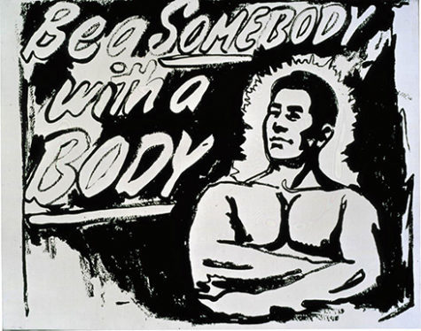
Eight Elvises, 1963Be a Somebody with a Body, 1985–86
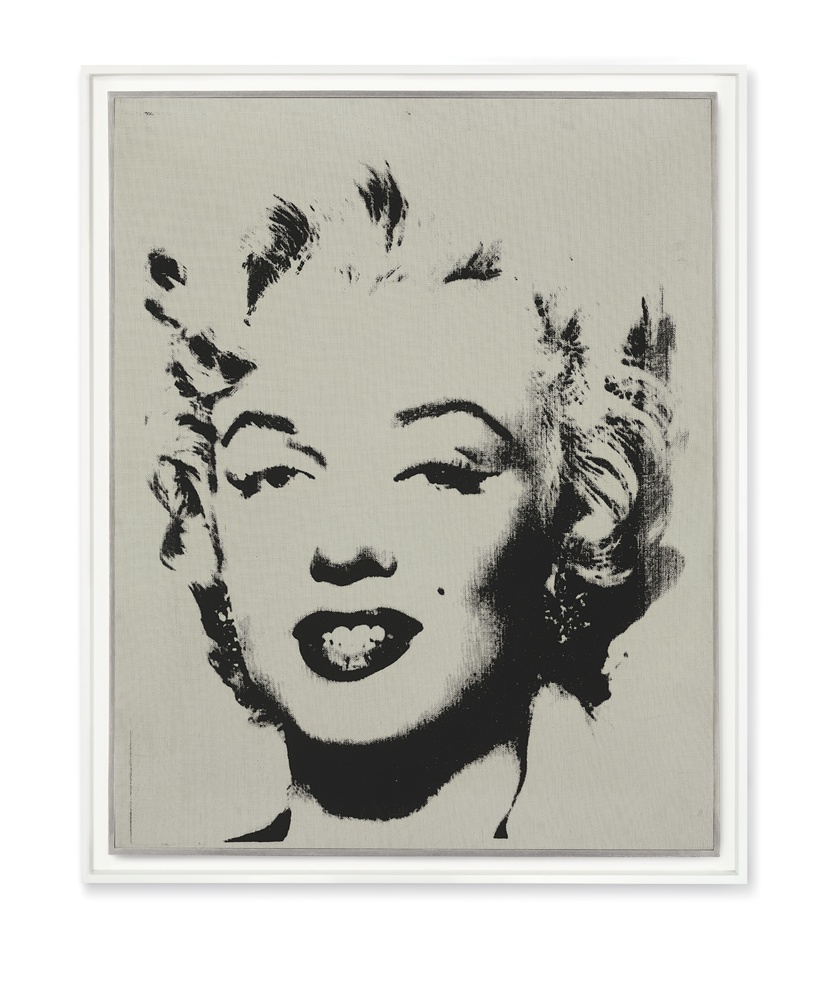
Marilyn Monroe
I wanted to portray the irony of my quotes in a whimsical manner, thus the style is influenced by pop art’s use of symbols and iconic imagery.
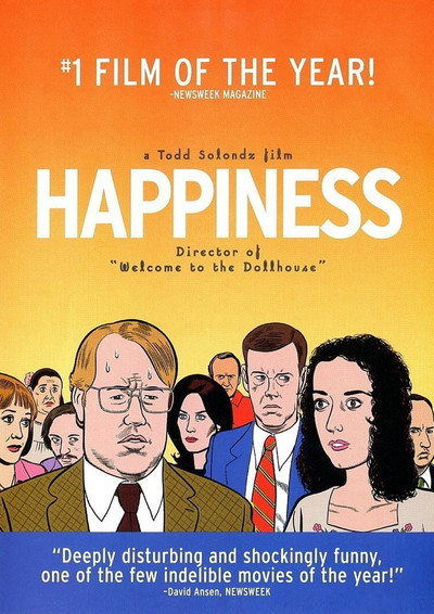
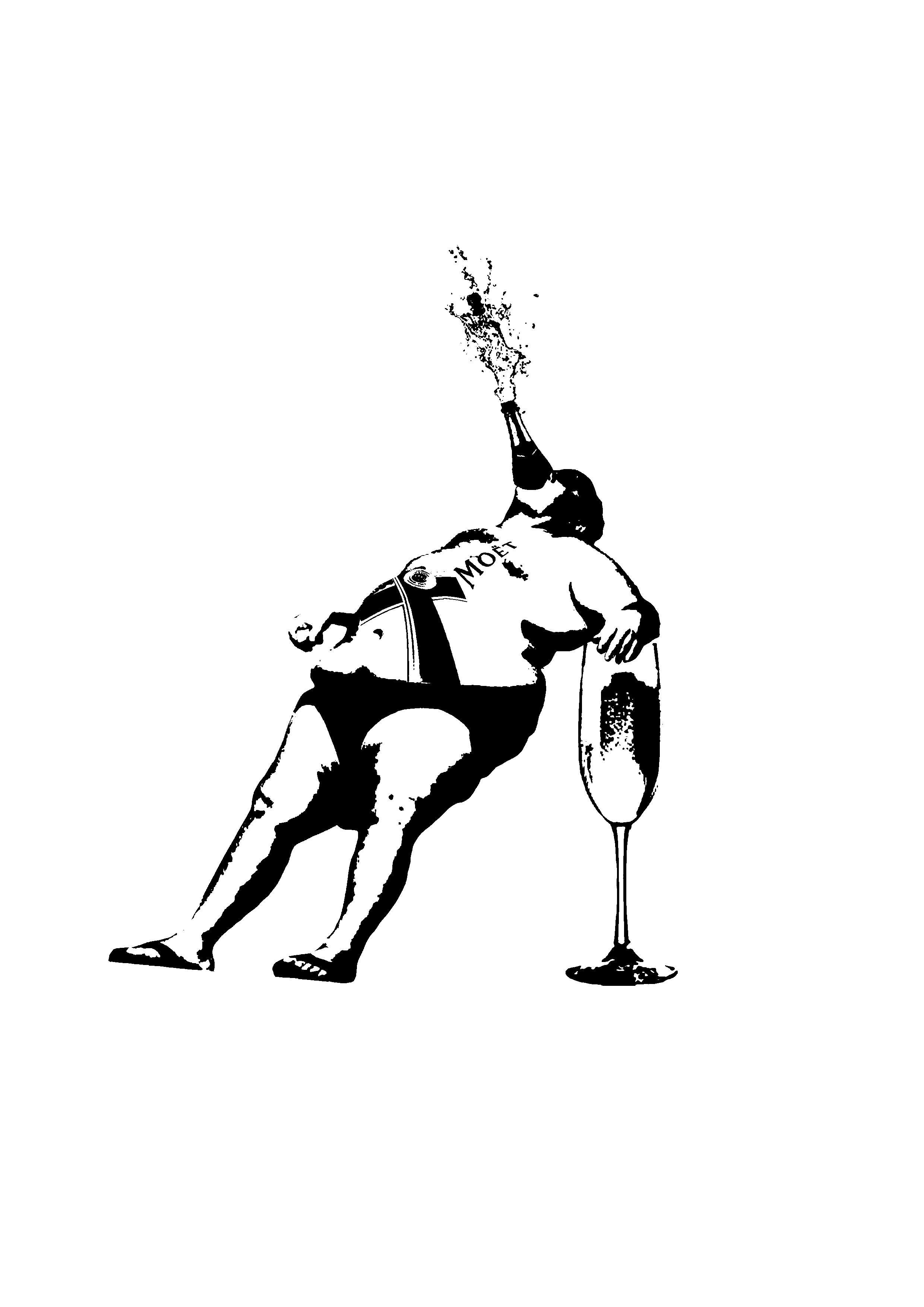
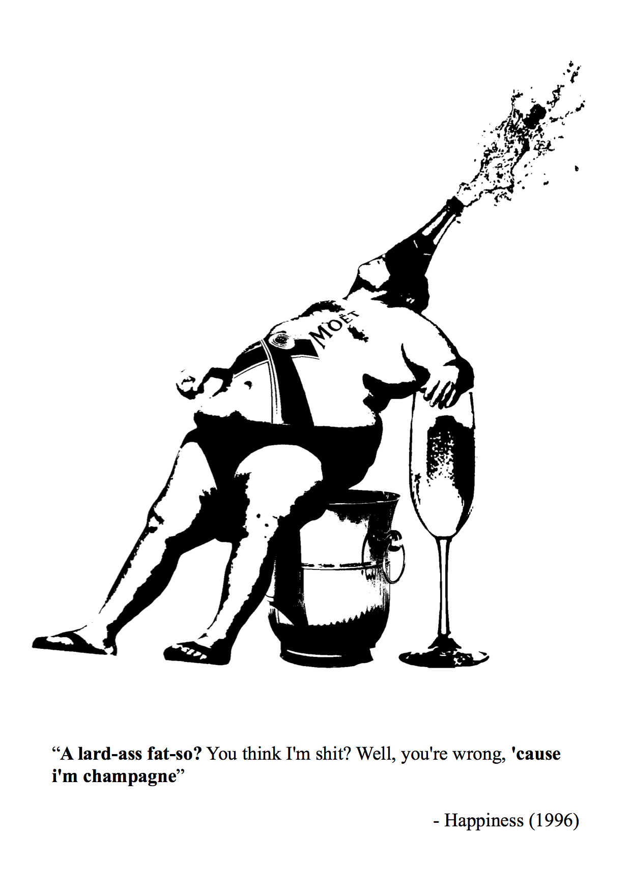
Movie 1 – Happiness (1996)
Quote: ” A lard-ass fat-so? You think I’m shit? Well, you’re wrong, ’cause i’m champagne.”
I chose a quote with obvious visual imagery, with contrasting subject matter to put a play between the images.
Subject matter: USE OF BRANDS AS SYMBOLS
Influenced by pop-art, I wanted to incorporate the symbol and imagery of brands, as they are instantly recognisable and well-spread in society.
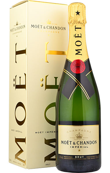
‘Moet’ champagne – known for its brand
I combined the champagne with the image of a “fat-so”, with the brand logo inscribed on his body and champagne popping out of his mouth.
Initial design 2
I realised the body has a bottle shape, thus to visualise “I am champagne”, I connected the bottle neck to his top of the head.
Initial composition
Comments: The man is not balanced, has an awkward position, should have him leaning his weight against something.
Edits: Place a ” chair” of a ice bucket, used to hold champagne.
The man has a relaxed pose, as if acting cocky and proud, and is fused as a moet champagne bottle using humour in the visual imagery.
Final Design 1
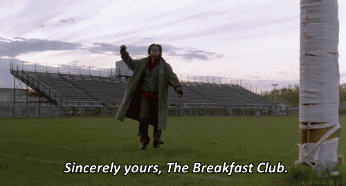
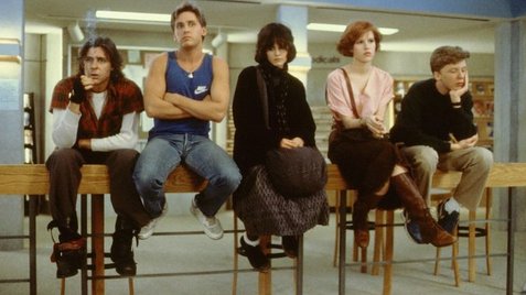
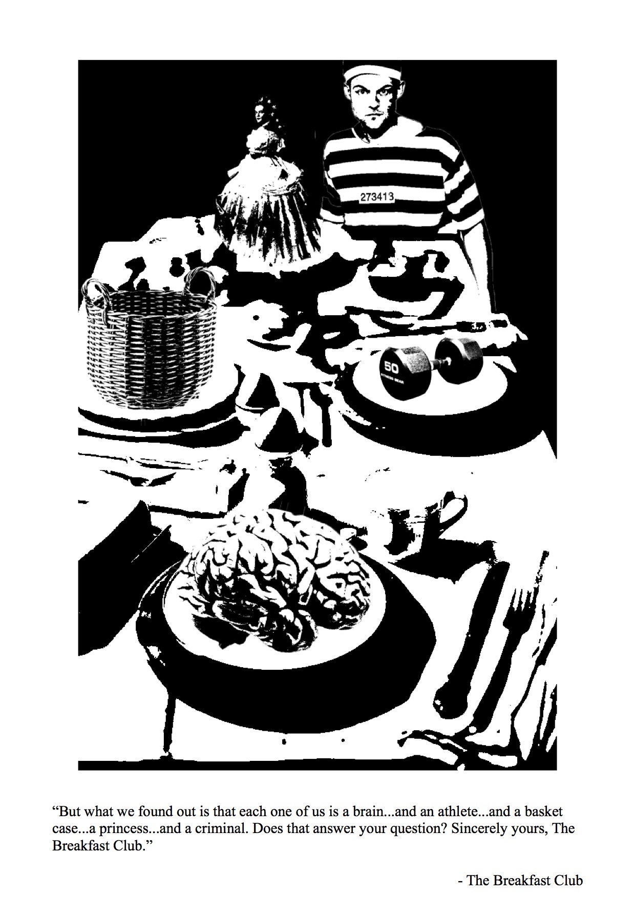
Movie 2 – The Breakfast Club (1985)
Five high school students meet in Saturday detention and discover how they have a lot more in common than they thought.
Quote: ” But what we found out is that each one of us is a brain…and an athlete…and a basket case…a princess…and a criminal. Does that answer your question? Sincerely yours, The Breakfast Club.”
I wanted to portray a breakfast table, with each stereotype on a place to capture how society is out to “eat” them up.
I place the criminal as a human figure to show how society incriminate the young teens with stereotypes by locking them up.
Final Design 2
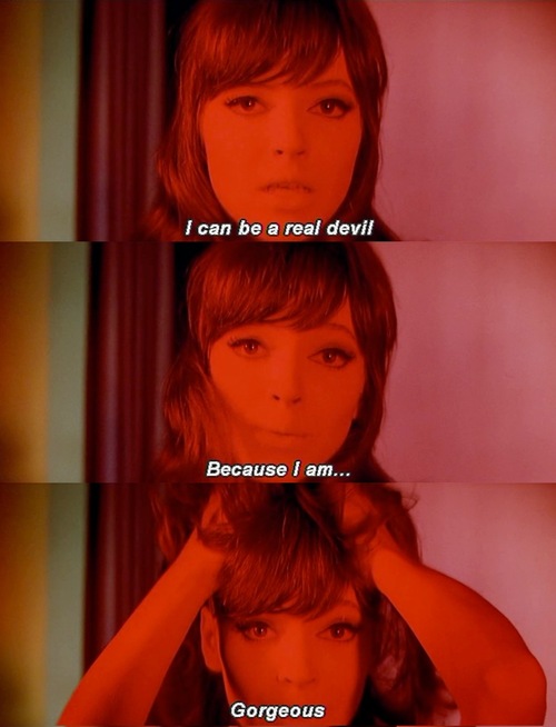
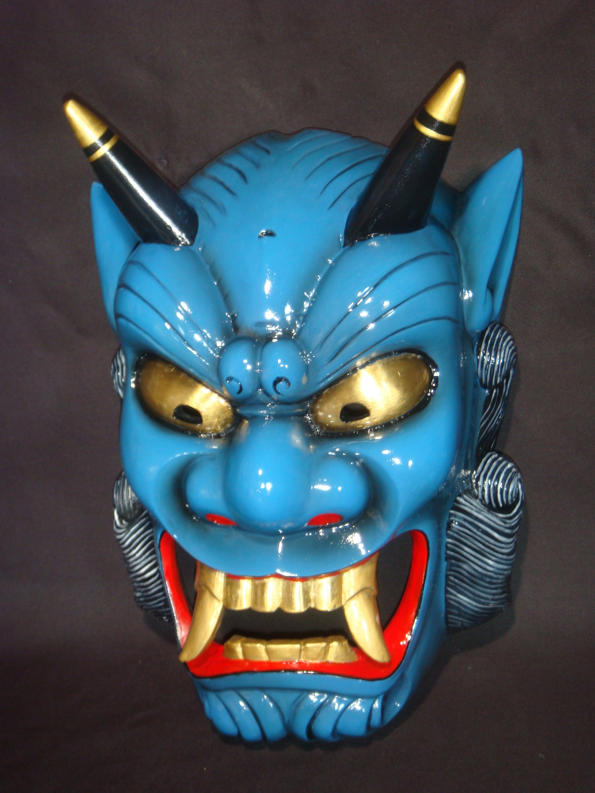
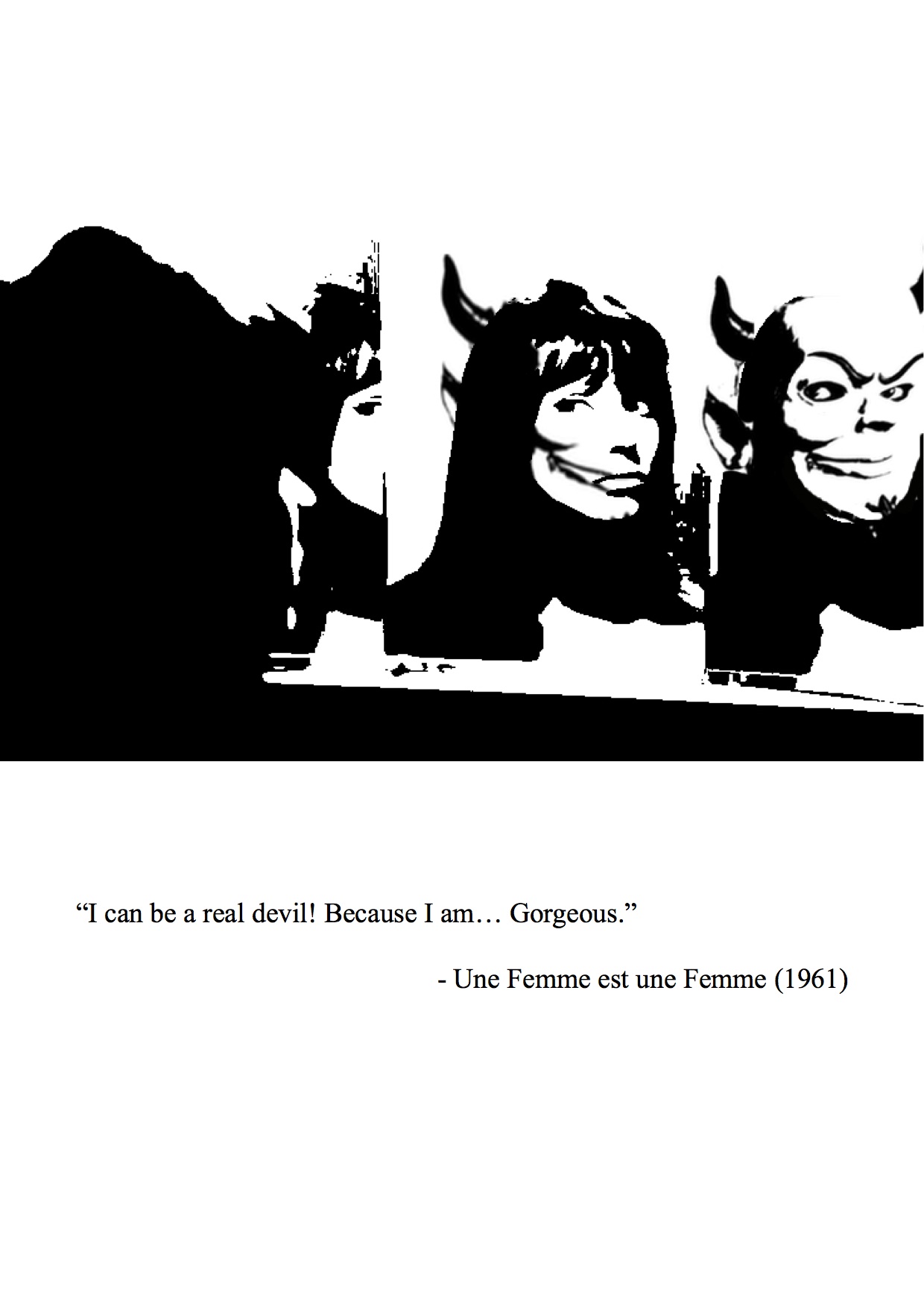
Movie 2- Une Femme est une femme (1961)
Quote: “I can be a real devil because I am… Gorgeous”
Imagery of devil – Japanese Oni
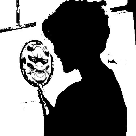
Initial Design
I did not like the silhouette so I changed the composition into overlap faces in mirrors. It shows the gradual change of the girl turning into a devil in the mirror, the symbol of vanity and beauty.
Final Design 3
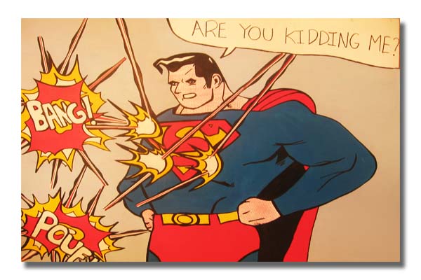
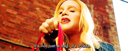
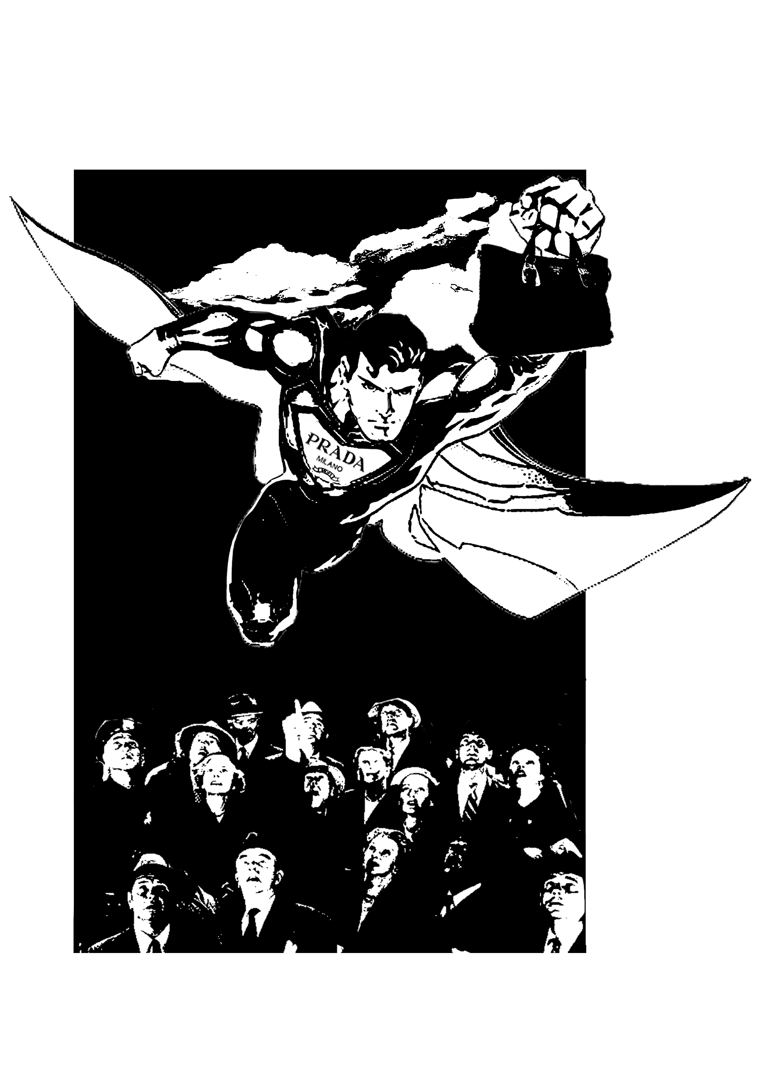
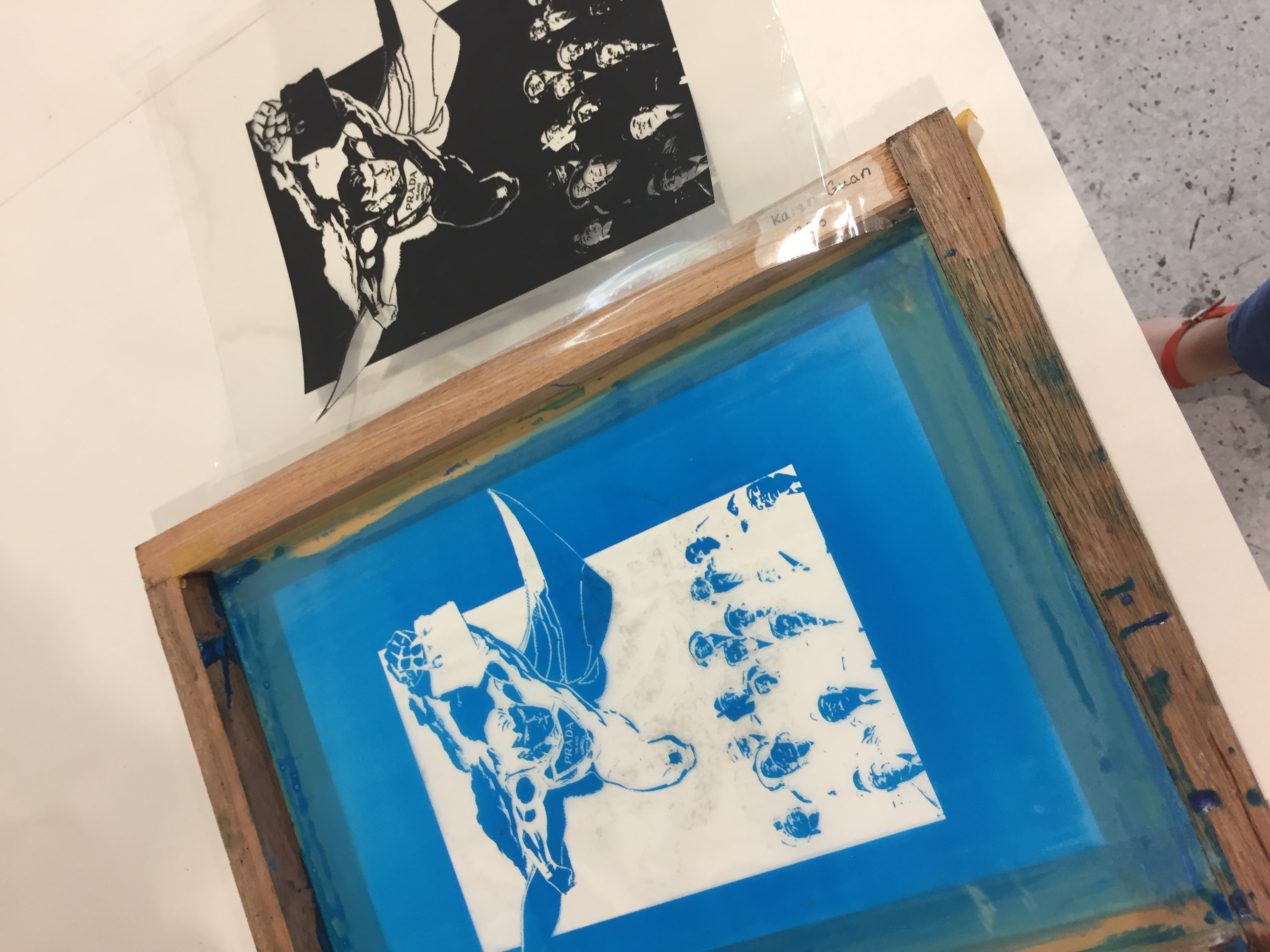
Movie 4: White Chicks (2004)
Quote: It’s not just a bag. It’s Prada.
Initially, I interpreted this quote like a 60s vintage adverts as the quote sounds like a advertising tagline.
References:
However, I felt that it was too literal. I brought the focus to “It’s not just a bag”, thus, wanting to play with the idea of the prada bag achieving more or has superpowers.
Symbol of superman: Superpower
I wanted to present the contrast between Superman, known for his masculinity, and the prada bag, a symbol of the feminine.
Use of BRANDS: the Prada logo
I wanted to combine both recognisable logos for parody.
Initial design
The people looking up is a play on the “It’s a bird, It’s a plane… It’s Superman” and the quote “It’s Prada”.
Comments: The faces and details are washed out. The expression on Superman should be more detailed.
Edit: I added in the details and the expression of Superman.
Final Design 4
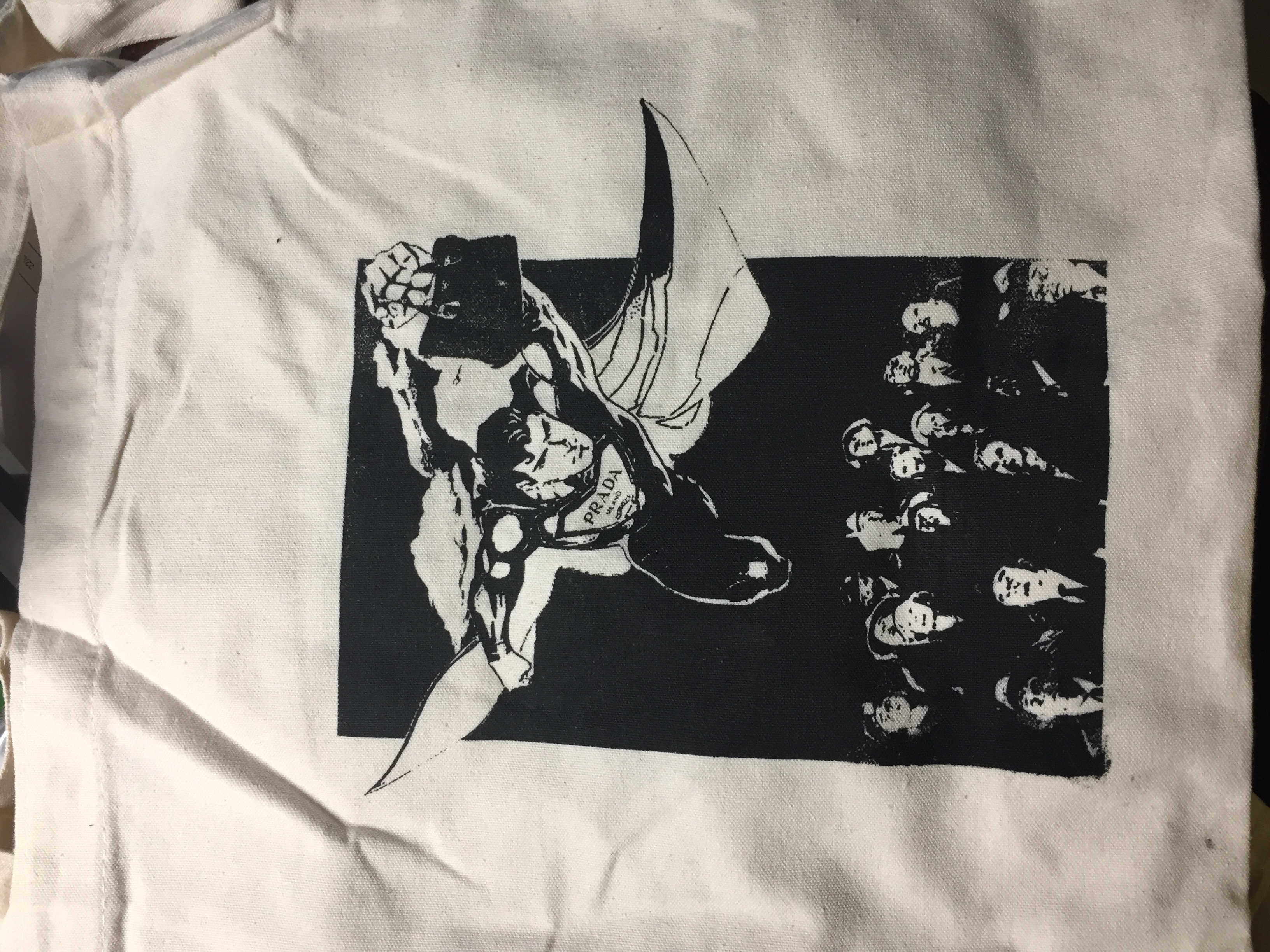
SILKSCREEN BAG
I used design 4 for my silkscreen print on the tote bag, as I feel the rectangular composition will look nice.
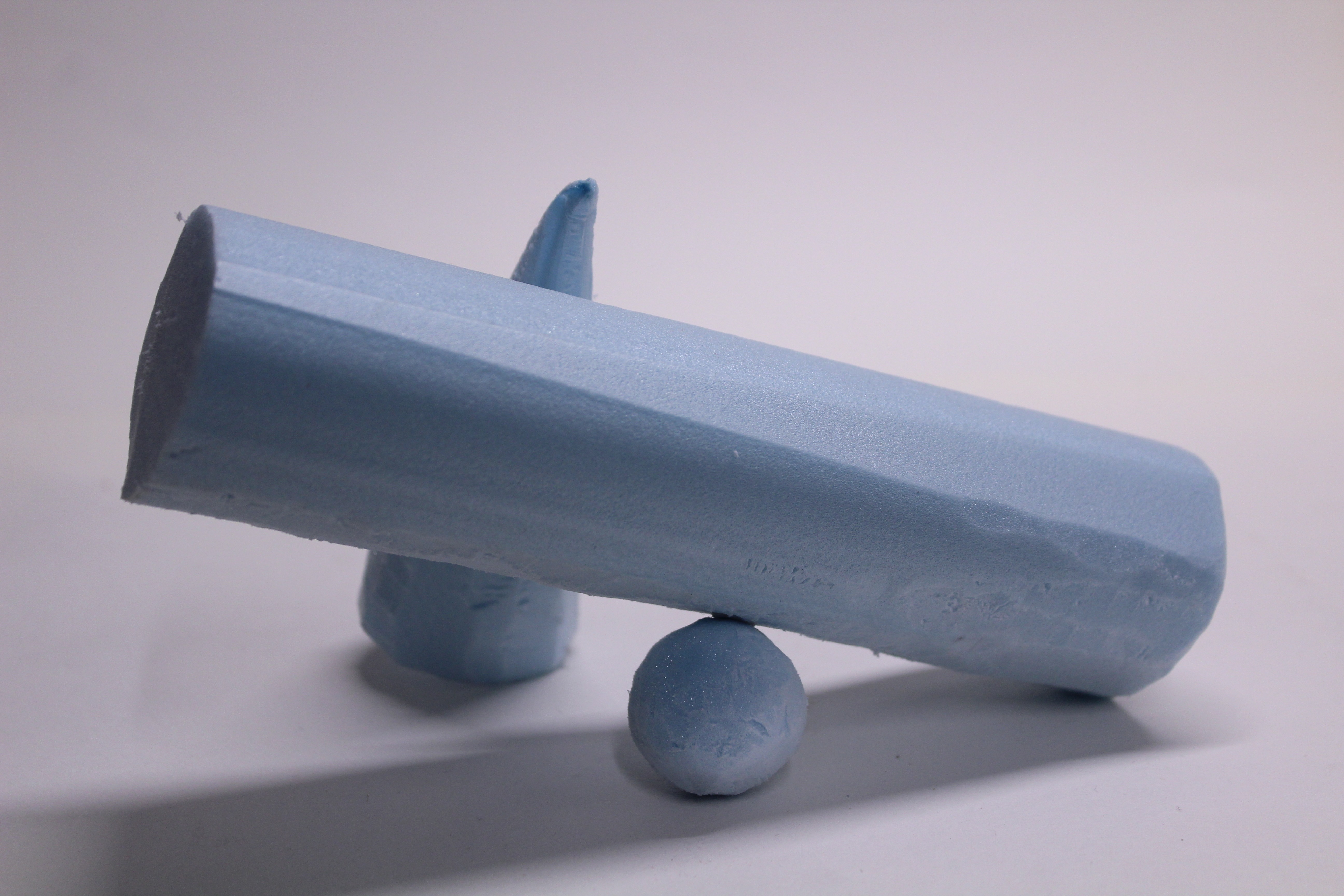
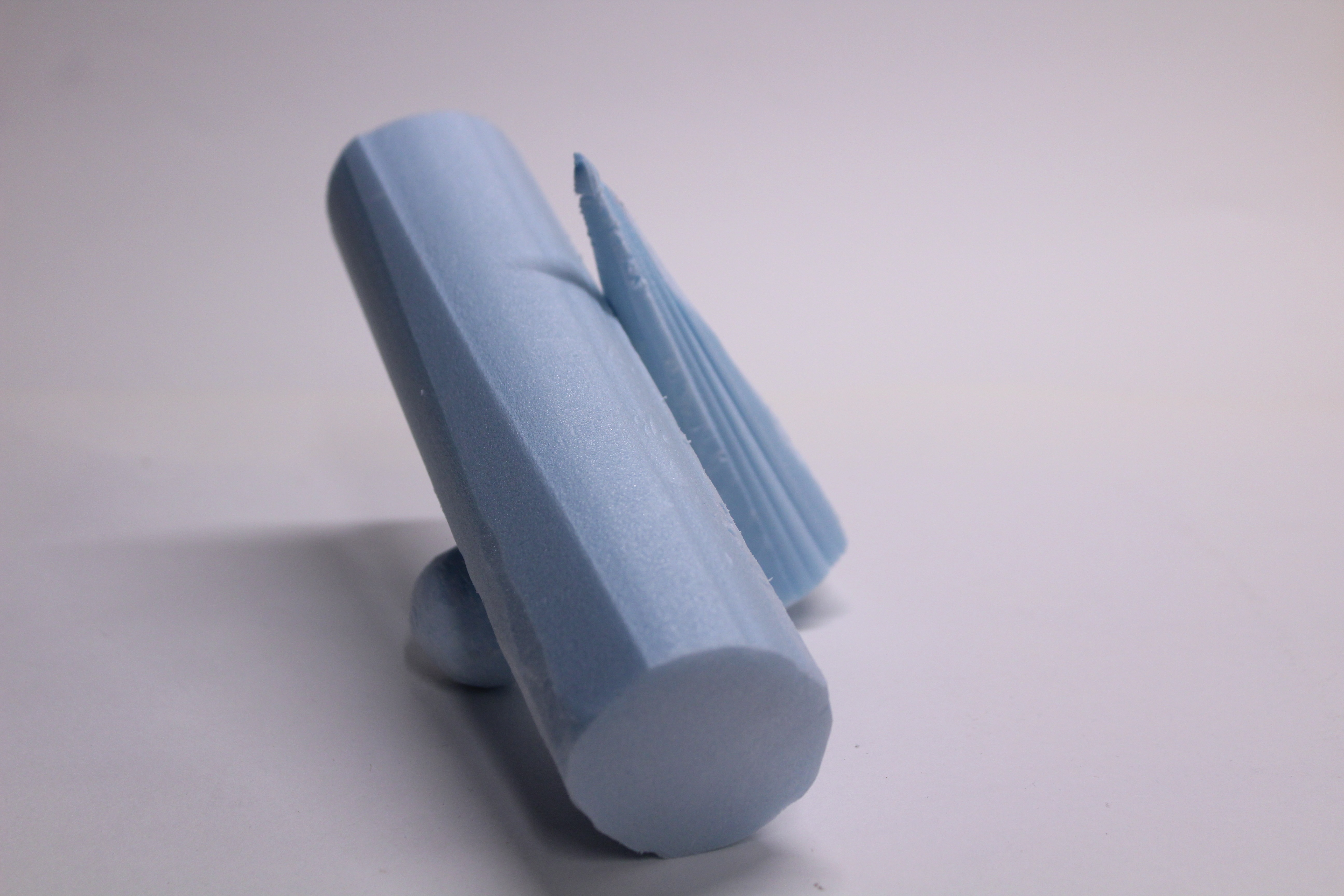
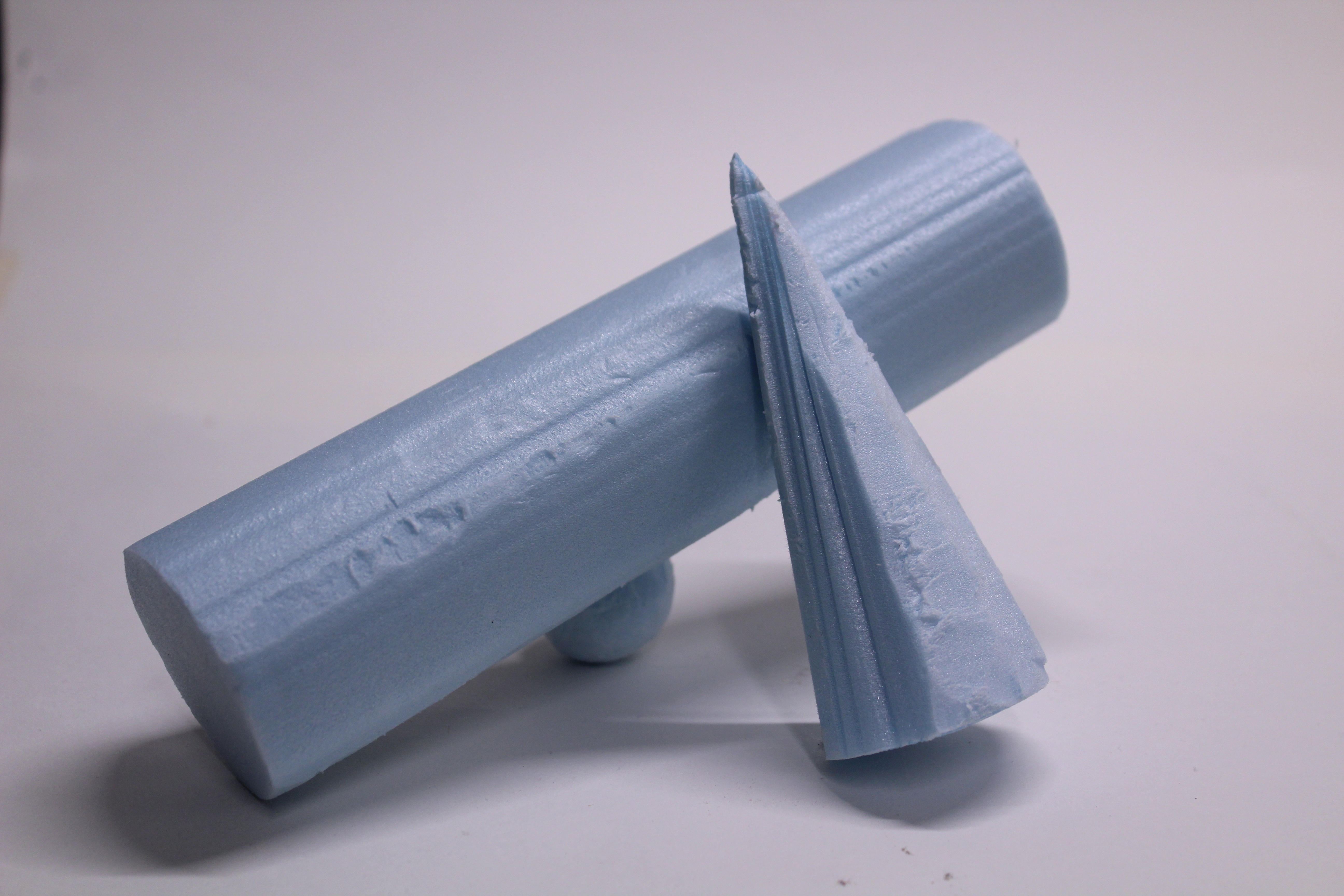
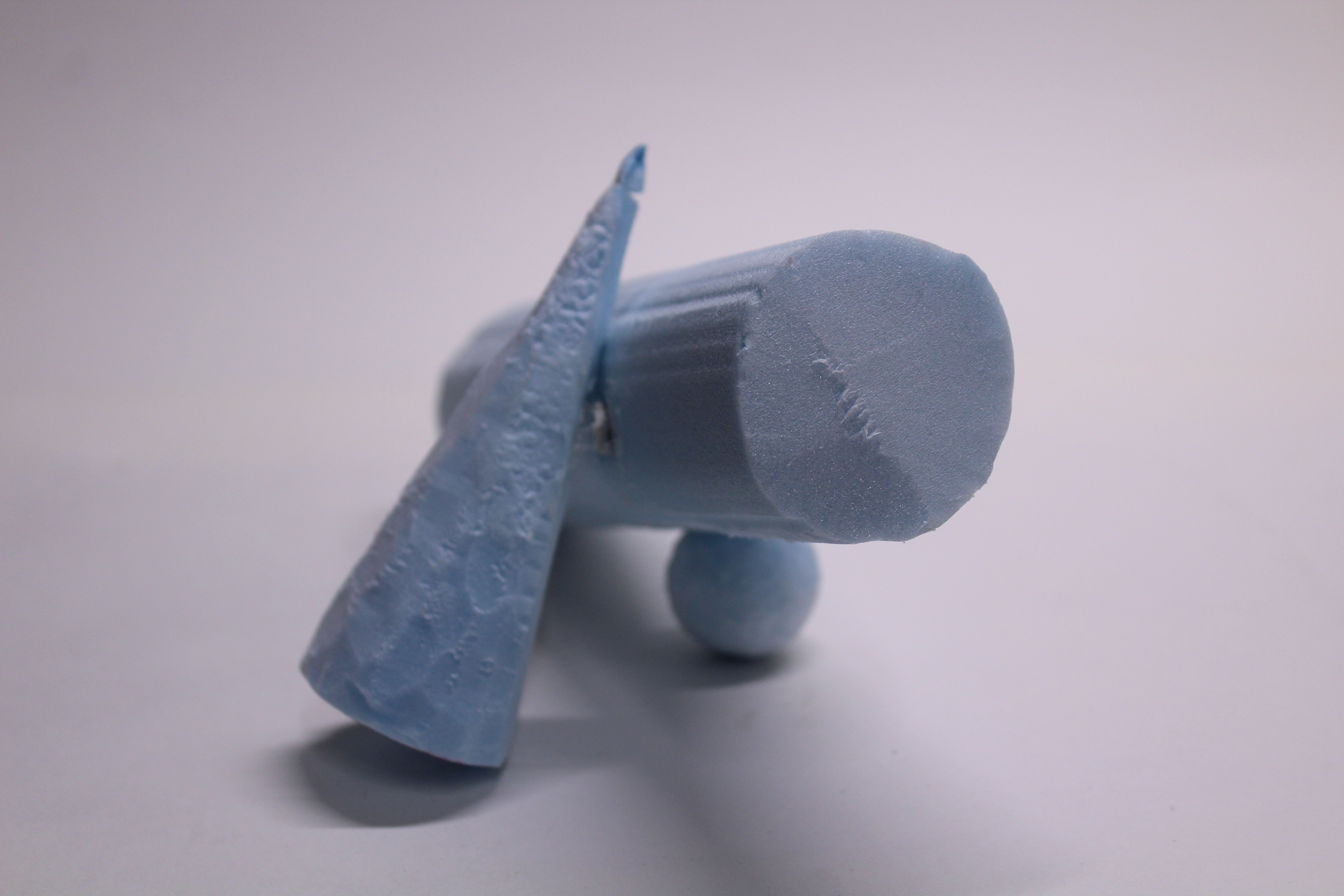
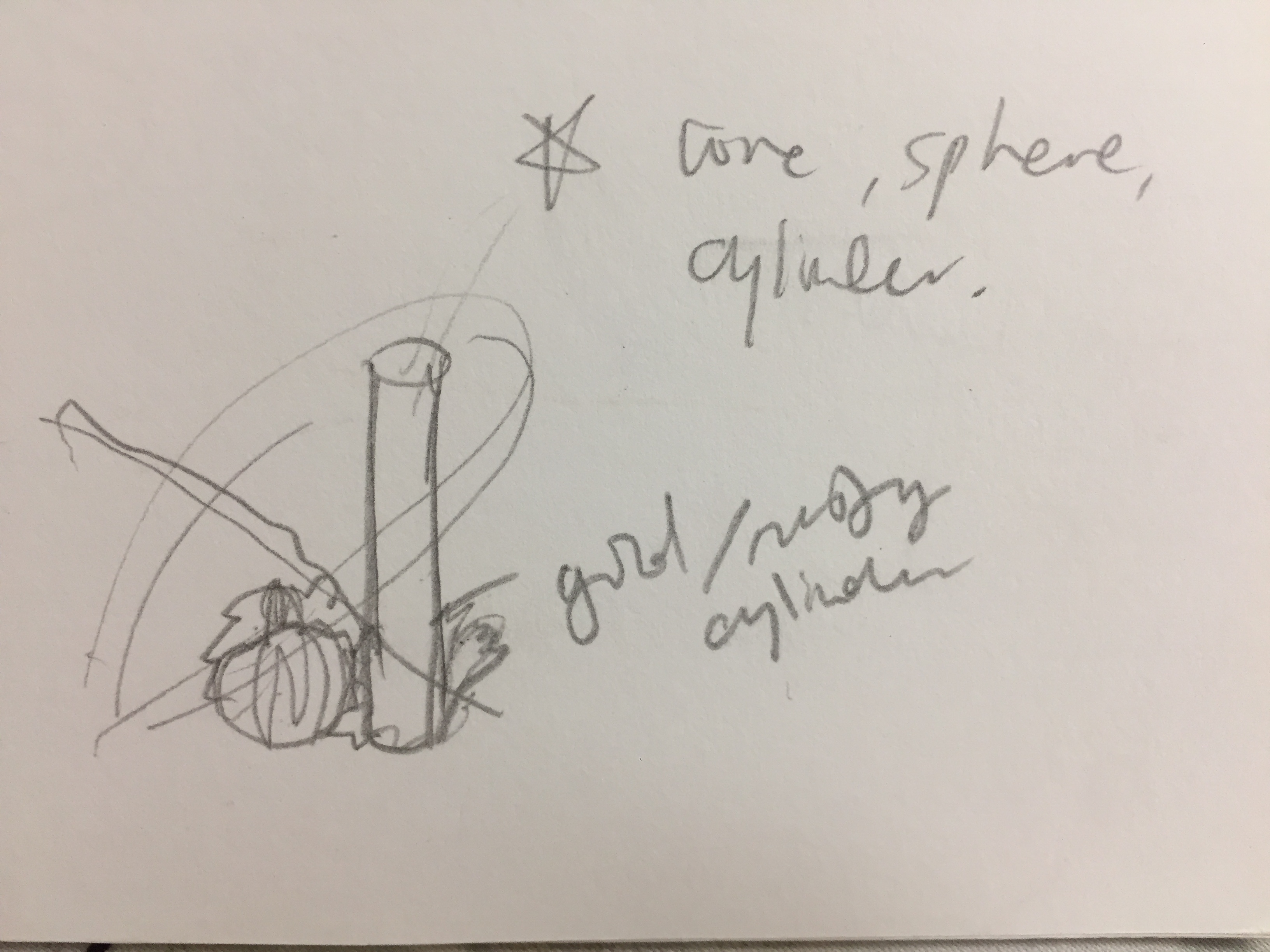
2 sketch models composed of a sphere, cone and cylinder. I played with the contrast between the diagonal axis of the cylinder in both sketch models and the smaller sphere and cone components.
MODEL 1
Side
Front
MODEL 2
Side
Front
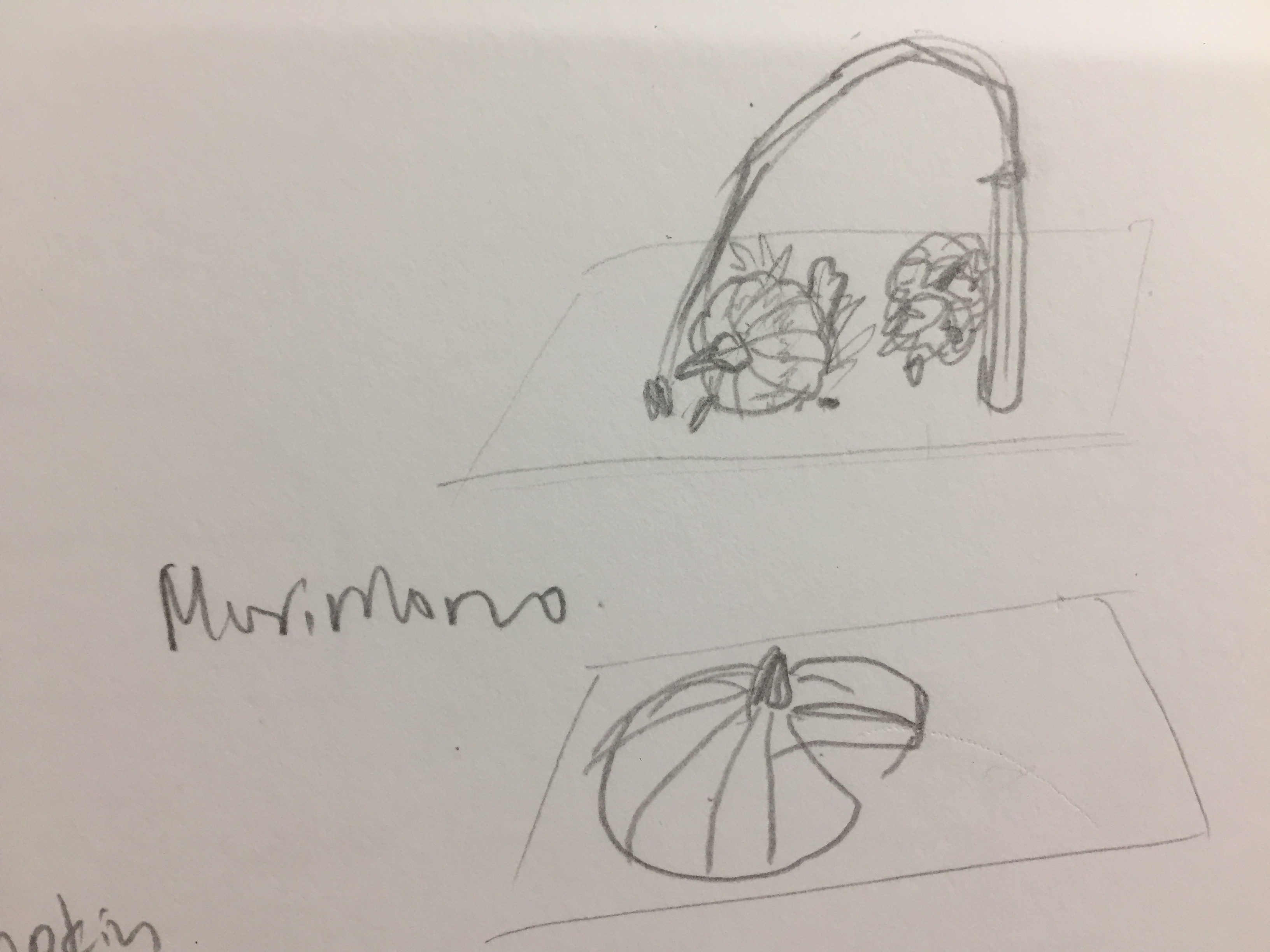
morimono ikebana
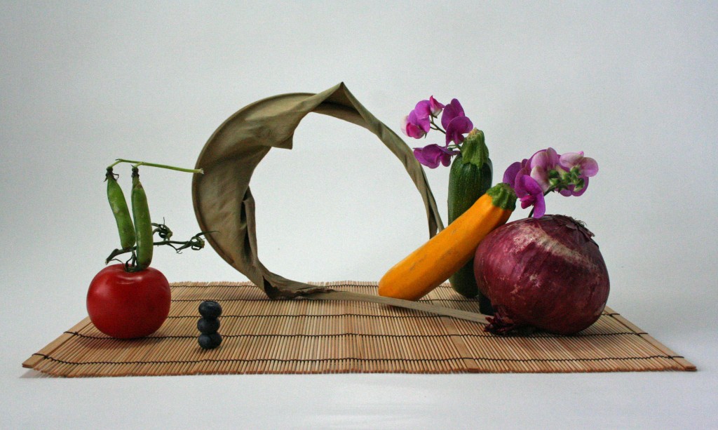
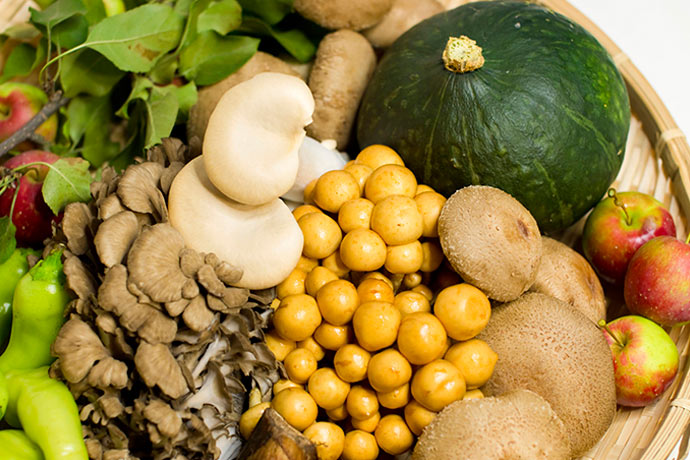
‘Morimono’ is the ikebana arrangement composed of fruits and vegetables.
I am more interested in the arrangement of spherical and tubular objects such as fruits and vegetables compared to the traditional medium of ikebana. Inspired by the vibrant colours and the use of a few elements to bring out the quality of the fruit or vegetable.
AUTUMN
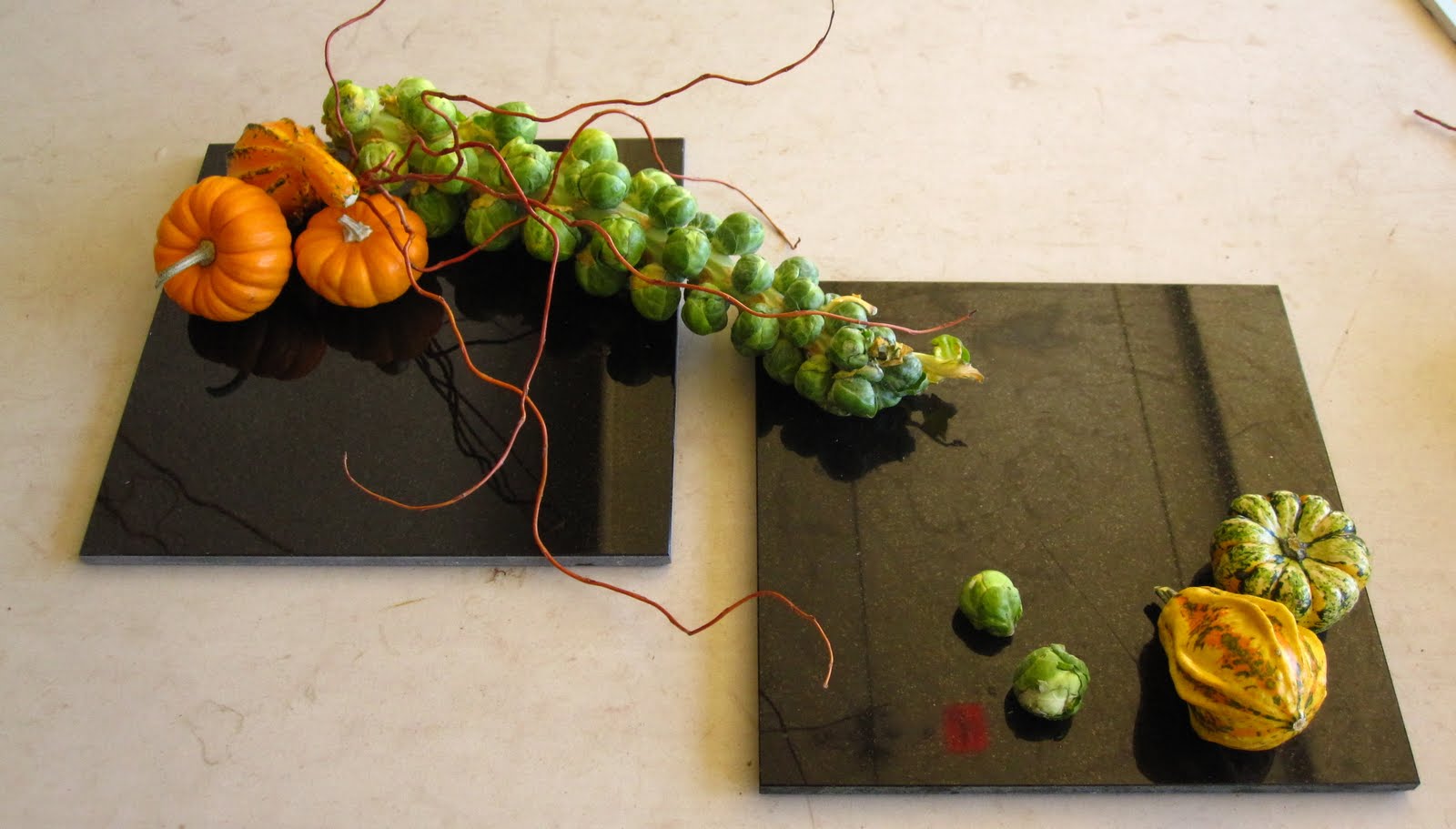
Our task was to create a composition of 5 elements with one branch, a cone, sphere and cylinder each and “something else”. My picked theme was the season AUTUMN.
Concepts:
Going with the idea of seasonal produce and to tie in with the theme of ikebana, I sourced for autumn-harvested fruits and vegetables in Japan. I filtered out fruits and vegetables with warm colours (red, orange, yellow and brown) to fit in better with the theme of autumn.
Initial ideas: A morimono composition using autumn produce
Comments given – diagonals should be considered more, should not dive straight into ikebana arrangement
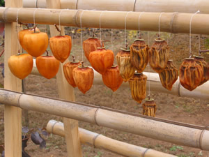
AUTUMN ACTIVITY – FRUIT DRYING
An autumn activity after the harvesting of persimmons in Japan is drying them. Persimmons are left out in autumn temperatures to dry to preserve and store through winter. The hanging action of the persimmon served to be the main inspiration for my ikebana compositions.
The individual hung persimmon serve as study of diagonals between the cyliner, cone and sphere equivalent of the fruit.
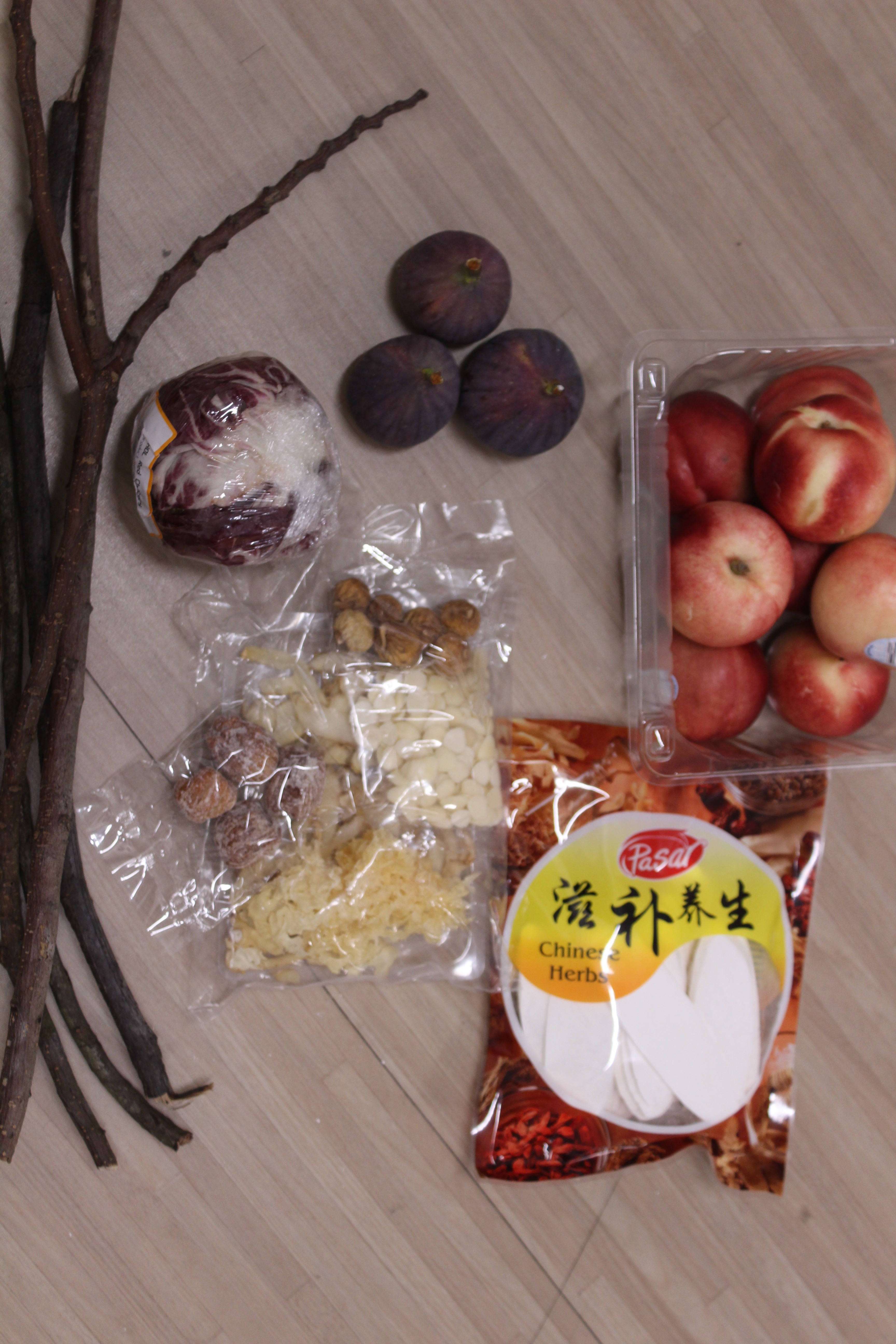
MATERIALS
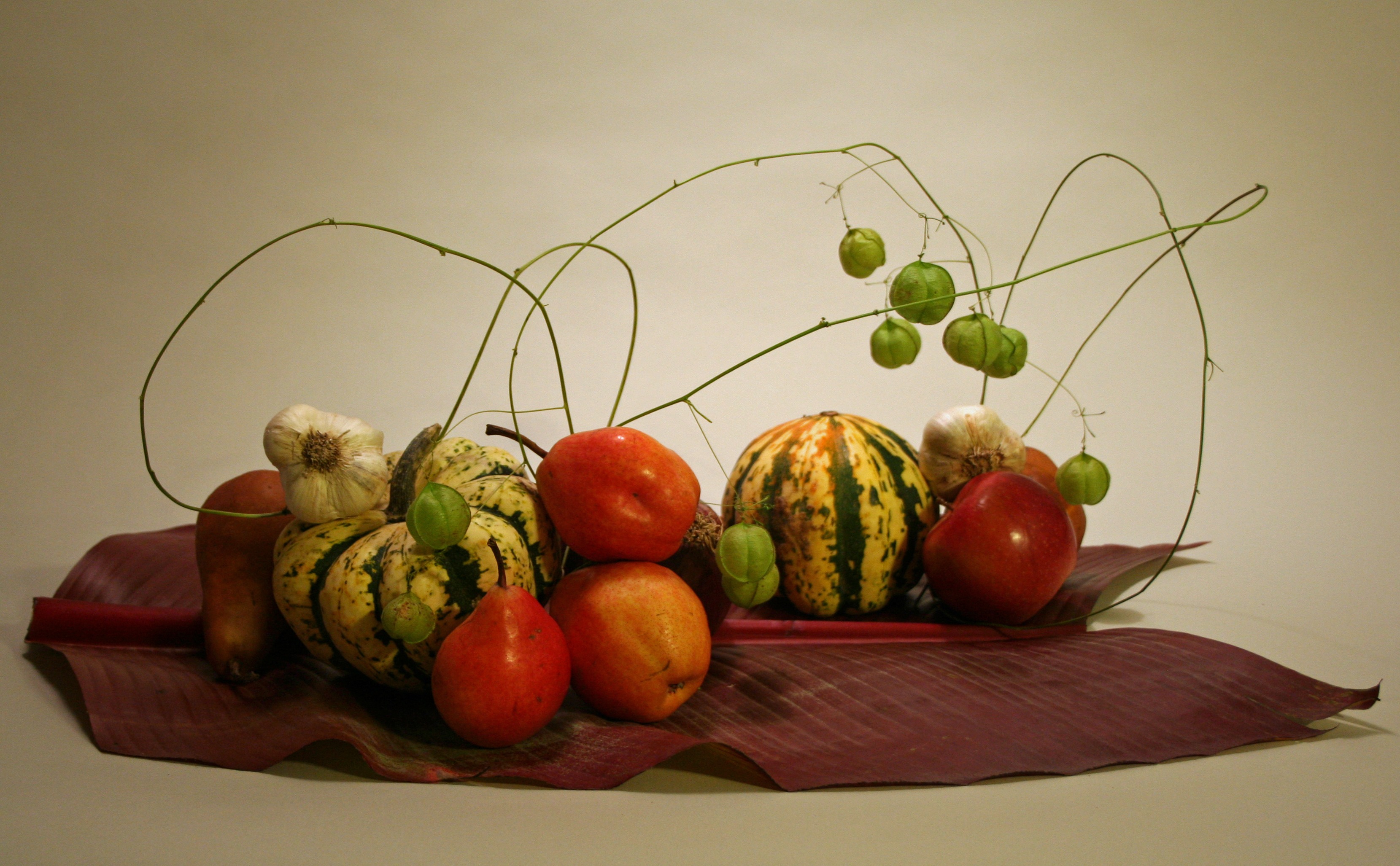
I decided to capture the act of drying of autumn fruits in one composition, contrasting the fresh and dried fruit. The local supermarket didn’t sell fresh and dried Japanese persimmons, so I went with other autumn fruits that were in season – figs and nectarine (In the US). I bought some dried Chinese herbs that contain dried figs and dates.
For the branches, I picked out branches that are darker in colour to fit the autumn theme.
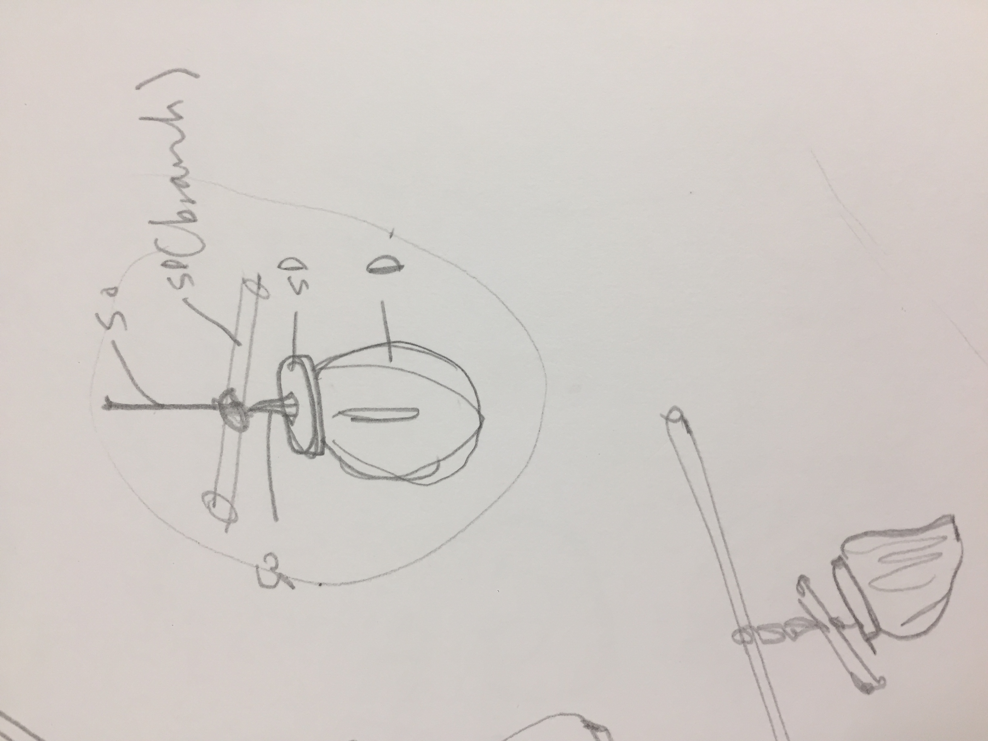
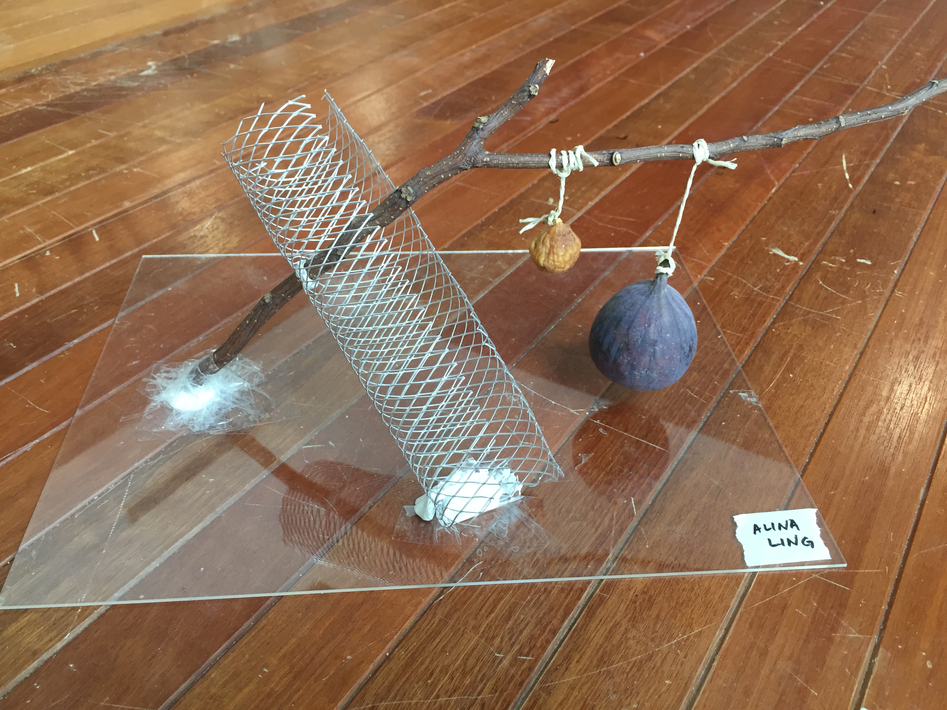
COMPOSITION 1 – figs
I used a wire mesh to create a netted cylinder to hold the branch diagonally. The fresh and dried are hung beside each other on the branch to create contrast between the act of gravity and the diagonal branch.
The act of hanging is established using string, similar to the ones used in persimmon drying. I chose to keep the composition simple and minimal to focus on the shape and action of the fruits.
Sketch Analysis:
Dominant – Branch
Sub-dominant – wire mesh and fresh fid
Sub-ordinate – string and dried fig
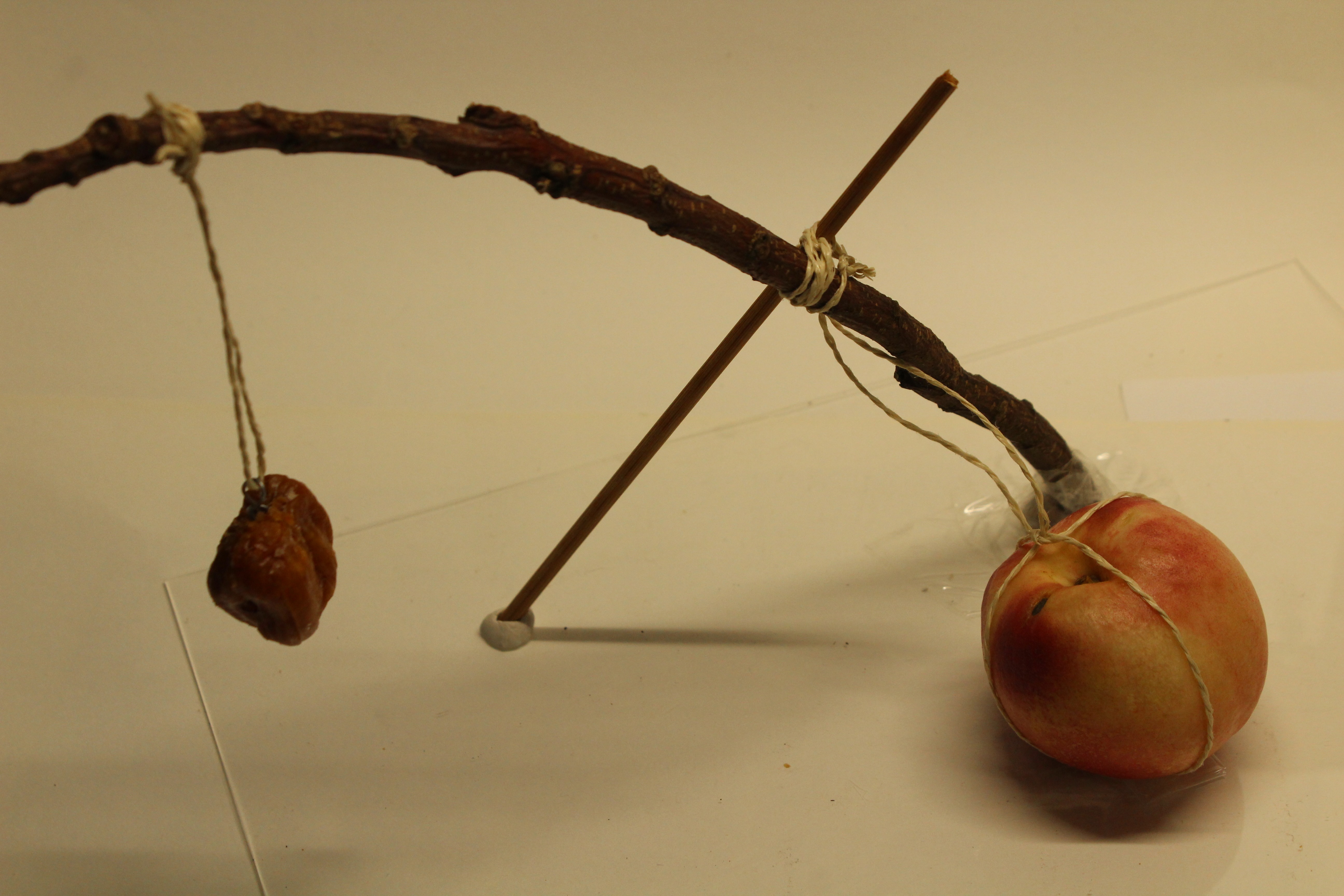
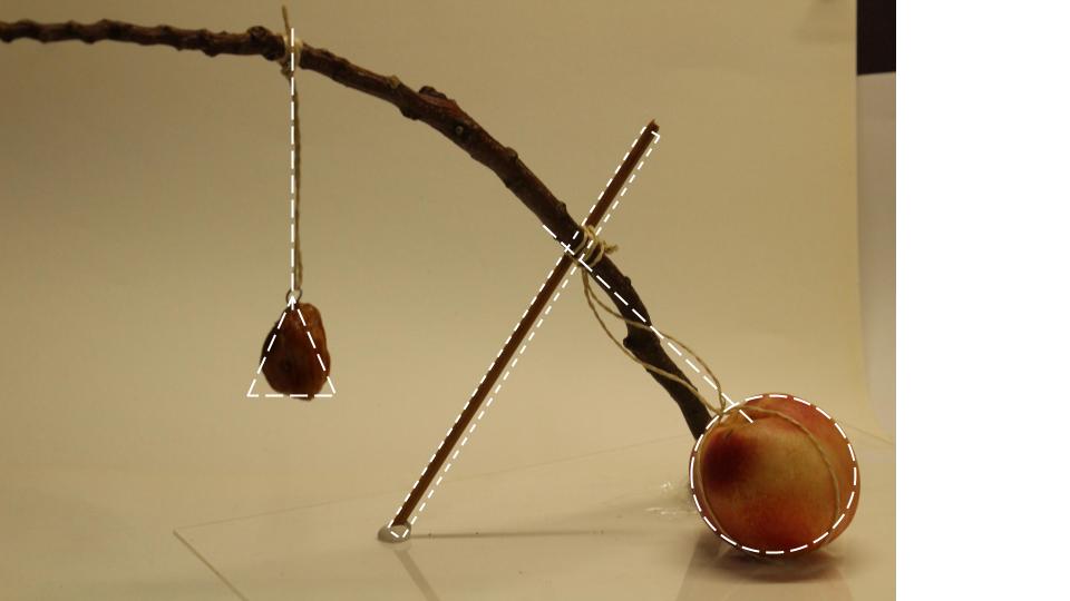
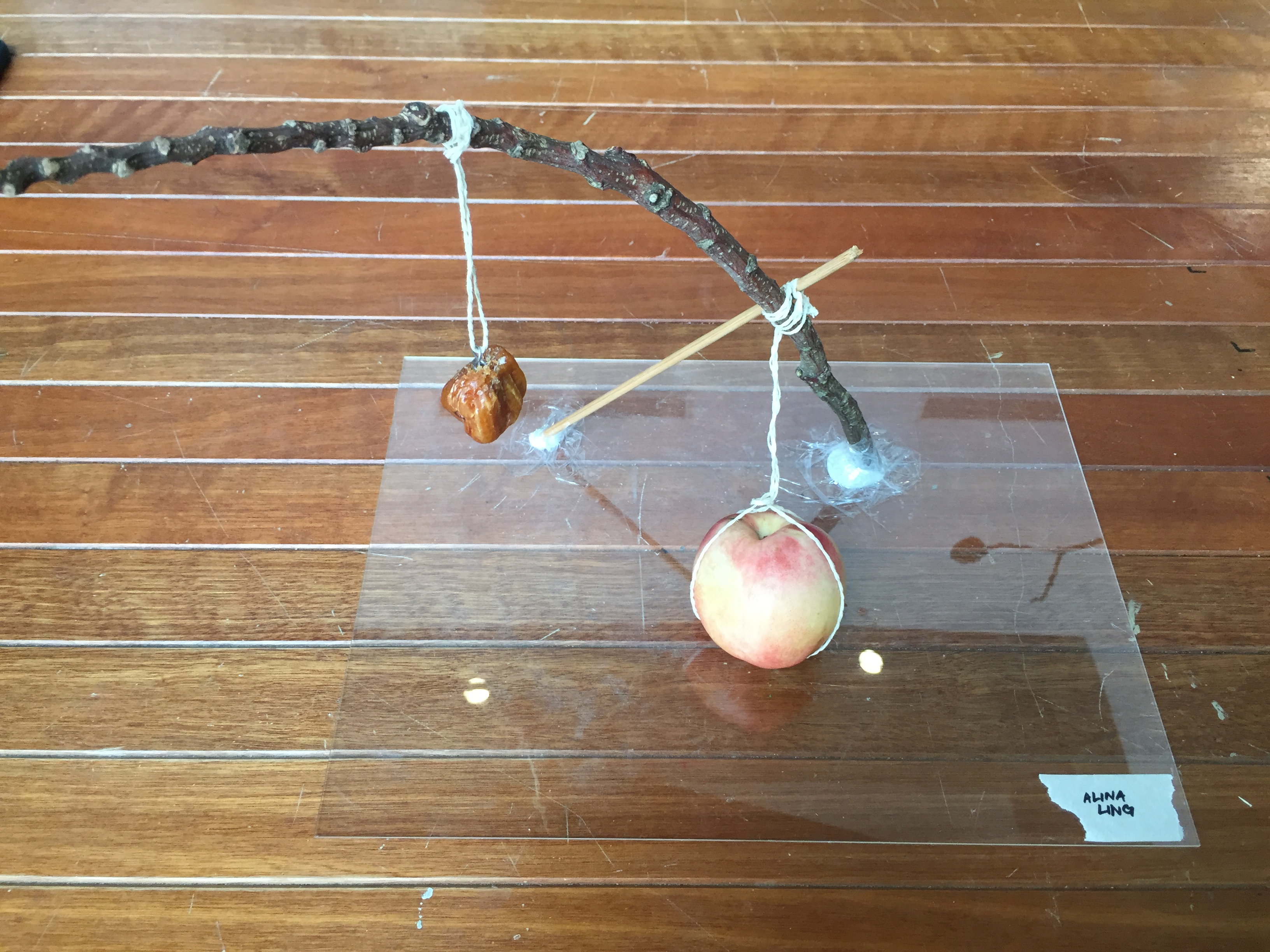
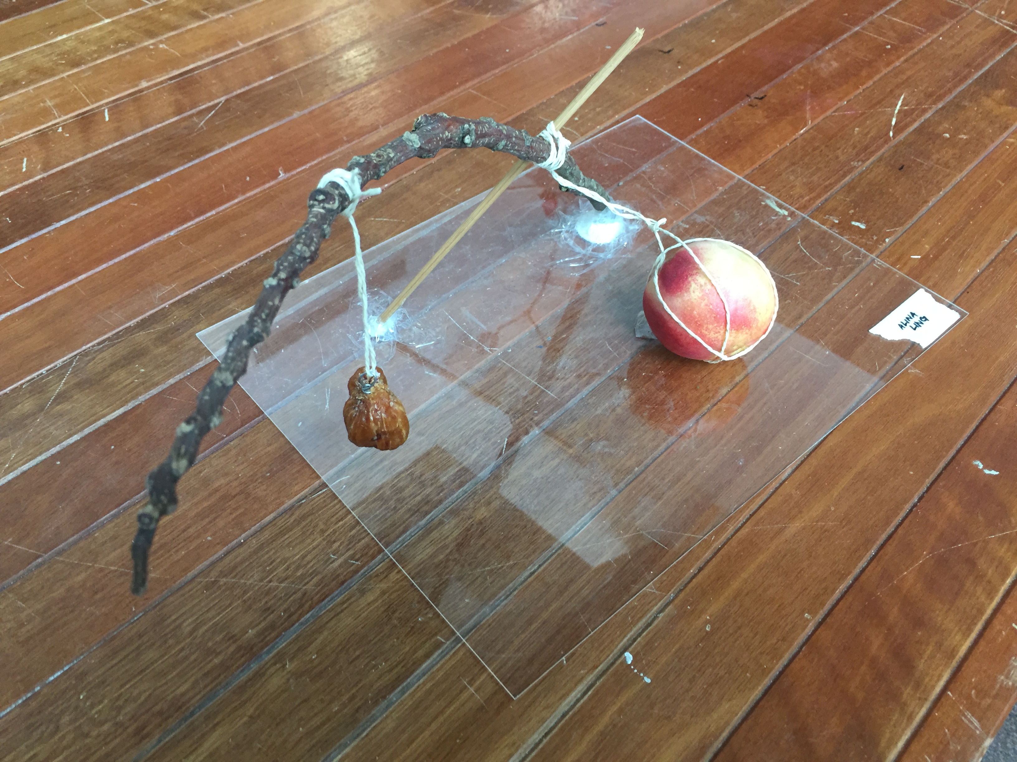
COMPOSITION 2 – nectarines & dates
I used the dried date to represent the dried version of the nectarine as they were similar in colour and relative size.
I played with the act of hanging of dried date with the fallen nectarine on the bottom. The diagonals of the branch and stick are interacting on one plane, while the lines of the string are on other intersecting planes.
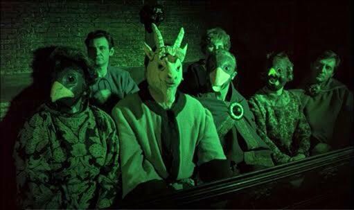
“Abattoir”, also known as a slaughterhouse, is a short story of a shy and introverted girl who just transferred to a new school. Bordering on the line of fantasy and reality, she sees her new environment as frightening and disturbing. Revealing her psychological state of mind as she meets her new school mates, she sees them as haunting animal figures, whose abnormal actions scares and confuses her. While believing that the evil is purely out of her imagination, she is manipulated to conform to their ideals and become one of them.
Main character
The girl – Weak and afraid, who eventually fell prey to the stronger-minded. While the main character believes she is being accepted if she conforms to their way of life, she loses her identity.
Symbolic imagery
The fox – Masking her true intentions behind inviting and kind act, she controls the weak mind of the main character to gain a lackey who follows her blindly. The fox has always been characterised as crafty and this quality is shown as she catches and fools her “prey”.
The dog – Symbol of blind loyalty. The main character foolishly becomes a loyal servant almost immediately after receiving a few acts of “kindness”.
The rabbit – conventionally known as silent and weak, the contradiction of power given to the rabbit allows the film to be slightly more creepy and haunting.
Overall Style & Themes
Genre – I decided to go with horror, using sound and imagery to convey the mental state of the main character. Purposely avoiding a happy ending, I appointed the fox as the main villain for this short story.
Style references:
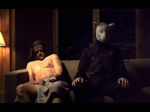
You’re Next (2011) – American slasher horror movie
Use of animal masks – the lack of empathy and human nature in the murderers adds to the horror of the film
Use of still scenes – coupled with silence to build suspense.
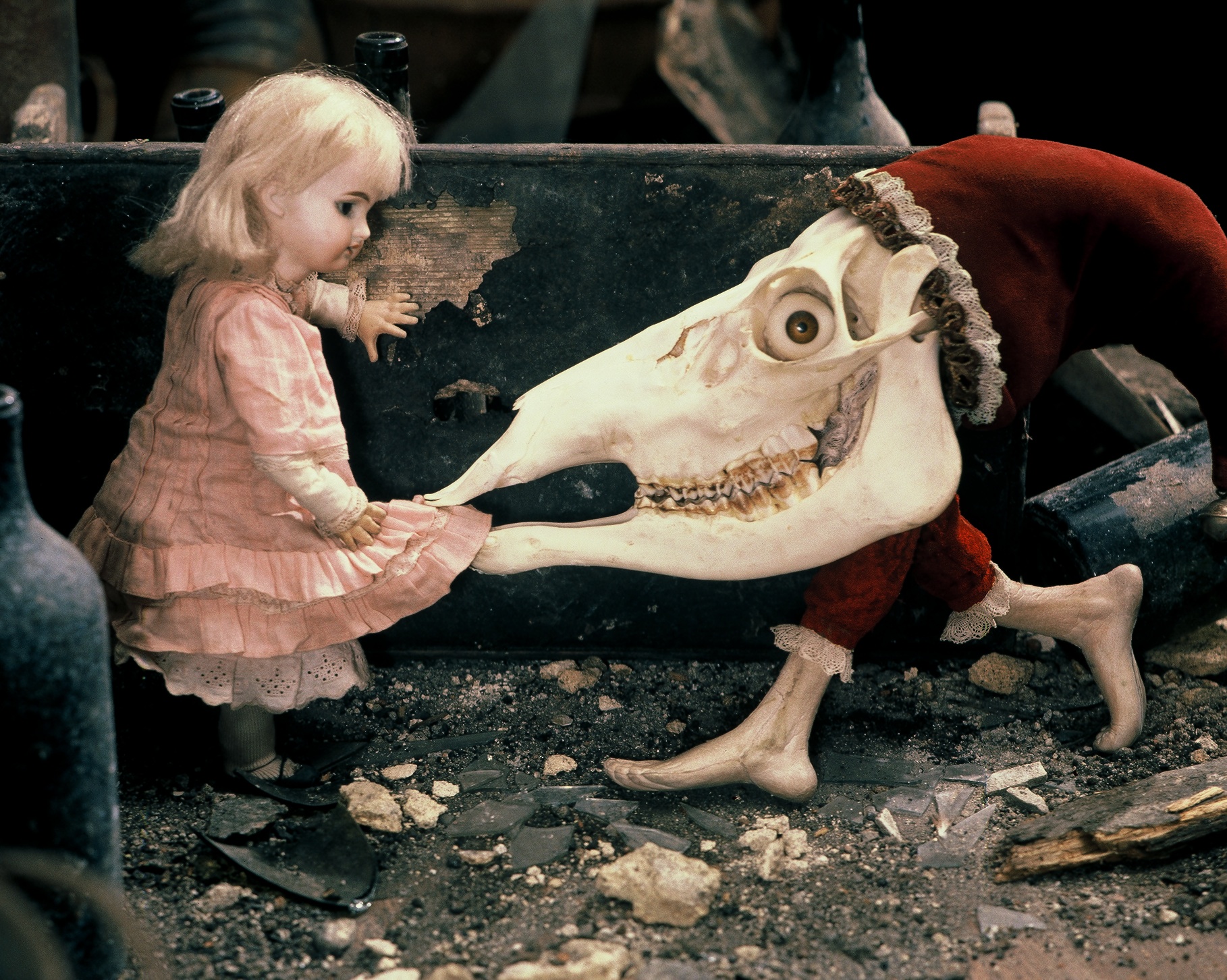
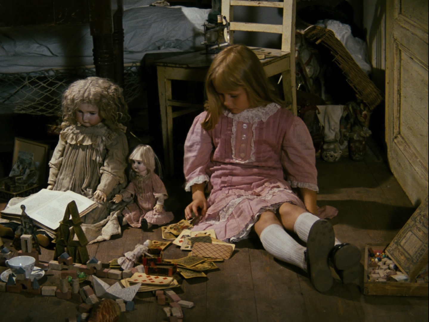
Jan Svankmajer’s animations – surrealist works “Alice” and “Meat love”
Use of stop motion – every action is captured with a natural flow
Use of sound – only the sounds of actions are heard against a background of no sound.
Surrealist influence
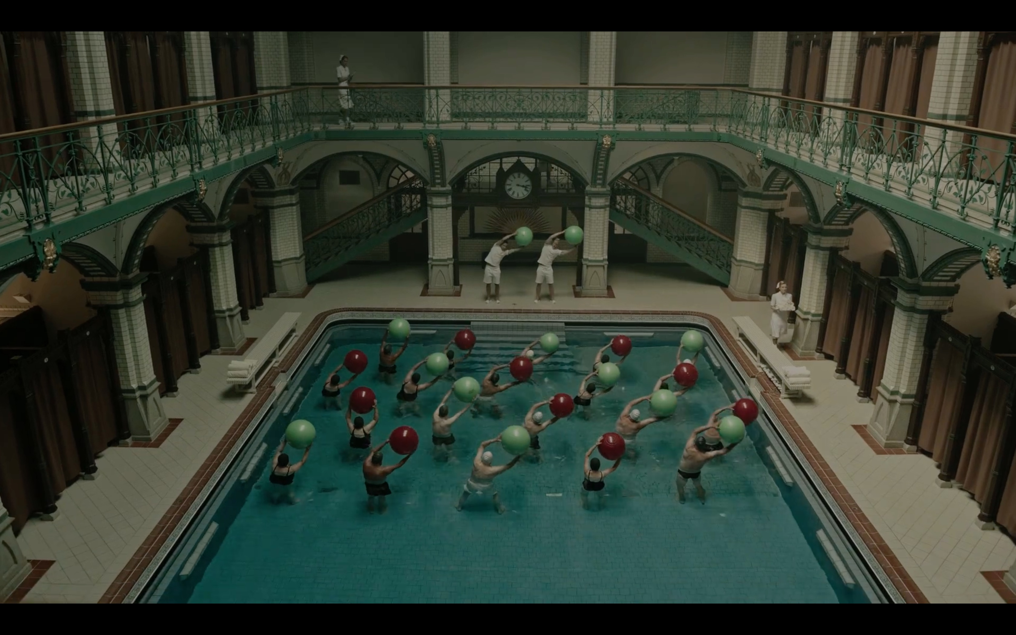
The Cure for Wellness (2016) – A health and mental institution with a dark past and terrifying truth
Use of images of the place – beautiful yet hiding an ugly or distorted truth. There is something amiss in the perfect and beautiful place