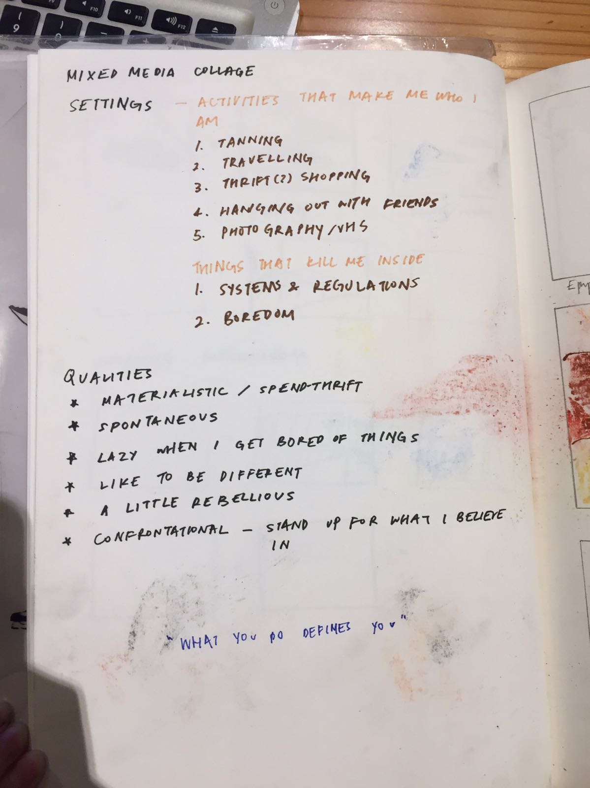
Linking each panel to a part of myself. Each panel varies in superficiality of the level of analysis of my qualities.
Panel 1 (Superficiality level – High)
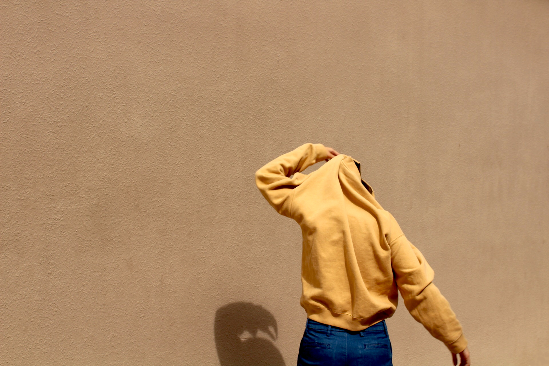
The first panel is the part of me that cares about my outer appearance and how I look on the outside. Being fair makes me feel empty and unconfident, where I feel I become soft and bland like tofu. Tanning is a very short-term but useful activity in establishing myself in the world, where I literally become darker in skin tone. And becoming fried, crispy bacon with a skin tone I personally find desirable.
Panel 2 (Superficiality level – Low)
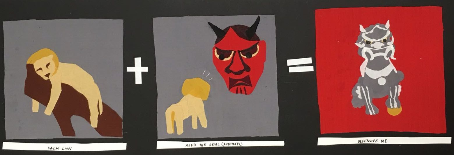
Like a lion, I have a relatively short attention span and I get bored of things that does not interest me quickly. While having many ideas and dreams, the lazy lion inside me will not hesitate to laze about while thinking that we will eventually get there. However, when faced with unreasonable authority or unneeded criticism, I quickly get defensive about my ideas and way of thinking when I feel somebody is trying to change me or make me conform to the norm. Thus, I turn into a stone lion, inflexible to change which I admit will be a troublesome quality to have.
Panel 3 (Superficiality level – High)
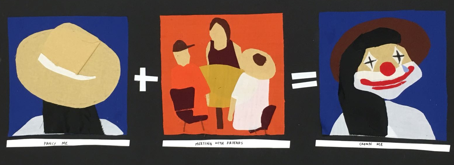
Dressing up and hanging out with friends are two activities I cannot live without. However, I like playing the role of a clown to entertain my friends but it is sometimes bittersweet when your other qualities are bypassed for your humour or you making a fool out of yourself. Nevertheless, I would still take that role any day.
Panel 4 (Superficiality level – Middle)
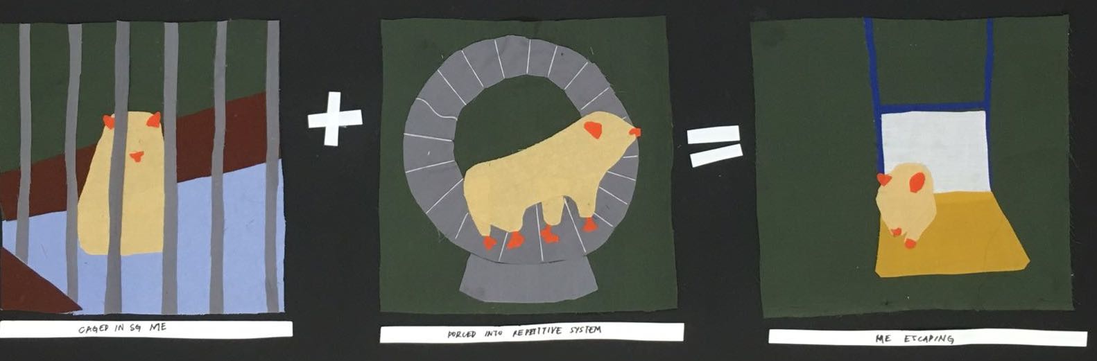
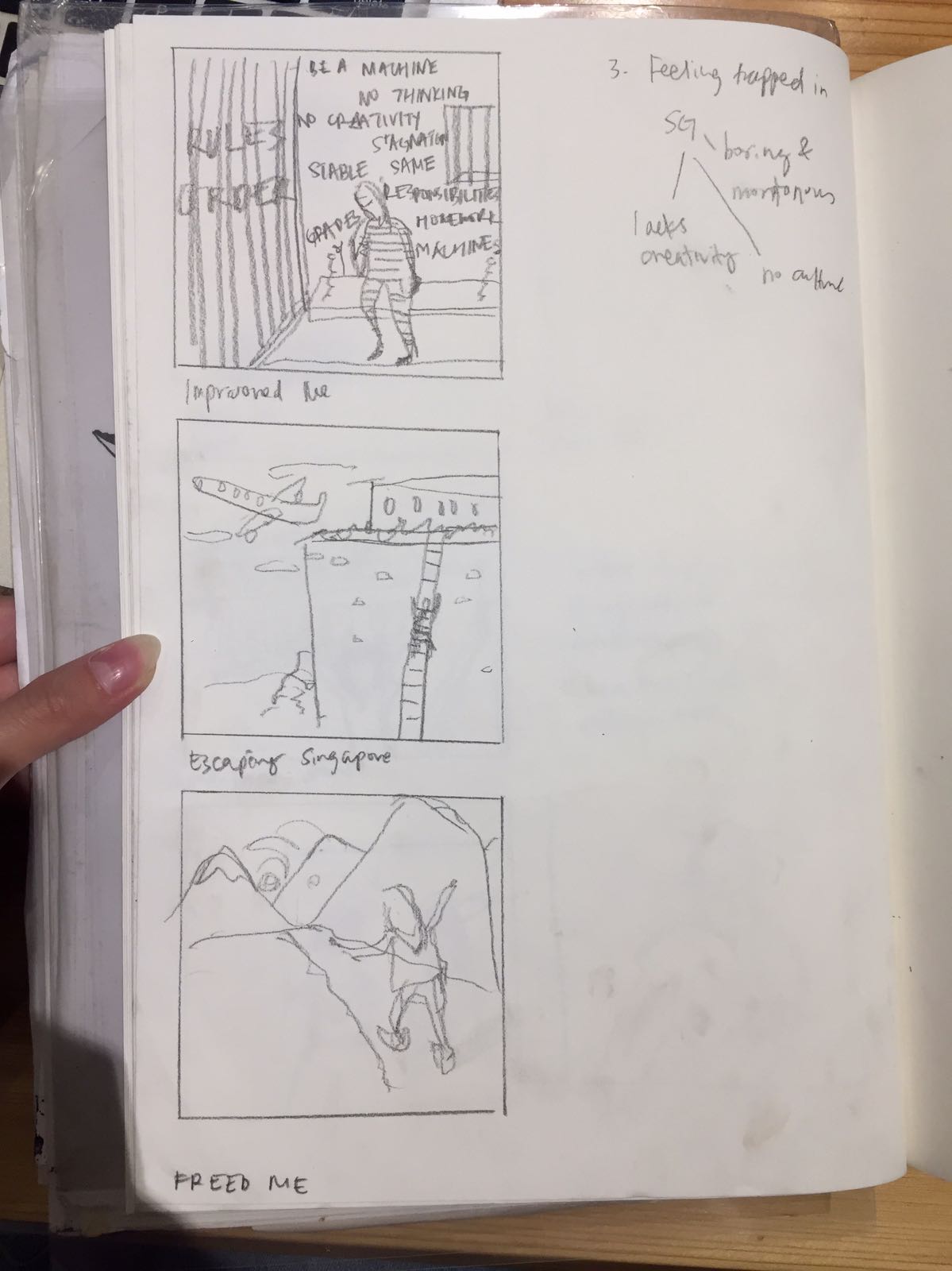
I sometimes do feel encaged here, where the creative landscape, while developing, is not as vibrant as I wish for it to be. The system in which creative fields are taught in Singapore feels slightly repetitive and sometimes, useless in developing my artistic style. I feel that it is a pity that one’s creative style is washed away in the pursuit of grades and jobs. BUT maybe the system does not work for only me, so my conditioned response to boredom is to escape and flee (through travelling! What were you thinking I was going to do)
I enjoyed this project as it allowed me to explore and understand myself more as a person and how I should improve myself as a student trying to establish my creative style. Thank you for reading! :- )
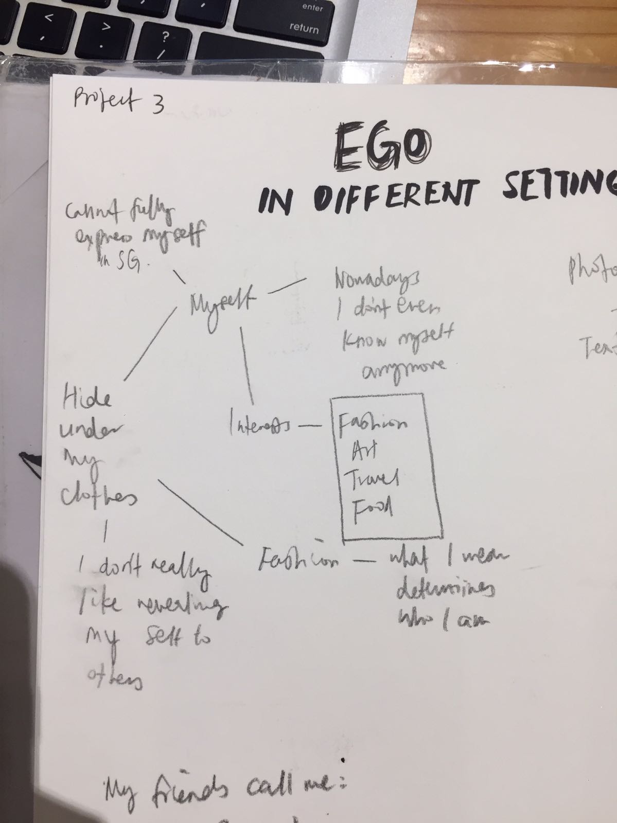
I wanted to work with fashion collage as it seemed like a versatile medium to work with colour and to express myself in. I found references on fashion collages and shoots and studied how they use colour to express certain emotions.
Johny Dufort
for Balenciaga
Use of blue, muted palette – reflect the weariness of the working class
For Re-Edition Magazine and AnOther AW2016
Use of analogous warm tones to express vibrancy
His use of muted colours brings about a softness to the strong colours he use, creating balance. I was intrigued the attractive and beautiful use of colours in his fashion photography.
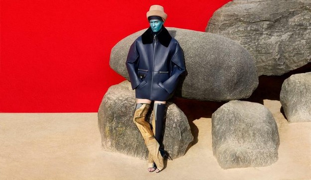
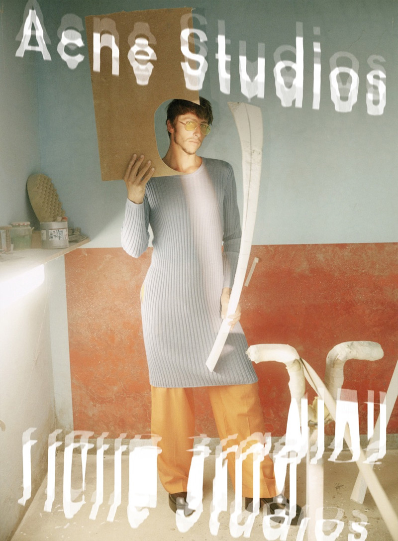
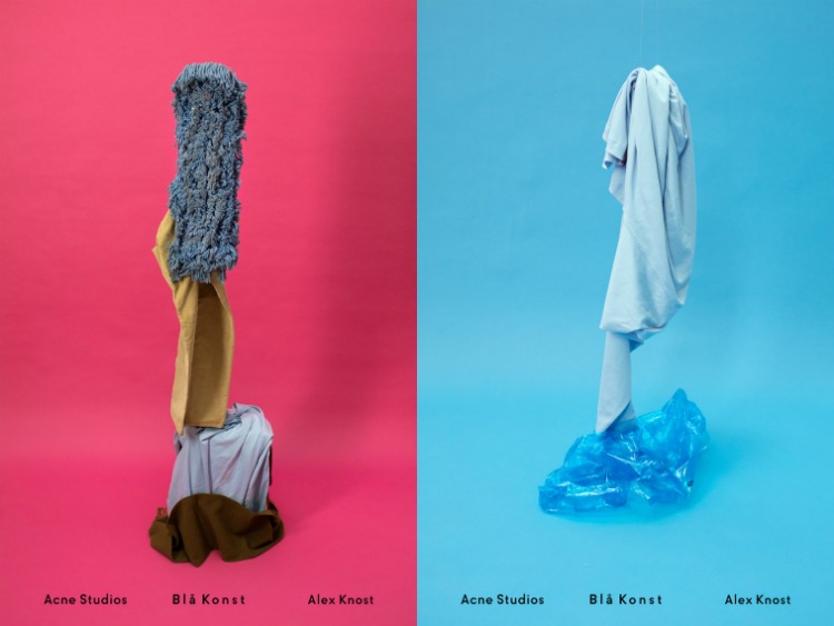
Acne Studios
Use of bright and vibrant colours – red and blue, muted yellow/ brown
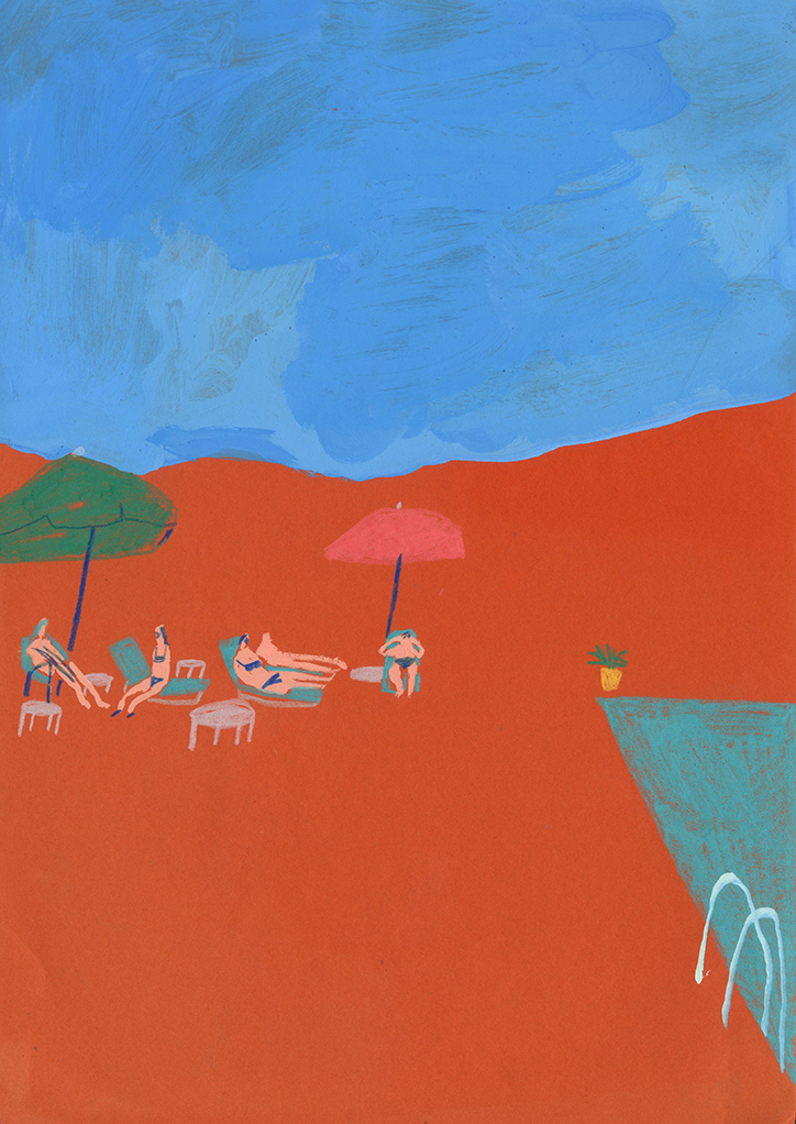
Initial Idea 1 – Using fashion photography and collage to express the various emotions I have in various settings
Possible Equations: (Me+ setting = outcome/ reaction)
Passive me (Wearing colours like green or blue) + Conflict (red – contrasting colour) = Confrontational Me (orange)
Free spirit me + Stress = Runs away
Oppressed me + Given space to create = Freed me
Possible style for panel:
Photography assignment I did for 4D class
However, there were limitations in this medium as it was not definitive enough and there was not enough room to explore colour palettes due to the lack of sources or materials (in this case clothes) and compositions were insufficient in expressing deeper human emotions.
EGO – Forming Equations
I decided to reconceptualising myself by focusing on the settings that I enjoy and do not, as well as qualities of myself to form my equations.
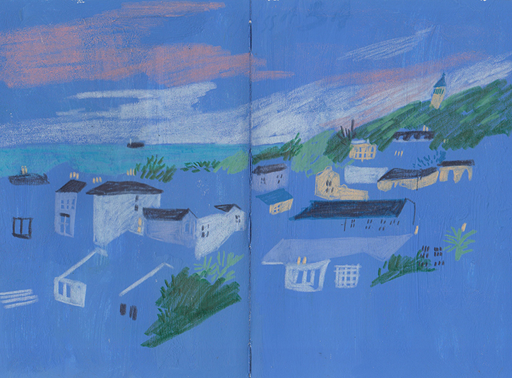
Initial Medium 2 – Marker and soft pastel illustration
I decided to stick to a traditional medium as I would like to explore the possibilities of non-digital mediums in expressing colours.
Charlotte Ager – illustrator Evocative drawings and paintings that are full of energy, movement and atmosphere through lines and colour.
I really like the gestural style and unharmonious and “messy” combination of colours she used, yet the choice of colours are purposeful, inspired by the works of post-impressionists, fauvists and cubists (Gauguin, Matisse and Picasso).
New equations (Me + activities I like/ dislike/ wish for = Reaction)
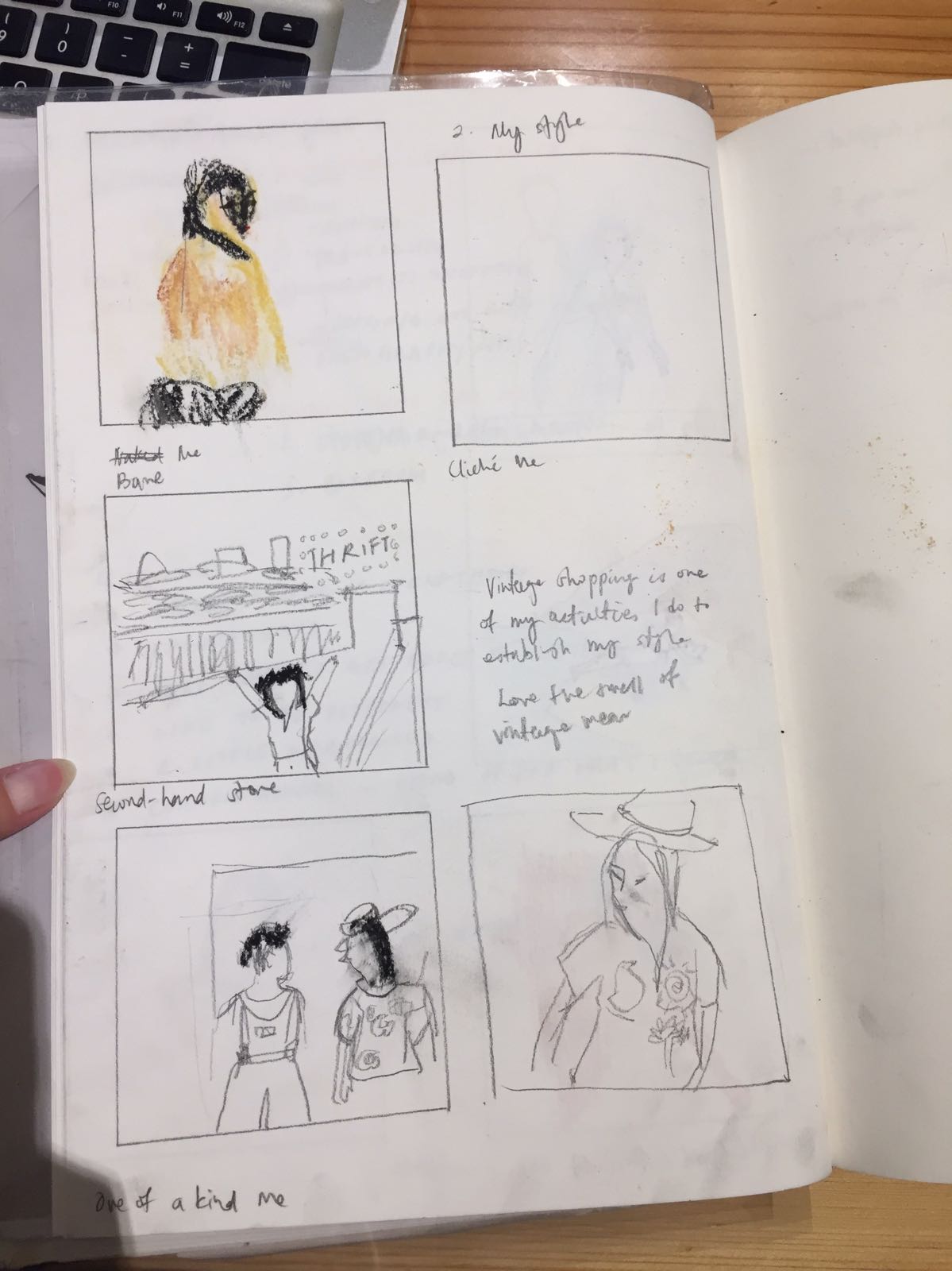
Medium – marker and soft pastels 1. Empty me + Tanning = Solidified Me
2. Bare/ Cliche Me + Second hand store = One of a kind Me
3. Imprisoned Me + Escaping Singapore = Freed Me
Comments from consultation:
– The gestural style can only be done well by those who have experience and confidence in the medium.
– Rendering of human figures are inadequate, should think of symbols that represent me
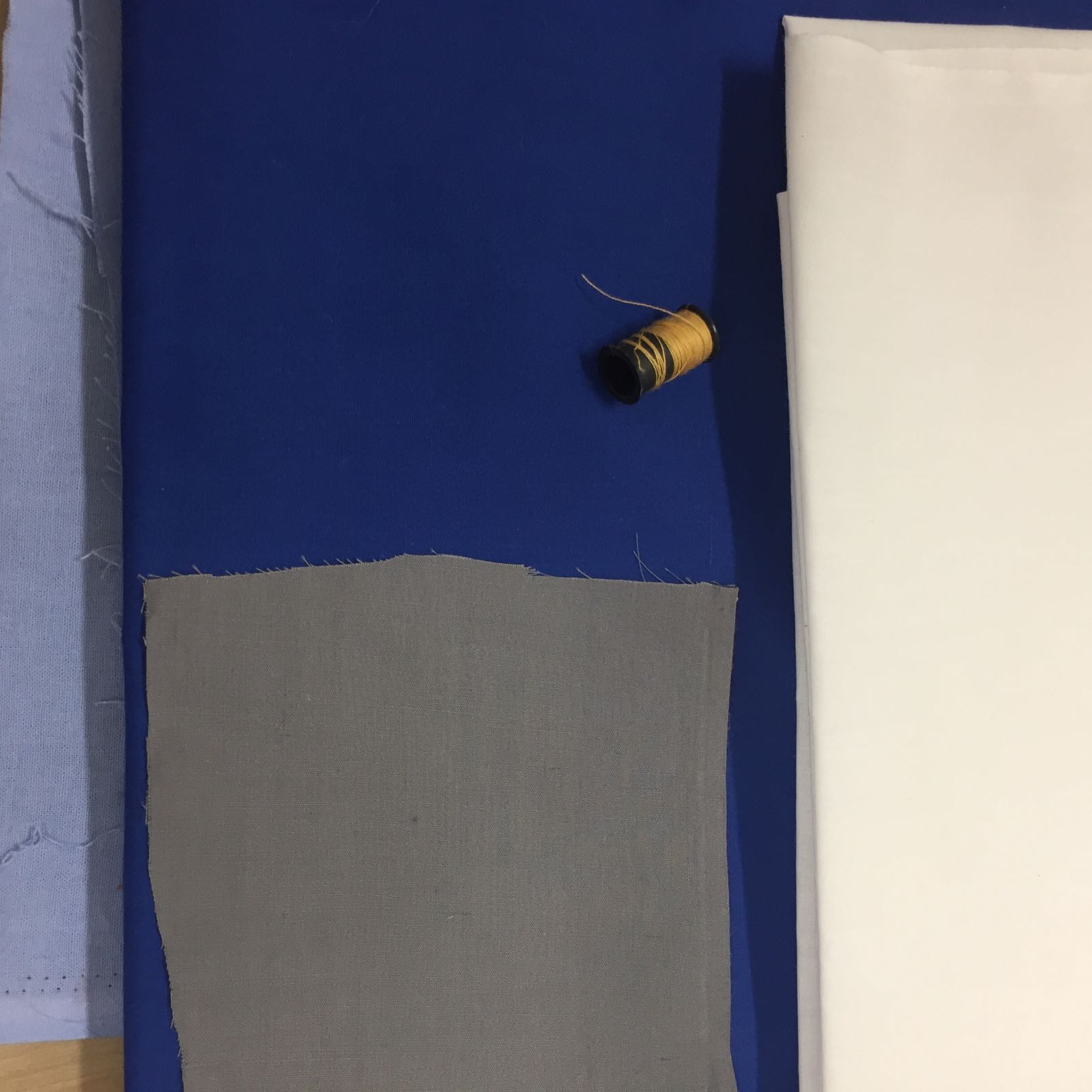
Final Idea – Fabric cut-outs and embroidery
So, I decided to work with a medium I am familiar with – Fabric.
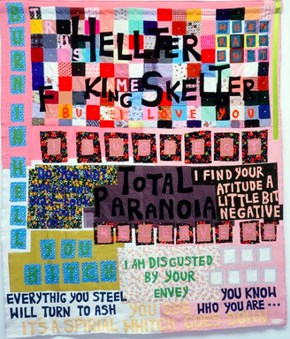
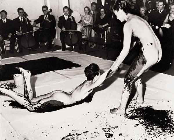
Artist references Tracey Emin – Using of fabric for her art works “Hellter Skelter”
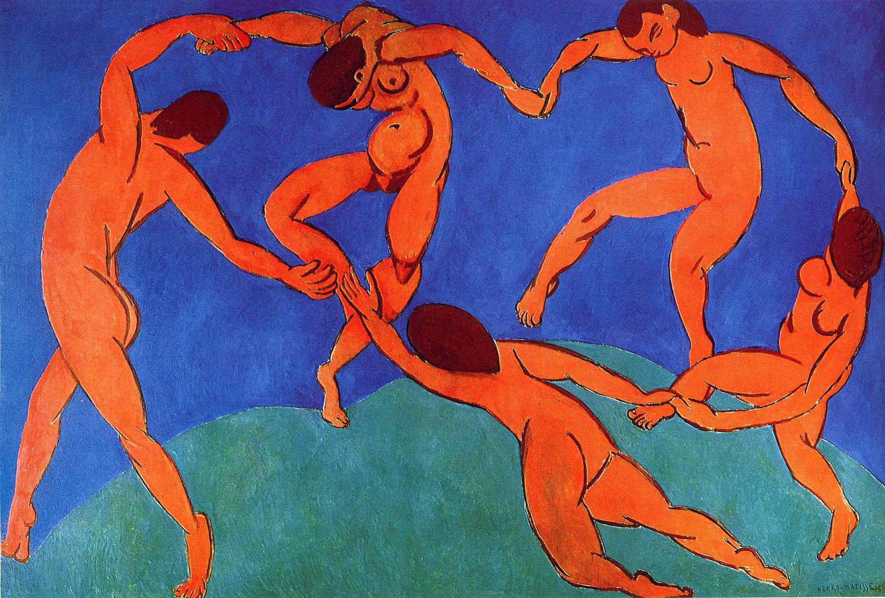
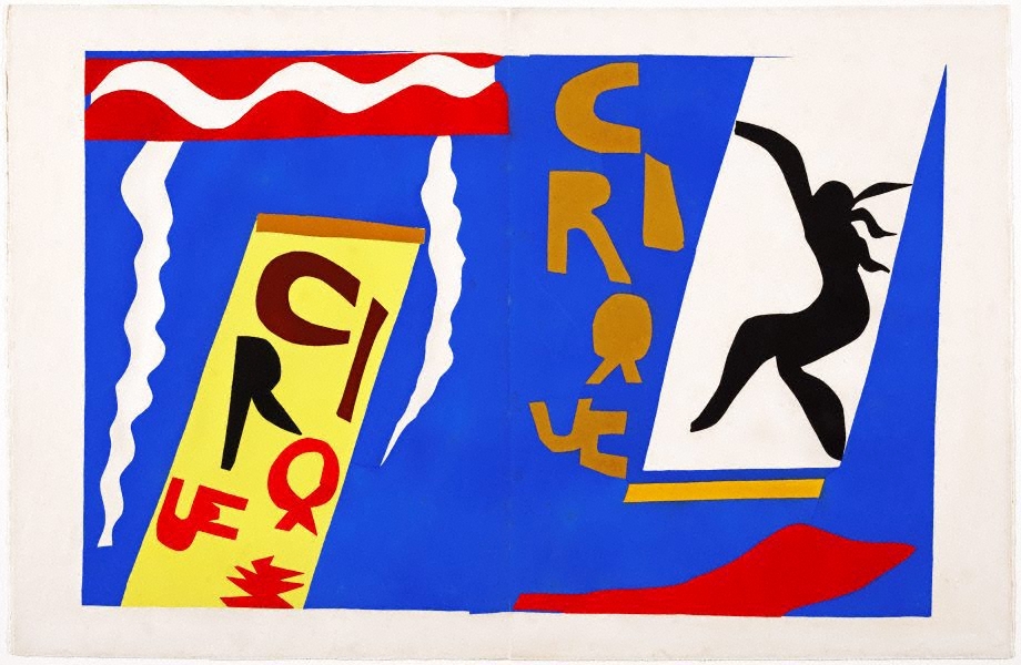
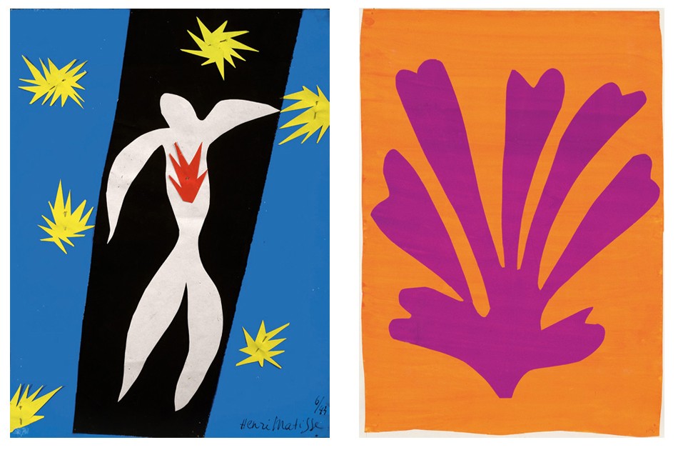
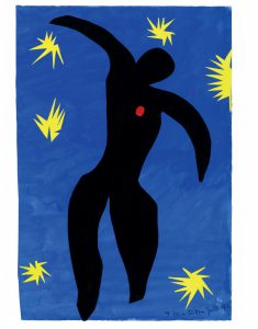
Fauvism – Henri Matisse’s fauvist paintings and paper cut-outs
“Dance” Use of fauvist palette – the intense warm colours against the cool blue-green background“The circus” Raw quality of cut-outs inspired my use of fabric cut-outsUse of vibrant colours to express emotional state
“The clown” “The fall of Icarus”
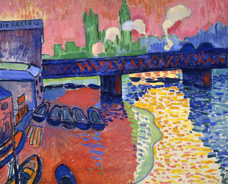
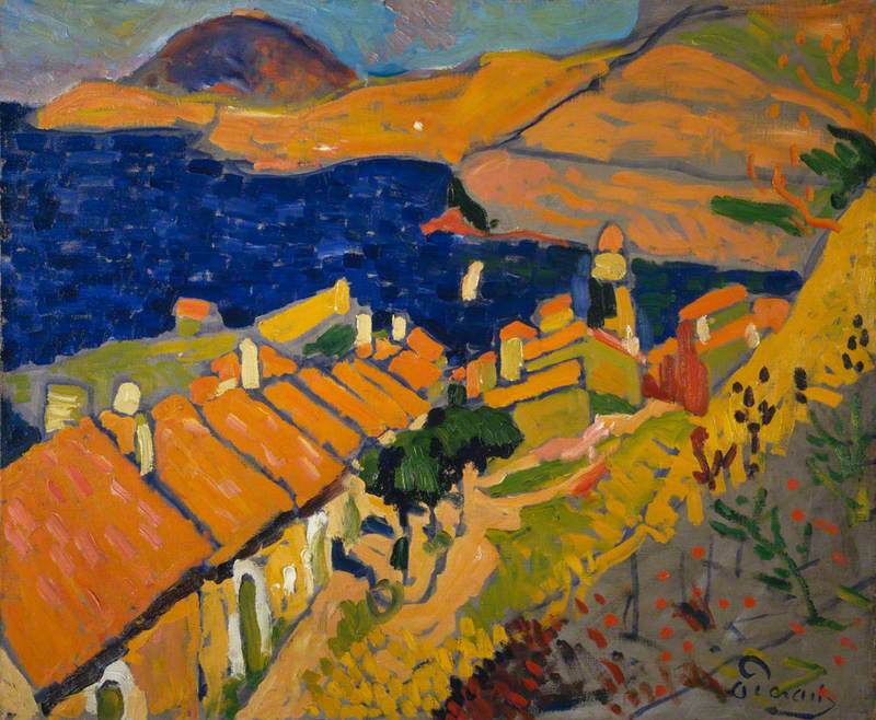
Fauvism – Andre Derain
Oil paintings of vibrant pure hues and unrealistic portrayal of colour and light to express emotive qualities.
Derain, Andre; Collioure; National Galleries of Scotland; http://www.artuk.org/artworks/collioure-211267
EQUATIONS – “What you do defines you”
From the qualities of myself , I thought of symbols that represented those qualities.
Fair skinned me – Tofu
Lazy me – lion
Fancy me – fancy hat
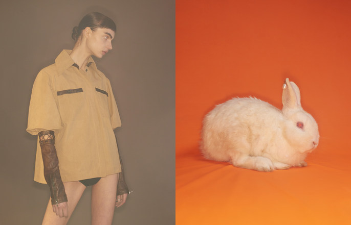
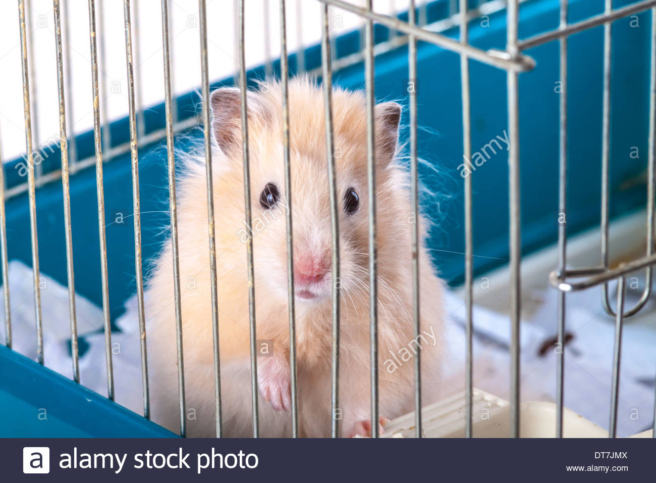
Trapped/ encaged me – hamster
Planning of compositions: I wanted to show the whimsical transition from one symbol to another after the setting, thus I chose different symbols to depict the result.
Final equations:
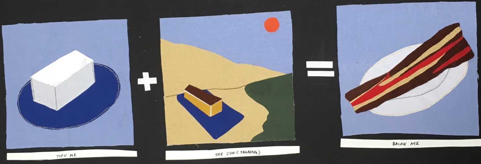
Tofu me + The sun (tanning) = Bacon me
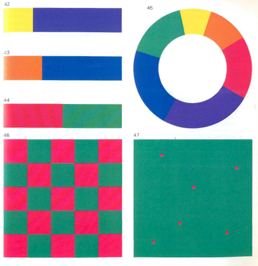
Lazing me + The devil (authority) = Stone Lion me (defensive and angry)
Fancy me + Meeting with friends = Fool/ clown me
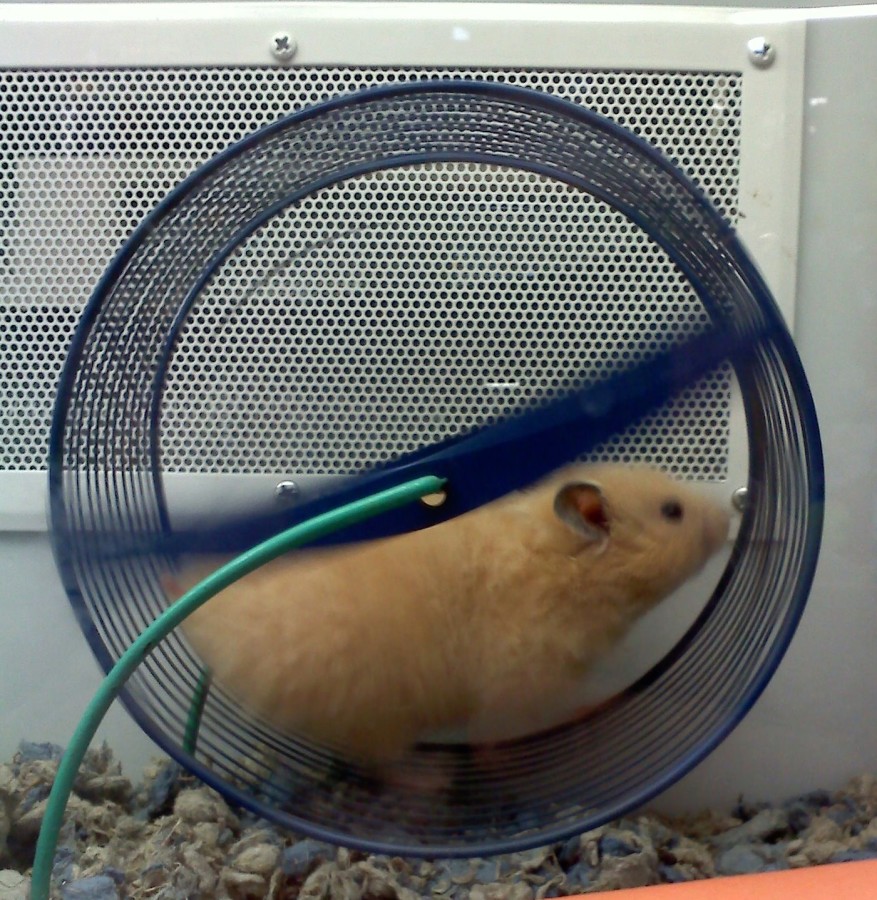
Encaged me + Running the hamster wheel (system that gets you nowhere) = Escaping me
COLOUR SCHEME
Using fabric has limited me to working with pure colour and I am not able to change the value or chroma of the colour of fabric. Thus, I was inspired by the use of bright, pure and untainted colour in the Fauvist movement. Unnatural colours are radically used, separating colour from its usual representational and realistic role, giving new, emotional meaning to the colours. Colour could project a mood and establish a structure within the work of art without having to be true to the natural world.
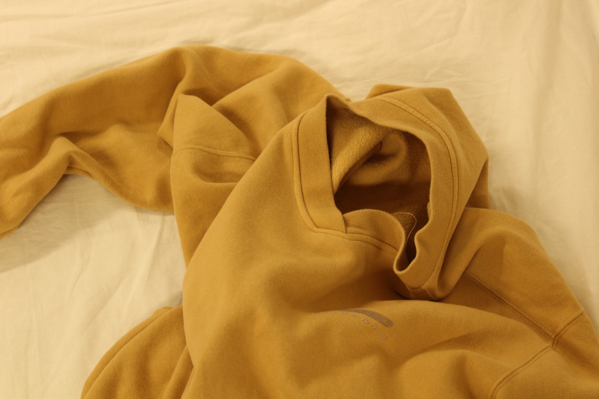
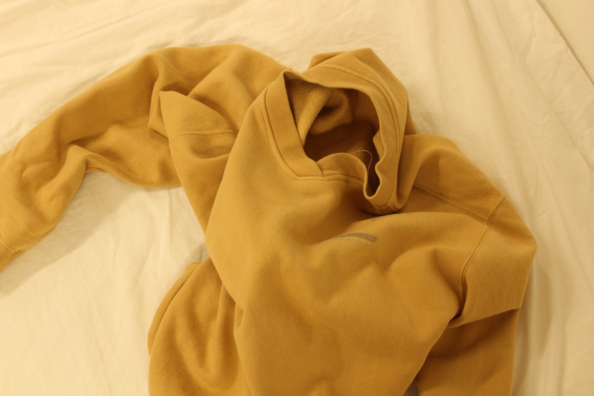
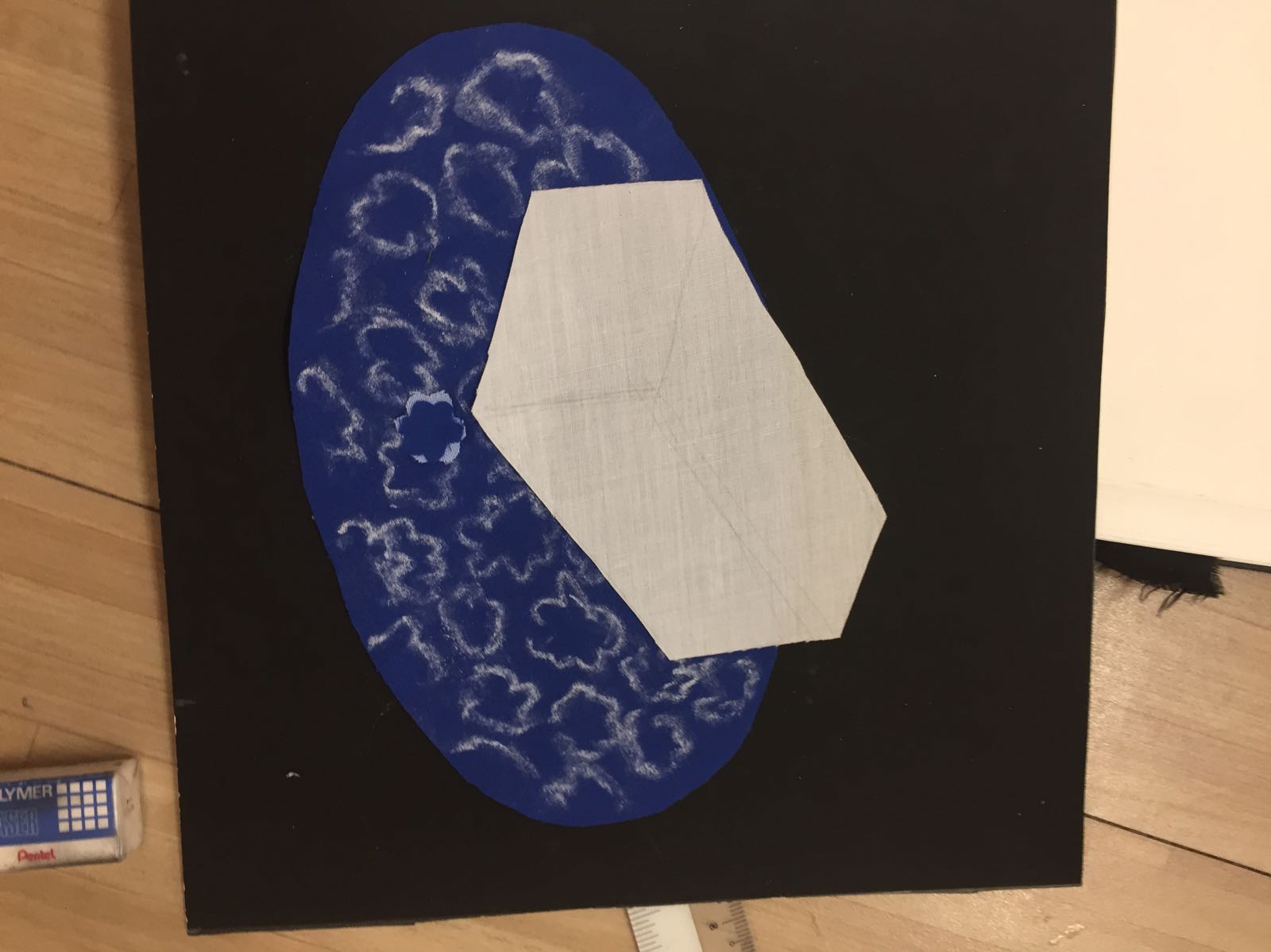
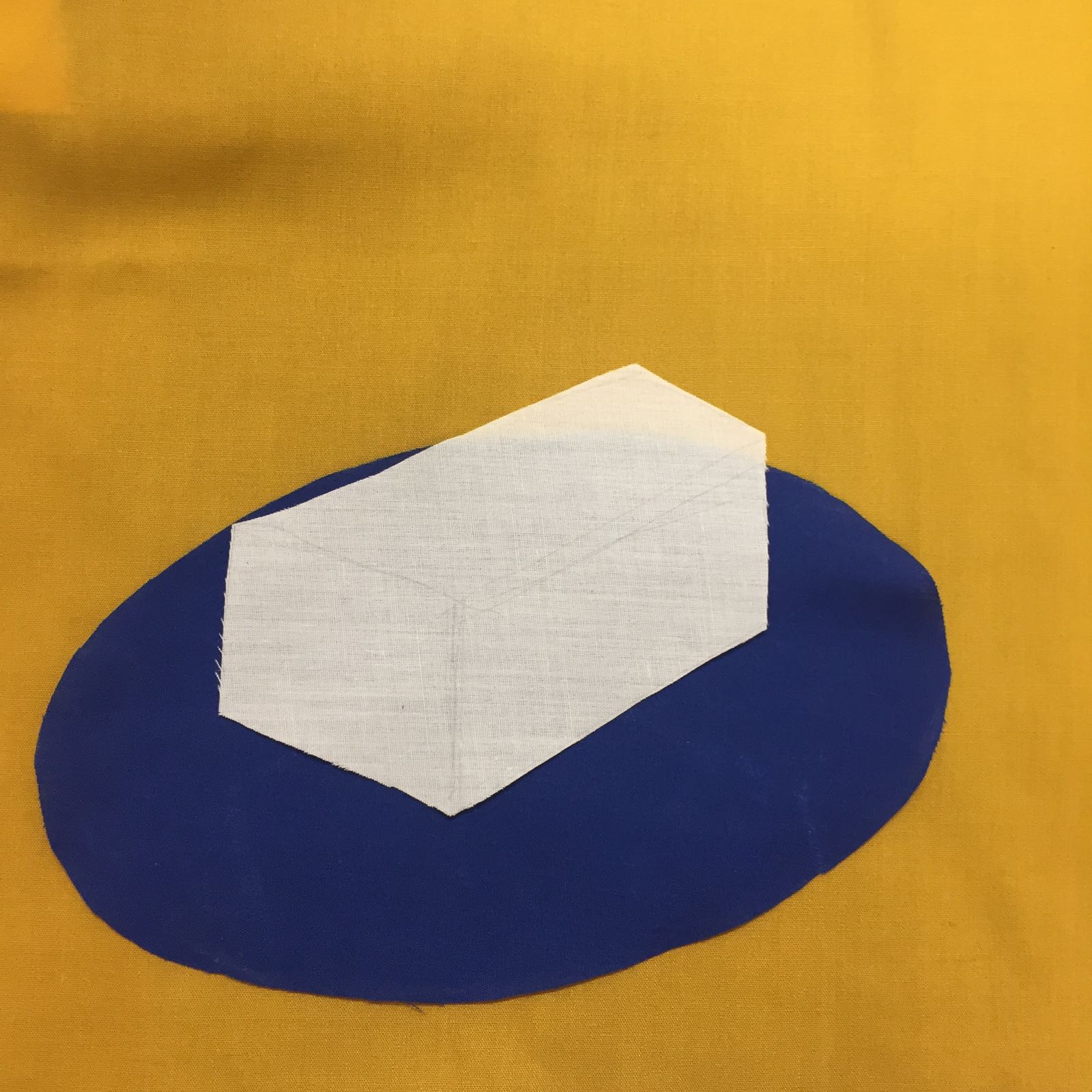
PANEL 1 (Tofu + tanning = bacon)
Colour scheme – I wanted to use cool blue tones to contrast the white colour of the tofu (first) to the bright reds of the bacon (third).
Complementary colour scheme
Image references for composition
Fabrics usedTrying our design for plate – decided to omit this as it was too distracting
Light blue, yellow and grey background – Chose the cool blue tone in the end
Analogous colour scheme used for bacon
Final Panel:
PANEL 2 (lazy lion + meeting the devil = Stone lion)
Analogous colour scheme for the “lazy lion”Analogous colour scheme of red for “meeting the devil”
Image references
Final composition
PANEL 3 (Fancy me + Meeting friends = Clown me)
Complementary colour scheme of blue and yellow for “Fancy me”Analogous colour scheme for “meeting with friends”Final composition
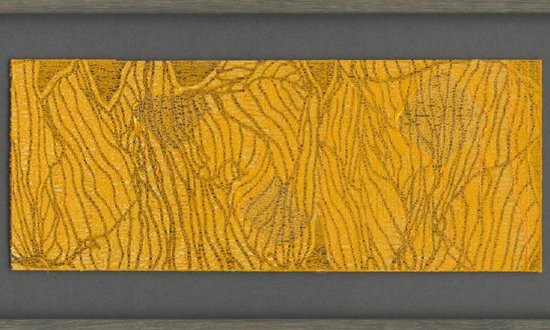
PANEL 4 (Encaged me + Forced into repetitive system = Escaping me)
“The Elements of Colour”
A Treatise on the Colour system of Johannes Itten
Colour aesthetics may be approached from these three directions:
Impression (visually) Expression (emotionally) Construction (symbolically)
“Symbolism without visual accuracy and without emotional force would be mere anemic formalism: visually impressive effect without symbolic verity and emotional power would be banal imitative naturalism: emotional effect without constructive symbolic content or visual strength would be limited to the plane of sentimental expression.”
Concord of colours COLOUR HARMONY
Harmony in our visual apparatus, then, would signify a psychological state of equilibrium in which dissimilation and assimilation of optic substance are equal. Neutral grey produce satisfaction of the eye, creating harmonic equilibrium.
When a set of two or more colours contains yellow, red and blue (may be substituted for the sum total of colours) in suitable proportions, the mixture will be grey.
Mixing of grey:
– black and white
– two complementary colours (contains all 3 primaries) and white
– three primary colours in suitable proportions
Goethe “A particular colour incites the eye, by a specific sensation, to strive for generality. In order, then, to realise this totality, in order to satisfy itself, the eye seeks, beside any colour space, a colourless space wherein to produce the missing colour. Here we have the fundamental rule of all colour harmony”
Theories
1. Goethe’s luminosities of primary colours
Harmonious composition – following proportionality of areas: yellow : red : blue = 3 : 6 : 8
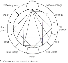
2. Harmonies in complementary pairs, triads and tetrads
General statement: All complementary pairs, all triads whose colours form an equilateral or isosceles triangles in the twelve-member colour circle and all tetrads forming squares or rectangles are harmonious.
3. Colour intensity
Equilateral triangle of the colour circle of yellow, red and blue – expresses the highest intensity and force of colour. In the combination, each has its static effect, that is, the yellow acts as yellow, the red as red, the blue as blue. The eye demands no additional, completing colours and the mixture of the three is a dark grey-black.
SUBJECTIVE TIMBRES
Interpretation of subjective colour combinations is not to be based on the several chromas and their expressional values alone. The timbre as a whole is of first importance, then the placement of the colours relative to each other, their directions brilliances, clarity or turbidity, their proportions, textures and rhythmic relationships.
Timbre of subjective colour propensities vary with industry for decorators and designers.
eg. Meat market – light green and blue-green tones, for various meats to appear fresher and redder.
Confectionary – light orange, pink, white and accents if black, stimulating an appetite for sweets
Subjectivity of colour spectrum
If an interior decorator’s personal spectrum is dominated by blue-grey, he will “naturally” tend to do all sorts of interiors in blue-grey tones, these being particularly satisfying to himself. Clients who are chromatically “related” to him will be pleased, but those who are attuned to orange, or green, will find their surroundings uncongenial and will feel ill-at ease.
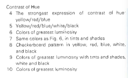
COLOUR CONTRAST
Contrast of Hue – undiluted colours in the most intense luminosity
Colour intensity:
red/ blue/ yellow > orange/ green/ violet > tertiary colours
Example of use of contrast of hue:
“Composition 1928” Piet Mondrian
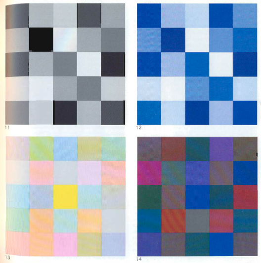
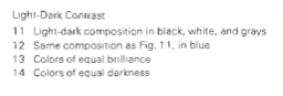
Light- Dark Contrast
Examples of light-dark composition:
“Lemons, oranges and Rose” by Francisco de Zurbaran (1598-1664)
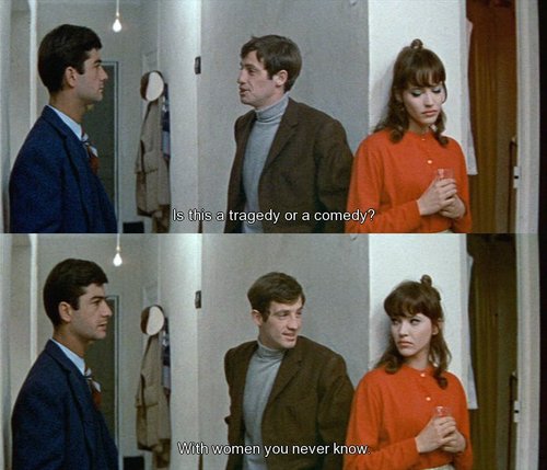
I chose my movie quotes to portray the irony of being classy in a trashy way, in particular the retorts given after being challenged. The main focus is parody, to capture the visual narrative in a humorous way through the use of imagery and symbols.
ARTIST REFERENCES
Pop-Art – Roy Lichtenstein
Lichtenstein’s paintings and precise compositions of comic images and pop images documented while they parodied, often in a tongue-in-cheek manner.
Drowning Girl, 1963
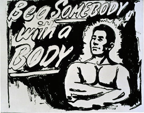
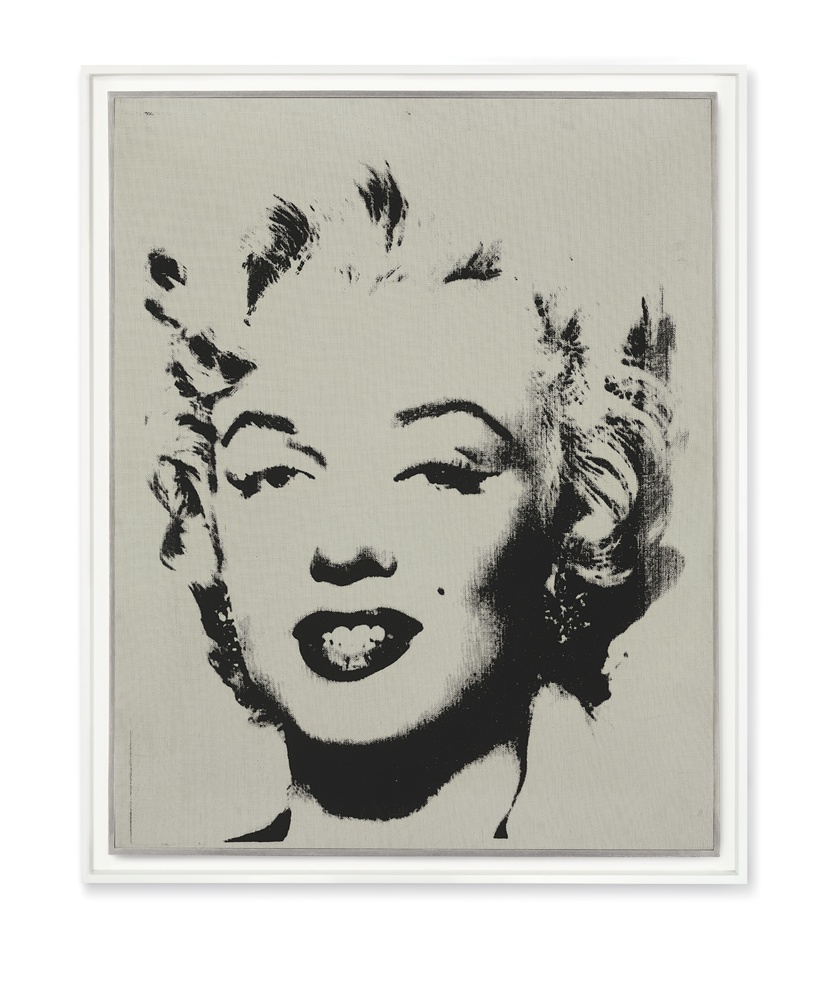
Pop-Art: Andy Warhol’s silkscreen print
Using pop icons and celebrities as symbols of pop culture, the silk screen prints reflects the mass-production and proliferation of such symbols in society.
Eight Elvises, 1963Be a Somebody with a Body, 1985–86
Marilyn Monroe
I wanted to portray the irony of my quotes in a whimsical manner, thus the style is influenced by pop art’s use of symbols and iconic imagery.
Movie 1 – Happiness (1996)
Quote: ” A lard-ass fat-so? You think I’m shit? Well, you’re wrong, ’cause i’m champagne.”
I chose a quote with obvious visual imagery, with contrasting subject matter to put a play between the images.
Subject matter: USE OF BRANDS AS SYMBOLS
Influenced by pop-art, I wanted to incorporate the symbol and imagery of brands, as they are instantly recognisable and well-spread in society.
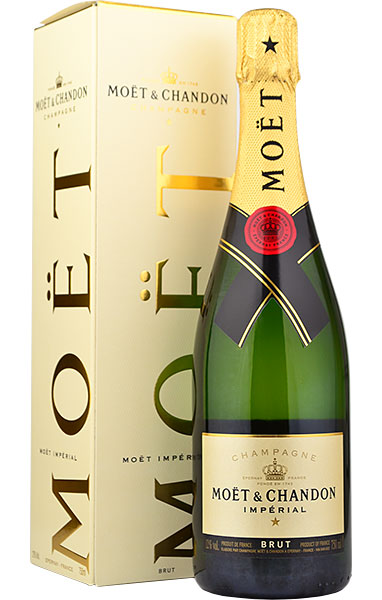
‘Moet’ champagne – known for its brand
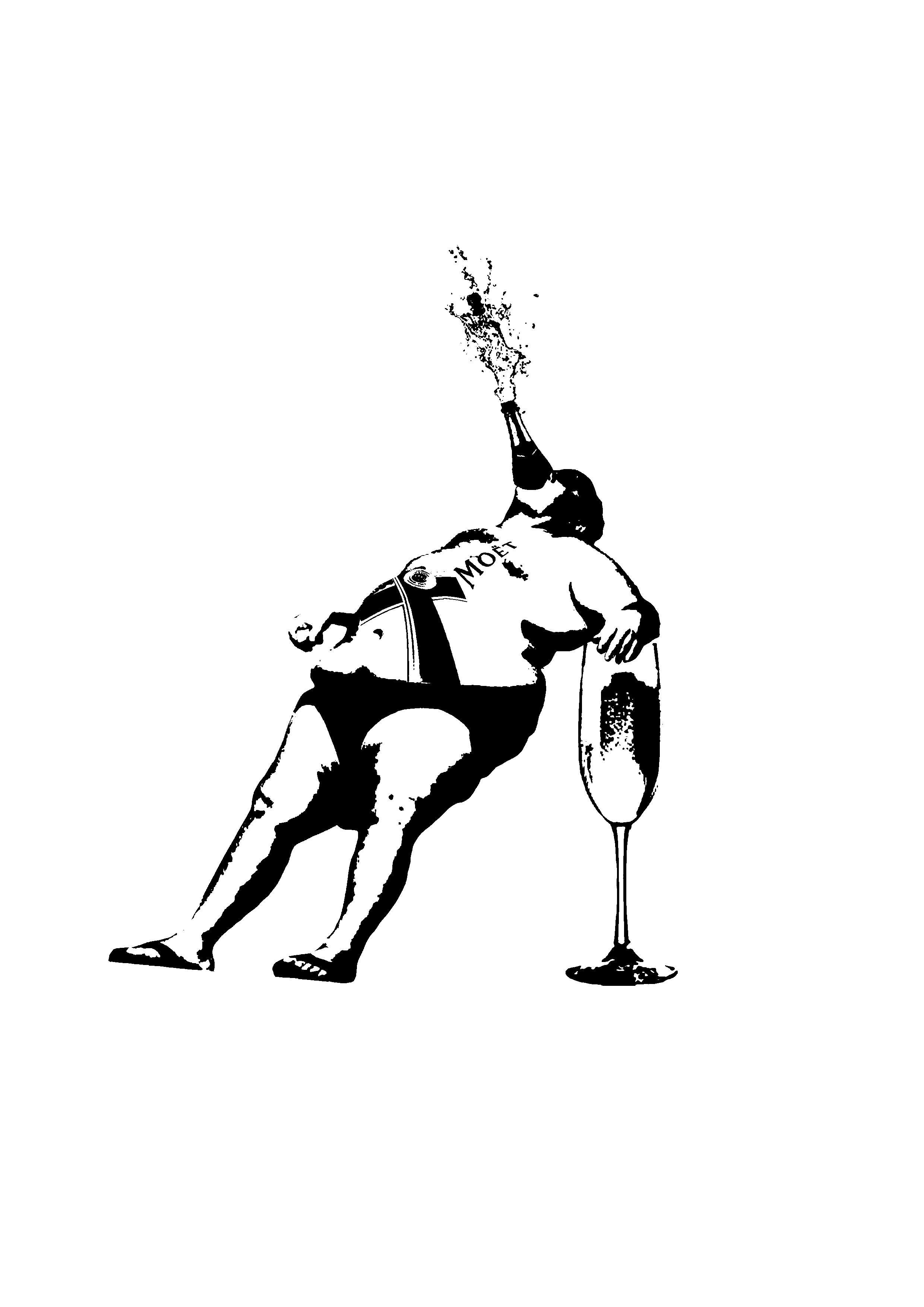
I combined the champagne with the image of a “fat-so”, with the brand logo inscribed on his body and champagne popping out of his mouth.
Initial design 2
I realised the body has a bottle shape, thus to visualise “I am champagne”, I connected the bottle neck to his top of the head.
Initial composition
Comments: The man is not balanced, has an awkward position, should have him leaning his weight against something.
Edits: Place a ” chair” of a ice bucket, used to hold champagne.
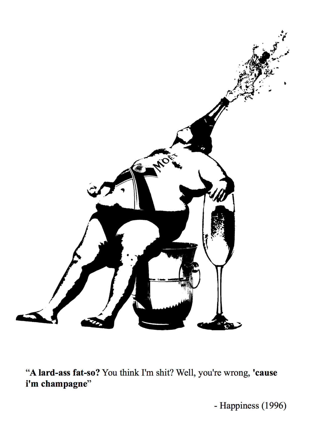
The man has a relaxed pose, as if acting cocky and proud, and is fused as a moet champagne bottle using humour in the visual imagery.
Final Design 1
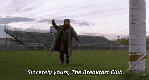
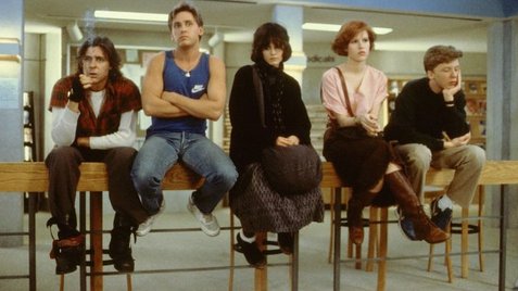
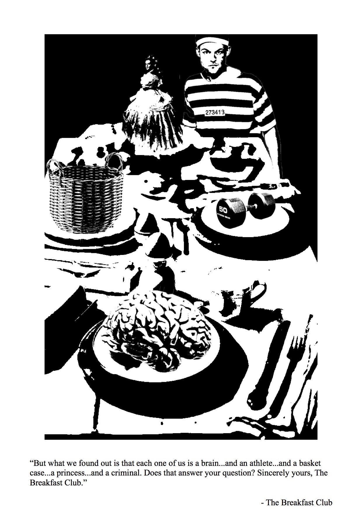
Movie 2 – The Breakfast Club (1985)
Five high school students meet in Saturday detention and discover how they have a lot more in common than they thought.
Quote: ” But what we found out is that each one of us is a brain…and an athlete…and a basket case…a princess…and a criminal. Does that answer your question? Sincerely yours, The Breakfast Club.”
I wanted to portray a breakfast table, with each stereotype on a place to capture how society is out to “eat” them up.
I place the criminal as a human figure to show how society incriminate the young teens with stereotypes by locking them up.
Final Design 2
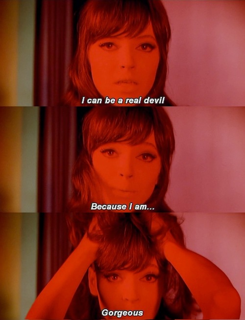
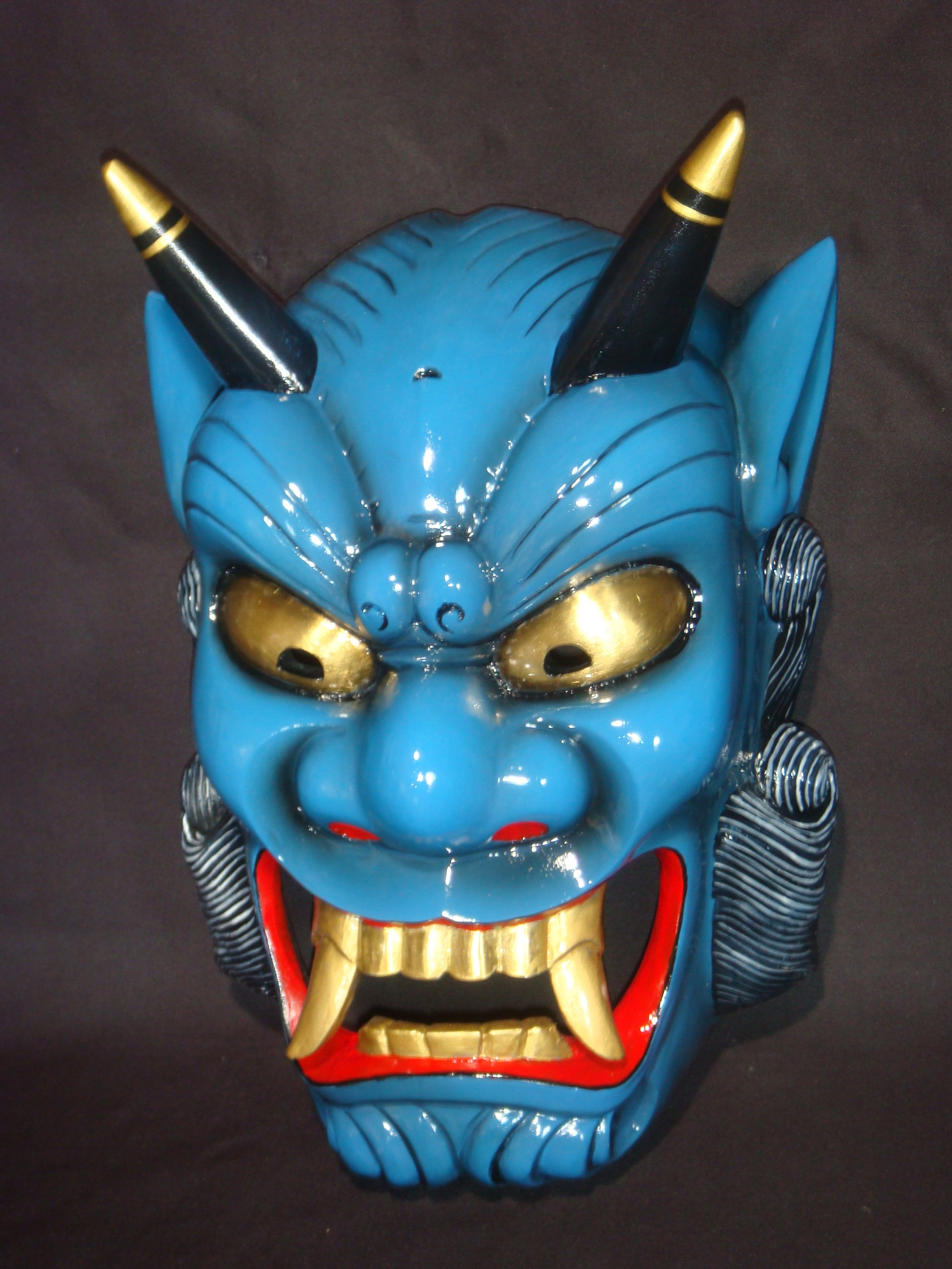
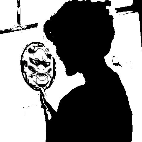
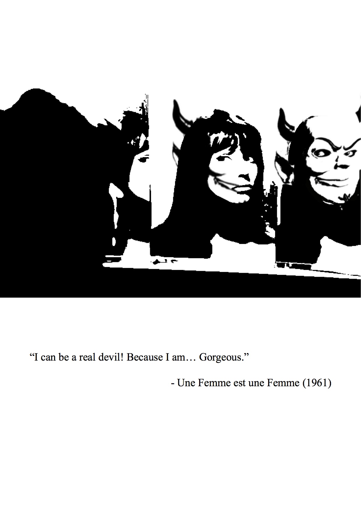
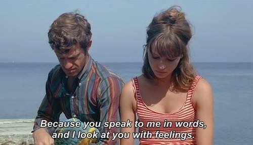
Movie 2- Une Femme est une femme (1961)
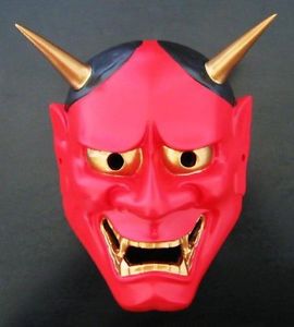
Quote: “I can be a real devil because I am… Gorgeous”
Imagery of devil – Japanese Oni
Initial Design
I did not like the silhouette so I changed the composition into overlap faces in mirrors. It shows the gradual change of the girl turning into a devil in the mirror, the symbol of vanity and beauty.
Final Design 3
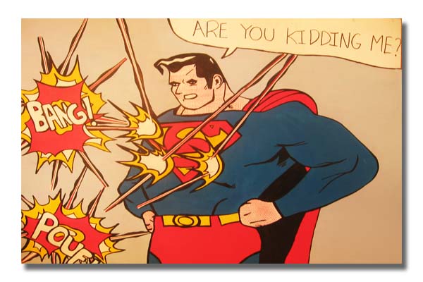
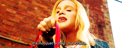
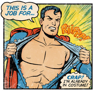
Movie 4: White Chicks (2004)
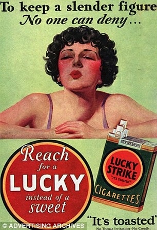
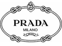
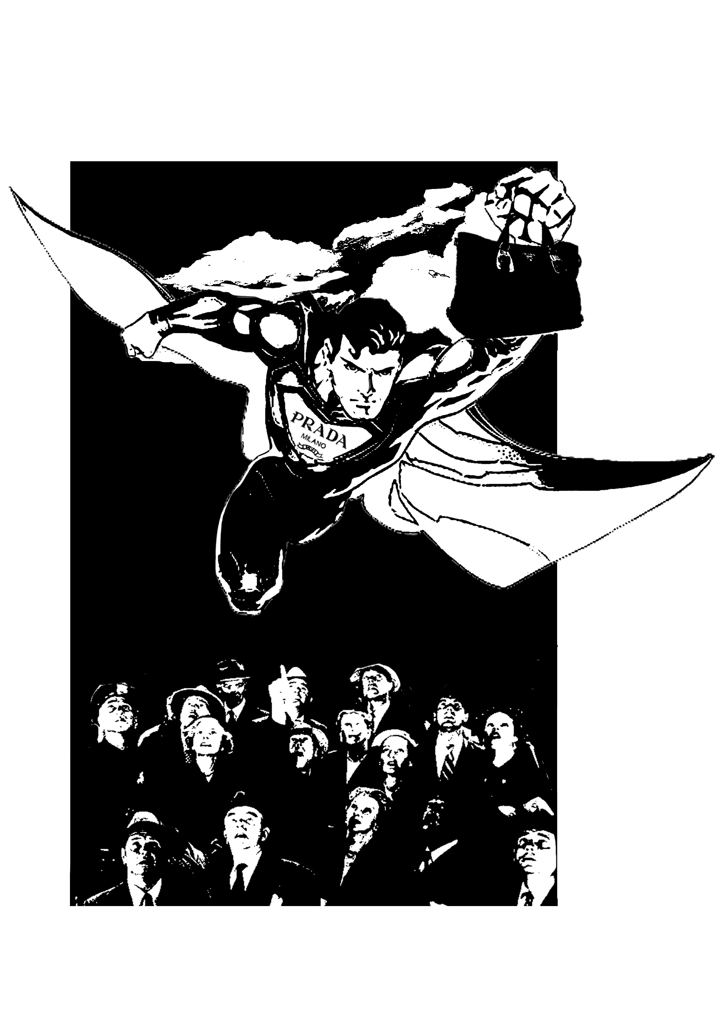
Quote: It’s not just a bag. It’s Prada.
Initially, I interpreted this quote like a 60s vintage adverts as the quote sounds like a advertising tagline.
References:
However, I felt that it was too literal. I brought the focus to “It’s not just a bag”, thus, wanting to play with the idea of the prada bag achieving more or has superpowers.
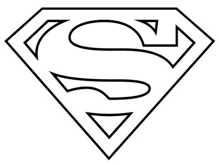
Symbol of superman: Superpower
I wanted to present the contrast between Superman, known for his masculinity, and the prada bag, a symbol of the feminine.
Use of BRANDS: the Prada logo
I wanted to combine both recognisable logos for parody.
Initial design
The people looking up is a play on the “It’s a bird, It’s a plane… It’s Superman” and the quote “It’s Prada”.
Comments: The faces and details are washed out. The expression on Superman should be more detailed.
Edit: I added in the details and the expression of Superman.
Final Design 4
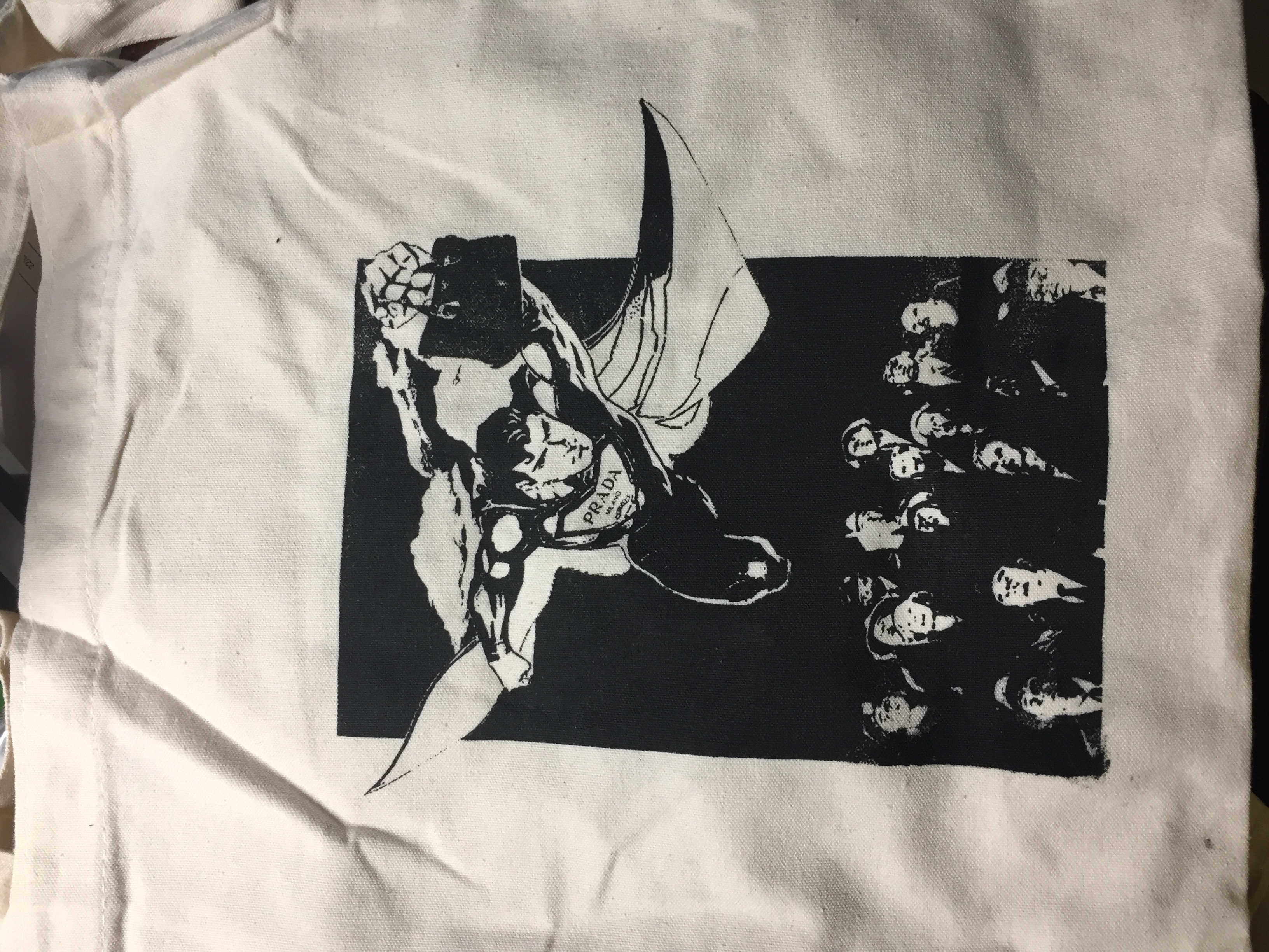
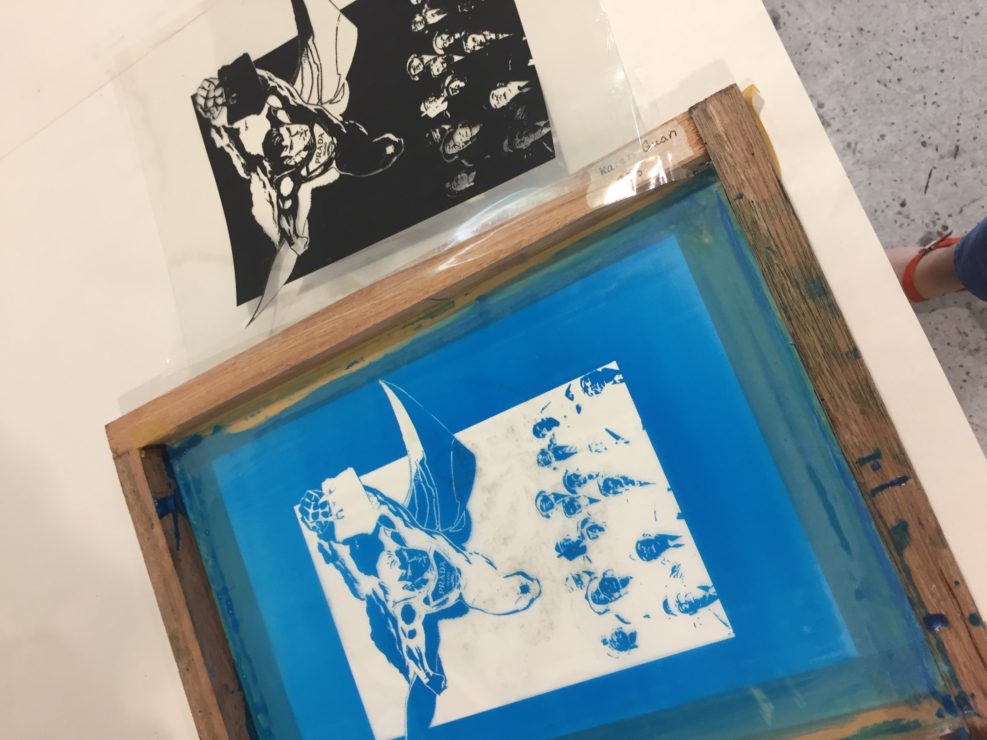
SILKSCREEN BAG
I used design 4 for my silkscreen print on the tote bag, as I feel the rectangular composition will look nice.
ANDY: You think I don’t appreciate art? You think I don’t understand fashion? You think I’m not hip? You think I’m pathetic? A nerd? A lard-ass fat-so? You think I’m shit? Well, you’re wrong, ’cause i’m champagne, and you’re shit. Until the day you die, you, not me, will always be shit.
“You see us as you want to see us—in the simplest terms, in the most convenient definitions. But what we found out is that each one of us is a brain…and an athlete…and a basket case…a princess…and a criminal. Does that answer your question? Sincerely yours, The Breakfast Club.”
Une Femme est une femme (1961) – A woman is a woman
OVER-ARCHING CONCEPT – emotional quality of textiles
I have always been interested in the visual quality of textiles and believe that they do hold an emotive quality to them. According to “Emotional textiles: An introduction” by Alice Dolan and Sarah Holloway, material objects such as garments and textiles”provide a wealth of opportunities for reconstructing material vocabularies of emotion”. I aimed to recreate the two-dimensionality (prints) and three-dimensionality (texture) of textiles on a flat piece of surface using materials and mark-making tools involved in textile design and fabric-making.
INSPIRATION
Jan Koen Lomans is a fine artist who works with textiles to create his emotive, abstract compositions of the theme of nature. He assembles different fabric and textiles in each composition to capture the emotion using lines and texture. However, the use of colour impacts greatly on the emotion and that may be a limitation in my using of textile mediums for mark-making.
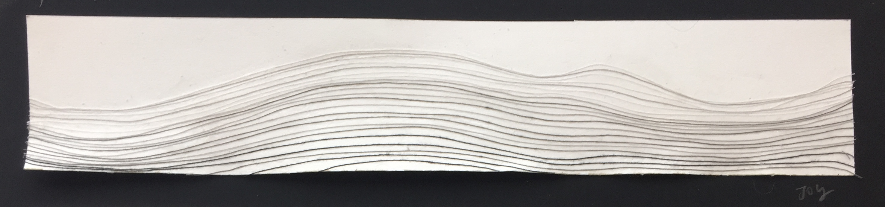
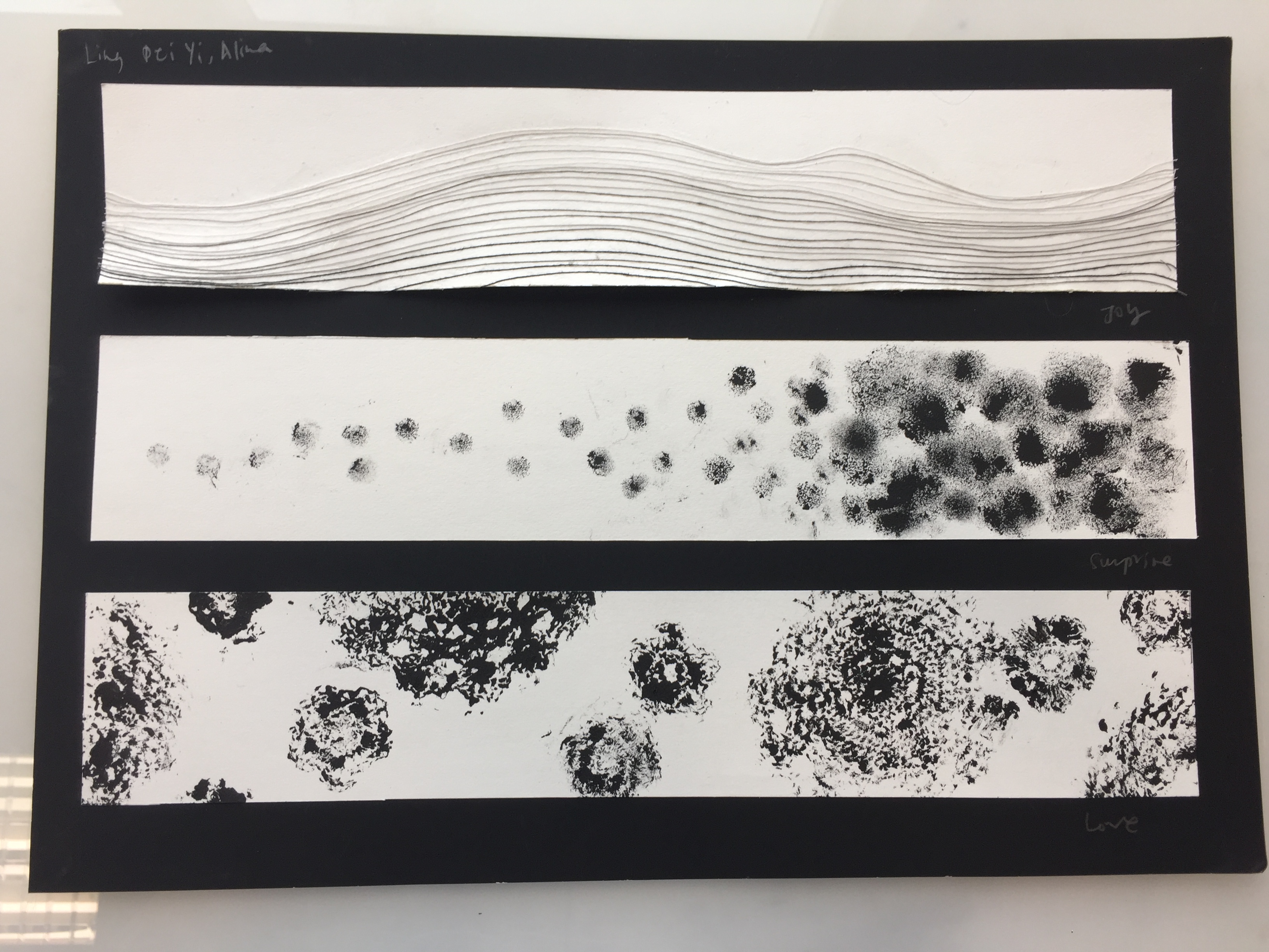
JOY
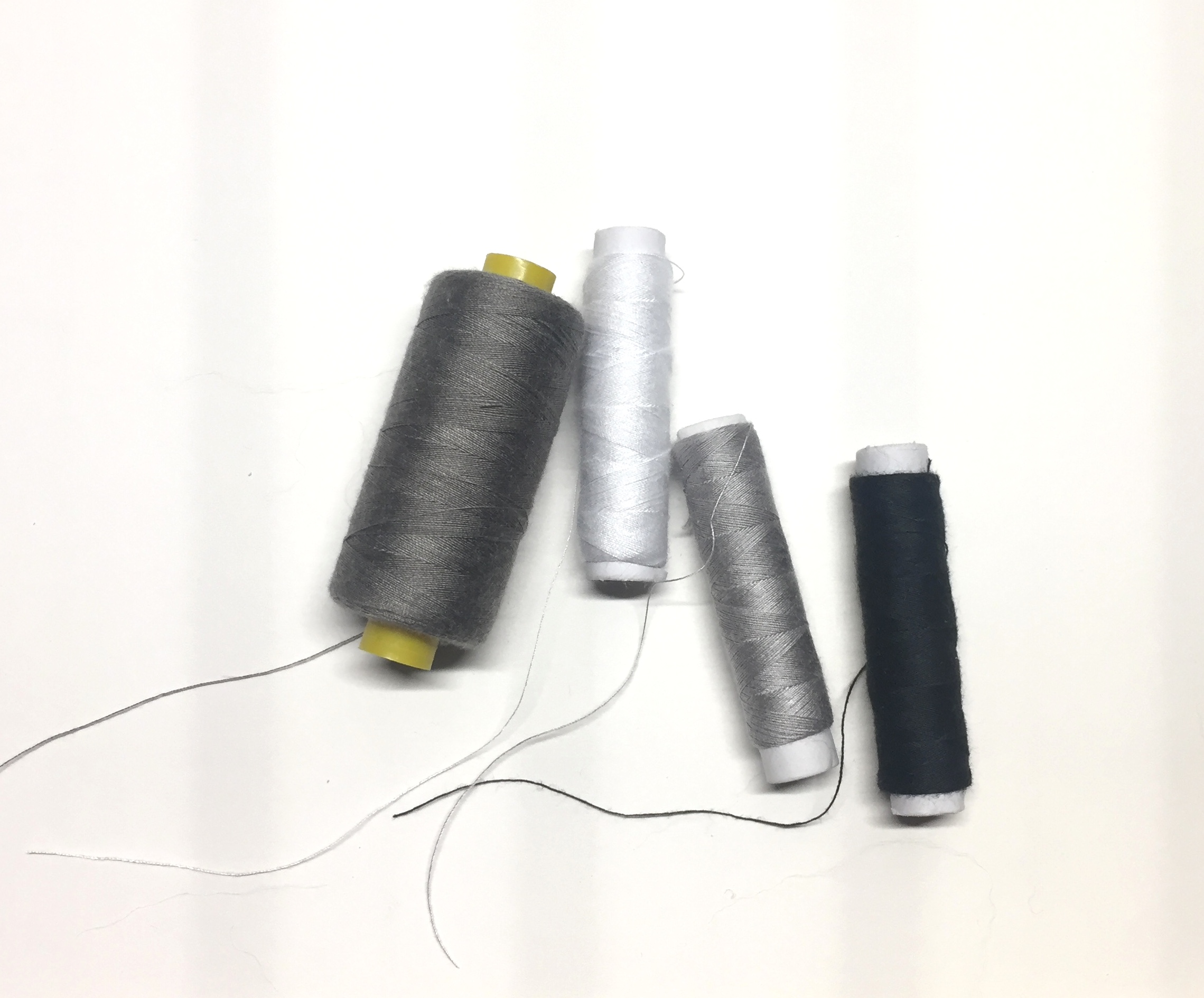
To me, Joy is silent, quiet and subtle. Flowing gently, I wanted to use the lines to convey calmness and the smoothness of the emotion. Inspired by the lines and folds of pleated cloth, I used thread as a medium and composed the movement line by line using fabric glue.
Using different threads of different colours (white and gradients of black), I tried to created the folds of these sculptural fabrics. Using space between lines to convey depth and volume, I tried to incorporated the three dimensionality as much as possible.
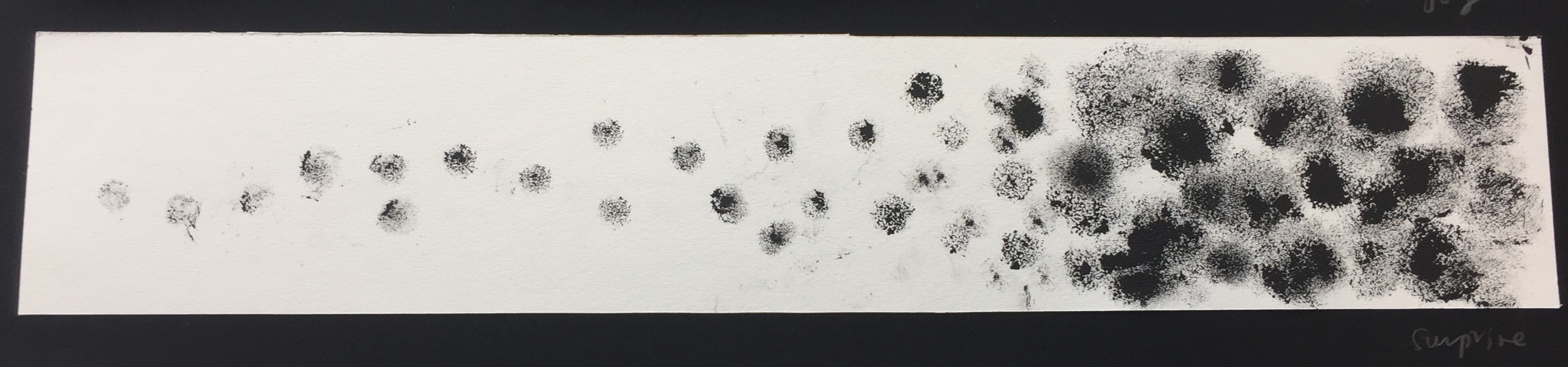
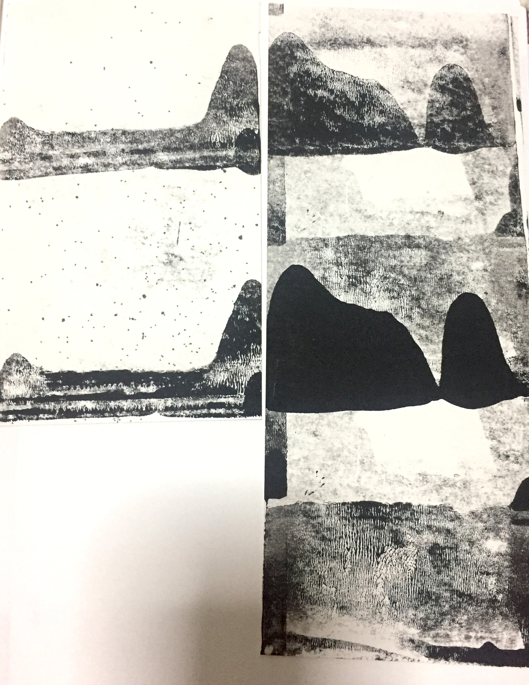
SURPRISE
Surprise has an obvious narrative, where elements are built up and then exploded in an moment. Inspired by Lomans’ textural use of the terrycloth (fabric made of tiny loops or protrusions), I sourced for similar material to imprint and to experiment with its texture.
I found tiny puffs of similar material of varying sizes and used them as a mark making tool with black acrylic paint. I also experimented with loose wool by fixing it upon the prints. However, it had more of an implication of decay than intended and thus was not used.
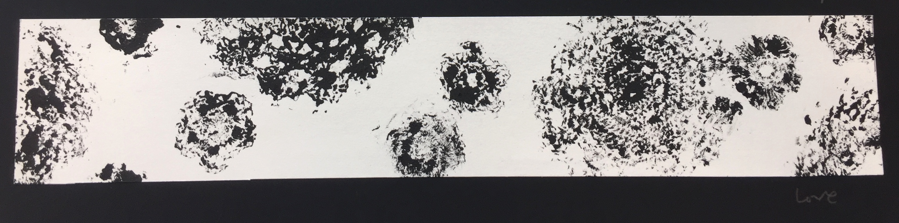
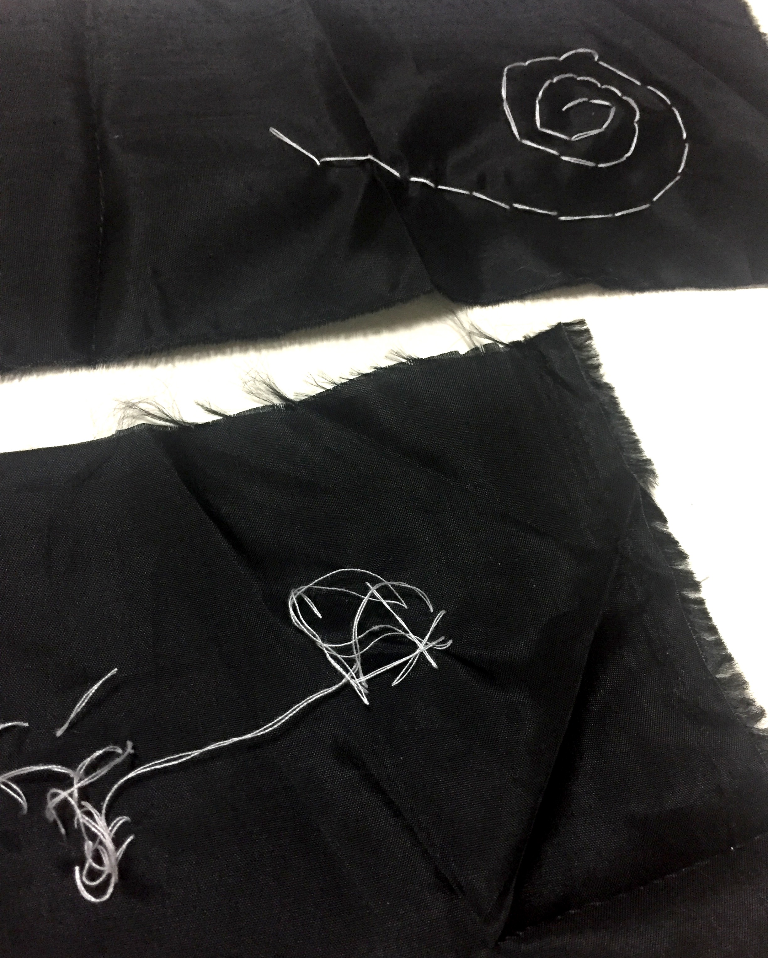
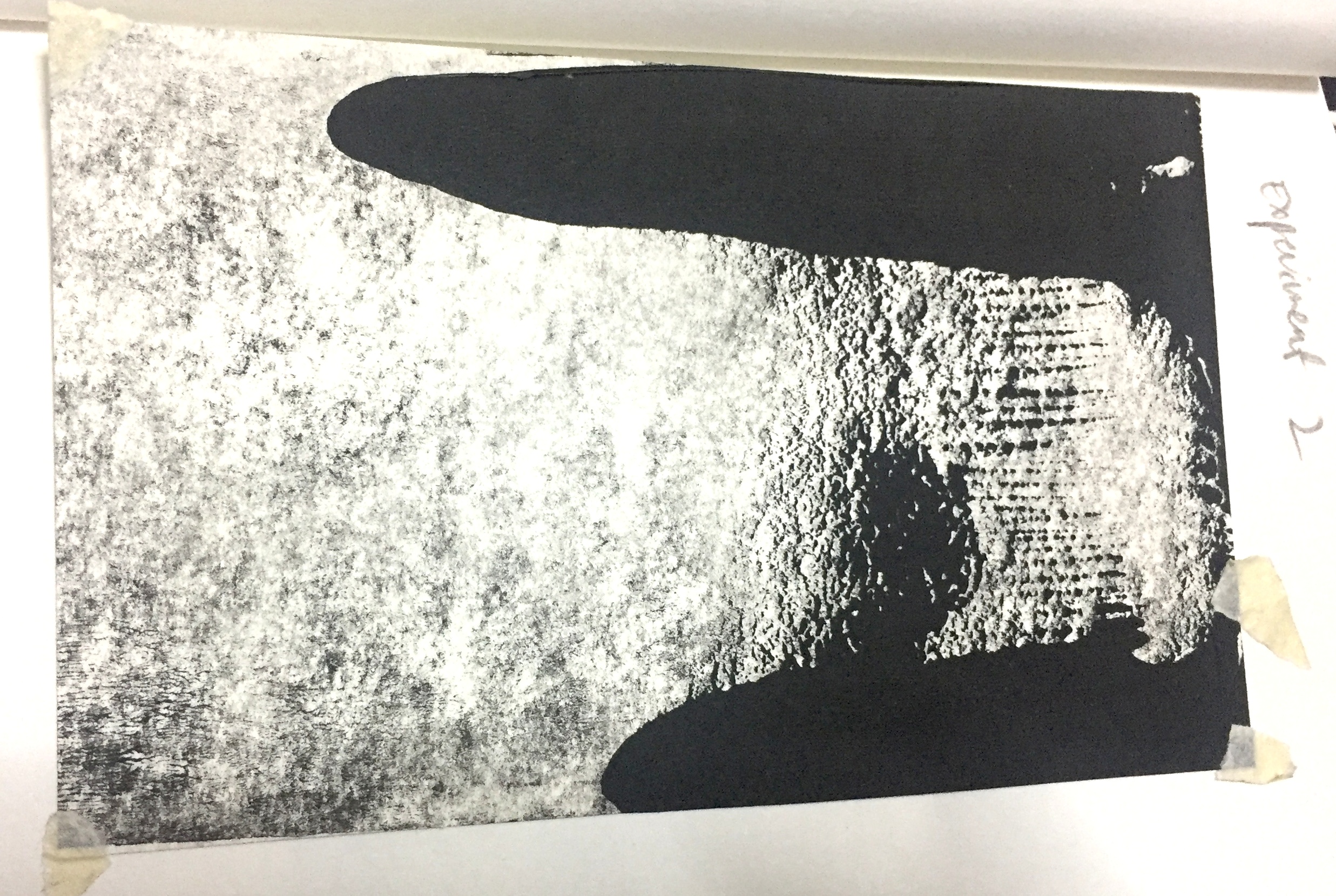
LOVE
Love is composed of prints made from crochet patches, a symbol of personal craft and maternal love. I feel like this print was not the most successful in its composition and does not capture the texture of the textile printed.
Crochet fabric
Initially, for the emotion of love, I worked with black satin fabric and embroidery with white thread. But due to incompetency of embroidery skills and time constraint, I was unable to create a print that could convey the emotion of love, an explosion of feelings, well. Thus, I used the prints made with crotchet instead.
.
Created using spunned wires and painted over with acrylic paint
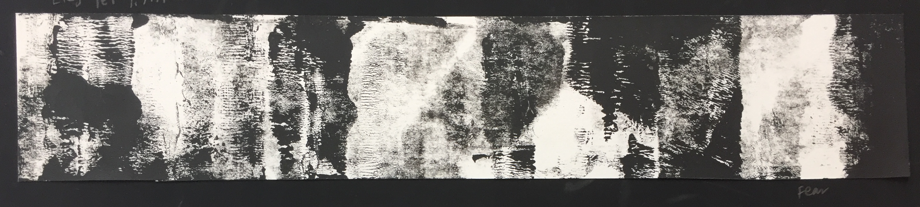
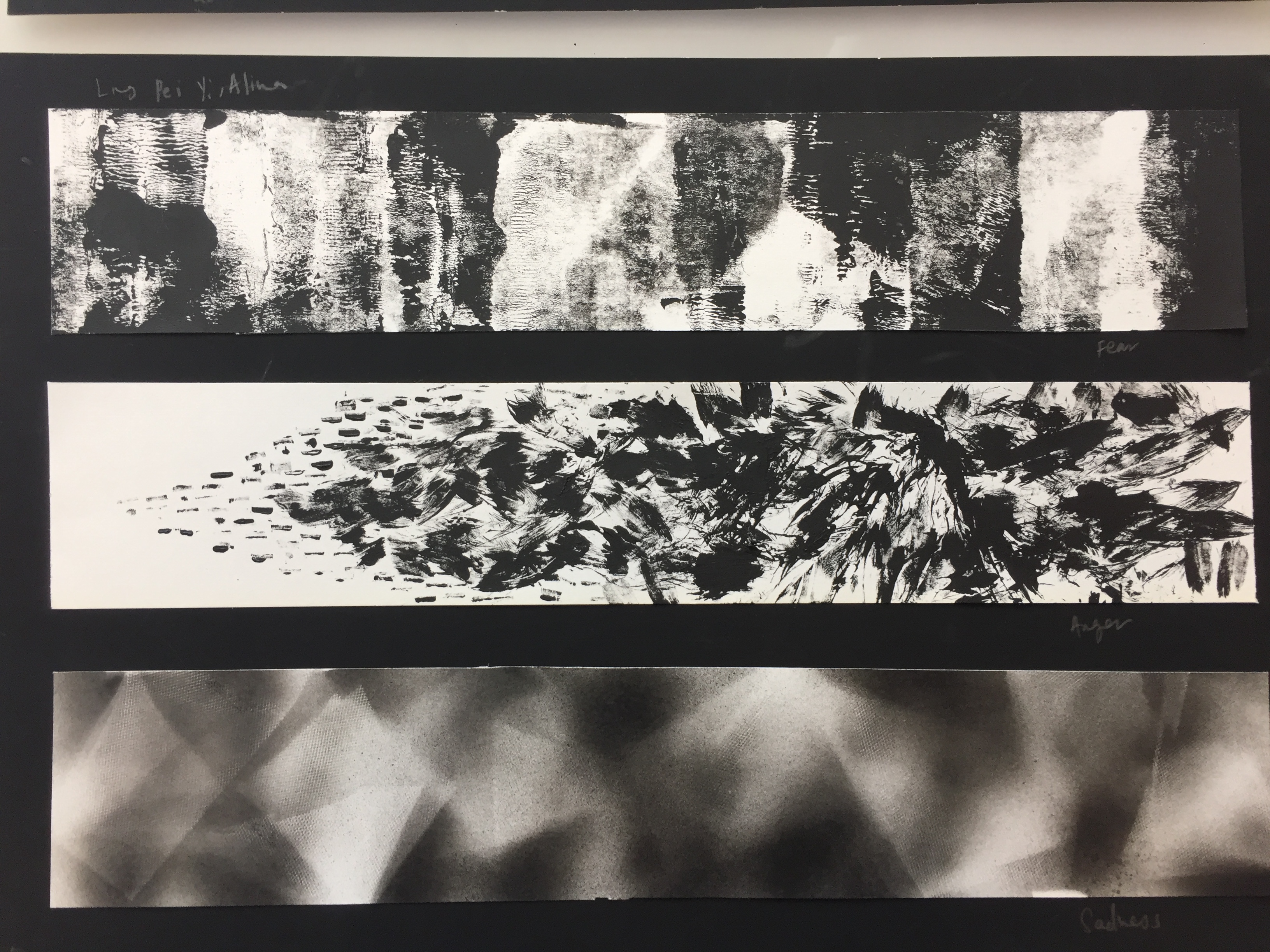
FEAR
Fear is made of repeated, contrasting prints of black and white coupled with textured line quality liken to fabric composed of thread. I intend for the quality of black and white film-noir films, where contrast between light and dark is used to evoke suspense or fear.
I used a roller, liken to the technique of a fabric press, where ink are rolled onto a surface to create prints.
Experiments with paint and roller:
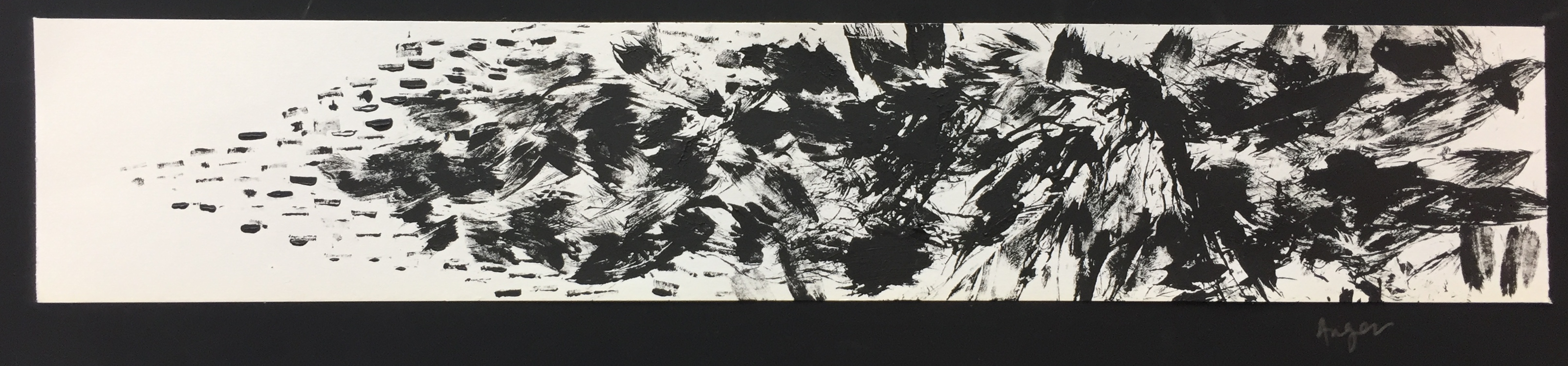
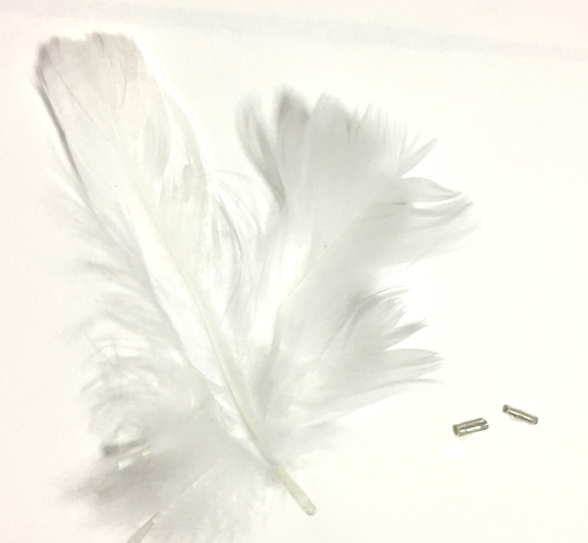
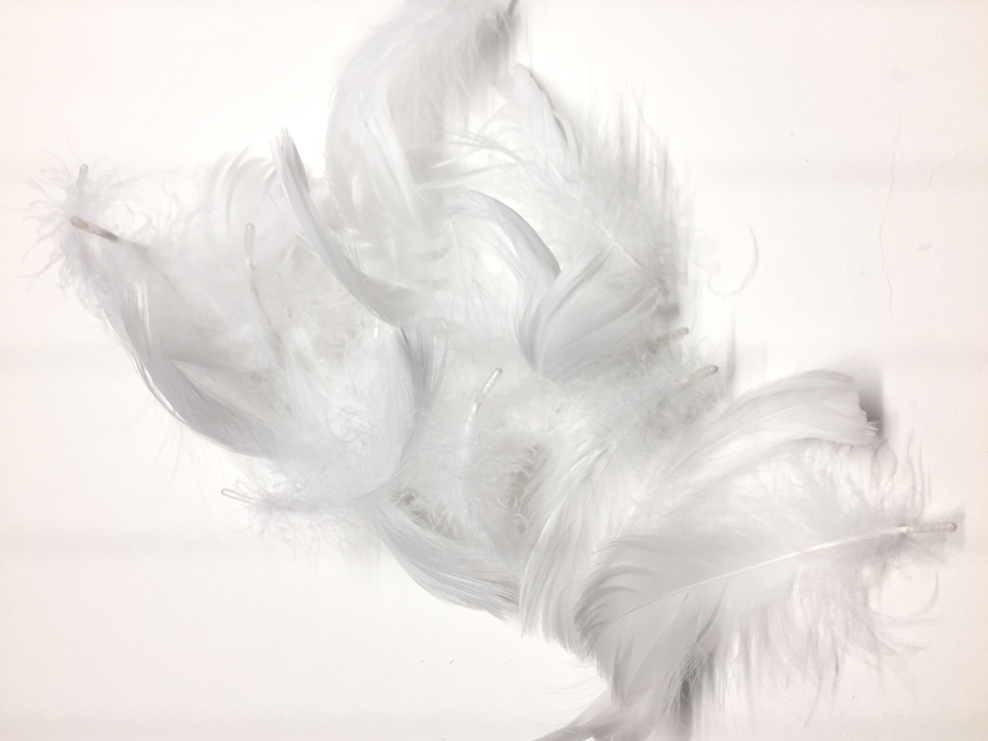
ANGER
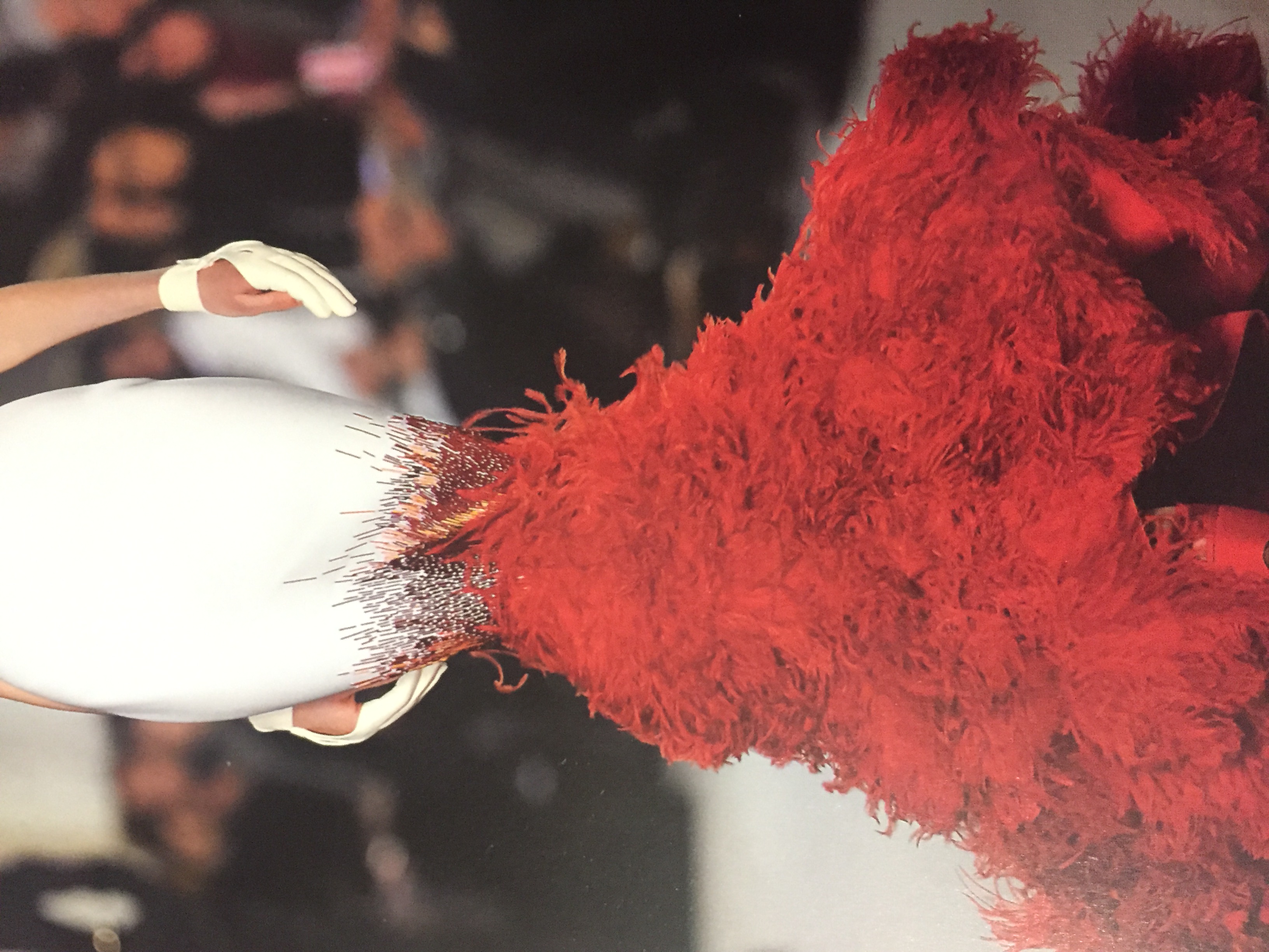
Anger is the outburst of uncontrollable emotion that is triggered by the built up of tiny irritations. Tiny metal sequins and feathers were used as mark making tools, inspired by a textile design I found in a book.
Stephane Rolland, Summer 2012
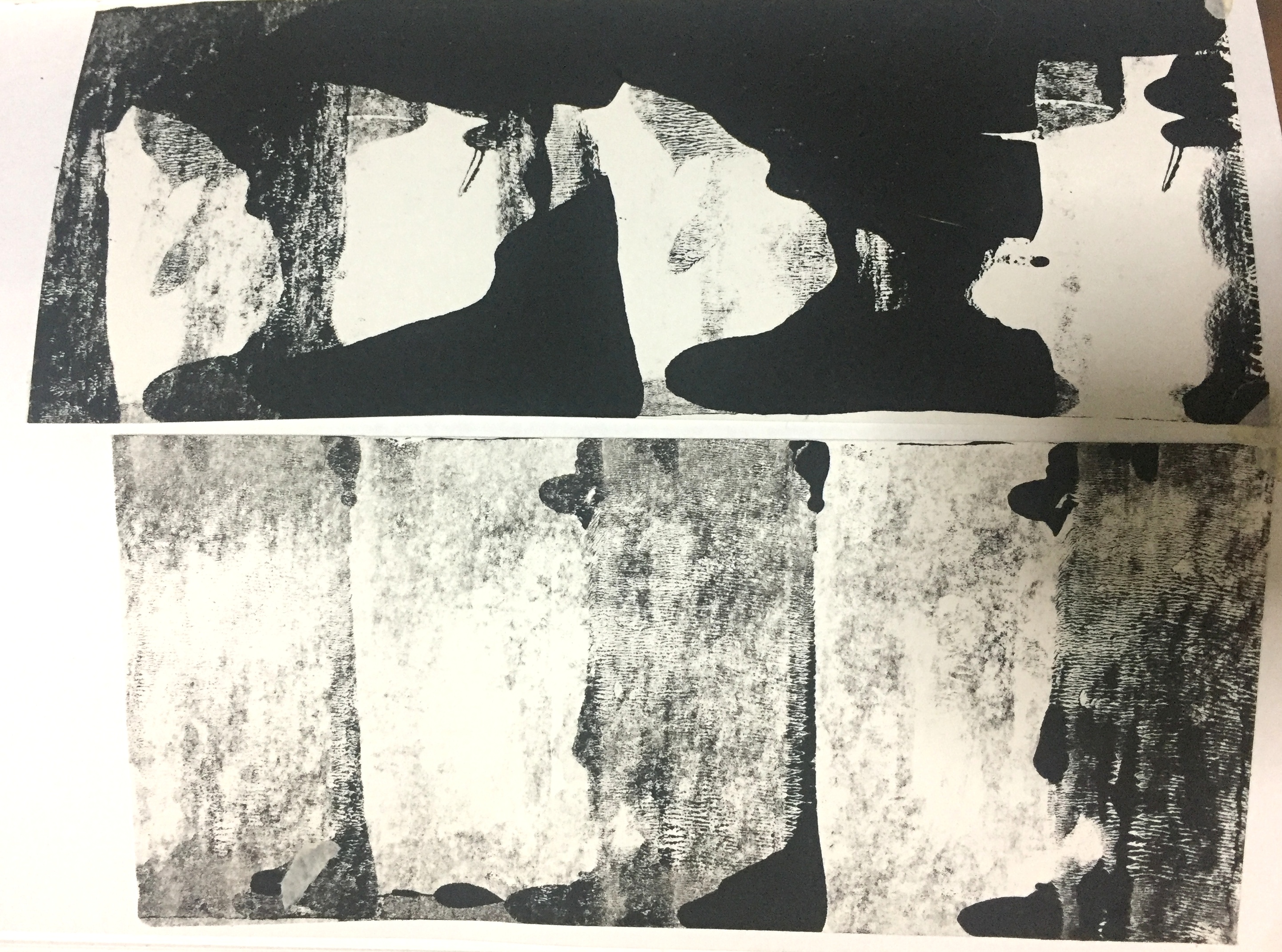
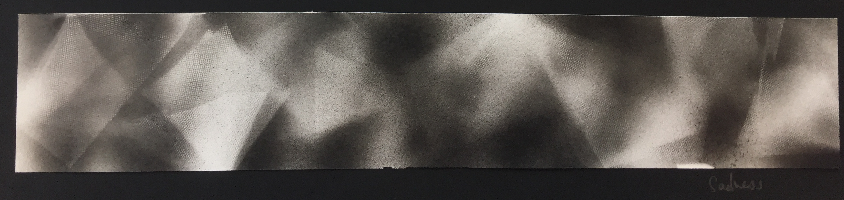
SADNESS
Sadness is experienced through a gloom around your life, where there is misdirection and uncertainty. I used spay-paint over tulle fabric to capture the darkness as well as to capture the print of the tulle fabric.
I experimented with other fabric but only the tulle was porous enough to recreate the print onto paper.


