COLOUR HARMONIES
Colour theories and the emotions colour convey.
“The Elements of Colour”
A Treatise on the Colour system of Johannes Itten
Colour aesthetics may be approached from these three directions:
Impression (visually)
Expression (emotionally)
Construction (symbolically)
“Symbolism without visual accuracy and without emotional force would be mere anemic formalism: visually impressive effect without symbolic verity and emotional power would be banal imitative naturalism: emotional effect without constructive symbolic content or visual strength would be limited to the plane of sentimental expression.”
Concord of colours
COLOUR HARMONY
Harmony in our visual apparatus, then, would signify a psychological state of equilibrium in which dissimilation and assimilation of optic substance are equal. Neutral grey produce satisfaction of the eye, creating harmonic equilibrium.
When a set of two or more colours contains yellow, red and blue (may be substituted for the sum total of colours) in suitable proportions, the mixture will be grey.
Mixing of grey:
– black and white
– two complementary colours (contains all 3 primaries) and white
– three primary colours in suitable proportions
Goethe “A particular colour incites the eye, by a specific sensation, to strive for generality. In order, then, to realise this totality, in order to satisfy itself, the eye seeks, beside any colour space, a colourless space wherein to produce the missing colour. Here we have the fundamental rule of all colour harmony”
Theories
1. Goethe’s luminosities of primary colours
Harmonious composition – following proportionality of areas: yellow : red : blue = 3 : 6 : 8
2. Harmonies in complementary pairs, triads and tetrads
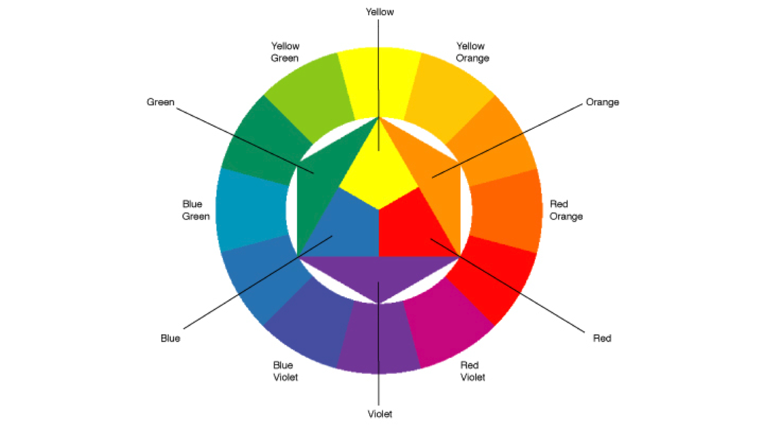
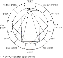
General statement: All complementary pairs, all triads whose colours form an equilateral or isosceles triangles in the twelve-member colour circle and all tetrads forming squares or rectangles are harmonious.
3. Colour intensity
Equilateral triangle of the colour circle of yellow, red and blue – expresses the highest intensity and force of colour. In the combination, each has its static effect, that is, the yellow acts as yellow, the red as red, the blue as blue. The eye demands no additional, completing colours and the mixture of the three is a dark grey-black.
SUBJECTIVE TIMBRES
Interpretation of subjective colour combinations is not to be based on the several chromas and their expressional values alone. The timbre as a whole is of first importance, then the placement of the colours relative to each other, their directions brilliances, clarity or turbidity, their proportions, textures and rhythmic relationships.
Timbre of subjective colour propensities vary with industry for decorators and designers.
eg. Meat market – light green and blue-green tones, for various meats to appear fresher and redder.
Confectionary – light orange, pink, white and accents if black, stimulating an appetite for sweets
Subjectivity of colour spectrum
If an interior decorator’s personal spectrum is dominated by blue-grey, he will “naturally” tend to do all sorts of interiors in blue-grey tones, these being particularly satisfying to himself. Clients who are chromatically “related” to him will be pleased, but those who are attuned to orange, or green, will find their surroundings uncongenial and will feel ill-at ease.
COLOUR CONTRAST
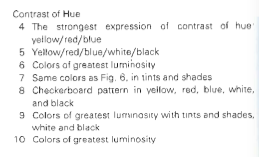
Contrast of Hue – undiluted colours in the most intense luminosity
Colour intensity:
red/ blue/ yellow > orange/ green/ violet > tertiary colours
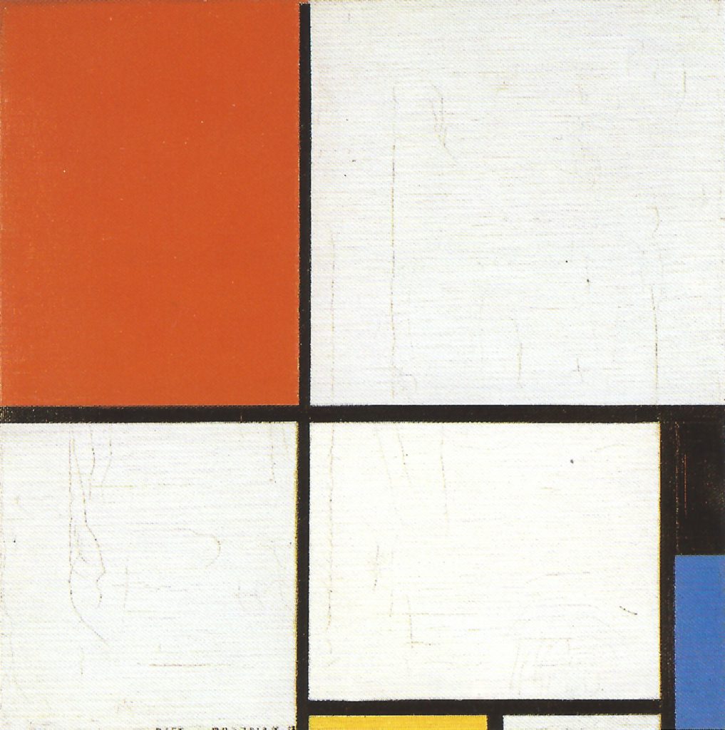
Example of use of contrast of hue:
“Composition 1928” Piet Mondrian
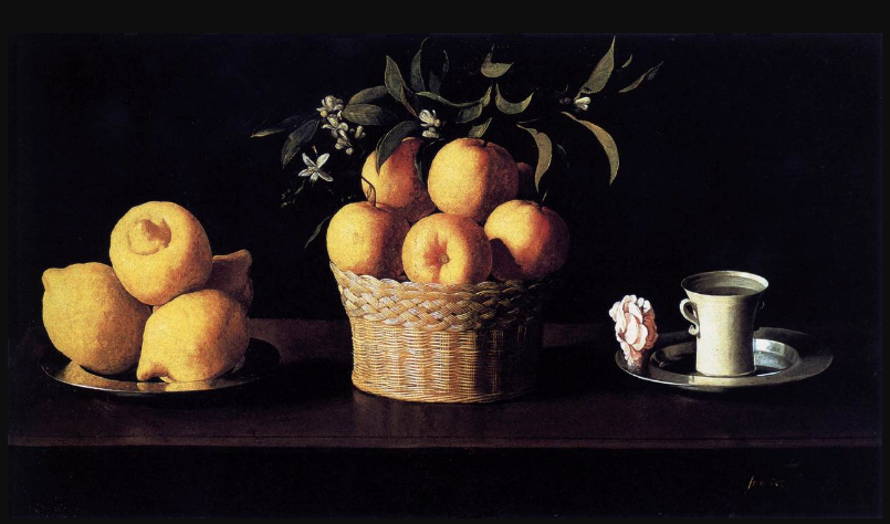
Light- Dark Contrast
Examples of light-dark composition:
“Lemons, oranges and Rose” by Francisco de Zurbaran (1598-1664)
“Guitar on Mantelpiece” by Pablo Picasso (1915)


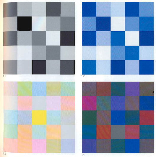
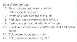
Cold-Warm contrast
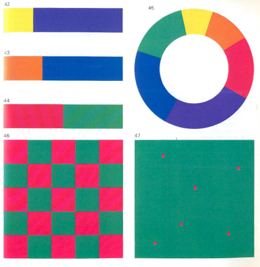
Complementary Contrast
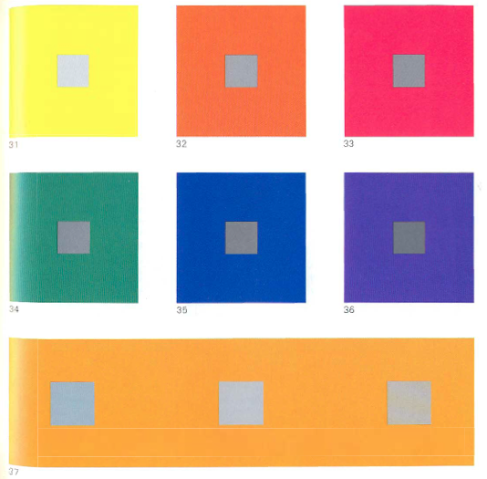
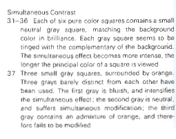
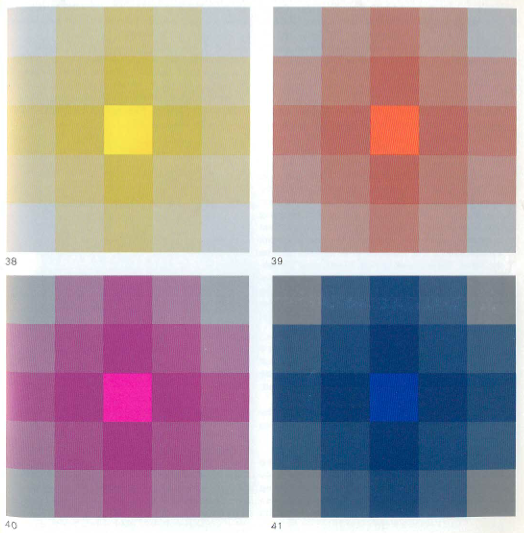
Simultaneous Contrast
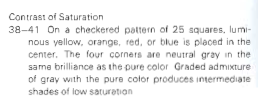
Contrast of saturation
Contrast of Extension – Size of colour
Colour agent and colour effect
IN RELATION WITH ‘EGO’
Colour Harmonies:
– Monochromes Harmony
– Analogous Harmony
– Analogous Harmony Warm and Cool
– Complementary hues
– Split complementary
INSPIRATIONS AND ARTIST REFERENCES
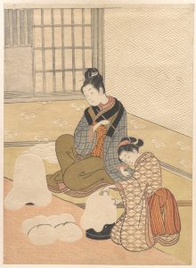
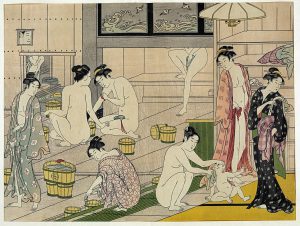
Ukiyo-e prints – muted colours
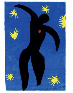
Henri Matisse cut outs
(More artist references in next post – Ego – Process)
