“Design is a journey of discovery. In design, color plays a significant role. It does not only play with the aesthetics but it also reinforces the design in harmony.”
Being the only project where we are allowed to play with color, this places great emphasis in manipulating the harmonies of color to produce our desired outcome. I wanted to choose a color palette that reflects both my style of illustration and I. Thus, I chose a pastel color scheme, playing with both complementary and analogous colors. I chose to illustrate through vectors and flat illustration which plays with shapes and the choices of colors.
B R A I N S T O R M of me + setting = ???
- me (a deer) + a food market/festival = food coma w food on my antlers lying down w a big belly ?
- me (a peach) + stacks of assignments/ squashed under = escape – dream (pressing esc button or parachute with papers flying around?)
- sleeping/tired me (a pig) + coffee = hyper pig bouncing off the walls
- me (a donut) + trapped in a room filled w negative F = donut worry be happy (fills up w jam) turns the F to an A
me (a donut) + failure ( fail to hit target) = do whatever it takes to achieve target - me (a curious fennec fox) + map/GPS = exploring a bizarre world/ new world
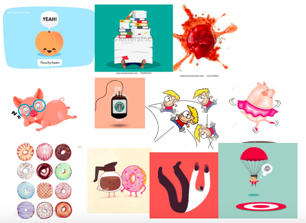
Before I ventured on to the final illustrations, I created a moodboard/inspiration board to refer back on how I would want the whole format and illustrations to be like. Taking reference and inspiration from pinterest, to fully visualise the desired outcome.
Top Row: A pictorialization of a bizarre world/ new world
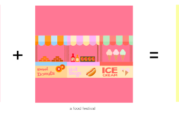
Second Row: me (a deer) + a food market/festival
Third Row: me (a peach) + stacks of assignments/ squashed under
Fourth Row: me (a sleeping pig) + coffee = hyper pig bouncing off the walls/ dancing
Fifth Row: me (a donut) + failure
CHOSEN COLOR PALLETTE

I chose a cool pastel color scheme to play with as it is my favorite color scheme. It reflects off a soft, dainty, sweet and delicate feeling which mirrors the vibe I give off (according to my friends). It is also aesthetically pleasing and fulfils the outcome I want to display.
________________________________________________________________________________________
FINAL. I decided to go off with these four ideas for my final illustrations.
- me (a curious fennec fox) + a map/GPS = exploration of a bizarre world/ new world
- me (a peach) + stacks of assignments = escape (pressing esc button with shades on)
- me (a donut) + failure to hit target = will do whatever it takes to achieve target (places the arrow on the bullseye)
- me (a deer) + a food market/festival (food stalls) = food coma // food on my antlers (gets everything)
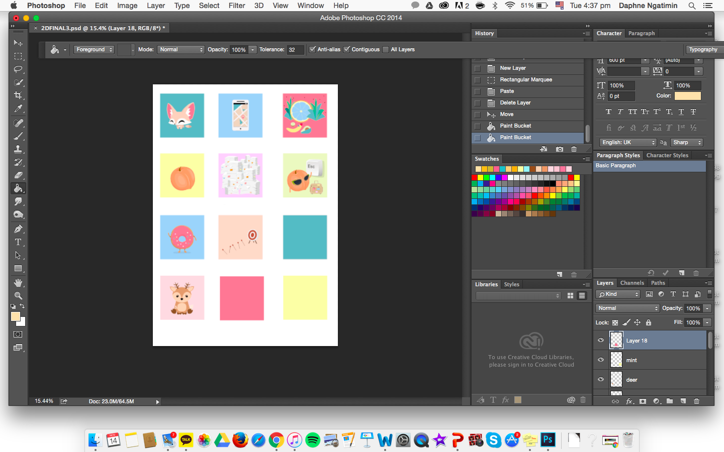
In each boxes, each rows, I try to vary the composition of each frame such that there is a sense of dynamism yet consistency in framing in each story. As well as, an unified color scheme as a whole instead of focusing on individual rows.
ROW 1

I started the equation with me as a fennec fox as I’ve always found them adorable and since they were pretty apt for the chosen setting, with their curious nature, I decided to go for it. In addition, I’ve heard that if I was an animal, I would resemble a fox. In the first frame, I’m portrayed as a cheerful fennec fox, with smiling eyes. Following, when given a map or GPS (a chance to venture off), I would head into a new world. This row reflects one of my personality, in which of my curious nature, I love wandering and exploring new places.
For the choice of color palette, I did not go for any color schemes but to harmonise as a whole. Starting with the fennec fox with a touch of neutral tones of nude beige and white + hints of complementary colors of “red and green”, in this case, turquoise and pink. In the second frame, I went with the color blue to represent the sky and sea, a sense of vastness and boundless, conveying the feel of endless exploration. It also carries on colors from the first frame, in order to harmonise as a whole. In the last frame, I made it more colorful with different pops of colors yet unifying, to achieve a sense of excitement and wonders in a ‘new world’, inspired by an album cover referenced in my moodboard. An attempt of subtle complementary and triadic colors.
Simple and centrally composed to bring focus on the main illustration in the first two frames – me and the setting. It ends with a more crowded composition encircling the depiction of me, in a sort of welcoming manner to achieve the sensation of wonder and positivity.
ROW 2 
Depicting a peach to represent me, when meets an overload of work equals to “vacation needed please – press to escape.”
For this row, I went with a complementary color scheme of yellow and purple as the background. As usual, I kept the first frame clean and central, following with an overwhelming squeezed composition depicting various sizes of stacks of assignments, to give off the sense of suffocation and overload in a box. Ending with a fresh cut illustration in the last frame which keeps it simple and direct. In this row, I carried over hints of the colors used from the previous row to give more of a unified look.
ROW 3
A donut. I went for more of a blue + neutral tones in this row, again, trying to incorporate colors from before. In the first frame, I chose a color that could make the donut ‘pop out’ against the background, as well as, pleasing to the eye. The second frame, I decided to tone it down by using a neutral color scheme and analogous colors with a touch of warm red. The last frame, I went for the complementary colors of red and green, with the donut in a neutral tone to balance the color composition of choice.
Compositionally, I positioned the illustrations in central and consistent for my first frames in each row. Whereas the dynamism of composition comes from the last frame. In the second frame, initially, I made the arrows more of an orderly touch with identical sizes (as shown below). However, I re-arranged it to a composition of big to small, in order to create a sense of depth and also incorporating a leading line. This row was more focused on a simple, clean-cut composition, thus directing the viewers focus to the main illustration and story line.
ROW 4
A deer. Deers are usually known to have an elegant and petite vibe where they are imaged to eat when accessible or less. I played with this image and contrasted it with a deer who is both playful and loves to eat, reflecting myself in the deer. The first frame is the portrayal of a typical quiet and still deer, but when situated in a food festival, out comes the playful, greedy-eyed me as I start getting all the food! The first frame of the deer remains a pinkish-neutral tone as its docile and elegant nature before meeting the joy of life (food festivals)^^ Food festivals are known to be lively and festive, hence this piece also incorporates a colourful bright touch of complementary colors (orange-blue, yellow-purple, red-green), as shown in the second frame. The last frame portrays a playful yet innocent-like deer with food stacked on it’s antlers while eating a donut. This plays an irony on the fact that deers are usually not seen as big nor greedy eaters, which reflects me…. Compositionally, I wanted to keep things consistent and simple by positioning the stalls as a row rather than a clutter of stalls. The last frame, I played with the depth and framing of the deer. I placed it as a near-shot where only the head could be seen with its antlers, making it more ‘interactive’ with the audience. With the colors cautiously chosen during the process, this row characterises a sort of ease, cheerfulness and docility.
FINAL 
To conclude, through this project I got to explore the world of colors (which I love using). I enjoyed composing my illustrations and picking out different color schemes to fit in as a whole. This mirrors the strategic planning and exploring of color schemes that would compose the 12 frames as a whole, like Instagram. I reflected myself and mood through the colors and illustration depicted in the 12 frames. This project makes you self-reflect in the knowledge of whether you are assertive or turbulent in knowing who you are, what you think you are and finding how others perceive you. Thus, using these perceptions into colored illustrations. I do not have any BIG takeaways but it did let me get back into digital drawing/illustrating through photoshop. AND most importantly, the joy in creating and completing this project.
Thank you so much Shirley for everything! I really enjoyed this class, in the bonus of your guidance and teaching that made me LOVE it even more ♥‿♥
“Be a pop of color in a world of black and white.”


