Project 3 Final: Archetypes

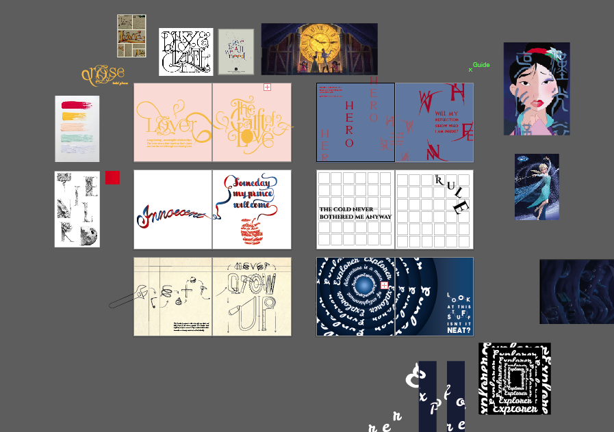
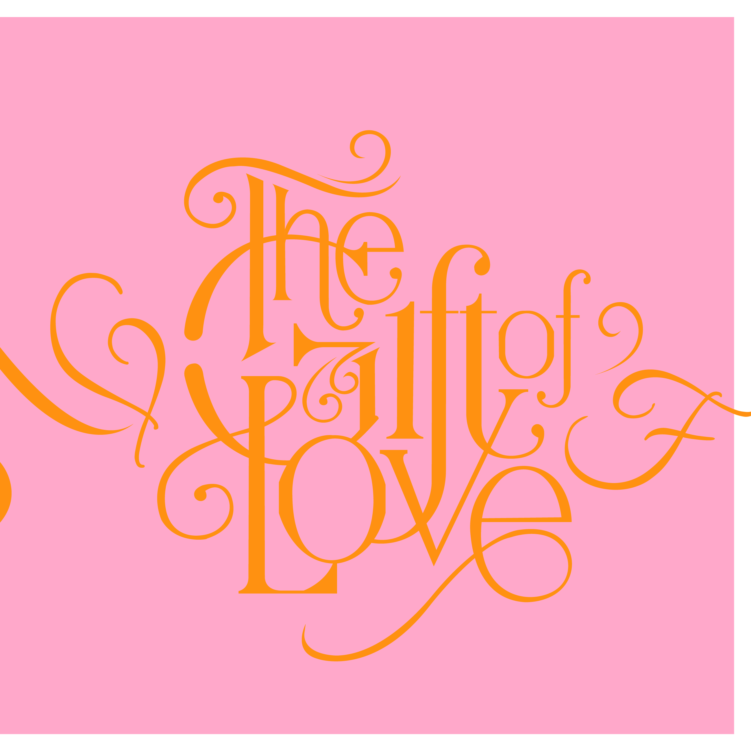
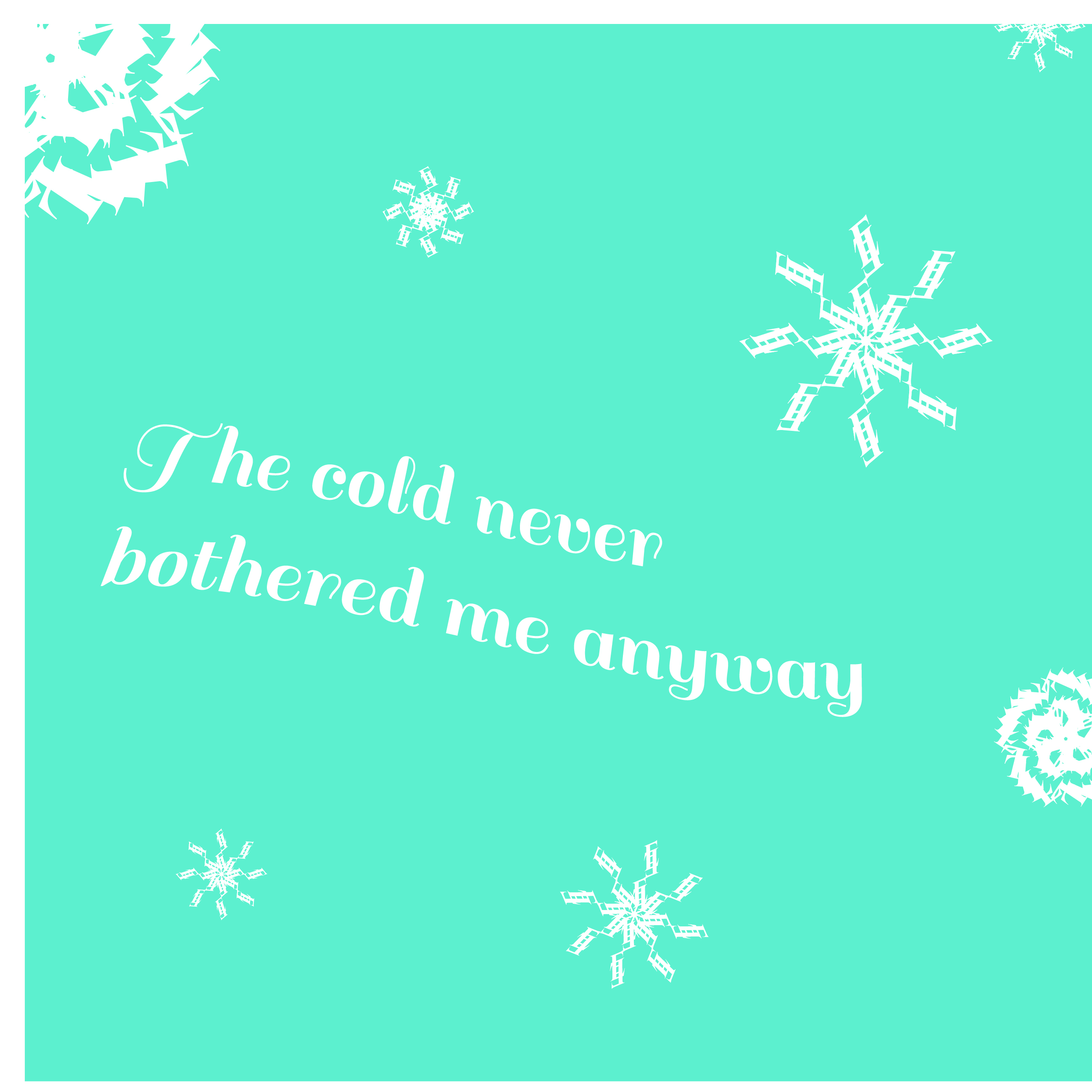
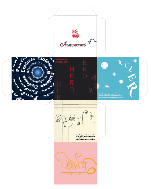
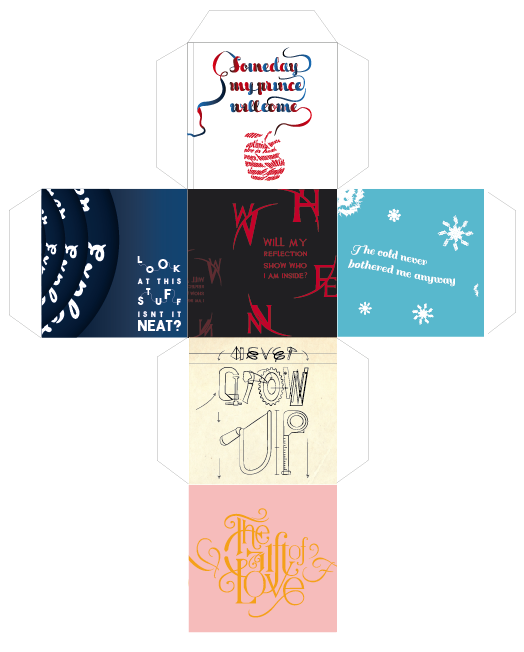
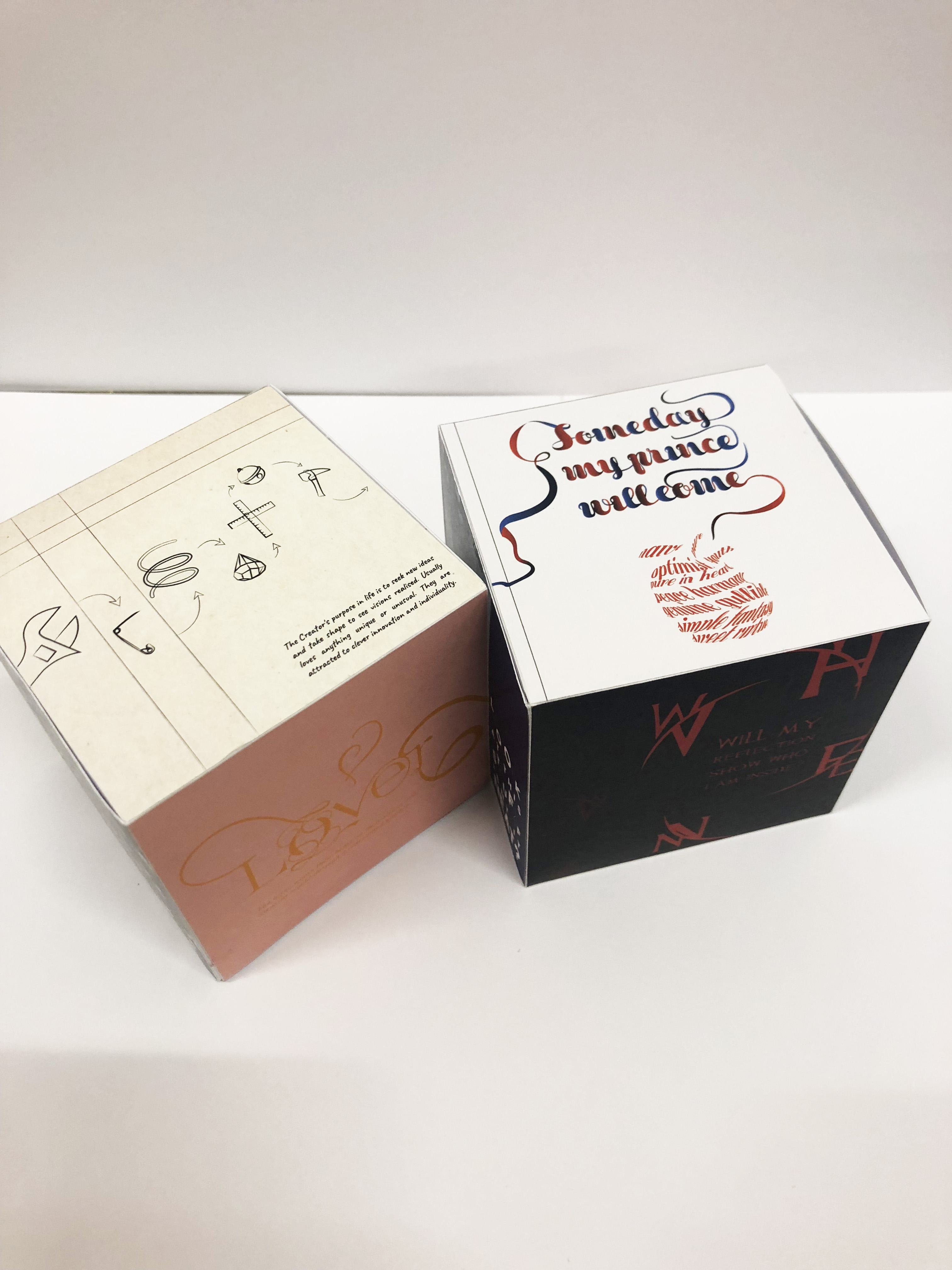
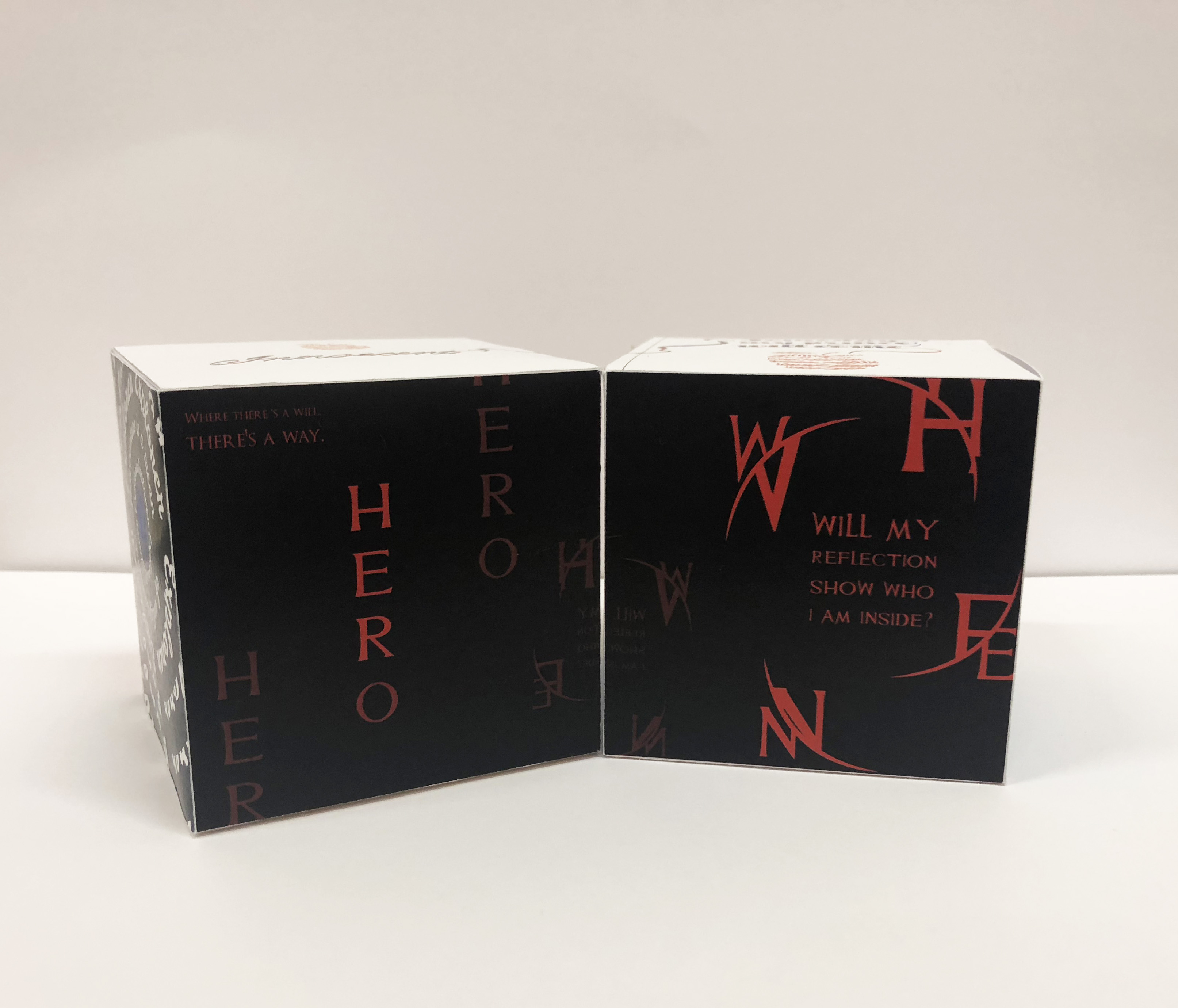
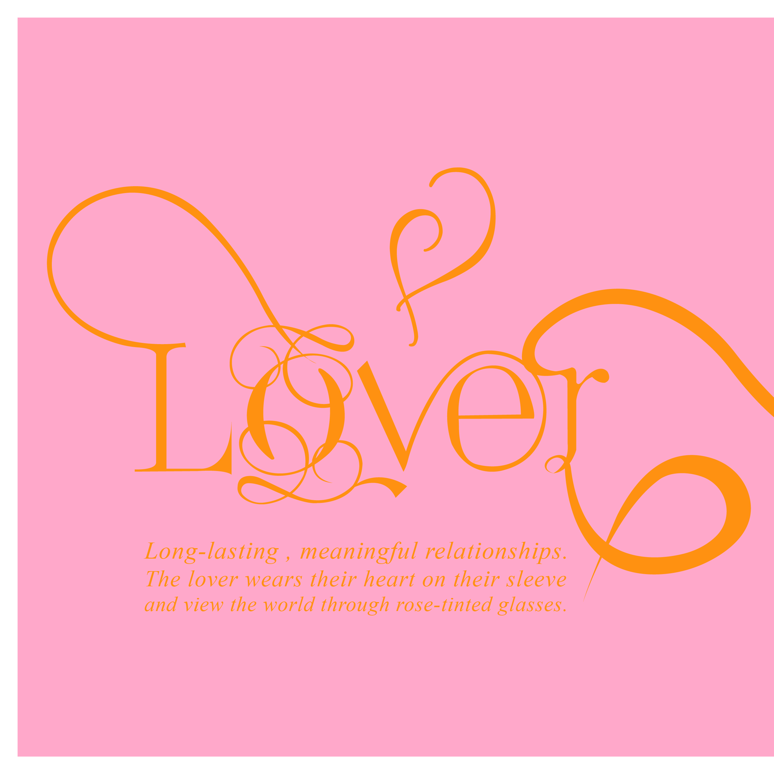
During the first brief of this assignment, I had no idea how I would execute and show my type in referencing to the archetypes learnt. Hence, I started brainstorming and researching on brands to learn how they played on the chosen archetypes. It took me quite some while till I came up with a theme to form a unity. I have chosen to take on a theme of Disney Original Princesses to show the following chosen archetypes: Lover, Hero, Innocent, Ruler, Creator and Explorer. To make it more interesting, I went to experiment on a 3D shape to present my designed faces through a cube (in presenting the idea of a game dice). It holds the idea of a game for kids where you have to match up the two cubes together, in resulting the same connecting face/ archetype.

Initial ideas + process:

For each archetypes, I tried to find a scene from the movie to help inspire me with the layout and following design .

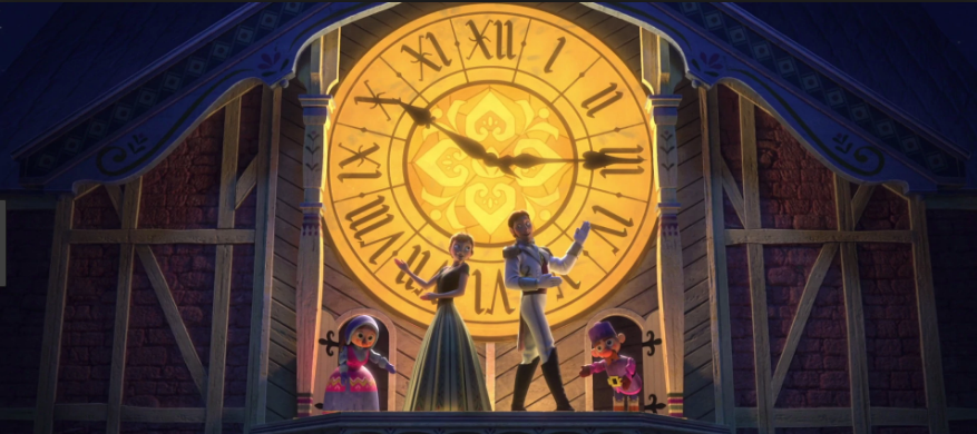
1. Lover – Anna, Frozen

(Reference Image/ Inspiration)
Scene: Love is An Open Door

https://www.youtube.com/watch?v=EgMN0Cfh-aQ

I chose this scene as I personally think it really sets out the archetype, the lover, well where she puts her heart on her sleeve and giving it to someone she just met.


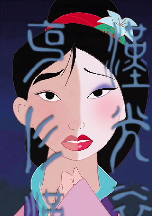
2. Hero – Mulan

(Reference Image/ Inspiration)
Scene: Reflection

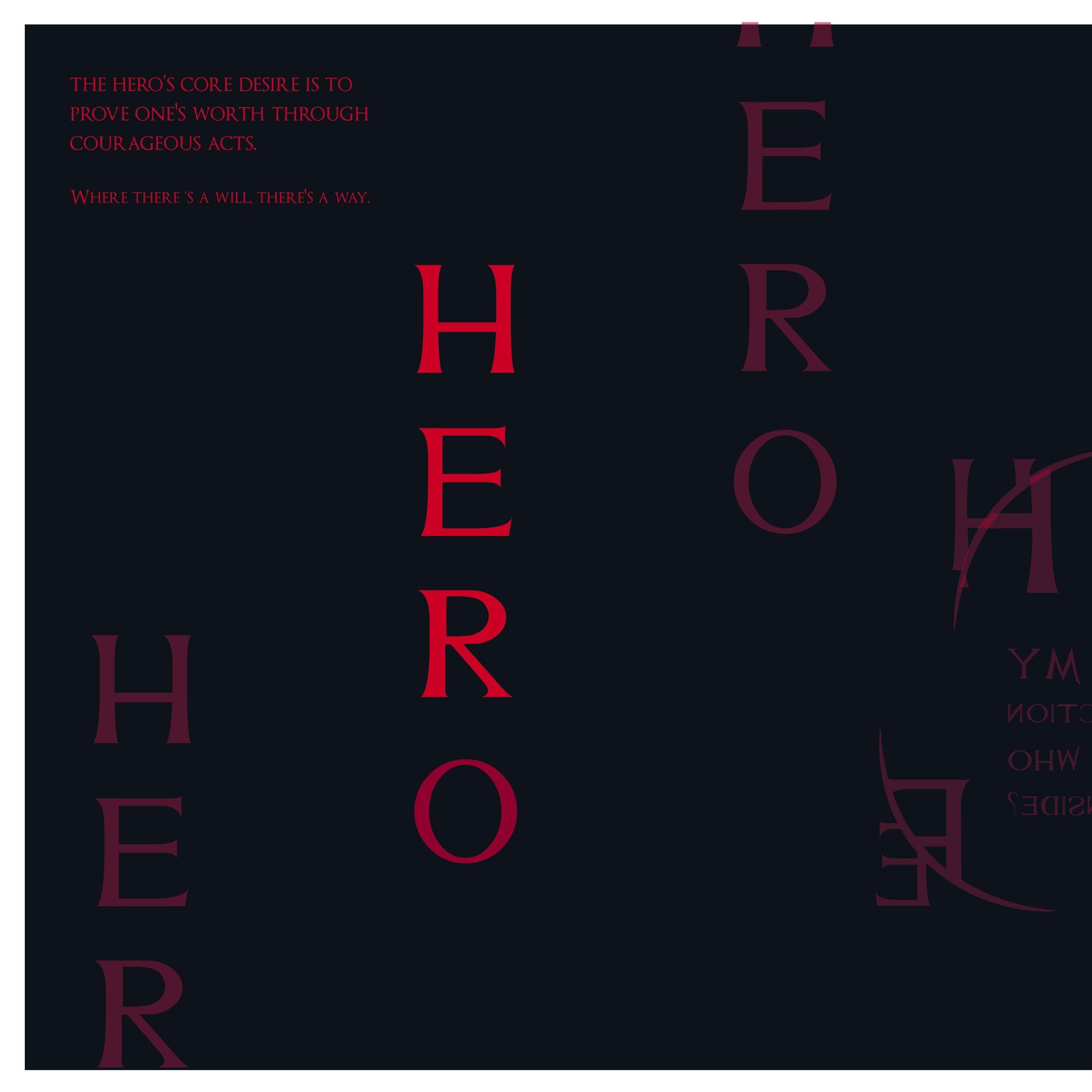
Instead of choosing a scene that really captures Mulan’s heroic actions like the battle field scene or the end scene. I wanted to capture the beginning of a hero where you are still in self-doubt and an unquestioned identity.


3. Innocent – Snow White

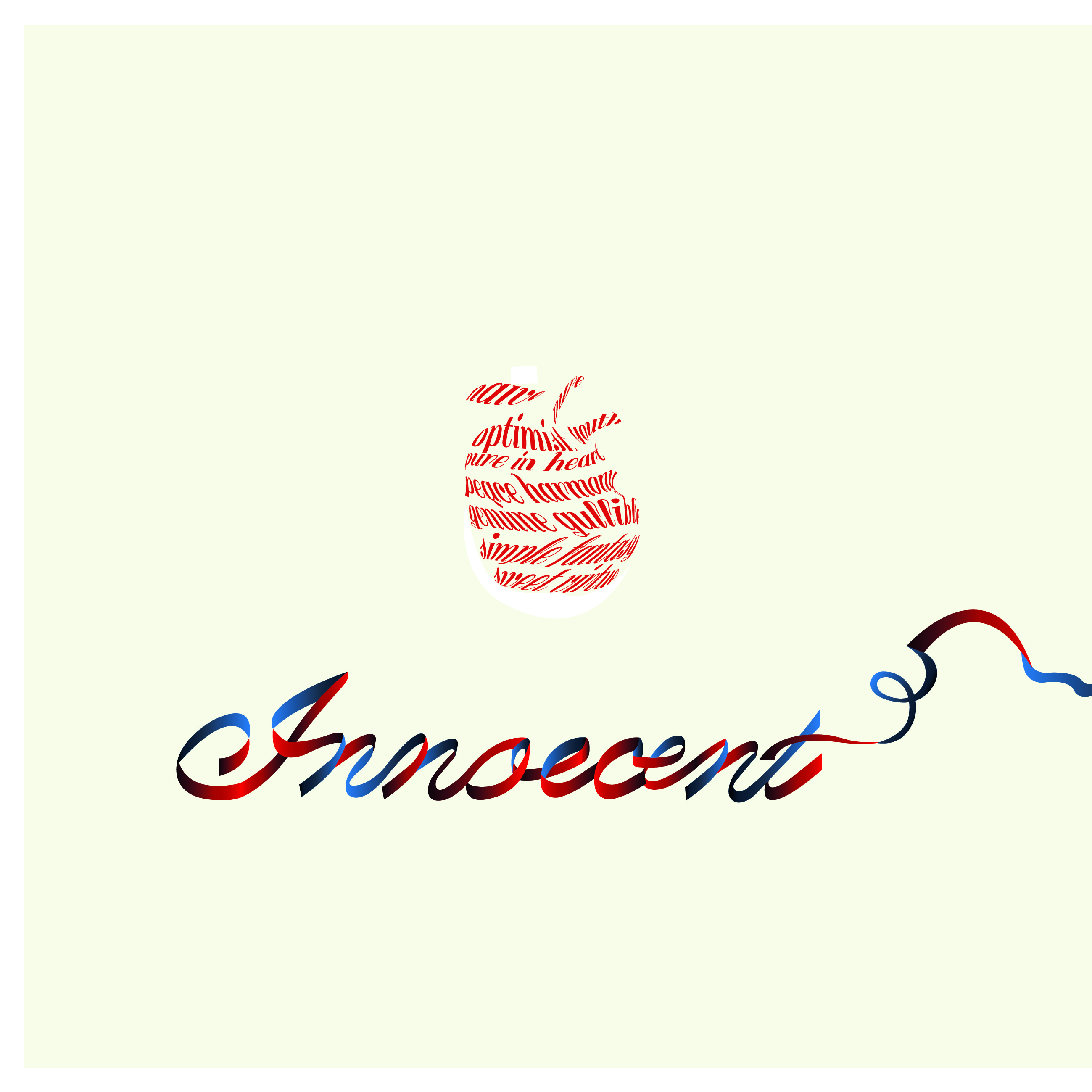
I did not choose a specific scene for Snow White as I believe her actions and gullibility towards the bite of an apple shows it all. Thus, I went to form a bitten apple with type. Instead of choosing a cute rounded font, I went with a handmade ribbon font as I feel like it would suit Snow White better in the sense of innocence and sweetness.

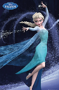
4. Ruler – Elsa, Frozen

I referenced this picture for my layout to portray the swirl of Elsa’s powers. To add more elements, I placed snowflake letters, transform and distort, like how we learnt in class. It was truly an amazing skill to learn!

(Reference Image/ Inspiration)


5. Creator – Tinkerbell

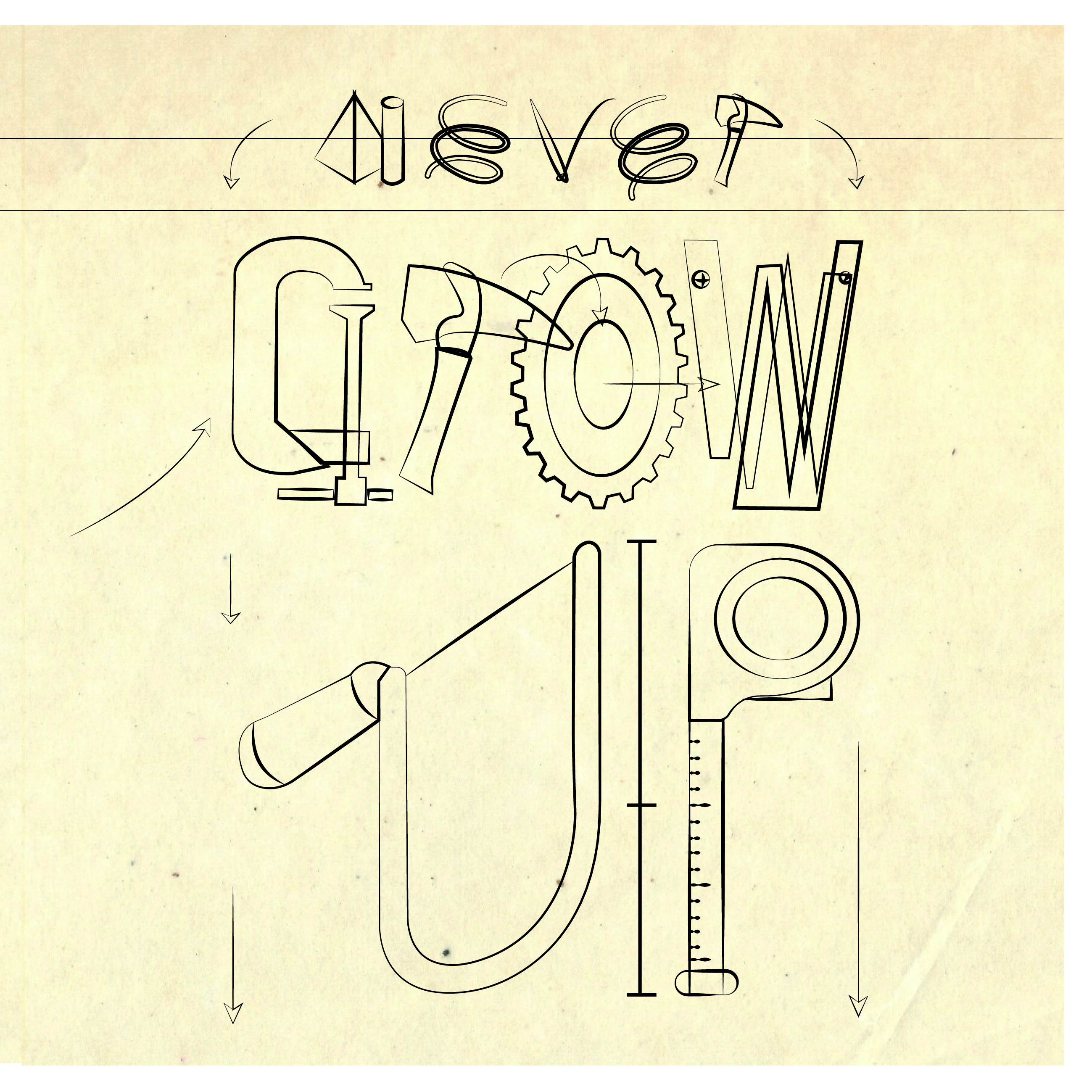
Instead of choose a typeface, I went out to spice things a bit by using graphic forms of Tinkerbell’s tools in creating my type. Just like in the movie, where she creates a blueprint on an old textured paper. Thus, I used this idea to design my font.

(Reference Image/ Inspiration)


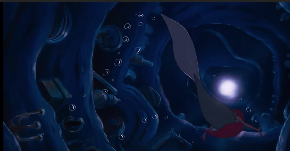
6. Explorer – Ariel, The Little Mermaid

(Reference Image/ Inspiration)
Scene: Part of your World

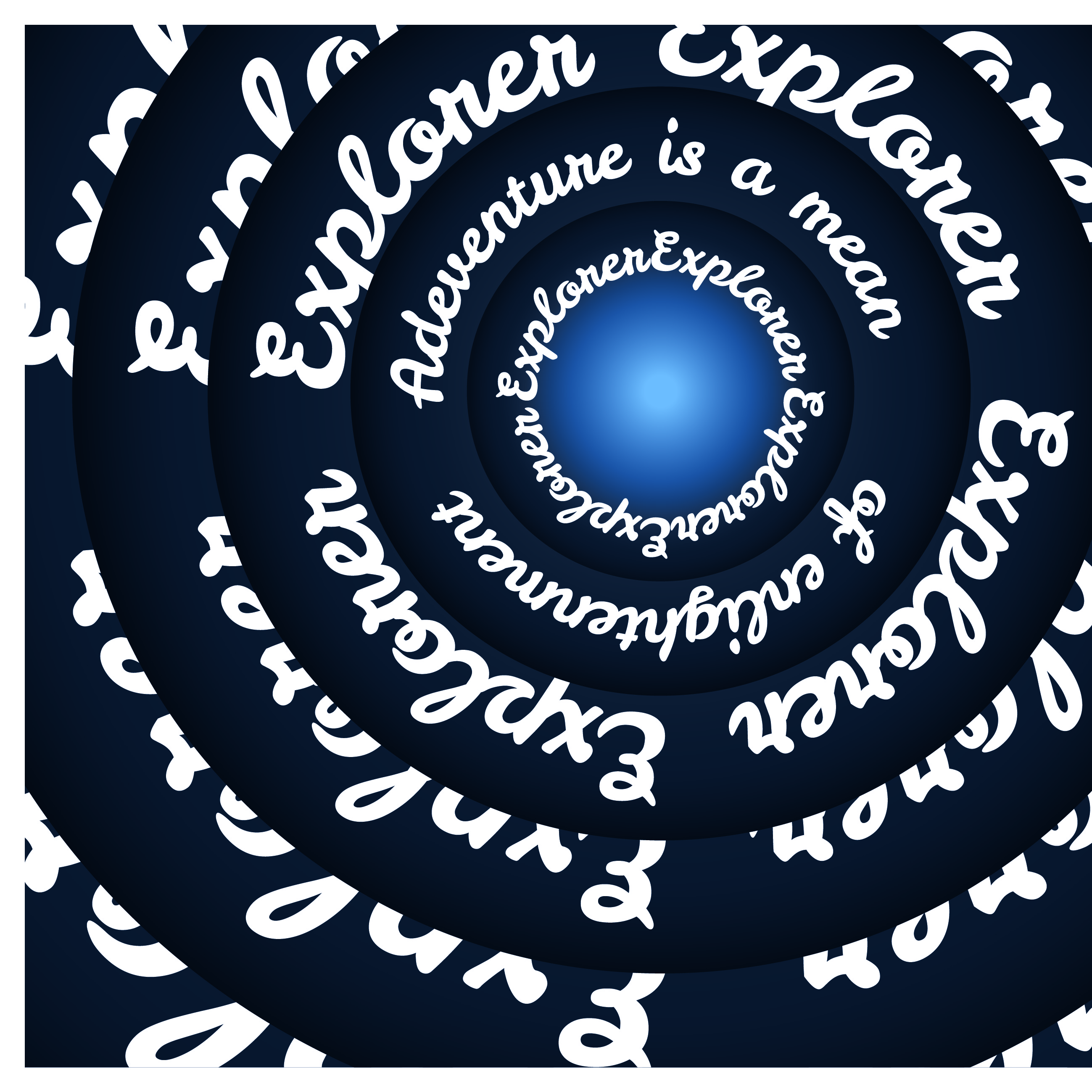
Last but definitely not least, I build upon Ariel’s curiosity to explore the other world as my inspiration layout. Designing a ongoing tunnel- like layout like the image below. I chose to form a rounded tunnel to reflect the infinite curiosity and exploration the archetype holds.

ROUGH COLOR PALETTE CHOICE:

INITIAL PROGRESS SHOT:
FACES+ Archetype Pairs:


CUBE TEMPLATE:FINAL PRODUCT:

Response to The Grid System

The Grid System


Grids act as a tool to help give consistency and order to page elements such as images and texts. 

“It allows you to think less about basic design principles and more about finding a design solution. This allows you to design at a more advanced level, being more able to think about advanced concepts like page rhythm.”


Applying grid and format: 

  1. Define the size of the page
  2. Define where the text will be placed
  3. Choose a font (best to stick to one and play with the typeface) 
  4. Test until you are satisfied with the type
  5. Decide how many units/columns you want your grid to be
  6. Create and apply grid
  7. Redefine the type area – play with certain composition and layout 
  8. Check how easy it is to read, how heavy it looks and how the type is positioned. Check on the gutters and leading.

There is no set rule on the number of grids you can create. However, the less divisions you have the more articulate and minimal your design will seem. The more divisions you create, the more complex the grid becomes to work with in keeping consistency. On the other hand, the more flexible your grid becomes, giving you various choices to play with your composition. There are multiple grid systems in the design world, but they each have their unique personality and uses. The final choice is up to the designer to articulate and choose what fits their design purpose the most.

Column Grid
Column grids are good to use when discontinuous information needs to be presented. It can be dependent or independent from each other, and crossed over by images/graphics, creating a different visual layout. One column might be used for text, another for images, and another for captions or quotes. This gives the page layout flexibility when organising texts onto the page. You can separate blocks of texts by placing them in different columns yet show a flow between them. It should also be able to accommodate legibility, too narrow of a column can make reading difficult.

Examples of a Column Grid System:

A symmetric column grid has all columns the same width. For example, the most common symmetric column grid will be found on printed newspapers to help organise information and stories.

An asymmetric grid has columns proportionally thinner or wider than others.

Other examples:

Modular Grid
Modular grids are like column grids but has consistent horizontal divisions from top to bottom in addition to vertical divisions from left to right. Between the column, row and the gutter creates a module. It allows you to arrange text in many various ways, thus this is good for complex projects that require more control than a column grid. The beauty of modular grid is that you can replace or add any module without affecting the rest of the system. Giving the whole page a consistent and structured aesthetic.

Examples of a Modular Grid System:

Resources:
http://www.typophile.com/sites/default/files/old-images/How%20you%20make%20a%20grid.pdf
http://www.thegridsystem.org/pdf/grids_are_good.pdf
https://ayapeters.com/emotions-in-grid

4 Types of Grids And When Each Works Best

A Quick Look at Types of Grids for Creating Professional Designs


Pinterest

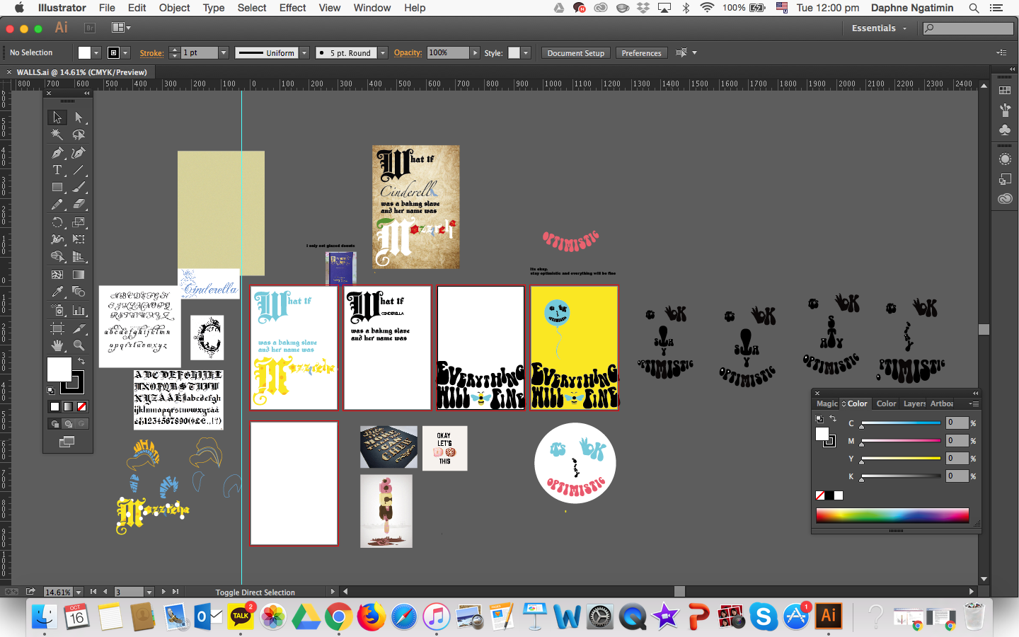
Assignment 2: The Wall Have Ears | Process + Final

3 Conversations/Quotes, I HAVE CHOSEN:

1.
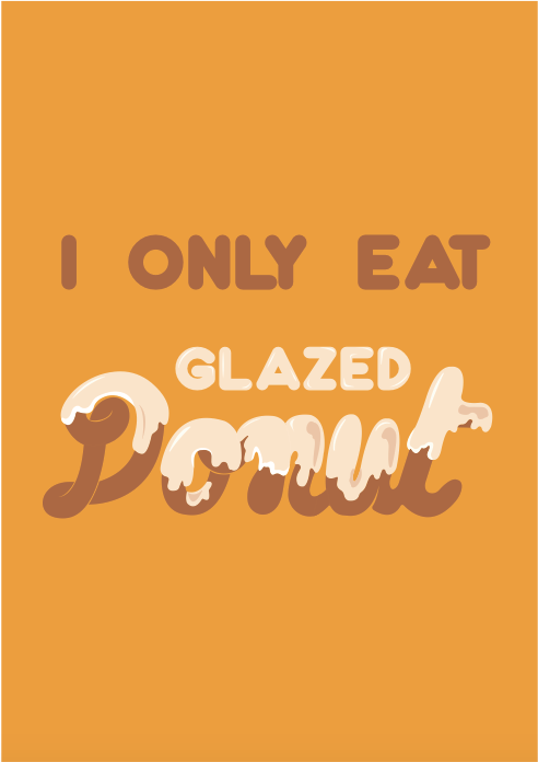
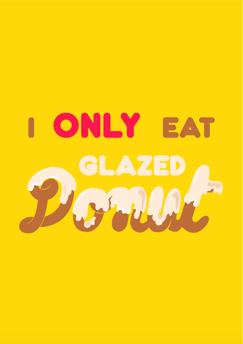
“Omg have look at this, doesn’t this look so good!” “Stop your making me so hungry… but then again I only eat glazed donuts.

2.
Dude, 
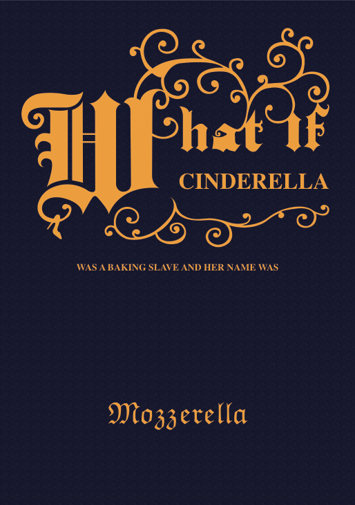
what if cinderella was a baking slave and her name was mozzarella?
….

3.
Damn I did so badly for this..ughs..what if I fail?
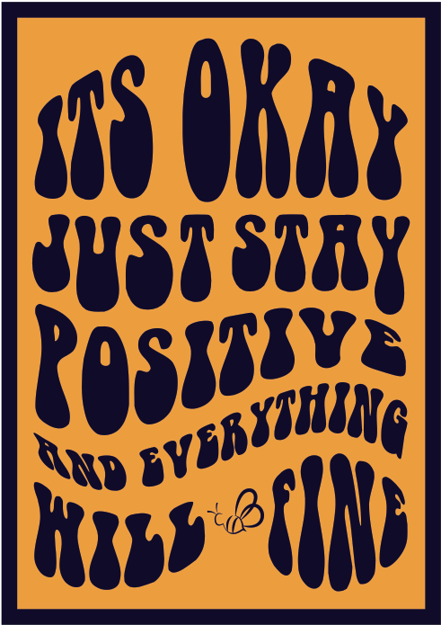
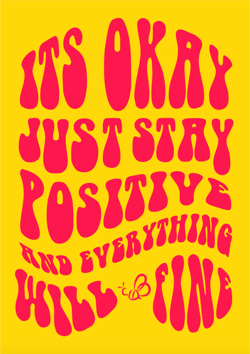
Its okay, just stay positive and everything will be fine!
Easy for you to say.

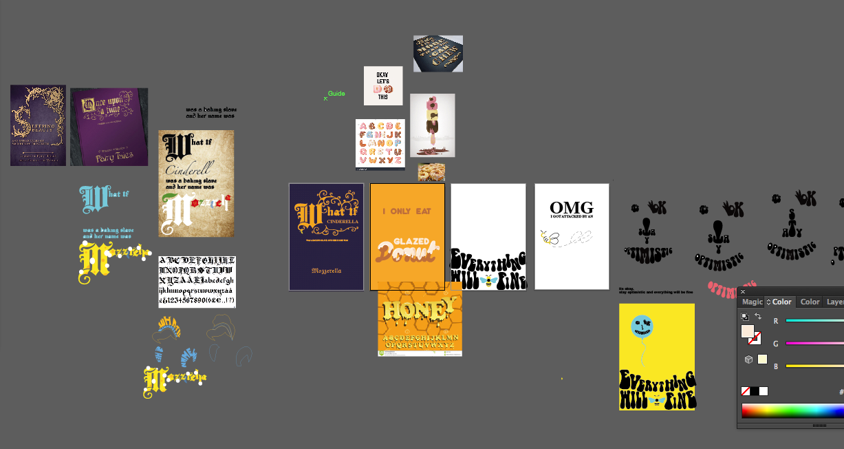
BOARD + DRAFTS

IDEA IN MIND
Quote 1: I only eat glazed donuts

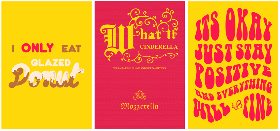
Originally, I wanted to incorporate real donuts in the type but it did not work as a whole and with the overall color scheme. Thus, I used digital illustration to help me tie in everything together with the use of the same color palette. I wanted to emphasise the “glazed donut” thus keeping it traditional with the white glaze and the only one manipulated.

Quote 2: Dude, what if cinderella was a baking slave and her name was mozzarella?

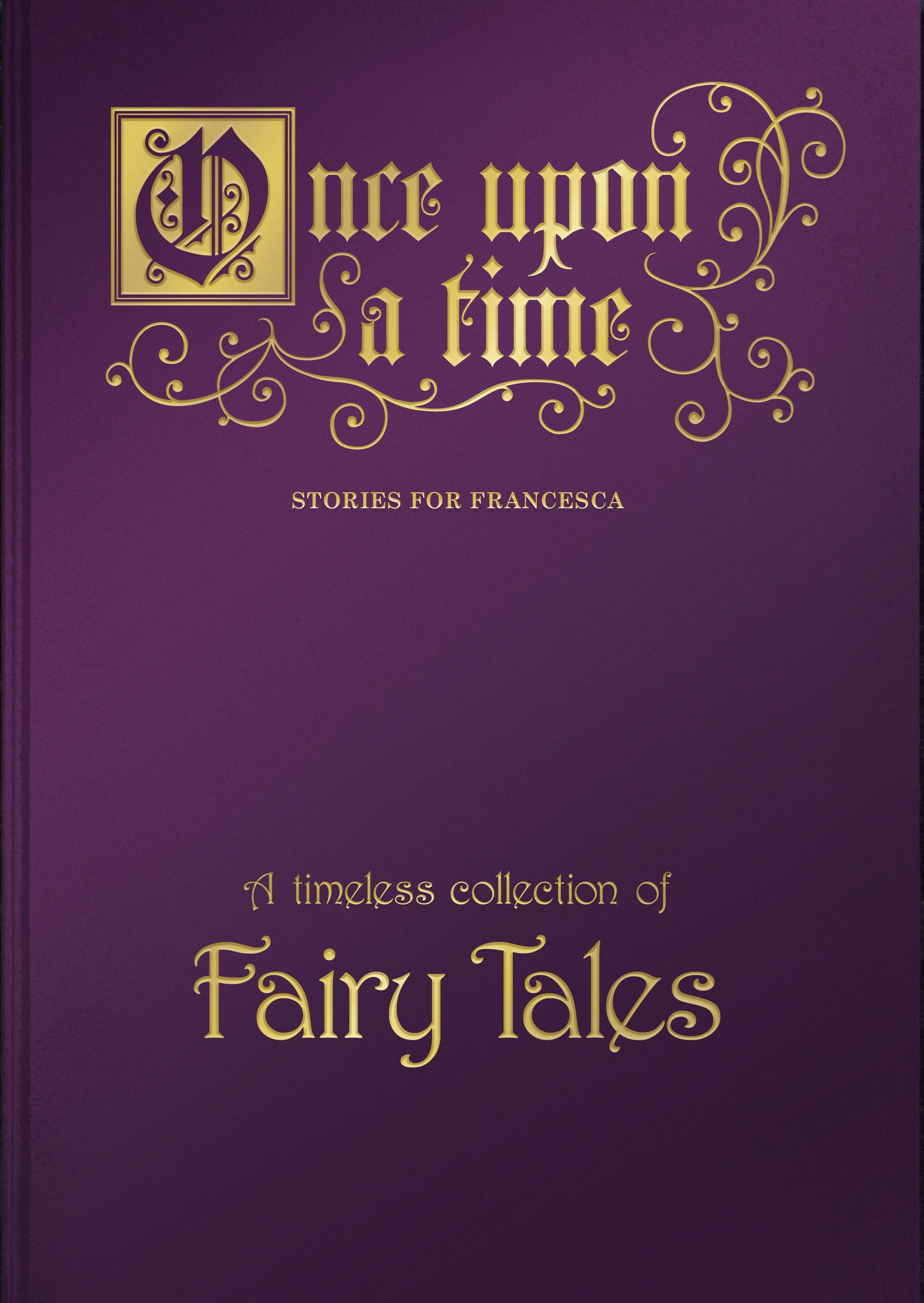
This quote holds the element of a fairytale yet a pun. I wanted to play with the irony of “Once upon of time” where it conveys a magical transportation, even though it may be a fun pun or a joke. In the beginning, I wanted to portray the mozzarella with a cheesy touch but there were too many elements flying around. Thus, I decided to go with the classic Grimm’s fairytale book cover layout (like the reference below).

Quote 3: Its okay, just stay positive and everything will be fine!

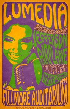
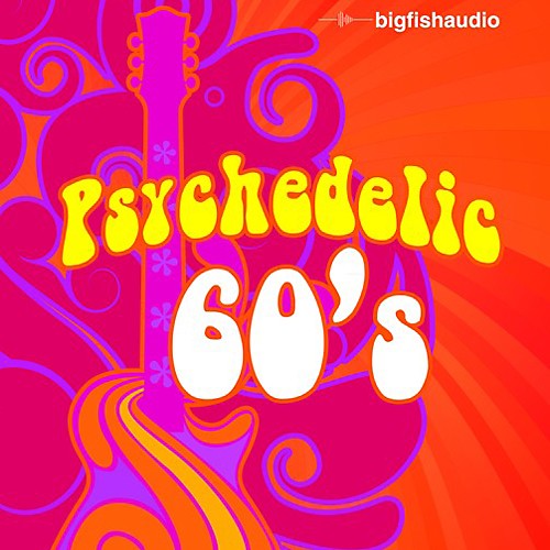
Initially, for Quote 3, I wanted the words to create a smiley face (shown in the AI board above). However, it turned out looking creepy. Thus I tried to play with the size of the face, scale and hierarchy of the types but something was still not right. It still gave a creepy halloween feel. I decided to scrap the idea and focus on the 1960s psychedelic hippie movement style, where types are soft, warped and portrayed the positive vibe.

References:

FINAL 1.0

Overall Feedback:

  • Could make the gold brighter, looks dull at the moment.
  • Maybe try to play with a brighter palette like pink and gold to bring the hippie feel, and Cinderella can be depicted more modern since it is pink?
  • Do not give a border to just one, either apply it to all or none – let it the background bleed out.

FINAL 2.0

(AFTER REFINEMENT FROM CLASS CRITIQUE)

my final 3 posters placed together:

Overall, I really enjoyed in experimenting and playing around with the different fonts and creating my own. However, I feel like I still can push myself to achieve a better outcome if I had plan the designs all together instead of individually. I would like it even more if all 3 pieces would intertwine and connect with each other so it looks like a solid set. Furthermore, instead of making everything centralised, I could play more with the composition of type, layout and off-positions – playing and pushing the boundaries. There is so much more I need to learn to understand and envelop the basis of typography. Just like the typographers we have reviewed, each one of them have their own unique style that makes them, them. One day I shall find my own unique style but yet still be flexible in the application of style to reach a broad audience.

Typographer of the Week: Herb Lubalin

Herb Lubalin is a spirited American designer who has won wide recognition for his innovations in advertising, publications and books. At the age of seventeen, he entered Cooper Union and was enticed by the world of typography. He was captivated by the various interpretations one could execute by changing one typeface to another. Lublin is one of the pioneers of expressive typography and an influential figure in the ‘creative revolution’ that has transformed American advertising in the 1960s.

”You can do a good ad without good typography but you can’t do a great ad without good typography.’’ – Herb Lubalin

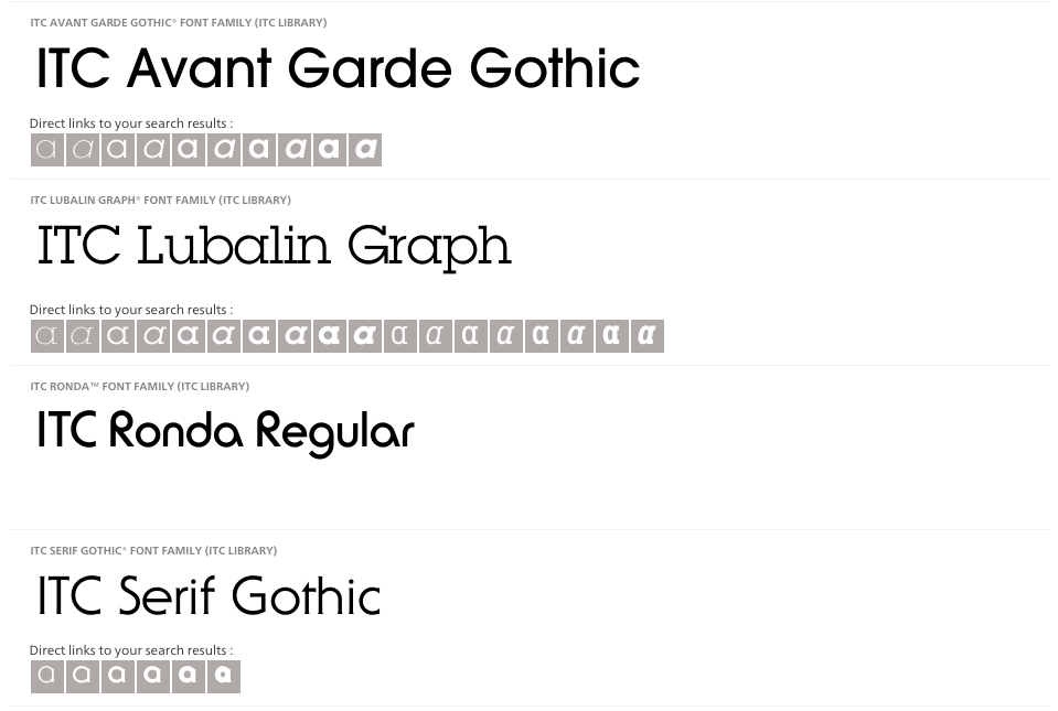
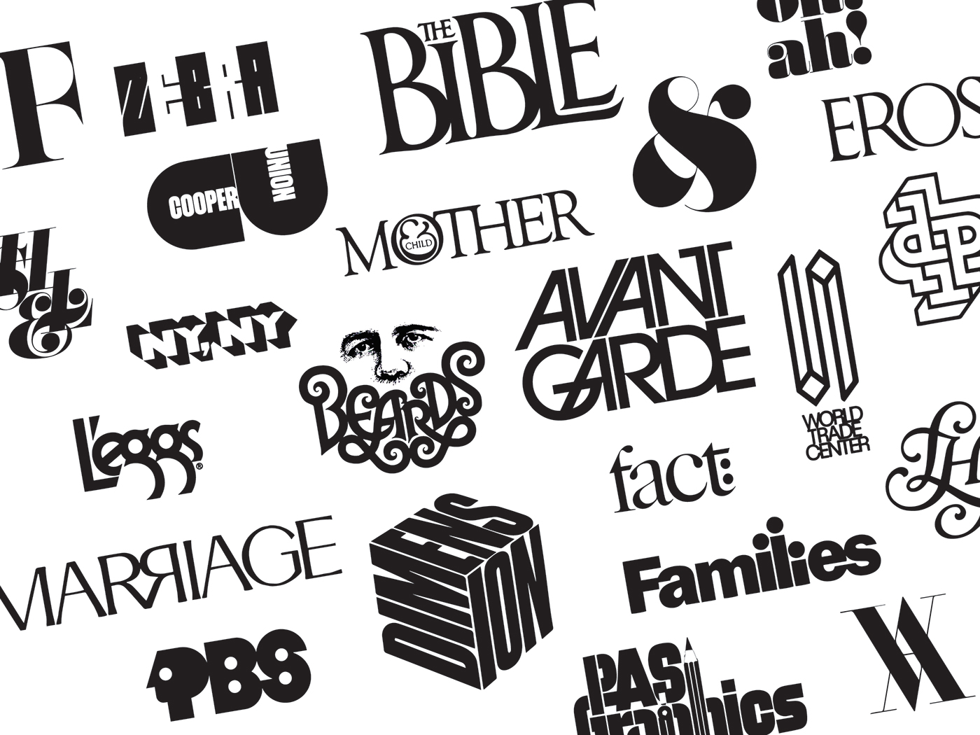
Lublin once declared that a good art director should know the strong points of every one of the many typefaces that existed and how to use them best. However, the existing typefaces were not good enough for him, thus, creating his own. Lubalin designed four typefaces: ITC Avant Garde Gothic (1970),  Ronda (1970), Lubalin Graph (1974), a slab serif and ITC Serif Gothic (1974). One of his prominent faces was ITC Avant-garde. It is also mostly known for being a revision of art deco. He customises serifs, ascenders and descenders to his liking.

https://www.linotype.com/483/herb-lubalin.html

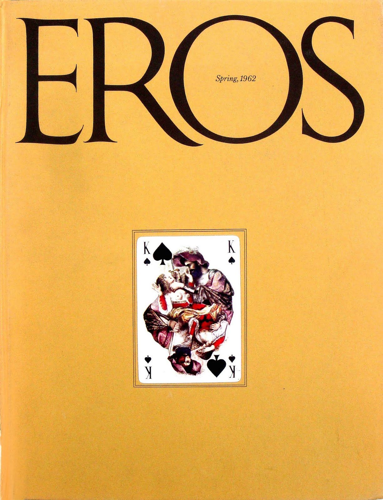
Lubalin puts the stress on bold headlines and graphic simplicity. For example, he used flashy layouts and strikingly elaborate graphics for a magazine called Eros, which carries a more sensuous content.

https://www.pinterest.com/pin/324470348138298242/?lp=true
http://www.historygraphicdesign.com/the-age-of-information/the-new-york-school/681-herb-lubalin

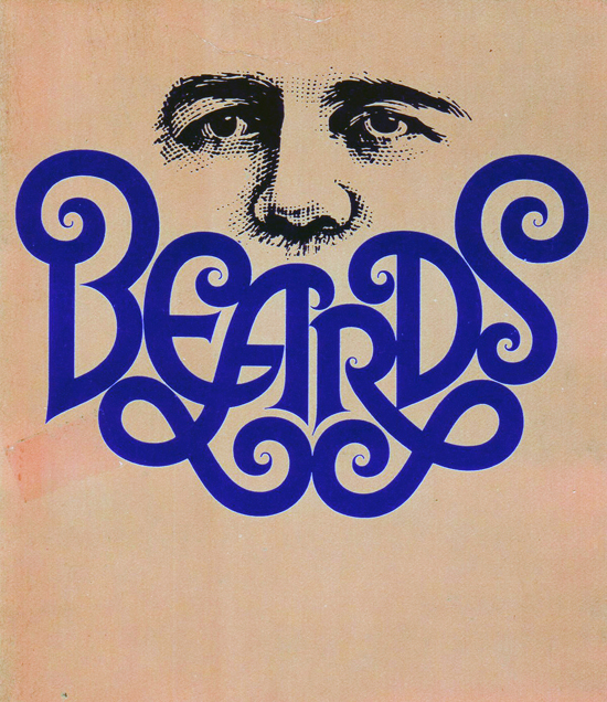
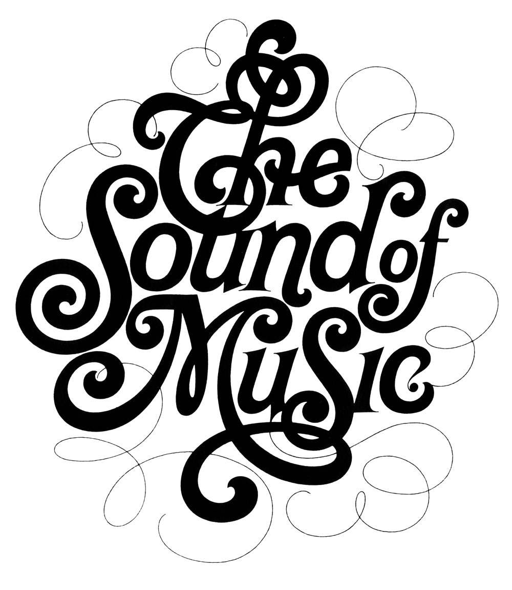
Lubalin took Modernism into the palm of his own hands with the use of geometry and tightly constructed compositions. He also adds slight humor, sensuality and flourishes. For example, his hand lettering for The Sound of Music Programme to the whisper-thin justified stack for Cooper Union. He was also commissioned with a project for Sprite in creating a new package, logotype and ad. He also did graphics for everything from Bazooka bubble gum and Chicken of the Sea tuna to Ebony magazine.

http://www.eyemagazine.com/feature/article/up-close-and-tight

What caught me by surprise was that Lubalin holds a stand in the use of graphic design in advertisement of products or services.

“I don’t particularly like to advertise products and help clients sell products that I have no particular use for. And very often I turn down a product because I just think it detrimental for people to buy certain products.”  – Herb Lubalin

This got me intrigued that there are designers out there that still holds there morals to the ground in the belief of pure graphic design, to communicate your own voice, choice and beliefs. He also rejected Swiss modernism in favor of a more humanistic ‘graphic expressionism’. He felt that it did not fit in with American culture and imagination. This idea links back to Erik Spiekermann’s manifest on how fonts must be altered and varied to ones culture. The different lifestyle and perceptions may affect the people’s opinion on a certain typeface. Hence, it is important to have designs stylized into cultures for it to be understood, absorbed and well functioned. Lubalin commented that the Americans react to new ideas and that they are a “concept-conscious society”. Thus, the creation of graphic expressionism by Lubalin.

In 1979, Lubalin wrote an article for Print magazine and said: “Graphic Expressionism is my euphemism for the use of typography, or letterforms, not just as a mechanical means for setting words on a page, but rather as another creative way of expressing an idea, telling a story, amplifying the meaning of a word or a phrase, to elicit an emotional response from the viewer.”
He illustrates human emotion through impactful juxtaposition. His constant search for something innovative and fresh made him one of the most successful art director/designer of the 20th century.

(Yet another designer that I found myself adoring.)

Herb Lubalin’s sketches + design work:

https://humanbeing.co/design/herb-lubalin/

http://www.famousgraphicdesigners.org/herb-lubalin

References:
http://www.eyemagazine.com/feature/article/up-close-and-tight
https://www.linotype.com/483/herb-lubalin.html
http://www.lubalin100.com/day-7/

Ten (or More) Things You Didn’t Know About Herb Lubalin


https://www.aiga.org/medalist-herblubalin

Herb Lubalin


Landor | Archetypes in Branding

“The role, immediately recognisable and subconsciously familiar, a brand plays in the market due to its offer, communications strategy, identity, and customer experience.”

An archetype helps reflect and position a brand in a specific look towards the target audiences. It helps emphasise the brand’s beliefs and attribute, giving it a personality, a character. It allows the consumer to develop a stronger connection towards the brand on a deeper level, feeding their needs and giving them a sense of identification.

“The brand becomes a character with a clear personality that informs the way it looks, behaves, and speaks. “

According to the article, to create a strong archetype, a brand must consider how the brand’s personality, traits and character positions itself to be. What are the attributes, beliefs and values that may fit into a certain archetype. This is usually found in a brand’s mission statement.

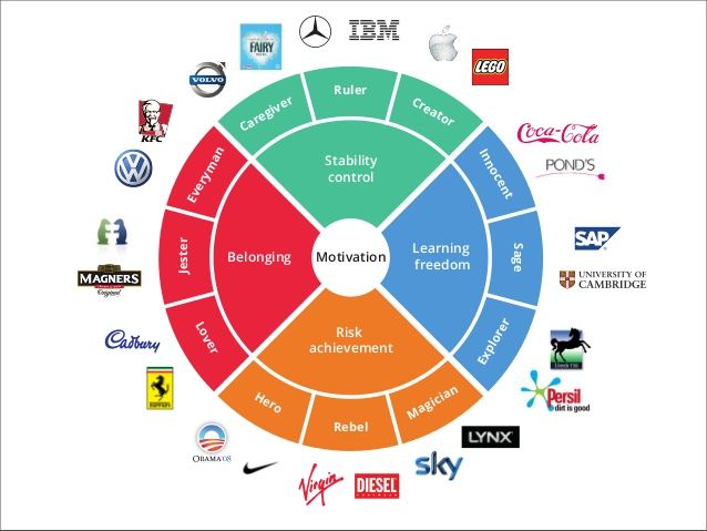
 In Lisa’s class we have identified the 12 fundamental archetypes:

  1. Caregiver
  2. Citizen
  3. Hero/ Warrior
  4. Innocent
  5. Creator
  6. Explorer
  7. Lover
  8. Rebel
  9. Jester
  10. Magician
  11. Sage
  12. Sovereign
https://www.pinterest.com/pin/183521753544136896/?lp=true

For example, these brands carry the archetype of a hero/warrior.

All in all, I did not really notice these factors until Lisa’s lecture cover. I only knew that brands do position themselves within their mission statement and target market in order to appeal consumers but using an archetype as a market strategy was truly an insight! (even the term archetype was new..) Thus I believe the role as a designer is truly important in the world of marketing and communication. We are the ones who can manipulate the mood and feelings on how others portray on a particular thing.

Talking Type with Jessica Hische

There are bountiful intricately designed typefaces up to this day, but how do we choose one that will be the perfect fit for our project?

Jessica Hische’s article, Uping Your Type Game will just be able to help us with that! She gives a thorough discussion on how type designers are the underdogs. She provides step by step pointers on how to choose a good typeface that may be the perfect fit for our design work and how we should broaden our horizon by not having a favourite type (but maybe a favourite type designer).

  1. To analyse the weight of the type. To Jessica, it is important to have access to a wide range of weights. This allows the flexibility in designing with perception of type weight.
  2. Look at the x-height, where it is best to look for an x-height that allows you to set type at small sizes and still have it be legible.
  3. True italics
  4. Type’s personality: What does the type convey and what historical baggage does it carry? What is the meaning behind its design?
  5. Spacing. This affects the legibility, whether it is easy, smooth and fluent to read.
  6. Even type color. This is my first time coming across this term. This is to make sure the letters don’t feel optically heavier at the joints. “Consistent type color also has a lot to do with the counters, or the spaces within the letters. If counters are too closed, it can make a letter seem heavy or affect legibility and letter recognition.” This made me reflect on how precise and intricate type designers must be and I would never pay close attention to it until this reading. Truly impressive!
  7. Widths. This ensures that the type is legible and beautiful per-line word-count.
  8. Using sans serifs. Jessica mentioned that using sans serif could be tricky as a body text. She introduced the “I to i to 1” rule where a capital I, lowercase i and a number 1 are placed next to each other. “If you can’t tell the difference between these characters, you may run into some trouble when setting the text.” 

Besides these pointers, choosing a type means defining the right mood. One must read the content, write down the key points and visual cues. When pairing typefaces, Jessica recommended to choose within a super-family, same type designer or one that has similar characteristics. For example, when pairing a serif with a sans-serif, it is best to choose the ones with a similar skeleton or proportions. When placing the text, place the serif for your body copy and a sans for your headlines.

After reading the article, it made me more aware on these detailed elements a type carries. When and what is appropriate in different moods, pairings and design. However, the article only talks about the functional use of proper text base fonts instead of the decorative and fun flourishing fonts that one can create for a project. It is does not necessarily mean we have to stick to these pointers but rather to keep in mind, for example, when one is designing an editorial or information texts. Personally, I feel it is more important to have fun and go wild with experimentation without these rules, and then maybe come back to them when finalising the design piece. At the end of the day, it all comes down to context, mood and the appropriation of type for the project.